
Your menu is one of the first things visitors see when they go to your website, so you want it to have some style right? Of course you do! That’s why in today’s post I’m going to share three ways to add some nice hover effects to your menu with custom CSS.
Hover effects should be subtle, we want visual interest but that’s not the most important part of the site, your content is. These will add just the right amount of “pop” to your Divi navigation.
Not only will we be adding a nice hover effect but there will also be some style applied to the link of the active page. For instance, if the user is on the homepage, then the home link in the menu will have some sort of small design treatment applied. This is a common visual marker to include on websites to help remind the user where they are on the site. It’s not absolutely necessary, but it’s a nice bit of helpful UX.
Let’s get started!
Subscribe To Our Youtube Channel
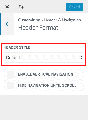
Theme Customizer Settings
First off, for all the styles we’re going to be using the default settings for header format. If you’ve just installed Divi you don’t need to configure this setting, it should be set to this automatically.
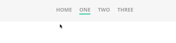
Style One – Growing line underneath
In this menu style we’ll be adding a line that appears to grow from left to right directly beneath the menu item being hovered over. It will also set a static line directly beneath the active page link.
Inspiration
This is a really nice effect that can work well on pretty much any kind of site, plus editing the code for this style to change the color and line width is pretty easy for any level user. It’s a pretty popular hover effect that I’ve seen on sites for years. I think it’s subtlety is what makes it so versatile, it can be used on a real estate site as well as a musician’s site and everything in-between.
Implementation
Add the following code to your child stylesheet OR to Divi theme options > general > custom CSS box:
#top-menu .current-menu-item a::before,
#top-menu .current_page_item a::before {
 content: "";
 position: absolute;
 z-index: 2;
 left: 0;
 right: 0;
}
#top-menu li a:before {
 content: "";
 position: absolute;
 z-index: -2;
 left: 0;
 right: 100%;
 bottom: 50%;
 background: #15bf86; /*** COLOR OF THE LINE ***/
 height: 3px; /*** THICKNESS OF THE LINE ***/
 -webkit-transition-property: right;
 transition-property: right;
 -webkit-transition-duration: 0.3s;
 transition-duration: 0.3s;
 -webkit-transition-timing-function: ease-out;
 transition-timing-function: ease-out;
}
#top-menu li a:hover {
 opacity: 1 !important;
}
#top-menu li a:hover:before {
 right: 0;
}
#top-menu li li a:before {
 bottom: 10%;
}
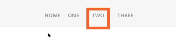
Style Two – Thick “boxy” look with line underneath
In this menu style we’ll be placing a large “blocky” line that animates down from the menu section beneath the menu item the mouse is hovering over. It also places a chunky box over the active menu link.
Inspiration
I use this style myself on a Divi child theme I developed called Executive (I’ll link to the demo below so you can see the hover in action on a real site). Visually this is not as subtle as the first style, I think picking the right site to use it on would be key. It’s important to match any type of small design detail like a hover effect to the overall feel of the site.
Implementation
Add the code below to your child theme’s stylesheet or to Divi’s custom css box under the Theme Options general tab. As far as ease of editing the color is very easy to change, but if you plan to change the width of the border you’ll find you’ll need to play with the other numbers in the CSS as well.
#top-menu li > a:hover {
 box-shadow: 0 10px 0 0 #F15A29 !important; /*** COLOR AND THICKNESS OF THE LINE ON HOVER ***/
 padding-bottom: 34px;
 opacity: 1 !important;
}
#top-menu li li a {
 padding-bottom: 6px !important;
}
#top-menu li.current-menu-item > a,
.et-fixed-header #top-menu li.current-menu-item > a {
 border: 10px solid #F15A29; /*** COLOR AND THICKNESS OF THE BOX ***/
 padding: 10px;
 margin-bottom: -10px;
}
This menu style turns the menu items into buttons with coordinated hover colors. It also gives another, separate color, to the active menu link.
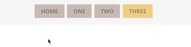
Inspiration
This is inspired by buttons of course 😀 I really like the way button navigation looks. I also think like style one it’s a pretty versatile look that could work on almost any site. Changing the background colors is pretty easy peasy as well.
Implementation
As with the other two styles above, you’ll want to add the custom css code below to your child theme’s stylesheet or to the custom css box in Divi’s general theme settings tab. You can make your own tweaks and changes to the code (such as colors) by adjusting values next to the commented portions of the code.
.et_header_style_left #et-top-navigation nav > ul > li > a,
.et_header_style_left .et-fixed-header #et-top-navigation nav > ul > li > a {
 padding-bottom: 15px;
}
#top-menu li {
 padding-right: 5px;
}
#et-top-navigation {
 padding: 20px 0 !important;
}
#top-menu li a {
 background: #C1B2AB; /*** CHANGES THE BACKGROUND COLOR ***/
 padding: 15px 20px;
 border-radius: 3px;
}
#top-menu li a:hover,
#top-menu li li a:hover {
 color: #fff !important;
}
#top-menu li a:hover {
 background: #559CAD !important; /*** CHANGES THE BACKGROUND COLOR ON HOVER ***/
}
#top-menu li.current-menu-item > a {
 background: #edc77b; /*** CHANGES THE BACKGROUND COLOR OF THE CURRENT PAGE LINK ***/
}
#top-menu .menu-item-has-children > a:first-child:after {
 content: none;
}
Examples of These Styles on Divi Sites “In the Wild”
Here are some examples of these styles (or very similar) being used on live Divi websites.
Complete Elevator Service
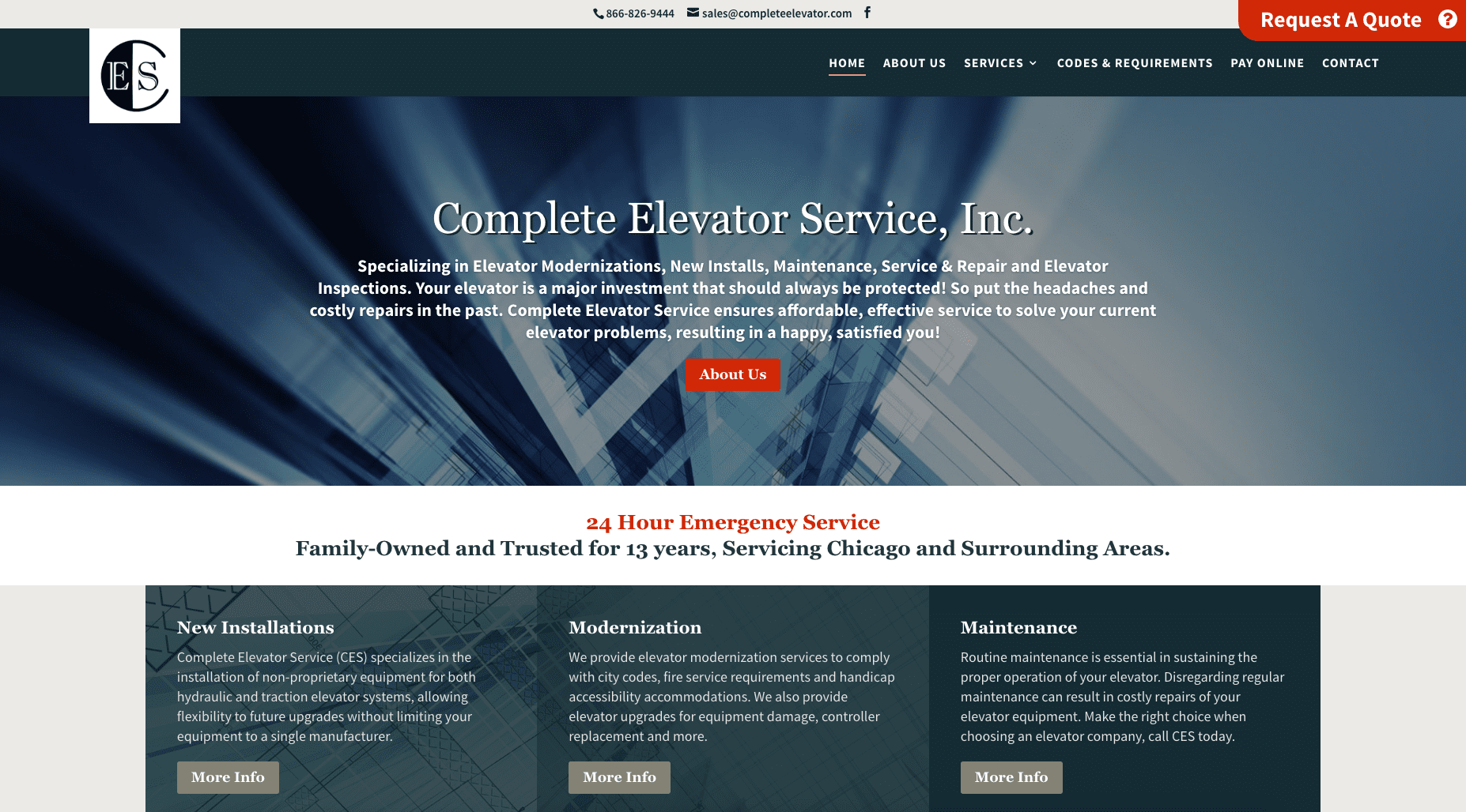
This site has the thin line treatment being used elsewhere on headings, so the hover style is being tied into the overall look so that it makes sense.
View the Complete Elevator Service Site

Like in the example above the style of the thick line is being used elsewhere on the site so that the different design elements complement each other.
View the Executive Premium Divi Child Theme
Endure Web Studios
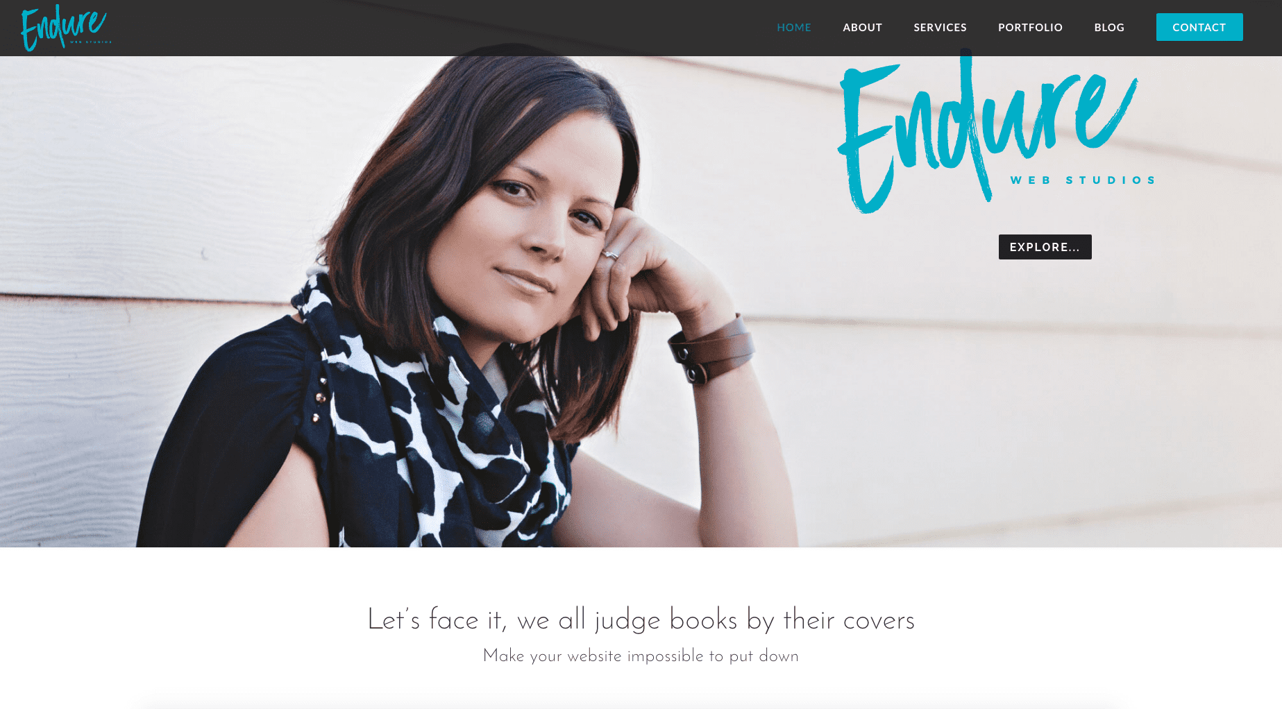
Okay so I had a really hard time finding a site that was using buttons for every menu link. I wrote the CSS just for this tutorial, but Endure shows a popular use of making one link look like a button, so the third style in this tutorial is just taking that idea and using it for all nav links.
View the Endure Web Studios Site
Wrapping Up
We hope you can find some use for one or even all of these menu hover styles on your Divi websites.
Something great about using snippets from tutorials like this is the fact that even the most beginner-level user can easily implement them, giving the most basic site that much needed boost of custom design. And even though technically none of them are actually using an animation function, it gives the feel of something being animated, which is hugely popular and trendy these days.
Let us know in the comments below what you’d like to learn about next. And be sure to subscribe for more easy-to-implement Divi tutorials from Elegant Themes!


Is there a way to do this for a secondary menu on the page itself rather than the top navigation? I’ve tried replacing #top-menu with #menu-nameofthemenu but its not working.
“Form elements do not have associated labels”
Comment Form
I’m sorry everyone has the same problem with Divi Theme.
A basic need today that has not gone away for centuries with Divi
Hi,
Where I will get these codes for menu designs
The CSS codes are on the post. Just simply copy them and put it in the CSS Box of the Theme Options.
How can this be used in a full width section menu?
Many thanks.
Hi Leslie – very nice, thank you!
Any chance we can see the underline on the primary menu item when an item in the sub-menu is clicked and active?
Just like you have done with the underline on the item without a sub-menu.
Hello Guys!
Im getting some trouble with the CSS from
Style One – Growing line underneath
since it also affects the logotype in the header.
I like the effect – but when a line suddenly goes through my logo while hovering I become a little sad 🙁
Any good advice on how to fix this?
I’m new to Divi and I really like menu button styling done with theEndure Web Studios website. Looking for the CSS code to style just one of my menu links. Can you help? Thanks!
Hi,
Thanks for the code, I absolutely love it!
I do have one problem with it though…
I have sub and subsubitems. Once I’m on the subitem page and navigate to the subsubmenu, all the items in that list, are underlined.
If you like, you can see it happening here :
The subitem page is this one :
https://infi.at-digital.nl/nl/show-uitslagen/
Please navigate to the subitems listed there and you will see that all of them are underlined.
Hopefully there’s solution for this?
Thanks in advance!
Can’t edit my post. I had to continue, so changed my page into a custom link. It does work nicely then, just a pity that sub submenu’s don’t work. Tried the option given by Leslie on March 2nd, but that doesn’t do a thing for me. Still hoping for a solution, but for now, I’ll try to use custom links instead.
Muchas gracias mi página ahora luce de maravilla fácil, rápido y con aspecto super profesional
Hello, I use version number 3.
However, the rectangles of my menus are very high as it takes the height of my logo. How do I adjust the height of the rectangles in my menu?
Thank you
We used the underlining menu style on our latest Divi release! It’s very elegant. Thank you!
its really helpful stuff to make our site more catchy… may be the style one and two little old.. but i preferred style one because its looking simple and more suitable for my site.. thanks Leslie for your valuable post 🙂
Hello,
I installed the style three. It was perfect.
I then wanted to remove it, but it is still there! Yet I deleted all the additional code.
That CSS is for example 1 by the way 🙂
If anyone is having issues with the submenus not working right use this CSS instead. I didn’t write it, I’ve just tweaked it a bit. My friend SJ James of Divi dot Space did (he’s very active in the Divi fb groups) and his way works much better with submenus. Mine wasn’t really written with submenus in mind.
I’m not able to edit my ET blog post so hopefully commenting here will be allowed.
#top-menu a:hover {
opacity: 1;
}
#top-menu a {
padding-bottom: 20px !important;
margin-bottom: 15px;
}
#top-menu li li a {
margin-bottom: 0;
}
#top-menu a:before {
background-color: #15bf86 ;
/*** THIS IS THE COLOR OF THE LINE ***/
bottom: 4px;
content: “”;
height: 3px;
left: 0;
position: absolute;
-ms-transform: scaleX(0);
transform: scaleX(0);
transition: all .3s ease-in-out 0s;
-webkit-transform-origin: 3px;
-ms-transform-origin: 3px;
transform-origin: 3px;
width: 100%;
-webkit-transform: scaleX(0);
-webkit-transition: all .3s ease-in-out 0s;
}
#top-menu a:hover:before {
-webkit-transform: scaleX(1);
-ms-transform: scaleX(1);
transform: scaleX(1);
visibility: visible;
}
.nav ul li a:hover {
background: transparent;
}
Thanks for all the sharing you do. Love it!
Thanks Eleanor! 🙂
Hi Leslie,
I’ve found this very helpful, but I’m wondering how to get the same effects with a full width menu module. Any thoughts?
Leslie,
Great Stuff! We are getting close to finishing up our site using the Executive! It is a great design.
Oh awesome! Feel free to share it with me if you get a chance!
Hi, I like the first one! Is there a way to disable the line just on the submenus? Thanx!
Hi, I like the first one! Is there a way to disabkle the line just on the submenus? Thanx!
Muy bueno, algo que le falta a divi es estas cuestiones, mas libertad y personalizacion al header y menu.
I love Divi!
Thank you!
Hey Les,
Seems like my issue is fixed.
Turns out, the complete URL path is not supposed to be used in the menu links. Takes the user to the destination, but only after they’ve been to the intermediate stations. Also making the menu links active by default (in case of one-page websites).
Turns out, a ‘#’ before the section CSS ID is enough to let Divi know about a section located on the same page. The complete URL path is not required for redirection.
Thanks anyway.
Hi Shubham, did you make any one-page site with this kind of menu? It is possible to see this?
Thanks
Just saw this after commenting above, glad you found a workaround 🙂
Hey Leslie,
Thanks for such a great tip. I tried using the ‘underline’ effect. However, I was struggling to get this to work on a one page website. You would understand that a one page website will have links to same page sections. For some reason, the underline is there on all the menu links by default and fails to work on the hover since the underline is already present.
Would appreciate you helping me fix the code for a one-page website, this coming from a beginner.
Thanks.
Aaah yes, this won’t work on the one-page site since the nav links technically are all active links. I did make it work on my one-page version of the Executive child theme which you can see on my store (click my name to go to my site) but it required JavaScript that I hired out to have written for me.
So unfortunately this tutorial alone won’t achieve that, sorry :/
Great post, @Leslie! I prefer No 1. Is it possible to use this design for ALL links, wether in a navigation bar on top or in the footer or within the text? Thank you!
Hi Anna! It certainly is possible. It would just be a matter of finding and applying the right classes that you want to use it on and then including those classes in the CSS code, but it’s definitely doable.
How should I remove the space above the menu buttons ??
I love ready soutions from yor website
i have the secondary menu showing – how do i add this to that menu too please?
Thanks a lot for these snippets I was searching for something like this just last week and there it was in my inbox yesterday.
Hi Leslie, thank you for sharing this! It’s been bookmarked for that special occasion. I do have a question though… I’ve been looking for the single menu item button change (like in Endure). Any chance you have written about that one before? (I’d like to use it for a “Donate” button on a non-profit site)
I don’t have a tutorial but Geno at quiroz dot co has one. I can’t add the link here but if you do a search for “cta” it should come up.
Hi Travis, I haven’t written a tutorial but Geno over at quiroz.co has one here: https://quiroz.co/transform-a-divi-menu-item-into-a-cta/
Hi Leslie
its funny, I like the one and it works perfectly on my PC screen by “standard” setting.
Would it be possible to make more space between the letter and the red line?
How? If it would so I could change to “center” the menu instead to “standard”
You can check it hwo it looks “center” by the homepage. Ther no space between.
Today I have seen on other PC’s (but not by me) that the lines on the submenu are fixe on all submenues, not so moving like on my computer. This looks not good when all lines are the same time there.
Is there somthing I can do?
BR
Dustin88
well, its almost everything solved with help I found above!!
Dustin88
bootstrap and css help to make a website beautiful
Hi Leslie,
This is great! I have a button as part of my menu at wp.outcomes.com and I was wondering how I can remove the underline effect from it?
Hi Francis, try adding this:
li#menu-item-28972 a:before {content: none;}
if you still see it try this:
li#menu-item-28972 a:before {content: none !important;}
All are good, but I would love to choose number 2.
Thank You 🙂
Great view, espacially style one.
Short Question has anyone an Idea how to underline with these effect also an Menupoints of first level – if an Sub-Menupoint was activated.
So that a user with closed menupanel also sees in wich area he was.
You explained the stuff so simply!! I am not a technical person but I was able to grasp all of it very easily! Thanks for the awesome post.
Will be great if we can do something like this http://jsfiddle.net/K6zCT/2309/, but its conflicting everything else.
I want to modify CSS of only one menu item. How to do that? Please help.
Thanks everyone for your comments! I see some of you got these to work with no issues, others not so much lol
It’s kind of hard to troubleshoot since I can’t replicate the issue on my end, and these styles were specifically written with the default header in mind. I would make sure you’re using the latest version of Chrome, Safari, Opera, and Firefox and also try clearing all caches after adding the code. One user said she had to log off and then log back in, which is odd, but it worked 🙂
Hi Leslie
Thanks for sharing the css codes. I like the idera of Option 2, I tweaked it to use a background colour instead of a keyline (border).
#top-menu li.current-menu-item > a,
.et-fixed-header #top-menu li.current-menu-item > a {
/*** border: 10px solid #D99659; ***/
/*** margin-top: -20px; ***/
background-color: #D99659; /*** Background COLOR OF THE BOX ***/
padding: 10px;
margin-bottom: -10px;
}
Question: Is there a way to force that border/background to cover the full height of the navigation bar? ( i tried margin-top: NNpx) but changing NN to different numbers does not force it to cover the full height of the navigation bar)
Hi Jojo, it sounds like you would need to mess with the #et-top-navigation element which contains/houses the menu elements inside of it. I believe by default there’s a top-padding in there and that’s probably why everything you’re trying isn’t working.
If you take just a short amount of time and learn how to use an inspect tool (I use Chrome’s) you can edit css and find where exactly you need to change it to get it looking how you want.
Another ET writer did a great article on this: https://www.elegantthemes.com/blog/tips-tricks/inspect-element-tips
Hope that helps 🙂
Hi Leslie! Great stuff. Congrats 🙂
Can you tell how did you record those gifs showing the interaction?
Thanks a lot
Ya Fabio! I actually found a free tool in the App Store called Monosnap. I was going to get a Camtasia license but I only needed to do these little short gifs so the app was perfect!
Very helpful post, thank you! I will implement this on a website that I’m currently designing.
Wow, this is awesome! Thank you so much!
Side note: Placing this particular snippet at the end of your CSS is the most appropriate. Otherwise, it tends to interfere with any CSS customization for your child theme, etc.
Hope this helps.
Style One – Growing line underneath is the one which I want to use on my blog, Thanks for the great list.
Style #1 is working and looking really good!
But I have a problem with the fixed menu. When scrolling down a page, so the fixed menu appears (the main menu shrinks) and then hovering the menu items, the animated line is nearer to the text, partly overlapping with the text. Do you have a solution?
Okay, I’ve adjusted this by changing the value of „bottom: 50%;“ to „bottom: 40%;“.
I have to apologize. I had an earlier comment that the styling was not working because I didn’t have default setting and I did have sub menus. But… When I logged off site and back on again, all the styling works as it should. Thank you for the styling tips. BTW – where is my earlier post? Still in review?
Thanks for great styling tips. I will use on other sites. Does not work on my current project site as I don’t use default setting and I have lots of sub menus.
Thanks a lot Leslie. I was looking for this for a long time. I have used “Growing line underneath” and simply rocks.
WOOHOO! Glad it’s working for you! 🙂
Lovely indeed. Nevertheless, there is one point to mention. All testimonal sites lack of a headline-structure that goes along the 10 SEO Commandments. E.g. lacking h1-Headlines. These are things that even a SEO-Beginner can detect easily.
Is this a problem of the Child Theme or a simple carelessness? The latter is true, I hope. Normally – and that is something I love about Divi – you can create pages with Divi showing a clean and exemplary headline structure.
What the heck does that have to do with my tutorial?? Lol
Well, maybe, I am the jester. But. You are presenting an example of a child theme I wonder to adopt and I am asking about the headlinestructure from a SEO point of view. And You burst out laughing? Wo`s the jester?
Hi Leslie
Thank you so much for sharing these goodies with us. I have tried implementing the first one (with underline).
I entered it as my third piece of CSS in my custom css box.
But my menu does exactly what it did before. The change doesn’t happen. Any thoughts on why that is?
BR
Rikke
Your site is behind a maintenance page so I’m afraid I can’t take a look, sorry.
Nice one Leslie
Any chance you could tweak the coding for the secondary menu?
Cheers!
Simply superb!!!
The STYLE ONE is not working. I puted the code in the right place and dont work.
Can you help? is there another place to put the code?
Hi Hugo, I’m looking at your site and I see the line effect in pink working, so you put it in the right spot 🙂
Hi there, great little snippets. Got another snippet for how to disable for CTA menu buttons please?
Thank you for another excellent article, Leslie! This and the Caldera Forms post are my favorites from your collection so far.
For a topic on what may be of interest to learn next, one of the sites you referenced actually made me think of it: I’d enjoy implementing something like the Flyout Sliding Panel that’s being used for “Request a Quote” on site #1.
I already looked into some of the details, and know there are solutions that can be purchased to achieve that effect. However, it would be pretty cool if a Divi solution can be created as well. Maybe create slide-in content using the Divi builder, so one has a selection of items (such as contact forms, pricing tables, a CTA, or other modules) to showcase throughout one’s web site or certain pages with the click of a floating button. Any chance this functionality might be a future article/resource?
Thanks again for your great work and sharing such wonderful resources! 🙂
Hi Mathias, I’m using a plugin on that site called Canvas from codecanyon made by Bonfire Themes. They also have one called Nest that I think is a step up from Canvas.
As far as a Divi plugin there is something similar coming out soon being built by Tim Strifler of Divi Life. I’m not certain it will exactly have the slide function but from what I saw it may be what you’re looking for.
Hi Leslie, thanks for your phantasmic work from south germany. I really like Number 1, can I manage the distance between line and Menu-words. I would prefer a little more distance between. Maybe 1 or 2 px padding. But I have no Idea how to fix it. Maybe it is easy. Thanks a lot
Hi Lulu, where you see the
#top-menu li a:before {
bottom: 50%;
}
change that 50% to 40% or 30% or lower til you have what you want.
Style One is causing my site problems. The Divi custom CSS box won’t save it, and when I try putting the code into SiteOrigin CSS it creates a ‘403 Forbidden – A potentially unsafe operation has been detected in your request to this site’ error message.
It only happens with Style One, the other two work correctly. I think it is the ‘webkit-transition’ property causing it.
Anyone else had this problem?
Solved it, it was the Wordfence firewall incorrectly configured giving a false positive.
Hi Leslie, Great Post, thanks for this info. I’m currently using number 1.
Just one thing, when I hover over my logo it also shows the line, how can I disable it from working on the logo? I’m using centered inline logo format.
Regards
Hi Hiram, change this line:
#top-menu li a:before {
to this:
#top-menu li:not(.centered-inline-logo-wrap) a:before {
that should fix it.
Hi Leslie,
I’m trying to disable social links and a CTA button from getting underlined. I’ve added the :not rule to everything but I still can’t make it to work. Any suggestion?
Here is the code with just the social class:
#top-menu li:not(.menu_social) a:before {
content: “”;
position: absolute;
z-index: -2;
left: 0;
right: 100%;
bottom: 50%;
background: #ff2448;
height: 2px;
-webkit-transition-property: right;
transition-property: right;
-webkit-transition-duration: 0.2s;
transition-duration: 0.2s;
-webkit-transition-timing-function: ease-out;
transition-timing-function: ease-out;
}
#top-menu li:not(.menu_social) a:hover {
opacity: 1 !important;
}
#top-menu li:not(.menu_social) a:hover:before {
right: 0;
}
#top-menu li li:not(.menu_social) a:before {
bottom: 10%;
}
thanks!
Gal
Hi Leslie,
These are fantastic! Thank you!
I’m using Number One with the Centred Inline Logo so added the extra snippet you just gave to Hiram. It works great, but also caused the underline in the drop down menu to go through the centre of the text (like a strikethrough) rather than underlining those submenu items like it was before.
Could you suggest a fix?
Many thanks
Tried changing the line
#top-menu li li a:before {
as well, and it worked!
Hadn’t realised I needed to change this line with the ‘double li’ as well.
Thanks a lot Leslie, that solved the logo issue.
And thank’s to you Faith, the drop down menu is also working changing the “li li” part.
Hi your correction does stop the logo being underlined but now on the sub menu list the hover is centered through the middle of each sub menu link – worked correctly just using #top-menu li a:before {
Any way to fix that?
Nice article by the way! 🙂
Fantastic Job Leslie ?, I agree with kwabsgops you bring the good stuffs.
Leslie, you never boring. Always bring good stuffs. Thanks
LOL thanks! 😀
This is really a great and useful post Leslie, thanks a lot!!
Thanks Herman! 🙂
Hey I really like this hover effect but for some reason the submenu links are all underlined? Here’s a screenshot:
https://www.screencast.com/t/wdCnuM6vf
How can I get rid of those other underlines?
I have the same issue here too.
So I checked your elevator theme and found that there it happens too.
When you choose Services ->New Installations both submenues (Hydraulic Elevators, Traction Elevators) are underlined like in Joseph’s example.
Sorry guys I’m not seeing any difference in the code and it’s working on the Complete Elevator site for me. Not sure if maybe it’s a browser issue. I checked on Chrome, Firefox and Safari, all at latest versions.
I have the same problem. The lines are working with submenu items, as long as you are not on the parent page. When clicking the parent item, then after opening the new page all submenu items of this active item are permanently underlined.
Hi, I have the same problem. Is their a solution to fix it?
Not yet, I’m afraid…
I have the same problem. Also I wasn’t getting a space between the line and the Menu Item. I fixed that with some additional padding CSS.
Hi Joseph, that’s strange because I’m using the CSS from the Complete Elevator site I built and it’s working as it should there with sub items. I’ll look into what’s causing this 🙂
I have the same problem. If I select the top level menu item then all sub-menu items are underlined, but if I select a sub-menu item, then it works correctly.
Would love to the background buttons style on our Extra-themed site. Any changes that would need to be made to make these work with Extra?
Thanks!
Have the same question/request…
This would be cool if we could use it for Extra themes
Great article! When I go to my theme customizer options there is no option to change anything? Any idea why this might be the case? Thank you!
Thank you, very helpful stuff. I would like to suggest a post on how to get your news feed into the dropdown mega menu area with pictures and excerpts in Divi. Similar to how the top menu works in the Kinja universe: http://deadspin.com/
Please! Let have nice effects for mobile menus!!
This is great! Unfortunately, it doesn’t work for the full-width menu module, does it? I’ve been kind of doing that lately, using the blank page and setting up my own modules for header, menu, and footer. It just feels like I have more control and options that way. Thanks!
Hi Steve,
I’m using the fullwidth menu module and was able to make it work with a little tweaking. I utilized #2 and did the following:
1. In the fullwidth menu module add a custom CSS Class. (I used menu)
2. Then in the epanel change #top-menu to simply .menu
I only wanted the active underline so this was the code I used:
.menu li.current-menu-item > a,
.et-fixed-header #top-menu li.current-menu-item > a {
box-shadow: 0 2px 0 0 #FFFFFF;
padding: 4px;
margin-bottom: -10px;
}
You can see the changes on tomsterner.com
I’m actually also interested in a way to do it on the full-width menu. Any idea ? Thank you in advance ! 🙂
I’m actually also interested in a way to do it on the full-width menu. Any idea ? Thank you in advance ! 🙂
I really like No 2! Thank you so much.
Truly fantastic. Thanks a lot.
I was googling for ages tonight for a way to change the hover colour for the menu. I then found some resources for cool Divi hover effects, but none that I really wanted. I was just about to give up and then your newsletter arrived in my inbox and BAM!! My hover effect situation is now sorted! Thank you ever so much, I love your emails 🙂
Wouah… Thank you
That’s class. This entire blog is really helpful. Thank you very much and keep it up!
I liked the first one but my menu has several subs so it doesn’t appear unless you hover over the sub menus. But it’s fun to play with.
What I’d really like is figure out how to change the color of the text for the active menu item. Instead of a colored underline, how would I go about changing the color of the text?
Thanks!
Nevermind…I just found it! I’ve noticed that often things do show up until I ask someone (usually my wife) where it is! LOL
Hi Bud! You can set the active link color in the customizer. Go to header & navigation > primary menu bar > active link color and set it there. You can do it in the fixed settings as well if you’re using a fixed header.
Thanks, Leslie. See…I just had ask!
Love it Leslie.
My only problem is… which one to choose 🙂
Ha! Thanks Keith 🙂