Deciding on which style you want your website to follow can be time-consuming. Not a surprise if you consider all the design styles you can follow. The style you choose will be a representation of everything your website stands for and you most definitely want it to match design trends in 2018. In this post series, we’re going to explore a few of the most popular and good-looking ones out there:
- Clean & Abstract
- Minimal
- Flat
- Bold & Colorful
For each one of the design styles, we’re going to go over a few Divi techniques that will make reaching that type of design a lot easier. We’ll start off with the clean and abstract design style. We’ll share 8 techniques you can apply to your design elements using Divi’s visual builder and afterwards, we’ll create two stunning examples from scratch!
Let’s get to it!
- 1 1. Avoid Colorful Main Section Background Colors
- 2 2. Use Subtle Row Pattern Backgrounds Instead
- 3 3. Break the Pattern with White Module Background Colors
- 4 4. Create Contrast with Font Sizes
- 5 5. Use Letter Spacing for Elegance
- 6 6. Use Gradient CTAs, Dividers & Empty Sections for Abstract Purposes
- 7 7. Create Depth with Subtle Box Shadows
- 8 8. Overlap Design Elements with Negative Margin
- 9 Preview
- 10 Let’s Start Creating!
- 11 Preview
- 12 Final Thoughts
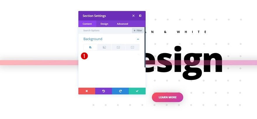
1. Avoid Colorful Main Section Background Colors
In most cases, the term ‘clean’ means a lot of ‘white’ as well. That doesn’t mean you should avoid colors in general, but avoiding colors in the main structural elements of your website (such as sections) can contribute a lot to giving visitors a clean impression.
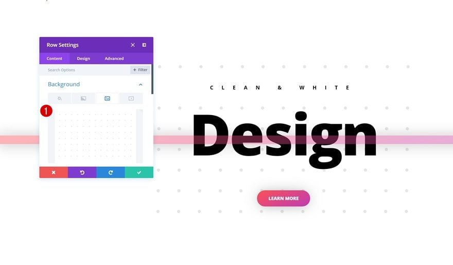
2. Use Subtle Row Pattern Backgrounds Instead
To reduce the white and clean feel of your section, you don’t necessarily have to focus on your section’s settings. You can easily create a subtle and abstract design using row pattern background images, for instance. It will only cover the background of your row and will leave enough white space to maintain that overall clean and white feeling. The pattern background you use should contain a white background color and only a part of that white background should be covered with patterns. Make sure you don’t add any patterns to borders or corners. This allows your row and section backgrounds to blend. Further down this post, in the part where we’ll recreate the examples, you’ll be able to save the pattern image and use it for your own web design projects!
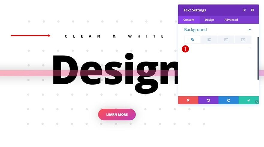
3. Break the Pattern with White Module Background Colors
The design hierarchy Divi contains (section → row → column → module) lets you do the same thing to your row pattern background. By using a white background color for the modules of your choice, you can override the row pattern background that your module takes up. This, in combination with a white section background color, allows you to make modules and section backgrounds merge while still keeping the row pattern background intact for other modules you’re using.
4. Create Contrast with Font Sizes
Using a white section background color means you’ll need to seek striking elements elsewhere. One of the things you can do to draw attention is creating contrast in font sizes. The bigger the difference in size between your subtitle and main title, for instance, the more your main title will pop.
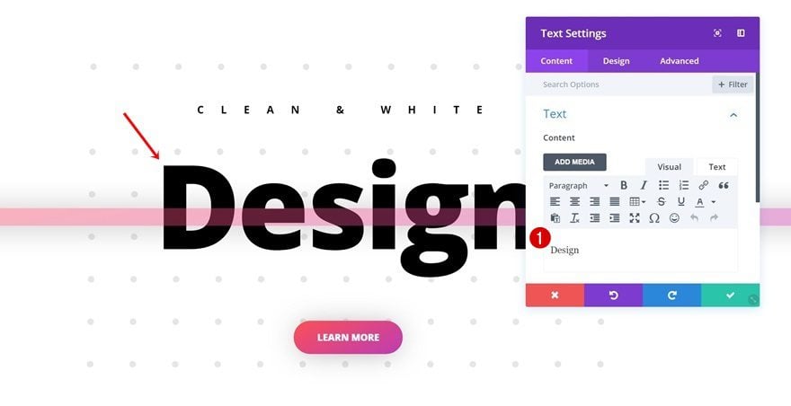
5. Use Letter Spacing for Elegance
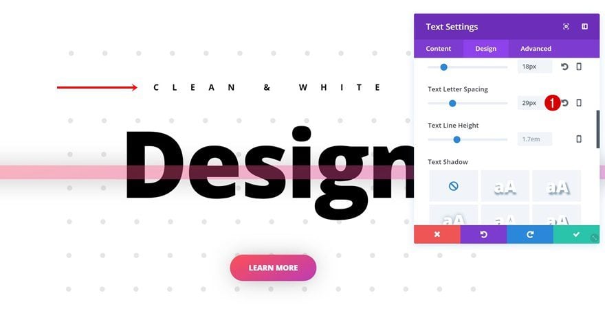
Just like playing around with font sizes, using extra letter spacing on different can bring stunning results. It helps to enhance the contrast between content you’re sharing without having to integrate a multi-color palette in your design. Like font sizes, it draws your visitor’s attention but in a different way than big font sizes do.
6. Use Gradient CTAs, Dividers & Empty Sections for Abstract Purposes
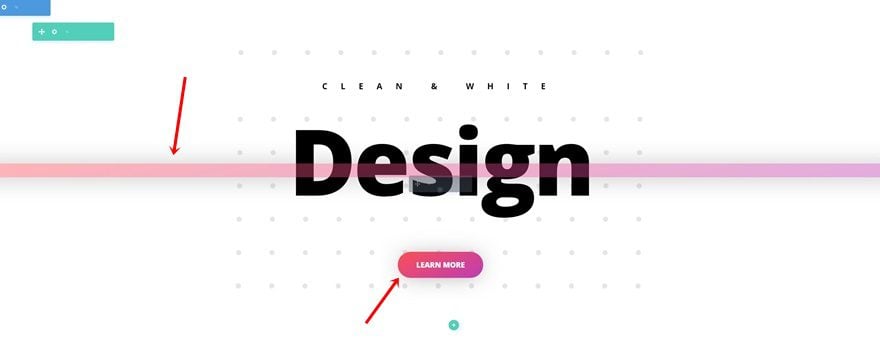
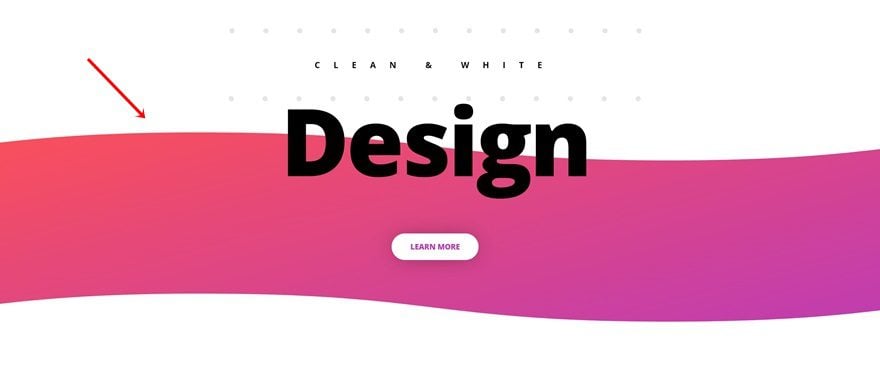
Another way to balance the clean and white design of your website is by using colors in an abstract way. Using gradient colors for your calls to action, dividers and empty sections in combination with section dividers are some of those things that’ll allow you to create stunning results without losing that clean and white factor.
7. Create Depth with Subtle Box Shadows
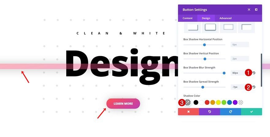
In combination with gradient and abstract design elements in your web design, a clean website also requires some depth. Not the ‘hard-to-miss’ kind of depth but rather the subtle kind that helps you take it up a notch higher. Subtle box shadows are characterized by a high blur strength in combination with a low spread strength and a light-colored box shadow color that doesn’t draw all too much attention but rather empowers the other design elements on your website.
8. Overlap Design Elements with Negative Margin
We’ve mentioned using gradient design elements such as dividers and empty sections in combination with section dividers. These elements are already gorgeous but to help make your design more complex (in a positive way) and abstract, you can easily use a negative top margin to make different design elements within your section overlap. You can also modify this negative top margin according to how you want it to look on different screen sizes, whether it is desktop, tablet or phone.
Preview
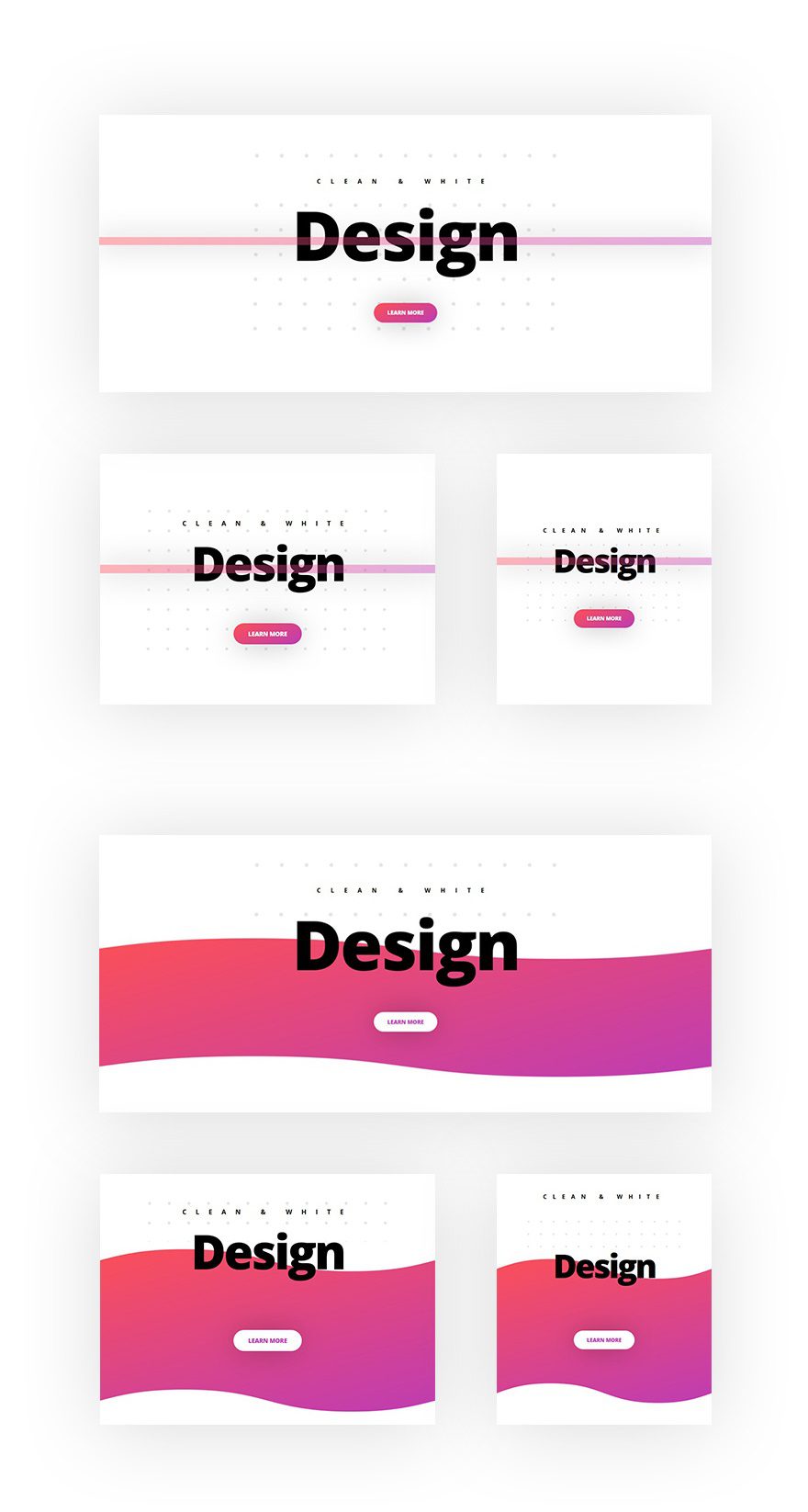
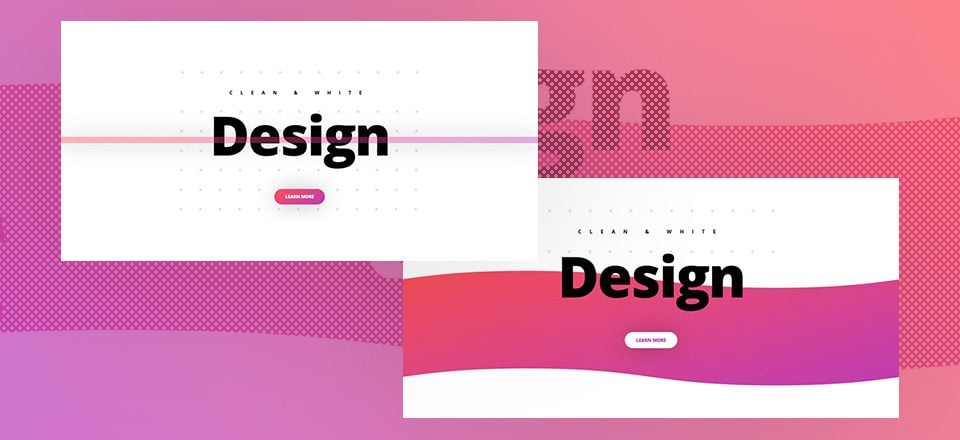
Now that we’ve gone through all the Divi techniques, it’s time to put them into practice. Let’s take a look at the design we’ll recreate on different screen sizes while keeping the different techniques in mind.
Let’s Start Creating!
General Steps
Add New Section
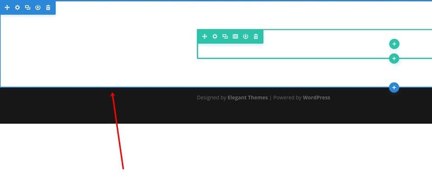
We’re going to create two different examples. The examples are similar but differ in design elements. To ease the process, we’re going to go through the general steps first and once those are done, we’ll focus on each one of the examples individually. Start by opening a new page using Divi’s Visual Builder and add a new standard section. This section contains, by default, a white background color and that’s the way we’re going to keep it.
Add New Row
Column Structure
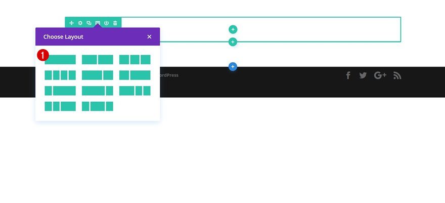
Next, add a row to your section containing one column.
Background Image
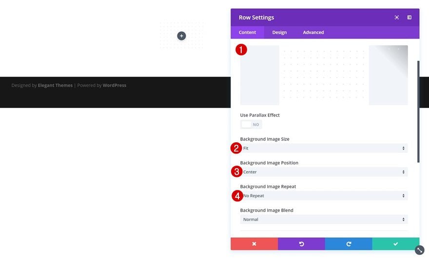
As mentioned in one of the techniques, you can easily enhance the white section background by using a pattern background for your row. Go ahead and save the image below, upload it and use it along with the following background image settings:
- Background Image Size: Fit
- Background Image Position: Center
- Background Image Repeat: No Repeat

Sizing
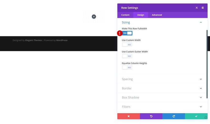
Open the Sizing settings next and enable the ‘Make This Row Fullwidth’ option.
Add Text Module #1
Background Color
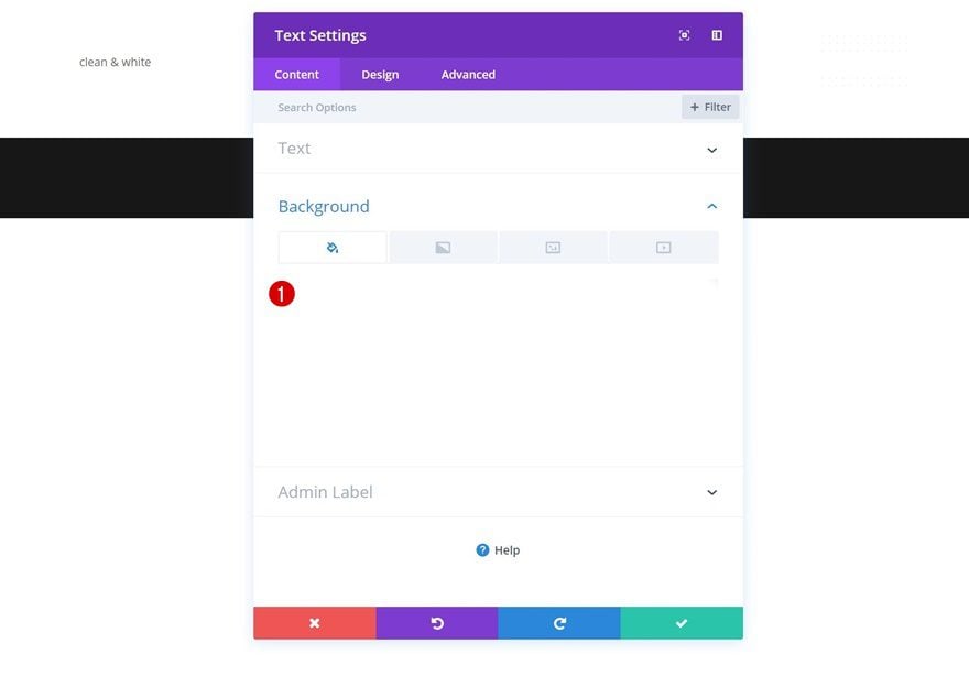
Now, let’s start adding modules! We’ll start with a subtitle and as mentioned in technique number 2, we’re going to break the pattern for this module using a white background color.
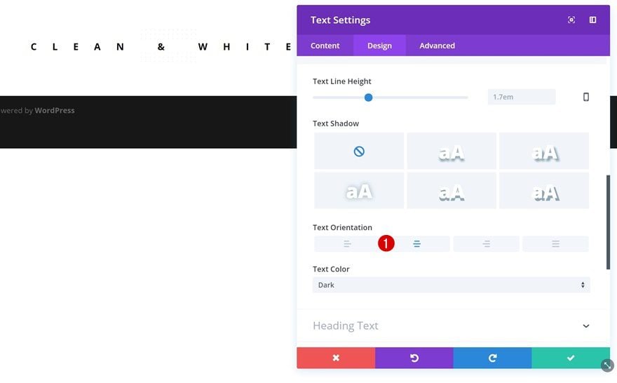
Text Settings
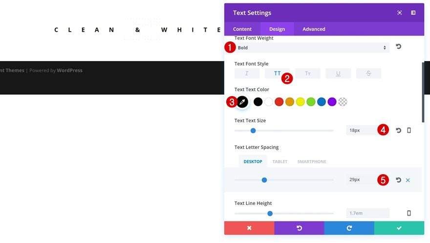
Open your text settings next and apply the following changes:
- Text Font Weight: Bold
- Text Font Style: Uppercase
- Text Color: #000000
- Text Size: 18px
- Text Letter Spacing: 29px (Tablet), 25px (Tablet), 18px (Phone)
- Text Orientation: Center
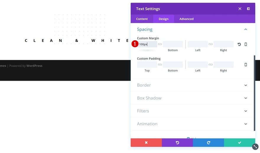
Spacing
To create some space between the beginning of the pattern and our Text Module, we’re going to add ‘100px’ to the top margin of our Text Module.
Add Text Module #2
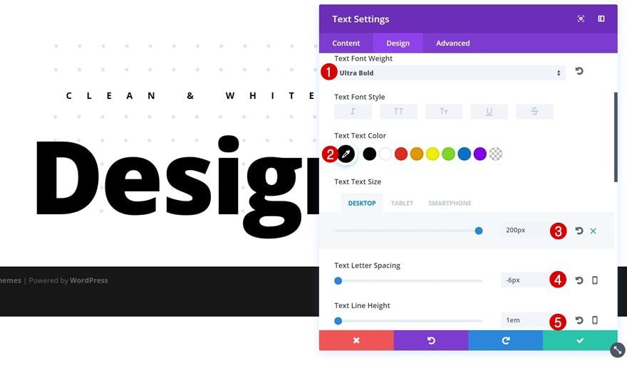
Text Settings
Right below the previous Text Module, go ahead and add a new one containing the title you want to display. Open the text settings of your module and make the following changes:
- Text Font Weight: Ultra Bold
- Text Color: #000000
- Text Size: 200px (Desktop), 130px (Tablet), 100px (Phone)
- Text Letter Spacing: -6px
- Text Line Height: 1em
Add Button Module
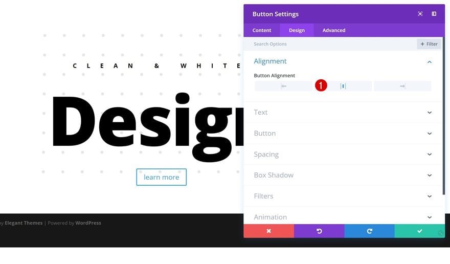
Button Alignment
The third and last module in our row is a Button Module. After adding the copy, go to the Alignment settings and use center Button Alignment.
Button Settings
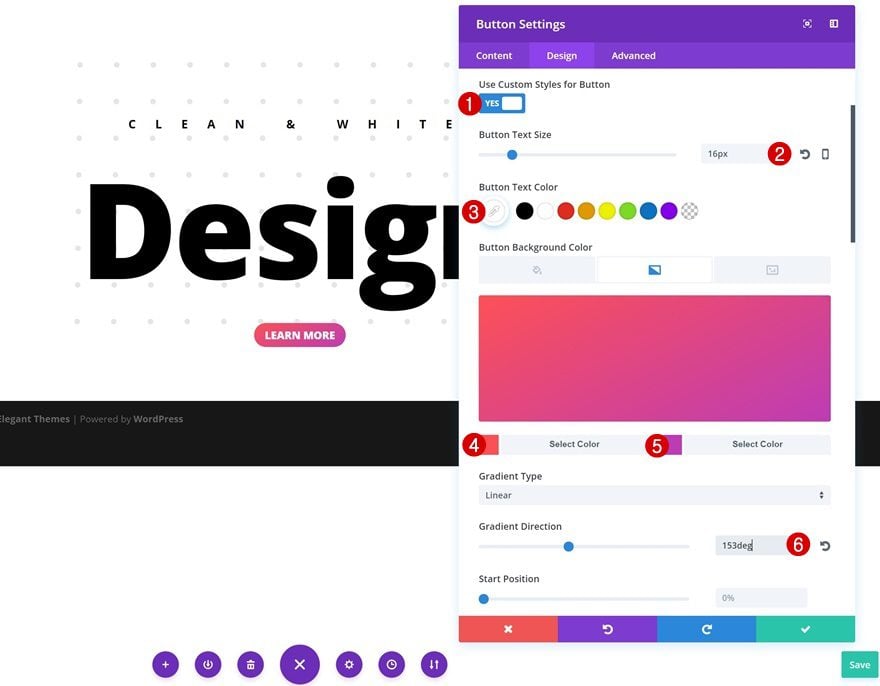
To change the appearance of your button, open the Button settings and apply the following modifications:
- Use Custom Styles for Button: Yes
- Button Text Size: 16px
- Button Text Color: #FFFFFF
- Gradient Color #1: #fd5056
- Gradient Color #2: #bd3cb5
- Gradient Direction: 153deg
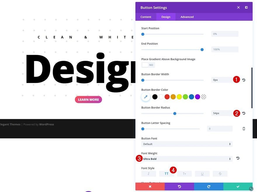
- Button Border Width: 0px
- Button Border Radius: 54px
- Font Weight: Ultra Bold
- Font Style: Uppercase
Spacing
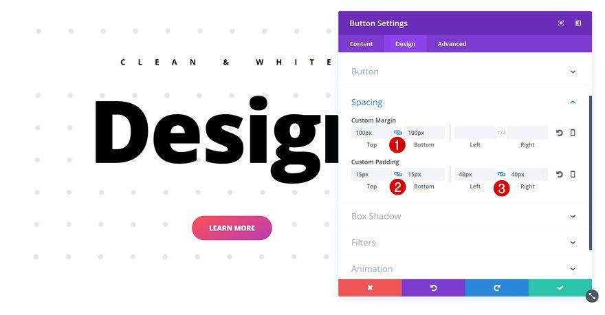
Giving your button enough padding is an important part of creating a readable and attractive CTA. Open the Spacing settings of your button and apply the following custom margin and padding:
- Top & Bottom Margin: 100px
- Top & Bottom Padding: 15px
- Left & Right Padding: 40px
Box Shadow
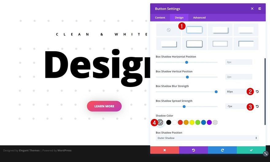
Last but not least, we’re going to create depth (as mentioned in technique number 7) to create an appealing design:
- Box Shadow Blur Strength: 80px
- Box Shadow Spread Strength: -7px
- Box Shadow Color: rgba(0,0,0,0.34)
Example #1: Additional Steps
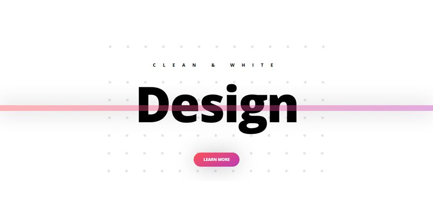
Add New Row
Column Structure
Now that we’ve gone through the general steps, let’s create the two different examples individually. For the first example, start by adding a new row to the same section with the following column structure:
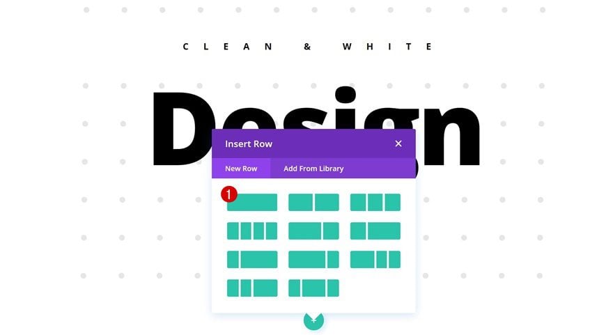
Sizing
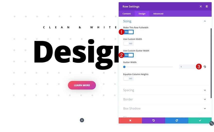
Open the settings of your row and allow your row modules to take up the entire width of your screen by using the following Sizing settings:
- Make This Row Fullwidth: Yes
- Use Custom Gutter Width: Yes
- Gutter Width: 1
Add Divider Module
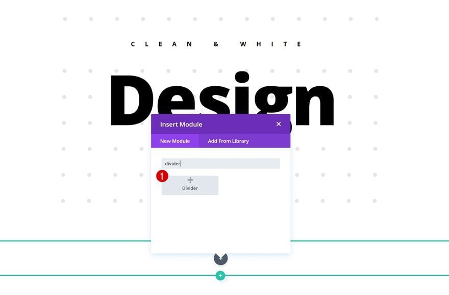
Add & Hide Divider
Add a Divider Module to your row and disable the ‘Show Divider’ option in the Visibility settings of the Content tab.
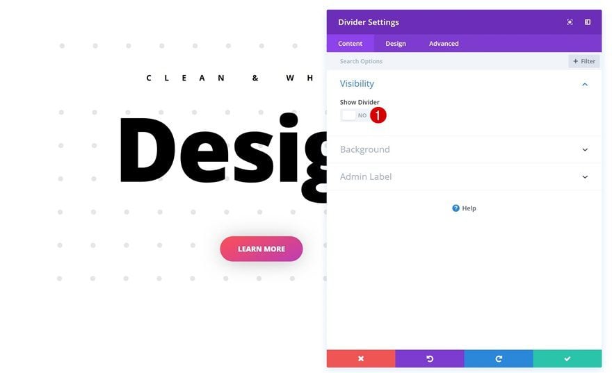
Gradient Background
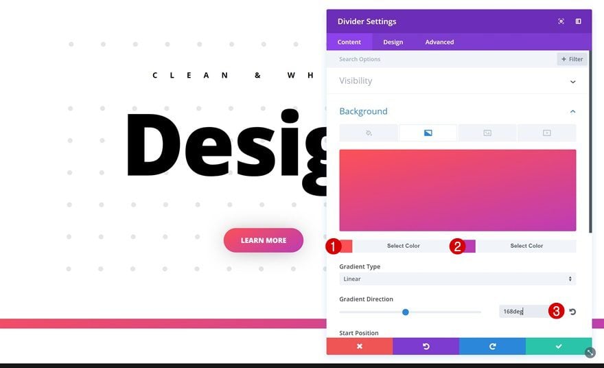
We’ll use a gradient background for our divider instead:
- Gradient Color #1: #fd5056
- Gradient Color #2: #bd3cb5
- Gradient Direction: 168deg
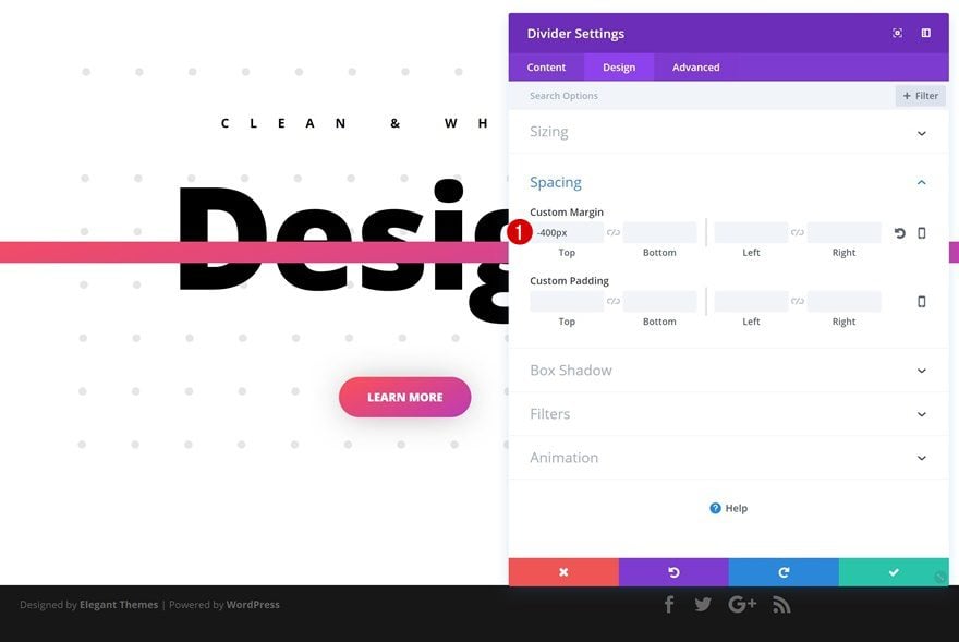
Spacing
To make the Divider Module overlap our previous row and its modules, we’re going to use ‘-400px’ for the top margin.
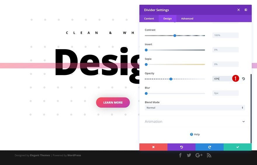
Opacity
And to make the title Text Module of our previous row still show through, we’re going to adjust the opacity within the Filters settings to ‘43%’.
Box Shadow
Last but not least, we’ll apply a subtle box shadow to enhance the depth of our design:
- Box Shadow Blur Strength: 80px
- Box Shadow Spread Strength: 3px
- Box Shadow Color: rgba(0,0,0,0.49)
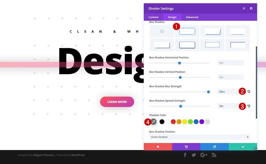
Example #2: Additional Steps
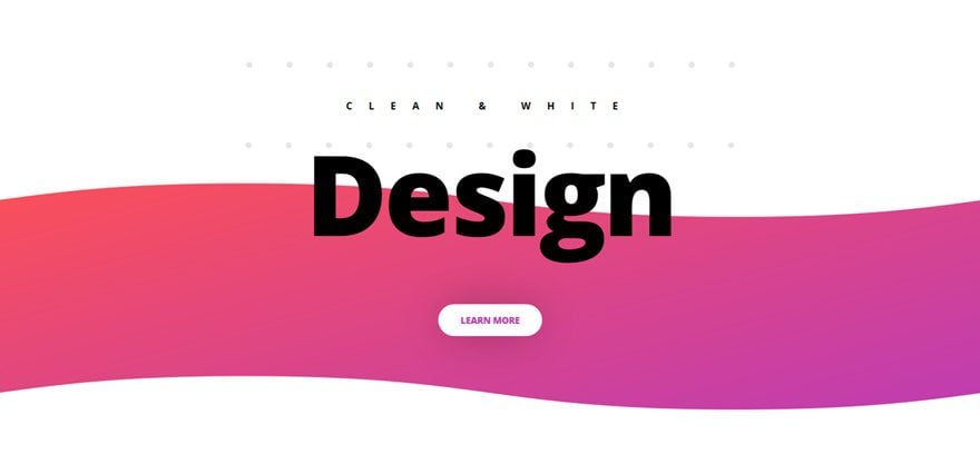
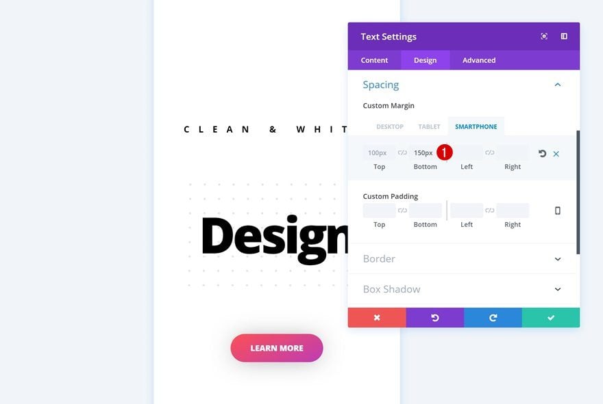
Change Spacing of Text Module #1
For the second example, we’ll need to make some modifications to our existing modules starting with the first Text Module. Open its Spacing settings and add the following custom margin:
- Bottom Margin: 150px (Phone)
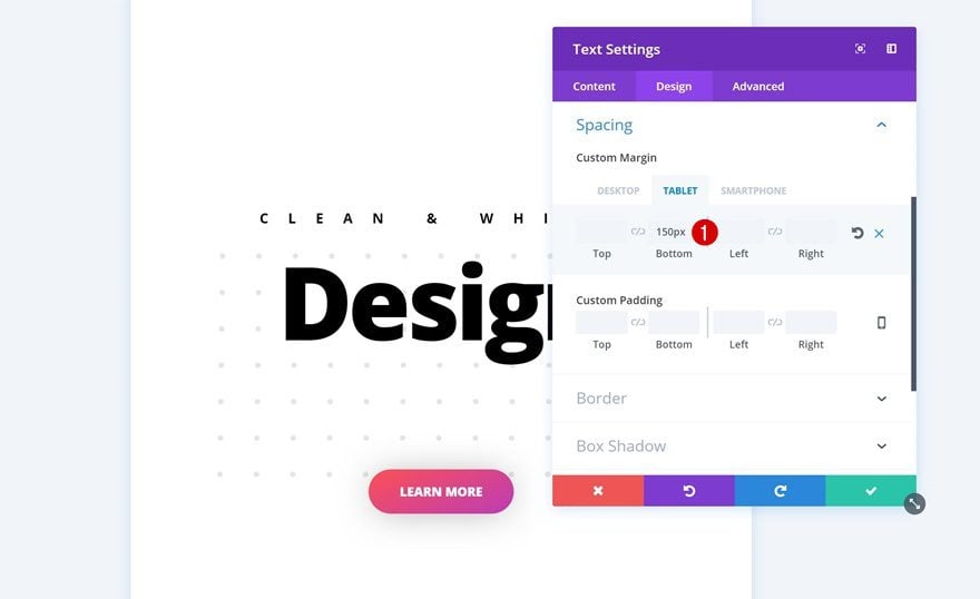
Change Spacing of Text Module #2
Open the second Text Module next, and use the following Spacing settings:
- Bottom Margin: 150px (Tablet & Phone)
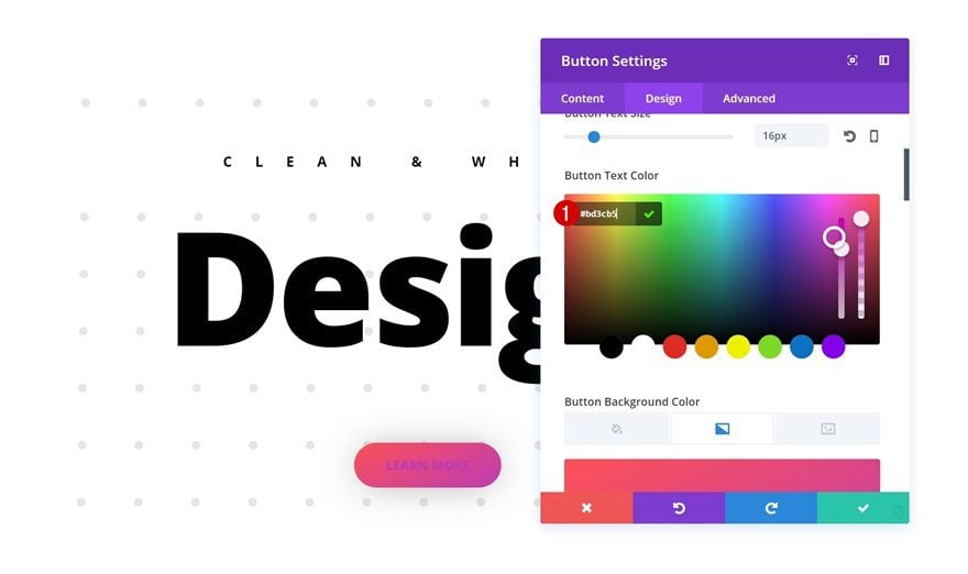
Change Button Text Color
Then, open the Button Module and change its Text Color into ‘#bd3cb5’.
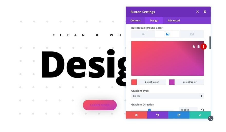
Remove Button Gradient Background
Go ahead and remove the Gradient Background of your Button Module next.
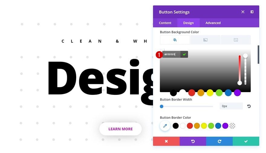
Add Button Background Color
And add a white background color instead.
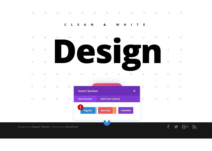
Add New Section
Gradient Background
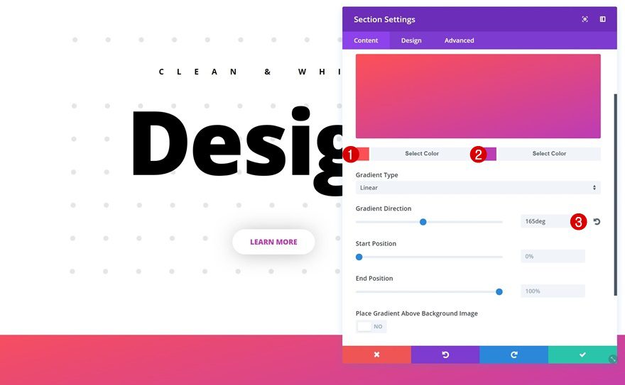
Once you’re done modifying the existing modules, you can go ahead and add a new section below the existing one. Open the settings of your section and use the following gradient background for it:
- Gradient Color #1: #fd5056
- Gradient Color #2: #bd3cb5
- Gradient Direction: 165deg
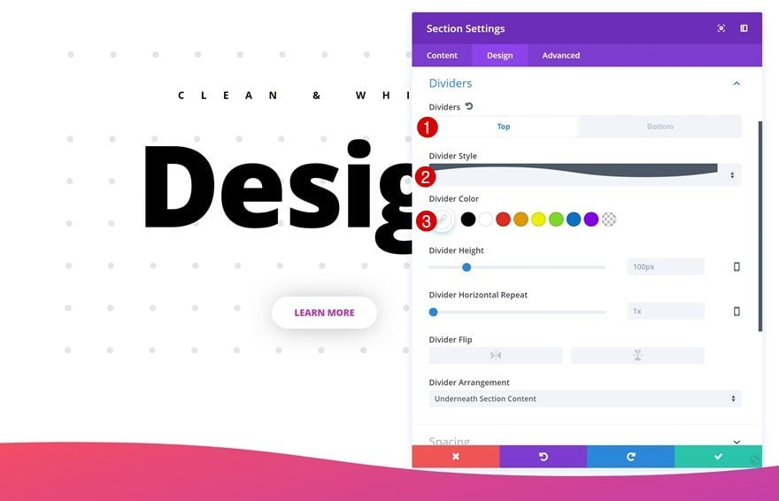
Top Divider
Continue by adding a top divider to your section:
- Divider Style: Find in List
- Divider Color: #ffffff
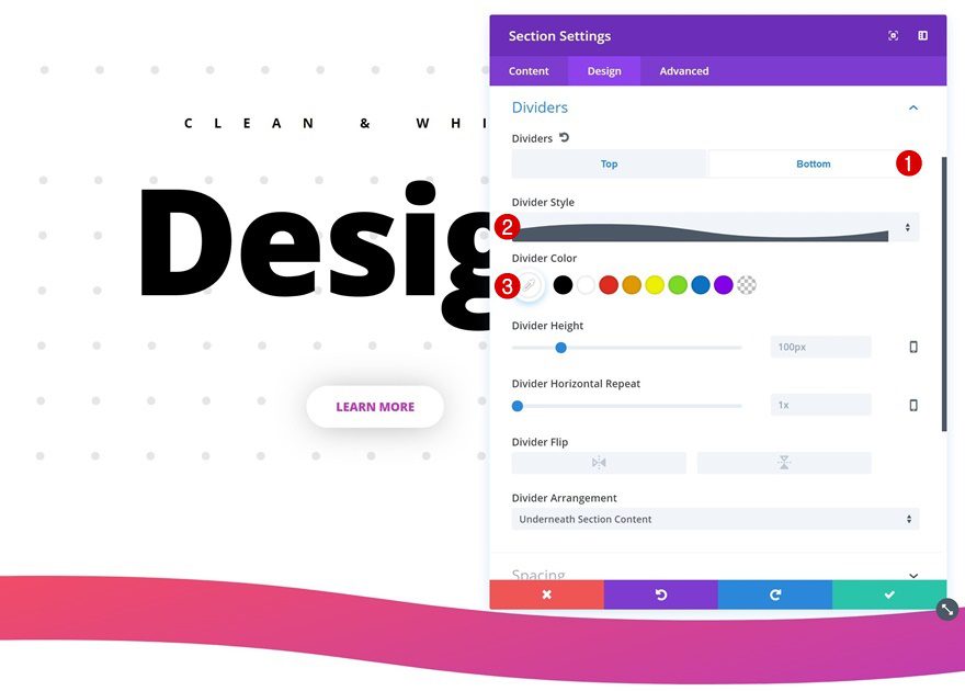
Bottom Divider
Use the same settings for the bottom divider.
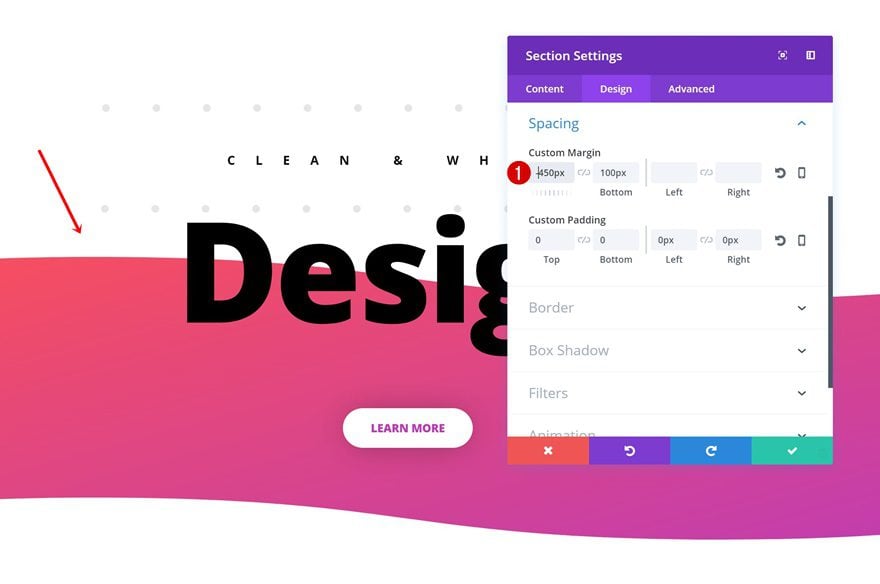
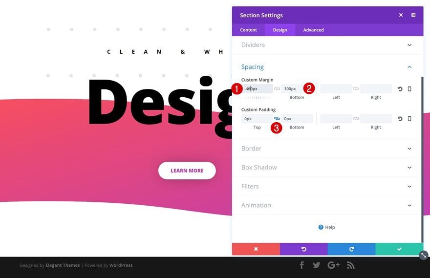
Spacing
The last thing you’ll need to do for your new section is modifying its Spacing settings:
- Top Margin: -460px
- Bottom Margin: 100px
- Top & Bottom Padding: 0px
Add New Row
Column Structure
Now, to make sure our section shows up on all screen sizes, we’re going to add a row with an invisible Divider Module to it. Start by adding your row first:
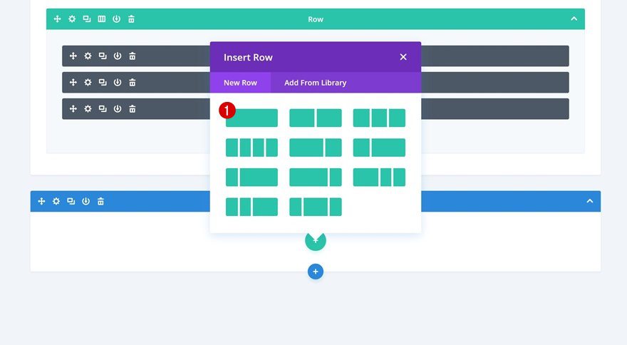
Add Divider Module
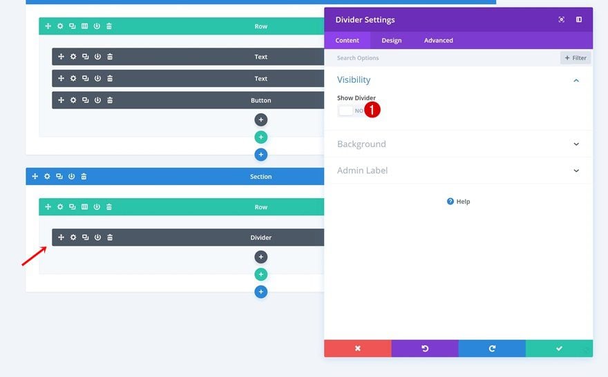
Hide Divider
Add your Divider Module next and make sure you disable the ‘Show Divider’ option within the Visibility settings and you’re done!
Preview
Now that we’ve gone through all the steps, let’s take a final look at the result on different screen sizes.

Final Thoughts
In this post, we’ve shown you some great techniques on how to achieve a clean and abstract website style. This is the first post of the series on how to make beautiful design styles happen using some of Divi’s finest built-in options. In the next series, we’ll share techniques on how to achieve more stunning design styles. If you have any questions or suggestions, make sure you leave a comment section below!



what an interesting thank you
Great tip video Mak!
Stuff like this keeps my design game super sharp.
Which fonts were used? Thanks
Could you provide us with the Download 😉
Hi Airton, it’s not a layout it’s a tutorial for the purpose of teaching some of the capabilities of Divi so therefore no layout to download. You will never learn by downloading a layout that’s why I love these Tuts. We get to see some of the other design capabilities of Divi which you can tweak to your hearts content.
Cheers.
It wasn’t obvious that the image is available for download at full res, that’s all.
In the video he says he’ll give us the background image to download in this post, which I think is what Airton is referring to. I would like it as well.
Excellent, excellent, excellent!
Looking forward to the rest of the articles.