
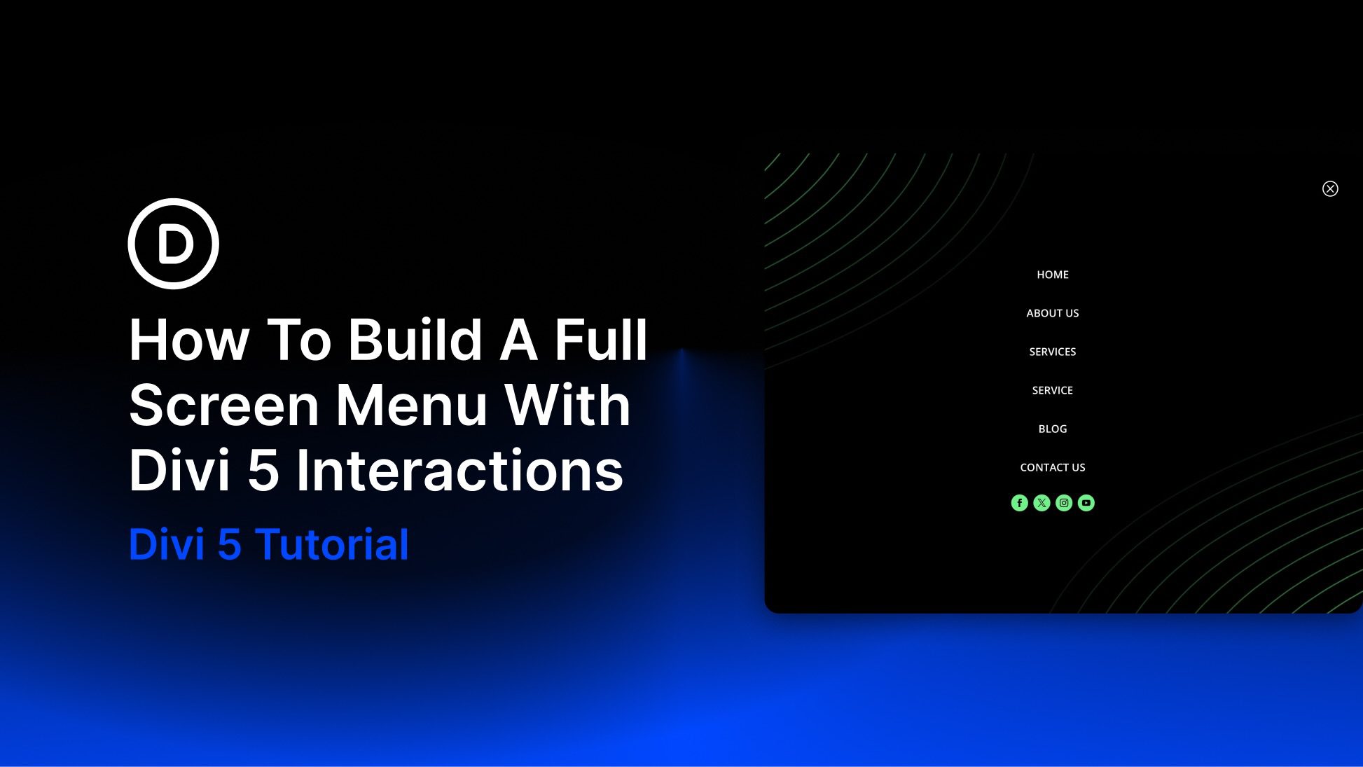
Headers and hero areas are the first thing your visitors see when your website loads. This makes their design crucial. Most include the basic elements such as navigation, contact and social follow buttons, images, video, sliders, etc., but making them stand apart from the crowd is another story. In this article we’ll look at 15 Divi websites with unconventional header and hero designs to help inspire you for your next Divi website.
Headers and hero areas are two completely different things, but the designs often blend together to create a single element. For this reason I’ve combined the two into a single article. Some only have a single unique element that stands apart from the crowd while others are unique in their overall design. Many contain elements that are not normally found in a header. I’ll point out what I find interesting about them.
Hang around until the end for a few links to Elegant Themes’ tutorials and a couple of free layout packs from Divi 100 to help you build your header or hero area with Divi.
Now, on to the websites, which are in no particular order…
- 1 1. Creative Folks
- 2 2. Mark Hendriksen
- 3 3. bd’s Mongolian Grill
- 4 4. Explosive Aperture
- 5 5. Hannah Gruber
- 6 6. London Fight Factory
- 7 7. Enable Web Design
- 8 8. RVFTA
- 9 9. Nordic Web
- 10 10. Pit Designs
- 11 11. National Infantry Museum
- 12 12. Power Financial Credit Union
- 13 13. Salon Ob’Art
- 14 14. The Generation
- 15 15. Weberas
- 16 Final Thoughts
1. Creative Folks
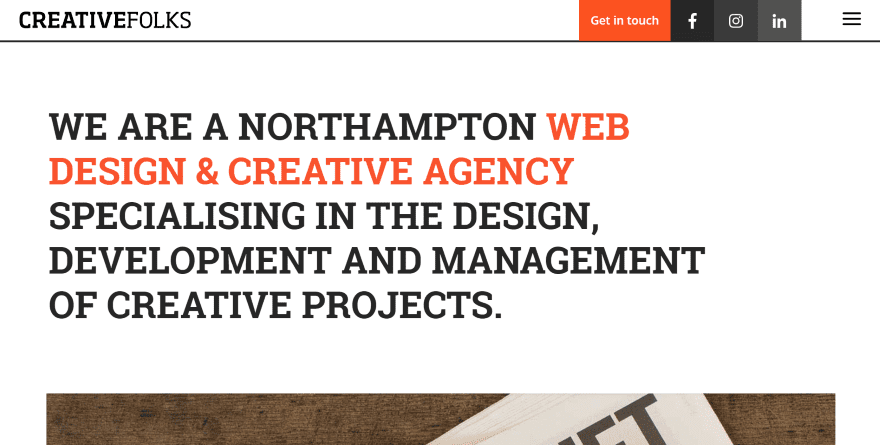
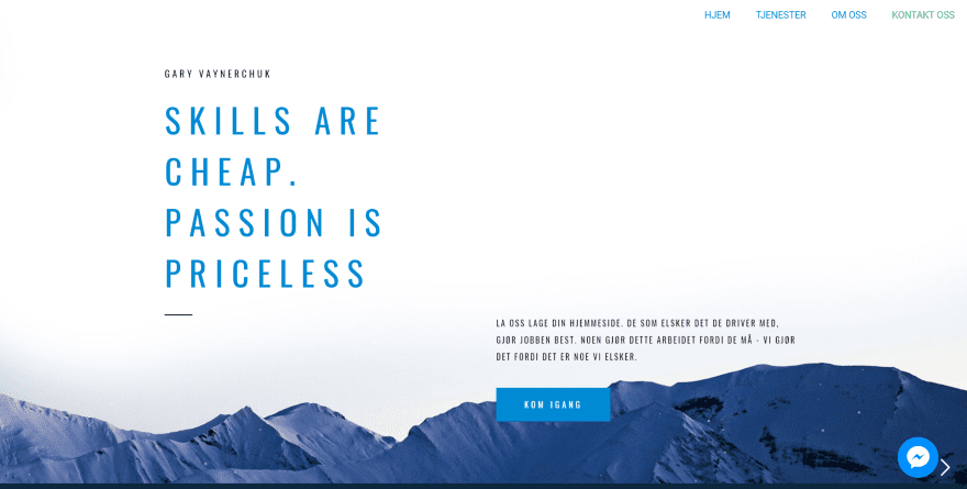
This one has an interesting menu with a contact CTA and social follow buttons displayed within boxes next to a hamburger menu. The hero section just uses large text in two colors with nothing else to get in the way. The red highlights what you need to know. I like the line that separates the menu from the hero area.
2. Mark Hendriksen
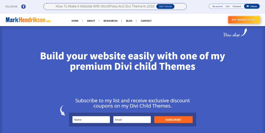
This one uses an interesting call to action above the header. That area also includes social follow and account links. The dotted lines around the CTA help it stand apart from the others without become obnoxious. The header includes a CTA with background gradient and the hero area includes a subscribe form- both with arrows leading the eye into the CTA.
3. bd’s Mongolian Grill
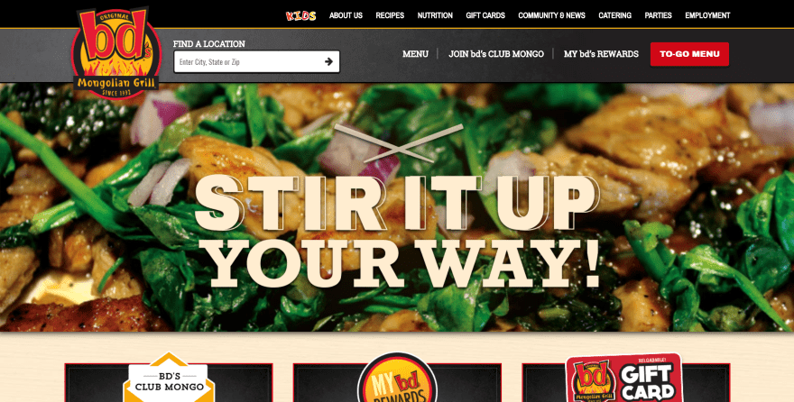
This website has two navigation menus with CTA’s in both. The CTA’s don’t fight against each other for your attention. What really stands apart though is the location finder within the primary menu. I like the gradient behind that menu and the yellow line separating the primary and secondary menus. I also like how the logo overlaps from the top menu to the slider section.
4. Explosive Aperture
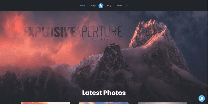
This one uses a background image that becomes the background for the rest of the website. This image is used as the hero image. Rather than placing text over the image, the website’s title is part of the image itself. It uses no other buttons or links within the hero area, so it stands out nicely.
5. Hannah Gruber
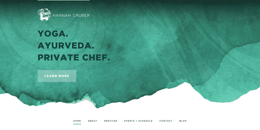
This one uses a beautiful background pattern with navigation under the hero area. The hero image stays in place on scroll. The menu is part of the next section and scrolls to the top as you scroll. Once the menu hits the top of the screen it becomes sticky and adds the logo and social follow buttons to both sides.
6. London Fight Factory
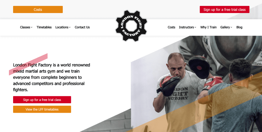
This one places the header a little lower than normal, allowing part of the hero area with a CTA to live above the header. The hero area includes a diagonal design that continues through the rest of the layout. The gear portion of the logo spins while the text remains in place.
7. Enable Web Design
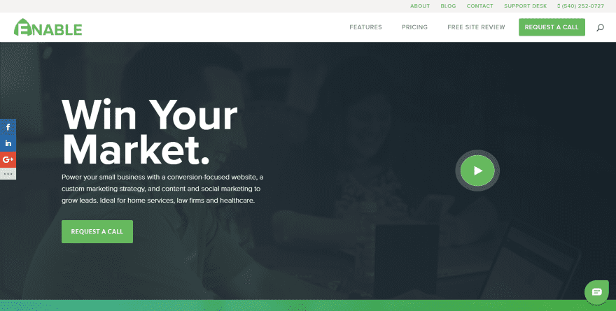
This website uses a video background with overlay that includes a tagline, information, and CTA. It includes two navigation menus with a CTA in the primary menu. What stands apart though is that one little button on the far right. Hovering over it expands it slightly and plays a full-color version of the background video- within the button. Clicking the button opens the video in a modal as expected.
8. RVFTA
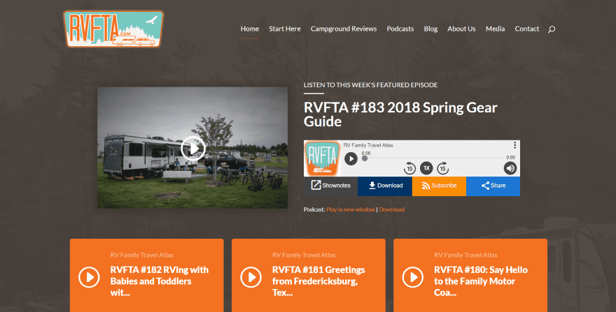
This site includes an image link to the podcast show notes and embedded audio within the hero area, which is placed over a background image with dark brown overlay that works perfectly for the site’s theme. The embedded audio player displays the site’s logo and links to the show notes, download, RSS, and sharing buttons. The podcast audio player is powered by Blubrry.
9. Nordic Web
This website has a unique slider feature powered by Slider Revolution. The slider fades the text and elements onto the screen while a snowing animation moves the snow from the bottom to the top. As you scroll, the text and background image slowly move back into place, independently of each other.
10. Pit Designs
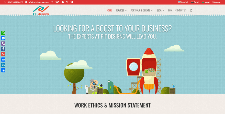
The hero area of this website uses a nice patterned background with cartoon graphics and text with shadow effects. It has a section divider to separate it from the header. What stands out though are the clouds. They’re animated, scrolling from left to right, and moving in front of the tree and behind the rocket. Nothing else in the image moves.
11. National Infantry Museum
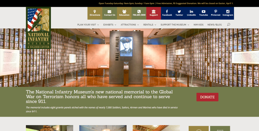
This one includes a large overlapping logo, primary menu, a message bar above the menu, a slider, and then a donation call to action below the slider. What’s unique is the row of buttons above the primary menu. The green and red buttons change color on hover and link to other pages on the website. The dark blue buttons take you to the various social networks.
12. Power Financial Credit Union
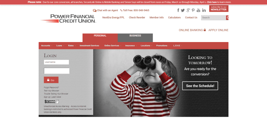
This one’s all business. It includes an embedded secure banking sign-in form with tabs to choose between personal and business accounts. The tabs include navigation that creates a mega menu with banking options. The Business tab includes a slider. The secondary menu includes a chat feature and phone number with icons, social networks, and a subscription CTA.
13. Salon Ob’Art
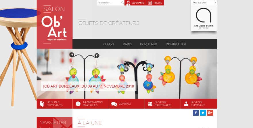
This is one of the more unique layouts for a header/hero area. It has a large logo that connects to the mega menu and slider. Above the menu is a page title with search and navigation buttons at the top and to the right. Below the slider is another set of navigation buttons with icons with social buttons below that. It has a lot going on in a small area, but it’s still easy to use.
14. The Generation
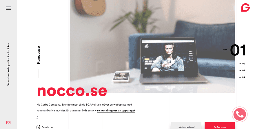
This site has one of the most unique slider’s that I’ve seen. The slides are numbered. The numbers appear on the right with the number of the current slide larger than the others. The logo is in the right corner and in the bottom right corner is an animated call button. A vertical bar is placed on the left with a hamburger icon to open the menu, a vertically aligned title and tagline, and email button. The buttons include nice hover animations.
15. Weberas
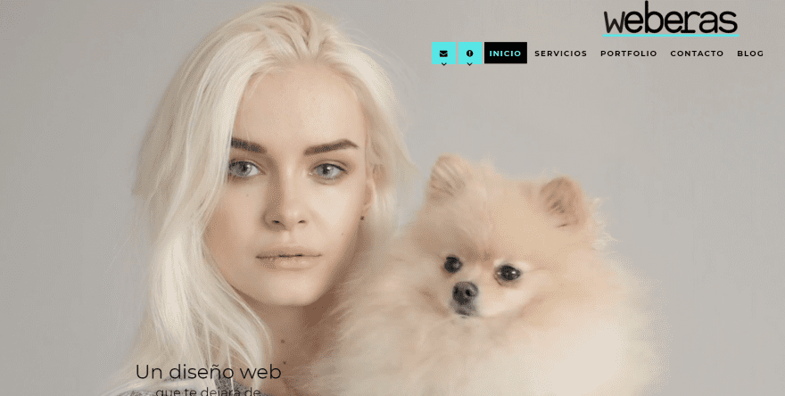
This website displays a cinemagraph for the hero image. The logo is placed on the right above the menu. The menu includes a few unique features. It contains icons for email and information. Hovering will open them. The information menu button provides a clickable phone number and links to social networks, with an icon and text for each.
Final Thoughts
That’s our look at 15 Divi websites with unconventional header and hero designs to help inspire you for your next Divi website. Some just have one thing that stands out while others are unique from start to finish. Some provide complex information that’s easy to follow while others keep it simple but interesting.
For more information about header and hero area design with Divi and few free layout packs, see the articles:
- How to Open Divi Fullwidth Header & Slider Buttons in New Tab/Window
- 5 Creative Divi Header Module Styles You Can Achieve Using Built-In Settings
- Free Divi Download: The Divi Header UI Kit
- Free Divi Header Extension Provides 20 New Hamburger Menu Styles
- Divi Nation Short: 3 Super Simple Divi Header Modifications
- Divi Nation Short – How to Get a Fullscreen Video Background When Using Divi’s Fullwidth Header Module
- Recreate a Trendy Hero Section for Your Next eCommerce Divi Project
We want to hear from you. Which of these header and hero designs are your favorite? Let us know in the comments below.


Hi Randy, I like the “Enable Web Design” site. Thanks for bringing all these great web-designed ideas to my consciousness. Great job.
Love these designs! It’s always a challenge to design outside of the box. These are great examples of fresh, new, and creative ideas that you can do with Divi that really show what can be done. I tried out 5 really different, personally boundary-stretching redesigns this past month, exploring new menu settings and hero textures and video (!). Think I finally got what I was striving for, thanks to Divi’s easy to customize features.
Biggest issue with Divinas always is the navigation styling options. Come on guys it’s time we had some options
I agree. I’ve been saying for quite some time now that revamping and adding more customization into the header menu would be a huge improvement to Divi. The menu’s are just so stock and old feeling. I love the look of the centered logo on desktop, but I hate that it goes to a centered logo above a “select page” mobile menu on tablet and phone. What mainstream websites do that? I’ve never seen any website other than a divi site have that “select a page” mobile menu. What we need is the option to choose centered logo on desktop and regular old mobile menu left or right on mobile.
Totally feel you. 😀 I’m always hacking up the menu’s CSS to make something more custom. Have you seen Mhmm Menu Maker? Thinking about grabbing my own copy soon.
Dominic, I did take a look at a number of their tutorials. It really seems worth the lifetime price. They created some really cool designs and I appreciate that they added a lot more of the custom css selectors for easier styling.
That said, when watching their tutorials, I did see a number of responsive glitches, for lack of a better word, that happened very quickly at certain screen widths. You’ll also see some ways in which it’s not compatible with Divi’s UI and how they have to perform “hacks” to work around it. I also get concerned with buying something like this, using it extensively, and then Elegant Themes comes out a month later and is like, “Hey! Nick here. Guess what? We’ve added an entire header customizer.”
Still, it is very interesting and looks like it has a lot of great applications.
Hi there,
Thank you for all the examples. BUT, how are these people adding all of these extra things to their menus? The first site, for example, has the mobile menu and it has buttons next to it. This is not stock and takes custom coding work.
I’m guessing that they are altering the php file for the divi main header. It would be really nice to have an article from you guys letting us know how to alter the header php file to add a custom link or button.
Hi mjcdev, it’s some basic CSS. You can google Divi menu CTAs or buttons, and I’m pretty sure Quiroz has some great tuts for that.
I think it’s more than basic css. If you use Chrome inspector to go in and look at the code of the header, you can see that some of them have new div elements in their headers that divi does not include by default. You can use the WordPress menu customizer to add css classes to menu items and then style them into buttons. However, you cannot use it to add new div elements, or any other new elements for that matter, directly into the DOM.
Again, I’m guessing they modified the header.php file by injecting some new html code and then styled it from there. This is definitely something I want to try. But, I don’t know php. That’s why I wish they had a tutorial on it, on top of the visual examples. They could even just say, “Custom PHP had to be employed to achieve this.” That might keep average users from thinking they can create something like that with Divi out of the box.
Well, only thing I can continue doing is inspecting code and playing around in the child theme of a development site. Screw things up in there and I’m all good, just spin up a new site or restore from backup.
Thank you for featuring PIT Designs 🙂
Its always great to see good design. I really liked Explosive Aperture and Hannah Gruber. Goes to show how important first impressions are, and these are bold, clean, and beautiful. Thanks for including my team’s site at Enable! We’re kinda proud of that little doohickey play button. 😉
Randy, you curated some very nice, fresh designs. Hero sections and, especially menus, need new life, and these are excellent examples. Your brief, yet comprehensive explanations of the new design concepts used in each site were helpful.
Thanks!
Great websites. But you always see the “DIVI menu style” in every example. I think we really need fully customizable menu options to make a menu standout on it’s own. Now we can change the text color and the background color (+ active text color). What we need is: Background color / Text color hover/active/focus/click / hover background color / hover text color / icon top / left / right / etc. But like always.. keep up the great updates. Divi has grown a lot the last 2 years.
Hi, that’s great examples !
The first example, Creative folks, looks great for me.
Could someone give me a trail to achieve a menu like that one with the CTA, in addition to the slide-in divi menu ? (maybe a divi plugin ?)
Thank you, best regards
Awesome samples! I would love to see all the design in a mobile format. That will save us a ton of time. If we are on the computer we do not really get the feeling of the others version and we need to check on our other devices one by one manually.
Yout guys rock!
Hey there,
No need to go to your phone or tablet, unless you want 100% accurate representation. If you use Chrome browser, you can just use the inspector and then activate responsive mode. It allows you to change screen size to many different mobile devices with one click. Here is an article on how to do it:
https://developers.google.com/web/tools/chrome-devtools/device-mode/
Awesome samples! I would love to see all the design in a mobile format. That will save us a ton of time. If we are on the computer we do not really get the feeling of the mobile version and we need to check on our phones one by one manually. Yout guys rock!
Hi great post. Hannahgruber example is really captivating.
But how to achieve this effect. Can someone post relevant elegant themes blog post links for this.
Hi got a relevant tutorial with some search. Thank you.
https://www.elegantthemes.com/blog/divi-resources/how-to-make-your-divi-navigation-start-at-the-bottom-then-stay-fixed-at-top-when-scrolling
sorry for being lazy in advance.
Some interesting samples and noticing quite a few with some UI / UX design bloopers.
Hi Randy thanks thats a really interesting post which made me think a bit wondering how i could make those headers and use them on my sites and then i got to the bottom and saw your links to the articles and i thought genius – the mans done the research for me too, thanks again and happy Easter 🙂
Thanks Mark! You’re awesome! Happy Easter to you too!
Thanks for those great examples!