
Personal coaching is a popular industry both on and off the web. Those providing personal coaching services needs well-designed websites to tell potential clients about their services and products. Fortunately there are a lot of personal coaching websites made with Divi to help spark your imagination. In this article we’ll take a look at 12 examples of Divi personal coaching websites.
Personal coaching covers a lot of topics including lifestyle, health, finances, relationships, careers, and more. The needs of the personal coach are different from one coach to another because of the wide range of services. Most include signup forms, booking information, products, contact info, blogs, and more. Some offer their services through their websites while others use their websites to showcase their products.
These 12 websites are in no particular order. We even have a bonus at the end – a personal coaching site made with Extra. Let’s take a look…
- 1 1. Amber Chalus
- 2 2. Cortney McDermott
- 3 3. Heidi Rose
- 4 4. Courtship vs Dating
- 5 5. Insight Coaching
- 6 6. Michelle Luft
- 7 7. We2Me
- 8 8. Breathe and Bliss
- 9 9. My Heart Alchemist
- 10 10. Deeper Than That
- 11 11. Laurie Erdman
- 12 12. Wild Sacred
- 13 Bonus: Extra Example – Hope and Cents
- 14 Final Thoughts
1. Amber Chalus
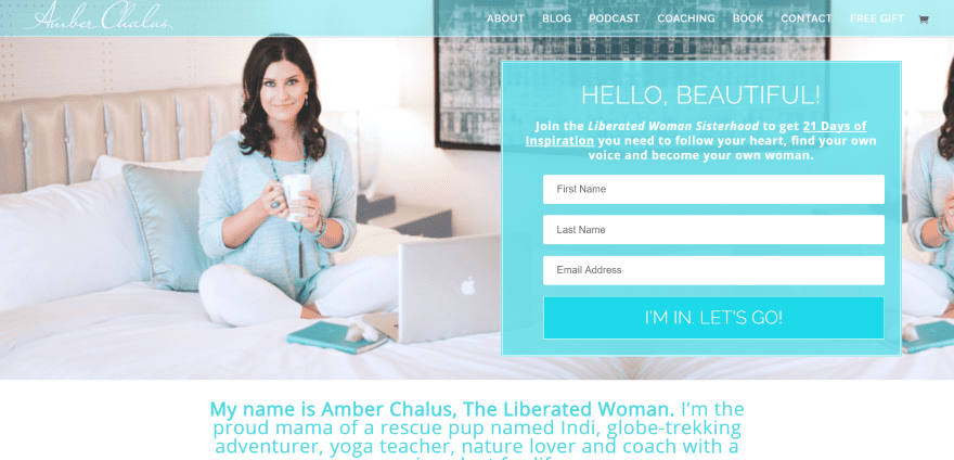
Amber Chalus uses a full-screen image with a styled email signup form on the right of the screen. Following this is an about section with fonts styled with branded colors. Next is a full-width section with images that link to pages, a blog section, a full-width section with a quote using an elegant white font over the blue background, and a section about the site owner with an image, text, and media icons where she’s been featured. Navigation is simple with no dropdowns. The layout looks well-designed and the site uses soft blues and elegant fonts.
2. Cortney McDermott
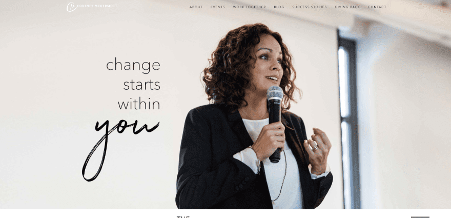
Cortney McDermott includes a full-screen image with a tagline followed by a full-width section of media icons and an email signup form. An information section uses a text module with background color and an elegant font as a Read More message. Three CTA’s (call to action) line up horizontally followed by a full-screen image as a testimonial. The blog section uses three clickable images. Following this is a book CTA, links to media, and a footer with signup form. The site makes great use of images and fonts.
3. Heidi Rose
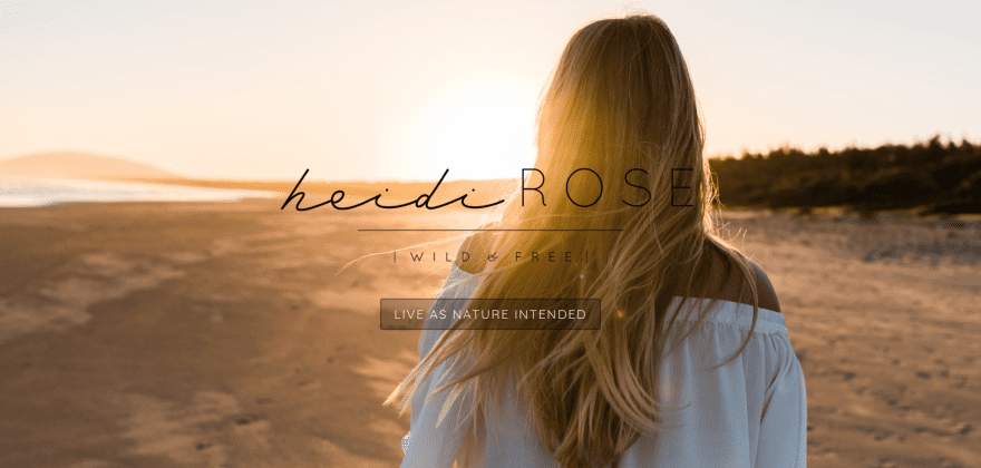
Heidi Rose displays a full-screen image with logo, tagline, and styled button. Clicking the button takes you to the home screen, revealing a full-screen image and top navigation. Scrolling displays several sections with motivating messages, CTA, and a footer menu. The blog displays three images in full-width over the post title. The posts themselves are centered in single column with no sidebar, creating an elegant look. The Work With Me page uses an stylish layout with alternating images with text in parallax. The store is powered by WooCommerce. The site makes excellent use of layouts, fonts, and images.
4. Courtship vs Dating

Courtship vs Dating uses a full-width slider with CTA’s and a newsletter form. Scrolling reveals a CTA for a book with an image and description, and a list of books with links to the Kindle store. A three column information section uses text and icons. An events section displays an image with link to the events page. Following this is a testimonials section, a blog section, and footer with branded colors. The site makes good use of branded color.
5. Insight Coaching
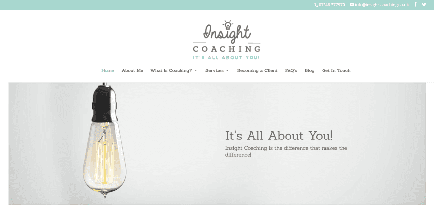
Insight Coaching uses a large header with logo with tagline above the menu. A full-width image includes the tagline with more information. Scrolling reveals a three column section with blurbs with icons and links about the services. An about section places text within a styled block. An information section provides information in bullet points. A testimonials section uses a mirrored version of the header image as a background. The site is simple and makes good use of color and fonts for the target audience.
6. Michelle Luft
Michelle Luft uses a full-width image with CTA and a chat system powered by Tawk.To. It includes a tagline placed over a background image in parallax. Circled images have links to services. An animated information section displays a slideshow above a contact form. The blog section displays posts within a slider. Testimonials are placed over the same parallax background as the tagline. The footer includes an embedded Facebook link. The event calendar is powered by WP Event Plus. The layout is clean and uses colorful background images to fit the topic.
7. We2Me
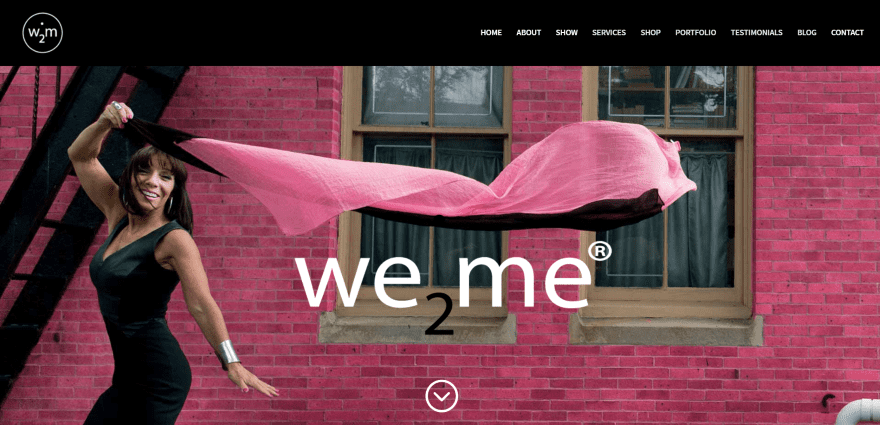
We2Me uses a full-screen image with logo in parallax. Scrolling reveals the mission statement as a quote followed by links to various pages. The sections of the home page are separated by full-screen images in parallax with introductory text. The sections use images, text, video, etc. It includes links to articles in the press, embedded audio, a contact form, and a four column section with CTA’s. Subscriptions are powered by WooCommerce. The site uses branded color to attract the target audience.
8. Breathe and Bliss
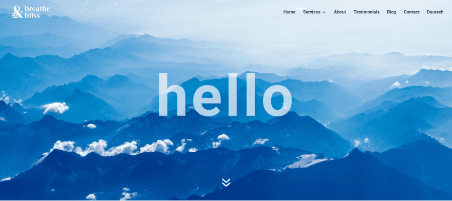
Breathe and Bliss uses a full-screen background image with rotating message in parallax. An information section uses header text with a background image showing through. Blurbs for the services are placed over a background in parallax. A two column about section displays an image on one side and bullets on the other. A full-width CTA displays images to demonstrate the classes and workshops. It also includes a full-width Instagram feed. Branded colors are used to set the mood.
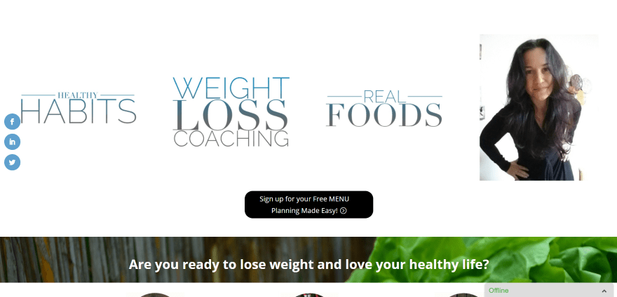
9. My Heart Alchemist
My Heart Alchemist displays a full-width image with tagline in an overlay, link, and CTA. An about section that describes problems uses centered text. A personal quote is placed within a full-width text section using a colored background. A full-width image collage uses a statement in an overlay as a CTA. An about section displays the benefits followed by a full-width testimonial and a full-width CTA with image and text with the entire section being a link. Booking is handled through a LeadBox form. The site makes great use of branded color, images, and CTA’s.
10. Deeper Than That
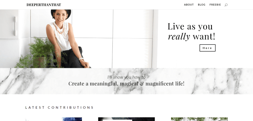
Deeper Than That displays a full-width image with CTA followed by a tagline over a full-width image in parallax. The blog section uses hover animation. An about section places a text box with link to one side of a full-screen image. Embedded YouTube videos display a snippet of the video with links to view the videos on YouTube. An Instagram section displays Instagram feeds in a masonry grid. The footer includes an email signup form, links to pages, and contact information. Downloads are embedded files from Dropbox. The site sets the mood using black and white.
11. Laurie Erdman
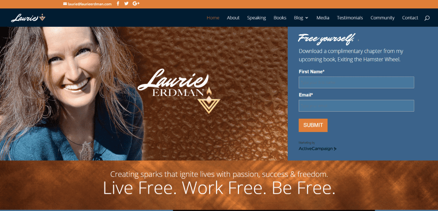
Laurie Erdman uses a two column section with a large image on one side and a signup form on the other which is powered by ActiveCampaign. A full-width section displays a tagline over a background pattern. Scrolling reveals an embedded video with link to hear more, images with blog categories using hover animation, a two column section with a testimonial on one side and media links on the other, and a footer with links and social media follow buttons. The shop is powered by WooCommerce. The site makes great use of color and images.
12. Wild Sacred

Wild Sacred uses a boxed design with a centered logo that includes a colored splash that’s used throughout the website as a highlight behind header text. Using a two-column design, the site includes an image on one side with a welcome message and newsletter form on the other. Following this is a series of images with a text overlay on one side as CTA’s. Some of the text is placed over one side of full-width images. Testimonials are displayed within a full-width slider. Purchasing for courses are handled through WooCommerce. The site makes excellent use of color and photography.
Bonus: Extra Example – Hope and Cents
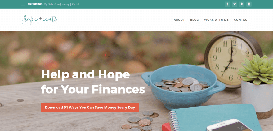
Hope and Cents includes a full-screen image with a tagline and CTA in parallax. The homepage includes a single column layout with sidebar which includes a post slider, tabbed post module with all of the categories, newsletter CTA, and popular and recent posts in two columns. The sidebar displays social follow buttons, an about widget, media icons, an award certificate, and recent tweets. The footer displays a large centered logo and menu. The Work With Me page steps through each of the services, separating them with full-width images in parallax. It has a clean layout and makes excellent use of color, and is a fine example of using Extra’s magazine modules to create a regular website.
Final Thoughts
These 12 Divi sites and 1 Extra site are great examples of personal coaching websites no matter the coaching topic. Whether you need inspiration for layouts, colors, fonts, contact info, signup forms, booking information, products, blogs, etc., there’s sure to be something here to help with your next Divi design for personal coaches.
We’d like to hear from you. What are your favorite design elements from these examples of Divi personal coaching websites? Let us know what you think in the comments below.
Featured Image via Vector Goddess / shutterstock.com


Great List! I particularly like my heart alchemist because the title is clear and to the point. Using a great title is just as important as the look and feel of one’s site and a good title will reduce bounce rate significantly! most of these sites are built with the user in mind which is great!
Woohoo! Thanks for adding both of my sites for Laurie Erdman and Lisa Frumin. Laurie’s was the first time I used Divi and I believe it needs a refresh, and Lisa’s is built using the Thrive child theme from DiviSoup’s Michelle Nunan and it was a great theme to use.
Thank you so much for featuring the bonus “Extra” theme coaching site. Since I’m trying to find good examples of websites using Extra, that was a good help. The site looks clean and not as boxy as some other examples I’ve seen. It really gave me some great ideas for my projects. It also looked like the site was using Bloom for their email capture, which is awesome!
Thanks a ton! This will be extremely helpful, as most of my clients are coaches. Now, I can send them here and say, “Do you like the design of any of these sites?” And they can see just what Divi can do, and spark our ideas on what to create for them.
Thanks for putting this list together!
How i can get this themes? this is free or buy themes?
12. Wild Sacred – Best of the bunch, well designed, well thought-out, great photography/composition for where the pics were being used…
Divi team, could you please provide some example of travel website using divi?
Thanks 🙂
Sure 🙂
https://www.elegantthemes.com/blog/divi-resources/examples-of-travel-websites-built-with-divi
I’ve been working on list building and it was suggested I build an upside down home page. I turned to Divi to do it, and I built the page in a couple hours. Such an easy theme to create any design needed!
It might not be good enough for this list, but I love the site I made myself with Divi: TrueEsteemCoaching.com I would love to hear what the community thinks of it, especially those with teenagers as it’s geared towards parents with teens.
It might not be good enough for the top 12 here, but I love the site I made myself with Divi: TrueEsteemCoaching.com. I would love to know what the divi community thinks of it, especially those with teenagers as it’s geared for coaching teens.
Your Site has a nice bright look… however, you should consider adding some animation to your buttons. A hover effect will be excellent. Good job with the pop up…. it really clean how did you do that?
Hey David,
I’m redoing the buttons, thanks for the suggestions. For pop-ups, it’s a mix of opt-in monster and hustle from wpmudev. Let me know if you need help implementing them.
Love it Randy 🙂
2 of those sites are using my coaching child themes:
Amber Chalus is using https://divisoup.com/product/versatile/
The Heart Alchemist is using https://divisoup.com/product/thrive/
Awesome 😀