
Most people travel when they go on vacation. Many even travel as a lifestyle. And all of these destinations (as well as the business that preside there) need websites to help visitors plan and navigate their destination. If you’re a web designer using Divi or a business owner in just such a destination city, then this post will be a great source of inspiration.
In this article we will cover sixteen examples of travel websites built with Divi to help spark your imagination for your next Divi design. Some are locations, some are packaged events, some are tours, others are resorts, and more. Many of these sites are multi-lingual. All have something interesting.
- 1 1. Salt and Mist Sea Tours
- 2 2. Monterey Bay Fun
- 3 3. Road to Quiet
- 4 4. MTB Travel
- 5 5. Hotels Combined Blog
- 6 6. The North Face Journal
- 7 7. Tieland to Thailand
- 8 8. Harmonia Fuseta Tours
- 9 9. Spring Break HQ
- 10 10. Savor Tourist Information
- 11 11. Hallmark Inns
- 12 12. Goodwings
- 13 13. Cestuj s Detmi (Traveling with Children)
- 14 14. Cultural Cuba
- 15 15. True Romania Tours
- 16 16. Samui Garden Villa
- 17 Final Thoughts
1. Salt and Mist Sea Tours
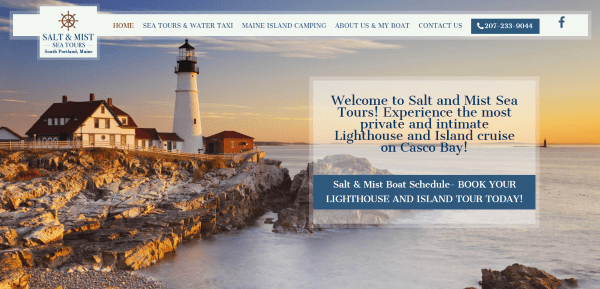
Salt and Mist Sea Tours includes a full-screen background with transparent CTA (call-to-action) and stylized menu. Scrolling shows a quote followed by a hand-drawn map background with transparent information and CTA’s in parallax and an about section. The map background is used throughout the various pages which also include lots of images of the area. This site uses gorgeous photography which is highlighted by the transparent parallax overlays.
2. Monterey Bay Fun
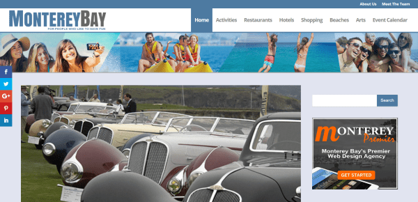
Monterey Bay Fun is unique in that it has a magazine layout that’s made to look like Extra but was made with Divi. It includes a full-width header image, links in the top menu, a sidebar, post slider, and articles that are shown in categories within tabbed modules in either single or double columns. The modules even have a colored line for each category. Events are displayed in the sidebar using The Events Calendar from Modern Tribe. If I didn’t know better I would think this was Extra. And yes, I had to check several times.
3. Road to Quiet
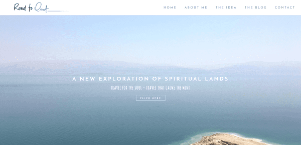
Road to Quiet includes a full-screen slider, an information section, full-width image, a blog section, a full-width section with rotating quotes in parallax, integrated Instagram feeds, newsletter signup, and social follow buttons. The customized blog design includes an interesting multi-column image gallery. The site includes lots of high-quality images and inspirational quotes.
4. MTB Travel
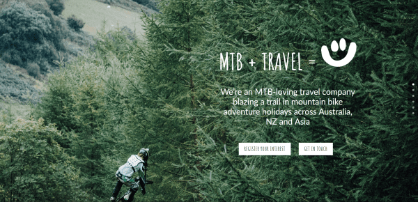
MTB Travel has a one-page design with a full-screen image in parallax, CTA’s, and only dot navigation (no menu). Scrolling reveals a double-column about section, a small signup section, a full-screen image in parallax with CTA, a triple-column section with details about the trip, and a footer with contact form and social links. The site makes great use of fonts and images.
5. Hotels Combined Blog
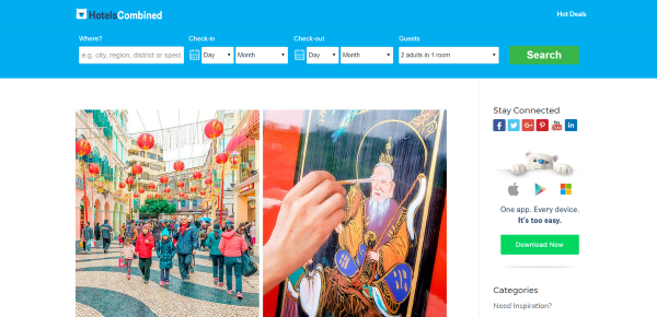
Hotels Combineds’ blog includes a single-column blog layout with sidebar and a header that has a responsive calendar with search so visitors can find accommodations. The blog posts include a contents box that outlines the article and provides links to the sections of the article. The sections are reviews of various hotels with prices and links.
6. The North Face Journal
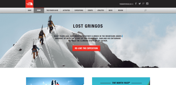
The North Face Journal uses a unique menu with CSS effects. It also includes a full-width image with CTA, two posts for trips with schedules, embedded videos over a parallax background, and a blog section with background. The Events pages use lots of full-screen images with parallax and galleries, includes links to the WooCommerce shop, and a newsletter signup powered by Bootstrap. The site uses beautiful imagery.
7. Tieland to Thailand
Tieland to Thailand has a full-screen image, images for the various pages that include overlays, and a footer with links. The Destination pages use full-width images, images and bullets for descriptions, and blog posts. The site is simple, clean, has a great navigation structure, and does a great job with images and overlays.
8. Harmonia Fuseta Tours
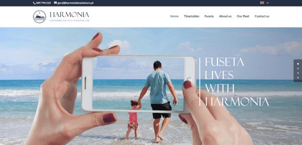
Harmonia Fuseta Tours displays a full-screen background with parallax, an about section with elegant icons, a full-width image in parallax with a statement CTA, and a testimonial section with flag icons. The Timetables page shows the tour times in text modules. The Fuesta page shows the various locations with a single image gallery for each one. The site makes great use of color and galleries.
9. Spring Break HQ
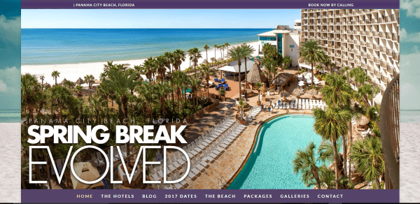
Spring Break HQ uses a boxed design with background image. A full-width image shows the logo and tagline. Under the image is a styled menu that remains at the top of the screen on scroll. Scrolling reveals an about section, several CTA sections, a double-column about section with images, a contact form with social links, links to various hotels in the area, and a styled footer menu. The Dates page shows events in a tabbed module.
10. Savor Tourist Information
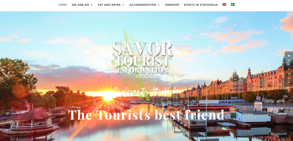
Savor Tourist Information has a full-screen background with welcome message overlay. Under this is a slim menu, several information sections in two columns with large images, an image slider, an ad section, and a footer with weather widget. Events are displayed using EventOn calendar plugin. The shop is powered by WooCommerce. The product pages include accordions and maps within the descriptions.
11. Hallmark Inns
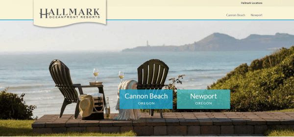
Hallmark Inns displays a full-screen image with links to the two locations. The menu includes an overlapping logo and the location links. The homepage has a slim reservation form, information about the area with maps, links, videos, a testimonial with stylized section separator, and a footer with Trip Advisor badges. The menu changes to match the location and includes social icons, a mega menu, and Push2Chat and Push2Talk buttons in the top menu.
12. Goodwings
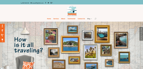
Goodwings has a one-page design that displays a full-width image with a large centered logo. Scrolling shows blurbs with large branded icons, an about section, blog posts, testimonials, a contact form, and footer with widgets. The blog uses a two-column design with sidebar. The site makes great use of branded color and icons.
13. Cestuj s Detmi (Traveling with Children)
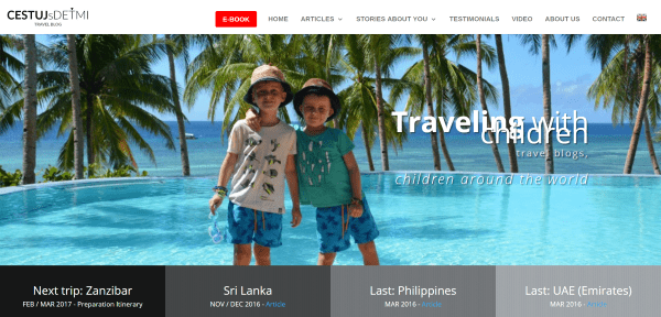
Cestuj s Detmi, or Traveling with Children, is a travel blog that shows a full-width header image and a four-column strip that shows trip dates with links. The menu displays a CTA. Scrolling reveals a blog grid, newsletter signup, map of locations they’ve visited, contact form, and footer that includes social follow buttons and images. The Testimonials page includes links to reviews and ratings.
14. Cultural Cuba
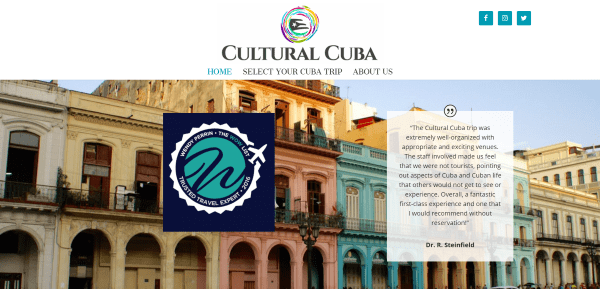
Cultural Cuba displays a full-width image with logo and testimonial. Scrolling shows travel and trip information, an image gallery in a masonry grid, testimonials in parallax, a video, a contact form, and Instagram feeds. The Trip page displays the images and information in a table view using text and image modules.
15. True Romania Tours
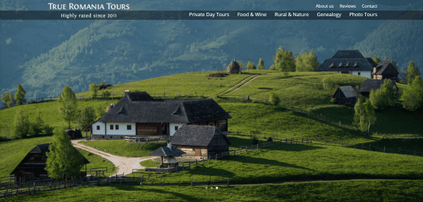
True Romania Tours displays a full-screen slider with a transparent menu and links in the top menu. Scrolling reveals a section showing the benefits of traveling with them and a section with reviews – both elegantly placed in three columns with images and text. Under this is a full-width image with CTA and a footer with contact info and newsletter form. The site makes excellent use of color, fonts, and images.
16. Samui Garden Villa
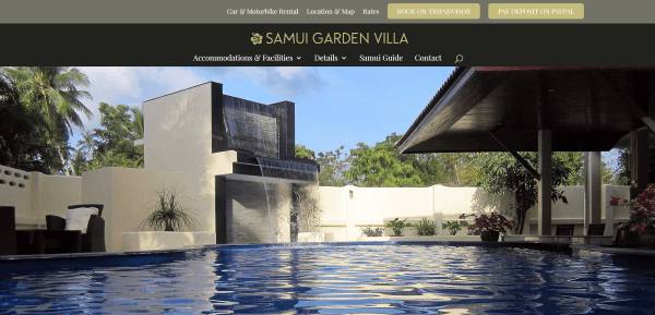
Samui Garden Villa has a one-page design that shows off a full-screen background image with parallax, a section about the accommodations, galleries of the rooms and pool, a CTA section, a booking section with a styled table, sections for vehicle rentals, a full-width map, and a contact form. Booking and payment buttons are included in the top menu. The site looks great and makes good use of color, fonts, and images.
Final Thoughts
These 16 examples of travel websites built with Divi go to show that Divi can create amazing designs for any type of travel website including tours, vacation rentals, travel blogs, resorts, attractions, events, and more.
These sites a great for providing ideas for layouts, fonts, colors, photography, video, navigation, calendars, and more. These websites are sure to spark your imagination for your next travel design with Divi.
What are some of your favorite elements of these Divi travel sites? Let us know in the comments below!
Featured Image via DRogatnev / shutterstock.com


hi my friends, can you give me some informations about the site “hotels combined” like the name of the plugin for the searching form features?
many thanks
My name is Susan, i like it
Wow! We are a local travel organizer in our city. Just knew, Divi can also be for travel websites and the result is great!
I need a layout for the visa service. Can suggest to me?
Hi,
I would love to know how Salt and Sea Mist Tours accomplished that look.. The intro with the large button looks great.. Is there any way to let us know how that was done?
Hi Bill. This can be done using a Call to Action module.
In General Settings:
1. Set the background color and adjust the opacity to make it see-through.
In Advanced Design Settings:
2. Select Use Border and make your choices.
3. Select Use Custom Styles for Button and choose your colors for regular and hover. Keep the button a solid color.
We use Divi on our blog, but looking at these sites gives me inspiration on how to improve the look and layout of ours. I’m a self-taught novice but getting there and improving all the time!
Thanks for the challenge to keep on improving!
Thanks for stopping by the blog and using these resources 🙂
Also, feel free to request tutorials if you ever need help with something that goes beyond a support ticket. Particularly anything style/design related.
Thank for this article
Do you know if you can create the same effect for EXTRA home page ?
I have in my mind a large picture to introduce myself ( as travel blogger) like The North face website for an example ?
Thank for you response 🙂
Hi. Are you referring to the full-width header image?
If so, you can definitely achieve that with our Extra theme.
Just timely for the site I am currently building at the moment. Thank you for these.
New image!! Very nice and fresh, congratulations to all the ET team
Like the travel sites and the new look for elegant themes.
Looks like elegant themes got an update.
In case you do another category, Divi is also great for political sites.
Thanks Henry!
Just what I needed today… I am just starting a new website for a Guest House in Jamaica. I am new with Divi, and now have to figure out how to do what I need to do!!
Thanks for the inspiration!
Those are some great looking sites. Thanks for including Monterey Bay Fun. That one has been my little community side project for a couple of years now. I remember building it before Extra came out but I used the Extra “sneak peaks” for the design inspiration.