")
Designing an incredible website footer isn’t ever at the top of every web developer’s or designer’s list of things to do. Given that it’s all the way at the bottom of the page, it’s easy enough to dismiss it as something that most visitors hardly ever notice.
However, the footer is an important area of your website. According to a study conducted by ClickTale, about 76% of visitors will scroll beyond the fold of your website and 22% will scroll all the way to the bottom.
A visitor who scrolls to the bottom of your site is clearly looking for more information, which means that you should provide it to them in an intuitive and compelling manner. By taking a look at some examples of great footer designs from around the web, you can get inspired and start experimenting with what might work best for your own site and the types of visitors it tends to attract.
In this article we’ll start by suggesting the elements you should include in your website footer, then move onto cover 15 elegant footer designs for you to take inspiration from!
- 1 What to Include in Your Website Footer
- 2 1. Tessmae’s All Natural
- 3 2. Best Made Co.
- 4 3. Fusion Design Creative Solutions
- 5 4. Brian Gardner
- 6 5. The Pixel
- 7 6. eRated
- 8 7. Collabogive
- 9 8. Griflan Design Inc.
- 10 9. Baxter of California
- 11 10. Sparkbox
- 12 11. Molamil
- 13 12. Jenier World of Teas
- 14 13. Savse Smoothies
- 15 14. fffunction
- 16 15. 13 Creative
- 17 Conclusion
Before designing your footer, you have to ask yourself what you’d want a visitors to do once they reach the bottom of your site. Whether you want them to read your ‘About Us’ page, subscribe to your newsletter or like your Facebook page, you can’t count on them to scroll all the way back up to look for those options in the header or sidebar.
Make it as convenient as possible by reminding visitors what else they should check out. Some of the most common components to put in a website footer include:
- Copyright information
- Contact information (phone number, email address)
- Address (with optional map and directions)
- Links to your sitemap, privacy policy, terms of use, press kit, etc.
- Navigation links
- Links to popular topics and/or recent blog posts
- Upcoming events
- Social media icons and/or widgets
- Newsletter signup form
- Login fields for members
- Site search field
- Mini image gallery
- Logo or branding images
- Mission statement
- Money back guarantee
- Awards, certifications, associations
- Testimonials
- Embedded video
- Large “call to action” button (to donate, order, contact, subscribe, etc.)
Avoid trying to cram absolutely everything you can think of including into your footer. Instead, pick just a few the most important content options and experiment with showcasing them in a clean and appealing way, perhaps enlarging and emphasizing the one really big thing you want your visitors to do.
If you have a lot of information you’d like to include in a footer, you may want to take advantage of ‘fat footer’ design, which are large footer sections extending from the bottom of the page, taking up as much as the visitor’s entire computer screen when they scroll to the bottom. Making use of columns and avoiding too much underlined text if there are a lot of links involved can also help with making your footer appear more organized and scannable.
Now let’s move onto those 15 elegant footer designs!
1. Tessmae’s All Natural
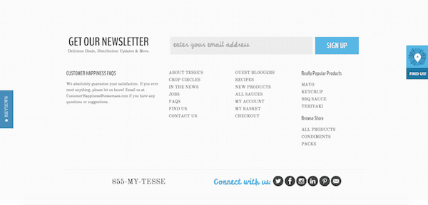
Tessmae’s provides a fantastic example of a fat footer that maintains a minimal look. While many sites often use a dark background for their footers as a way to separate it from the rest of their content, this one remains light – making it super easy to read.
There’s a clear emphasis on the newsletter signup in this footer, featuring larger text and an oversized signup form that spans the width of the site. Beneath it, neatly organized columns to navigation links can be accessed while some snazzy looking social icons stand out at the very bottom.
What works well with this particular footer is that it’s clear that the visitor is encouraged to take action by signing up for the newsletter. But if they don’t want to do that, the second most obvious thing to do would be to call Tessmae’s number or check out their social profiles. And lastly, those navigation links are there if they simply want to browse for more information on the site.
2. Best Made Co.
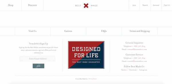
Best Made Co. is another online retail site that extends its white background into the footer while still creating a clear separation from the main part of the site. In this case, a clever horizontal navigation menu is added to create that separation.
Keeping the menu limited to just those four links ensures that users won’t be overwhelmed by all sorts of links to click on. In the very center of the footer, the company combines branded imagery with its guarantee.
While the brand image is the clear thing that stands out most, it’s easy enough to notice the inviting newsletter signup form on the left and the contact information on the right. By keeping the number of options included in this footer to a minimum, visitors can get a crystal clear understanding of what to do next.
3. Fusion Design Creative Solutions
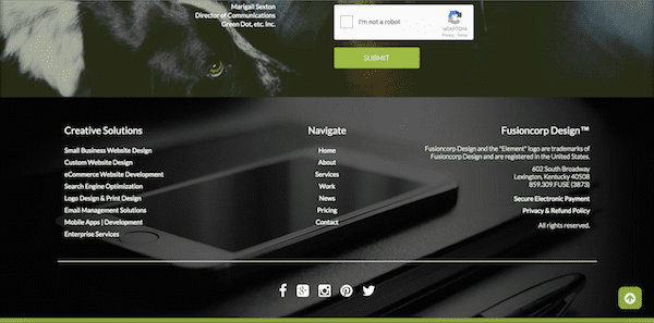
Fusion Design Creative Studios has a really slick-looking footer that organizes just the essential navigation components in a very creative way. While the footer itself is dark and features a nice background image, it actually compliments the content on top of it, rather than conflicting with it.
Three columns is just about the right amount needed for this particular footer without getting too messy with that background image. Notice how the alignment of the text included in each column (aligned to the left, centered and then aligned to the right) help create good balance. Lastly, there are the centered social icons that stand out at the very bottom.
A lot of background image sections can be seen throughout the site as you scroll down, so the footer feels just like another part of it that it flows into nicely. Visitors can then decide whether they want to check out the creative specifics of their services, find out more about them from their general navigation links, contact them by phone or connect on social media.
4. Brian Gardner
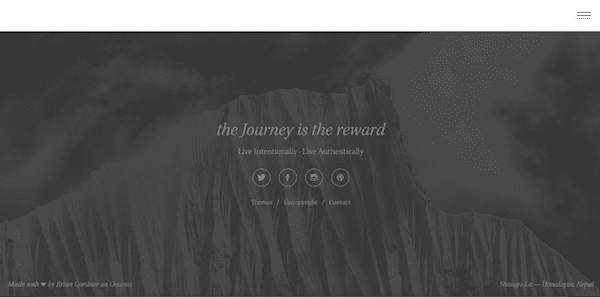
A footer doesn’t necessarily need to include a ton of information using a set of three or four columns, even if it’s a ‘fat’ footer. Brian Gardner’s personal website is a great example of this, featuring a background footer image similar to the one we saw in the previous example above.
The background image sticks to a simple two-colored color scheme that’s elegant but not too overpowering. The only content included are some short quotes, social icons and three navigation links – fitting the extremely minimal look of the overall site.
What works so well with this footer is that it’s so simple and subtle, yet it still clearly tells visitors exactly what to do. It just goes to show how great you can make a footer look without having to decorate it with every navigation link you can think of.
5. The Pixel
![]()
There certainly are ways to include more information than most visitors would probably like to see in a footer without cluttering it up too much. The Pixel achieves this nicely by using small text, simple typefaces, contrasting colors and columns of different widths.
Visitors know exactly which text is clickable (as represented by the bright turquoise text) versus which is there to inform them (characterized by the white text). The lengthier text in the centre column is also easier to read because it’s wider than the two other columns on each side.
Overall, the footer does an amazing job at keeping everything organized and easy on the eyes in terms of being able to quickly identify the varying types of information presented. Visitors get the convenience to choose from a wide range of options on what to do next.
6. eRated
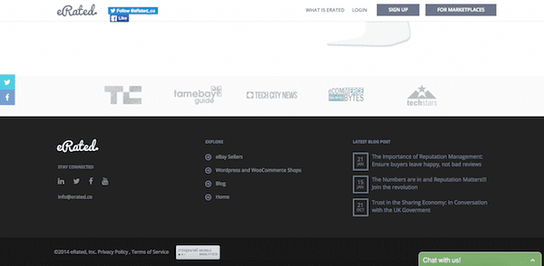
eRated has a website footer that shows just how clean and easy to read you can make it when using a very dark color like black as the background. There are only three columns used here, all of which give visitors a unique option to choose.
What particularly works well is the combination of icons that highlight different types of information with light colors and the generous spacing. Notice how the social icons aren’t all crammed together; nor are the bullet point icons under the Explore column.
This footer would provide great inspiration to anyone who hasn’t decided on emphasizing just one clear call to action but also doesn’t exactly have a ton of options to display. Practically any website could take advantage of a simple and versatile footer design like this one.
7. Collabogive
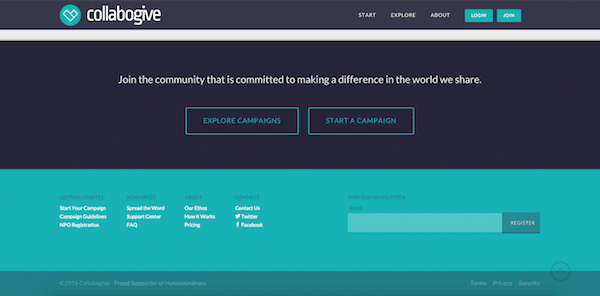
Collabogive is one example with a slightly smaller footer that features simplicity and a strong call to action. Here, the big newsletter signup form is the main focus, since it takes up almost half of the entire footer.
In addition to the signup form, it’s interesting to see how Collabogive made use of the column footer trend by making it smaller and more compact on the left side. Just three options for each of the four columns have been picked out to avoid overwhelming visitors.
For those who want the best of both worlds in terms of a large signup form that stands out plus three or four columns of additional options, this footer can serve as an ideal model for that. It’s also ideal for anyone who isn’t a huge fan of the really fat footer design that takes up an entire computer screen.
8. Griflan Design Inc.
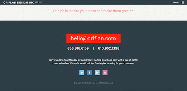
A big call to action in the footer doesn’t necessarily need to be an oversized signup form, which we’ve seen in a few of the examples above. For Griflan Design Inc., it’s clear from that huge red button in the middle of the footer that they want their visitors to contact them ideally by email.
In fact, this is one example we’ve seen that actually doesn’t provide any navigation links in there footer. Besides the email button and the colourful social icons at the bottom, which also stand out nicely, there’s nothing else to look at – and that’s fine! It works well for sites like this one.
If you have a personal or small business-related website where your results come from visitors who get in direct contact with you, a footer that leaves out the extra navigation links and instead puts a huge focus on contact information can be really effective at encouraging more visitors to get in touch with you. Visitors always need the reminder if you want them to take some form of action.
9. Baxter of California
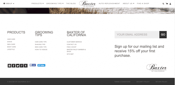
Baxter of California’s website footer design is similar to what we saw from Collabogive, featuring mini columns on the left side and and a big newsletter signup form on the right. But this one has a few differences worth mentioning.
For one, it’s another great example of a footer with a white background. It’s also larger than Collabogive’s footer, meaning that the columns don’t look quite as small. There’s room for more links, and the link text is small enough that social icons fit conveniently underneath them.
If you have clear instructions you need to include and emphasize in your footer, you can look to Baxter of California’s design for ideas on how to achieve this without making it look too big and cluttered. The text for the “receive 15% off your first purchase” message beneath the signup form is huge for a sentence of that length, but because the rest of the content is minimal and well balanced, it just works.
10. Sparkbox
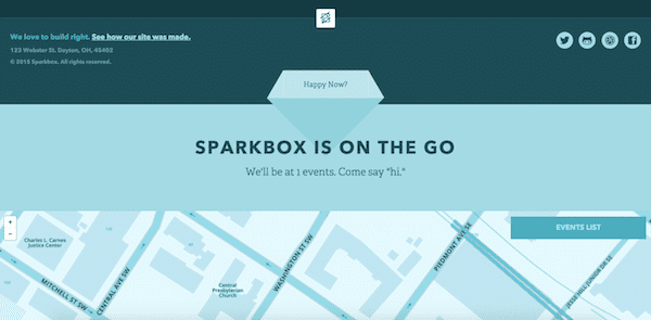
Sparkbox has a footer design that you don’t typically see on other websites. At first glance, it looks simple enough, featuring a link to see how the site was made with address information on the left side and some social icons on the right.
In the center, there’s a button labeled “More Footer?” which you can click to expand to see a large map and upcoming events. Talk about a unique way to get your curious visitors to explore more of your site!
This might be an interesting idea for someone who’s looking for a truly unique footer design and has the skills to create it (or at least the money to hire someone to do it). Expandable and collapsable sections is a nifty design trend often used around other main areas of a website, so why not the footer too?
11. Molamil
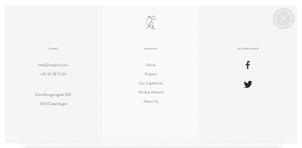
Molamil has a website that’s just really cool to browse through overall, and it ends with a footer (that doubles as its menu), which sort of takes traditional footer design and spices it up a bit to match the quirkiness of the site. This is one footer that’s meant to take up the entirety of the screen, providing enough space around the content for a minimal look.
There’s one column for contact information, one for navigation and one for social media. A lot of white space makes for an easy read through all of the options, and you can probably get away with fancier fonts if you want to with a design style similar to this one.
Essentially, this footer works well because it puts everything front and center in the cleanest, simplest way possible when you scroll right down to the page. If you have an eye for quirky and different footer design, this one might be worth recreating and tweaking in your own unique way.
12. Jenier World of Teas
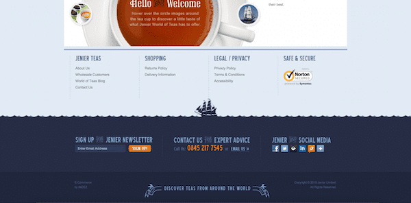
Jenier World of Teas has a brilliant website footer that’s all about visual design. The separation of the footer is made by creating a horizon of a body of water with waves that flow across the page and the silhouette of a ship floating on top of it.
The footer content is beautifully designed with text imagery prompting visitors to sign up for their newsletter, get in contact or connect on social media. This is one more footer that really just looks great without any inclusion of navigation links.
Anyone who wants to bring more visual appeal to their footer can take inspiration from this one. Beautiful graphics are a surefire way to get your footer and its contents noticed.
13. Savse Smoothies
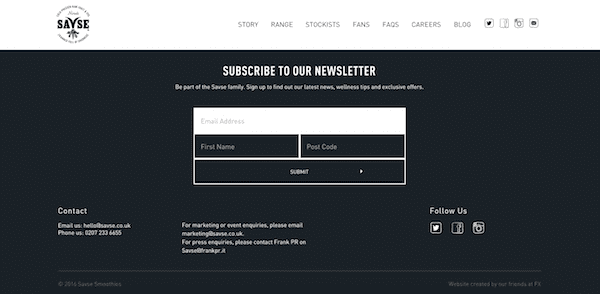
Savse Smoothies shows how you can basically turn your footer into nearly a full-sized opt-in form with multiple fields. Signing up for the newsletter is the clear message they want to send their visitors once they reach the end of the page.
Underneath the large form, visitors can easily see how to get in contact with the business and follow them on social media. It’s simple, easy to read and clutter-free.
This footer might be great inspiration for any individual or business who’s trying to increase their newsletter sign-ups. And the best part is that as long as you don’t have a ton of links to include, you can combine it with other common footer content options too.
14. fffunction
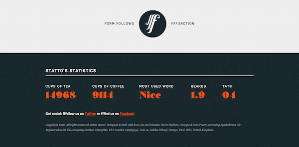
So, how do you make your footer look amazing when you don’t want to cram it with extra navigation options? fffunction does it by including some interesting statistics and displaying them in different fonts and colors.
If you have any facts, figures or other information you think could be worth sharing with your visitors, using your footer to creatively showcase them could be a neat way to educate, entertain and even relate to your visitors. You don’t see this type of content worked into footers very often, which makes it all the more interesting.
15. 13 Creative
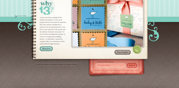
While 13 Creative’s footer design might be pretty impossible to replicate on just any site, it’s still worth showing here as a potential example that may help you think more about how to fit the design of your footer with the rest of your site in a way that looks natural and beautiful. 13 Creative uses a notebook design to feature its main content and then cleverly uses the idea of a bookmark as its footer.
This type of design also helps keep content to a minimum in the footer. If you want to include a lot of navigation links and other options in your footer, something like a bookmark or another very visual design might not work so well, but in this case, it really stands out.
Conclusion
It’s so important to give your visitors a few good options to do something next once they hit the bottom of your website. And from the above examples, it’s clear that there are many creative ways to go about doing it that could potentially make a huge difference in the number of page views, newsletter sign-ups, social followers, customers or clients you get.
Which footer from the above examples is your favorite and why? Leave a comment below to let us know what you liked best!
Article thumbnail image by Wiktoria Pawlak / shutterstock.com


Thanks a lot Tom, simply great!!!
Those are nice examples to choose for my new website. Is there a way we can split test widgets in footer to see which one is getting more views and clicks?
Nice thanks
This was sent at the perfect time! I have several active projects and a creative footer would make a great impression on my clients. Thank you for the inspiration!
Thank you very much for the article Tom, never as designing foot, Greetings
All the footers are very cool but just remember that Google treats the footers as mostly potential spammy areas of a site. So too many links and text can see your SERP ranking reduced.
You could “no follow” the links; they are solely for the user’s use after all, right? This is good to know; thank you.
Hi! Great article, i love footer 🙂 Footer is a very important area of each web site, it must have a great design and fast/useful information. It must be the summary of the main website informations. Thank you for speaking about this important element.
Thanks Tom. Agreed. Footers are really important and some nice examples here. It would be great if the forthcoming release of Divi 2.6 supports the ability to edit the standard Elegant Themes footer credits within Divi rather than having to create a child theme to do this.
My opinion is a big footer might work on a blog as it might add usefulness. On a corporate page a big footer might take the visitors’ focus away from the action needed or expected from him.
Great examples, many thanks. I’m wondering what’s the best way to implement such footers using your page builder? (I’m using it with Divi)
Using global sections and calling them from every page/post is OK, but it makes the different page templates (mainly the archive ones) spread the footer only on a column, rather than full-width, unless you fix them accordingly.
Using widgets is a bit complex for most of my clients, and still forces changes to child theme templates.
I was offered by one of your support personnel to build a page which will consist of only the footer, and call it from footer.php. An interesting solution, but one that will require 2 pages per loaded-page, and some more child theme tinkering…
Which one of these is best for Elegant Theme page-builder-based themes? Or is there a better solution?
Thanks 🙂
Thanks a lot, this helps me in my current project.
Cheers!
Great! absolute coincidence. A few days ago I was telling my partner that I felt all our footers seemed stucked in the common pattern and looked somehow the same. This is great for inspiration and forces me to re-think about footers. Absolutely the next ones will look refreshed.
This does not show you how to make a footer in Divi. Where are the directions to do this?
These are really nice footer design . Footer is mostly say every thing bout the site so It must be beautiful . But I am looking of something different . I want to show the contact form at the footer . Will you suggest how I can make this happen .
This is brilliant collection for to choose from. Keep rolling more
Nice article, but this brings me to the Divi wish list: A possibility to easily edit and customize the footer is a real must have for the next release of Divi …!
Seriously nice ideas to get us all thinking how to use that space better. Thank you.