Girly websites never fail at giving their visitors a calm and refreshing feeling. For this type of website, it’s not as much about what the website can do but what feeling it brings to you. That’s why you’ll notice that most of these websites don’t have too many advanced effects integrated. It goes back to the basics and is all about representing elegance along with the content that is in most cases very visually represented.
You’d be surprised how many “girly” websites are running on WordPress. To give you the slightest clue, we’ve listed 10 very beautiful websites, made with WordPress, which have a girly style to match the message they’re trying to bring.
1. Amy’s Healthy Baking
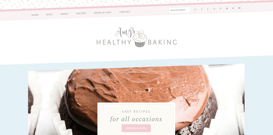
To start off our list of girly websites, we’ve decided to show you Amy’s Healthy Baking. The first thing that makes this website stand out is the slightly diagonal menu. It’s something you don’t see that often but this website definitely pulls it off. The website has an excellent structure and focuses primarily on the visuals. For a baking website, that’s the best thing you can go with. It makes it easier to navigate through the content that’s being provided and triggers curiosity.
2. Angie Makes
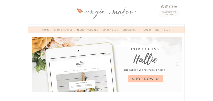
Next up, we have the Angie Makes website. This website represents exactly what it is offering; cute WordPress themes and lovely graphics for web and print. The main color being used on this website is not one you come across so often but it definitely provides the website with the elegance and girly factor it wants to give to its visitors. The social icons and call to action in the right corner of the website manage to stand out, although the color being used isn’t that noticeable.
3. Joy The Baker
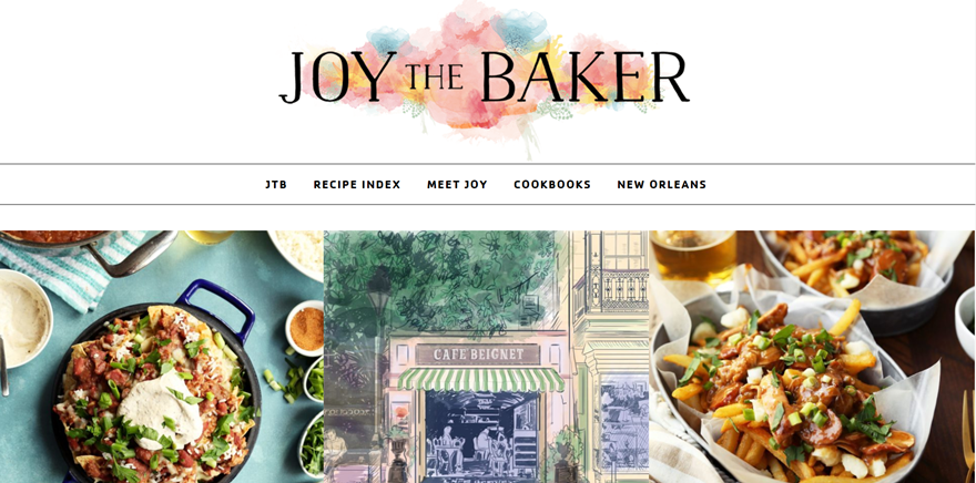
The next girly website is Joy The Baker. There are colors everywhere. Primarily, in the website content but the website owner also decided to represent those colors in the logo at the top of the page as well; this site goes visual all the way. One of the very nice-looking things of this website is the sidebar that doesn’t start right away but right after the hero section of the page.
4. Felicia Day
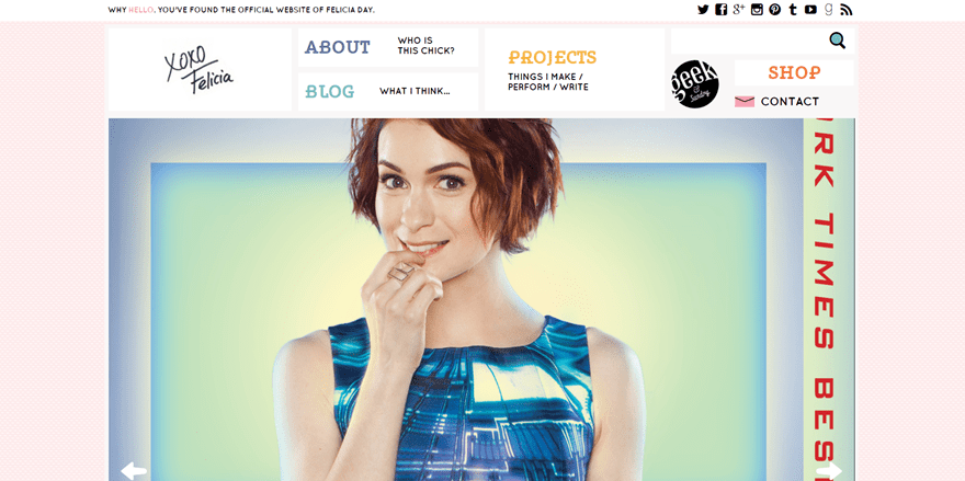
One of the next girly websites is the official website of Felicia Day, a professional actress. This website has an overall very clean and sober feeling but some details make the website very feminine, such as the light pink background with patterns and the font families that are being used. The navigation on this website doesn’t look like something you see that often. Instead of using menu items lined up next to each other, each one of the pages is part of a storytelling process and gets explained even before clicking.
5. We Heart This
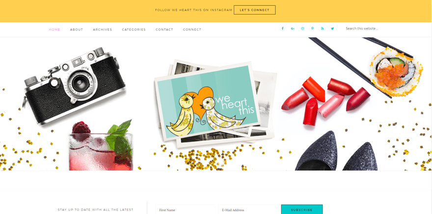
Moving on, we’re going to take a look at the We Heart This website. This website revolves all around very girly stuff, no wonder their website looks as girly as the topic they are handling. Besides giving you that girly vibe, the website also uses some very summery colors that put people at ease and give them a holiday feeling. A nice extra touch to the website is the iInstagram feed that’s been provided at the end of the page.
6. The Beauty Department
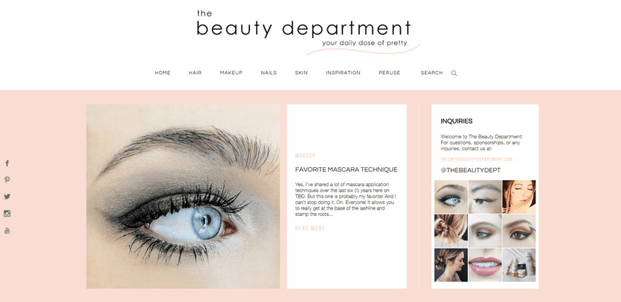
Those people who love makeup will definitely love the website of The Beauty Department as well. This website is pretty well known in the makeup industry and provides dozens of tips and tricks to their visitors. With a topic such as makeup, it’s only predictable that the website will look very gily. Although it’s girly, they’ve also managed to bring a sense of maturity to the website by using soft colors that reflect feminity and professionality at the same time.
7. Joliette
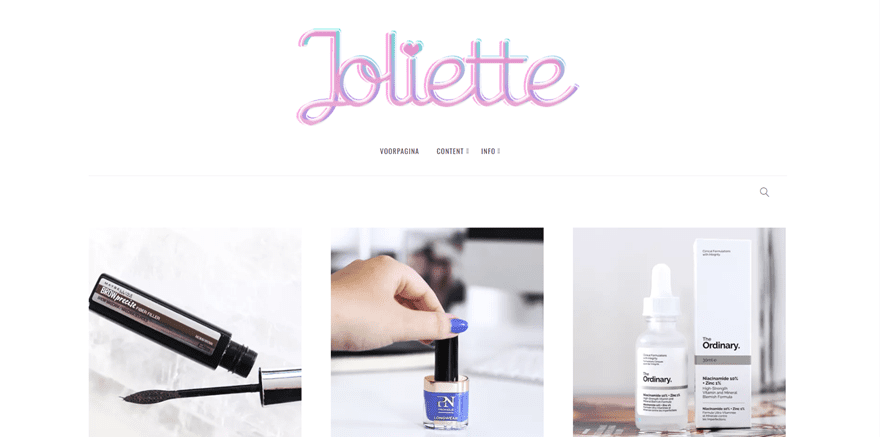
Joliette is a very girly website on first sight, the logo that is being used gives that away. A website that is girly is often also well-organized as well. The Joliette website is a perfect example for that. The posts that are shared on the home page immediately manage to draw visitors’ attention. The fonts are elegant yet not too playful and the color combination gives that fancy touch to the minimalistic layout.
8. My Beauty Bunny
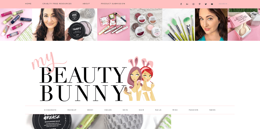
Another beauty blog that runs on WordPress is My Beauty Bunny. This one is probably one of the girliest websites of them all. With colors like pink and mint green that frequently appear on the website, this website represents girliness at its finest. Visuality is not missing at all and starts right at the top of the page where the website owner decided to add a personal touch and introduction with an Instagram feed right away.
Made With Divi
9. Anita Costa
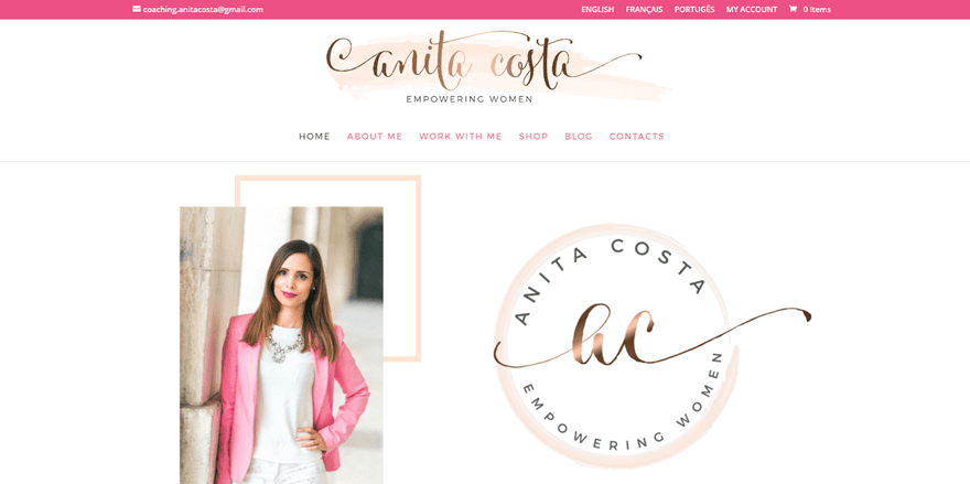
The first girly website that is made with Divi, and that we want to share with you, is Anita Costa. A beautiful coaching website that uses very girly yet elegant colors. The website owner immediately starts by representing herself in the hero section of the website. Besides, the website is also available in three languages; English, French and Portuguese.
10. Life on a Plate
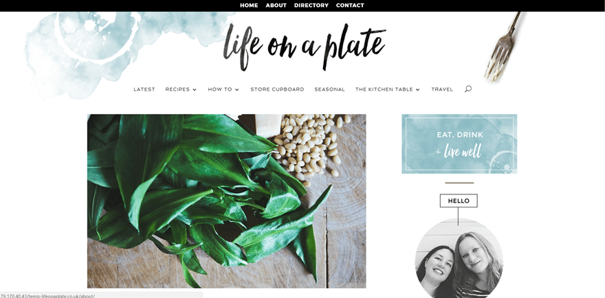
The second and last Divi website in our list of girly websites is life on a plate. Although this website doesn’t necessarily use girly colors, the look and feel of the website still feel very girly. Something that we’ve seen in all of the girly websites we’ve mentioned up until now is the white background color that allows the other colors to draw the attention. The girly factors of this website are the font families and layout that are being used.
Final Thoughts
In this post, we’ve shown you some girly websites that are made with WordPress. We’ve noticed that most of them have some things in common such as the use of soft colors, elegant fonts and light background colors. If you have any questions or suggestions; make sure you leave a comment in the comment section below.
Be sure to subscribe to our email newsletter and YouTube channel so that you never miss a big announcement, useful tip, or Divi freebie!
Featured Image by gst / shutterstock.com




Back to website development … I have mentioned this before and wonder if there is a way to include it – When I see these samples and fall in love with the site’s look I would love some insight into how they achieved it without having to use my firefox web design tools.
It would be so cool if, when highlighting wonderful sites, you could also give some samples of the CSS and or .js that was used.
Thanks
p.s. I did at first wonder why you were doing a post on XXX websites, lol … language changes over time. Personally I find it a complement that beauty and color and breezy open websites are considered feminine. So, as a woman, thanks for the compliment!
Based on these design examples. I note a lot of the themes use a far more flexible approach to the headers and navigation options. Lots of social media links are used and this, I feel, is greatly lacking in the Divi theme.
It shouldn’t require lots of “back end” work to add LinkedIn or other social media options to the header. Just add all the options for people to choose from. Simple solution really.
I’ve read all the comments, and still think calling them girly websites is freaking stupid on lots of levels. Have an unsubscribe Divi, for plain stupidity.
These comments are quite entertaining. I’m a woman and when I first saw the article, I chuckled at the silly title, but I didn’t get offended. I can completely understand why people would get offended though. What DOES annoy me a bit are the people telling others to “take a chill pill” and being insensitive to how others feel. Why can’t people have a conversation without being condescending to each other? Anyway, I think Elegant Themes have responded and explained their side well. I personally would have searched for “feminine” rather than “girly”, but that’s just me I guess.
Thank you for sharing my site (My Beauty Bunny)! I am a strong, confident woman who owns a thriving business, and I love the feminine aesthetic that my web designer (another strong, confident female business owner) created for me. I don’t take issue with the word “girly” but I do see how it could offend. I don’t think the writer/editor had any intention of being misogynistic here. They are using smart SEO best practices to find people who are looking for a particular type of website for inspiration.
How about a woman owned business website?!? ;-D
The world is full of Lefties and feminists the replies on this post are so Left wing it is unbelievable !! I thought the UK was bad but if majority of relies are from US Good grief people lighten up and get of your high horses the people at ET give these posts for free !!!!!!!!!!!!!!!!!
Jeepers, lighten up people! The folks at ET have great senses of humor and work very hard to provide us all with great products and services, much of which is FREE!
I thought it was a great post with lovely examples. Anyone who didn’t like the word ‘girly’ probably should have passed on the article and skip subjecting themselves to their own aggravation and feeling they had to share with the rest of us.
Thanks ET for yet another great post.
Wow! Look at all the social just warriors out there all bent out of shape because of a single word. Get over yourselves.
Thx for a great article! As a female web designer and female biz owner I have no issue with the term “girlie” but would love to be featured in your next post as my website is designed in DIVI and I design all my websites in DIVI!
Thank you from the tip of Africa – Cape Town!
Hey Samantha, if you’d like to send us your website for consideration please send it to nathan at elegantthemes.com with the subject line DIVI SITE SUBMISSION. Looking forward to seeing your work!
Totally agree!
Wow. This is for real one of the worst posts et made.”we just want to use keywords people use”. What kind of person search for “girly” website ? If this is your target I honestly do not want to be your customer anymore. Disappointed to say the least.
lol @ sjws
I was always asked by our college, is there any great personal site that they could aspire (or copy)? This list answered part of it, now if you could make another list for the man, we’ll be grateful.
Waiting list – 10 best WordPress site for personal branding
This is a great post, thank you! The fact is some clients ask for “girly, soft, and feminine” websites and there’s nothing wrong with that. I just finished one where the client actually apologized for requesting something girly and simple with pastel colors, but she needn’t have. It was a fun project and I knew exactly what to design based on her description. So I’m going to look at your examples to find inspiration for the next client who requests a similar look and feel.
I hope you aren’t discouraged by some of the comments. You are obviously very talented both in web design and communications. The real problem here is those who assume everyone in the world must adhere to their own expectations of political correctness or suffer their wrath. That’s a lot to demand of someone raised in the U.S., much less from someone who may have been raised in a different culture. Pretty insensitive, I’d say. Please bear with us and keep the helpful posts coming.
Love your response. I agree. 🙂
Honestly, what can one say these days without offending someone. Never thought I would see that here.
Thank you Elegant Themes for providing us so many ideas, options and variations in the web world. How can anyone even think of criticizing them with all they provide for free.
There was, and still is, such a thing as girly, which in my mind means soft colors and a more gentle style of design. If some of you thing “girly” is offensive then what “adjective” would you choose instead?
Totally agree!
Nothing wrong with the term “girly” or “girly girl” here in Canada. It’s a common word that females often use to describe their feminine persona. I’m surprised at how some people find that offensive – it’s not like the B word was used lol
I “get” the critique of using the word “Girly” as a descriptor, but I disagree with the tone against the softer, more “femme” feeling of these sites. While some people reject that type of personal aesthetic, some people embrace the “girly” moniker, and take on the femme-energy-inspired aesthetic as their own. They don’t take being labelled as femme/girly as an insult, and for some it’s part of their personal identity.
This blog post is a great primer of femme designs for those who want to express that aesthetic for their own brand. Thank you for these examples!
On subsequent read of this article, a major critique I have is in the describing these “girly” sites as using less powerful techniques, and generally describing each site in more stereotypical terms that appear to disempower the energy and effort put into each site. I, for one, would not describe any of the sites (that use Divi, especially!) as using “less powerful” web building techniques. I’ll risk making a broad assumption that these sites use a wide variety of CSS coding and even Javascript techniques to achieve the visual affects and animations on each of these sites.
I personally would not risk diminishing the work these web designers put into these sites by using “less powerful” next to “girly” as describing these sites. That description does these web designers a disservice in critiquing the work they put into these websites, and their craft in general.
If I had written this article, I would have focused more on the color palettes the designers used in creating each of these sites. I would have also highlighted the site integrations used for certain site details to illustrate how each designer approached creating a “softer” or “soothing” effect for the user when visiting the site. Also, the site “We Heart This” doesn’t strictly follow the softer palette (they used a brighter palette), but is still making good use of a clean minimalist design (that’s probably the word we’re going for, here).
Summary: “Girly” isn’t as much of a problem for me as describing the hard work these web designers (mostly female) put into these great sites as “using less powerful techniques.”
Hi Tanisia, my intention was in no way to link ‘girly’ to ‘less powerful’. I never used those words in combination either. Just because a type of website uses less advanced animations or effects doesn’t mean it’s less powerful. Some would even say that advanced effects distract visitors from the content that’s being provided.
I’ve actually heard the “use fewer effects” critique from one of my clients. She didn’t want her site to use parallax effect, for example. Another effect that some web designers say that’s been over-used is the “image slider” on some websites. I even ran into a humorous website arguing against using sliders – while it used a slider to make its point. My point was, fewer animations and effects does not equal “less powerful” in construction overall. It just means fewer effects and a more “minimalist” look as opposed to a website with lots of “bells, whistles, and dancing icons.”
Other than those critiques, I did enjoy the example websites you presented for the “girly” theme. It reminded me of another website I go to, “Adorned By Chi,” which uses the Girly design for their line of products. Their design uses a similar palette to other Girly sites, so I appreciated seeing other examples. Thank you very much!
While I understand your intentions may be in the right place, please stop gendering websites. It does women no service to infantilise us with words like “girly”, or align us only with all that is soft, classic, and calming. There is a full spectrum of women out there, and not every woman fits this one generalisation. And to suggest that the Life on a Plate website doesn’t use “girly colours” is rather regressive. What are girly colours? Are they soft and pink? Why? We are strong, not soft. A better way of presenting this piece would have been a title like, “10 lovely examples of calming websites with soothing palettes”.
Absolutely right on, Monica. I couldn’t believe that in 2017 some twit thinks that women need or want their own “girly” colours and “girly” webiste. All those years fighting for equal rights for nothing, apparently.
Hey Monica, I wanted to respond to your comment and a few others in this thread by people who feel it was inappropriate for us to use the term “girly websites”. While I understand that in the larger context of feminism that gendering things like toys, clothes, and yes–websites–is not in keeping with ideal rhetoric when discussing a person’s identity. However, I think it’s worth pointing out that we’re not attempting to have a discussion on gender here or even suggest that these websites represent an ideal or standard for what websites by or for women should look like. Instead, we’re using a keyword that our search engine optimization tools showed us people are using when searching for the types of websites above. So in this instance, using this term was simply the best way to get this specific type of design inspiration in front of the people using this specific search term.
The life on a plate website looks pretty in the screenshot but doesn’t seem to be up anymore? When you click on link it says currently unavailable.
As far as marketing appeal, these are great examples that we will use for our current site-redesign! (Something gender studies majors just won’t grok.)
We are very excited to use Divi because it gives us massive flexibility and allows us to remove some plug-ins since it provides the necessary functionality out of the box.
Agreed! No need to make a site top or bottom heavy with plugins that are all built in on the new updates – love it!
Awesome sites. Perfect guide so that I can create something girly myself. And yeah, girly is used in a positive way, not really condescending. ?
I agree with Dakota’s comment. Next, I want to see a collection of sites that epitomize a boyish essence. What will they be about? Certainly not baking, health, or well-being. That’s girly. Might it be about being number one at all cost, killing things, or leaving behind a steely cold feeling? Be sure it has “advanced” technical features. Or simply the polar opposite of “lovely.” Geeze.
Hi Barb, just wanted to chime in here. You’re not the only person to find this post offensive and for that I apologize. That was not our intent at all.
By way of explanation, I would refer you to my comment above which explains how we use keywords to help make sure designers searching for different types of inspiration can find our content.
I get that you want your blog posts found so you can sell more Divi. Not all search data should be used raw because people search privately. So before you write a post that categorizes this way, use the turnaround test that I illustrated in my comment. Also ask “is Elegant Themes brand messaging inclusive or not?” I would guess not from this post. As a brand identity designer, I know how language lands—is the brand. People buy Divi, so talk to people inclusively. Or diminish at least half of your audience and talk that way. It’s a choice.
You can tell by the whining comments above that these are young women spoiled by our educational system of brainwashing. There is nothing 1950s about the term ‘girly’ and if you had grown up in the 50s you might have been better off. (I know I was)
I’m a 68-and-a-half-year old web designer who uses DIVI and I love the idea of ‘girly’. What is wrong with it? I think it celebrates softness which is so lacking today with many modern women.
I think there are advanced things being used on them, such as the little popup that shows on one the moment you arrive, and others that have their own little icons at the top… I’m still learning how to take advantage of the features in DIVI but so far not one complaint by any of the people I’ve made sites for.
There’s really no reason to be ugly. You are welcome to your opinion about the word girly but I do not approve of your attacking other women with your comment.
Yeap, Buddy great post and wonderful ideas for website design, the best part of it is that it’s all can be duplicated with divi..
Great Job I love it..
What a great list! There are some beautiful website and very talented people out there… well done!
OMG. This post is so incredibly sexist. “Girly websites never fail at giving their visitors a calm and refreshing feeling. For this type of website, it’s not as much about what the website can do but what feeling it brings to you. That’s why you’ll notice that most of these websites don’t have too many advanced effects integrated.” Where to begin… the implications in this message are so demeaning and patronizing… I feel like I crawled into a wayback machine and it’s 1950. So disappointed to see you post something like this in 2017.
You really should get a life and lighten up.
Previous comment was directed at a user above who had all sorts of negative things to say about this being a sexist post. Silly. Girls just wanna have fun sometimes I think.
Chill.
I think it is a great post with wonderful samples, and I’m convinced that it did not even cross the authors mind, that it will be interpreted as demeaning and patronizing.
Agreed. This was just terrible. Whoever green lighted this article (and decided it was a good idea to make a newsletter out of it as well) needs to get their shit together.
Hi there,
Being a woman myself, I was simply observing these websites and noticing the obvious.
PS: There’s absolutely nothing wrong with having a feminine website that focuses on how visitors feel instead of using advanced effects.
I agree with your response, Donjete, with one minor tweak: There’s absolutely nothing wrong with having *a website* that focuses on how visitors feel instead of using advanced effects.
If we want to describe the effect of these wonderful websites on users, how about:
“10 lovely examples of websites made with WordPress”
“10 lovely examples of user-friendly websites made with WordPress”
“10 lovely examples of engaging websites made with WordPress”
“10 examples of WordPress sites that are easy on the eyes”
“10 examples of beautifully designed websites made with WordPress”
When I look at the sites posted here, I see a variety of approaches – differences in textures, color schemes, layouts, amount of content, etc. They are all lovely, appear easy to use, and are well-thought-out. Calling out those traits speaks to something more specific and tangible (and apparently, less aggravating) for people trying to build websites, than the term “girly”.
did you see their comment above – that this post was keyword targeted to meet the search requests for the term “girly websites.” so that people who are searching for this term would find this post. they acknowledged that in the wider context this could be seen as intentional. I think, if they were smart they would put their comment into the post.
Indeed. I didn’t take it to mean that “female sites” don’t focus on features and instead what feelings it brings to the visitor. I saw the descriptor “girlie” and immediately took it to understand classical feminine…and that is precisely what the sites are.
I think it is a good list. I think showing how Divi can be used for any number of genres is awesome and is what makes Divi the powerhouse it is today.
While it’s a nice selection of sites that give a certain type of look and feeling, you guys seriously couldn’t think of a better name to call them then “Girly websites”?
Hey Dakota, I think I can shed some light on this. We target keywords with our content. So when we see that “girly websites” is something people search for a lot we try to see what exactly they’re looking for. Our research suggested these were the types of aesthetic examples people who search for that term are actually looking for. And if we don’t use the term, they won’t find the content.
I understand that in the broader context of feminism in the world today, it’s not cool to call something masculine or feminine based on arbitrary or (perhaps especially) dated stereotypes. But in this instance I think it’s important to note that we’re not attempting to wade into a complex discussion on gender. We’re just trying to provide designers with inspiration resources using the terms they themselves search for.
Something tells me that when people are searching for “girly websites” this isn’t what they have in mind. Swing and a miss, ET. 🙁
“Girly” has a very different meaning from “girlish,” which is probably where you were aiming. “Girly” describes sites that show women in various states of nudity designed to appeal to men who are looking for that sort of stimulation. That is why their search numbers are high.
“Girlish” means girl-like, or feminine. Those search numbers would be lower.
Either way, it’s an unfortunate choice of title or topic that could be better served with something more socially- or politically-aware such as “Websites focused on female audiences.”
I was a little taken aback by the title (being a feminist practically since birth–over 50 years, at least). Following your advice, I searched “girly website” and expected to find XXX sites, but instead found exactly what you described. Here’s an example from Forbes magazine from 2012:
https://www.forbes.com/sites/forbeswomanfiles/2012/06/20/top-100-websites-for-women-2012/#5bfaabaf47b6
So thanks for enlightening me. Now I’m inspired to fearlessly explore my “girly” design side.
Also… how many times can you say girly in an article.
I guess that means keyword stuffing still works? Good to know! Nice collection of sites btw OP. =P
Your comment is inherently sexist since you assumed that it was written by a guy and therefore that the use of a feminine word, girly, was derogatory.
Exactly @Dakota Girly Websites really Elegant Themes? This is the best you came up with?