
The more visually-appealing a CTA is, the higher the chances are for a better conversion rate. There are many ways to design your CTAs but in this post, we’ll show you how to create beautiful CTA column designs with semi-transparent images and column overlaps. You can find the semi-transparent images in the download folder below, but feel free to use other images. You’ll be able to download the JSON file for free as well!
Let’s get to it.
Previews
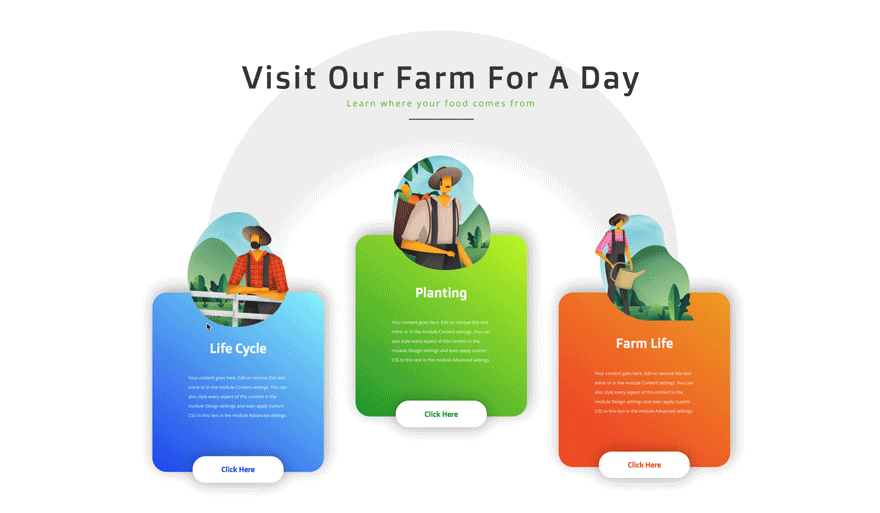
Before we dive into the tutorial, let’s take a quick look at the outcome across different screen sizes.
Desktop
Mobile

Download The CTA Column Layout for FREE
To lay your hands on the free CTA column layout, you will first need to download it using the button below. To gain access to the download you will need to subscribe to our newsletter by using the form below. As a new subscriber, you will receive even more Divi goodness and a free Divi Layout pack every Monday! If you’re already on the list, simply enter your email address below and click download. You will not be “resubscribed” or receive extra emails.

Subscribe To Our Youtube Channel
Let’s Start Recreating!
Add New Section
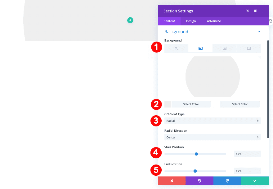
Background
Start by creating a new page or adding a new regular section to an existing page. Then, go into the section settings and add a gradient background.
- Background: Gradient
- Background Gradient Color One: Very Light Grey #efefef
- Background Gradient Color Two: White #ffffff
- Gradient Type: Radial
- Radial Direction: Center
- Start Position: 52%
- End Position: 50%
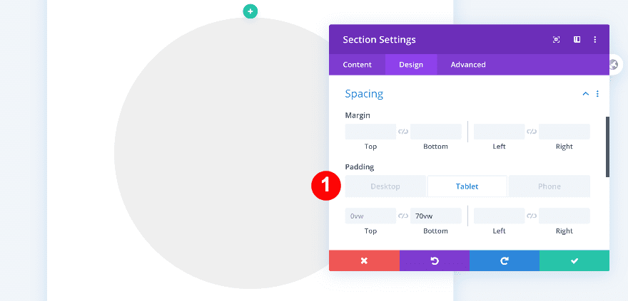
Spacing
Move on to the design tab and adjust the padding in the spacing settings.
- Top and Bottom Padding
- Desktop: 0vw
- Bottom Padding
- Tablet + Phone: 70vw
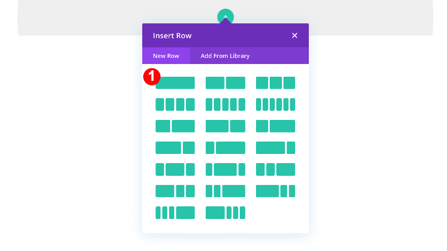
Add New Row
Column Structure
Continue by adding a new row using the following column structure:
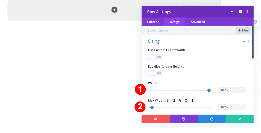
Sizing
Then, adjust the width and max width of the row.
- Width: 100%
- Max Width 100%
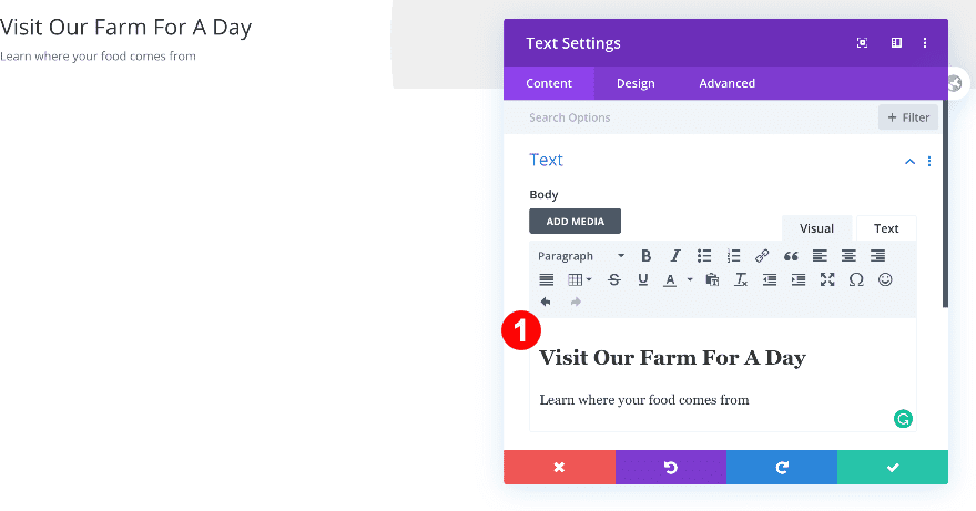
Add Text Module
Add H2 and Text Content
Time to add modules! First, add a text module and insert some H2 and paragraph content of your choice.
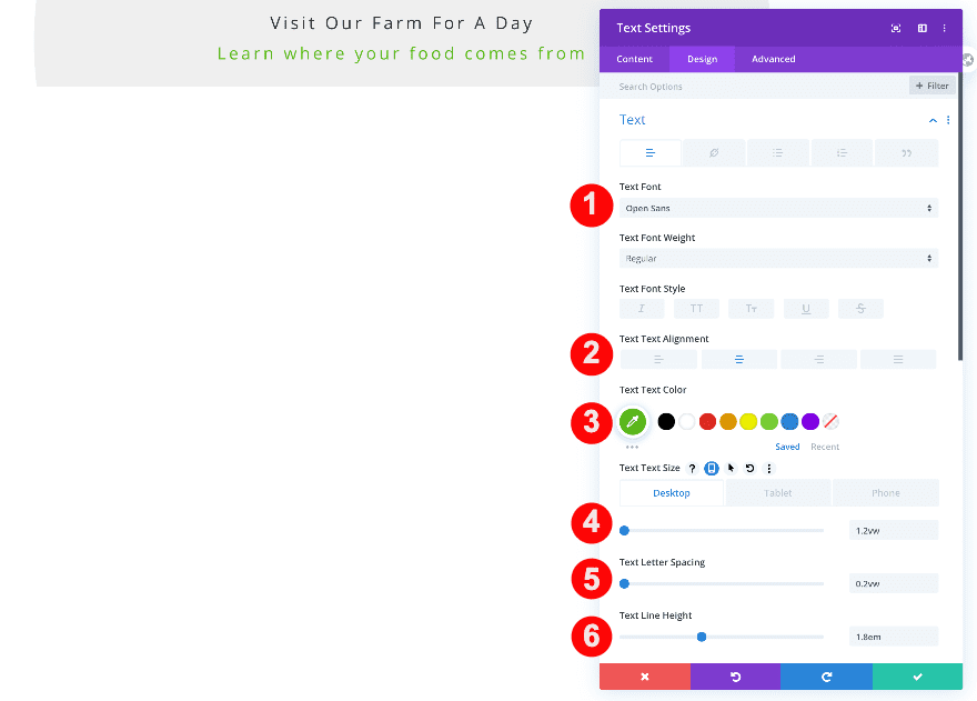
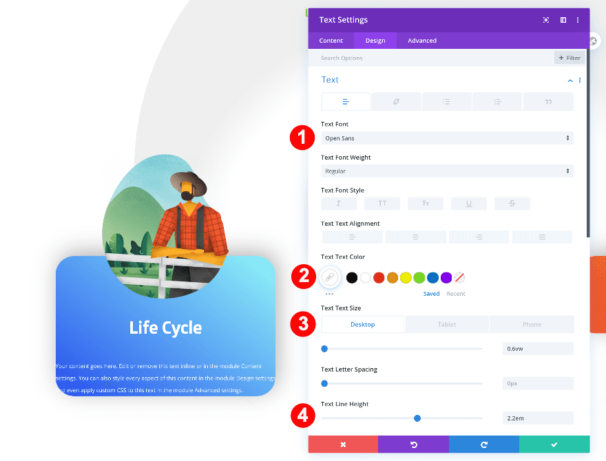
Text
Move on to the design tab and style the text as follows:
- Text Font: Open Sans
- Text Alignment: Center
- Text Color: Green #5bba1b
- Text Size:
- Desktop: 1.2vw
- Tablet: 2.8vw
- Phone: 3.6vw
- Text Letter Spacing: 0.2vw
- Text Line Height: 1.8em
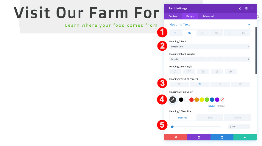
Heading 2 Text
After styling the paragraph text, style the H2 text as well.
- Heading: H2
- H2 Font Weight: Doppio One
- H2 Text Alignment: Center
- H2 Text Color: Very Dark Grey #3d3d3d
- H2 Text Size:
- Desktop: 4.4vw
- Tablet: 5.9vw
- Phone: 6.9vw
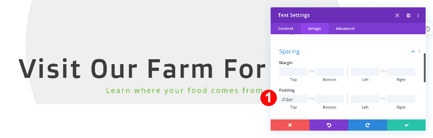
Spacing
And add some top padding.
- Top Padding: 212px
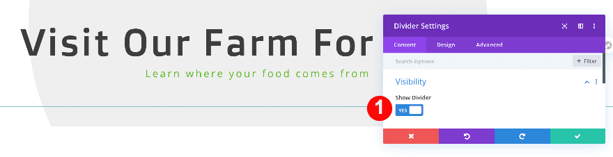
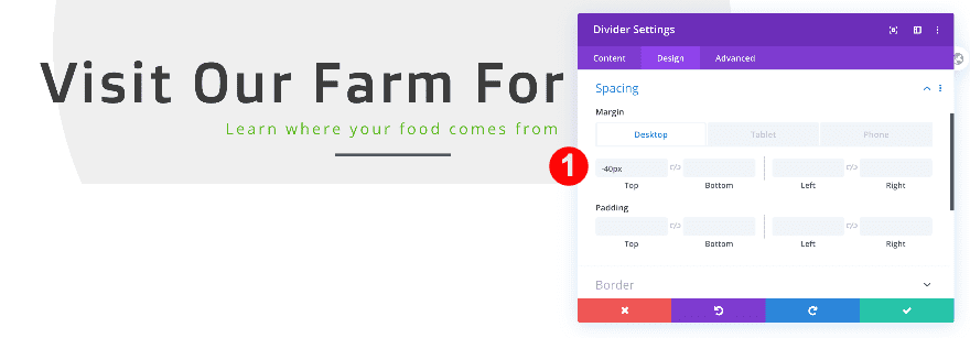
Add Divider Module
Visibility
Below the text module, add a divider module and set the visibility to ‘Yes’.
- Visibility: Yes
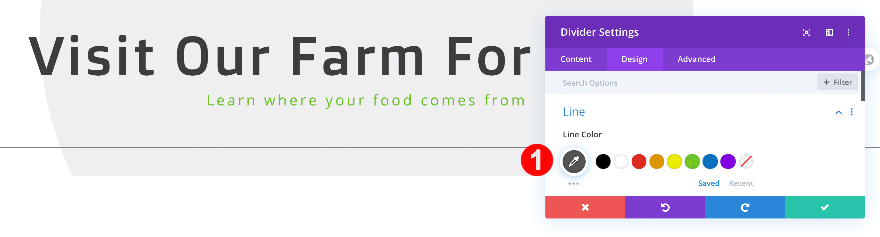
Line
Change the divider color next.
- Line Color: Dark Grey #545454
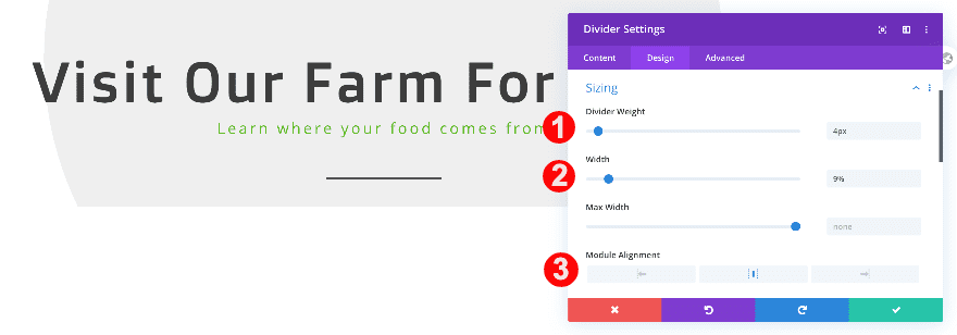
Sizing
Now, adjust the sizing of the divider so it looks smaller.
- Divider Weight: 4px
- Width: 9%
- Module Alignment: Center
Spacing
Add some negative top margin too.
- Top Margin:
- Desktop: -40px
- Tablet + Phone: -15px
Add New Row
Column Structure
Continue by adding a new row with three equally-sized columns. This will be the basis of the CTA column design.

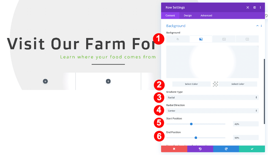
Background
Before adding any modules, add a gradient to the background to the row settings.
- Background: Gradient
- Background Color Gradient One: White #ffffff
- Background Color Gradient Two: Transparent
- Gradient Type: Radial
- Radial Direction Center
- Start Position: 42%
- End Position: 50%
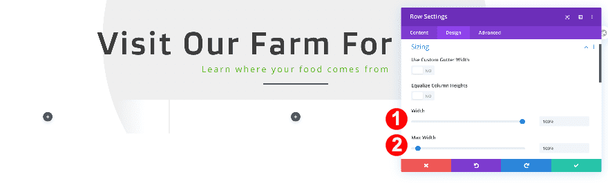
Sizing
Now, adjust the sizing of the row.
- Width: 100%
- Max Width: 100%
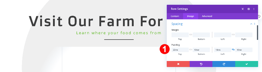
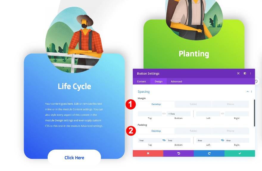
Spacing
Go to the spacing settings next and add some custom padding values.
- Top Padding: 22vw
- Bottom Padding: 10vw
- Left and Right Padding: 10vw
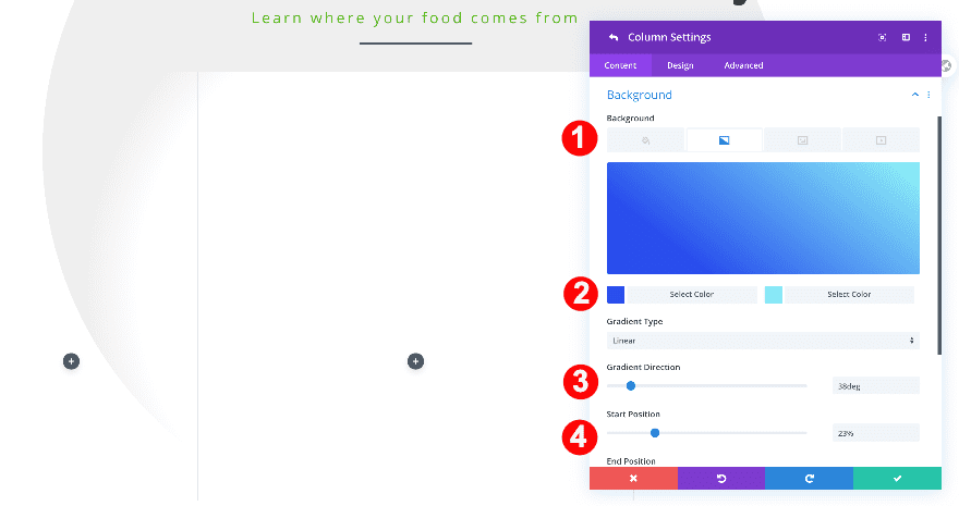
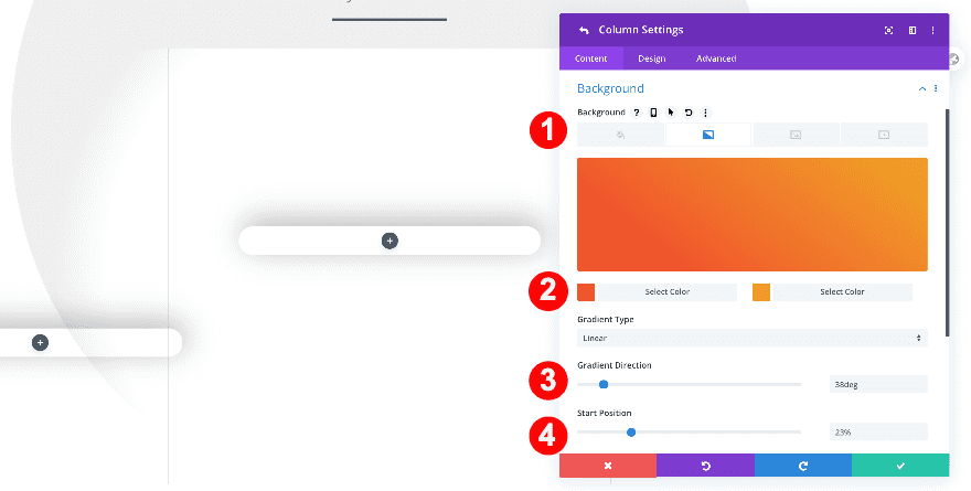
Column 1 Settings
Background
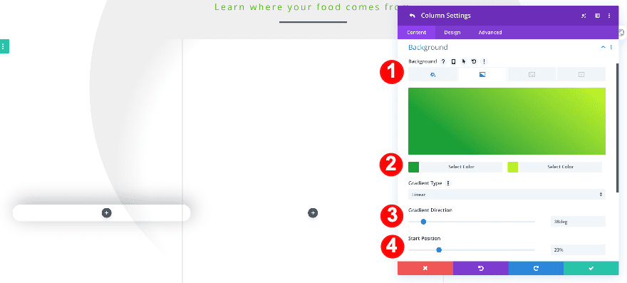
Continue by opening the column 1 settings and add a gradient background.
- Background: Gradient
- Background Gradient Color One: Blue #2a4eed
- Background Gradient Color Two: Light Blue#91f5f7
- Gradient Type: Linear
- Gradient Direction: 38deg
- Start Position: 23%
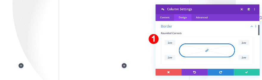
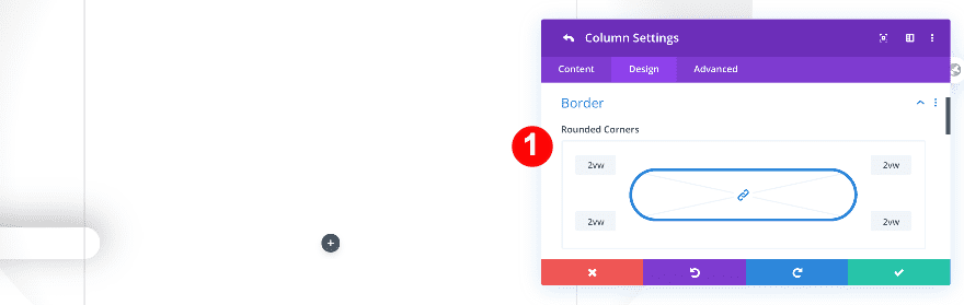
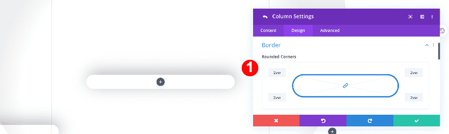
Border
Give the column rounded corners in the border settings next.
- Rounded Corners: 2vw on all corners
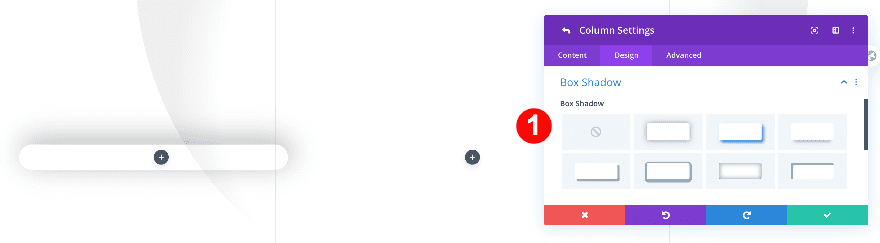
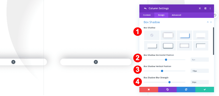
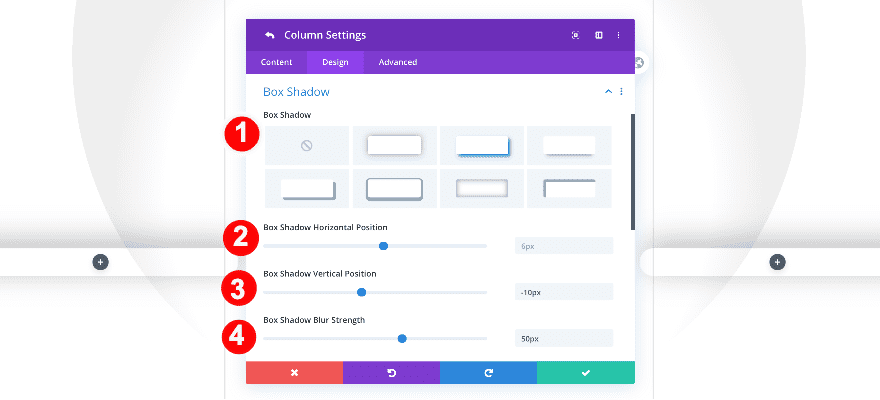
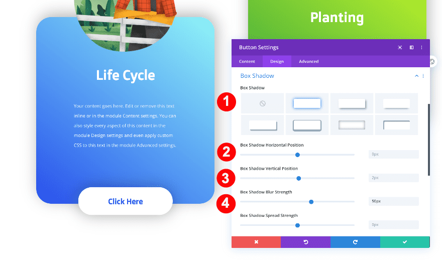
Box Shadow
Add a subtle box shadow too.
- Box Shadow: Second Option
- Box Shadow Horizontal Position: 6px
- Box Shadow Vertical Position: -10px
- Box Shadow Blur Strength: 50px
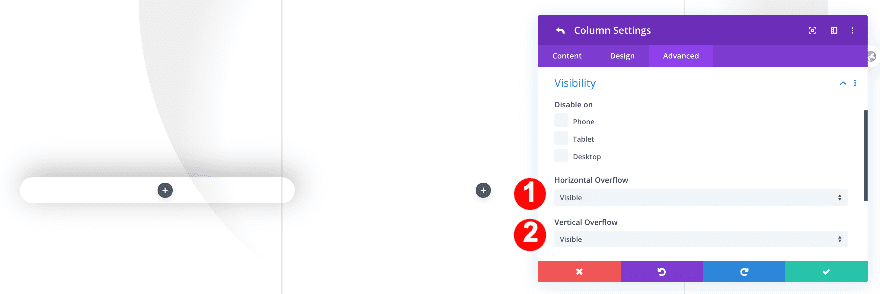
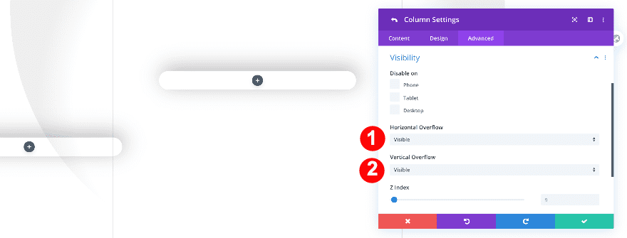
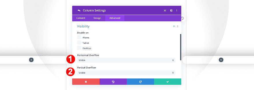
Overflows
Make sure the column’s overflows are visible as well.
- Horizontal and Vertical Overflow: Visible
Column 2 Settings
Background
Move on to the second column and add the following gradient background:
- Background: Gradient
- Background Gradient Color One: #1ba038
- Background Gradient Color Two: #c6f727
- Gradient Type: Linear
- Gradient Direction: 38deg
- Start Position: 23%
Border
Add some border radius to the column as well.
- Rounded Corners: 2vw all four corners
Box Shadow
Along with a subtle box shadow.
- Box Shadow: Second Option
- Box Shadow Horizontal Position: 6px
- Box Shadow Vertical Position: -10px
- Box Shadow Blur Strength: 50px
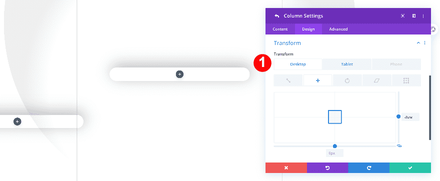
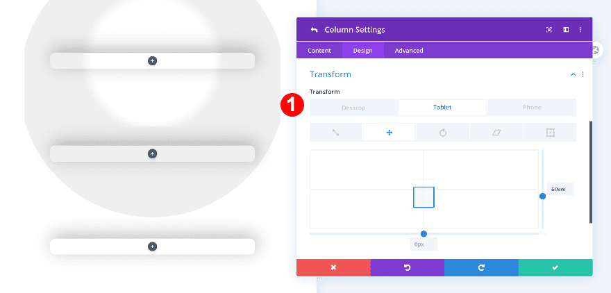
Transform
This column sits a bit higher than the others. To create this effect, we’ll adjust the transform translate settings for column 2.
- Transform Translate:
- Desktop: -8vw, y-axis
- Tablet + Phone: 30vw, y-axis
Overflows
Make the overflows of this column visible as well.
- Horizontal and Vertical Overflows: Visible
Column 3 Settings
Background
On to the next and last column! Add a gradient background.
- Background: Gradient
- Background Gradient Color One: #f0562c
- Background Gradient Color Two: #f1a526
- Gradient Type: Linear
- Gradient Direction: 38deg
- Start Position: 23%
Border
Move on to the design tab and add some border radius to each corner.
- Rounded Corners: 2vw on all corners.
Box Shadow
Add a box shadow too.
- Box Shadow: Second Option
- Box Shadow Horizontal Position: 6px
- Box Shadow Vertical Position: -10px
- Box Shadow Blur Strength: 50px
Transform
On smaller screen sizes, we’ll need to reposition the column using custom transform translate values.
- Transform Translate:
- Tablet + Phone: 60vw
Overflows
Finally, adjust the overflow settings.
- Horizontal and Vertical Overflows: Visible
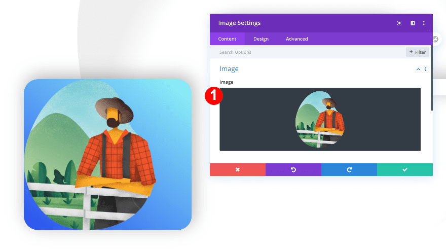
Add Image Modules
Upload a Cut-Out, Semi-Transparent Image
Once you’ve completed all column settings, it’s time to add modules. Add an Image Module to column 1 and upload a semi-transparent image of your choice. You can find the images we’ve used in the zipped folder that you were able to download at the beginning of this post.
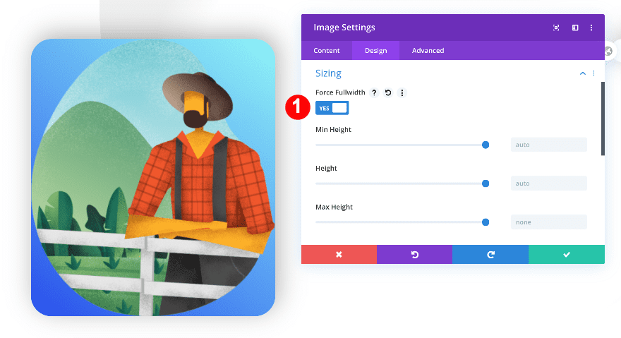
Sizing
Make the module fullwidth.
- Force Fullwidth: Yes
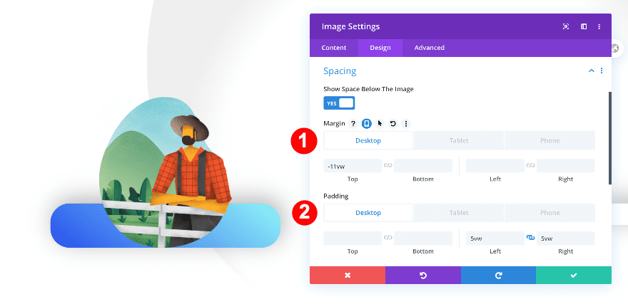
Spacing
Add some custom margin and padding values next.
- Top Margin:
- Desktop: -11vw
- Tablet + Phone: -24vw
- Left and Right Padding:
- Desktop: 5vw
- Tablet + Phone: 20vw
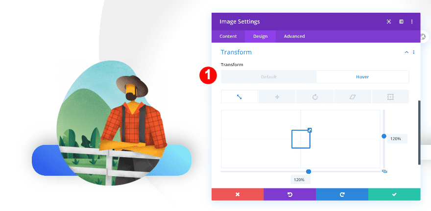
Transform Scale on Hover
We’re adding a subtle hover effect to the image using the transform scale option in the transforms settings.
- Transform Scale on Hover: 120% on both axes.
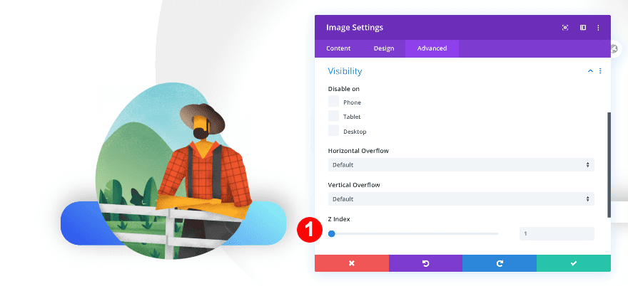
Z-Index
To make sure the image appears on top of the column, we’ll increase the z index value in the advanced tab.
- Z-Index: 1
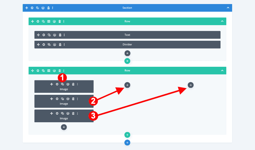
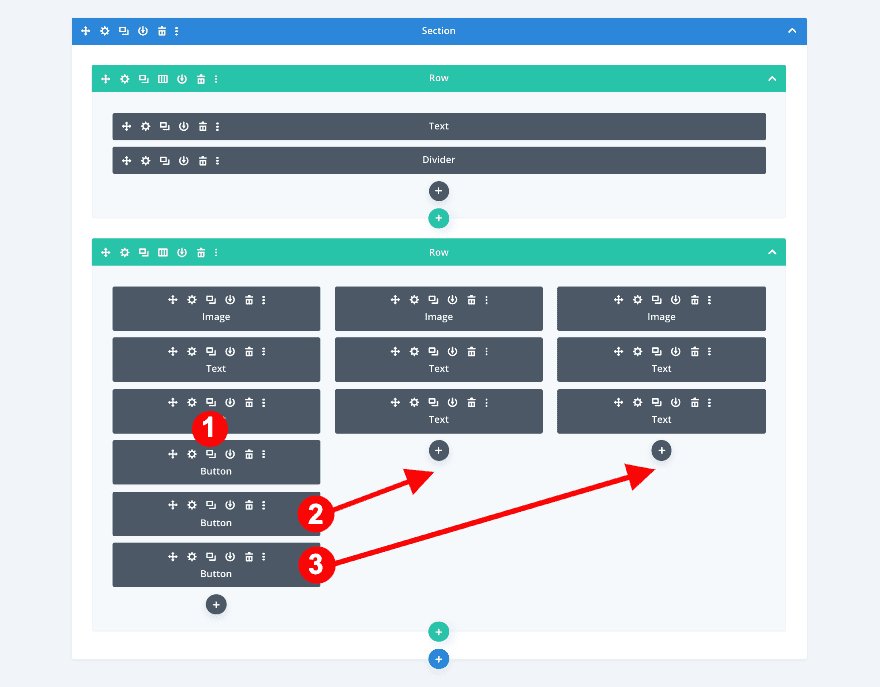
Duplicate and Drag Image Modules
Now, clone the image module twice and place the duplicates in the two remaining columns. This process is easier in wireframe view.
- First, duplicate the image module twice
- Then, drag the new image modules to columns 2 and 3
- Upload different images
Add Text Modules
Add H3 content
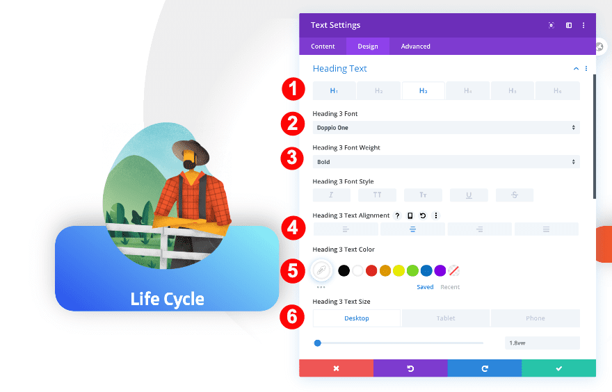
Below the image in column 1, add a text module and insert some H3 content of your choice.
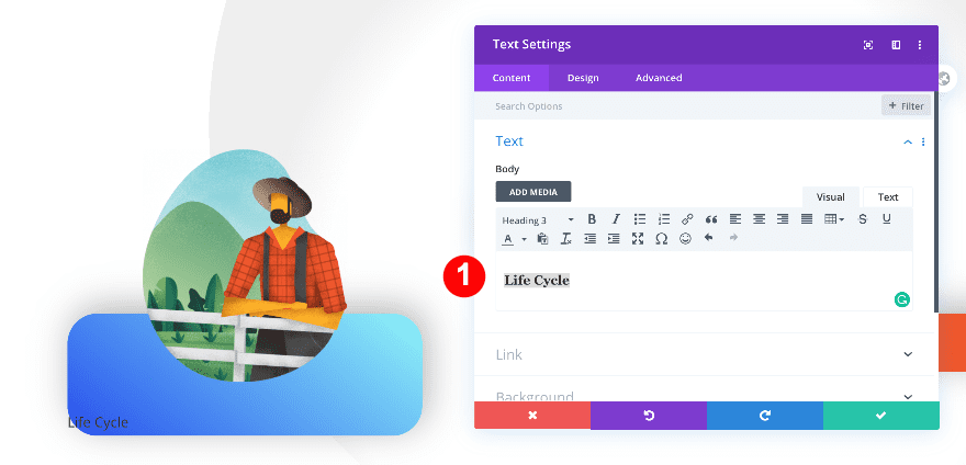
Heading 3 Text
Move on to the design tab and style the H3 text settings.
- Heading Text: H3
- H3 Font: Doppio One
- H3 Font Weight: Bold
- H3 Alignment: Center
- H3 Text Color: White #ffffff
- H3 Text Size:
- Desktop: 1.8vw
- Tablet: 5vw
- Phone: 6vw
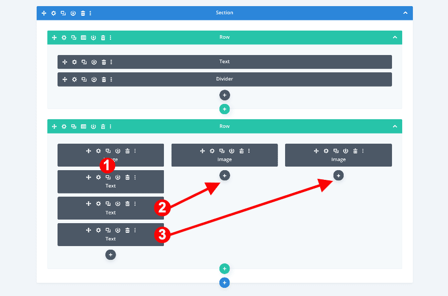
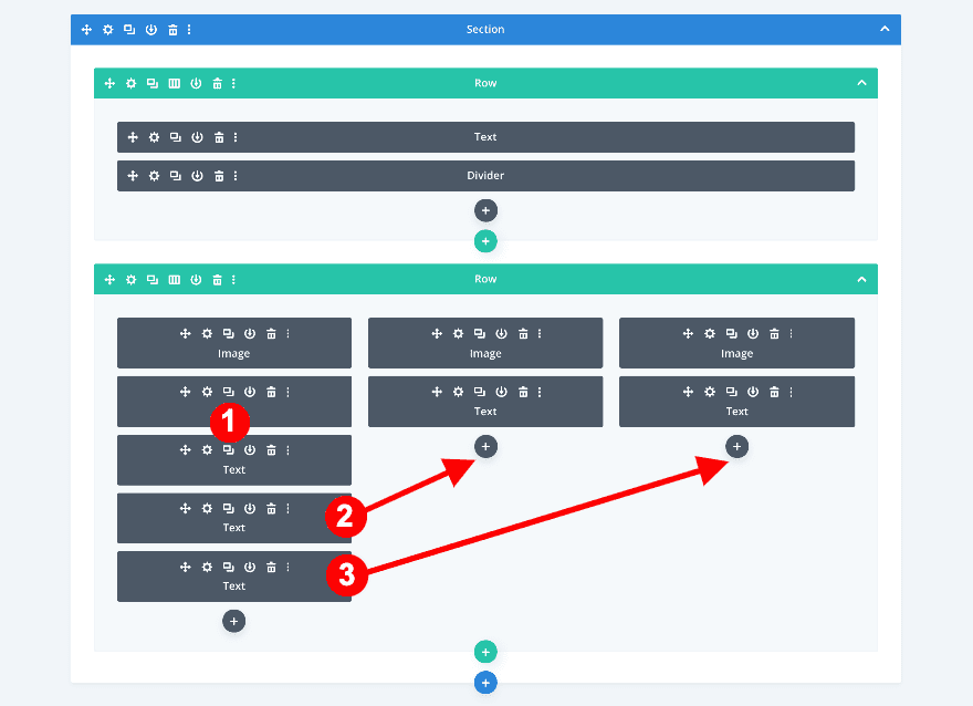
Duplicate and Drag Text Modules
Clone the text module twice and place the duplicates in the two remaining columns.
- First, duplicate the text modules twice
- Then, drag them below the image modules in columns 2 and 3
- Change the content in each new text module
Add Text Modules
Add Content
Below the title module, add a new text module. Add some paragraph content to the content box.
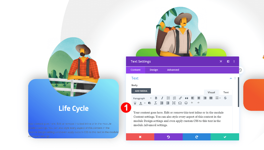
Text
Now, style the text as follows.
- Text Font: Open Sans
- Text Color: White #ffffff
- Text Size:
- Desktop: 0.6vw
- Tablet: 2vw
- Phone: 2.8vw
- Text Line Height: 2.2em
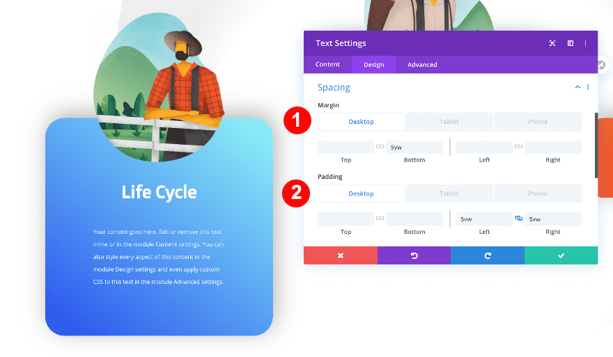
Spacing
To center the text, adjust the spacing of the module as follows.
- Bottom Margin:
- Desktop: 5vw
- Tablet + Phone: 10vw
- Left and Right Padding
- Desktop: 5vw
- Tablet + Phone: 14vw
Duplicate and Drag Text Modules
Clone the text module twice and drag the duplicates to the two remaining columns.
- First, duplicate the text modules two times
- Then, place the duplicates in columns 2 and 3
- Change the content in each duplicate
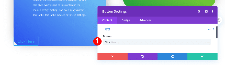
Add Content
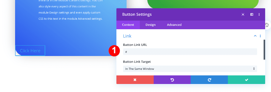
On to the last module! Add a button module to column 1 with some copy of your choice.
Add Link
Insert a link in the module’s link options.
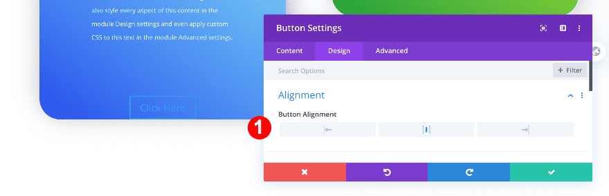
Alignment
Now, align the button module.
- Alignment: Center
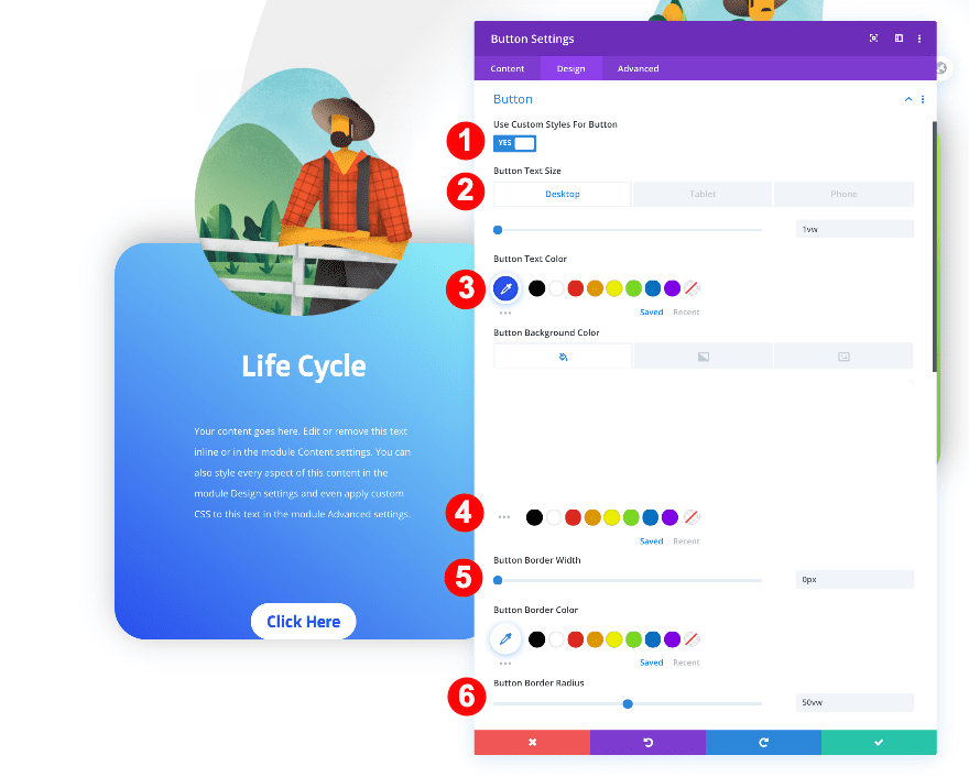
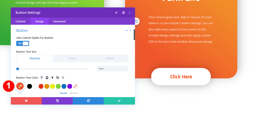
Button Styles
Then, style the button as follows.
- Button Text Size:
- Desktop: 1vw
- Tablet: 2vw
- Phone: 3vw
- Button Text Color: Bright Blue #2a4eed
- Button Background Color: White #ffffff
- Button Border Radius: 50vw
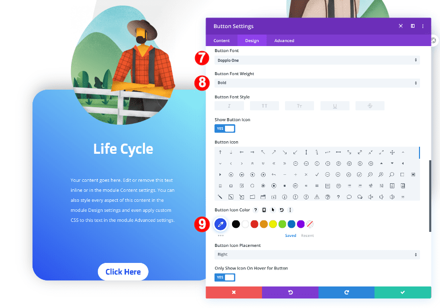
- Button Font: Doppio One
- Button Font Weight: Bold
- Button Icon Color: Bright Blue #2a4eed
Spacing
Shape the button and create a bottom overlap by adding some custom margin and padding values in the spacing settings.
- Bottom Margin:
- Desktop: -1.5vw
- Tablet: -4vw
- Phone: -6vw
- Top and Bottom Padding:
- Desktop: 1vw
- Tablet + Phone: 3vw
- Left and Right Padding
- Desktop: 4vw
- Tablet + Phone: 10vw
Box Shadow
Last but not least, add a subtle box shadow to the button.
- Box shadow: First Option
- Box Shadow Horizontal Position: 0px
- Box Shadow Vertical Position: 2px
- Box Shadow Blur Strength: 50px
Duplicate and Drag Button Modules
Just like the previous modules, clone the button twice and place the duplicates in the two remaining columns of the row.
- Clone the button module twice
- Place the duplicates in columns 2 and 3
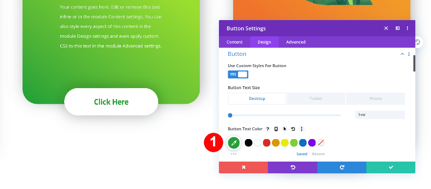
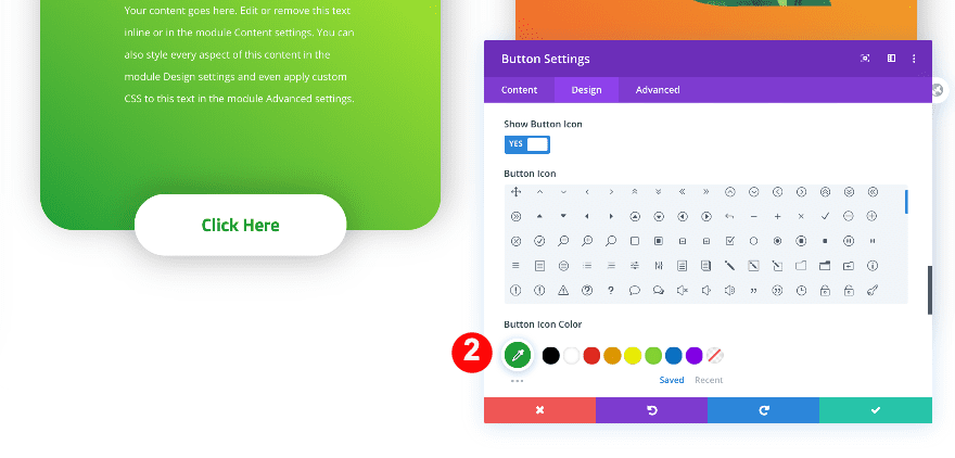
Button 2 Text and Icon Color
Change the button and icon color of the button module in column 2.
- Button Text Color: Green #1ba038
- Icon Color: #1ba038
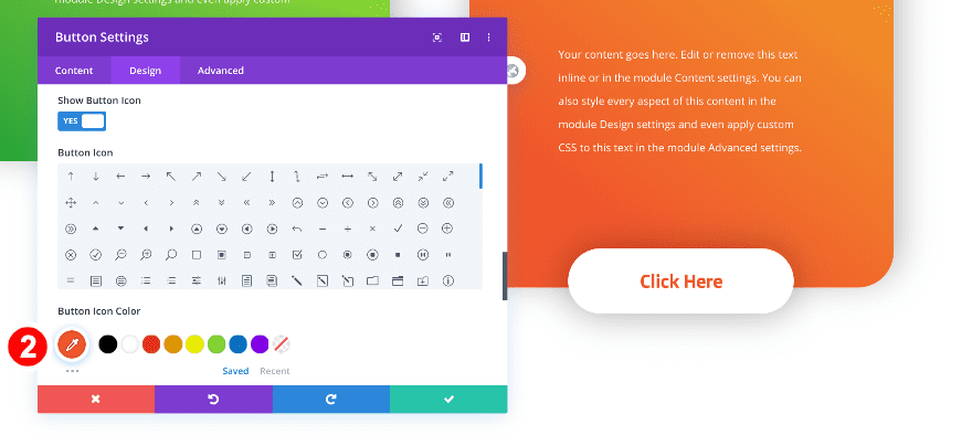
Button 3 Text and Icon Color
Do the same with the button in the last column and you’re done!
- Button Text Color: Orange #f0562c
- Icon Color: #f0562c
Preview
Now that we’ve gone through all the steps, let’s take a final look at the outcome across different screen sizes.
Desktop
Mobile
It’s a Wrap
In this post, we’ve shown you how to use semi-transparent images to create a beautiful CTA column design. We used the Divi column overflow settings to make the images and buttons overlap seamlessly. Try using this design in your next Divi project and let us know how that goes in the comment section!


This is just great. I am trying to follow the tutorial because the results are awesome. Thank you for the great free training.
This looks really good, thanks !