
When you’re trying to create a unique design for your website, thinking outside the box can help you get there. In past tutorials, we’ve often used a design element for its built-in options. Not only does it help you maintain a real-time view of the design your creating, but it also helps you make it look exactly the way you want to across different screen sizes. In today’s Divi tutorial, we’re going to show you how to use a module’s low z index borders to create a stunning design and that can be used for multiple purposes. You’ll be able to download the JSON file for free as well!
Let’s get to it.
- 1 Preview
- 2 Download The Low Z Index Module Borders Layout for FREE
- 3 Download For Free
-
4
Let’s Start Recreating!
- 4.1 Add New Section
- 4.2 Add New Row
- 4.3 Column 1 Settings
- 4.4 Add Text Module #1 to Column 1
- 4.5 Add Text Module #2 to Column 1
- 4.6 Add Image Module to Column
- 4.7 Add Text Module #2 to Column 2
- 4.8 Clone Text Module
- 4.9 Place New Text Module Between Both Text Modules in Column 2
- 4.10 Add Button Module to Column 2
- 5 Preview
- 6 Final Thoughts
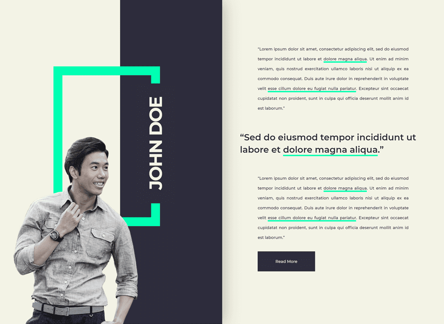
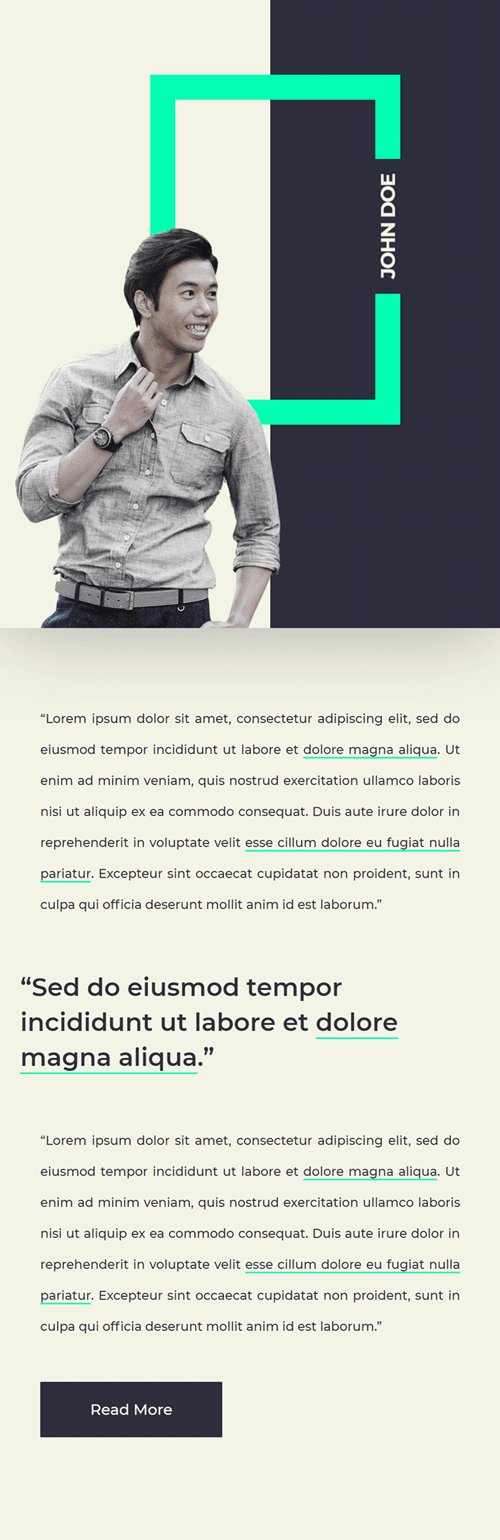
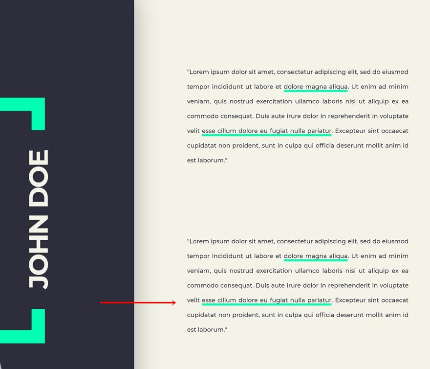
Preview
Before we dive into the tutorial, let’s take a quick look at the outcome across different screen sizes.
Desktop
Mobile
Download The Low Z Index Module Borders Layout for FREE
To lay your hands on the free low z index module borders layout, you will first need to download it using the button below. To gain access to the download you will need to subscribe to our newsletter by using the form below. As a new subscriber, you will receive even more Divi goodness and a free Divi Layout pack every Monday! If you’re already on the list, simply enter your email address below and click download. You will not be “resubscribed” or receive extra emails.

Subscribe To Our Youtube Channel
Let’s Start Recreating!
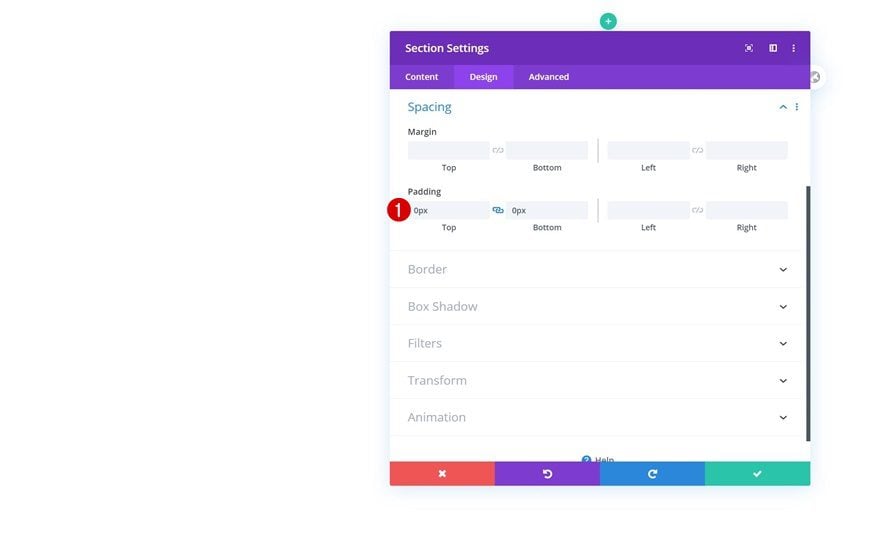
Add New Section
Spacing
Start by adding a new section to the page you’re working on. Open the section settings and remove the default top and bottom padding.
- Top Padding: 0px
- Bottom Padding: 0px
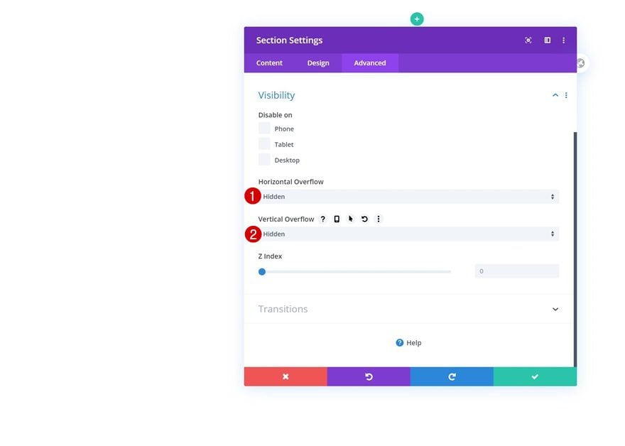
Overflows
Move on to the advanced tab and change the overflows.
- Horizontal Overflow: Hidden
- Vertical Overflow: Hidden
Add New Row
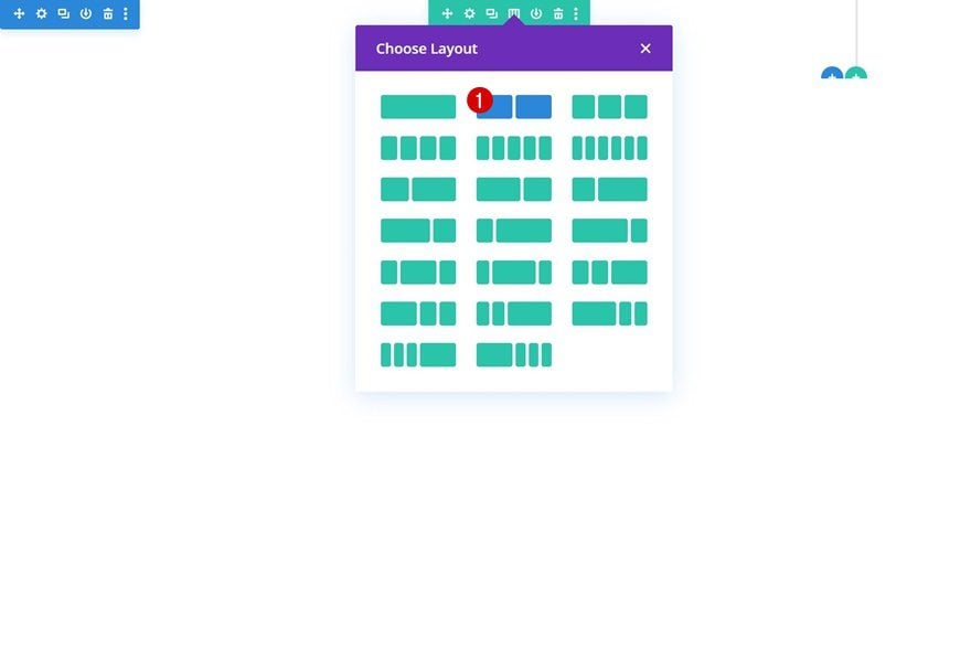
Column Structure
Continue by adding a new row using the following column structure:
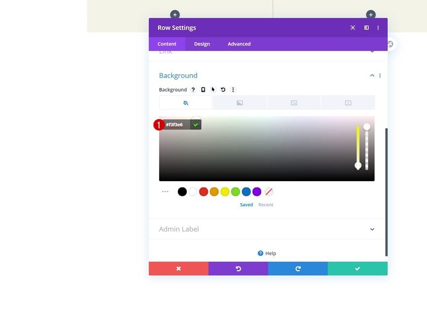
Background Color
Without adding any modules yet, open the row settings and change the background color.
- Background Color: #f3f3e6
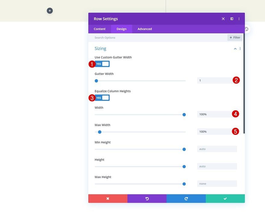
Sizing
Move on to the design tab and change the sizing settings accordingly:
- Use Custom Gutter Width: Yes
- Gutter Width: 1
- Equalize Column Heights: Yes
- Width: 100%
- Max Width: 100%
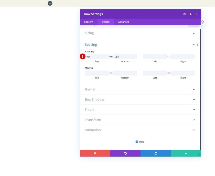
Spacing
Remove the default top and bottom padding of the row next.
- Top Padding: 0px
- Bottom Padding: 0px
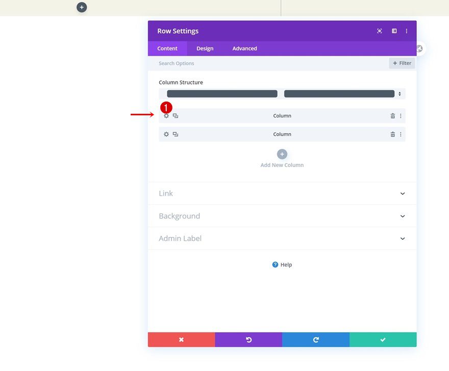
Column 1 Settings
Once you’ve completed the row settings, you can open the first column’s settings and make some changes.
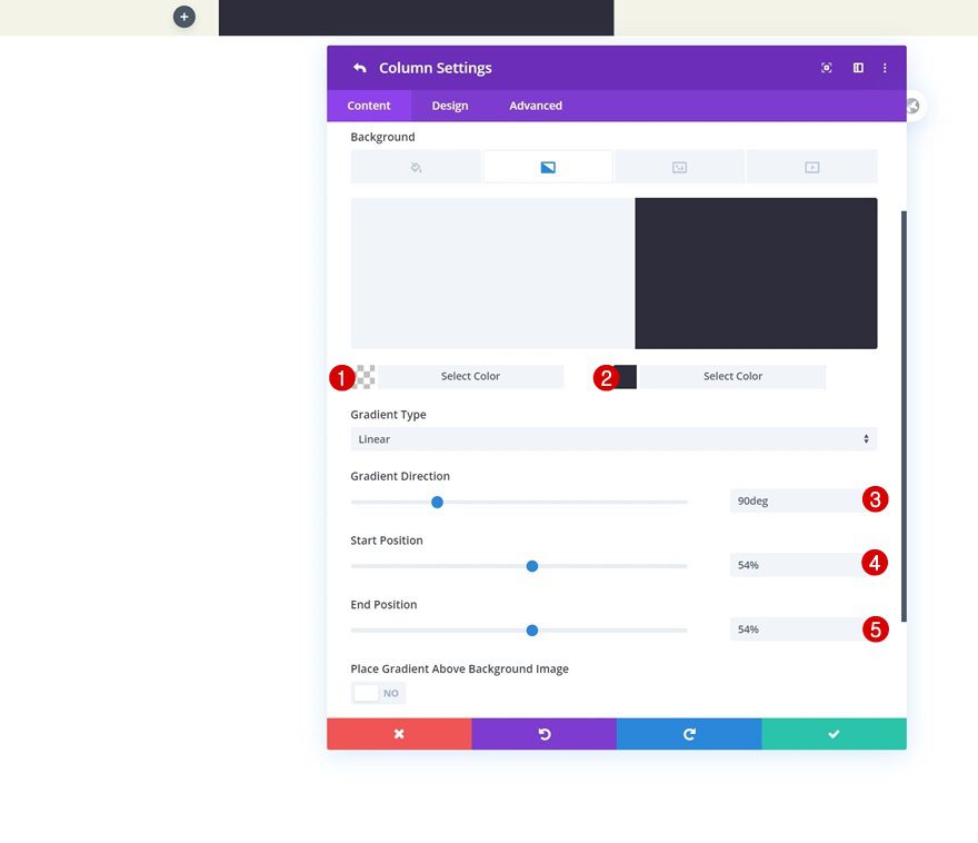
Gradient Background
Add a gradient background using the following settings:
- Color 1: rgba(0,0,0,0)
- Color 2: #2e2d3c
- Gradient Direction: 90deg
- Start Position: 54%
- End Position: 54%
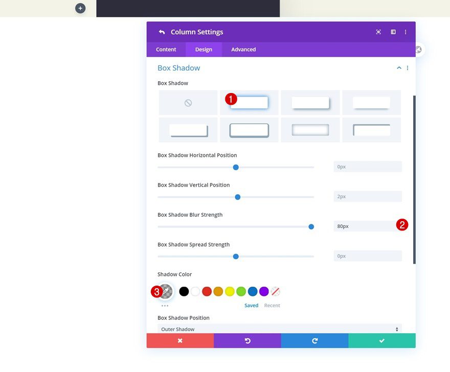
Box Shadow
Add a box shadow too.
- Box Shadow Blur Strength: 80px
- Shadow Color: rgba(0,0,0,0.3)
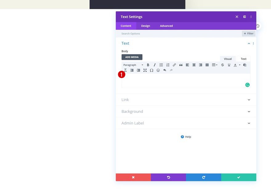
Add Text Module #1 to Column 1
Leave Content Box Empty
Time to start adding modules! Insert a Text Module in the first column and leave the content box empty. We’ll use this module for its built-in settings only. Because of its position (first module in first column), the module has a low z index and will appear below everything else that follows.
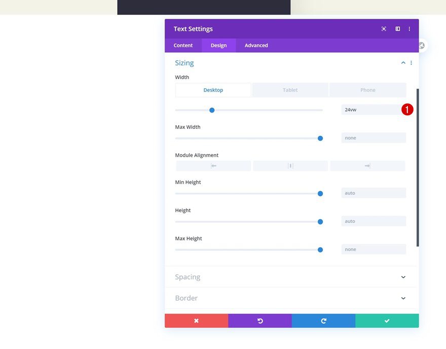
Sizing
Move on the design tab and change the width across different screen sizes.
- Width: 24vw (Desktop), 50vw (Tablet & Phone)
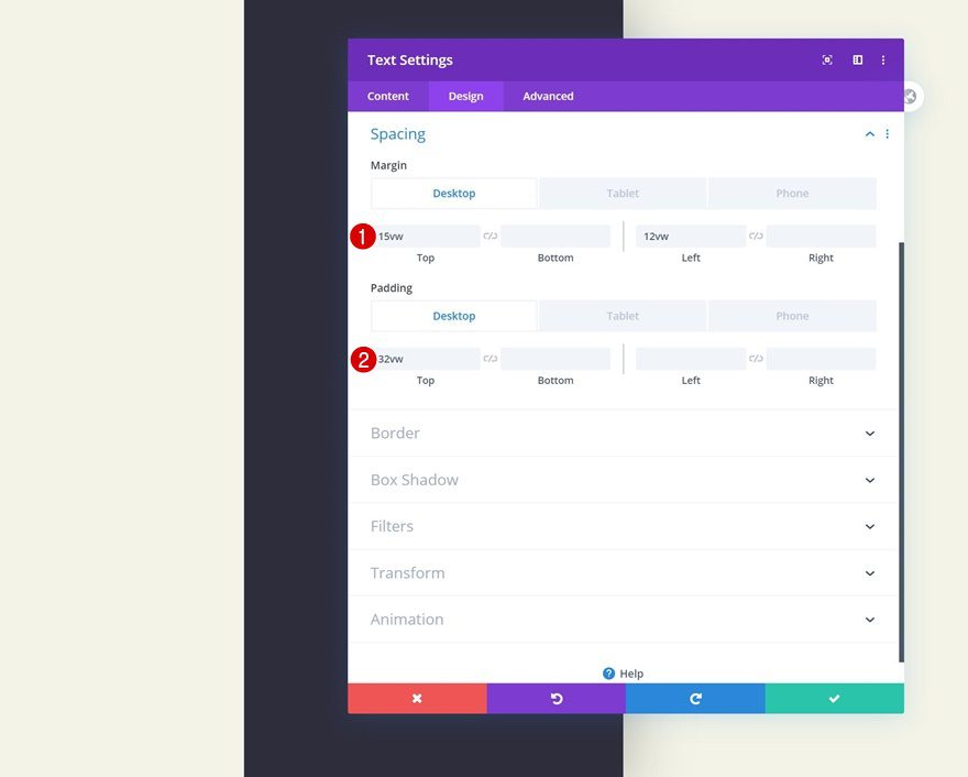
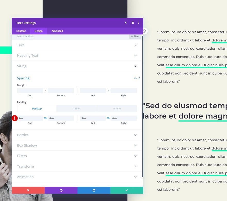
Spacing
Go to the spacing settings next and change the values as follows:
- Top Margin: 15vw
- Left Margin: 12vw (Desktop), 30vw (Tablet & Phone)
- Top Padding: 32vw (Desktop), 67vw (Tablet), 60vw (Phone)
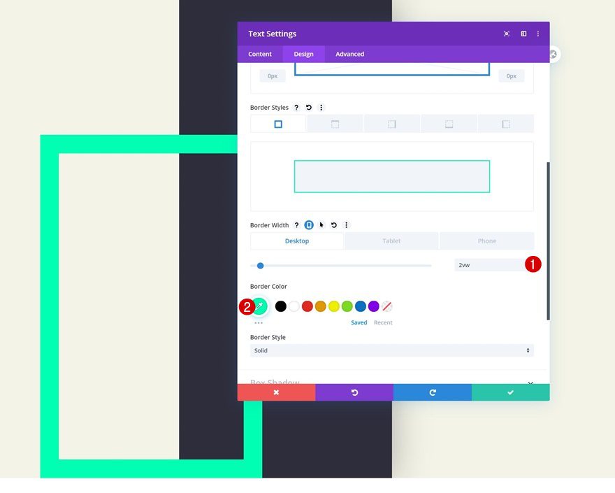
Border
Complete the module design by adding a border.
- Border Width: 2vw (Desktop), 4vw (Tablet), 5vw (Phone)
- Border Color: #00ffb2
Add Text Module #2 to Column 1
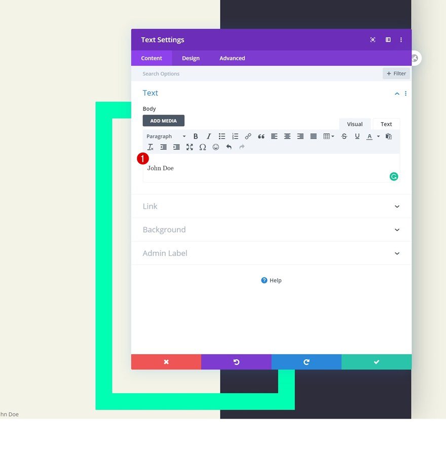
Add Content
Add another Text Module to column 1 and enter some content of your choice.
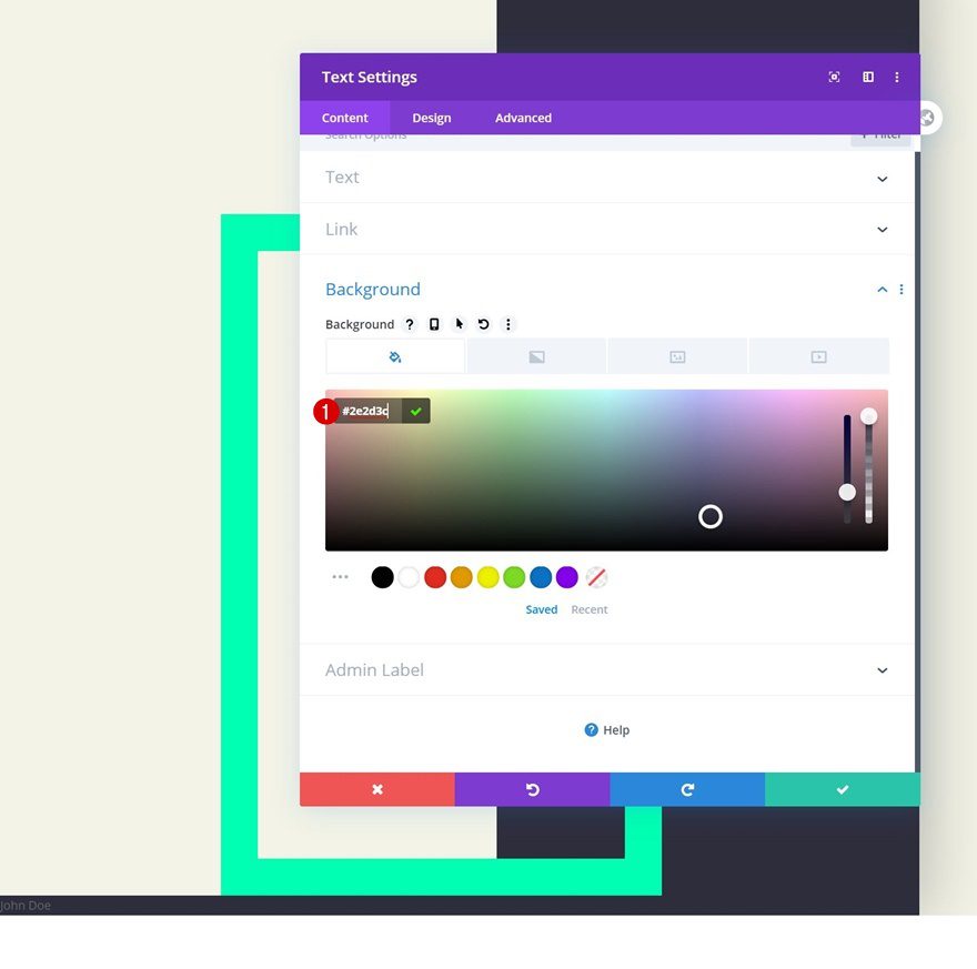
Background Color
Match the background color with the column’s second gradient color.
- Background Color: #2e2d3c
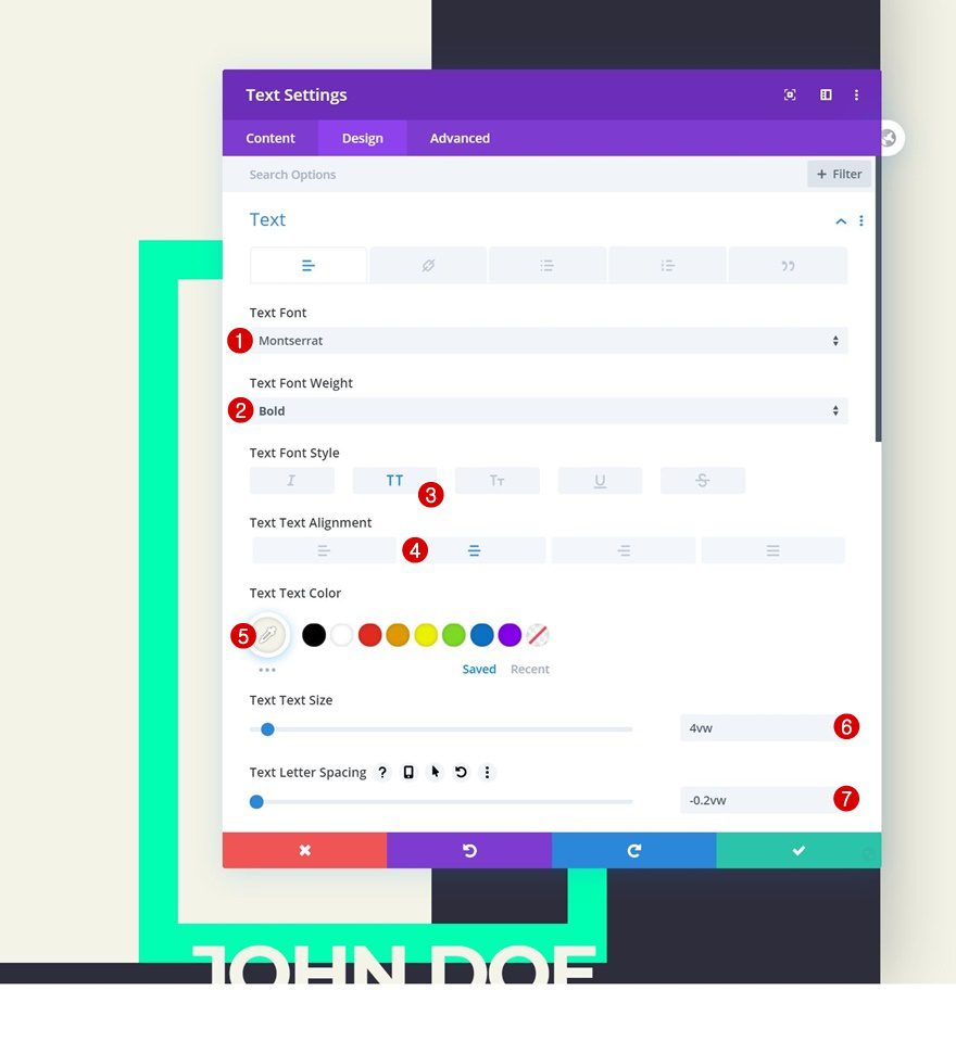
Text Settings
Move on to the design tab and change the text settings accordingly:
- Text Font: Montserrat
- Text Font Weight: Bold
- Text Font Style: Uppercase
- Text Alignment: Center
- Text Color: #f3f3e6
- Text Size: 4vw
- Text Letter Spacing: -0.2vw
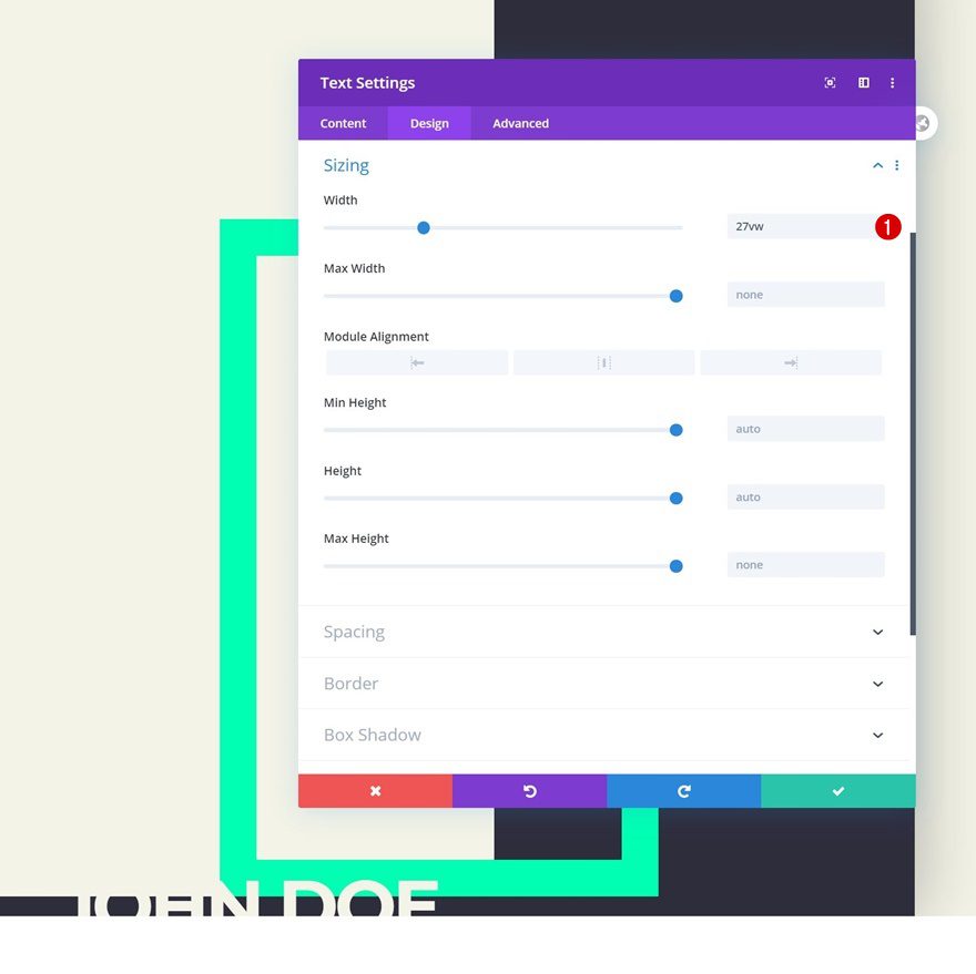
Sizing
Change the width too.
- Width: 27vw
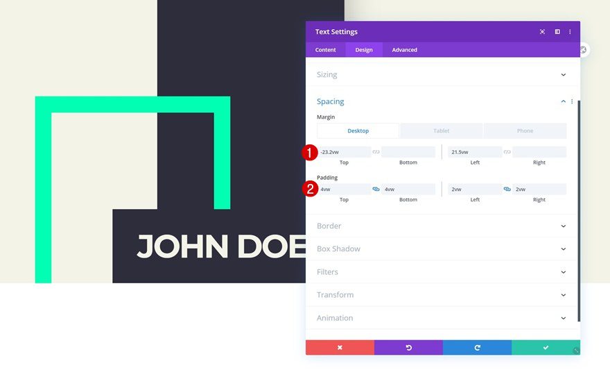
Spacing
Then, go to the spacing settings and play around with the values across different screen sizes.
- Top Margin: -23.2vw (Desktop), -46vw (Tablet & Phone)
- Left Margin: 21.5vw (Desktop), 64.5vw (Tablet), 64vw (Phone)
- Top Padding: 4vw
- Bottom Padding: 4vw
- Left Padding: 2vw
- Right Padding: 2vw
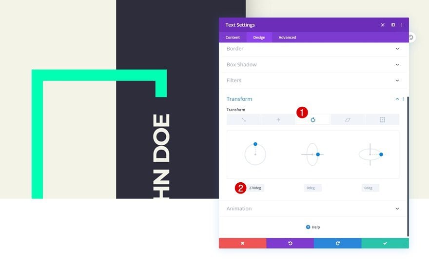
Transform Rotate
Complete the module’s settings by rotating the module in the transform settings.
- Left: 270deg
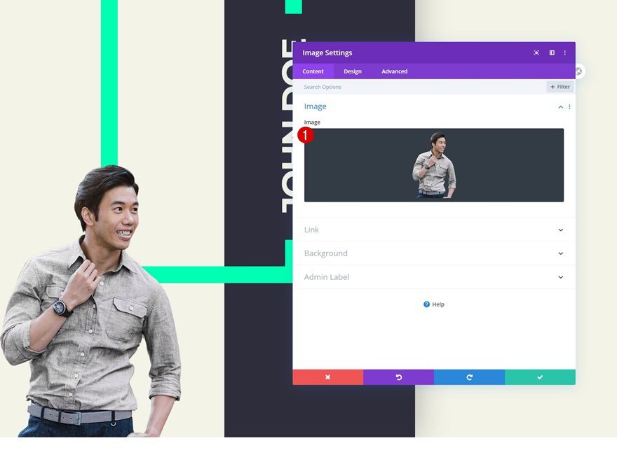
Add Image Module to Column
Upload Image
The next and last module we need in column 1 is an Image Module. Upload a semi-transparent image of your choice.
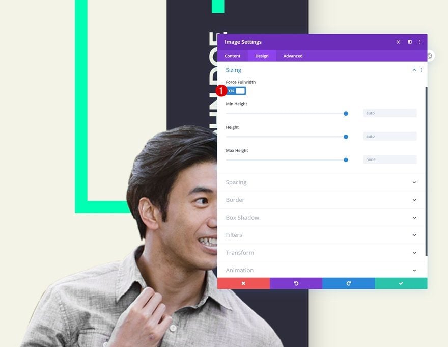
Sizing
Go to the design tab and enable the ‘Force Fullwidth’ option. This will help us make the image responsive across different screen sizes.
- Force Fullwidth: Yes
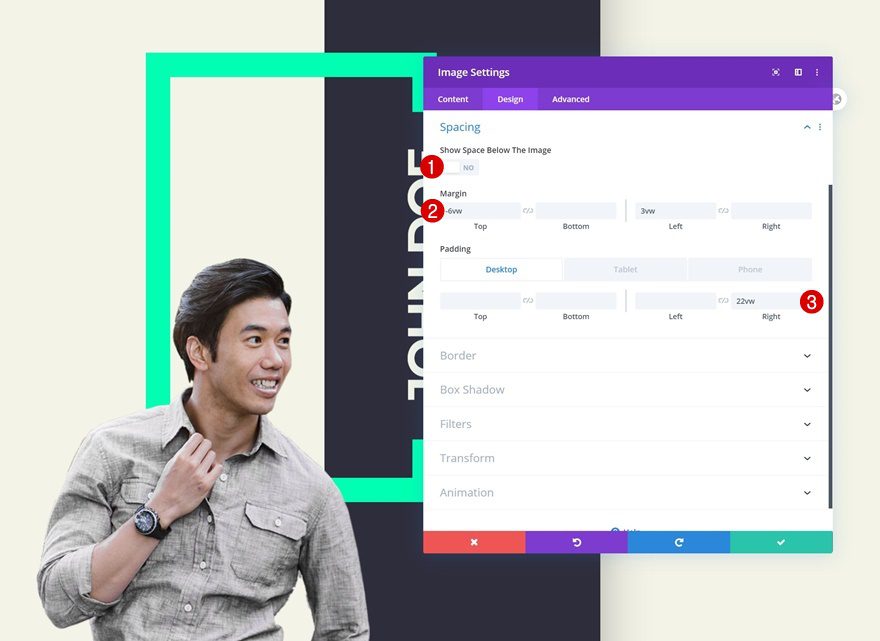
Spacing
Open the spacing settings next and change the values as follows:
- Show Space Below The Image: No
- Top Margin: -6vw
- Left Margin: 3vw
- Right Padding: 22vw (Desktop), 47vw (Tablet & Phone)
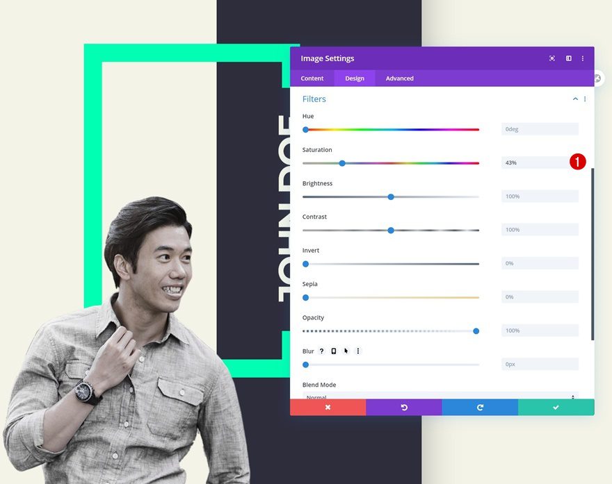
Filters
We’re also decreasing the saturation of the image in the filters settings.
- Saturation: 43%
Add Text Module #2 to Column 2
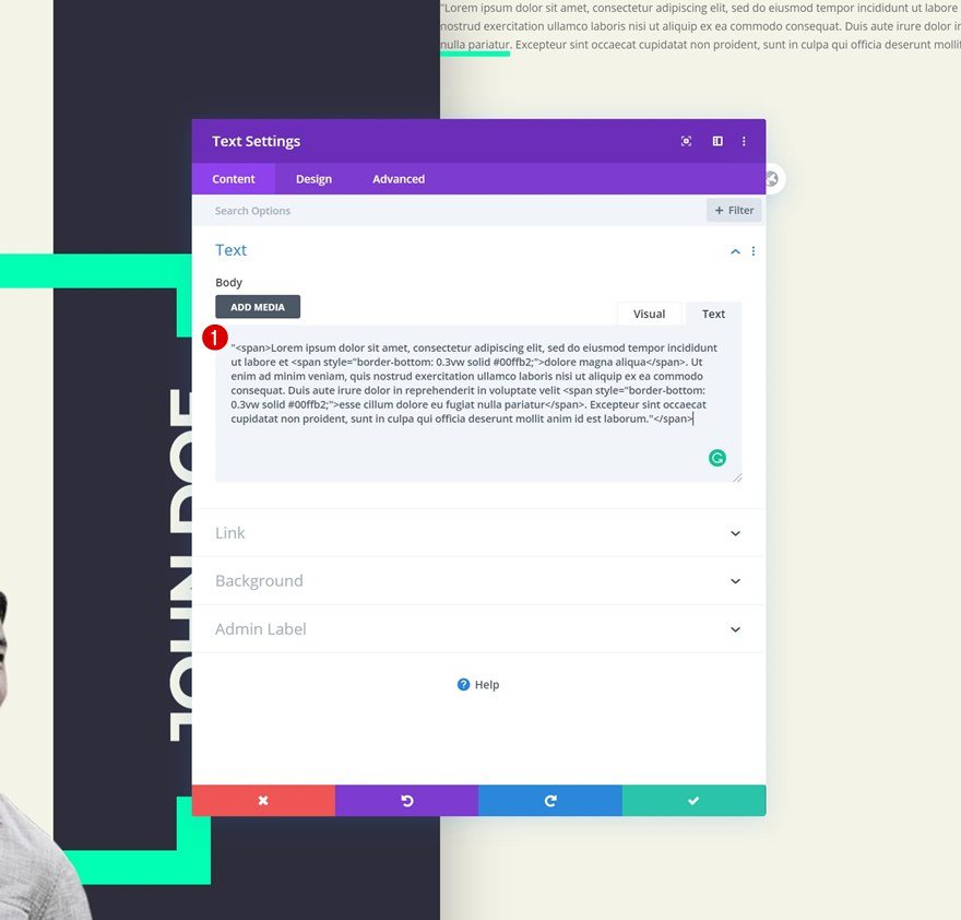
Add Content
On to the next column! Enter some content of your choice.
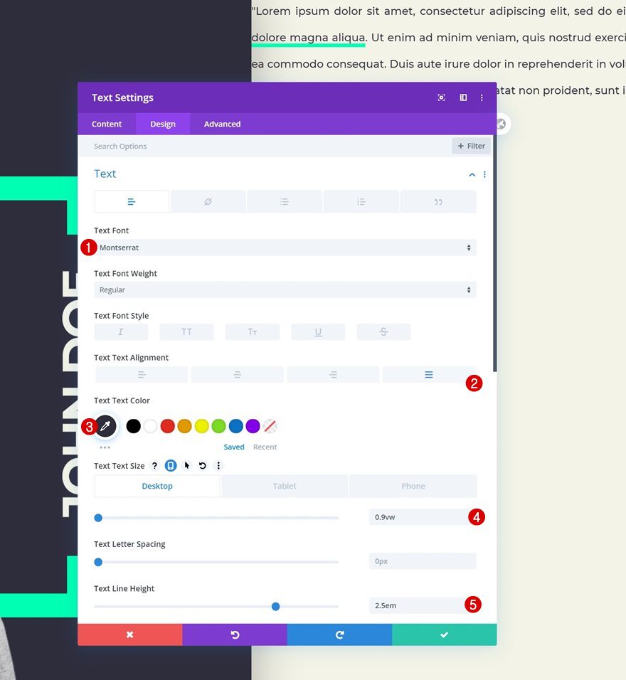
Text Settings
Move on to the design tab and change the text settings as follows:
- Text Font: Montserrat
- Text Alignment: Justify
- Text Color: #2e2d3c
- Text Size: 0.9vw (Desktop), 2.2vw (Tablet), 2.5vw (Phone)
- Text Line Height: 2.5em
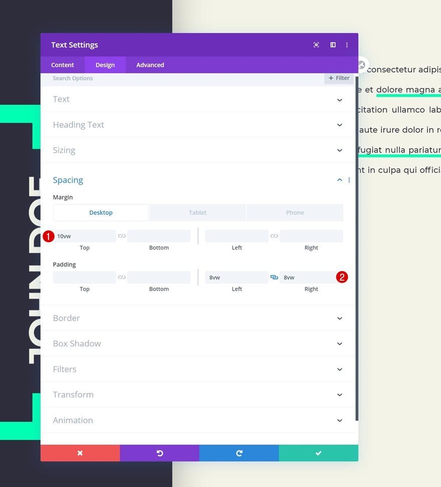
Spacing
Add some custom spacing values next.
- Top Margin: 10vw (Desktop), 15vw (Tablet & Phone)
- Left Padding: 8vw
- Right Padding: 8vw
Clone Text Module
Once you’ve completed the Text Module, clone it once.
Remove Top Margin
Remove the duplicate’s top margin.
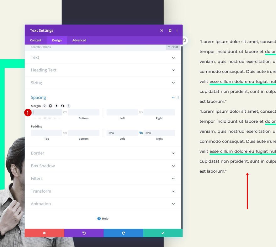
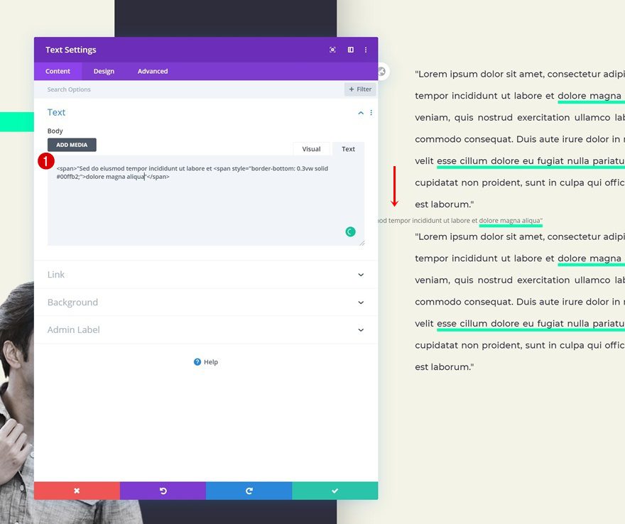
Place New Text Module Between Both Text Modules in Column 2
Add Content
Add another Text Module right between both existing Text Modules in the column and enter some content of your choice.
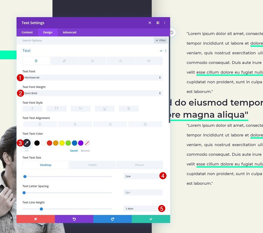
Text Settings
Change the text settings as follows:
- Text Font: Montserrat
- Text Font Weight: Semi Bold
- Text Color: #2e2d3c
- Text Size: 2vw (Desktop), 5vw (Tablet & Phone)
- Text Line Height: 1.4em
Spacing
Change the padding values too.
- Top Padding: 4vw (Desktop), 8vw (Tablet), 10vw (Phone)
- Bottom Padding: 4vw (Desktop), 8vw (Tablet), 10vw (Phone)
- Left Padding: 4vw
- Right Padding: 4vw
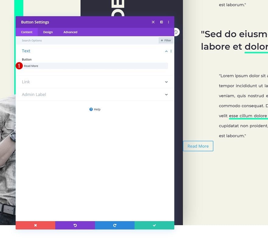
Add Copy
On to the next and last Button Module. Insert some copy of your choice.
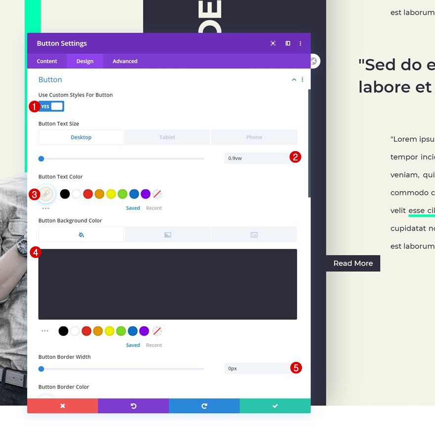
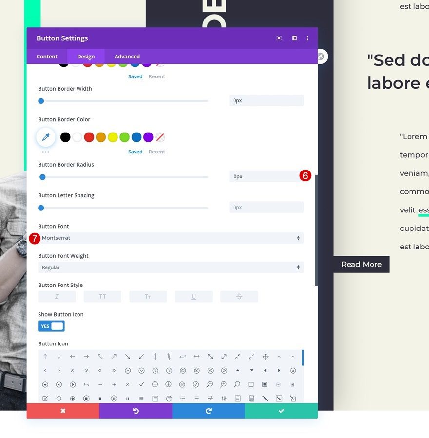
Button Settings
Move on to the design tab and change the button settings.
- Use Custom Styles For Button: Yes
- Button Text Size: 0.9vw (Desktop), 2.5vw (Tablet), 3vw (Phone)
- Button Text Color: #f3f3e6
- Button Background Color: #2e2d3c
- Button Border Width: 0px
- Button Border Radius: 0px
- Button Font: Montserrat
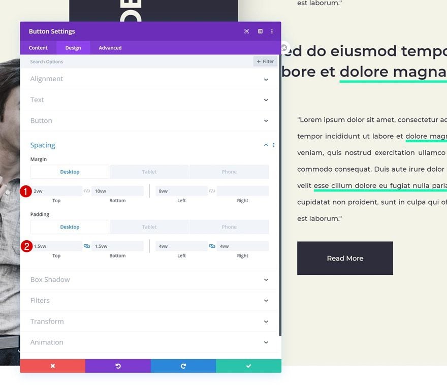
Spacing
Complete the Button Module design by adding some custom spacing values and you’re done!
- Top Margin: 2vw (Desktop), 8vw (Tablet & Phone)
- Bottom Margin: 10vw (Desktop), 15vw (Tablet & Phone)
- Left Margin: 8vw
- Top Padding: 1.5vw (Desktop), 2.5vw (Tablet), 3vw (Phone)
- Bottom Padding: 1.5vw (Desktop), 2.5vw (Tablet), 3vw (Phone)
- Left Padding: 4vw (Desktop), 8vw (Tablet), 10vw (Phone)
- Right Padding: 4vw (Desktop), 8vw (Tablet), 10vw (Phone)
Preview
Now that we’ve gone through all the steps, let’s take a final look at the outcome across different screen sizes.
Desktop
Mobile
Final Thoughts
In this post, we’ve shown you how to creatively use an empty module’s low z index border settings to create a stunning result. We’ve also included some rotated copy in our design. This tutorial goes to show how versatile Divi’s built-in options are and how you can tweak each element’s settings to make it match with different screen sizes. If you have any questions or suggestions, make sure you leave a comment in the comment section below!
If you’re eager to learn more about Divi and get more Divi freebies, make sure you subscribe to our email newsletter and YouTube channel so you’ll always be one of the first people to know and get benefits from this free content.


I tried several times to build the page using the tutorial in detail. I could not get my layout to work. I lost the column module add icon. The section frame disappeared and the image was lost behind the footer below.
I tried importing the json file and divi give message “this file should not be imported”
Frank, you have to import it via the Divi Library. At the top, left. There is the import button.
And then on your page, go to the Divi builder, and klick on that “+” to add it to the page.
DIVI… some bloggger says DIVI is great. But I’m not trying it yet…
Nice ‘minimal’ design! For both desktop and mobile.
Thanks you!
Anytime, Joost! 🙂
and the fact is very simple u know, but i am still had some problem here
I say it looks nice.
Happy you like it, Richard! 🙂