
When building a landing page for specific products, whether it’s a new launch or a sale you’re preparing for, chances are high you’ll use the Shop Module at some point. Divi and its Shop Module allows you to dynamically pull products from the WooCommerce plugin and style the products using Divi’s built-in options. Now, by default, the shop module comes with a few column structures that all translate into two columns on smaller screen sizes. This means that the more products you choose to show, the more vertical scrolling is required to get to the next part of your landing page.
In modern web design, an often-used technique to limit vertical scrolling and show items based on your visitors’ preference is using swipe cards. In this tutorial, we’ll show you how to turn the Divi Shop Module into dynamic product swipe cards on smaller screen sizes without using a plugin. We’ll start by preparing the different elements in our product section and use a small amount of CSS code to enable the swipe effect. This is a great way to show a wide range of products within your landing page without overwhelming your visitors. You’ll be able to download the JSON file for free as well!
Let’s get to it.
Preview
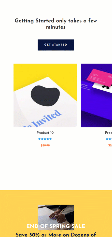
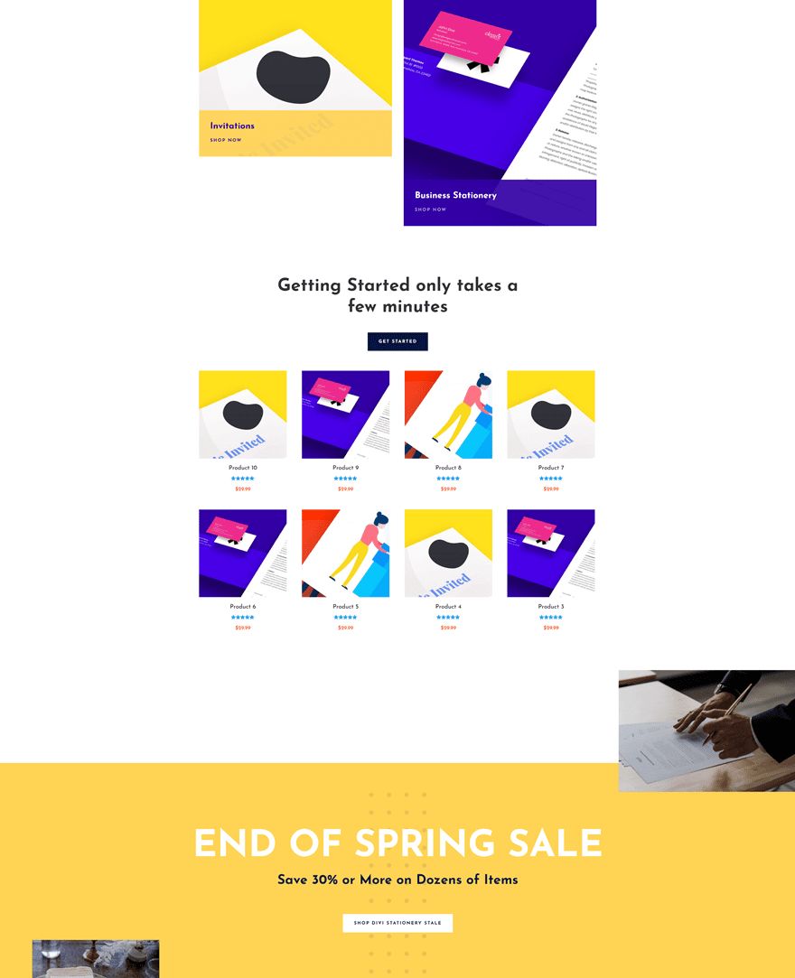
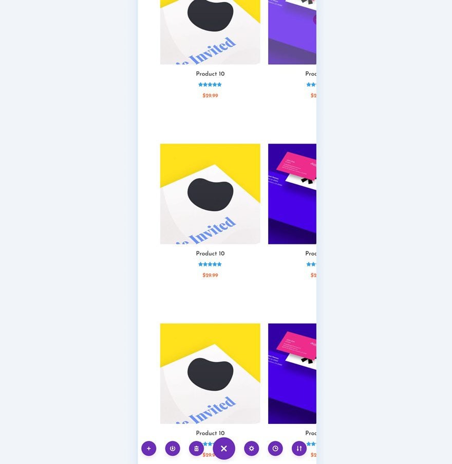
Before we dive into the tutorial, let’s take a quick look at the outcome. We’re only enabling the product swipe cards on tablet and mobile. On desktop, we’re keeping the column structure we determine inside the Shop Module.
Mobile
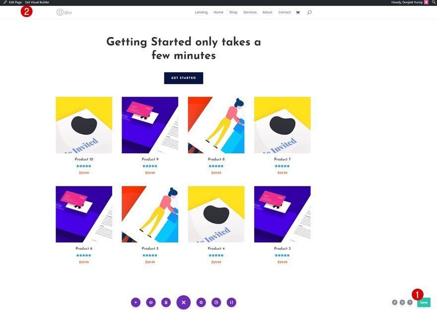
Desktop
Download The Product Swipe Cards Layout for FREE
To lay your hands on the free product swipe cards layout, you will first need to download it using the button below. To gain access to the download you will need to subscribe to our newsletter by using the form below. As a new subscriber, you will receive even more Divi goodness and a free Divi Layout pack every Monday! If you’re already on the list, simply enter your email address below and click download. You will not be “resubscribed” or receive extra emails.

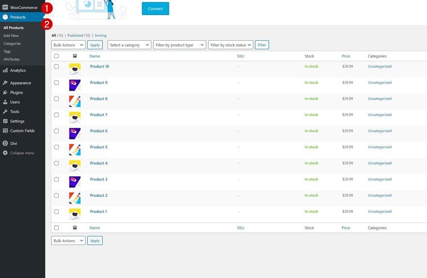
1. Set up WooCommerce & Product Pages
Before getting into the Divi part of this tutorial, it’s important to have the WooCommerce plugin installed and activated on your website. If you haven’t already, add several products, depending on how many products you want to display in your Shop Module.
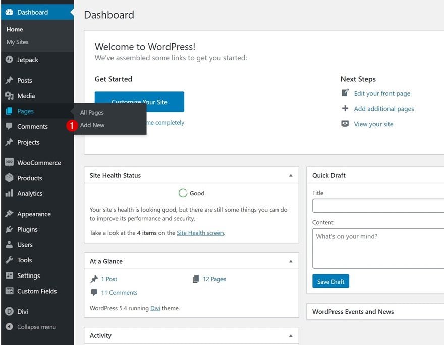
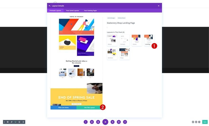
2. Create New Page & Upload Stationery Landing Page Layout
Create New Page
Once you have the products in place, add a new page inside your WordPress backend. Give your page a title, publish the page and enable Divi’s Visual Builder.
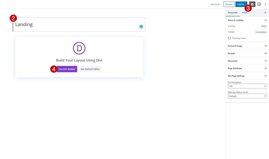
Upload Stationery Landing Page Layout
Once inside your new page, navigate to your premade layouts and upload the Stationery Shop Landing Page layout. Although we’re using this specific layout, you’re free to use any other layout of your choice, as long as you add or locate a shop module inside that layout.
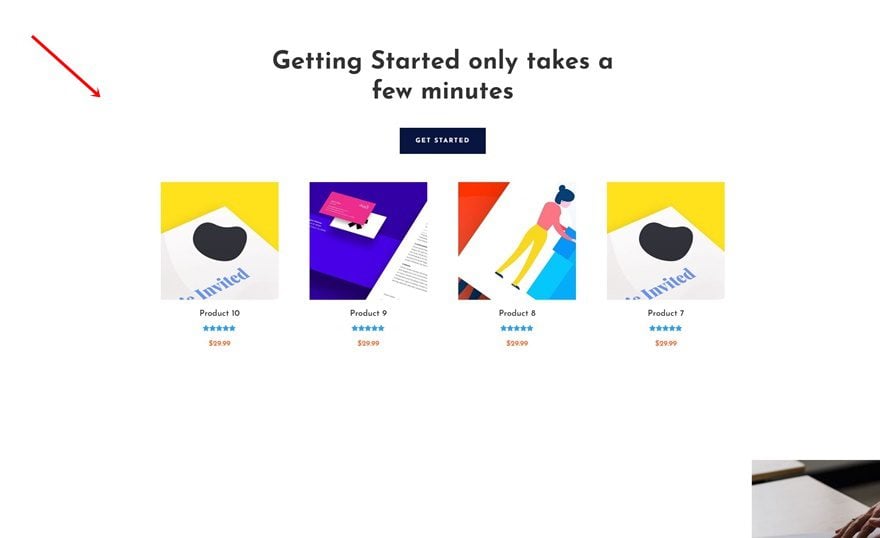
3. Modify Shop Section
Locate Section with Shop Module
If we scroll down our new page we’ve built using the Stationery Shop Landing Page layout, we’ll come across a section with a Shop Module. We’ll use this section throughout the next steps of this tutorial.
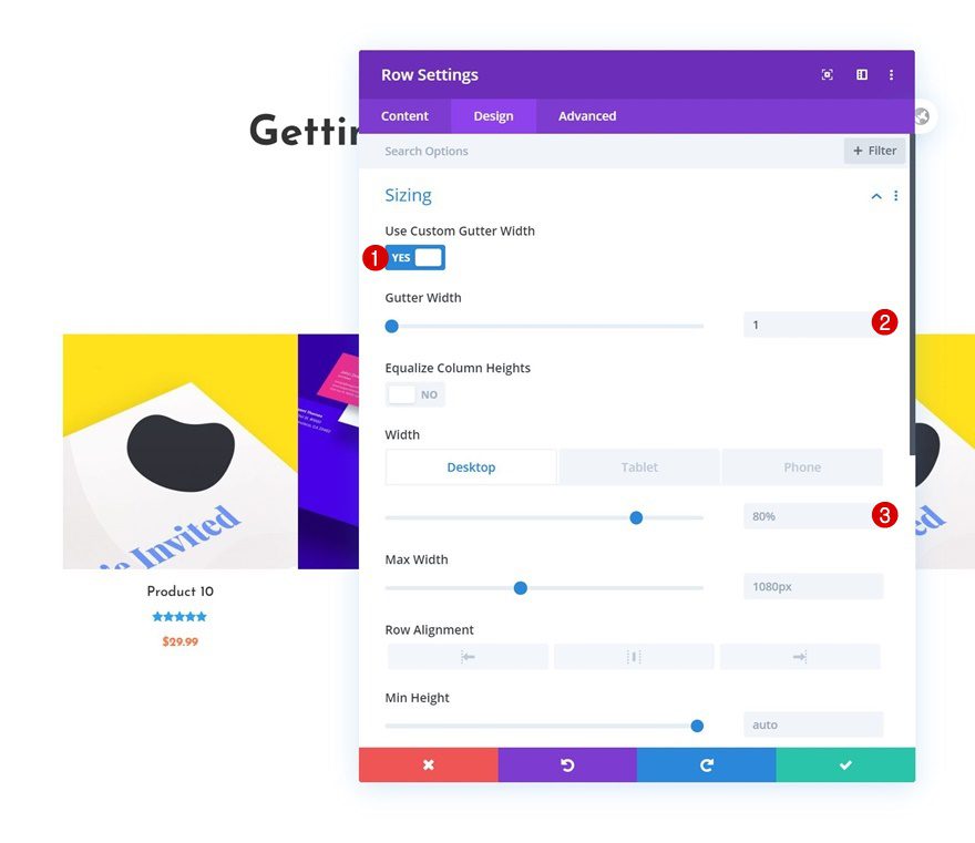
Row Settings
Responsive Sizing
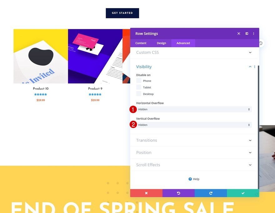
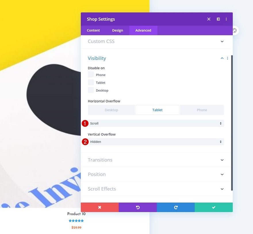
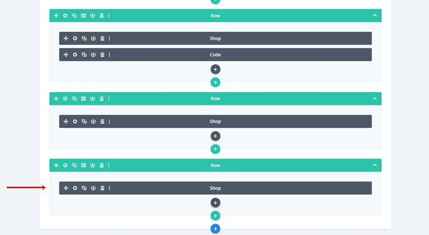
Start by opening the row settings of the row containing the Shop Module. As mentioned before, we’re keeping the same design on desktop, we’ll only enable the product swipe cards on smaller screen sizes. To create an effortless experience, we’ll allow the row to touch the left and right side of our screen by changing the width in the sizing settings.
- Use Custom Gutter Width: 1
- Width: 80% (Desktop), 100% (Tablet & Phone)
Visibility
We’ll also make sure nothing surpasses the row container by setting the visibility settings to hidden.
- Horizontal Overflow: Hidden
- Vertical Overflow: Hidden
Shop Module Settings
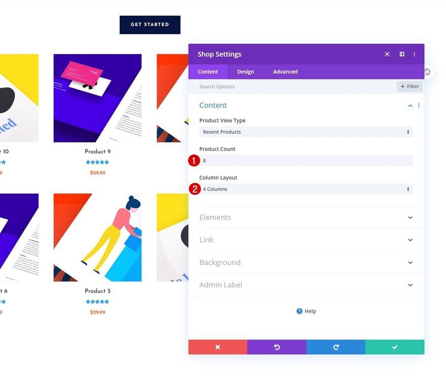
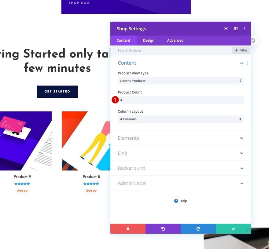
Pick Product Count & Desktop Column Structure of Choice
Then, we’ll open the Shop Module settings. The changes we make in our CSS Code (which we’ll add later on) depend on the number of products we’re showing. We’ll start by showing you how to turn a Shop Module with 8 products into product swipe cards. You can pick any column layout of your choice for desktop.
- Product Count: 8
- Column Layout: 4 Columns
Responsive Sizing
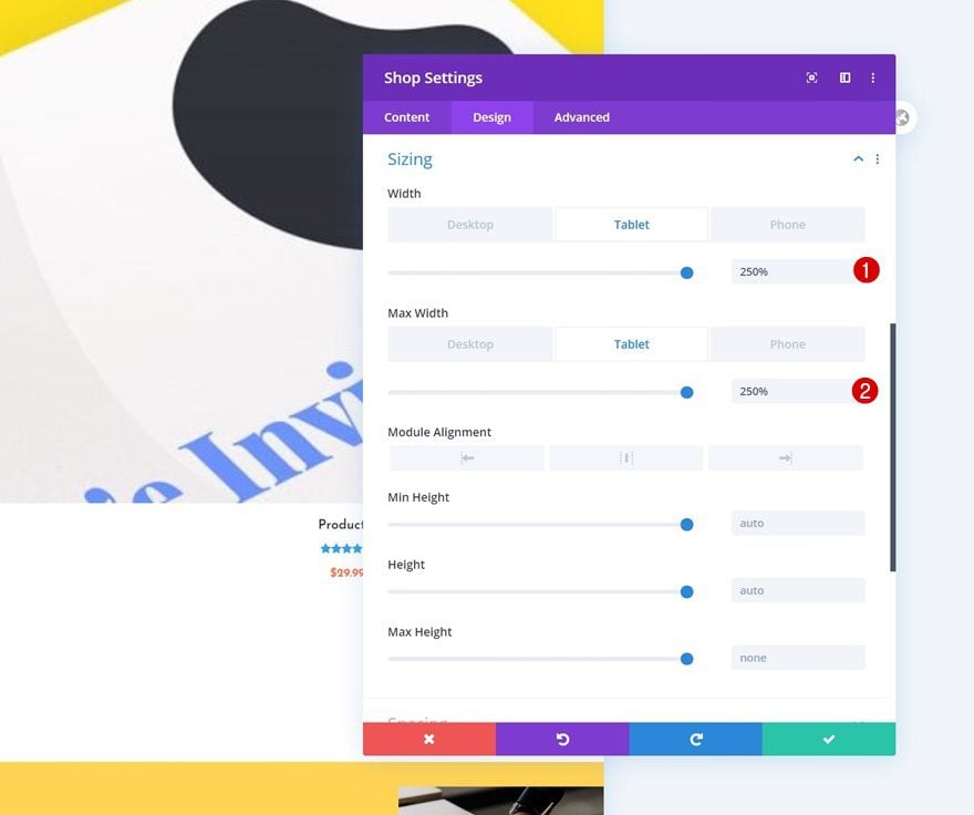
To increase the size of our shop module, we’ll modify the sizing settings in the design tab. Notice how we’re only doing this for tablet and phone.
- Width: 100% (Desktop), 250% (Tablet & Phone)
- Max Width: 100% (Desktop), 250% (Tablet & Phone)
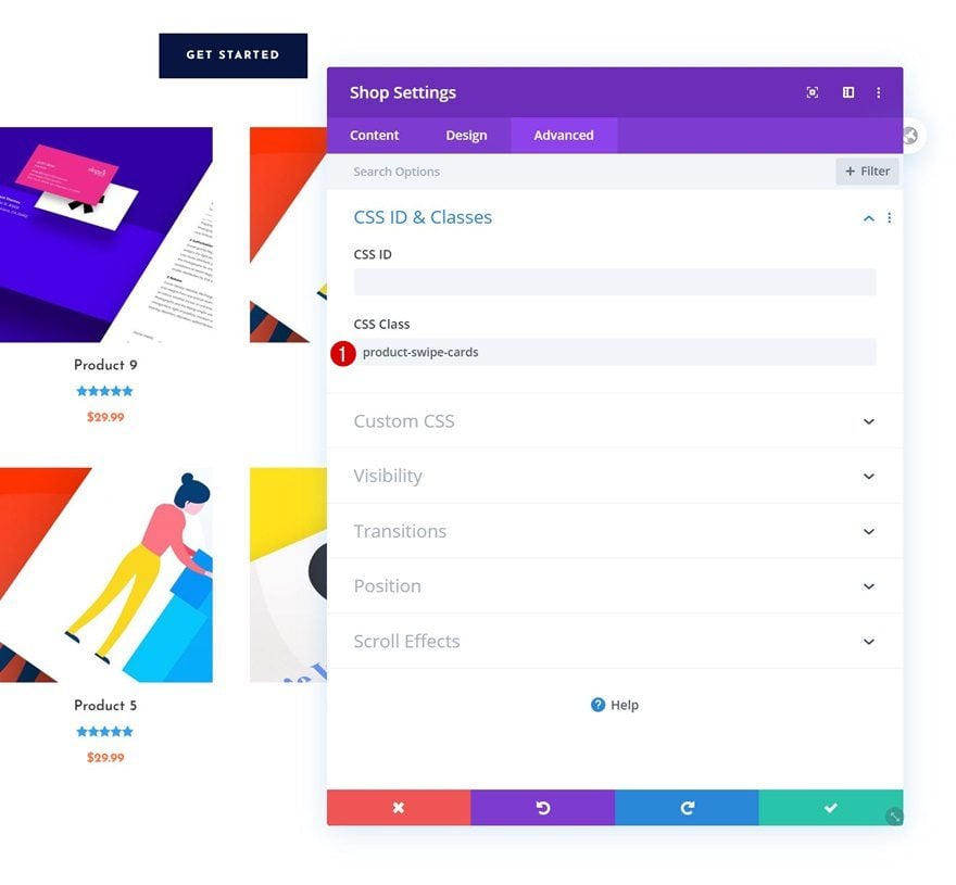
CSS Class
We’ll also add a CSS class to our shop module. Later on, when we add the CSS code, we’ll be able to transform the Shop Module that carries this CSS class only. In other words, if you want another Shop Module to show up in a normal state, leaving out this CSS class will allow you to do that.
- CSS Class: product-swipe-cards
Responsive Overflows
We’ll complete the row settings by changing the visibility settings across different screen sizes. As you can notice in the settings, we only want the scroll effect to occur on smaller screen sizes.
- Horizontal Overflow: Hidden (Desktop), Scroll (Tablet & Phone)
- Vertical Overflow: Hidden
Add Code Module Below Shop Module
Once you’ve modified the Shop Module, you can add a Code Module right below it.
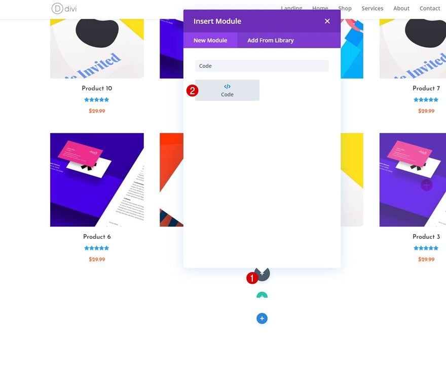
Add CSS Code to Module
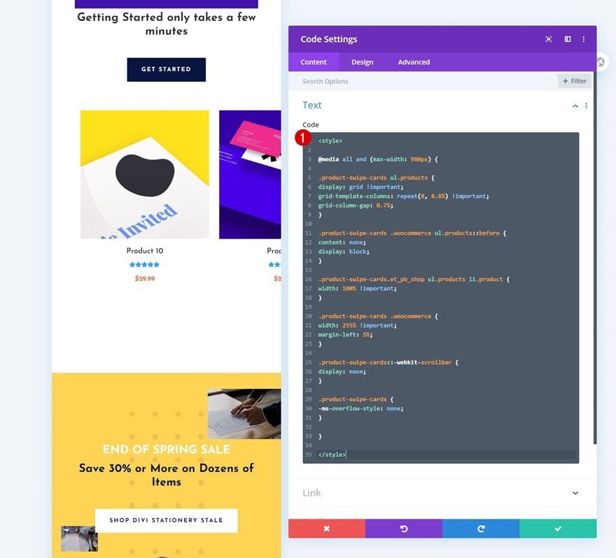
The following CSS code will automatically turn our 8-product Shop Module into responsive product swipe cards:
<style>

@media all and (max-width: 980px) {

.product-swipe-cards ul.products {
display: grid !important;
grid-template-columns: repeat(8, 8.8%) !important;
grid-column-gap: 0.7%;
}

.product-swipe-cards .woocommerce ul.products::before {
content: none;
display: block;
}

.product-swipe-cards.et_pb_shop ul.products li.product {
width: 100% !important;
}

.product-swipe-cards .woocommerce {
width: 255% !important;
margin-left: 5%;
}

.product-swipe-cards::-webkit-scrollbar {
display: none;
}

.product-swipe-cards {
-ms-overflow-style: none;
}

}

</style>
Matching Different Product Counts
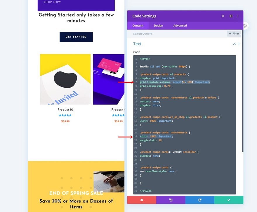
Now, if you’re looking to add less (or more) products in your shop module, the code slightly changes in two places. These two places have to be manually modified to match the desired outcome. Let’s change the product count in our Shop Module to ‘4’, for instance.
- Product Count: 4
When we go back to our code, there are two changes we’ll need to make. First, we’ll have to change the grid template columns. Instead of 8, we’re using 4 (same number as our product count). We’re also increasing the size in percentage these products take up in our product swipe cards (the more products, the less space).
grid-template-columns: repeat(4, 14%) !important;
Then, we’ll also modify the width of the container the products are placed in. For 4 products, this equals 150%. These values are not set in stone, they’re achieved by playing around and finding a harmony between the grid template columns and the container width. To find the right balance, switch over to mobile view inside the Visual Builder and tweak the values carefully while viewing the outcome of these changes.
width: 150% !important;
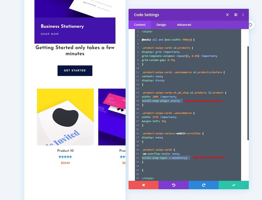
Add Scroll Snapping
If you want to take the user experience one step further in your product swipe card design, you can add scroll snapping too. Scroll snapping helps your visitors scroll by snapping to the beginning of a new product. This means that their swipe doesn’t have to be exact, the scroll snapping will at one point take over and show adjust their position inside the horizontal scrolling mechanism. To enable scroll snapping on your product swipe cards, add one line of CSS code to each product individually in the CSS code (see print screen below).
scroll-snap-align: start
We’ll also enable the scroll snapping on our shop module by adding the following line of CSS code:
scroll-snap-type: x mandatory
Reuse Shop Module to Display Other Categories
Clone Entire Row Once
Once you’ve completed the first product swipe card set, you can clone the entire row once.
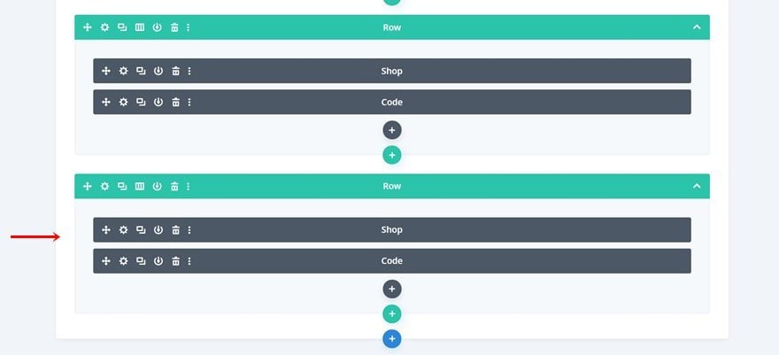
Delete Code Module in Duplicate Row
As long as your Shop Module contains the same CSS class as the previous one did, one Code Module will do. Go ahead and delete the Code Module in your duplicate row.
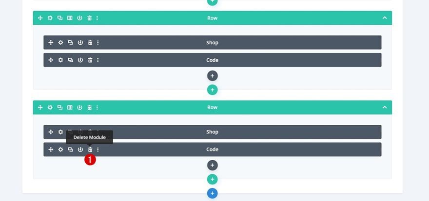
Clone Duplicate Row as Much as Wanted
And clone the duplicate row now as many times as needed, depending on how many product swipe card sets you want to display on your landing page!
4. Save Page Changes & View Outcome on Mobile Device
Make sure that once you’re done adding the product swipe cards, you save your page before exiting the Visual Builder and you’re done!
Preview
Now that we’ve gone through all the steps, let’s take a final look at the outcome across different screen sizes.
Mobile
Desktop
Final Thoughts
In this post, we’ve shown you how to turn the built-in Divi Shop Module into product swipe cards on smaller screen sizes. On desktop, we’ve maintained the original column structure assigned to the Shop Module. Using product swipe cards allows you to add endless products to a horizontal swipe mechanism without overwhelming your visitors with vertical scrolling.
It’s an often-used trend in modern web design because it focuses on user behavior and makes it easier to access a wide range of items on smaller screen sizes. You can use these product swipe cards on any page you want but it’s particularly convenient for product landing pages you build. You were able to download the layout’s JSON file for free as well! If you have any questions or suggestions, feel free to leave a comment in the comment section below.
If you’re eager to learn more about Divi and get more Divi freebies, make sure you subscribe to our email newsletter and YouTube channel so you’ll always be one of the first people to know and get benefits from this free content.


Hi,
How can I make the + icon on hover to open the product when clicked. Currently, it does nothing.
Many thanks!
Very super nice idea. I apply the same concept using the flexbox intead the grid layout in combination with rows and columns. The page reduction is really huge and the result is great! Thank you so much.
If can help:
Section: used with 100% [desktop] | 300% [mobile and tablet] in width and max width; Ovreflow-X: scroll [mobile and tablet]
Rows: display: flex; flex-direction: row; flex-wrap: nowrap;
Columns: i have also user a flexbox but is related to my personal design in combination to flex-basis (different column size)
Very nice job Donjete,
But how can we apply that to a row of 4 images modules for example, to make them swippable like you did ?
Thank you it is working for me, but there is not enough space between each product. How to fix that ?
Thank you 😀
Or just use a plugin?
It’s like you all read my mind. I implemented something similar yesterday with testimonials and also related projects.
Thanks for this implementation! It’s clean and I’ll use it for something 😁
pls can you show me how you did this or a video link .
Can be applied to the picture blurb blog module?
Can this be applied to the portfolio module? If so, how?
pls can you answer this am also in of this