
Stacking typography is an easy and effective technique for creating beautiful heading designs in Divi. Typography is often used strictly as an abstract design element in ways that don’t really contribute to the content read by search engines. But you can also get creative with the design of actual headings (h1, h2, etc.) with a few Divi techniques.
In this tutorial, I’m going to use Divi to create 5 different heading designs with stacked type. Hopefully, you will be able to use these designs as inspiration for your own heading designs.
Let’s get started.
Sneak Peek
Here is a peek at the 5 designs.
Design #1
Design #2
Design #3
Design #4
Design #5
Getting Started
We are going to be building these designs from scratch. So to get started, create a new page, give your page a title, and deploy the Visual Builder. Select the option “Build from Scratch” and you are ready to start building.
In order to simplify the process of creating each of the 5 designs, I will be duplicating sections to get a headstart on the next design. So it would be best to create these designs in order starting with the first one.
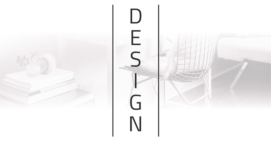
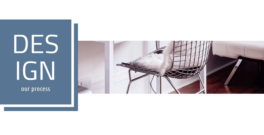
Heading Design #1
For this first design, I’m going to show you how to vertically stack your heading text and center it in the middle of the row. I’m also going to add two layers of gradient (one on the section and one on the row) over the background image in order to give a balanced semi transparent white overlay that blends in perfectly with white page backgrounds. The result is subtle but very unique and clean.
Before we add our text module, let’s first take care of the section and row settings. This will make adjusting the module a lot easier later on.
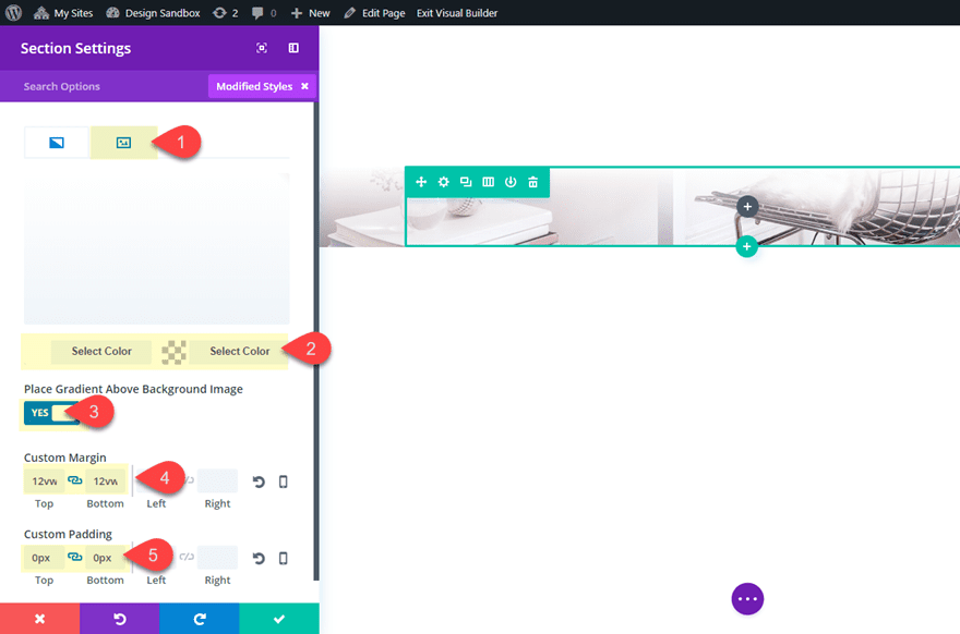
Go to the section settings and update the following:
Add a background image (at least 1920px wide)
Background Gradient Left Color: #ffffff
Background Gradient Right Color: rgba(255,255,255,0)
Place Gradient Above Background Image: YES
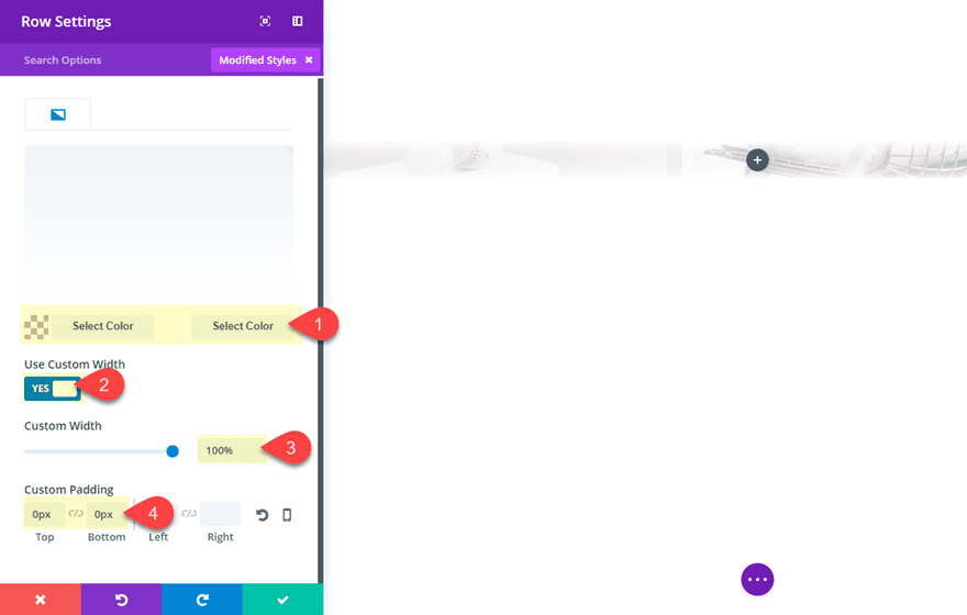
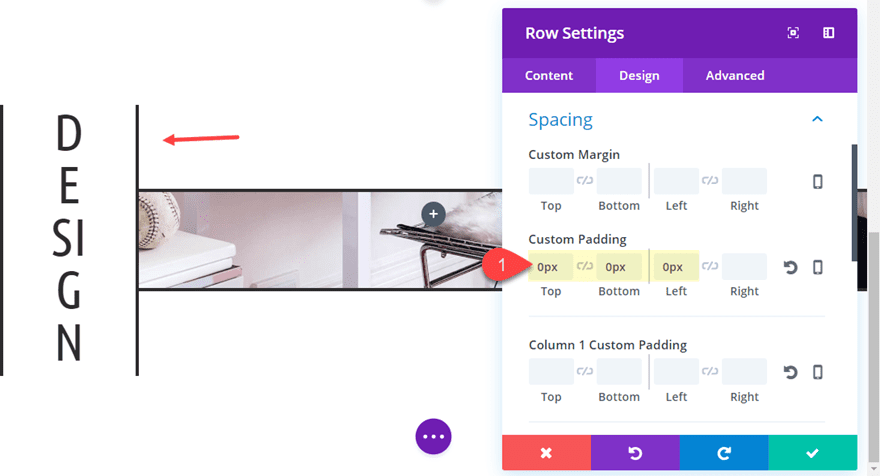
Next, update the row settings as follows:
Background Gradient Left Color: rgba(255,255,255,0)
Background Gradient Right Color: #ffffff
Custom Width: 100%
Custom Padding: 0px Top, 0px Bottom
Now we can add our text module to the middle column of our three column row. Then update the text module settings as follows:
Replace the mock content in the content box with an h2 header that reads “design” like this:
<h2>design</h2>
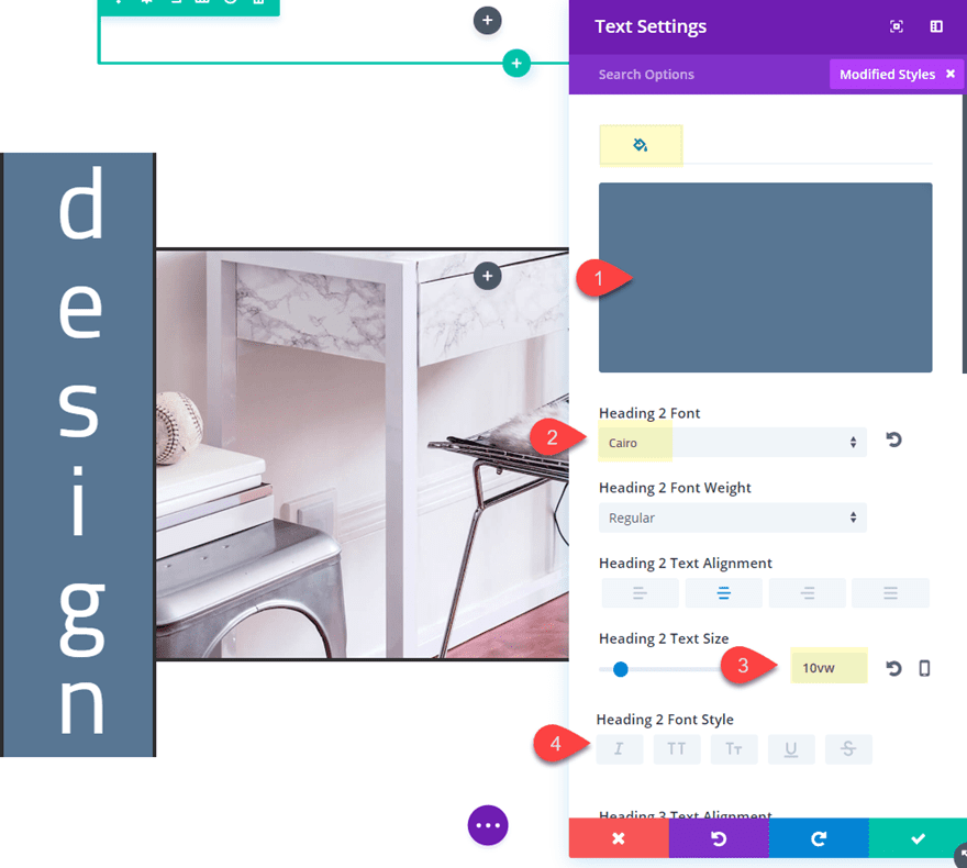
Then update the rest of the settings as follows:
Heading 2 Font: Cairo
Heading 2 Font Weight: Regular
Heading 2 Font Style: Uppercase (TT)
Heading 2 Text Size: 8vw
Width: 58% (desktop), 16% (tablet), 18% (smartphone)
Module Alignment: Center
Custom Margin: -10vw Top, -10vw Bottom
The custom width values combined with the 8vw heading text size is the key to making this design. The custom width squeezes the text so that each letter stacks on top of each other. The width percentage value changes drastically on tablet because the column size holding the text module goes from being 1/3 to fullwidth. Setting the heading text to a vw (viewport width) length unit will allow the text to scale perfectly with the browser window size.
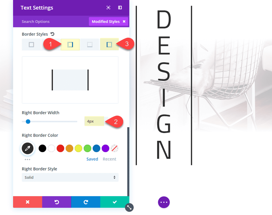
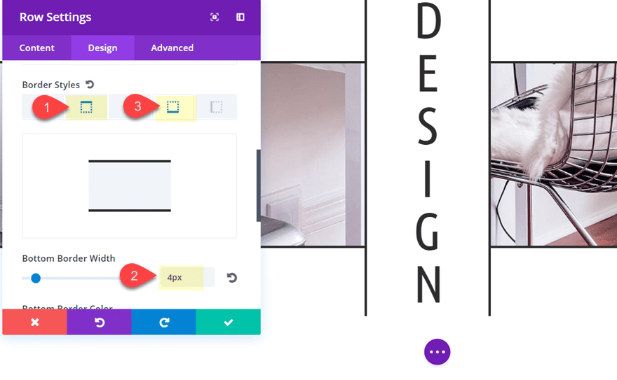
Finally, let’s finish off the design with a border on the right and left side.
Right Border Width: 4px
Left Border Width: 4px
Here is the final result.
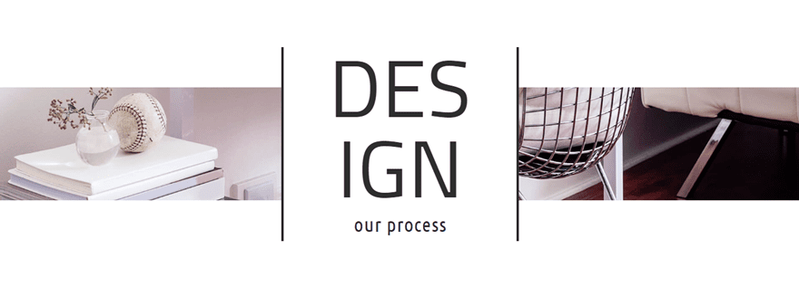
Heading Design #2
For this next example, I’m going to tweak the design a bit so that the heading text is broken in half and stacked instead of each letter being stacked individually. I’m also going to add a subheading under the main heading for another look.
In the content box add the following h3 heading:
<h3>our process</h3>
Then add a white background to the module:
Background Color: #ffffff
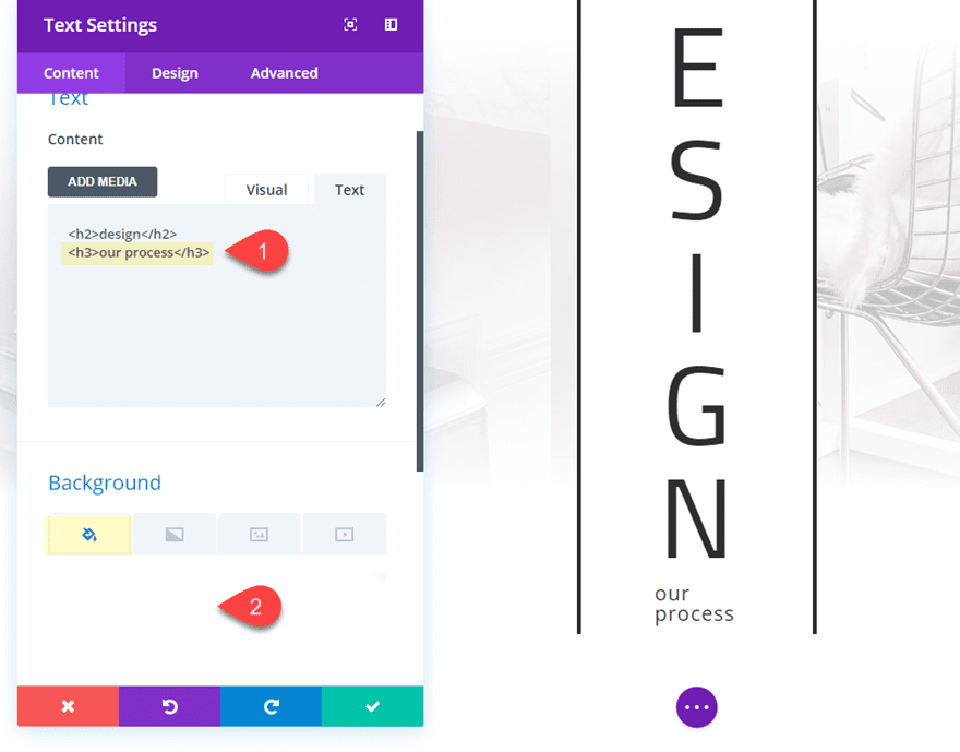
Under the design tab, update the following:
Heading 2 Text Size: 10vw
Width: 100% (desktop), 32% (tablet), 33% (smartphone)
Heading 3 Font: Ubuntu Condensed
Heading 3 Text Alignment: Center
Heading 3 Text Size: 32px (desktop), 20px (tablet), 16px (smartphone)
Then update the spacing for the text module to make it more responsive on mobile:
Custom Margin (tablet): -5vw Top, -10vw
Custom Margin (smartphone): -5vw Top, -12vw
Now take out the background gradient in the section and in the row.
Then add a little padding to your row by updating the following row setting:
Custom Padding (desktop): 5vw Top, 5vw Bottom
Custom Padding (tablet): 0vw Top, 0vw Bottom
Here is the final result.
Heading Design #3
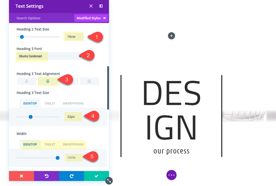
This time we are going to offset the heading to the left and go back to stacking each letter vertically. Then I’m going to change the font and give the row a matching border to compliment the module borders.
Duplicate the second design section and then update the module settings as follows:
First delete the h3 heading in the content box.
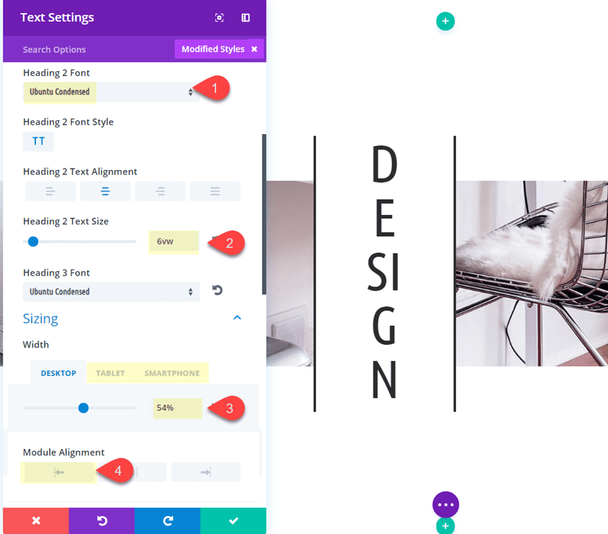
Heading 2 Font: Ubunto Condensed
Heading 2 Text Size: 6vw
Width: 54% (desktop), 16.4% (tablet), 17.5% (smartphone)
Module Alignment: Left (default)
To adjust for mobile devices, update the following spacing:
Custom Margin (tablet): -15vw Bottom
Custom Margin (smartphone): -17vw Bottom
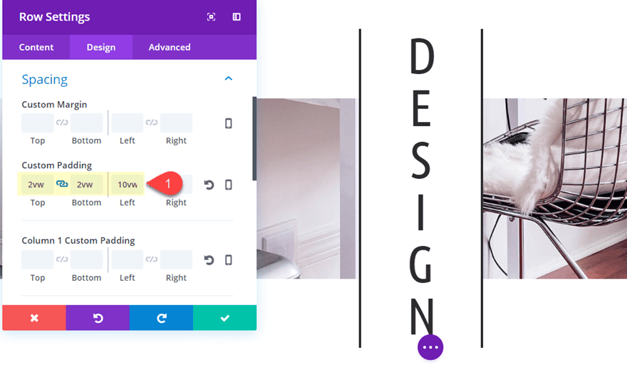
Now go to the row settings and update the following to get the spacing right.
Custom Padding: 2vw Top, 2vw Bottom, 10vw Left
Then add a border to the row to compliment the border of the module.
Top Border Width: 4px
Bottom Border Width: 4px
Now all there is left to do is drag over our module into the left column of the row.
check out the final result.
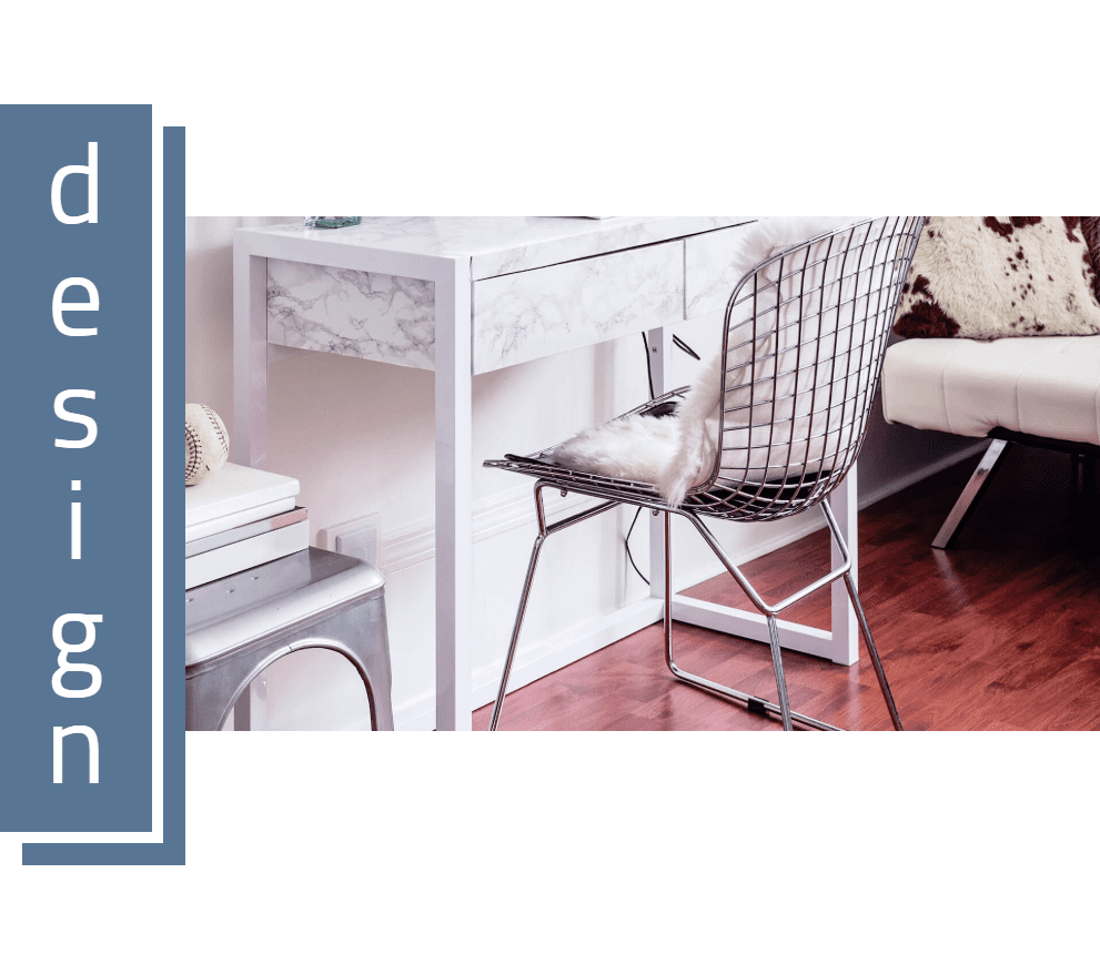
Heading Design #4
For the last heading design, I’m going to make the stacked heading completely left aligned and then add some color and a cool box shadow effect.
First update the row settings to get rid of the left padding.
Then update the text module settings to include the following:
Background Color: #5b7796
Text Color: Light
Heading 2 Font: Cairo
Heading 2 Font Style: default
Heading 2 Text Size: 10vw
Text Text Size: 5vw
Custom Padding: 2vw Top, 2vw Bottom, 4vw left, 4vw right
Restore Border Styles to default then update the new border settings as follows:
Border Right Width: 0.2em
Right Border Color: #ffffff
Bottom Border Width: 0.2em
Right Border Color: #ffffff
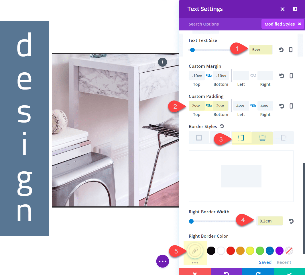
Now as you may notice, the 0.2em value for the border may seem small. This is because the em value is based on the body font value, which we changed to 5vw specifically for this reason. Since we want the border width to adjust along with the size of our heading, we need to give our body text a vw length unit value that will scale with the browser size.
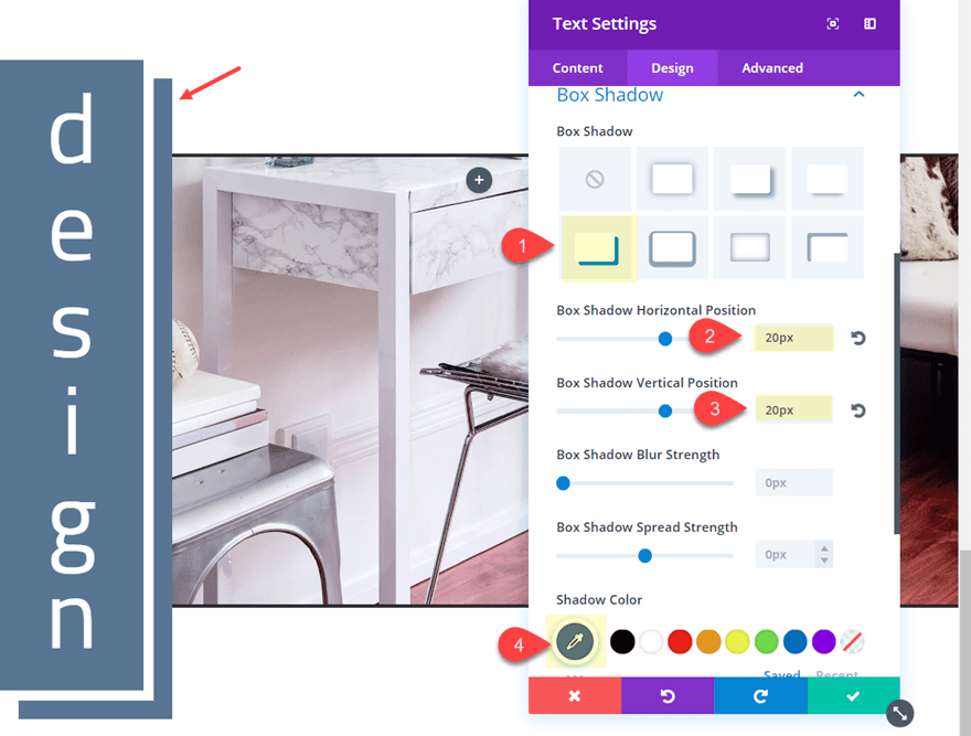
Now Let’s give it a box shadow for a nice broken grid effect.
Box Shadow: see screenshot
Box Shadow Horizontal Position: 20px
Box Shadow Vertical Position: 20px
Shadow Color: #5b7796
Box Shadow Position: Outer Shadow
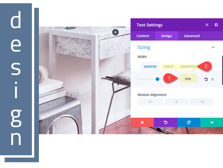
Then update the size of the module for mobile.
Width: 50% (desktop), 13% (tablet), 16% (smartphone)
For one last step, take out the padding and border of your row.
Then check out the final result.
Heading Design #5
For this last heading design, we are simply going to tweak the spacing a little in order to widen the text module. This will create a similar design as in heading design #2.
First, open the text module and add the following text under your h2 heading:
<h3>our process</h3>
Then update the design settings as follows:
Heading 2 Font Style: Uppercase (TT)
Width: 94% (desktop), 29% (tablet), 29% (smartphone)
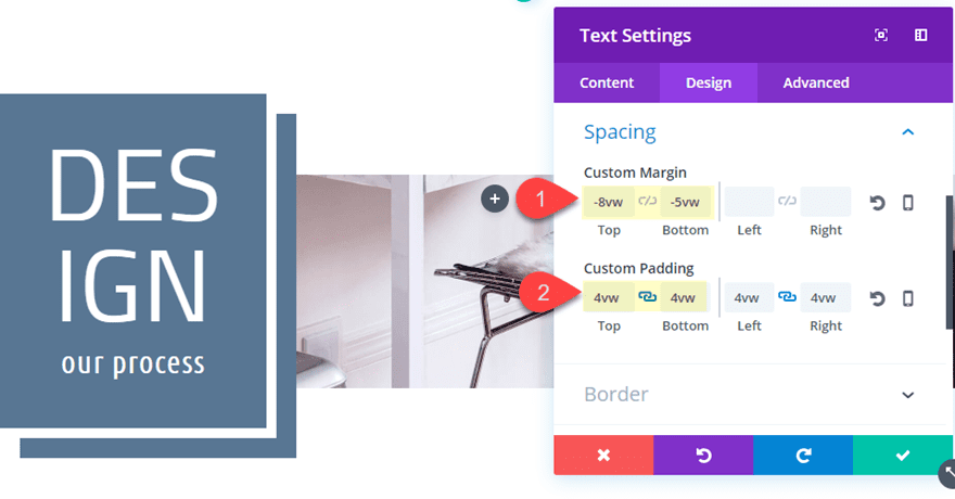
Then update the spacing as follows:
Custom Margin: -8vw Top, -5vw Bottom
Custom Padding: 4vw Top, 4vw Bottom
Here is the final result.
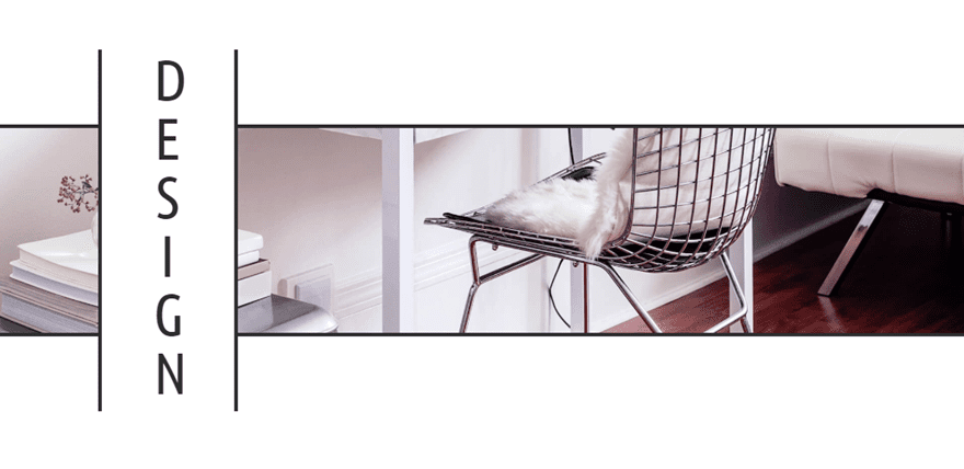
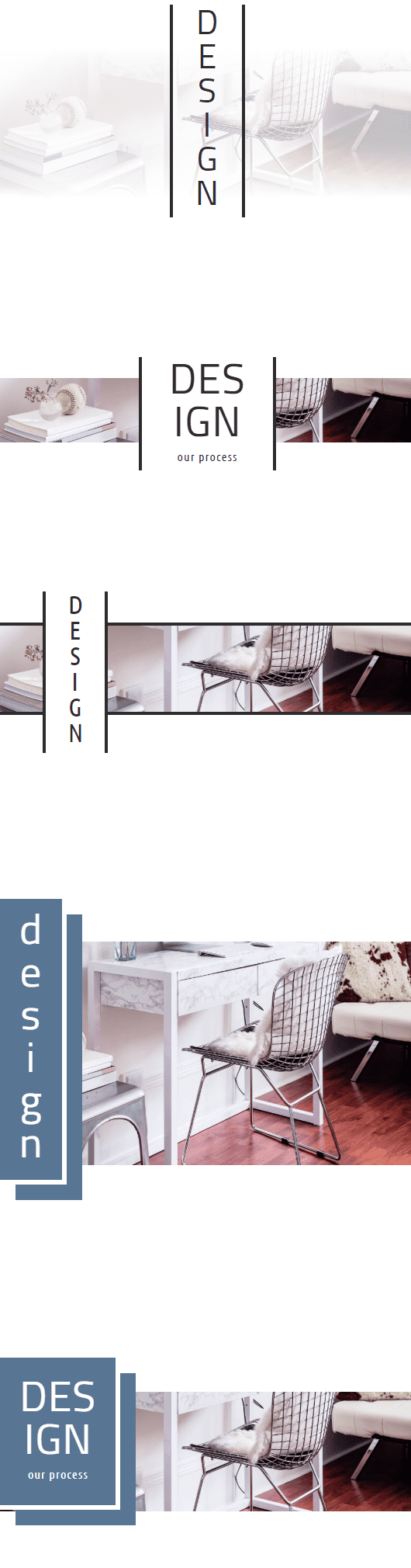
Responsive
The trick to get these designs to look well on mobile is to adjust the size and margins of the text module to scale with the shrinking browser window. So if something doesn’t quite scale properly, you may have to adjust these properties for your own purposes. Here is what the designs will look like on mobile.
Final Thoughts
I hope the 5 heading designs in this tutorial will at least offer some great starting points for your own designs. As you might expect, the design works best for shorter (one word) headings since the text will be stacked vertically. But there are tons of design elements that can be added to make these designs really unique. Feel free to explore different fonts, colors, and borders to make it your own.
For more inspiration, check out this vertical text layout. And you may also like to learn how to create sideways and vertical text with a more custom css approach.
I look forward to hearing from you in the comments.
Cheers!


I’m with Leslie on this one. I followed the instructions to the ‘T’ on the first one only to be presented with a design that’s not of that represented in your pictures. To make sure this wasn’t a simple input error of some spacing or a setting that I missed, I redid it again, however still the same result. The result that is displaying for me is ‘DESI’ on the first line and ‘GN’ on the second line. Also, the spacing between your text and the border is nice however that isn’t represented in my attempts either.
I was able to get something similar by adding some left and right padding to the text module, however, the letter ‘I’ is aligned to the left even with the module alignment set to ‘center’.
Any help is appreciated and besides that the designs are awesome!
very nice post thanks share the post
Great ideas! I practice each of these tuts and read every post from ET. In this one, I found a few big errors. If you start with the first header and follow the instructions as listed, you won’t get the result shown. It’s also a nightmare for people who aren’t familiar with manipulating layouts yet, or those with less experience in general, if they pick header 3 and you are overlooking steps that were included in previous layouts that are modified. They would have to do 1 and 2 to understand what’s going on.
I did find an easier way of manipulating the copy in the text module to still get the same results.
I absolutely commend such beautiful work! You are truly talented and an inspiration to us all! Please don’t stop. You are my source of so many ideas and I love practicing these tuts and exercising my creative muscles. Many thanks!
Leslie,
Thanks for the feedback. There was a snippet of content that was left out in the last design which has recently been updated. And yes, I can see how it would be confusing if you aren’t going in the order presented. The goal of the post is to show how you can created different designs based off of the initial structure in order to show how the design process might work when making these changes with Divi. Please let us know if you find a missing step that I may have overlooked so I can get the post updated. And feel free to share you own discoveries as well!
I truly love what has been done! It’s just so lovely! Thank you so much for always keeping the creatively flowing. These types of posts are an inspiration. Have an awesome day Jason!
Need video tutorial)
The video is coming soon. Thanks.
By the way – I love the fact that many of these new designs that you guys are demonstrating are using the “Viewport” dimensions (Viewport Width “vw” and Viewport Height “vh”). It makes these designs so much more portable across desktop and mobile devices. Thank you!
Thanks, Randy. And I agree.
Seriously, so freakin’ gorgeous! Thank you so much!!!
Very glad you like it, Sandra. Thanks for the comment.