
Divi’s Divider Module is unique among the modules available within the Divi Builder. It works to serve multiple purposes. Not only does it provide a styled line to add an interesting division between modules, but it’s also used to add whitespace. Many Divi layouts use invisible Divider Modules to create space within the layout. In this post, we’ll see how to use invisible Dividers to create space between Divi modules.
Subscribe To Our Youtube Channel
Why Create Space with Invisible Dividers?
Invisible dividers are a great way to add whitespace to your layouts. Without whitespace, a layout can become cluttered and visually unappealing. Elements can be easily ignored if they’re too close to other elements. They won’t stand apart, making CTAs go unnoticed.
Whitespace can help focus attention on certain areas of the screen. When an element has lots of whitespace around it, it stands out. This is especially important for buttons, descriptions, blurbs, or anything you want your visitors to interact with. Whitespace even improves readability, so content is easier to consume.
Divider Module Settings
Divider Modules can create vertical and horizontal space in several ways. The amount of space the module takes can be adjusted with Sizing, Margin, and Padding. The result is essentially the same and each of the methods can be used in combination if you need to fine-tune the spacing.
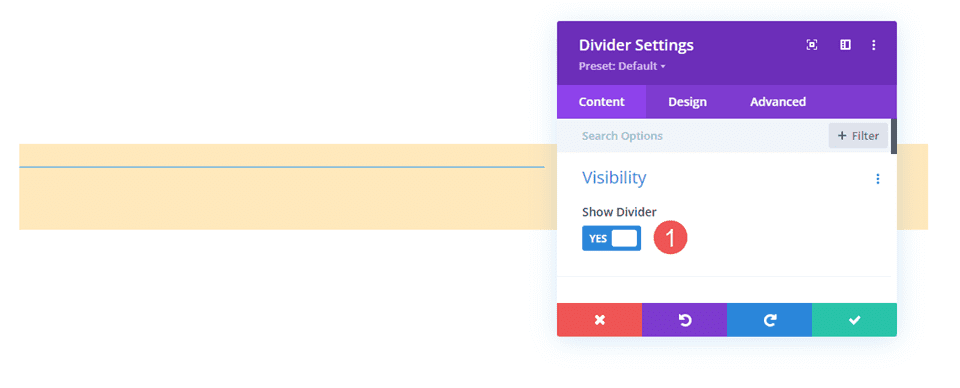
Divider Module Show Visibility
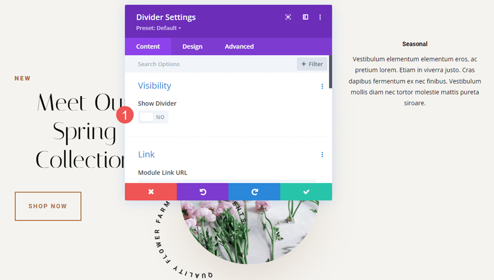
The module can show or not show the divider. This allows us to use the module just of space if we want. The size of the space the module takes is different from the visible and invisible divider.
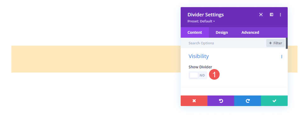
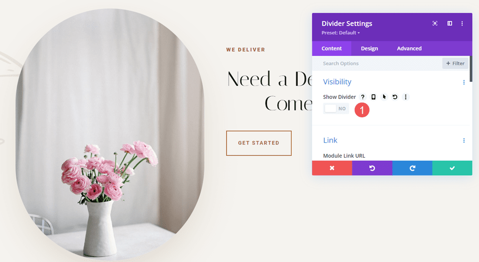
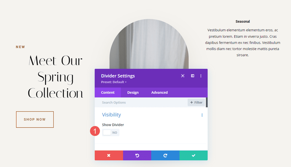
To make the divider invisible, go to its Content tab. The first section is Visibility. This is enabled by default. Here’s the setting with Visibility enabled. I’ve given the Row a tan background to help visualize the Divider Module.
Simply disable it. The divider won’t show, and you can now use the module to add spacing within the Divi layout. All that shows now is the tan background for the Row.
Invisible Divider Combined with Sizing
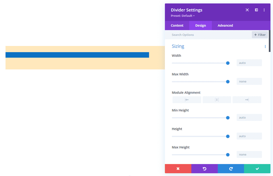
Like many Divi modules, the Divider Module includes several adjustments to control the size of the module. The first is the Sizing settings. When the Divi Module is set to not show the divider, the Sizing settings Only show:
- Width
- Max Width
- Min Height
- Height
- Max Height
The example below shows the invisible Divider Module. I’ve added a blue background to the module, so it stands out.
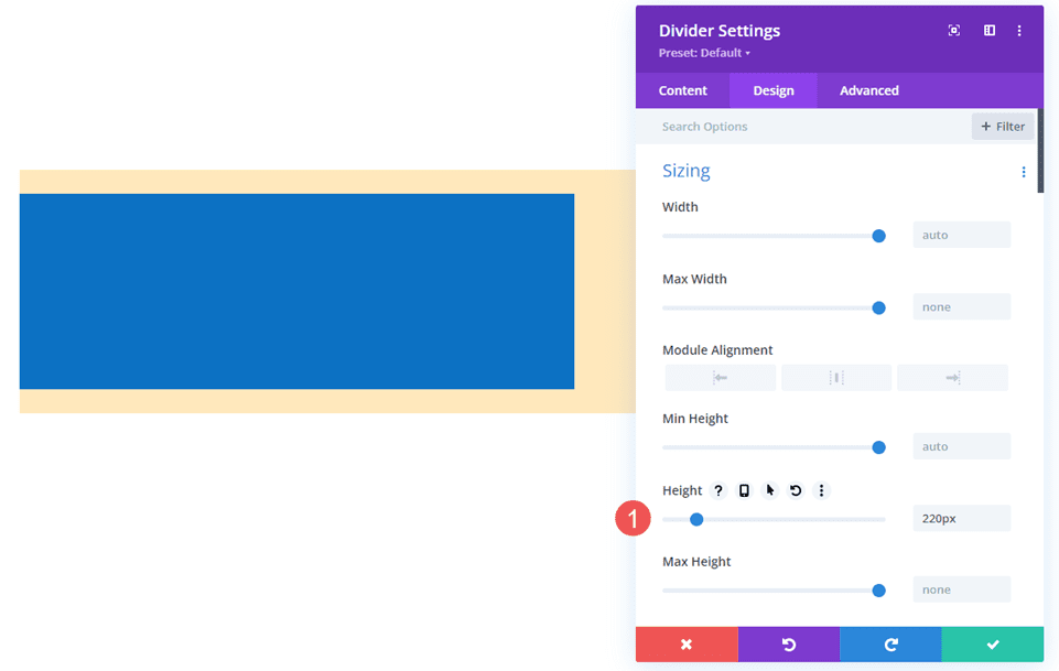
Adjusting Height is a great way to control the spacing for the invisible Divider Module. The example below shows a Divider Module with 220px of Height.
Invisible Divider Module Combined with Spacing
Margin and Padding can also be used to add spacing for the invisible Divider Module. They work the same as with any Divi module.
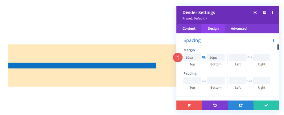
This example shows the invisible Divider module with no Height adjustment. I’ve added 50px Top and Bottom Margin. The module still shows the blue background as its normal size, but there’s more margin around the module, as you can tell by the tan background of the Row.
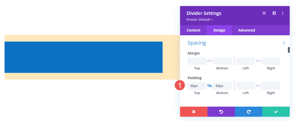
This example adds 50px Top and Bottom Padding. The Row is the same size, but the module now takes up more of the Row. The result is essentially the same, so you can try both and see which works best for each situation.
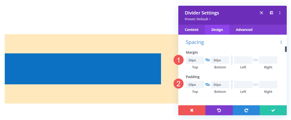
This example shows both with 50px Top and Bottom Margin and Padding. The module now takes more of the area. You can use one or the other, but this does help you fine-tune the spacing if there are any issues.
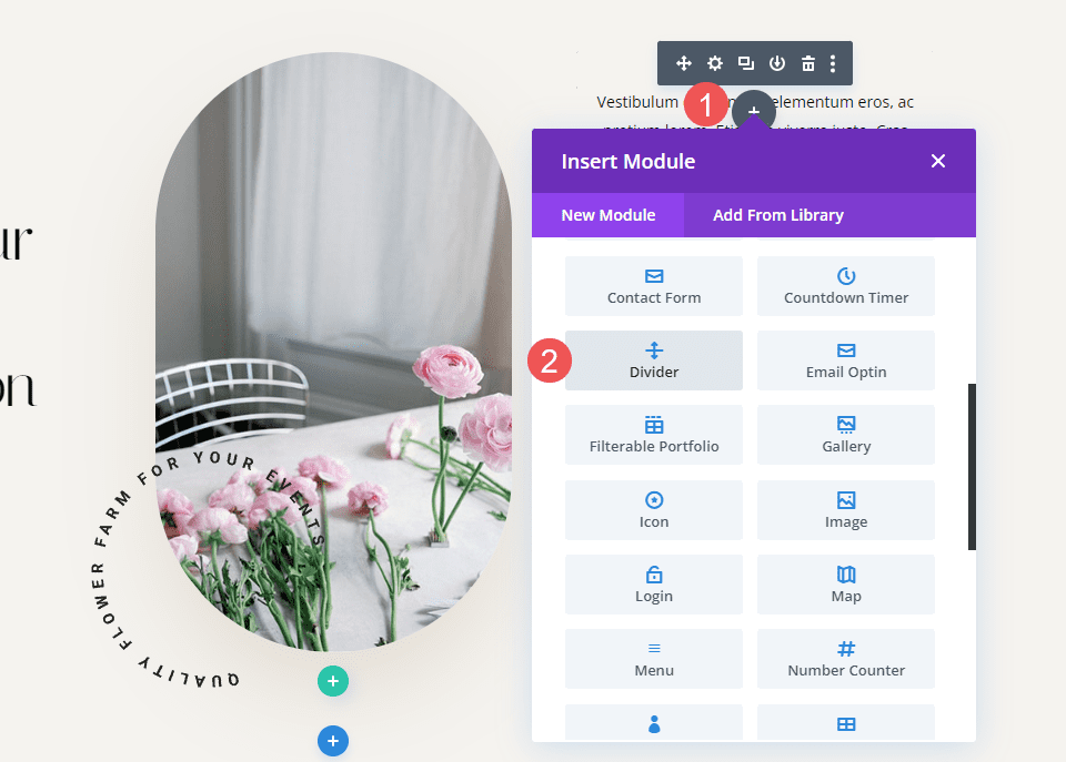
Invisble Dividers Examples
We’ll create two examples from the same layout pack. our examples will add whitespace to give the content some focus or help with alignment. For the examples, I’ll use the landing page and the home page from the free Flower Farm Layout Pack that’s available within Divi. We’ll use a variety of adjustments to see how they work.
Invisible Dividers Example One
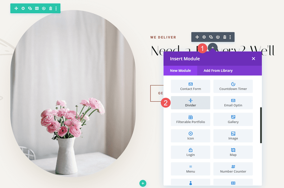
For our first example, we’ll add space between two Text Modules and a Button Module just so they take up more space in their area. We’ll use two invisible Divider Modules.
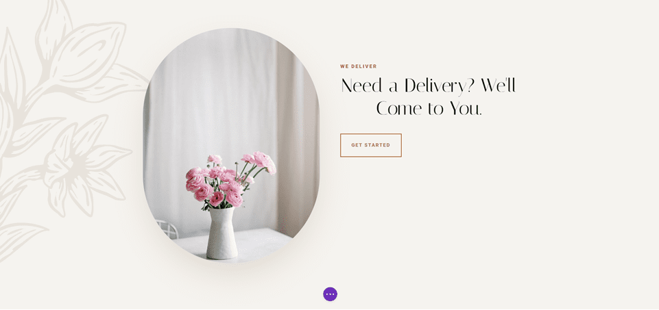
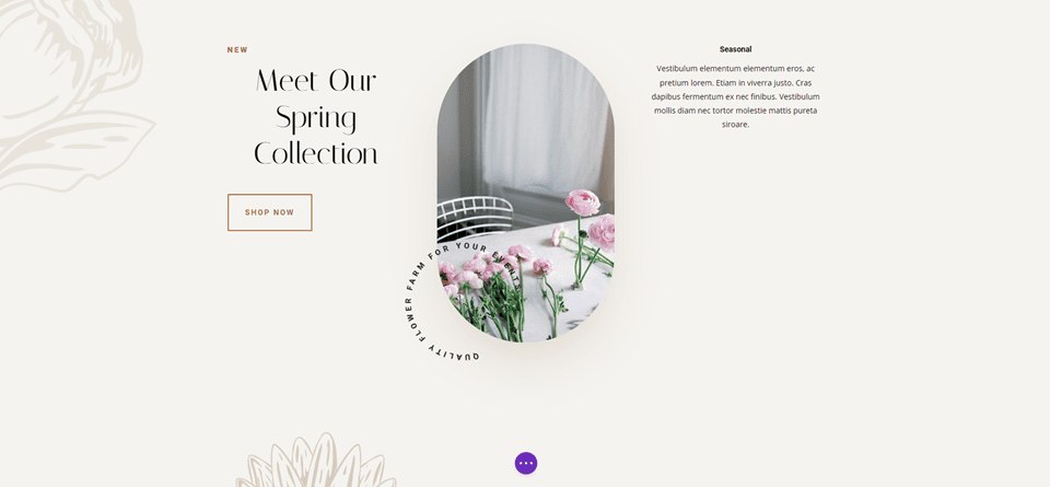
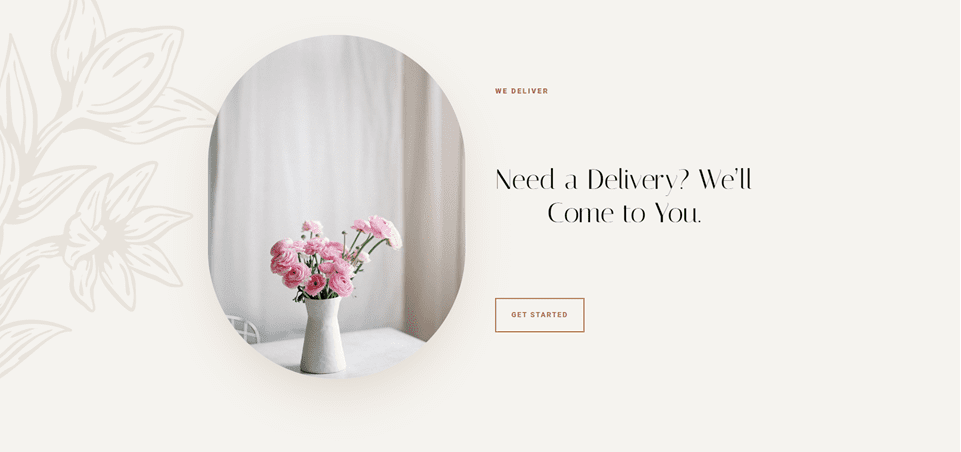
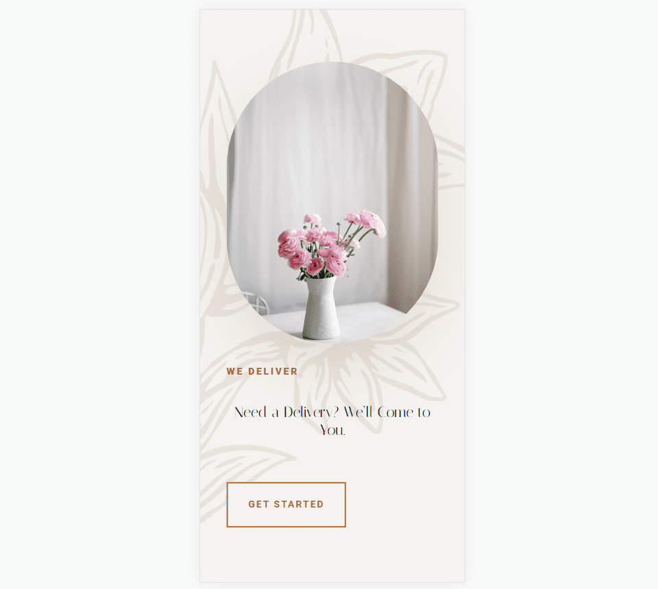
This example uses the Landing Page from the Flower Farm Layout Pack. I’ll add whitespace to the CTA in the Service Section. For reference, here’s a look at this section before adding the invisible Divider Modules.
First Divider
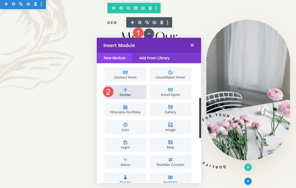
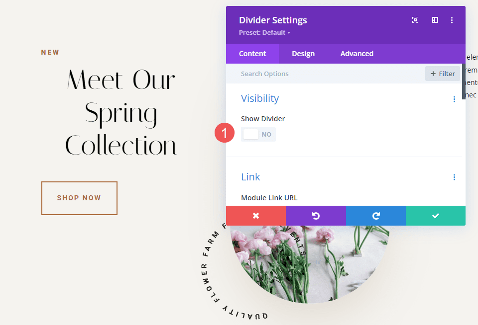
Place a Divider Module under the first Text Module.
Set the module’s Visibility to not show the divider.
- Show Divider: No
Select the Design Tab and change the Height to 120px for desktops. Set the Height for tablets and phones to Auto. Close the module’s settings.
- Height: 120px (desktop), Auto (tablet and phone)

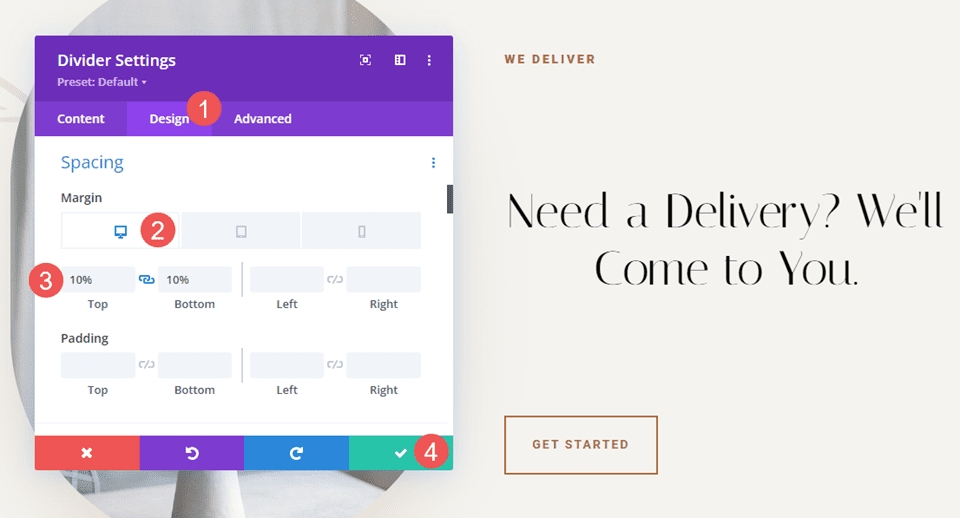
Second Divider
Next, place the second Divider Module above the Button Module.
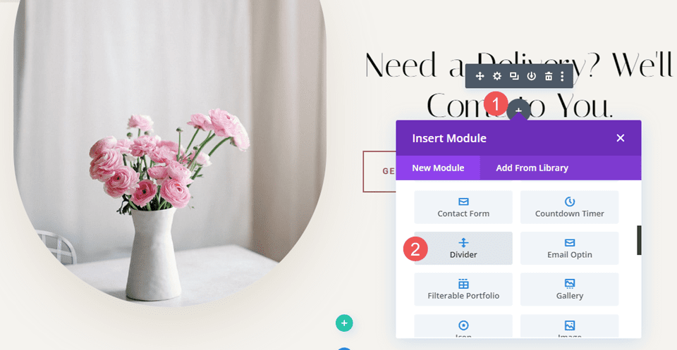
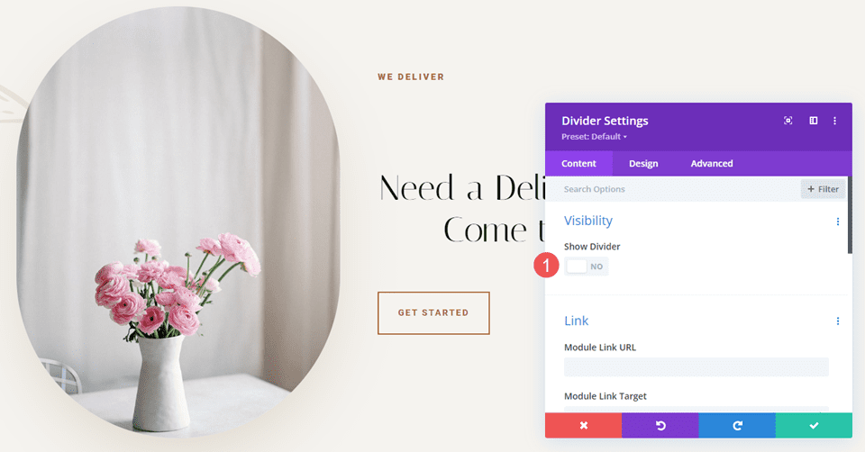
Set the module’s Visibility to not show the divider.
- Show Divider: No
Select the Design tab and scroll down to Spacing. Enter 10% for the Top and Bottom Margin for desktops. Set tablets and phones to Auto. Close the module and save your settings.
- Margin: 10% Top and Bottom, Auto tablet and phone
Invisible Dividers Example Two
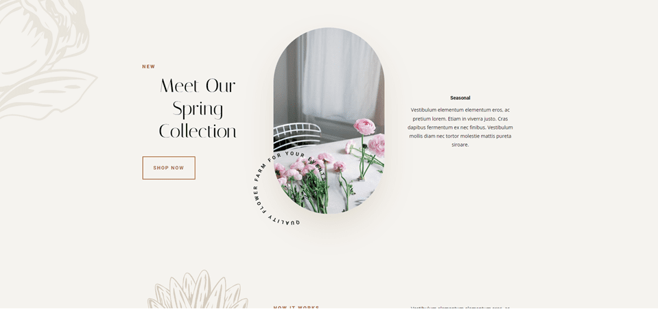
For our second example, we’ll use the Call-to-Action section from the layout. This section has a three-column row with a title and button on the left, an image in the middle, and a description on the right. The content for the left and right columns starts at the top of the Row. We’ll use three Divider Modules to add whitespace and center the content. The difference will be minor, but it will have a visual impact on the layout.
This one uses the Home Page from the Flower Farm Layout Pack. For reference, here’s a look at this section before adding the invisible Divider Modules.
First Divider
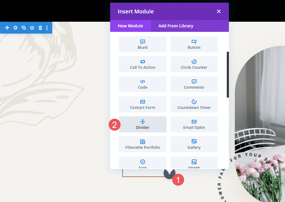
Place a Divider Module above the first Text Module in the left column. You might need to drag the Divider Module above the first Text Module after it’s added.
Set the module’s Visibility to not show the divider. Close the module’s settings.
- Show Divider: No
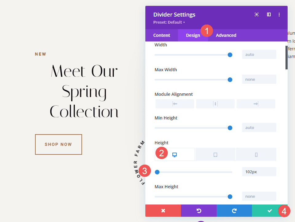
Select the Design tab and change the Height to 102px for desktops. Set the Height for tablets and phones to auto. Close the module’s settings.
- Height (desktop): 102px
- Height (tablet, phone): Auto
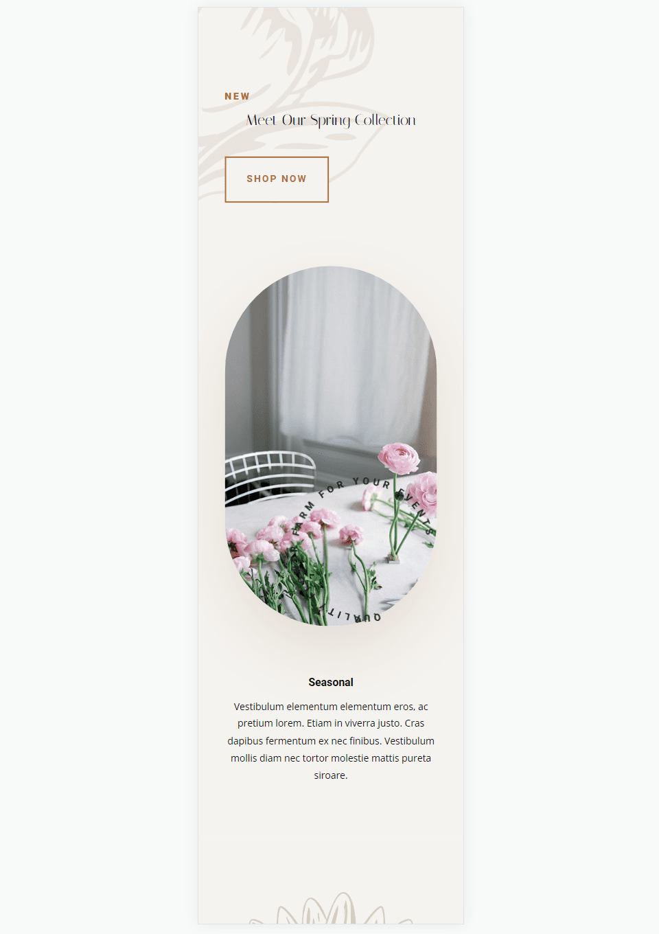
Second Divider
Place the second Divider Module under the Button Module in the left column. At first, it will seem that this one isn’t needed since won’t affect the desktop version, but it will have an impact on tablets and phones.
Set the module’s Visibility to not show the divider.
- Show Divider: No
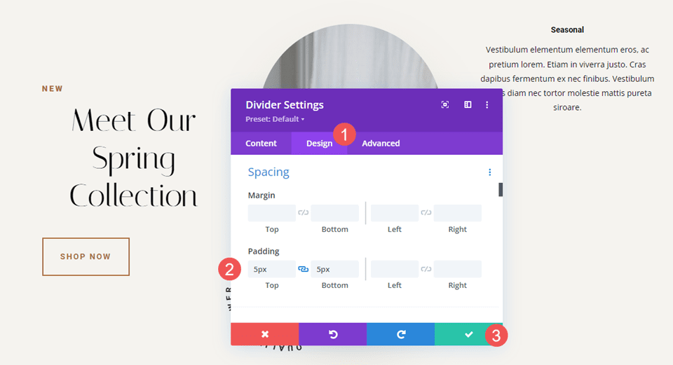
Select the Design Tab. Scroll down to Spacing and add 5px to the Top and Bottom Padding. Close the module’s settings.
- Padding: 5px Top, 5px Bottom
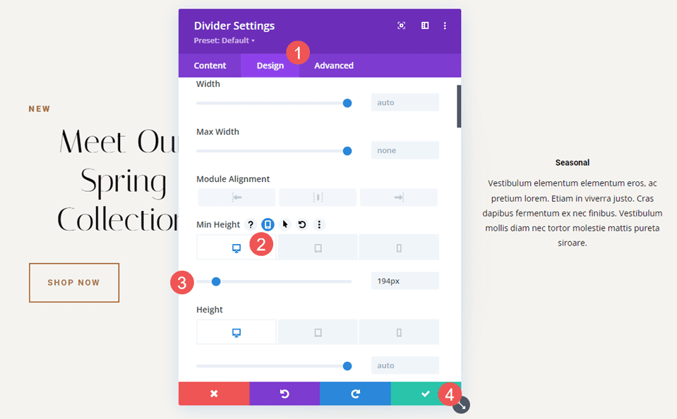
Third Divider
Finally, place the third Divider Module over the first Text Module in the right column. You might need to drag it into place.
Set the module’s Visibility to not show the divider.
- Show Divider: No
Select the Design Tab and change the Height to 194px. Set the Height for tablets to 50px and phones to 40px. Close the module’s settings.
- Height: 194px (desktop), 50px (tablet), 40px (phone)
Invisible Dividers Results
Desktop Invisible Dividers Example One
Phone Invisible Dividers Example One
Desktop Invisible Dividers Example Two
Phone Invisible Dividers Example Two
Ending Thoughts
That’s or look at how to use invisible dividers to create space between Divi modules. Whitespace is great for highlighting certain elements and improving the readability of a website. The Divider Module provides several options for adding space including Sizing and Spacing, and you can adjust Margin, Padding, or both. You can use any or all of the settings in any combination you want to get the results you need.
We want to hear from you. Do you use invisible Divider Modules to add whitespace to your Divi layouts? Let us know about your experience in the comments.


Those are and my thoughts as well. The use of dividers reminds of the dark old days of 1 px spacer gifs. I see no advantage over a clean use of padding and margin, especially for responsive design and media queries.
I don’t get the point of using a divider module to create space, when you can simply increase padding or margins of the other elements. Do I’ve missed something?
I have the same question.