
Interactive designs can make any website shine. In this tutorial, we’ll show you how to toggle between images in a stunning split section design. When hovering an image, it’ll come to the front while covering the other. Follow the steps below to recreate the design or download the JSON file through the sign-up link. Make sure you use images with transparent backgrounds so you can control the background colors of each column.
Let’s get to it!
- 1 Preview
- 2 Download The Toggle Image Design for FREE
- 3 Download For Free
-
4
Let’s Start Recreating
- 4.1 Add New Section
- 4.2 Add New Row
- 4.3 Column 1 Settings
- 4.4 Column 2 Settings
- 4.5 Add Image Module to Column 1
- 4.6 Add Text Module to Column 1
- 4.7 Add Bar Counters Module to Column 1
- 4.8 Bar Counter Settings 1-4
- 4.9 General Bar Counters Settings
- 4.10 Add Image Module to Column 2
- 4.11 Add Text Module to Column 2
- 4.12 Add Bar Counters Module to Column 2
- 4.13 Bar Counter Settings 1-4
- 4.14 General Bar Counters Settings
- 5 Preview
- 6 It’s a Wrap!
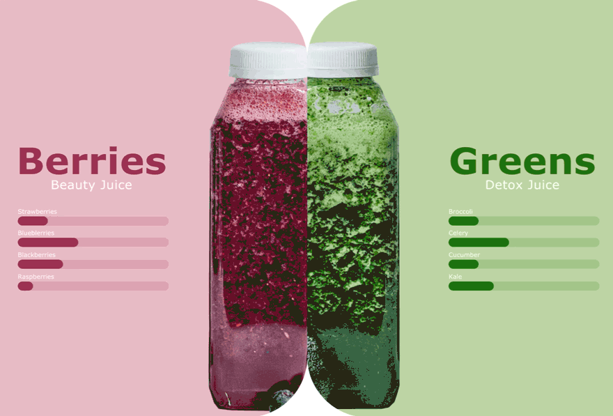
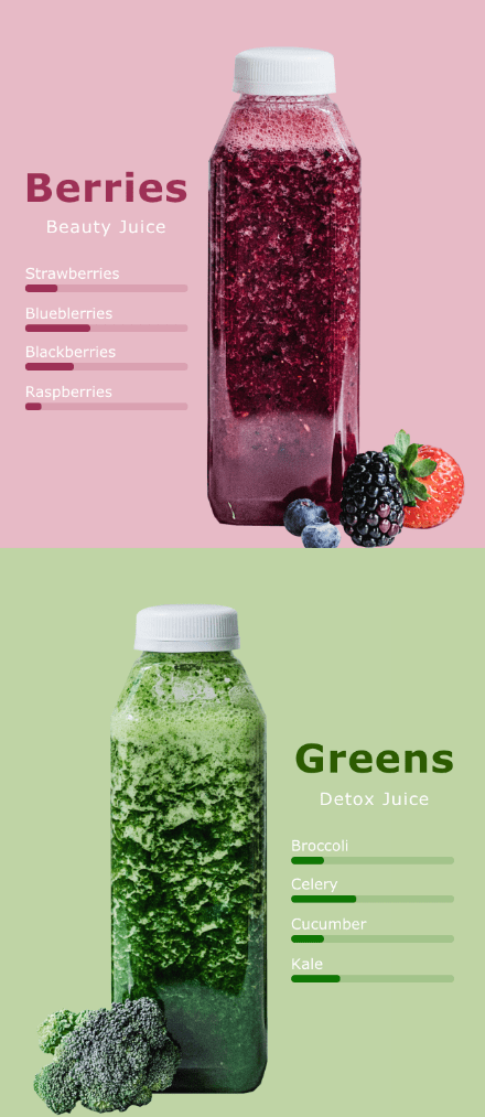
Preview
Let’s take a look at the design across different screen sizes.
Desktop
Mobile
Download The Toggle Image Design for FREE
To lay your hands on the free toggle image design, you will first need to download it using the button below. To gain access to the download you will need to subscribe to our newsletter by using the form below. As a new subscriber, you will receive even more Divi goodness and a free Divi Layout pack every Monday! If you’re already on the list, simply enter your email address below and click download. You will not be “resubscribed” or receive extra emails.

Let’s Start Recreating
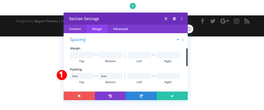
Add New Section
Spacing
Create a new page or open an existing one. Add a regular section, open the section settings and remove all default top and bottom padding.
- Top + Bottom Padding: 0vw
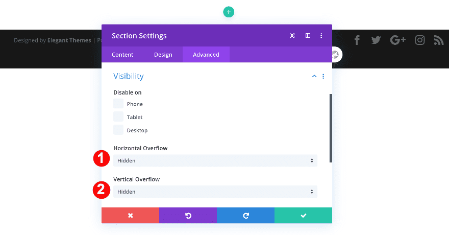
Visibility
Then, set the section’s overflows to hidden.
- Horizontal + Vertical Overflow: Hidden
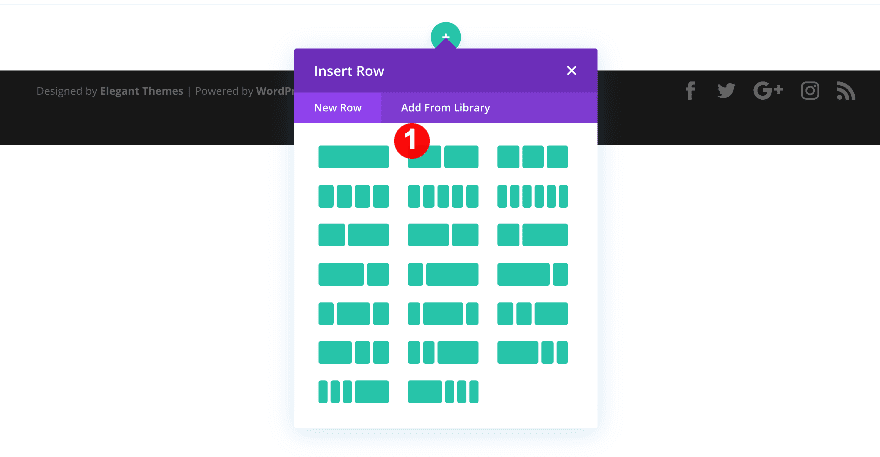
Add New Row
Column Structure
Continue by adding a new row using the following column structure:
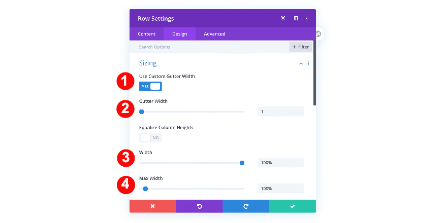
Sizing
Before adding any modules, adjust the sizing of the row.
- Gutter Width: 1
- Width: 100%
- Max Width: 100%
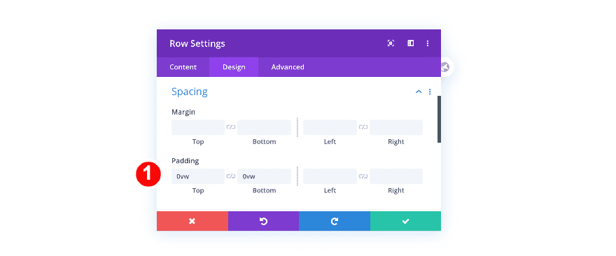
Spacing
Remove the row’s default top and bottom padding as well.
- Top and Bottom Padding: 0vw
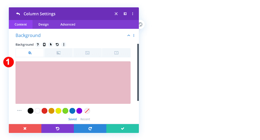
Column 1 Settings
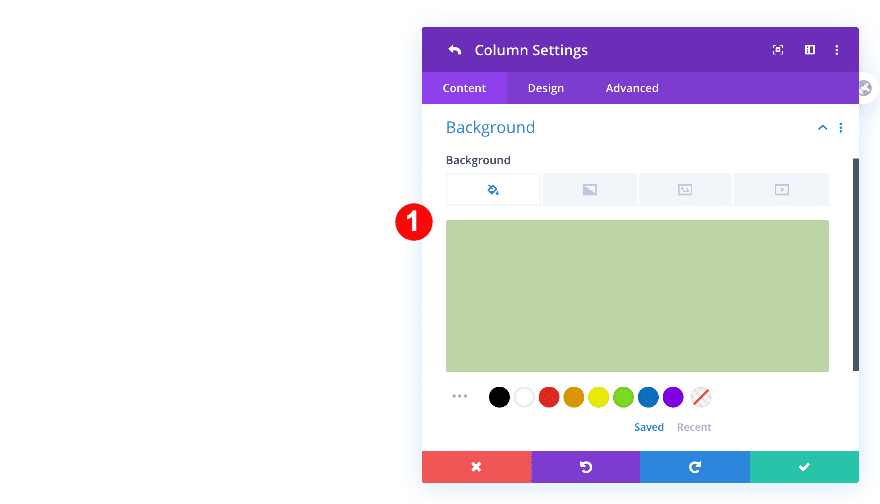
Background
Open the column 1 settings next and add a background color.
- Color: Pale Rose #E7BAC6
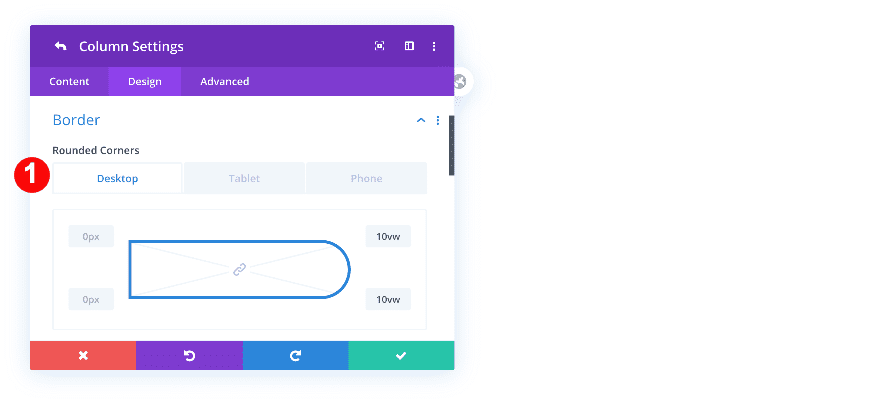
Border
Then, adjust the column’s border settings across different screen sizes.
- Rounded Corners: Top Right + Bottom Right
- Desktop: 10vw
- Tablet & Phone: 0vw
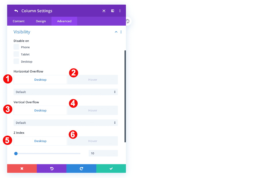
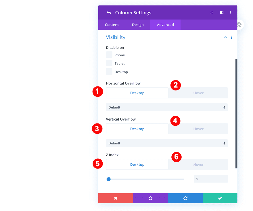
Visibility
Move on to the advanced tab and adjust the visibility settings as follows:
- Horizontal + Vertical Overflow
- Desktop: Default
- Hover: Visible
- Z-Index:
- Desktop: 10
- Hover: 11
Column 2 Settings
Background
Now, add the color background to column 2.
- Color: Pale Green #bfd5a5
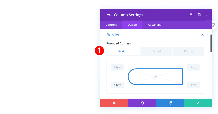
Border
Change the second column’s border settings as follows:
- Rounded Corners: Top Left + Bottom Left
- Desktop: 10vw
- Tablet & Phone: 0vw
Visibility
Last but not least, change the visibility settings accordingly:
- Horizontal + Vertical Overflow
- Desktop: Default
- Hover: Visible
- Z-Index:
- Desktop: 9
- Hover: 11
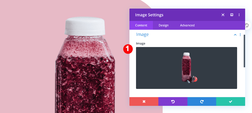
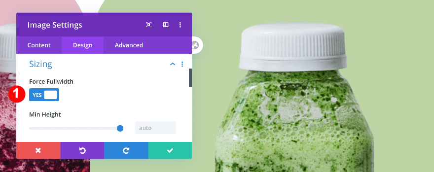
Add Image Module to Column 1
Add Image
Time to start adding modules! Add an image module to column 1 and upload a semi-transparent image of your choice.
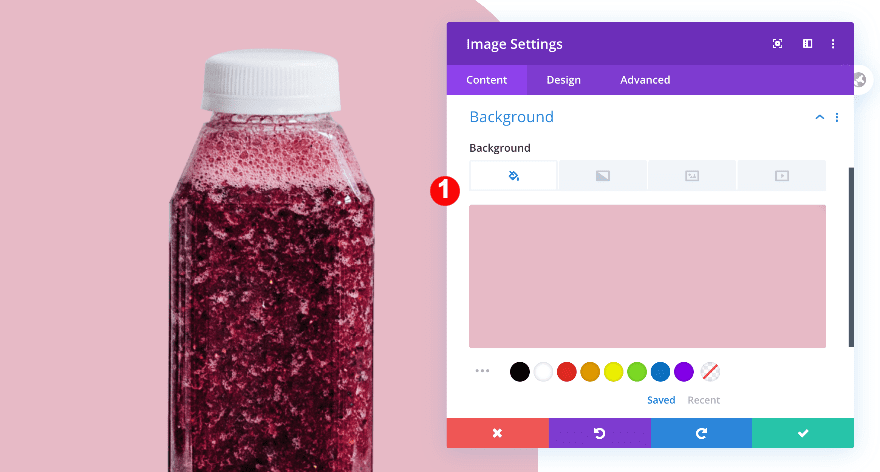
Background
Use the column’s background color as your image background color.
- Color: Pale Rose #E7BAC6
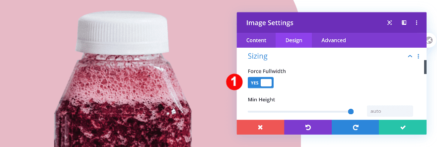
Sizing
Then, in the design tab, adjust the sizing settings.
- Force Fullwidth: Yes
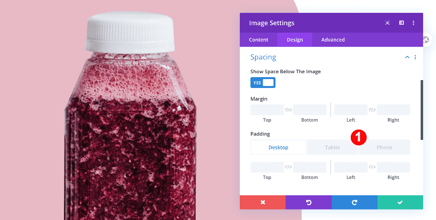
Spacing
Add some custom padding as well.
- Right Padding:
- Tablet: 18vw
- Phone: 20vw
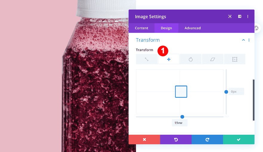
Transform
Last but not least, adjust the module’s transform translate settings.
- Transform Translate: x-axis 19vw
Add Text Module to Column 1
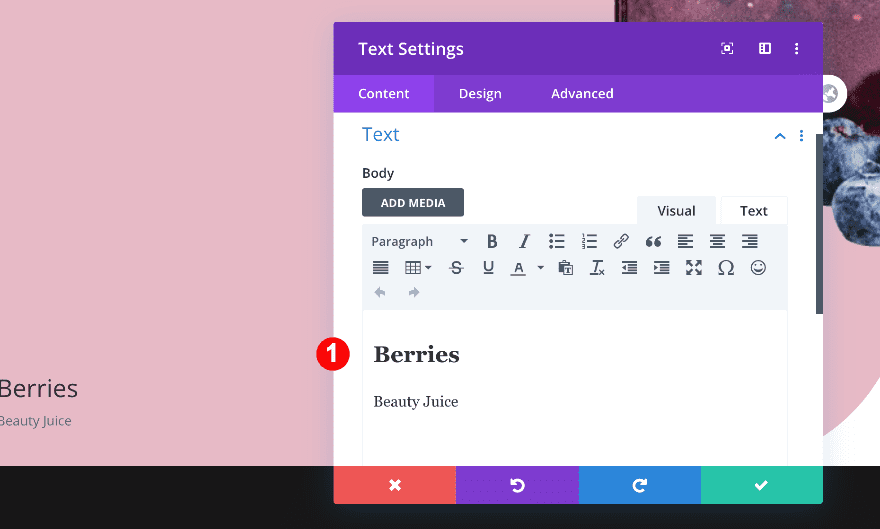
Add content
On to the next module, which is a text module. Add some H2 and paragraph content of your choice.
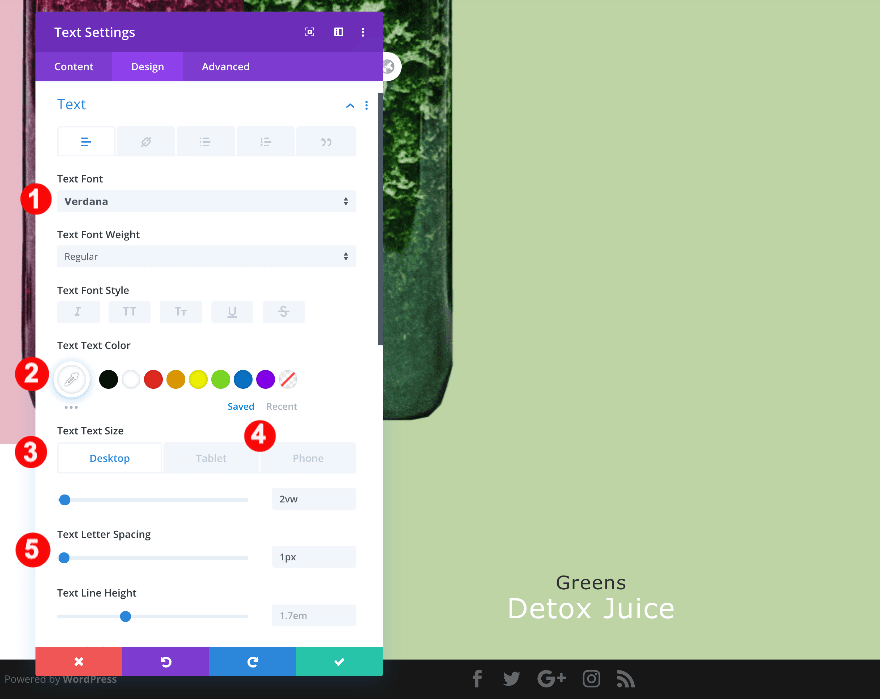
Text
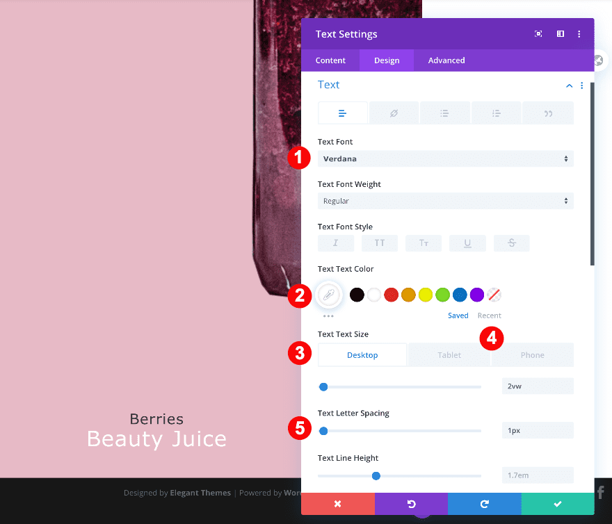
Move on to the design tab and change the text settings as follows.
- Font: Verdana
- Color: White #ffffff
- Size:
- Desktop: 2vw
- Tablet: 3vw
- Phone: 3.5vw
- Letter Spacing: 1px
- Alignment: centered
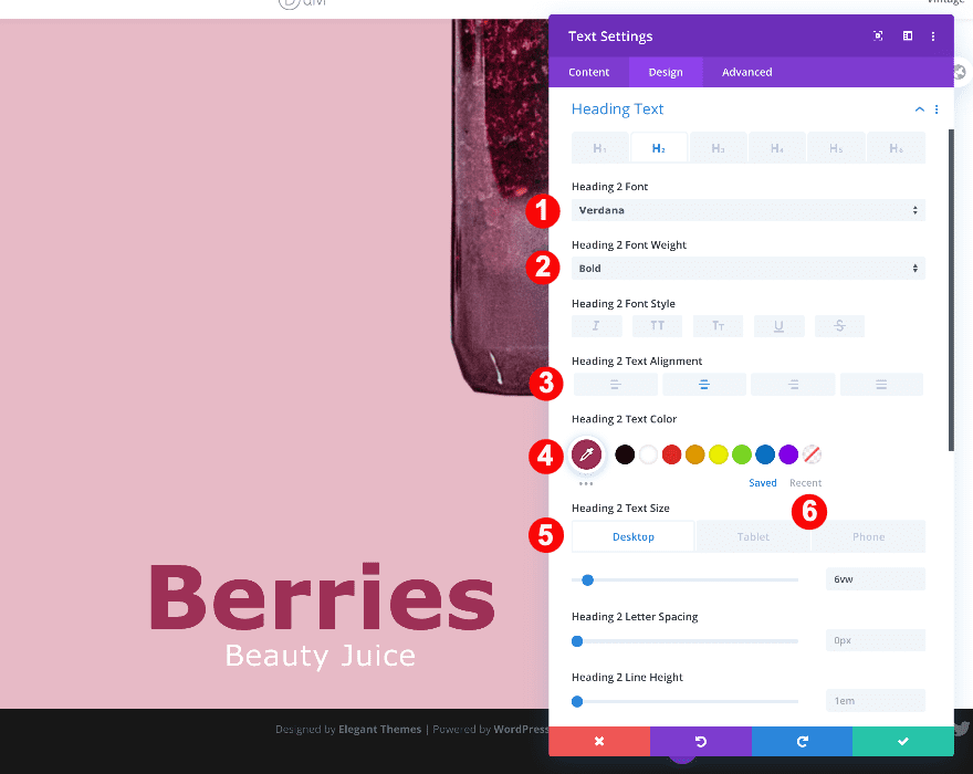
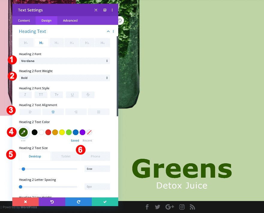
Heading Text
Style the heading text next.
- Heading Level: H2
- Font: Verdana
- Weight: Bold
- Alignment: Center
- Color: Magenta #9d3056
- Size:
- Desktop: 6vw
- Tablet + Phone: 8vw
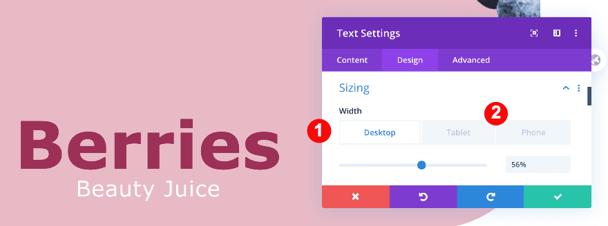
Sizing
Then, adjust the sizing of the module.
- Width:
- Desktop: 56%
- Tablet + Phone: 43%
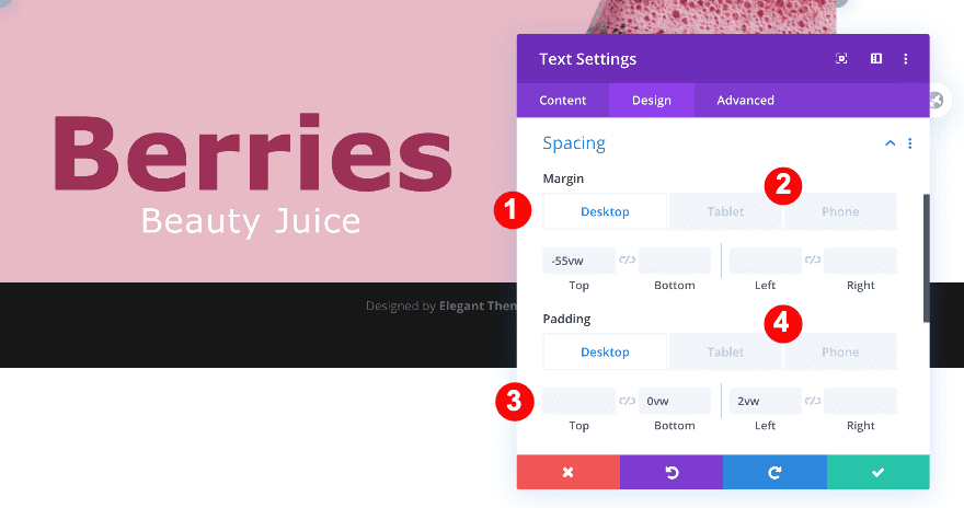
Spacing
Complete the module’s settings by modifying the spacing settings across different screen sizes.
- Top Margin:
- Desktop: -55vw
- Tablet: -70vw
- Phone: -90vw
- Bottom Padding:
- Desktop + Tablet: 0vw
- Left Padding: 2vw
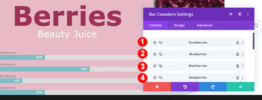
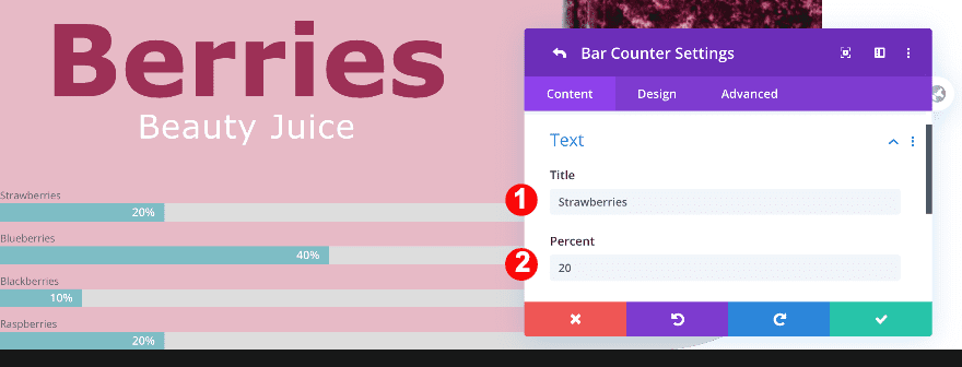
Add Bar Counters Module to Column 1
Bar Counter Settings 1-4
Titles
The next and last module we need in column 1 is the bar counters module. Add titles to the bar counters.
- Strawberries
- Blueberries
- Blackberries
- Raspberries
Percentages
Along with the percentages.
- 20
- 40
- 10
- 20
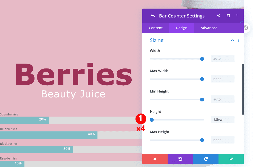
Sizing
Click on the first bar and set the height. Repeat this step for all four bars.
- Height: 1.5vw
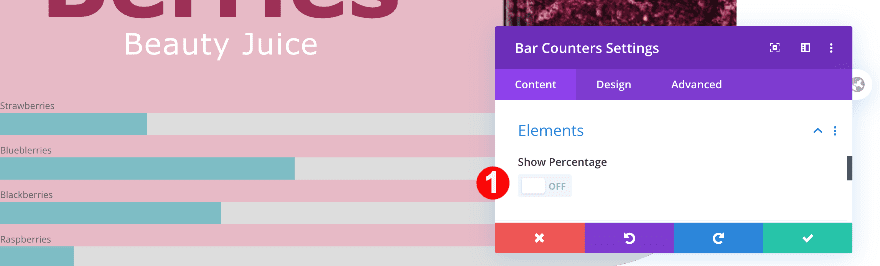
General Bar Counters Settings
Elements
In the general bar counter settings, open the elements settings. Toggle the percentage to “No”.
- Show Percentage: No
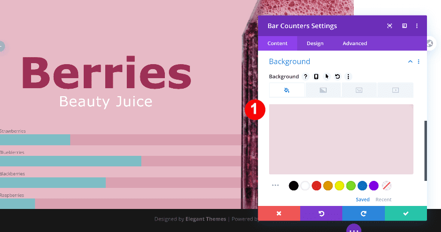
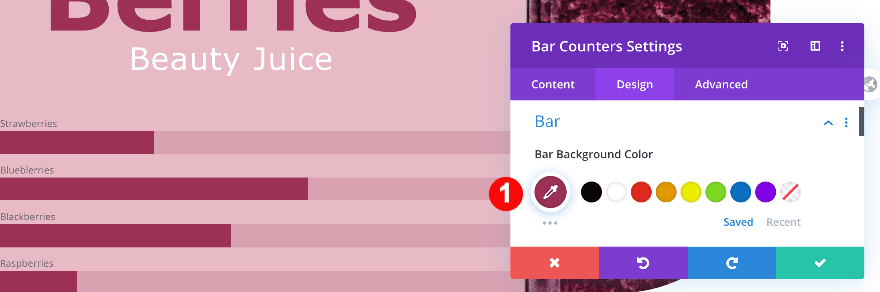
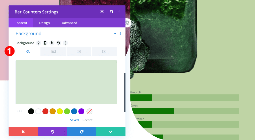
Background
Now, add a semi-transparent background.
- Color: Pale Rose with Transparency rgba(157,48,86,0.18)
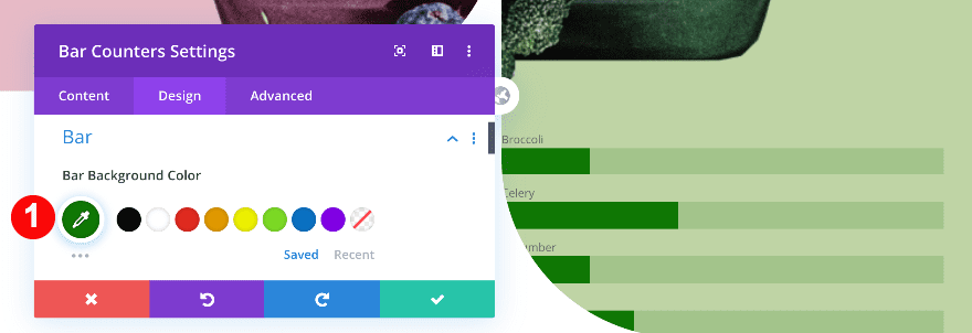
Bar
In the design tab, give the bars a magenta bar color.
- Background Color: Magenta #9d3056
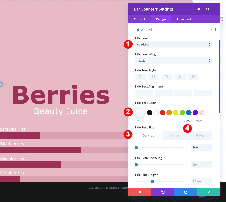
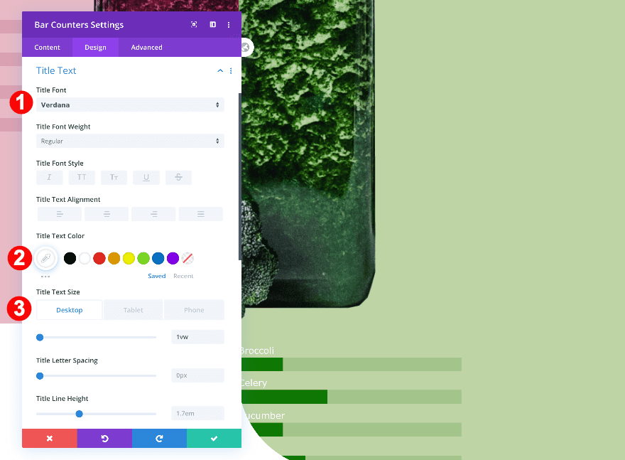
Title Text
Style the title text settings next.
- Font: Verdana
- Color: White #ffffff
- Size:
- Desktop: 1vw
- Tablet: 2vw
- Phone: 3vw
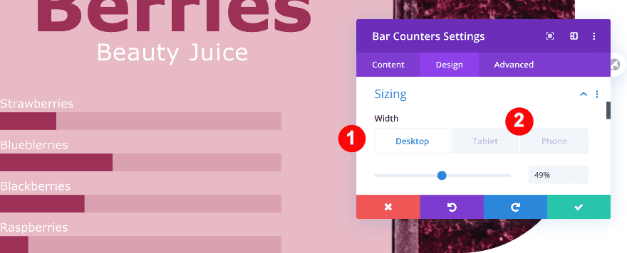
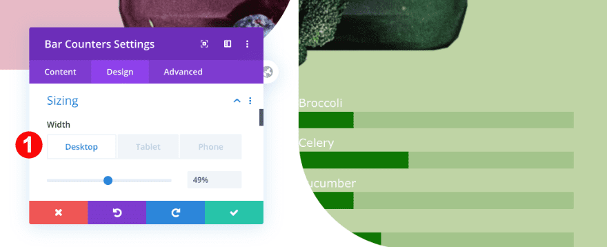
Sizing
Continue by adjusting the sizing settings of the module.
- Width:
- Desktop: 49%
- Tablet + Phone: 33%
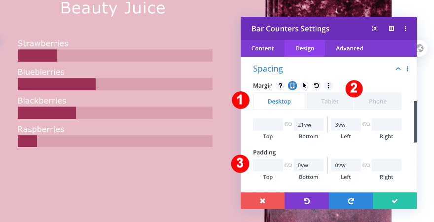
Spacing
Modify the spacing settings too.
- Top Margin:
- Tablet + Phone: -3vw
- Bottom Margin:
- Desktop: 21vw
- Tablet + Phone: 28vw
- Left Margin:
- Desktop: 3vw
- Tablet + Phone: 6vw
- Bottom + Left Padding: 0vw
Border
Modify the border settings next.
- Rounded Corners: 1vw all four corners
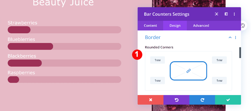
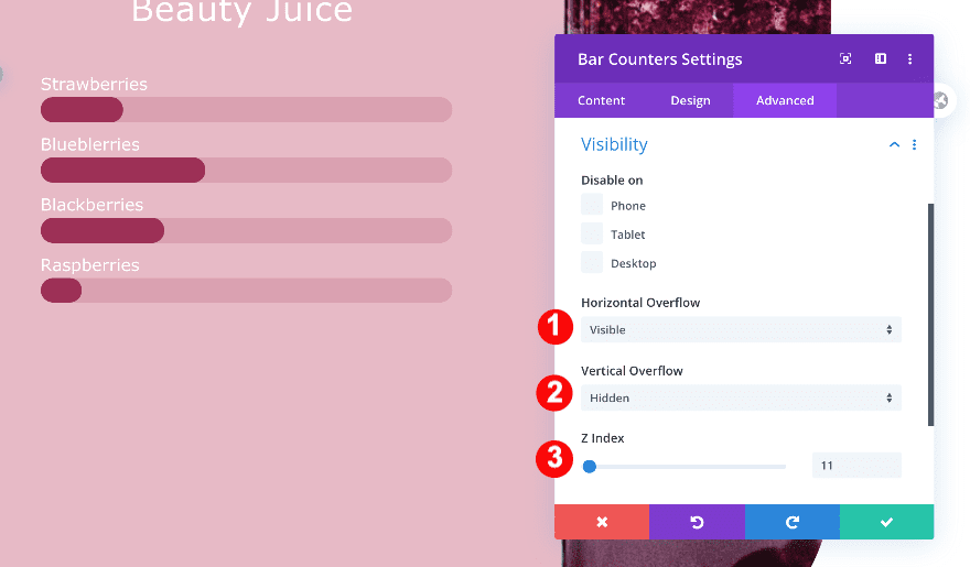
Visibility
Finally, adjust the z index and overflows in the visibility tab.
- Horizontal Overflow: Visible
- Vertical Overflow: Hidden
- Z-Index: 11
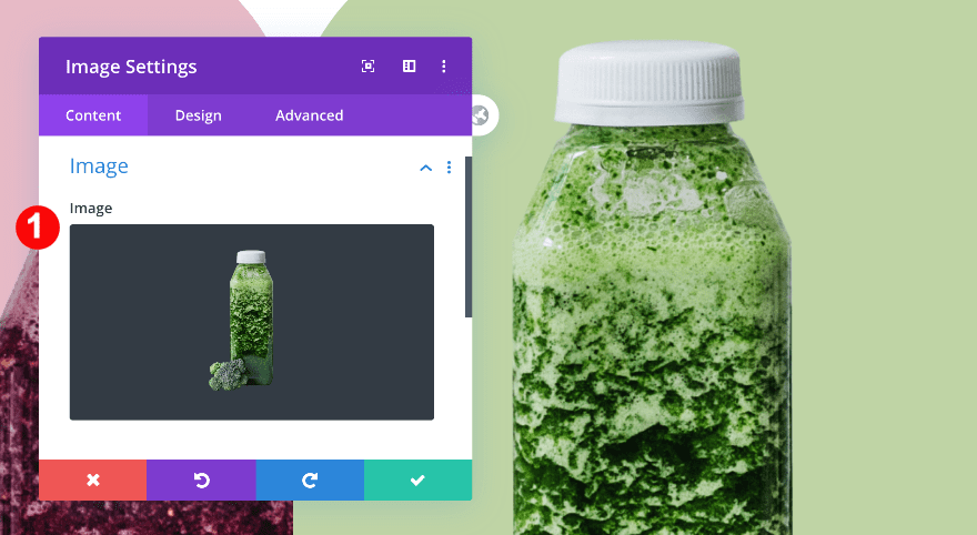
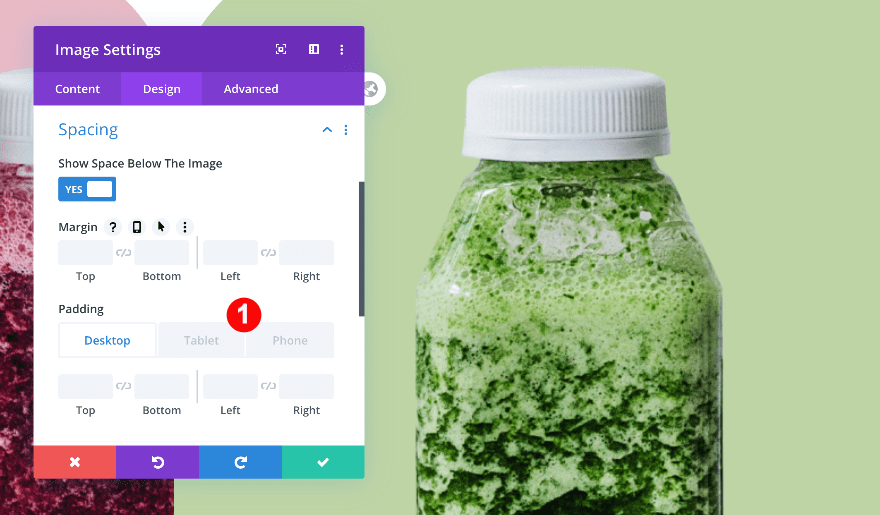
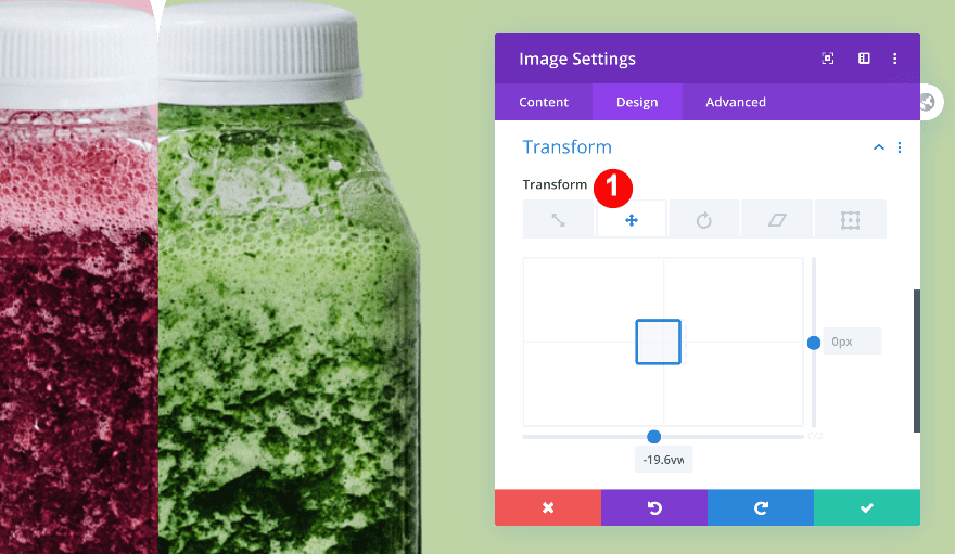
Add Image Module to Column 2
Add image
On to the second column! Add a new image module and upload a semi-transparent image of your choice.
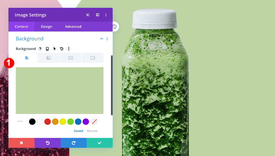
Background
Use the column 2 background color as your image’s background color next.
- Color: Pale Green #bfd5a5
Sizing
In the design tab, adjust the sizing of the module.
- Force Fullwidth: Yes
Spacing
Add some custom left padding on smaller screen sizes too.
- Left Padding:
- Tablet: 16vw
- Phone: 18vw
Transform
Last but not least, change the transform translate settings.
- Transform Translate: x-axis -19.6vw
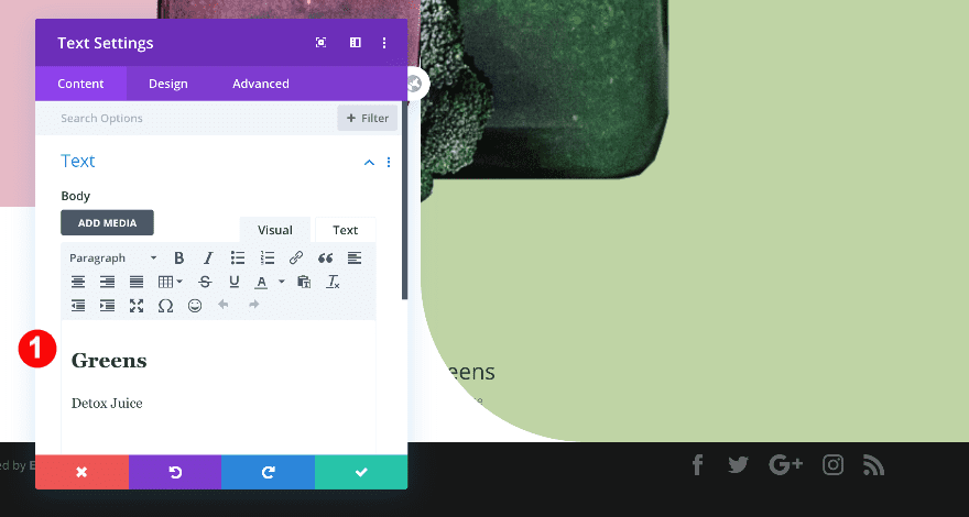
Add Text Module to Column 2
Add content
Continue by adding a Text Module to column 2 with some H2 and paragraph content.
Text
Then, in the design tab, style the text.
- Font: Verdana
- Color: White #ffffff
- Size:
- Desktop: 2vw
- Tablet: 3vw
- Phone: 3.5vw
- Letter Spacing: 1px
- Alignment: Center
Heading Text
Change the heading text settings too.
- Heading Level: H2
- Font: Verdana
- Weight: Bold
- Alignment: Center
- Color: Green #2c5b00
- Size:
- Desktop: 6vw
- Tablet + Phone: 8vw
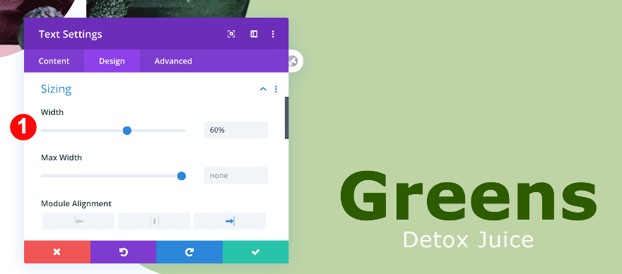
Sizing
And adjust the module’s sizing settings.
- Width: 60%
- Alignment: Right
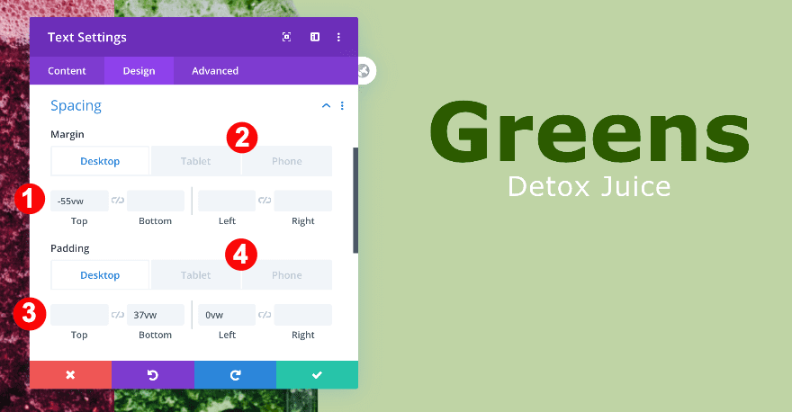
Spacing
Last but not least, use some custom spacing values across different screen sizes.
- Top Margin:
- Desktop: -55vw
- Tablet: -63vw
- Phone: -90vw
- Bottom Padding:
- Desktop + Tablet: 37vw
- Left Padding:
- Desktop: 0vw
- Tablet + Phone: 16vw
- Right Padding:
- Tablet + Phone: 2vw
Add Bar Counters Module to Column 2
Bar Counter Settings 1-4
Titles
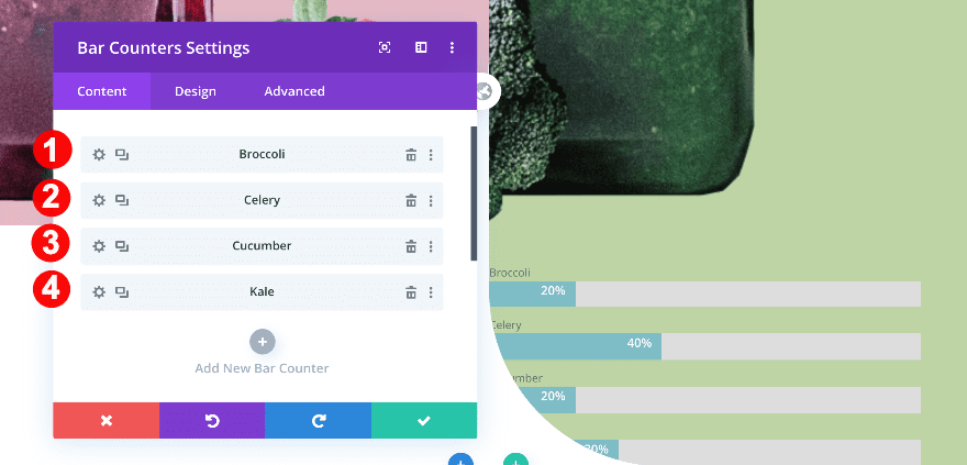
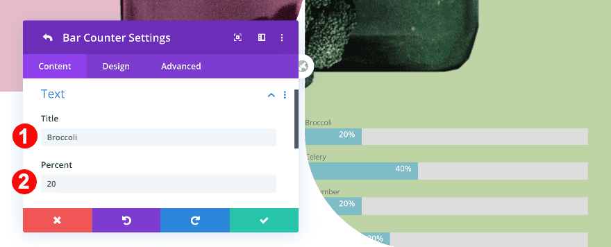
The last module we need in column 2 is the bar counters module. Add four bar counters.
- Broccoli
- Celery
- Cucumber
- Kale
Percentages
Assign a percentage to each bar counter.
- 20
- 40
- 20
- 30
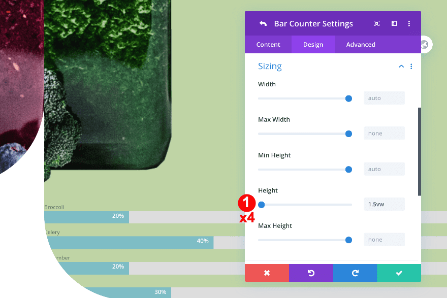
Sizing
Open the first bar’s individual settings and modify the height in the sizing settings. Repeat this step for all four bars.
- Height: 1.5vw
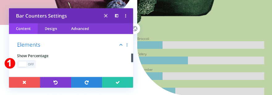
General Bar Counters Settings
Elements
In the general bar counter settings, change the percentage toggle to “No”.
- Show Percentage: No
Background
Next, add a semi-transparent background color.
- Color: Pale Green with Transparency rgba(17,119,3,0.18)
Bar
Then, in the design tab, add color to the counter bar.
- Bar Color: Green #9d3056
Title Text
Continue by styling the text.
- Font: Verdana
- Color: White #ffffff
- Size:
- Desktop: 1vw
- Tablet: 2vw
- Phone: 3vw
Sizing
Modify the width across different screen sizes too.
- Width:
- Desktop: 49%
- Tablet + Phone: 33%
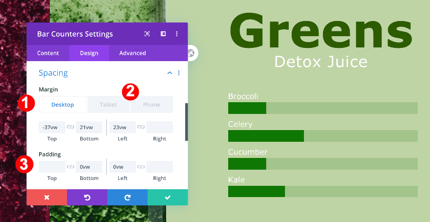
Spacing
Move on to the spacing settings and add some custom spacing values across different screen sizes.
- Top Margin:
- Desktop: -37vw
- Tablet + Phone: -40vw
- Bottom Margin:
- Desktop: 21vw
- Tablet + Phone: 28vw
- Left Margin:
- Desktop: 23vw
- Tablet + Phone: 60vw
- Bottom + Left Padding: 0vw
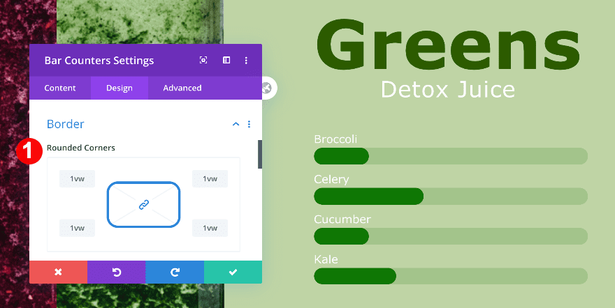
Border
We’re adding some rounded corners too.
- Rounded Corners: 1vw all four corners
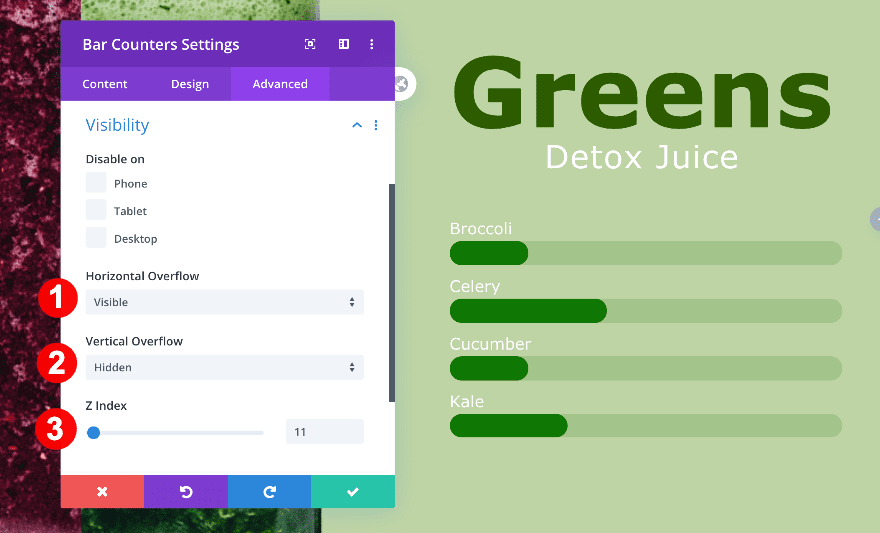
Visibility
Complete the module’s settings by adjusting the overflows and z index in the visibility tab.
- Horizontal Overflow: Visible
- Vertical Overflow: Hidden
- Z-Index: 11
Preview
Now that we’ve gone through all the steps, let’s take a final look at the outcome across different screen sizes.
Desktop
Mobile
It’s a Wrap!
In this post, we’ve shown you how to toggle between images in a beautiful design. This is a great way to create interactive design and use Divi’s built-in z index to determine which image shows up. If you have any questions or suggestions, make sure you leave a comment in the comment section below!


I suppose the same effect can be achieved with four columns?
I must be missing something, I downloaded the json file but where do I install it? TIA
Great job with such a detailed and precise explanation to be able to achieve this effect.
I have configured it in my new project and it looks amazing.
Thanks.