
This post is part 3 of 5 in our mini series titled 5 Fun Ways to Style Divi’s Audio Module. Stay tuned this week for all five unique examples of Divi’s Audio Module, with a tutorial on how to achieve each one!
There are all kinds of audio content that you may want to share on your website: your latest lyrics, instrumentals, or podcasts, for instance. Divi’s built-in audio module makes including these a breeze!
In today’s tutorial we show you how to style the Divi audio module like a podcast player.
- 1 Today’s Before & After: The Divi Audio Module as Podcast Player
- 2 How to Style Your Divi Audio Module as a Podcast Player
- 3 The Concept & Inspiration
- 4 Preparing the Design Elements
- 5 Implementing the Design with Divi
- 6 Section Settings
- 7 Row Settings
- 8 Audio Module Settings
- 9 Tomorrow: Part 4 – Rocking Color Blocking with the Divi Audio Module
Today’s Before & After: The Divi Audio Module as Podcast Player
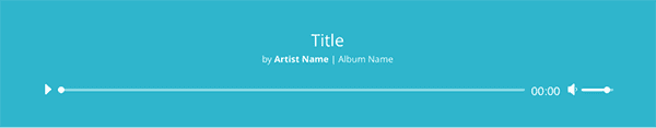
Before we begin styling the audio module, let’s familiarize ourselves with the default feature. The clean, minimalist look would certainly suffice to showcase some sound bytes, but it’s always a good idea to tailor a design based on context–which is exactly what we are going to do today.
Here is the default version of the Divi audio module:
And here is the design concept we are going to be building today:
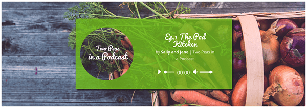
Just follow the steps I describe below to imitate this design, substituting image assets that best communicate your own brand.
How to Style Your Divi Audio Module as a Podcast Player
Subscribe To Our Youtube Channel
The Concept & Inspiration
Between the raw, vegan, and paleo movements, it’s clear that people are starting to pay closer attention to their diets. While scrolling through a stock photography website, I came across this photo–which spoke immediately to those initiatives, with its rustic color palette and home-grown feel. Even if your business or website isn’t food-centric, the layout and composition of this design works equally well with other image assets, so feel free to theme it differently.
Preparing the Design Elements
Because we accomplish much of this design with CSS, the number of image assets we need is limited to two. First is the section background image, which I downloaded from Unsplash here. I recommend sizing it down a bit; Unsplash provides high resolution photos that invariably slow down load time. To ensure that the image still looks good on retina devices, I recommend sizing it down to 1920 px by 1280 px in Photoshop or some other image-editing software.
Next, I created a simple podcast cover image in Adobe Photoshop, designed at 600 px by 600 px. Notice that part of the design hinges on the repetition of imagery, so if you use a different background image, be sure to incorporate it into your cover image as well.
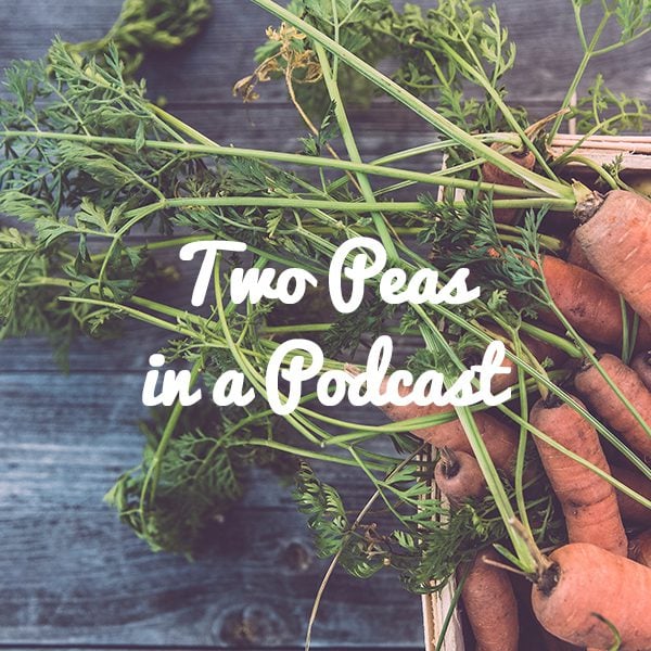
The text in the image above should be added in your photo editing software.
To get the free font we used in the above graphic and install it on your computer, follow the following steps:
- Download Pacifico from Google Fonts
- Locate the downloaded file on your computer.
- Unzip or expand the folder.
- Double-click “Pacifico.ttf” and install the font.
- Locate it in your photo editing software as a font option. You may need to quick and re-start your photo editing app before it shows up.
Implementing the Design with Divi
The design we will be creating today is best suited to a podcast about cooking, gardening, or local produce, but it can be repurposed for anything–from software engineering to globe-trekking–depending on the images you choose. The important feature to note is the prominence of the podcast cover image. This allows users to recognize your show next time they are browsing the App Store!
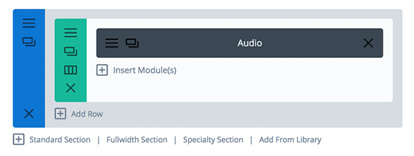
This design has a basic architecture: it is composed of a single section, which houses a single-column row containing only the audio module.
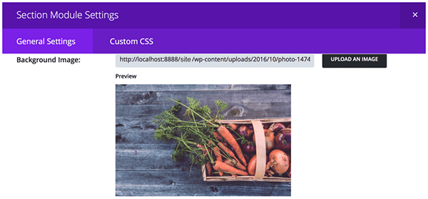
Section Settings
The section settings are straightforward and involve only the upload of a background image. (You can find the harvest photo I used here.)
In the General Settings tab of your section settings, select the photo you want to use from your computer’s local Downloads folder and upload it.
Row Settings
Remember the simplicity of this design’s architecture? It includes only one single-column row inserted within the section whose background image we just set.
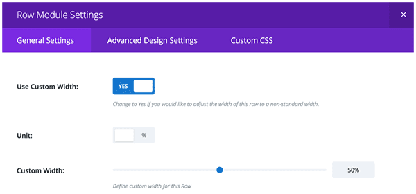
However, there are a few customizations we want to make to this row. After opening up the Row Settings window, toggle the button next to “Use Custom Width” to “Yes.” Next, set the unit to percentage, and drag the slider to 50%. This will prevent the row from spanning the full width of the viewport. Now, it will only ever occupy 50% of its containing box–in this case, the section with the vegetable background that we just customized.
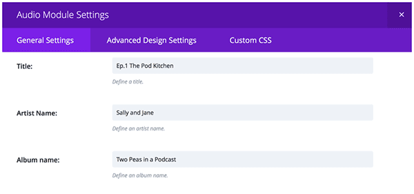
Audio Module Settings
Now it’s time to get to the exciting part–the podcast player! After adding an audio module to the row, upload an MP3 of the episode. Without an audio file, the play button and the progress bar will not display.
Next, fill in the text fields under the General Settings tab. Although the text field titles reference music, we can infer how to input our podcast’s information: in the Title field, input the name of the episode; in the Artist’s Name field, input your host’s name(s); finally, in the Album Name field, input the name of the podcast–in my fictional case, Two Peas in a Podcast.
Lastly, scroll down a little farther and upload the image of your podcast’s cover art.
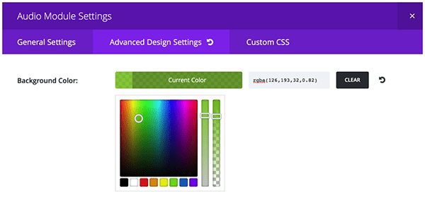
Next, we want to add some styling. Let’s start with the easy details first. Select the Advanced Design Settings tab to adjust the background color and opacity of the box that houses your audio player. I used a rgba value of (126,193,32,0.82) to achieve that pea-green color. If you are using different image assets, however, you will want to select a more bespoke color palette. Feel free to toggle the hue and opacity sliders until you find a background color that suits your brand.
The last adjustment we will be making within the Advanced Design Settings tab is to the font; typography is a fantastic opportunity to communicate brand aesthetics. For Two Peas in a Podcast, I selected the home-grown font, Pacifico. Again, feel free to select whatever font that best resonates with the image assets you are using.
Now it’s time to add a few lines of code under the Custom CSS tab. First, we will add a subtle drop-shadow to the green box containing our audio player. To do this, scroll down to the text field labeled “Main Element,” and paste the following snippet:
box-shadow: 5px 5px 5px #2c2c2c;
You can play with the values to adjust the size, direction, opacity and hue of your drop-shadow.
Finally, we are going to customize the shape of the “album cover” image. (Note, in our design, this image should actually be your podcast’s cover art). Within the Custom CSS tab of the audio player, scroll down to the text field titled “Audio Cover Art” and paste the following:
-webkit-clip-path: circle(40% at 50% 50%);
clip-path: circle(40% at 50% 50%);
This is going to reveal only the parts of the image that are within the parameters we set, making it look like a circle.
When you’re finished, click Save and Exit.
Congrats, with a few built-in customizations and a couple of CSS snippets, you have created the perfect way to market your latest podcast episodes!
Tomorrow: Part 4 – Rocking Color Blocking with the Divi Audio Module
Join us tomorrow for the next installation of our series, in which I’ll show you how to customize the audio module to create a medium-contrast, split-screen design through which to share both music and critical acclaim.
Be sure to subscribe to our email newsletter and YouTube channel so that you never miss a big announcement, useful tip, or Divi freebie!


I cannot get the cut out circle to work. I tried rect as well but nothing…
Has the module changed?
same problem here, couldn´t get the circle to work. Any idea?
thanks in advance
Love this tip! Will start using within the next week or so!
I like it! The audio module is probably my least used at the moment… but I am fairly new to divi. This looks like a great way to style a podcast though. I think I’m going to have to give the audio module a go ASAP 🙂
Not sure if this is the correct place for this… This comment is not about the above, it’s a suggestion for a topic for a Daily Divi series – I remember you said you were looking for new topics to cover… If this is not the correct place to post this, please tell me where I should be posting it.
Unless there is a tool or plugin or tutorial on this already that I’ve missed… (in which case PLEASE let me know) I would like to see a step by step guide on how to build a 3 column page – that has some text fields of varying lengths and have it align vertically when viewing on a desktop and have the page stack correctly when viewing on a tablet or phone.
This is an example page that I’m trying to fix:
http://beacondigitalvideo.biz/dev-hf/project/holiday-cookies-2/
Thanks,
\Dave
PS: my website is not Divi or even WordPress – (I know it needs to be redone).!
Hi Dave, yes this is something that I can put on the blog ideas list. Creating a three column responsive page is not hard. The challenge is changing the “stacking” order when the viewport dimensions change. We will create a tutorial on that topic.