

Post sliders are an elegant solution for presenting a variety of content to your readers. The posts that are highlighted can be organized in a number of ways from categories to date. In today’s project we’re looking at an example from the Facebook Newsroom blog page which presents a category of posts called “Top Stories”. It’s a very attractive slider that emphasizes the post title and the featured image. We’ll recreate the look of this slider using the Divi Post Slider module.
Before & After: The Divi Post Slider Module
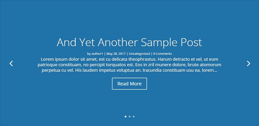
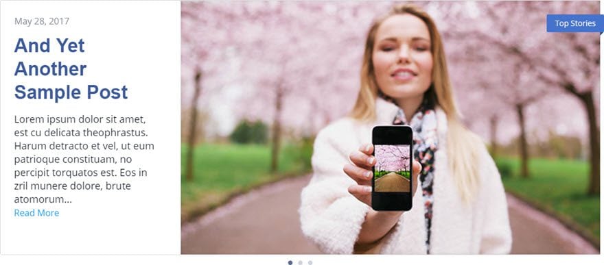
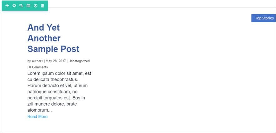
The first image below shows the divi post slider module with it’s default settings, while the second is a modification created with just a few tweaks in settings and some custom CSS.
Before
After
The Concept & Inspiration

As mentioned, the model for today’s post slider style comes from Facebook Newsroom. This is a news blog dedicated to, as you may have guessed, all things Facebook. While most of us know facebook as the social media giant, a quick look through this blog will broaden your perspective. With $8.8 billion in revenue last quarter and 1.23 billion active users per day, the blog post slider on the Facebook Newsroom page provides a worthy model for today’s project.
Preparing the Design Elements
In preparation for this design, you’ll need a few blog posts with featured images. If you aren’t familiar with setting featured images for your posts, you’ll find the setting on the edit post page at the lower right side of the page.
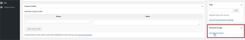
This slider design will work best if each of the featured images is 600px x 400px, but the exact size isn’t critical.
You may also want to add some excerpt text for each of your posts in the “Excerpt” input box found toward the bottom of the post editor page. The post will display your post excerpt if you have one, but will use a portion of your actual content if you don’t.

Implementing the Design with Divi
Subscribe To Our Youtube Channel
If you’re following along and don’t already have a page setup to display your post slider, simply create a new page and click on “Use Visual Builder” to start making the needed modifications.
We begin by adding a Regular Section with a 1 Column structure row.
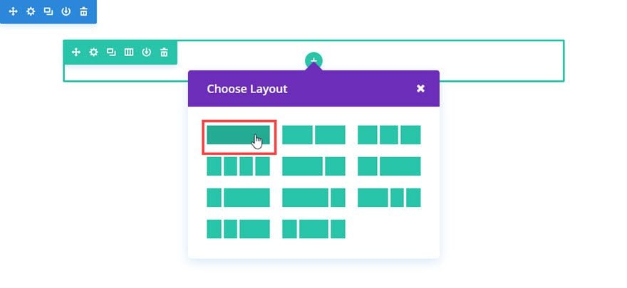
Then add the Post Slider Module to the row.
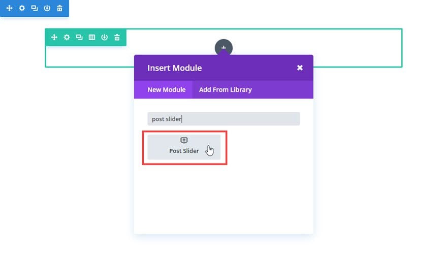
Our modifications begin with “Content” settings, which is where you are by default after adding any new module in the Visual Builder.
Make the following changes to the default Content settings:
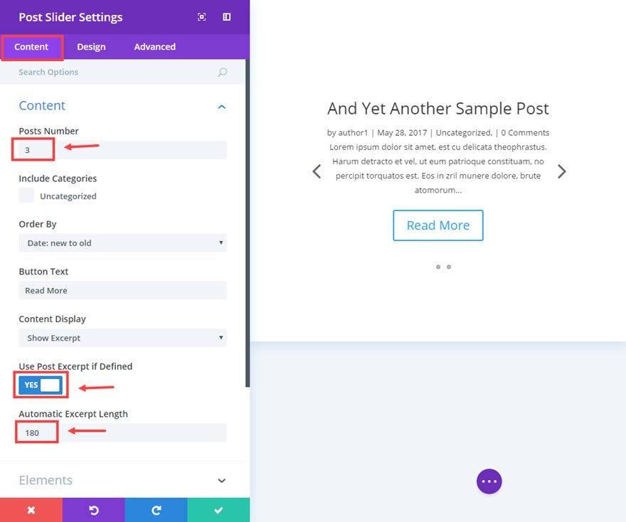
Set “Post Number” to however many posts you want. For this example, I’m using 3.
Then set “Use Post Excerpt if Defined” to yes, and set “Automatic Excerpt Length” to 180.
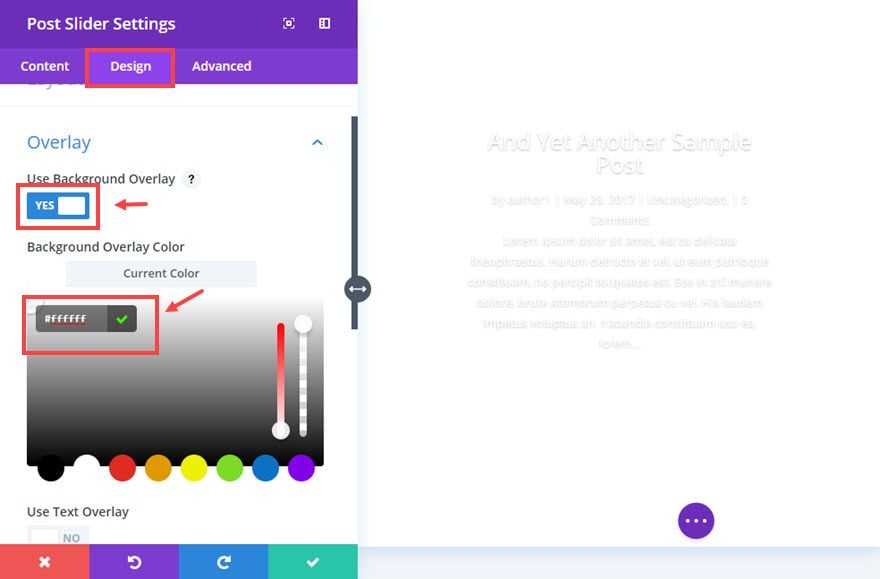
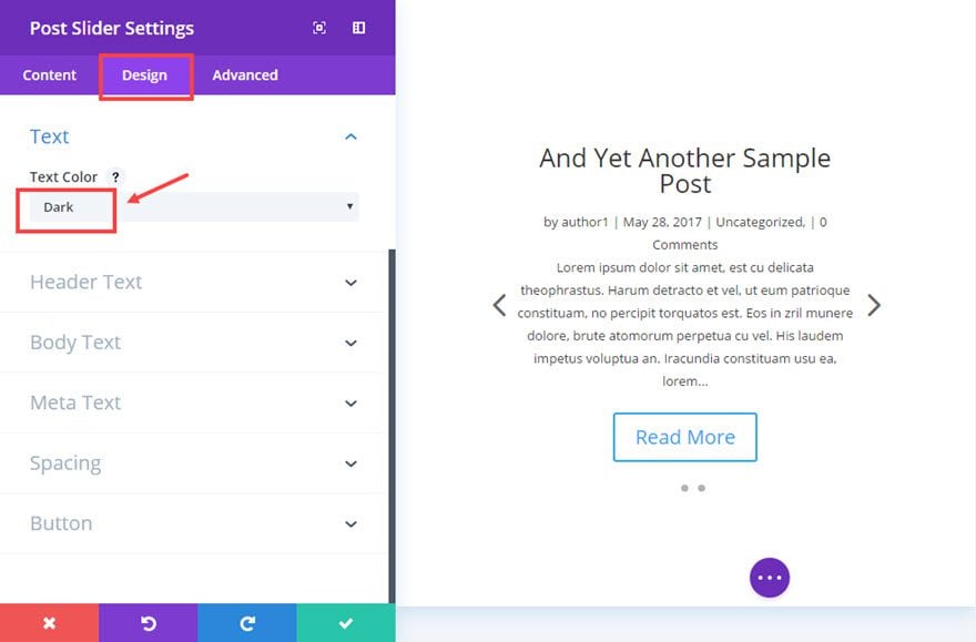
Now we are ready to move to the design settings by clicking the tab at the top of the module settings modal.
Make the following changes to the design settings:
Change the “Background Overlay Color” to white (#ffffff).
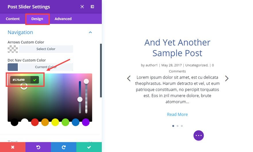
Change “Dot Nav Custom Color” to #576d90.
Change the “text Color” to Dark.
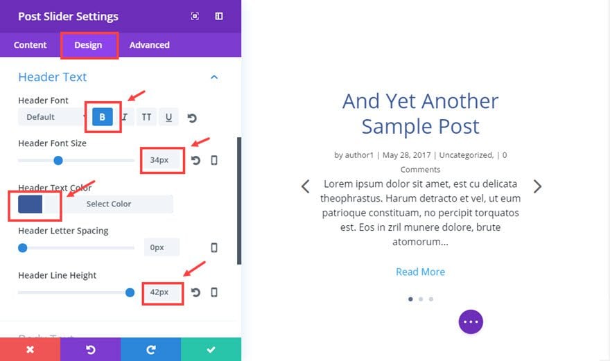
Now make the “Header Font” bold, set the “Header Font Size” to 34px, set “Header text Color” to #3b5998, and “Header Line Height” to 42px.
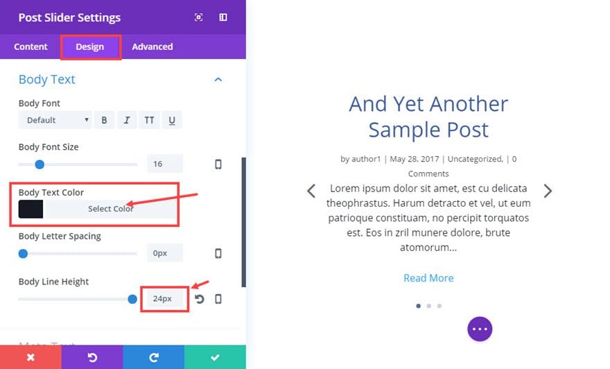
Now set the “Body Text Color” to #141924, and the “Body Line Height” to 24px.
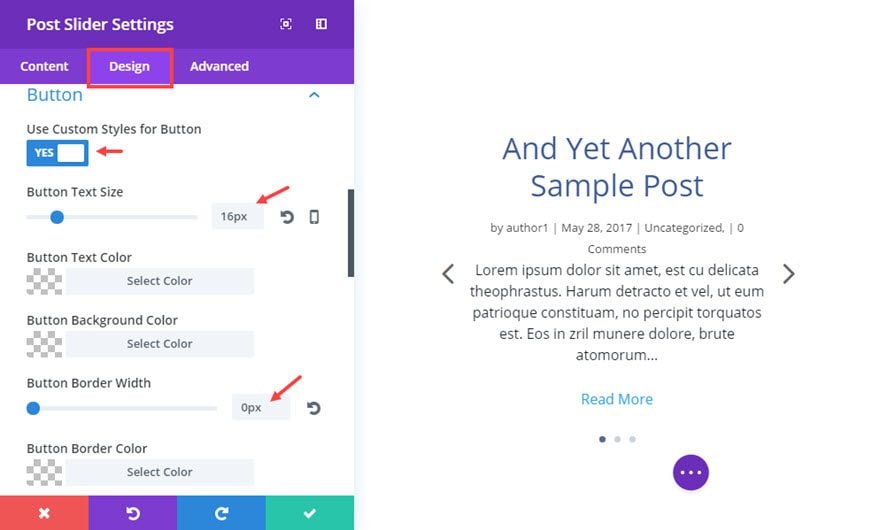
Now click on “Use Custom Styles for Button” to change it to yes. Change the “Button Text Size” to 16px, “Button Border width” to 0px, the “Button Hover Text Color” to #666666, and the “Button Hover Background Color” to rgba(0,0,0,0).
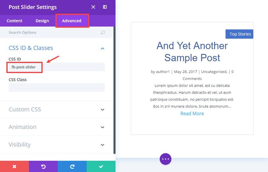
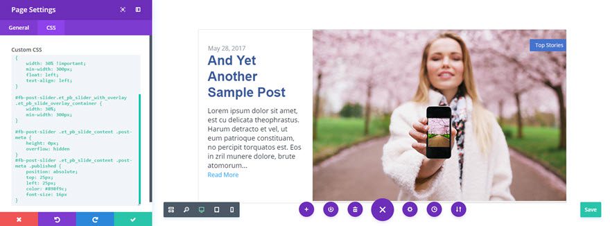
Now click the “Advanced” tab at the top of the module settings modal. In the text input under CSS ID, add “fb-post-slider”. This allows us to add styles to this specific module without having any effect on other post modules that may be displayed on the page.
Now add CSS code to the various elements as follows:
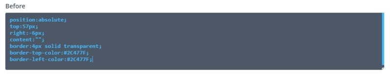
Before
position:absolute;
top:57px;
right:-6px;
content:"";
border:4px solid transparent;
border-top-color:#2C477F;
border-left-color:#2C477F;
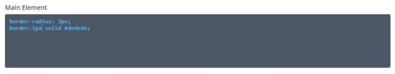
Main Element
border-radius: 3px;
border:1px solid #dedede;
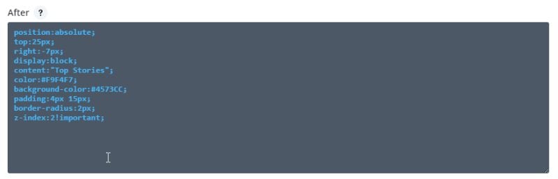
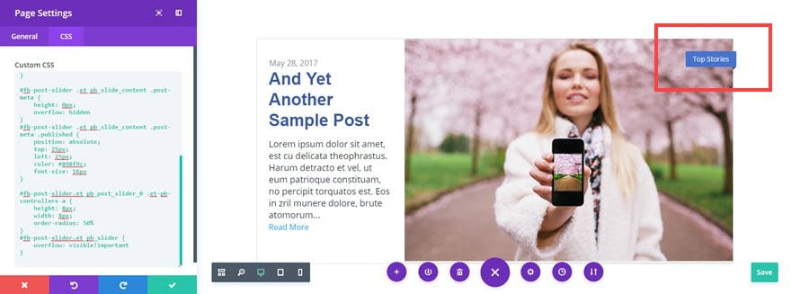
After
position:absolute;
top:25px;
right:-7px;
display:block;
content:"Top Stories";
color:#F9F4F7;
background-color:#4573CC;
padding:4px 15px;
border-radius:2px;
z-index:2!important;
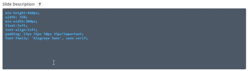
Slide Description
min-height:460px;
width: 35%;
min-width: 300px;
float:left;
padding: 57px 45px 50px 35px!important;
font-family: 'Alegreya Sans', sans-serif;
text-align:left
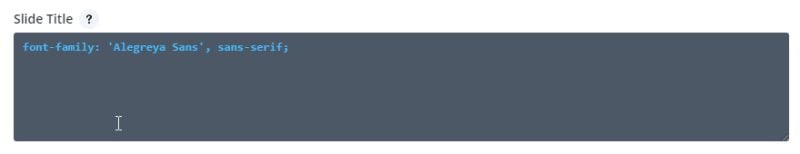
Slide Title
font-family: 'Alegreya Sans', sans-serif;
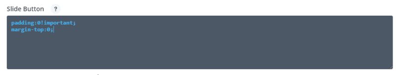
Slide Button
padding:0!important;
margin-top:0;
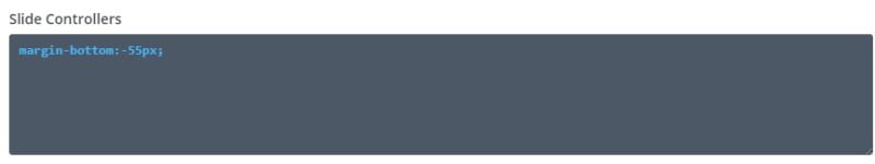
Slide Controllers
margin-bottom:-55px;
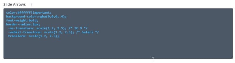
Slide Arrows
color:#ffffff!important;
background-color:rgba(0,0,0,.4);
font-weight:bold;
border-radius:2px;
 -ms-transform: scale(1.2, 2.5); /* IE 9 */
 -webkit-transform: scale(1.2, 2.5); /* Safari */
 transform: scale(1.2, 2.5);
Now save the module settings by clicking on the check mark in the lower right corner of the modal.
You can see in the Visual Builder that there’s still a little ways to go to get our post slider looking just like the one on the Facebook Newsroom page.
That’s nothing a bit of CSS can’t take care of, and we’ll be able to watch it take shape by adding the remaining code to the Page Settings right from the Visual Builder. To get there, click on Expand Settings icon at the bottom center of the page, then click the “Page Settings” icon.
If you are working on a larger monitor, I suggest moving the modal to the side of the Post Slider so that you can see what each bit of code does as we add it. That will better help you to understand the CSS used to style our module.
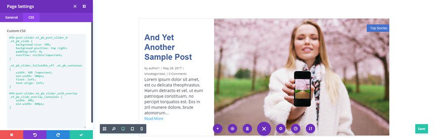
First we will take care of the background image size and position (currently hidden behind the white overlay), as well as the position of the slider text and overlay by adding the following CSS to the “Custom CSS” textarea.
#fb-post-slider.et_pb_post_slider_0 .et_pb_slide {
    background-size: 70%;
    background-position: top right;
    padding-left: 0;
    overflow: visible!important;
}

#fb-post-slider.et_pb_slider_with_overlay .et_pb_slide_overlay_container {
    width: 30%;
    min-width: 300px;
}
Now we’ll take care of hiding our post meta, with the exception of the date, and moving the position of the date above the title. To accomplish this add the following code to the Custom CSS text input just below the previously entered code.
#fb-post-slider .et_pb_slide_content .post-meta {
    height: 0px;
    overflow: hidden
}
#fb-post-slider .et_pb_slide_content .post-meta .published {
    position: absolute;
    top: 32px;
    left: 35px;
    color: #898f9c;
    font-size: 16px
}
We’re just about there with only some minor exceptions. You’ll notice when you hover over our Post Slider module, that both the previous and the next arrows appear. On the Facebook newsroom slider, only the next arrow appears. That’s easily fixed by adding the following CSS to the Custom CSS text input just below the previously entered code.
#fb-post-slider .et-pb-arrow-prev {
    display: none
}
Now we need to reposition the navigation dots underneath the slider with the following code. By the way, you’ll also notice that setting the slider’s overflow property to visible reveals the 3D effect we created earlier for the “Top Stories” tag that wraps around the upper right corner.
#fb-post-slider.et_pb_post_slider_0 .et-pb-controllers a {
    height: 8px;
    width: 8px;
    order-radius: 50%
}
#fb-post-slider.et_pb_slider {
    overflow: visible!important
}
Finally, this last bit of code will change the animation of our slider to more closely match our model slider. Albeit not a perfect match, it’s the closest I could get without getting into jQuery solutions. There’s also some media queries to make our slider a bit more responsive.
.et-pb-active-slide .et_pb_slide_description {
    animation-name: fadeIn;
}
.et_pb_slide.et-pb-active-slide {
    transition: opacity 2.5s!important
}

@media all and (max-width: 1252px) {
    #fb-post-slider.et_pb_post_slider_0 .et_pb_slide {
        background-size: 90%
    }
}
@media all and (max-width: 980px) {
    #fb-post-slider.et_pb_post_slider_0 .et_pb_slide {
        background-size: 100%;
        background-position: top center;
    }
}
Now you can save the page by clicking the save button at the bottom right corner of your screen. Once the page is saved, exit the visual builder to see the finished post slider, inspired by the post slider on the Facebook Newsroom page.
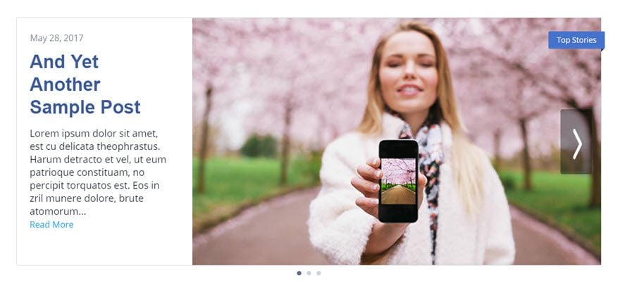
Final Thoughts
Well, whether you found this particular design useful or not, I hope it has provided a detailed look into some of the more advanced settings within Divi’s Post Slider Module, as well as piqued your imagination as to what is possible.


Great Article.
Everything is working fine. But I have a big space under the photo.
here is the link http://gruendermetropole-berlin.de/top
Thank you so much for hints to fix it
Stefan
Now I have another problem:
I saved the complete layout of the page to the library.
When I create a new page and load that layout, I get everything except the images!
The text/content is there, the navigation works, the layout is ok, but the images are not displayed.
Why that?
I found the reason: Featured Images don’t belong to a layout, so they are not saved…
This recipe is only working if you are not using any text or other content before that slider on a standard page template.
It was possible to add some headlines / titles etc. before the slider only when the “blank page template” was active
This is not very clever as most of the users use menues etc.
you can change that by setting
.et_pb_post_slider_0.et_pb_slider:before
to
position:relative;
in the advanced settings.
I wonder why this was set to absolute? What is the benefit of the absolute placement?
can we customize the height and width of the module. I need small and compact. Please help.
Can you configure it in any way so that the text Top Stories is not static on the CSS sheet? And be dynamic, and show, for example, the category of the item? Thank you
Hello,
Sorry, I am trying to add this as an extra row on an existing page (that has other elements in it) and it is not working for me. It all looks fine with the tutorial until I start adding the custom CSS to the page settings, then nothing happens at all. But I don’t actually have the same tabs for page settings – I have “content”, “design” and “advanced” across the top and the custom CSS is under advance. Is the problem perhaps that I am adding it to a page with other elements in it? My site is still on a local host so I can’t post the URL unfortunately.
Thank you,
Alison
Very nice! But i’m wondering how to change the Top Stories text in the overlay on the image.
In the module settings under Advabced => Custom CSS => After you will see the text is set as CSS content.
Great article. But, I have space added below the picture which I could not remove. I added css as mentioned in reply but that also did not help.
Is your featured image sized to 600 x 400px or something very close to that aspect ratio?
Great post, thx.
One question: How can I delete the date?
.comment_date { display: none; }
at custom-css
doesn’t work
Thx in advance, Michael
If you don’t want the date then you should just change the “Show meta” to no in content settings
Hi!! Would anyone please help me to make it this style look good on mobile devices. The design works perfectly on tablet and desktop but on mobile it is not showing the image and it looks dull.
Can someone help?
Hi there: I’m having the same problem. The Post slider on Desktop View works fine, Tablet View leaves half-the-space blank at the bottom, and the Phone View narrows down the image and it looks odd. Can any one please help? Thank you.
Really like this look but I noticed that it does not seem to respond well on mobile. Thoughts?
Hi Another great blog, thanks. But can this be done using the normal (non post) slider and with projects rather than posts?
OH, I like this A LOT… Thanks for sharing.. Not only do I see using this almost as-is… It also has inspired some other ideas as well.. which is why I love this blog so much.
Is it not possible to do this using woocommerce products in place of post categories?
Looks great. I’ll give it a try.
Great tutorial!
I experienced a problem though with the image at small viewports. It did not fill the entire width or height.
I fixed it like this in the custom css within the page settings:
/* extra media query*/
@media all and (min-width: 769px) an (max-width: 880px) {
#fb-post-slider.et_pb_post_slider_0 .et_pb_slide {
background-size:auto 100%!important;
}
}
/* end extra media query*/
If there is a better way to fix this, please let me know.
Thanks once again for the great tutorial!
You must select the image featured location in background. After that, the imagen must adjusted proportionally to your slide size.
Under which Custom CSS heading do you enter the code?
I’m having the same problem…picture no filling the whole column.
@Matt & @Brent:
Revised version, this seemed to work better. It must be added in the Page settings CSS. Here is the css:
/* extra media queries to be added in the Page settings, Advanced tab underneath the code of the tutorial */
/*extra query on small screens up to 870px */
@media all and (max-width:870px) {
#fb-post-slider.et_pb_post_slider_0 .et_pb_slide {
background-size: auto 100%!important;
}
}
/*fix triangle of 3D effect on small screens */
@media all and (max-width: 980px) {
#fb-post-slider.et_pb_post_slider_0:before {
top: 50px!important;
}
}
Thank you!
That’s why I like Divi the most. Thanks for all features and tutorials. My website is looking very professional although I don’t have any coding knowledge. Thanks to Divi thanks to cms platform WordPress
Fantastic thanks.
A great way to learn.
Its very helpful. Thanks
Ah finally, the continuation of November’s series 🙂 I’ve been waiting for this one 🙂 Now if I can remember which project I was wanting to use it for lol.
Thank you for publishing this one. I also wondering if you can publish how to create Facebook Newsroom products page design. I like nice, clean user interface. I am struggling to achieve this look with divi. I will go over your tutorial and let you know how it went.
good information. thank you.
I love the design! I would like to know if this would work in Extra too?
Wow ! I am spell bound.
Great tutorial.
Thanks
Followed the instructions to the letter and it worked fine, nice quick way to make 2 similar sites look a little different. Thanks.
Great work. Thanks for sharing. I’m going to try this one out.
John,
Very cool and I can’t thank you enough for the step-by-step illustration. You have no idea how much more useful a blog post is when people show you how to do it so you can replicate it. Again, nice post and I cannot wait to use this.