
Designing a blog post template is pretty easy with the Divi theme builder. But there’s one thing that tends to get overlooked when designing blog templates, and that’s the comments section. Thankfully, Divi has a customizable comments module that can easily be added to a blog post template. In this post, we’ll show you how to create two custom comments section designs that you can include in any blog template. You’ll be able to download the JSON file for free as well!
Let’s get to it.
- 1 Preview
- 2 Download The Comments Module Templates for FREE
- 3 Download For Free
-
4
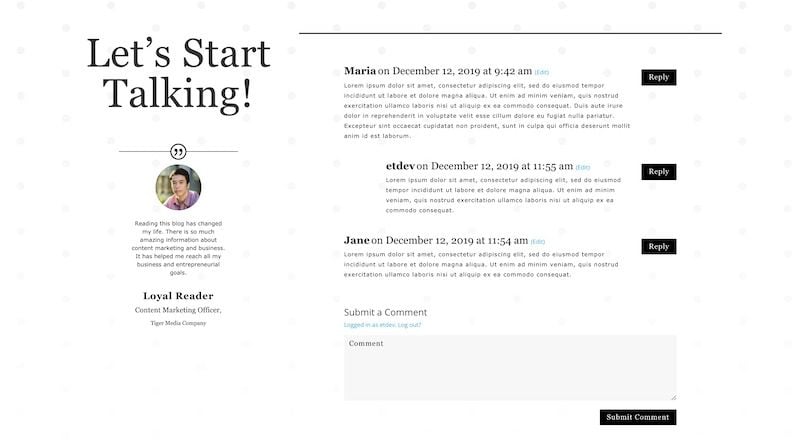
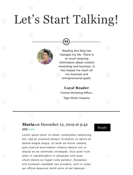
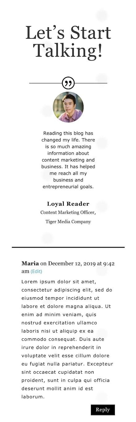
Let’s Recreate Comments Module Design #1
- 4.1 Create Background Design
- 4.2 Open Theme Builder and Add New Template
- 4.3 Select the Template for All Posts
- 4.4 Add Custom Body and Build From Scratch
- 4.5 Add New Section
- 4.6 Add New Row
- 4.7 Column 2 Settings
- 4.8 Add Text Module to Column 1
- 4.9 Add Testimonial Module to Column 1
- 4.10 Add Comments Module to Column 2
-
5
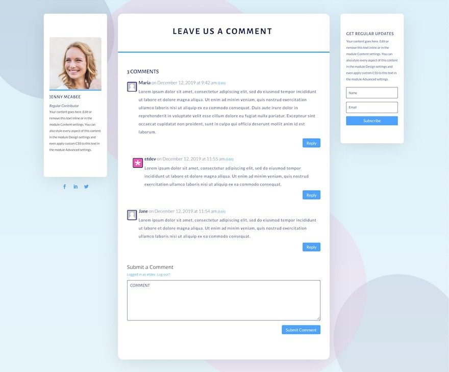
Let’s Recreate Comments Module Design #2
- 5.1 Create Background Design
- 5.2 Open Theme Builder and Add New Template
- 5.3 Select the Template for All Posts
- 5.4 Add Custom Body and Build From Scratch
- 5.5 Add New Section
- 5.6 Add New Row
- 5.7 Column 2 Settings
- 5.8 Add Person Module to Column 1
- 5.9 Add Social Media Follow Module to Column 1
- 5.10 Add Text Module to Column 2
- 5.11 Add Comments Module to Column 2
- 5.12 Add Email Optin Module to Column 3
- 6 Preview
- 7 It’s a Comments Module Wrap!
Preview
Let’s take a look at how the comment layout designs look on different screen sizes. The first design is a minimal style in black and white and the second one is more colorful.
Desktop
Tablet
Phone
Desktop
Tablet
Mobile
Download The Comments Module Templates for FREE
To lay your hands on the free comments module templates, you will first need to download them using the button below. To gain access to the download you will need to subscribe to our newsletter by using the form below. As a new subscriber, you will receive even more Divi goodness and a free Divi Layout pack every Monday! If you’re already on the list, simply enter your email address below and click download. You will not be “resubscribed” or receive extra emails.

Let’s Recreate Comments Module Design #1
Create Background Design
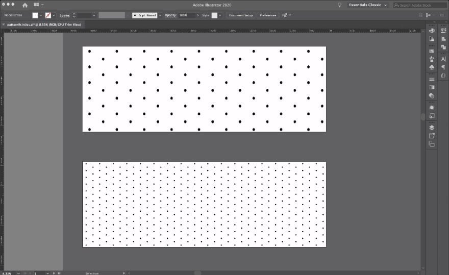
The first step to recreate the black and white comments layout template is to design the dots background. One for the desktop view and another for responsive screens. If you want to create this yourself you will need Adobe Illustrator’s pattern maker tool. Otherwise, you can source a similar pattern from the internet or use the one that’s included in the downloadable .zip file above.
- In Adobe Illustrator, create a blank artboard around 1920px high + 670px wide.
- Create a black circle inside a white square with margins about half the size of the circle.
- Select both shapes and make a pattern by clicking on object > pattern > make.
- In the pattern maker, choose ‘brick by column’ and save as a pattern swatch.
- Create a shape the size of the artboard and apply the pattern.
- For the responsive screen sizes, shrink the shape to half its size. Press shift to keep the circles’ ratio.
- Copy and paste the patterned shape next to the first and now you have the same pattern with smaller circles.
- Download both separately.
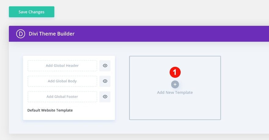
Open Theme Builder and Add New Template
Now it’s time to open the theme builder. Add a new template.
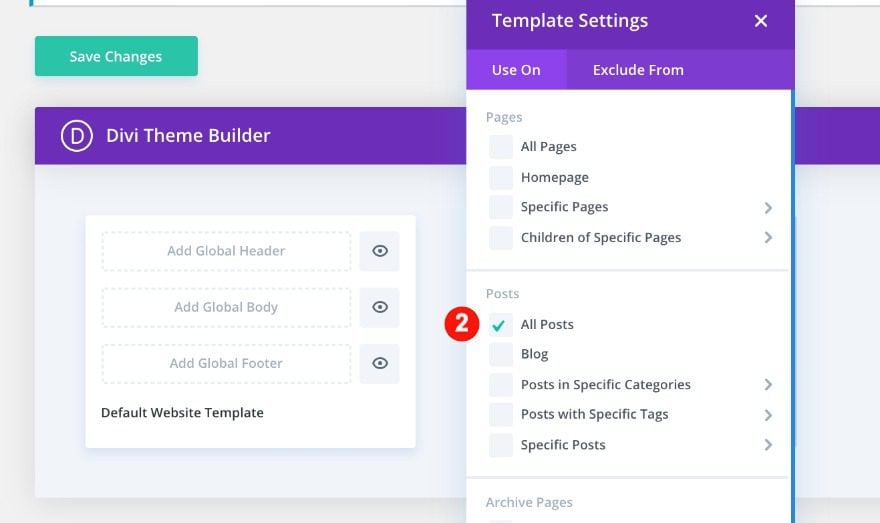
Select the Template for All Posts
Use the new template on all posts.
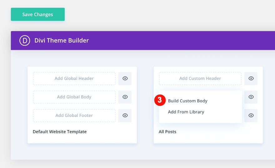
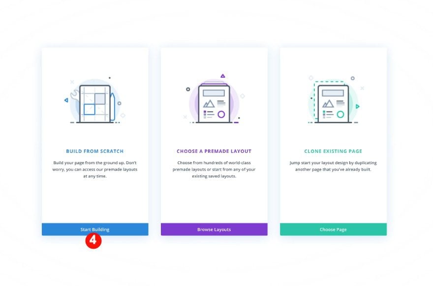
Add Custom Body and Build From Scratch
Last but not least, start building the template’s custom body.
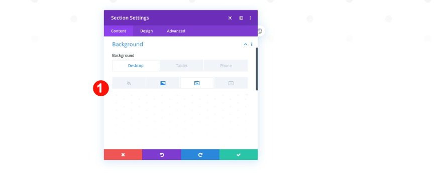
Add New Section
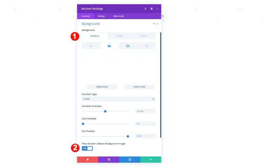
Background
Now, we can start building the design for the comments layout. Inside the template editor, you’ll notice a section. Open the section settings and upload the pattern background images. Add a gradient overlay as well.
- Background: Gradient
- Color 1: Semi-Transparent White rgba(255,255,255,0.96)
- Color 2: White #ffffff
- Place Gradient Above Background Image: Yes
- Image:
- Desktop: Dots Pattern Image 1
- Tablet and Phone: Dots Pattern Image 2
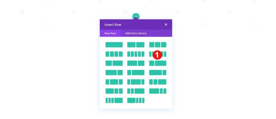
Add New Row
Column Structure
Now, add a new row with two columns.
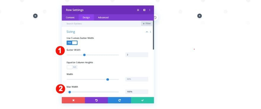
Sizing
Then, adjust the sizing of the row.
- Custom Gutter Width: 2
- Width: 80%
- Max Width: 100%
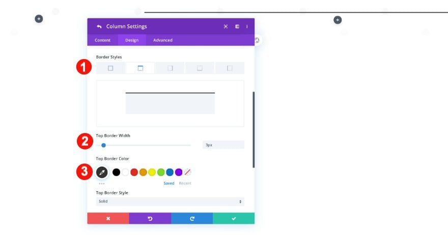
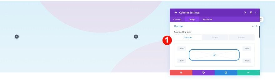
Column 2 Settings
Border
In the columns settings, add a top border to the second column.
- Style: Top only
- Width : 3px
- Color: Black #ffffff
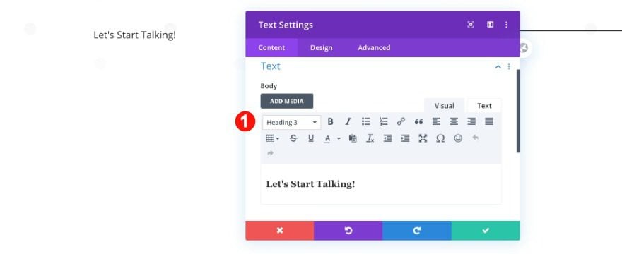
Add Text Module to Column 1
Content
Add the first text module to column 1 with some H3 content of your choice.
- Text: Paragraph
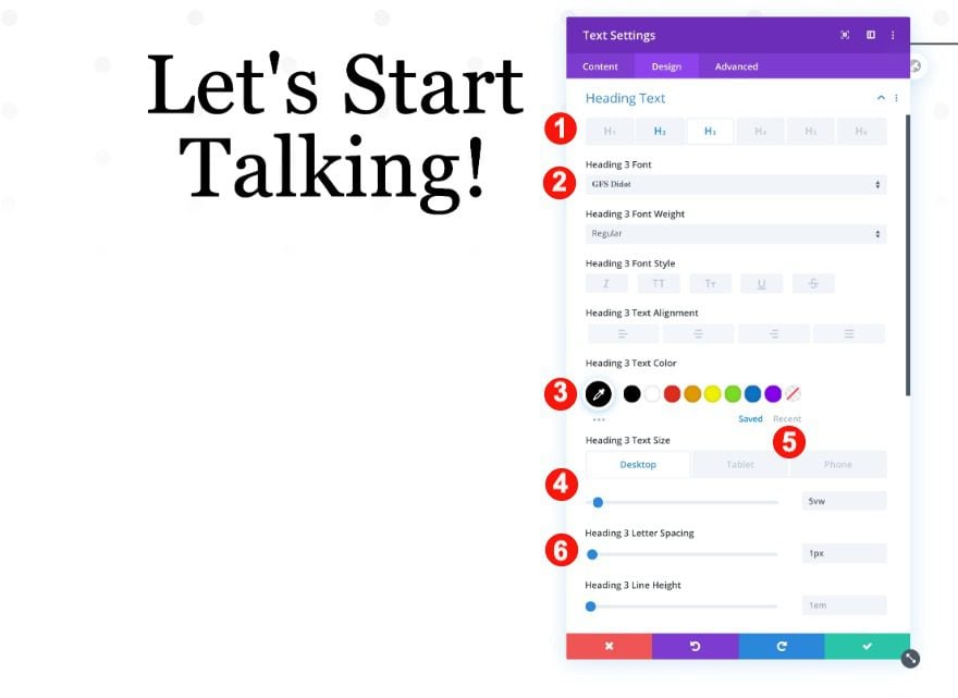
Heading Text
Then, in the design tab, style the heading text.
- Heading Level: H3
- Font: GFS Didot
- Color: Black #000000
- Size:
- Desktop: 5vw
- Tablet: 9vw
- Phone: 13vw
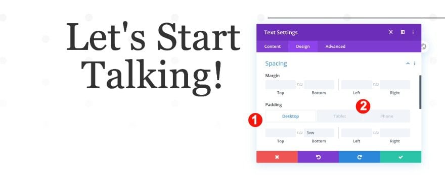
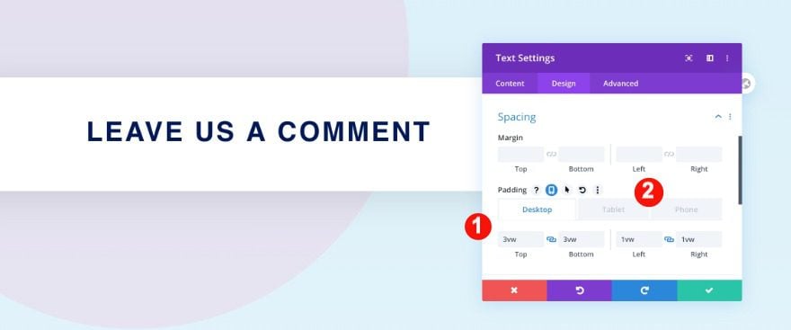
Spacing
Also, adjust the spacing.
- Bottom Padding
- Desktop: 3vw
- Tablet and Phone: 7vw
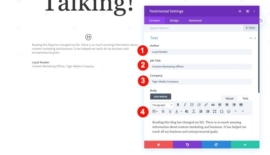
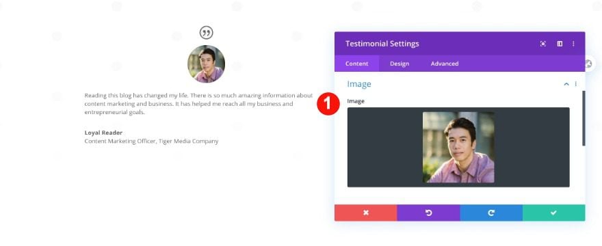
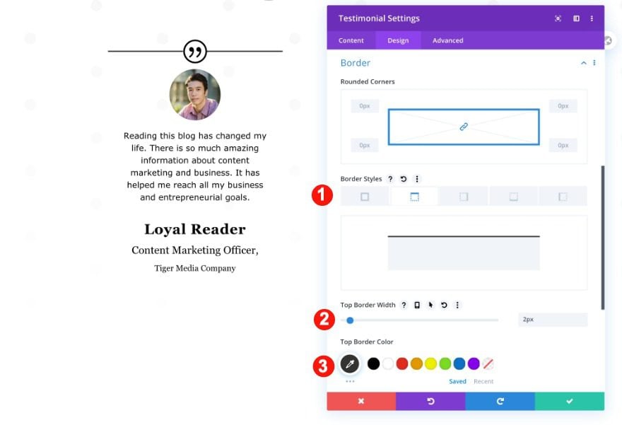
Add Testimonial Module to Column 1
Content
Now, add a testimonial module to column 1 with some content of your choice. Upload an image as well.
- Author: Loyal Reader
- Job Title: Content Marketing Officer
- Company: Tiger Media Company
- Body: Paragraph text
- Image: Portrait Photo
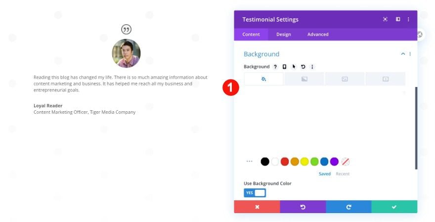
Background
Make sure the background is transparent
- Background Color: Transparent
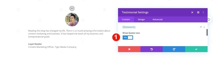
Elements
In the elements tab, select to show the quote icon.
- Show Quote Icon: Yes
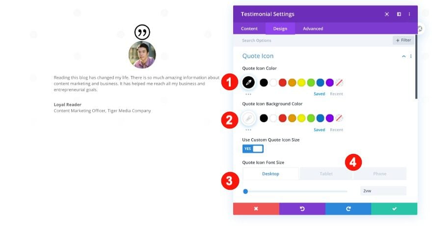
Quote Icon
Then, style the quote icon as follows.
- Color: Black #000000
- Background: White #ffffff
- Icon Font Size:
- Desktop: 2vw
- Tablet: 5vw
- Phone: 9vw
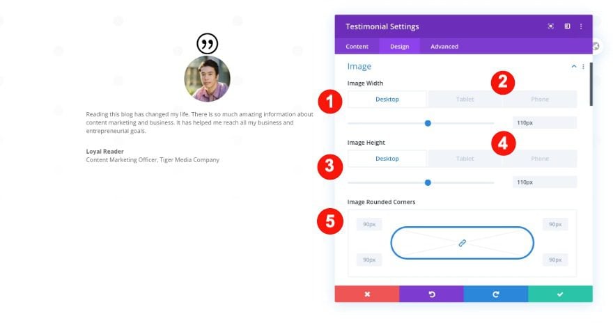
Image
Change the image settings next.
- Width and Height:
- Desktop: 110px
- Tablet and Phone: 90px
- Rounded Corners: 90px
- Border Color: Transparent
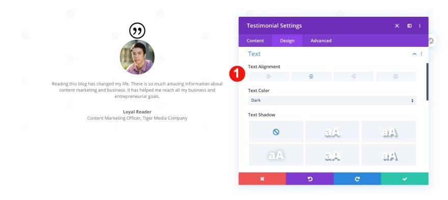
Text
Change the text alignment too.
- Alignment: Center
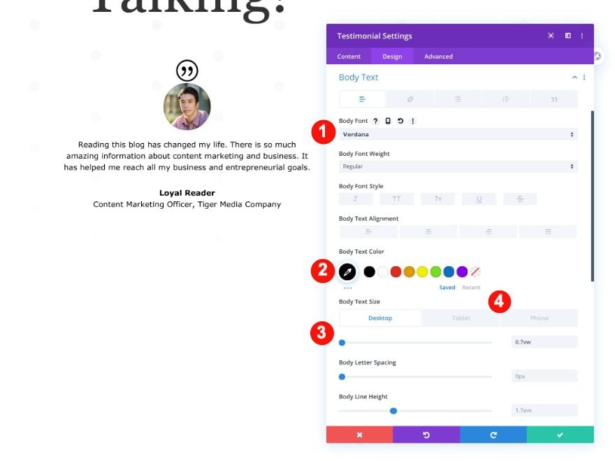
Body Text
Then, style the body text.
- Font: Verdana
- Color: Black
- Size:
- Desktop: 0.7vw
- Tablet: 2vw
- Phone: 3vw
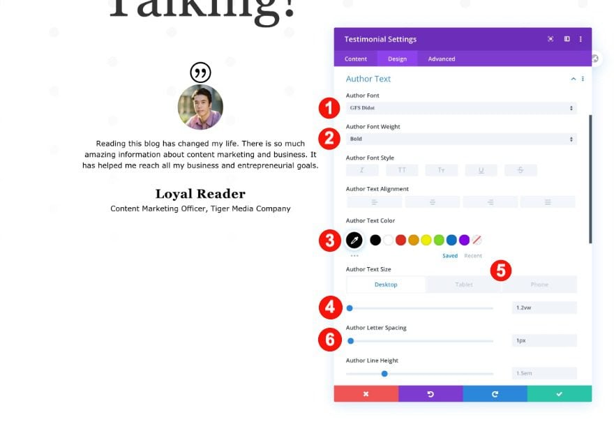
Author Text
Continue by styling the author text.
- Font: GFS Didot
- Weight: Bold
- Color: Black #ffffff
- Size:
- Desktop: 1.2vw
- Tablet: 2.5vw
- Phone: 4vw
- Letter Spacing: 1px
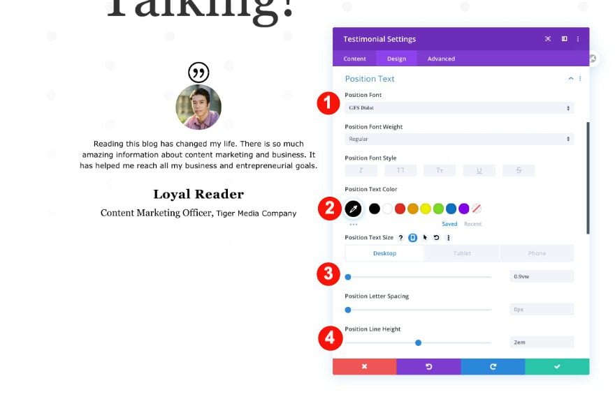
Position Text
Then, the position text.
- Font: GFS Didot
- Color: Black #ffffff
- Size:
- Desktop: 0.9vw
- Tablet: 2vw
- Phone: 3vw
- Line Height: 2em
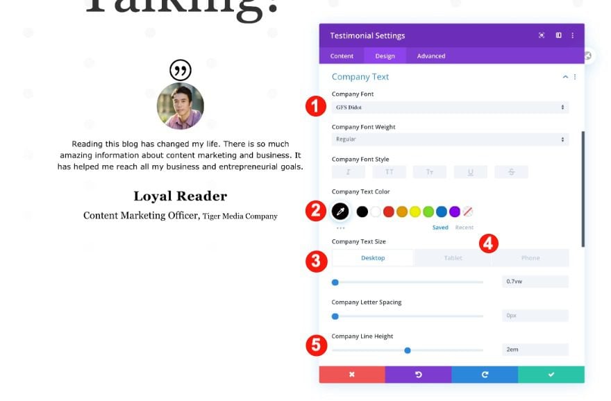
Company Text
Also, the company text.
- Font: GFS Didot
- Color: Black #ffffff
- Size:
- Desktop: 0.7vw
- Tablet: 2vw
- Phone: 3vw
- Line Height: 2em
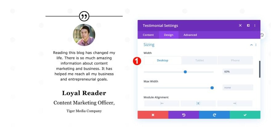
Sizing
Continue by adjusting the sizing of the module.
- Width:
- Desktop: 60%
- Tablet: 65%
- Phone: 75%
- Module Alignment: Center
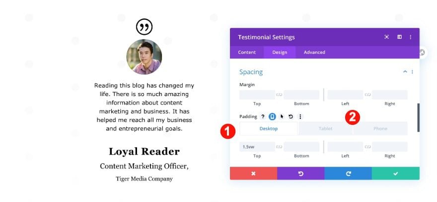
Spacing
Also, adjust the spacing.
- Top Padding:
- Desktop: 1.5vw
- Tablet: 5vw
- Phone: 6vw
Border
Finally, add a top border to the module.
- Border Styles: Top only
- Width: 2px
- Color: Black #ffffff
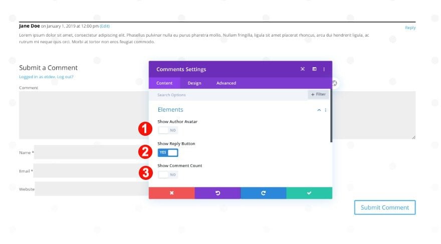
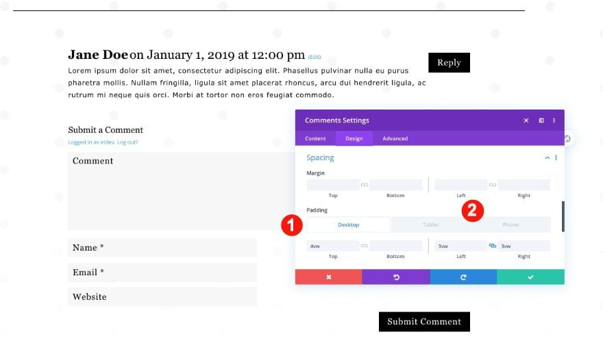
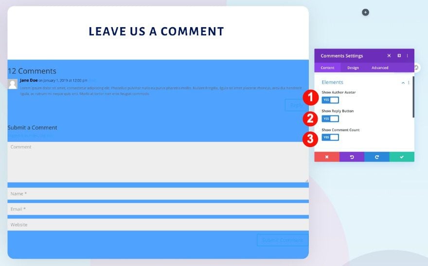
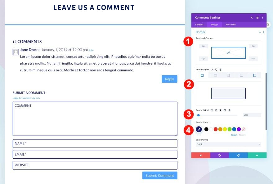
Add Comments Module to Column 2
Elements
Moving on to column 2, add a comments module. Change the elements settings as follows.
- Show Author Avatar: No
- Show Reply Button: Yes
- Show Comment Count: No
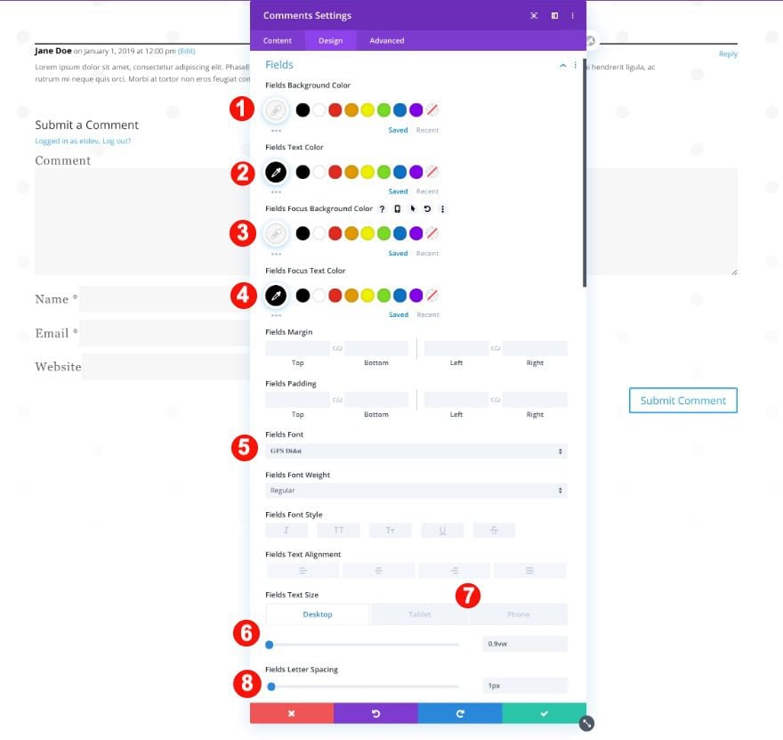
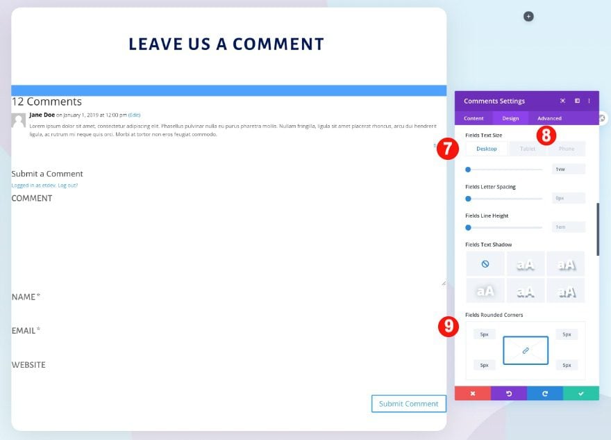
Fields
Move on to the module’s design tab and change the fields settings.
- Text Color: Black #oooooo
- Background Color: Pale Grey #f7f7f7
- Focus Text Color: Black #oooooo
- Focus Background Color: Pale Grey #f7f7f7
- Font: GFS Didot
- Text Size:
- Desktop: 0.9vw
- Tablet: 1.5vw
- Phone: 2.5vw
- Letter Spacing: 1px
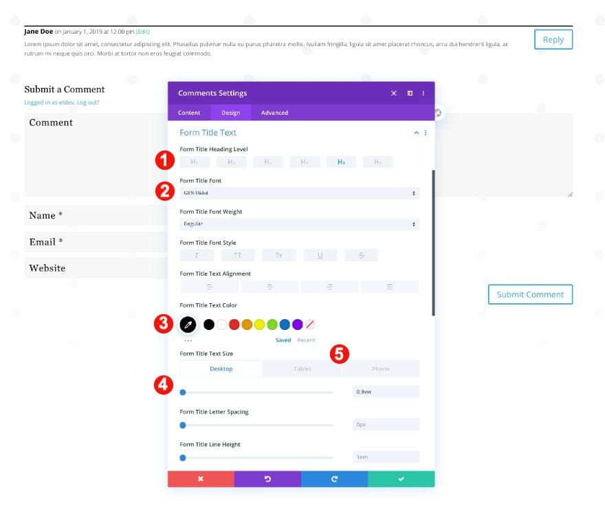
Form Title Text
Modify the form title text settings next.
- Font: GFS Didot
- Color: Black #ffffff
- Size:
- Desktop: 0.9vw
- Tablet: 2.5vw
- Font: 3.5vw
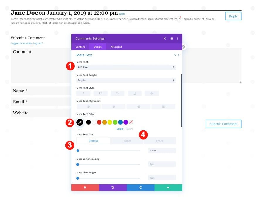
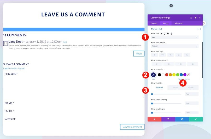
Meta Text
Continue by styling the meta text.
- Font: GFS Didot
- Color: Black #ffffff
- Size:
- Desktop: 1.3vw
- Tablet: 3vw
- Phone: 4vw
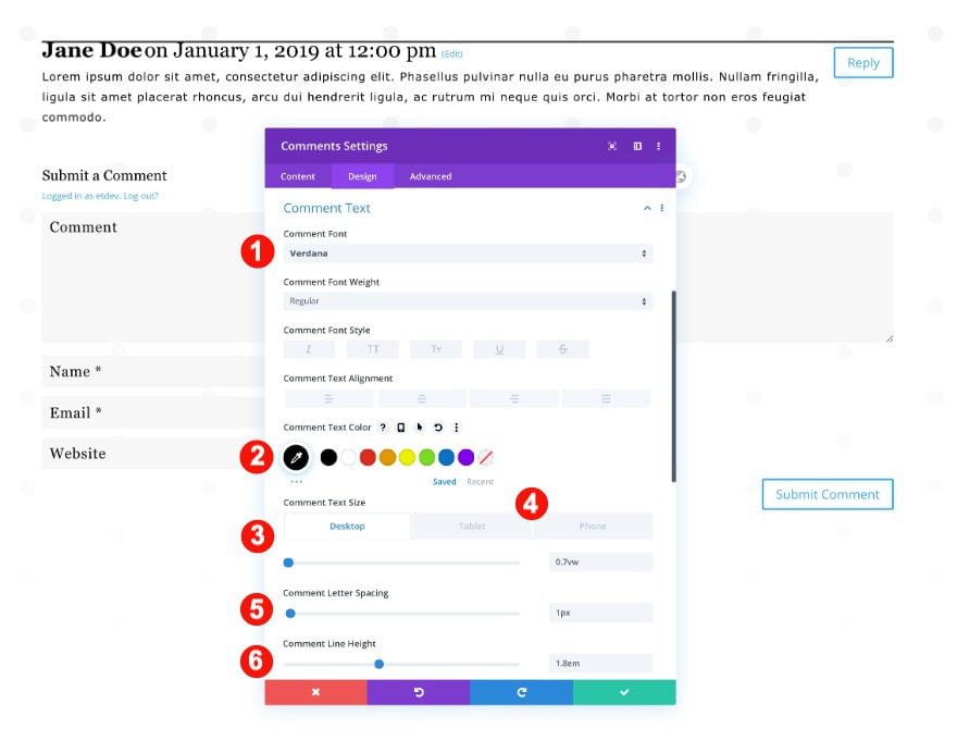
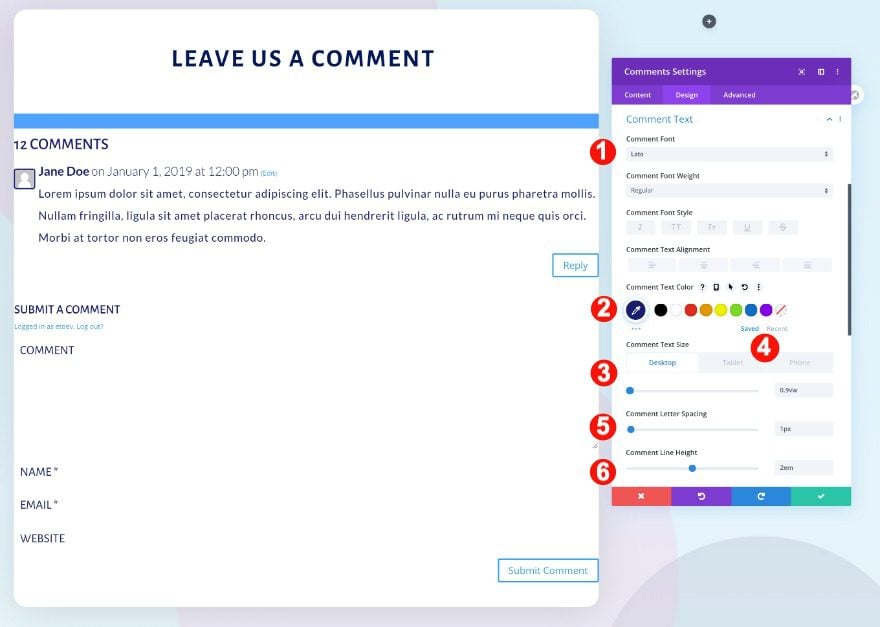
Comment Text
Also, the comment text.
- Font: Verdana
- Color: Black #ffffff
- Size:
- Desktop: 0.7vw
- Tablet: 1.7vw
- Phone: 2.7vw
- Letter Spacing: 1px
- Line Height: 1.8em
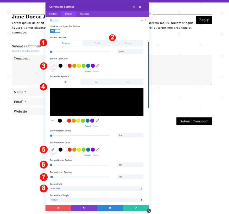
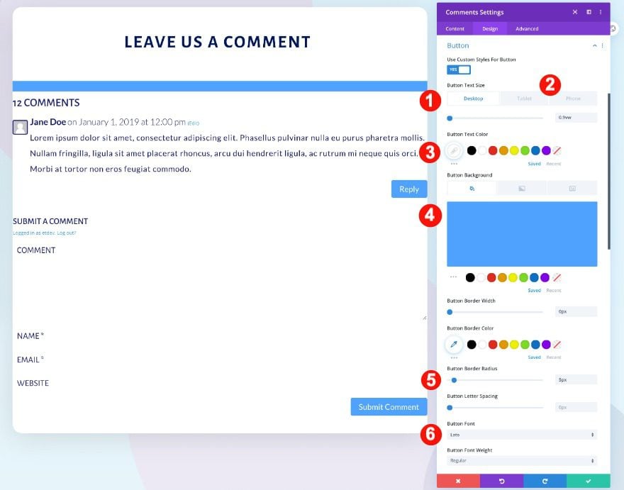
Button
Moving on, style the buttons.
- Text Size:
- Desktop: 0.9vw
- Tablet: 2.5vw
- Phone: 3.5vw
- Text Color: White #000000
- Background: Black #ffffff
- Letter Spacing: 1px
- Font: GFS Didot
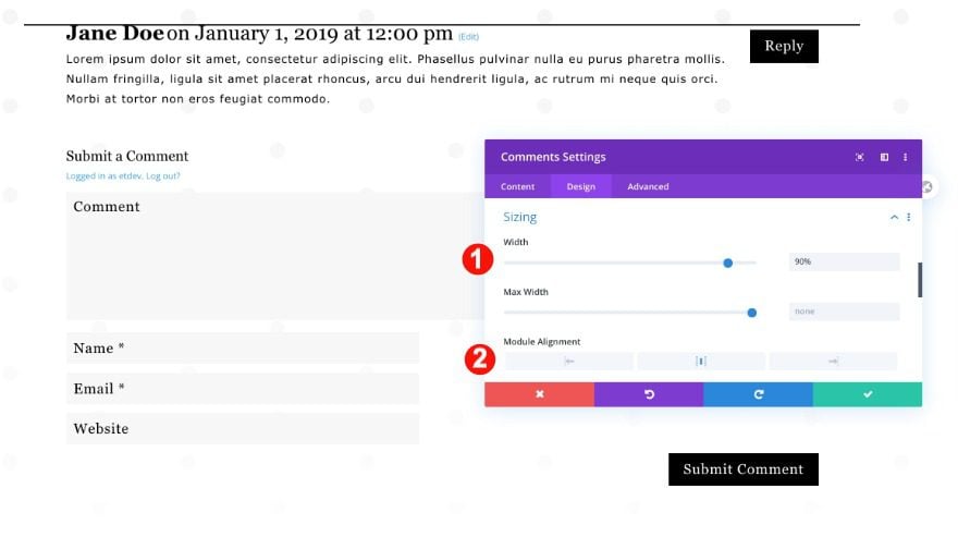
Sizing
Then, adjust the module’s sizing settings.
- Width: 90%
- Module Alignment: Center
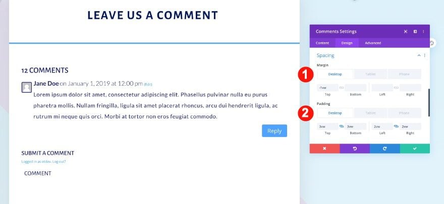
Spacing
Finally, the spacing too.
- Top Padding:
- Desktop: 4vw
- Tablet and Phone: 8vw
- Left and Right Padding: 3vw
Let’s Recreate Comments Module Design #2
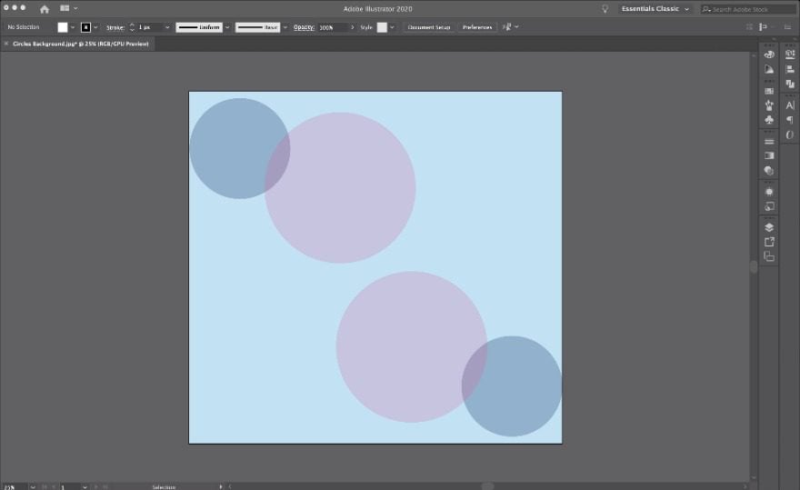
Create Background Design
The first step to recreate the colorful circles’ comments module layout is to prepare a background design. You can create a simple circle design inside your favorite graphics editor. These are the steps you need to take to create the background image:
- Create a canvas 1800px wide and around 1800px high.
- Add two circles, one larger than the other.
- Color the circles and add some transparency.
- Place the two circles a little overlapped on the top left of the canvas.
- Group the circles as one object and duplicate them.
- Flip the circles and place them diagonally down and right from the first two.
- Make sure to leave space at the top and bottom. When there are a lot of comments, the image will repeat and tile vertically.
The background design we created for this comment layout template is also available in the zipped folder that you can download at the beginning of the tutorial.
Open Theme Builder and Add New Template
Now it’s time to open the theme builder. Add a new template.
Select the Template for All Posts
Apply the template to all posts.
Add Custom Body and Build From Scratch
And start building the template’s custom body.
Add New Section
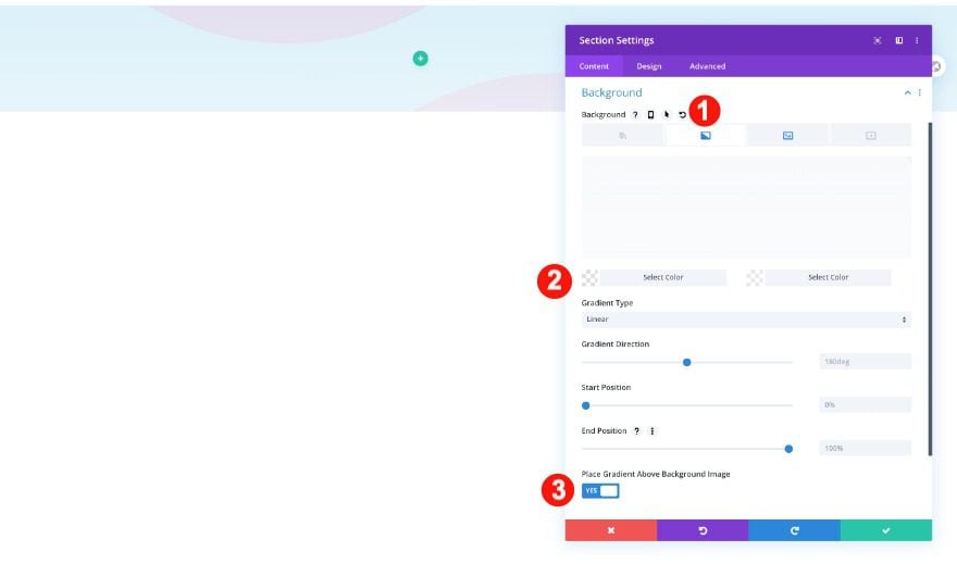
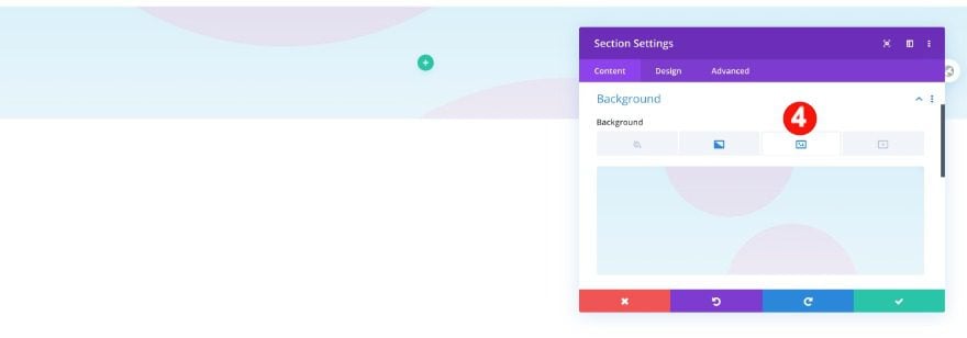
Once in the template editor, you’ll notice a section. Open that section and upload the background image. Include a gradient color overlay as well.
Background
- Background: Gradient
- Gradient Color 1: Transparent White rgba(255,255,255,0.55)
- Gradient Color 2: Transparent White rgba(255,255,255,0.55)
- Image: Circles Background
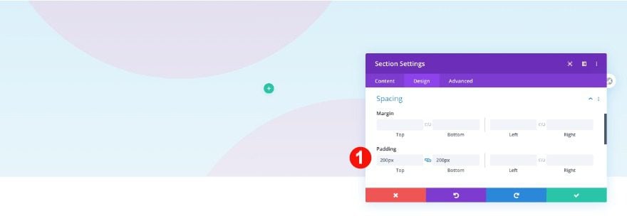
Spacing
Also, adjust the spacing of the section before adding a row.
- Top and Bottom Padding: 200px
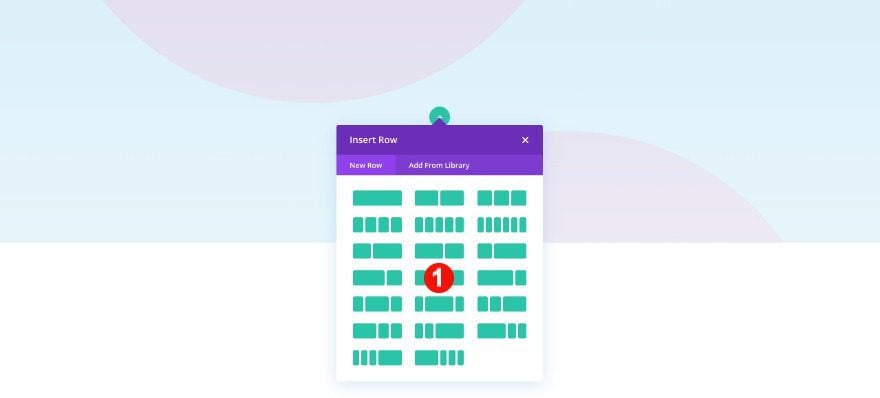
Add New Row
Column Structure
Now add a row with three columns.
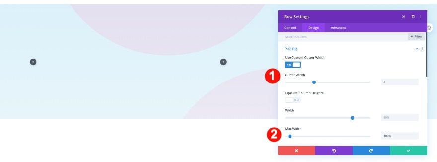
Sizing
Before adding modules, adjust the row’s sizing.
- Custom Gutter Width: 2
- Width: 80%
- Max Width: 100%
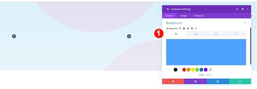
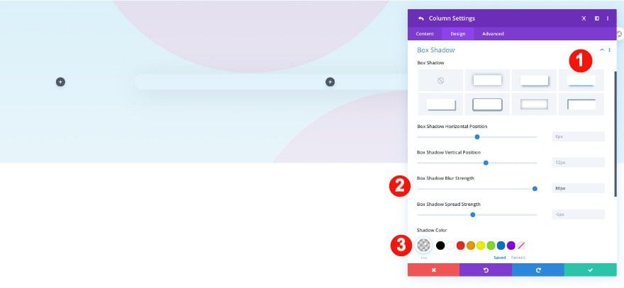
Column 2 Settings
Background
Now, style the second column by adding a blue background.
- Background Color: Blue #51a2ff
Border
Continue by rounding the borders.
- Rounded Corners: 1vw all four corners
Box Shadow
Finally, add a box shadow too.
- Shadow: Third Option
- Blur Strength: 80px
- Color: rgba(0,0,0,0.13)
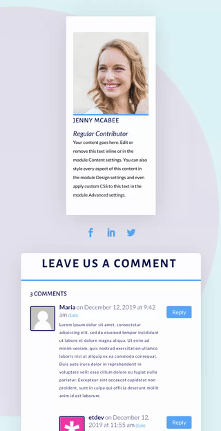
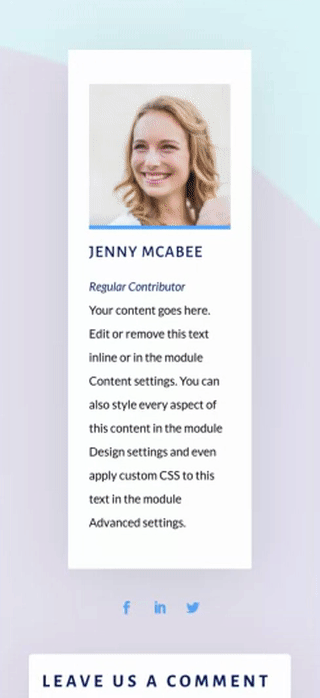
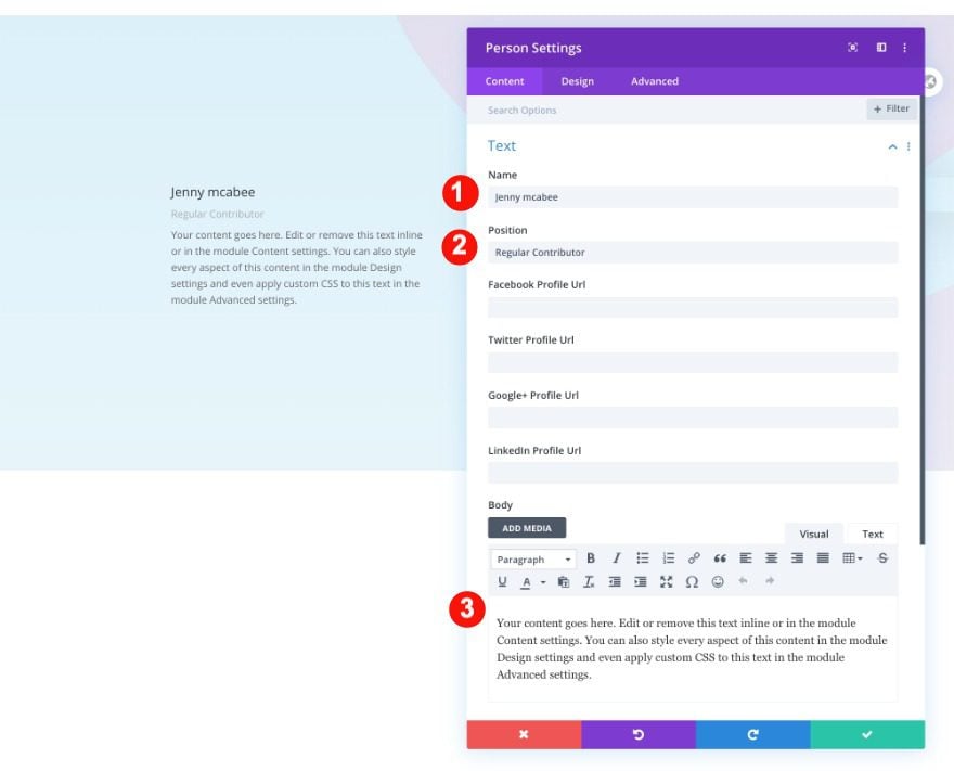
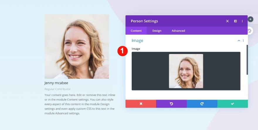
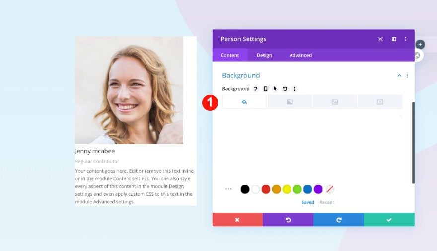
Add Person Module to Column 1
Content
It’s time to add the modules. Start with a person module in column 1 and add the content.
- Name: Jenny McAbee
- Position: Regular Contributor
- Body: Paragraph Text
- Image: Portrait Photo
Background
Add a white background to the module.
- Background Color: White #000000
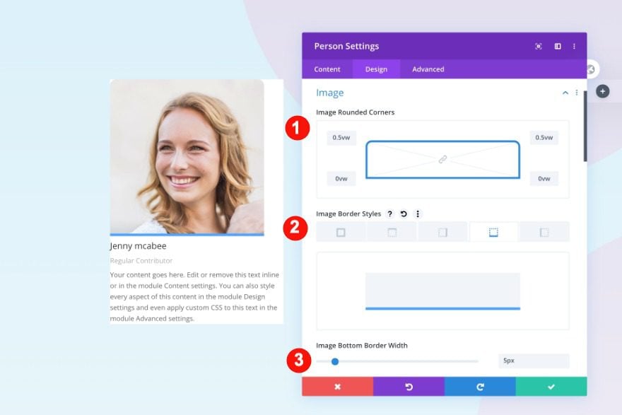
Image
In the design tab, style the image border as follows.
- Rounded Corners: 0.5vw on the top left and top right
- Border Styles: Bottom Border
- Width: 5px
- Color: Blue #51a2ff
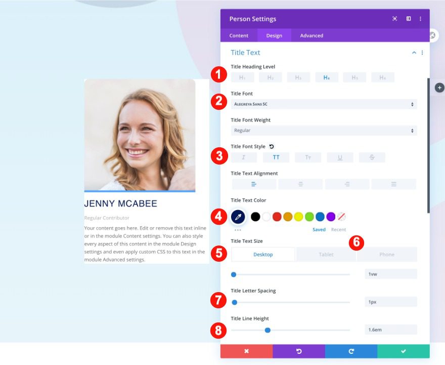
Title Text
Continue by styling the heading text.
- Heading Level: H4
- Font: Alegreya Sans SC
- Style: TT
- Color: #021859
- Size:
- Desktop: 1vw
- Tablet: 3vw
- Phone: 5vw
- Letter Spacing: 1px
- Line Height: 1.6em
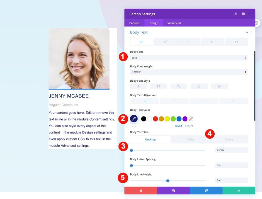
Body Text
Then also, the body text.
- Font: Lato
- Color: Blue #1a1f73
- Size:
- Desktop: 0.7vw
- Tablet: 2vw
- Phone: 3vw
- Line Height: 2em
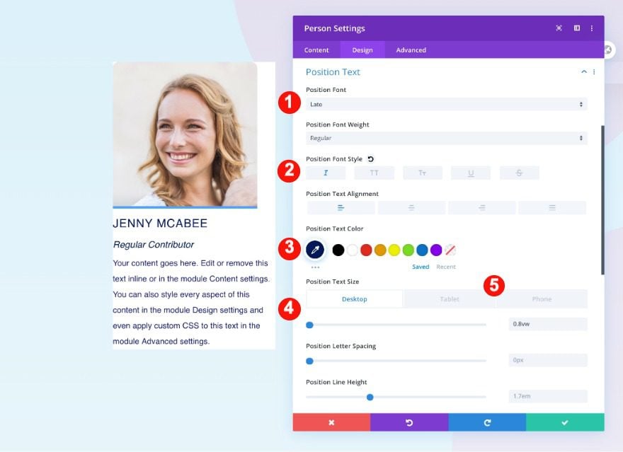
Position Text
Continue with the position text.
- Font: Lato
- Style: Italic
- Color: #021859
- Size:
- Desktop: 0.8vw
- Tablet: 3vw
- Phone: 3.5vw
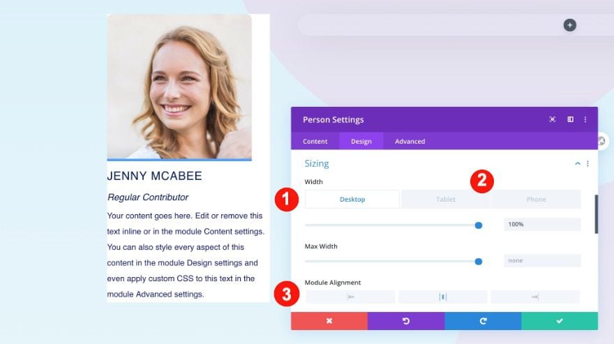
Sizing
Then, adjust the sizing.
- Width:
- Desktop: 100%
- Tablet: 50%
- Phone: 70%
- Module Alignment: Center
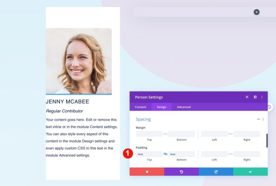
Spacing
Also, the spacing.
- Top and Bottom Padding: 4vw
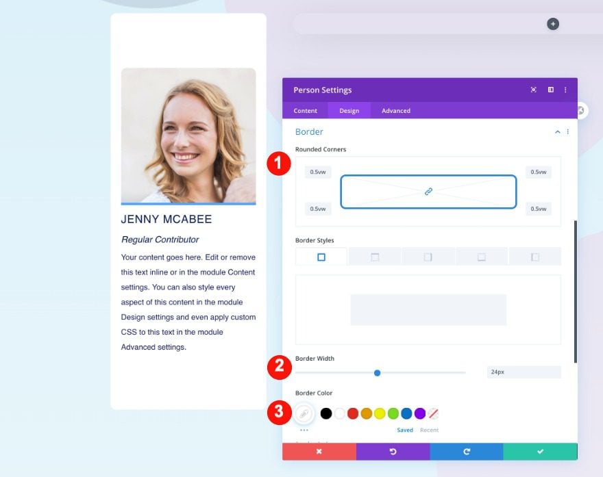
Border
Then, add some rounded corners.
- Rounded Corners: o.5vw on all four corners
- Border Styles: 24 px all four sides
- Color: White #ffffff
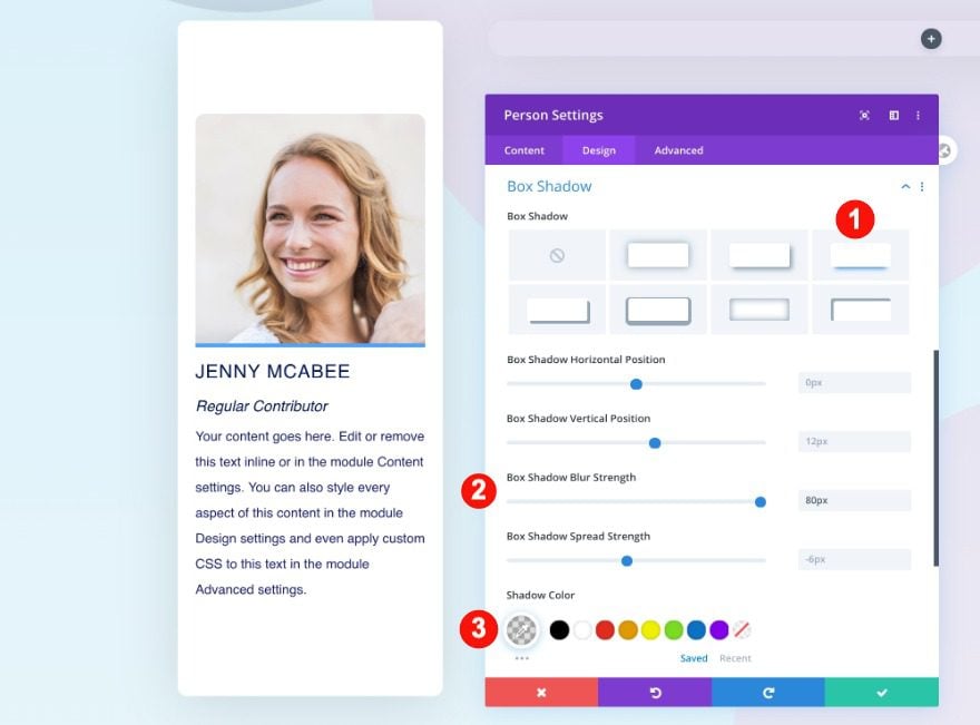
Box Shadow
Finally, add a box shadow.
- Shadow: Third Option
- Blur Strength: 80px
- Color: rgba(0,0,0,0.13)
Networks
Below the person module, add a social media follow module with three social networks.
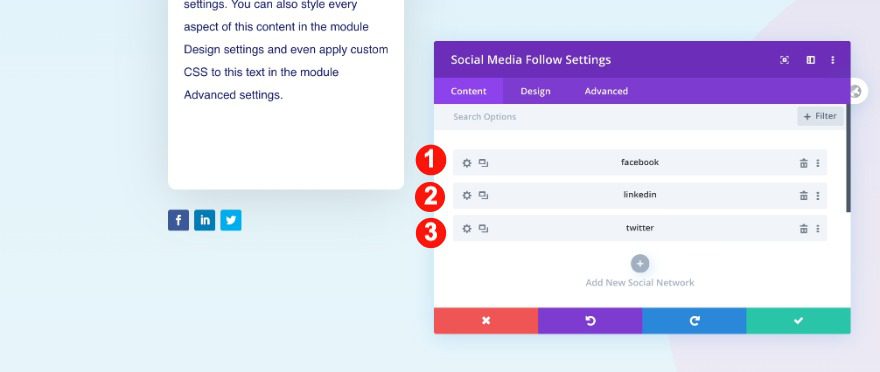
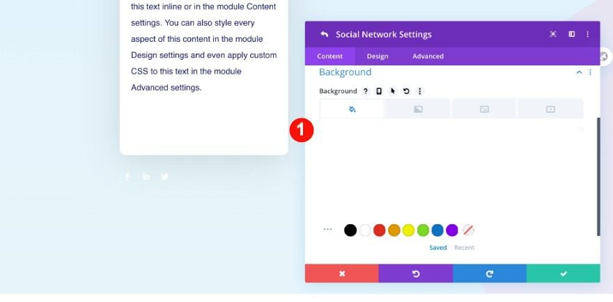
Network Settings
Apply a transparent background color to each social network. You need to do this one by one.
- Background: Transparent
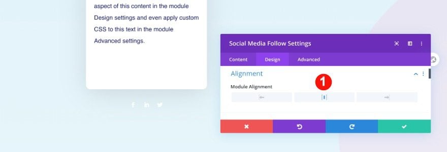
Alignment
In the main design settings, center the alignment of the module.
- Module Alignment: Center
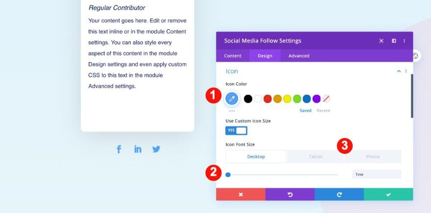
Icon
Finally, color the icons blue.
- Color: Blue #51a2ff
- Size:
- Desktop: 1vw
- Tablet and Phone: 4vw
Add Text Module to Column 2
Content
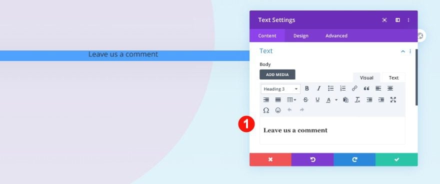
Move on to column 2. Add a text module with some h3 content of your choice.
- Text: Leave us a comment
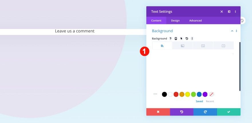
Background
Add a white background.
- Background Color: White #ffffff
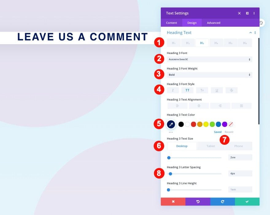
Heading Text
Then move on to the design tab and style the heading text.
- Heading Level: H3
- Font: Alegreya Sans SC
- Weight: Bold
- Font Style: TT
- Color: Blue #021859
- Size:
- Desktop: 2vw
- Tablet and Phone: 5.5vw
Spacing
Finally, adjust the spacing.
- Top Padding:
- Desktop: 3vw
- Tablet: 2vw
- Phone: 6vw
- Bottom Padding
- Desktop and Tablet: 3vw
- Left and Right Padding:
- Desktop and Tablet: 1vw
Add Comments Module to Column 2
Elements
Now add the comments module to column 2. Enable all elements.
- Show Author Avatar: Yes
- Show Reply Button: Yes
- Show Comment Count: Yes
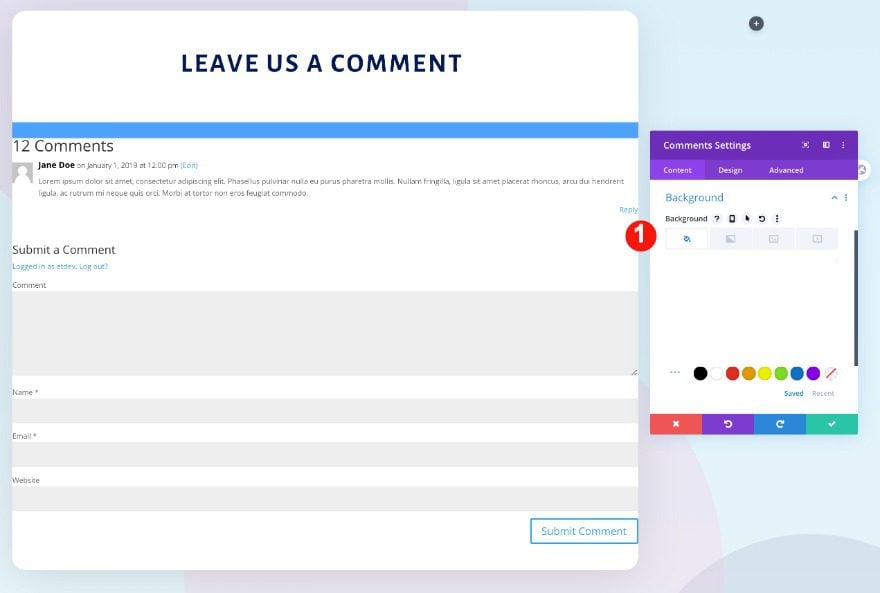
Background
Add a white background to the comments module.
- Background Color: White #ffffff
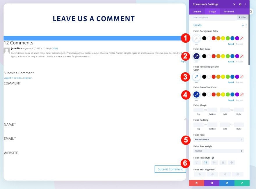
Fields
Then, start styling the module by adjusting the fields settings as follows
- Background Color: White #ffffff
- Text Color: Blue #1a1f73
- Focus Background Color: White #ffffff
- Focus Text Color: Blue #1a1f73
- Font: Alegreya Sans SC
- Style: TT
- Size:
- Desktop: 1vw
- Tablet: 3vw
- Phone: 4vw
- Rounded Corners: 5px all corners
Image
Change the image settings too.
- Rounded Corners: 5px
- Border Style: all sides
- Width: 3px
- Color: Blue #1a1f73
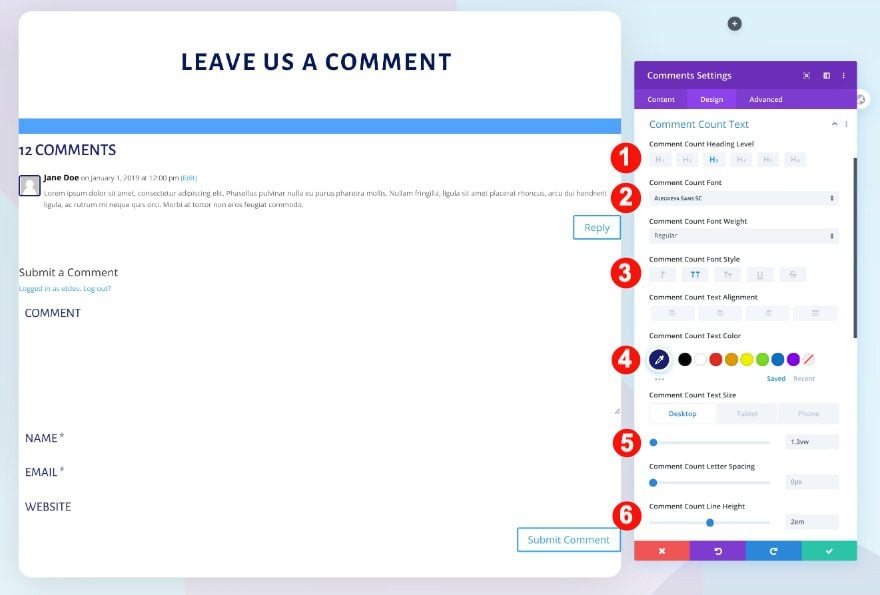
Comment Count Text
Then, the comment count text.
- Heading Level: H3
- Font: Alegreya Sans SC
- Font Style: TT
- Color: Blue #021859
- Size:
- Desktop: 1.3vw
- Tablet: 3vw
- Phone: 5vw
- Line Height: 2 em
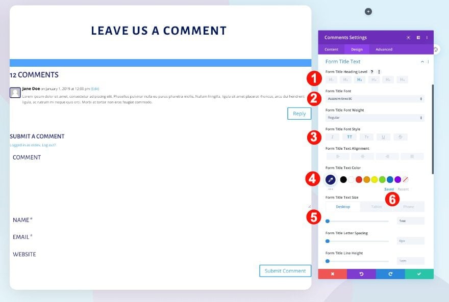
Form Title Text
Also, style the form title text.
- Heading Level: H3
- Font: Alegreya Sans SC
- Font Style: TT
- Color: Blue #021859
- Size:
- Desktop: 1vw
- Tablet: 3vw
- Phone: 5vw
- Line Height: 2 em
Meta Text
Move on to the meta text and style as follows.
- Font: Lato
- Color: #021859
- Size:
- Desktop: 1vw
- Tablet: 2.7vw
- Phone: 3.5vw
Comment Text
Then the comment text.
- Font: Lato
- Color: #021859
- Size:
- Desktop: 0.9vw
- Tablet: 1.8vw
- Phone: 2.5vw
Button
Don’t forget to style the buttons too.
- Text Size:
- Desktop: 0.9vw
- Tablet: 2.5vw
- Phone: 3.5vw
- Text Color: White #ffffff
- Border Radius: 5px
- Font: Lato
Spacing
Also, the spacing of the comments module.
- Top Margin:
- Desktop: -1vw
- Tablet and Phone: -3.3vw
- Top Padding:
- Desktop and Tablet: 3vw
- Phone: 4vw
- Bottom Padding:
- Desktop: 3vw
- Phone and Tablet: 0vw
- Left and Right Padding:
- Desktop: 2vw
- Tablet: 4vw
- Phone: 7vw
Border
Finally, add some rounded corners to the comments module.
- Border Styles: 2px all four sides
- Color: Blue #1a1f73
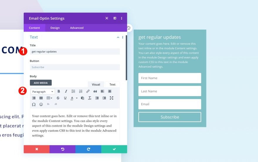
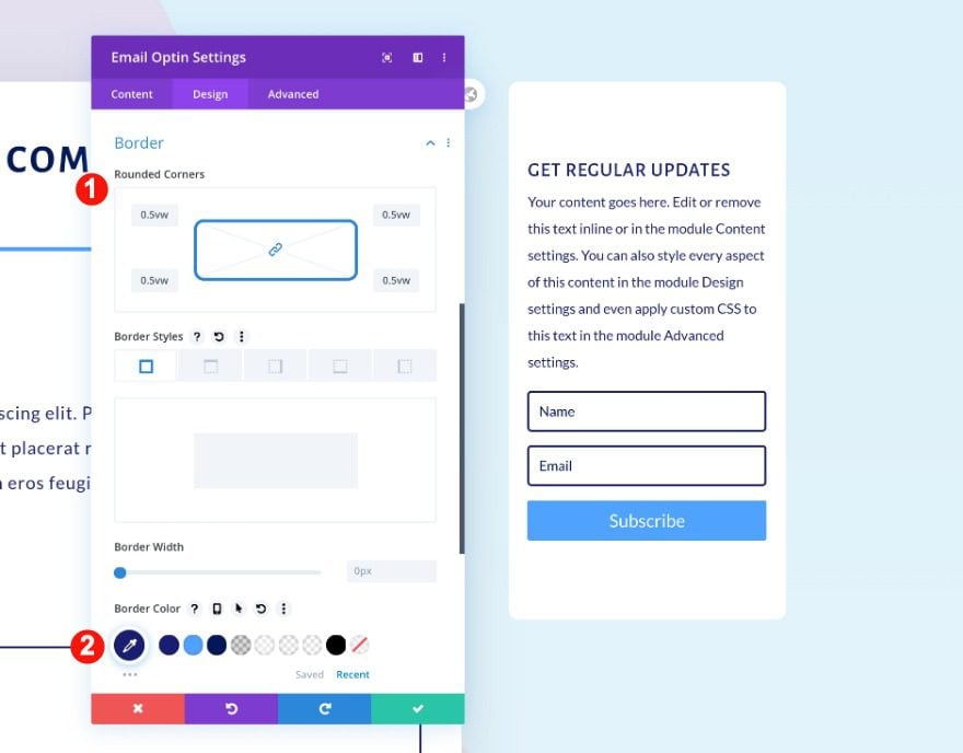
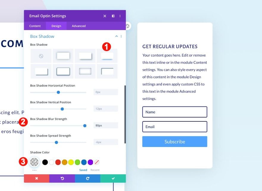
Add Email Optin Module to Column 3
Content
Move on to column 3 and an email optin module. Give the module a title.
- Text: Get Regular Updates
- Body: Paragraph Text
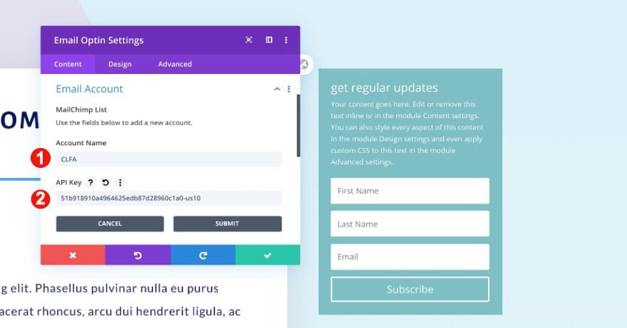
Email Account
Set up your email provider in the email account tab. Choose a list and add your API key.
- Email Provider
- List
- API Key
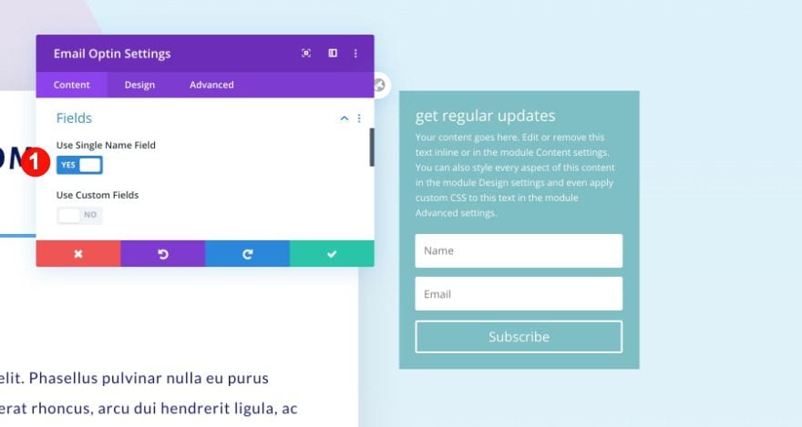
Fields
Then, select to use only a single name field.
- Use Single Name Field: Yes
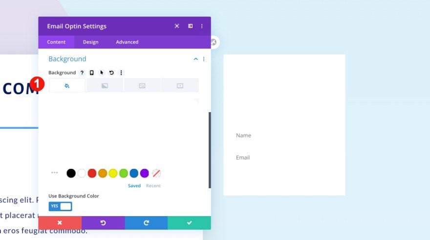
Background
Add a white background to the module.
- Background Color: White
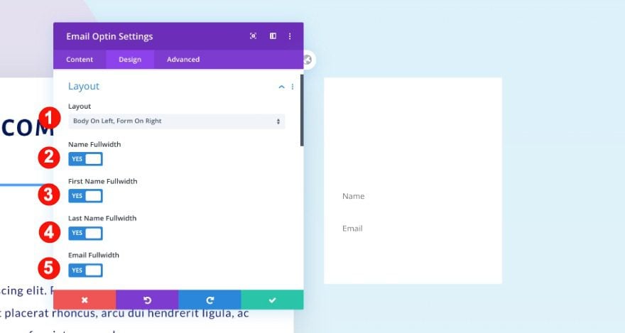
Layout
Move on to the design ta and change the layout settings as follows.
- Layout: Body on Left, Form on Right
- Name Fullwidth: Yes
- First Name Fullwidth: Yes
- Last Name Fullwidth: Yes
- Email Fullwidth: Yes
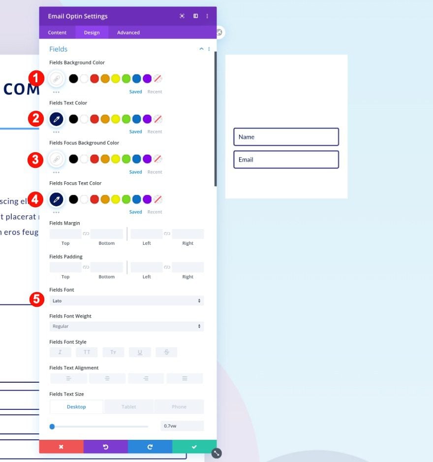
Fields
Then, style the fields settings.
- Text Color: Blue #1a1f73
- Background Color: White #ffff
- Focus Text Color: Blue #1a1f73
- Focus Background Color: White #ffff
- Font: Lato
- Text Size:
- Desktop: 0.7vw
- Tablet: 2.2vw
- Phone: 3.2vw
- Letter Spacing: 1px
- Rounder Corners: 0.2vw on all corners
- Border Styles: All four sides
- Width: 2px
- Color: Blue #1a1f73
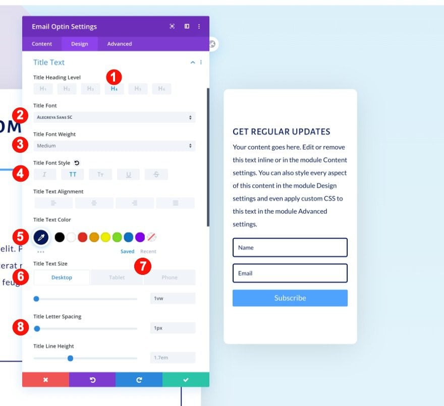
Title Text
Followed by the title text.
- Heading Level: H4
- Font: Alegreya Sans SC
- Weight: Medium
- Font Style: TT
- Color: Blue #1a1f73
- Size:
- Desktop: 1vw
- Tablet: 4vw
- Phone: 5vw
- Letter Spacing: 1px
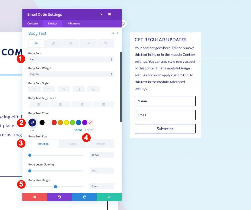
Body Text
Also, the body text.
- Font: Lato
- Color: Blue #1a1f73
- Size:
- Desktop: 0.7vw
- Tablet: 2.3vw
- Phone: 3vw
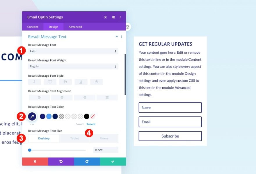
Result Message Text
Don’t forget the result message text.
- Font: Lato
- Color: Blue #1a1f73
- Size:
- Desktop: 0.7vw
- Tablet: 2.3vw
- Phone: 3vw
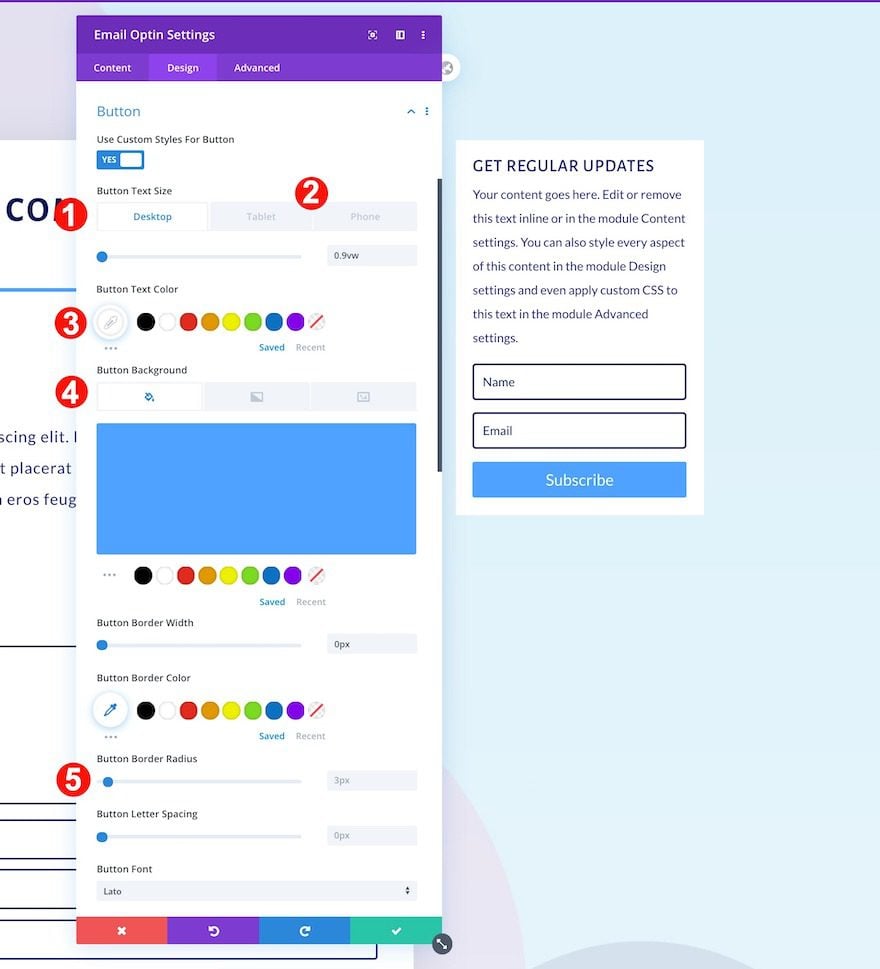
Button
Also, style the button.
- Text Size:
- Desktop: 0.7vw
- Tablet: 2.3vw
- Phone: 3vw
- Text Color: White #ffffff
- Background Color: Blue #51a2ff
- Font: Lato
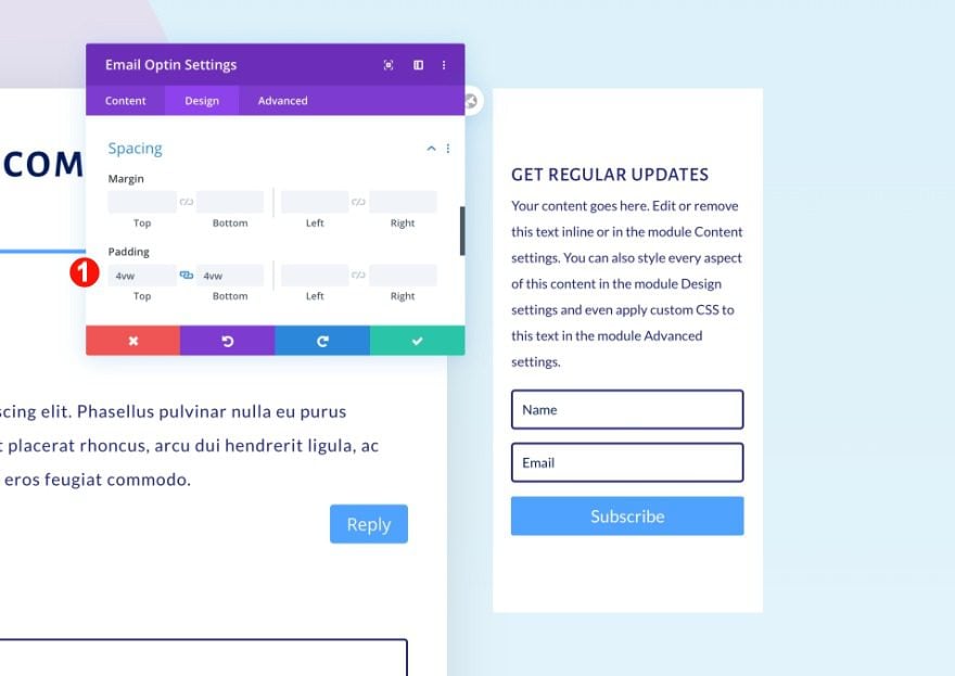
Spacing
Adjust the spacing.
- Top and Bottom Padding: 4vw
Border
Then, add some rounded corners.
- Rounded Corners: o.5vw on all four corners
Box Shadow
Finally, add a box shadow.
- Shadow: Third Option
- Blur Strength: 80px
- Color: rgba(0,0,0,0.13)
Preview
Now that we’ve gone through all the steps, let’s take a final look at the outcome of this tutorial.
Desktop
Tablet
Phone
Desktop
Tablet
Mobile
It’s a Comments Module Wrap!
That’s it! You just added a customized comments section to your blog post template. We hope that these designs will inspire your own Divi theme builder creations. You were able to download the JSON files of both designs at the beginning of this tutorial. If you have any questions or suggestions, feel free to leave a comment in the comment section below!


Hi!
I am interested in posting on your blog… ://www.elegantthemes.com/ . I need to know some things in advance before I include your site in my offer:
1. Final and flat best rates per post.
2. Type of links (dofollow).
3. Do you accept easy writing article
4. Do not add disclosures/sponsored tags.
Payments are sorted in 4+ business days after posting via Paypal
If you run other sites in any niche and language feel free to share with the above info.
Hope you can understand.
Looking forward to working with you!
Cheers!
Please, how can i upload the divi-black-and-white-comments-layout-template.json file to the Divi Theme Builder. When I try to upload I have only the error message “ThemeThis file should not be imported in this context.”
Love this but is there a way to swap this around so the SUBMIT A COMMENT is above the comments? I designing a new website for a client and they have requested this. TIA
Hi, forgive this possible silly question. But how do I import this section into the template I’m building without it overwriting everything I have already written. Many thanks Gaynor
It’s really an awesome feature of this DIVI theme. Very easy to insert the comment module inside the post. Thank you.
I’m a bit confused, is there a way to set this up using the template provided to show on all blog posts without having to use a blog post template every single time, similar to the way my current comments section works? It would be nice to have a tutorial on how to use the actual template.
Hi Sondra, when you add the template to the custom body in your Theme Builder, assign it to all posts and it will show up on every blog post.
Are you having trouble adding this template in your theme builder?
If multiple author how to customize that for different author. ?
You can create a version for each author and then toggle the options for when to show which template in your Theme Builder settings.
ita a very helpoful information thank you
This is awesome..
Let me give this a try. I have been wanting to edit my comment section to make it look clean and nicer.