
If you’re building a website where images play a central role in the design, you might want to include a gallery at some point. That’s where the Divi Gallery Module comes in. It allows you directly select images from your media library and display them in an organized structure. By default, you’re able to dynamically show each image’s title and caption too. However, if you’re looking to limit the amount of text that shows up in your design, you might want to slide-down reveal an image’s title and caption when hovering it. In this tutorial, we’ll show you exactly how to do that. You’ll be able to download the JSON file for free as well!
Let’s get to it.
Preview
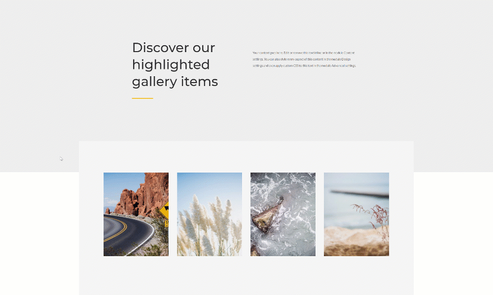
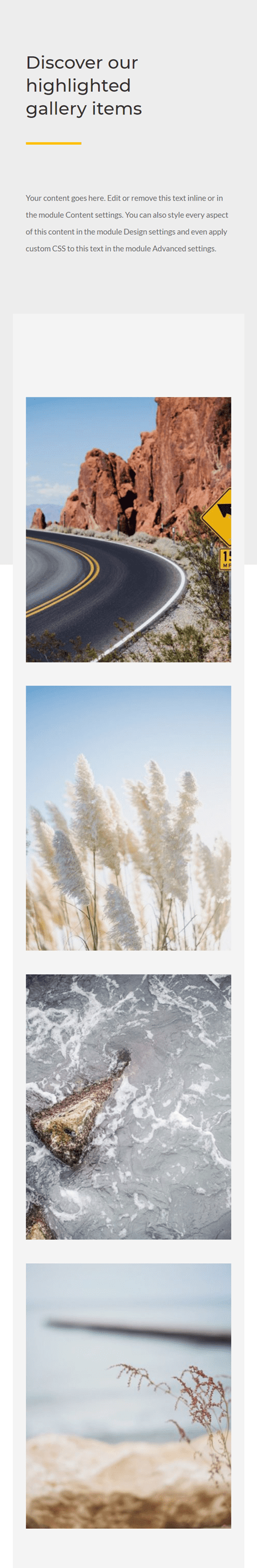
Before we dive into the tutorial, let’s take a quick look at the outcome across different screen sizes.
Desktop
Mobile
Download The Layout for FREE
To lay your hands on the free layout, you will first need to download it using the button below. To gain access to the download you will need to subscribe to our newsletter by using the form below. As a new subscriber, you will receive even more Divi goodness and a free Divi Layout pack every Monday! If you’re already on the list, simply enter your email address below and click download. You will not be “resubscribed” or receive extra emails.

https://youtu.be/p6Bh7wz3HMc
Subscribe To Our Youtube Channel
1. Upload Images with Titles and Captions
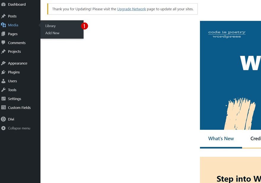
Go to Media Library
The first part of this tutorial focuses on adding the images with titles and captions inside your media library. To get there, navigate to your WordPress Dashboard > Media > Library.
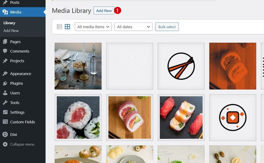
Upload Images
Once there, upload the images you want to include in your gallery.
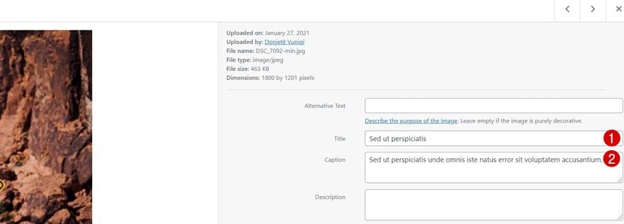
Add Titles & Captions
You’ll need to add a title and caption to each image individually. For the most optimal result, try to keep a similar text length for each image.
2. Create Design with Divi
Create a New Page or Open Existing One
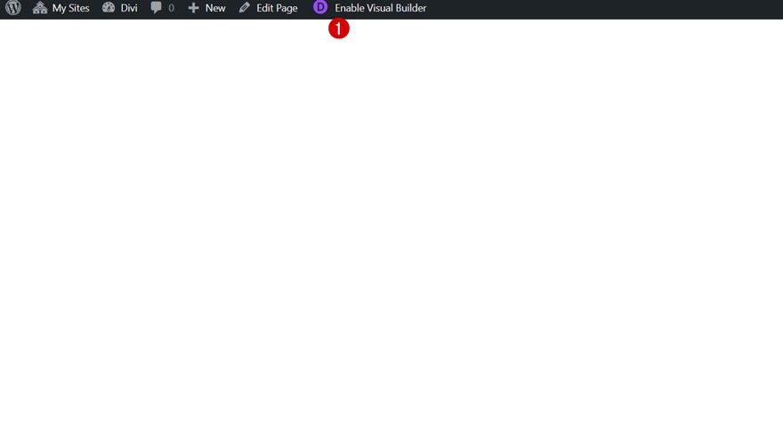
Once your images have been upload, it’s time to build the design in Divi. Create a new page or open a new one and enable the Visual Builder at the top.
Add Section #1
Background Color
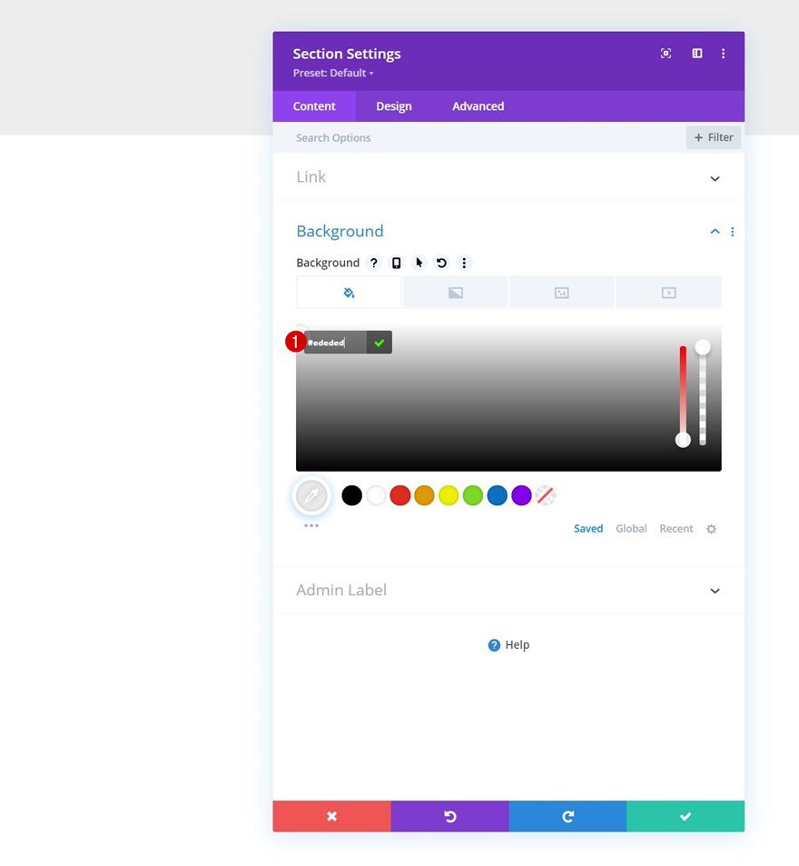
Add a new section to your page and open the section settings. Apply the following background color:
- Background Color: #ededed
Add Row #1
Column Structure
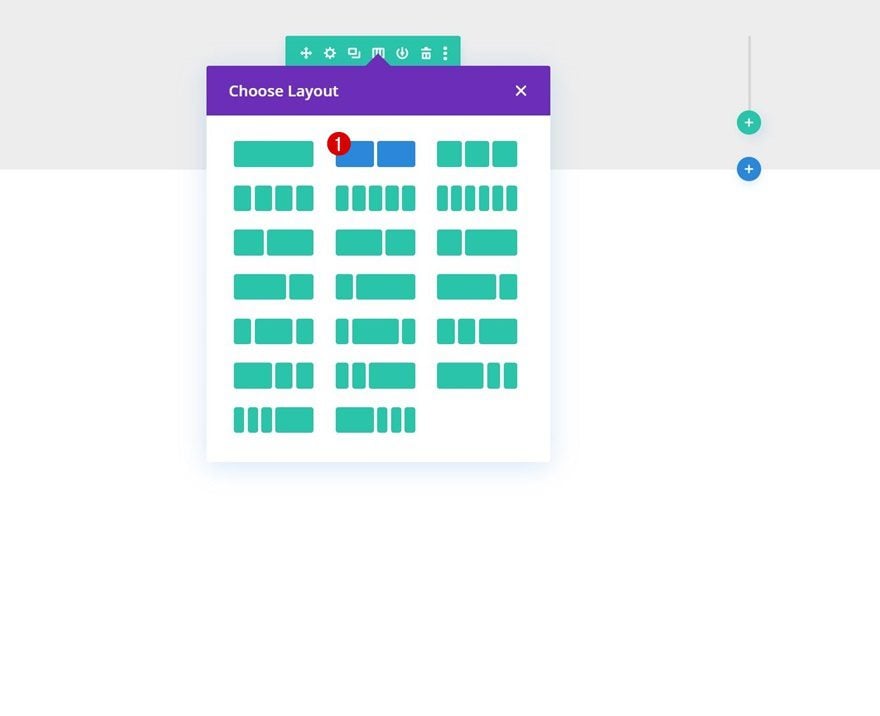
Continue by adding a new row using the following column structure:
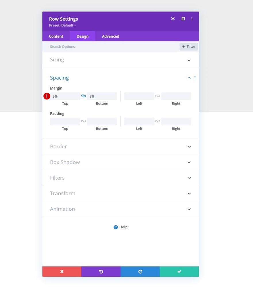
Spacing
Without adding modules yet, open the row settings, go to the design tab and apply the following top and bottom margin:
- Top Margin: 5%
- Bottom Margin: 5%
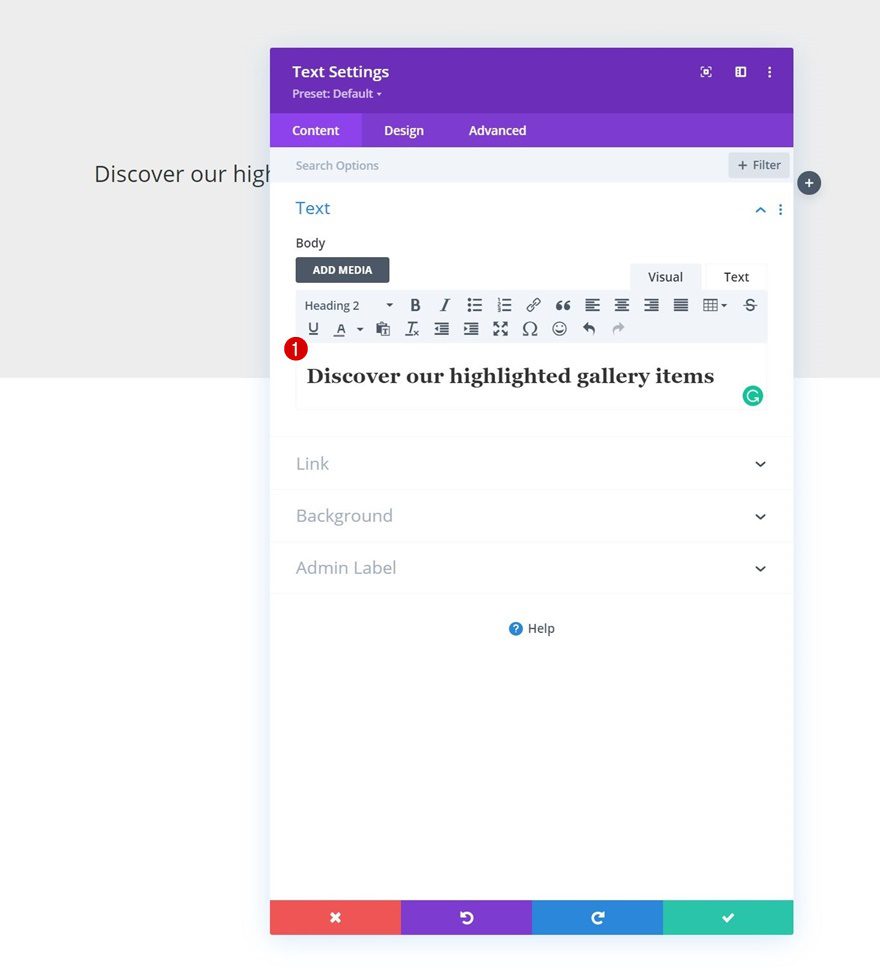
Add Text Module to Column 1
Add H2 Content
Time to add modules, starting with a Text Module in column 1 containing some H2 content.
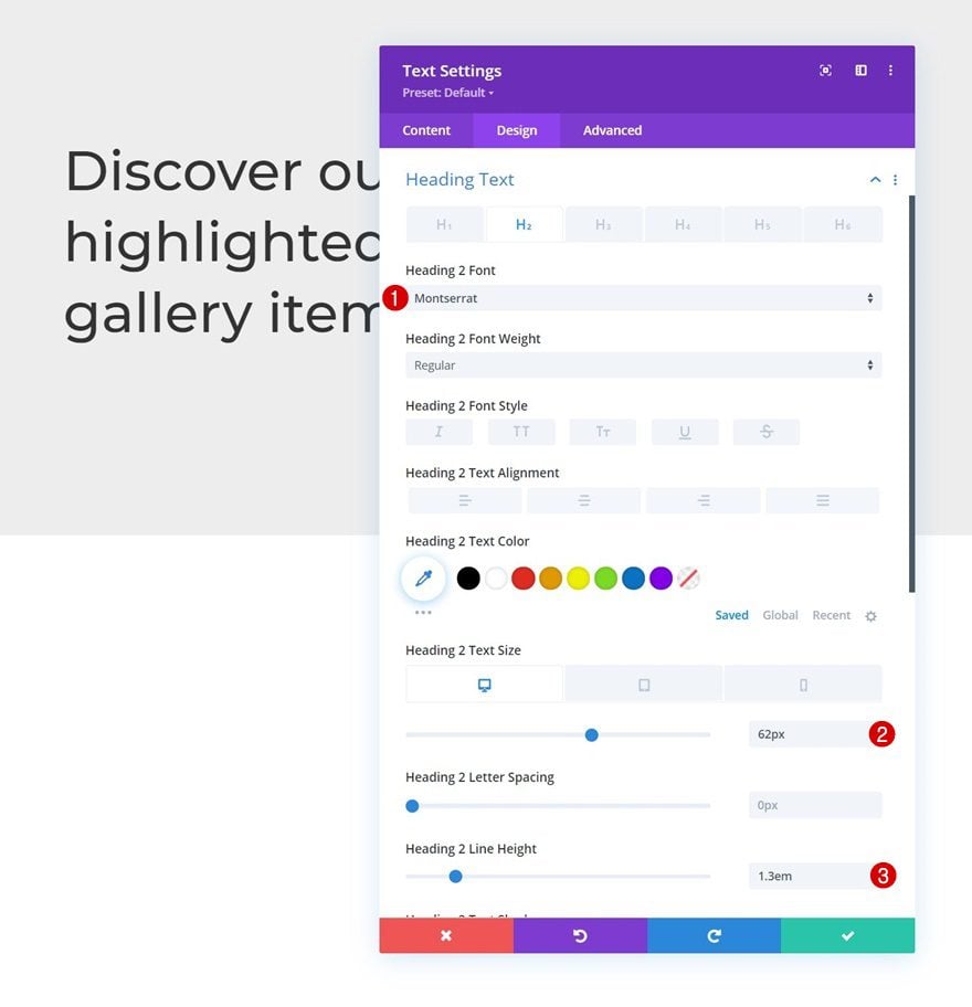
H2 Text Settings
Move on to the module’s design tab and change the H2 text settings accordingly:
- Heading 2 Font: Montserrat
- Heading 2 Text Size:
- Desktop: 62px
- Tablet: 48px
- Phone: 32px
- Heading 2 Line Height: 1.3em
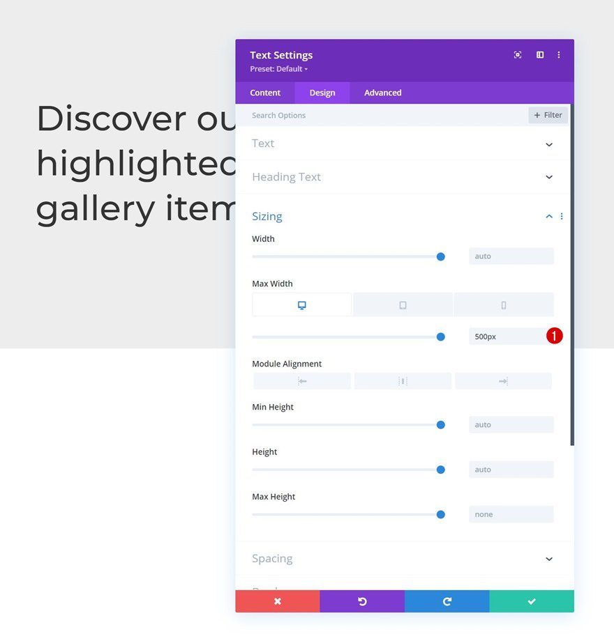
Sizing
Modify the module’s max width across different screen sizes too.
- Max Width:
- Desktop: 500px
- Tablet: 400px
- Phone: 250px
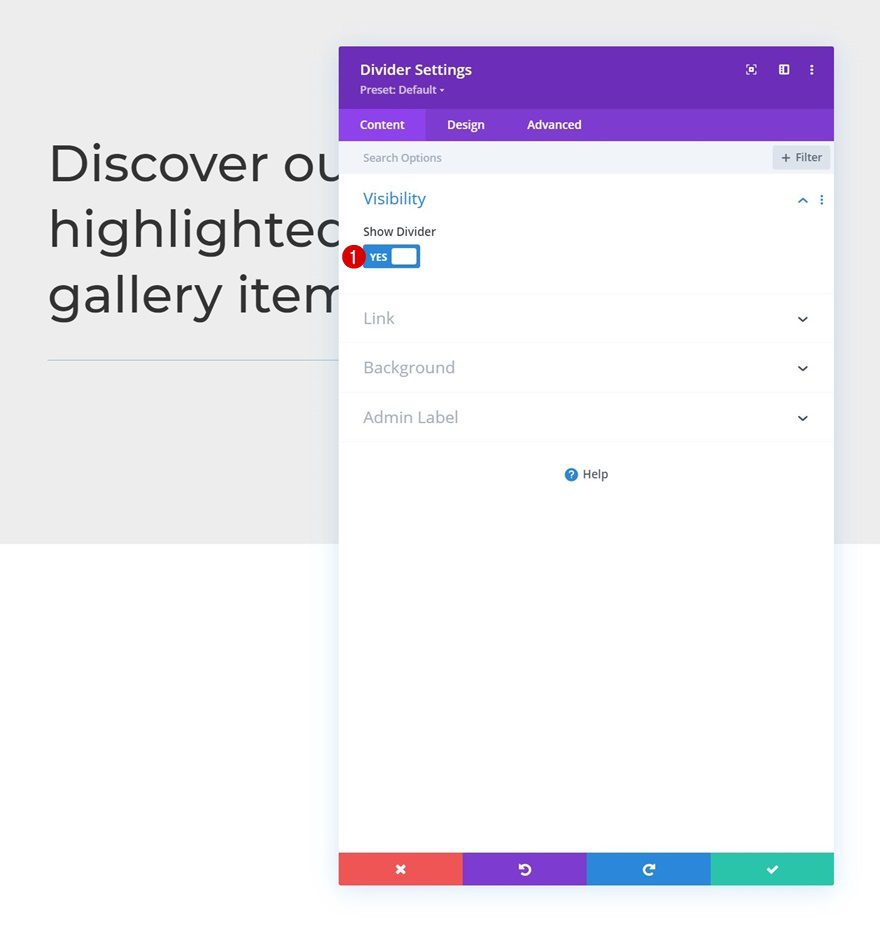
Add Divider Module to Column 1
Visibility
The next and last module we need in column 1 is a Divider Module. Make sure the “Show Divider” option is enabled.
- Show Divider: Yes
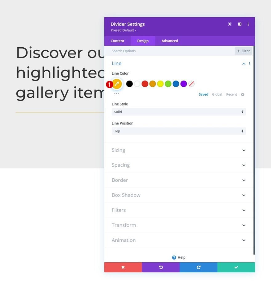
Line
Then, move on to the design tab and change the line color.
- Line Color: #ffc000
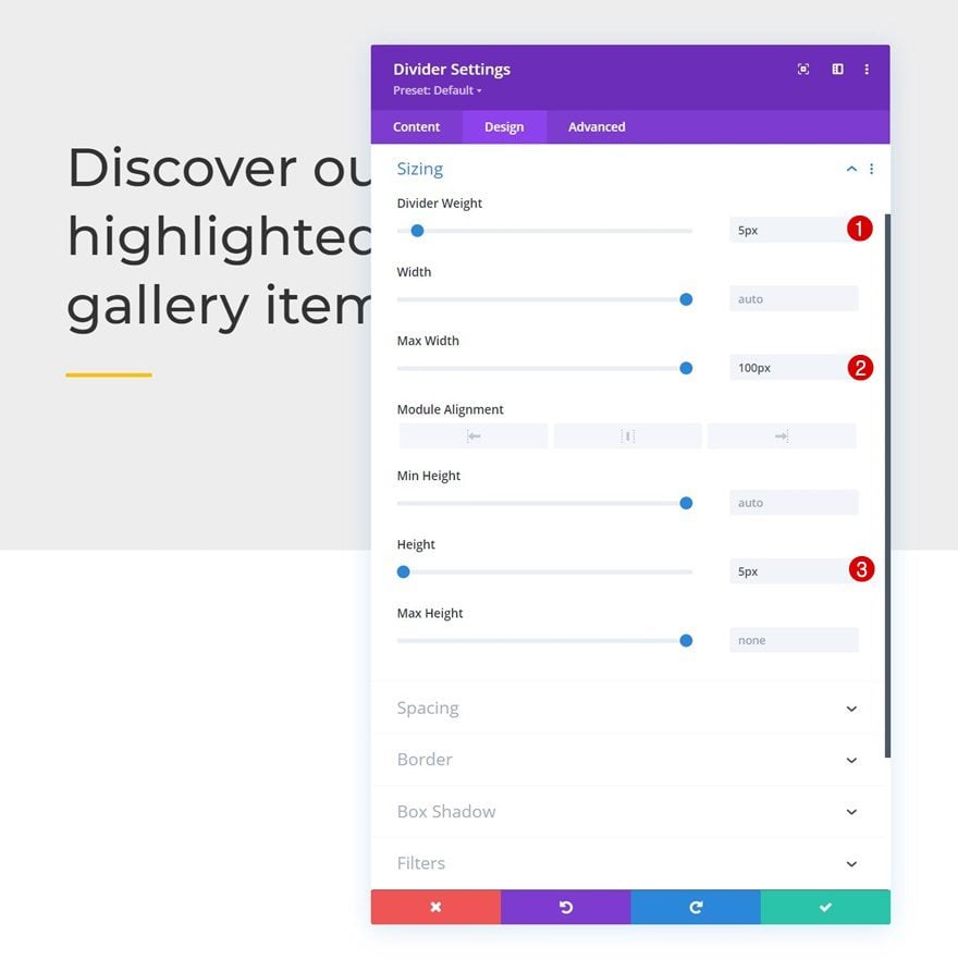
Sizing
Modify the module’s sizing settings too.
- Divider Weight: 5px
- Max Width: 100px
- Height: 5px
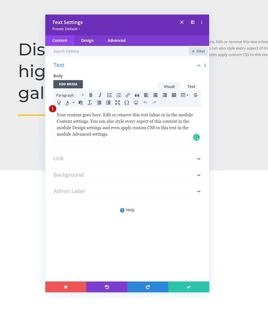
Add Text Module to Column 2
Add Content
In column 2, the only module we need is a Text Module with some description content.
Text Settings
Change the module’s text settings as follows:
- Text Font: Lato
- Text Line Height: 2.2em
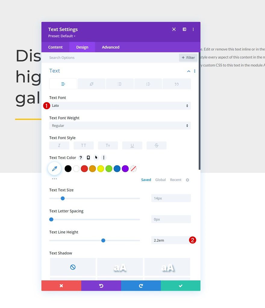
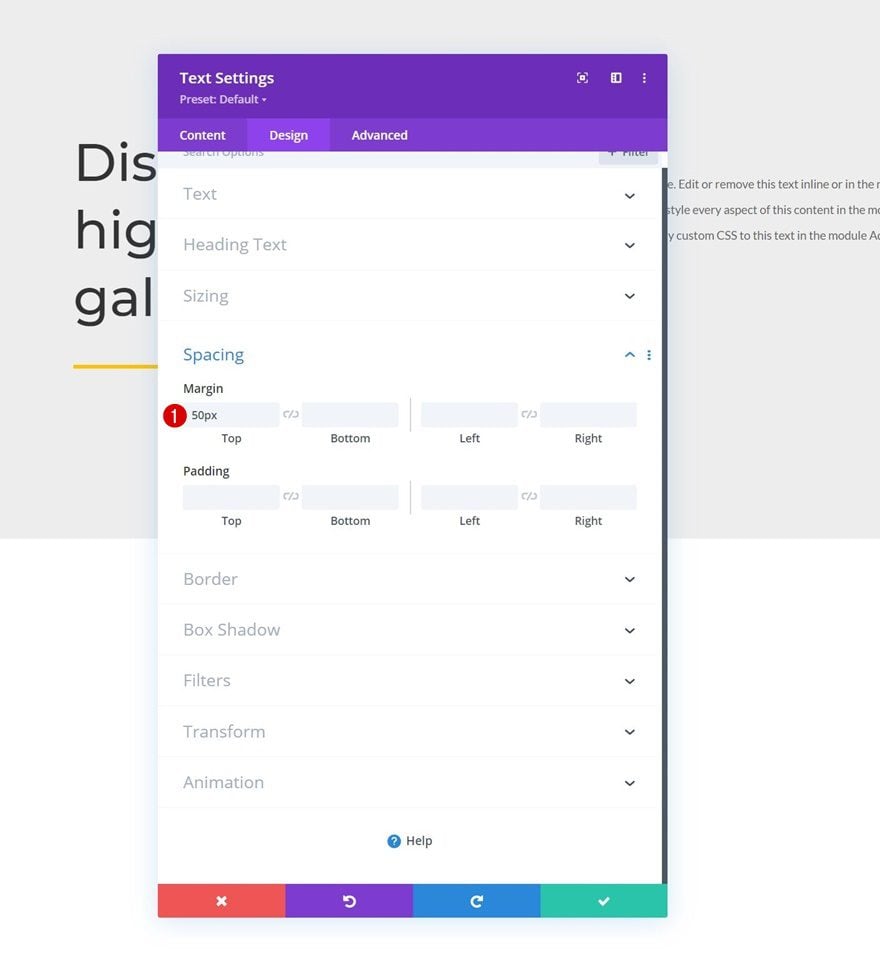
Spacing
Apply some top margin too.
- Top Margin: 50px
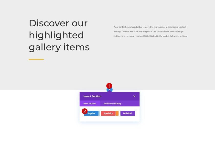
Add Section #2
Add another section below the previous one.
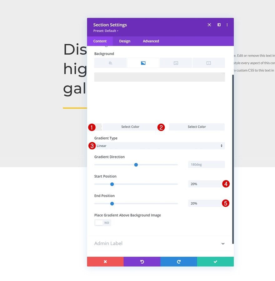
Gradient Background
Open the section settings and apply a gradient background.
- Color 1: #ededed
- Color 2: #ffffff
- Gradient Type: Linear
- Start Position: 20%
- End Position: 20%
Spacing
Move on to the section’s design tab and remove all default top and bottom padding.
- Top Padding: 0px
- Bottom Padding: 0px
Add Row #1
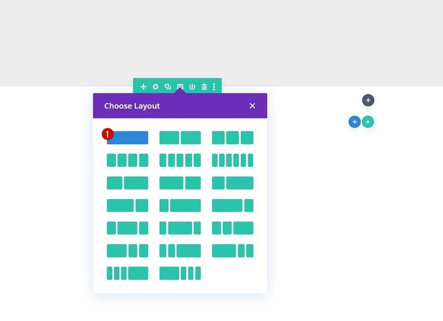
Column Structure
Continue by adding a new row to the section using the following column structure:
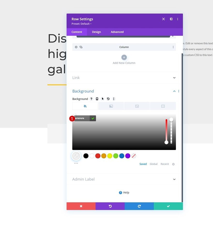
Background Color
Without adding modules yet, open the row settings and apply a background color.
- Background Color: #f4f4f4
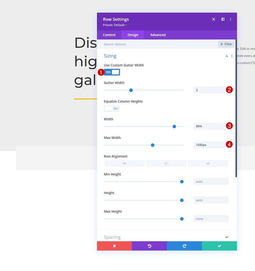
Sizing
Move on to the row’s sizing settings next and apply the following changes:
- Use Custom Gutter Width: Yes
- Gutter Width: 2
- Width: 90%
- Max Width: 1580px
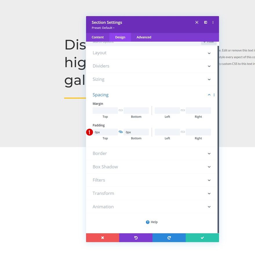
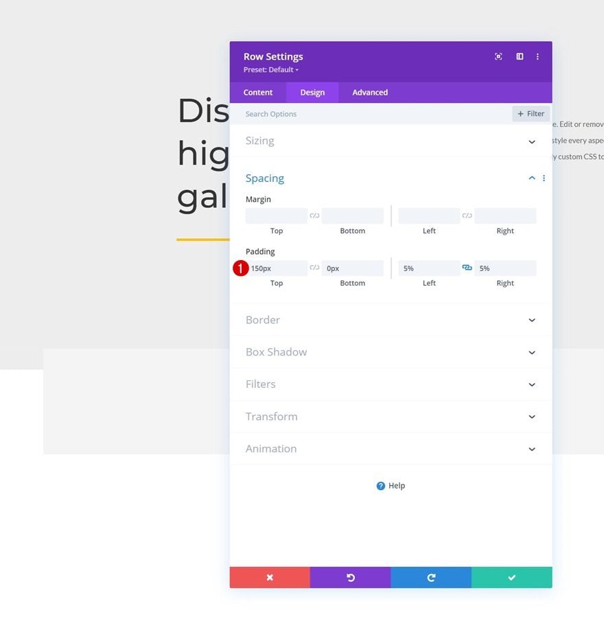
Spacing
We’re customizing the padding values as well.
- Top Padding: 150px
- Bottom Padding: 0px
- Left Padding: 5%
- Right Padding: 5%
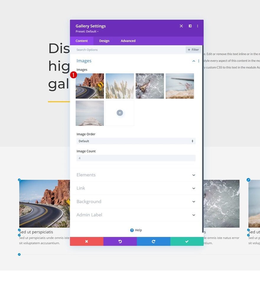
Add Gallery Module to Column
Select Uploaded Images
Time to add the images, using a Gallery Module! Select the images you’ve uploaded to your media library in the first part of this tutorial.
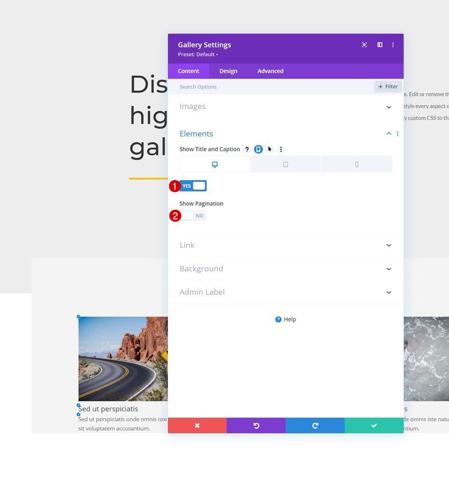
Elements
The hover effect only makes sense on desktop. On smaller screen sizes, there’s no hover, and touch will trigger a lightbox effect instead. For that reason, we’re only showing the title and caption on desktop, and we’re disabling them on smaller screen sizes. We’re also disabling pagination. You can find these options in the elements settings.
- Show Title and Caption
- Desktop: Yes
- Tablet & Phone: No
- Show Pagination: No
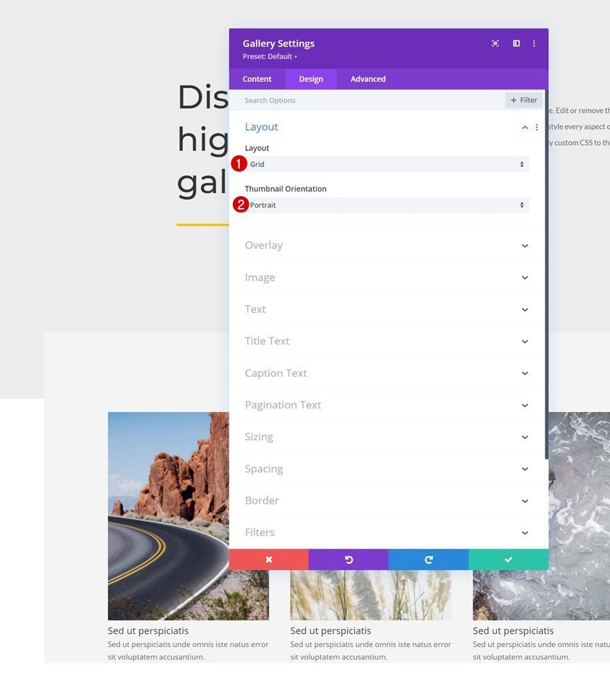
Layout
Move on to the module’s design tab and change the layout next.
- Layout: Grid
- Thumbnail Orientation: Portrait
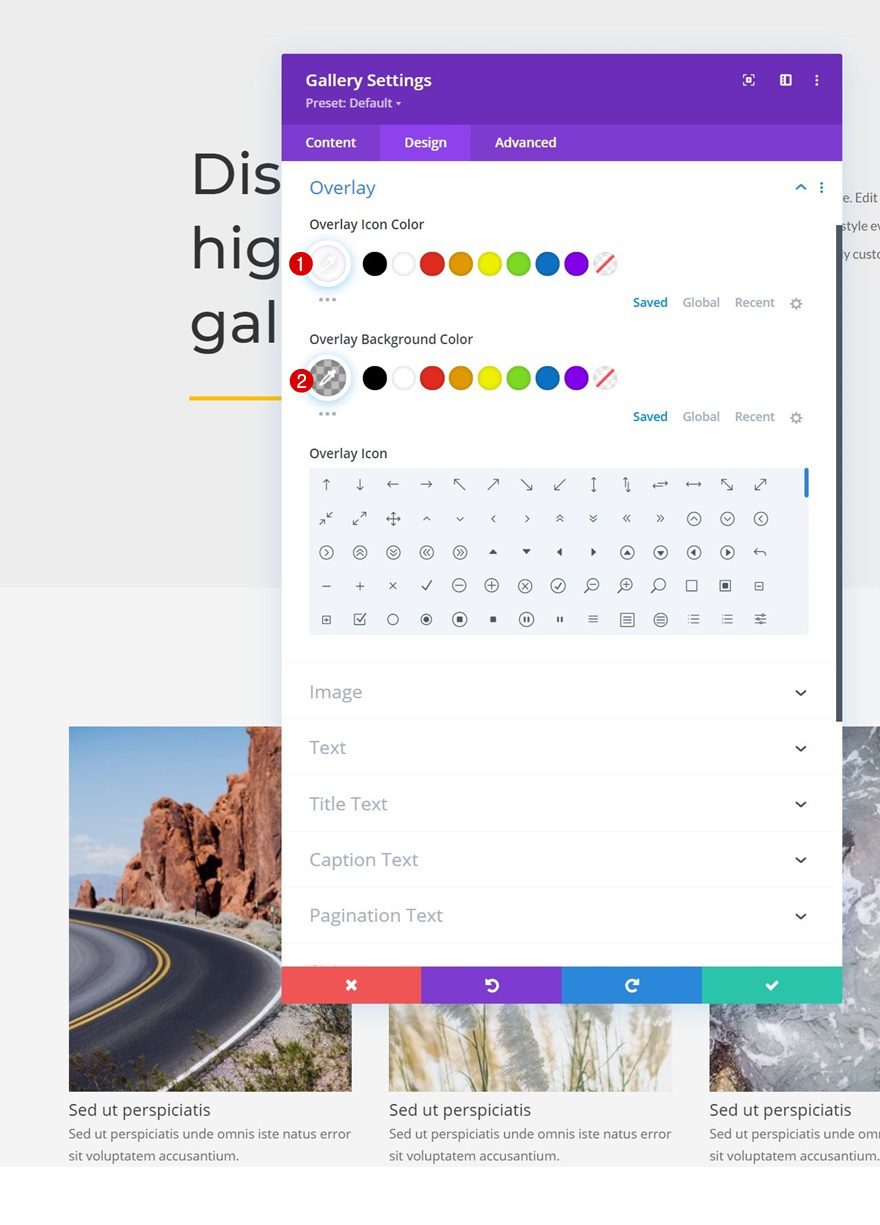
Overlay
We’re modifying the overlay settings too.
- Overlay Icon Color: #ffffff
- Overlay Background Color: rgba(0,0,0,0.25)
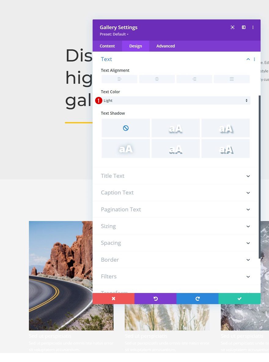
Text Settings
Next, we’ll change the text color in the text settings.
- Text Color: Light
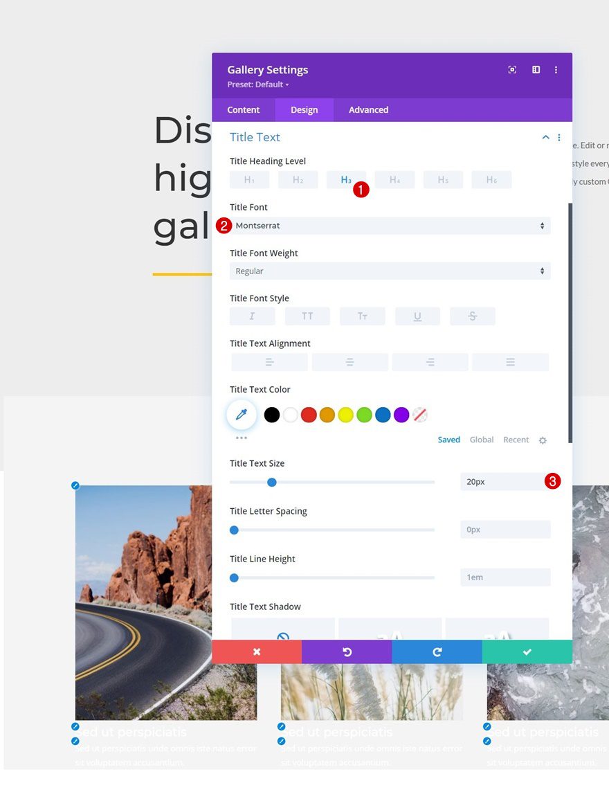
Title Text Settings
Then, we’ll style the title text.
- Title Heading Level: H3
- Title Font: Montserrat
- Title Text Size: 20px
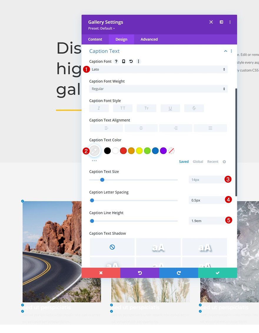
Caption Text Settings
We’re changing the caption text settings too.
- Caption Font: Lato
- Caption Text Color: #efefef
- Caption Letter Spacing: 0.5px
- Caption Line Height: 1.9em
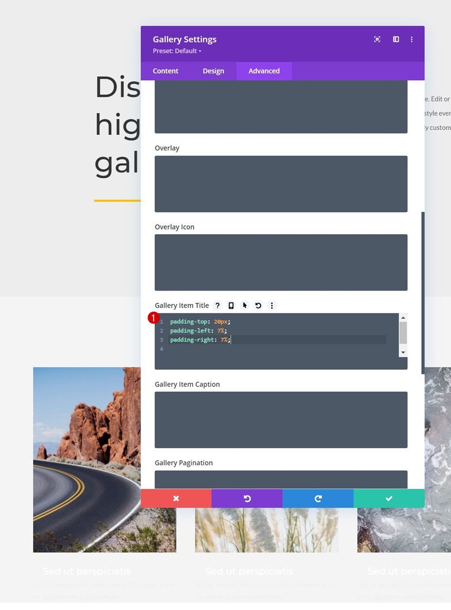
Gallery Item CSS
Then, we’ll move on to the advanced tab. Once there, we’ll add the following lines of CSS code to the gallery item title CSS box:
padding-top: 20px;
padding-left: 7%;
padding-right: 7%;
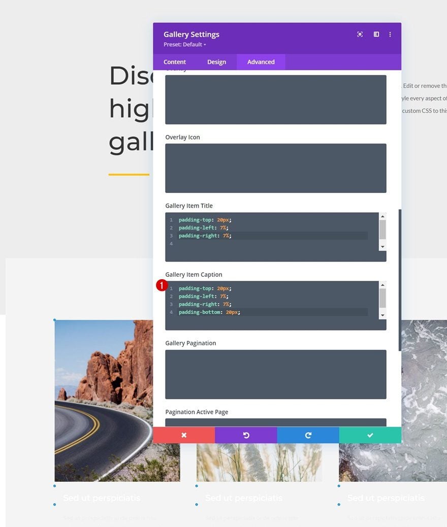
Gallery Item Caption CSS
And we’ll use these code lines inside the the gallery item caption CSS box:
padding-top: 20px;
padding-left: 7%;
padding-right: 7%;
padding-bottom: 20px;
3. Apply Reveal Effect
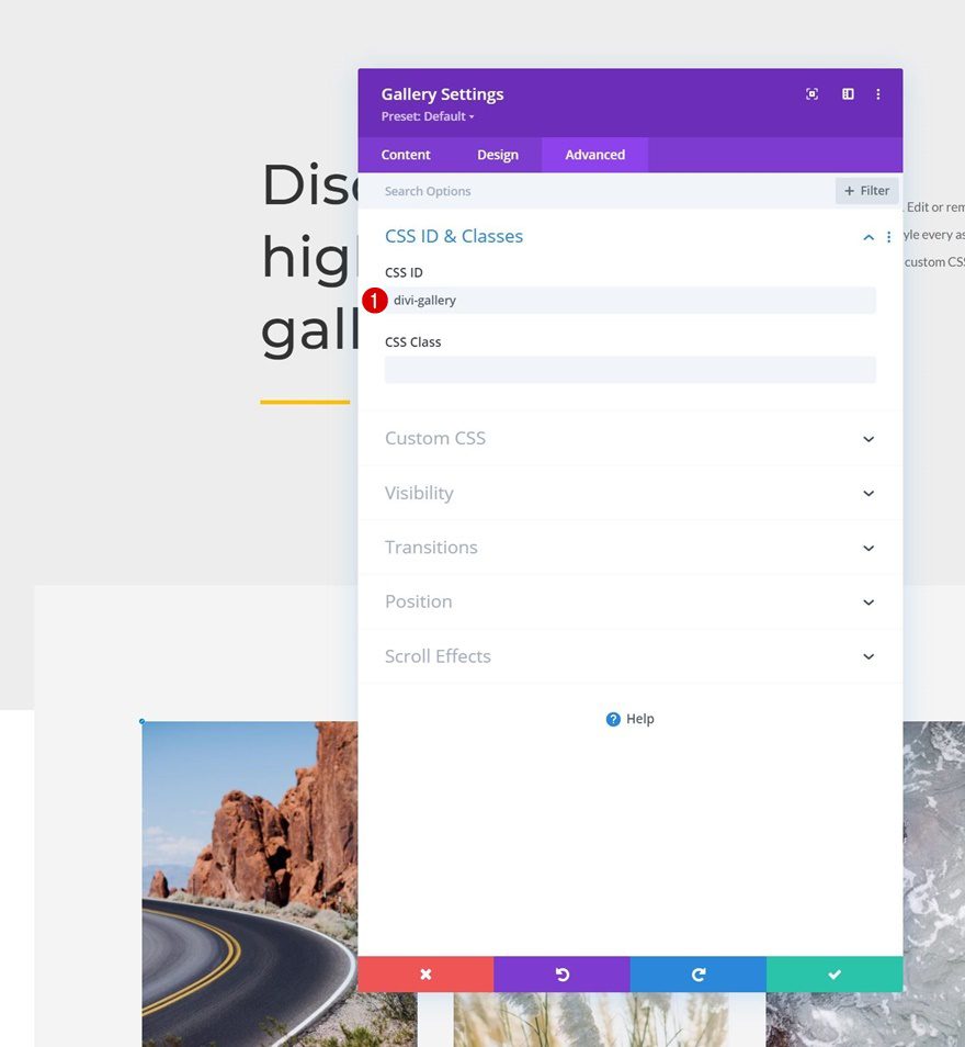
Add CSS ID to Gallery Module
Now that our design is in place, we can focus on a few necessary steps to create the reveal effect. The first thing we’ll do is add a CSS ID to our Gallery Module.
- CSS ID: divi-gallery
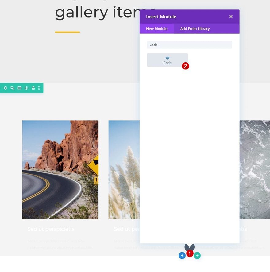
Add Code Module Below Gallery Module
Then, we’ll add a Code Module below the Gallery Module.
To create the effect, we’re going to use some CSS code. To prepare our Code Module for that code, we’ll place some style tags inside the code box.
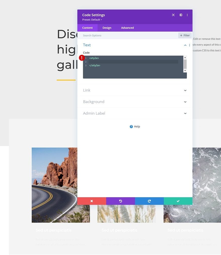
And we’ll copy-paste the following lines of CSS code between the style tags:
#divi-gallery .et_pb_gallery_item h3, #divi-gallery .et_pb_gallery_item p {
visibility: hidden;
opacity: 0;
transform: translateY(-50px);
background-color: #FE7541;
margin-bottom: 0px !important;
margin-top: 0px !important;
}

#divi-gallery .et_pb_gallery_item h3, #divi-gallery .et_pb_gallery_item p, #divi-gallery .et_pb_gallery_image {
-webkit-transition: 300ms all cubic-bezier(.4,0,.2,1);
-moz-transition: 300ms all cubic-bezier(.4,0,.2,1);
-o-transition: 300ms all cubic-bezier(.4,0,.2,1);
-ms-transition: 300ms all cubic-bezier(.4,0,.2,1);
transition: 300ms all cubic-bezier(.4,0,.2,1);
}

#divi-gallery .et_pb_gallery_item:hover h3, #divi-gallery .et_pb_gallery_item:hover p {
visibility: visible;
opacity: 1;
transform: translateY(0);
}

#divi-gallery .et_pb_gallery_item:hover div {
transform: translateY(-10px);
}
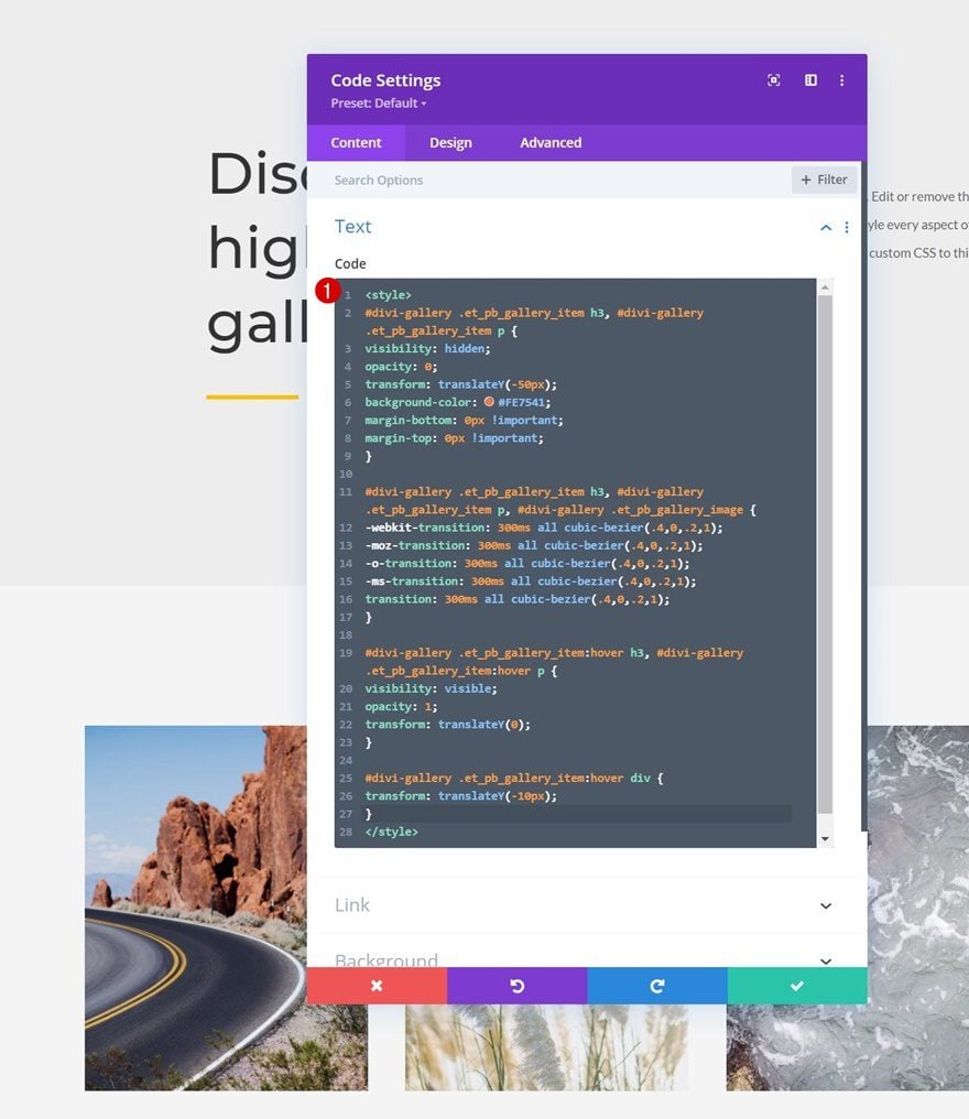
That’s it! Save your page settings and exit the Visual Builder to view the outcome when you hover one of the gallery items.
Preview
Now that we’ve gone through all the steps, let’s take a final look at the outcome across different screen sizes.
Desktop
Mobile
Final Thoughts
In this post, we’ve shown you how to get creative with Divi’s built-in Gallery Module. More specifically, we’ve shown you how to slide-down reveal an image’s title and caption when hovering it on desktop. This helps you keep a visual design without displaying too much text at once. You were able to download the JSON file for free as well! If you have any questions or suggestions, feel free to leave a comment in the comment section below.
If you’re eager to learn more about Divi and get more Divi freebies, make sure you subscribe to our email newsletter and YouTube channel so you’ll always be one of the first people to know and get benefits from this free content.


At first I thought this might be a reasonable alternative to my existing Smart Slider 3 and FooGallery, but this is far too complicated and far too much work for minimal gain.
So no captions or tiles visible on mobile? Seems like a lot of work to go thru only for desktop.