
Are you looking for new and creative ways to showcase features and/or products on your web pages? If so, keep reading because in this post, we’ll show you how to display features in hover tabs using Divi and its built-in options only. The possibilities you have with this approach are endless and they will surely allow you to understand Divi on a deeper level. The tab hover effect will only occur on hover-friendly desktop environments. When the hover tabs are being viewed from smaller screen sizes, the features will be listed in their original form.
Let’s get to it!
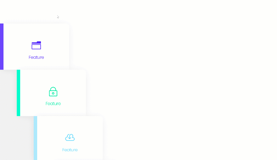
Preview
Before we dive into the tutorial, let’s take a look at the outcome on different screen sizes.
Desktop
Mobile
Let’s Start Creating!
Subscribe To Our Youtube Channel
Add New Section
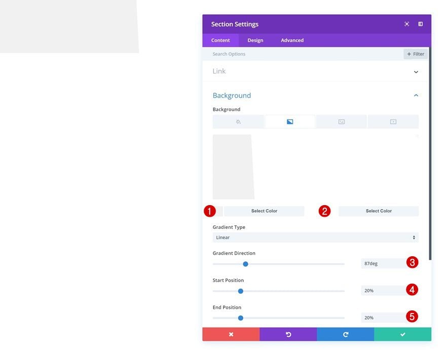
Gradient Background
Add a new page or open an existing one and add a new section. Open the section settings and add a gradient background to the section. We’ll use the gradient background to cover the left part of the hover tabs as you can notice in the print screens above.
- Color 1: #f2f2f2
- Color 2: #ffffff
- Gradient Direction: 87deg
- Start Position: 20%
- End Position: 20%
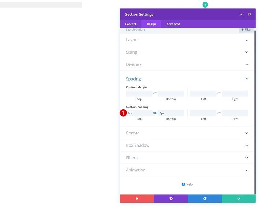
Spacing
Then, remove the section’s custom top and bottom padding by adding ‘0px’ to both options.
- Top Padding: 0px
- Bottom Padding: 0px
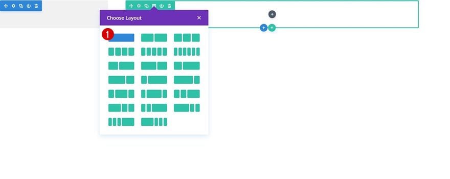
Add New Row
Column Structure
Continue by adding a new row to the section using the following column structure:
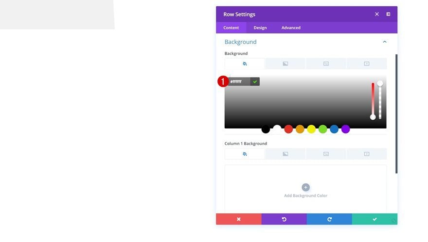
Background Color
Without adding any modules yet, open the row settings and change the background color.
- Background Color: #ffffff
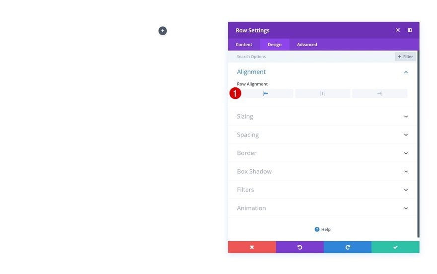
Row Alignment
Modify the row alignment as well.
- Row Alignment: Left
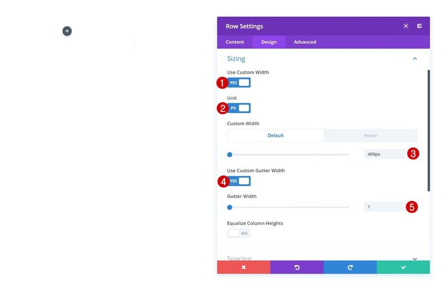
Default Sizing
And change the sizing settings too.
- Use Custom Width: Yes
- Unit: PX
- Custom Width: 400px
- Use Custom Gutter Width: Yes
- Gutter Width: 1
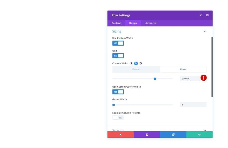
Hover Sizing
Modify the Custom Width option in the Sizing settings on hover. This will allow the row to expand when being hovered.
- Custom Width: 2000px
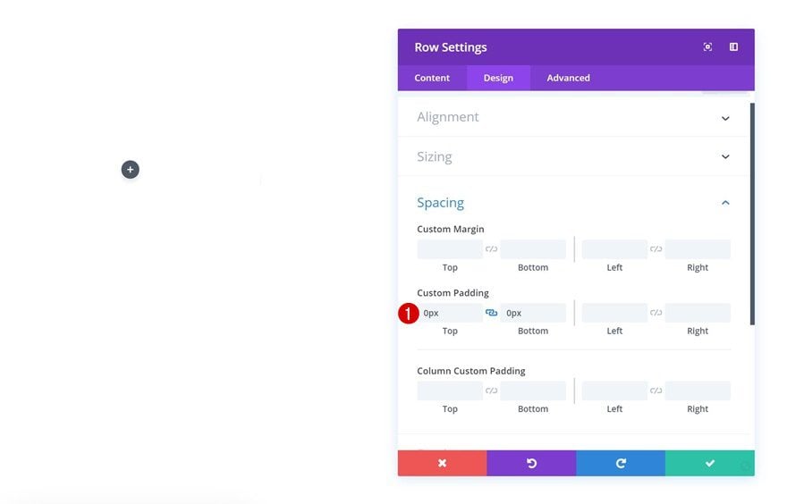
Spacing
Then, go to the spacing settings and remove the default top and bottom padding values.
- Top Padding: 0px
- Bottom Padding: 0px
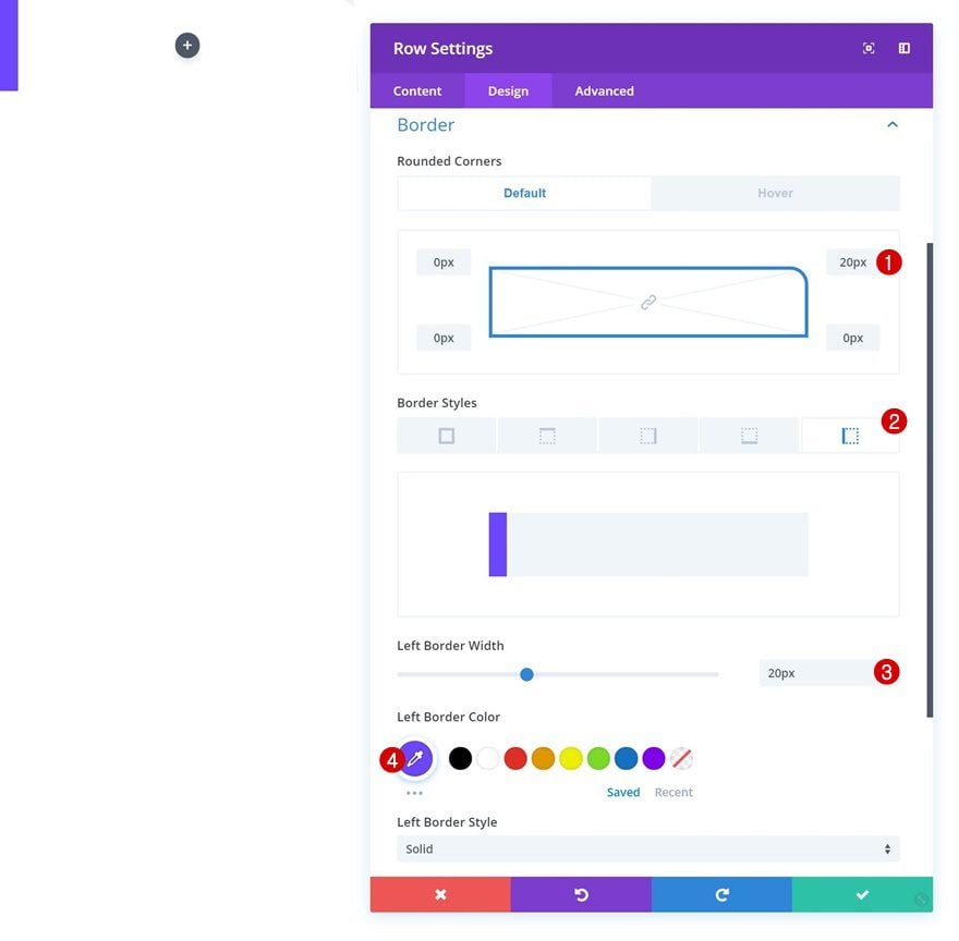
Default Border
Add ’20px’ to the top right corner of the row and add a left border to the row as well.
- Left Border Width: 20px
- Left Border Color: #6d44ff
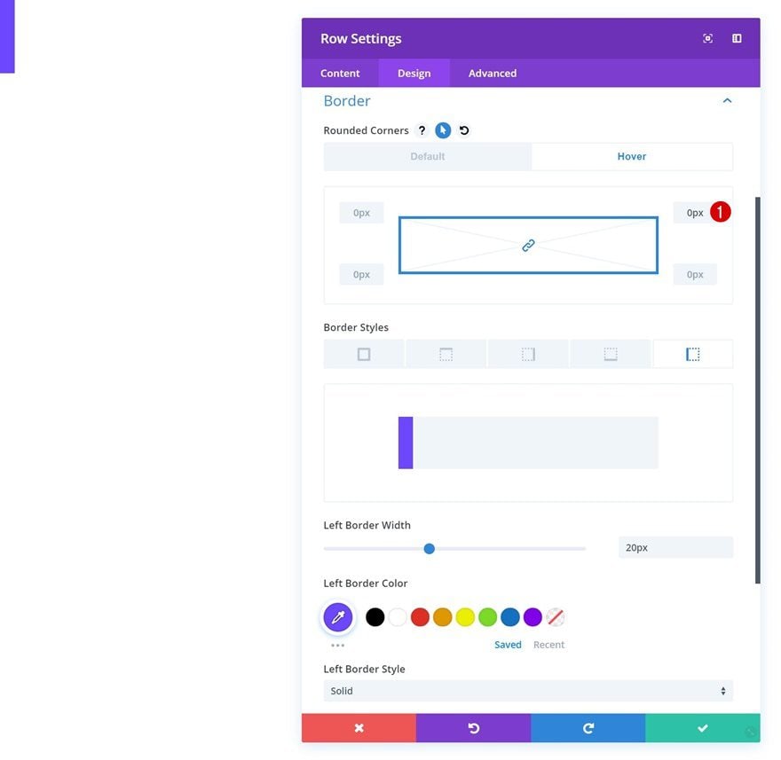
Hover Border
Remove the ’20px’ top right rounded corner on hover by adding ‘0px’ instead.
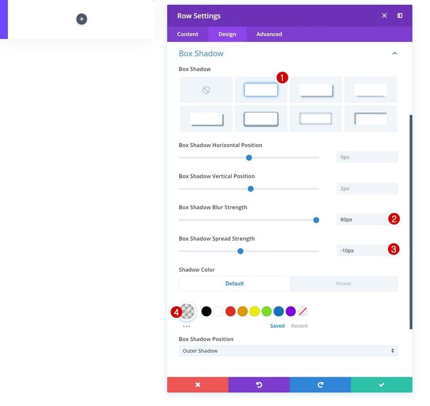
Default Box Shadow
Last but not least, add a subtle box shadow.
- Box Shadow Blur Strength: 80px
- Box Shadow Spread Strength: -10px
- Shadow Color: rgba(0,0,0,0.11)
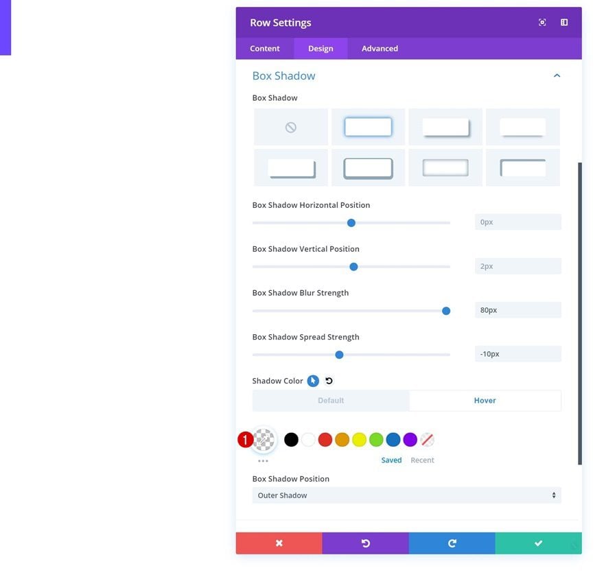
Hover Box Shadow
And modify the shadow color into a completely transparent color on hover.
- Shadow Color: rgba(255,255,255,0)
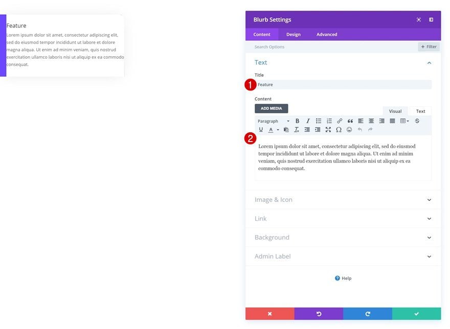
Add Blurb Module to Row
Add Content
Now that we’re finished modifying all the row settings, we can go ahead and add a Blurb Module to the column. Feel free to use any other module of your choice. Once you’ve added the module, add some content of choice.
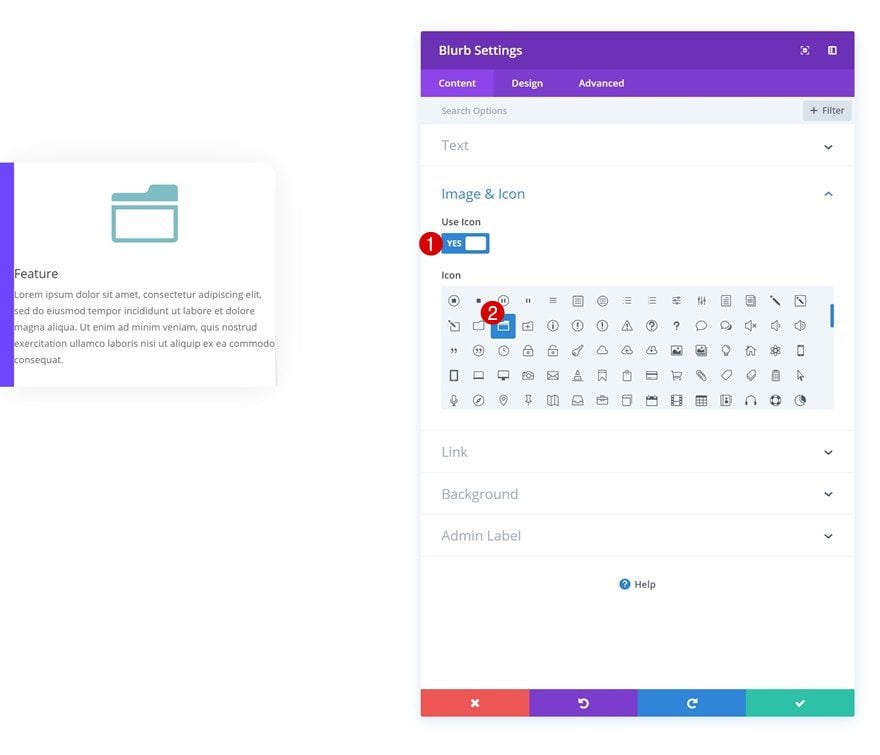
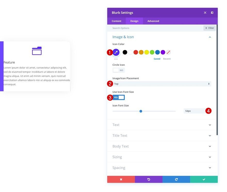
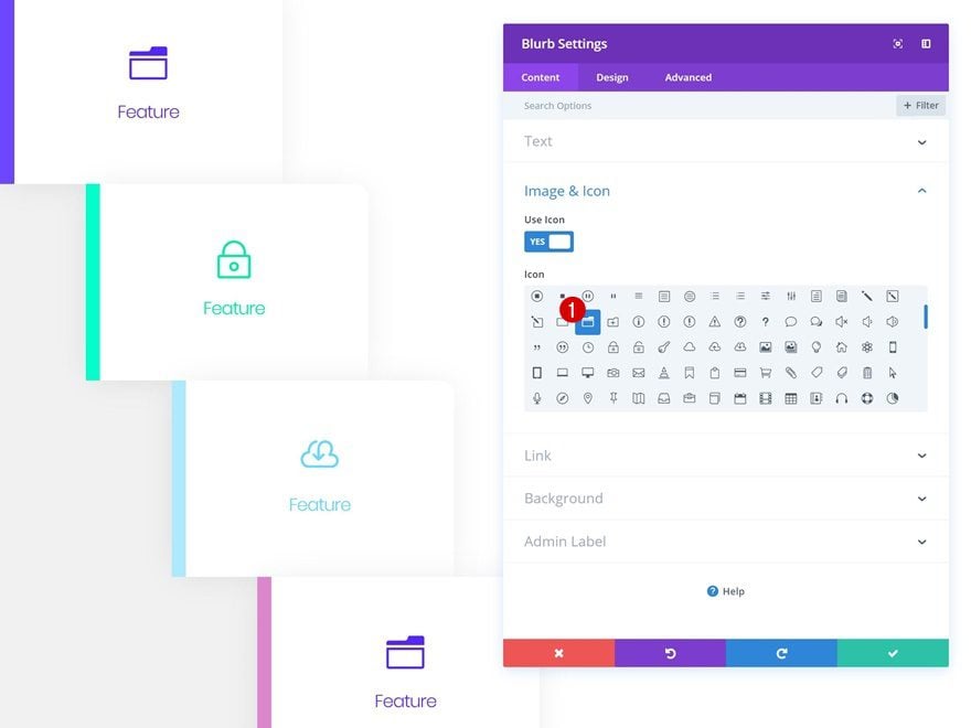
Select Icon
Select an icon of your choice next.
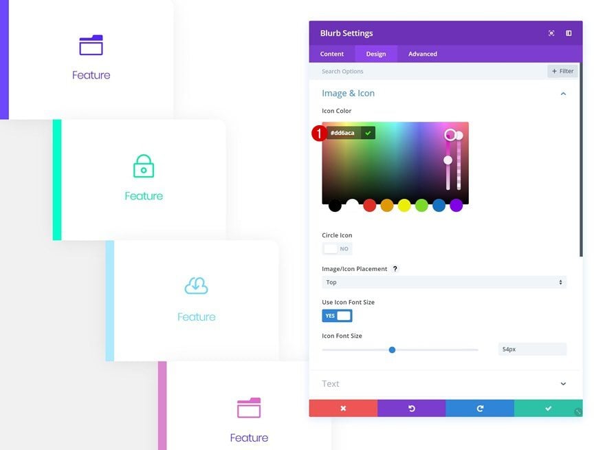
Icon Settings
And change the appearance of the icon in the icon settings.
- Icon Color: #5323ff
- Icon Placement: Top
- Use Icon Font Size: Yes
- Icon Font Size: 54px
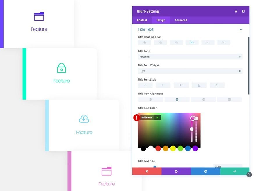
Default Title Text Settings
Modify the title text settings next.
- Title Font: Poppins
- Title Text Alignment: Center
- Title Text Color: #5323ff
- Title Text Size: 25px
- Title Letter Spacing: -1px
- Title Line Height: 1em
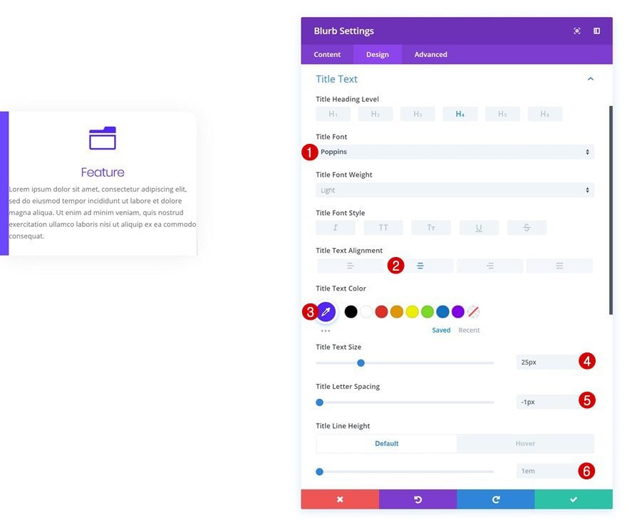
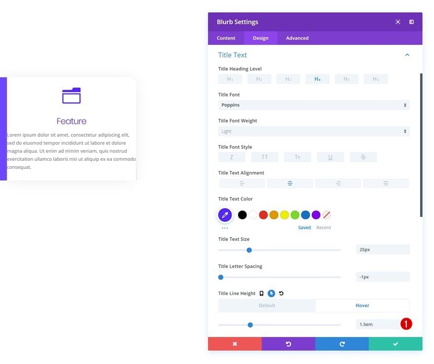
Hover Title Text Settings
And modify the title line height on hover.
- Title Line Height: 1.5em
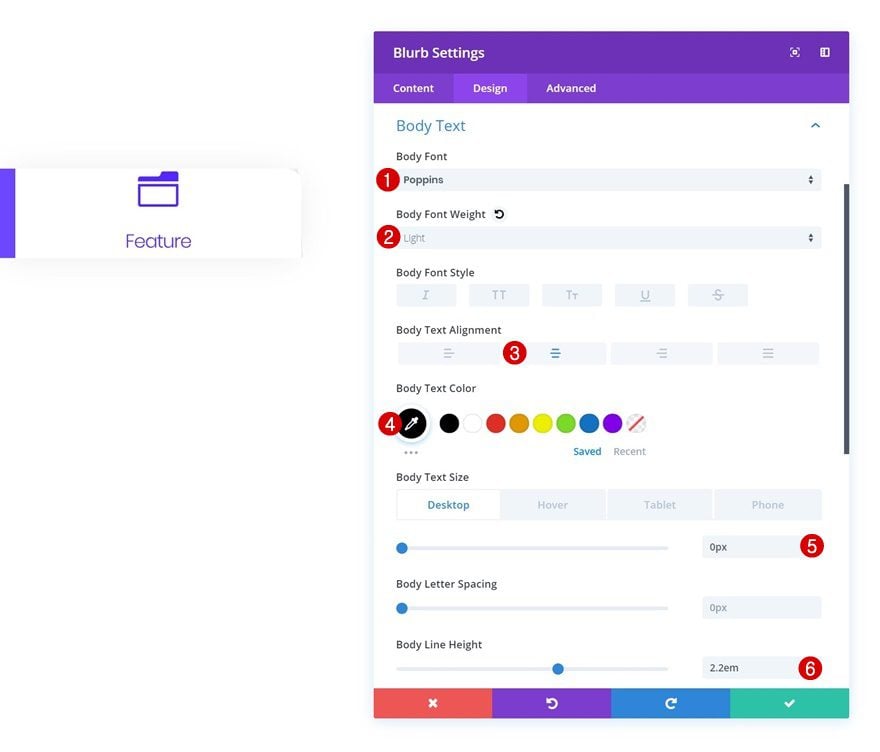
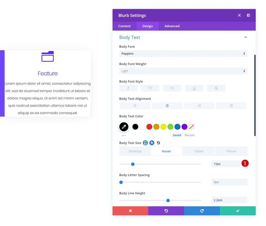
Default Body Text Settings
Then, go to the body text settings and make some changes. This includes changing the text size to ‘0px’. This will help us make the body text appear on hover only.
- Body Font: Poppins
- Body Font Weight: Light
- Body Text Alignment: Center
- Body Text Color: #000000
- Body Text Size: 0px (Desktop), 15px (Tablet & Phone)
- Body Line Height: 2.2em
Hover Body Text Settings
To make sure the body text appears on hover, change the text size on hover.
- Body Text Size: 15px
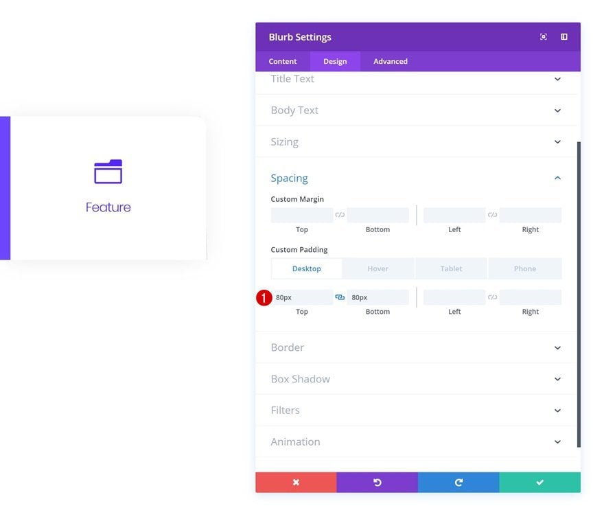
Default Spacing
To give the module some space to breathe, we’re adding some custom top and bottom padding to the module.
- Top Padding: 80px
- Bottom Padding: 80px
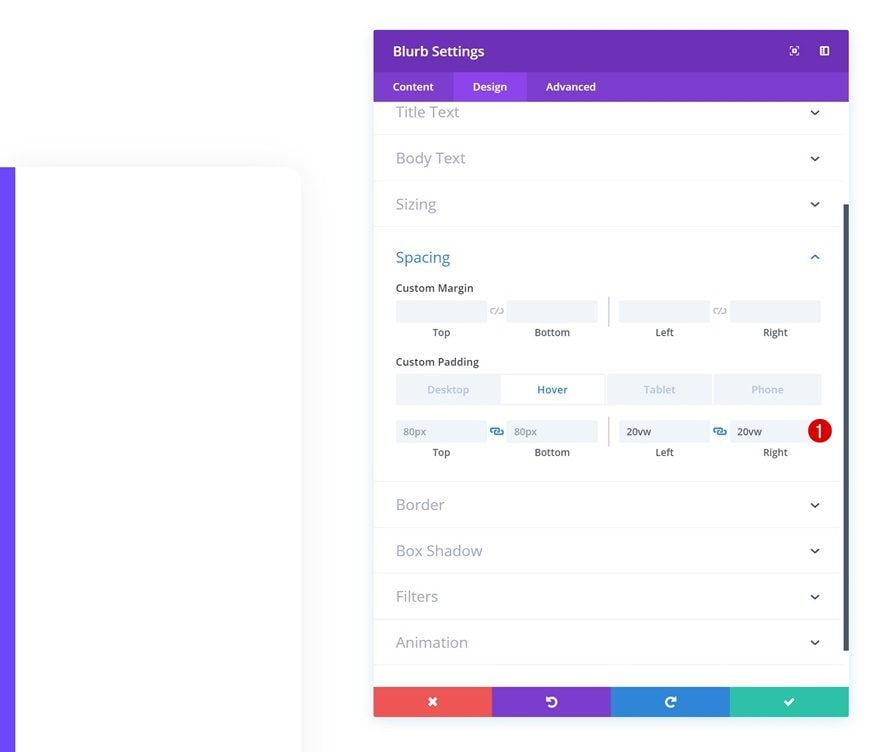
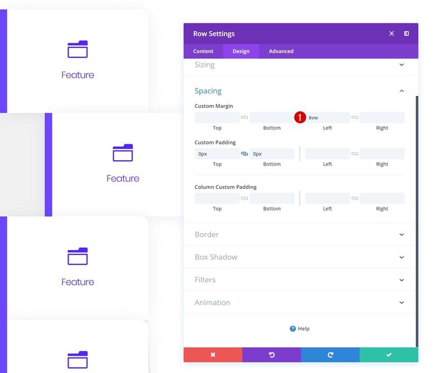
Hover Spacing
We’ll modify the spacing settings on hover. You won’t be able to see the end result before exiting the Visual Builder because we’re applying hover options to both the row and Blurb Module.
- Top Padding: 80px
- Bottom Padding: 80px
- Left Padding: 20vw
- Right Padding: 20vw
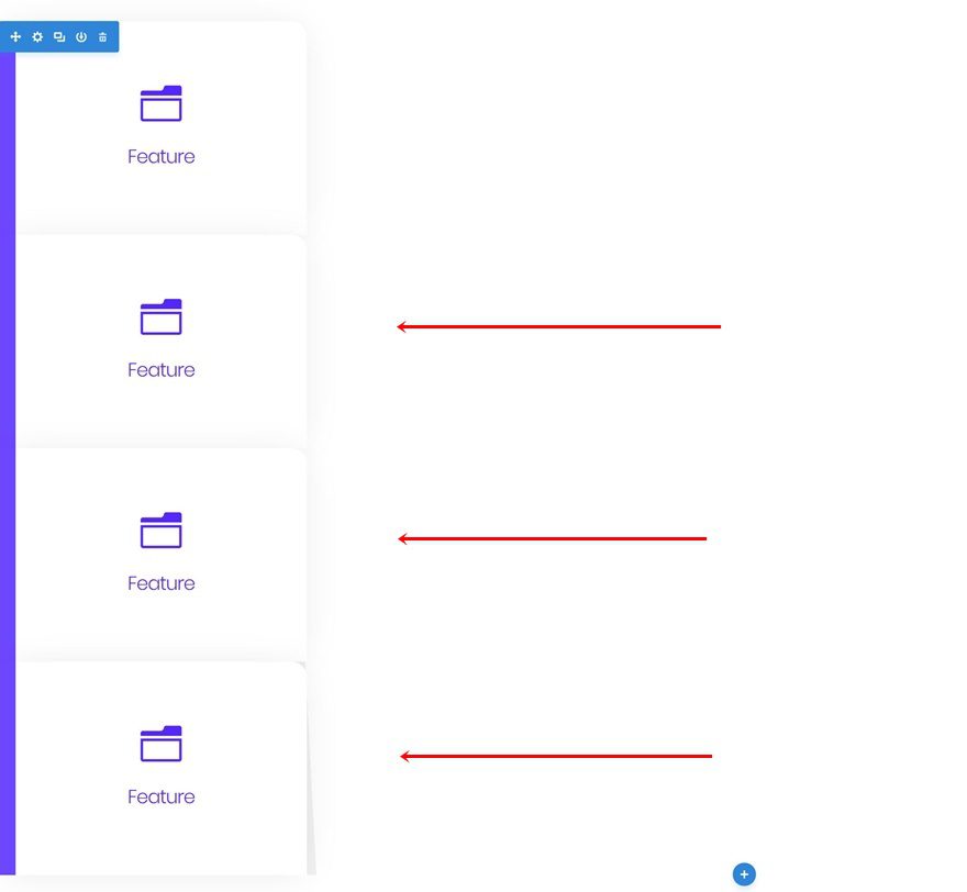
Clone Row 3 Times
Once you’re done modifying the first row and its Blurb Module, you can go ahead and clone the row up to as many times as you want.
Change Row & Blurb Module #2
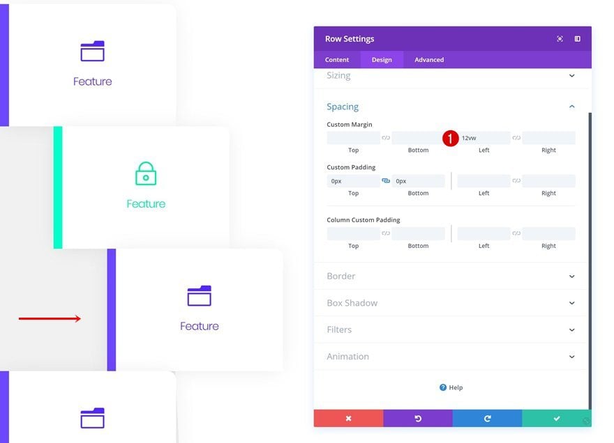
Change Row Spacing
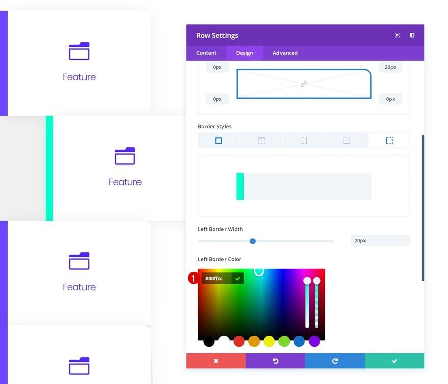
Open the first duplicate and add some custom left margin. This will allow us to create the staircase effect which you can notice in the preview of this post.
- Left Margin: 6vw
Change Row Border Color
Change the left border color of the row as well.
- Left Border Color: #00ffcc
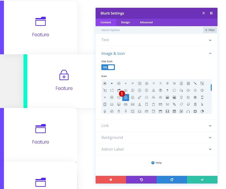
Change Blurb Content & Icon
Then, open the Blurb Module and change the icon.
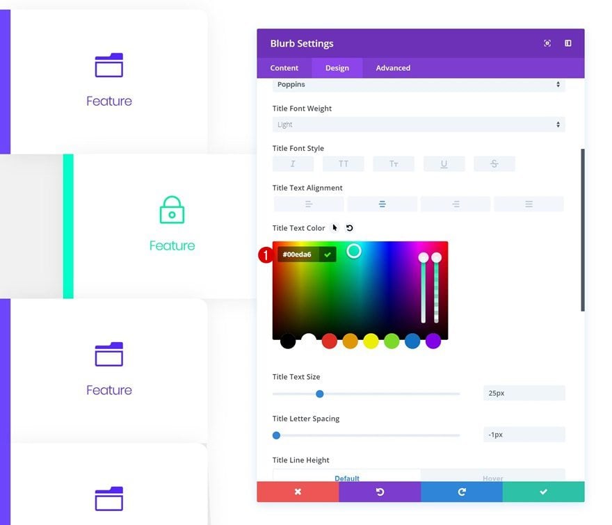
Change Blurb Module Icon Color
Along with the icon color.
- Icon Color: #00eda6
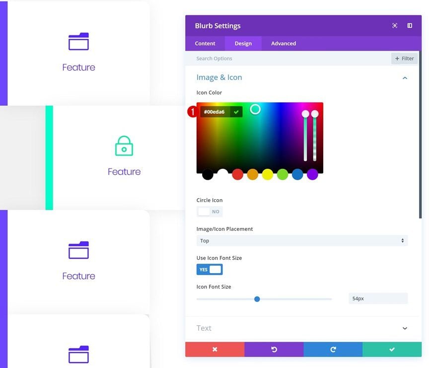
Change Title Text Color
And the title text color.
- Title Text Color: #00eda6
Change Row & Blurb Module #3
Change Row Spacing
Add some custom left margin to the second duplicate as well.
- Left Margin: 12vw
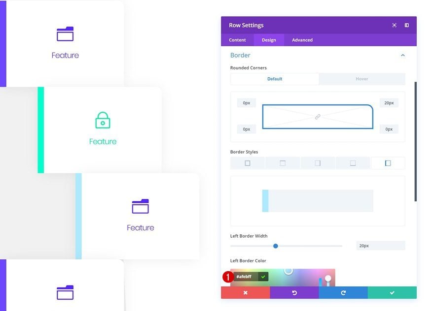
Change Row Border Color
Change the left row border color.
- Left Border Color:#afebff
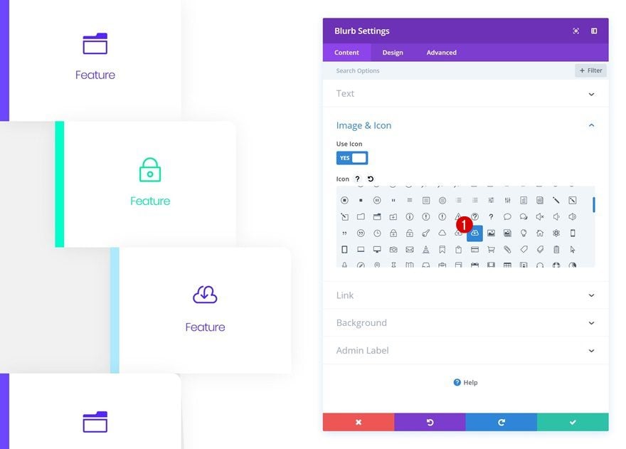
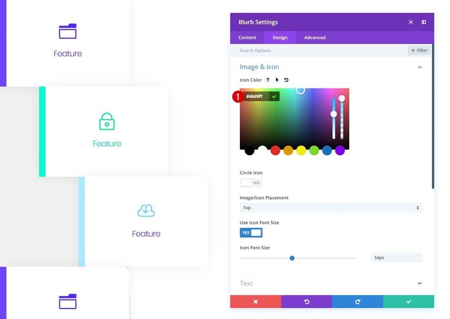
Change Blurb Content & Icon
Along with the blurb icon and content.
Change Blurb Module Icon Color
Modify the icon color as well.
- Icon Color: #68d9ff
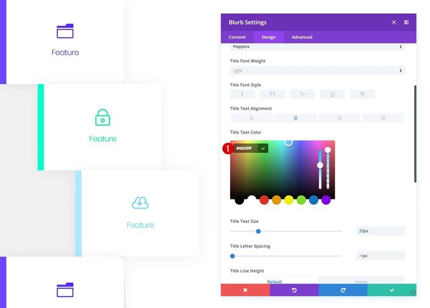
Change Title Text Color
And the title text color too.
- Title Text Color: #68d9ff
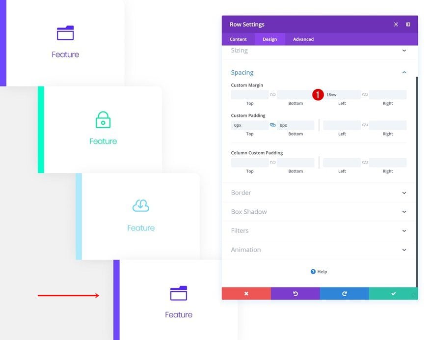
Change Row & Blurb Module #4
Change Row Spacing
On to the next and last duplicate! Add some custom left margin to the row.
- Left Margin: 18vw
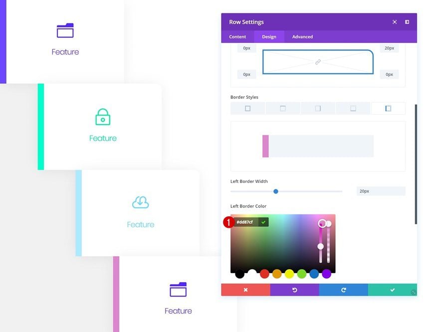
Change Row Border Color
Change the left border color of the row as well.
- Left Border Color: #dd87cf
Change Blurb Content & Icon
Open the Blurb Module in the row and change the icon and content of the module.
Change Blurb Module Icon Color
Along with the icon color.
- Icon Color: #dd6aca
Change Title Text Color
And the title text color as well.
- Title Text Color: #dd6aca
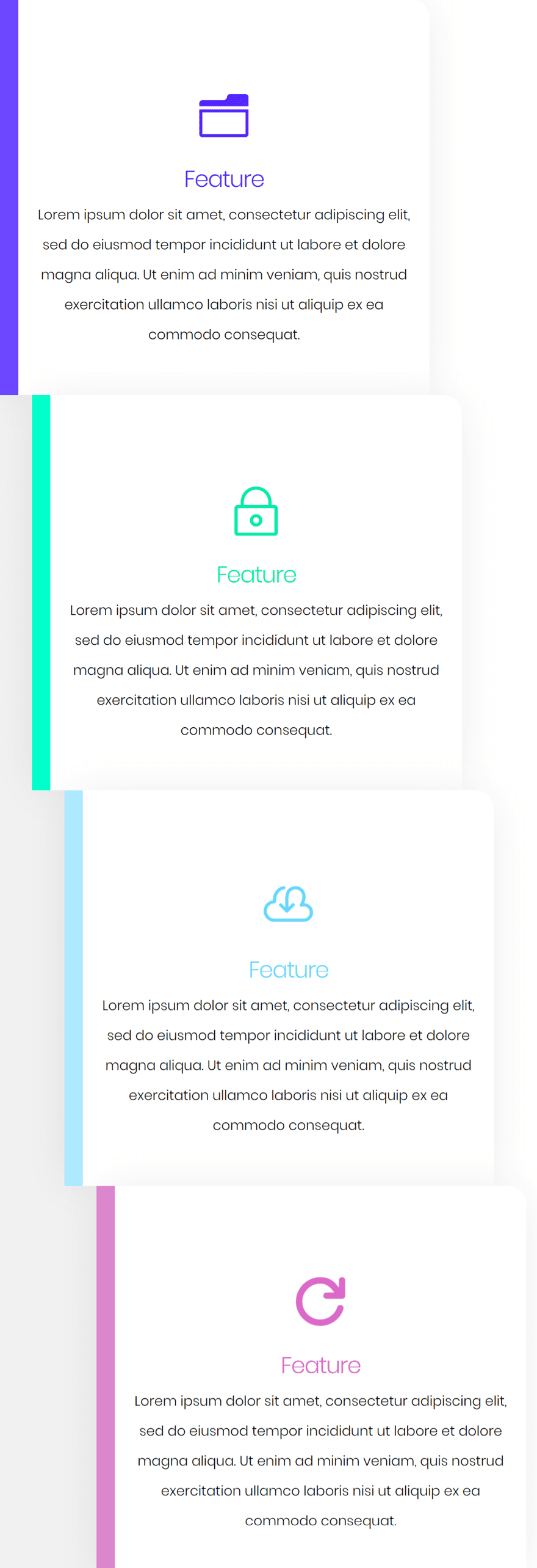
Preview
Now that we’ve gone through the tutorial, let’s take a final look at the outcome on different screen sizes.
Desktop
Mobile
Final Thoughts
In this post, we’ve shown you how to use Divi’s built-in options only to create hover tabs. This approach will help you share content about features or products in an interactive way. If you have any questions or suggestions, make sure you leave a comment in the comment section below!


hmm.. I have the latest version of divi and it has no hover options whatsoever
Great tutorial
for christs sake please start providing live demos of these, screenshots are absolutely useless
Please fix the alt tag issue with the Gallery Module. Unbelievable.
hahaha! Good luck! It’s been broken for years. The stupid Visual Builder comes first and they just fix things when they break inside the VB. If it doesn’t affect the VB, good luck ever seeing it get fixed. :/
Hej, can you export it and add for download?:)
Thanks for this tutorial.
A lot of tutorial with the function “hover” and it’s very good because it is very fashionable now.
translate fr >> en
Thanks for this tutorial.
A lot of tutorial with the function “hover” and it’s very good because it is very fashionable now.
translate fr >> en
Good Luck I always check you.