
When thinking of ways to include CTAs in your page design, you might consider including a contact form in your hero section. This approach allows people to immediately get in touch with you without having to navigate any further on your website. If you’re looking for a seamless way to make this work inside Divi, you’re going to love this post. In this tutorial, we’ll show you how to add a slide-in column contact form to your hero section using Divi’s built-in options only. You’ll be able to download the JSON file for free as well!
Let’s get to it.
Preview
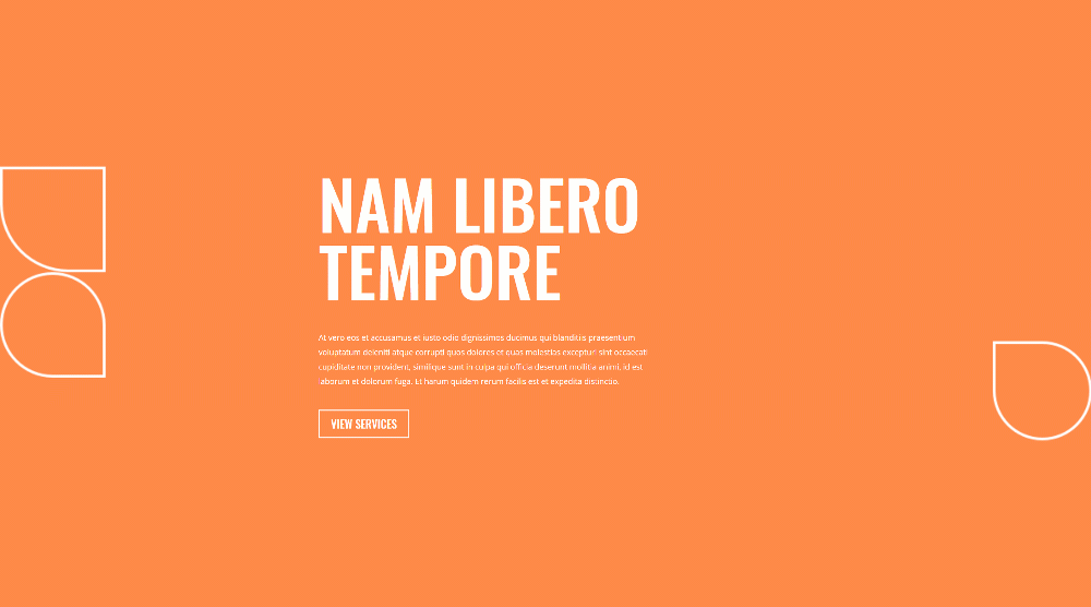
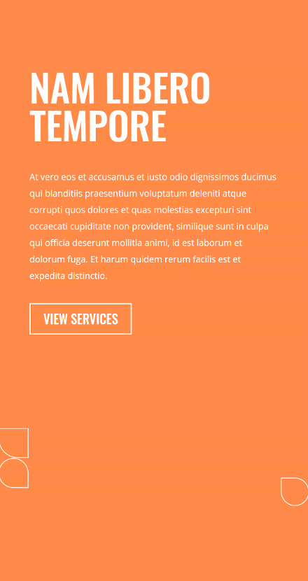
Before we dive into the tutorial, let’s take a quick look at the outcome across different screen sizes.
Desktop
Mobile
Download The Column Contact Form Hero Section Layout for FREE
To lay your hands on the free column contact form hero section layout, you will first need to download it using the button below. To gain access to the download you will need to subscribe to our newsletter by using the form below. As a new subscriber, you will receive even more Divi goodness and a free Divi Layout pack every Monday! If you’re already on the list, simply enter your email address below and click download. You will not be “resubscribed” or receive extra emails.

Let’s Start Recreating
Add New Section
Background Color
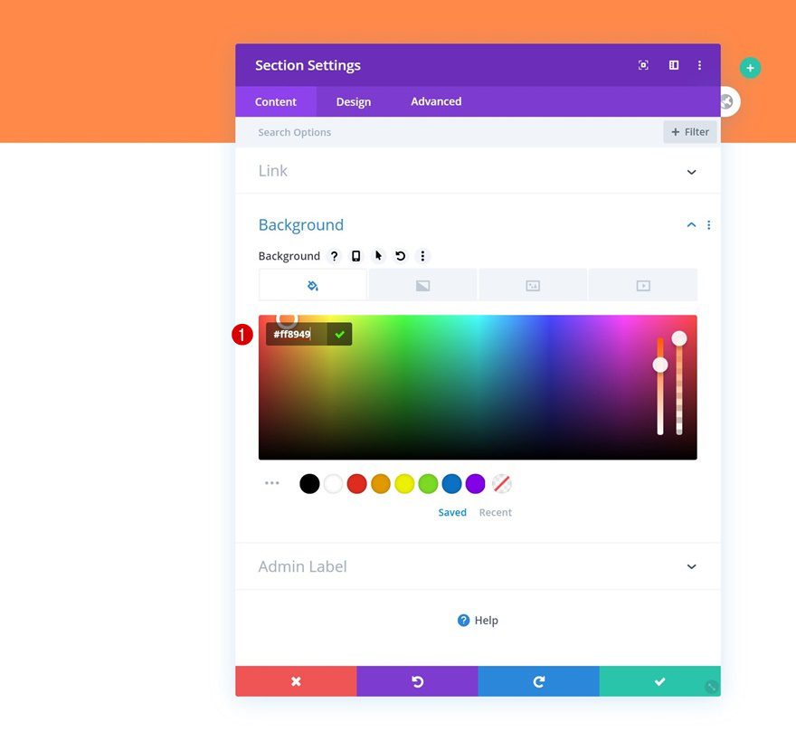
Start by adding a new section to the page you’re working on. Open the section settings and change the background color.
- Background Color: #ff8949
Background Image
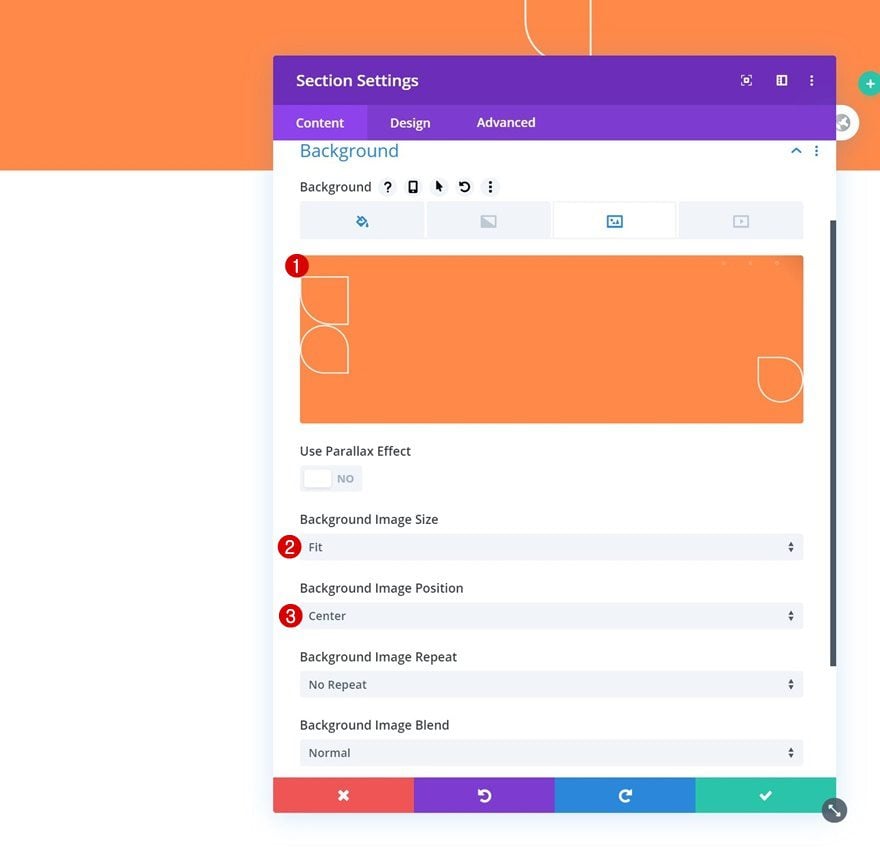
We’re uploading a background pattern that’s part of the Financial Advisor Layout Pack next. You can find this background image in the folder you were able to download at the beginning of this post.
- Background Image Size: Fit
- Background Image Position: Center
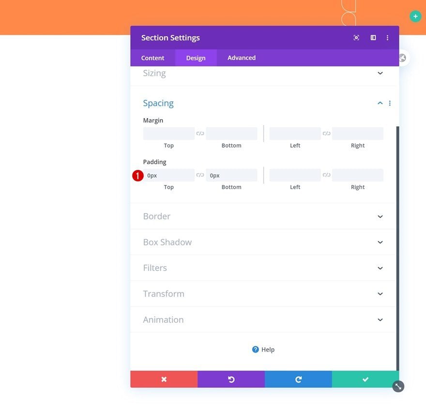
Spacing
Move on to the section’s design tab and remove all default top and bottom padding.
- Top Padding: 0px
- Bottom Padding: 0px
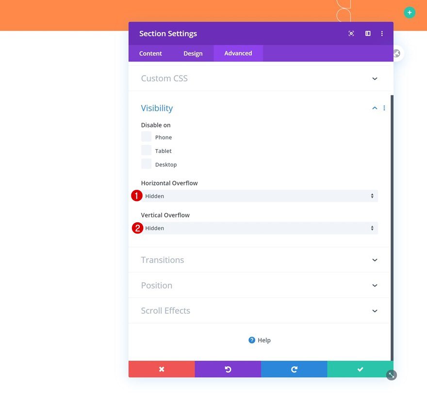
Overflows
Complete the section settings by hiding the overflows in the advanced tab. This will make sure the animations we add later won’t go beyond the section container.
- Horizontal Overflow: Hidden
- Vertical Overflow: Hidden
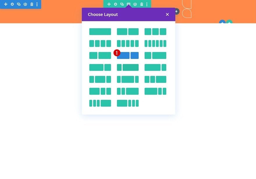
Add New Row
Column Structure
Continue by adding a new row to the section using the following column structure:
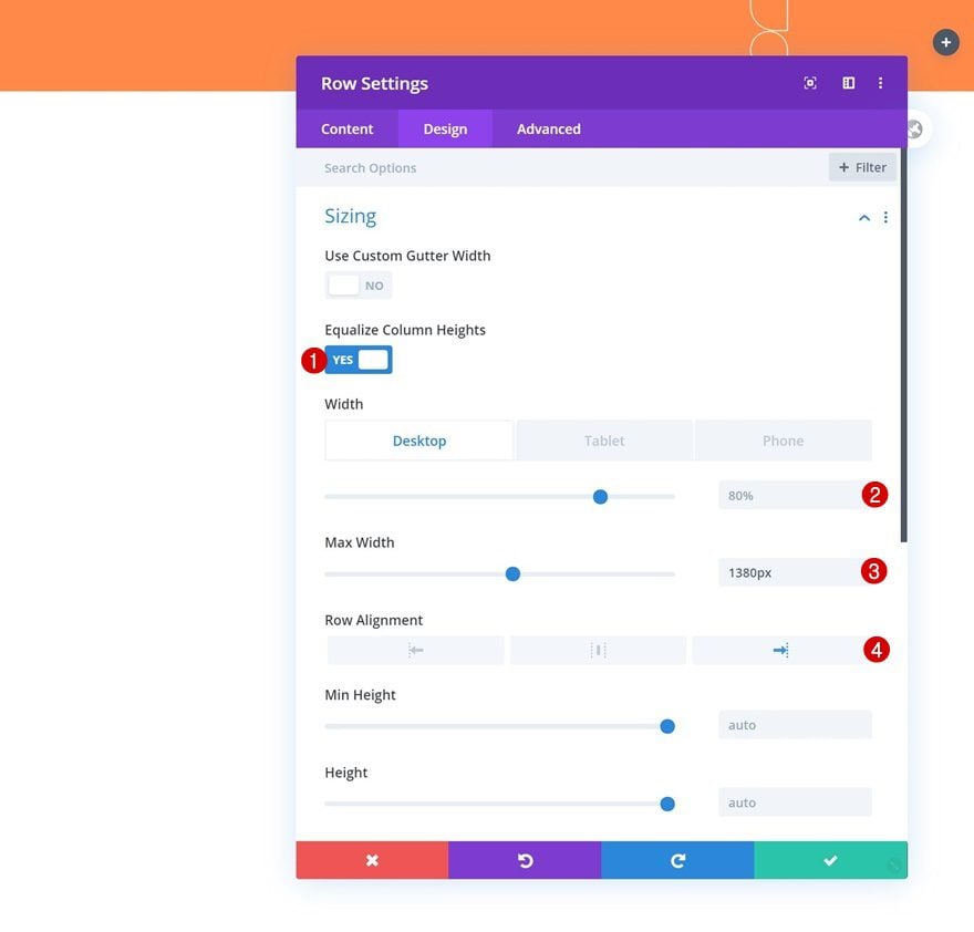
Sizing
Without adding any modules yet, open the row settings and modify the sizing settings as follows:
- Equalize Column Heights: Yes
- Width: 80% (Desktop), 100% (Tablet & Phone)
- Max Width: 1380px
- Row Alignment: Right
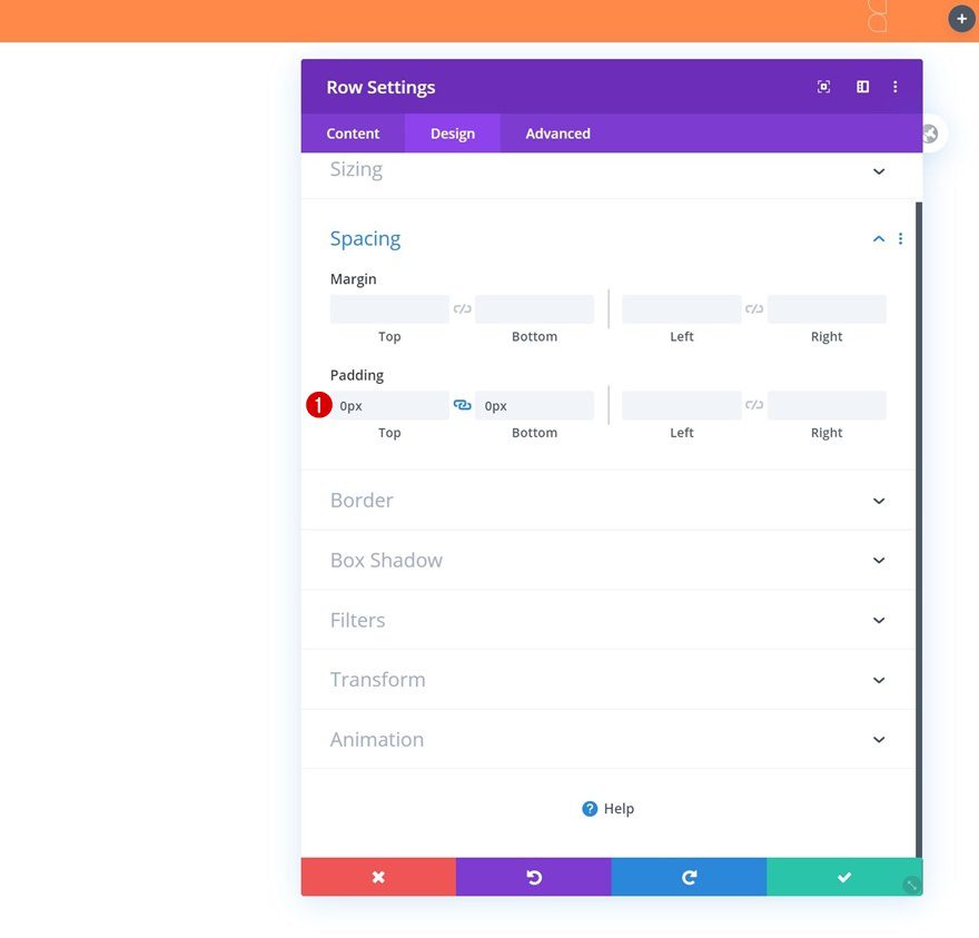
Spacing
Remove all default top and bottom padding next.
- Top Padding: 0px
- Bottom Padding: 0px
Column 1 Settings
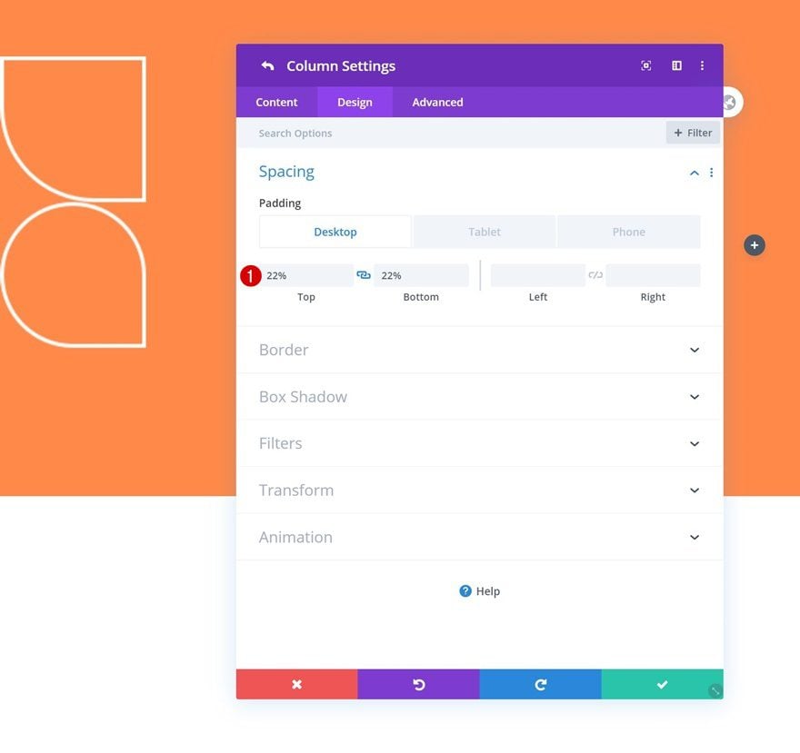
Spacing
Then, open the column 1 settings and modify the spacing settings across different screen sizes.
- Top Padding: 22%
- Bottom Padding: 22%
- Left Padding: 10% (Tablet & Phone Only)
- Right Padding: 10% (Tablet & Phone Only)
Column 2 Settings
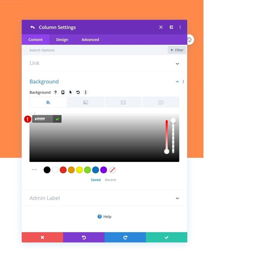
Background Color
Next, we’ll open the column 2 settings and use a white background color.
- Background Color: #ffffff
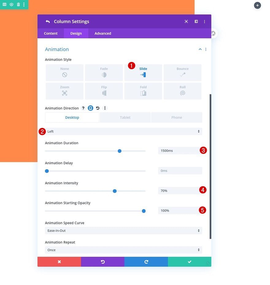
Animation
We’ll complete the column 2 settings by applying the following animation settings:
- Animation Direction: Left (Desktop), Up (Tablet & Phone)
- Animation Duration: 1500ms
- Animation Intensity: 70%
- Animation Starting Opacity: 100%
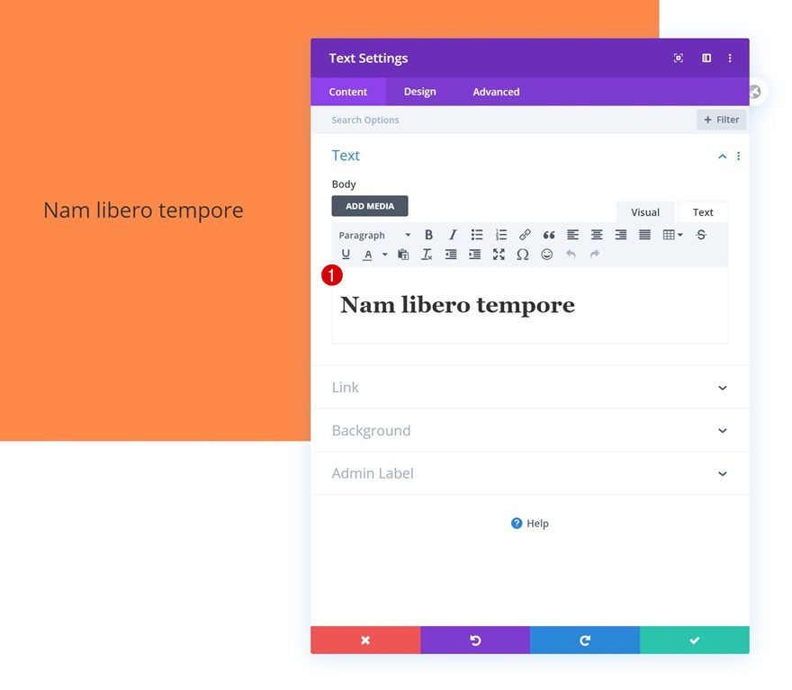
Add Text Module #1 to Column 1
Add H1 Content
Time to add modules, starting with a first Text Module in column 1. Add some H1 content of your choice.
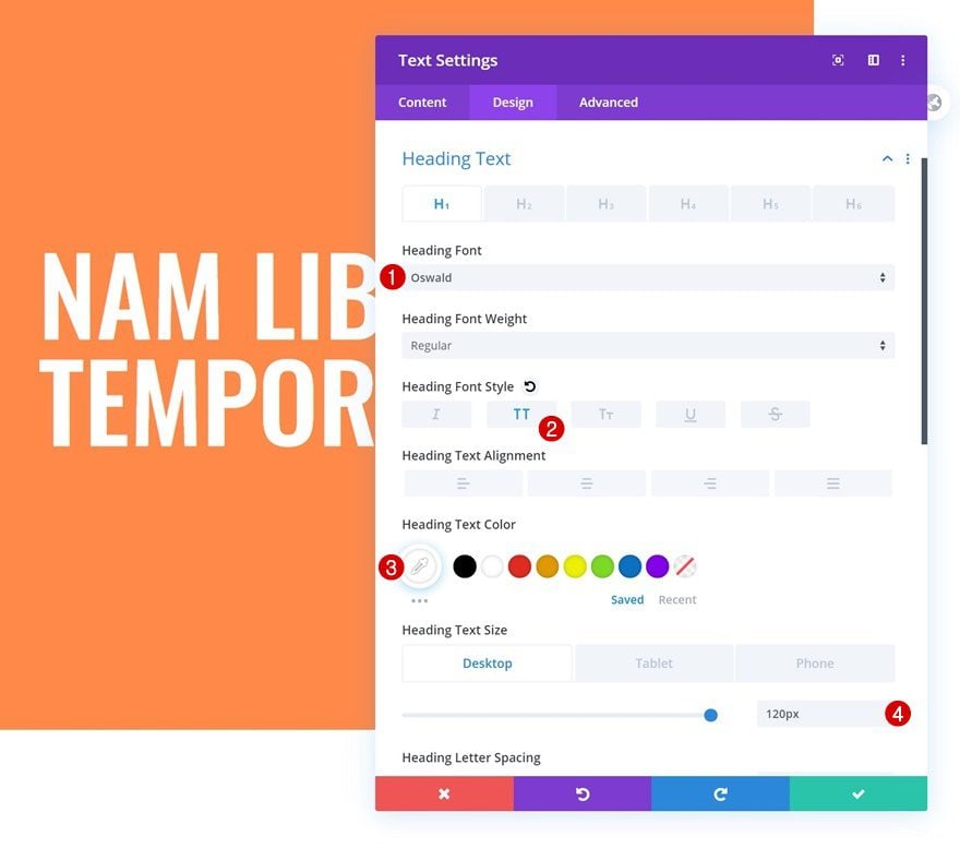
H1 Text Settings
Move on to the module’s design tab and change the H1 text settings as follows:
- Heading Font: Oswald
- Heading Font Style: Uppercase
- Heading Text Color: #ffffff
- Heading Text Size: 120px (Desktop), 70px (Tablet), 60px (Phone)
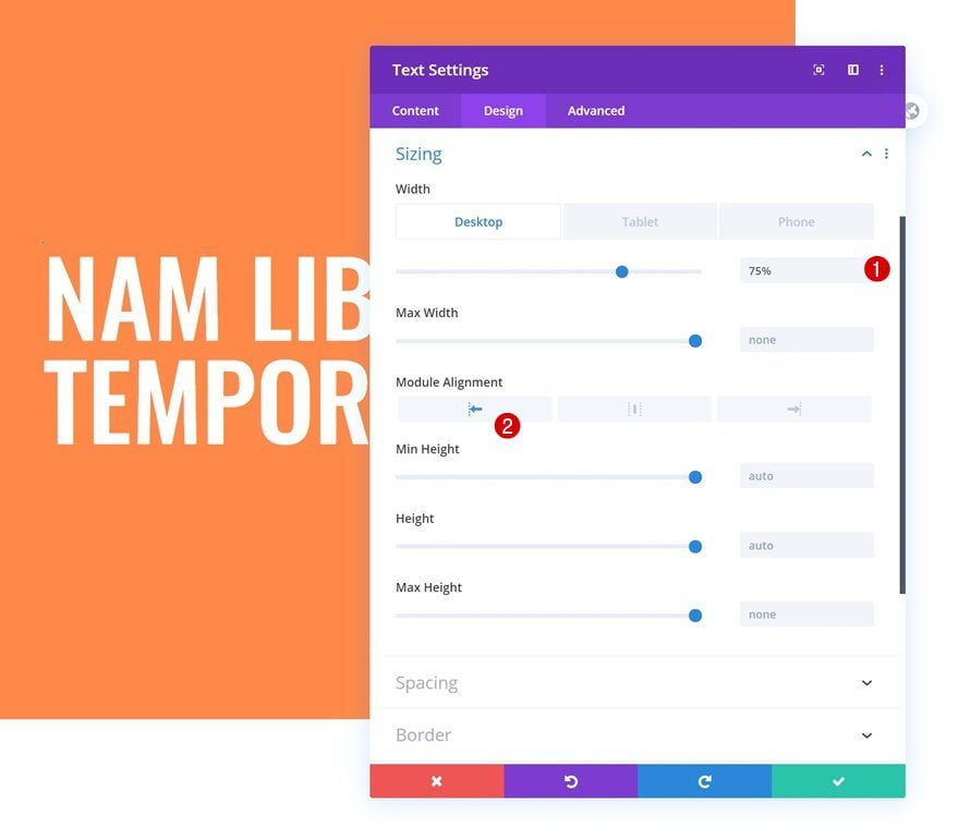
Sizing
We’re changing the module’s sizing settings as well.
- Width: 75% (Desktop), 100% (Tablet & Phone)
- Module Alignment: Left
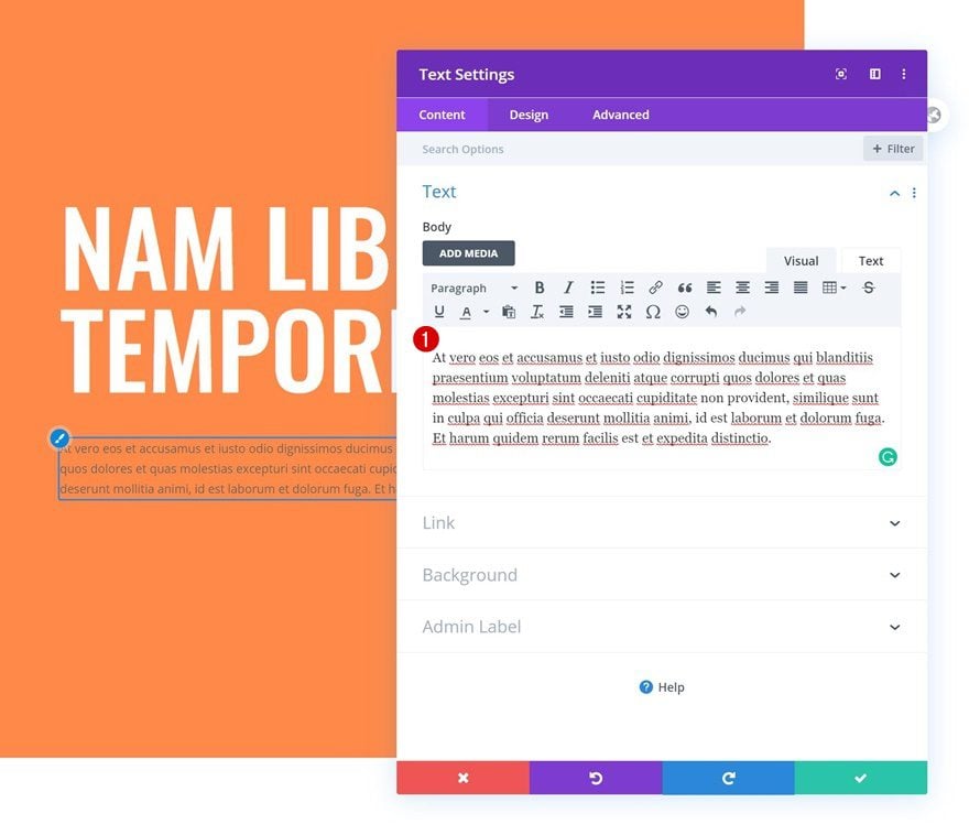
Add Text Module #2 to Column 1
Add Description Content
On to the next module, which is another Text Module. Add some description content of your choice.
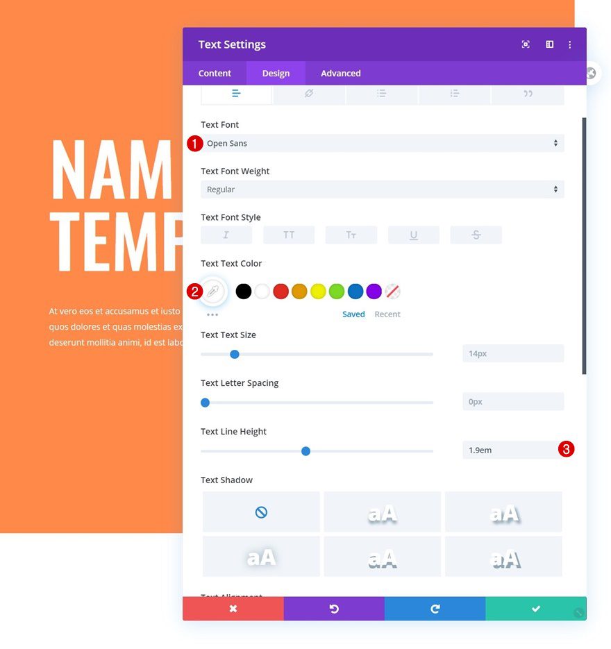
Text Settings
Move on to the module’s design tab and change the text settings accordingly:
- Text Font: Open Sans
- Text Color: #ffffff
- Text Line Height: 1.9em
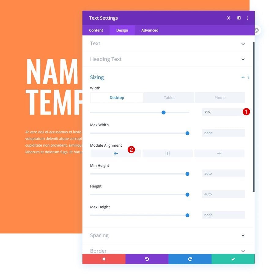
Sizing
Modify the sizing settings too.
- Width: 75% (Desktop), 100% (Tablet & Phone)
- Module Alignment: Left
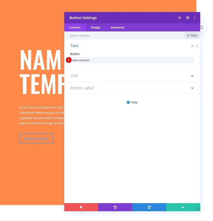
Add Copy
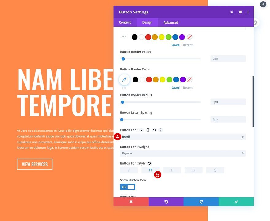
The last module we need in column 1 is a Button Module. Add some copy of your choice.
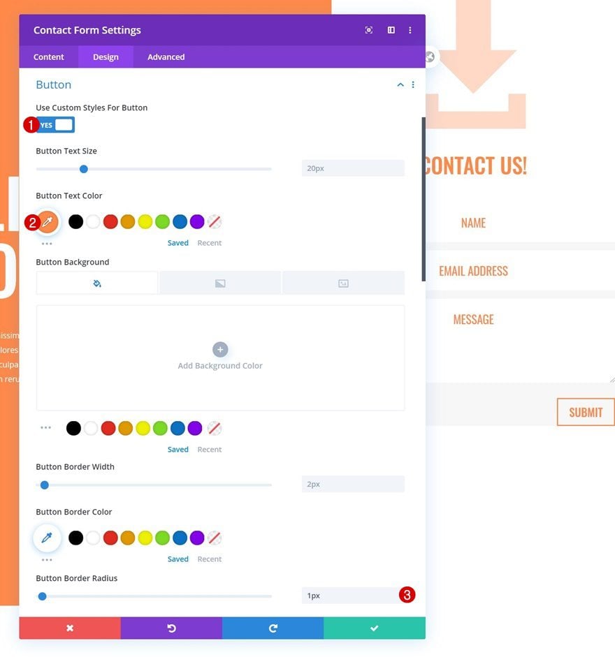
Button Settings
Move on to the module’s design tab and change the button settings as follows:
- Use Custom Styles For Button: Yes
- Button Text Color: #ffffff
- Button Border Radius: 1px
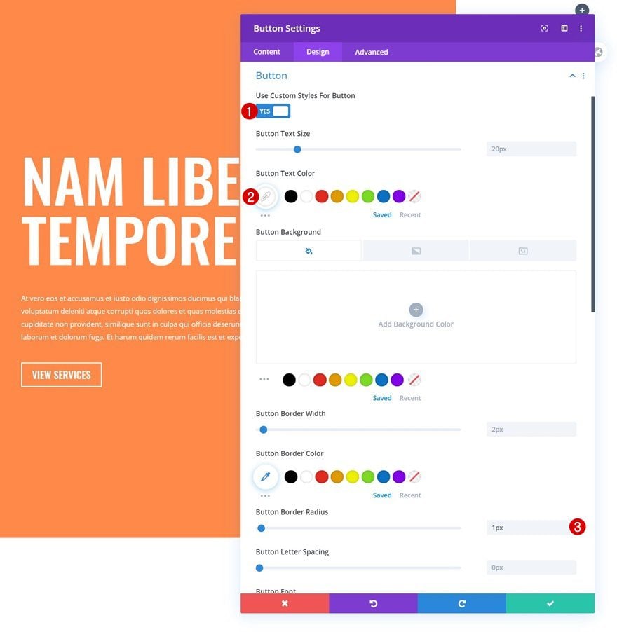
- Button Font: Oswald
- Button Font Style: Uppercase
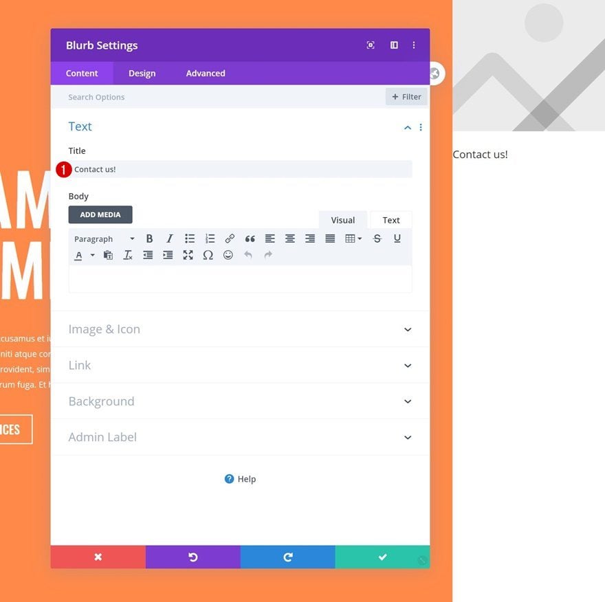
Add Blurb Module to Column 2
Add Content
On to the second column. There, the first module we need is a Blurb Module. Add a title of your choice.
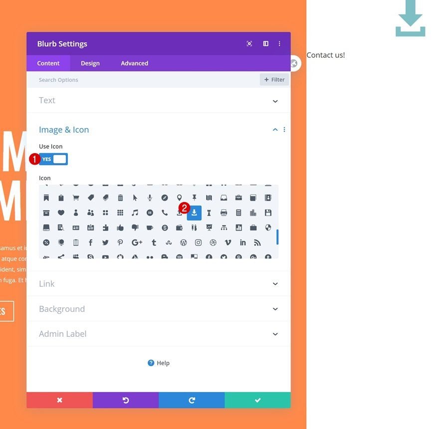
Select Icon
Next, select an icon.
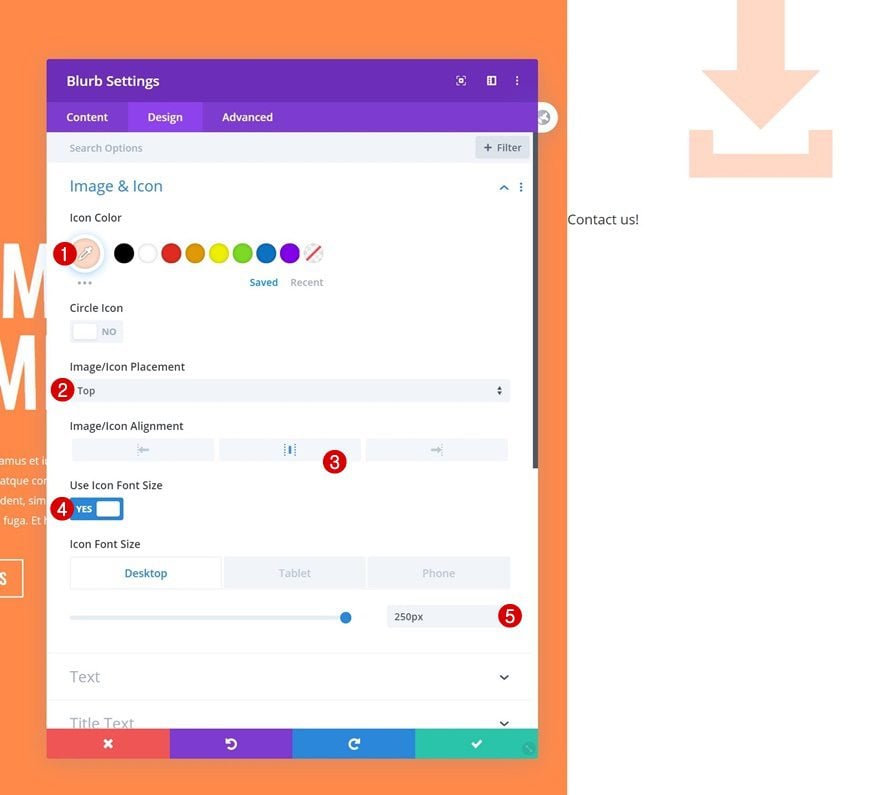
Icon Settings
Move on to the module’s design tab and change the icon settings as follows:
- Icon Color: #ffd8c6
- Icon Placement: Top
- Icon Alignment: Center
- Use Icon Font Size: Yes
- Icon Font Size: 250px (Desktop), 150px (Tablet & Phone)
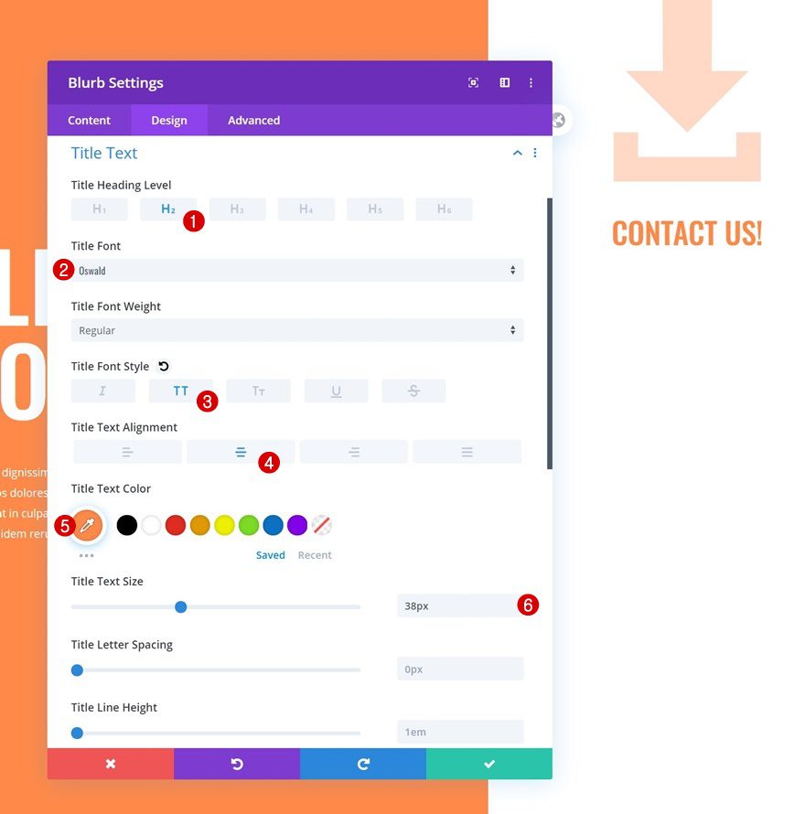
Title Text Settings
Modify the title text settings next.
- Title Heading Level: H2
- Title Font: Oswald
- Title Font Style: Uppercase
- Title Text Alignment: Center
- Title Text Color: #ff8949
- Title Text Size: 38px
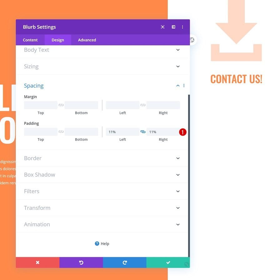
Spacing
Add some left and right padding too.
- Left Padding: 11%
- Right Padding: 11%
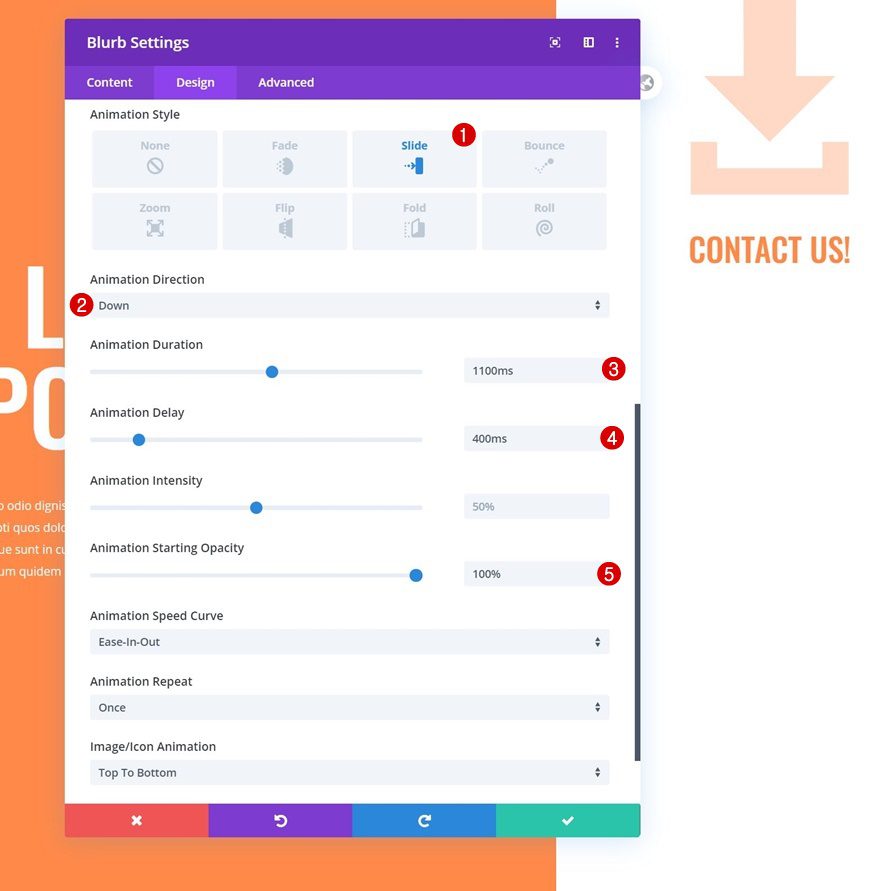
Animation
And complete the module by adding the following animation settings:
- Animation Direction: Down
- Animation Duration: 1100ms
- Animation Delay: 400ms
- Animation Starting Opacity: 100%
Add Contact Form Module to Column 2
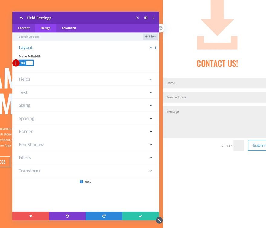
Turn Fields Fullwidth
On to the last module, which is a Contact Form Module. Open the name and email fields individually and make them fullwidth in the layout settings.
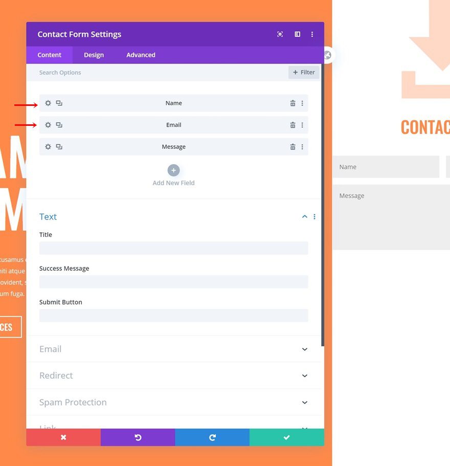
- Make Fullwidth: Yes
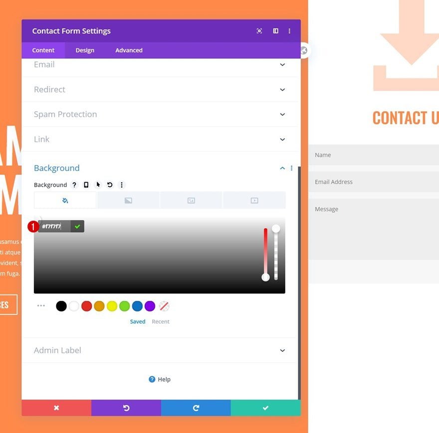
Background Color
Then, go back to the general Contact Form Module settings and add a background color.
- Background Color: #f7f7f7
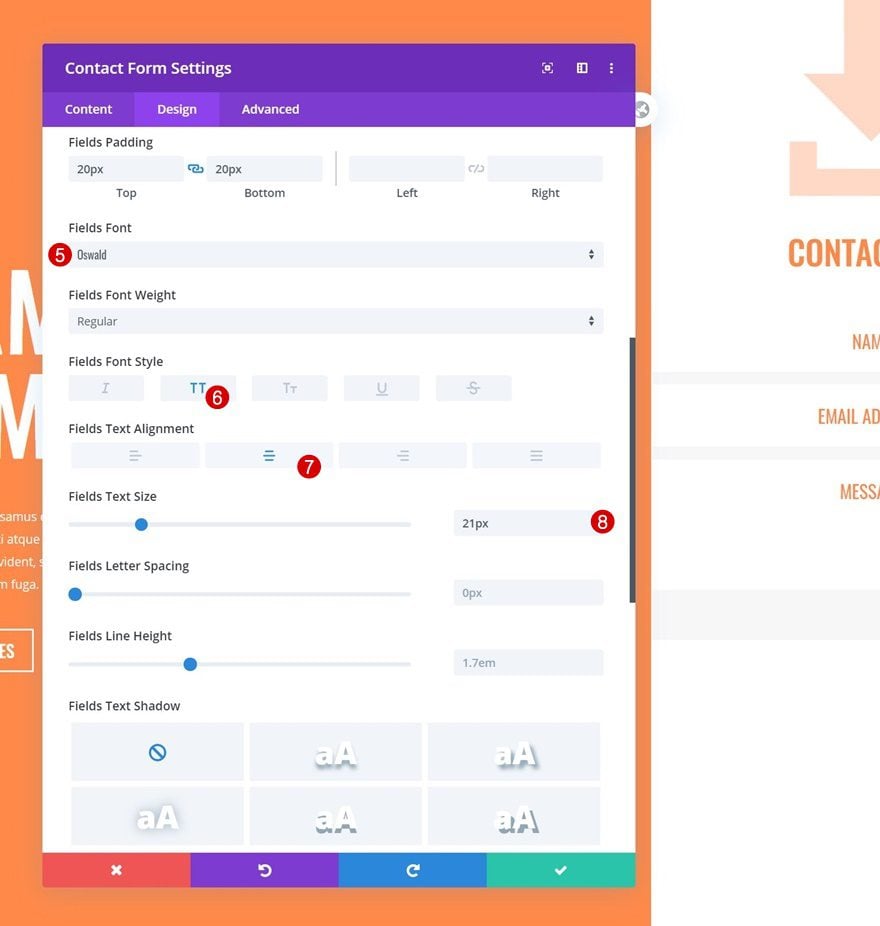
Fields Settings
Move on to the design tab and make some changes to the fields settings next.
- Fields Background Color: #ffffff
- Fields Text Color: #ff8949
- Fields Top Margin: 15px
- Fields Bottom Margin: 15px
- Fields Top Padding: 20px
- Fields Bottom Padding: 20px
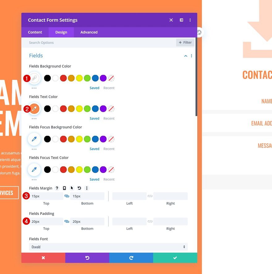
- Fields Font: Oswald
- Fields Font Style: Uppercase
- Fields Text Alignment: Center
- Fields Text Size: 21px
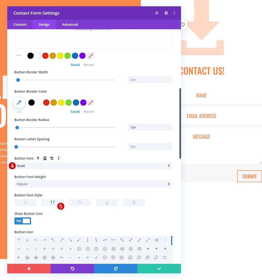
Button Settings
Then, style the button accordingly:
- Use Custom Styles For Button: Yes
- Button Text Color: #ff8949
- Button Border Radius: 1px
- Button Font: Oswald
- Button Font Style: Uppercase
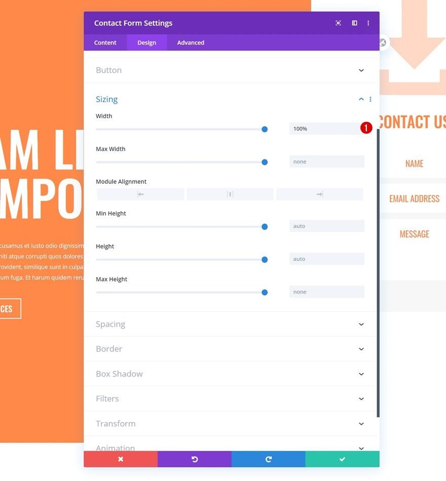
Sizing
We’re also making sure the width is ‘100%’ in the sizing settings.
- Width: 100%
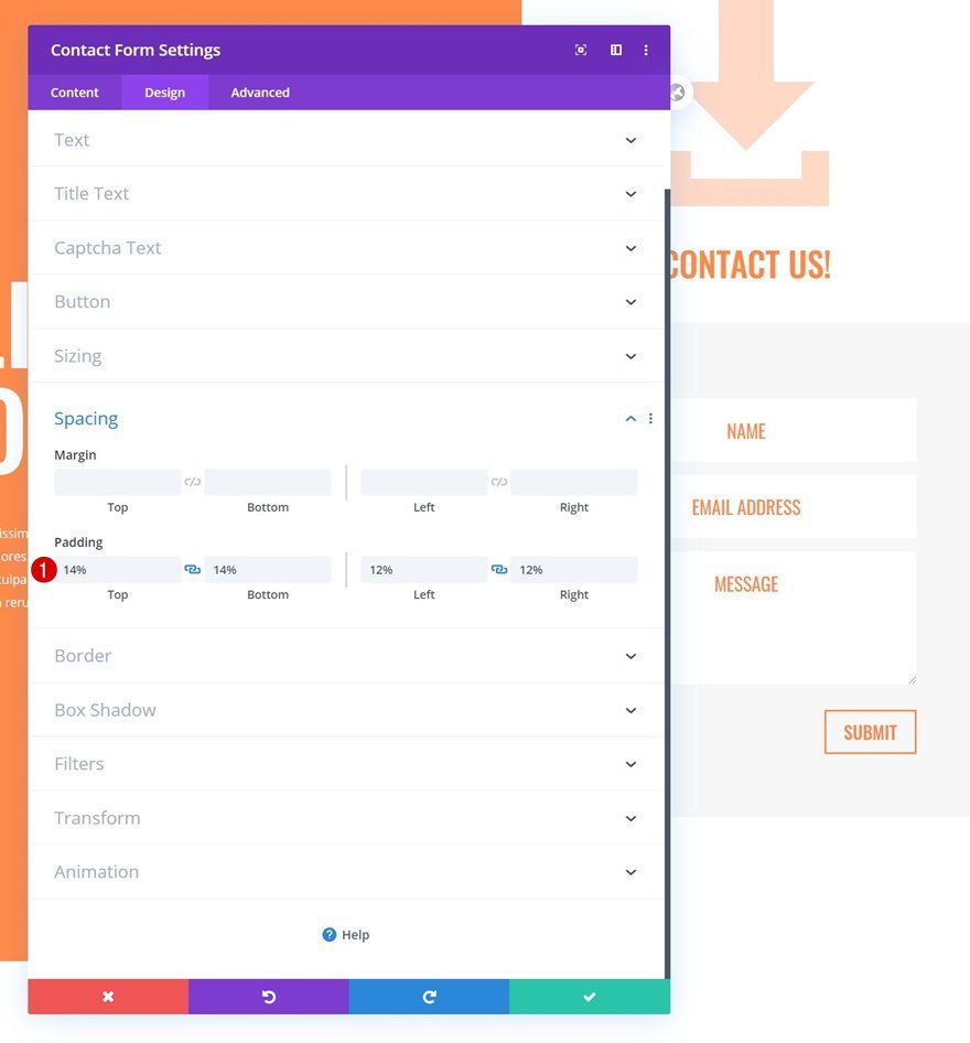
Spacing
Move on to the spacing settings next and apply some custom padding values.
- Top Padding: 14%
- Bottom Padding: 14%
- Left Padding: 12%
- Right Padding: 12%
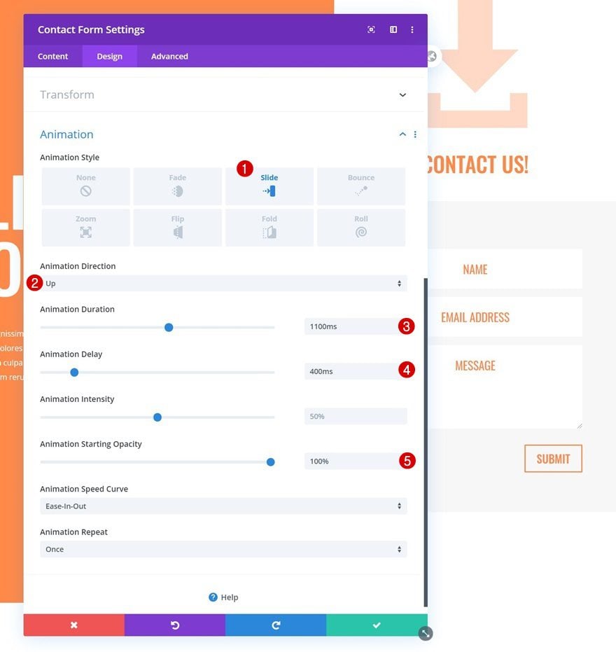
Animation
Then, use the following animation settings:
- Animation Style: Slide
- Animation Direction: Up
- Animation Duration: 1100ms
- Animation Delay: 400ms
- Animation Starting Opacity: 100%
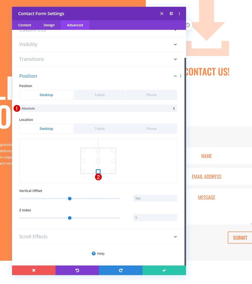
Position
And complete the module settings (and the tutorial) by repositioning the module on desktop only:
- Position: Absolute (Desktop), Default (Tablet & Phone)
- Location: Bottom Center
Preview
Now that we’ve gone through all the steps, let’s take a final look at the outcome across different screen sizes.
Desktop
Mobile
Final Thoughts
In this post, we’ve shown you how to seamlessly include a contact form in your hero section. More specifically, we’ve created a slide-in column contact form that looks great across all screen sizes. You were able to download the JSON file for free as well! If you have any questions, feel free to leave a comment in the comment section below.
If you’re eager to learn more about Divi and get more Divi freebies, make sure you subscribe to our email newsletter and YouTube channel so you’ll always be one of the first people to know and get benefits from this free content.


you forgot to add the demo site U_U
I must say that adding a slide-in contact form will definitely be a good move. Contact forms are generally helpful to someone who wanna contact us and this will be helpful to them. Glad you shared it with us.
I really like the creative tutorial on how I might use divi. truly shows off the power of the divi plugin.
I loved this tutorial and followed it step by step.
Even though I was paying close attention to it, I think I missed something because my results look too big compared to yours.
Am I correct?