
Since Divi and its new sizing options have come out, we’ve created a few tutorials that show you how to create hover reveals. In those tutorials, the hidden content was placed vertically. In some cases, however, you might want to create a horizontal reveal instead. In this post, we’re going to show you how to reveal images using hover grids and Divi’s overflow options. Making this work asks for a slightly different approach. We’ll use a one-column row and place all modules below each other and on hover, we’ll transform the column into a horizontal grid. You’ll be able to download the JSON file for free as well!
Let’s get to it.
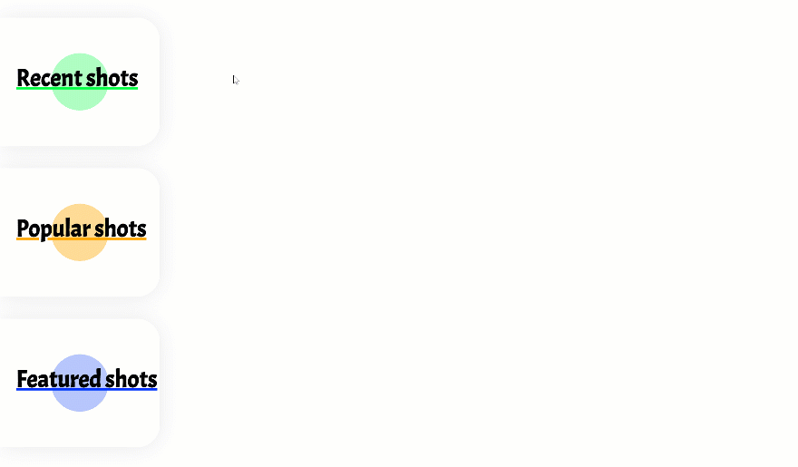
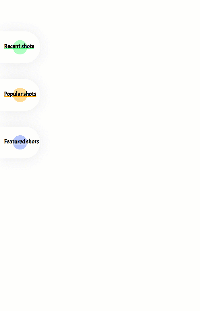
Preview
Before we dive into the tutorial, let’s take a quick look at the outcome across different screen sizes.
Desktop
Mobile
Download The Hover Grids Layout for FREE
To lay your hands on the free hover grids layout, you will first need to download it using the button below. To gain access to the download you will need to subscribe to our newsletter by using the form below. As a new subscriber, you will receive even more Divi goodness and a free Divi Layout pack every Monday! If you’re already on the list, simply enter your email address below and click download. You will not be “resubscribed” or receive extra emails.

Let’s Start Recreating!
Subscribe To Our Youtube Channel
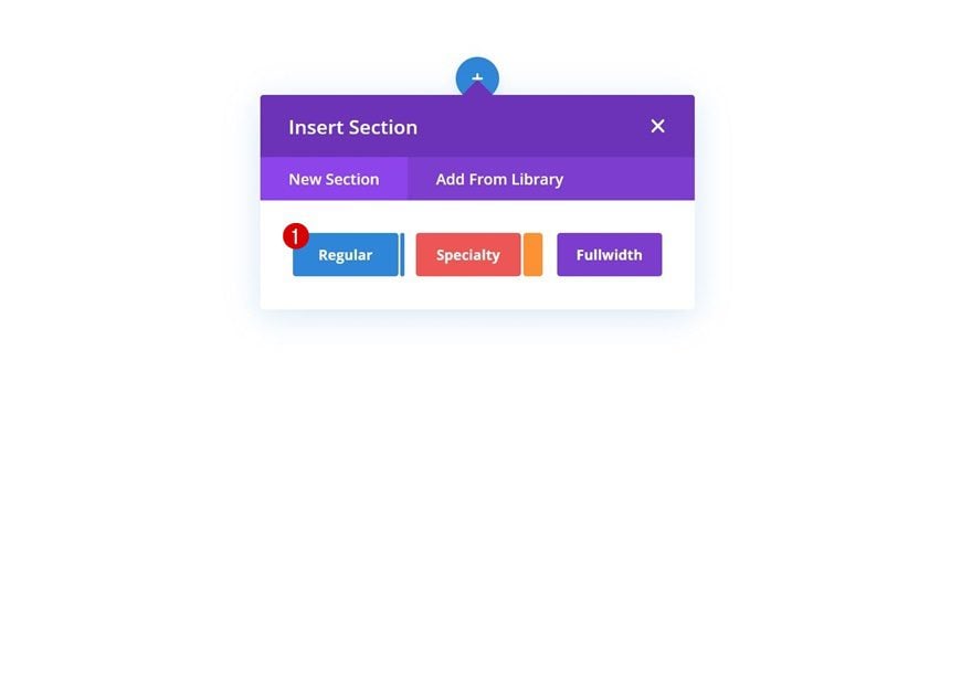
Add New Section
Start by adding a new regular section to the page you’re working on.
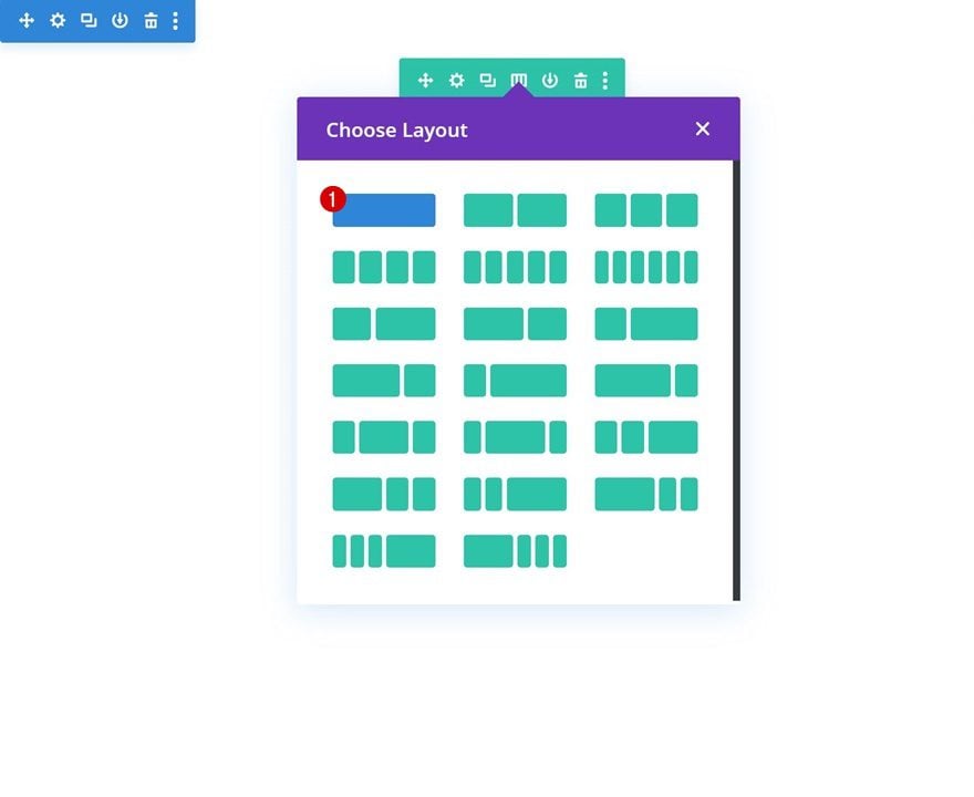
Add New Row
Column Structure
Continue by adding a new row using the following column structure:
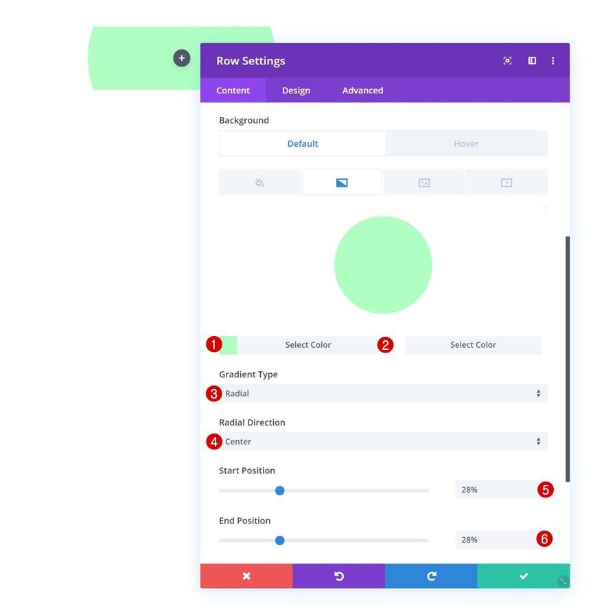
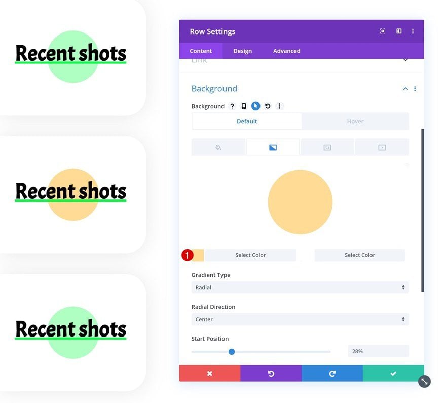
Default Gradient Background
Without adding any modules yet, open the row settings and add the following gradient background:
- Color 1: #b1ffc4
- Color 2: #ffffff
- Gradient Type: Radial
- Radial Direction: Center
- Start Position: 28%
- End Position: 28%
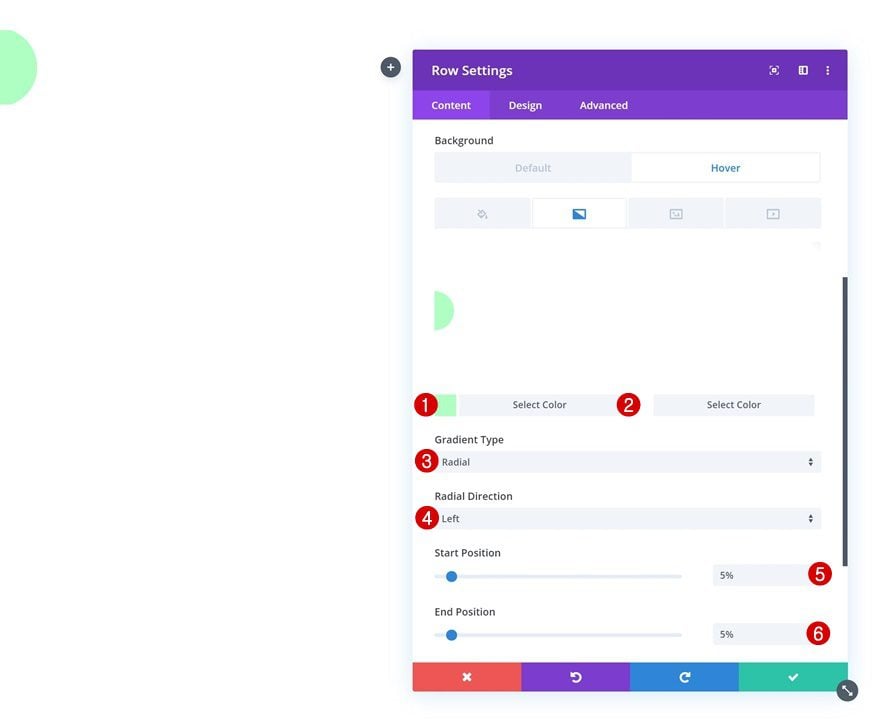
Hover Gradient Background
Change the gradient background on hover.
- Color 1: #b1ffc4
- Color 2: #ffffff
- Gradient Type: Radial
- Radial Direction: Left
- Start Position: 5%
- End Position: 5%
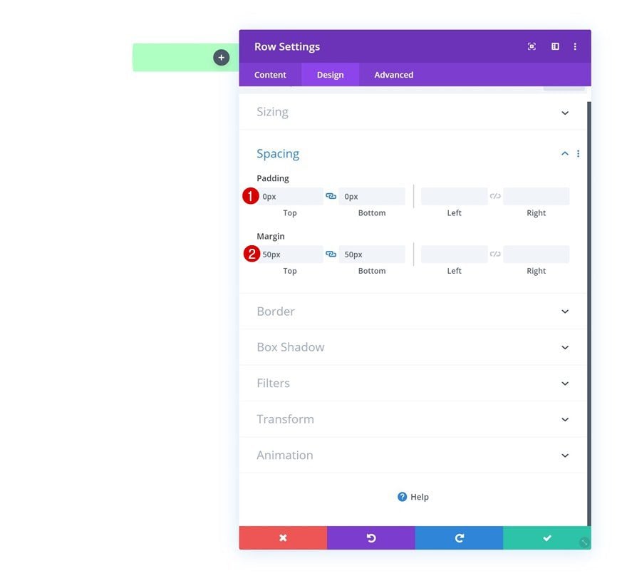
Spacing
Move on to the spacing settings and change the padding and margin values next.
- Top Padding: 0px
- Bottom Padding: 0px
- Top Margin: 50px
- Bottom Margin: 50px
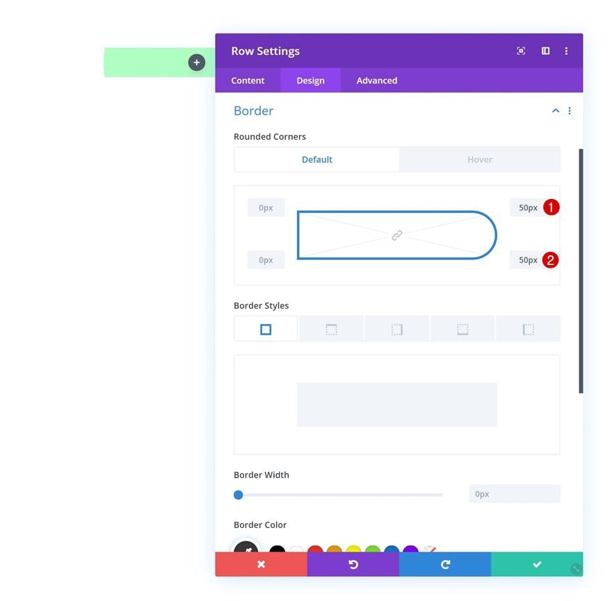
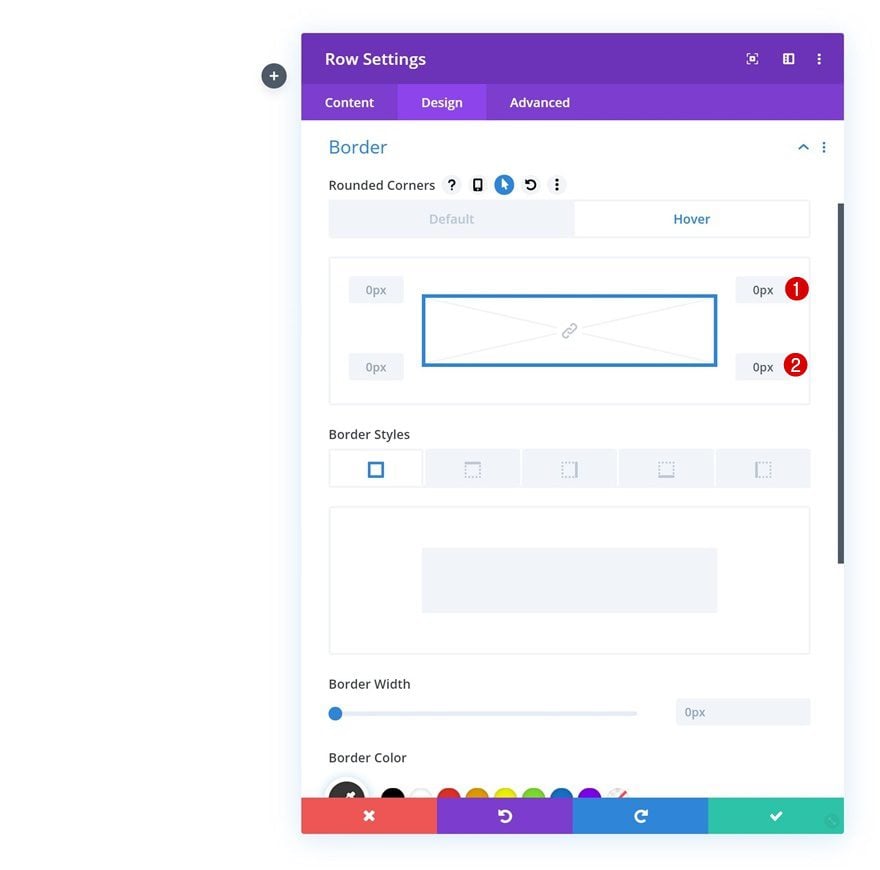
Default Border
Add ’50px’ border radius to the top right and bottom right corners next.
Hover Border
Bring back the corners to ‘0px’ on hover.
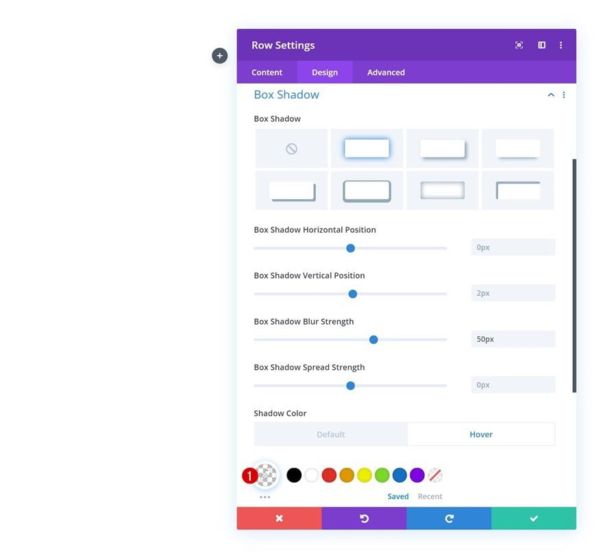
Default Box Shadow
Add a subtle box shadow next using the following settings:
- Box Shadow Blur Strength: 50px
- Shadow Color: rgba(0,0,0,0.09)
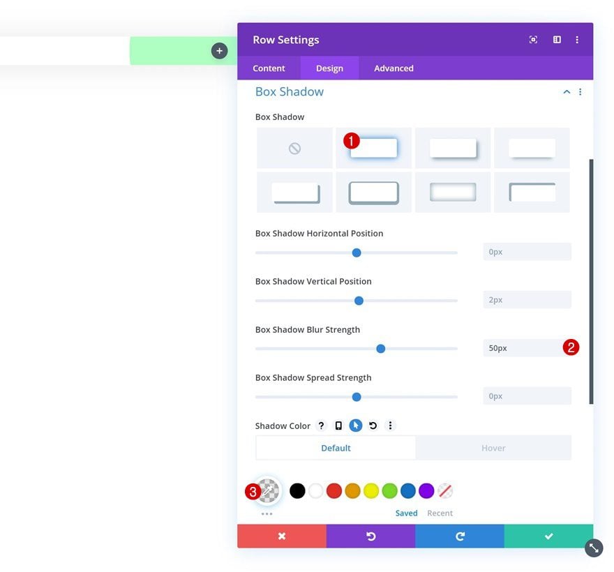
Hover Box Shadow
Remove the box shadow on hover by replacing the shadow color with a completely transparent one.
- Shadow Color: rgba(0,0,0,0)
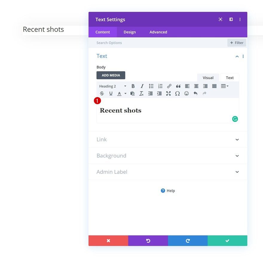
Add Text Module to Column
Add H2 Content
Time to start adding modules, starting with a Text Module. Enter some H2 content of your choice.
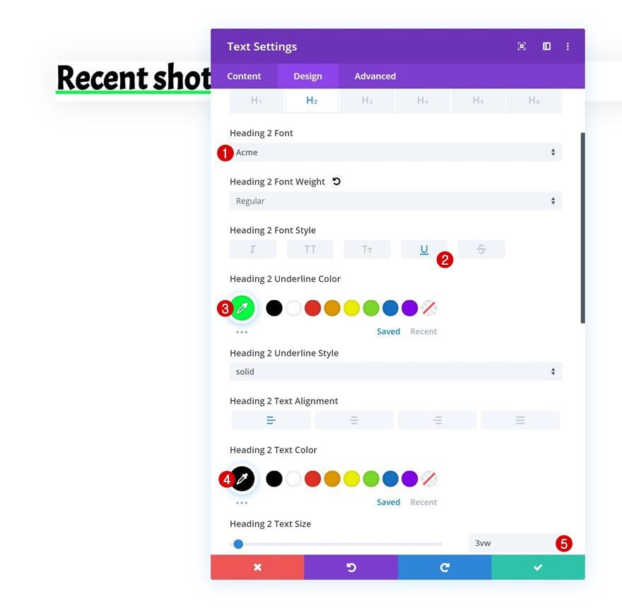
H2 Text Settings
Move on to the design tab and change the H2 text settings accordingly:
- Heading 2 Font: Acme
- Heading 2 Font Style: Underline
- Heading 2 Underline Color: #00ff3f
- Heading 2 Text Color: #000000
- Heading 2 Text Size: 3vw
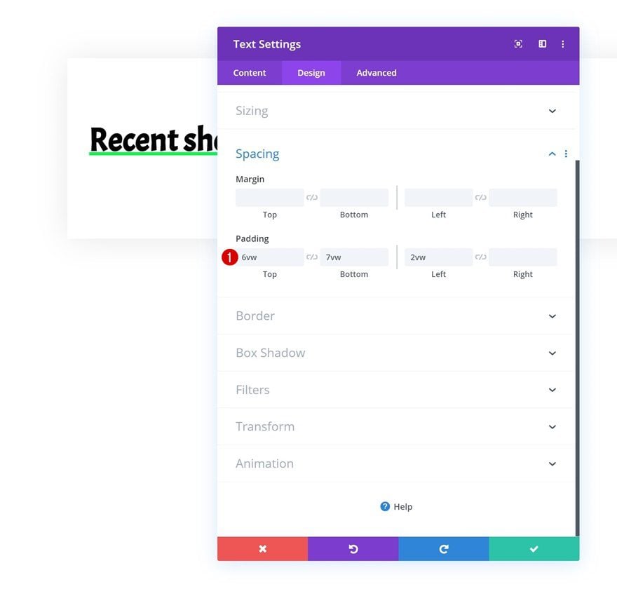
Spacing
Add some custom padding values next.
- Top Padding: 6vw
- Bottom Padding: 7vw
- Left Padding: 2vw
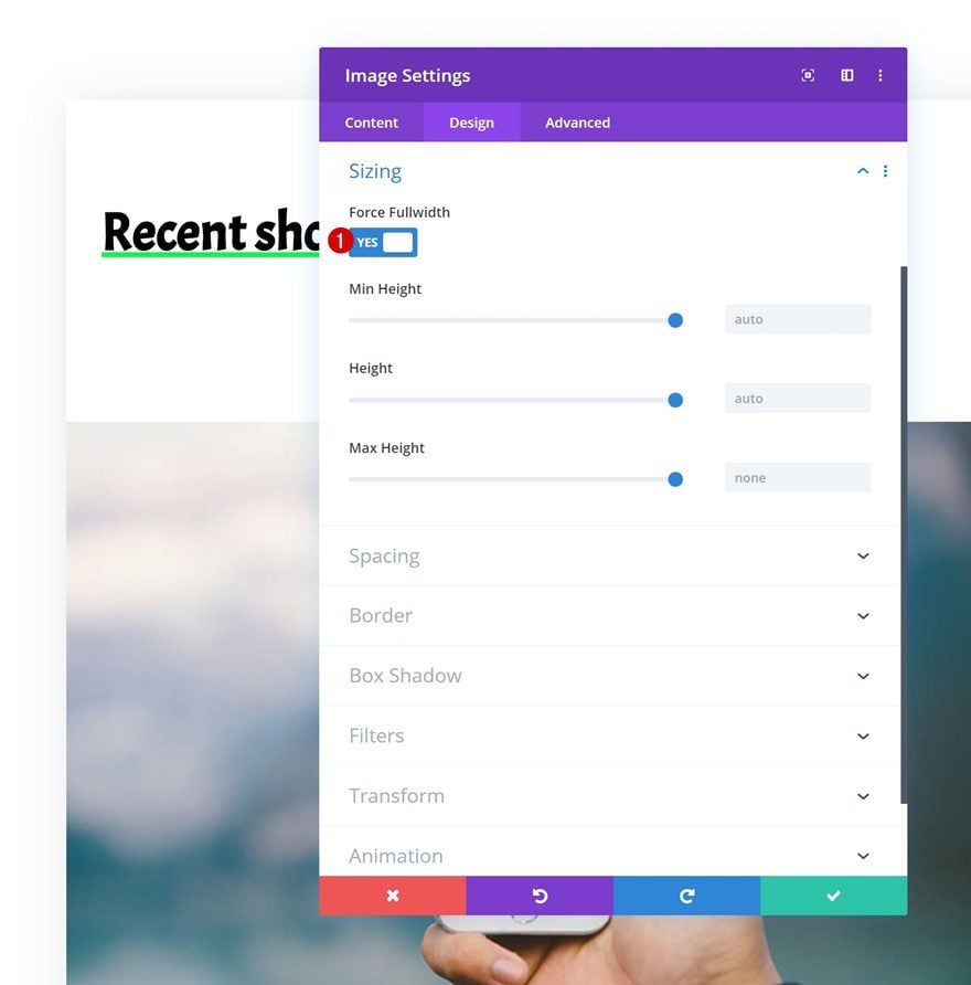
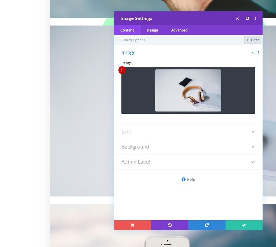
Add Image Module to Column
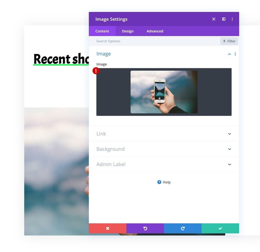
Upload Image
The second module we need in this column is an Image Module. Upload a landscape image of your choice.
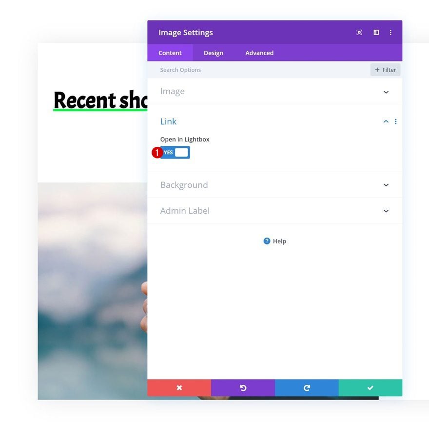
Lightbox
Enable the lightbox option in the link settings next.
- Open in Lightbox: Yes
Sizing
And force fullwidth on the image in the sizing settings. This will make sure the image remains responsive across all screen sizes.
- Force Fullwidth: Yes
Clone Image Module Twice
Once you’ve completed the first Image Module, you can go ahead and clone it twice.
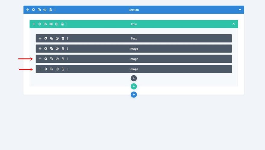
Change Images
Change the images in both duplicates. Make sure the images you upload have the same dimension set as the first image.
Add Hover Effect to Row
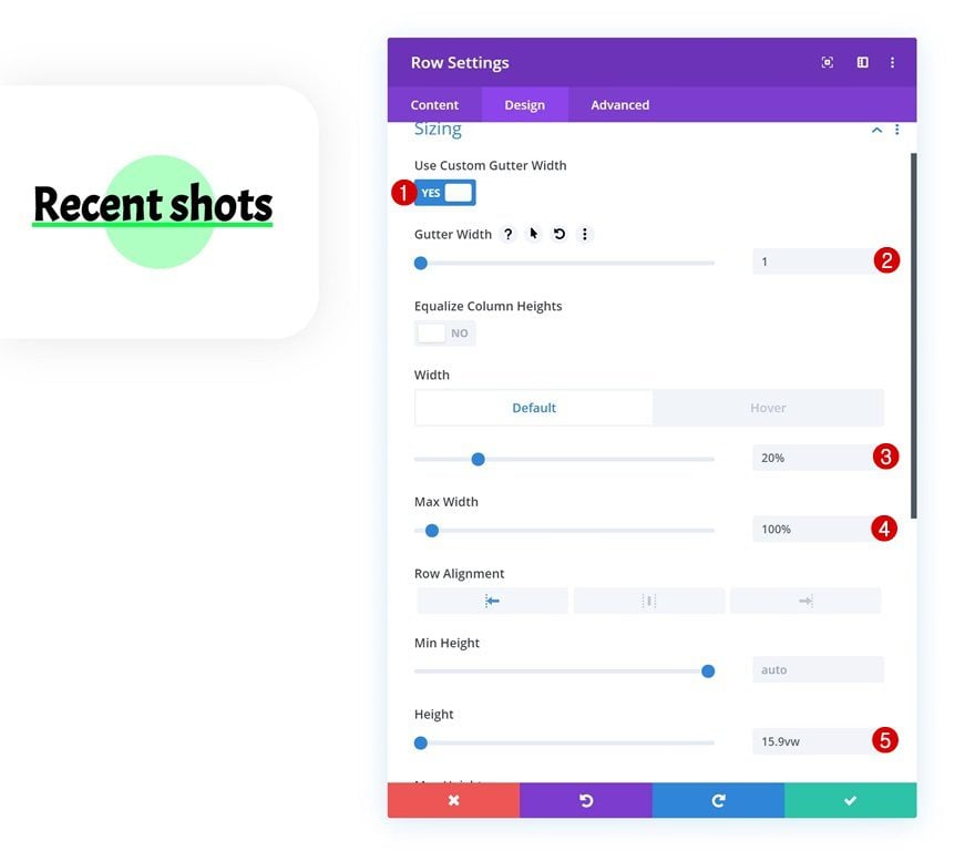
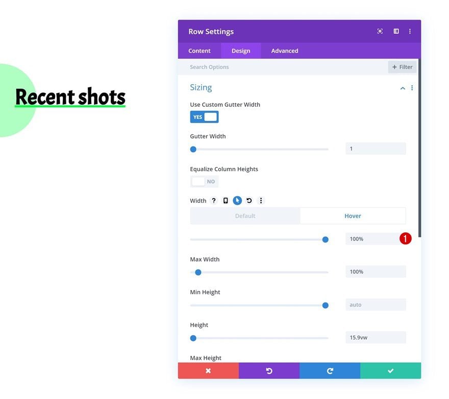
Sizing
Now that we’ve completed the basic row and module settings, it’s time to make the hover effect happen! We’ll start by modifying the height and width of the row and hiding the overflows. Open the row’s sizing settings and make the following changes:
- Use Custom Gutter Width: Yes
- Gutter Width: 1
- Width: 20%
- Max Width: 100%
- Height: 15.9vw
Hover Sizing
Bring back the width to ‘100%’ on hover. This will allow the images to show up once the row is hovered.
- Width: 100%
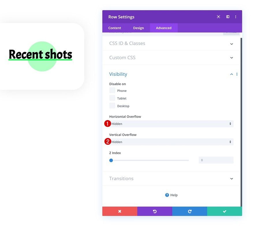
Visibility
Move on to the advanced tab next and hide the overflows. This will make sure the images are hidden before visitors hover (desktop) or click (tablet/mobile) on the Text Module.
- Horizontal Overflow: Hidden
- Vertical Overflow: Hidden
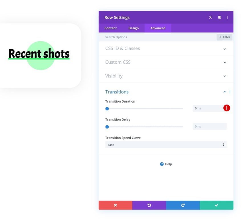
Transitions
We’re also changing the transition duration in the transitions settings.
- Transition Duration: 0ms
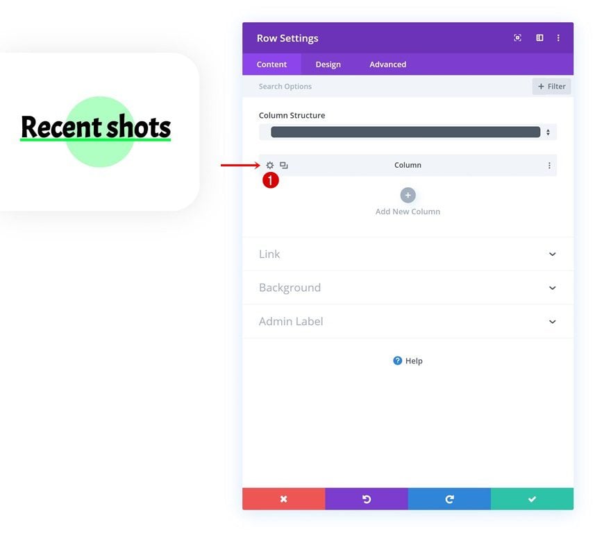
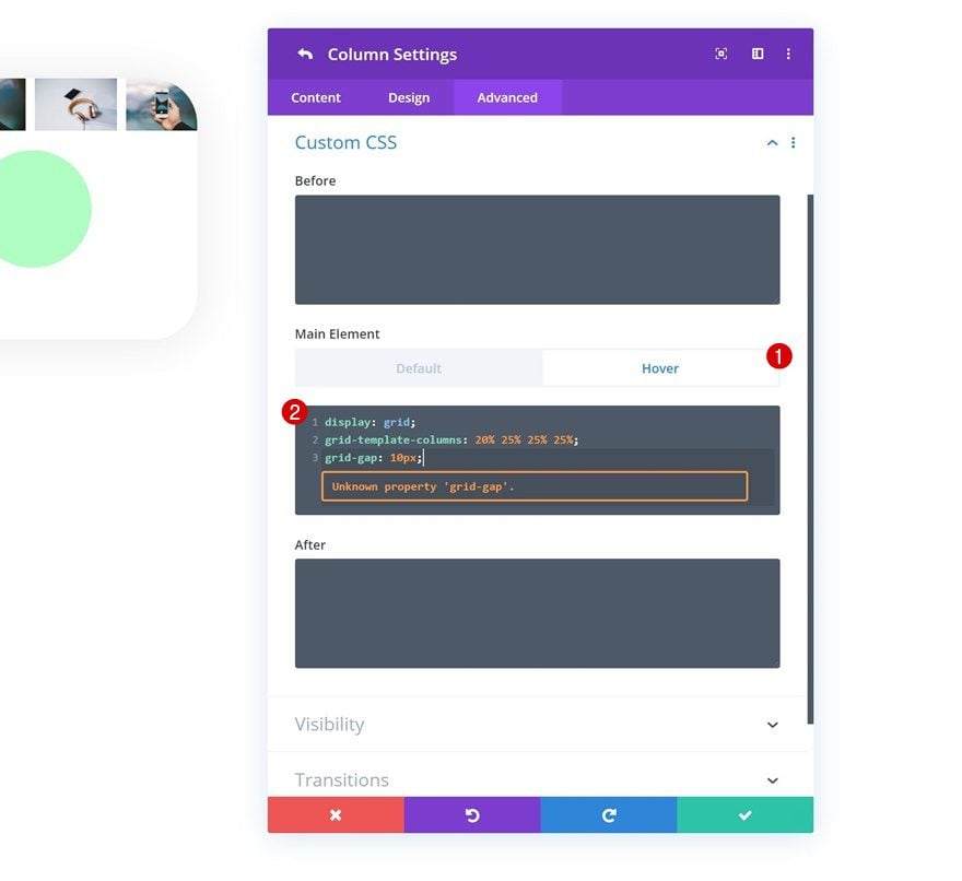
Column Hover Main Element
To create a grid on hover, we’re going to open the column settings, go to the advanced tab and place the following lines of CSS code in the hover main element:
display: grid;
grid-template-columns: 20% 25% 25% 25%;
grid-gap: 10px;
Clone Row Twice
Once you’ve completed the first row, you can clone it up to as many times as you want. For this particular design example, we’re cloning the row twice.
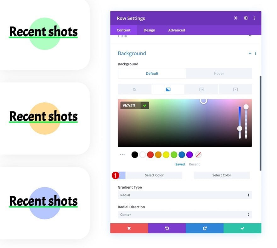
Change Duplicate Row #1 Gradient Background
Change the first gradient color of the second row’s gradient background.
- Color 1: #ffdc96
Change Duplicate Row #2 Gradient Background
Do the same for the third row.
- Color 1: #b7c7ff
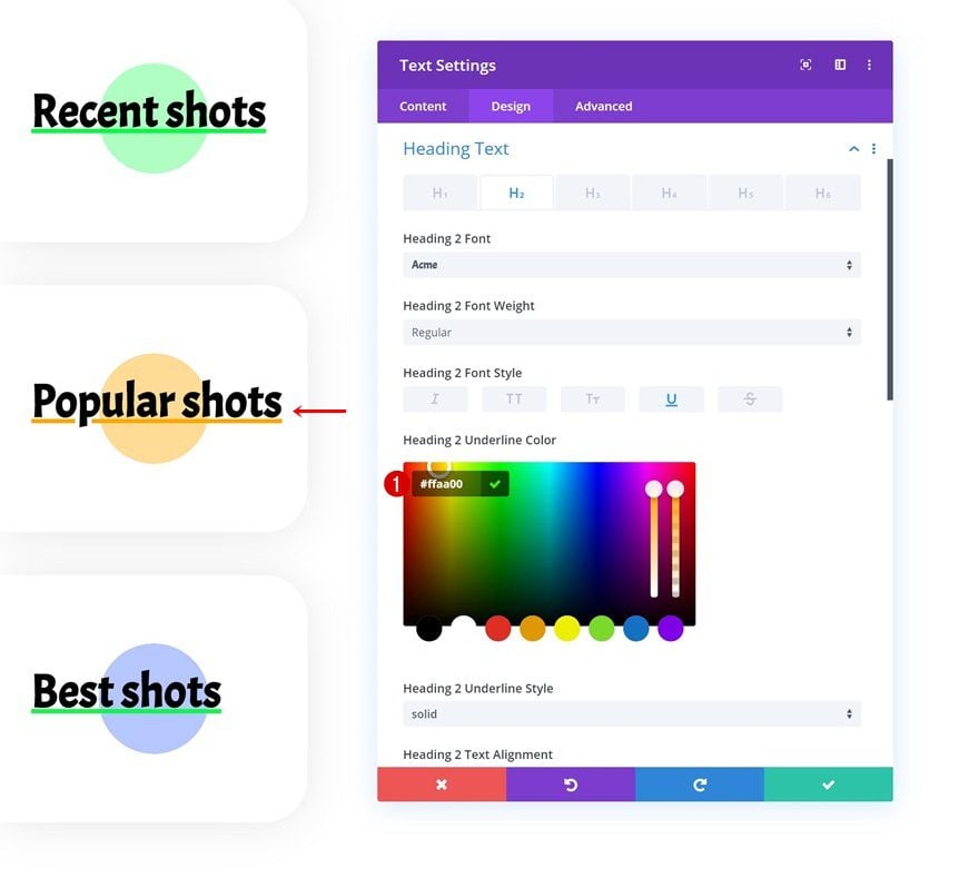
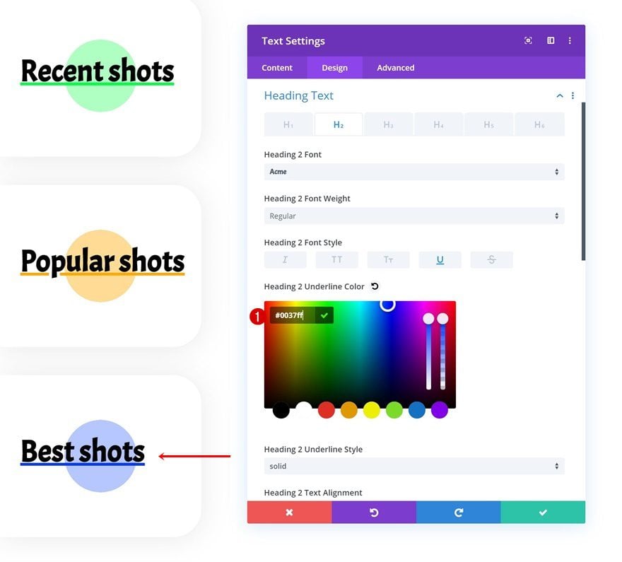
Change Text Module Copy & Underline Color of Both Duplicates
Continue by modifying the underline color of both Text Module duplicates along with the copy and you’re done!
- Underline Color #1: #ffaa00
- Underline Color #2: #0037ff
Preview
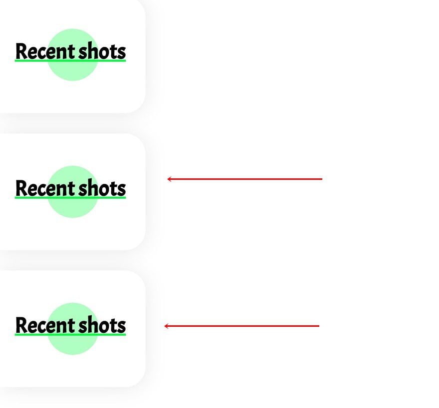
Now that we’ve gone through all the steps, let’s take a final look at the outcome across different screen sizes.
Desktop
Mobile
Final Thoughts
In this post, we’ve shown you how to reveal images in horizontal hover grids using Divi’s overflow options. The images were revealed once hovered on deskop and clicked on tablet/phone. Although we revealed images, you can reveal any kind of content you want by tweaking the settings inside the builder. We hope this tutorial inspires you to create your own alternative hover grid designs as well! If you have any questions or suggestions, make sure you leave a comment in the comment section below!
If you’re eager to learn more about Divi and get more Divi freebies, make sure you subscribe to our email newsletter and YouTube channel so you’ll always be one of the first people to know and get benefits from this free content.


Really good !
Thank you for sharing
You’re welcome, Bruno! Thanks for dropping by in the comment section. 🙂
thank you.. very nice and awesome design
You’re welcome, glad you like it! 🙂