
")
It’s always fun to discover new and creative ways to engage users with your content using unique hover effects. One great way to do this is to reveal content on hover using expanding corner tabs. This allows the user to hover over a tab in the corner of a column or image to expand an overlay with additional helpful content for the user.
For this tutorial, we are going to create a completely unique Divi layout that will reveal content on hover using expanding corner tabs. In fact we’ll show you how to design an expanding corner tab for all four corners of a column in Divi.
Let’s get started!
- 1 Sneak Peek
- 2 Download the Layout for FREE
- 3 Download For Free
- 4 You have successfully subscribed. Please check your email address to confirm your subscription and get access to free weekly Divi layout packs!
- 5 What You Need to Get Started
-
6
Creating the Expanding Content Overlays Layout from Scratch
- 6.1 Part 1: Creating an Expanding Corner Tab from the Bottom Right Position
- 6.2 Part 2: Creating an Expanding Corner Tab from the Bottom Left Position
- 6.3 Part 3: Creating an Expanding Corner Tab from the Top Right Position
- 6.4 Part 4: Creating an Expanding Corner Tab from the Top Left Position
- 6.5 Part 4: Finishing the Design of the Layout
- 7 Final Result
- 8 Final Thoughts
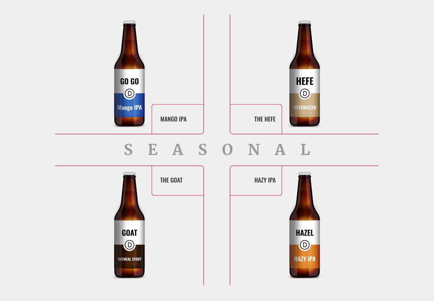
Sneak Peek
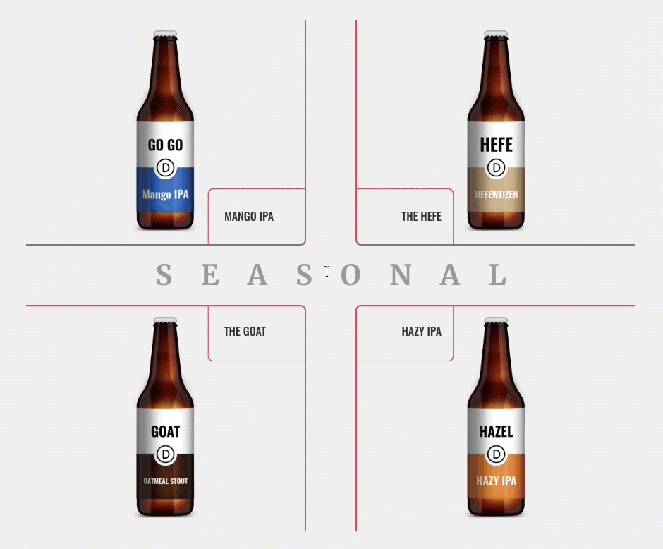
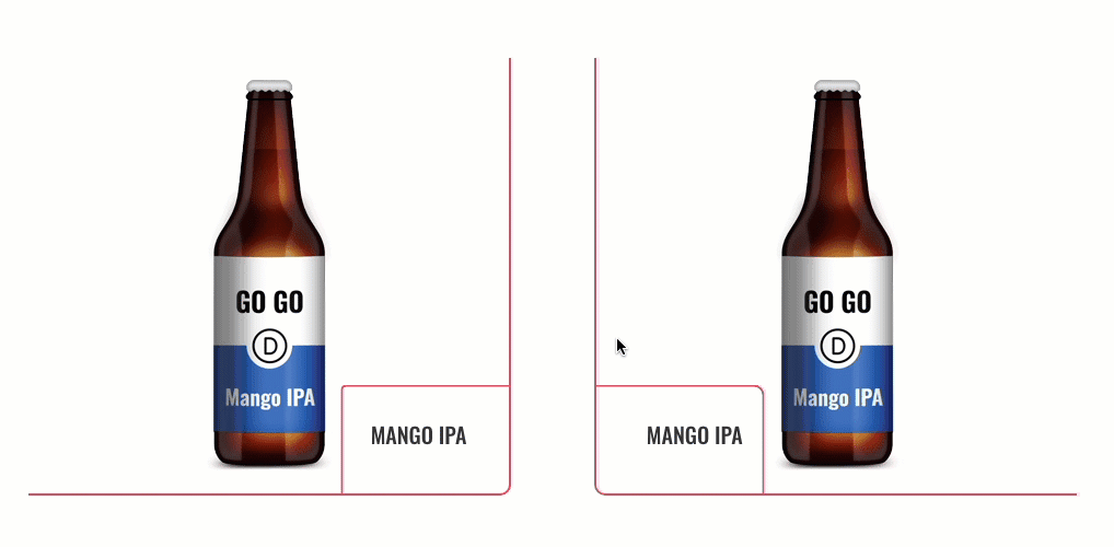
Here is a quick look at the expanding corner tab layout we will build together. Notice how the hover effects and content are beautifully symmetrical.
Download the Layout for FREE
To lay your hands on the designs from this tutorial, you will first need to download it using the button below. To gain access to the download you will need to subscribe to our newsletter by using the form below. As a new subscriber, you will receive even more Divi goodness and a free Divi Layout pack every Monday! If you’re already on the list, simply enter your email address below and click download. You will not be “resubscribed” or receive extra emails.

To import the layout to your page, simply extract the zip file and drag the json file into the Divi Builder.
Letís get to the tutorial shall we?
What You Need to Get Started

To get started, you will need to do the following:
- If you haven’t yet, install and activate the Divi Theme.
- Create a new page in WordPress and use the Divi Builder to edit the page on the front end (visual builder).
- Choose the option “Build From Scratch”.
After that, you will have a blank canvas to start designing in Divi.
Creating the Expanding Content Overlays Layout from Scratch
Part 1: Creating an Expanding Corner Tab from the Bottom Right Position
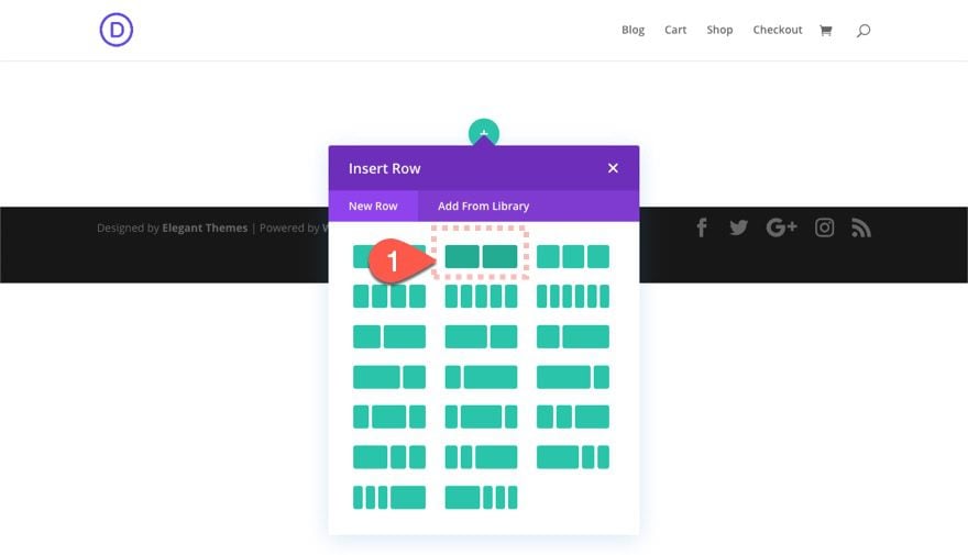
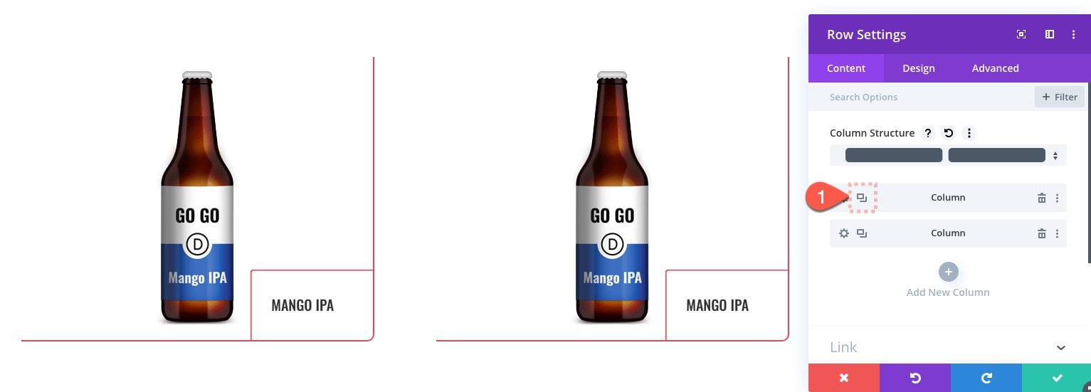
To start, add a two-column (one-half one-half) row to the regular section.
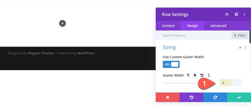
Before adding a module, update the row settings with a custom gutter width as follows:
- Gutter Width: 4
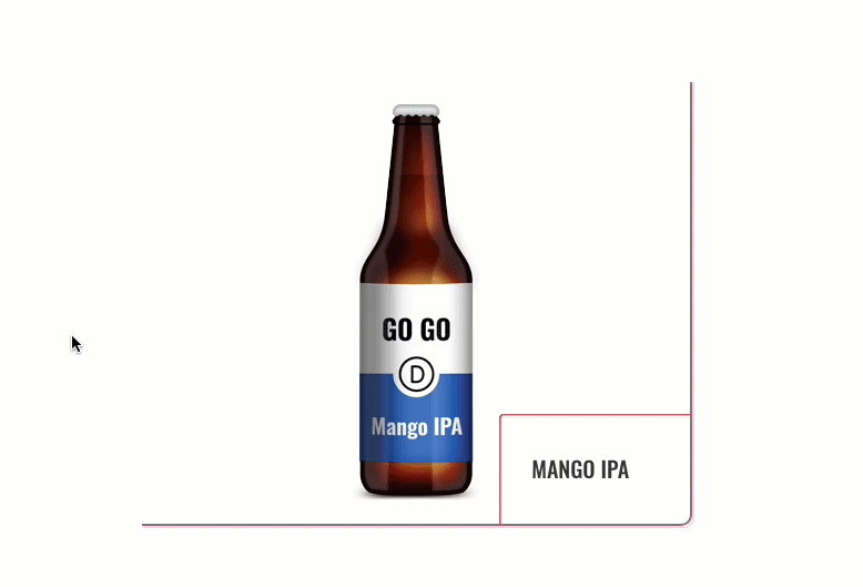
For this first featured item, we will create a column background image that will have a corner tab (using a blurb module) at the bottom right of the column that expands and overlays the entire column/image on hover.
Let’s start with adding a blurb module.
Add Blurb Module
Add a blurb module to column 1.
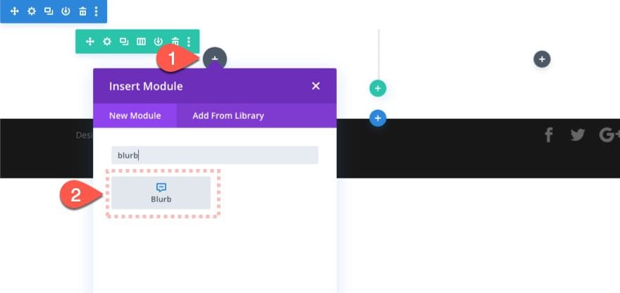
We aren’t going to style it just yet. We basically needed some content so that we can style the column that contains the blurb.
Column 1 Settings
With the blurb in place, open the row settings and then click to edit column 1 settings. Then update the following:
- Background Image [insert image]
- Background Image Size: Actual Size
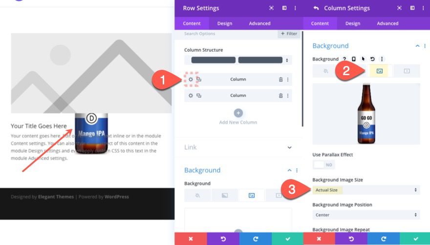
NOTE: for my example, I’m using the transparent background beer images taken from the Brewery Layout Pack. They are 128px by 359px which is why I’m using the actual size of the image.
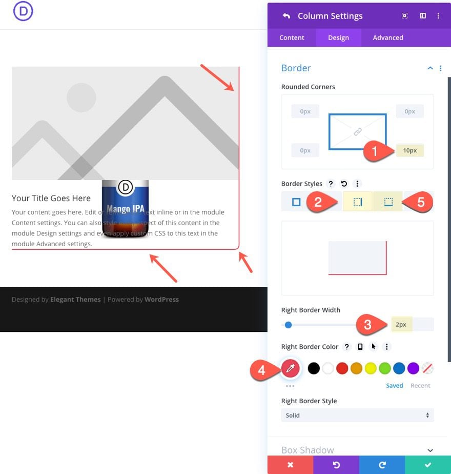
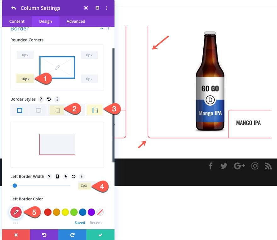
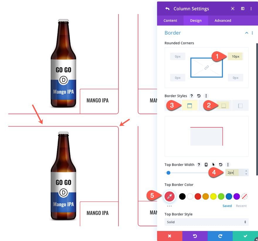
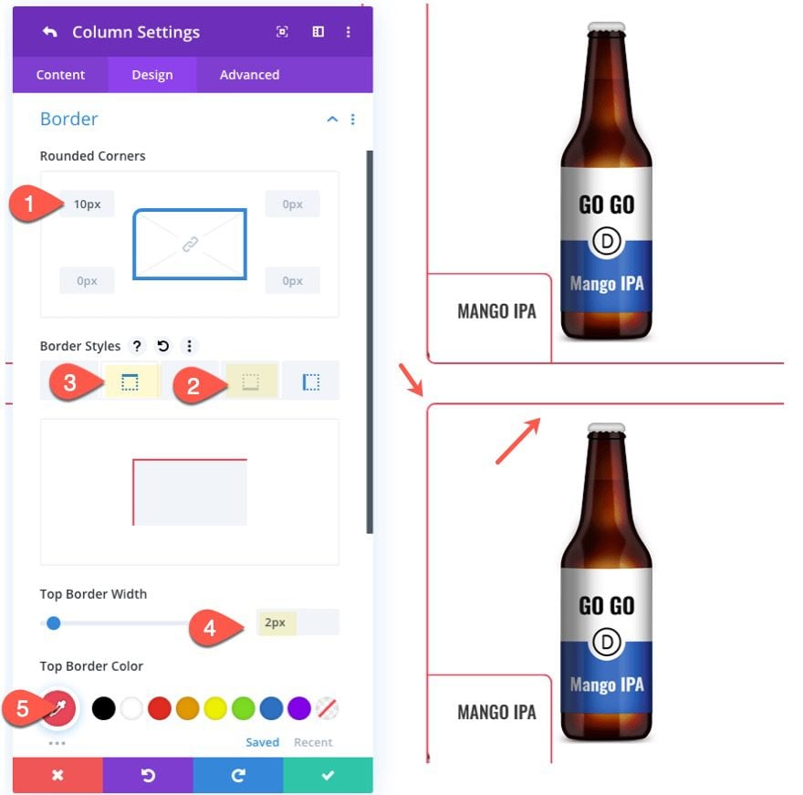
Column 1 Border
- Rounded Corners : 10px bottom right
- Right Border Width: 2px
- Right Border Color: #e94558
- Bottom Border Width: 2px
- Bottom Border Color: #e94558
Custom CSS and Overflow
Under the advanced tab, add the following custom CSS to the main element:
height: 400px;
The update the following:
- Horizontal Overflow: Hidden
- Vertical Overflow: Hidden
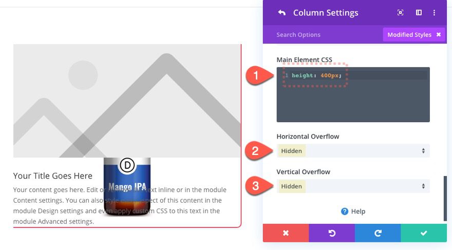
This custom height is necessary in order for our blurb module (corner tab) to expand the full height of the column. And the hidden overflow is needed so that we can hide most of the blurb module outside the column until the hover state.
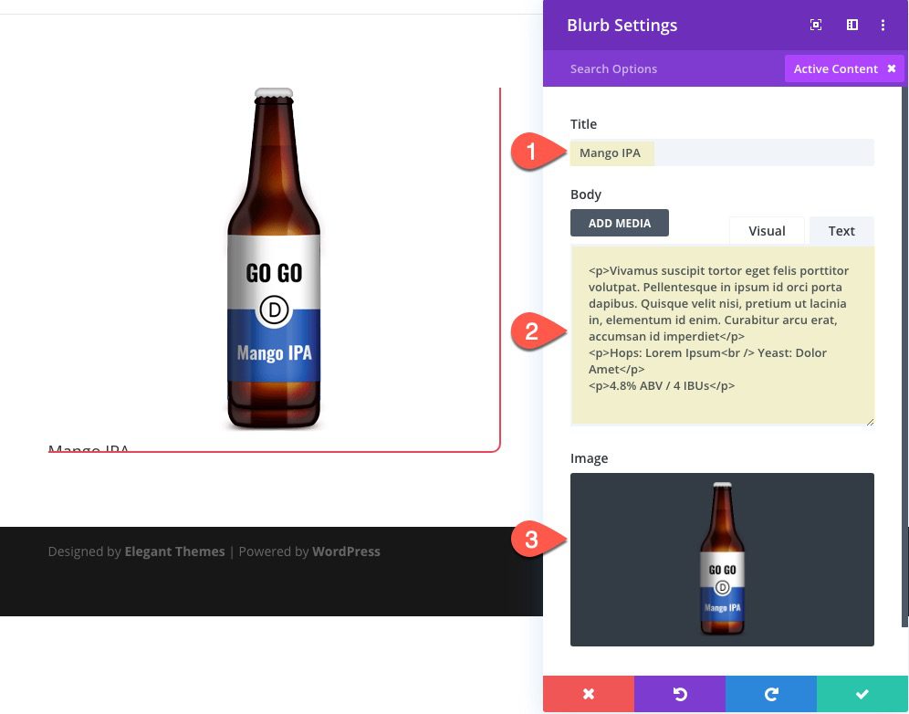
Adding Blurb Module Content
Now we are ready to start customizing the blurb module inside of column 1. Open the blurb settings and update the following:
- Title: Mango IPA
- Body:
<p>Vivamus suscipit tortor eget felis porttitor volutpat. Pellentesque in ipsum id orci porta dapibus. Quisque velit nisi, pretium ut lacinia in, elementum id enim. Curabitur arcu erat, accumsan id imperdiet</p>
<p>Hops: Lorem Ipsum<br /> Yeast: Dolor Amet</p>
<p>4.8% ABV / 4 IBUs</p>
- Image: Add same image used for the column background
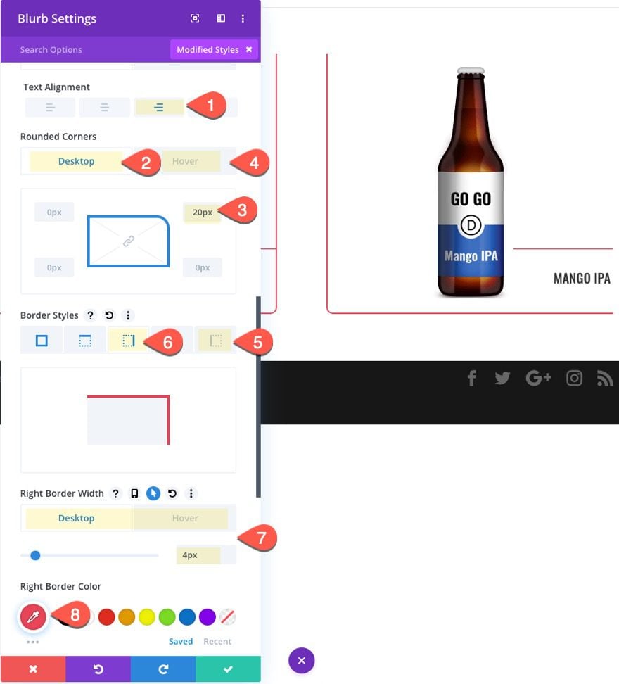
Designing the Blurb Module
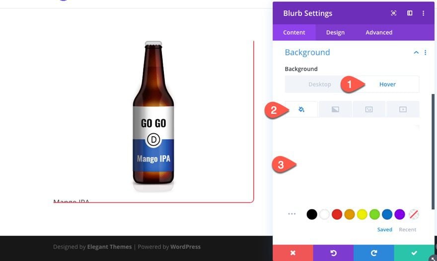
Give the blurb a background color on hover as follows:
- Background Color (desktop): transparent
- Background color (hover): rgba(255,255,255,0.9)
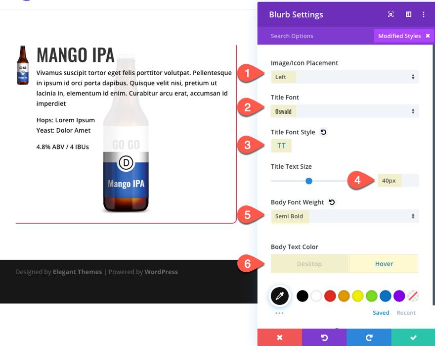
Under the design tab, update the following:
- Image/Icon Placement: Left
- Title Font: Oswald
- Title Font Style: TT
- Title Text Size: 40px
- Body Font Weight: Semi Bold
- Body Text Color (desktop): transparent
- Body Text Color (hover): #121212
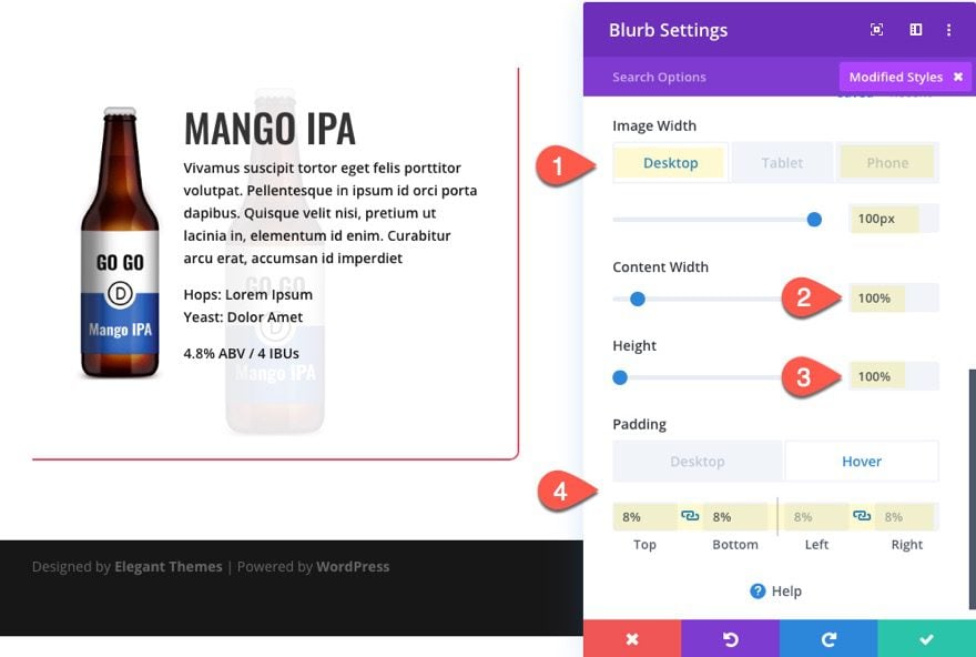
- Image Width: 100px (desktop), 64px (phone)
- Content Width: 100%
- Height: 100%
- Padding (desktop): 15% top, 15% bottom, 8% left, 8% right
- Padding (hover): 8% top, 8% bottom, 8% left, 8% right
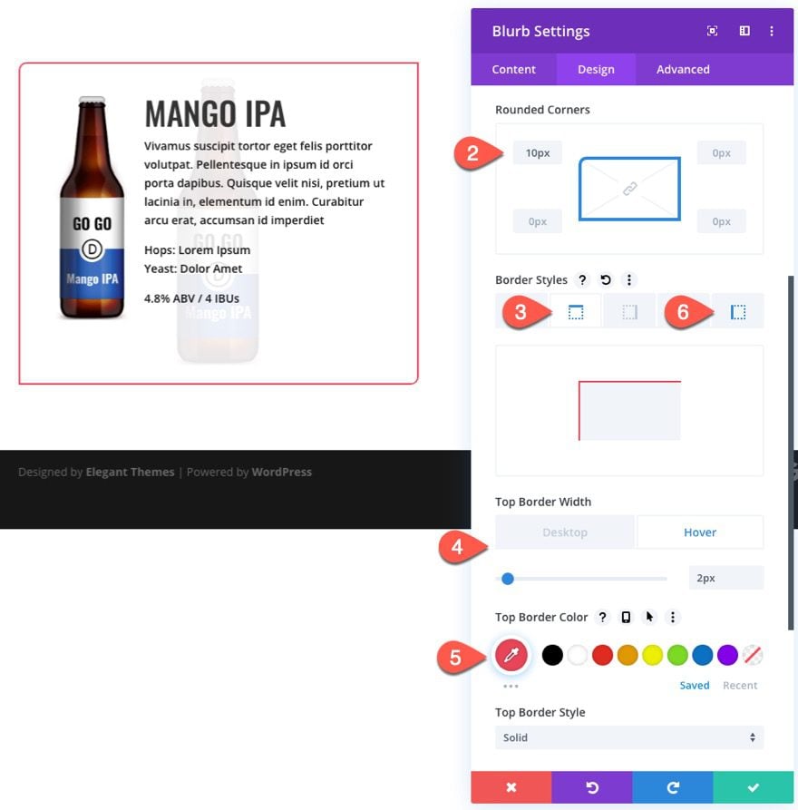
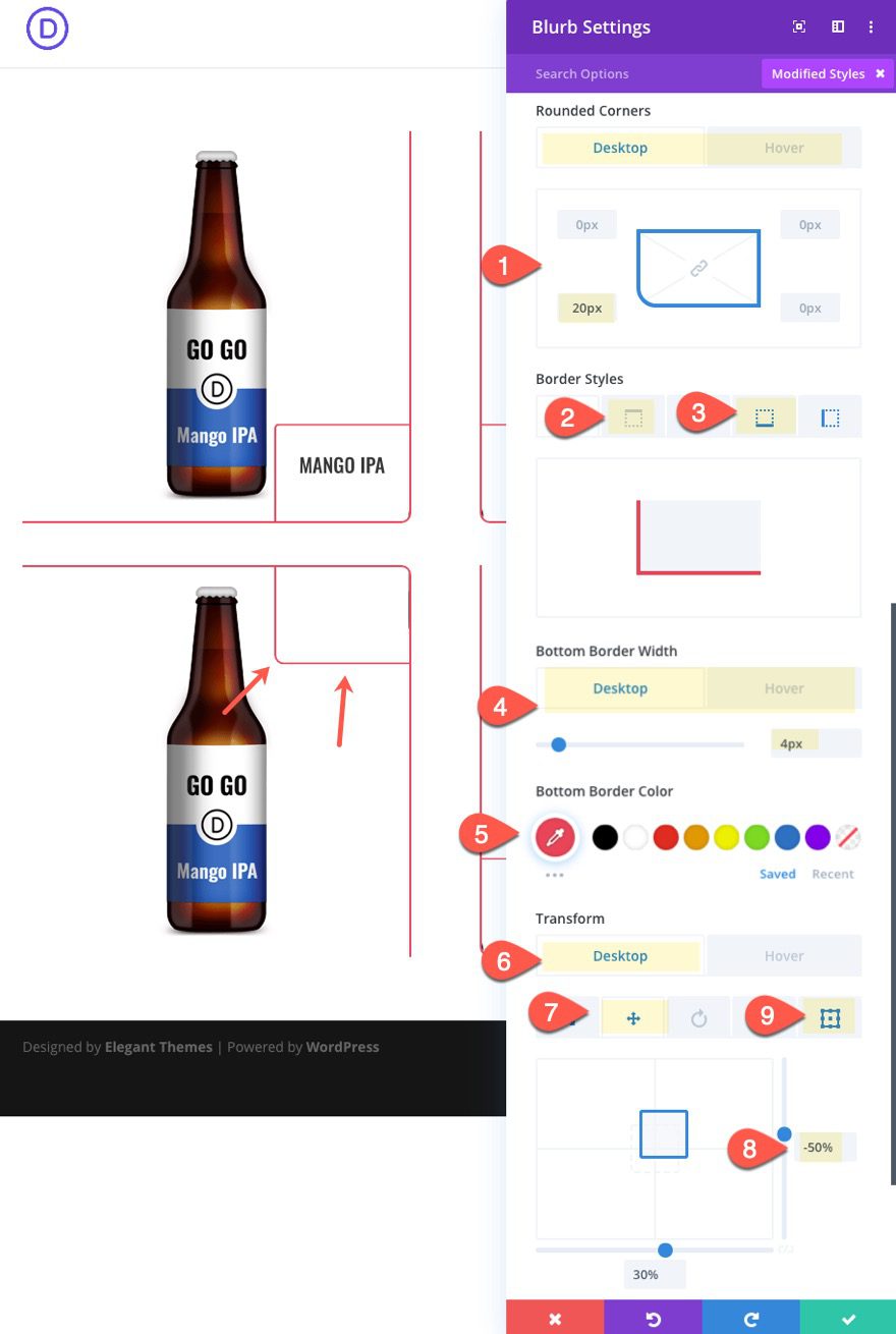
- Rounded Corners (default): 20px top left
- Rounded Corners (hover): 10px top left
- Top Border Width: 4px (desktop), 2px (hover)
- Top Border Color: #e94558
- Left Border Width: 4px (desktop), 2px (hover)
- Left Border Color: #e94558
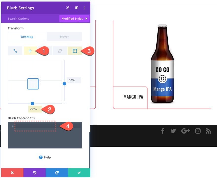
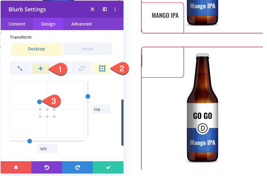
Transform Option (Desktop)
- Transform Scale Y Axis: 50%
- Transform Scale X Axis: 50%
- Transform Translate Y Axis: 50%
- Transform Translate X Axis: 30%
- Transform Origin: Bottom Right
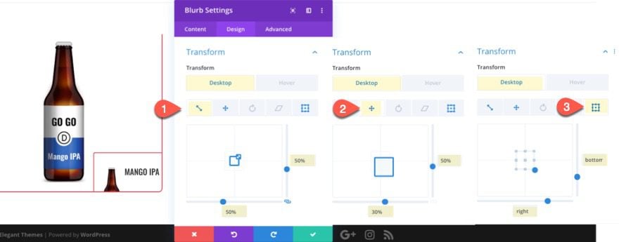
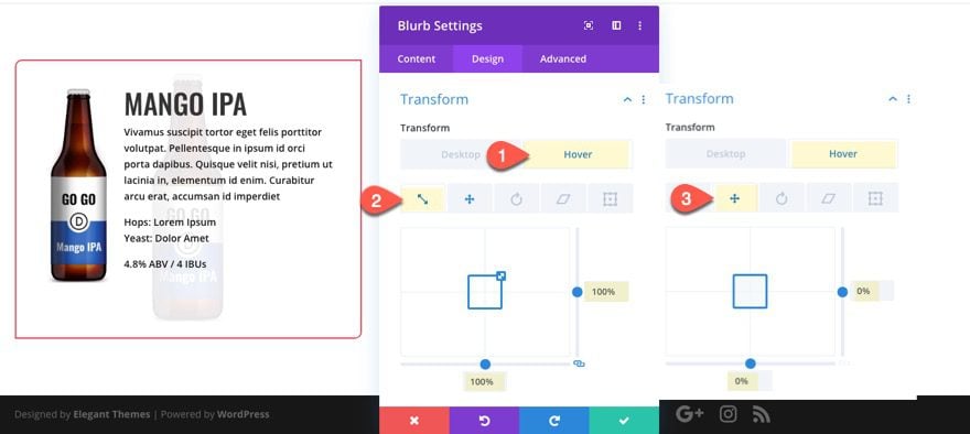
Transform Options (Hover)
- Transform Scale Y Axis (hover): 100%
- Transform Scale X Axis (hover): 100%
- Transform Translate Y Axis (hover): 0%
- Transform Translate X Axis (hover): 0%
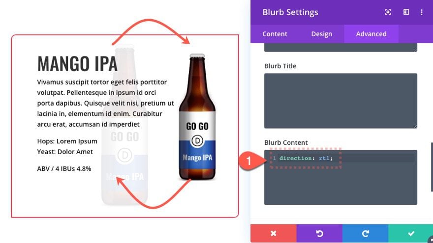
In order to flip the blurb image over to the right side, add the following custom CSS to the Blurb Content box:
direction: rtl
NOTE: The direction “rtl” stands for “right to left” which switches the default order of the content (left to right).
Result
Let’s check out the final result of our expanding corner tab from the bottom right position. Notice how it expands to fill the entire column on hover.
Part 2: Creating an Expanding Corner Tab from the Bottom Left Position
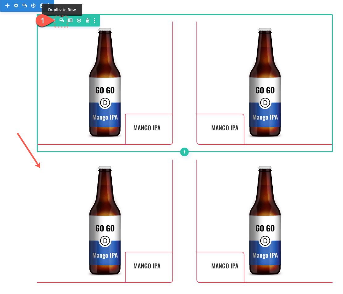
Duplicate the Column
To create the expanding corner tab from the bottom left position, we can jumpstart the design by duplicating the entire column. Open the row settings and duplicate column 1. Then delete the extra column so that you only have two exact duplicates.
Update Column 2 Settings
Next, open the settings for column 2 and update the following:
- Rounded Corners: 10px bottom left
- Right Border Width: 0px
- Left Border Width: 2px
- Left Border Color: #e94558
Update Blurb Settings
Next, update the Blurb Settings as follows:
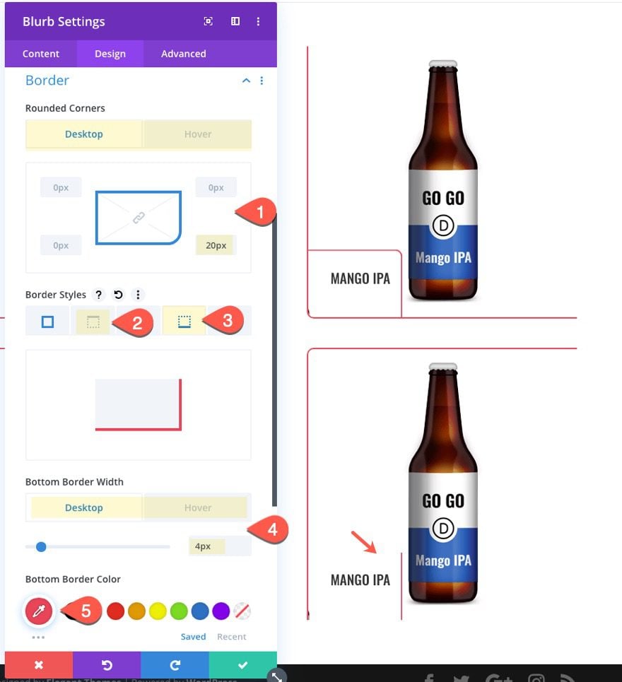
- Text Alignment: right
- Rounded Corners (desktop): 20px top right
- Rounded Corners (hover): 10px top right
- Left Border Width: 0px
- Right Border Width: 4px (desktop), 2px (hover)
- Right Border Color: #e94558
- Transform Translate X Axis (desktop): -30%
- Transform Origin (desktop): bottom left
Then make sure to delete the custom CSS in the Blurb Content box.
Result
Here is the result. Notice how this one is symmetrical to the first one and expands from the bottom left position of the column.
Part 3: Creating an Expanding Corner Tab from the Top Right Position
Now we are ready to start our last two expanding corner tab designs. To get a head start, let’s duplicate the entire row containing the blurb we already designed.
Update Column 1 Settings
Next open the settings of the duplicate row and then open the settings for column 1 and update the following:
- Rounded Corners 10px top right
- Bottom Border Width: 0px
- Top Border Width: 2px
- Top Border Color: #e94558
Update Blurb Module Settings
Next, open the setting for the blurb module and update the following:
- Rounded Corners (desktop): 20px bottom left
- Rounded Corners (hover): 10px bottom left
- Top Border Width: 0px
- Bottom Border Width: 4px (desktop), 2px (hover)
- Bottom Border Color: #e94558
- Transform Translate Y Axis (desktop): -50%
- Transform Origin: top right
Blurb Custom CSS
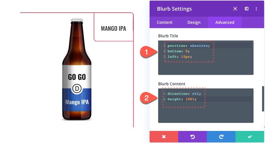
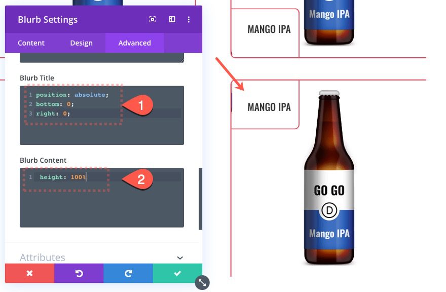
Right now we can only see the bottom left portion of the blurb module which doesn’t show our title like the other two blurbs in the row above. In order to show the Title inside the tab, we need to reposition the title to the bottom left of the blurb with some custom CSS.
Add the following Custom CSS to the Blurb Title box:
position: absolute;
bottom: 0;
left: 15px;
Then add the following CSS to the Blurb Content Box:
direction: rtl;
height: 100%;
Part 4: Creating an Expanding Corner Tab from the Top Left Position
For our fourth and final expanding corner tab hover effect we are going to position it at the top left corner to complete the symmetrical design of the entire grid layout.
Update Column 2 Settings
Under the row settings, open the settings for column 2 and update the following:
- Rounded Corners: 10px top left
- Bottom Border Width: 0px
- Top Border Width: 2px
- Top Border Color: #e94558
Update Blurb Settings
Next, open the settings for the blurb in column 2 and update the following:
- Rounded Corners (desktop): 20px bottom right
- Rounded Corners (hover): 10px bottom right
- Top Border Width: 0px
- Bottom Border Width: 4px (desktop), 2px (hover)
- Bottom Border Color: #e94558
Then update the transform options:
- Transform Translate X Axis (desktop): -30%
- Transform Origin: Top Left
Blurb Custom CSS
Then add the following Custom CSS to the Blurb Title box:
position: absolute;
bottom: 0%;
right: 0%;
Then add the following CSS to the Blurb Content box:
height: 100%;
Part 4: Finishing the Design of the Layout
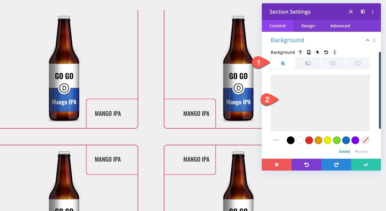
Section Background Color
Add a Section Background Color as follows:
- Background Color: #efefef
Adding the Title
To create the title, add a row in the middle of the two rows and add a text module to the one column row.
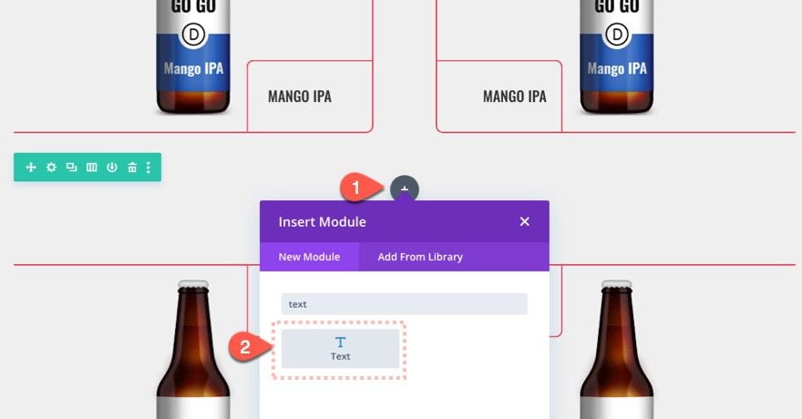
Add the content: “Seasonal”.
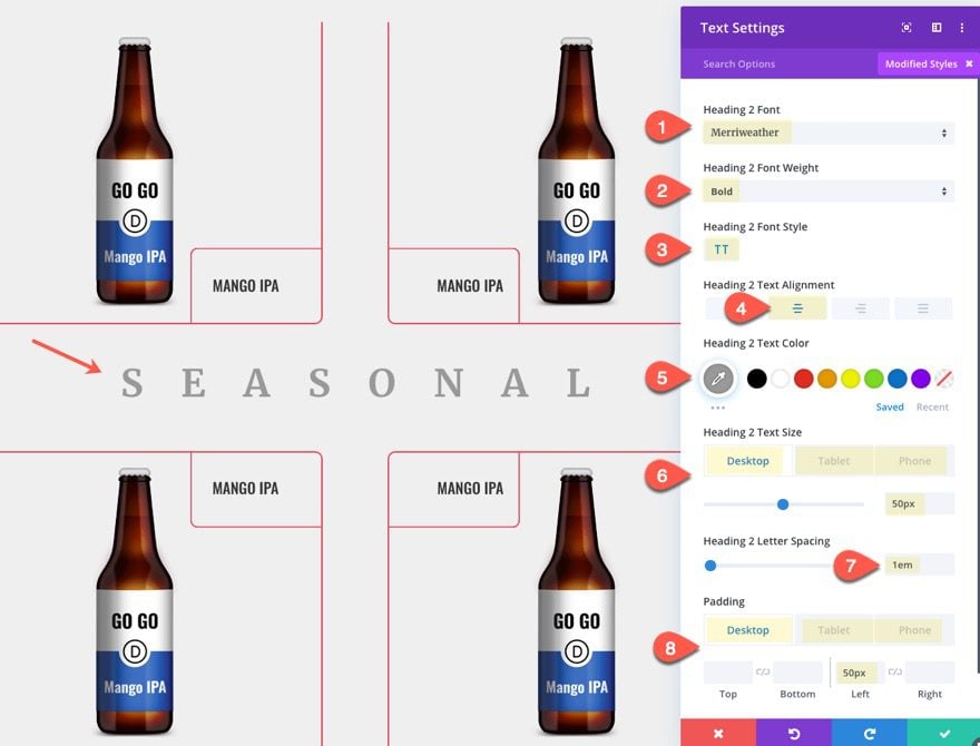
Then update the following settings:
- Heading 2 font: Merriweather
- Heading 2 Font Weight: Bold
- Heading 2 Font Style: TT
- Heading 2 Text Alignment: Center
- Heading 2 Text Color: #999999
- Heading 2 Text Size: 50px (desktop), 30px (tablet), 24px (phone)
- Heading 2 Letter Spacing: 1em
- Padding: 50px left (desktop), 30px left (tablet), 24px left (phone)
Final Result
Check out the final result of the layout with expanding corner tabs.
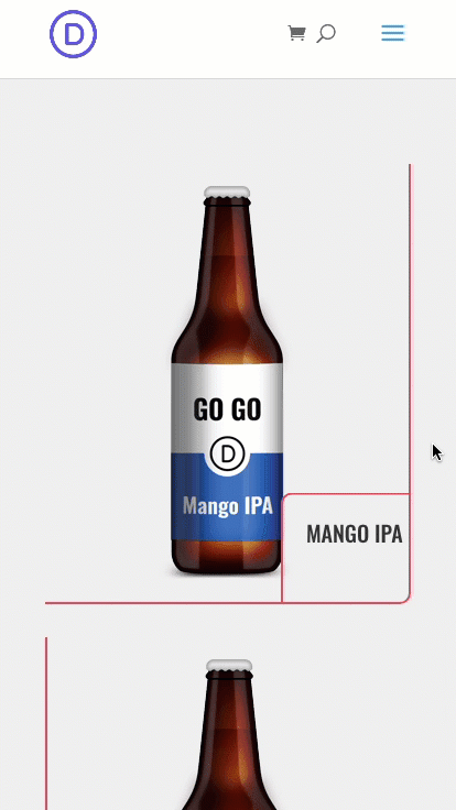
And here is the design on mobile.
Final Thoughts
The expanding corner tabs featured in this layout design will definitely work for all kinds of content you want to feature on your Divi website. You don’t have to use all four corners either. For example, you can create a grid layout for images using only top right corner tabs to reveal content on hover. The design capabilities are plentiful with this one. Have fun.
I look forward to hearing from you in the comments.
Cheers!


Hi
I really want to do this on my new page, but this is for an old version of Divi.
I finally found hover, but there are other parts om struggeling with, I cannot find the exact place you are editing.
Is there a way I can find the correct places in my Divi (it is the newest version and in Danish)
Best regards
Jeric
Thanks Jason, this is a great tutorial. I’m trying to implement a similar design with the Shop module – I’d like to replace/overlay the image with the product details. But I don’t see a way of doing it. Any advice?
Another great tutorial that I can’t wait to try out!! I especially love the little tidbit on the RTL code for blurb images.
One question though- is it true that using techniques as these also hides the content from SEO crawlers?
I have followed these tricks on my blog and impressively it’s work. So many many thanks about it.
the article is very good and easy to understand
This really helped me to create that section. I am new to Divi and yes the tutorials you guys have really straight to the point and easy to implement. Thanks.
Awesome! That’s great to hear.
Amazing
LOVE this. Thanks so much Jason!
You are very welcome, Jamie. Thanks for the comment.
Absolutely excellent tutorial! I can see many awesome applications of this technique!
Great to hear, Keegan