

At a certain point when you’re creating a page design, you might run into a list of services, courses, or something similar that you want to share in an interactive way. The design you’re using for your list content plays a very important role in how your visitors digest the content. And with most lists, you’re also going to want to include a call to action that connects the dots. If you’re looking for a creative way to do that, you’ll love this tutorial.
Today, we’ll show you how to reveal a column CTA in a sticky state with Divi. As soon as the CTA touches the end of the column, the sticky effect stops, which gives an effortless experience in which people can continue reading the list items and decide to take action whenever they want without having to scroll up or down to find the CTA. We’ll share the JSON file for free as well!
Let’s get to it.
Preview
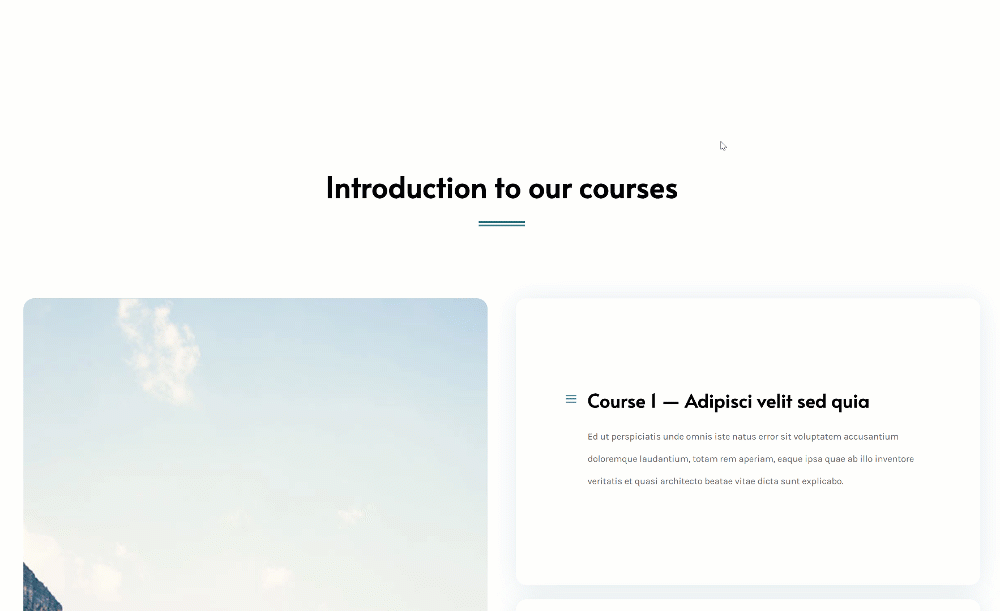
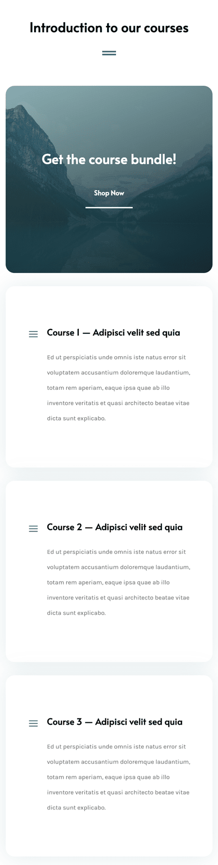
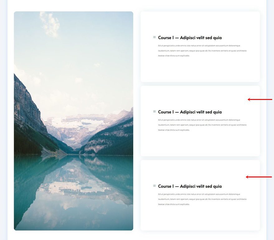
Before we dive into the tutorial, let’s take a quick look at the outcome across different screen sizes.
Desktop
Mobile
Download The Sticky Column CTA Section Layout for FREE
To lay your hands on the free sticky column CTA section layout, you will first need to download it using the button below. To gain access to the download you will need to subscribe to our newsletter by using the form below. As a new subscriber, you will receive even more Divi goodness and a free Divi Layout pack every Monday! If you’re already on the list, simply enter your email address below and click download. You will not be “resubscribed” or receive extra emails.

Let’s Start Recreating!
Add New Section
Background Color
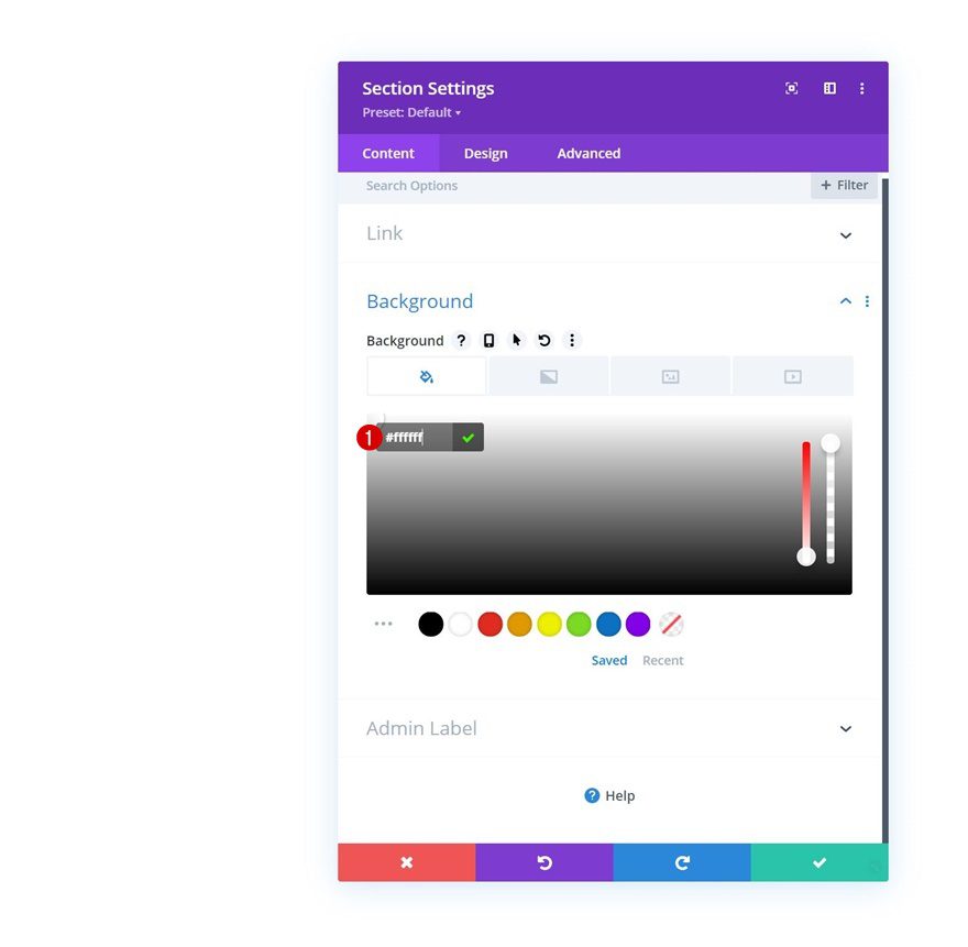
Start by adding a new section to the page you’re working on. Open the section settings and apply a white background color.
- Background Color: #ffffff
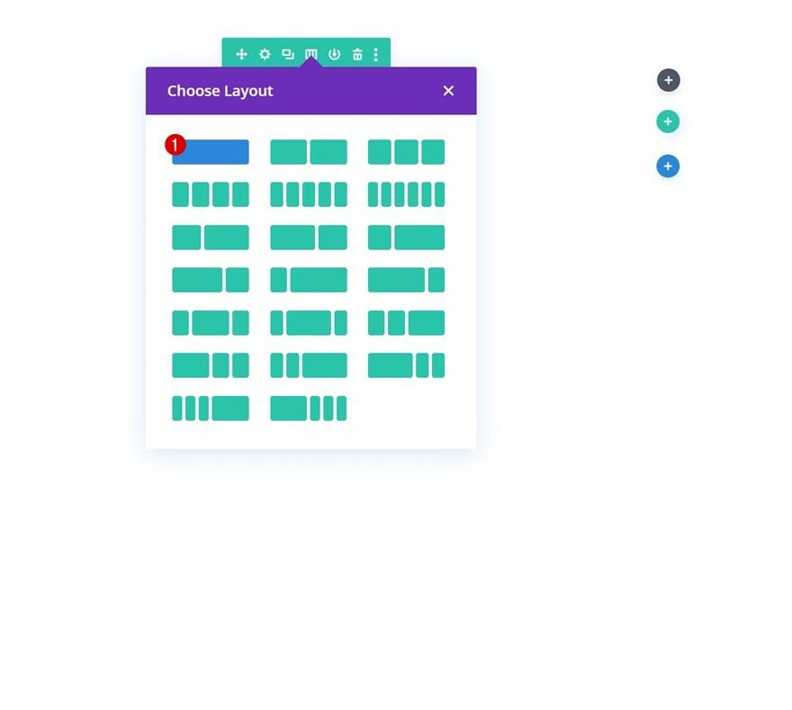
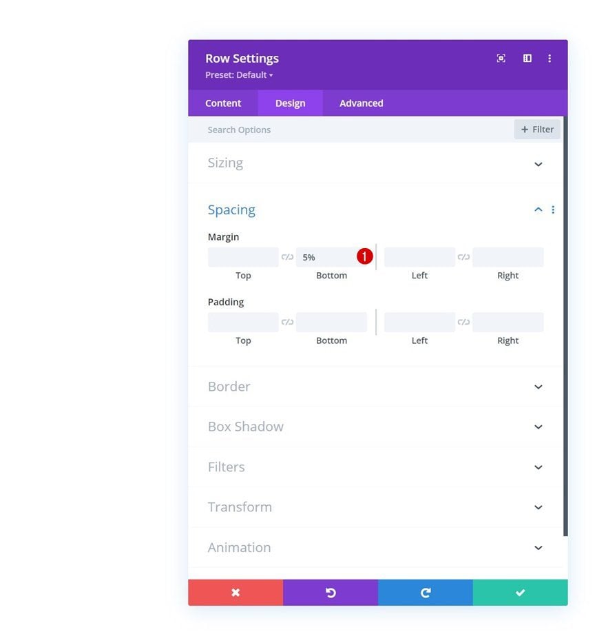
Add Row #1
Column Structure
Continue by adding a new row using the following column structure:
Spacing
Without adding any modules yet, open the row settings and apply some bottom margin.
- Bottom Margin: 5%
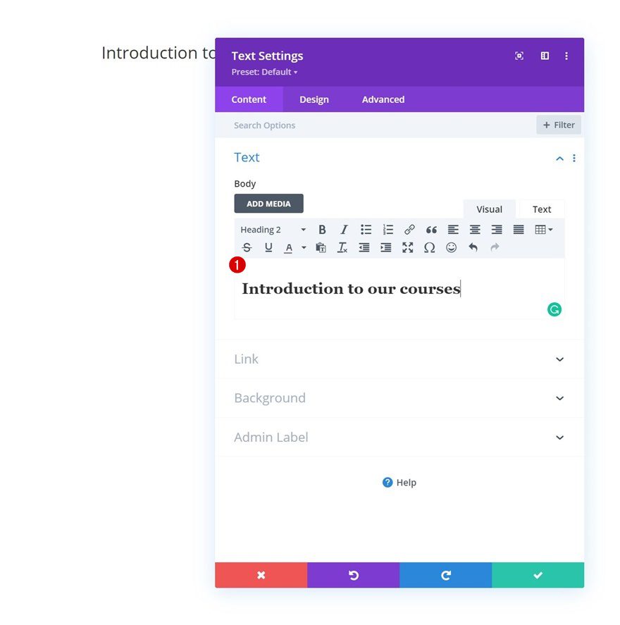
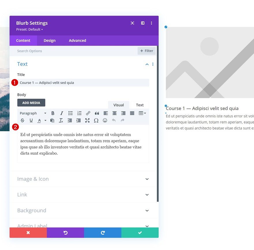
Add Text Module to Column
Add H2 Content
Add a Text Module with some H2 content of your choice.
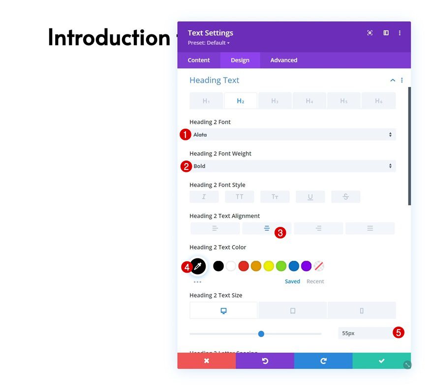
H2 Text Settings
Move on to the module’s design tab and change the H2 text settings accordingly:
- Heading 2 Font: Alata
- Heading 2 Font Weight: Bold
- Heading 2 Text Alignment: Center
- Heading 2 Text Color: #000000
- Heading 2 Text Size:
- Desktop: 55px
- Tablet: 40px
- Phone: 30px
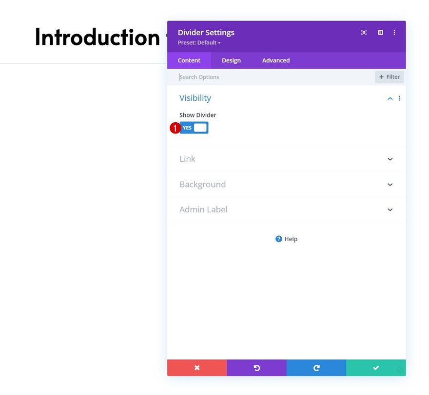
Add Divider Module to Column
Visibility
Right below the Text Module, add a Divider Module and make sure the “Show Divider” option is enabled.
- Show Divider: Yes
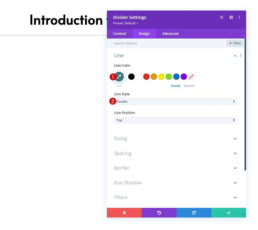
Line
Move on to the module’s design tab and change the line settings as follows:
- Line Color: #3a7a84
- Line Style: Double
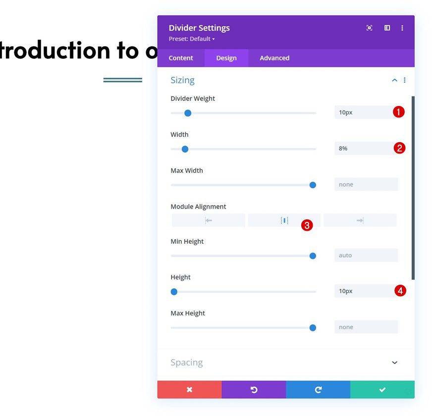
Sizing
Complete the module’s settings by modifying the sizing settings accordingly:
- Divider Weight: 10px
- Width: 8%
- Module Alignment: Center
- Height: 10px
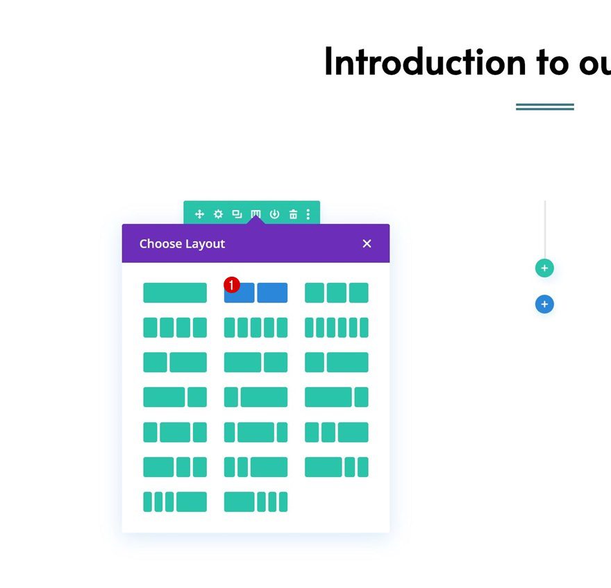
Add Row #2
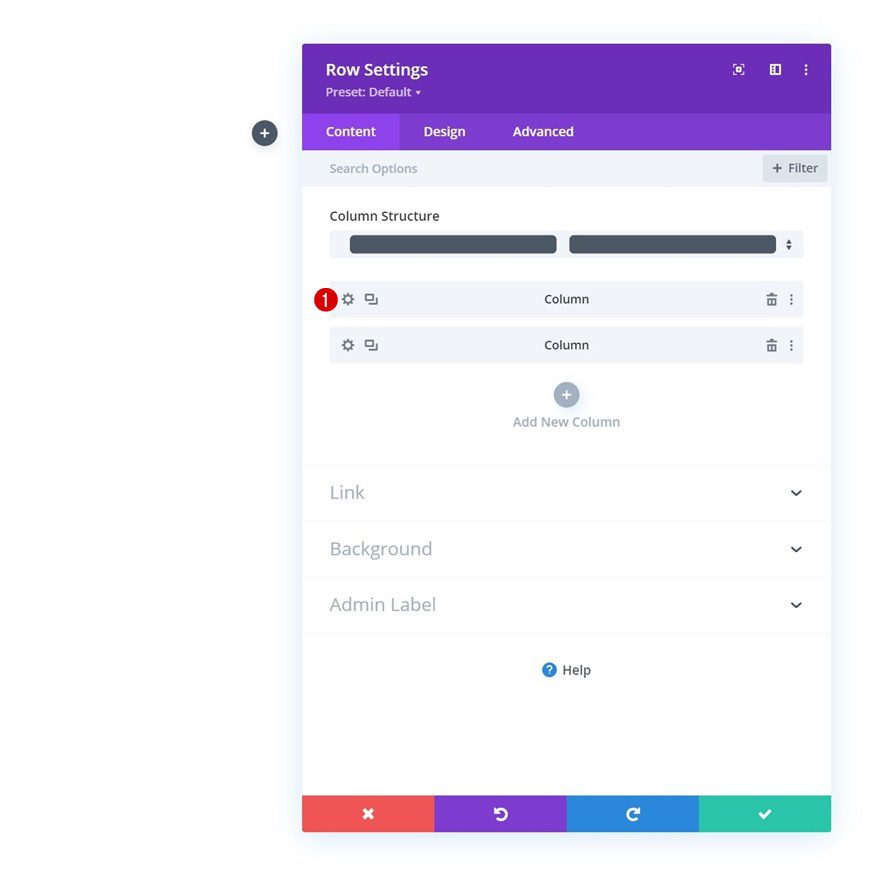
Column Structure
Continue by adding another row right below the previous one using the following column structure:
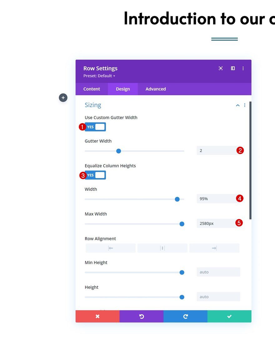
Sizing
Open the row settings and modify the sizing settings as follows:
- Use Custom Gutter Width: Yes
- Gutter Width: 2
- Equalize Column Heights: Yes
- Width: 95%
- Max Width: 2580px
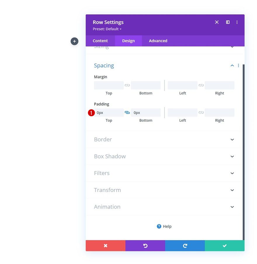
Spacing
Remove all default top and bottom padding next.
- Top Padding: 0px
- Bottom Padding: 0px
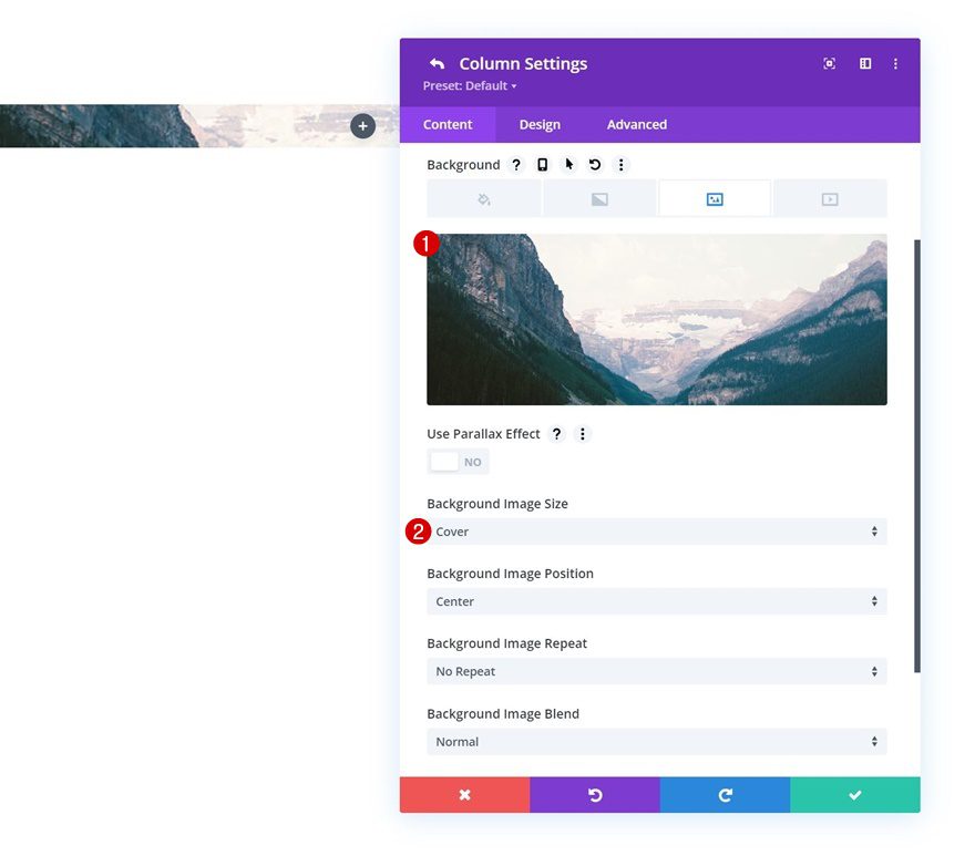
Column 1 Settings
Background Image
Then, open the column 1 settings and apply a background image.
- Background Image Size: Cover
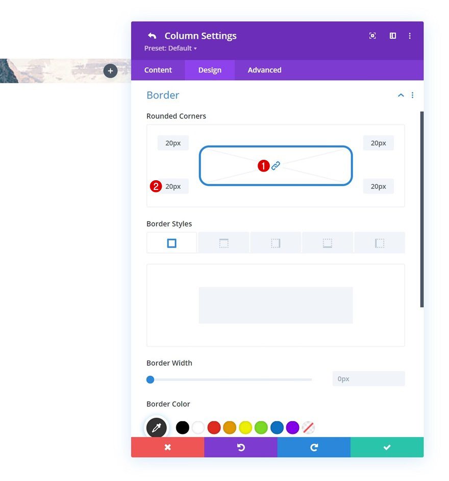
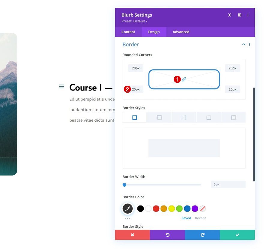
Border
Move on to the column’s design tab and apply some rounded corners.
- All Corners: 20px
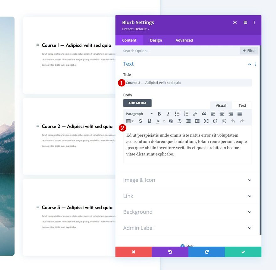
Add Blurb Module to Column 2
Add Content
Time to add modules, starting with a Blurb Module in column 2. Add some content of your choice.
Select Icon
Select an icon next.
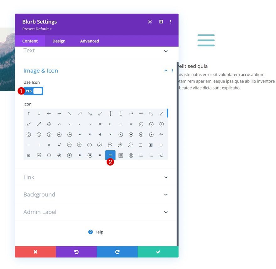
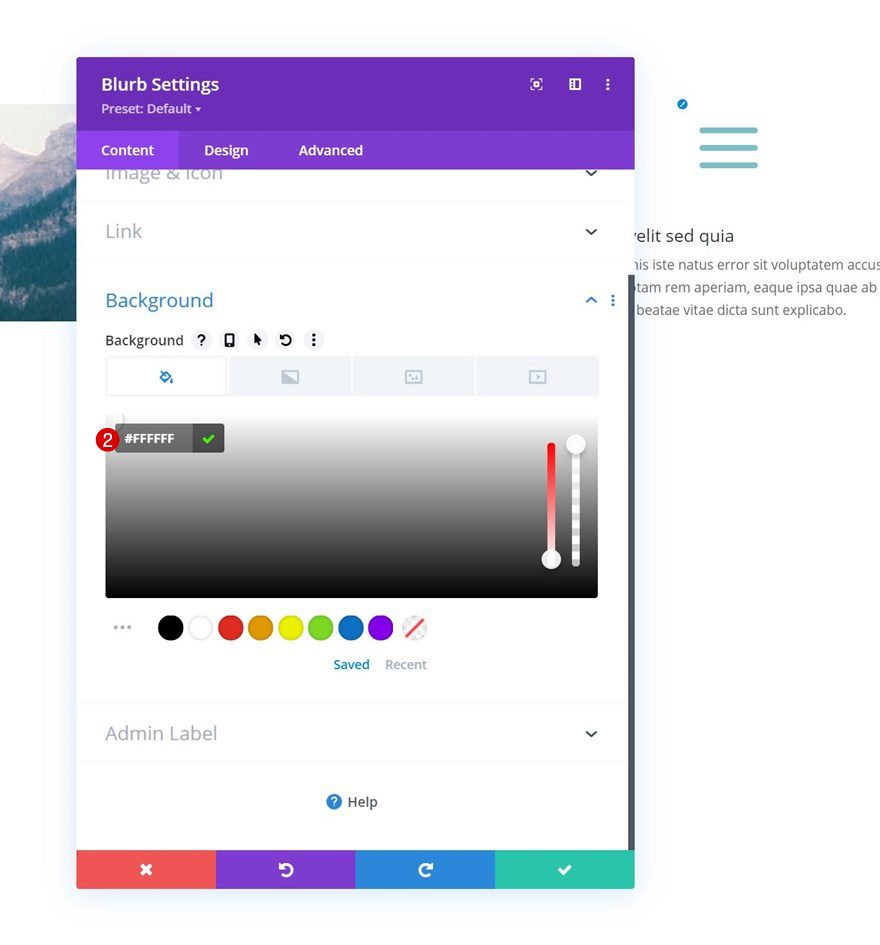
Background Color
Then, apply a white background color.
- Background Color: #FFFFFF
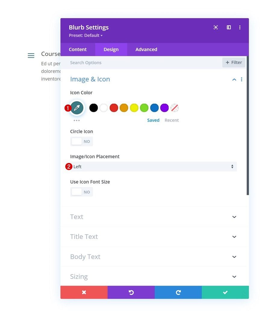
Icon Settings
Move on to the module’s design tab and change the icon settings accordingly:
- Icon Color: #3a7a84
- Image/Icon Placement: Left
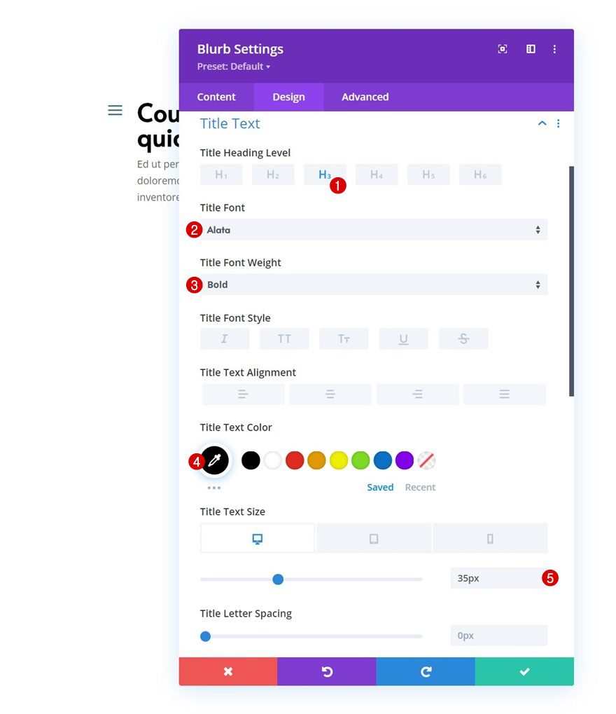
Title Text Settings
Then, style the title text settings.
- Title Heading Level: H3
- Title Font: Alata
- Title Font Weight: Bold
- Title Text Color: #000000
- Title Text Size:
- Desktop: 35px
- Tablet: 30px
- Phone: 20px
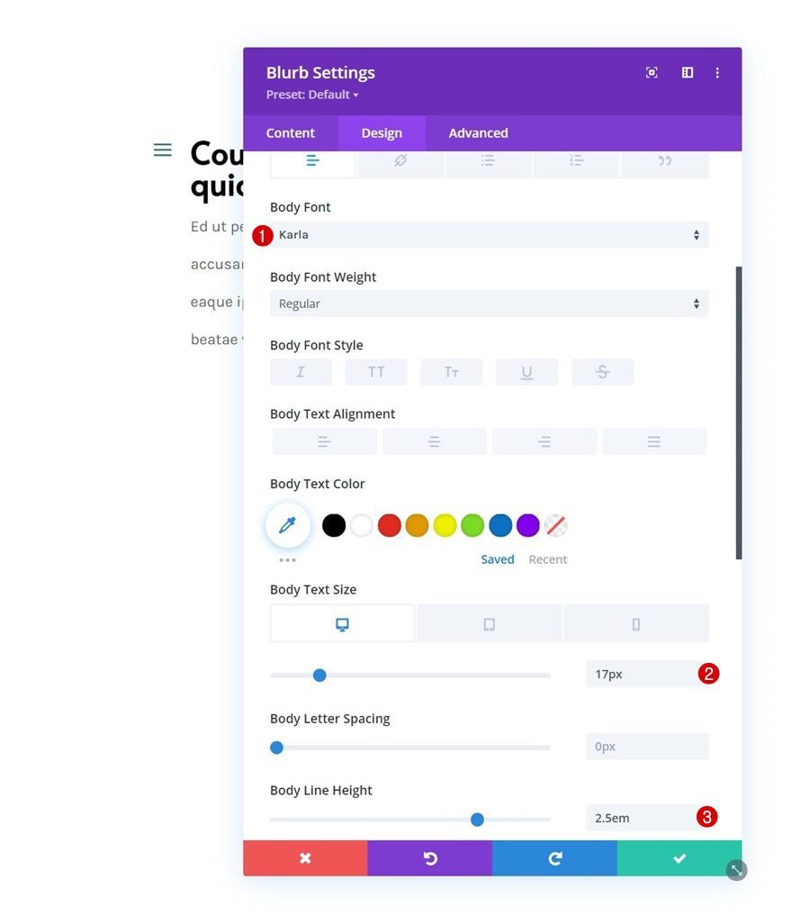
Body Text Settings
Make some changes to the body text settings too.
- Body Font: Karla
- Body Text Size:
- Desktop: 17px
- Tablet: 15px
- Phone: 14px
- Body Line Height: 2.5em
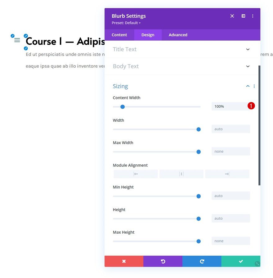
Sizing
Change the sizing settings next.
- Content Width: 100%
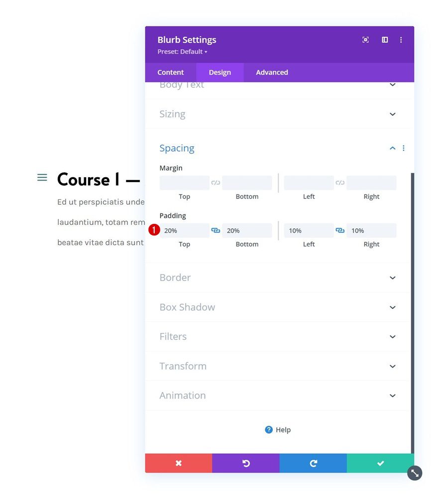
Spacing
And apply some custom padding values to the spacing settings.
- Top Padding: 20%
- Bottom Padding: 20%
- Left Padding: 10%
- Right Padding: 10%
Border
Next, we’ll add some rounded corners to the border settings.
- All Corners: 20px
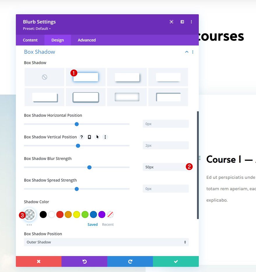
Box Shadow
And we’ll include a subtle box shadow.
- Box Shadow Blur Strength: 50px
- Shadow Color: rgba(59,120,130,0.14)
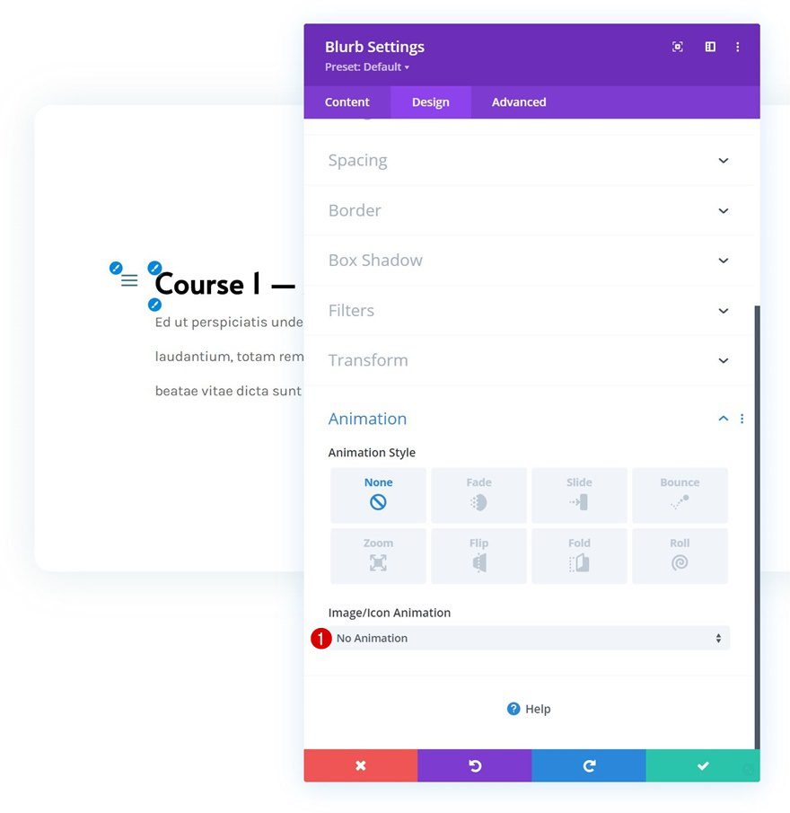
Animation
Continue by removing the Blurb Module’s default animation in the animation settings next.
- Image/Icon Animation: No Animation
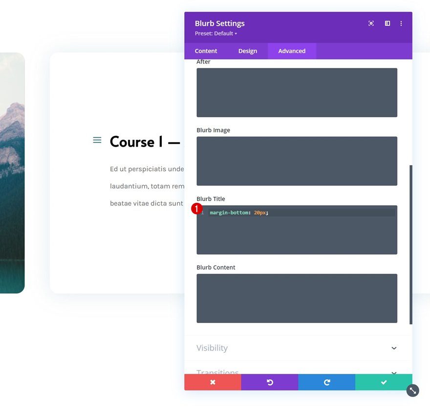
Blurb Title CSS
And complete the module settings by adding one line of CSS code to the blurb title CSS box in the advanced tab.
margin-bottom: 20px;
Clone Blurb Module Twice
Once you’ve completed the first Blurb Module, clone the Blurb Module up to as many times as you need.
Change Content
Change the content in each duplicate module.
Add CTA Module to Column 1
Add Content
In column 1, the only module we need is a Call to Action Module. Add some content of your choice.
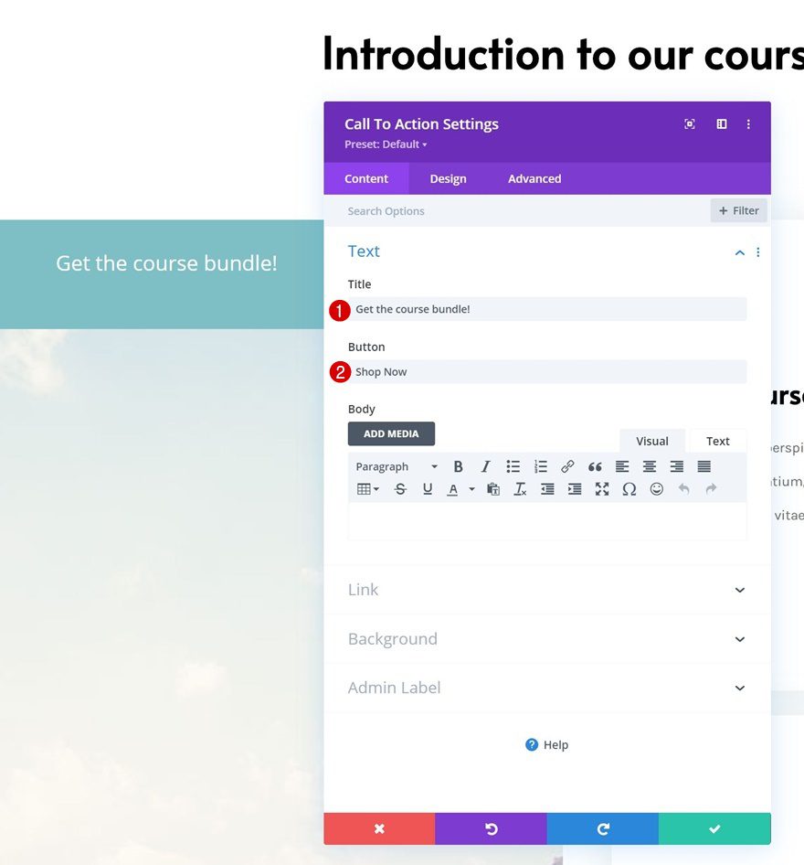
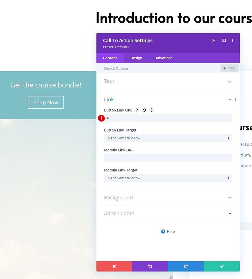
Add Button Link
Add a button link next.
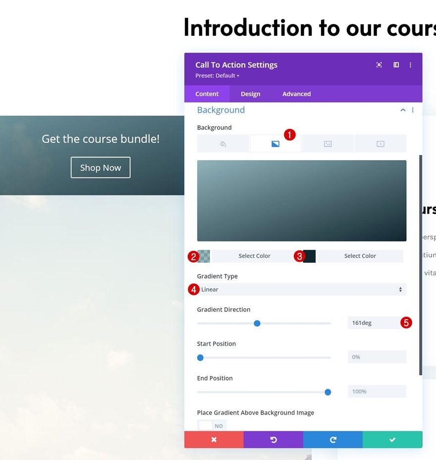
Gradient Background
Then, apply a gradient background.
- Color 1: rgba(59,120,130,0.53)
- Color 2: #112730
- Gradient Type: Linear
- Gradient Direction: 161deg
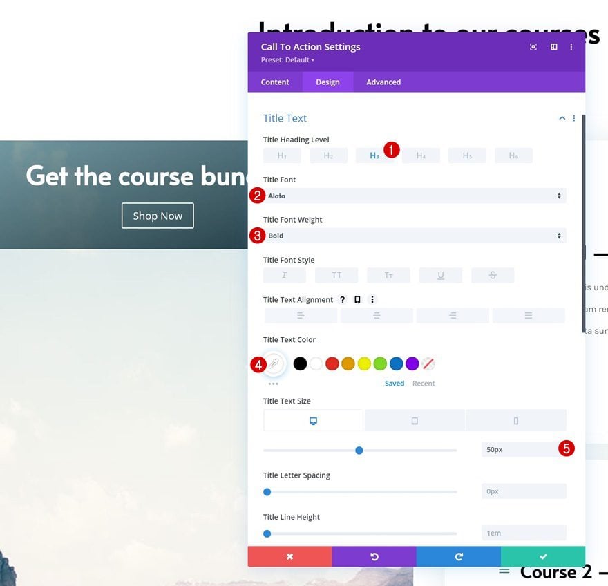
Title Text Settings
Move on to the module’s design tab and make the following changes to the title text settings:
- Title Heading Level: H3
- Title Font: Alata
- Title Font Weight: Bold
- Title Text Color: #ffffff
- Title Text Size:
- Desktop: 50px
- Tablet & Phone: 30px
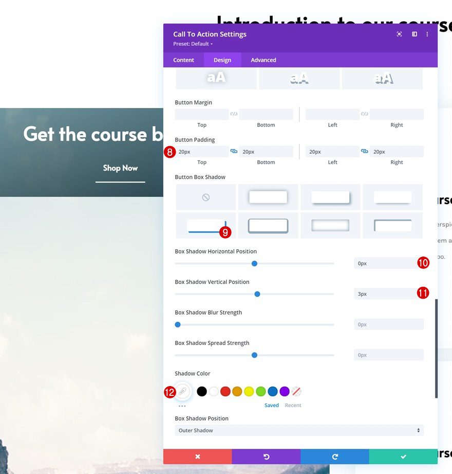
Button Settings
Style the button next.
- Use Custom Styles For Button: Yes
- Button Text Size:
- Desktop: 20px
- Tablet: 17px
- Phone: 15px
- Button Border Width: 0px
- Button Border Radius: 0px
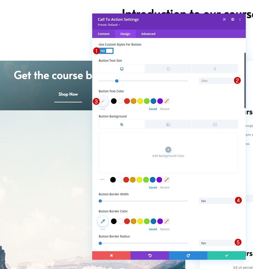
- Button Font: Alata
- Button Font Weight: Bold
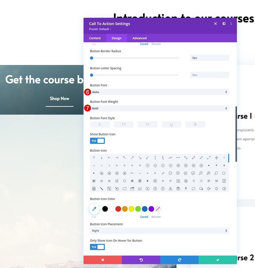
- Top Padding: 20px
- Bottom Padding: 20px
- Left Padding: 20px
- Right Padding: 20px
- Box Shadow Horizontal Position: 0px
- Box Shadow Vertical Position: 3px
- Shadow Color: #ffffff
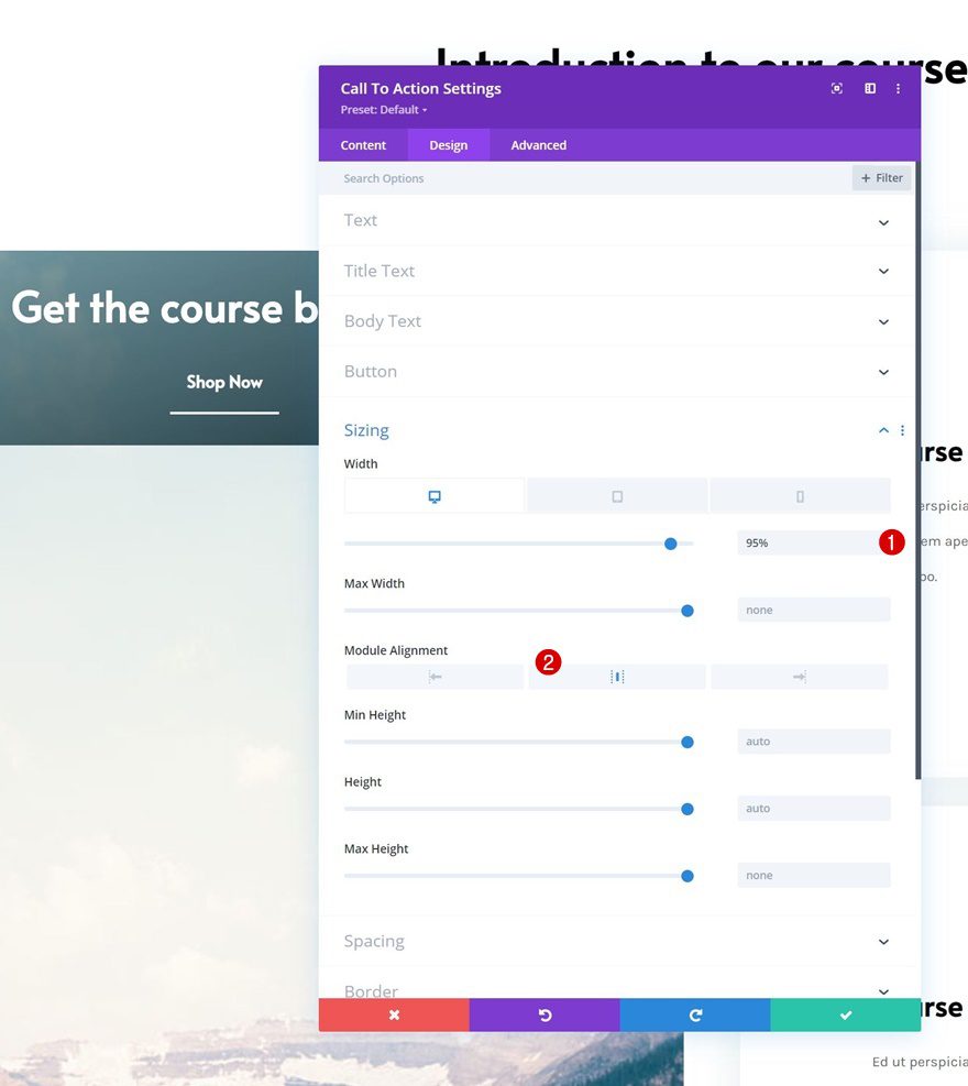
Sizing
Move on to the module’s sizing settings and apply the following changes:
- Width:
- Desktop: 95%
- Tablet & Phone: 100%
- Module Alignment: Center
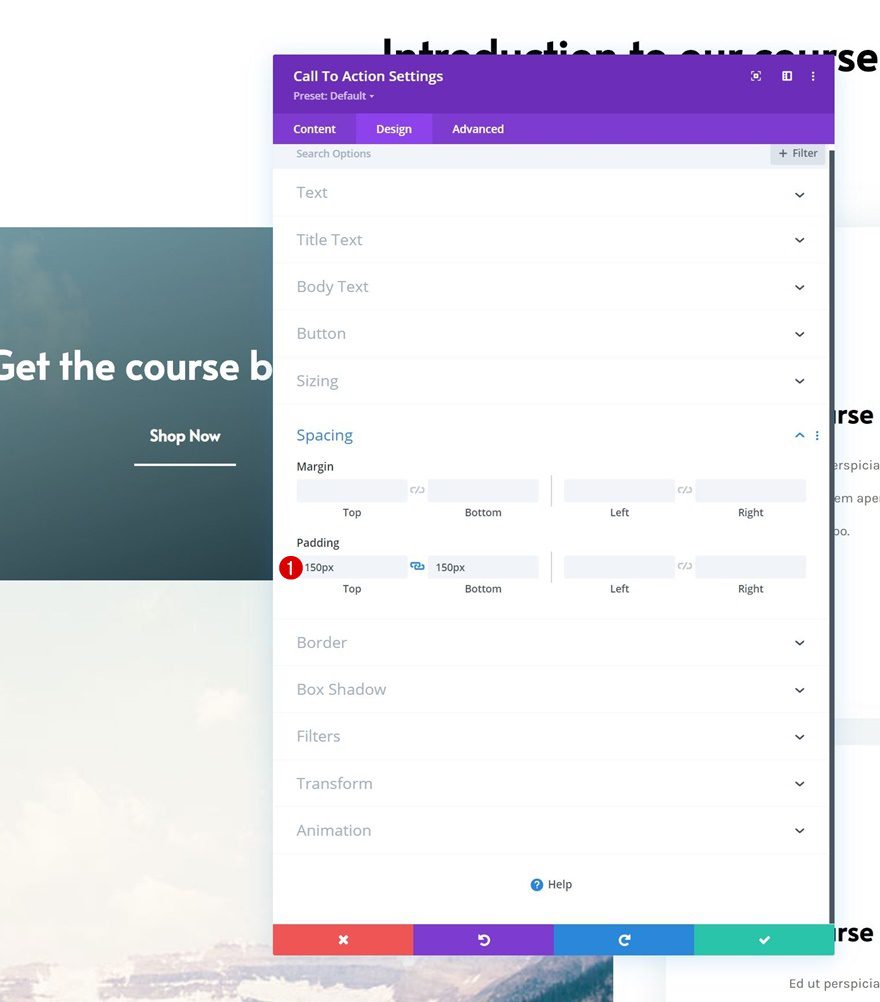
Spacing
Add some custom top and bottom padding too.
- Top Padding: 150px
- Bottom Padding: 150px
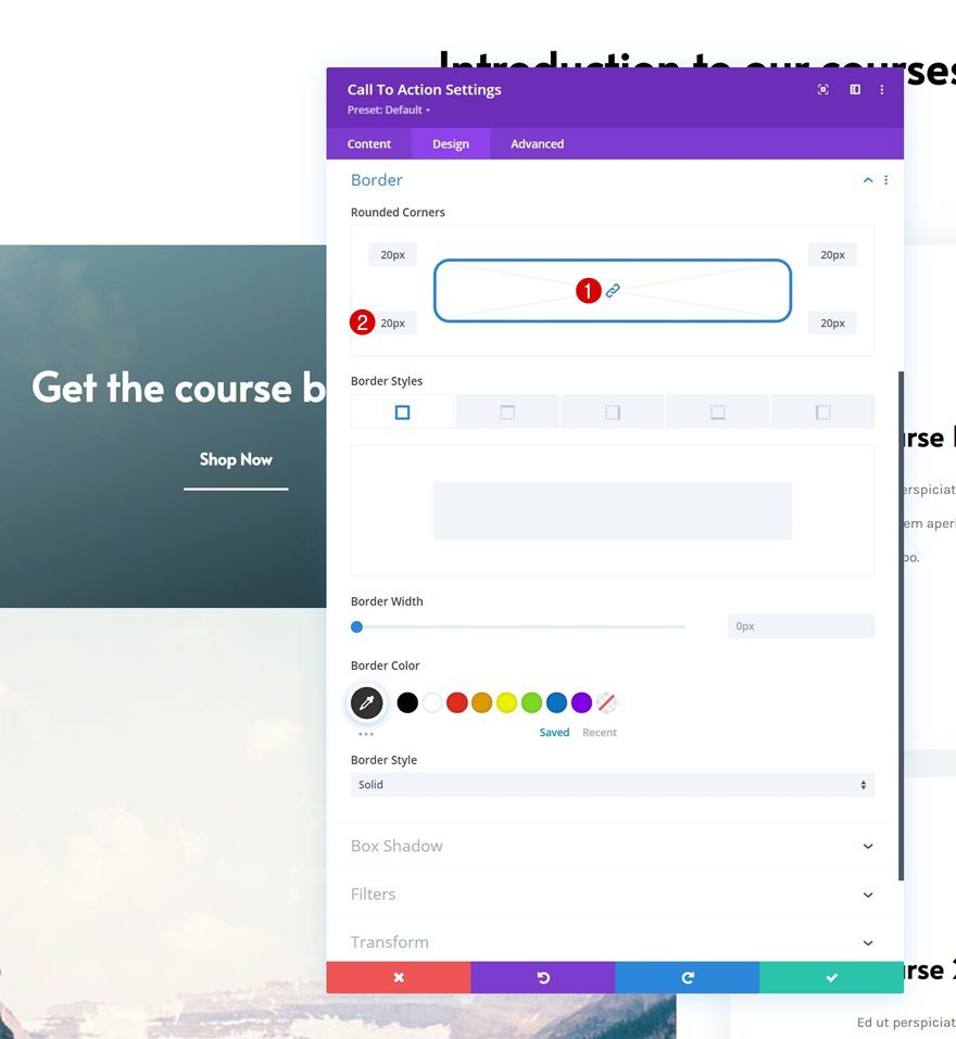
Border
Include some rounded corners as well.
- All Corners: 20px
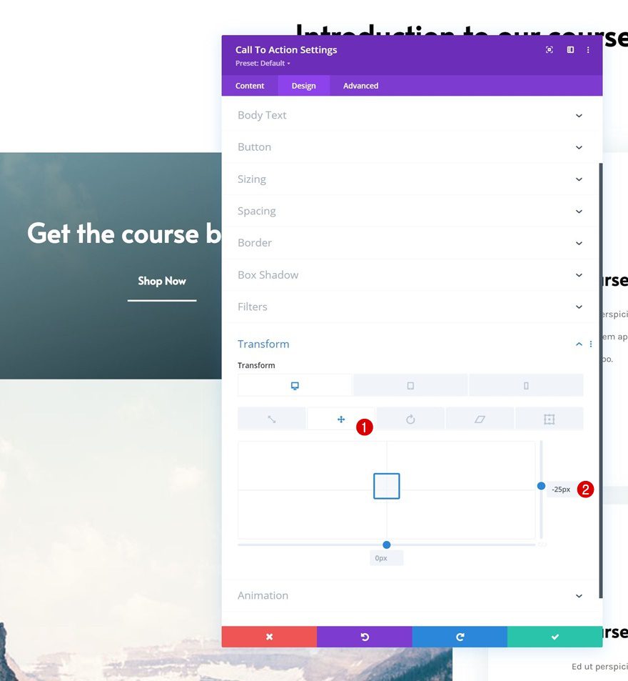
Transform Translate
Complete the module settings by applying the following transform translate settings:
- Right:
- Desktop: -25px
- Tablet & Phone: 0px
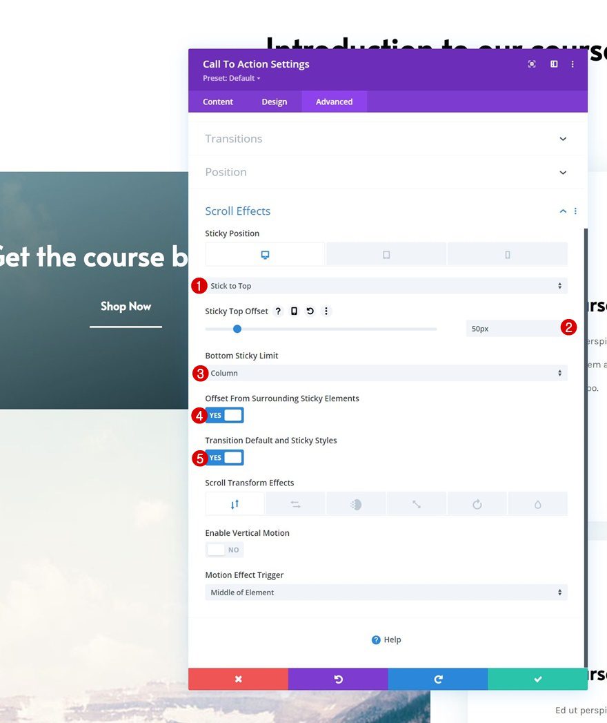
Apply Sticky Effect to CTA Module
Sticky Settings
Now that all elements are in place, it’s time to apply the sticky effect. Open the CTA Module and apply the following sticky settings:
- Sticky Position:
- Desktop: Stick to Top
- Tablet & Phone: Do Not Stick
- Sticky Top Offset: 50px
- Bottom Sticky Limit: Column
- Offset From Surrounding Sticky Elements: Yes
- Transition Default and Sticky Styles: Yes
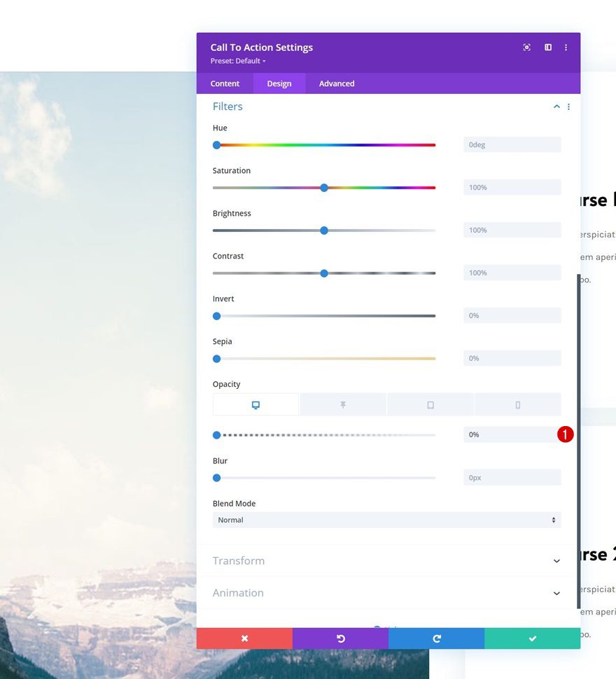
Opacity
Now that the module is turned sticky, we can apply sticky styles. Go to the filters settings and apply the following opacity filter settings:
- Default Opacity:
- Desktop: 0%
- Tablet & Phone: 100%
- Sticky Opacity: 100%
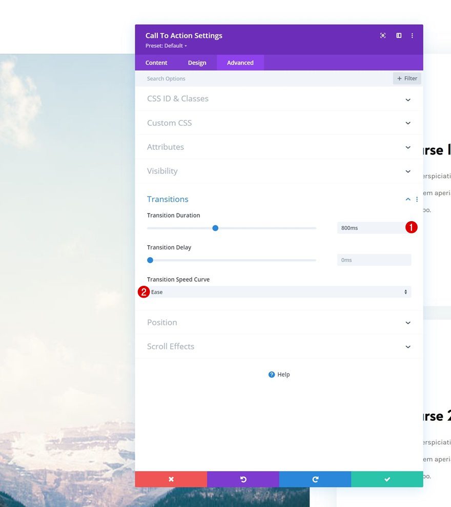
Transition
Last but not least, we’ll change the transition settings in the advanced tab. That’s it!
- Transition Duration: 800ms
- Transition Speed Curve: Ease
Preview
Now that we’ve gone through all the steps, let’s take a final look at the outcome across different screen sizes.
Desktop
Mobile
Final Thoughts
In this post, we’ve shown you how to get creative with Divi’s sticky options. More specifically, we’ve shown you how to beautifully display list items with a sticky column CTA. This approach allows you to visually display all the items and have a call to action closeby while your visitors ready through your services, courses or other types of lists. You were able to download the JSON file for free as well! If you have any questions, feel free to leave a comment in the comment section below.
If you’re eager to learn more about Divi and get more Divi freebies, make sure you subscribe to our email newsletter and YouTube channel so you’ll always be one of the first people to know and get benefits from this free content.


Looks awesome! Thanks for explaining.
Happy you’ve enjoyed the tutorial, Edgar! 🙂