")
Welcome to our 2-part series on how to recreate our color filters, effects, and blend mode examples with Divi. You can check out our filter demo page for a look at these examples to get an idea of what we will be creating together.
With the recent release of Divi’s new Filters, Effects, and Blend Modes, you have a complete arsenal of design tools within the Visual builder. Now you don’t have to go to Photoshop everytime you want to make these kind of adjustments because these new options can be applied to any element within Divi. And I love how you can make visual adjustments on the fly right on your browser without having to disrupt the design process.
Today I’m going to show you how to recreate the first 3 sections of the demo as well as highlight the different filters, effects and blend modes used throughout the sections. Keep an eye out for highlights throughout the post which will give your more insight into how these new options work.
Let’s get started.
- 1 Sneak Peak
- 2 Design Elements Needed
- 3 How to Recreate The Color Filters, Effects & Blend Mode Examples with Divi (Part 1)
-
4
Recreating Section #1 with Divi
- 4.1 Section Highlights
- 4.2 Create a Regular Section
- 4.3 Change Column Structure of the Row
- 4.4 Add a Text Module for the Title Section
- 4.5 Add a Three Column Row for your Images
- 4.6 Add Image to First Column
- 4.7 Copy Image #1 Module to Create a Second Image in the Second Column
- 4.8 Copy the Image #1 Module to Create a Third Image in the Third Column
- 4.9 Add the Button
- 5 Recreating Section #2
- 6 Recreating Section #3
- 7 Want to Know More?
- 8 Coming Up
Sneak Peak
Here are the two sections we will be creating today.

Design Elements Needed
Since I will be recreating examples from our demo, I will be using the same images and design settings. The only design elements you will need are the images I will be using in this tutorial which I will provide as we go along. To use the image that is embed on this post, simply drag it off of the page onto your desktop or folder of your choice.
Other than that, all you need is an updated install of Divi and you are good to go.
How to Recreate The Color Filters, Effects & Blend Mode Examples with Divi (Part 1)
Subscribe To Our Youtube Channel
Recreating Section #1 with Divi
Section Highlights
Blend Mode Used: Luminosity
Filters and Effects Used: Saturation, Opacity, and Blur
This section highlights the use of the Luminosity Blend mode and the Blur effect. The result is a group of images that seem to float and certain depths with matching colors blended throughout to really pull the design together. Here’s how to build it.
Create a Regular Section
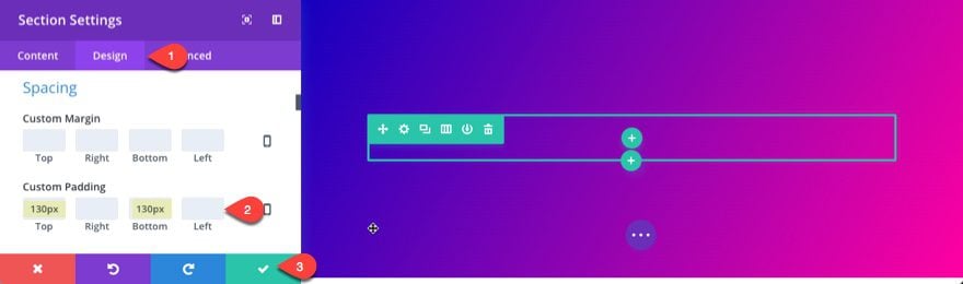
We will start from a blank canvas using the Visual Builder. You should already have a regular section with a one column row. Start by editing the section and updating the following:
Under the Content Tab…
Background Gradient Colors: #1300bf, #ff00a1
Gradient Direction: 120deg
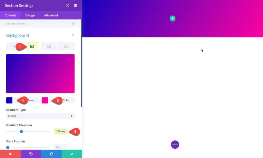
Under the Design Tab…
Custom Padding: 130px Top, 130px Bottom
Save Settings
Change Column Structure of the Row
Right now we have a one column structure for the row. Change this to a one-fourth one-half one-fourth column structure.

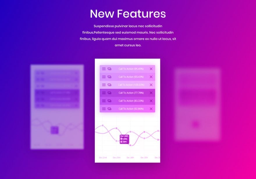
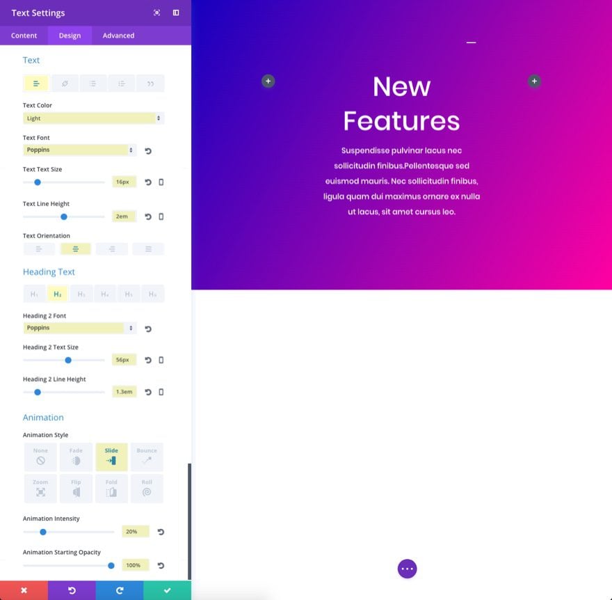
Add a Text Module for the Title Section
Let’s add a title for our section. Insert a text module in the middle column of the row and update the settings as follows:
Under the Content tab…
Content:
<h2>New Features</h2>
Suspendisse pulvinar lacus nec sollicitudin finibus.Pellentesque sed euismod mauris. Nec sollicitudin finibus, ligula quam dui maximus ornare ex nulla ut lacus, sit amet cursus leo.
Under the Design tab…
Text Color: Light
Text Font: Poppins
Text Text Size: 16px
Text Line Height: 2em
Text Orientation: Centered
Select H2 tab
Heading 2 Font: Poppins
Heading 2 Text Size: 56px
Heading 2 Line Height: 1.3em
Custom Margin: 10px Bottom
Animation Style: Slide
Animation Intensity: 20%
Animation Starting Opacity: 100%
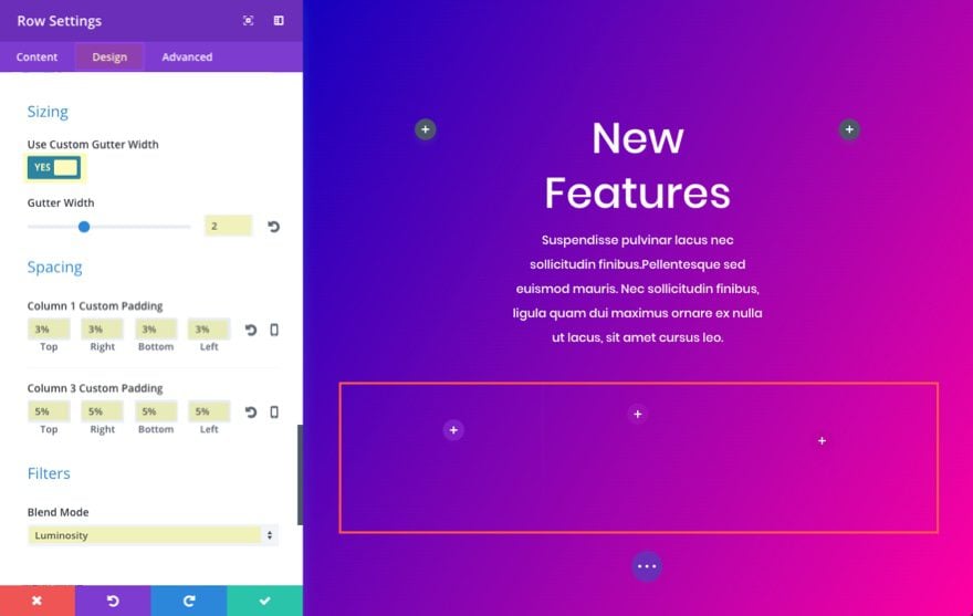
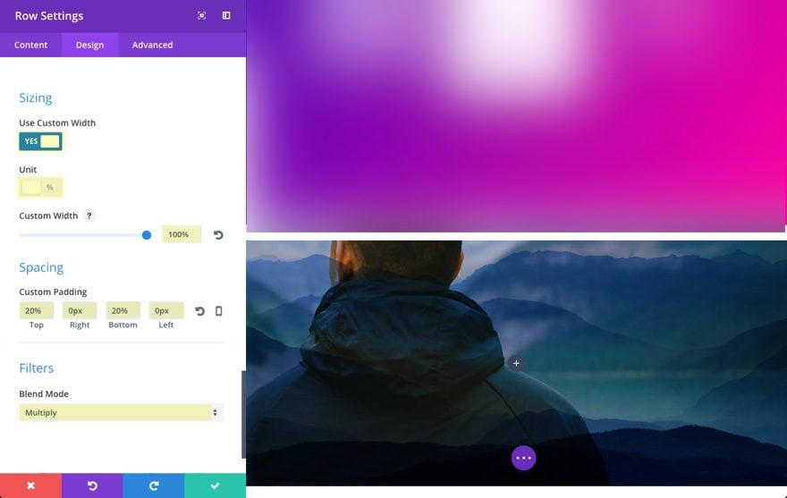
Add a Three Column Row for your Images
Click to add a three column (1/3 1/3 1/3) row directly under the previous row. This will be were we showcase our three images. In the row settings, go to the design tab and update the following:
Use Custom Gutter Width: YES
Gutter Width: 2
Column 1 Custom Padding: 3% Top, 3% Right, 3% Bottom, 3% Left
Column 3 Custom Padding: 5% Top, 5% Right, 5% Bottom, 5% Left
Blend Mode: Luminosity
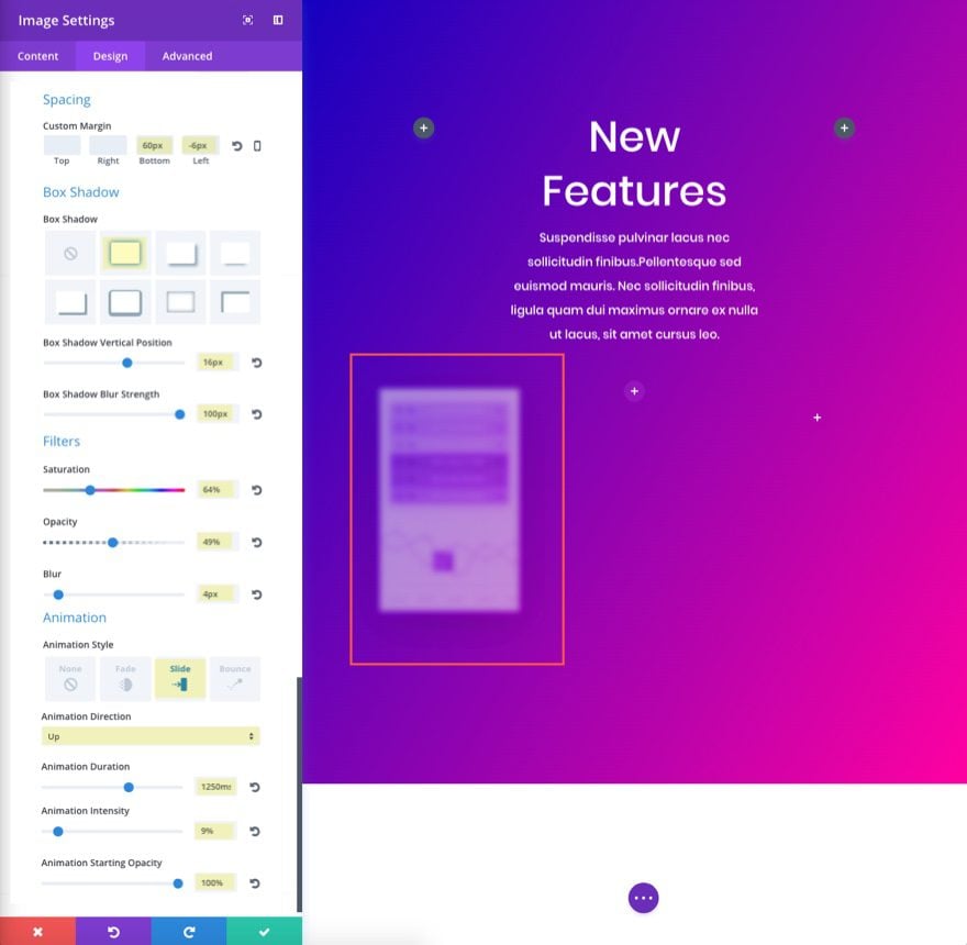
Add Image to First Column
In the first column, add an image module and upload/insert your image under the content tab settings. Here is the image I’m using (drag it to your desktop if you want to use it):
Because of the Luminosity blending effect that was set for the row, your image will automatically take on a new “blended” color when adding it to the row column. This is because the image is included in the blended layer or row.
Go to the Design tab and update the following:
Custom Margin: 60px Bottom, -6px Left (for tablet and smartphone, take out the -6px Left margin)
Box Shadow: 1st selection
Box Shadow Vertical Position: 16px
Box Shadow Blur Strength: 100px
Saturation: 64%
Opacity: 49%
Blur: 4px
Animation Style: Slide
Animation Direction: Up
Animation Duration: 1250ms
Animation Intensity: 9%
Animation Starting Opacity: 100%
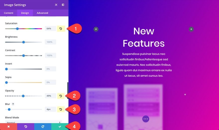
Copy Image #1 Module to Create a Second Image in the Second Column
There is no need to work harder than we have to. So, let’s copy and past the image module you just created into the second column and restore the following to the default setting by clicking the restore default icon on the right of the option.
Saturation: 64% (restore to default)
Opacity: 49% (restore to default)
Blur: 4px (restore to default)
Then update the following animation settings:
Animation Duration: 1300ms
Animation Intensity: 19%
Save Changes
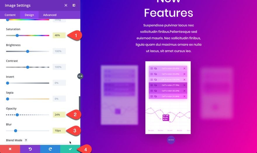
Copy the Image #1 Module to Create a Third Image in the Third Column
Copy the image module in the first column again and paste it into the third column and update the image module settings in the design tab as follows:
Saturation: 48%
Opacity: 24%
Blur: 10px
Animation Duration: 1350ms
Animation Intensity: 7%
Save Settings
To add the matching button below the three images, just create a one column row, add a button module and update the following:
Use Custom Styles for Button: YES
Button Text Size: 14px
Button Text color: #4444ff
Button Letter Spacing: 1px
Button Font: Poppins
Font Weight: Semi Bold
Button Hover Letter Spacing: 1px
Custom Padding: 12px Top, 24px Right, 12px Bottom, 24px Left
Check out the new filter effects:
Recreating Section #2
This next section showcases the Multiply blend mode to blend two background images together to produce a beautiful design and parallax effect. Here’s how to build it.
Create a Regular Section
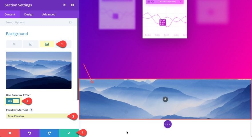
First add a new regular section with a one column row. Before we add our first module, jump into the section settings and under the content tab add a background image. Here is the one I am using…
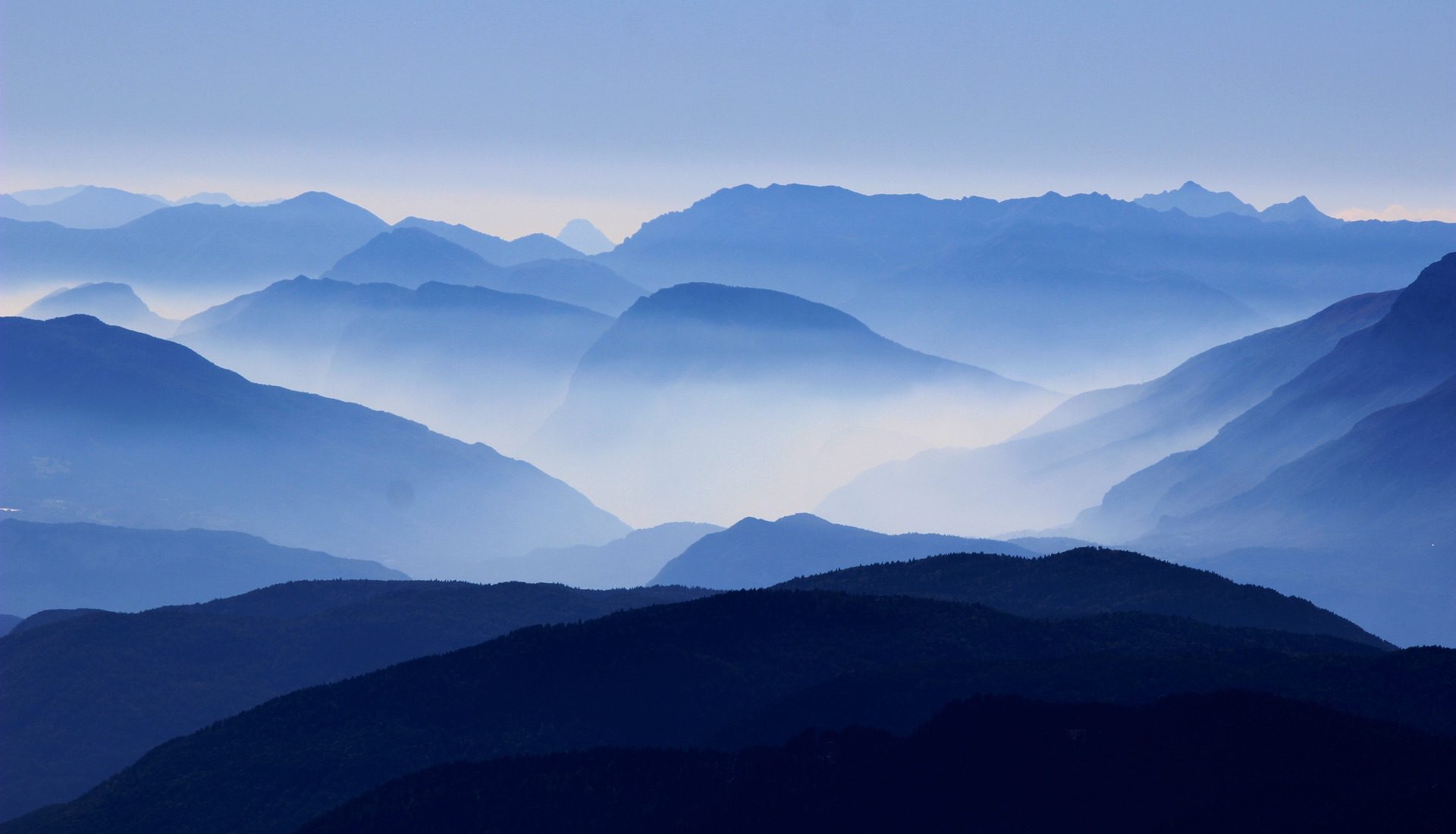
Also, select to use parallax effect with the True Parallax method. This is going to create that cool looking motion of the mountains when scrolling down the page.
Then go to the Design tab and update the following:
Custom Padding: 0px Top, 0px Right, 0px Bottom, 0px Left
Edit the Row Settings
The goal here is to have your row span the fullwidth and height of your section so that the row background image can blend with your section background image. To do this, edit the settings of your row and add a new background image to you row. Here is the one I’m using…
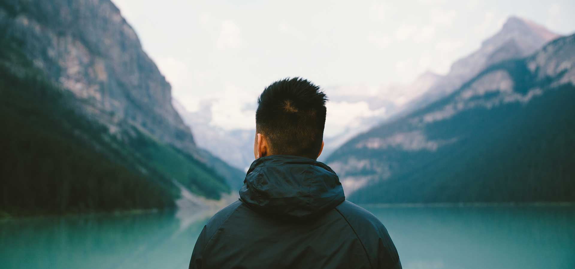
Select to use the CSS parallax method.
Now we need to expand the row to the fullwidth of the section and add our blend mode. We can do this under the Design tab as follows:
Use Custom Width: YES
Unit: %
Custom Width: 100%
Custom Padding: 20% Top, 0px Right, 20% Bottom, 0px Left
Blend Mode: Multiply
Add the Text Module for the Title
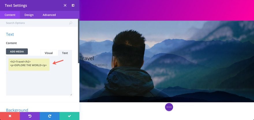
Now that your row is set, go ahead and add a Text Module to your column and update the following:
Under the Content settings…
Content:
<h2>Travel</h2>
EXPLORE THE WORLD
Under the Design settings…
Text Color: Light
Text Font: Lato
Text Font Weight: Heavy
Text Letter Spacing: 9px
Text Orientation: Center
Select to edit the H2 tab..
Heading 2 Font: Lato
Heading 2 Font Weight: Heavy
Heading 2 Text Size: 12vw
Heading 2 Letter Spacing: -0.02em
Heading 2 Line Height: 1.4em
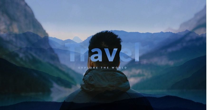
Check out the result.
Recreating Section #3
This next section utilizes some custom html/css but the end result is definitely a spark of inspiration. Even without the animation, the different colored letters of the text over the gradient background work really well together to showcase a unique design option for large text displays.
Add a Regular Section with a One-Column Row
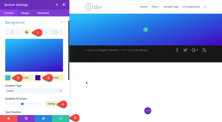
First, Add a new regular section with a one-column row. Now go back and edit the section settings as follows:
Under the Content tab…
Gradient Background Colors: #0ac9ff, #4600bf
Gradient Direction: 164deg
Under the Design tab…
Custom Padding: 0px Top, 0px Right, 0px Bottom, 0px Left
Update Row Settings
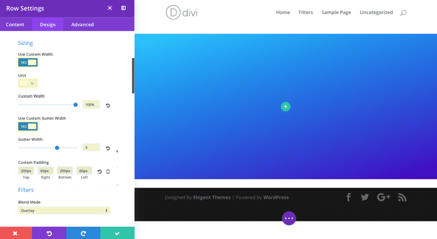
Now we need to expand our row settings a bit. Update the row settings with the following under the design tab.
Use Custom Width: YES
Unit: %
Custom Width: 100%
Use Custom Gutter Width: YES
Gutter Width: 3
Custom Padding: 200px Top, 60px Right, 200px Bottom, 60px
Blend Mode: Overlay
Add the First Text Module
Now lets add some text. Add a text module with the following:
Under the Content tab…
Content: “Divi Theme”
Under the Design Tab…
Text Color: Light
Text Font: Nunito
Text Font Weight: Ultra Bold
Text Font Style: Uppercase (TT)
Text Text Size: 22px
Letter Text Spacing : 9px
Text Orientation: Center
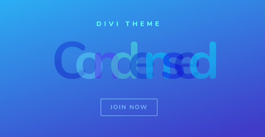
Add the Second Text Module for the Large Text
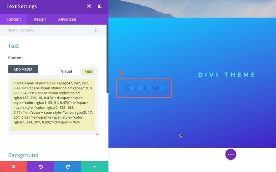
Now this next text module is the highlight of the section. Add a text module and update the following:
Content:
<h2>C<span style="color:rgba(247,247,247,0.4);">o</span></span style="color:rgba(219, 8, 215, 0.4);">n</span><span style="color:rgba(185, 255, 10, 0.47);">d</span><span style="color:rgba(1, 55, 91, 0.47);">e</span><span style="color:rgba(0, 192, 198, 0.77);">n</span><span style="color:rgba(8, 17, 204, 0.52);">s</span>e<span style="color:rbga(0, 224, 201, 0.69);">d</span></h2>
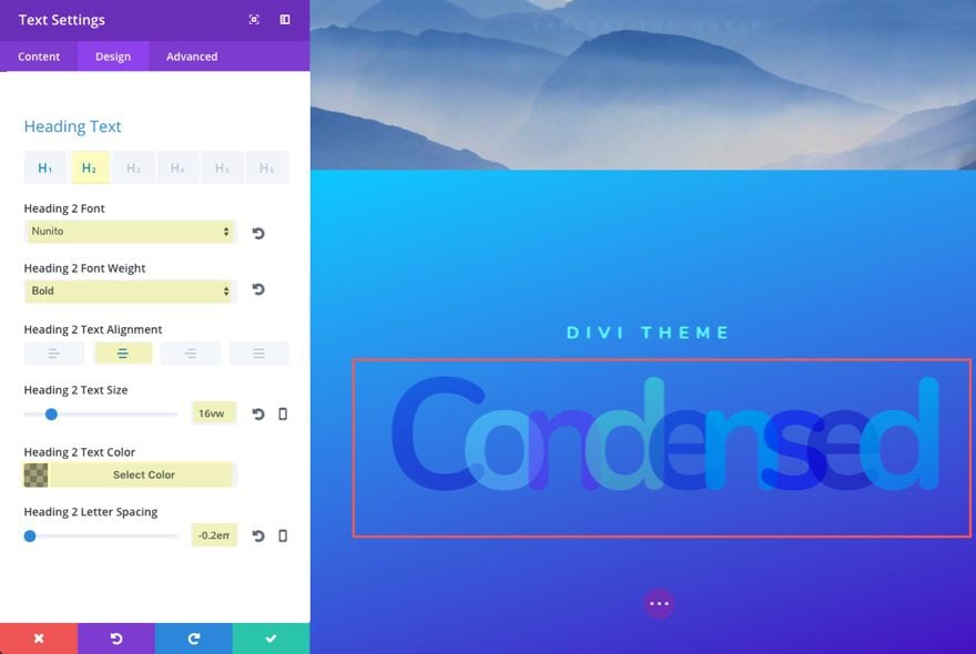
Under the Design Tab…
Click the H2 tab…
Heading 2 Font: Nunito
Heading 2 Font Weight: Bold
Heading 2 Text Alignment: Center
Heading 2 Text size: 16vw
Heading 2 Text Color: rgba(0,0,0,0.36)
Heading 2 Letting Spacking: -0.2em
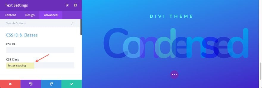
Under the Advanced Tab…
CSS Class: letter-spacing
Note: This css class will be used to add some custom CSS to add an expanding animation.
But before we add our custom CSS, let’s add the Button module with the following settings:
Under Content Tab…
Button Text: Join Now
Under Design Tab…
Button Alignment: Center
Text Color: Light
Use Custom Styles for Button: YES
Button Letter Spacing: 3px
Button Font: Nunito
Font Weight: Bold
Font Style: Uppercase (TT)
Button Hover Letter Spacing: 3px
Custom Padding: 10px 30px 10px 30px
Save Settings
Add Custom CSS to the Page Settings Modal
Now Let’s add our custom CSS to animate our letters. Open to expand the settings menu at the bottom and click to open the page settings. From the Page Settings Modal, click the Advanced tab and add the following Custom CSS:
.letter-spacing .et_pb_text_inner h2 {
white-space: nowrap;

-webkit-animation: et_pb_fade_2 4s infinite ease !important; /* Safari 4+ */
  -moz-animation:    et_pb_fade_2 4s infinite ease !important; /* Fx 5+ */
  -o-animation:      et_pb_fade_2 4s infinite ease !important; /* Opera 12+ */
  animation:         et_pb_fade_2 4s infinite ease !important; /* IE 10+, Fx 29+ */

}

@-webkit-keyframes et_pb_fade_2 {
  0%   { opacity: 0; letter-spacing: 0em; }
  50% { opacity: 1; letter-spacing: -0.25em; }
  100%   { opacity: 0; letter-spacing: 0em; }
}


@-moz-keyframes et_pb_fade_2 {
  0%   { opacity: 0; letter-spacing: 0em; }
  50% { opacity: 1; letter-spacing: -0.25em; }
  100%   { opacity: 0; letter-spacing: 0em; }
}

@keyframes et_pb_fade_2 {
  0%   { opacity: 0; letter-spacing: 0em; }
  50% { opacity: 1; letter-spacing: -0.25em; }
  100%   { opacity: 0; letter-spacing: 0em; }
}
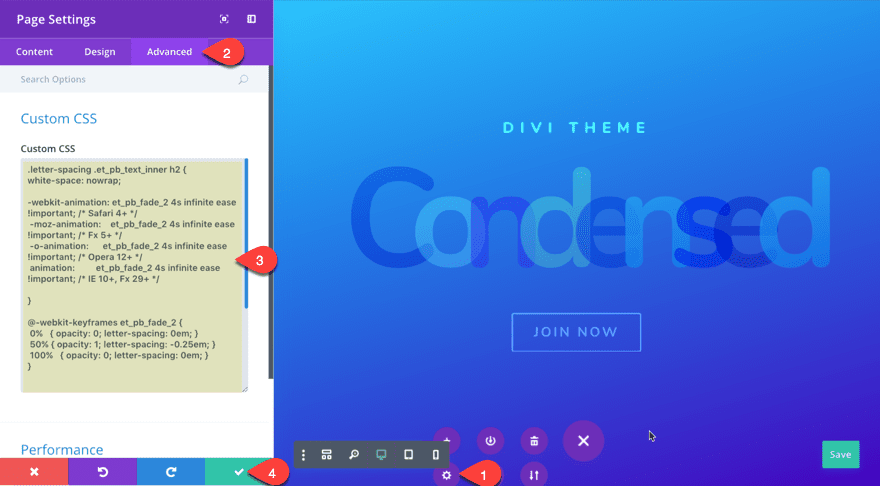
NOTE:Using Custom CSS in the page settings is a convenient way to add external CSS to a specific page without using a Child Theme. Since we don’t need this CSS on any other page, this makes the most sense.
Want to Know More?
Check out these links for helpful Photoshop references that help explain the difference between filters, effects and blend modes:
http://photoblogstop.com/photoshop/photoshop-blend-modes-explained
https://helpx.adobe.com/premiere-pro/using/blending-modes.html
Coming Up
In the next part of this Tutorial, I’m going to show you how to recreate sections 4 and 5 of the demo examples as well as discuss the filters and blend modes used throughout. Hope to see you there!
Please feel free to add your comments below.
Until Next Time…


Sorry, newbie question here. What would be the strategy to animate this effect (hover over blurred images to become like middle one) so that it looks like the blurred images are pulled from depth? I am working on biotech website and would be nice that i can use png files to simulate cellular liquid environment. Thank You
First of all, let me thank you for this amazing blog on how to use filters.
I may be have missed, but I could not find photos to download, so I am able to follow along the tutorial. can you provide me the link to download the photos.
thank you
Thank you so much for considering it Jason. 🙂
Stunning, “Elegant”, Gorgeous, I Love it, love it, love it!! Looking forward to learning from part 2 as well.
You are all so talented and clever!
*Animated COLOUR CHANGING BACKGROUND*
Something that I have seen on the divi space website a while back, that is highly likely to interest a lot of people who also love these Divi builder new visual features, is CSS colour changing background effects.
I tried the sample code (from Divi Space) posted under tutorials color-changing-background-css but sadly couldn’t’ get the sample css code from there to work.
(however it is in an older blog post, so the original code may not be supported by newer browser updates?)
I think animated Colour changing Background effects similar to the example on the divi space site, would greatly compliment these stunning visual effects that we are now able to create with the Divi builder.
Please would you conciser also showing us how to create an animated colour changing background effect. I hope others would also agree with me? Please, pretty please, with squeeze hugs! I am really keen to learn how to achieve this effectively.
xxx
🙂
Great! Thank you for the suggestion. We will definitely keep this in mind going forward.
I’d also like to know if possible to make those pages interactive, so a user on mobile can slide, left or right, and the background image comes to view. On desktop a user can click a button and same effect occurs; something like a carousel.
Cheers.
With Divi… You get way more than just a theme. Impressive guys. Thanks!
AAA +++ Super Star Divi!! Just do it. Get it, Hurry, Do it Now, Faster!!
It will be the best Christmas you ever had!
Since joining as a lifetime member, it has been like Christmas every day… unbelievable! What an awesome journey 2017 has been… Divi is borderline better than sex!! I hope my husband doesn’t see this… lol
Oh thank goodness you posted these examples. I’ve been trying to recreate the second example with no luck. This explains a lot. Thanks for sharing and keep em’ coming.
Exponential jumps in web design and graphic design authoring tools. What a great year 2017 has been for us users of Divi. Tech support continues to be stellar too.
Excellent post !
Greats