
Every week, we provide you with new and free Divi layout packs which you can use for your next project. For one of the layout packs, we also share a use case that’ll help you take your website to the next level.
This week, as part of our ongoing Divi design initiative, we’re going to show you how to create and place hover tooltips anywhere on your page with Divi. This is a great way to share side-information with your visitors without directly including it on the page right away.
Let’s get to it!
Preview
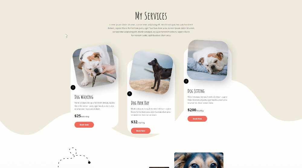
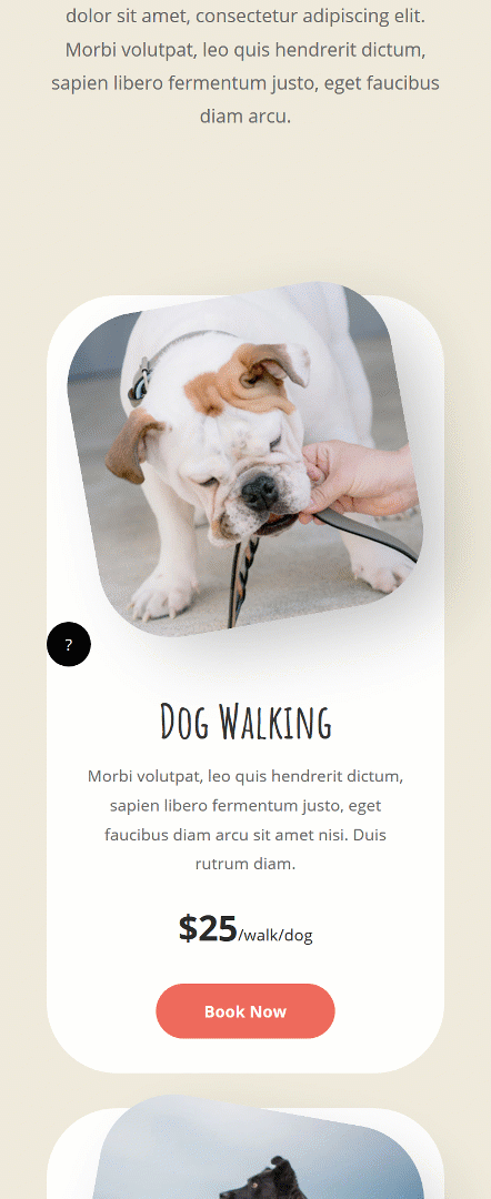
Before we dive into the tutorial, let’s take a quick look at the outcome across different screen sizes.
Desktop
Mobile
Download The Hover Tooltips Layout for FREE
To lay your hands on the free hover tooltips layout, you will first need to download it using the button below. To gain access to the download you will need to subscribe to our newsletter by using the form below. As a new subscriber, you will receive even more Divi goodness and a free Divi Layout pack every Monday! If you’re already on the list, simply enter your email address below and click download. You will not be “resubscribed” or receive extra emails.

Create New Page Using Dog Walker Homepage Layout
Add New Page
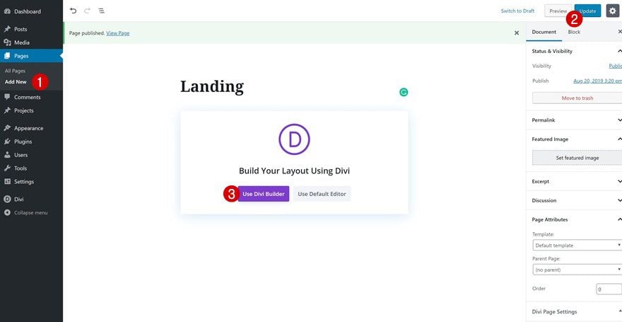
The first thing you will need to do is create a new page by going to Pages > Add New. Continue by giving your page a title, publishing the page and switching over to Visual Builder.
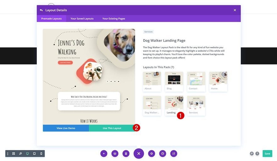
Upload Dog Walker Landing Page
Upload the landing page layout to your page next. Although we’ll be using this layout pack to go through the hover tooltips technique, you can make this approach apply on any kind of layout you’re working on.
Create Hover Tooltips Design
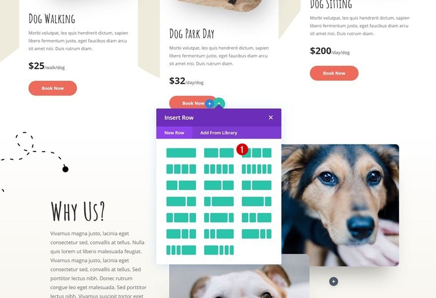
Add New Row to Bottom of Section
Column Structure (Decide How Many Tooltips You Need)
Once you’ve uploaded the landing page layout, it’s time to start creating the hover tooltips. We’ll add them to a specific spot on the page but you can place them anywhere using the transform translate options. Locate the following section on your page and add a three-column row to the bottom of it:
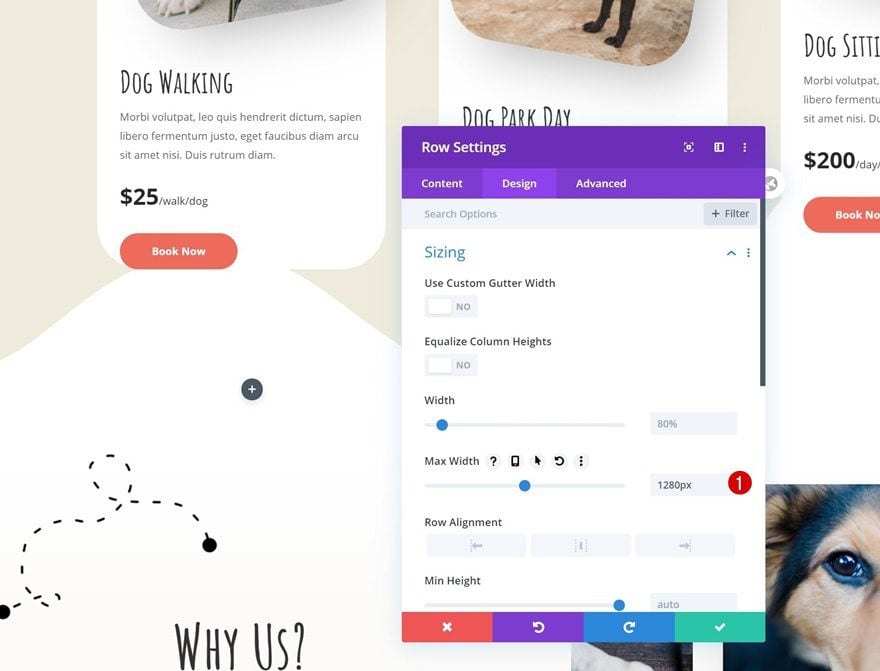
Row Max Width
To make sure the tooltip designs appear on the right spot, we’re going to use the same row max width as was used for the row that comes above it. Go to the row’s sizing settings and adjust the max width accordingly:
- Max Width: 1280px
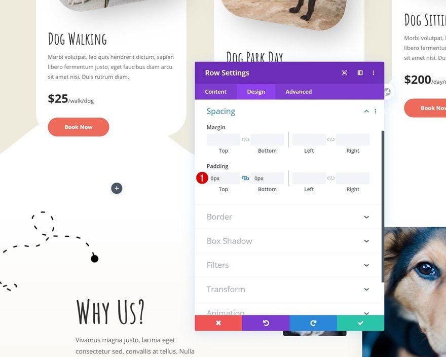
Spacing
To reduce the space that is taken up by the row container, we’re going to remove the default top and bottom padding in the spacing settings.
- Top Padding: 0px
- Bottom Padding: 0px
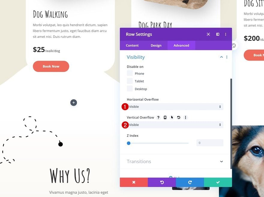
Overflows
We’re also making sure the row’s overflows are visible in the advanced tab.
- Horizontal Overflow: Visible
- Vertical Overflow: Visibile
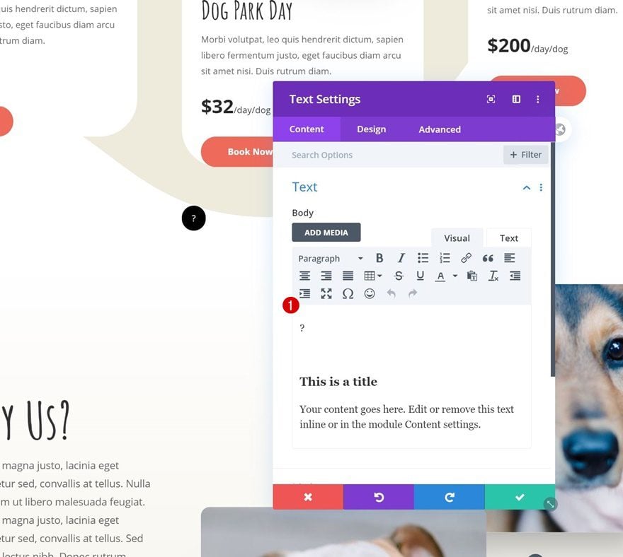
Add Tooltip Text Module to Column 1
Add Content to Content Box
Question Mark Span
Time to start creating the first tooltip design! We’ll use a Text Module. We’ll add a span (for the tooltip icon) and a div (for the tooltip content) inside the content box. This will give us more freedom to style the hover tooltip icon and tooltip content individually. Start by adding the span and assigning the class ‘question-mark’ to it.
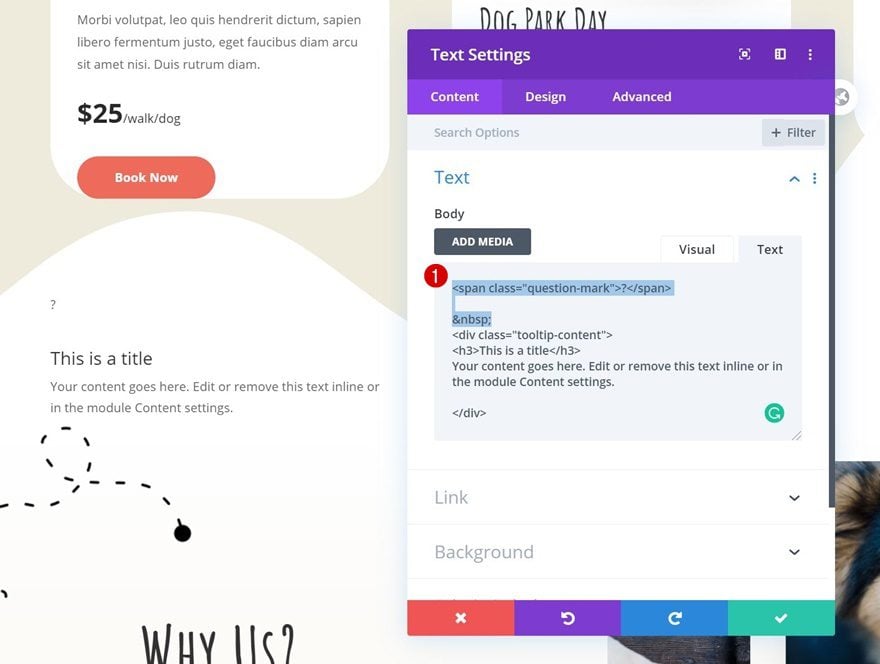
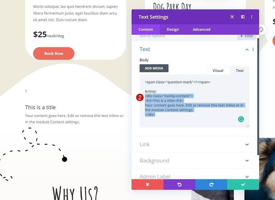
Tooltip Div
Continue by adding a div to the content box with the ‘tooltip-content’ class. Add the tooltip content of your choice in this div.
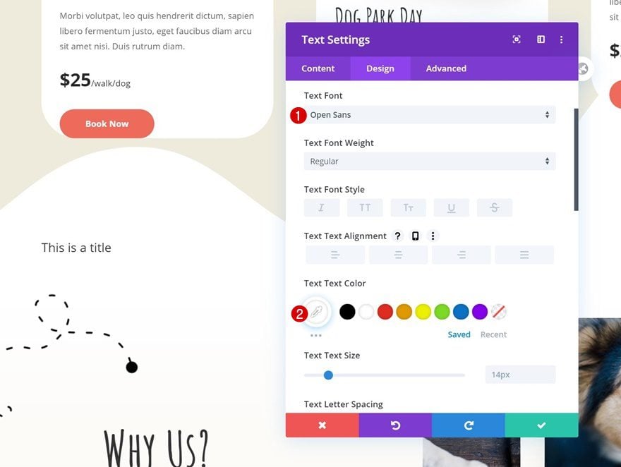
Text Settings
Move on to the design tab and change the text settings accordingly:
- Text Font: Open Sans
- Text Color: #ffffff
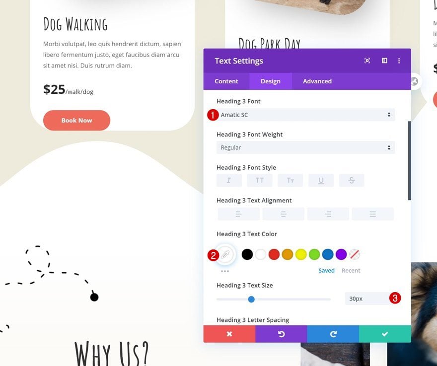
H3 Text Settings
Modify the H3 text settings as well.
- Heading 3 Font: Amatic SC
- Heading 3 Text Color: #ffffff
- Heading 3 Text Size: 30px
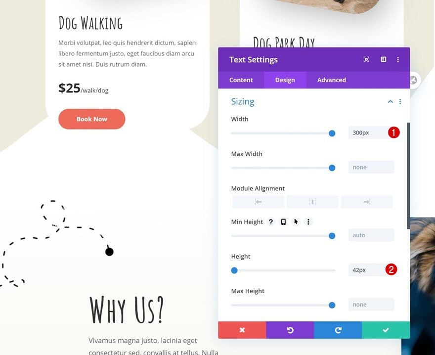
Sizing
We’re also playing around with the width and height of the module to create the hover effect.
- Width: 300px
- Height: 42px
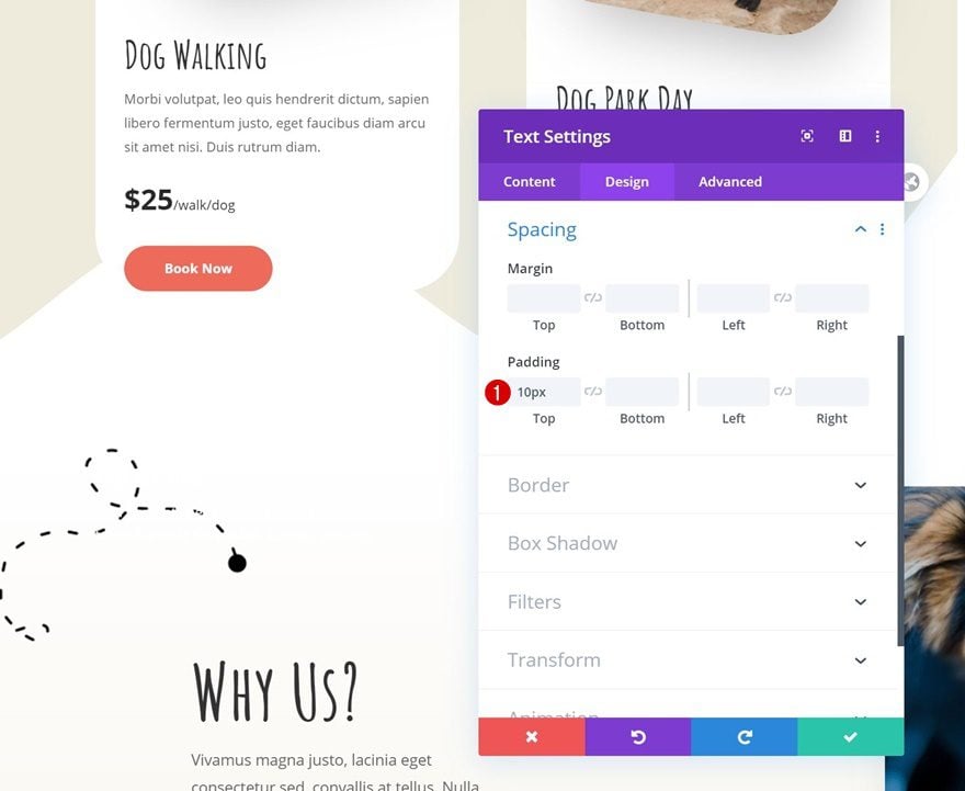
Spacing
Add some top padding too.
- Top Padding: 10px
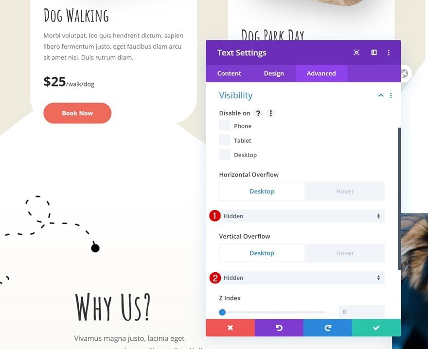
Default Visibility
Now, in the default state, we want everything that goes below the tooltip icon to be hidden. That’s why we’ll hide the overflows in the advanced tab.
- Horizontal Overflow: Hidden
- Vertical Overflow: Hidden
Hover Visibility
On hover, however, we want everything to show up. We’ll do that by making the overflows visible on hover.
- Horizontal Overflow: Visible
- Vertical Overflow: Visible

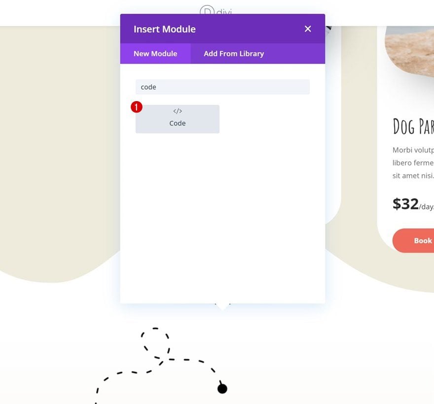
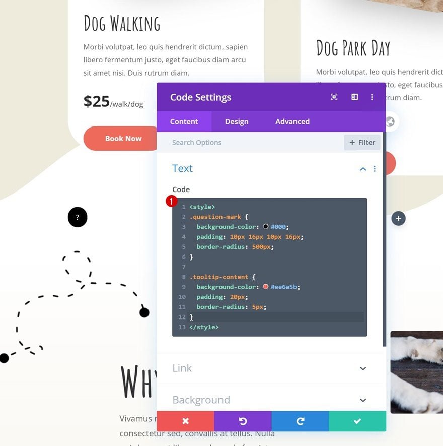
Add Code Module Below Text Module
Now that we’ve styled the module, we still need to style the span and div inside the content box using the CSS classes we’ve assigned to it. Add a Code Module right below the tooltip Text Module.
Add CSS Code to Style Divs in Text Module
Add the following lines of CSS code to style the different parts of the Text Module:
<style>
.question-mark {
background-color: #000;
padding: 10px 16px 10px 16px;
border-radius: 500px;
}

.tooltip-content {
background-color: #ee6a5b;
padding: 20px;
border-radius: 5px;
}</style>
Clone Tooltip Text Module Twice & Place in Remaining Columns
Once you’ve completed the first column, you can clone the tooltip Text Module twice and place the duplicates in the two remaining columns of the row.
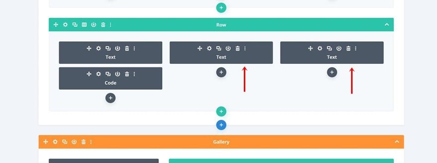
Change Tooltip Content
Make sure you change the tooltip content of each duplicate.
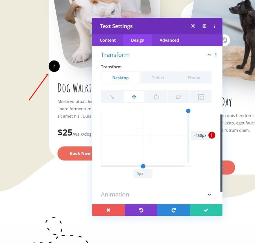
Change Tooltip Position (Using Transform Translate)
Tooltip #1
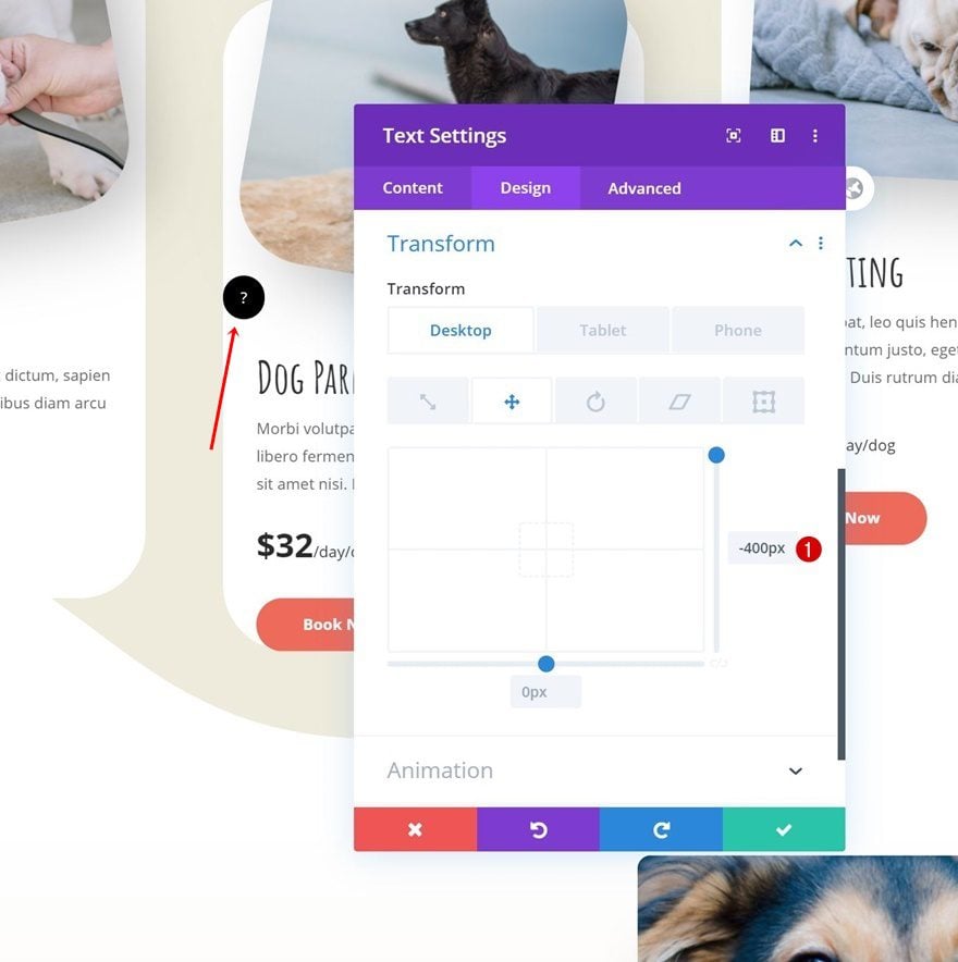
Last but not least, we’ll need to reposition the tooltips wherever we want on the page. To achieve the exact same outcome that was shown in the preview of this post, open the first tooltip Text Module and apply the following transform translate values:
- Right: -450px (Desktop), -2000px (Tablet), -1900px (Phone)
Tooltip #2
Move on to the tooltip Text Module in the second column and change the transform translate values as follows:
- Right: -400px (Desktop), -1300px (Tablet), -1250px (Phone)
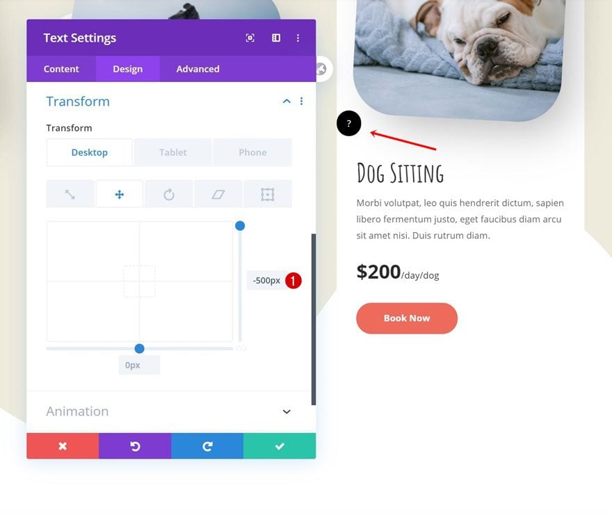
Tooltip #3
Do the same thing for the tooltip Text Module in column 3 and you’re done!
- Right: -500px (Desktop), -600px (Tablet & Phone)
Preview
Now that we’ve gone through all the steps, let’s take a final look at the outcome across different screen sizes.
Desktop
Mobile
Final Thoughts
In this post, we’ve shown you how to create and place hover tooltips anywhere on your page without the need for an additional plugin. This is a great way to add additional information without directly including it on your page. This use case tutorial is part of our ongoing Divi design initiative, where we try to put something extra into your design toolbox each and every week. If you have any questions, make sure you leave a question in the comment section below!
If you’re eager to learn more about Divi and get more Divi freebies, make sure you subscribe to our email newsletter and YouTube channel so you’ll always be one of the first people to know and get benefits from this free content.


Hi! How installa The Hover Tooltips Layout (json)?
Just a thought, you probably wanted to say Code module here “Add CSS Code to Style Divs in Text Module”.
Don’t have to approve comment, this is for your reference only.
And thanks for great tutorial!
I do like this but perhaps like @rick I wonder if there is a problem because there are so many different size devices. The break point, for example, will be different for a mini iPad than that for a standard iPad.
I would like to use this for technical terms on a website – as Wikipedia does. The only problem I can see is getting the icon to stay in the right place in a text module as it would shift on different screen sizes. Any ideas?
Great! Enjoyed it.
I would like to use this for technical terms on a website – as Wikipedia does. The only problem I can see is getting the icon to stay in the right place in a text module as it would shift on different screen sizes. Any ideas?
This is needed as a standard Divi module
Thanks for the suggestion, David.
I like this a lot. Great job.
Thanks, Britt, glad you’ve enjoyed the tutorial! 🙂