
One of the main purposes of hero sections is to convince people to keep scrolling down the page and discover more content and information you’ve shared. With Divi and its built-in animation options, you can add interactive animations to your page that will help you persuasively lead visitors down the page. In this tutorial, we’re going to motivate visitors to scroll down to the services section using arrow icons that lead them to the services section.
Let’s get to it!
- 1 Preview
-
2
Let’s Start Creating!
- 2.1 Add Section #1
- 2.2 Add Row
- 2.3 Add Text Module
- 2.4 Add Section #2
- 2.5 Add Row
- 2.6 Add Blurb Module
- 2.7 Add Text Module #1 to Column 1
- 2.8 Add Text Module #2 to Column 1
- 2.9 Add Divider Module to Column 1
- 2.10 Add Text Module #3 to Column 1
- 2.11 Clone Modules 3 Times & Place Duplicates in Remaining Columns
- 2.12 Customize Blurb Icon #2
- 2.13 Customize Blurb Icon #3
- 2.14 Customize Blurb Icon #4
- 3 Final Thoughts
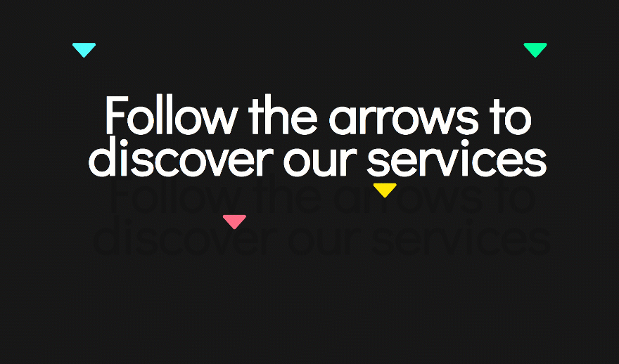
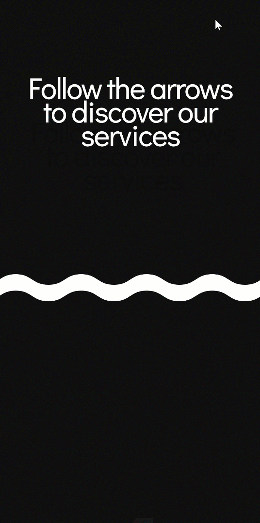
Preview
Before we dive into the tutorial, let’s take a quick look at the outcome on different screen sizes.
Desktop
Mobile
Let’s Start Creating!
Subscribe To Our Youtube Channel
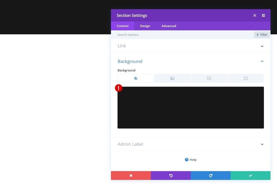
Add Section #1
Background Color
Create a new page and add a regular section to it. Open the section settings and change the background color.
- Background Color: #0f0f0f
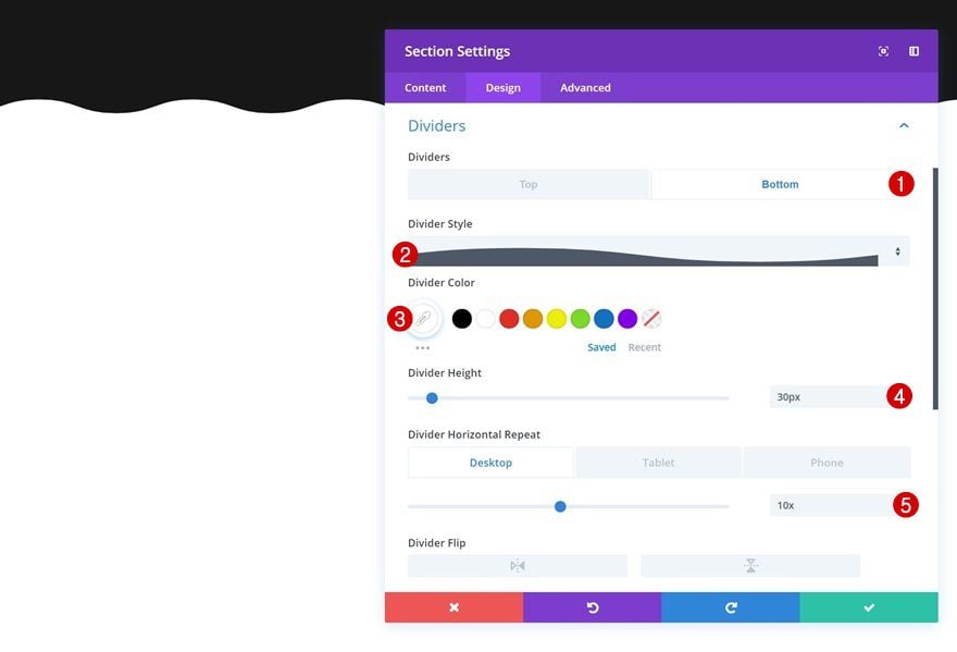
Bottom Divider
Continue by adding a bottom divider to the section.
- Divider Style: Find in List
- Divider Color: #ffffff
- Divider Height: 30px
- Divider Horizontal Repeat: 10x (Desktop), 4x (Tablet & Phone)
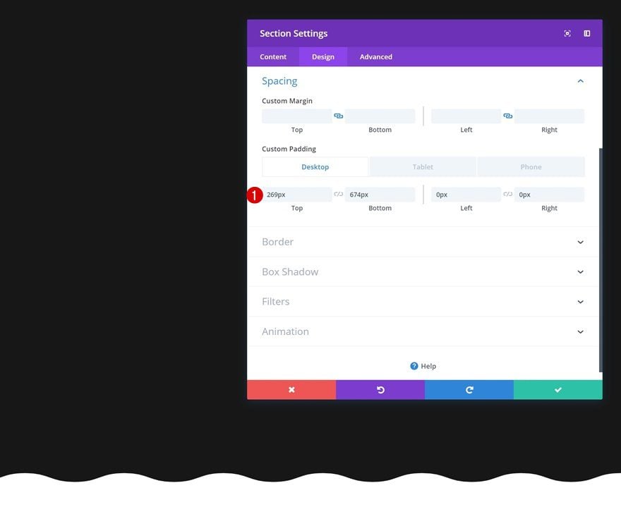
Spacing
Add some custom padding values as well.
- Top Padding: 269px (Desktop), 100px (Tablet & Phone)
- Bottom Padding: 674px (Desktop), 200px (Tablet & Phone)
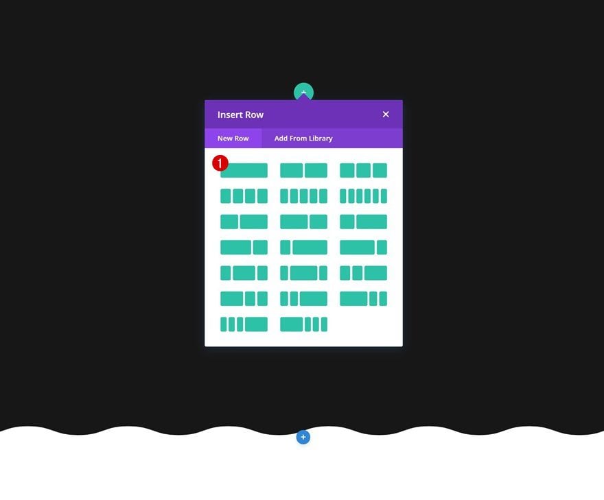
Add Row
Column Structure
Then, add a new row using the following column structure:
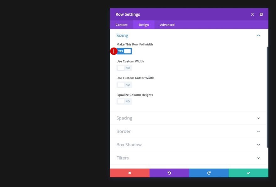
Sizing
Without adding any modules yet, open the row settings, go to the sizing settings and enable the ‘Make This Row Fullwidth’ option.
- Make This Row Fullwidth: Yes
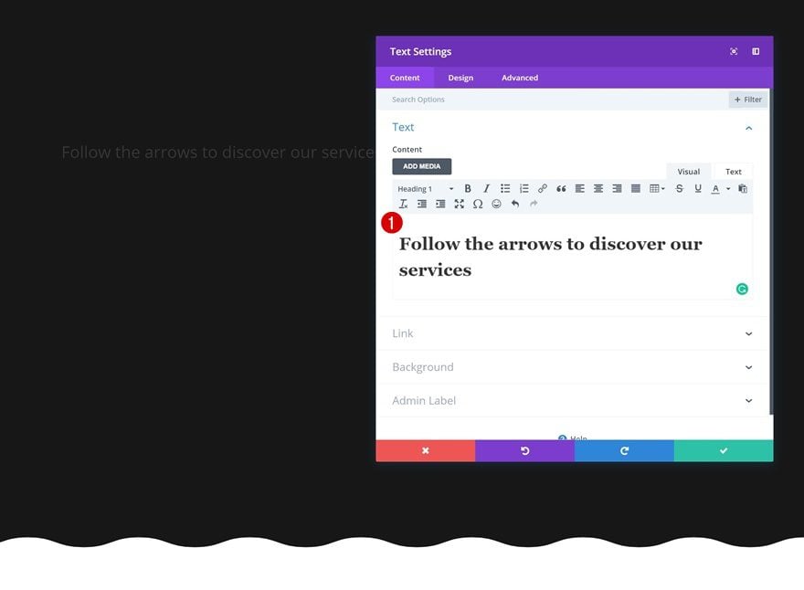
Add Text Module
Add Content
The only module we need in this row is a Text Module. Go ahead and add some H1 content of choice.
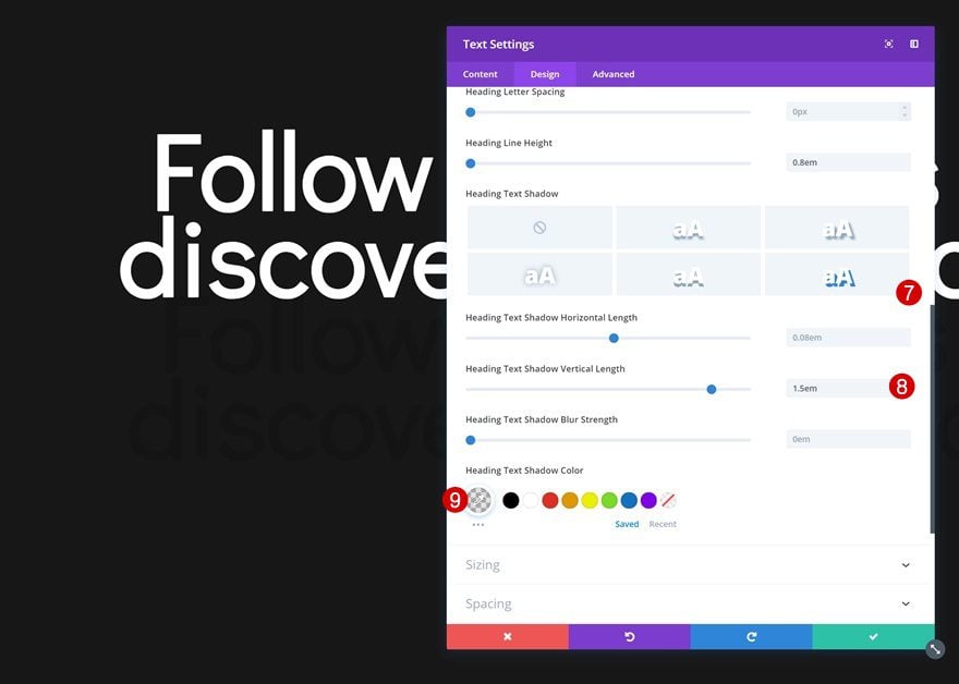
Heading Text Settings
Change the heading text settings next.
- Heading Font: Didact Gothic
- Heading Font Weight: Bold
- Heading Text Alignment: Center
- Heading Text Color: #ffffff
- Heading Text Size: 170px (Desktop), 50px (Tablet & Phone)
- Heading Line Height: 0.8em
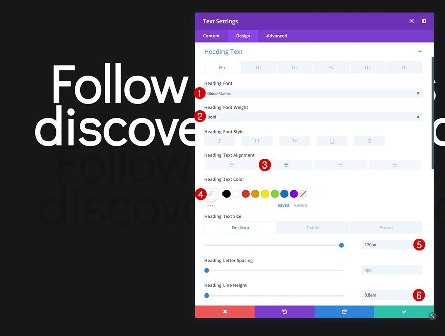
- Heading Text Shadow Vertical Length: 1.5em
- Heading Text Shadow Color: rgba(0,0,0,0.11)
Add Section #2
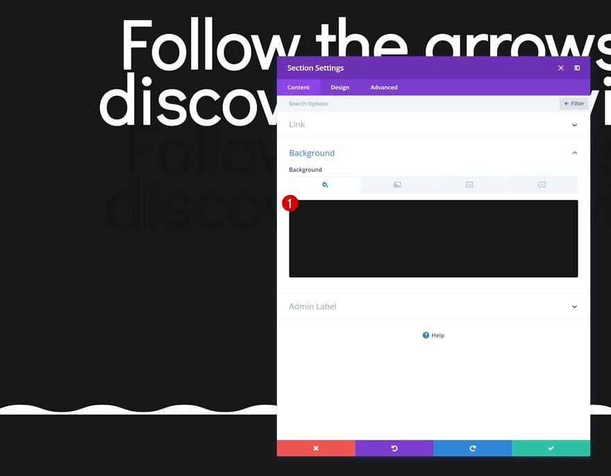
Background Color
Continue by adding the second section to the page. Change the background color in the section settings.
- Background Color: #0f0f0f
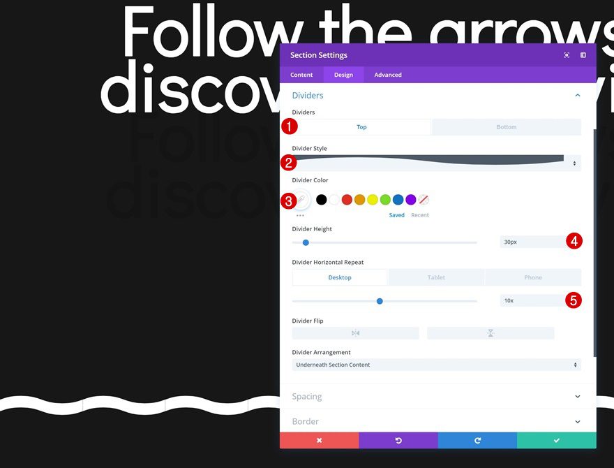
Top Divider
Add a top divider to the section as well.
- Divider Style: Find in List
- Divider Color: #ffffff
- Divider Height: 30px
- Divider Horizontal Repeat: 10x (Desktop), 4x (Tablet & Phone)
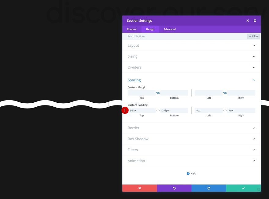
Spacing
And increase the spacing values in the spacing settings.
- Top Padding: 245px
- Bottom Padding: 245px
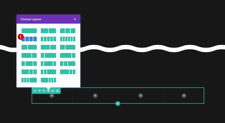
Add Row
Column Structure
Continue by adding a new row with the following column structure to the section:
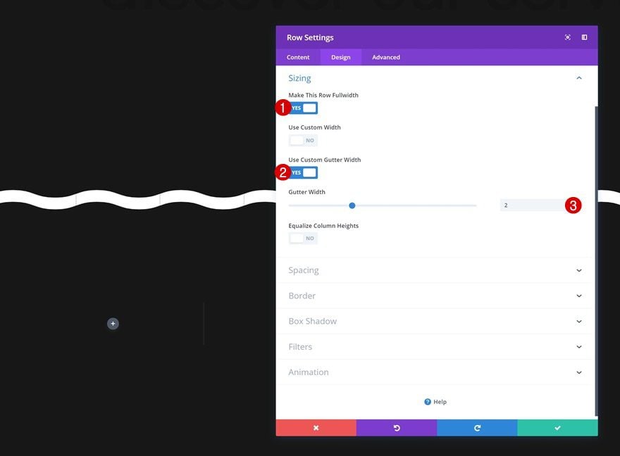
Sizing
Open the row settings, go to the sizing settings and make some changes.
- Make This Row Fullwidth: Yes
- Use Custom Gutter Width: Yes
- Gutter Width: 2
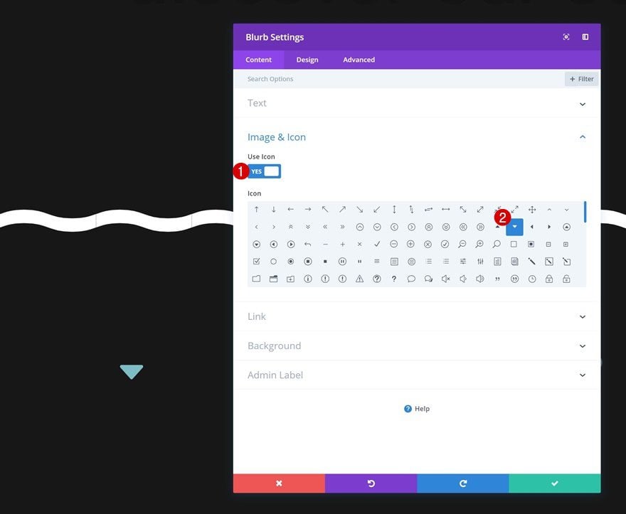
Add Blurb Module
Select Icon
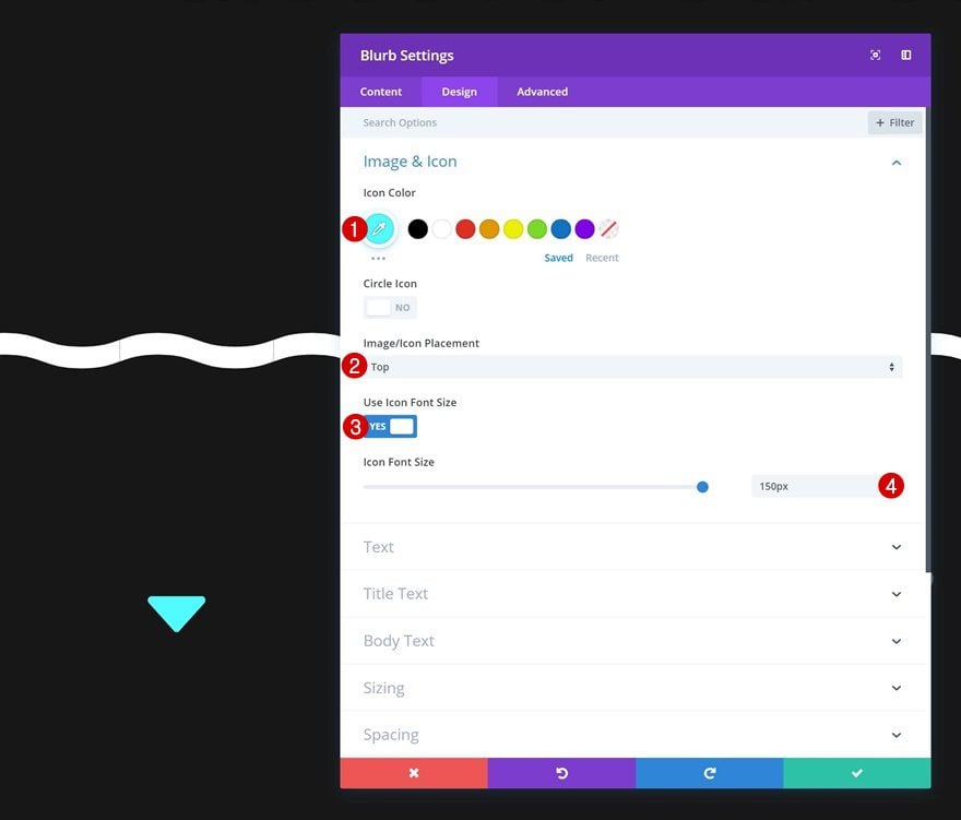
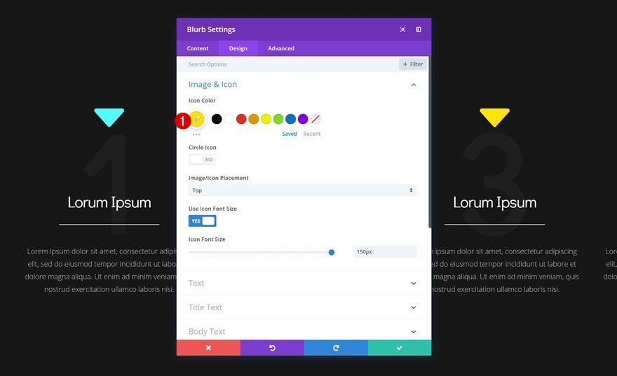
The first module we’ll need in the first column is a Blurb Module. The only part of the element of the Blurb Module that we need is the icon. Select the arrow icon that points downwards.
Icon Settings
Then, go to the design tab and change the icon settings.
- Icon Color: #4ffcff
- Icon Placement: Top
- Use Icon Font Size: Yes
- Icon Font Size: 150px
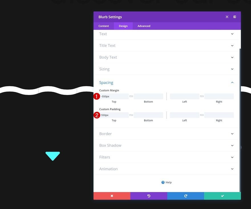
Spacing
To increase the reach of the icon, we’ll need to add some negative top margin. This will allow the Blurb Module to overlap the previous section and will allow the animation between two sections to happen smoothly. To make up for the custom margin, we’ll add custom top padding as well. This will make sure the icon remains in the exact same position as before. The only thing that changes is the size and reach of the entire module.
- Top Margin: -550px
- Top Padding: 550px
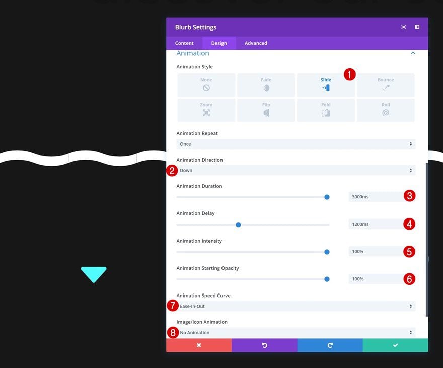
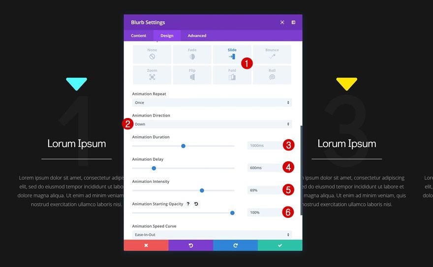
Animation
Last but not least, add an animation to the Blurb Module using the following settings:
- Animation Style: Slide
- Animation Direction: Down
- Animation Duration: 3000ms
- Animation Delay: 1200ms
- Animation Intensity: 100%
- Animation Starting Opacity: 100%
- Animation Speed Curve: Ease-In-Out
- Image/Icon Animation: No Animation
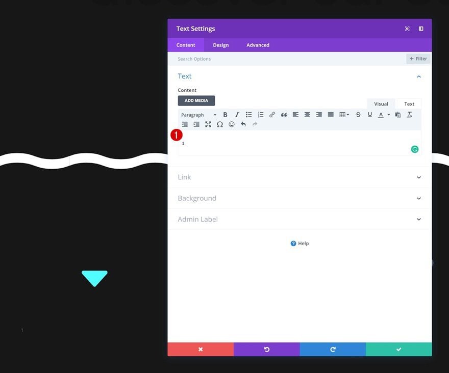
Add Text Module #1 to Column 1
Add Content
The next module we need in the first column is a Text Module. Add some content of choice.
Text Settings
Continue by changing the text settings.
- Text Font: Didact Gothic
- Text Font Weight: Bold
- Text Color: rgba(255,255,255,0.03)
- Text Size: 350px
- Text Orientation: Center
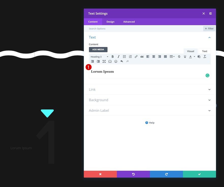
Add Text Module #2 to Column 1
Add Content
Add a second Text Module to the first column with some H3 content of choice.
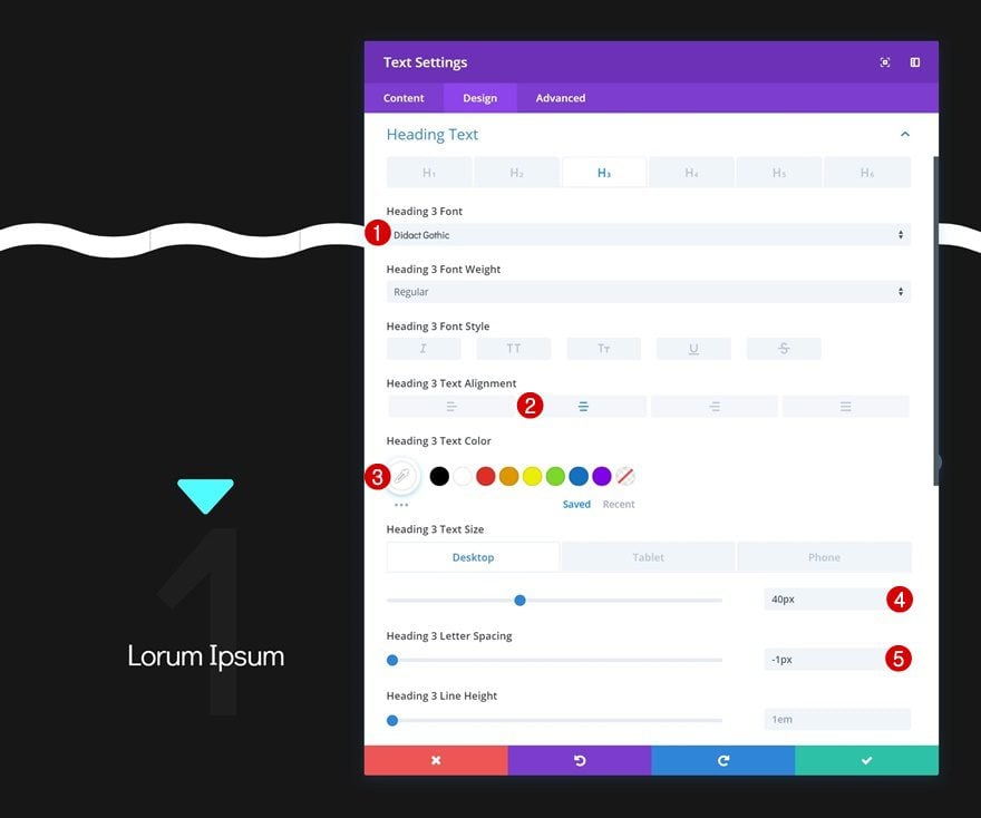
Heading Text Settings
And change the heading text settings in the design tab.
- Heading 3 Font: Didact Gothic
- Heading 3 Text Alignment: Center
- Heading 3 Text Color: #ffffff
- Heading 3 Text Size: 40px (Desktop), 30px (Tablet & Phone)
- Heading 3 Letter Spacing: -1px
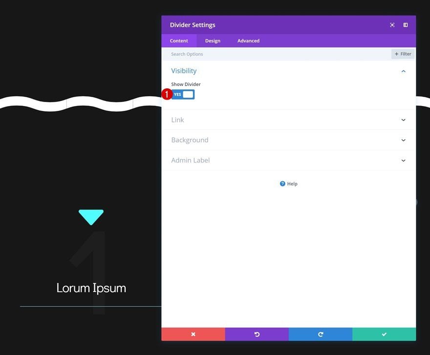
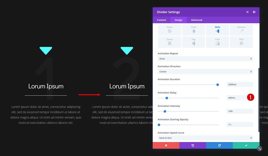
Add Divider Module to Column 1
Visibility
The next module needed in the first column is a Divider Module. Make sure the ‘Show Divider’ option is enabled.
- Show Divider: Yes
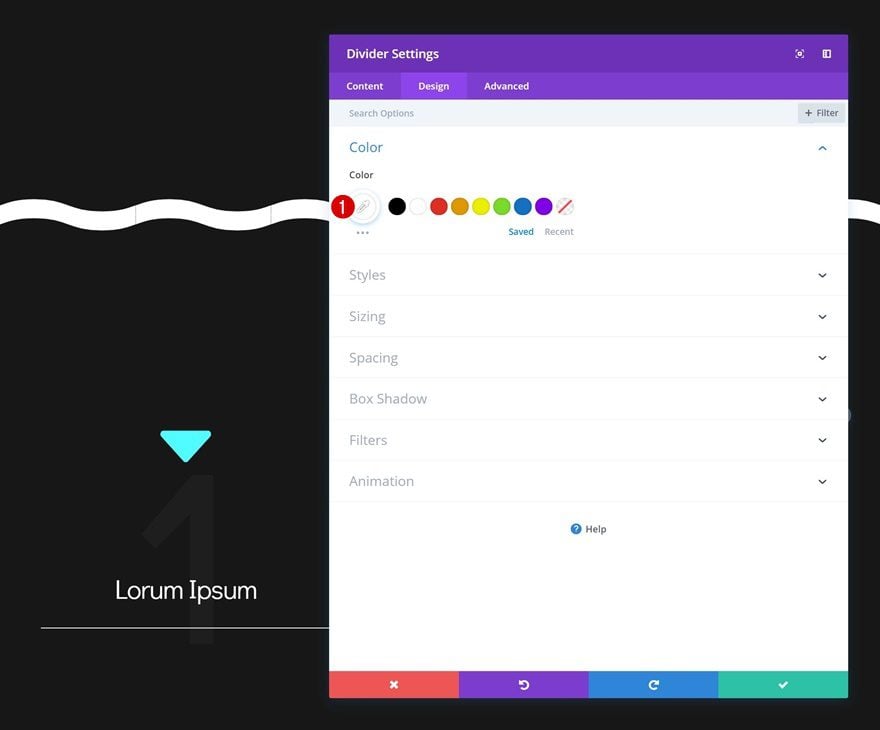
Color
Continue by changing the divider color in the design tab.
- Color: #ffffff
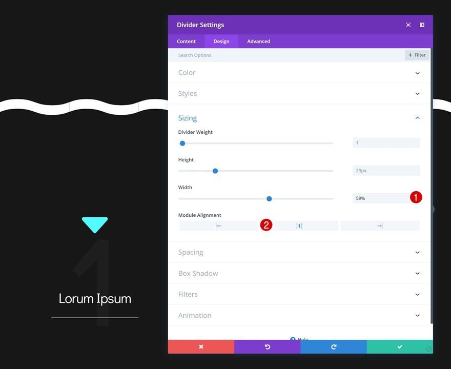
Sizing
Make some changes to the sizing settings too.
- Width: 59%
- Module Alignment: Center
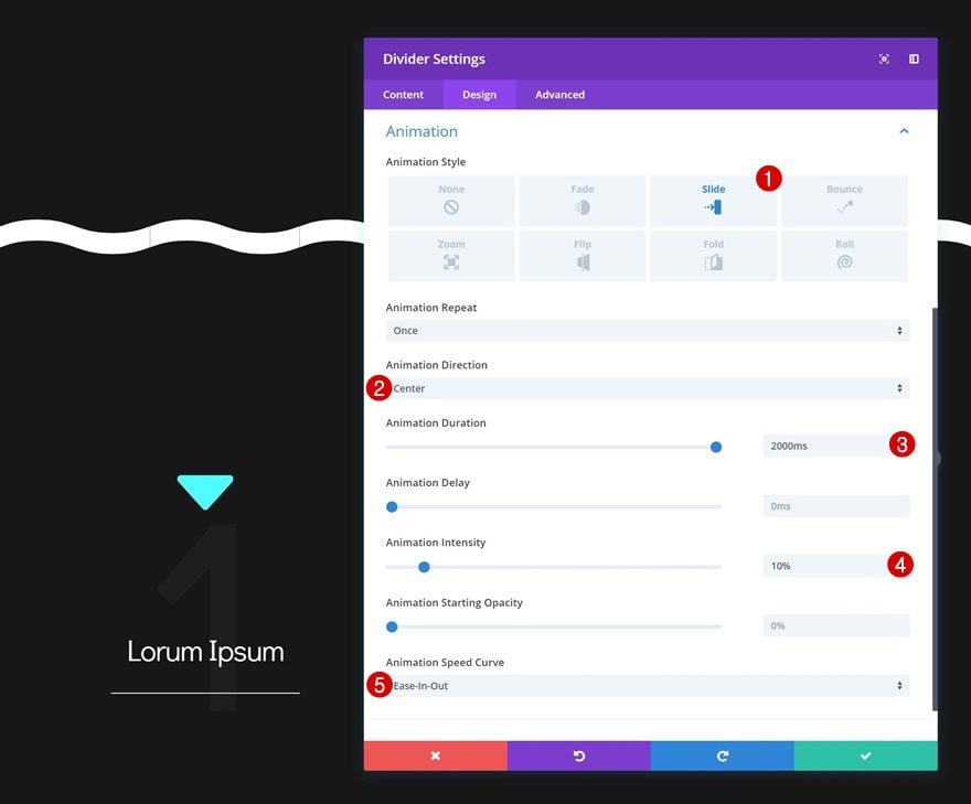
Animation
And add an animation to the module as well.
- Animation Style: Slide
- Animation Direction: Center
- Animation Duration: 2000ms
- Animation Intensity: 10%
- Animation Speed Curve: Ease-In-Out
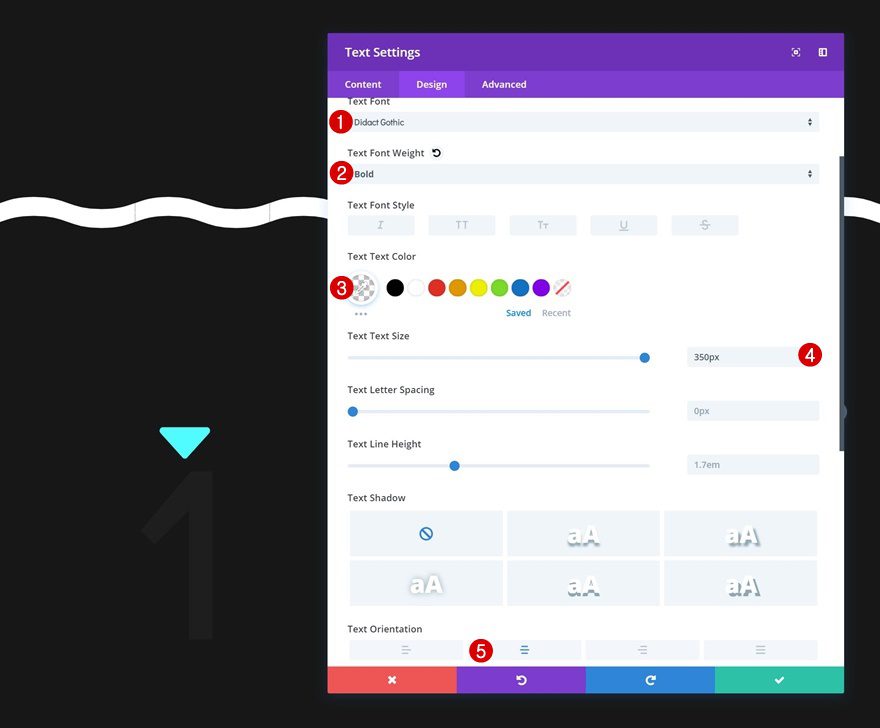
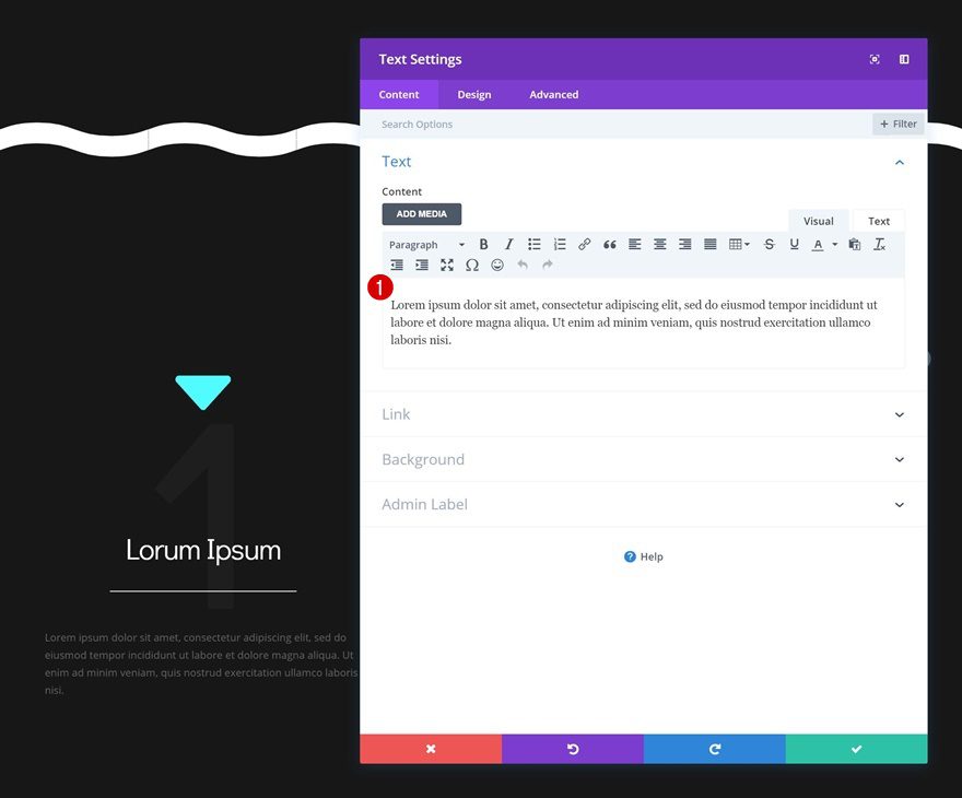
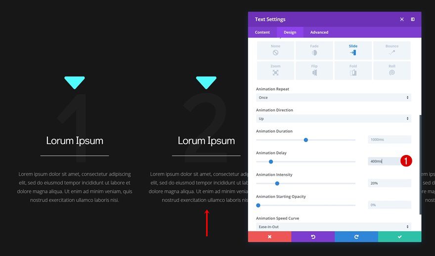
Add Text Module #3 to Column 1
Add Content
The next and last module we need in column one is another Text Module. Add some content of choice.
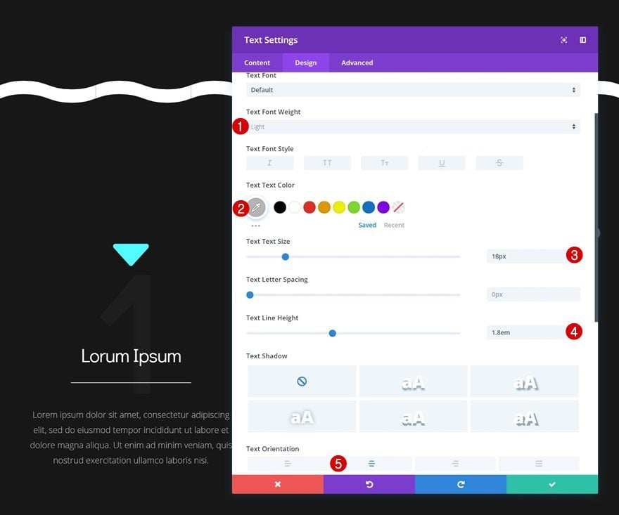
Text Settings
Continue by changing the text settings.
- Text font Weight: Light
- Text Color: #b7b7b7
- Text Size: 18px
- Text Line Height: 1.8em
- Text Orientation: Center
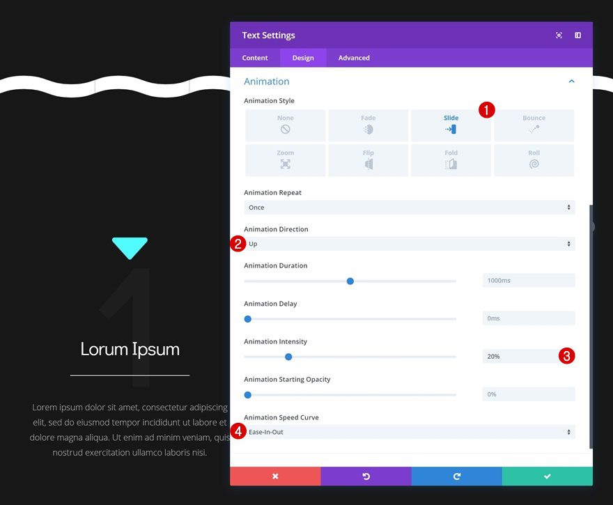
Animation
And add an animation to the module.
- Animation Style: Slide
- Animation Direction: Up
- Animation Intensity: 20%
- Animation Speed Curve: Ease-In-Out
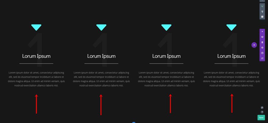
Clone Modules 3 Times & Place Duplicates in Remaining Columns
Now that we’re done modifying all modules in column 1, we can clone all modules in column one 3 times and place the duplicates in the remaining columns.
Change Module Content
Change the content of the duplicates.
Add Animation Delay to Divider Modules of Duplicates
Add some animation delay to each one of the Divider Module duplicates as well.
- Divider Module in Column 2: 400ms
- Divider Module in Column 3: 800ms
- Divider Module in Column 4: 1200ms
Add Animation Delay to Text Module #3 Duplicates
Do the same thing for the last Text Module in each column.
- Last Text Module in Column 2: 400ms
- Last Text Module in Column 3: 800ms
- Last Text Module in Column 4: 1200ms
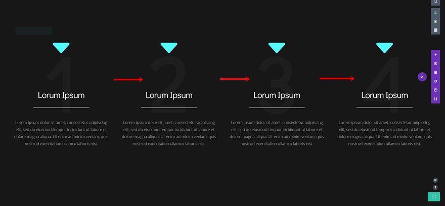
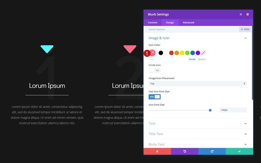
Customize Blurb Icon #2
Icon Color
We’re also modifying the blurb icon’s color and animation for each one of the duplicates. Open the Blurb Module in column 2 and change the icon color.
- Icon Color: #ff6b86
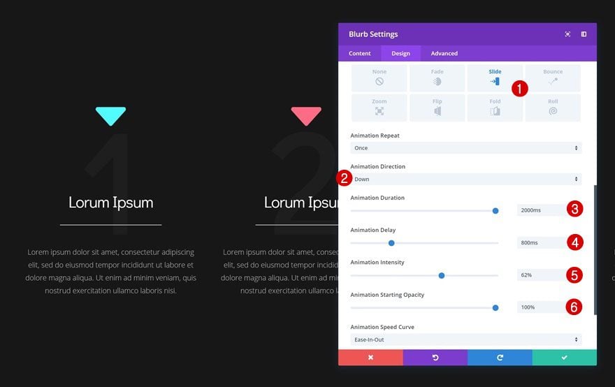
Animation
Change the animation settings as well.
- Animation Type: Slide
- Animation Direction: Down
- Animation Duration: 2000ms
- Animation Delay: 800ms
- Animation Intensity: 62%
- Animation Starting Opacity: 100%
- Image/Icon Animation: No Animation
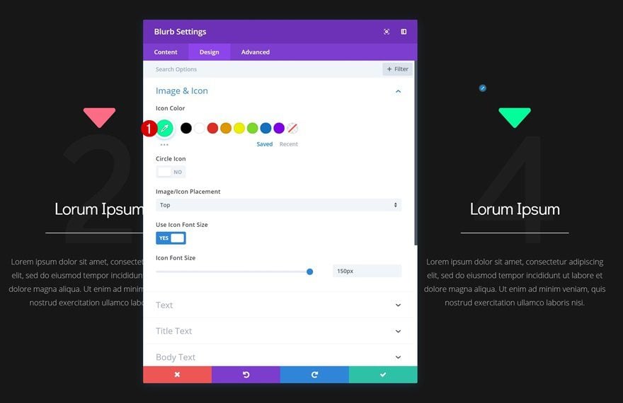
Customize Blurb Icon #3
Icon Color
Continue by opening the Blurb Module in column 3 and change the icon color.
- Icon Color: #ffe500
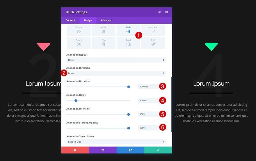
Animation
Modify the animation settings as well.
- Animation Type: Slide
- Animation Direction: Down
- Animation Duration: 1000ms
- Animation Delay: 600ms
- Animation Intensity: 69%
- Animation Starting Opacity: 100%
- Image/Icon Animation: No Animation
Customize Blurb Icon #4
Icon Color
Open the last Blurb Module, in column 4, and change the icon color.
- Icon Color: #00ff9d
Animation
And finish the design by changing the animation settings in the design tab.
- Animation Type: Slide
- Animation Direction: Down
- Animation Duration: 3000ms
- Animation Delay: 400ms
- Animation Intensity: 100%
- Animation Starting Opacity: 100%
- Image/Icon Animation: No Animation
Final Thoughts
In this post, we’ve shown you how to persuasively lead visitors down the page using Divi’s animation settings. The basic idea is that you use Blurb Modules for their icons and increase their animation reach to the hero section. You can use this approach on any kind of website you build and get as creative as you want. If you have any questions or suggestions, make sure you leave a comment in the comment section below!


Great artical.Thank you very much for sharing this awesome post with us.
Amazing way to capture the attention of any visitor going down to you web page. Thanks for the tutorial!
Amazing way to capture the attention of any visitor going down to a page. Thanks for the tutorial.
nice post………..thank you for sharing
Wow, this is fabulous … I can’t wait to try and put my own spin on it … Just goes to show how powerful Divi has become!
do you have the live demo page link ?
Yes, LINK please!
Thanks Donjete.
I will definitely try this out on my website.
You’re welcome, Tendai! Nice to hear you’re planning on using it on your own website. 🙂
Donjete and Jason have really been sharing some cool ideas. Thanks ET team for all of the helpful resources!
Thanks, Ryan! It’s nice to see you find the resources helpful. 🙂
Clever – I like it. thanks…
Happy you like it, Chris! 🙂