
In today’s Divi post, we’re going to share a quick tip that will help you enhance your mobile designs. We all know that your design on mobile is just as important as it is on desktop, but because of some standard settings within Divi, not all changes you make in the Theme Customizer look the same on Desktop as they do on mobile.
What we’re going to do in this post, specifically, is show you how to create a smaller mobile menu bar that looks the same as the menu bar on desktop when using the max logo height and min menu height. By default, the outlook on mobile and desktop differ. Just because you’ve set a certain menu height and logo max height, it doesn’t mean the same will apply to mobile.
The Difference for Mobile & Desktop
There are plenty of websites who deliberately choose to have a primary menu bar with not that much height. It just looks more elegant and takes up less space, something which is definitely interesting to consider if you’re using fixed navigation as well.
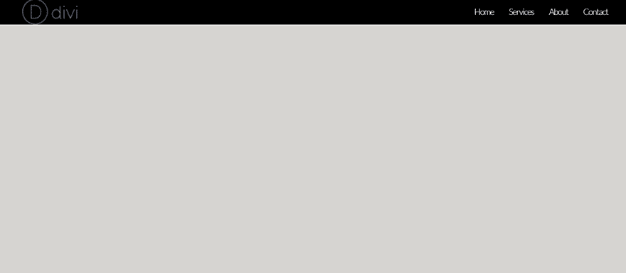
When you choose the highest value for the Logo Max Height (which is 100) within your Theme Customizer, and the lowest value of the Menu Height (which is 30), you’ll have the following result on desktop:
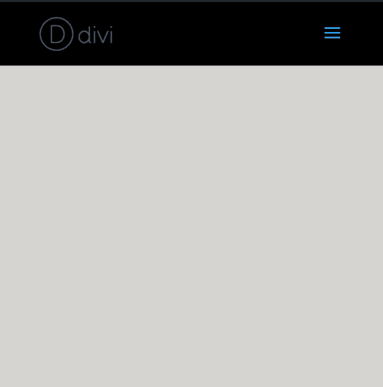
However, the proportions of the logo and menu height are different for mobile. If you’ve selected the highest value for the Logo Max Height and the lowest value for the Menu Height, you won’t have the same result as you have on desktop. The result you’ll get will, instead, looks like this:
Result
Now, what we’re going to do is show you how to make the same layout apply to your mobile menu bar. That means that the logo will have its maximum height on the menu. Besides that, the menu bar itself will be a lot smaller. Eventually, you’ll have more place left for on the screen for the content on your page to show up.
After having followed this tutorial step by step, you’ll achieve the following result:
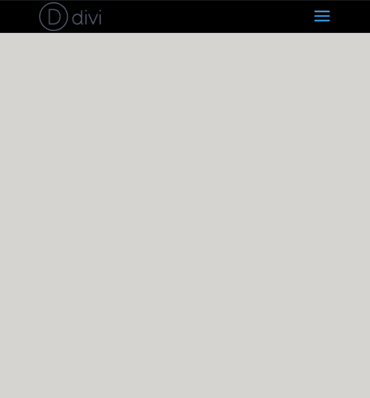
Which obviously looks more like the desktop version:
Subscribe To Our Youtube Channel
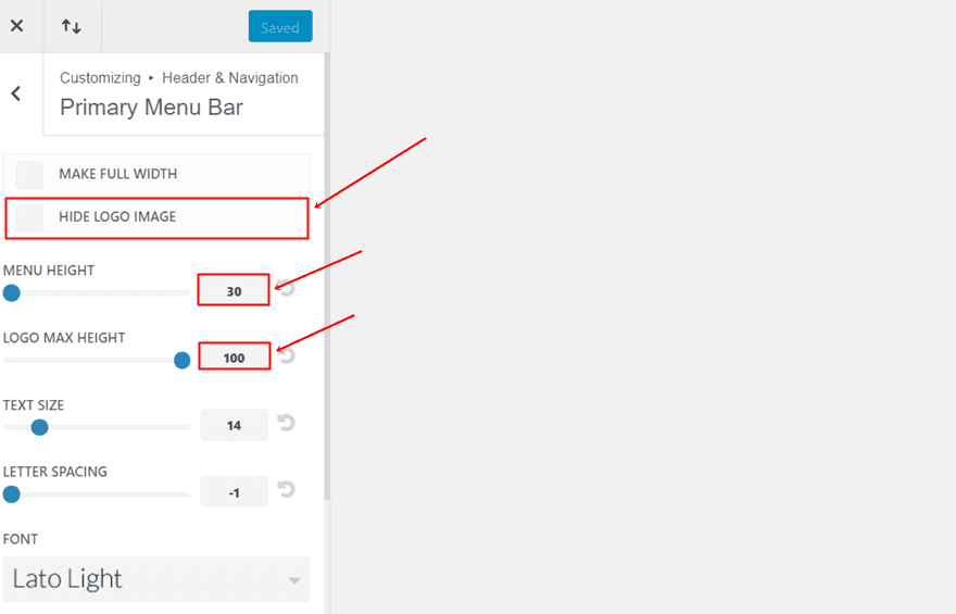
The first thing we’re going to do is make the needed changes to the Primary Menu Bar within the Theme Customizer. If you’re on your WordPress Dashboard, go to Appearance > Customize > Header & Navigation > Primary Menu Bar and make sure the following settings apply:
- Hide Logo Image: Disable
- Menu Height: 30
- Logo Max Height: 100
The next thing we’ll need to do is add some additional CSS code to make the mobile menu bar look the same way as the menu bar does on desktop. We can choose to add the CSS code to one page in particular (if we just want to show the menu in that way on certain pages only) or to the entire website. Typically, you’ll apply the CSS code to the entire website to keep the needed consistency on your website but that’s up to you.
Add CSS Code to One Page in Particular
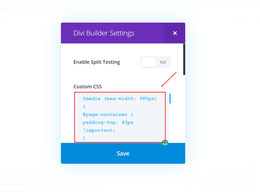
To add the CSS code to one page in particular, you’ll have to open the page within your WordPress dashboard. While using the Divi builder, you’ll have to click on the following icon within it:
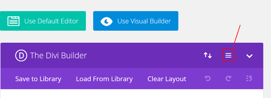
Next, you can take the following lines of CSS code and place them in the Custom CSS field:
@media (max-width: 980px) {
#page-container {
padding-top: 43px !important;
}
}
@media (max-width: 980px) {
#logo {
max-width: 100% !important;
max-height: 90% !important;
}
}
@media (max-width: 980px) {
#mainheader {
top: 4% !important;
}
}
@media (max-width: 980px) {
#et-top-navigation{
padding-top: 5px !important;
}}
.et_header_style_split .mobile_menu_bar,
.et_header_style_left .mobile_menu_bar {
padding-bottom: 5px;
}
Add CSS Code to Entire Website
The other possibility, and probably the one that’ll be used the most, is adding the code to your entire website. There are two ways to do that.
Through The Theme Customizer
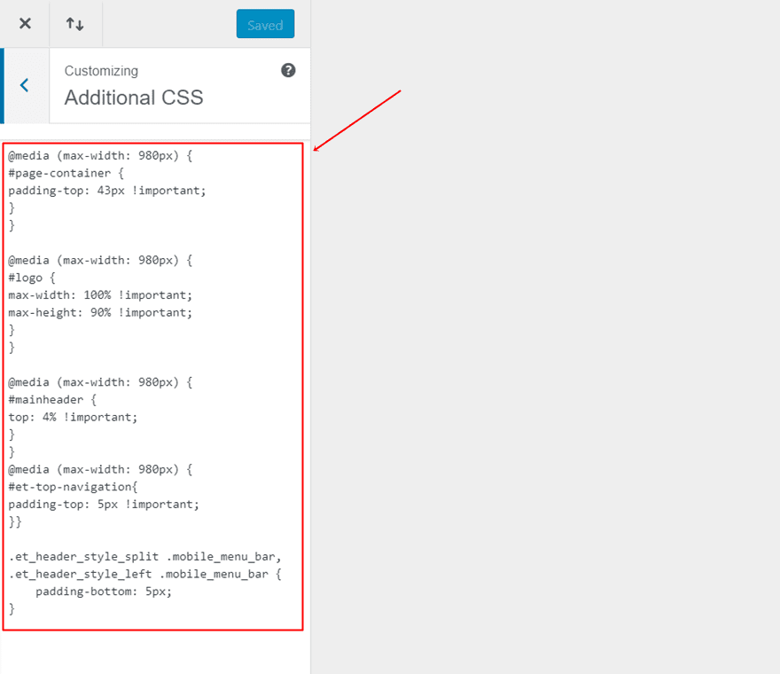
The first method is by adding the CSS code to your Theme Customizer. To do that, go to your WordPress Dashboard > Appearance > Customize > Additional CSS > Place the following lines of CSS code in the Custom CSS field:
@media (max-width: 980px) {
#page-container {
padding-top: 43px !important;
}
}
@media (max-width: 980px) {
#logo {
max-width: 100% !important;
max-height: 90% !important;
}
}
@media (max-width: 980px) {
#mainheader {
top: 4% !important;
}
}
@media (max-width: 980px) {
#et-top-navigation{
padding-top: 5px !important;
}}
.et_header_style_split .mobile_menu_bar,
.et_header_style_left .mobile_menu_bar {
padding-bottom: 5px;
}
This option allows you to see the changes happen in real time. This is probably the most interesting choice if you’re going to change some things in the code and you want to see how it looks like before saving the changes.
Through The Theme Options
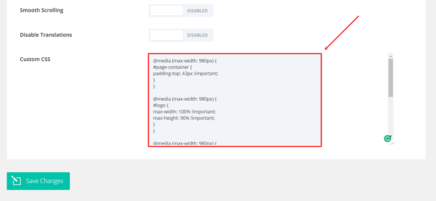
The second method is by adding the CSS code to the Theme Options. To do that, go to your WordPress Dashboard > Divi > Theme Options > Scroll down the General tab and place the following CSS code in the Custom CSS field:
@media (max-width: 980px) {
#page-container {
padding-top: 43px !important;
}
}
@media (max-width: 980px) {
#logo {
max-width: 100% !important;
max-height: 90% !important;
}
}
@media (max-width: 980px) {
#mainheader {
top: 4% !important;
}
}
@media (max-width: 980px) {
#et-top-navigation{
padding-top: 5px !important;
}}
.et_header_style_split .mobile_menu_bar,
.et_header_style_left .mobile_menu_bar {
padding-bottom: 5px;
}
Modify The Code to Your Own Preferences
Of course, this is not the only way you can make the mobile menu bar look like. If you’re applying different settings to your Primary Menu Bar in the Theme Customizer, it’s very likely that you’ll need to make the changes within the CSS code as well. However, the CSS Classes and CSS IDs that you’ll be using are the same.
One of the things you’ll definitely have to take into account, though, is the top padding of the page container. The value we assigned in our CSS code matches the other changes we’ve made. However, if you change the values in the other classes, you’ll have to make sure the top padding remains correct. The easiest way to do that is to start with a higher value and modify the value until you watch the page container fall into place.
Result
If you’ve followed this tutorial step by step, you should have been able to achieve the following result for your mobile menu bar:
Which looks almost exactly the same as the result you obtain on desktops:
Before making any CSS changes, the result on Mobile looks like this:
Final Thoughts
In this post, we’ve shown you how to make your mobile menu bar smaller and fit with the menu bar on desktops. You can simply add the needed CSS code to a page in particular or the entire website to make this method work. If you have any questions or suggestions; make sure you leave a comment in the comment section below!
Be sure to subscribe to our email newsletter and YouTube channel so that you never miss a big announcement, useful tip, or Divi freebie!


How does one change the font size and section size in the Mobile main header? I have no logo but am displaying Site Title (no tagline at the moment but would like to).
My title overruns the borders of the section and text gets lost in the slider below.
this currently affects 2 websites I am working on.
Well. This have been giving me headache for a long time.
Didn’t do much research for a solution tho. Great that you suddenly stumble upon a solution on divi blog 🙂
I’m afraid it does not work. I did exactly as you explained. The logo dimensions are 300 × 38. With an android phone it does look fine in landscape but in portrait the logo shows up right below the Primary Menu Bar.
Simple solution to a long known irritation. Very clearly explained. Thank you!
Thanks. While I don’t find the default version really awful this does, as you mention, provide a better match to the desktop version.