
Adding tooltips to label a background image is a creative way to engage visitors with valuable information about your product or service. The basic idea is to position icons (or text) specific locations on the image (like a google map with pinpoints). And if you take advantage of Divi’s hover effects, you can reveal additional text when hovering over an icon to create engaging tooltips.
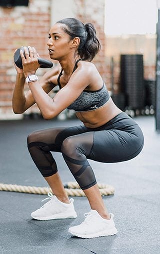
In this tutorial, I’m going to show you how to label a background image with blurbs that will serve as informative tooltips about your product. To do this I’ll be using the Fitness Gym Landing page to label a background image with information about quality fitness.
Let’s get started.
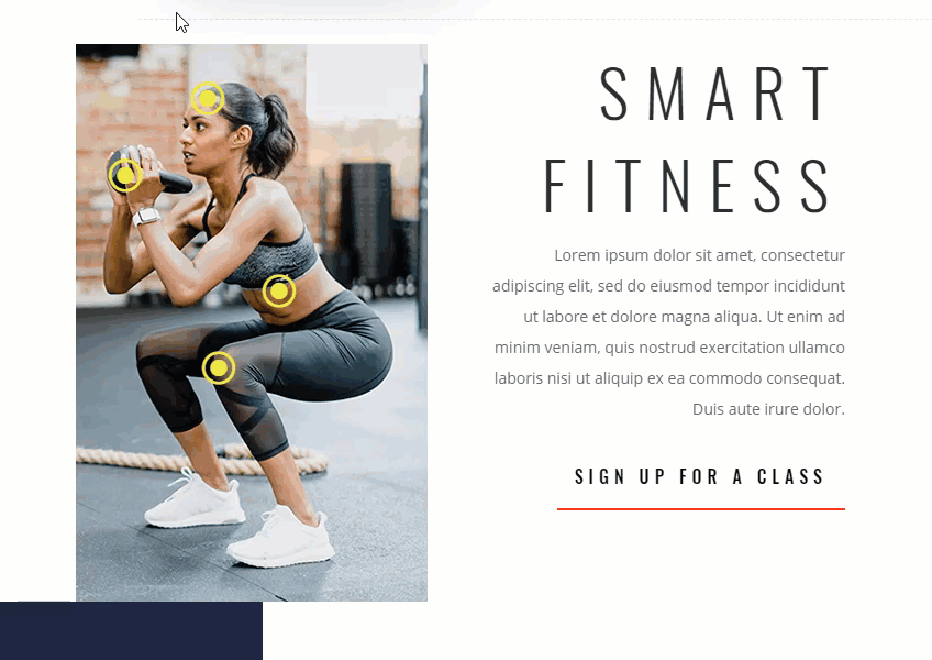
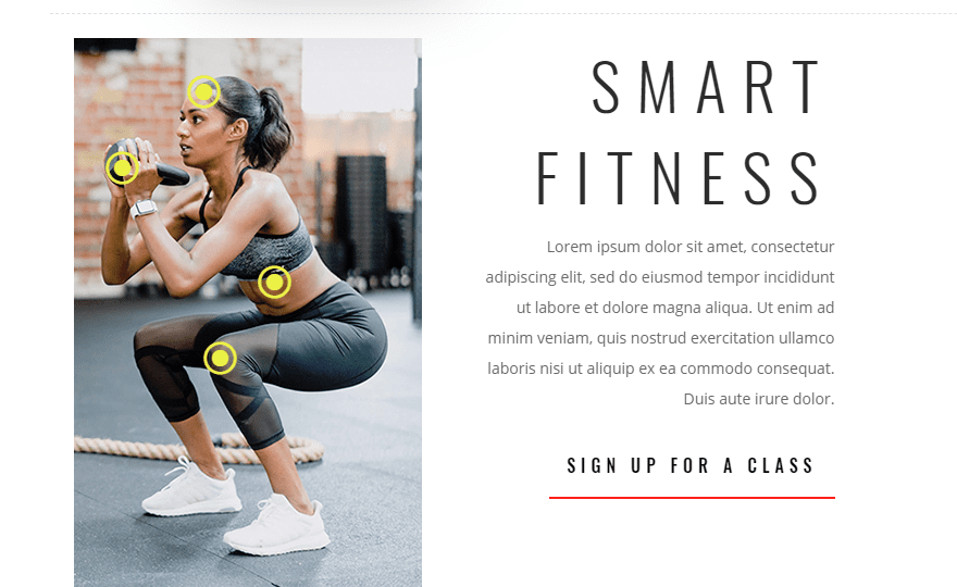
A Sneak Peek
Here is a sneak peak of the design we will build in this tutorial.
What You Need
For this tutorial, you will need the following:
- The Divi Theme
- The Fitness Gym Landing Page from the Fitness Gym Layout Pack (available from the Divi Builder)
- An image to use for your background image that is exactly 320px by 507px. Feel free to drag this one onto your desktop and use it for this tutorial.
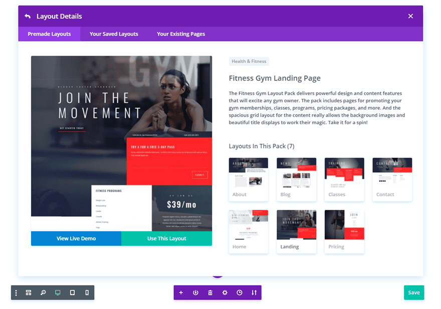
Preparing the Premade Layout
To get started, create a new page, add a title, and then deploy the Visual Builder. Then select “Choose a Premade Layout”. From the load from library popup, select the Fitness Gym Landing Page layout and click “Use This Layout”.
Once the layout is loaded to the page, scroll down to the fourth section with the two column row that has the title “Featured Programs” in the right column. We are going to add our background image with tooltips in the left column of this row.
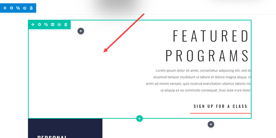
Use the inline editor to change the title text in the right column to “Smart Fitness”.
Adding the Background Image and Customizing the Row Settings
With this design, sizing and spacing are crucial and will need to be precise. And, it all starts with the size of our background image. As mentioned before the image we use for the background should be 320px by 507px. Since a 320px width is a good starting point for mobile, this will allow us to make the design mobile friendly without having to change the size of our image.
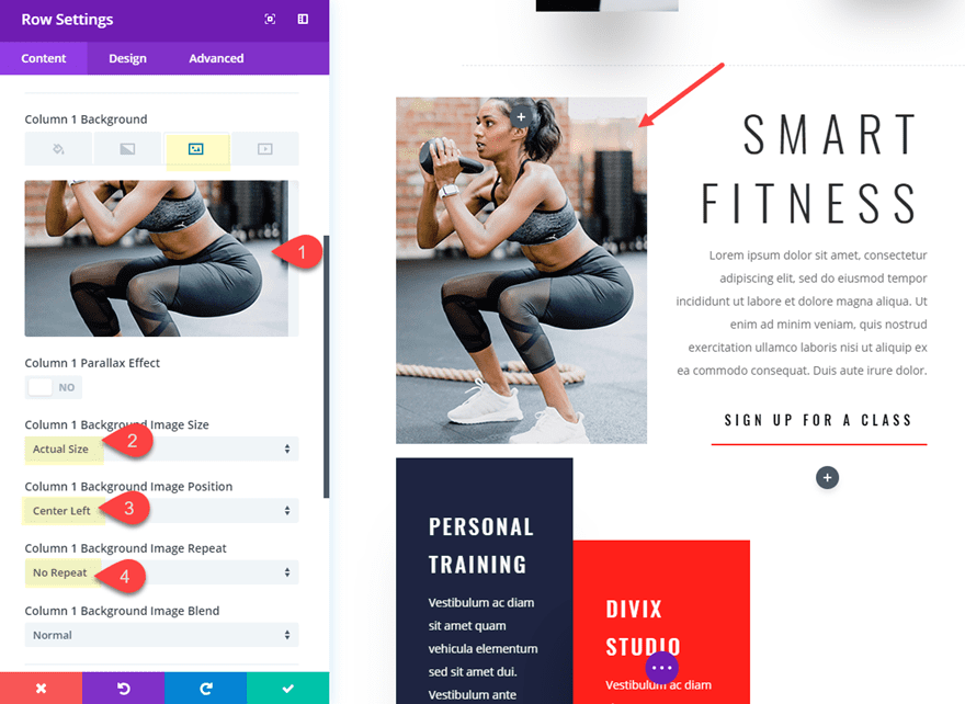
Open up the row settings and add the background image to column 1. Then update the following:
Column 1 Background Image Size: Actual Size
Column 1 Background Image Position: Center Left
Column 1 Background Image Repeat: No Repeat
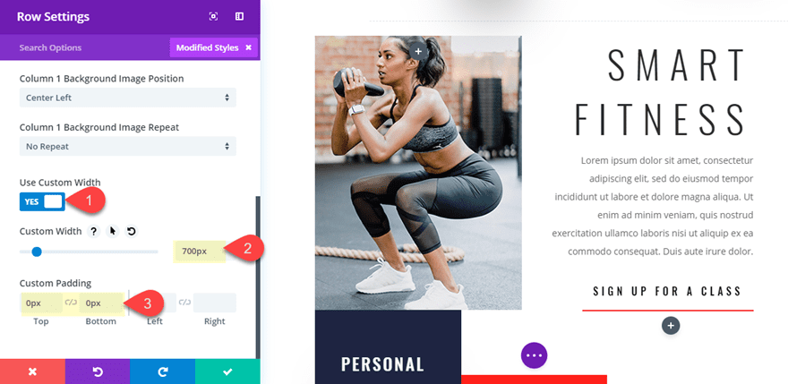
Next we need to add a custom width to the row and take out the top and bottom spacing.
Custom Width: 700px
Custom Padding: 0px top, 0px bottom
Setting the width to 700px will make sure the row doesn’t get smaller on smaller screen sizes before the tablet breakpoint.
At this point, I think it is a good idea to go ahead and set a specific height for column 1 equal to the height of the background image. This way we know that the image will remain visible if the content of the column doesn’t expose the entire image. To do this, go to the advanced tab and add the following custom CSS in the Column 1 Main Element:
height: 507px;
Now the height of the column is equal to the height of your image and will not depend on the content (or modules) we add to the row.
Adding the Tooltip Labels over the Background Image Using Blurbs
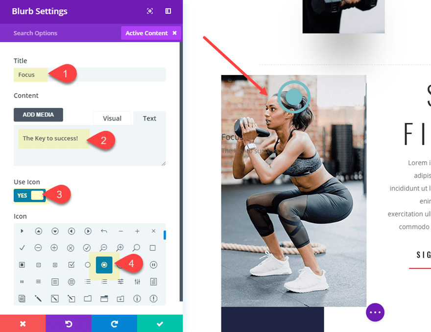
With our background image in place, we can start adding our blurbs which will be positioned and styled to function as tooltips. Go ahead and add a blurb module to column 1 and update the following blurb settings:
Title: “Focus”
Content: “The key to success!”
Use Icon: Yes
Icon: see screenshot
It is important to keep the Title and content to only a few words because we want to be able to fit the entire blurb inside the background image.
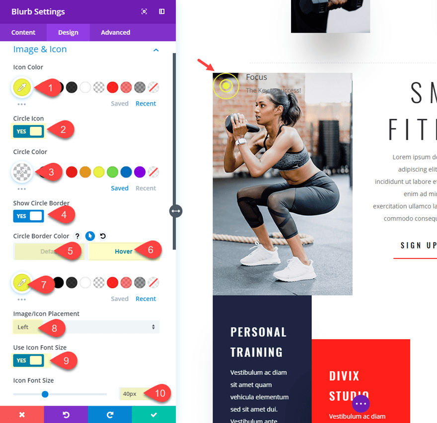
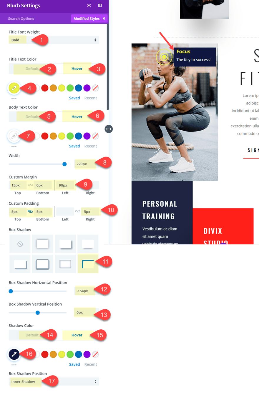
Next, you are going to update the design settings. This is a more advanced design of a blurb so there are a lot of options to change along with a few hover effects that will reveal the content of the blurb on hover. Update the following blurb design settings:
Icon Color: #edf000
Circle Icon: YES
Circle Color: rgba(0,0,0,0)
Show Circle Border: YES
Circle Border Color (default): rgba(0,0,0,0)
Circle Border Color (hover): #edf000
Image/Icon Placement: Left
Use Icon Font Size: YES
Icon Font Size: 40px
Continue to adjust the design settings as follows:
Title Font Weight: Bold
Title Text Color (default): rgba(0,0,0,0)
Title Text Color (default): #edf000
Body Text Color (default): rgba(0,0,0,0)
Body Text Color (default): #ffffff
(Notice that the default text colors are completely transparent in order to hide them until you hover over the blurb.)
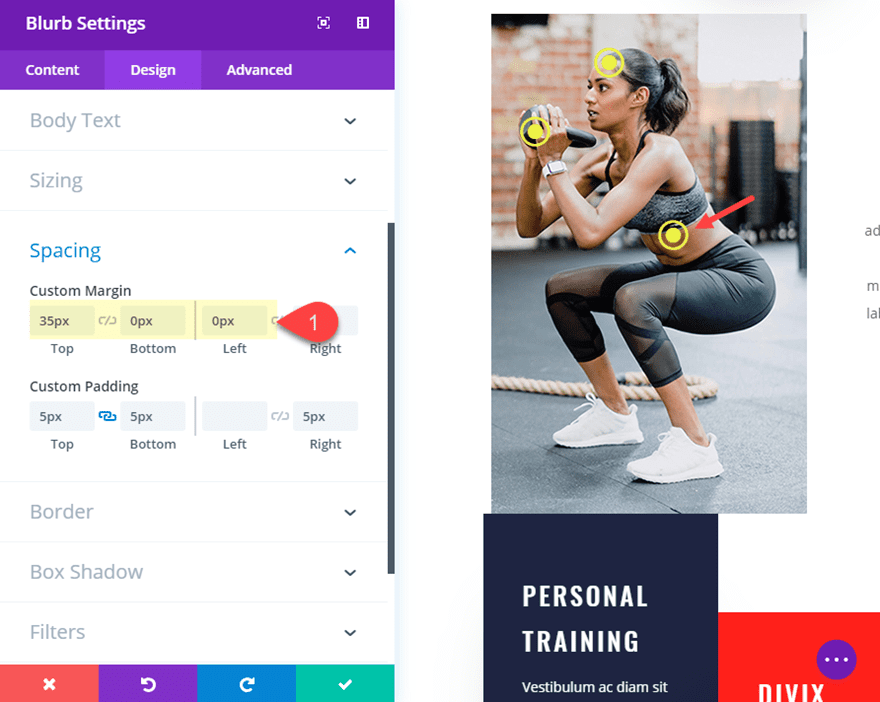
Custom Margin: 15px top, 0px bottom, 90px left
Custom Padding: 5px top, 5px bottom, 5px right
(The custom margin is how you position the blurb icon in a specific location over the image.)
Box Shadow: see screenshot
Box Shadow Horizontal Position: -154px
Box Shadow Vertical Position: 0px
Shadow Color (default): rgba(0,0,0,0)
Shadow Color (hover): #1e2441
(The box shadow is a creative way to add a background color behind the content of the blurb. By default, the box shadow is completely transparent but will show a nice blue color on hover.)
Now go and check out the final result of your first blurb to make sure the hover effect and design is correct.
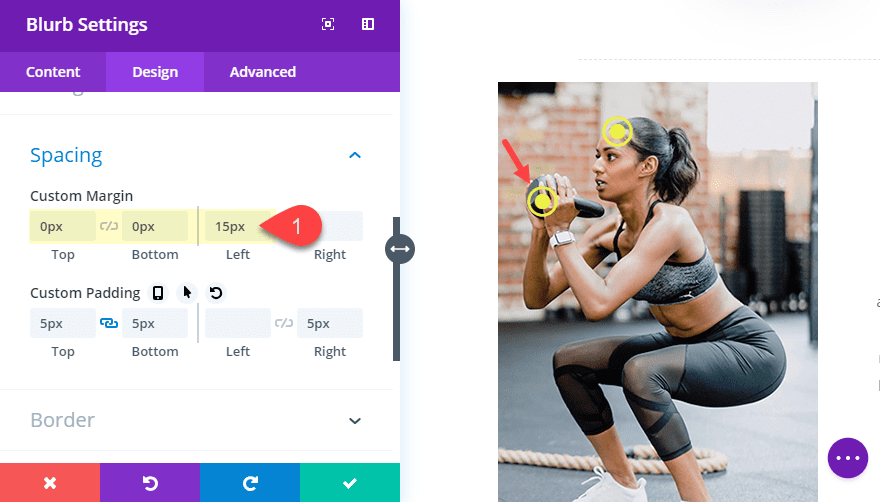
Next, we can duplicate the blurb module to create our second tooltip label. After you duplicate the blurb, You can update the content to whatever text you want (keep it short). Then all you need to do is position the tooltip using a different custom margin as follows:
Custom margin: 0px top, 0px bottom, 15px left
To create the third blurb, you can duplicate the second blurb.
For this third blurb, we will run out of room on the right side of our image so we really won’t have much room for content. We could use negative margin to extend the blurb outside of the image, but this would also extend beyond the 320px screen size on mobile. So, we are going to introduce a few small snippets of code to flip our blurb content around so that the icon is on the right and the text is on the left. To do this open the blurb settings and, under the Advanced tab, add the following custom CSS.
Main Element CSS:
direction: rtl;
Blurb Image CSS:
padding-left: 15px;
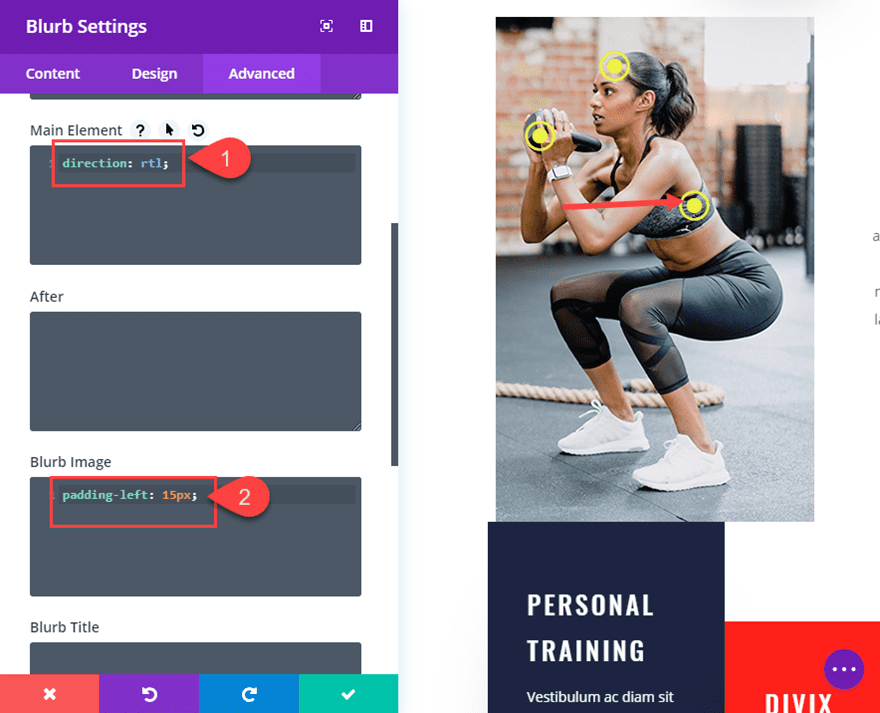
If you haven’t noticed, the icon is now on the right. Now all you need to do is position the blurb using the following custom margin:
Custom Margin: 35px top, 0px bottom, 0px left
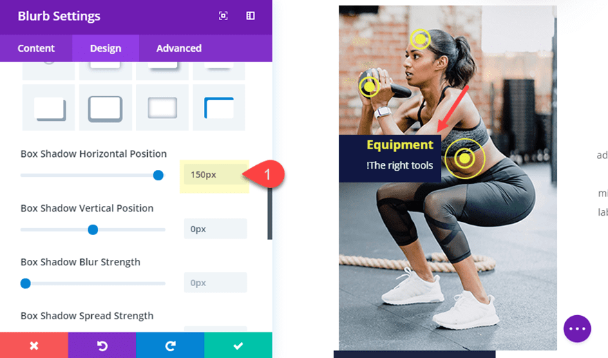
We also need to adjust the box shadow so that it comes from the left instead of the right as follows:
Box Shadow Horizontal Position: 150px
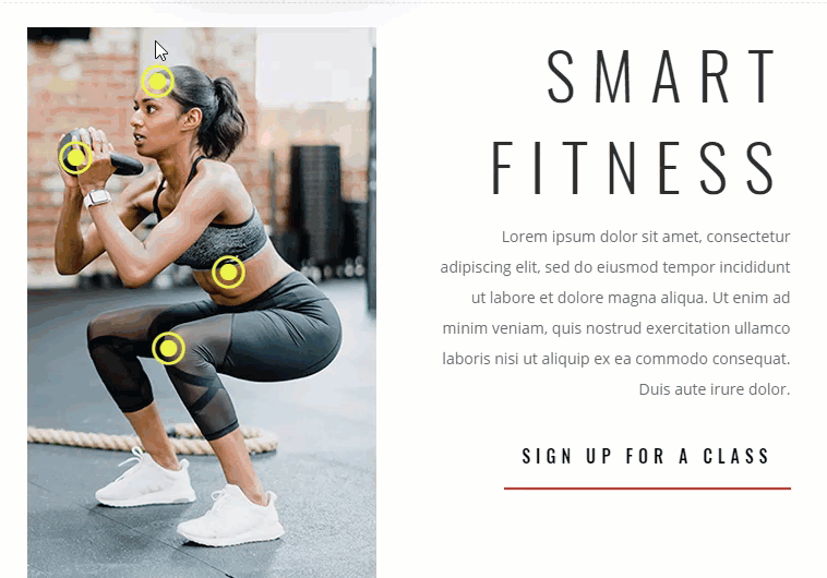
Now check out the reversed tooltip on the live site.
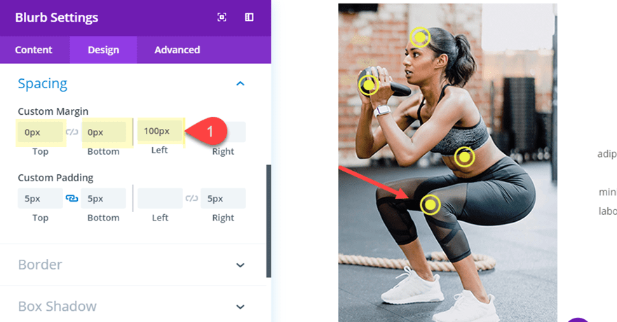
For the last blurb, copy the first blurb at the top of the column and paste it under the third blurb.
Then update the margin as follows:
Custom Margin: 0px top, 100px left
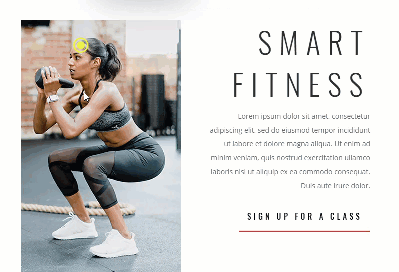
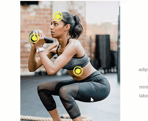
Now check out the final result of the design!
And check out those tooltip hover effects!
Is it Responsive?
This design was built was built with mobile in mind from the beginning. The image has a width of 320px which is the width of most small smartphones. And because we sized and positioned everything using a pixel length units, the design (including the tooltips) do not move around when we adjust the browser size.
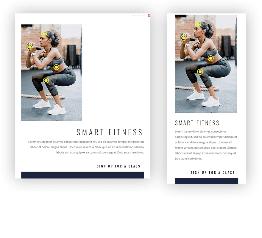
However there is one more thing you may need to do in order to make sure and maximize the width of the image on small phone screens. By default, your row will have a 80% width on mobile, so in order to make this 100%, you can add it as custom CSS to your Row’s main element like so:
width: 100%;
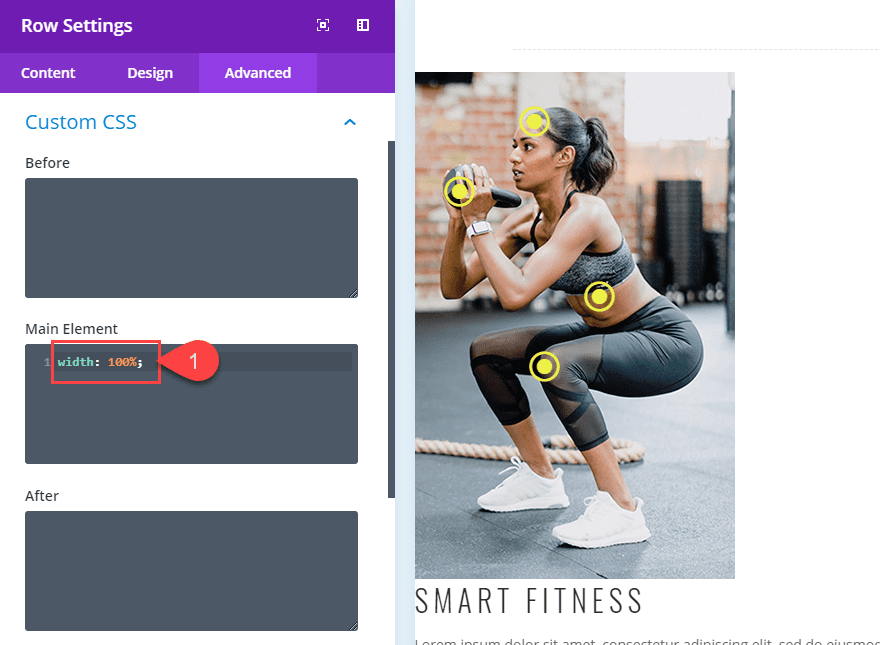
Your custom width of 700px will still serve as a max width on desktop, but will now be 100% on mobile.
Final Thoughts
Labeling a background image with tooltips and hover effects like this one can add an element of professional design that engages your audience with useful information. And I’m sure there are multiple ways to use this concept for other use cases. But it does come with challenges if you plan on keeping the design on mobile as well. The trick is to think mobile-first and plan ahead. I hope this serves as inspiration for future projects down the road. If anything, at least you know how to create a blurb with an icon or the right :).
I look forward to hearing from you in the comments below.
Cheers!


Cool idea!
Here is the error (need to write hover):
Title Font Weight: Bold
Title Text Color (default): rgba(0,0,0,0)
Title Text Color (default): #edf000
Body Text Color (default): rgba(0,0,0,0)
Body Text Color (default): #ffffff
Wonderful tutorial – specially the blog shows in detail what was changed. This is really great – a job well done.
Is there a way to hover and click to take it to another location on the same page or a different page.
Thanks
Does this work on a mobile touch screen?
+1 Is the hover effect triggered by “tapping” the blurb on mobile? It would be nice if you published a live demo link. Gif:s are good but not real testig. Maybe also .json-files since you already made the design.
Anyway, thanks for a nice tutorial!
Jason, what a brilliant idea! I was expecting to see a plugin name for that and when I read the whole thing I realize there is no plugin involved. Wow! Beautiful! Thanks for the share! I love creating things without plugins. Very creative one! Is there a video for this tutorial? I confess I hate to read long tutorials. Some people like video best. Congrats! This one was really outstanding!
Actually, there will be a live stream on this one on Nov. 13 at 3pm EST. And thank you! Glad you liked it.
Great! Thank you!
Considering the trouble that Google Maps gives me nowadays with their new rules – is this a applicable solution to show maps perhaps? What do you think?
With the ability to zoom on maps I say using this idea on a map is a no-no.
And with the ability to displace the map, also a no-no.
And don’t forget that this idea is not really responsive, only in the case explained in the tut when the image has a small width as the screen of a small device, otherwise wouldn’t work.
I strongly reccomend using a plugin for hot spotting images.
Thanks, great feedback.
Nice way how to use the Divi’s potential in a creative way. However, I’m not sure if hiding text by default is good for SEO. Google is against hidden text on websites.
Andre,
Thanks! This is a good point to consider. Although I’m not sure this is completely hiding the text for the user. Showing content on hover seems like a common practice (but I’m no SEO expert). However, I would probably not add any important headings or key search terms for these tooltips just to be safe.
Super, as usual. Thank you for this brilliant tutorial. I think about making a timeline tooltip on my site
Awesome! I hope it helps.
Great tutorial. I think it is a very interesting complement to increase the time spent on the page. I’ll put into practice. Thank you! It’s a great job.
Glad you liked it!
Super! 🙂
Very nice! Thanks!
very interesting idea. You do know we have the divi image hotspot plugin for this.
hi Richard
it’s possible to have a coupon code for this plugin ? 😉
many thanks
have a nice day
ARF i have buy other plugin 🙁 i don’t know you sale this plugin 🙁
plugin this, plugin that … and one a week 25 updates
Very nice I enjoyed this tut.
Thanks, Britt!