
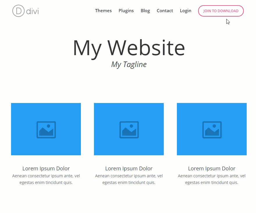
The new Elegant Themes menu has been a popular request for developers to duplicate on their own sites. The main feature of the menu is the call to action (CTA) button that grabs the attention of visitors by changing colors and animating when scrolling down the page. Having this kind of CTA button on your site will likely increase click rate and conversions.
Today I’m going to show you how to duplicate Elegant Theme’s primary menu using Divi. To implement the custom style and functionality of the button, I will be using a combination of CSS and jQuery.
Let’s get started!
Implementing the Design
Subscribe To Our Youtube Channel
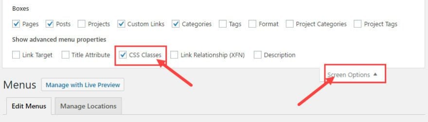
From the WordPress Dashboard, go to Appearance → Menus. At the top of the menus page click Screen Options and check CSS Classes. This will allow you to add a custom CSS class to your menu items.
Now click “create new menu” and give your menu a name.
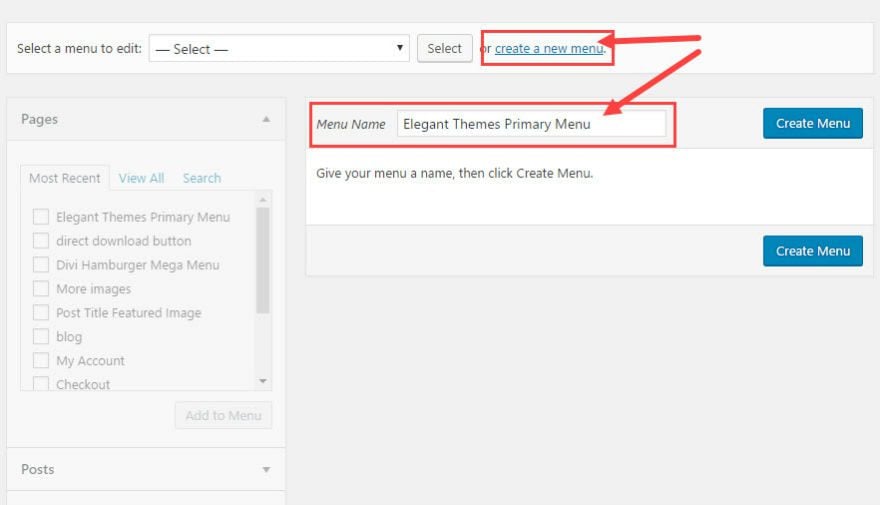
Click “Create Menu” button.
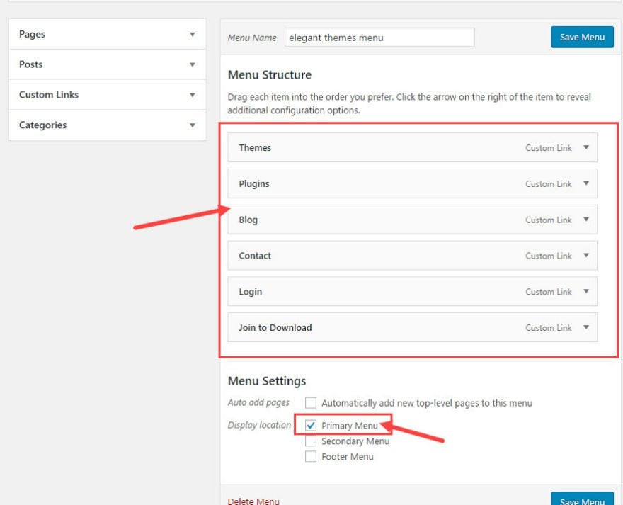
Next, add the menu links to your new menu. Since we are duplicating the Elegant Themes menu I’m adding the following custom links:
Themes
Plugins
Blog
Contact
Login
Join to Download
Once you are finished adding the links to your menu, select the new menu as the primary menu for your site.
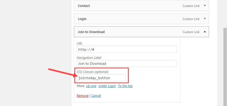
In order to change the “Join to Download” menu link into the CTA button, you will need to add a custom CSS class to it so you can style it later using CSS. To add the class, click the arrow on the right of the Join to Download menu item to reveal the configuration options. Add a class called “jointoday_button” inside the CSS Classes text box.
Save Menu
With the menu created and set as the primary menu, it’s time to add the styling to the navigation menu and CTA button.
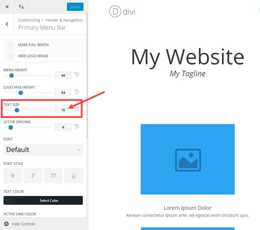
First we need to change your primary menu bar text size. Go to Theme Customizer → Header & Navigation → Primary Menu Bar. Keep all of the default settings and change the text size to 15.
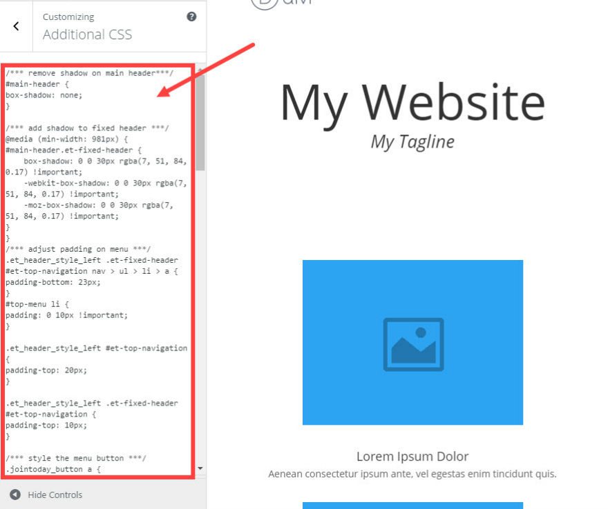
The rest of the navigation menu will be styled using custom CSS. Under Theme Customizer, go to Additional CSS and add the following custom CSS (you can also add these to your child theme’s style.css file):
/*** remove shadow on main header***/
#main-header {
box-shadow: none;
}
/*** add shadow to fixed header ***/
@media (min-width: 981px) {
#main-header.et-fixed-header {
box-shadow: 0 0 30px rgba(7, 51, 84, 0.17) !important;
-webkit-box-shadow: 0 0 30px rgba(7, 51, 84, 0.17) !important;
-moz-box-shadow: 0 0 30px rgba(7, 51, 84, 0.17) !important;
}
}
/*** adjust padding on menu ***/
.et_header_style_left .et-fixed-header #et-top-navigation nav > ul > li > a {
padding-bottom: 23px;
}
#top-menu li {
padding: 0 10px !important;
}
.et_header_style_left #et-top-navigation {
padding-top: 20px;
}
.et_header_style_left .et-fixed-header #et-top-navigation {
padding-top: 10px;
}
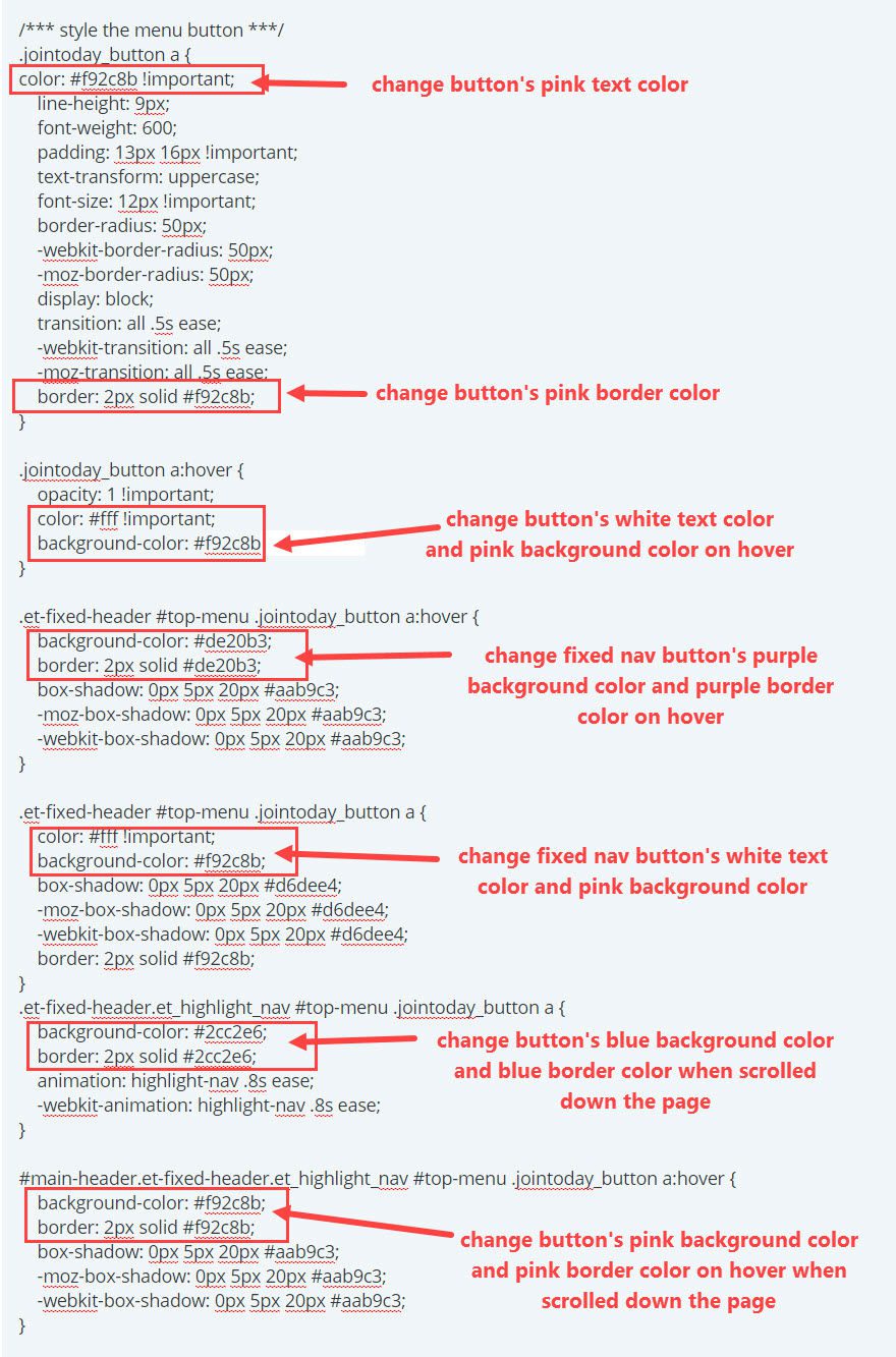
/*** style the menu button ***/
.jointoday_button a {
color: #f92c8b !important;
line-height: 9px;
font-weight: 600;
padding: 13px 16px !important;
text-transform: uppercase;
font-size: 12px !important;
border-radius: 50px;
-webkit-border-radius: 50px;
-moz-border-radius: 50px;
display: block;
transition: all .5s ease;
-webkit-transition: all .5s ease;
-moz-transition: all .5s ease;
border: 2px solid #f92c8b;
}
.jointoday_button a:hover {
opacity: 1 !important;
color: #fff !important;
background-color: #f92c8b;
}
.et-fixed-header #top-menu .jointoday_button a:hover {
background-color: #de20b3;
border: 2px solid #de20b3;
box-shadow: 0px 5px 20px #aab9c3;
-moz-box-shadow: 0px 5px 20px #aab9c3;
-webkit-box-shadow: 0px 5px 20px #aab9c3;
}
.et-fixed-header #top-menu .jointoday_button a {
color: #fff !important;
background-color: #f92c8b;
box-shadow: 0px 5px 20px #d6dee4;
-moz-box-shadow: 0px 5px 20px #d6dee4;
-webkit-box-shadow: 0px 5px 20px #d6dee4;
border: 2px solid #f92c8b;
}
.et-fixed-header.et_highlight_nav #top-menu .jointoday_button a {
background-color: #2cc2e6;
border: 2px solid #2cc2e6;
animation: highlight-nav .8s ease;
-webkit-animation: highlight-nav .8s ease;
}
#main-header.et-fixed-header.et_highlight_nav #top-menu .jointoday_button a:hover {
background-color: #f92c8b;
border: 2px solid #f92c8b;
box-shadow: 0px 5px 20px #aab9c3;
-moz-box-shadow: 0px 5px 20px #aab9c3;
-webkit-box-shadow: 0px 5px 20px #aab9c3;
}
@-webkit-keyframes highlight-nav {
0% {
-webkit-transform: scale(1);
transform: scale(1)
}
50% {
-webkit-transform: scale(1.2);
transform: scale(1.2)
}
100% {
-webkit-transform: scale(1);
transform: scale(1)
}
}
@keyframes highlight-nav {
0% {
-webkit-transform: scale(1);
transform: scale(1)
}
50% {
-webkit-transform: scale(1.2);
transform: scale(1.2)
}
100% {
-webkit-transform: scale(1);
transform: scale(1)
}
}
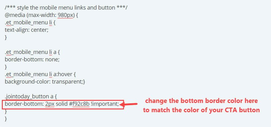
/*** style the mobile menu links and button ***/
@media (max-width: 980px) {
.et_mobile_menu li {
text-align: center;
}
.et_mobile_menu li a {
border-bottom: none;
}
.et_mobile_menu li a:hover {
background-color: transparent;}
.jointoday_button a {
border-bottom: 2px solid #f92c8b !important;
}
}
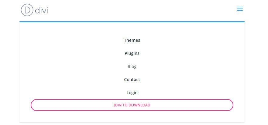
You are almost done. Let’s check out what the menu looks like so far.
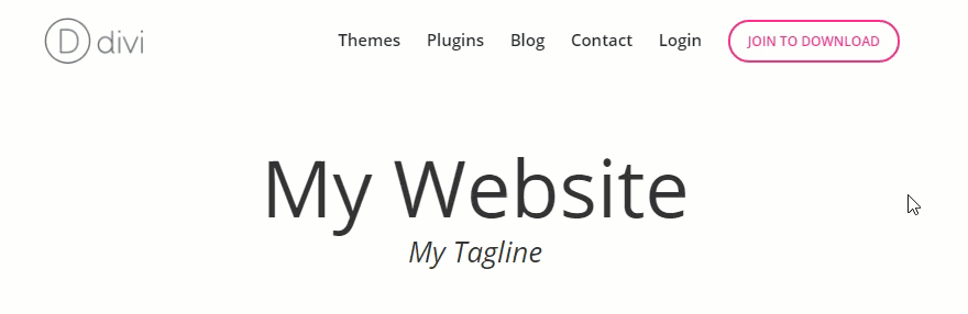
Notice the shadow under the menu has been removed and only shows when the fixed navigation is activated when scrolling down the page. Also, the CTA button has been styled to change colors on fixed navigation.
Adding the jQuery
All that is left to do is add the additional color change and pulse animation to the button when scrolling down to a certain point on the page. This additional functionality draws further attention to the CTA button as the user engages with content. In order to add this effect, we need to add an additional CSS class to the button only when the user scrolls to a specific point on the page. In this case, we will be adding the class “et_highlight_nav” to the menu when the user scrolls to a point greater than 50 percent of the body of the page. This class will be removed once the user scrolls back to the top of the page.
You can accomplish this by adding some jQuery. Go to Divi → Theme Options, and under the Integration tab, add the following jQuery to the “Add code to the head of your blog” text area:
<script>
jQuery(document).ready(function($){
	jQuery(window).scroll(function() {
	var   $main_header = jQuery('#main-header'),
		$body = jQuery('body'),
                scrollPercentage = 100 * (jQuery(this).scrollTop() / $body.height()),
                scroll = $(window).scrollTop(),
	    	objectPosition = $body.offset().top;

	    if (scroll < objectPosition) {
	        $main_header.removeClass("et_highlight_nav");
	    }
	    if (scrollPercentage >= 50){
	        $main_header.addClass("et_highlight_nav");
	    }
	});
});
</script>
The class “et_highlight_nav” can now be used to style the CTA button with a pulse animation and a blue color. Since you already added the custom CSS for this effect earlier, you are all set.
Check out the menu now.
The CTA button will now turn blue and pulse as you scroll further down the page and reset when you go back to the top of the page.
Since the CTA button is using a custom CSS class, you can change the button’s style to match your site by adjusting the CSS you added earlier. Simply replace the color code with your own. Here are the sections of CSS that target the different button styles:
If you change the color of your button, make sure to change the bottom border of your button on mobile by changing the CSS here:
How Does It Look on Mobile?
The custom CSS added earlier will center your menu items and properly space your CTA button on mobile just like on the elegant themes mobile menu.
For this tutorial, I’m using the default font Open Sans as the menu font. The default font for the Elegant Themes site (including the menu text) is a font called Poppins. You can import this font using Google Fonts by following the instructions on this previous post.
Final Thoughts
That’s it! You have successfully duplicated the Elegant Themes primary menu. And, you can adjust the style of your CTA button to match the design of your site by adjusting the custom CSS. Since the button colors change on the fixed navigation and animate when scrolling down the page, users are more likely to notice the CTA which will help your conversions.
I hope this new menu will be a useful feature for upcoming projects. And I look forward to hearing from you in the comments below.
Enjoy!


How do you make this work with “Divi Theme Builder”? It does not use the same calls as the standard menu. So I have my custom header created in the Theme Builder and it stopped working correctly. Mobile is still fine.
This is an excellent tutorial. Thank you! The CTA button, in particular, is very useful.
I’m sure you have this in mind already, but are there plans to include another blog article related to the CTA bar that shows up on your blog above the primary menu? Perhaps you could cover your techniques for creating it, and any tips for expanding its functionality (like including a sign-up form field), different design options, etc.
Thanks again for your great work!
Hello! I added these changes in the home, if I go to another page of the web, the change does not work the vertical scroll scroll.
On the other hand, the logo looks small and has the same dimensions as the Eleganth Temes logo and when you set the menu, the logo disappears in the home (ok) but it does not disappear in the rest of the pages.
If you can help.
Good job. Thank you!
This is great! I got it working nicely with Divi. But less luck with Extra. Would that be possible? What needs to be changed in order to get it working with Extra?
This is a fine step-by-step tutorial. Thank you for taking the time to write it.
I just tested it everything works but mobile. On hover it goes white color the text so cant be seen. Any ideas? latest divi
Great tutorial. Thanks! But I think it seems a little bit unfinished – the menu for smartphones doesn’t look exactly the same like that of elegantthemes. 😉
Well , This is really beautiful ..But when i Implemented these codes in my website .. Secondary menu items , Specially sub menu items disappears so quickly.
Brilliant, thank you.
Can I ask why Divi still puts scripts and java in the headers of pages when that blocks render able content from loading first? Google hates it, and webmasters have to work out how to minify the code or move it.
How about ET thinks about adding a generic fix in the next release of Divi? That would make it truly a great theme, whereas right now, it’s flawed, good, but flawed.
+1
Thanks so much! Very useful. One note for non-coders like me – I think one small step in the directions is missing in changing the custom colors. If you want to change the pink border on the fixed nav button – it is the last line in the section which starts:
.et-fixed-header #top-menu.jointoday_button a {
It is currently set to:
border: 2px solid #f92c8b; (pink)
Otherwise – terrific, easy to follow tutorial!
The CTA button will not reset when you go back to the top of the page.
It only works when you are logged on.
Any suggestion in the code to correct it?
It works great. Very cool. Thanks!
Graeat advice . Would be nice if we would have more Google fonts inside
Thanks for this feature, I will try it on my site with Divi.
Thank you for sharing. But the jQuery only works when I am connected. Someone can help me?
Cool! I appreciate the utility of this one! Thank you!
very nice thanks a lot
Thank you! It is fantastic and easy 😉
I’m trying to implement this into a child theme and it seems to be overwriting the menu options for the fixed header height. Any ideas on how to give that control back to the editor or change it to a different value? Thanks in advance!
Nice one, thanks!
Great post, thanks for sharing the technique. I do wonder though if using this type of button is a step back in time to the flashing GIF animation days of the early internet. It can be very distracting. I found this to be the case with your animation above, and would have preferred a video that I could start and stop.
As always, it’s a balance between annoying the user and engaging them.
Awesomeness, LOVE it as i was just thinking about that 🙂
I get it now! Thanks. I’ll be adding this to my site and a clients.
Was much awaited. Thanks
I was attempting something like this myself today, many thanks! It’s a pity though, this cant be created out of the box.
My new favorite Divi modification! Thank you for this!
Thanks for sharing Jason, Looks awesome. I added it directly to the menu! Love it 😉 Now wait and see how it works out.
Nice and simple. Thanks!
Terrific post. Will apply this to my site. Anyone got any idea how to completely disable the Divi primary meni on mobile? I’ve been trying for days…
#et_mobile_nav_menu{
visibility: hidden;
}
That was immensely appreciated. Works nicely.
Thanks Will. Would be great if Divi had that option built into it, as some of us are not capable of figurering it out.
No problem, glad it worked! 🙂
OMG thank you! I have been wanting to fix my menu on mobile and well this just rocks for both desktop and mobile!
yay
Another ElegantThemes/Divi homerun! Can’t wait to implement this. Thanks!!
Hello,
Pretty cool! Thank you. It would be great to know how did you make that amazing call-to-action at the bottom!
Tnx. This is really active blog. I
You rock 🙂 Thanks very much for this one 🙂
Thank you so much for your amazing tutorial, Look my website trueiconic.co.id the menu is so Beautifull