
Sticky Bars continue to be a popular element in web design. They are great for boosting conversions by keeping CTAs at the forefront without being as intrusive as popups.
In this use case, we are going to design a sticky bar for WooCommerce products using Divi and its Woo Modules. The sticky bar can include any Divi module. For this tutorial, we are going to create one sticky bar that includes the “Add to Cart” button so that it remains visible as the user scrolls down the page. Plus, we will also create a sticky cart notice bar so that users will always see the “view cart” button once the “Add to Cart” button is clicked.
These sticky bar elements will help boost conversions by keeping those crucial CTAs in view.
Let’s get started!
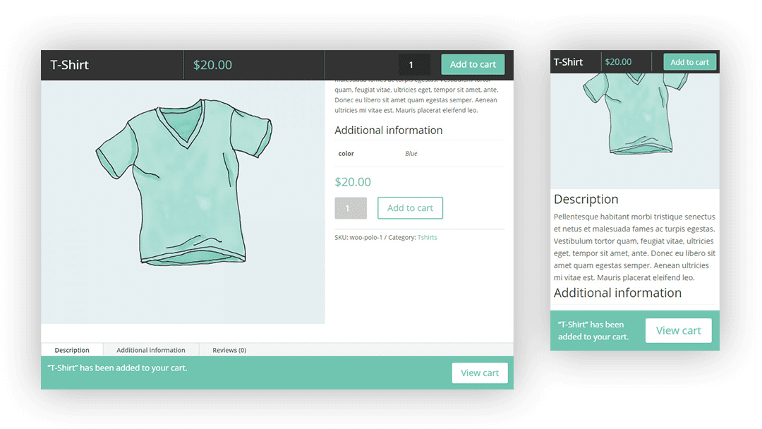
Sneak Peek
Here is a quick look at what we will be designing in this use case tutorial.
Download the Sticky Bars Layout for FREE
To lay your hands on the designs from this tutorial, you will first need to download it using the button below. To gain access to the download you will need to subscribe to our newsletter by using the form below. As a new subscriber, you will receive even more Divi goodness and a free Divi Layout pack every Monday! If you’re already on the list, simply enter your email address below and click download. You will not be “resubscribed” or receive extra emails.

To import the layout to your page, simply extract the zip file and drag the json file into the Divi Builder.
Let’s get to the tutorial shall we?
What You Need to Get Started
To get started, you will need to do the following:
- If you haven’t yet, install and activate the Divi Theme installed (or the Divi Builder Plugin if not using the Divi Theme).
- Install and activate the WooCommerce plugin. If it is the first time setting up WooCommerce, you will need to run through the basic setup wizard to get your store ready. Once done, you are ready to add your new products.
- Create a few products if you don’t have any yet. For more info on how to add a new product, check out this tutorial.
After that, you will have a blank canvas to start designing in Divi.
Part 1: Designing the Sticky Bar on a Product Page
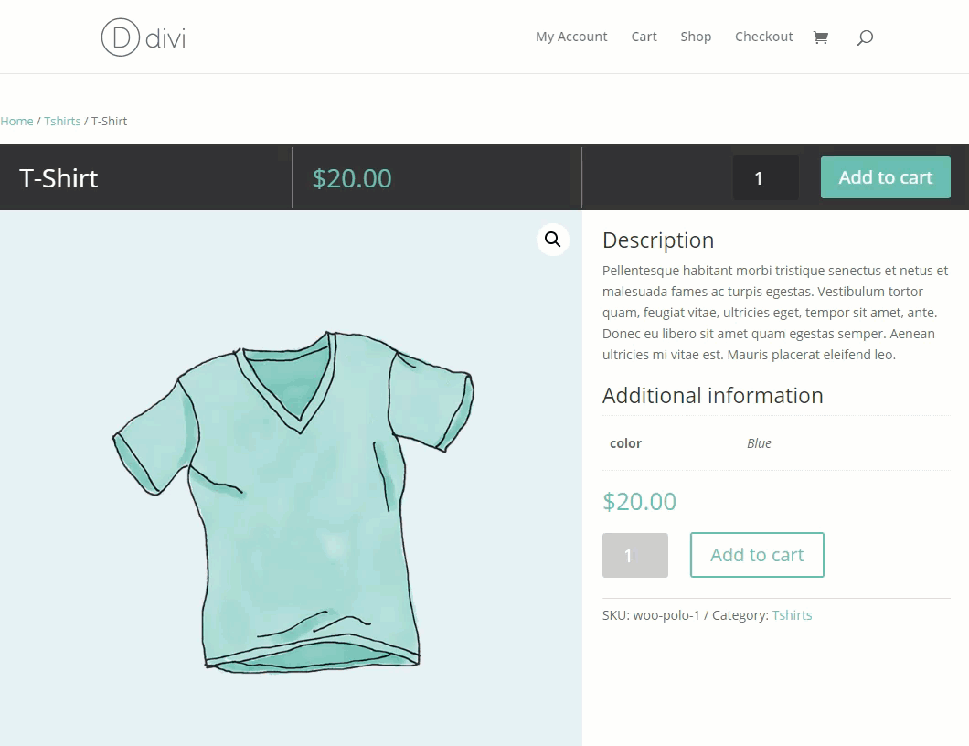
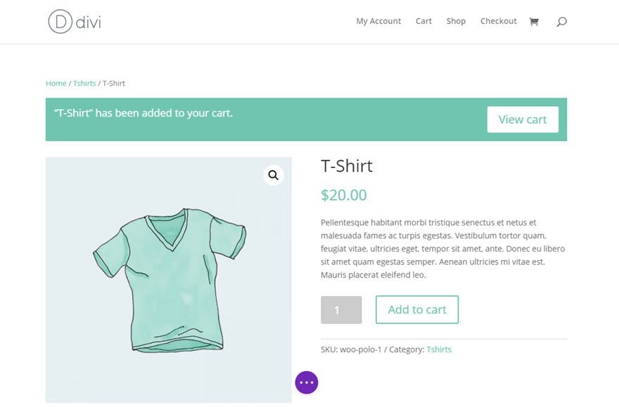
We are going to use a mock simple product for this example, so you need to create a new product or edit an existing product. The product information isn’t important for this tutorial, just make sure you have the basics like Product Title, Price, Description, Image, etc…
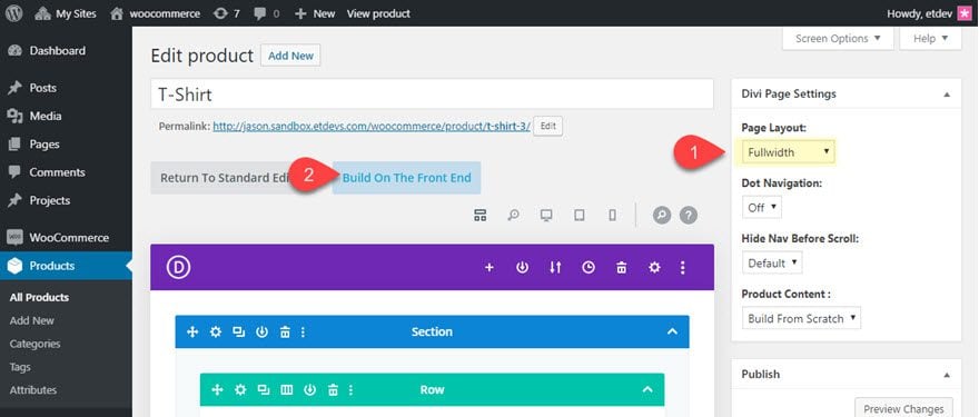
Once you have a simple product ready, click to edit the product on the backend and deploy the Divi Builder on the product page. Under Divi Page Settings, select “Fullwidth” for the Page Layout and then click “Build On the Front End”.
The product page should look similar to this.
Under the first row containing the breadcrumbs and the cart notice, add a new row with a one-column layout.
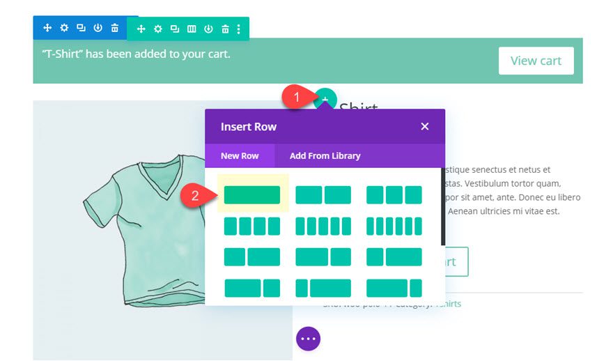
Row Settings
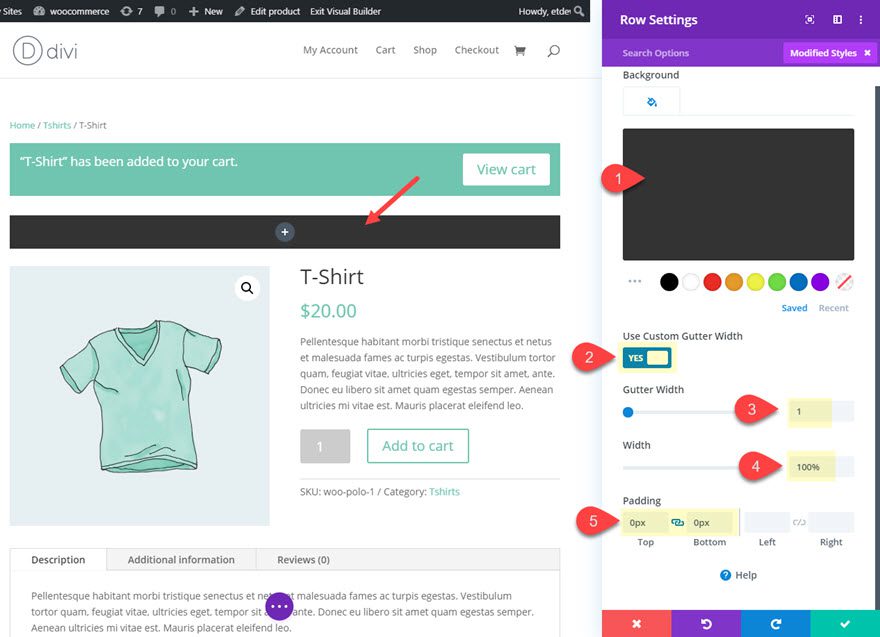
Before adding any modules, update the row settings as follows:
- Background Color: #333333
- Use Custom Gutter Width: YES
- Gutter Width: 1
- Width: 100%
- Padding: 0px Top, 0px Bottom
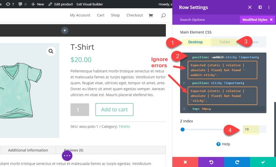
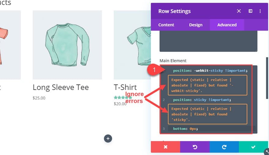
Making the Row Sticky
To make the row sticky, add the following custom CSS to the Main Element for Desktop:
position: -webkit-sticky !important;
position: sticky !important;
top: 50px;
Then add the following CSS to the same Main Element for Tablet display:
top: 0px;
If you aren’t familiar with the “position: sticky” css property, basically it is kind of a blend between the fixed position and the relative position where the element (in this case the row) will scroll along with its container until it reaches a designated position at the top or bottom of the page (or the offset specified). In this example, we are setting the offset to be 50px from the top of the browser window (leaving room for the height of a default fixed header on desktop). Then on tablet, the offset is changed to “top: 0px” in order to fix the row/sticky bar at the top of the browser on mobile.
NOTE: Ignore the errors that you see when adding the CSS to the box. The code will work fine.
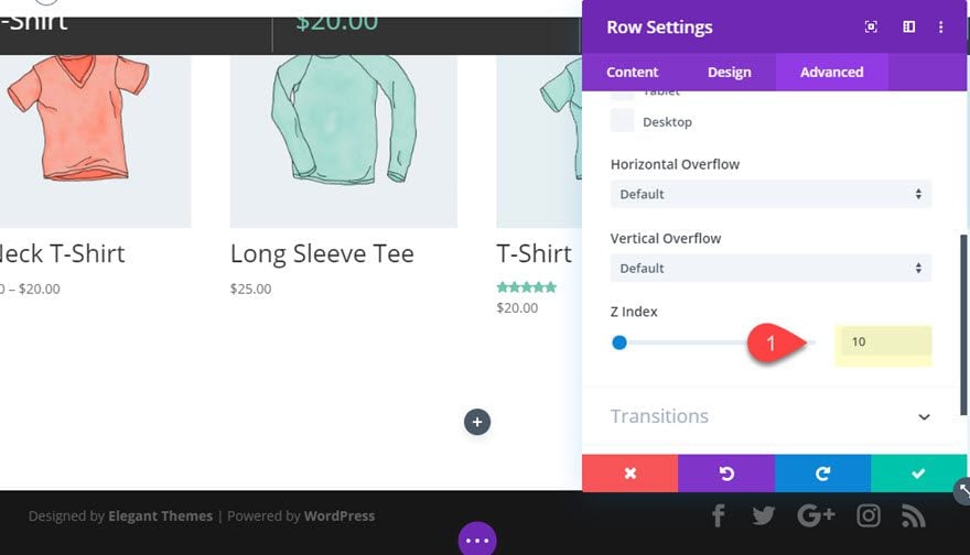
After you the CSS, update the Z Index as follows:
- Z Index: 10
Now the row will become sticky as the user scrolls down the product page.
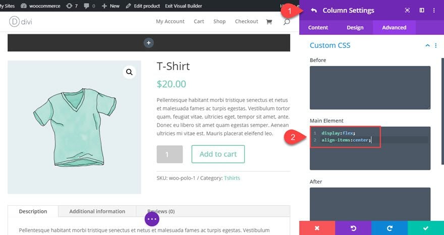
Column Custom CSS
Before we start filling the row with content, we need to make sure the module inside our one-column row will align horizontally instead of vertically. We can use a simple CSS trick to do this with the flex property. Open the column settings and add the following custom CSS to the main element:
display:flex;
align-items:center;
That takes care of our sticky row design. Now, we need to fill the row with some content.
Add Woo Title
Add a new Woo Title Module to the column of the sticky row.
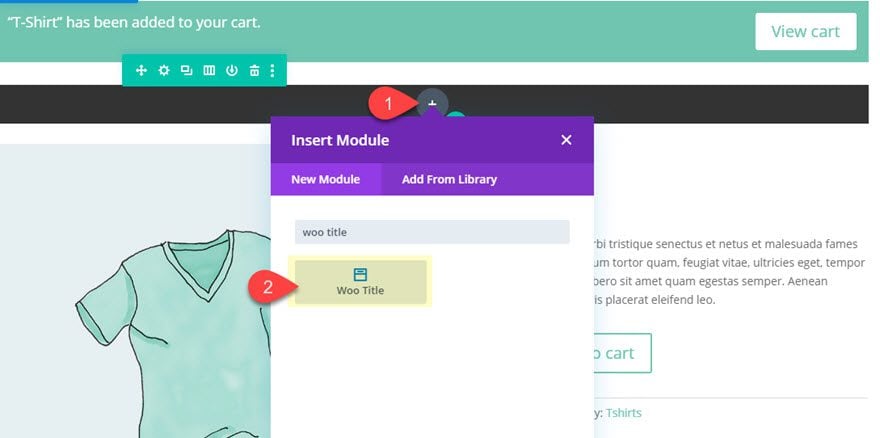
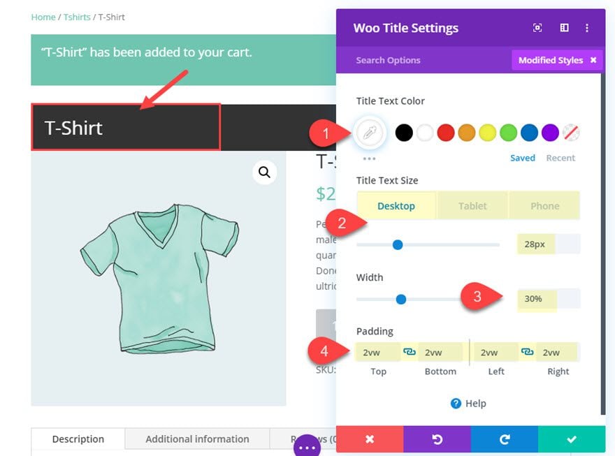
Then update the settings as follows:
- Title Text Color: #ffffff
- Title Text Size: 28px (desktop), 20px (tablet), 16px (phone)
- Width: 30%
- Padding: 2vw top, 2vw bottom, 2vw left, 2vw right
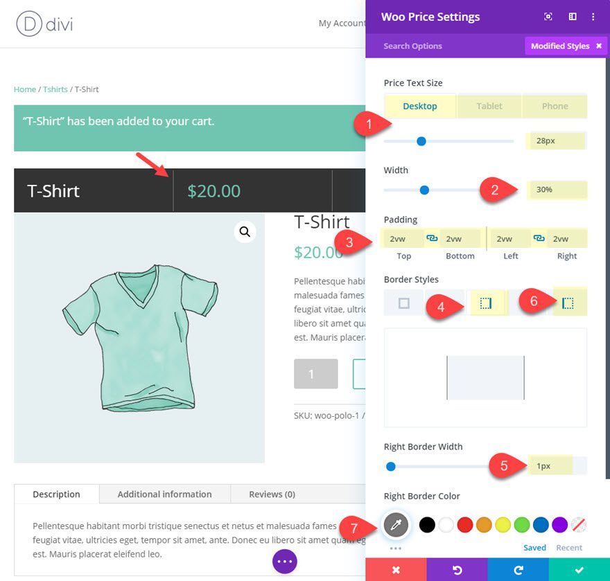
Add Woo Price
Next, add a woo price module by clicking the gray plus icon that appears when hovering over the woo title module you just created.
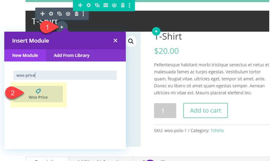
Then update the Woo Price settings as follows:
- Price Text Size: 28px (desktop), 20px (tablet), 16px (phone)
- Width: 30%
- Padding: 2vw top, 2vw bottom, 2vw left, 2vw right
- Right Border Width: 1px
- Right Border Color: #777777
- Left Border Width: 1px
- Left Border Color: #777777
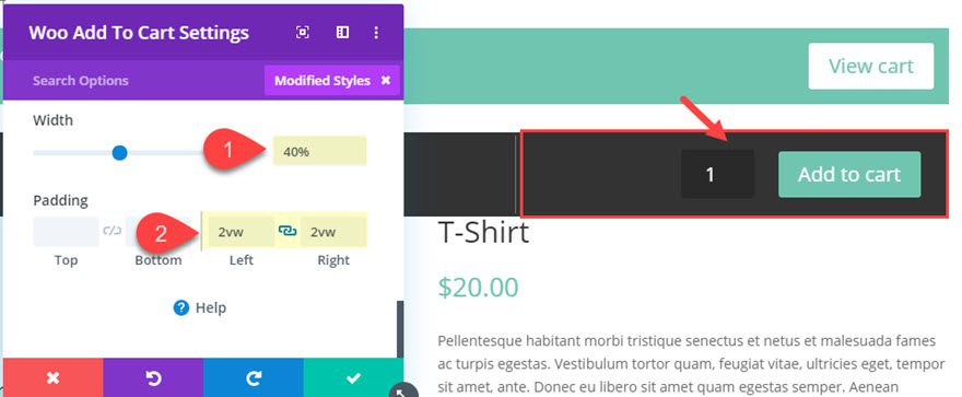
Add Woo Add to Cart Module
For the last piece of content, add a Woo Add to Cart Module right after the Woo Price module.
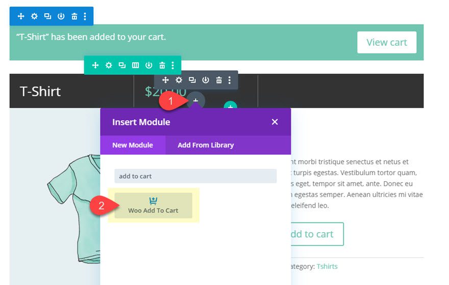
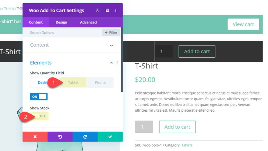
Then update the settings as follows:
Simplify the Add to Cart element by hiding the stock amount and the quantity field on mobile.
- Show Quantity Field: OFF (tablet)
- Show Stock: OFF
- Text Alignment: Right
- Use Custom Styles for Button: YES
- Button Text Size: 18px (tablet), 14px (phone)
- Button Text Color: #ffffff
- Button Background Color: #7ac5af
- Button Border Width: 0px
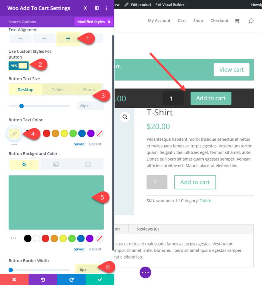
- Width: 40%
- Padding: 2vw left, 2vw right
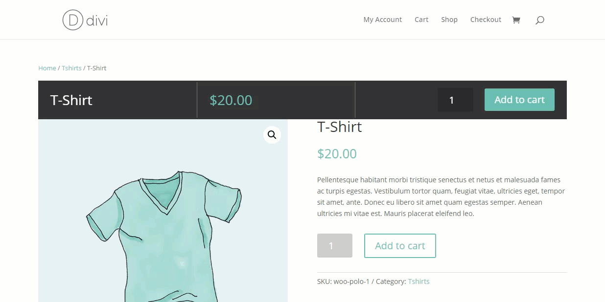
Result
Now let’s check out what it looks like on the live page.
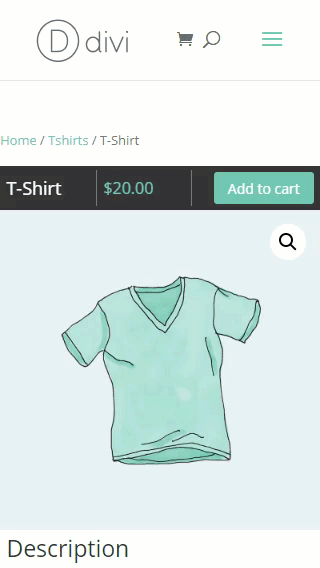
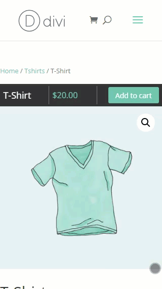
And here it is on mobile.
Part 2: Creating a Cart Notice Sticky Bar
Creating a cart notice sticky bar actually involves just a few simple steps, but the result can be extremely effective. As you may already know, the cart notice only appears after a user clicks the “Add to Cart” button. But it is the next crucial step in the buying process that leads users to the checkout page. So when the cart notice pops up as a sticky bar at the bottom of the window, it is more noticeable to the user.
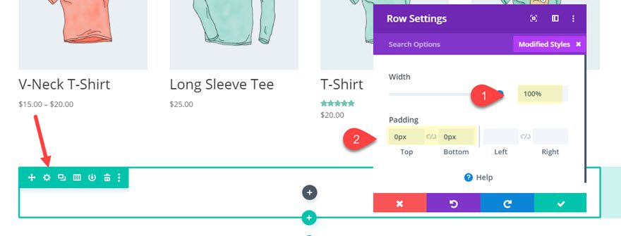
To create the cart notice sticky bar, first create a new one-column row at the bottom of the product page. Then update the row settings as follows:
- Width: 100%
- Padding: 0px top, 0px bottom
Then make the row sticky by adding the following custom CSS to the main element:
position: -webkit-sticky !important;
position: sticky !important;
bottom: 0px;
NOTE: As we did earlier, you can ignore the errors that popup when adding the position: sticky property.
This will make the row stick to the bottom of the window when scrolling upward.
Then update the z index to keep it at the forefront as follows:
- Z Index: 10
Add the Cart Notice Module
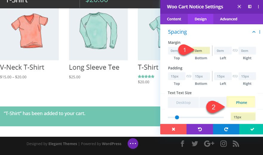
Once you have created the row, add the Woo Cart Notice Module to the row and update the settings as follows:
- Text Text Size (phone): 15px
- Margin: 0em bottom
That’s it! It’s up to you whether or not you want to erase the default cart notice element at the top of the page, but it might be a good idea to leave it for better conversions.
Final Result
Here is the final result with the two sticky bars in place.

Desktop
Mobile
Final Thoughts
Hopefully this post will help us understand how to create sticky bars for our product pages in Divi. We covered how to create a sticky bar that includes a product title, price, and add to cart button. And we also showed how to create a cart notice sticky bar. Both of these should help the buying process and boost conversions. And we don’t even need a plugin!
Feel free to explore new ways to use product page sticky bars on your own site.
We look forward to hearing from you in the comments.
Cheers!


Thank you for the tutorial Jason. It’s very helpful. However, when I add the “woo add to cart” its also taking in other elements: size, colour, enter an inscription, upload photo. Is there any way to avoid this? Thanks
I’ve been wanted to add something like this for a while, and the new Woo modules in Divi makes it soooo easy. Can’t wait to add it to a website ?
Well! I’m using DIVI for a long time and loved every part of it, It helps in SEO too.
somehow sticky never works for me. Maybe it’s some other css overwriting the behaviour, but usually in totally unreliable, and I can’t understand why.
Jackpot,
It was the same way for me until I realized that the “position: sticky” property requires a location to be set using “top”, “bottom”, “right”, “left”. And it will also conflict with other “scrolling ancestors”. https://developer.mozilla.org/en-US/docs/Web/CSS/position
Hope that helps.
Just tried this tut. Not working for me either. Used both tips mentioned here; 1) put CSS in Section instead of row, 2) added y-overflow to page. Anything else you can think of?
Thanks kindly,
As Jason Champagne said, you need to set the “top: 0px”. Or “left”, “right” or “bottom”.
Also, don’t forget about the z-index for your section, set it at 999 to be sure.
Thanks jason, yes i saw that, and on this tutorial the “top” setting is actually present (you’re referring to: position: -webkit-sticky !important; position: sticky !important; top: 50px; …..right?).
Searching online I think it has something to do with the “overflow:” setting of the parent sections, maybe of the body itself. I’ll have to test it more because it’s currently working only on the visual builder for me, but as long as you exit the builder, it doesn’t “stick” on scrolling. It’s weird that apparently I’m the only one experiencing this, anyway (since i’m also working on a clean WP install).
You’re right, @jackpot, the issue (which I encountered as well) has to do with the “overflow”.
Following your lead, I found a way to fix this. Just add the following to the Page Settings CSS:
#page-container { overflow-y: visible !important; }
That should do the trick 🙂
Hi Leo. Yes,
#page-container { overflow-y: visible !important; }
did the trick! Thanks!
But that was not enough: in my case, the solution included also putting the sticky code, so:
position: -webkit-sticky !important;
position: sticky !important;
Top: 50px;
…not in the Row, but in the parent SECTION. With this 2 tricks, the sticky element did finally work.
It still feels like a somewhat fiddly workaround anyway. Not the fault of DIVI, I feel like it’s the css code that is not reliable at all with this parameter in particular.
It’s Really cool! That’s why I love divi. We can play with divi!
Jason,
I have just opened a tab for life for you at my local bar. Again, you introduce me to something new:
position: sticky
I am sure I might have seen it before but was not aware of its significance. I can see lots of occasions where I will use this.
Sweeeet!
Not working for me. It works for some time, but after my cache plugin takes over, it stops working. I checked in the inspect window in google chrome, the CSS shows up, but the webkit-sticky property is marked as invalid by google chrome. However, chrome doesn’t show any problem with the position: sticky property, yet the row is not sticky. Any thing I’m missing here?
Navmeet,
hmm, you might just try adding the “position:sticky” CSS property to the row with an external stylesheet (or the Custom CSS in page settings). I didn’t think adding it to the row element would cause any issues but maybe I was wrong.
Nice tutorial, this brings some pretty cool customisation yet again
Awesome!
Hello,
Another excellent tutorial.
Indeed, the sticky elements bring a real personalization.
Thank you
Thanks, Bruno!