
An engaging hero section is one of the more important aspects of any website. Adding smooth transitions and animations to showcase the hero section content is one way you can boost the quality of your hero section. In Divi, basic hero section transitions can be accomplished easily with a slider module (going from one slide to another), but the animation design possibilities can be limited. However, with a little creative (outside the box) thinking, you can unlock the power of Divi to design a completely custom hero section with countless unique animations or transitions.
In this tutorial, we are going to show you how to build a hero section with unique transitions and animations that can be easily designed and customized with Divi Builder Settings.
Let’s get started!
- 1 Sneak Peek
- 2 Download the Layout for FREE
- 3 Download For Free
- 4 What You Need to Get Started
- 5 Understanding the Basic Idea First
- 6 Part 1: Creating the First Hero Section Design with Custom Animation Elements
- 7 Part 2: Creating the Transition (Second) Hero Section Design with Custom Animation Elements
- 8 Final Result
- 9 Final Thoughts
Sneak Peek
Here is a quick look at the design we’ll build in this tutorial.
Download the Layout for FREE
To lay your hands on the designs from this tutorial, you will first need to download it using the button below. To gain access to the download you will need to subscribe to our newsletter by using the form below. As a new subscriber, you will receive even more Divi goodness and a free Divi Layout pack every Monday! If you’re already on the list, simply enter your email address below and click download. You will not be “resubscribed” or receive extra emails.

Subscribe To Our Youtube Channel
To import the section layout to your Divi Library, navigate to the Divi Library.
Click the Import button.
In the portability popup, select the import tab and choose the download file from your computer.
Then click the import button.

Once done, the section layout will be available in the Divi Builder.
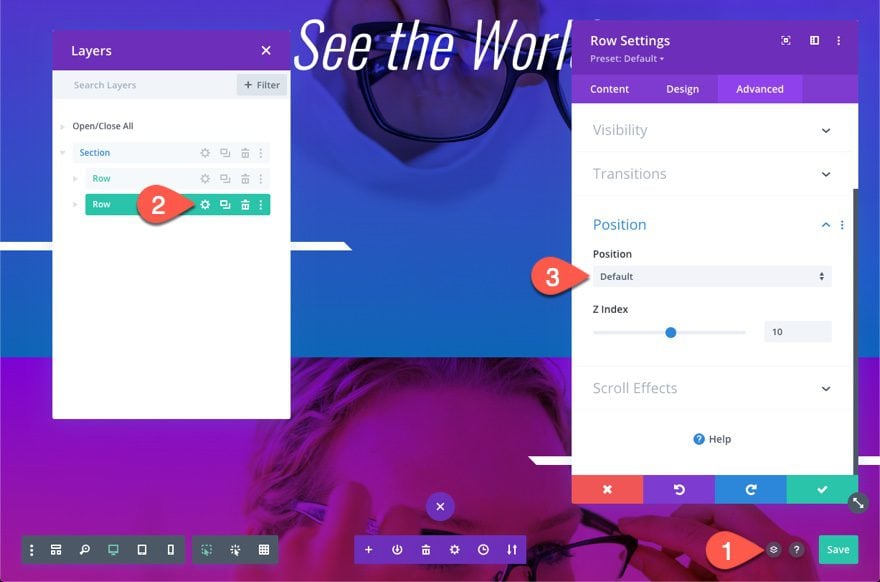
By default, the second row will have an absolute position that covers the first row so the first row won’t be visible. To edit the first row, you will first need to open the settings of the second row and change the position back to the default. Once done, you can add the absolute position back before publishing.
Let’s get to the tutorial, shall we?
What You Need to Get Started

To get started, you will need to do the following:
- If you haven’t yet, install and activate the Divi Theme.
- Create a new page in WordPress and use the Divi Builder to edit the page on the front end (visual builder).
- Choose the option “Build From Scratch”.
After that, you will have a blank canvas to start designing in Divi.
Understanding the Basic Idea First
Before we start building our hero section, it might be helpful to understand the basic idea behind the design. Basically, what we are going to do is create one section with two rows. Each row will serve as a hero section design (like a slide). Each row will have a single column that is customized to be fullscreen (span the full width and height of your browser window).
Using this large amount of available space in each column, we can position each module with precision using the absolute position in Divi. After that, we can add animation styles, durations, and delays, to any of those modules or rows to achieve the hero section transitions and animations we want. The goal of this tutorial is to show you a basic design, but as you might already have guessed, there are a ton of possibilities.
Part 1: Creating the First Hero Section Design with Custom Animation Elements
In this first part of the tutorial, we are going to create the first hero section design which will reside in a single row and column within the section.
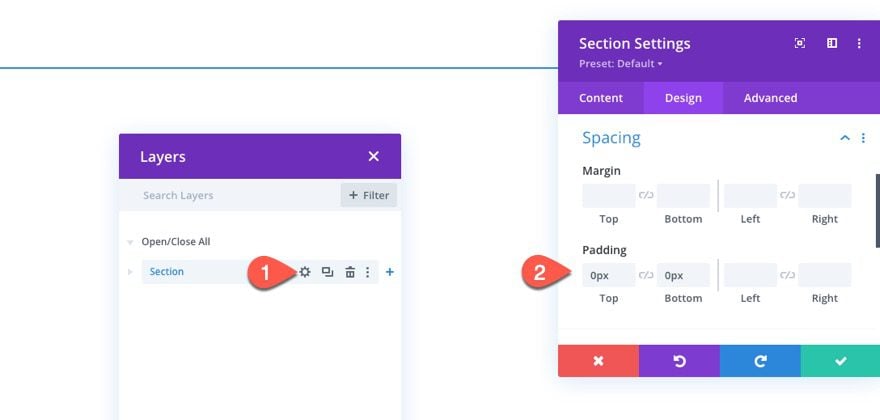
Update Section Padding
Before we do anything else, open the settings for the default section in the builder and take out the default top and bottom padding:
- Padding: 0px top, 0px bottom
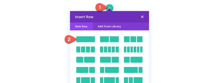
Creating the First Row and Column
Let’s start by adding a one-column row to the section. This first row will contain the design of our initial hero section before transitioning to a second row/design which we will build after this row.
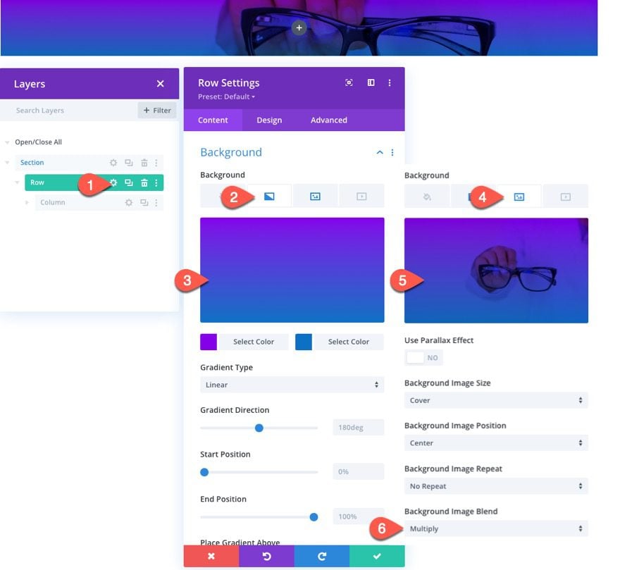
Row Settings
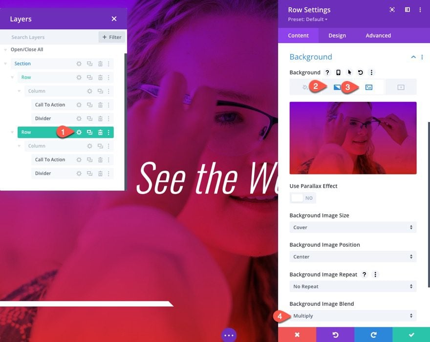
Open the row settings and add a custom background as follows:
Background Gradient
- Background Gradient Left Color: #8300e9
- Background Gradient Right Color: #0c71c3
Background Image
- Upload Image
- Background Image Blend: Multiply
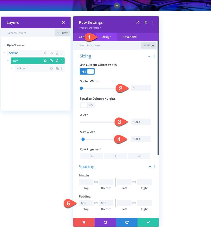
Under the design tab, update the sizing and padding as follows:
- Gutter Width: 1
- Width: 100%
- Max Width: 100%
- Padding: 0px top, 0px bottom
The gutter width 1 will take out any default margins that may affect our module design spacing later on. And we want the width to span the full width of the browser since this will serve as our main background for our fullscreen hero section.
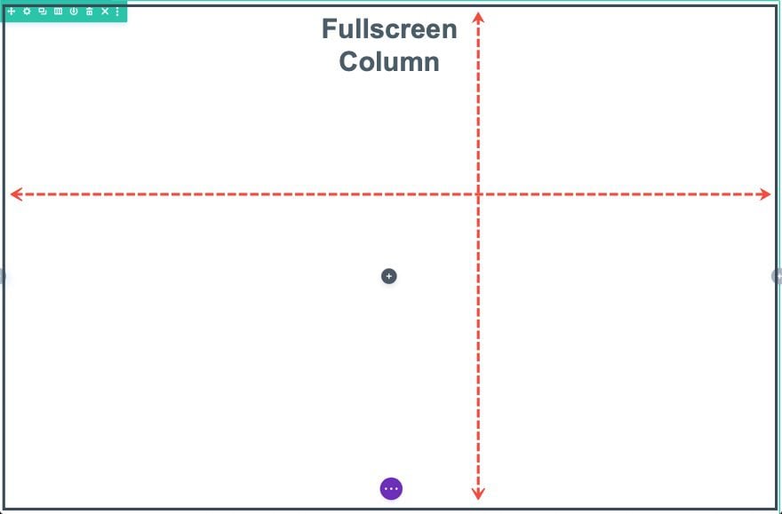
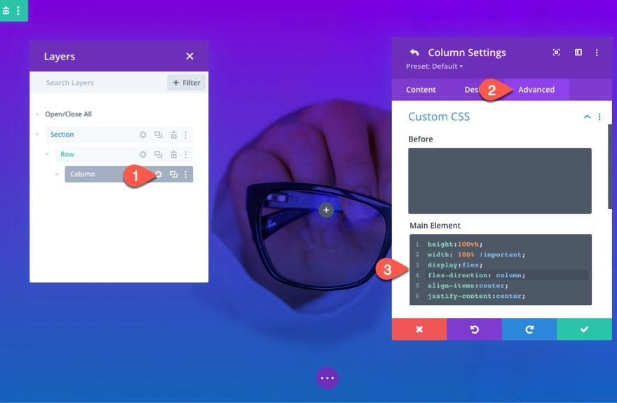
Column Settings
The real key to this design is the customization of the column. We want the column to span the full height and width of the browser window. This will give us room to add and position multiple modules inside the column using the absolute position. And we want to use the flex property to vertically center any modules we will add without the absolute position.
Open the column settings and add the following custom CSS to the Main Element:
height:100vh;
width: 100% !important;
display:flex;
flex-direction: column;
align-items:center;
justify-content:center;
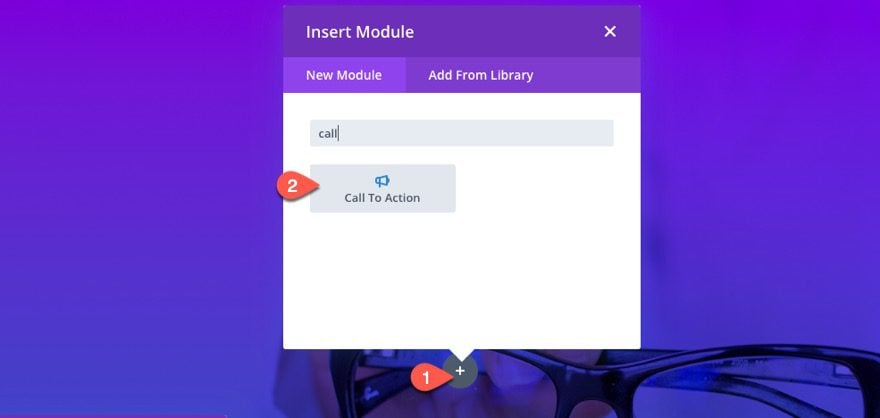
Adding the Modules
Now we can add the module we want to use to add the content for the initial hero section design.
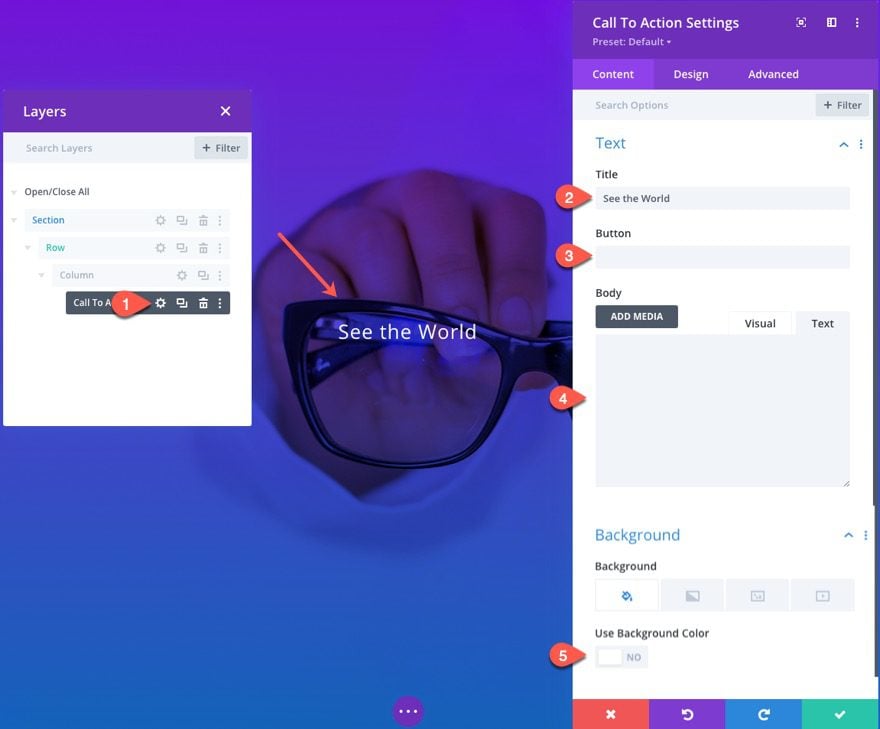
Call To Action
For our first module, let’s add a Call to Action module that will include the Title for our initial hero section design.
Because of our column custom CSS, the module should stay vertically centered within the window automatically.
Content Settings
Then open the Call to Action Settings and update the following:
- Title: See the World
- Button: leave blank
- Body: leave blank
- Use Background Color: NO
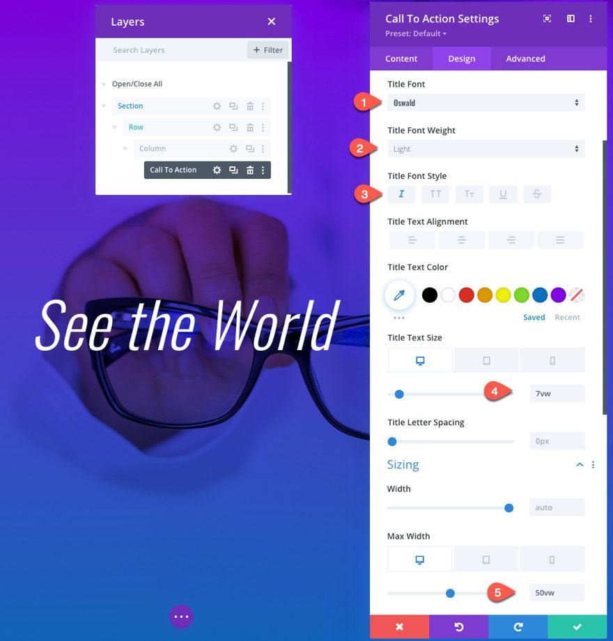
Design Settings
- Title Font: Oswald
- Title Font Weight: Light
- Title Font Style: italic
- Title Text Size: 7vw (desktop), 40px (phone)
- Max Width: 50vw (desktop), 70vw (tablet and phone)
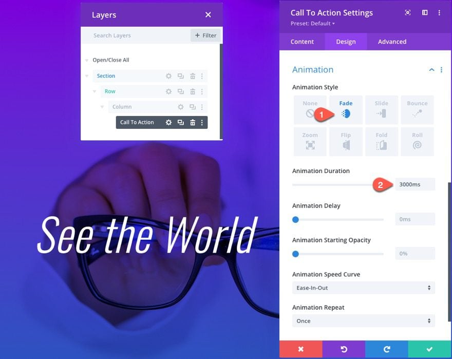
Animation
- Animation Style: Fade
- Animation Duration: 3000ms
Keep Track of your Animation Timing!
The key to making this design work is to orchestrate the timing of any animation duration and/or animation delay values so that the next hero section design elements don’t start until the first hero section design animations have completed. For this example, the Call to Action module has an animation duration of 3000ms (or 3 seconds). This is important to remember so that we how long to delay the animation of the transition (or next) design. The next transition hero section design we are going to create after this one consists of a separate row (with new design elements and animations) that sits on top of this one (like an overlay). However, we will need to delay the animation of that entire row/design so that the first hero section design has been given adequate time to animate. So theoretically, we should delay the animation of our next hero section design by around 3000ms because that is the animation duration of our initial Call to Action Module.
Although keeping track of the timing can be tricky, especially with a lot of animation elements, this setup gives you a world of possibilities for adding all kinds of animation designs because you have the power to adjust the duration and delay of each animation element.
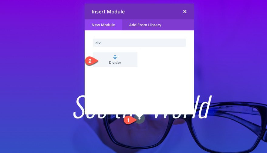
Divider
Although we can choose any module/content design to animate on our initial hero section, we are going to keep it simple by adding a Divider Module with a Slide animation.
Go ahead and add a new Divider module under the Call to Action Module.
Design Settings
Under the design tab in the Divider Settings, update the following:
- Line Color: #ffffff
- Divider Weight: 1vw
- Width: 40vw
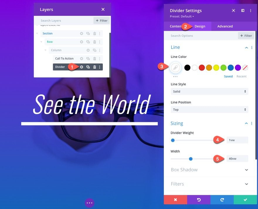
Take Advantage of the VW Length Unit
Using the vw length unit here is perfect because we want the size of the divider to scale consistently with the browser width for a smooth responsive design. Since the parent column of the divider has a width of 100% and a height of 100vh, the vw length unit is perfect for these design elements. We have already used it for our CTA Title text as well.
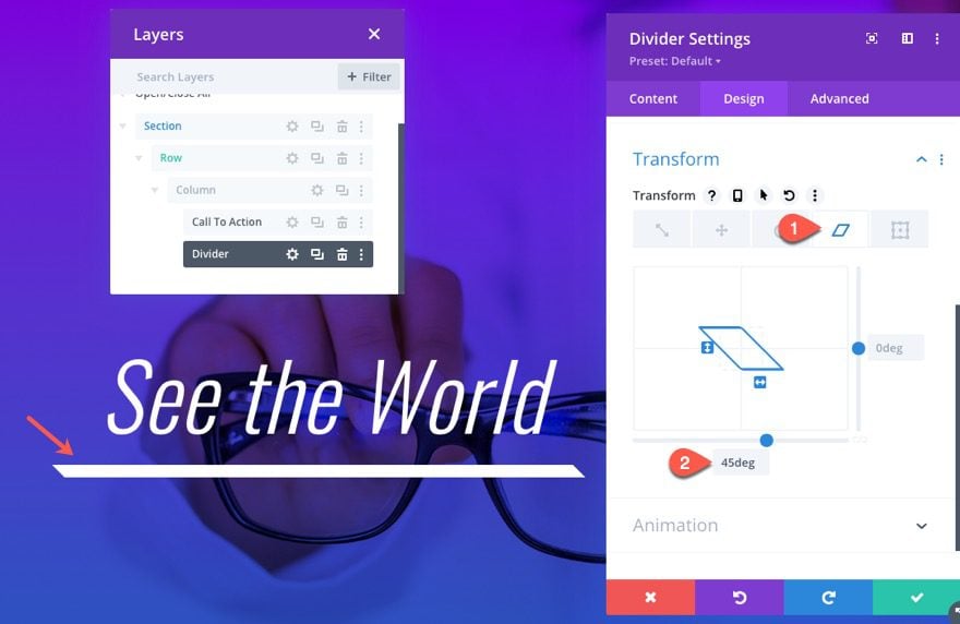
Transform
To add a unique twist to the divider design, update the transform skew option as follows:
- Transform Skew X Axis: 45deg
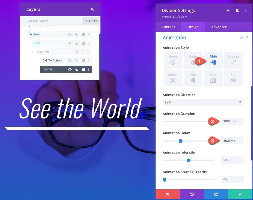
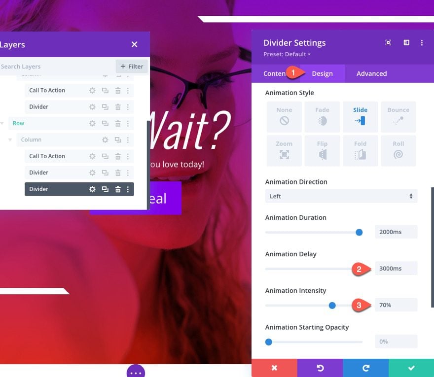
Animation
- Animation Style: Slide
- Animation Duration: 2000ms
- Animation Delay: 1000ms
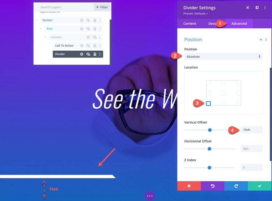
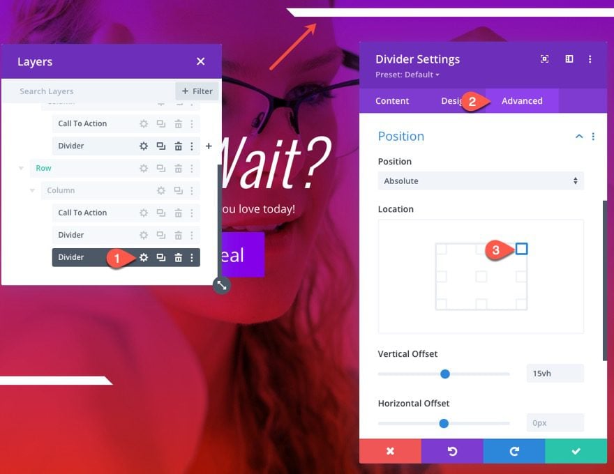
Position
Now position the divider with an absolute position as follows:
- Position: Absolute
- Location: bottom left
- Vertical Offset: 15vh
Result
Here is the result so far.
Part 2: Creating the Transition (Second) Hero Section Design with Custom Animation Elements
Duplicate the First Row
To jumpstart the design of our second/transition hero section design, duplicate the first row.
Now we can tweak the content, design, and animation of the duplicate row elements as needed.
Update Row Background
Open the row settings of the new/duplicate row and update the background with a new gradient color combo and image:
- Background Gradient Left Color: #8300e9
- Background Gradient Right Color: #e02b20
- Background Image: [upload new image]
- Background Image Blend: Multiply
Update Call to Action Module
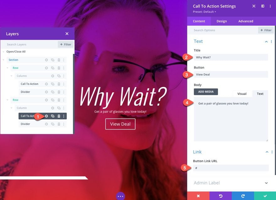
Content
Next, open the call to action module settings and update the content as follows:
- Title: Why Wait?
- Button: View Deal
- Body: Get a pair of glasses you love today!
- Button Link URL
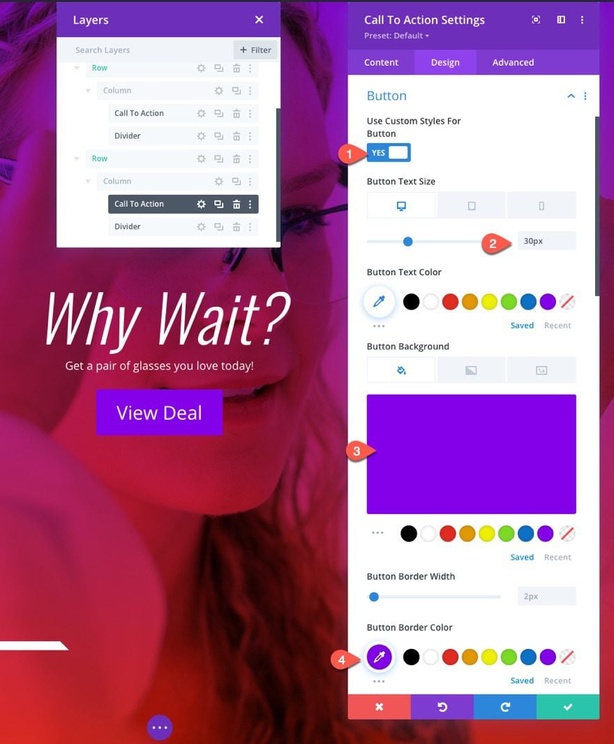
Button Settings
Under the design tab, update the button settings as follows:
- Button Text Size: 30px (desktop), 20px (phone)
- Button Background Color: #8300e9
- Button Border Color: #8300e9
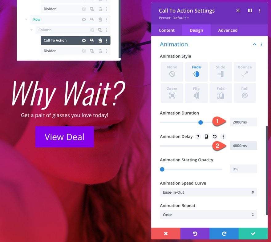
Update Animation
Next, change the animation duration and delay:
- Animation Duration: 2000ms
- Animation Delay: 4000ms
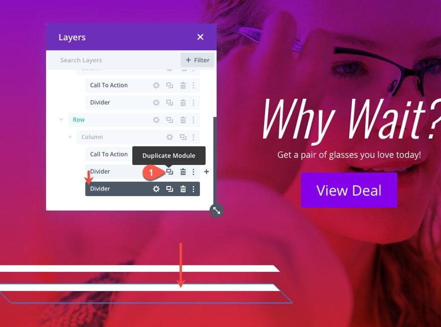
Duplicate Divider
Since the first hero section design included a divider that slides to the bottom left of the hero section, we can add another complimentary divider that slides to the top right on this transition hero section design.
To make this process easier, duplicate the existing divider.
Divider Position
Then open the duplicate divider settings and update the position as follows:
- Position Location: top right
Update Divider Animation
- Animation Delay: 3000ms
- Animation Intesity: 70%
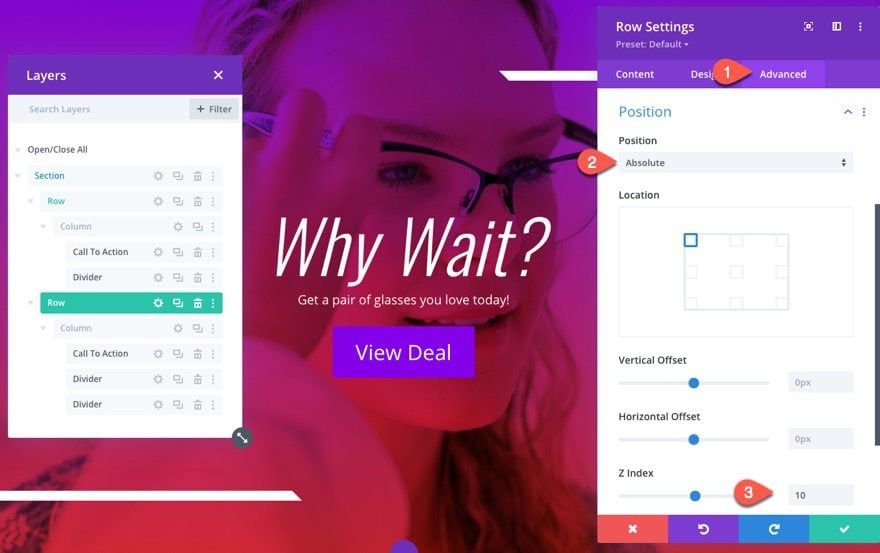
Row Position
Now that the next transition hero section design is finished, we can now give the row an absolute position so that it will sit on top of the initial row/hero section design.
Update the row settings position as follows:
- Position: Absolute
- Z Index: 10
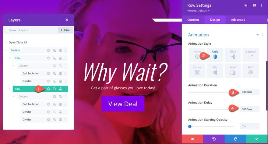
Row Animation
To make sure the animation of this second transition hero section design appears at the right time, update the animation settings as follows:
- Animation Style: Fade
- Animation Duration: 2000ms
- Animation Delay: 3000ms
Final Result
Final Thoughts
Hopefully, the design techniques featured in this tutorial will boost your understanding of Divi in order to create amazing animation and transitions for your hero section. Feel free to play around with different animations (slide, flip, etc.) and add new modules for additional design elements. And there is a good chance you will see even more applications for this technique as well.
I look forward to hearing from you in the comments.
Cheers!


How do you put this on loop?
Good Way to create Hero Section without using a slider. But after I added the second row, changed the middle text to Why wait with a line geta pair… and the button, my bottom divider went down… and then both rows had bottom divider spaced apart. I had to manually adjust the bottom divider in the second row to match the first one to get the correct animation. Did I make a mistake anywhere? Where did I go wrong…
Thank you for this exciting insight! I think you always have to see how you have to balance the compromise between beautiful design and website speed. Actually, it’s a pity that Google puts us in front of this decision at all.
It’s a very attractive design but animation and a slider adds to the timings on Google’s Pagespeed Insights does it not? On the one hand we want to attract visitors with a great design but on the other we don’t want to lose ranking on Google due to slow loading of the Core Web Vitals. Clearly a balance to be made here.
Very awesome design I m thinking to try this one for my blog
Can’t tell how much i love this animation! thank for sharing the tips. Best regards