
Hero sections; they serve all kinds of purposes. They’re the first thing visitors see when they visit your website, they immediately show the style of your website and they influence the way your visitors feel and behave on your site. We’re already used to all kinds of hero sections out there, but most of them include a hero image, a tagline and a call to action. There are other possibilities as well, though. In this post, we’ll show you another approach on hero sections and we’ll follow it up with an example you can recreate using Divi.
Example
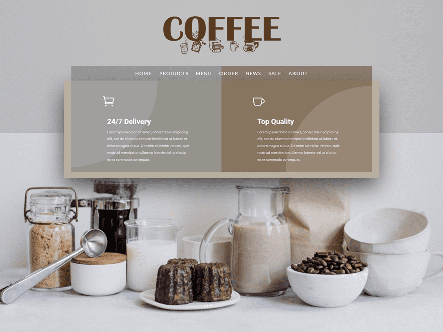
The example we’ll show you how to recreate with Divi looks like this on desktop:
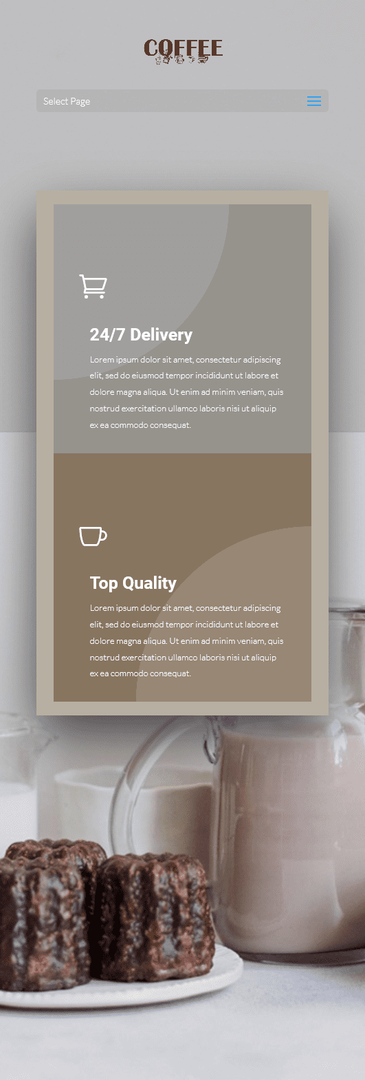
And like this on mobile:
How to Make Your Hero Section Stand Out
Before we show you how to recreate the example, let’s take a look at some of the factors that differentiate this hero section from other ones.
1. Large, Descriptive and Centralized Logo
The first thing we’re using in our example, to help make our hero section stand out, is a centered header format instead of the default. Along with that, we’re also using a transparent menu that’ll help overlap the menu items with the hero section design. The link between the logo, menu and website is clearer when using a transparent background since there’s one less division within the hero section.
2. Concentrate Written Content
Another thing you can do to make your hero section stand out is concentrating the written content you have. That way, you’ll draw the visitors’ attention to one place on the screen which makes the chance of them reading it bigger. If you’re, on the other hand, dividing written content throughout your whole hero section, the changes are more likely that they’ll miss out on a part of the message you’re trying to bring.
3. Highlight Unique Selling Propositions
Usually, a hero section contains normal Text Modules that share a product or company’s tagline. However, you can also use Blurb Modules within the hero section as well. These Blurb Modules are perfect if you want to share the unique selling propositions of your product or service right away. On top of that, you can also choose whether or not you want to include calls to action in it right away. In our example, these call to actions are built into the blurb modules themselves.
4. Clean Product Image
To top it off, and to balance the written content you’ve provided, we recommend using a clean product image as your hero section background image. You want your hero image to be as qualitative and self-explanatory as possible without taking over the whole hero section.
How to Create Showstopping Hero Sections with Divi
Subscribe To Our Youtube Channel
Recreate Example with Divi
Now that we’ve gone over the theoretical side, it’s time we start recreating it.
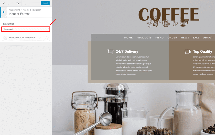
Header Format
The first thing you’ll need to do is choosing ‘Centered’ as the Header Style by going to your WordPress Dashboard > Customize > Header & Navigation > Header Format > And choose ‘Centered’ as the Header Style’.
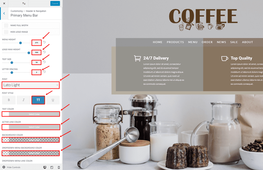
Then, go back to the Header & Navigation > Primary Menu Bard > And make the following adjustments:
- Menu Height: 211px
- Logo Max Height: 100px
- Text Size: 16
- Letter Spacing: 2
- Font: Lato Light
- Font Style: Uppercase
- Text Color: #FFFFFF
- Active Link Color: #FFFFFF
- Background Color: rgba(255,255,255,0)
- Dropdown Menu Background Color: rgba(255,255,255,0)
Add New Section
Once done, add a new page, enable the Divi Builder, enable Visual Builder and add a new standard section.
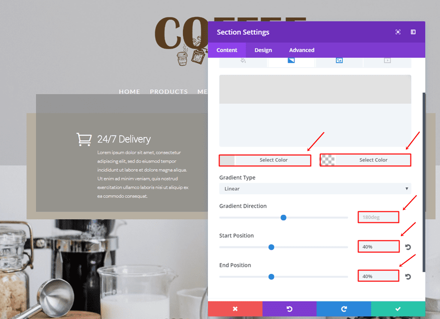
Gradient Background
Use the following gradient background for this section:
- First Color: #e2e2e2
- Second Color: rgba(255,255,255,0)
- Gradient Type: Linear
- Gradient Direction: 180deg
- Start Position: 40%
- End Position: 40%
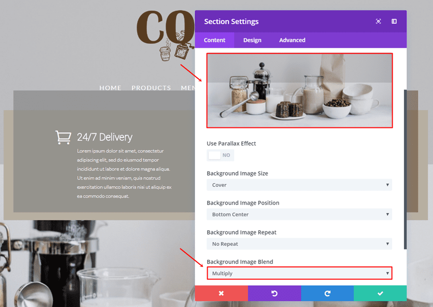
Background Image
Next, upload background image and choose ‘Multiply’ as the Background Image Blend.
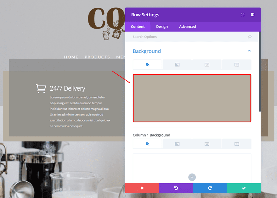
Add Two-Column Row
Background Color
Add a two-column row to the section you’ve just created and use ‘#b7afa1’ as the background color.
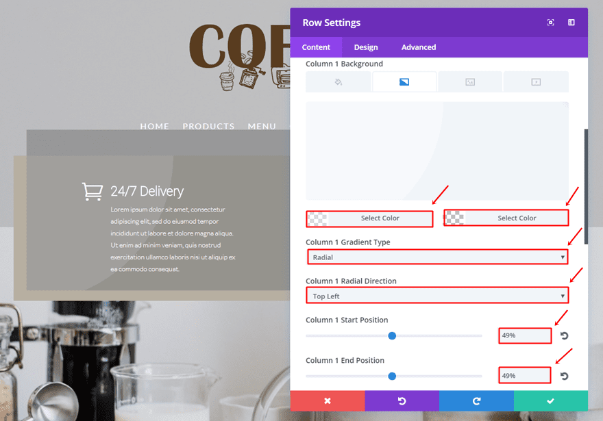
Column 1 Gradient Background
Scroll down and make use of the following gradient background for the first column:
- First Color: rgba(255,255,255,0.43)
- Second Color: rgba(255,255,255,0)
- Column 1 Gradient Type: Radial
- Column 1 Gradient Direction: Top Left
- Column 1 Start Position: 49%
- Column 1 End Position: 49%
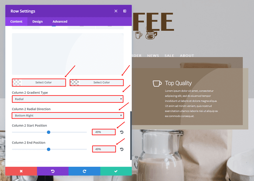
Column 2 Gradient Background
And use the following gradient background for the second column:
- First Color: rgba(255,255,255,0.43)
- Second Color: rgba(255,255,255,0)
- Column 2 Gradient Type: Radial
- Column 2 Radial Direction: Bottom Right
- Column 2 Start Position: 49%
- Column 2 End Position: 49%
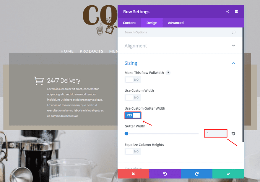
Sizing
Go to the Design tab, enable the ‘Use Custom Gutter Width’ option and use ‘1’ for the Gutter Width.
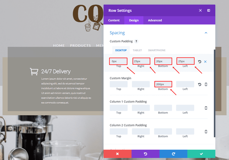
Spacing
Open the Spacing subcategory and use the following padding and margin:
- Top Padding: 0px (Desktop), 20px (Tablet & Phone)
- Right Padding: 25px
- Bottom Padding: 20px
- Left Padding: 25px
- Bottom Margin: 200px
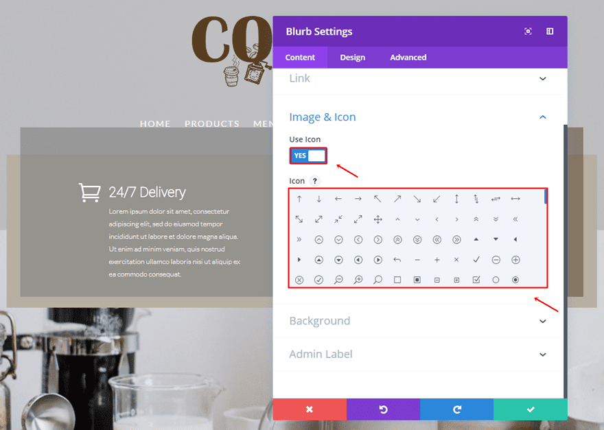
First Blurb Module
Enable Icon
Add a Blurb Module to the first column of the row, enable the ‘Use Icon’ option and choose an icon.
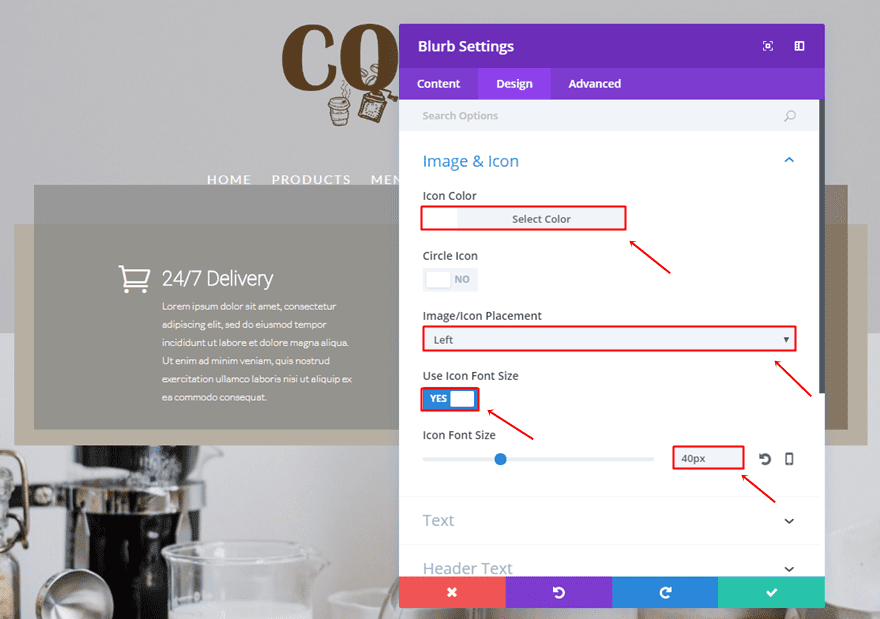
Icon Settings
Then, go to the Design settings and make the following changes to the Image & Icon subcategory:
- Icon Color: #FFFFFF
- Image/Icon Placement: Left
- Use Icon Font Size: Yes
- Icon Font Size: 40px
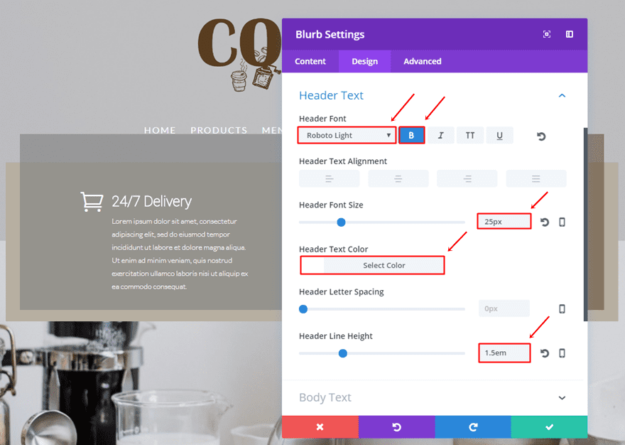
Header Text Settings
Then, make the following settings apply to the Header Text subcategory:
- Header Font: Roboto Light
- Font Style: Bold
- Header Font Size: 25px
- Header Text color: #FFFFFF
- Header Line Height: 1.5em
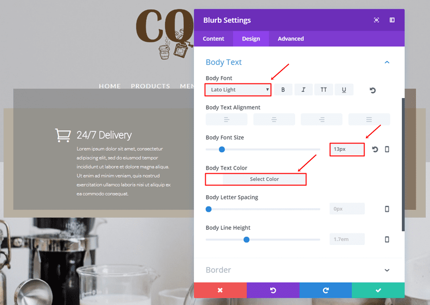
Body Text Settings
The Body Text subcategory will need the following changes:
- Body Font: Lato Light
- Body Font Size: 13px
- Body Text Color: #FFFFFF
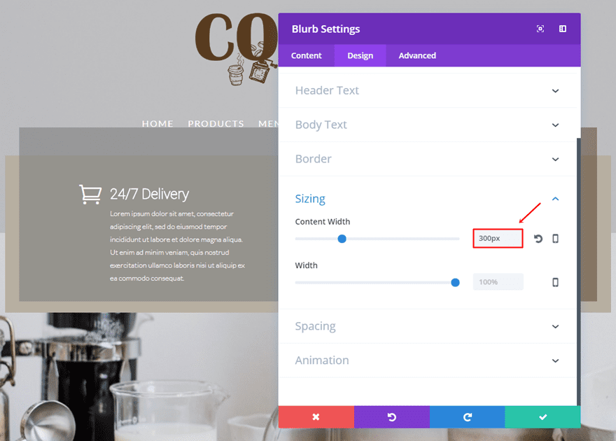
Sizing
Next, use ‘300px’ as the Content Width.
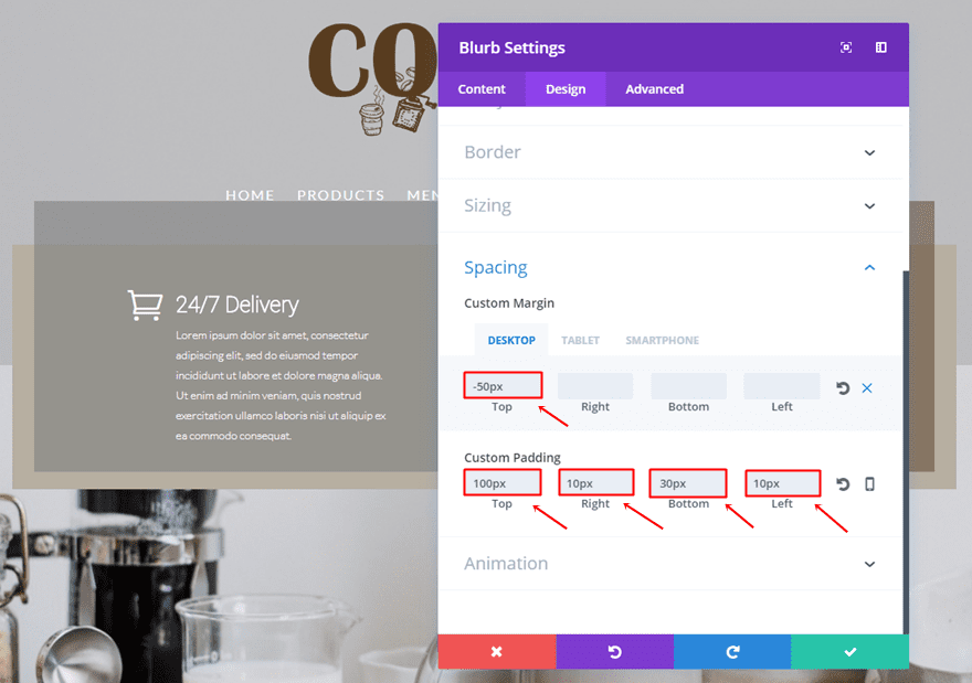
Spacing
Lastly, use the following margin and padding for the Blurb Module:
- Top Margin: -50px (Desktop), 0px (Tablet & Phone)
- Top Padding: 100px
- Right Padding: 10px
- Bototm Padding: 30px
- Left Padding: 10px
Clone Blurb Module & Place in Second Column
Continue by cloning the previously made Blurb Module and placing it in the other column as well.
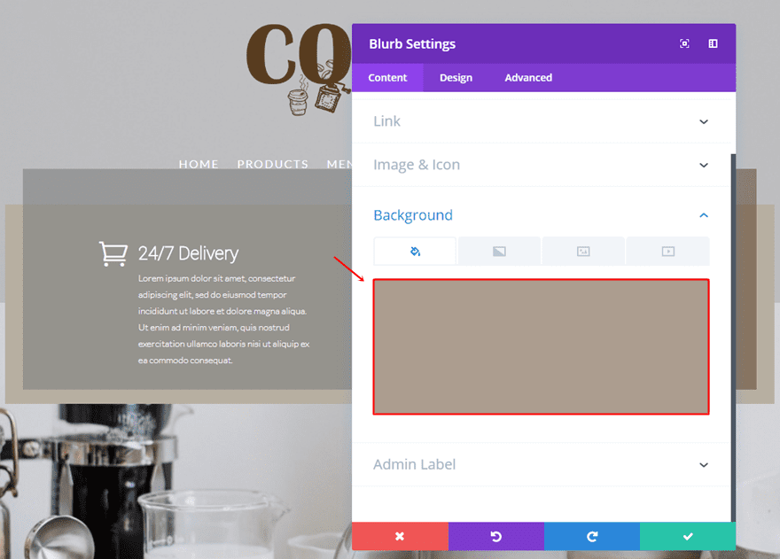
Change Background Color
The first thing you’ll have to change in this cloned Blurb Module is the background color. Change it into ‘rgba(89,60,31,0.5)’.
Change Icon
The next and last thing you’ll need to change is the icon within the content tab.
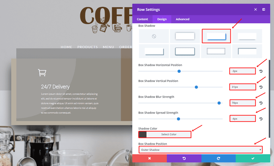
Extra: Add Divi’s New Box Shadow Option to Row
With the recent update, you’re now also able to add box shadows to rows, modules and sections. For this example, we’re going to add some box shadow to the row. That’ll help create some depth and emphasize the written content in our hero section.
- Box Shadow Horizontal Position: -3px
- Box Shadow Vertical Position: 31px
- Box Shadow Blur Strength: 79px
- Box Shadow Spread Strength: -4px
- Shadow Color: #424242
- Box Shadow Position: Outer Shadow
Result
Let’s take another quick result at the result you should be able to achieve on desktop after following this post:
And on mobile:
Final Thoughts
In this post, we’ve shown you a different approach on hero sections. We’ve given you some tips and elaborated those tips by showing you how to recreate an example we’ve made in advance with Divi. If you have any questions or suggestions; make sure you leave a comment in the comment section below!
Be sure to subscribe to our email newsletter and YouTube channel so that you never miss a big announcement, useful tip, or Divi freebie!
Featured Image by Ellagrin / shutterstock.com


Thank you very much for this example!
Throughout some trial and error (and reading the comments) I was able to ALMOST achieve this. The top overlay section of the two blurbs does not line up with my menu. The menu, from my impression, should be locked into place at the top of the two blurbs. Am I missing something?
I see all the great positive reviews and slam my face into the keyboard. Nothing I’ve done, so far, has my “Hero” section turn out remotely close to being this great. They say the 3rd time is a charm… I’m hoping this 4th time will shine said charm.
I was right, 4th was the shine to said charm!
I’m loving the new Divi tools. Thanks so much, I’m learning a lot with these posts. Keep the tutorials coming!
JSON FILE!!!
+1 for json file
Hi Donjete,
Thanks for the great idea, however I think that there’s still some steps missing or that may need to be changed;
In your image for mobile the icons in the blurbs are above the text, however when I follow your instructions my icons are fixed to the left of the title text for mobiles. This has the effect of pushing the heading and body text to the right and outside of the background area.
Hmmm… Is it just me? (I use Divi all the time). This does not seem to work properly, looks like some steps are not included? 😉 Please include the .json file so we can figure it out better – It’s sometimes easier to work backwards 😉 to actually see and follow the post. Appreciated.
Oh! I just saw the comment… But the post didn’t seem to be updated. Still would like the .json file though 😉
David is correct, there are steps missing. The instructions for column 1 are missing the background colour, the section instructions do not address how to get the upper transparent block to appear over top of the navigation (it appears about an inch below) and the instructions for the background image cause the image to appear fullscreen vs just the bottom half. I was able to sort out all but the background image issue. Anyone know how to get the background image to appear on the bottom half alone?
These tutorials are fantastic and greatly appreciated. Including the json to these tutorials would be most helpful though. Both to solve the problem of left out instructions and to better learn by example vs learning by copying and pasting, then trying to figure out what’s missing.
Unfortunately, I did forget to add two steps. I’ll try to include them in this post asap. In the meantime, here they are:
– Section settings: add 10px top padding & 330px bottom padding in the Spacing subcategory of the Design tab
– First blurb module settings: add background color of ‘rgba(130,130,130,0.63)’ to the Background subcategory in the General tab
This should make it work 🙂 Plus, know that the background image covers the whole section, it’s the image itself that makes the first half appear as just a color.
Thanks Donjete! Much appreciated.
Thanks so much for this great Hero Section tutorial. It looks great and I have tried it out today. However, despite checking and re-checking every single option I am unable to re-produce this.
The main issue is that the coloured blurb boxes (grey/brown) sit within (ie. slightly below the top of) the beige row background colour (rather than slightly up from it as per your picture). Therefore the menu items do not sit across the blurb background boxes but instead hover above the whole section. So basically this just looks like a large coloured rectangle with two coloured boxes inside it and a menu up above.
Also, the radial gradients worked fine within the settings boxes but do not seem to actually show up over the row/section either. I’ve been over my settings about 5 times and can’t seem to see where I have gone wrong … any suggestions? If you can provide any assistance I would greatly appreciate it. Thanks. (PS. Just to note that you also haven’t mentioned the background colour for the first blurb module).
Unfortunately, I did forget to add two steps. I’ll try to include them in this post asap. In the meantime, here they are:
– Section settings: add 10px top padding & 330px bottom padding in the Spacing subcategory of the Design tab
– First blurb module settings: add background color of ‘rgba(130,130,130,0.63)’ to the Background subcategory in the General tab
Hope that’ll change this for you 🙂
Thanks Donjete, Many thanks for your speedy response.
I have now changed the Section padding but unfortunately this has had no effect!
I have double checked a number of times (and ensured my caching is not on) but it doesn’t want to work for me. Perhaps I’m missing something.
Will be interesting to see if this now works for everyone else with the same issues.
Rgds, Julia 🙂
I just took a look at your website and I noticed you used 50px instead of -50px as the top margin of your blurb modules
Use a value of -50px or -60px or -70px for the top margin of your blurb modules until you watch it all fall into place. And for the best result; disable fixed scrolling by going to Divi > Theme Options > Disable fixed navigation
Yes !! Thank you so much. So obvious now. I do think that, like some of the comments mention, it would be great to add in a brief explanation of which settings are creating what effect so as to better learn from each of them as we re-create the layout. I have found these tutorials very helpful (as are the free layouts) as when you disect them you learn more about how they are structured. Many thanks for the reply. 🙂
Very cool post. I love seeing these examples of how to use some of the Divi tools. Keep the emails coming!
Sorry, I attempted to replicate this as per instructions. I use Divi every day. The instructions are not clear and are missing some important steps. If you uploaded JSN file you would have saved me about an hour of my time wasted on this.
Unfortunately, I did forget to add two steps. I’ll try to include them in this post asap. In the meantime, here they are:
– Section settings: add 10px top padding & 330px bottom padding in the Spacing subcategory of the Design tab
– First blurb module settings: add background color of ‘rgba(130,130,130,0.63)’ to the Background subcategory in the General tab
Json file post please.
Hello Donjete,
You show us how to do an exercice school, I mean with your background image size and text (five lines for the text)…
If my image or text are different, your design will continue to work ? If not I have te re-create and may be frustrated because not working ….
So why not share the json file ? I download, make my custom, working easily I happy, not working I don’t lose time but your design still in my mind and I’ll take time to adapt ….
Anyway your work is perfect…
Best regards
Den
Please keep these “how to design” posts coming! It’s definitely stirring up my design juices. It’s super simple yet eye catching…Keep it up!
This is how to do this sort of blog-tutorial.
• Show me what you’re going to do.
• Tell me why it’s to my advantage to do it.
• THEN get in the weeds and show me how to do it. But don’t forget to tell me WHY I’m adding that padding. That’s where the REAL learning is!
Thanks.
Randy, I agree with you, at first I thought the same – it would be neat to have the padding etc explained. But then I started recreating this layout, following the instructions using Visual Builder and that´s where I started to get the picture and understood how the sizing and spacing works and why 🙂
Thanks ET!!
I was about to comment just that. The instructions are easy to follow even for non experts, but I feel like there is a huge pack of explanation on why this padding or margin helps building the design for people who would begin with divi.
Trying to recreate this and no matter how many times I go over the instructions, my background image covers the entire page instead of just the bottom half. Any ideas as to what might be causing this? I don’t believe I’ve missed any steps but maybe I’m just reading something wrong. Are there supposed to be 2 sections perhaps? I’ve also tried reducing the background image size with no change. In case this is the cause, what would be the ideal image size to use?
Thanks for any help with this,
T
I like this tutorial. Im always looking for a new inspirstions and this is one of them
Neat.
Interesting use of an old advertising term to indicate something very different. Back in the Paleo era when we were working on the AlkaSeltzer commercials, we had two-and-a-half-foot round tablets of the AlkaSeltzer tablets made of carved foam. they were that big in order to allow us to skim over the surface with the camera. These big models were always called ‘heroes’.
I’m not sure what you are calling a ‘hero’. Is it a grouped shot taken at normal focal length? What I see is just a standard, what we used to call, a product shot. Why do you call this a hero?
Maybe it’s like Adobe calling a composition a ‘comp’. ‘Comp’ was a term of trade that referred to a ‘comprehensive sketch’, a layout sketch that, while still a sketch gave the art director an idea of what the finished piece would look like. In those days we used to call a composition a ‘composition’. Kinda tricky, eh?
I like to stay up on the latest terminologies and how traditional terms of trade have changed since computers made graphics and marketing open to a wider range of practitioners with very different skills than we had.
So nice. Thanks! ?
This looks awesome but I wonder about the rest of the pages. I would not want to devote this much page real estate to the page top menu throughout a website. Is this just good for single page sites?
Lots of great ideas here Donjete and the final result is stunning.
Appreciate the time and effort that went into this tutorial 🙂
Awesome! thank for sharing!
Looks great. Do you have the section json available?
I too would love the json, even if it is easy to follow
I agree. Why not share the .jsn files for these tutorials?
Ditto
You read my mind Steve 🙂
why? it’s literally a couple dozen clicks to make this example. Just follow the glaringly simple instructions and make it yourself.
Significantly nice work/example Donjete, and thanks for seeing my previous comment regarding showcasing mobile examples.
Nice Emilio, and not to troll, but I too saw that example of societal outcome of ribbons for seventeen places society. I literally laughed out loud after reading your reply. Thanks for that, on this B-busting Friday afternoon.
🙂
I would also like to save a couple dozen clicks. And by the way, this is part of the ‘comments policy’ here.
“Civility is not optional – The Elegant Themes blog and social channels are meant to be places of empowerment, thoughtful discussion, encouragement, and learning.”
Thanks for reminding me, Brian.
My tongue-in-cheek remarks will henceforth be kept to an even more sparse minimum.
And, I’ll re-iterate what an arduous job the author did in presenting the examples, and instructions, for assistance in training mental muscle memory.
Thank you again Donjete for your diligence.