
Creating pop out sections on your website can really make your content stand out. Plus, this pop out design technique can be applied to any Divi layout for countless combinations.
In this tutorial, I’ll be showing you how to use Divi’s box layout and the Divi Builder to create pop out sections and rows on your website. All it takes is a small amount of custom CSS that extends the section or row past the page container. You can then make additional adjustments and styling using the Divi Builder.
Let’s get started!
Sneak Peek
Here is an example of what you will be able to do:
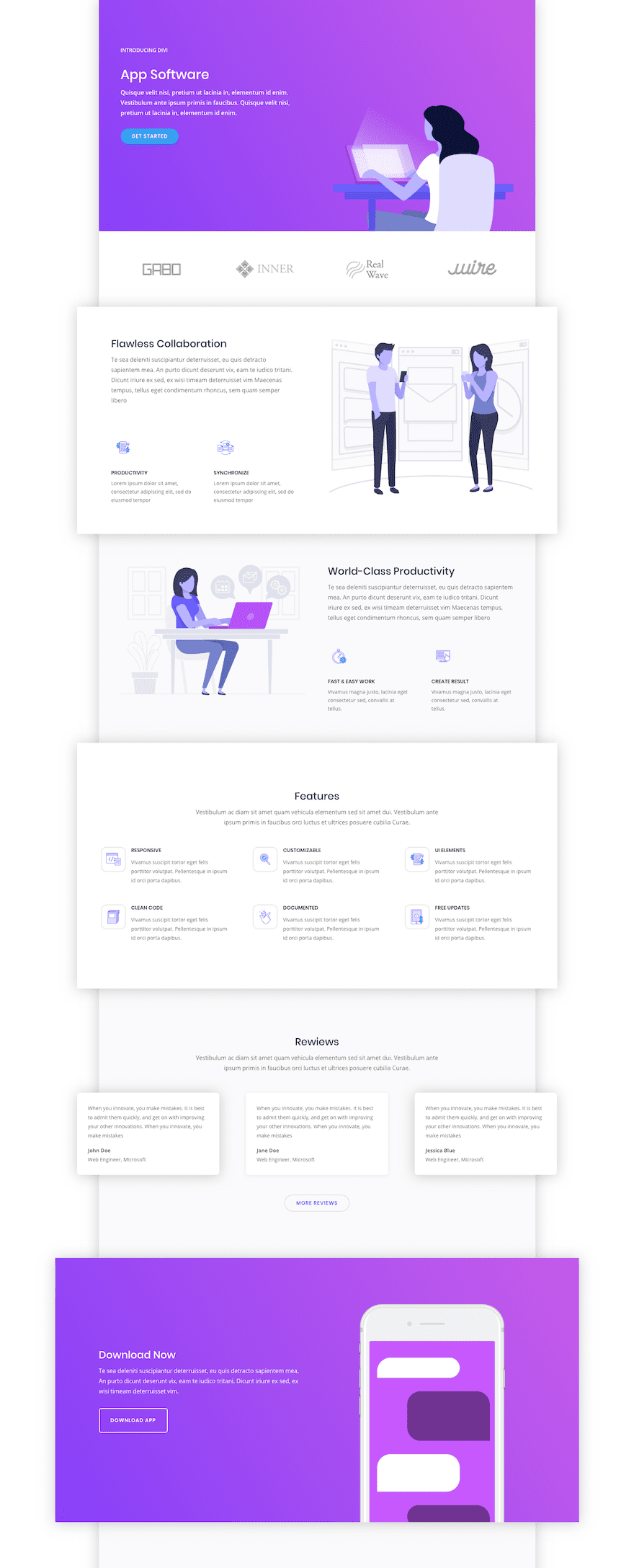
How to Create Pop Out Sections with Divi’s Boxed Layout
Subscribe To Our Youtube Channel
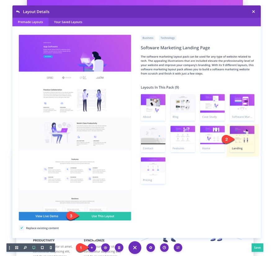
Upload Your Divi Layout
In order to demonstrate how this pop out works, I’m going to use Divi’s Software Marketing Landing Page layout. To use the layout, create a new page, deploy the visual builder, open the settings menu, click the add from library button, select the Software Marketing Landing Page Layout, and click the “Use This Layout” button.
Save and Publish your page.
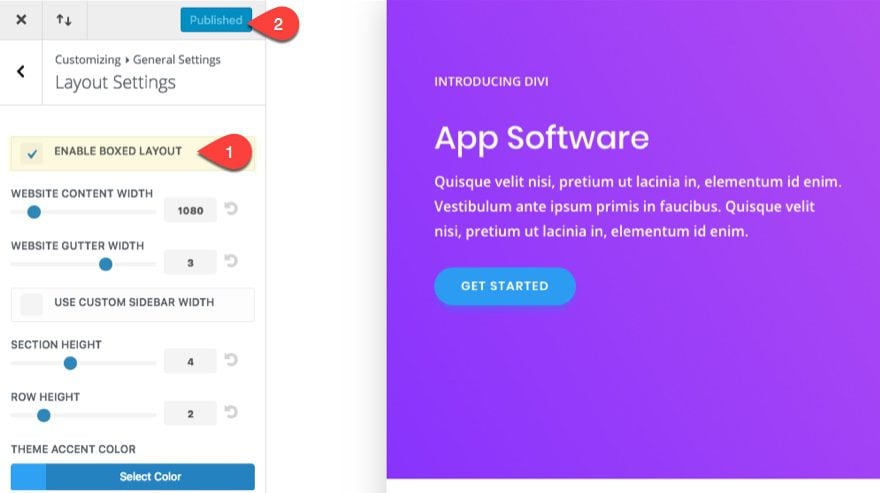
Enable Box Layout in Theme Customizer
The next step is to deploy Divi’s box layout. From your WordPress dashboard, navigate to Divi > Theme Customizer > General Settings > Layout Settings. Then click the check box to enable boxed layout and publish your changes.
Add Custom CSS to Theme Customizer
Next on the list is adding a few snippets of custom CSS. In the Theme Customizer select Additional CSS and add the following Custom CSS in the edit field:
@media (min-width: 980px) {
/*** Adjust default box layout width and allow overflowing sections to become visible ***/
.et_boxed_layout #page-container{
	overflow-y: visible !important;
	width: 80%;
	-webkit-box-shadow: 0px 2px 60px 0px rgba(0,0,0,0.2);
        -moz-box-shadow: 0px 2px 60px 0px rgba(0,0,0,0.2);
        box-shadow: 0px 2px 60px 0px rgba(0,0,0,0.2);
  }
/*** custom class to increase the max width of your pop out sections ***/
.popout-section {
  width: 120% !important;
  }
}
As the comments in the css suggest already, the first css snippet allows the overflowing sections to become visible using “overflow-y: visible”. I also added a shadow (box-shadow) to the box layout, but if you want to keep the default one just leave this out. There is also an adjustment to the default box layout width (or page container). I added this to allow for more “pop out” room on each side of the container. Since the width is now 80% (it was 90%), you will have 10% of margin space on each side of the container to allow for your pop out to extend.
Since we have an extra 20% of space, I created a second snippet with a CSS class (named “popout-section”) that will set the default width to 120% (20% more than 100% of the width of the container) for any row or section you add the CSS class to.
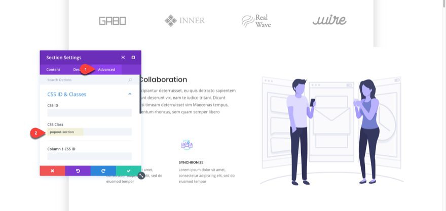
Add the CSS Class to Your Section
To add the CSS Class to your section, open the section settings and, under the advanced tab, enter “popout-section” in the CSS Class input field.
Once you add the CSS Class “popout-section” to your section, you should notice that your section has grown in width and extending past the right side of your page container. This means that your CSS is working by increasing the width of your section to 120%. I didn’t completely customize the section using Custom CSS because I thought it best to leave some room for adjustments using the Divi Builder.
Adjusting Your Pop Out Section with the Divi Builder
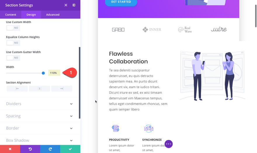
Now that you have a section with 120% width, you can use the Divi Builder to fine tune your pop out width and position. Open you section settings under the design tab and change the width of your section by entering the percentage value in the field. You can enter any value between 100-120%. I think 110% is a great happy medium. Enter 110% in the width field.
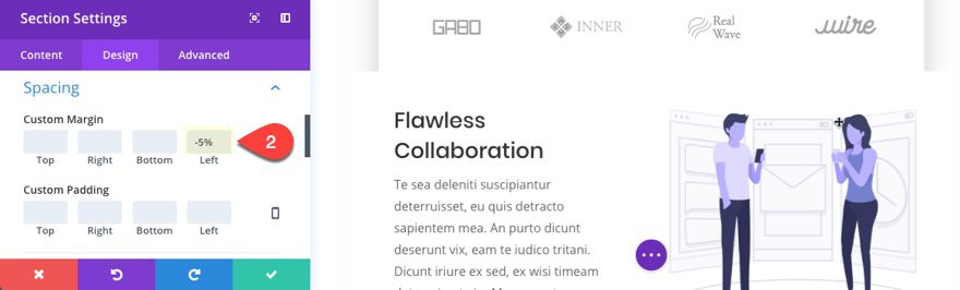
Now you need to adjust the margin to center the pop out section. Since the section is extending 10% to the right of the page container, we need to move it 5% to the left. To do this, enter a custom left margin of -5%.
If you set your width to 120%, you would need to add a left margin of -10%.
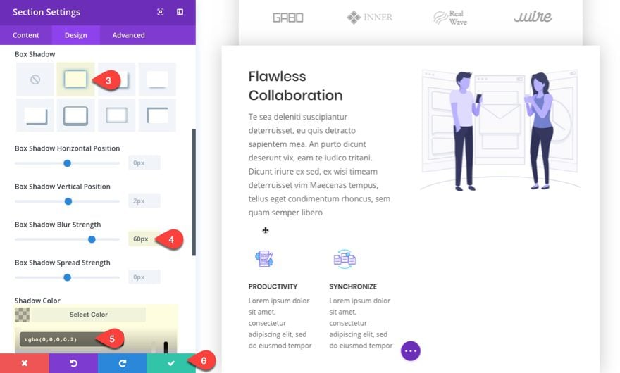
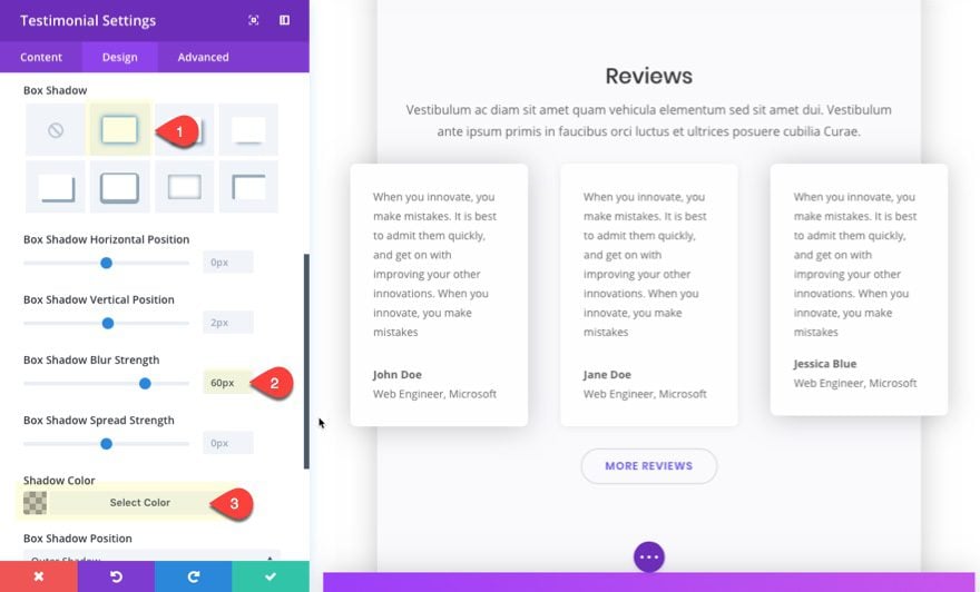
Next select the first box shadow option and give it a blur strength of 60px. And change the shadow color to rgba(0,0,0,0.2).
Create a Pop Out Row
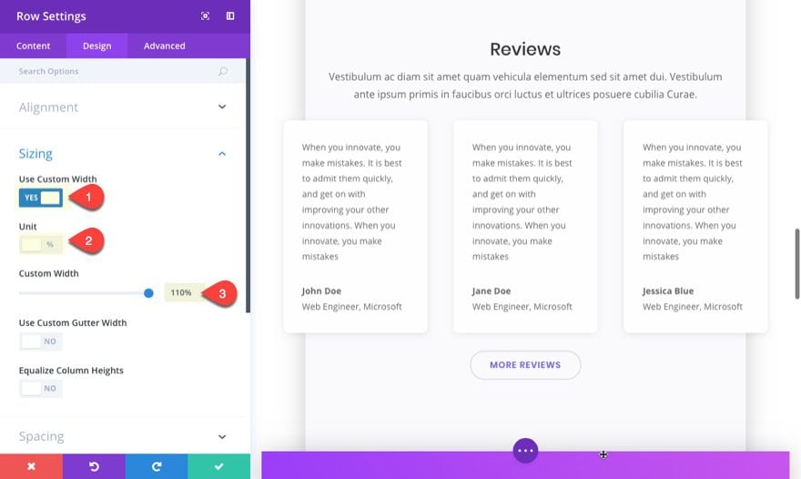
To create a pop out row, you will follow the same basic process as when you create a pop out section. Add the CSS Class “popout-section” to the Row Settings under the Advanced tab. Then under the design tab, select to use custom width, select the percentage unit option, and then enter 110% for the width.
Then set a -5% left margin.
Instead of adding background color and box shadow to the row, you can choose to create the pop out effect on the modules that extend past the page container. Simply edit the module settings, add a white background color, and give it a box shadow with a blur strength of 60px and the color rgba(0,0,0,0.2).
Final Thoughts
Creating pop out sections on a box layout is a unique way to set your design apart with the added bonus of making your content stand out. All it takes is a little custom CSS and you can add a CSS class to any row or section to extend it past the page container. After that, you can adjust your row or section using the Divi Builder settings. This tutorial merely introduces the design concept, but feel free to experiment with your own application of the pop out design.
Looking forward to hearing from you in the comments.
Cheers!


It works great for popup section but not perfectly for row (blur did not appear avant width must be about 120% or more, and you can’t have the previous arrow in the boxed area) but it’s ok ! Thanks a lot for this tutorial !!!
Hey. Thank for this feature. But I have problem with navigation bar, it has a different lengh, what should I do?
Niks, You may have it set to fullwidth. You can change that from theme customizer > Header and Navigation > Primary Menu.
This is wrong —->(.pop out-section)
/*** custom class to increase the max width of your pop out sections ***/
.pop out-section {
width: 120% !important;
}
}
———————————————————————————-
This is OK—–>(.popout-section)
My mistake. I update the post. Thanks.
These tutorials are going to make a decent designer out of me yet. Thanx Jason, keep up the good work.
Is there a way to apply the boxed layout to just certain pages, and the the whole site?
Just to clarify, how can you apply the boxed layout to certain pages and NOT to the whole site?
I created a page giving each section a 90% width. Next I added a top and bottom margin to respective sections. Shazam… Instant boxed layout. I will use this approach to make a pop out section too. Easy and simple.
Thanks Britt. I guess I should have mentioned that in the article.
That is such an great concept, Mak! Thanks for sharing!
actually in last few days i was searching for like this article but here on elegantthemes i read this article now i will use this on my blog so thnak you so much…….
The title’s not misleading in any way. This is super-cool Jason. Thanks!
So glad you liked it, Alicia.
Hi Jason, nice resource, thanks!
I think for your class name, you meant .popout-section (instead of .pop out-section)?
Thanks again for your great tutorials!
Thanks Justin. I updated the post.
I am new to using CSS And I just followed the tutorial in the video and used popout-section which seems to work do I need to change it to (.pop out-section)?
Love the effect it creates thanks guys
Adrian
Disregard the last reply. You shouldn’t change it. As long as the css class in the code on the theme customizer matches the CSS Class name in the module, you are good. Sorry if I confused you.
Adrian,
No you should leave it. The main thing is to have the CSS class “.popout-section” match the CSS ID “popout-section”.
Wait do I need to use the divi layout pack or can I do this in my current site?
This is just for the purpose of this tutorial and will work great with any of your created layouts – assuming the sections are not too high.
Hi, are you planning to include something like that Divi Overlays? It would be great to be able to make buttons, which open in a pop-up modules or sections, directly with Divi builder and not have to depend on third-party plugins.
Thank you very much
Agreed. I just purchased lifetime Divi Overlays plugin yesterday. It is super cool indeed and something I too would prefer to have standard in Divi.
+1
Xavi,
Honestly, I’m not sure if this is in the plans or not, but I do think it is a cool idea. Thanks. And, sorry for the misleading title :).
That would be a nice feature!