
In one of the latest Divi updates, we added some pretty amazing controls to columns in the builder. It’s now easier than ever to create column overlaps. In this tutorial, we’ll show you how to create a testimonial section with three overlapping columns using Divi’s column and transform settings.
For this design, we’ll use three colors, a rich orange #ff8300, a warm yellow #ffd400, and a stand-out blue gradient #0c99c1. You can apply this overlapping column design to a website project in no time.
Let’s get started.
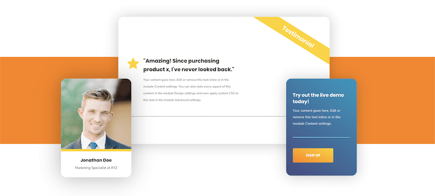
Preview
Before we dive into the tutorial, let’s take a quick look at the outcome across different screen sizes.
Desktop
Mobile

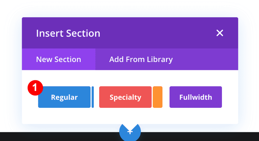
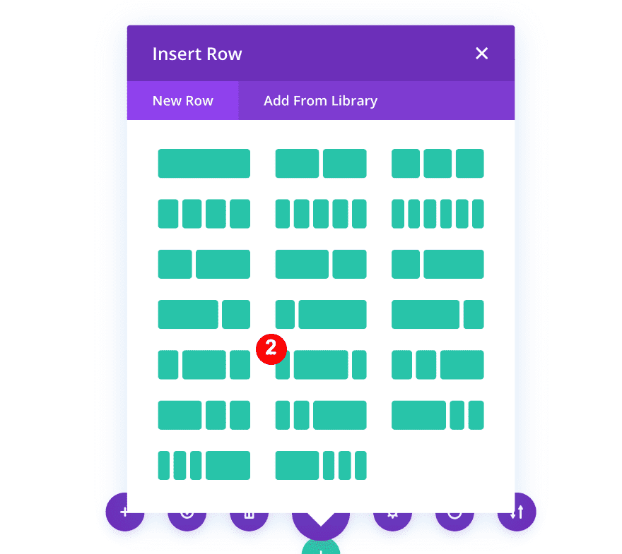
1. Create New Regular Section + Three-Column Row
The first thing you need to do is create a regular section with a three-column row.
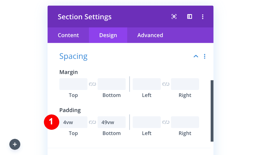
Adjust Spacing of Section
Increase the top and bottom padding of the section.
- Top Padding: 4vw
- Bottom Padding: 16vw
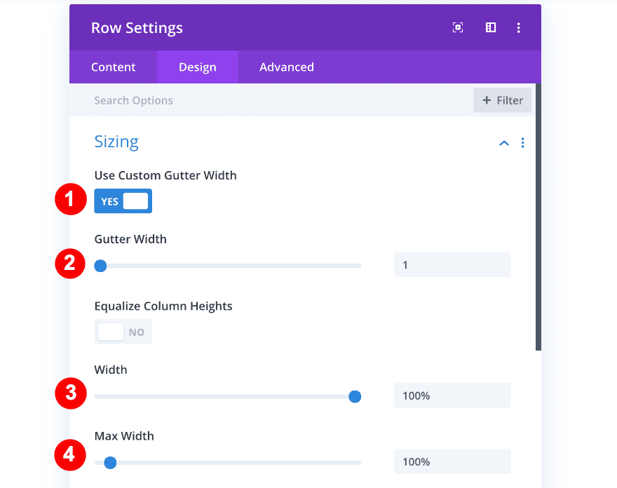
Adjust Sizing & Spacing of Row
Open the row settings and change the sizing settings accordingly:
- Use a Custom Gutter Width: Yes
- Gutter Width: 1
- Width: 100%
- Max Width: 100%
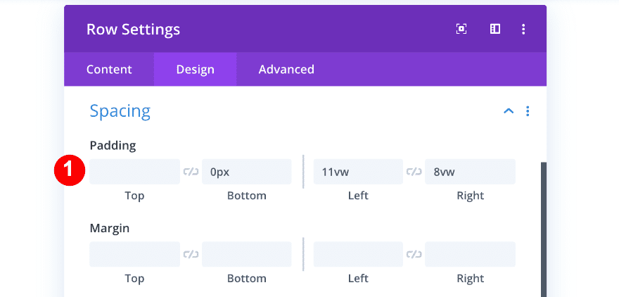
After that, modify the spacing settings:
- Bottom Padding: 0px
- Left Padding: 11vw
- Right Padding: 8vw
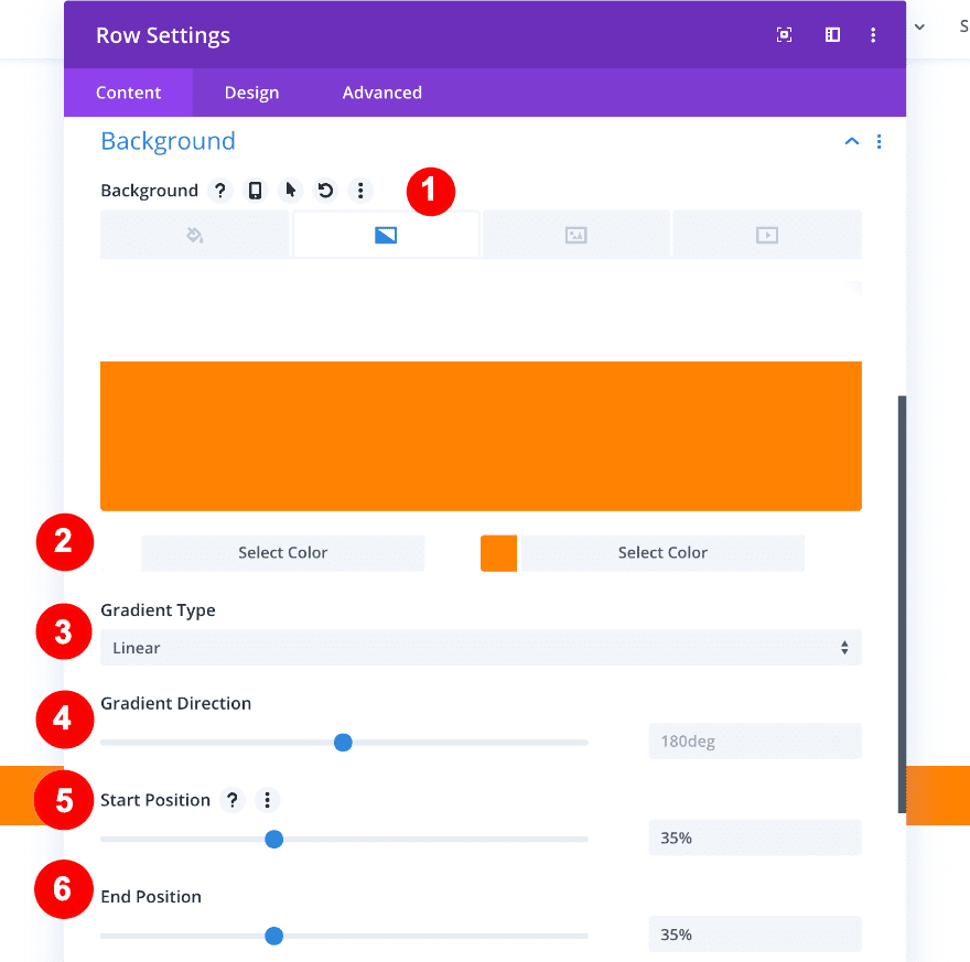
Add Gradient Background
Add a gradient background next:
- Background Style: Gradient
- First Color: white #ffffff
- Second Color: Orange #ff8300
- Gradient Type: Linear
- Gradient Direction: 180 deg
- Start Position: 35%
- End Position: 35%
2. Style Columns
Before adding modules to the columns, we’ll change the styling, spacing and transform settings of each column individually.
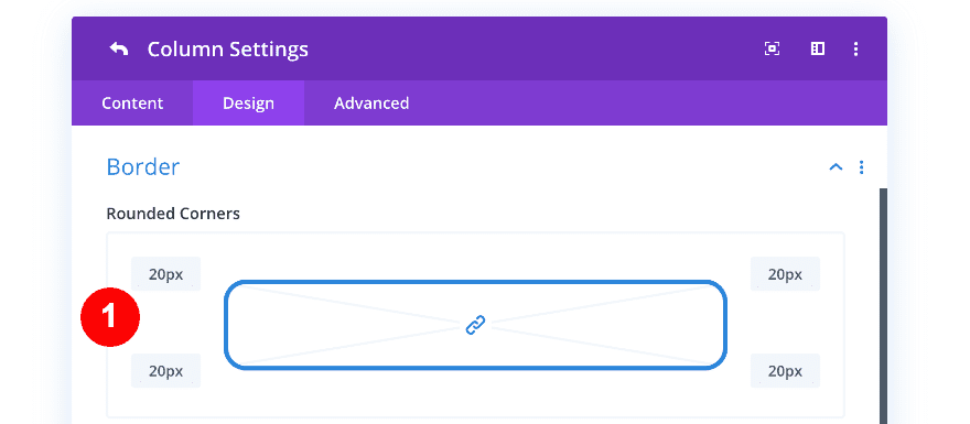
Column 1
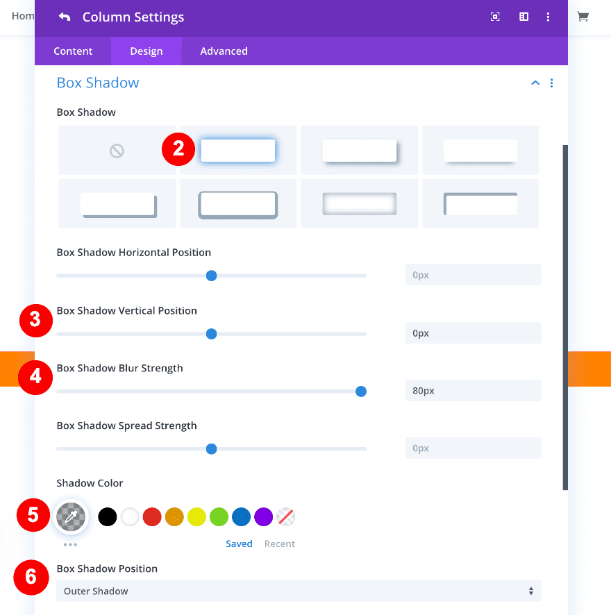
The first steps of the column styling are the rounded corners and box shadow:
- Border: 20px on all rounded corners
- Box Shadow: First box shadow option
- Box Shadow Vertical Position: 0px
- Box Shadow Blur Strength: 80px
- Shadow Color: rgba(0,0,0,0.3)
- Box Shadow Position: Outer
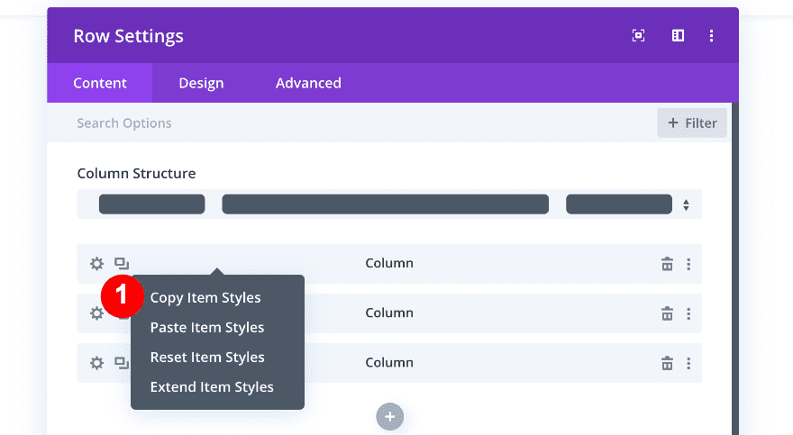
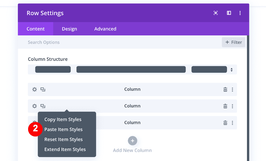
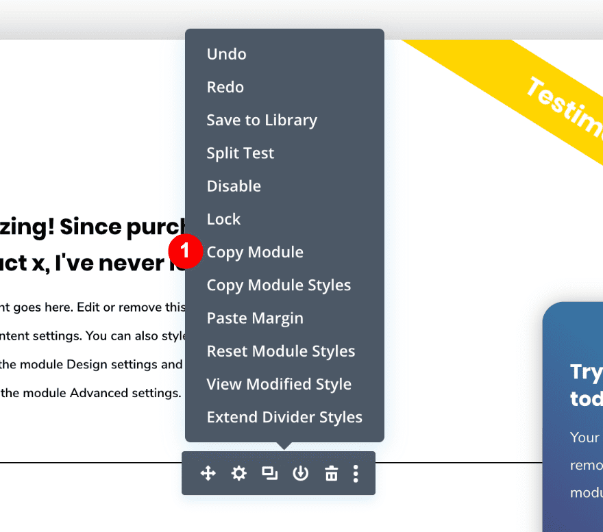
* Before adding any transform settings, we will copy and paste these item styles to column two and three.
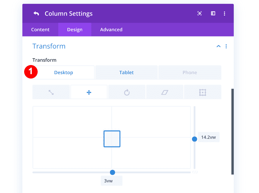
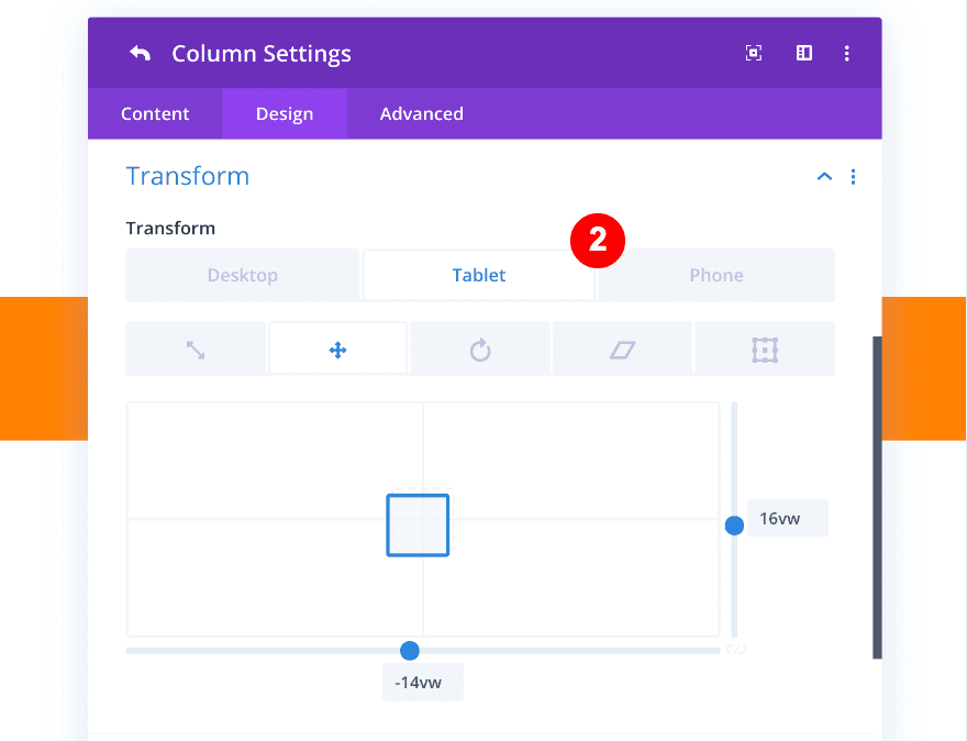
Open the column 1 settings again and go to the design tab. We’ll use the transform settings to make the first column overlap the second. Just in case you forgot, the x-axis is horizontal and the y-axis is vertical.
- Transform Translate:
- Desktop: x-axis = 3vw. y-axis = 14.2vw
- Tablet and Phone: x-axis = -14vw. y-axis = 16vw
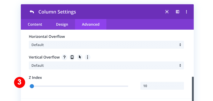
- Visibility: Z Index 10
Column 2
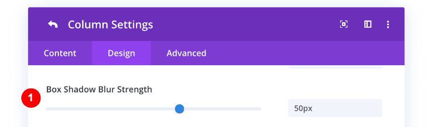
On to the second column! Go to the box shadow (which you’ve added in one of the previous steps) and increase the box shadow blur strength.
- Box Shadow Blur Strength: 50px
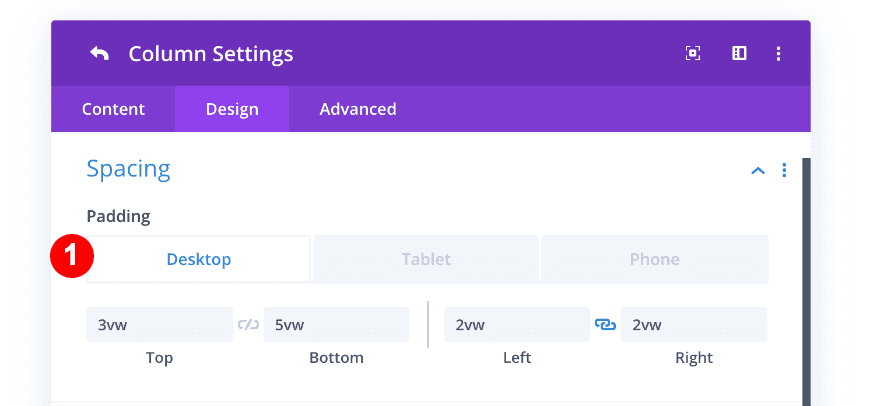
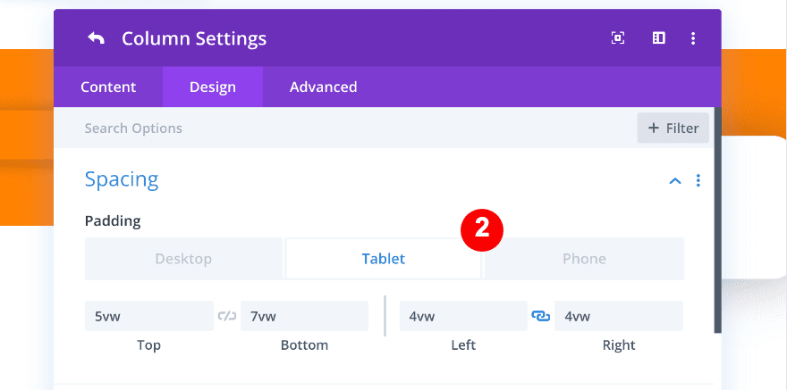
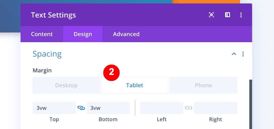
Continue by adding some custom spacing values to column 2.
- Top Padding:
- Desktop = 3vw
- Tablet + Phone = 5vw
- Bottom Padding:
- Desktop = 5vw
- Tablet + Phone = 7vw
- Left Padding:
- Desktop = 2vw
- Tablet + Phone = 4vw
- Right Padding:
- Desktop = 2vw
- Tablet + Phone = 4vw
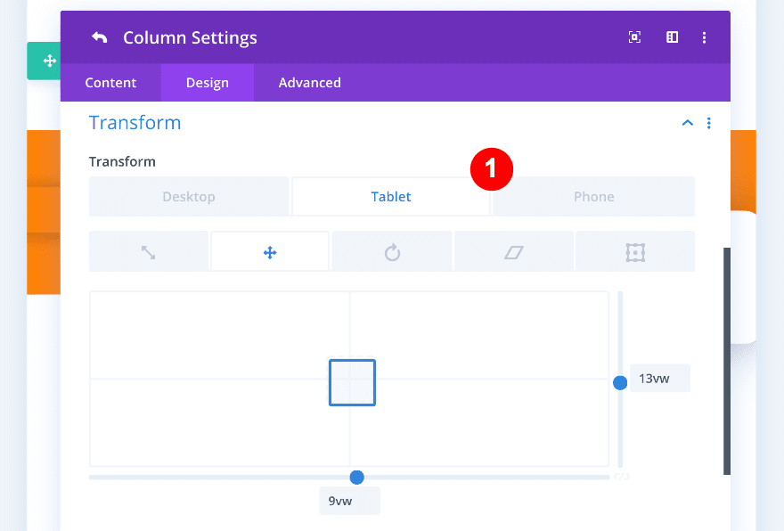
Time to transform the second column! The second column stays in its place for desktop but we have to apply some custom transform settings across smaller screens. Go ahead and adjust the transform translate tab. Additionally, we’ll increase the Z index to 9.
- Transform Translate:
- Tablet and Phone: x-axis = 9vw. y-axis = 13vw
- Visibility: Z Index 9
Column 3
On to the third column! Increase the box shadow blur strength of the already existing box shadow.
- Box Shadow Blur Strength: 50px
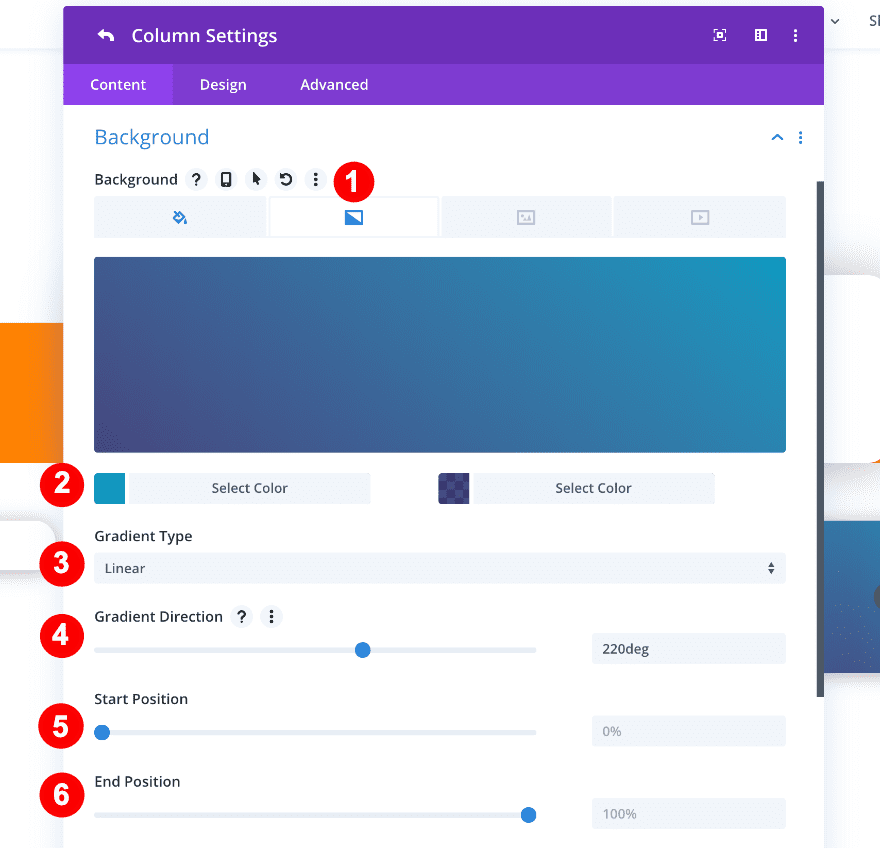
Open the background settings next and add a blue gradient background.
- Background: Gradient
- Gradient Color One: #0c99c1
- Gradient Color Two: rgba(5,0,78,0.72)
- Gradient Type: Linear
- Gradient Direction: 220 deg
- Start Position: 0%
- End Position: 100%
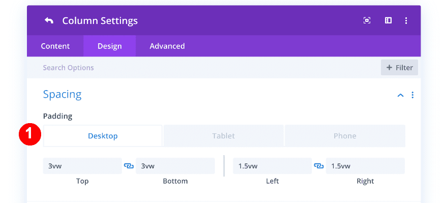
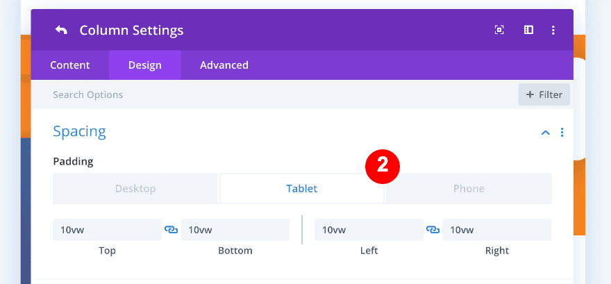
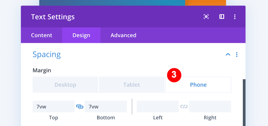
Now, let’s add the spacing.
- Top Padding:
- Desktop = 3vw
- Tablet + Phone = 10vw
- Bottom Padding:
- Desktop = 3vw
- Tablet + Phone = 7vw
- Left Padding:
- Desktop = 1.5vw
- Tablet + Phone = 10vw
- Right Padding:
- Desktop = 1.5vw
- Tablet + Phone = 10vw
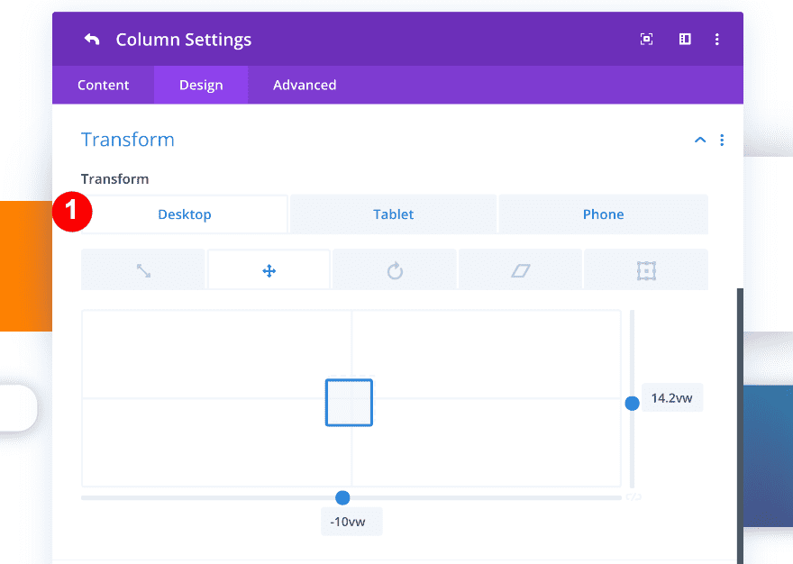
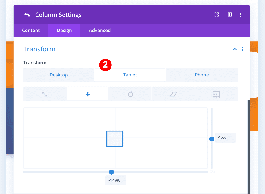
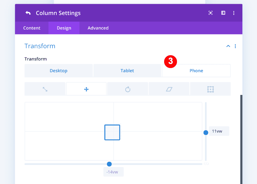
Last but not least, we’ll make the third column overlap the second one by changing transform translate settings.
- Transform Translate:
- Desktop: x-axis = -10vw. y-axis = 14.2vw
- Tablet: x-axis = -14vw. y-axis = 9vw
- Phone: x-axis = -14vw. y-axis = 11vw
- Visibility: Z Index 9
Here’s a preview of our columns before adding the modules.
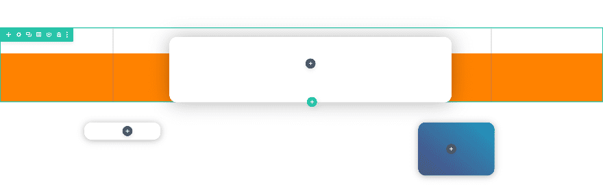
3. Add Modules to Columns & Style Them
Now, let’s add the modules to each column!
Column 1
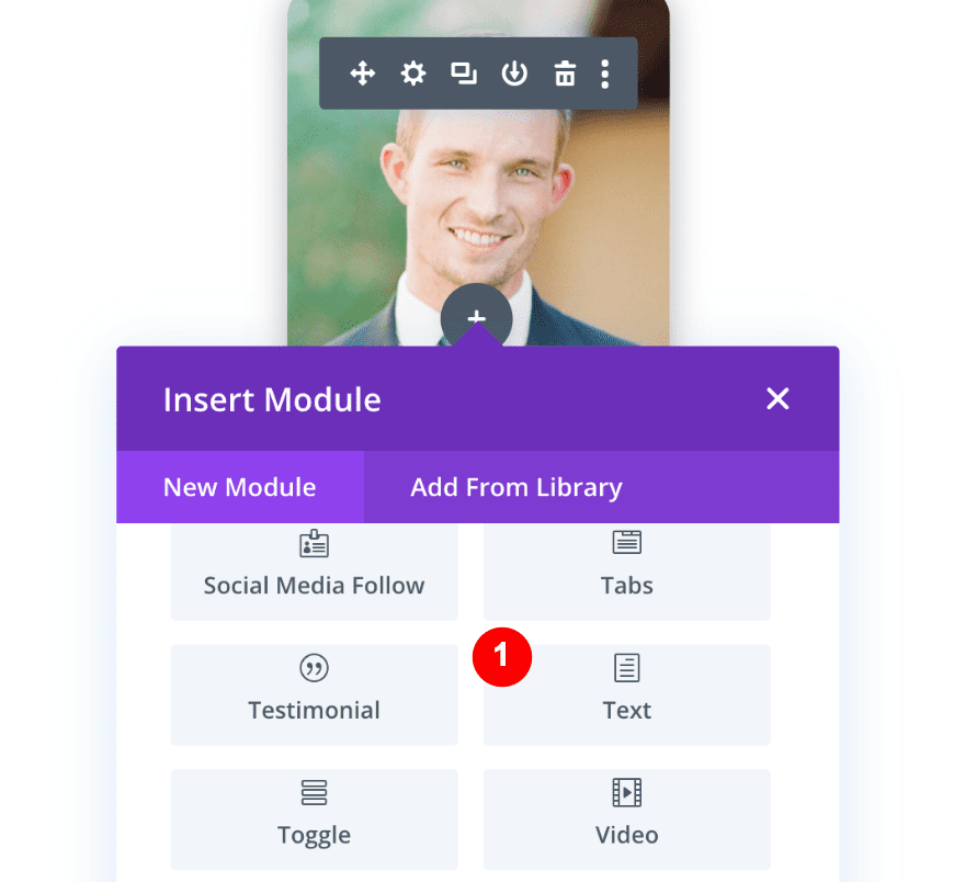
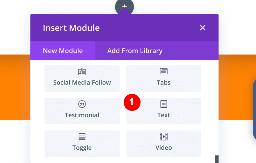
In column one, we’ll insert an image module and a text module. Add the image module first.
1. Add The Image Module
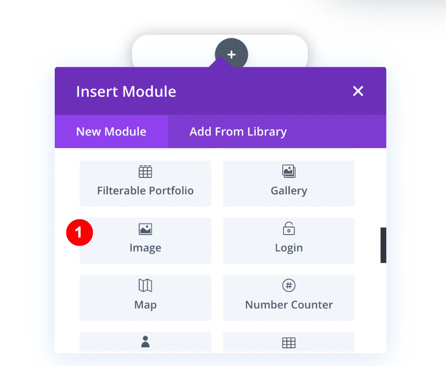
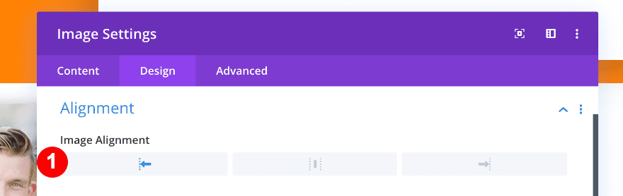
Insert a photo of your client and style it as follows:
- Alignment: Left
- Force Fullwidth: Yes
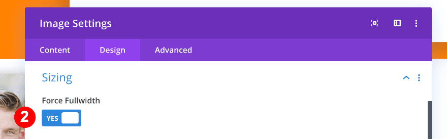
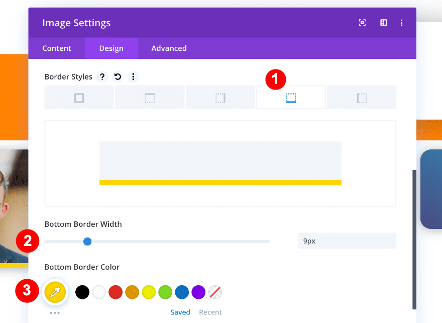
Add a bottom border to the image as well.
- Bottom Border Color: Yellow #ffd400
- Bottom Border Width: 9px
- Border Style: Solid
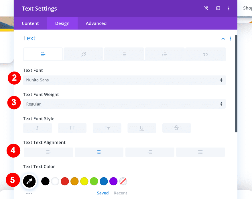
2. Add The Text Module
Add a new text module right below the image module and insert the client’s name and position.
- Name: Heading 4
- Position: Paragraph
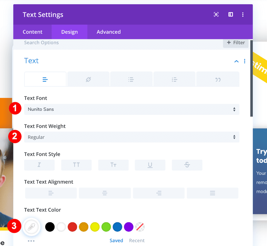
After adding the content, we’ll style the text settings:
- Text Font: Nunito Sans
- Text Font Weight: Regular
- Text Alignment: Center
- Text Color: Black #000000
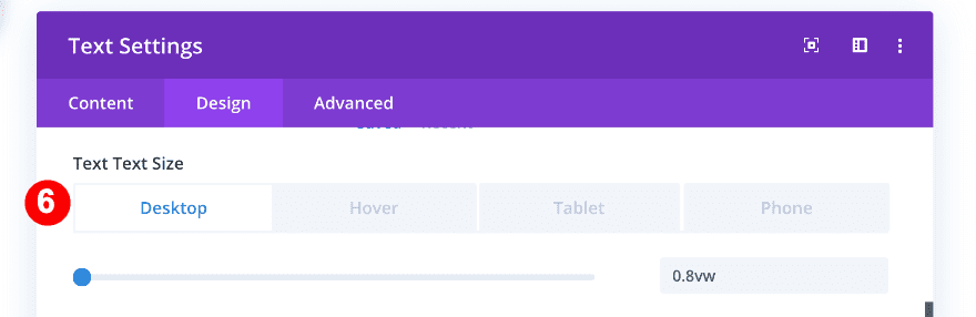
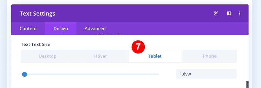
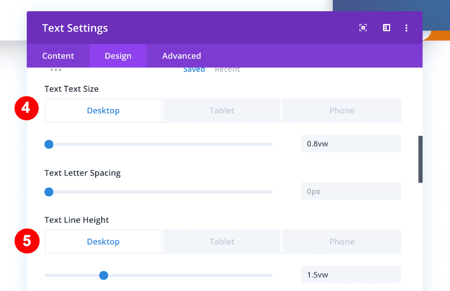
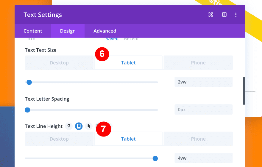
- Text Size:
- Desktop = 0.8vw
- Tablet = 1.8vw
- Phone = 2.8vw
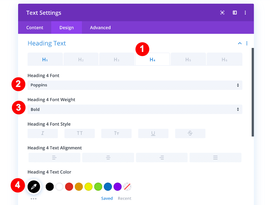
Move on to the heading text settings and apply the following changes:
- Heading Text: H4
- Heading 4 Font: Poppins
- Heading 4 Font Weight: Bold
- Heading 4 Text Color: Black #000000
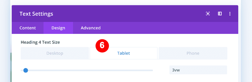
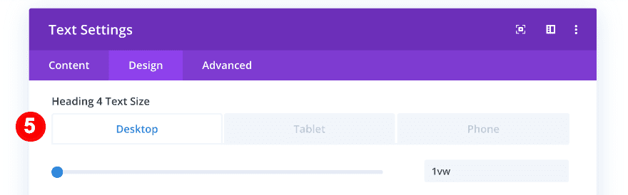
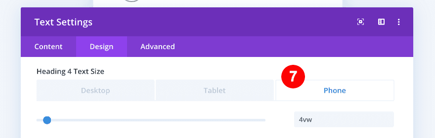
- Heading 4 Text Size:
- Desktop = 1vw
- Tablet = 3vw
- Phone = 4vw


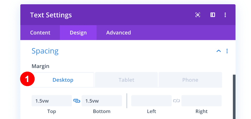
We’ll also change the spacing settings:
- Top Margin:
- Desktop = 1.5vw
- Tablet = 3vw
- Phone = 7vw
- Bottom Margin:
- Desktop = 1.5vw
- Tablet = 3vw
- Phone = 7vw
Your column should look like this once you’ve completed both modules:

Column 2
In column 2, we need a text, a blurb, and a divider module. The first text module is the one that looks like an angled banner at the top right corner of the column. We will use the transform options to achieve this effect.
1. Add Text Module.
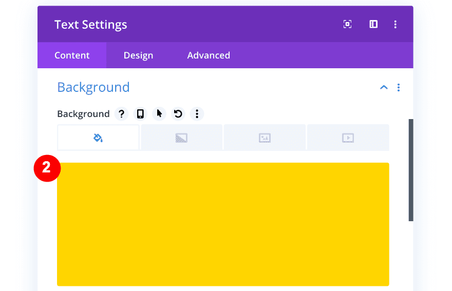
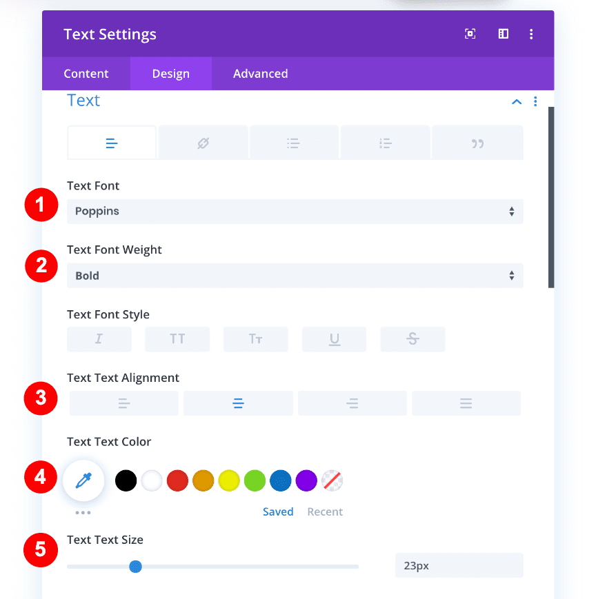
Add a new text module and add the word ‘Testimonial’ to the content box.
Add a yellow background to the module.
- Background Color: Yellow #ffd400
Move on to the design tab and change the text and spacing settings accordingly:
- Text Font: Poppins
- Text Font Weight: Bold
- Text Alignment: Center
- Text Color: White #ffffff
- Text Size: 23px
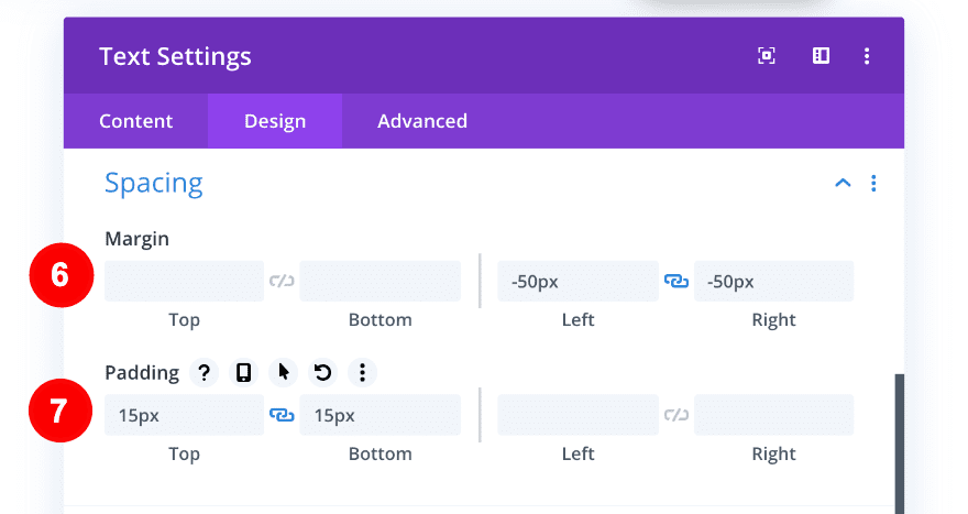
- Right Margin: -50px
- Left Margin: -50px
- Top Padding: 15px
- Bottom Padding: 15px
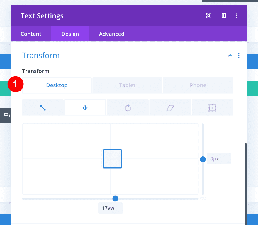
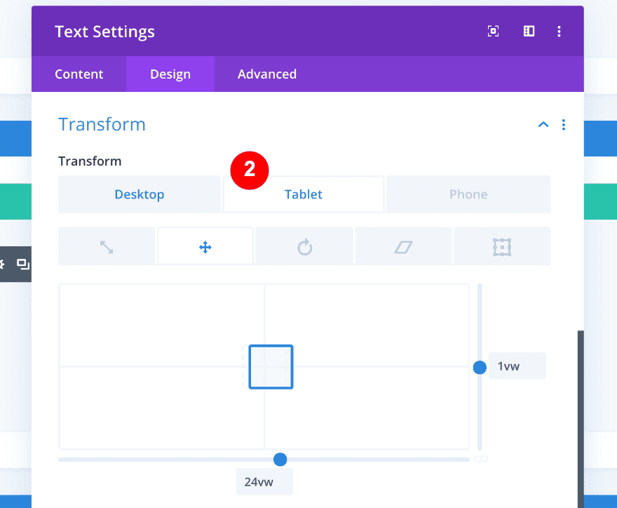
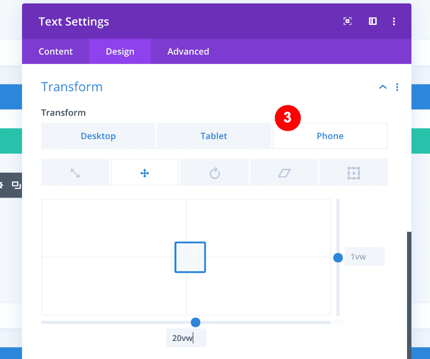
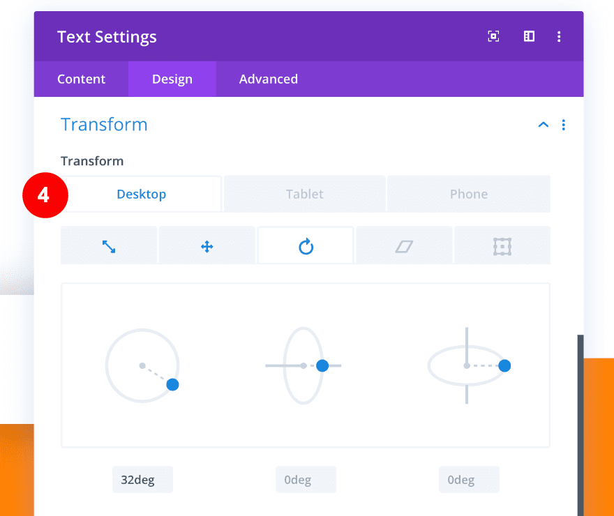
Last but not least, we’ll adjust the transform settings as follows:
- Transform Translate:
- Desktop = 17vw on the x-axis
- Tablet = 24vw on the x-axis, 1vw on the y-axis
- Phone = 20vw on the x-axis, 1vw on the y-axis
- Transform Rotate: 32 deg on the first axis
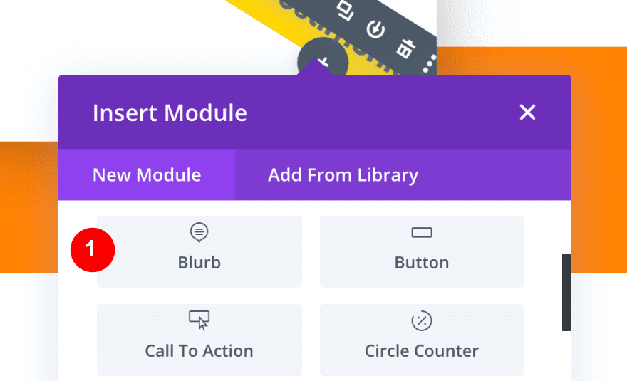
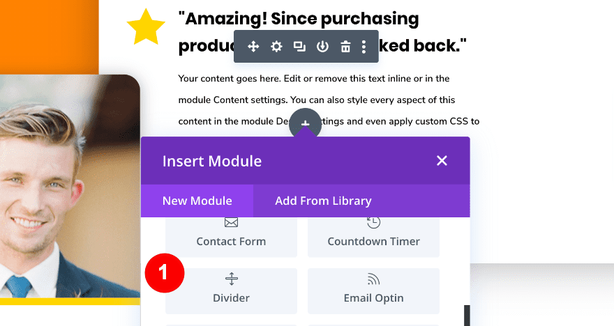
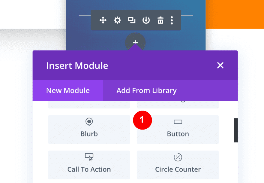
2. Add The Blurb Module.
Once you’ve completed the first module, its time to add a blurb module.
The blurb module is where the client’s testimonial is displayed. First, click on the + icon to add a module and select blurb.
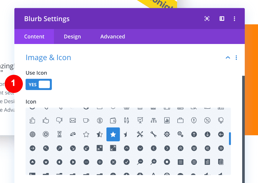
Afterward, insert the content, select an icon and style the icon as follows:
- Use Icon: Yes, a Star
- Icon Color: Yellow #ffd400
- Icon Placement: Left
- Use Icon Font Size: Yes, 48px
Continue by styling the title text at an H4 level
- Title Text: H4
- Title Font: Poppins
- Title Font Weight: Bold
- Title Font Color: Black #ffffff
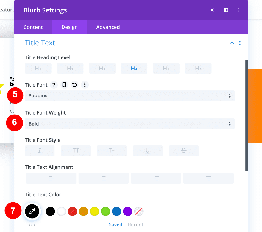
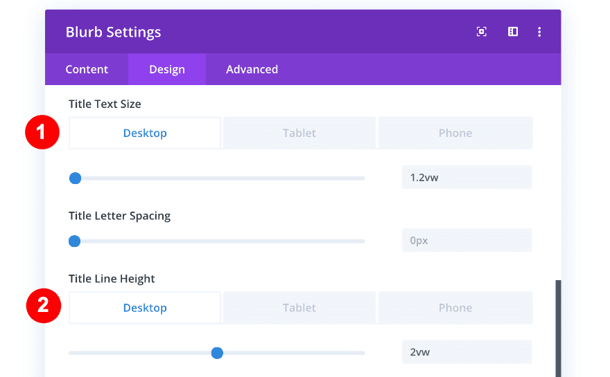
- Title Text Size:
- Desktop = 1.2vw
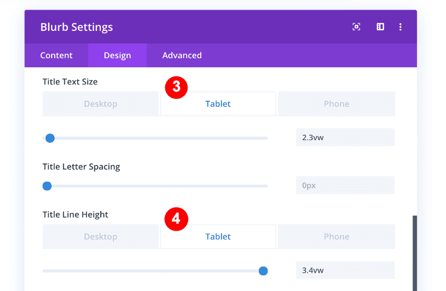
- Tablet = 2.3vw
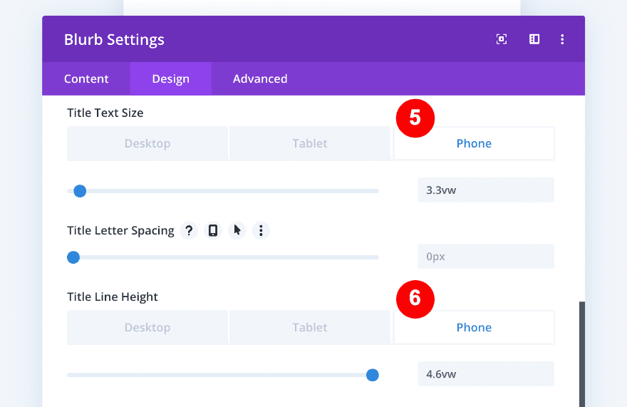
- Phone = 3.3vw
- Title Line Height:
- Desktop = 2vw
- Tablet = 3.4vw
- Phone = 4.6vw
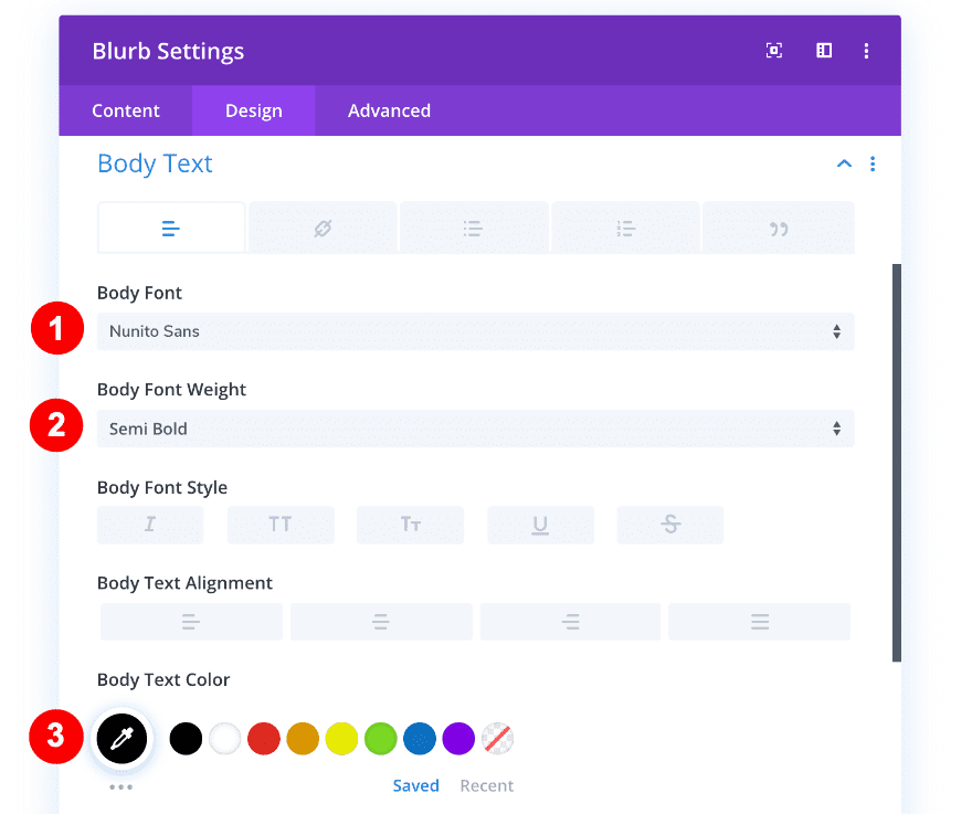
Style the body text settings accordingly:
- Body Text Font: Nunito Sans
- Body Text Weight: Semi Bold
- Body Text Color: Black #000000
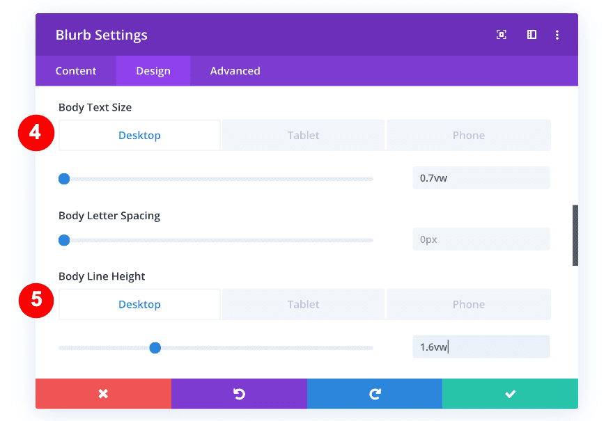
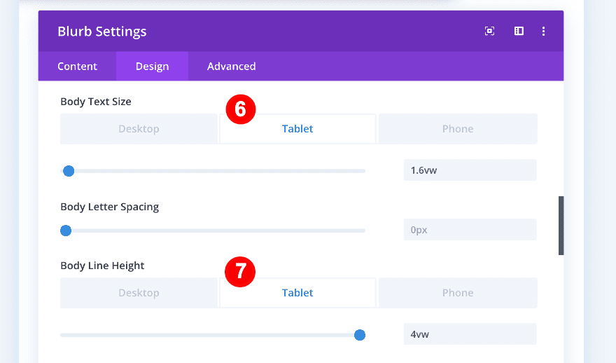
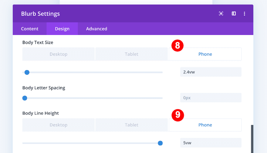
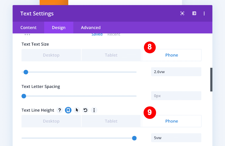
- Body Text Size:
- Desktop = 0.7vw
- Tablet = 1.6vw
- Phone = 2.4vw
- Body Line Height:
- Desktop = 1.6vw
- Tablet = 4vw
- Phone = 5vw
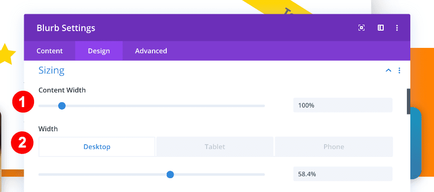
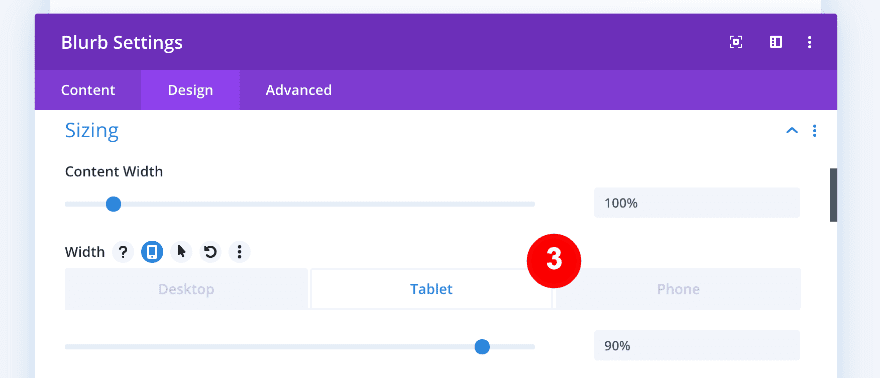
We want the blurb to be less wide than its column, to accomplish that, we’ll adjust the width, margins, and padding values.
First, we’ll adjust the width of the blurb:
- Content Width: 100%
- Width:
- Desktop = 58.4%
- Tablet + Phone = 90%
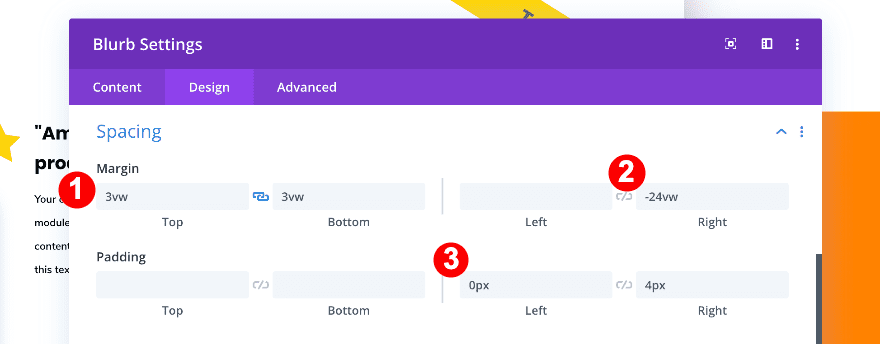
And then, the spacing settings:
- Top Margin: 3vw
- Bottom Margin: 3vw
- Right Margin: -24vw
- Left Padding: 0px
- Right Padding: 4px
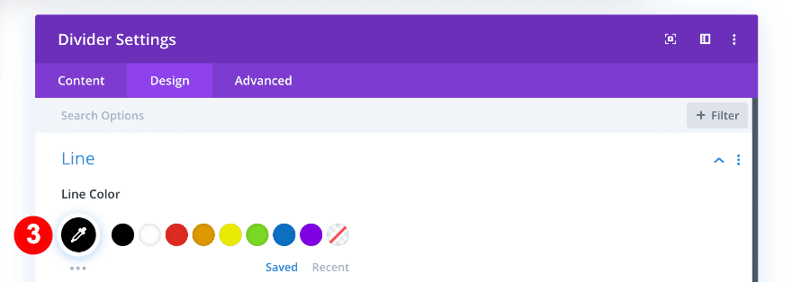
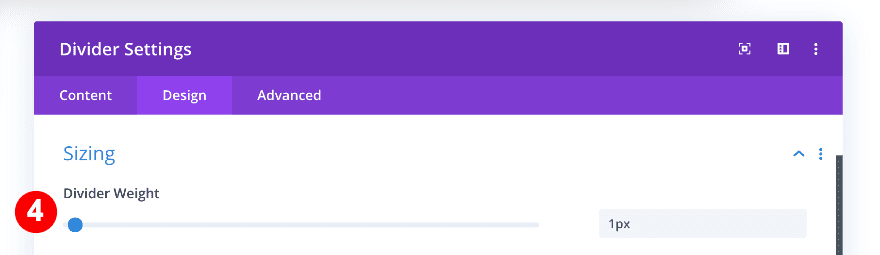
3. Add Divider
The last module we need in this column is a divider module. Apply the following changes to the divider:
- See Divider: Yes
- Divider Color: Black #oooooo
- Divider Weight: 1px
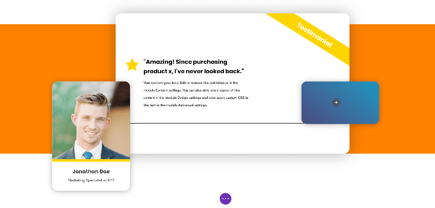
We’re almost there! This is what our outcome looks like up until now:
Column 3
On to the third and last column! We’re using this column to display a call to action. We’re using three modules; a text module, a divider module and a button module.
1. Add Text Module
The first thing we’ll add to this column is the text module.
We’ll add a title in H3 and a bit of paragraph text to the content box.
Go ahead and style the text settings accordingly:
- Text Font: Nunito Sans
- Text Font Weight: Regular
- Text Font Color: White #ffffff
- Text Font Size:
- Desktop = 0.8vw
- Tablet=- 2vw
- Phone = 2.6vw
- Text line Height:
- Desktop = 1.5vw
- Tablet = 4vw
- Phone = 5vw
Complete the text module by styling the heading text settings.
- Heading Text: H3
- Heading 3 Font: Poppins
- Heading 3 Font Weight: Bold
- Heading 3 Text Color: White #ffffff
- Heading 3 Text Size:
- Desktop = 1.1vw
- Tablet = 3vw
- Phone = 4vw
- Heading 3 Line Height:
- Desktop = 1.5vw
- Tablet = 3vw
- Phone = 4.5vw

2. Add Divider Module
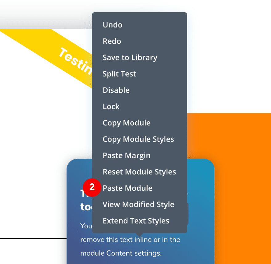
Continue by adding a divider module to column 3. To style the divider, we’ll copy and paste the divider styles from the one you can find in column 2.
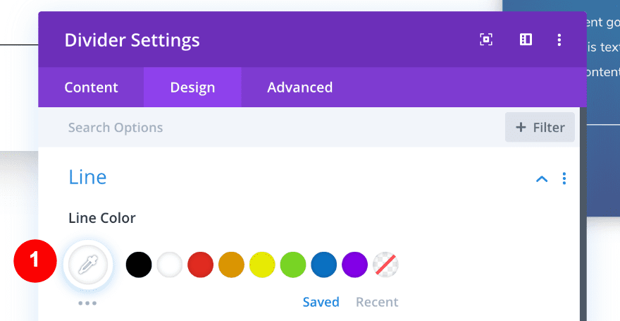
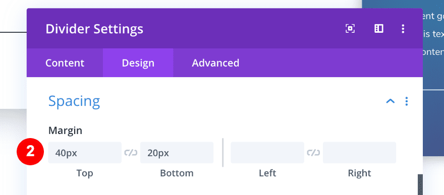
Open the divider settings and change color from black to white. Add some top and bottom padding as well.
- Divider Color: White #ffffff
- Top Padding: 40px
- Bottom Padding: 20px
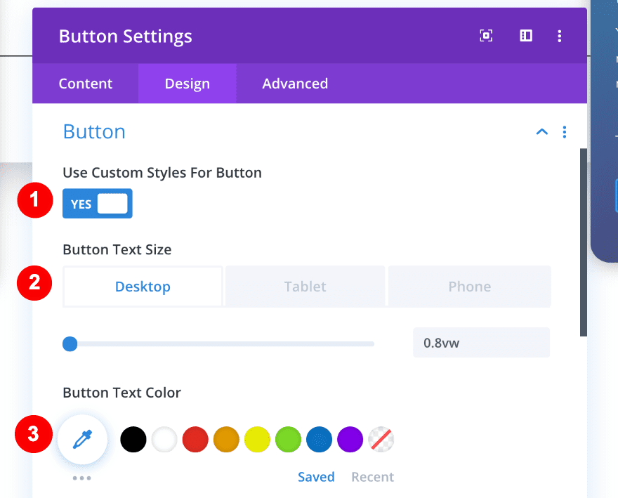
3. Add Button Module
On to the last module, which is a button module. Add some copy of your choice.
Move on to the design tab and style the button as follows:
- Use Custom Style for Button: Yes
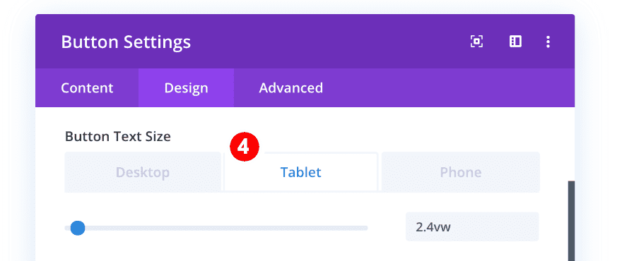
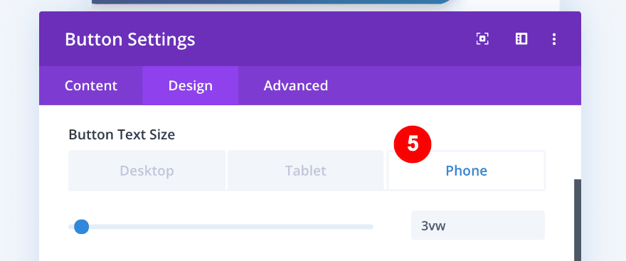
- Button Text Size:
- Desktop = 0.8vw
- Tablet = 2.4vw
- Phone = 3vw
- Button Text Color: White #ffffff
- Button Background Color: Gradient
- Gradient Color One: Yellow #ffd400
- Gradient Color Two: Orange #ff8300
- Gradient Type: Linear
- Gradient Direction: 202deg.
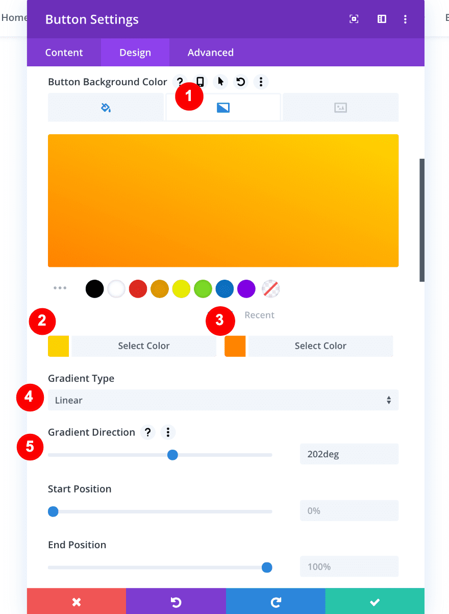
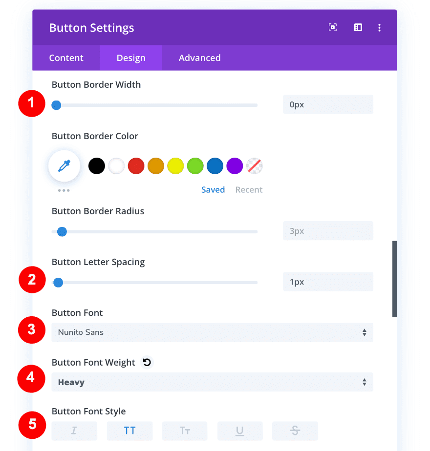
- Button Border Width: 0px
- Button Letter Spacing: 1px
- Button Font: Nunito Sans
- Button Font Weight: Heavy
- Button Font Style: TT
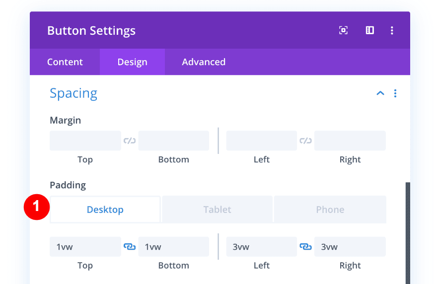
In order to make the button look good across all screen sizes, we’ll adjust the padding of the button as follows:
Desktop
- Top Padding: 1vw
- Bottom Padding: 1vw
- Right Padding: 3vw
- Left Padding: 3vw
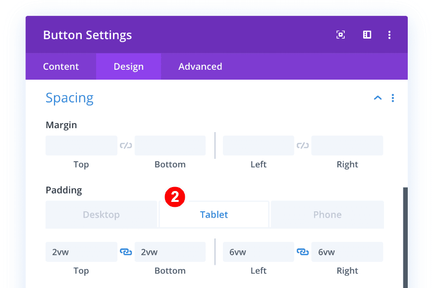
Tablet
- Top Padding: 2vw
- Bottom Padding: 2vw
- Right Padding: 6vw
- Left Padding: 6vw
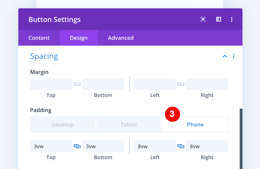
Phone
- Top Padding: 3vw
- Bottom Padding: 3vw
- Right Padding: 8vw
- Left Padding: 8vw
Preview
Now that we’ve gone through all the steps, let’s take a final look at the outcome across different screen sizes.
Desktop
Mobile
Wrapping up
This overlapping three-column build looks great as a testimonial but we’re sure you can implement it for other amazing things. We hope this will inspire you to use the column transform and overlapping options for future projects. If you have any questions or suggestions, make sure you leave a comment in the comment section below!


Thanks, Great tutorial. Elegantthemes are always improving the user experience and thats why they are #1 in the industry
As in previous tutorials, making a video (like those by Mak) are so useful. I tend to get lost when reading long text, while it is very easy to follow along a video. In any case, thank you for the great tutorial.
Thanks, Great tutorial. I am a DIVI user and I really love how flexible the design can be. You are only limited by your imagination. Please keep coming with more new tutorials.
Nice article thank you for sharing with us.
Please add download link
oh yes please this is a very long tutorial and that sneaks itself gladly errors in.
I have to agree. Much of the structure of designs such as this one depend on the specific content, text, images and graphics. It’s very frustrating having to scroll to parts of the page so you can eyeball what content you need to use.