
Flip Cards are a fun way for users to interact with your website. Not only does it provide a cool flip animation, it also allows you to offer additional information in one concise location. In this tutorial, I’m going to show you how to turn Divi Modules into flip cards without using a plugin! With this method, you will be able to use one Divi module as the front of a card and another Divi module as the back of a card. You can even design each module (front and back) however you like using the divi builder. The functionality is accomplished through just a few snippets of CSS (no jquery).
I think you will be surprised at just how simple and fun building these cards can be.
Let’s dive in!
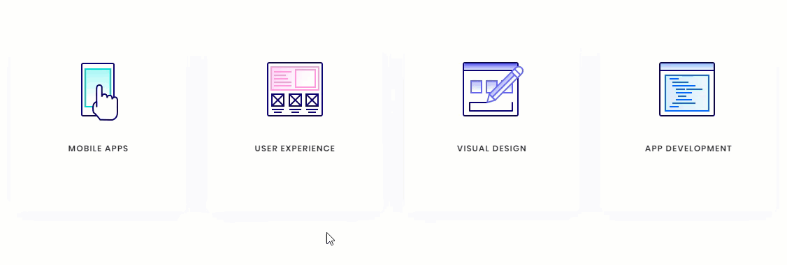
Sneak Peak
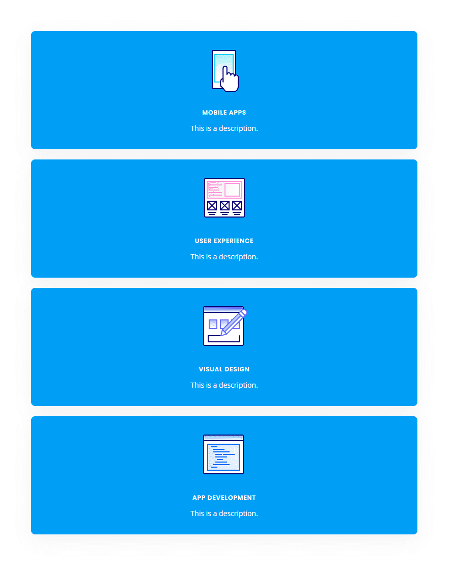
Here is a sneak peak of the design we will be building today.

Subscribe To Our Youtube Channel
What You Need for This Tutorial
All you will need for this Tutorial is Divi! No plugin needed. We will also be using the App Developer Layout Pack which is FREE and available within the Divi Builder.
The Basic Idea Explained
The inspiration for this concept actually came from this basic example of how to design flip cards. All it took was a little re-engineering to assign the div classes to Divi rows, columns and modules and then clean up the CSS a bit.
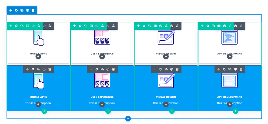
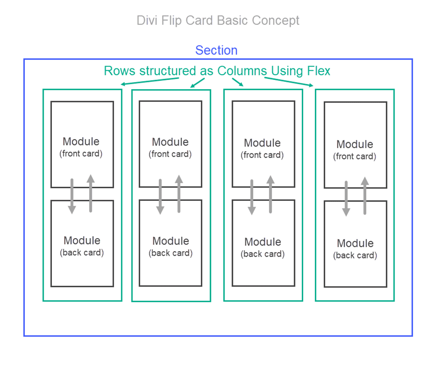
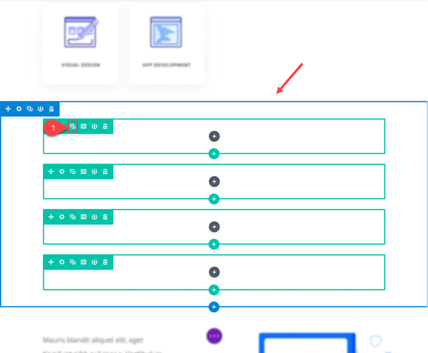
The Divi layout consists of a regular section with four one-column rows. In each row, I added two blurb modules stacked on top of each other (although any Divi module would work as well). The top blurb serves as the front of the flip card and the bottom blurb serves as the back of the flip card. By applying “display:flex” to the section, the rows are structured horizontally like columns. This allows to the cards to be aligned side by side into four columns.
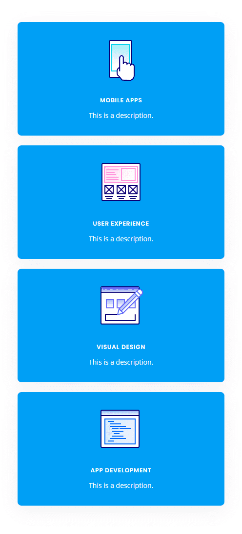
Here is what the setup looks like before we add the custom CSS.
Then I added the custom CSS to page settings and added the corresponding CSS classes to each row, column, and module.
That’s it!
Creating Divi Flip Cards Using a Premade Layout
Adding the Premade Layout to Your Page
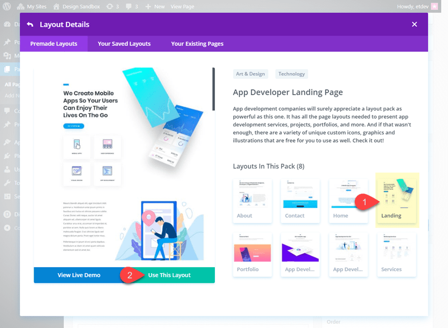
To get things rolling, go ahead and create a new page, give you page a title, and then click to use the Divi Builder. Select the option “Choose a Premade Layout”. From the Load from Library popup, select the App Developer Layout Pack and then click to use the App Developer Landing Page layout.
Once the layout loads to the page, publish your page and then click the button “Build on the Front End”. Now you are ready to start creating the Flip Cards.
Setting up the Section, Rows, and Modules
Under the first section of the layout, add a new regular section with a one-column row. Don’t add any modules yet. Open the row settings and update the following:
Custom Margin: 20px bottom
Custom Padding: 0px top, 0px bottom
Save settings.
Then duplicate the row three times so that you have a total of four rows in the section.
Now open the section settings and add the following custom CSS to the Main Element:
display:flex;
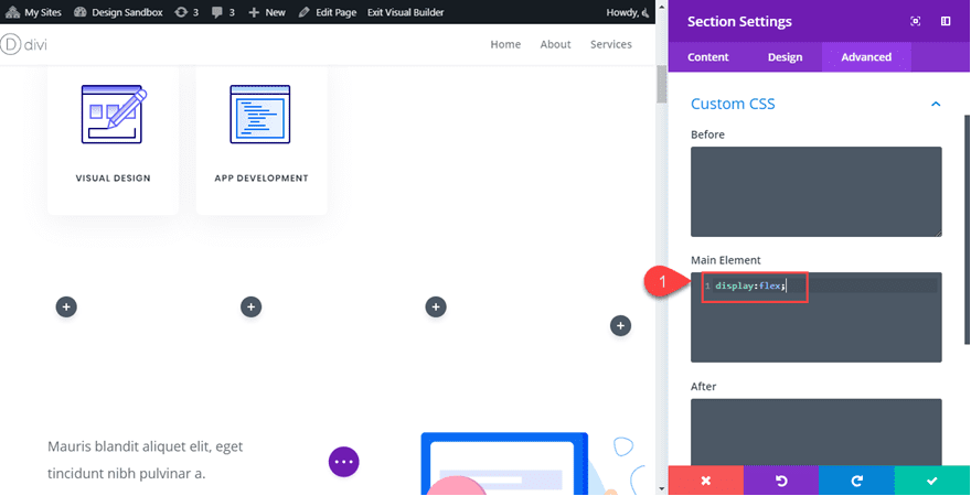
This changes the rows to display horizontally which basically converts our rows into four columns even though technically they are still Divi rows each with one column.
Adding the Modules to the Rows
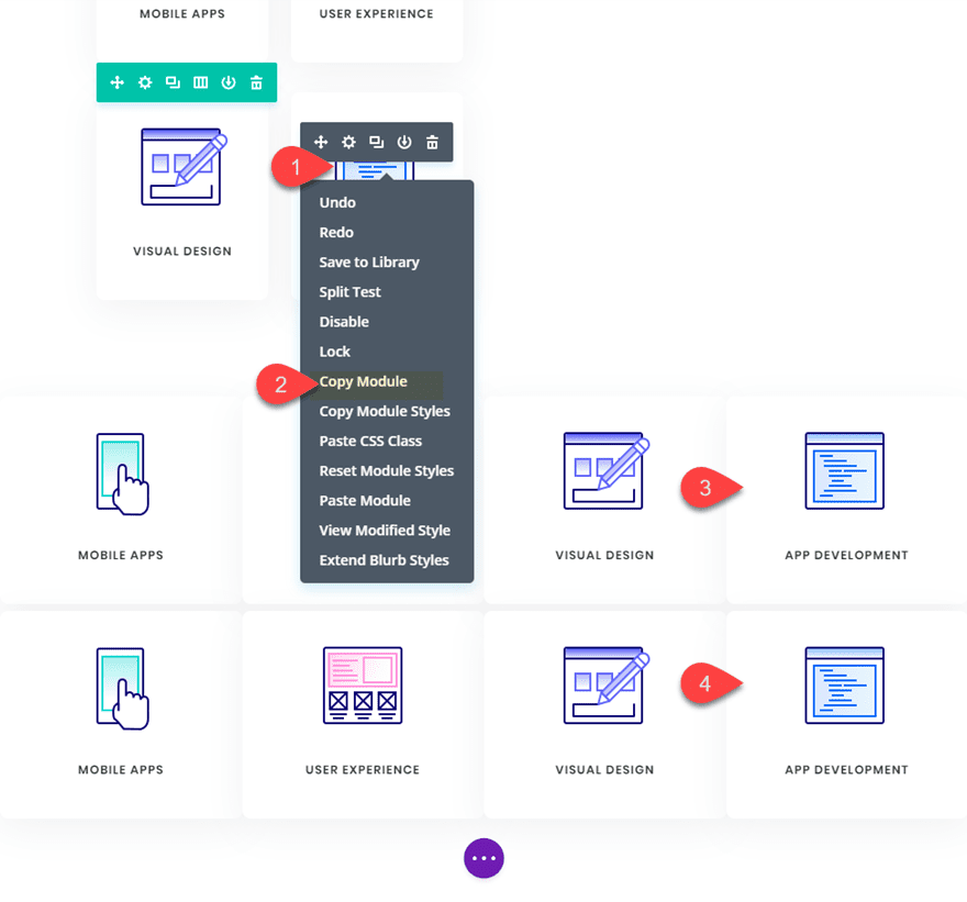
This is where our premade layout comes in handy for this tutorial. We will use the four blurb modules in the top section of the layout to jumpstart the design of our flip cards. Using the right click options or the shortkeys ctrl+c and ctrl+v (windows) and cmd+c cmd+v (mac), copy and paste the premade modules into each of the rows we just created. Make sure that each row has duplicate versions of the same module.
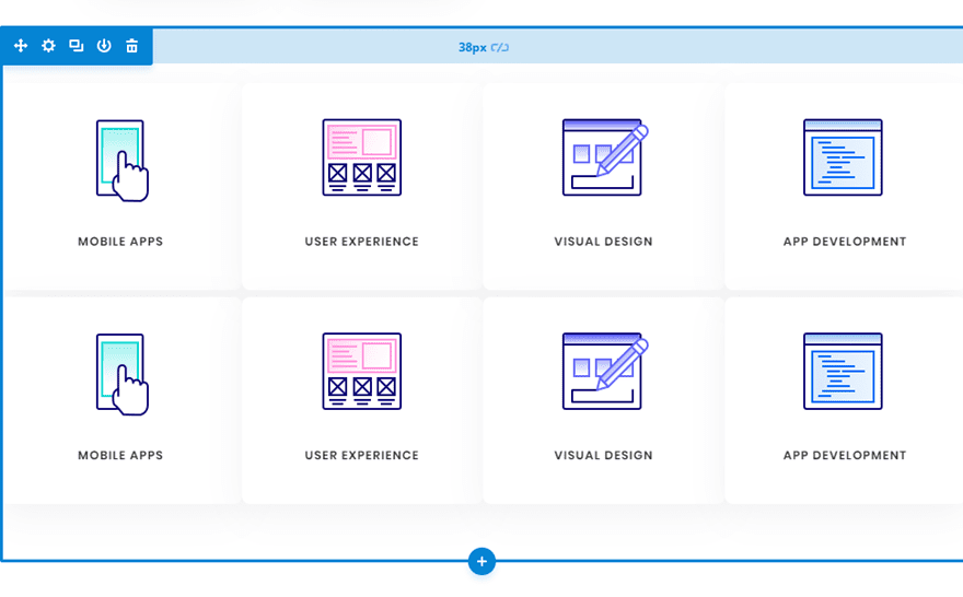
Now your section should look like this.

Designing the Front and Back Flip Card Modules
The two modules stacked in each row will be used as the front and back of the flip cards. The top module in each row will serve as the front and the bottom module will serve as the back. Since the design of the front card (top module) is already done thanks to our premade layout, all we need to do is adjust the design and content of the back card (bottom module).
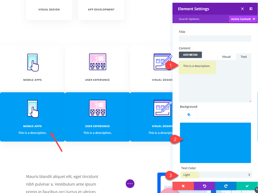
Using Divi multiselect feature, select all bottom modules in each row and then open the element settings to customize all four modules at the same time.
Now we can update the element settings options to style the back version of our flip cards. Update the element settings as follows:
Content: “This is a description.”
Background Color: #00a2fa
Text Color: Light
Adding Custom CSS and CSS Classes
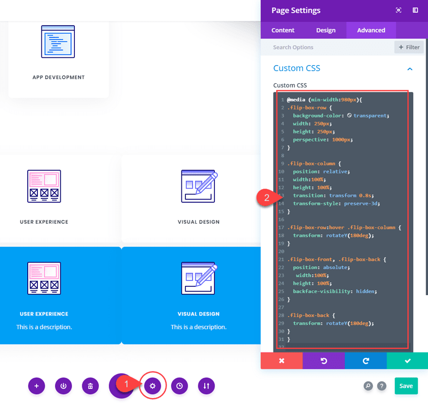
Now it’s time for the custom CSS that will give us the flip card functionality. Open the page settings and add the following Custom CSS:
@media (min-width:981px){
.flip-box-row {
  background-color: transparent;
  width: 250px;
  height: 250px;
  -webkit-perspective: 1000px;
  perspective: 1000px;
}

.flip-box-column {
  position: relative;
  width:100%;
  height: 100%;
  -webkit-transition: transform 0.8s;
  transition: transform 0.8s;
  -webkit-transform-style: preserve-3d;
  transform-style: preserve-3d;
}

.flip-box-row:hover .flip-box-column {
  -webkit-transform: rotateY(180deg);
  transform: rotateY(180deg);
}

.flip-box-front, .flip-box-back{
  position: absolute;
   width:100%;
  height: 100%;
  -webkit-transform: translate3d(0,0,0);
  -webkit-backface-visibility: hidden;
  backface-visibility: hidden;
}

.flip-box-back {
  -webkit-transform: rotateY(180deg);
  transform: rotateY(180deg);
}
}
Notice that the above CSS classes are named in a way that should help you understand what each is doing. It is also a helpful indicator as to where we need to add those CSS classes to our Divi elements. For example, the class “flip-box-row” is meant to style each of the four rows; therefore, each row needs to have that CSS class.
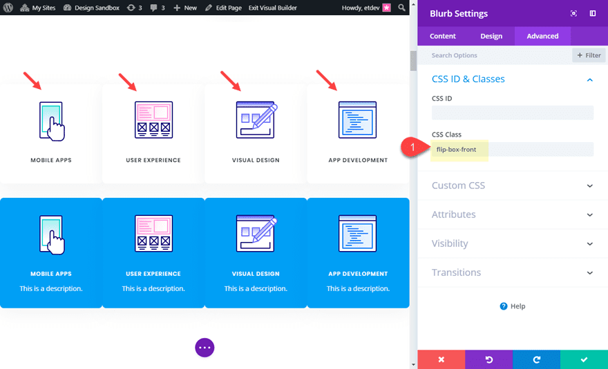
Adding CSS Classes to the Divi Elements
Using Multiselect, select all four of the top modules (front cards) in each of the rows. Then add the following CSS class:
CSS Class: flip-box-front
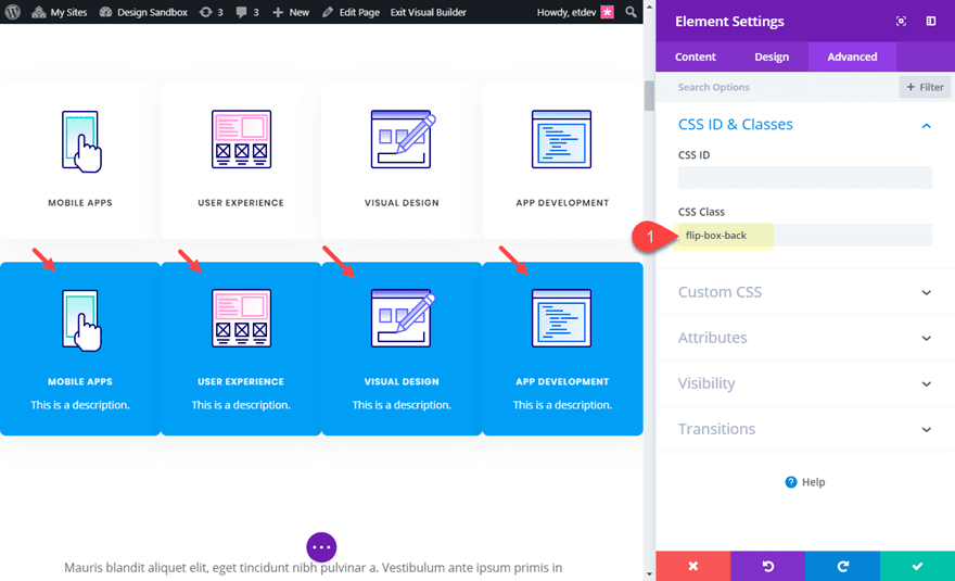
Then, use multiselect to select all four of the bottom modules (back cards) in each of the rows and add the following CSS Class to those modules:
CSS Class: flip-box-back
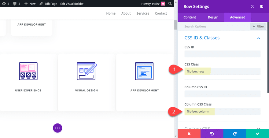
Lastly, use multiselect to select all four rows and give them the following CSS Classes:
CSS Class: flip-box-row
Column CSS Class: flip-box-column
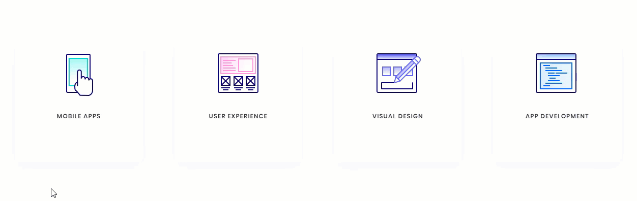
Final Design on Desktop
With all our CSS classes added, our flip cards are fully functional. Check out the final design on desktop.
Customizing the Design for Mobile
In the custom CSS code that we already added to the page settings, there is a media query that limits the flip card functionality to desktop only. However, we still need to hide the front versions of our flip cards on tablet and smartphone as well as make sure our rows stack nicely when adjusting browser widths.
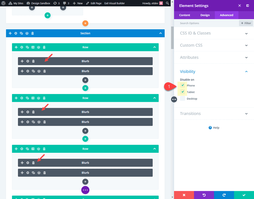
To hide our front card blurb modules, use multiselect to select all of the top modules (front cards) in each row (this will be easier in wireframe view mode since things will be moving around in the front end builder) and update the following:
Disable on: Phone and Smartphone
Then open the section settings and add one more line of CSS to the main element in addition to the one added previously:
flex-wrap:wrap;
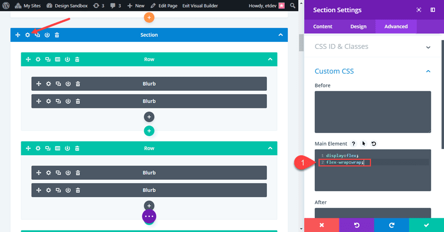
This will make sure the rows will stack on mobile.
Now let’s check out the final design on tablet and smartphone.
Bonus Option: Vertical Flip Cards!
If you want your flip cards to flip vertically instead of horizontally, you only need to change a two letters (literally) in the custom CSS. Open the page settings and locate the two places where “transform: rotateY(180deg)” is being used. Then replace the “Y” with “X”. If you haven’t guessed already, this changes the rotation to rotate on the X axis instead of the Y axis.
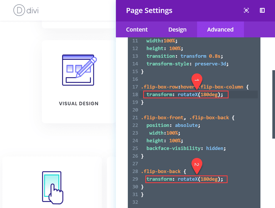
Pretty cool stuff! Check out the result.
Final Thoughts
You don’t have to resort to a plugin to create great looking Flip Cards in Divi. With this tutorial, you have a framework to create countless designs and combinations of flip card content. Don’t forget that you can choose any two modules to serve as the front and back of your cards. So feel free get creative!
I hope this was helpful and I look forward to hearing from you in the comments below.
Cheers!


For the part where you add this:
CSS Class: flip-box-row
Column CSS Class: flip-box-column
There isn’t a Column CSS Class for me. How do I get that?
Adding a CSS class to a column in Divi is a straightforward process. Here’s how to do it:
– Open the settings for the row that contains the column you want to modify by clicking on the gear icon.
– Then open the setting panel of the column you want to apply the class to.
– Navigate to the Advanced tab.
– Go to CSS ID & Classes.
– In the CSS Class field, type in the class name you want to use.
Here’s a quick screencast to guide you through the process: Applying a CSS class to a column.
Awesome! Definitely plan to implement this in a redesign. Thsnks for the detailed instructions.
I’ve followed the instructions twice, once using my own three-column layout that I want and then when that didn’t work I did it with the premade layout you used. Both times the modules end up above and below (vertically) not on top of one another. The flip works but the back of the card is below the space where the top of the card is.
This was awesome and worked perfectly! Saved me SO much time! Thank you!!
Thank you for this tutorial! I works fine on my computer with resolution of 1920 x 1200. But whne i looked at it from another computer with lower resolution, 1366 x 768, the one of the columns move down so hat I have one row with three flip cards and another one with one flip card.
I did not follow your tutorial with a premade layout but made my own following the rest of the tutorial.
Any idea of whats wrong here?
this doesnt work in my end, i don’t see the “Build on the Front End” button anywhere.
Hi there,
My back card keeps appearing below the row on hover, may someone explain what could be wrong with that ?
Thanks a lot and have a good day 🙂
It works in Chrome and Firefox, however not in Explorer. In Explorer the “back-card” doesn’t show instead it’s the “front-card” that flips.
Any fixes for the Explorer error.
After 100 attempts i finally got it right. The effect works beautiful in Chrome and Firefox, however in Explorer it doesn’t work. In Explorer the back card doesn’t show instead it’s the front card that flips.
Any fixes for the Explorer error.
I got it to work, great instructions, but somehow it makes the text slightly blurred?
I followed the directions to the letter and my cards flip vertically 🙁 Kudos to you though, I’m terrible at following instructions (obvi) and this tutorial was clear and concise!! (yet I still screwed it up hahha). I’ll figure out what I missed. thanks for sharing!!
Hmm my cards stack on my iphone, but don’t flip – have I missed soemthing?
I included the custom CSS code in a media query that adds the flip functionality only on desktop because mobile hover effects are a bit unpredictable. If you want to test it out on mobile, take the css code out of the media query:
@media (min-width:981px){ }I got lost at display flex: everything went south from there!! Video would have been awesome!
so much easier for following. “Monkey see monkey do” LOL 🙂
I’ve followed the steps , hover i’m not getting it right. Can’t you just do a video tutorial “Creating “Divi Flip Cards” pleassssseee..
I followed this to the absolute letter (and it works, so thank you!!!). Buuuuut my cards still flip vertically. What did I do?!
I think the updated code has “rotateY” instead of “rotateX” in the CSS code by default. You can change the rotation in the CSS code by replacing the “X” in “rotateX” with a “Y” in both places. So all you need to do is replace those 2 letters, nothing else.
I followed all of the instructions twice but the module are stack atop each other and flip up and down.
Any ideas on how to fix this?
Not sure what you mean that they are stacked atop each other. As far as flipping up and down, you can change the rotation in the CSS code by replacing the “X” in “rotateX” with a “Y” in both places.
Thanks for this. But require a bit of time doing this and that. There’s an alternative and I would like to recommend Divi supreme plugin on wordpress plugin repo that has alot of modules including this flipbox module for free.
Great tutorial, you explained it very clearly. This article is really very interesting and effective.Thanks for sharing
Great to hear, haider!
Super tutorial this is going to be a great addition to our Divi Websites, thank you 😉
hi
Thanks for sharing. Please provide some video tutorial for customization.
GREAT!!!
Although we do have Divi Supreme Modules and a free option for this idea.
very cool. and lots of uses… playing around with it now. thanks 🙂
Found your post interesting to read. I cant wait to see your post soon. Good Luck for the upcoming update.This article is really very interesting and effective.
Don’t you love it when you give people free stuff all the time and they complain about it…
Thanks Jason for all that you give us.
Lovely tut, Jason! Thanks a bunch for your time!
Thanks, Elisandro. Glad you liked it.
Can someone make a simple flip model of this? I get lost in the 900 steps of these tutorials. How about 1 item. An image flips to reveal a couple sentences of text? Or two sentences reveals an image?
I got lost at Viewport.
Thank you
This worked perfectly until adding flex-wrap:wrap; to the custom CSS in the section. That causes it to stack on desktop as well. Any ideas?
It might be that your row is too narrow on desktop. A better solution may be to only add “display:flex” to the section on desktop.
I am afraid this didn’t work for me as the flip cards stacked up in an ugly manner in smartphones and tablets while using only “display:flex;”
My solution:
i. Remove “flex-wrap:wrap;” from the Custom CSS in Section. Keep “display:flex;”
ii. Add following in the Page Settings > Advanced Tab > Custom CSS
@media (max-width:980px) {
.et_pb_section_1 {
flex-wrap:wrap;
}
}
Anyways, Thanks Jason for this wonderful article! It would be great if we can replicate this in DIvi Blog Module > Grid Layout where the post cards are flipped.
Totally agree ?
Very cool! I definitely want to give this one a try. 🙂
Thanks for the tutorial!
What gives? Most of the comments just disappeared into thin air.
Basel made a good suggestion that if these demos could be supplied as downloadable items, we could actually use and modify, we could put them to work quickly on our projects.
Same comment I make all the time and nothing as of yet.
Same comment I make all the time and nothing as of yet.
I have made that comment a million times but …
I’d like these tutorials to focus on the main item. If it’s how to make a flip box, make it simple. There are settings for fonts, colors, line space, backgrounds—none of that is needed. Start with a blank page, not a loaded up layout. Create a simple thing and make it flip.
And, always make it available for download.
Great tutorial, you explained it very clearly. Thanks for sharing!
Your media breakpoint is slightly incorrect. Divi breaks at a max-width of 980px. That means that in your custom CSS above, you should use
@media (min-width:981px){
instead of
@media (min-width:980px){
(yes, that 1 pixel makes a difference.)
This is a very minor thing, but still. 😉
Does not work on Safari or Chrome due to backface-visibility:hidden;
Matthew,
I updated the CSS in the tutorial so that it works on safari and chrome. Thanks for letting us know.
awesome, but when will this be a divi feature??
Follow up.. it works in Firefox but not in Chrome nor Safari.. as these two browsers seem to be ignoring “backface-visibility: hidden;”
This is great – thanks Jason!
The Title on Top Card appears when mouse over and it appears of course backwards. What is missing that should make the Title of the bottom card show only on mouse over?
Sorry about that Matthew. I will update the post with new css to fix that. Thanks for bringing it to my attention. You need the -webkit prefix for backface-visibility and I also needed to add ” -webkit-transform: translate3d(0,0,0);” to the front and back cards/modules. This seems to work on chrome, safari, and firefox.
Absolutely does it. Thanks for the follow-up.. Very nice touch on cards and so easy to get going. Why can’t all of these Browsers get along ? 🙂
it would be nice if you shorten the work for us and make it as an item so we can upload it in our library and use it just need to change the items 🙂
+1
+1
Excellent suggestion Basel. I look at these demos and say to myself, when I have time, I’ll come back here and spend the time to duplicate it, but I never do. Too many other things on the go already.
If I could download this and upload it to a test site, I could modify it and use it on my next project. Would be great to have a library of these.
Concerned about the people saying this is not cross browser capable. Shouldn’t be demoed here if it doesn’t work on all standard browsers, or should at least be qualified by what browsers it works or doesn’t work on.
Maybe it is because when you export the json file and import to another site, things get broken. That is the only reason why we don’t have the download gift. At least it is what I guess. 🙂
It’s so easy to use “Image Caption Hover Pro”, why loose time with all that stuff?
Bill
Why loose[sic] time building websites when you can pay for someone to do it for you?
Learning how to do things is important…? Isn’t it?
There’s no reason to dismiss an informative tutorial like that.
Every effort you do to avoid plugins is a win. Plugins are nice, but if we can do something cool like that without plugins, it means you contribute to better site performance.