
Getting creative with images can definitely help draw attention to your CTAs. In this post, we’ll show you how to recreate a beautiful split-image product info section with Divi. The design we’re recreating is beautiful, eye-catching and can be customized to your needs. You’ll be able to download the design’s JSON file for free as well!
Let’s get to it.
- 1 Preview
- 2 Download The Free Split-Image Layout for FREE
- 3 Download For Free
-
4
Create Split-Image Effect With Photoshop and Illustrator
- 4.1 Step 1: Select The Images
- 4.2 Step 2: Erase The Background
- 4.3 Step 3: Open a New Project on Illustrator
- 4.4 Step 4: Add a Vertical Guide.
- 4.5 Step 5: Import or Place The Cut-Out Images
- 4.6 Step 6: Start Visualizing The Split
- 4.7 Step 7: Finalize The Effect
- 4.8 Step 8: Crop Half and Save
- 4.9 Step 9: Resize for Tablet and Mobile
-
5
Let’s Start Recreating!
- 5.1 Add New Section
- 5.2 Add 1st Row
- 5.3 Column 1 Settings
- 5.4 Column 2 Settings
- 5.5 Add Text Module to Column 1
- 5.6 Add Text Module to Column 2
- 5.7 Add 2nd Row
- 5.8 Add Image Module to Column 1
- 5.9 Add Image Module to Column 2
- 5.10 Add 3rd Row
- 5.11 Column 1 Settings
- 5.12 Column 2 Settings
- 5.13 Add Text Module to Column 1
- 5.14 Duplicate Text Module And Drag to Column 2
- 5.15 Add Call to Action Module to Column 1
- 5.16 Duplicate Call to Action Module And Drag to Column 2
- 6 Preview
- 7 Conclusion
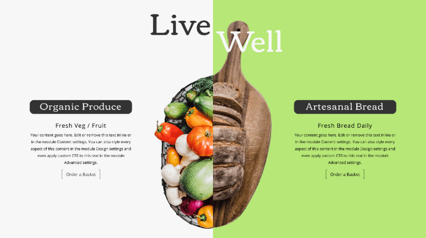
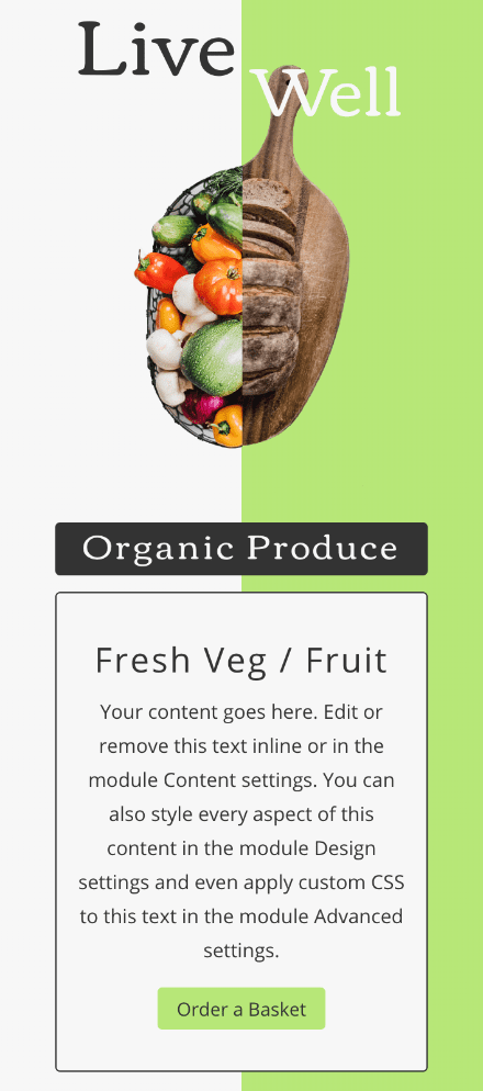
Preview
Before we dive into the tutorial, let’s take a quick look at the outcome across different screen sizes.
Desktop
Mobile
Download The Free Split-Image Layout for FREE
To lay your hands on the free split-image layout, you will first need to download it using the button below. To gain access to the download you will need to subscribe to our newsletter by using the form below. As a new subscriber, you will receive even more Divi goodness and a free Divi Layout pack every Monday! If you’re already on the list, simply enter your email address below and click download. You will not be “resubscribed” or receive extra emails.

Subscribe To Our Youtube Channel
Create Split-Image Effect With Photoshop and Illustrator
Before getting started with Divi, you need to have a set of images ready to upload. Since this is a split-image effect, you need two images that fit well together. You’ll need two different image sizes: 960px wide by 1200px tall for desktop, and 600px wide by 1200px tall for tablets and mobile.
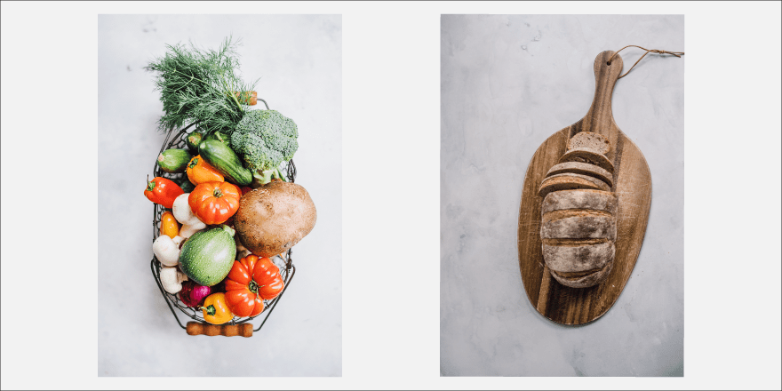
Step 1: Select The Images
Select two HD images of your products.
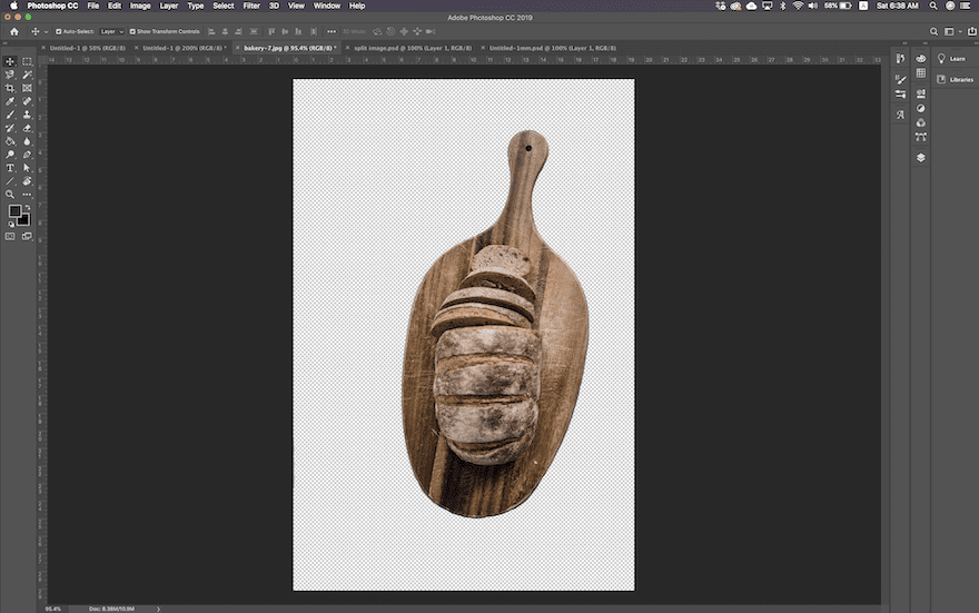
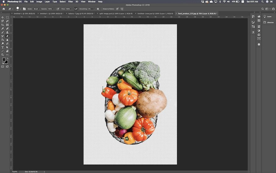
Step 2: Erase The Background
Erase the backgrounds to create cut-outs. You can use any program you want. But here’s a step by step guide for Photoshop.
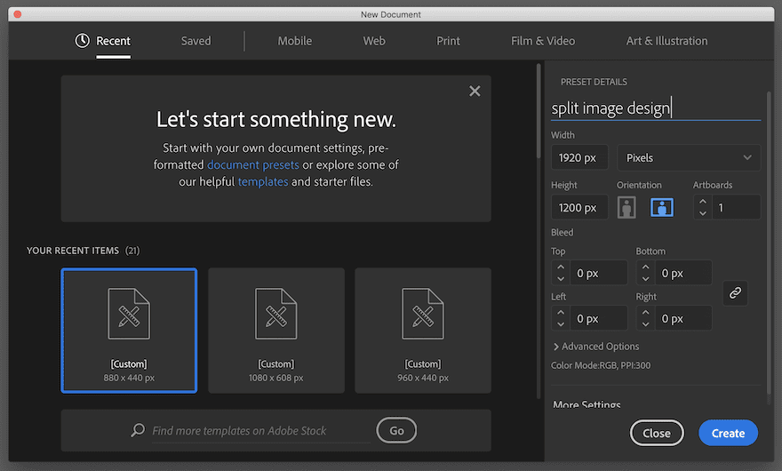
Step 3: Open a New Project on Illustrator
Open a new project in Illustrator, 1920px wide by 1200px tall.
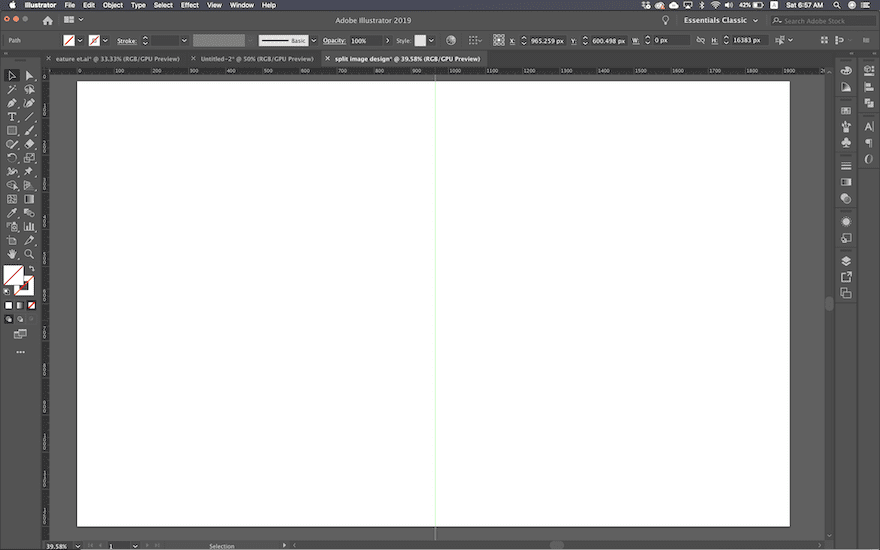
Step 4: Add a Vertical Guide.
Add a vertical guide through the center of the empty canvas. Make sure it’s right in the center.
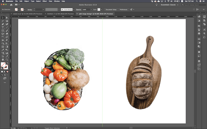
Step 5: Import or Place The Cut-Out Images
Place both cut-out images on the canvas.
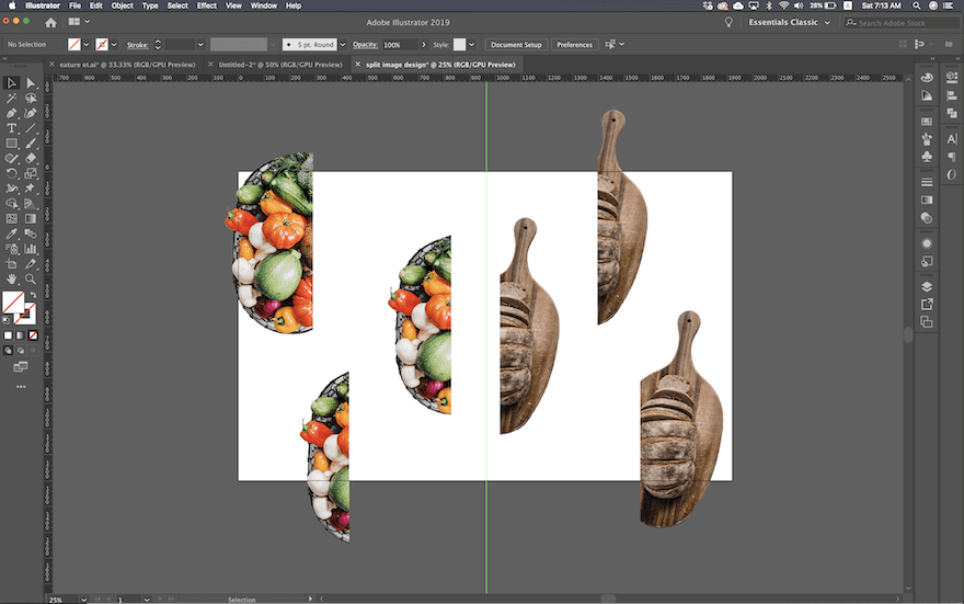
Step 6: Start Visualizing The Split
Make two duplicates of each image. Use the crop function to split them in half at different spots. First through the center, and then a bit less and a bit more for the duplicates. Now you’ll have three split versions of each image.
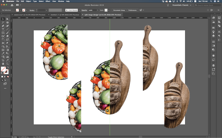
Step 7: Finalize The Effect
Using the different split cut-outs, find the best composition for your images. Make sure that the straight edge of each image is right on the central guide on the canvas. Try changing the size of the images to make them fit better. Remember that the canvas has the size of a fullwidth screen so adjust the size of the images accordingly.
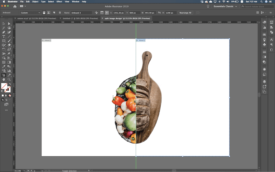
Step 8: Crop Half and Save
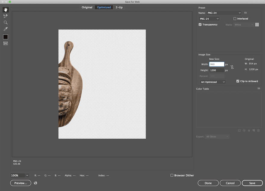
When the design is finished, get rid of the extra cut-outs. Double-check that the straight edge of each image is touching the center guide. Create two new artboards and resize them to fit each side, making sure they are separated right at the center guide. Export for web, one artboard at a time and save as .png. Now, you have two different images. Both 960px wide and 1200px tall.
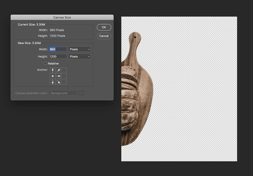
Step 9: Resize for Tablet and Mobile
Resize both images to 960px wide by 1200px tall. Make sure you only crop out the transparent background, don’t touch the image. I did it on Photoshop by changing the canvas size with the anchor on the side of the image.
Let’s Start Recreating!
Add New Section
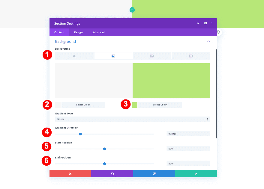
Background
Now that we’ve gone through the first part of the tutorial, it’s time to get started with Divi! Create a new page or add a new section to an existing page. Add a gradient background to the section.
- Background: Gradient
- Color One: Off White #f7f7f7
- Color Two: Fresh Green #b7e778
- Gradient Direction: 90deg
- Start and End Position: 50%
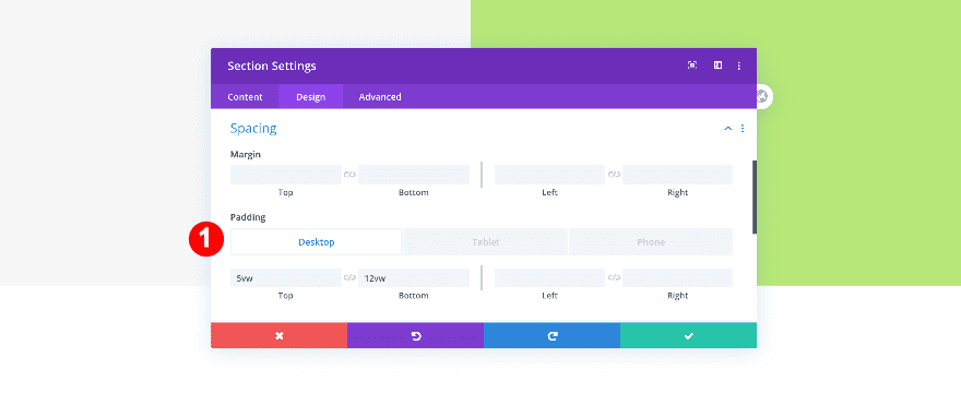
Spacing
Change the section’s spacing settings next.
- Top Padding: 5vw
- Bottom Padding: 12vw
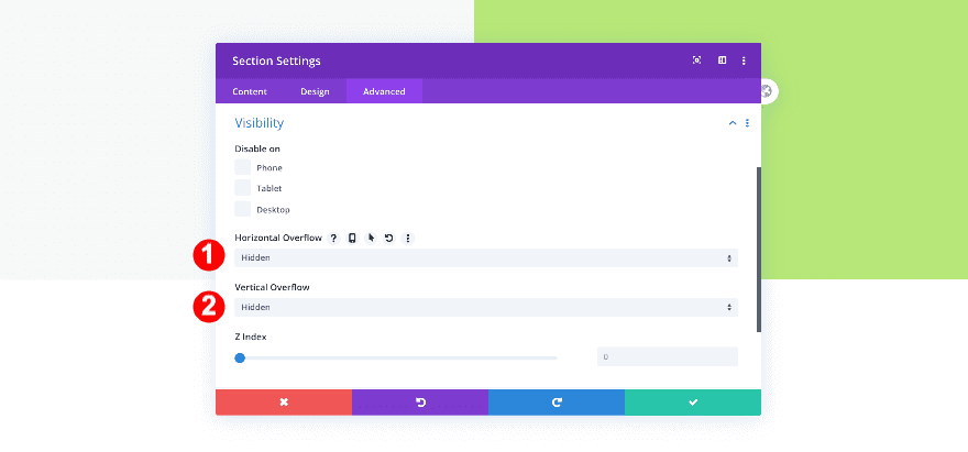
Visibility
Finally, adjust the visibility.
- Vertical and Horizontal Overflow: Hidden
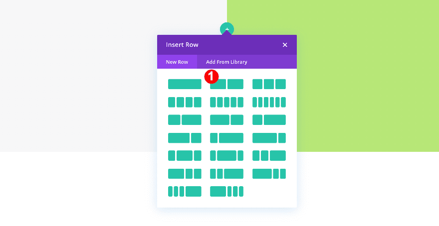
Add 1st Row
Column Structure
Continue by adding a new row using the following column structure:
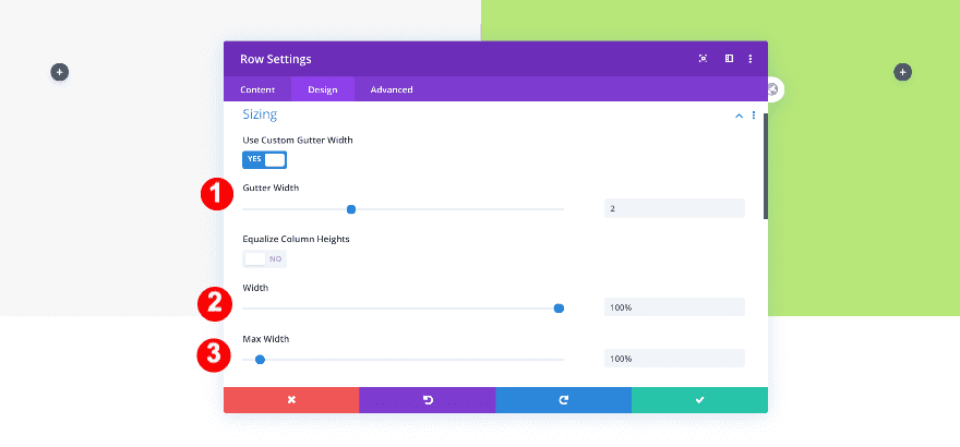
Sizing
Adjust the row’s sizing settings.
- Gutter Width: 2
- Width: 100%
- Max Width: 100%
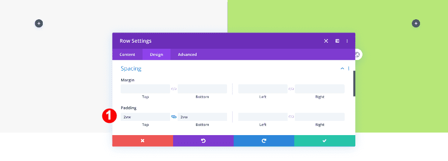
Spacing
Add some custom padding values too.
- Top and Bottom Padding: 2vw
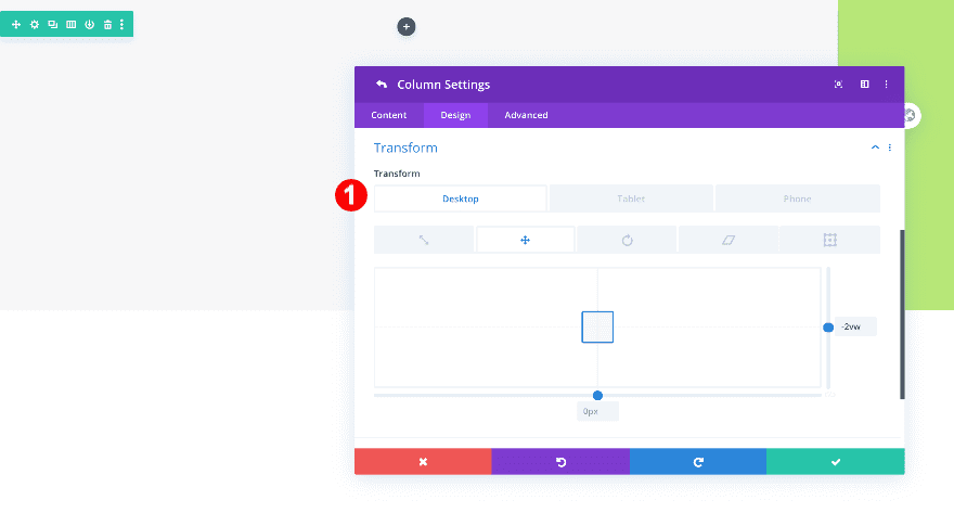
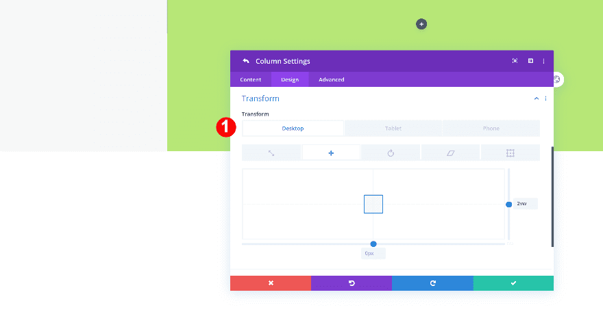
Column 1 Settings
Transform
Go to the column 1 settings next, and change the transform translate values.
- Transform Translate: -2vw y-axis
Column 2 Settings
Transform
Do the same for column 2.
- Transform Translate: 2vw x-axis
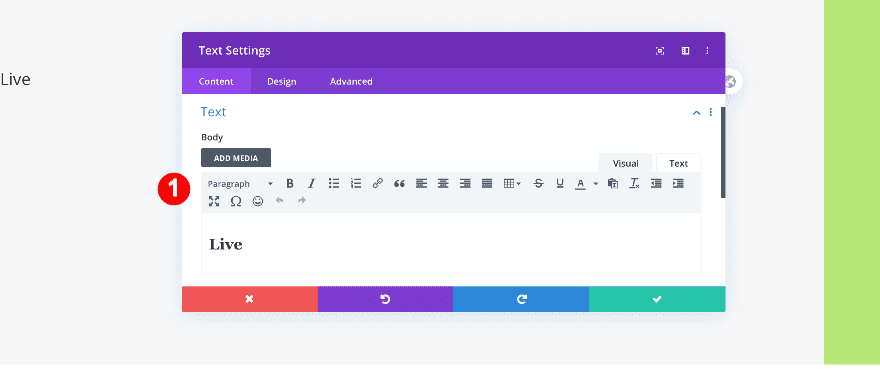
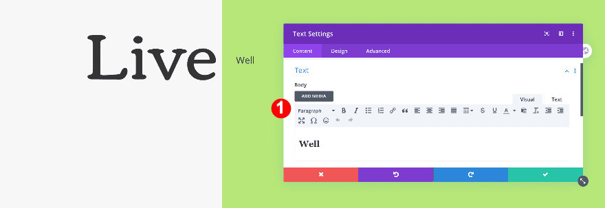
Add Text Module to Column 1
Add Content
Time to start adding modules! Add a text module to column 1 with some H2 content of your choice.
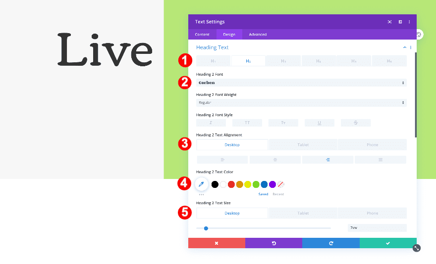
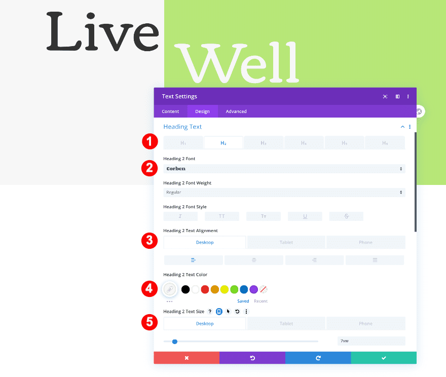
Title Text
In the design tab, change the heading text settings.
- Heading Text Level: H2
- H2 Font: Corben
- H2 Alignment:
- Desktop: Left
- Tablet + Phone: Center
- H2 Text Color: Very Dark Grey #3a3a3a
- H2 Text Size:
- Desktop: 7vw
- Tablet + Phone:16vw
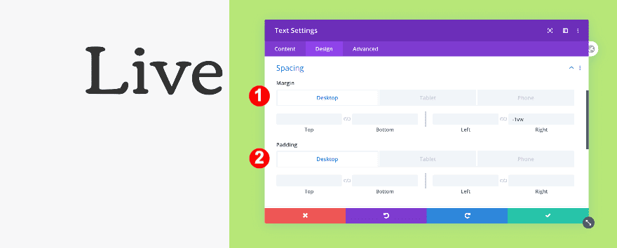
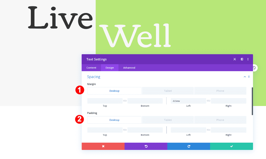
Spacing
Then, adjust the spacing.
- Right Margin:
- Desktop: -1vw
- Tablet + Phone: 0vw
- Right Padding:
- Tablet + Phone: 35vw
Add Text Module to Column 2
Add Content
Now, add a text module to the second column. Insert some H2 content of your choice.
Title Text
Then, style the heading text as follows.
- Heading Text Level: H2
- H2 Font: Corben
- H2 Alignment:
- Desktop: Left
- Tablet + Phone: Right
- H2 Text Color: Very Dark Grey #3a3a3a
- H2 Text Size:
- Desktop: 7vw
- Tablet + Phone: 14vw
Spacing
Finally, adjust the spacing.
- Top Margin:
- Tablet: -12vw
- Phone: -14vw
- Left Margin:
- Desktop + Tablet: -0.5vw
- Right Padding:
- Tablet + Phone: 17vw
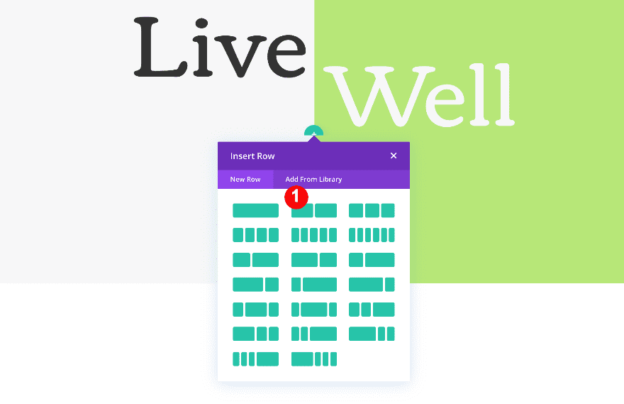
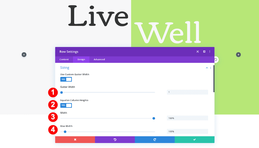
Add 2nd Row
Column Structure
Continue by adding a new row to your section using the following column structure:
Sizing
Open the row settings and adjust the sizing settings.
- Gutter Width: 1
- Equalize Column Heights: Yes
- Width: 100%
- Max Width: 100%
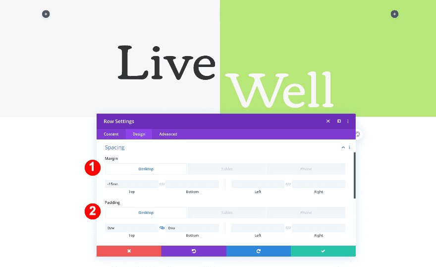
Spacing
Modify the spacing settings next.
- Top Margin:
- Desktop: -15vw
- Tablet: -36vw
- Phone: -40vw
- Top and Bottom Padding:
- Desktop: 0vw
- Tablet: 9vw
- Phone: 12vw
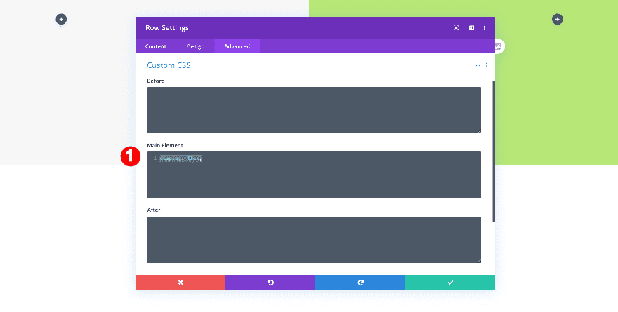
Custom CSS
Complete the row settings by adding one single line of CSS code to the row’s main element. This will help keep the images together.
- Main Element: display: flex;
display: flex;
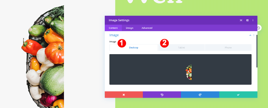
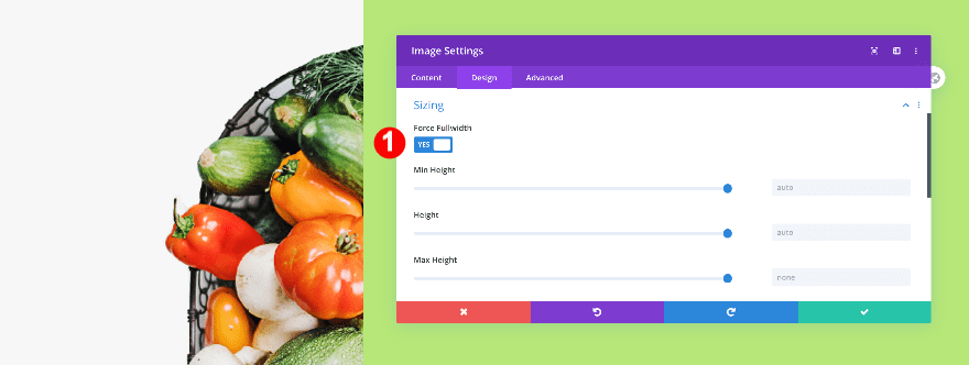
Add Image Module to Column 1
Add Image
Add the left half image to column 1.
- Image:
- Desktop: The 960px wide image
- Tablet + Phone: The 600px wide image
Sizing
Make the image module fullwidth.
- Force Fullwidth: yes
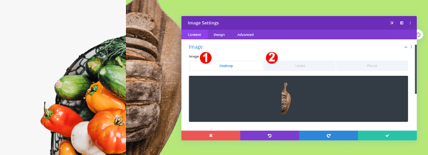
Add Image Module to Column 2
Add Image
Add the right half image to column 2.
- Image:
- Desktop: The 960px wide image
- Tablet + Phone: The 600px wide image
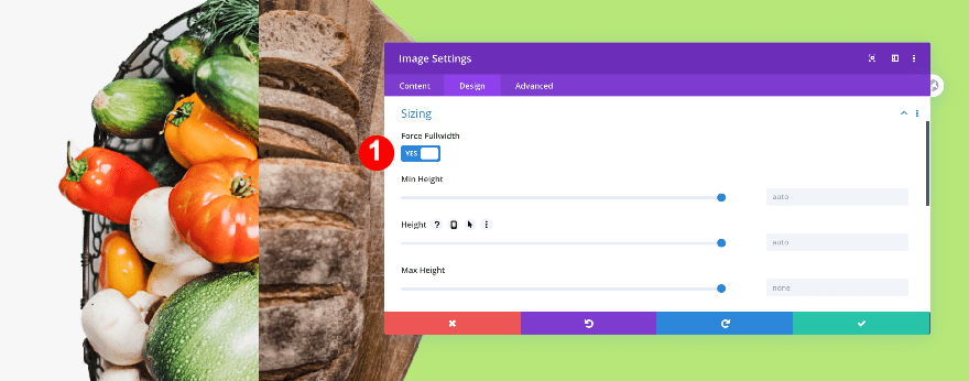
Sizing
Make this image module fullwidth too.
- Force Fullwidth: yes
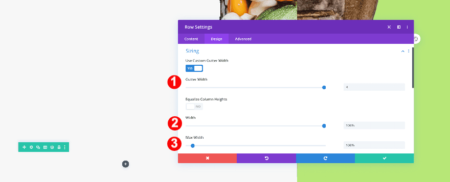
Add 3rd Row
Column Structure
On to the next row! Choose the following column structure:
Sizing
Adjust the row’s sizing as follows:
- Gutter Width: 4
- Width: 100%
- Max Width: 100%
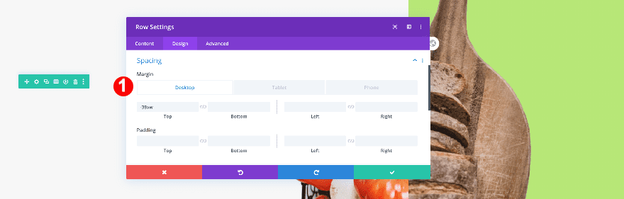
Spacing
Then, adjust the spacing.
- Top Margin:
- Desktop: -38vw
- Tablet + Phone: -14vw
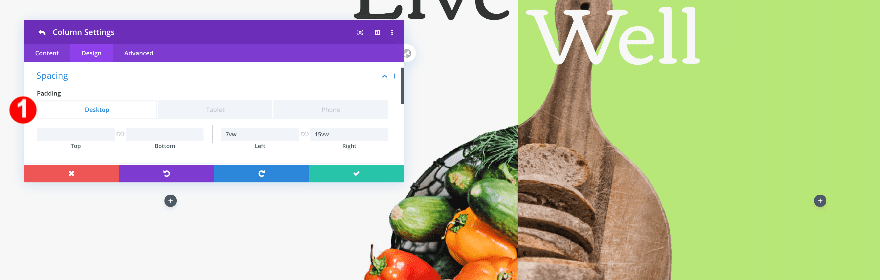
Column 1 Settings
Spacing
Before adding modules, adjust the spacing in the columns. Start with column 1.
- Left Padding:
- Desktop: 7vw
- Tablet + Phone: 12vw
- Right Padding:
- Desktop: 15vw
- Tablet + Phone: 12vw
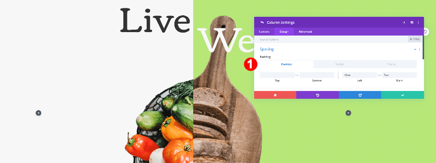
Column 2 Settings
Spacing
Then, adjust the column 2 spacing settings
- Left Padding:
- Desktop: 15vw
- Tablet + Phone: 12vw
- Right Padding:
- Desktop: 7vw
- Tablet + Phone: 12vw
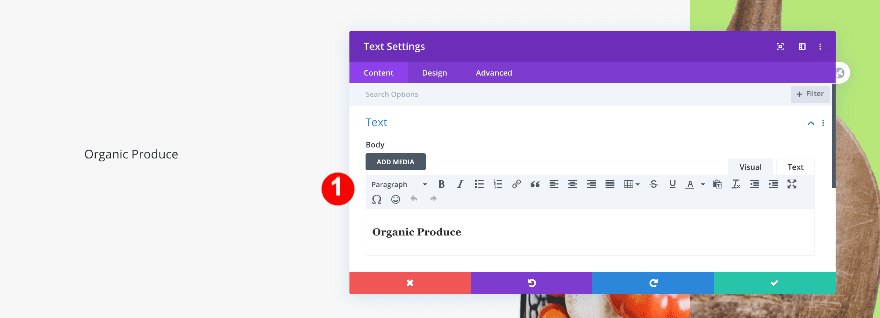
Add Text Module to Column 1
Add Content
Add a text module to column 1 and add some H3 content of your choice.
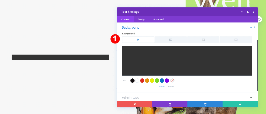
Background
Change the background color.
- Background: Color
- Color: Very Dark Grey #333333
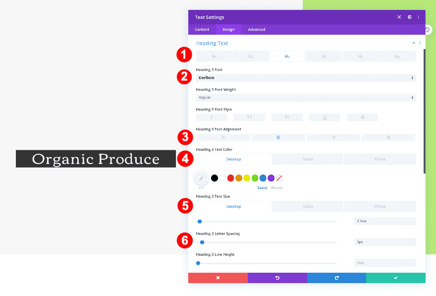
Title Text
Then, style the heading text.
- Heading Text Level: H3
- H3 Font: Corben
- H3 Alignment: Center
- H3 Font Color: Off White #f7f7f7
- H3 Font Size:
- Desktop: 2.2vw
- Tablet: 6.4vw
- Phone: 7vw
- H3 Letter Spacing: 3 px
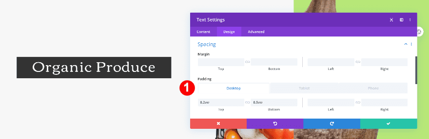
Spacing
Add some custom spacing values next.
- Top Padding:
- Desktop + Tablet: 0.2vw
- Phone: 1vw
- Bottom Padding:
- Desktop: 0.5vw
- Tablet: 1.2vw
- Phone: 1vw
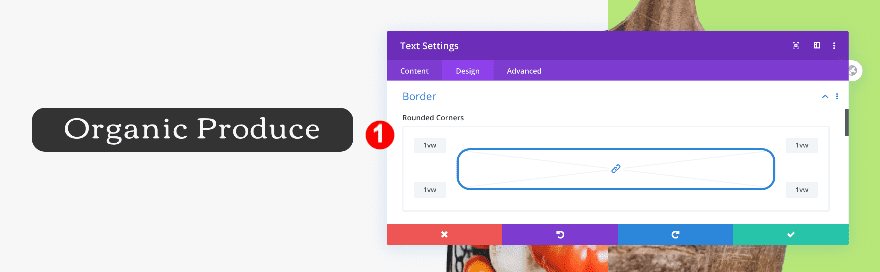
Border
Complete the module’s settings by adding some rounded corners.
- Rounded Corners: 1vw all four corners
Duplicate Text Module And Drag to Column 2
Now, duplicate the text module and drag it over to column 2.
Change content
Of course, you’ll need to change the content in the duplicate text module.

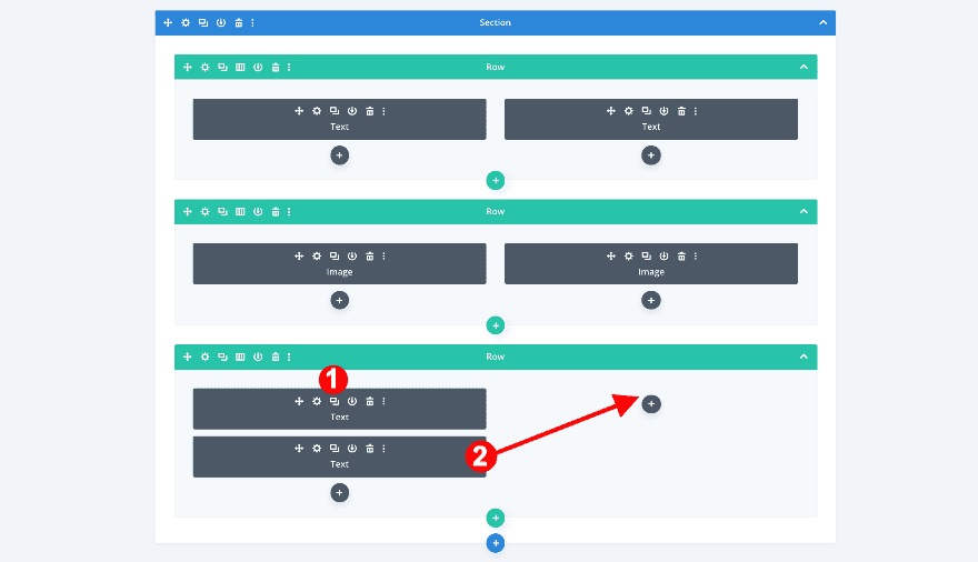
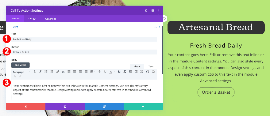
Add Call to Action Module to Column 1
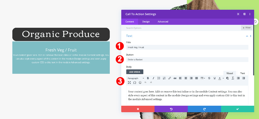
Add Content
Below the text module in column 1, add a call to action module with some content of your choice.
- Title
- Button
- Body
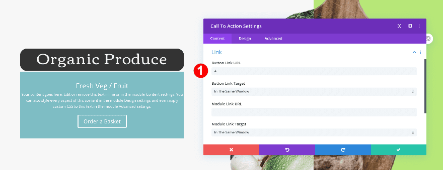
Add Link
Continue by adding a link to the CTA’s button.
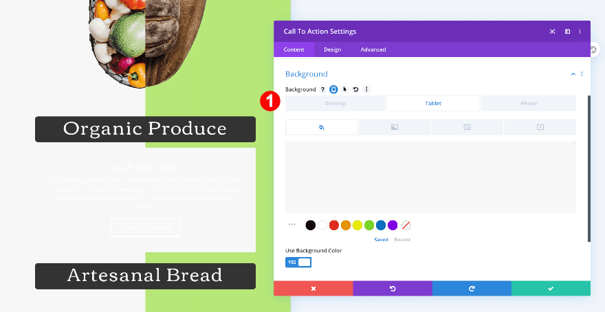
Background
And add a background color to tablet and mobile.
- Background Color:
- Tablet + Phone: Off White #f7f7f7
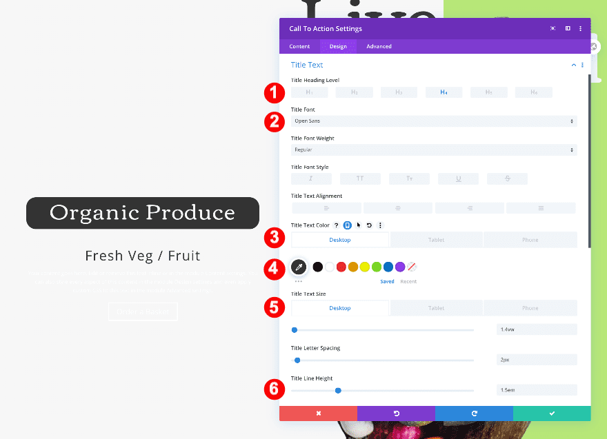
Title Text
In the design tab, style the H4 text settings.
- Heading Text Level: H4
- H4 Font: Open Sans
- H4 Color: Very Dark Grey #333333
- H4 Text Size:
- Desktop: 1.4vw
- Tablet: 4.5vw
- Phone: 7vw
- H3 Letter Spacing: 2px
- H3 Line Height: 1.5em
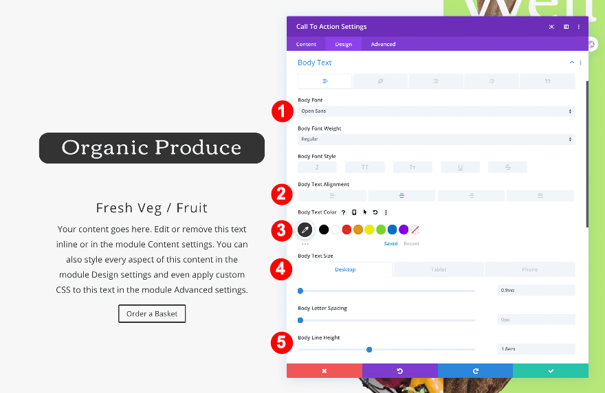
Body Text
Change the body text settings next.
- Body Font: Open Sans
- Body Text Alignment: Center
- Body Text Color: Very Dark Grey #333333
- Body Font Size:
- Desktop: 0.9vw
- Tablet: 3vw
- Phone: 4vw
- Body Line Height: 1.8em
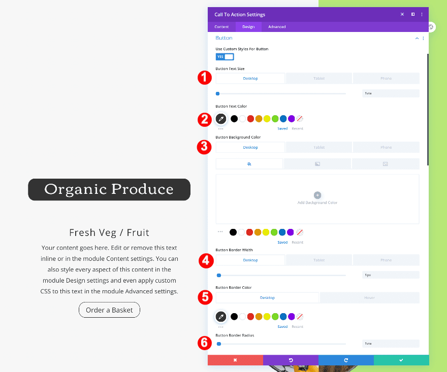
Button
Style the button too.
- Button Text Size:
- Desktop: 1vw
- Tablet: 2.2vw
- Phone: 3.8vw
- Button Font Color: Very Dark Grey #333333
- Button Background Color:
- Tablet + Mobile: Fresh Green #b7e778
- Button Border Width:
- Desktop: 1px
- Button Border Color:
- Desktop: Very Dark Grey #333333
- Button Border Radius: 1vw
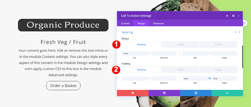
Spacing
And add some custom spacing values.
- Top Margin:
- Desktop + Tablet: -2vw
- Phone: 3vw
- Left and Right Padding:
- Desktop: 0vw
- Tablet + Phone: 4vw
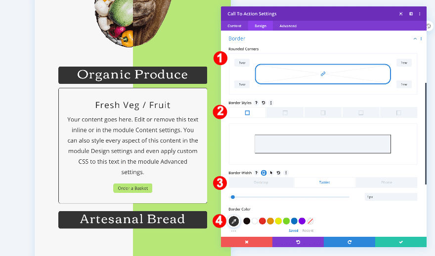
Border
Last but not least, style the border across different screen sizes.
- Rounded Corners: 1vw all corners
- Border Styles:
- Tablet + Phone: all four sides
- Border Width:
- Tablet + Phone: 1px
- Border Color:
- Tablet + Phone: Very Dark Grey #333333
Duplicate Call to Action Module And Drag to Column 2
Duplicate the call to action module and drag it over to column 2.
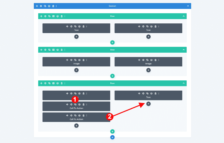
Change content
To complete the design, change the content in the duplicated call to action module and you’re done!
Preview
Now that we’ve gone through all the steps, let’s take a final look at the outcome across different screen sizes.
Desktop
Mobile
Conclusion
In this post, we’ve shown you how to create a split-image product info section with Divi. We’ve explained how to create the split-images using image editing software and continued using the files in our Divi design. We hope this design will inspire you to get creative with your own product images. If you have any questions or suggestions, feel free to leave a comment in the comment section below!


I was searching something like this since last couple of days. I am glad to find this excellent post !! Thank you so much.