
Recently, some additional hover options have been added to Divi–allowing you to create even more cool effects without having to touch one single line of code. You can now, for instance, create amazing gradient background hover transitions. By combining column, row and section gradients, you can achieve unique designs. In this tutorial, we’ll show you exactly how to do that. We’ll start off by going through some general steps. Once that’s done, we’ll focus on three design examples individually. You’ll also be able to download the JSON file for free!
Let’s get to it.
Preview
Before we dive into the tutorial, let’s take a quick look at the three different examples we’ll recreate throughout this tutorial.
Example #1
Example #2
Example #3
Download The Hero Sections for FREE
Subscribe To Our Youtube Channel
To lay your hands on these free hero sections, you will first need to download them using the button below. To gain access to the download you will need to subscribe to our newsletter by using the form below. As a new subscriber, you will receive even more Divi goodness and a free Divi Layout pack every Monday! If you’re already on the list, simply enter your email address below and click download. You will not be “resubscribed” or receive extra emails.

General Steps
Add New Section
Spacing
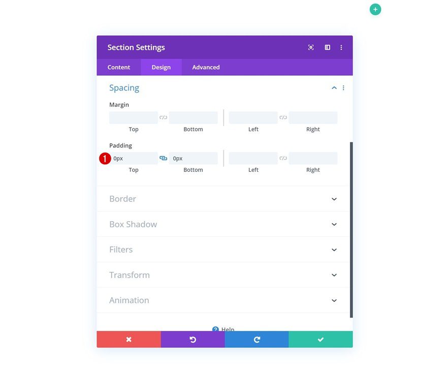
Let’s start by going through some general steps. Add a new section to the page you’re working on and remove all default padding. Removing all top and bottom padding will, later on, help us combine column, row and section gradient backgrounds.
- Top Padding: 0px
- Bottom Padding: 0px
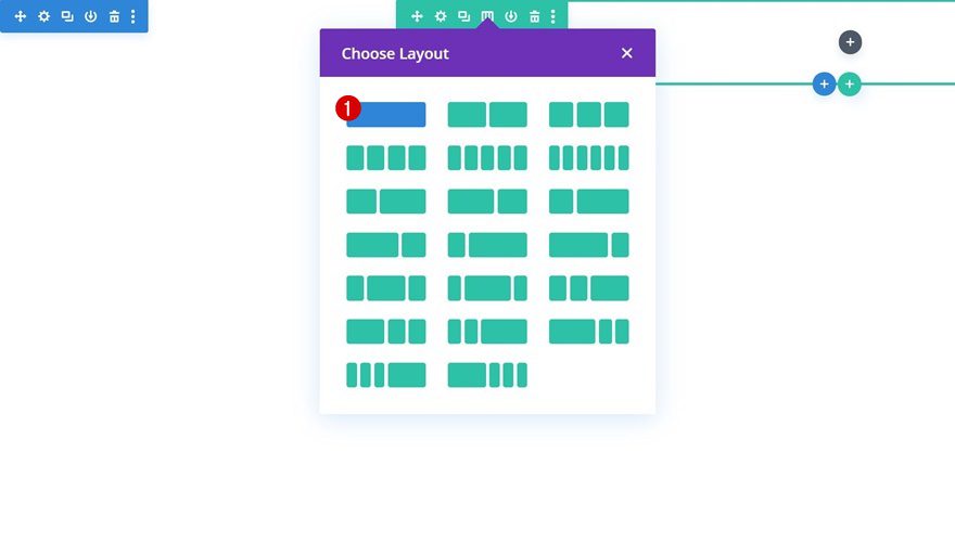
Add New Row
Column Structure
Continue by adding a new row using the following column structure:
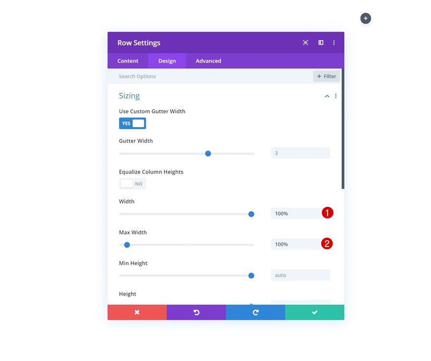
Sizing
Without adding any modules yet, open the row settings and allow the row to take up the entire width of the section container.
- Width: 100%
- Max Width: 100%
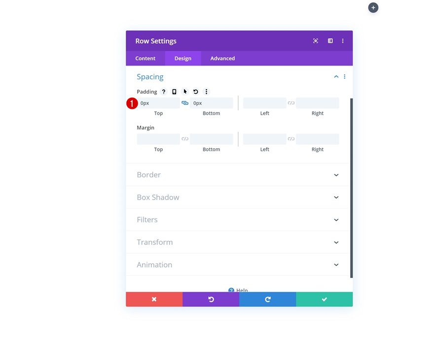
Spacing
Move on to the spacing settings and remove all default top and bottom padding.
- Top Padding: 0px
- Bottom Padding: 0px
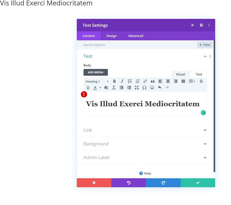
Add Text Module #1 to Column
Add H1 Content
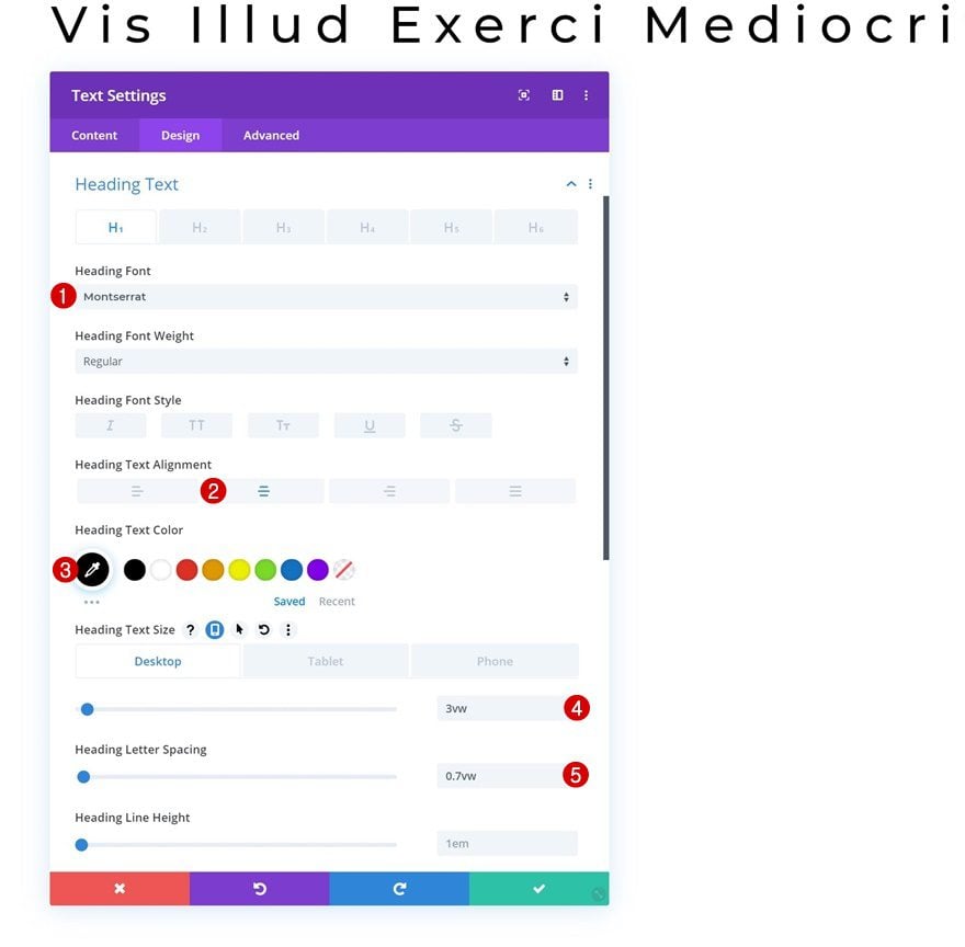
Let’s start adding modules! The first one we need is a Text Module with some H1 content.
H1 Text Settings
Move on to the design tab and change the H1 text settings accordingly:
- Heading Font: Montserrat
- Heading Text Alignment: Center
- Heading Text Color: #000000
- Heading Text Size: 3vw (Desktop), 6vw (Tablet & Phone)
- Heading Letter Spacing: 0.7vw
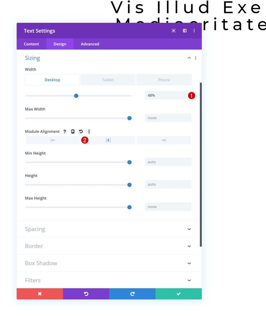
Sizing
Open the sizing settings next and change the width along with the module alignment.
- Width: 48% (Desktop), 60% (Tablet & Phone)
- Module Alignment: Center
Spacing
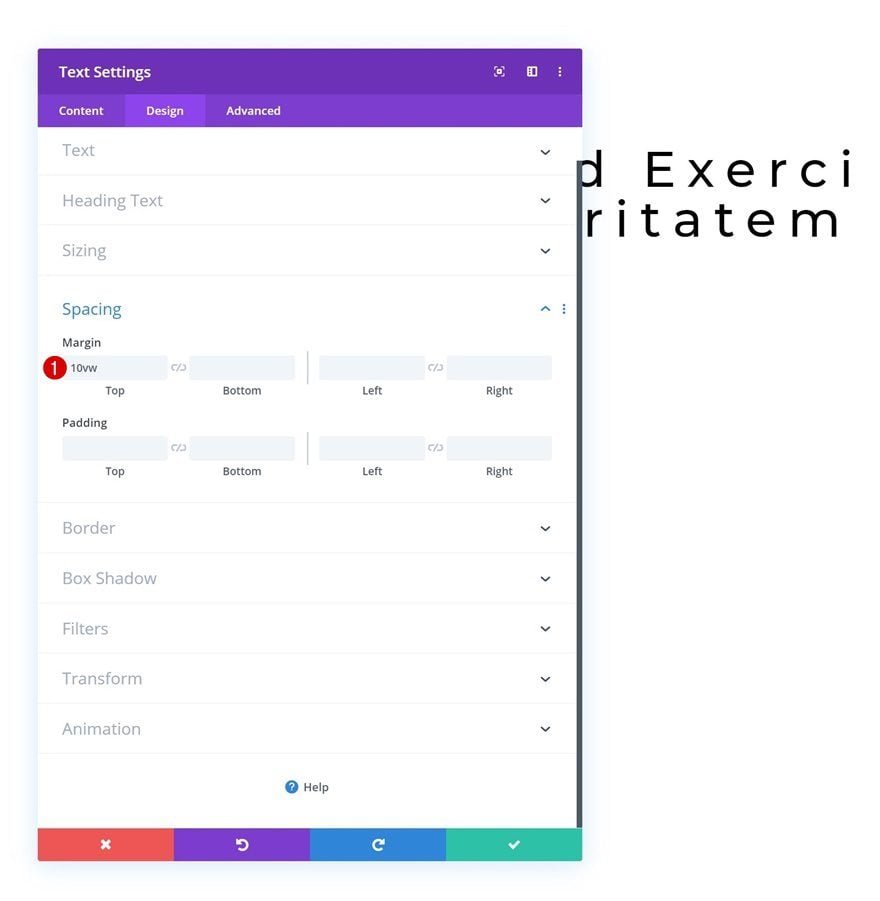
Complete the module’s design by adding some top margin.
- Top Margin: 10vw
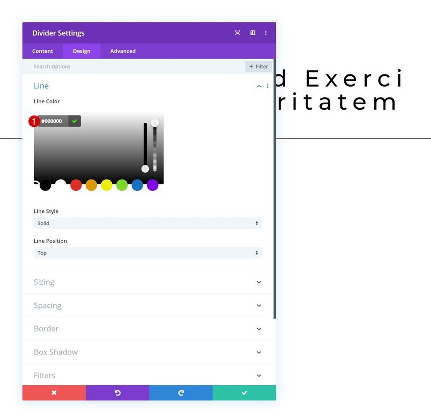
Add Divider Module to Column
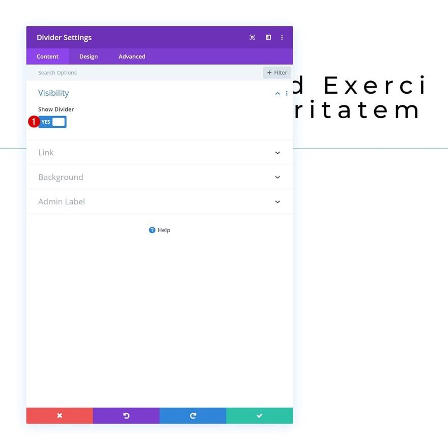
Visibility
On to the next module! Add a Divider Module and make sure the ‘Show Divider’ option is enabled.
- Show Divider: Yes
Line
Change the line color next.
- Line Color: #000000
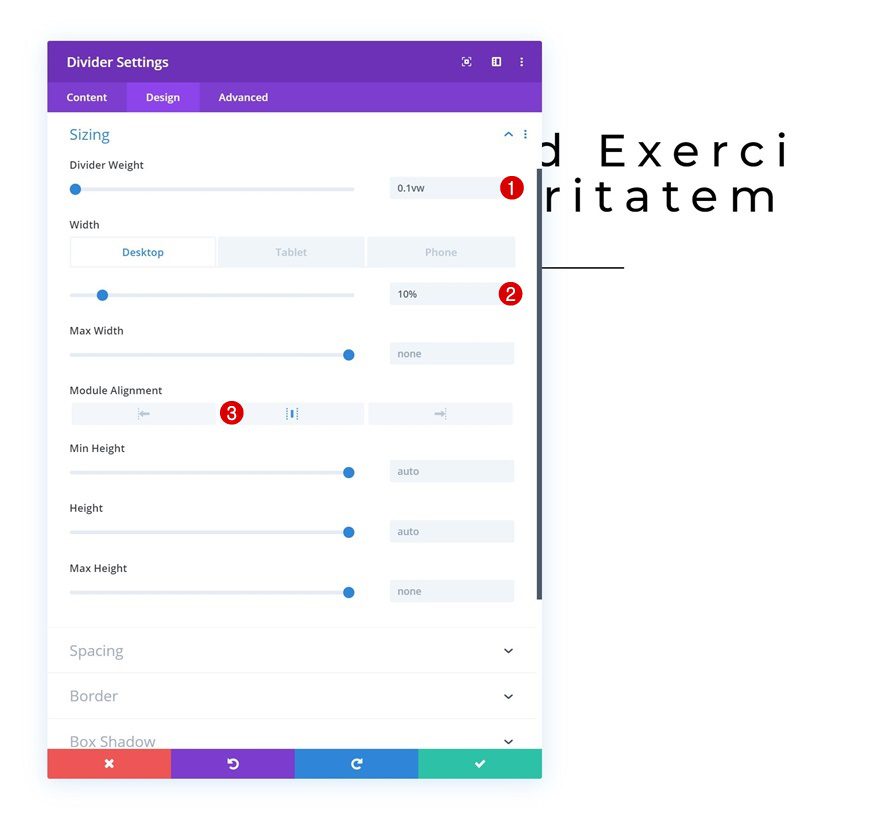
Sizing
Move on to the sizing settings and apply the following settings:
- Divider Weight: 0.1vw
- Width: 10% (Desktop),16% (Tablet), 25% (Phone)
- Module Alignment: Center
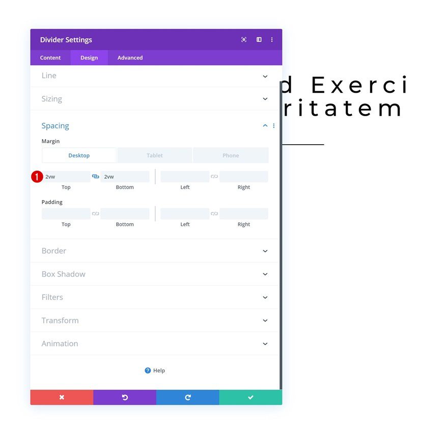
Spacing
Add some custom padding values across different screen sizes as well.
- Top Padding: 2vw (Desktop), 4vw (Tablet), 6vw (Phone)
- Bottom Padding: 2vw (Desktop), 4vw (Tablet), 6vw (Phone)
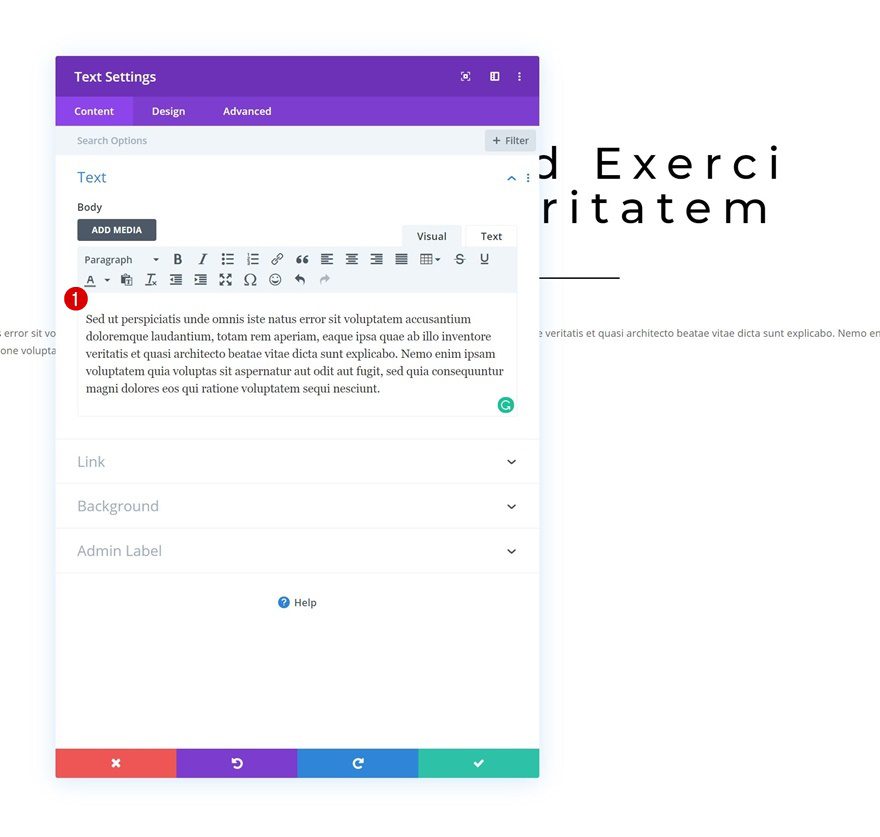
Add Text Module #2 to Column
Add Content
On to the next module, which is another Text Module. Add some paragraph content of your choice.
Text Settings
Move on to the design tab and change the text settings accordingly:
- Text Font: Open Sans
- Text Alignment: Justify
- Text Line Height: 2.3em
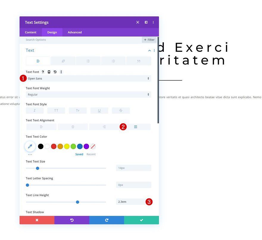
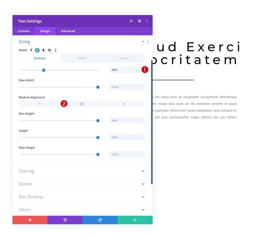
Sizing
Modify the width and module alignment in the sizing settings next:
- Width: 30% (Desktop), 54% (Tablet), 70% (Phone)
- Module Alignment: Center
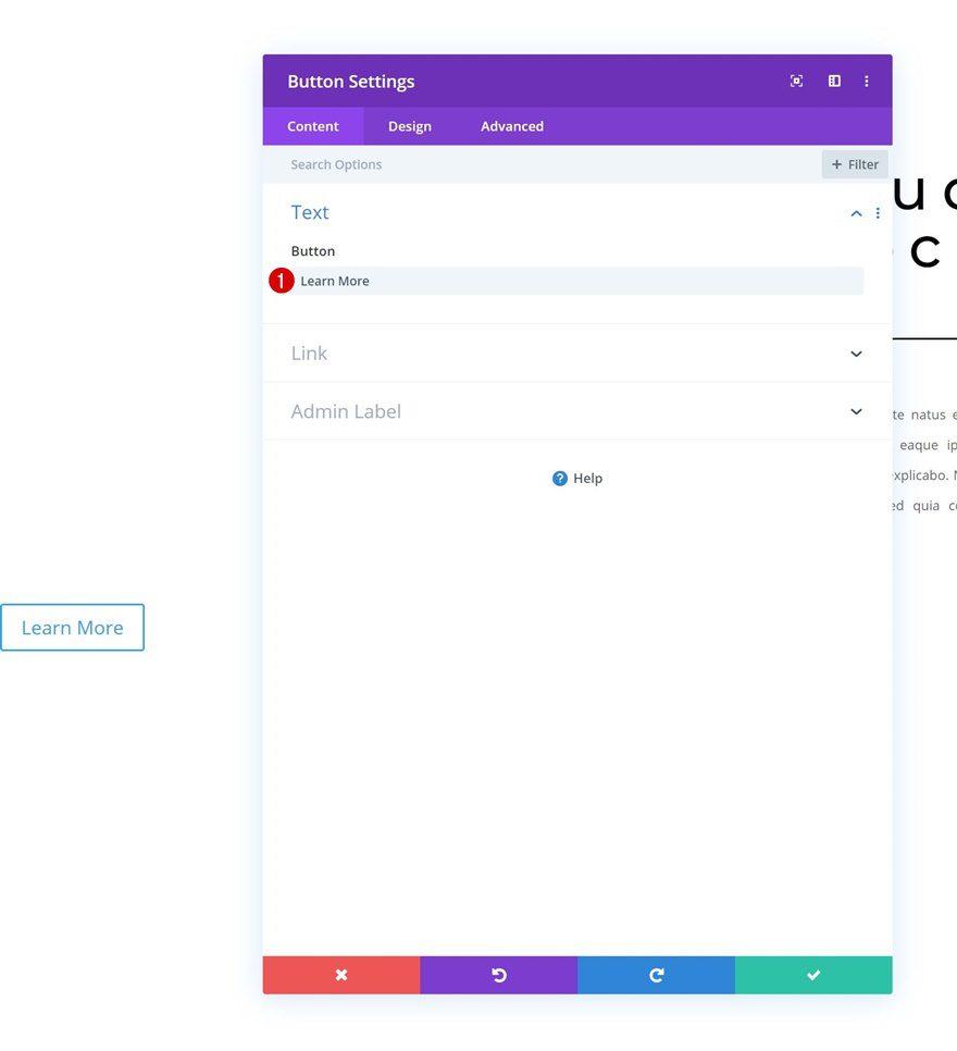
Add Copy
The next and last module we need in the column is a Button Module. Add some copy of your choice.
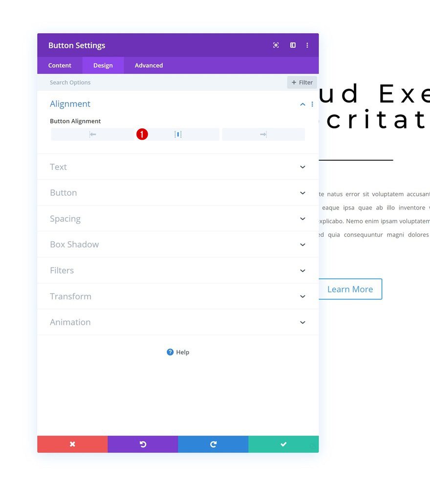
Alignment
Move on to the design tab and change the button alignment.
- Button Alignment: Center
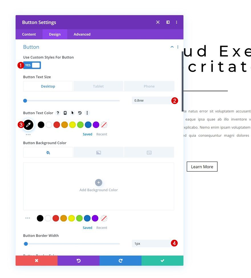
Button Settings
Modify the button settings as well.
- Use Custom Styles For Button: Yes
- Button Text Size: 0.8vw (Desktop), 2vw (Tablet), 2.8vw (Phone)
- Button Text Color: #000000
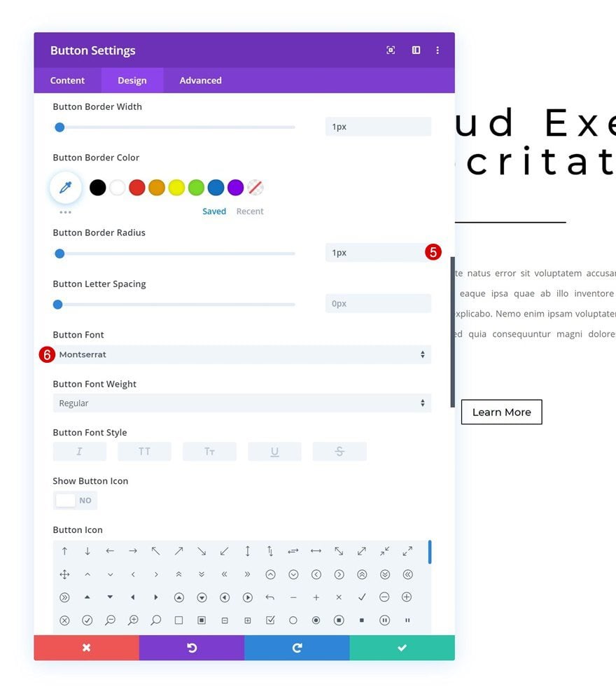
- Button Border Width: 1px
- Button Border Radius: 1px
- Button Font: Montserrat
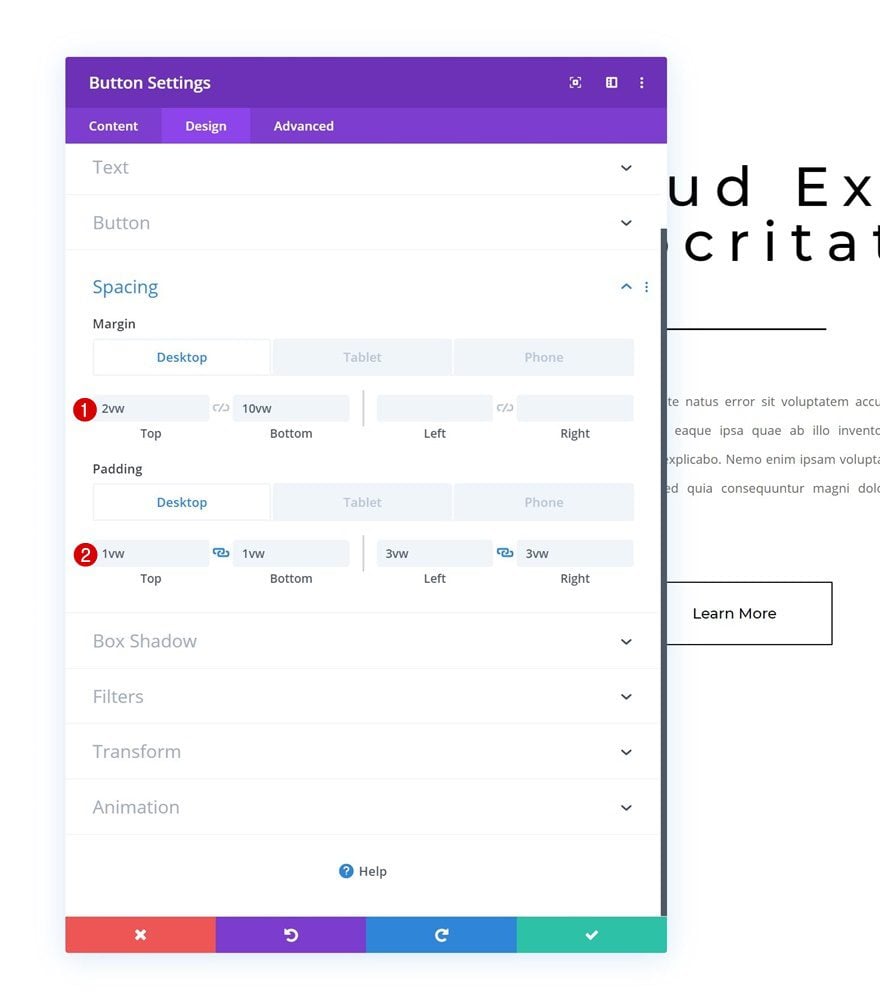
Spacing
And add some custom spacing values across different screen sizes.
- Top Margin: 2vw (Desktop), 8vw (Tablet & Phone)
- Bottom Margin: 10vw
- Top Padding: 1vw (Desktop), 2vw (Tablet), 3vw (Phone)
- Bottom Padding: 1vw (Desktop), 2vw (Tablet), 3vw (Phone)
- Left Padding: 3vw (Desktop), 6vw (Tablet), 8vw (Phone)
- Right Padding: 3vw (Desktop), 6vw (Tablet), 8vw (Phone)
Clone Section Twice Times
Once you’ve completed the section, you can clone it twice; one for each example.
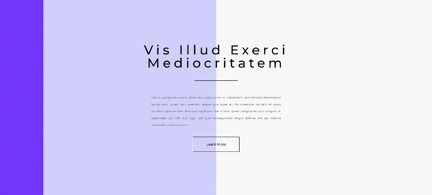
Recreate Gradient Background Hover Transition #1
Section
Default Gradient Background
Let’s start creating the first hover transition! Open the section settings and add the following default gradient background:
- Color 1: #d1d1ff
- Color 2: #f7f7f7
- Gradient Direction: 90deg
- Start Position: 50%
- End Position: 50%
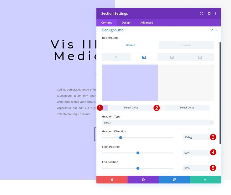
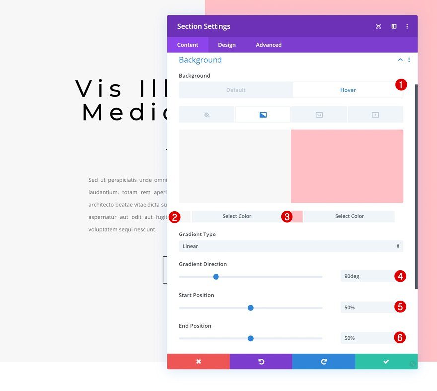
Hover Gradient Background
Modify the gradient background on hover.
- Color 1: #f7f7f7
- Color 2: #ffc1c7
- Gradient Direction: 90deg
- Start Position: 50%
- End Position: 50%
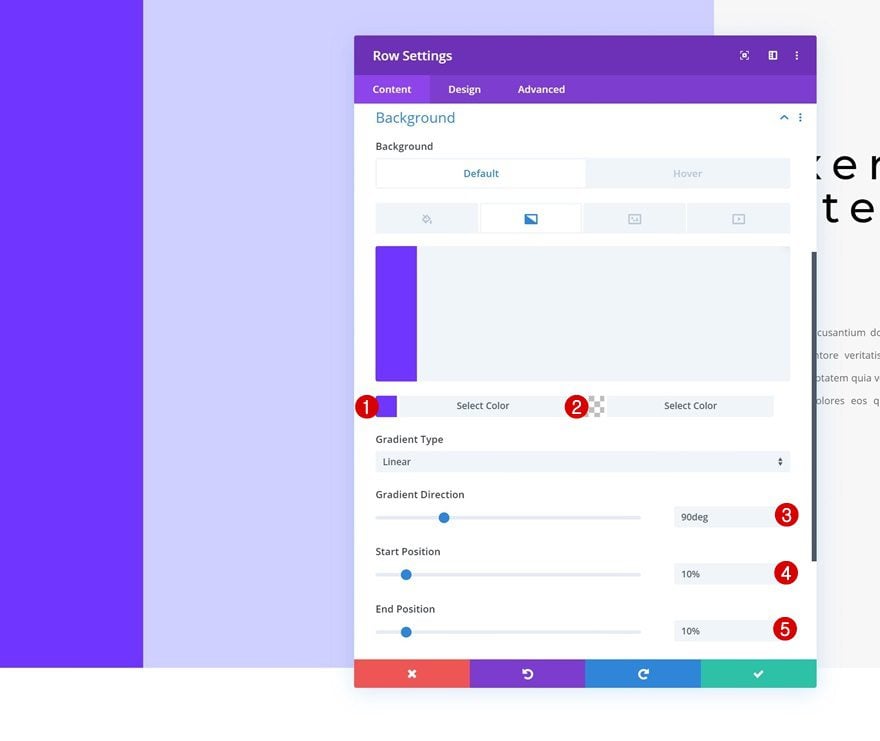
Row
Default Gradient Background
Open the row settings next and apply the following default gradient background settings:
- Color 1: #7032ff
- Color 2: rgba(255,255,255,0)
- Gradient Direction: 90deg
- Start Position: 10%
- End Position: 10%
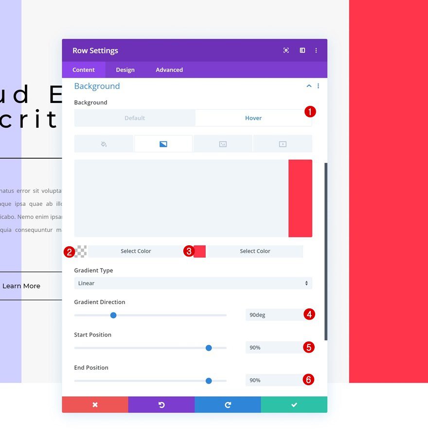
Hover Gradient Background
Modify the gradient background on hover.
- Color 1: rgba(255,255,255,0)
- Color 2: #ff324a
- Gradient Direction: 90deg
- Start Position: 90%
- End Position: 90%
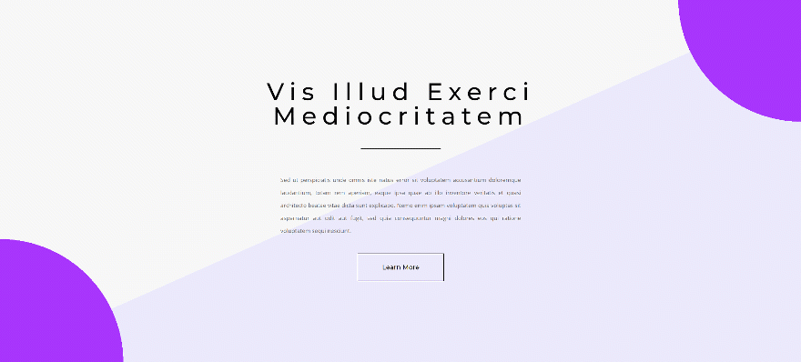
Recreate Gradient Background Hover Transition #2
Section
Default Gradient Background
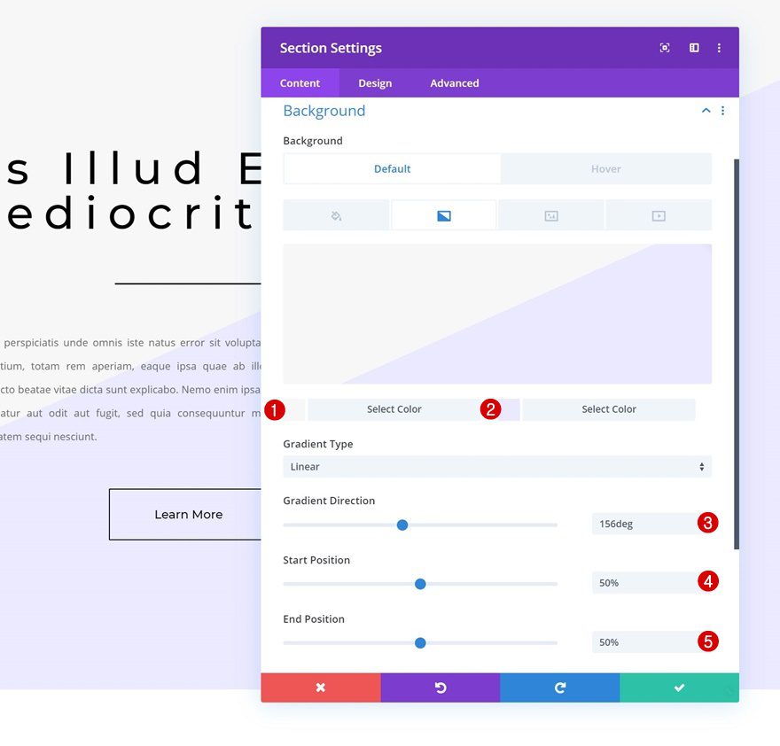
On to the second example! Open the section settings and add the following gradient background:
- Color 1: #f7f7f7
- Color 2: #eceaff
- Gradient Direction: 156deg
- Start Position: 50%
- End Position: 50%
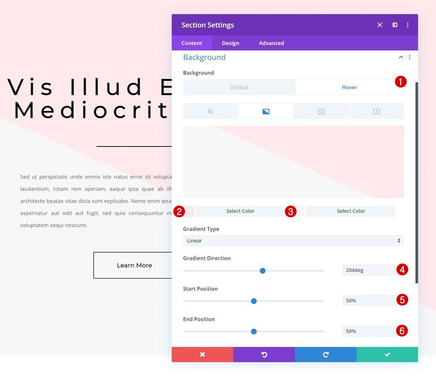
Hover Gradient Background
Add a different gradient background on hover:
- Color 1: #ffeaec
- Color 2: #f7f7f7
- Gradient Direction: 204deg
- Start Position: 50%
- End Position: 50%
Row
Default Gradient Background
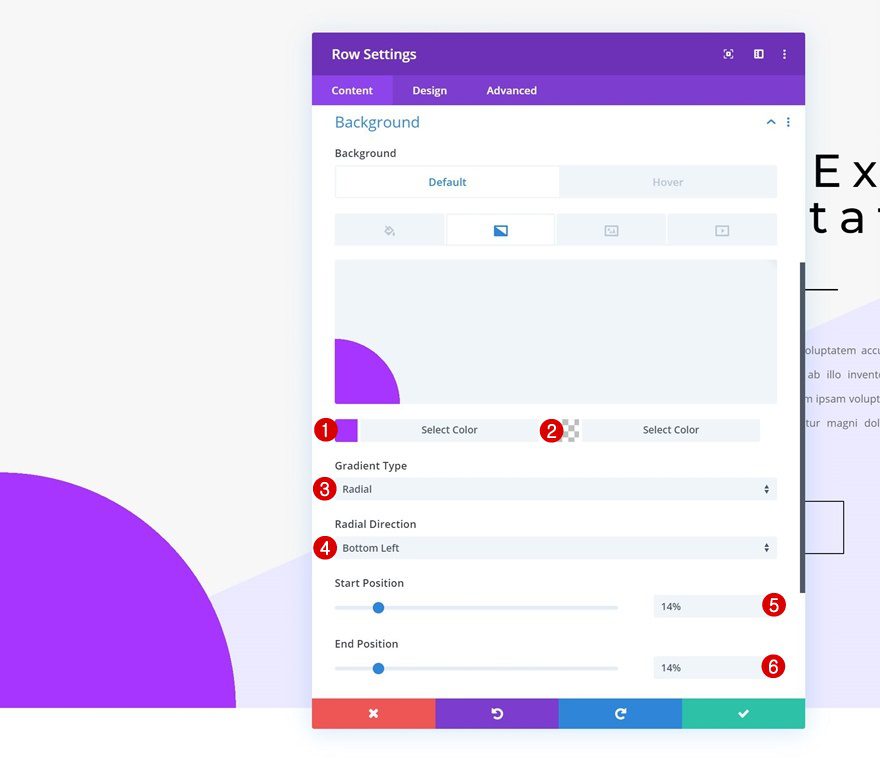
Open the row settings next and apply the following gradient background settings:
- Color 1: #a932ff
- Color 2: rgba(255,255,255,0)
- Gradient Type: Radial
- Radial Direction: Bottom Left
- Start Position: 14%
- End Position: 14%
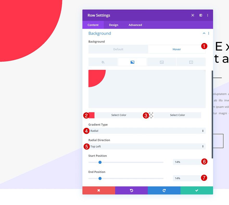
Hover Gradient Background
Change the row gradient background on hover accordingly:
- Color 1: #ff324a
- Color 2: rgba(255,255,255,0)
- Gradient Type: Radial
- Radial Direction: Top Left
- Start Position: 14%
- End Position: 14%
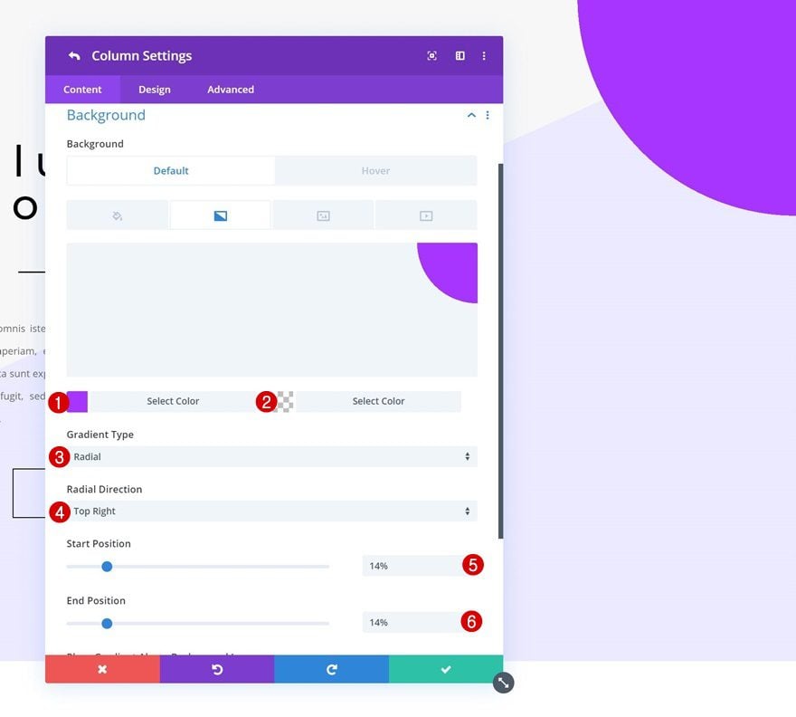
Column
Default Gradient Background
Move on to the column settings and add the following gradient background:
- Color 1: #a932ff
- Color 2: rgba(255,255,255,0)
- Gradient Type: Radial
- Radial Direction: Top Right
- Start Position: 14%
- End Position: 14%
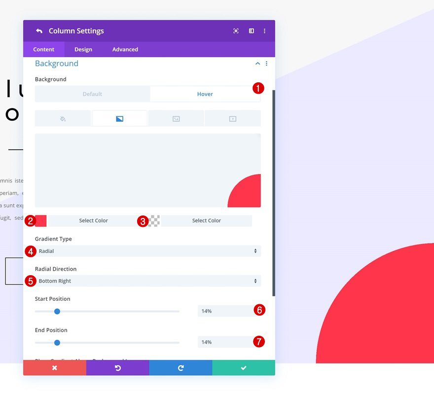
Hover Gradient Background
Modify the column gradient background on hover:
- Color 1: #ff324a
- Color 2: rgba(255,255,255,0)
- Gradient Type: Radial
- Radial Direction: Bottom Right
- Start Position: 14%
- End Position: 14%
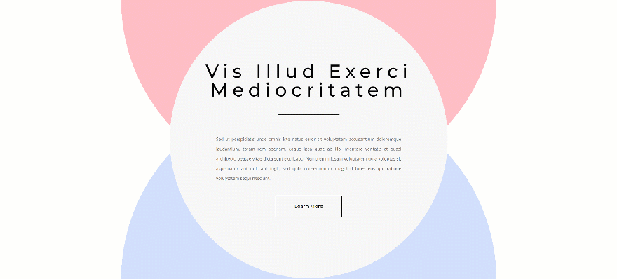
Recreate Gradient Background Hover Transition #3
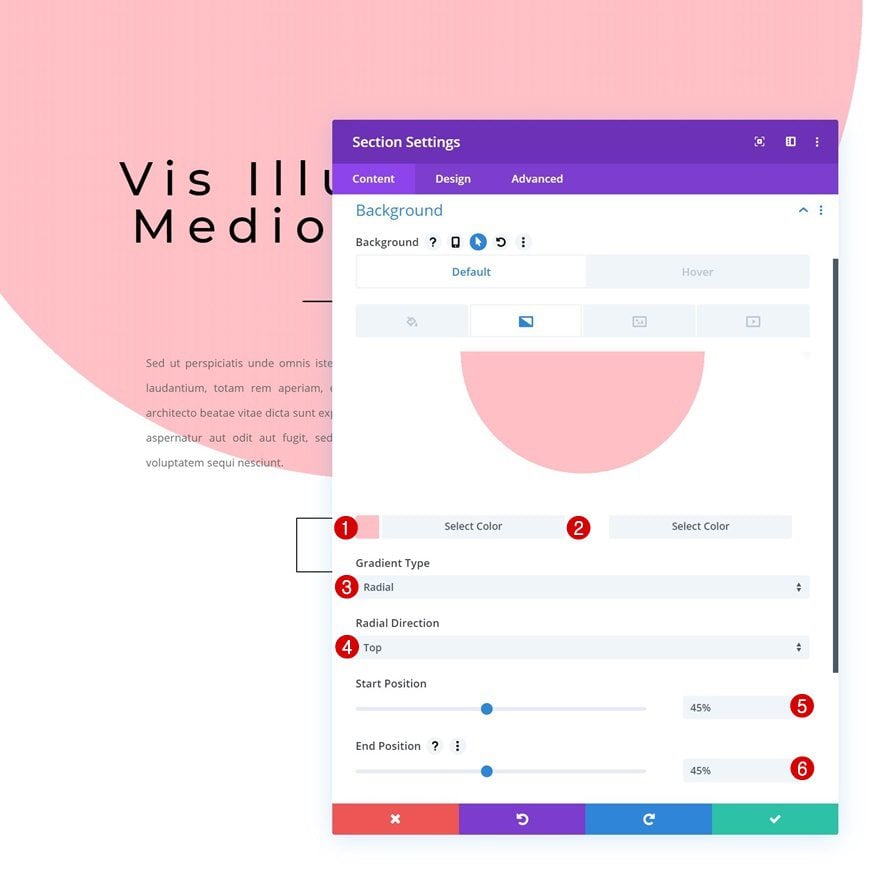
Section
Default Gradient Background
On to the next and last example! Open the section settings and apply the following gradient background:
- Color 1: #ffc1c7
- Color 2: #ffffff
- Gradient Type: Radial
- Radial Direction: Top
- Start Position: 45%
- End Position: 45%
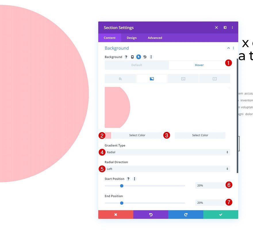
Hover Gradient Background
Modify the section gradient background on hover.
- Color 1: #ffc1c7
- Color 2: #ffffff
- Gradient Type: Radial
- Radial Direction: Left
- Start Position: 20%
- End Position: 20%
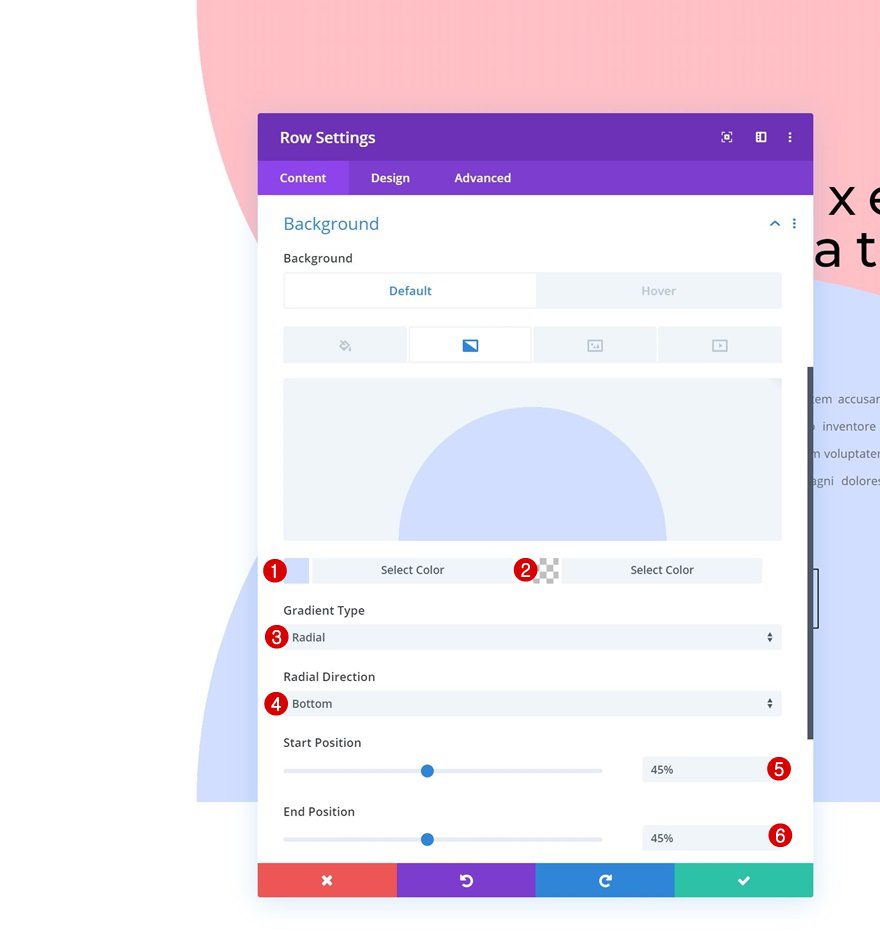
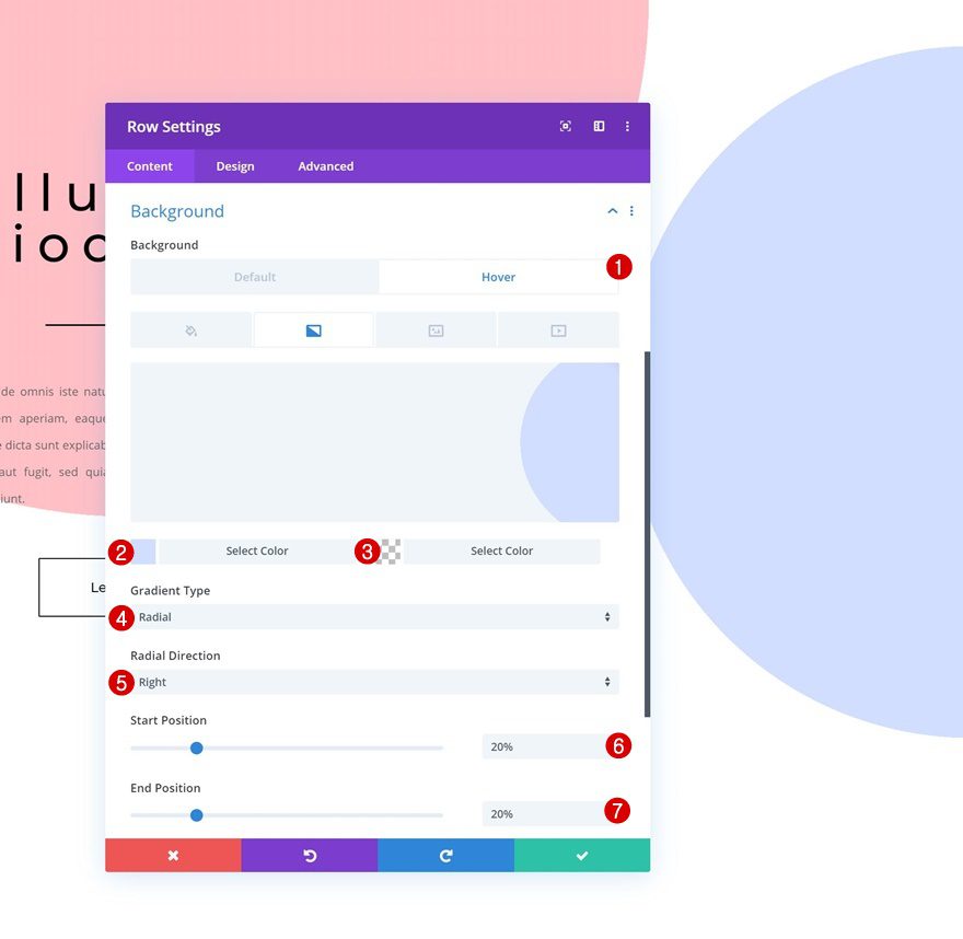
Row
Default Gradient Background
Open the row settings next and add the following gradient background:
- Color 1: #d3dfff
- Color 2: rgba(255,255,255,0)
- Gradient Type: Radial
- Radial Direction: Bottom
- Start Position: 45%
- End Position: 45%
Hover Gradient Background
Modify the gradient background accordingly:
- Color 1: #d3dfff
- Color 2: rgba(255,255,255,0)
- Gradient Type: Radial
- Radial Direction: Right
- Start Position: 20%
- End Position: 20%
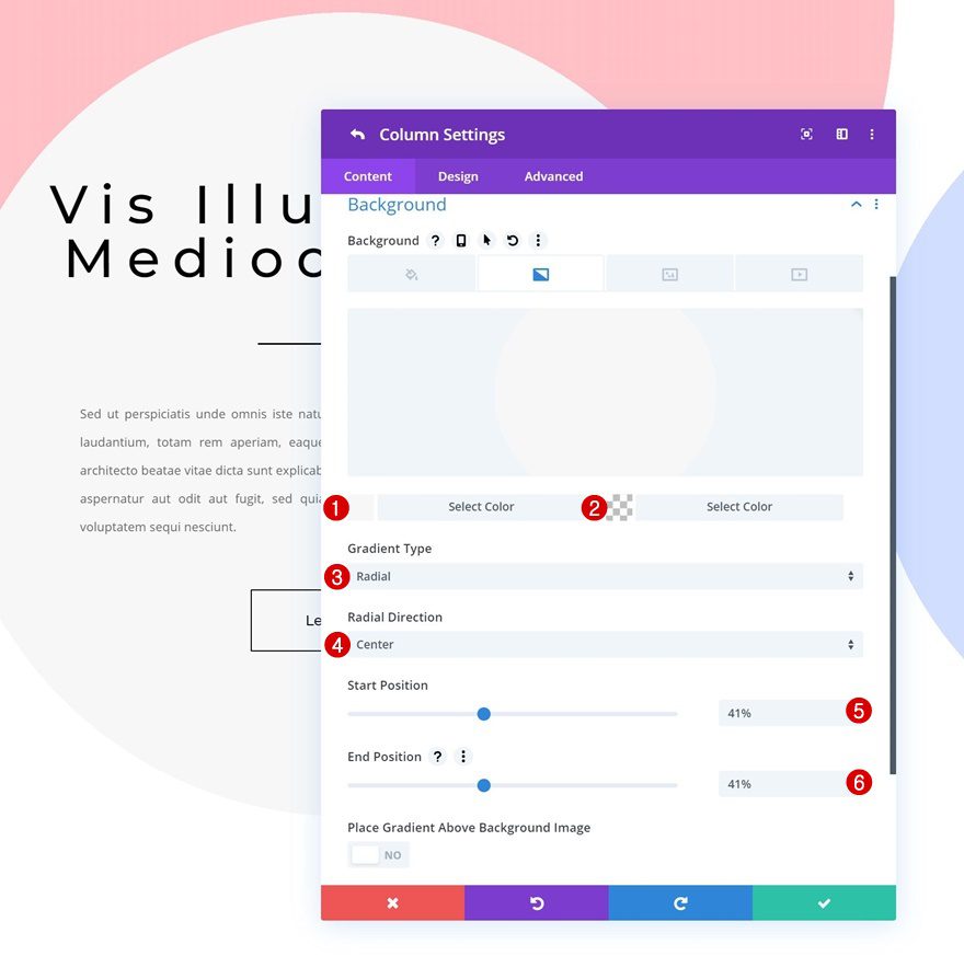
Column
Default Gradient Background
Last but not least, add a column gradient background and you’re done!
- Color 1: #f7f7f7
- Color 2: rgba(255,255,255,0)
- Gradient Type: Radial
- Radial Direction: Center
- Start Position: 41%
- End Position: 41%
Preview
Now that we’ve gone through all the steps, let’s take a final look at the outcome of all three examples we recreated throughout this tutorial!
Example #1
Example #2
Example #3
Final Thoughts
In this post, we’ve shown you how to creatively use Divi’s additional gradient background hover options to create beautiful hover transitions with Divi’s built-in options only. We’ve started with some general steps and continued by recreating each one of the three examples. If you have any questions or suggestions, make sure you leave a comment in the comment section below!
If you’re eager to learn more about Divi and get more Divi freebies, make sure you subscribe to our email newsletter and YouTube channel so you’ll always be one of the first people to know and get benefits from this free content.


I cant change hover background setting i just cant click Hover Gradient Background
That kind of jumpy graphics is annoying. If it was smoothly animated transition I might find use for this.
Wow it’s just awesome for such blogger I always try to design my beauty blog like this. So it’s a helpful for Colour Lover. Thanks.