
Adding an expanding hover effect to your grid layout is a unique way to engage your audience to interact with your page content. The idea is to start with a compact display of your grid and then expand that grid to bring the grid content to the forefront when a user hovers over the element in Divi. This is great for expanding an image gallery to display a larger gallery (with larger images) on hover. And you could also expand a cluster of blurbs to engage visitors to explore your services.
Let’s get started.
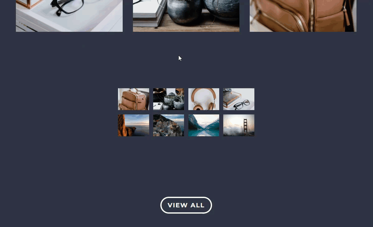
Sneak Peek
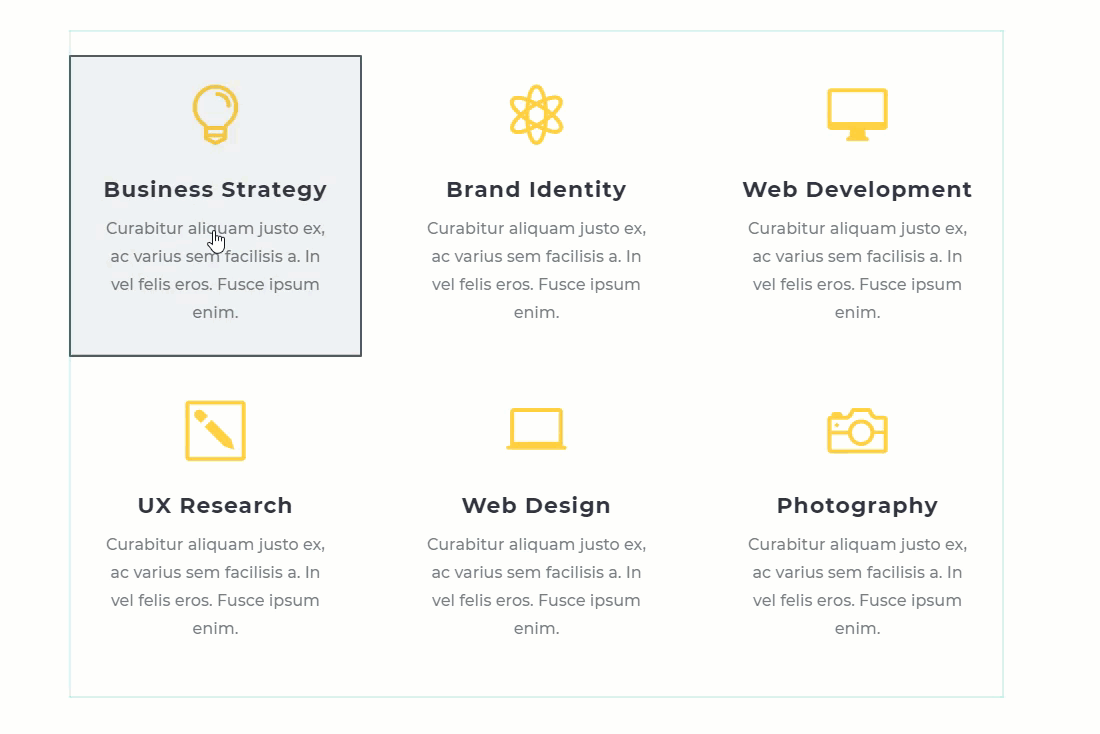
Here is a sneak peek of the expanding hover effect examples I will be covering in this tutorial.
Getting Started
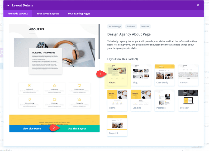
For this tutorial, all you really need is Divi. We will also be using the Design Agency About Page premade layout available within the Divi Builder to kick start the design.
To start, create a new page, give your page a title, and click to use the Divi Builder. Next select the option to Choose a Premade Layout. From the load from library popup, select the Design Agency Layout Pack and then click to use the Design Agency About Page.
Once the layout has been loaded to the page, publish it. For this tutorial, I will be using the Divi builder on the front end. To do this all you need to do is click the “Build On The Front End” button at the top of the backend page editor.
Now you are ready to start!
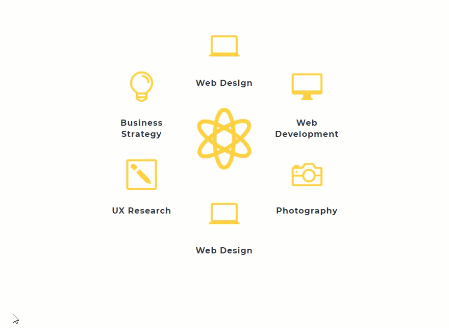
Expanding Blurbs on Hover
For this first example, I’m going to show you how to expand the blurbs in the second section of this layout that are displaying services offered.
Move the Blurb Modules to Occupy Only One Row
Currently the section is made up of two three-column rows with a blurb in each column.
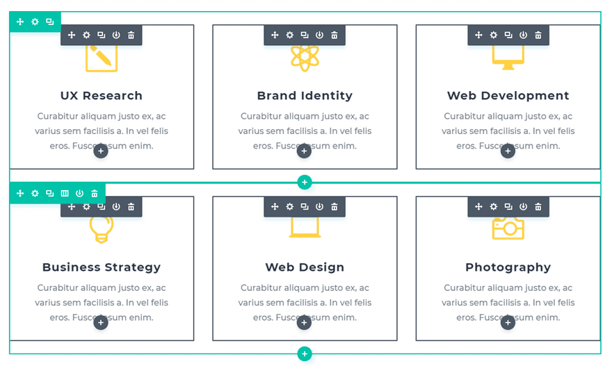
Since we will be adding our hover effect to a single row, we need to move the blurbs in the bottom row to the top row. Make sure each column in the top row has two blurbs.
Then delete the empty bottom row.
Customizing the Blurb Modules
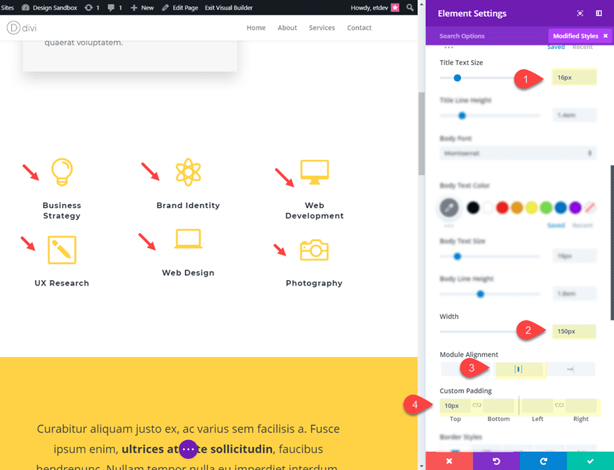
Next, we are going to use Multiselect to select all six blurbs so that we can apply the same design to all of them simultaneously. To do that, hold down ctrl (or cmd) and click on each of the blurb modules until all are selected. Then click the settings icon on one of the blurbs to open the Element settings modal.
Go ahead and take out the content found in the content box and then update the design settings as follows:
Title Text Size 16px
Width: 150px
Module Alignment: center
Custom Padding: 10px top, default bottom, default left, default right
Giving the modules a custom width of 150px keeps the title text locked in place when we expand the row.
Save changes and the click out of multiselect.
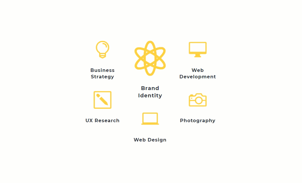
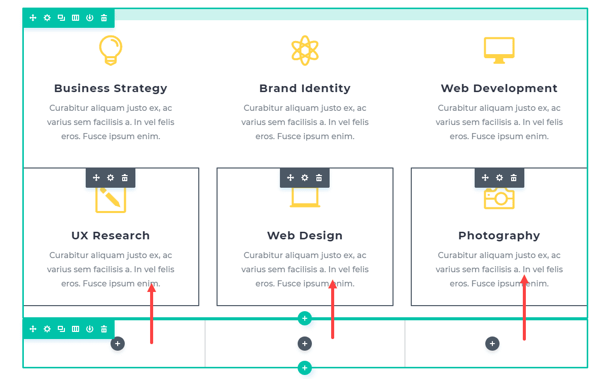
Make the Center Blurb More Pronounced
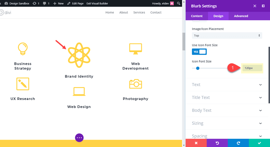
Next, open the blurb module settings for the top blurb in the second column titled “Brand Identity”. Then update the following:
Icon Font Size: 120px
Title Text Size: 18px (default)
This simply makes the center blurb more pronounced as the center piece from which the other blurbs will be expanding outward.
Customizing the Row to Expand on Hover
In order to expand our modules on hover, we will be adjusting the size and spacing of the row. Open the row settings and update the following:
Custom Width: 750px
Gutter Width: 4
Custom Padding (default): 150px Left, 150px Right
Custom Padding (hover): 0px Left, 0px Right
Custom Padding (tablet): 0px Left, 0px Right
The change in the padding values on hover is what creates the expanding hover effect. The row will expand 150px to the right and 150px to the left.
Check out the final result.
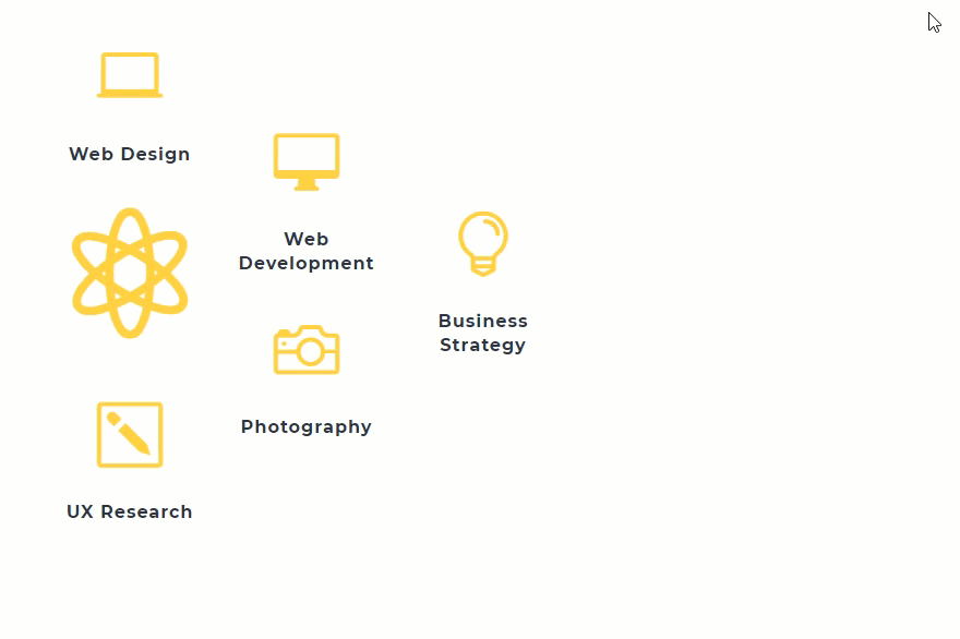
Making a Circular Grid
If you want to create a circular grid layout that expands, all it takes is a few minor adjustments.
First duplicate one of the outer blurbs and drag it above the large blurb the second column. Then delete the title text in middle blurb with the large icon.
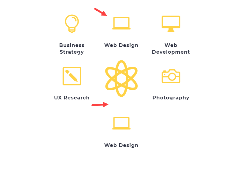
To vertically align the blurbs, you can add a small snippet of custom CSS. Open the row settings and add the following custom CSS to the Main Element:
align-items: center;
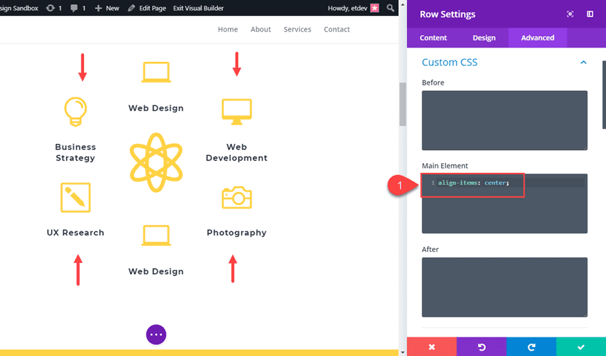
Now check out the result.
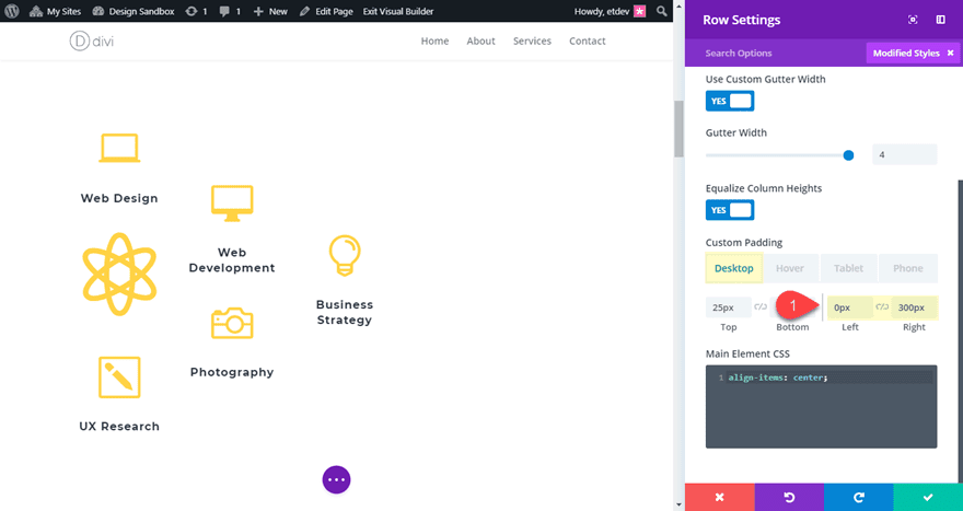
Expanding the Grid to the Right
You can also choose to expand the grid to the left or right. Simply organize your modules and then update your row’s custom padding. For example, if you want to expand the content to the right, set your default custom padding to 0px left and 300px right.
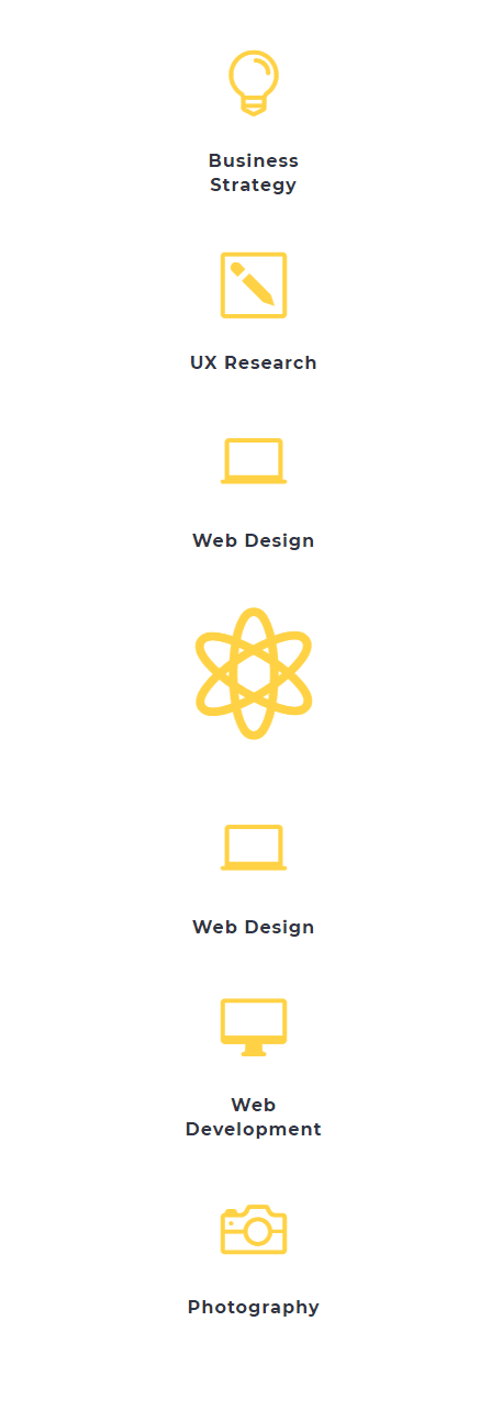
What it Looks Like on Mobile
Here is what the design will fall back to on tablet and smartphone. The expanding hover effect will not be active on mobile either.
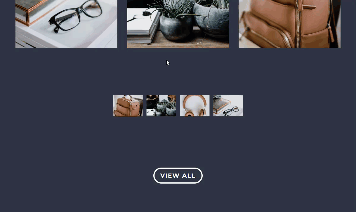
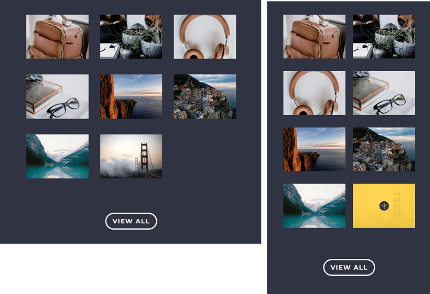
Adding an Expanding Hover Effect to an Image Gallery
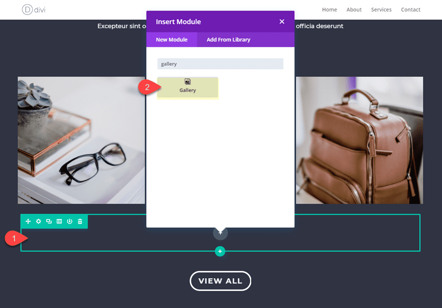
You can also expand an image gallery on hover using the gallery module to showcase a larger grid layout with larger images. To do this, locate the section toward the bottom of the Design Agency About Page layout title “Our Work”.
Then add a new one-column row under the row with the three images. Inside the row, add a gallery module.
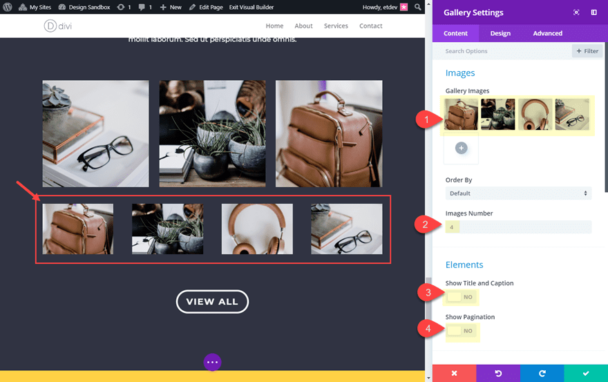
Update the gallery module settings as follows:
Add 4 images to the gallery with the same dimensions so they look the same across the row.
Images Number: 4
Show title and Caption: NO
Show Pagination: No
Next, go over to the design tab and update the following:
Zoom Icon Color: #353740
Hover Overlay Color: rgba(252,210,29,0.92)
Width (desktop): 40%
Width (hover): 100%
Width (tablet): 100%
Changing the width of the gallery module on hover is what creates the expanding hover effect. Setting the tablet width to 100% also keeps the hover effect from happening on mobile.
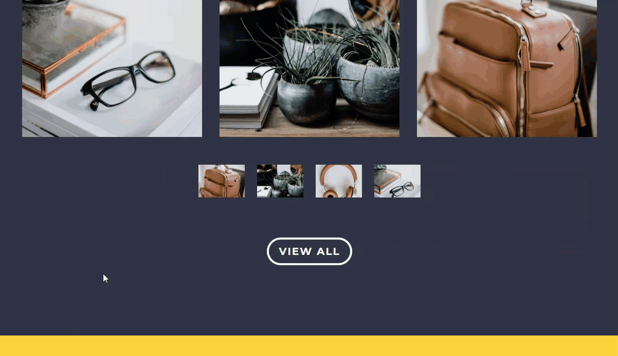
Here is what it looks like so far.
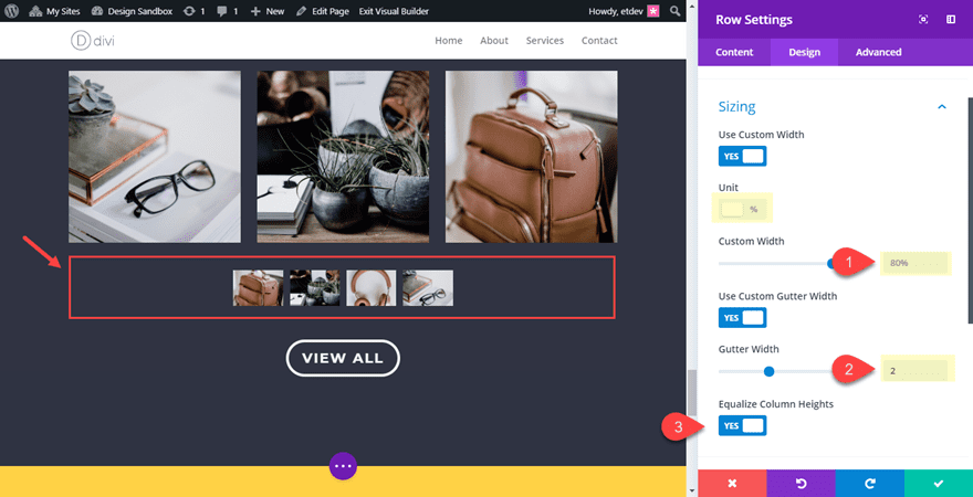
We still need to update our row settings to improve the functionality a bit and match the layout.
Open the row settings and update the following:
Custom Width: 80%
Gutter Width: 2
Equalize Column Heights: YES
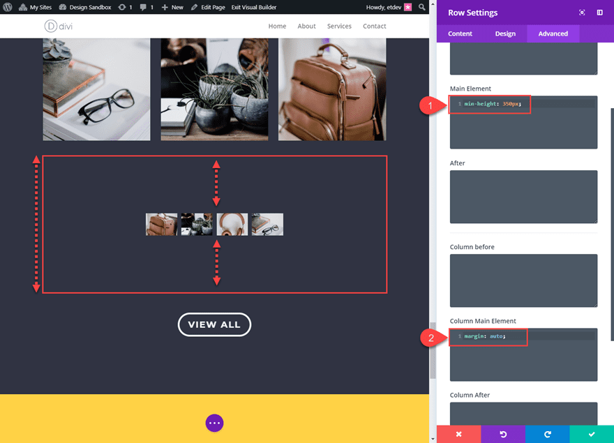
Stopping the Expanding Hover Effect from Pushing Content Down the Page
If you want the image gallery to expand without pushing the page content down, you can do this by setting a min-height to your row. this will make for a better UX, especially with a button directly below the gallery.
Go to row settings and add the following custom CSS in the Main Element:
min-height: 350px
Then add the following custom CSS in the Column Main Element:
margin: auto;
Equalizing column heights activates the “display: flex” css property on the backend which allows “margin: auto” to align the content of the column to be vertically centered within the row which now has a min-height of the 350px. Learn more about this concept on our full article on how to vertically align content in Divi.
Check out the final result.
Adding More Images to the Gallery
You can also add 4 more images to the gallery and increase the min-height of your row to 475px for the following result.
What it Looks Like on Mobile
Here is what the gallery will look like on mobile. The expanding hover effect is not active.
Final Thoughts
The examples given are just a few ways you use Divi to create an expanding hover effect for your entire grid content. But I’m sure you can use it for countless other use cases. You can expand portfolio modules, shop modules, or even blog modules. So get creative and have fun exploring the possibilities on your own.
I look forward to hearing from you in the comments below.
Cheers!


Really great idea for new web designers. However on mobile, may be we can just simply reset everything to default and that will look better. Just an opinion!
These “How to” Posts involving Elegant Themes Divi, Extra, Bloom, and Monarch, is highly likely to be the reason why we all originally started following the ET blog. I think they are the best, most relevant and highly beneficial Post of all. Thank you for doing these excellent how to’s it gives us many new ideas and a lot of inspiration.
They are also great for the simple reason that we don’t all have time to go through the documentation to find out or be reminded that all of these wonderful features and tools exist, as well as the multitudes of things that can be done with them.
Can i use the last Divi theme version in WORDPRESS 4.9.9?
Wow! That’s amazing.
This is great! It’s how I use cooking recipes: I never cook the recipe, but reading it I come up with something I couldn’t think of myself. Thank you!