When designing a website, sometimes it is difficult to find the right balance of creativity. You don’t want your design to be too “over the top” but you don’t want to underwhelm your audience either. A great way to add a subtle, yet creative, aspect to your design is with what I call the image overlapping effect (a creative name I know).
This overlapping effect makes image icons appear to be elevated when overlapping another element on the page, like a sticker holding a piece of paper to the wall or sealing an envelope. The trick is to position background images on different layers (like sections, rows, and modules) to allow a box shadow to divide the image in half and appear to be elevated at the center.
This design works really well for blurb image icons and will also work for adding an image to the side of text module.
Let’s get started.
What You Need for This Tutorial
For this tutorial, you will need the following:
- Divi Theme (installed and active)
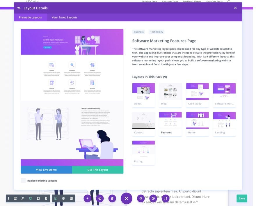
- The Software Marketing Features Page Layout loaded on a new page
- A simple photo editor to crop images (like Preview)
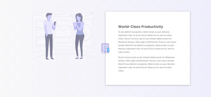
Sneak Peek
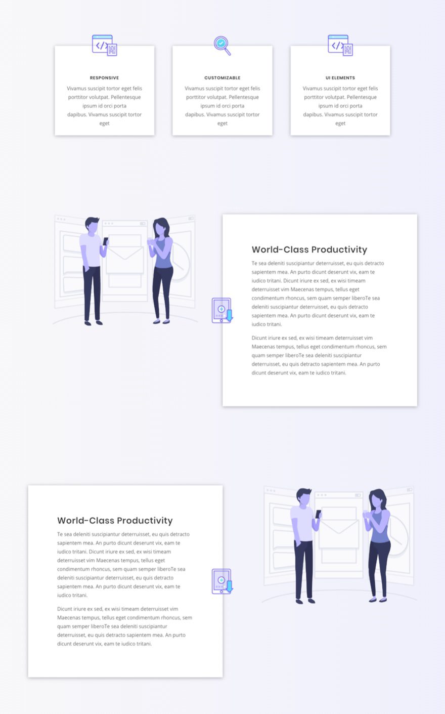
Here is a sneak peek of the design we will build in this tutorial.
Create a New Page and Upload the Layout
For this design, I’m going to use the Software Marketing Features Page layout to get things rolling. Go ahead and create a new page and upload the layout to the page using the Visual Builder.
Crop Your Image Icons
Before we dive into the customizing the layout, we need to crop image icons so we can use them as background images.
You can grab one of the icons from the layout easily by viewing the live version of the page and dragging one of the image icons to your desktop. Then open the image in Preview (if using a Mac) or any image editing software. Since the icons on this layout are 128px by 128px, you will need to cut the image in half by cropping the image at exactly 64px on the right side.
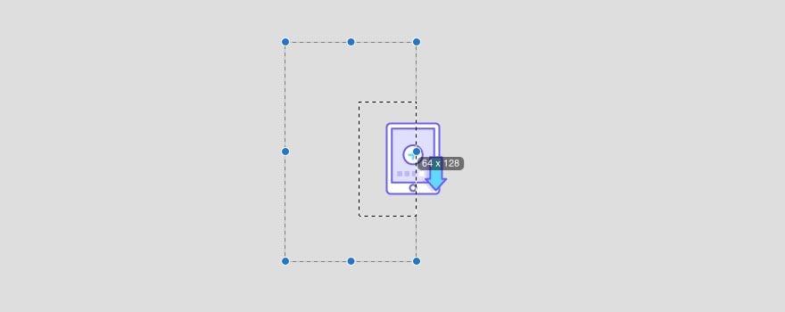
This will create a right half version of the image icon.

Save the image and open the original file again to crop the left half of the image icon.


Finally, crop a bottom half version of the image icon.

If you are going to use different images throughout your design, you will need to crop them as well.
Now you have what you need to tackle the design.
Create Overlapping Blurb Image Icons
Add Background Gradient to Section
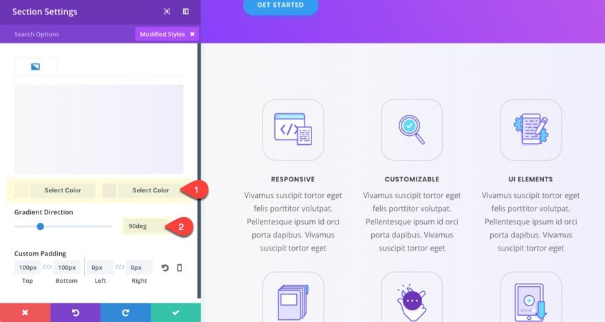
In the second section of the layout, update the settings to include a gradient background.
Background Gradient Left Color: #f8f8f8
Background Gradient Right Color: #efeffc
Gradient Direction: 90deg
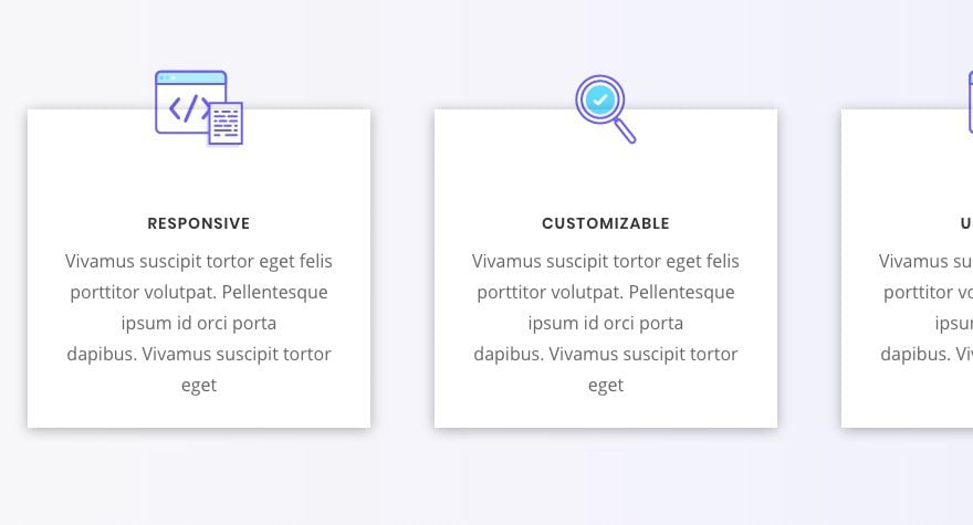
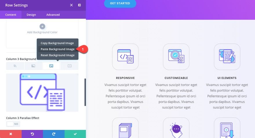
Add Background Images to Columns
To create the overlapping effect, we need to have a full version of the image icon as a background image in each of the three columns for each of our blurbs. For each column, add a background image with the following settings:
Background Image Size: Actual Size (this is important)
Background Image Position: Top Center
Background Image Repeat: No Repeat
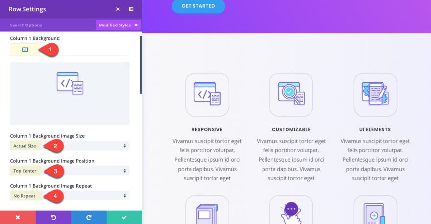
One you have one background added to one column you can copy the background image and paste it to the other two columns.
Customize the Blurb Modules
Right now you can’t really see the background images because the blurb is overlapping them but that will be fixed.
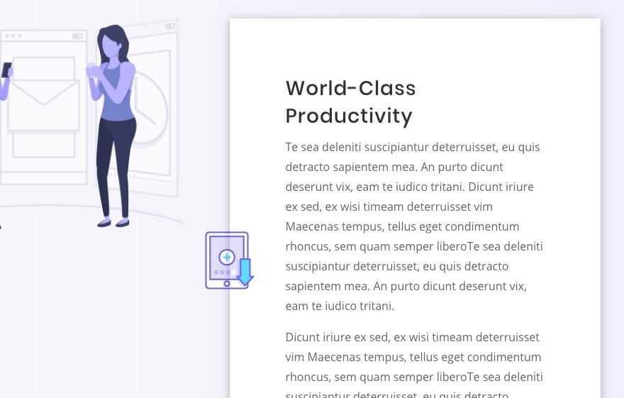
Open the blurb module settings for the first blurb and add the bottom half version of our image icon as the blurb icon.
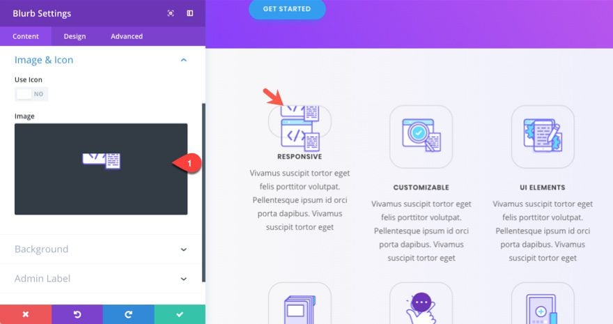
Then add a background color of #ffffff as well.
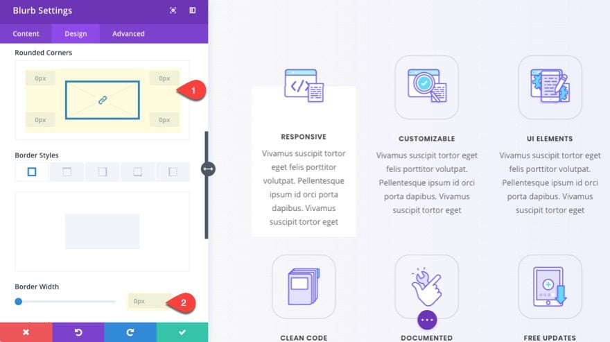
Now update the blurb design settings as follows:
Image Rounded Corners: 0px
Image Border width: 0px
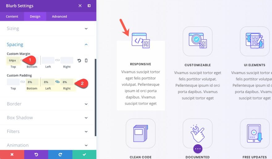
For the spacing, we need to add exactly 64px of top margin to our blurb in order to expose the column background image. This will ensure the icon is cut in half by the top of the blurb. We also need some padding for our text.
Custom Margin: 64px Top
Custom Padding: 8% Bottom, 8% Left, 8% Right
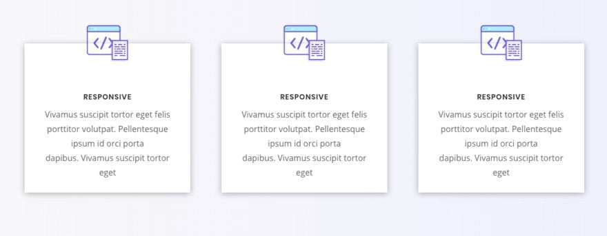
Next add a box shadow to the blurb. This is the key to making this overlapping effect look unique.
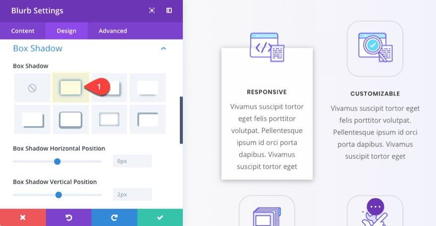
Now copy and paste the module to replace the other two blurbs in the row and delete the row with the old blurbs below.
Here is the final result of the row.
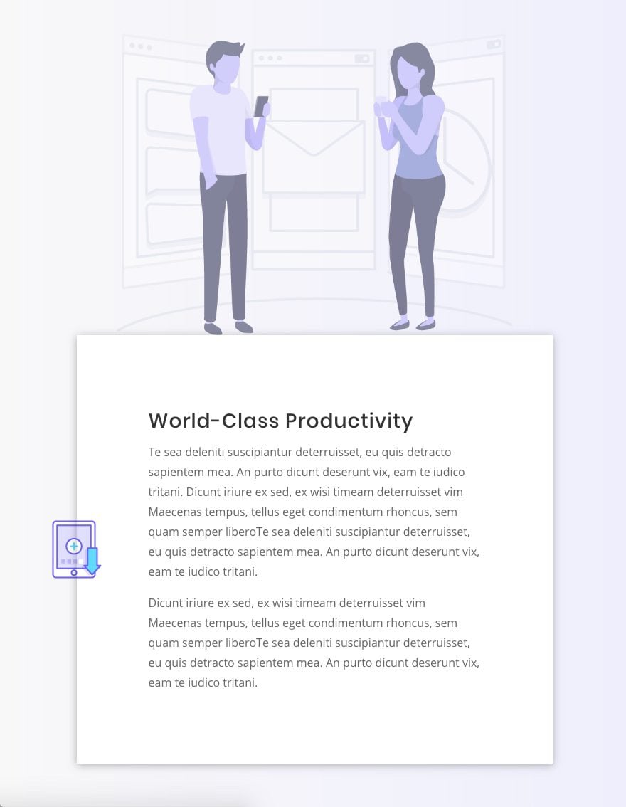
Create Overlapping Image Icons on the Sides of Text Modules
For the next section of our layout, we are going to add the same type of image overlap effect to the side of our text module in the right column.
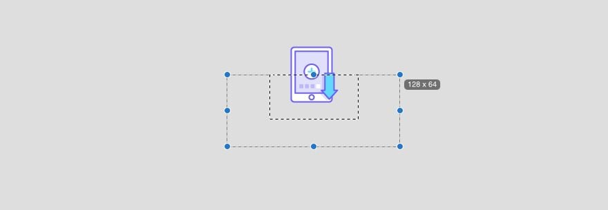
Adding background images to create the overlap effect on the sides of modules is a bit more challenging since we have to account for mobile devices as well. That is why I would suggest using images around 128px wide so that you can show the image on smartphones as well.
The trick to this design is to have multiple background images – one in the center of the section and one at the left center of column 2.
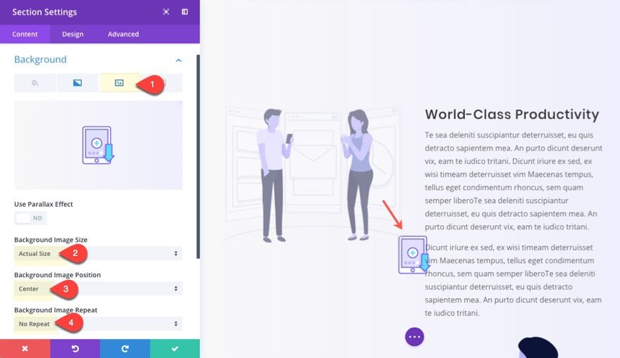
Add Background Image Icon to the section
First, copy over the section styles from the previous section and paste them into the section directly below so that we can have matching background gradients. Then add your image to the section with the following settings:
Background Image Size: Actual Size
Background Image Position: Center
Background Image Repeat: No Repeat
Add Background Image Icon to Column 2
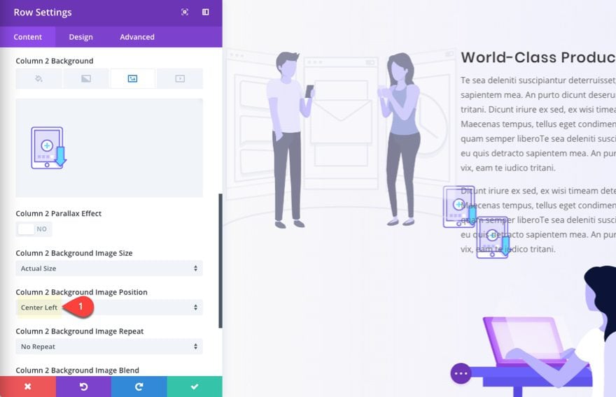
Since our section background image is centered, it will not be visible on the left of our text module on mobile. That’s why we need to add another background image to the left of column 2. That way we can adjust the spacing on mobile to reveal the background image on the left of the module.
Go ahead and copy the background image from the section and paste it to the background of column 2. Then update the column 2 background image position to Center Left.
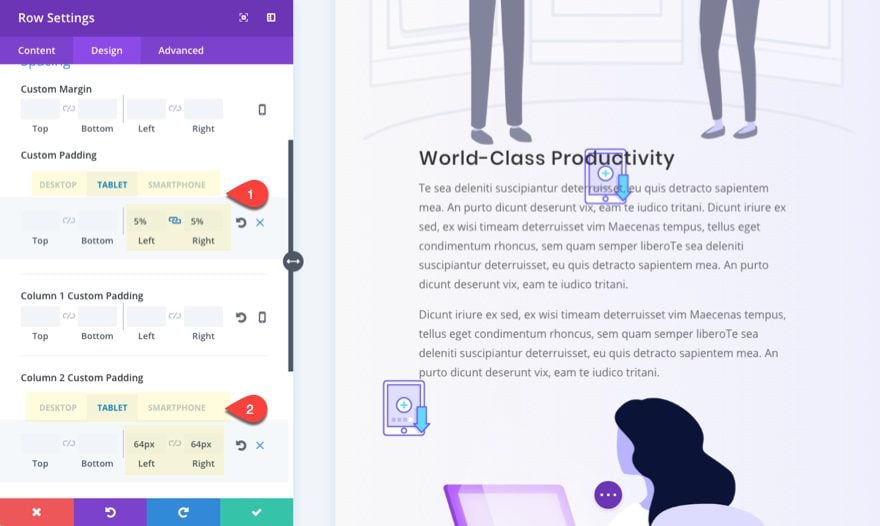
Customize Row Settings
We are going to want the row to eventually span to 100% width on mobile so that we will have more room for the background image. Update the following Row Settings:
Use Custom Width: YES
Unit: %
Custom Width: 100%
Use Custom Gutter Width: YES
Gutter Width: 1
Now for some padding magic to adjust for mobile.
Custom Padding (desktop): 10% left, 10% Right
Custom Padding (tablet): 5% left, 5% Right
Custom Padding (smartphone): 0% left, 0% Right
Column 2 Custom Padding (tablet): 64px left, 64px Right
Column 2 Custom Padding (smartphone): 64px left, 0px Right
Notice that column 2 has a 64px left padding on mobile. This is to show exactly half of the background image on the left of the module.
Save settings.
Now delete the image under the text module in the right column. Your background images aren’t aligned yet, but that will be fixed once we customize our image and text module. The trick is to make sure your text module on the right always has more height than the image on the left column. This will keep the background images aligned perfectly.
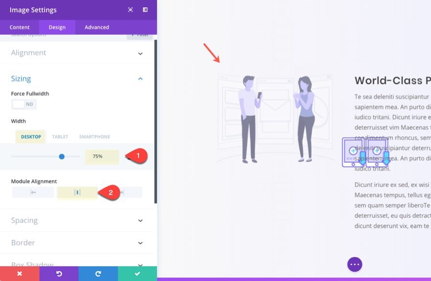
Shrink the Image Module
Let’s shrink the image module in the left column a bit to leave room for out background image. Update the following settings:
Width: 75% (on desktop and tablet)
Module Alignment: Center
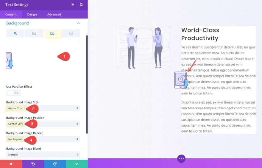
Add Background and Spacing to Text Module
Next, we need to add a background color to our text module.
Background Color: #ffffff
For our background image, we need to use the right half version of our image and then make sure it is centered left.
Background Image Size: Actual Size
Background Image Position: Center left
Background Image Repeat: No Repeat
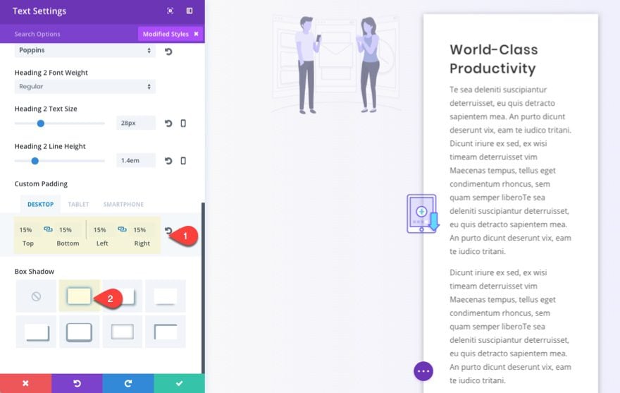
Update the rest of the settings as follows:
Width: 100%
Custom Padding: 15% Top, 15% Bottom, 15% Left, 15% Right
Select Box Shadow
Now let’s check the final result.
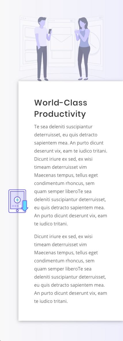
Because we added a second background image to the left of column 2, we have a great looking result on tablet and mobile as well.
And here is the completed design.
Final Thoughts
This image overlapping design can be a subtle way to set your layout apart. Feel free to experiment with differnt background colors and filter effects to create even more unique designs. You can also use regular images as well. Just keep in mind that this design works when your background images are set to their actual size so try to use small images (about 128px wide).
I look forward to hearing from you in the comments.
Cheers!


Looks awesome within the screenprints..,
did I miss the DEMO link? Would love to see it in action.
Jason, very interesting! Thanks
Thanks, Jason Great stuff. The more challenging the better.
Thanks, Jason, great tutorial!
Could we have a live demo version to look at?
I don’t understand this:
Use Custom Width: YES
Unit: %
Custom Width: 100%
Wouldn’t the default be 100%? If no, what is the default?
Thank you for helping me understand…
Chris,
I can see why that would be confusing. When you select “make fullwidth” for a row, the actual width of the row will be 89% if you keep the default gutter width at 3. Setting the gutter width to 1 will make the row 100%. But if you want to keep the default gutter width and also have the row span the full 100% width, you can set a custom width of 100% to force the row to span the “full width” of the section without any margin. Then you can have more control over your mobile spacing because you can create the spacing on the right and left of your content using row padding on desktop and then get rid of that padding on mobile devices. I cover this technique in more detail in this article to create fullwidth blurbs on mobile:
https://www.elegantthemes.com/blog/divi-resources/how-to-optimize-your-divi-layout-for-mobile-devices
Typically, the default width in % is 80%.
I’m loving how this technique is doing well responsively too!
Thanks Christina! It does however become more difficult to keep the design on smartphones when you use larger images on the side of a module. Since you have to use “actual width” for the image, you run out of space for content.