In this post, we’ll be showing you how you can easily create a simple yet elegant timeline with Divi’s your Blurb Modules. We’ll be combining the different options that modules and rows provide to achieve the result you can view below. The example we’ll be sharing is based on the built-in Divi options only, which means you won’t need to add any additional CSS code! We’re also making sure that it looks good on desktop as well as on mobile.
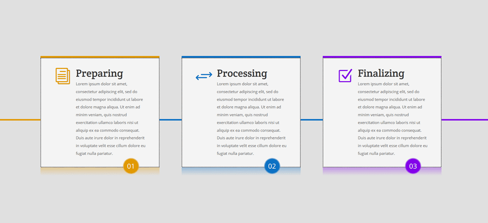
Result
The appearance of a timeline is achieved with two design elements; the line that crosses all three Blurb Modules and the numbers. The desktop version looks like this:
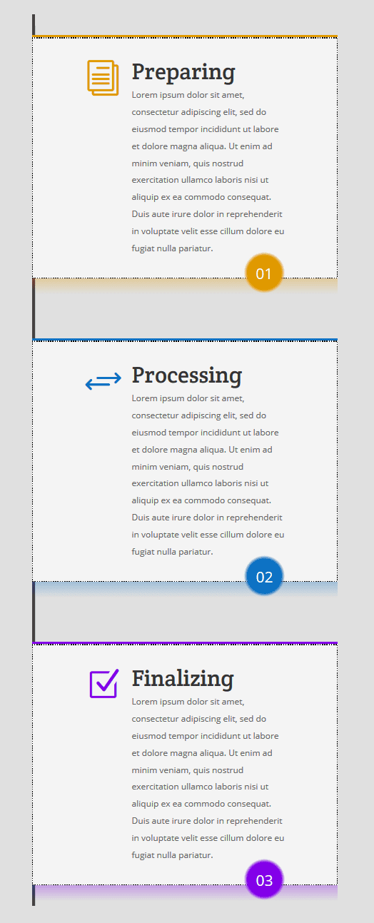
And the mobile version looks like this:
Let’s get started!
How to Create a Timeline with Divi’s Blurb Module
Subscribe To Our Youtube Channel
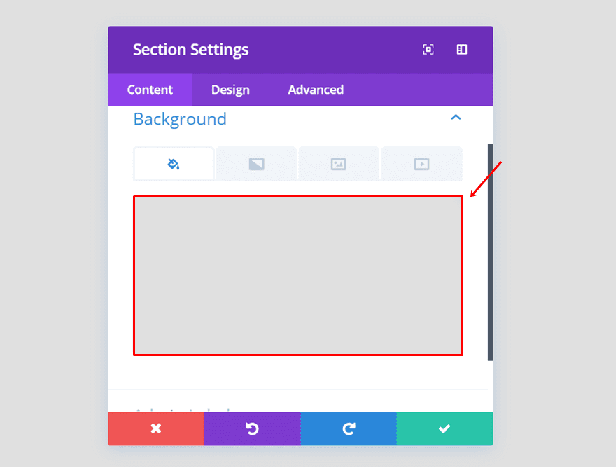
Add Standard Section
Section Background Color
Start by adding a new standard section and using ‘rgba(0,0,0,0.12)’ as its background color.
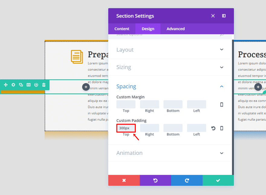
Section Padding
Go to the Design tab and use a top padding of ‘300px’.
Add Three-Column Row (Timeline)
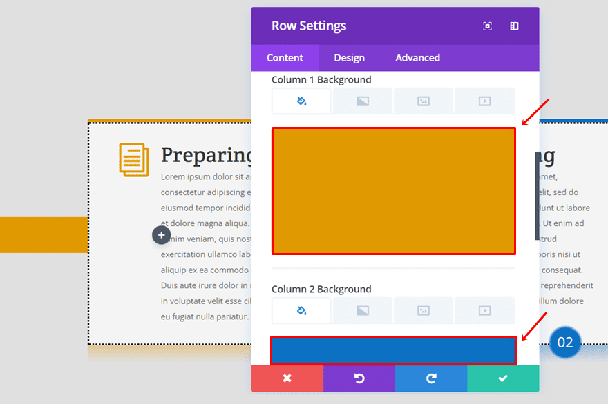
Column Backgrounds
Once you’ve created the section, add a three-column row to it. Within the Content tab of that row, use ‘#e09900’ as the Column 1 background color, ‘#0c71c3’ as the Column 2 background color and ‘#8300e9’ as the Column 3 background color.
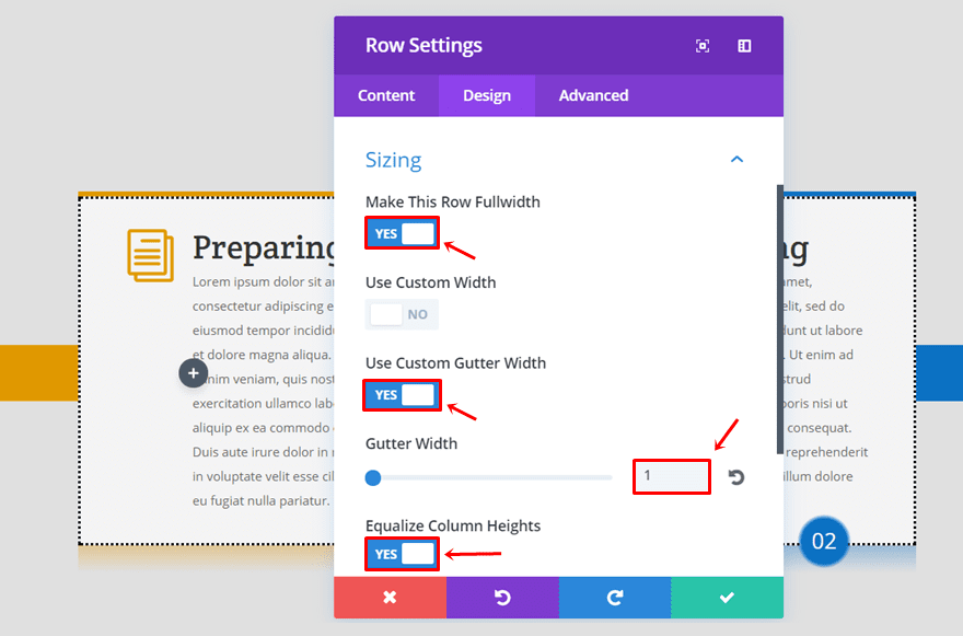
Sizing
Move on to the Design tab and use the following settings for the Sizing subcategory:
- Make This Row FulldWidth: Yes
- Use Custom Gutter Width: Yes
- Gutter Width: 1
- Equalize Column Heights: Yes
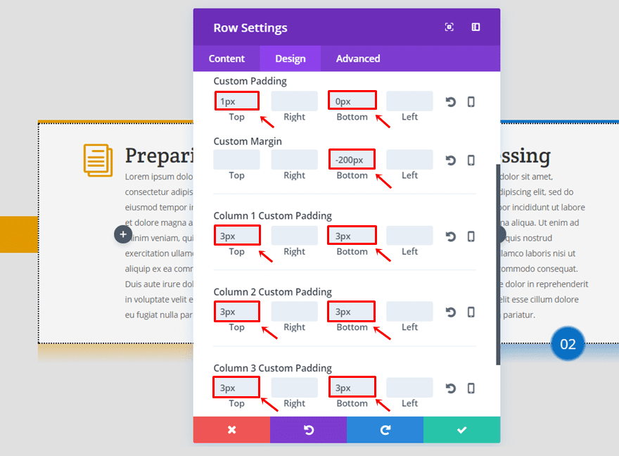
Custom Margin & Padding
Next, add the following Custom Padding and Custom Margin to the row:
- Top Padding: 1px
- Bottom Padding: 0px
- Bottom Margin: -200px
And add ‘3px’ to the top and bottom padding of each column.
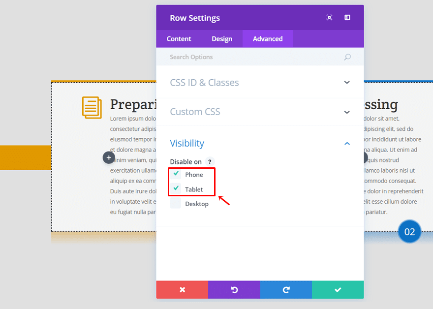
Disable on Tablet & Phone
Lastly, disable the row on both tablet and phone.
Add Another Three-Column Row (Blurb Modules)
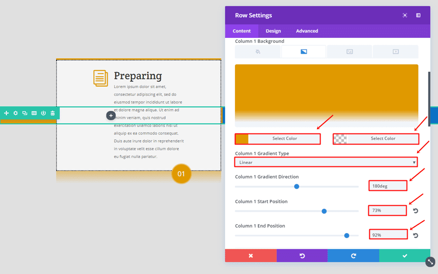
Column Gradient Background
Once you created the first three-column row, you can go ahead and create the second one right below it (they share the same section). Each one of the columns needs a gradient background with the same settings but with a different first color:
- First Color: #e09900 (Column 1), #0c71c3 (Column 2), #8300e9 (Column 3)
- Second Color: rgba(255, 255, 255, 0)
- Gradient Type: Linear
- Gradient Direction: 180deg
- Start Position: 73%
- End Position: 92%
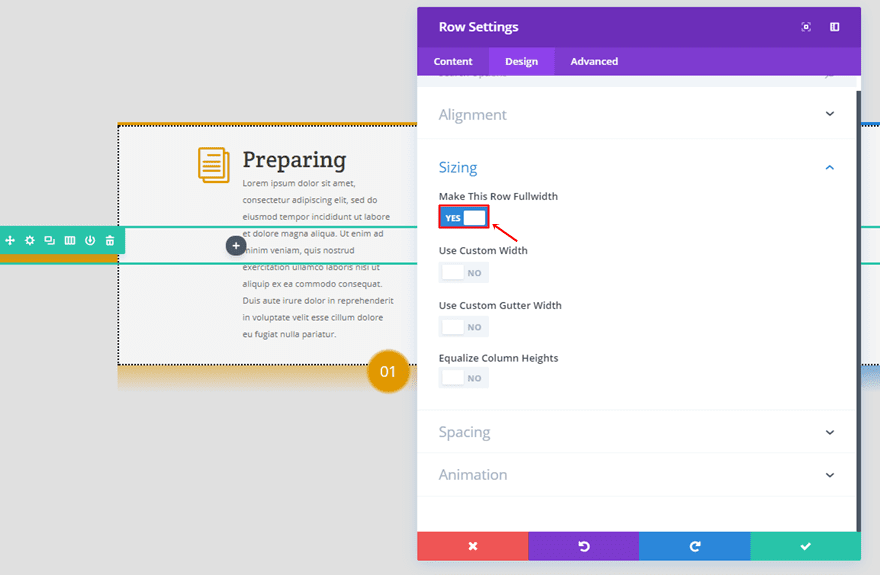
Make Row Fullwidth
Then, go to the Design tab and enable the ‘Make This Row Fullwidth’ option.
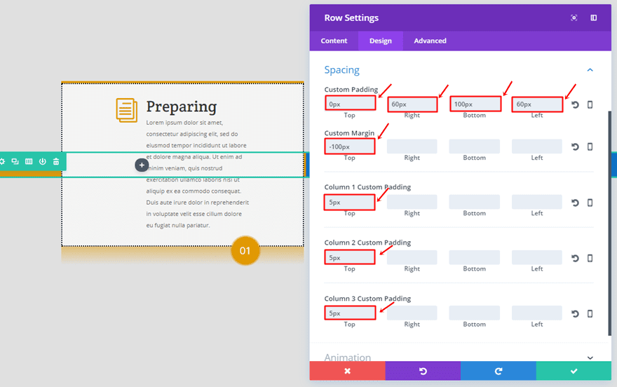
Row Custom Padding
Open the spacing subcategory and use the following Custom Padding & Custom Margin for the row:
- Top Padding: 0px
- Right Padding: 60px
- Bottom Padding: 100px
- Left Padding: 60px
- Top Margin: -100px
Add ‘5px’ to the top padding of each column as well.
Blurb Module
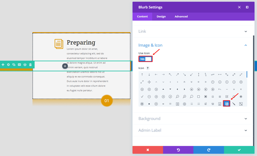
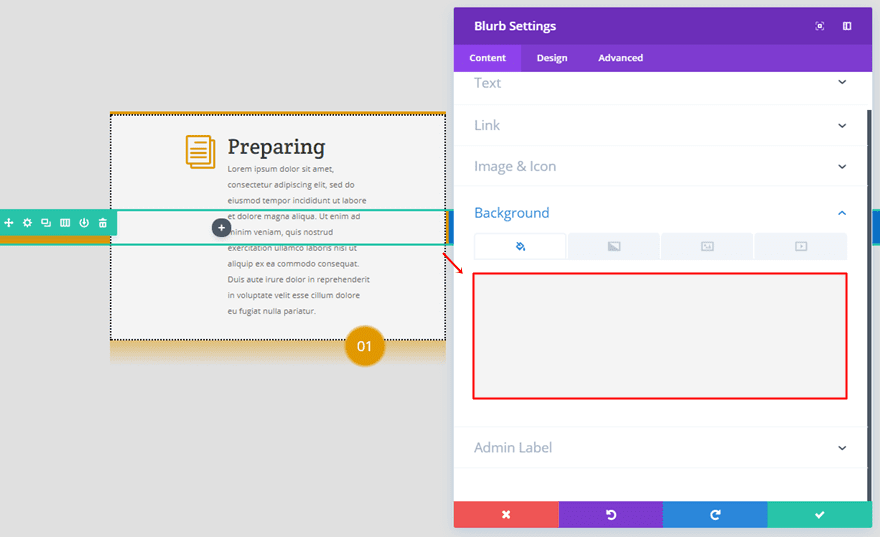
Once you’ve completed the row settings, you can add a Blurb Module to the first column of the row you’ve just created. Within the Image & Icon subcategory of the content tab, enable the ‘Use Icon’ option and select an icon of choice.
Scroll down the same tab and use ‘#f4f4f4’ as the background color.
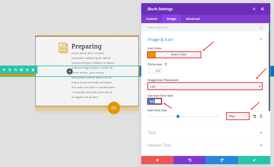
Go to the Design tab and make the following adjustments to the Image & Icon subcategory:
- Icon Color: #e09900
- Image/Icon Placement: Left
- Use Icon Font Size: Yes
- Icon Font Size: 50px
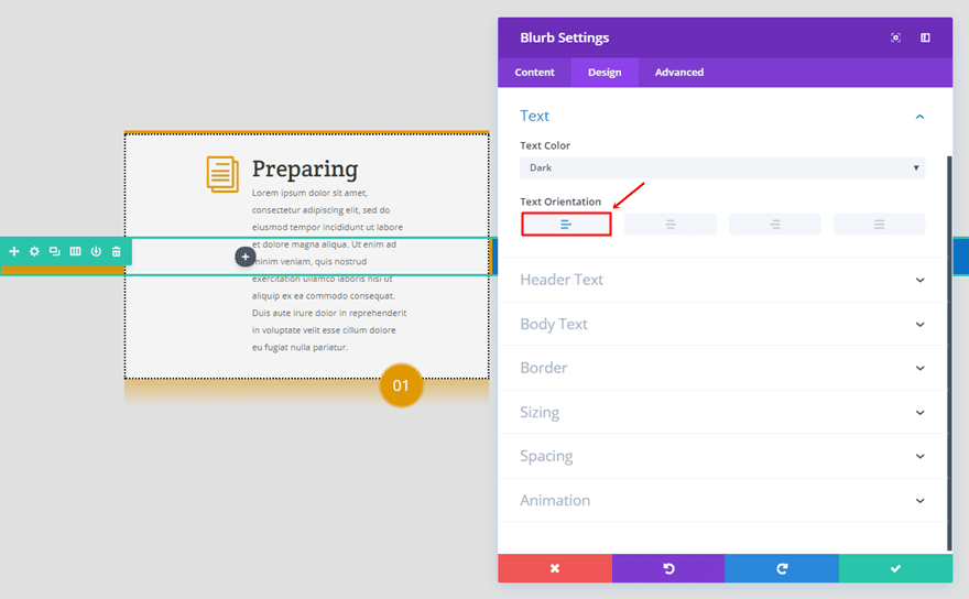
Within the Text subcategory, make sure the left Text Orientation is enabled.
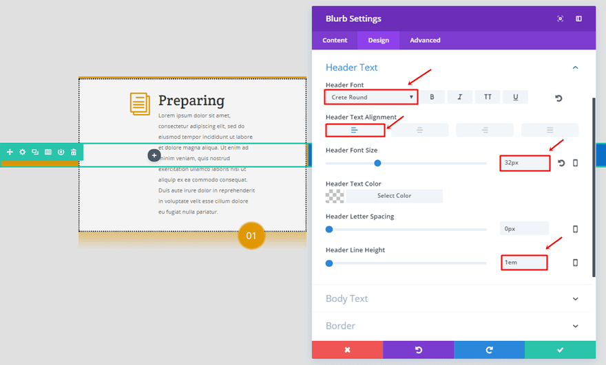
The options for the Header Text subcategory are the following:
- Header Font: Crete Round
- Header Text Alignment: Left
- Header Font Size: 32px
- Header Line Height: 1em
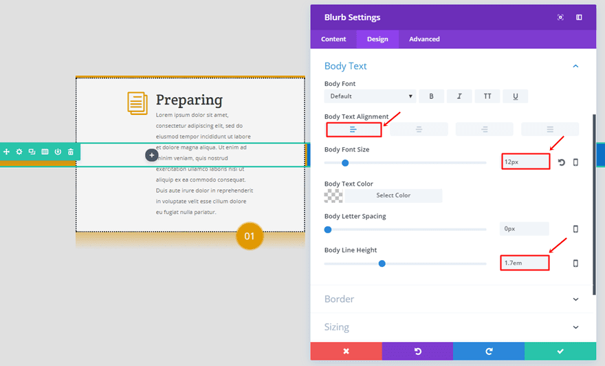
Then, open the Body Text subcategory and use the following settings:
- Body Text Alignment: Left
- Body Font Size: 12px
- Body Line Height: 1.7em
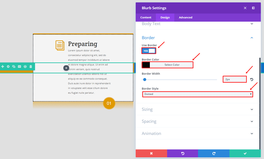
We’ll be using a border with the following settings as well:
- Use Border: Yes
- Border Color: #000000
- Border Width: 2px
- Border Style: Dotted
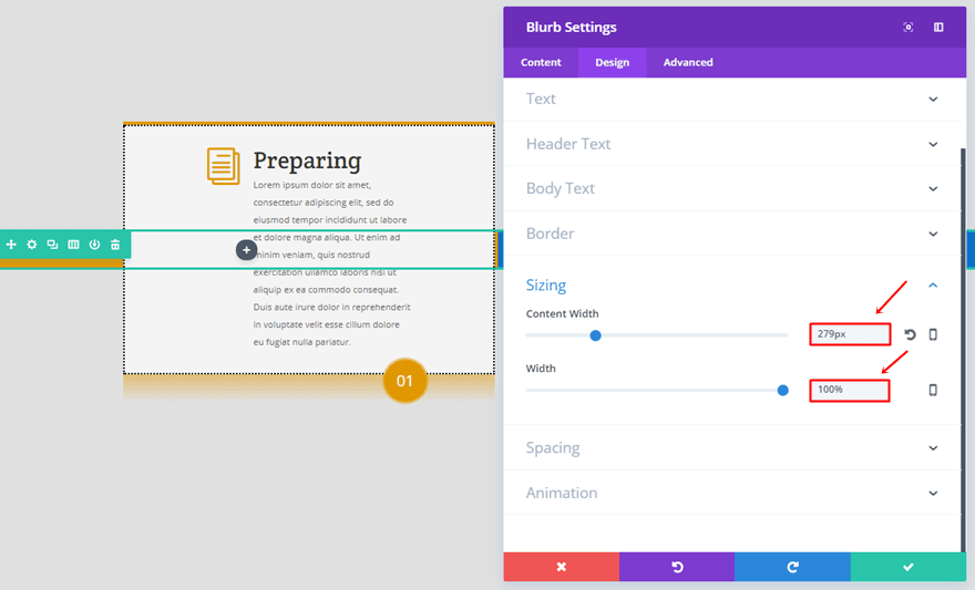
Next, open the Sizing subcategory and use ‘279px’ for the Content Width and ‘100%’ for the Width.
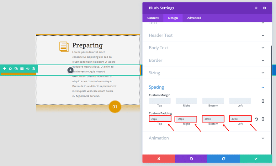
Lastly, add ’30px’ to the top, right, bottom and left padding.
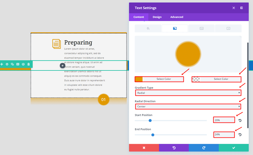
Text Module
Once you’ve added and modified the Blurb Module, go ahead and add a Text Module right below it. The Text Module will need a gradient background as well:
- First Color: #e09900
- Second Color: rgba(255, 255, 255, 0)
- Gradient Type: Radial
- Radial Direction: Center
- Start Position: 20%
- End Position: 24%
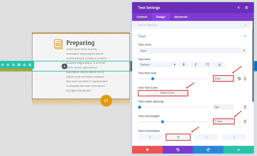
Move on to the Design tab and use the following settings for the Text subcategory:
- Text Font Size: 21px
- Text Color: #FFFFFF
- Text Line Height: 1.7em
- Text Orientation: Center
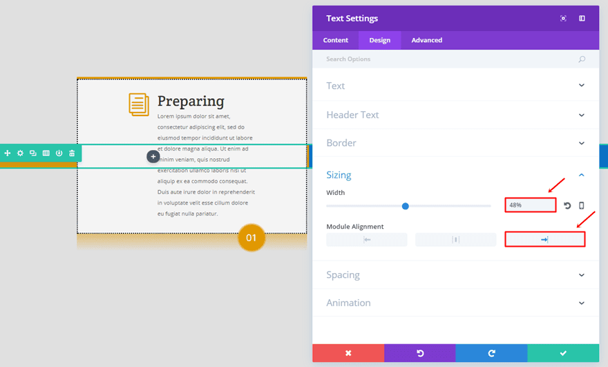
Open the Sizing subcategory, use a width of ‘48%’ and select the right Module Alignment.
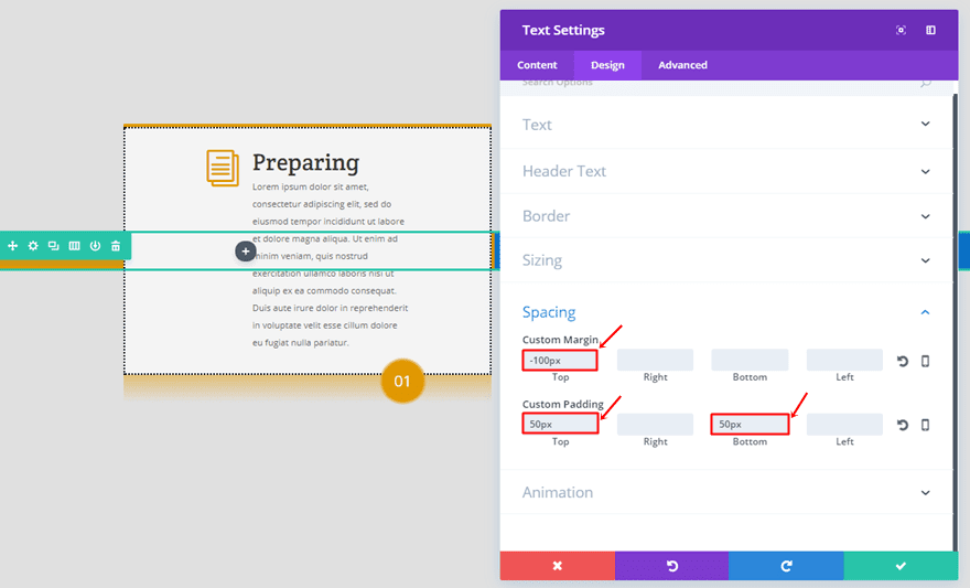
Lastly, use a top margin of ‘-100px’ and add ’50px’ to the top and bottom padding.
Clone Blurb & Text Module
Once you’ve completed the first column, you can clone both modules and place them in the other two columns. The only things you’ll have to change is the blurb icon, blurb color and the first gradient color of the Text Module into ‘#0c71c3’ for the second column and ‘#8300e9’ for the last column.
Disable on Tablet & Phone
Once you’ve completed this second row, make sure you disable it for phone and tablet as well.
Clone Three-Column Row (Tablet & Phone)
The timeline version on tablet and phone is slightly different. Clone the row with blurbs you’ve created in the previous part of this post and follow the next steps to make it fit on phone and tablet.
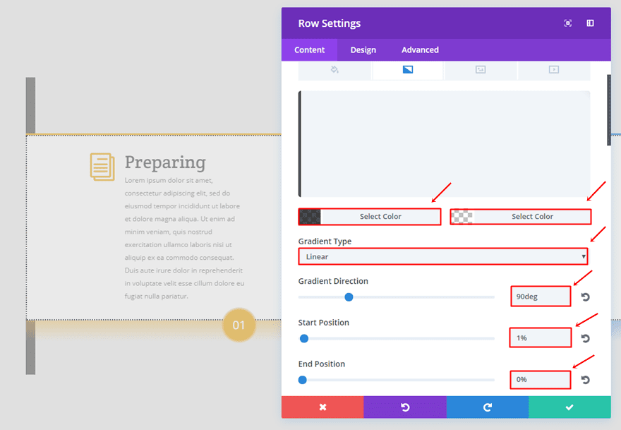
Add Row Gradient Background
The row on tablet and phone will need the following gradient background:
- First Color: rgba(0,0,0,0.7)
- Second Color: rgba(255, 255, 255, 0)
- Gradient Type: Linear
- Gradient Direction: 90deg
- Start Position: 1%
- End Position: 0%
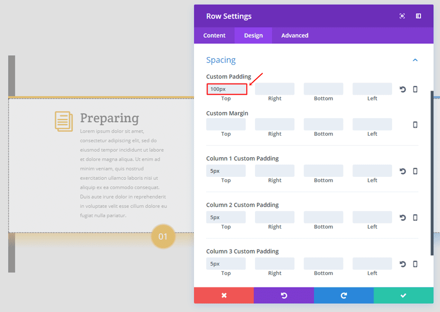
Row Padding
Delete all the custom padding and margin that was used in the desktop version and add ‘100px’ to the top padding.
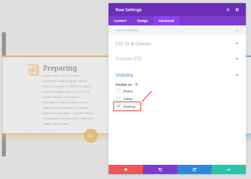
Disable on Desktop
Lastly, instead of disabling the row on phone and tablet, disable it on desktop instead.
Result
After having followed all the steps in the post, you should be able to achieve the following result on desktop:
And the following result on tablet and phone:
Final Thoughts
In this post, we’ve shown you how you can create a simple timeline of your Blurb Module by using nothing else than the built-in Divi options. Two factors that help identify the Blurb Modules as a timeline are the line that connects all three Blurb Modules and the numbers. If you have any questions or suggestions; make sure you leave a comment in the comment section below!
Be sure to subscribe to our email newsletter and YouTube channel so that you never miss a big announcement, useful tip, or Divi freebie!


This is awesome! Just made a 4 blurb one with your demo, thank you.
Nice tutorial! Thanks one more time Divi Team!
Would be great to have these instructional ET pages “saved as PDF” link minus the comment section.(I save pages the long way then edit)
Some of us have limited data in rural areas.
Thinking about all this work. It is gonna take me a week just to follow the steps!
Great Tutorial! I was able to achieve great results. Maybe you should point out that the Preview differs from the end result – the narrow bar of the desktop timeline is very bold in the editor view, but displayed correctly when I exit the Divi builder.
Again, Great Work!
Very elegant!
Maybe I’m the only one bothered by this (probably due to me having made lots and lots of manuals), but I find it perplexing that you post a tutorial with screenshots that don’t show the actual process of building the timeline. Yes, you show the settings per step (section, row and module), but right from the start everything’s added already, making it frustrating to see which screenshot belongs to what step.
I’d appreciate actual step-by-step screenshots in future posts like this one.
Agreed!
It would be great to have a left and right button, timelines are sometimes not just three “blurbs”… -> that is what I would include in divi theme ;).
+1000! I was thinking about that as well. However, nice tutorial Donjete
I would like to see a new module to easily allow creation of corner ribbons/banners etc. that works in all sections, blurbs etc.
+1
+1
All these tutorials are great. It would have been better if downloadable JSON files are provided along with the tutorials.
Yes please, this would be great.
This post shows the need for a full on vertical and horizontal timelime module.
Yes, I do agree!
Hello, i’m french and my taylor is poor 😉
Too much steps for this result, i’m sorry
Too much hard to follow all the steps and i don’t understand all of the informations
Too much work for this result
But thank you for all 🙂
Nice… I purchased the timeline plugin from EM but I would prefer using native Divi
Thanks for an excellent tutorial. When you implement something of this nature, it takes time and patience and the love of the craft.
I like that fact all the settings are built into the modules and you don’t have to use the endless CSS code or plugins. Just use what Divi already has.
You don’t get this kind of instruction anywhere else. The quality design Donjete produces speaks for itself.
too much work, this is “anti-divi”.
As always an excellent and useful article Donjete, I love the effect, saved in my favorites to implement it soon, thanks
greetings from Asturias
Great to see that settings for a mobile-specific view are being included.
Do you have any plans for “mobile first” designs/tutorals as they can require more “tweaking” to get right.
-Donal
Divi not only helps u create something out of the box, it also Forces you to be creative and create unique designs always!!
This Timeline feature is a great addition to Wedding Websites!!
or for any Step By Step Signup process or something like that!
kudos developers for thinking creative
The stuff that E.T. provides is more than just…. Well stuff! I think that they also encourage you to learn some design. In all fairness if you have selected to use divi for your design needs then there is an argument perhaps that you can’t be bothered to learn the ins and outs before you start selling your wares. If your answer to everything and every solution is a plugin then you do the people you sell your sites to no favor. As the moment something goes wrong you’ll have no idea how to at least attempt in fixing it. The tutorials are designed to help you have a greater understanding of Divi and also design (such as css).
Well said! People expect Divi to do it all for them. I guess that’s what separates good designers from those who sell premade layouts.
And, if ET made Divi do everything it would be bloated and buggy.
Nice tutorial but you need to integrate all this in a single plugin. It’s very hard to it step by step as you posted above.
How would you make a verticle timeline?
When you input Gradient Direction: 90deg, you should write 90deg, not 90px.
+1
When you input Gradient Direction: 90deg, you should write 90deg, not 90px.
Same question.
Can’t you guys just make it part of the modules? With so many steps to follow, it’s easier to just install a timeline plugin.
i think this is a great idea too
I think it’s great to know how to build this, so you can adjust it to your needs.