
An accordion slider is a fun and engaging way to display content in a small space. Accordion sliders usually consist of multiple elements (or panels) stacked horizontally like the folds of a curtain. And when you hover over one of the panels, it expands to reveal content as the other accordion panels contract. This is where we get the accordion type effect of expanding and contracting.
In this tutorial, I’m going to show you how to create a responsive accordion slider in Divi using nothing but CSS. To do this we will be using multiple Divi modules to serve as accordion panels. Any module could be used, but for this example, we are going to use blurb modules in a very creative way to build a beautiful accordion slider that looks (and works) great both on desktop and mobile.
Check it out!
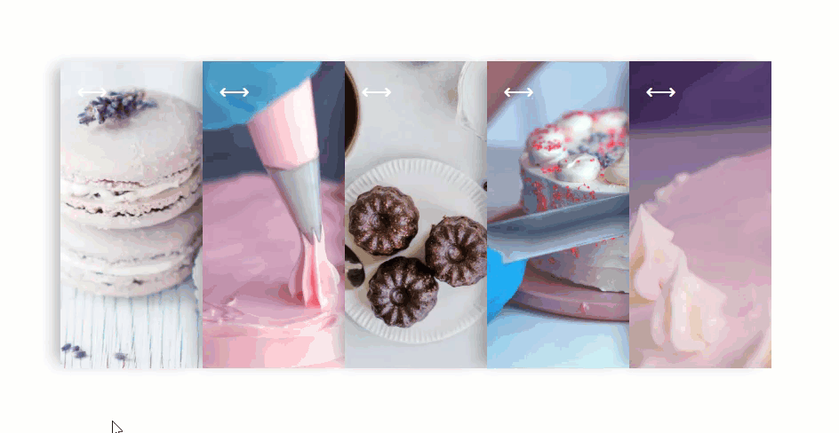
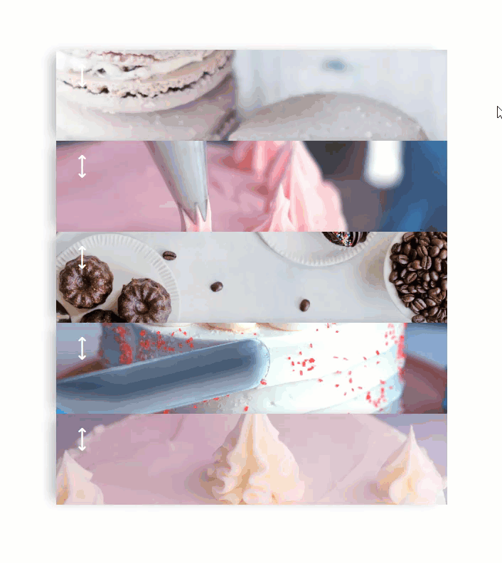
Sneak Peek
Here is a quick peek at what we will be building in this tutorial.
Desktop
Tablet and Phone
Download the Divi Responsive Accordion Slider Layout for FREE
To lay your hands on the accordion slider designed in this tutorial, you will first need to download it using the button below. To gain access to the download you will need to subscribe to our newsletter by using the form below. As a new subscriber, you will receive even more Divi goodness and a free Divi Layout pack every Monday! If you’re already on the list, simply enter your email address below and click download. You will not be “resubscribed” or receive extra emails.

Subscribe To Our Youtube Channel
To import the layout to your page, simply extract the zip file and drag the json file into the Divi Builder.
Let’s get to the tutorial shall we?
What You Need to Get Started
To get started, you will need to do the following:
- If you haven’t yet, install and activate the Divi Theme installed (or the Divi Builder Plugin if not using the Divi Theme).
- Create a new page in WordPress and use the Divi Builder to edit the page on the front end (visual builder).
- Upload about 5 different mock images to the media library to be used for the background images needed in the tutorial.
After that, you will have a blank canvas to start designing in Divi.
Creating a Responsive Accordion Slider in Divi
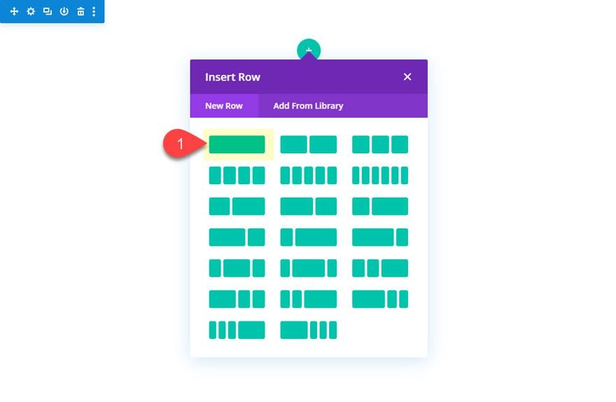
Creating the Row
To start, add a one-column row to the regular section.
Then open the row settings and update the following:
- Gutter Width: 1
- Width: 100%
- Max Width: 800px
- Height: 400px (desktop); 700px (tablet and phone)
The width and max width values can be changed to whatever you need. The accordion will scale and function within any row width. Also, it is very important to set a fixed height for the design to work. The child elements (column and modules) will have a height of 100% so if you don’t set the fixed height of the row, the child elements will not have a height at all.
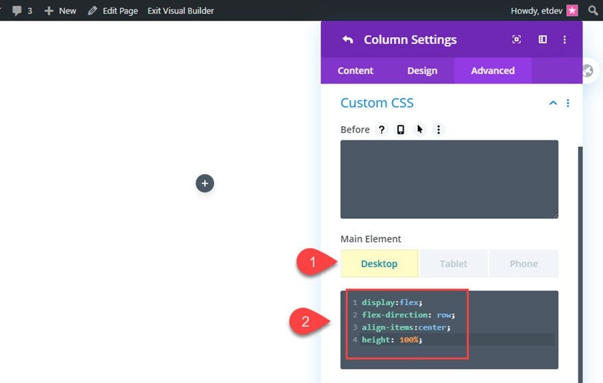
Column Settings
Now that we have a set height for the row, open the column settings and add the following CSS to the main element:
Desktop
display:flex;
flex-direction: row;
align-items:center;
height: 100%;
Tablet
display:flex;
flex-direction: column;
align-items:center;
height: 100%;
The flex property will align the accordion panels horizontally on desktop and vertically on tablet and phone. The 100% height will allow the modules we will add to use the 100% height value as well.
Creating the Accordion Panel with Blurb Modules
The accordion slider can be built using any type of module(s). If we wanted to we could use a combination of different modules to serve as our accordion panel. But for this design, we are going to use blurb modules.
Begin by adding a blurb module to the row.
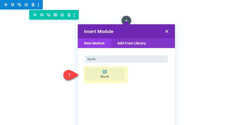
Designing the Blurb Module
Open the blurb module settings and update the following:
Keep the mock title and body content. We can always change that later.
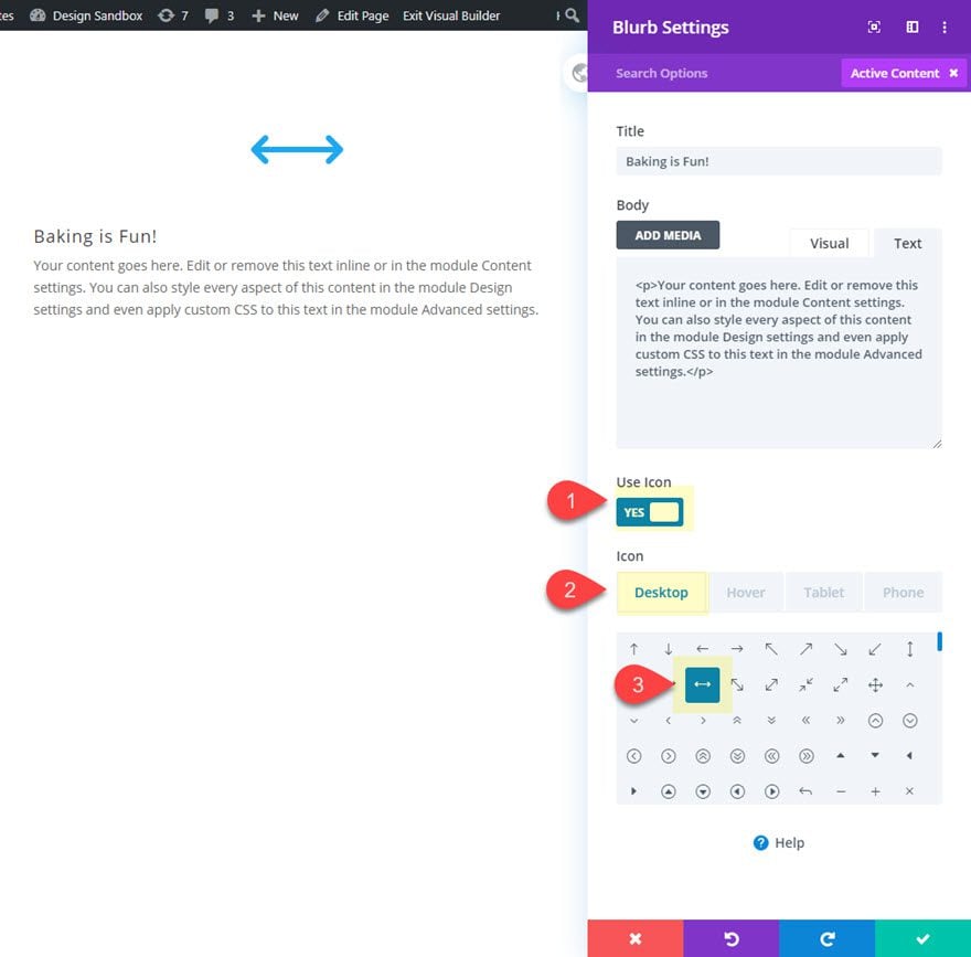
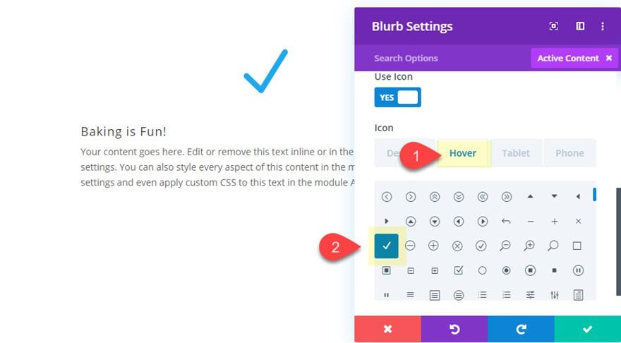
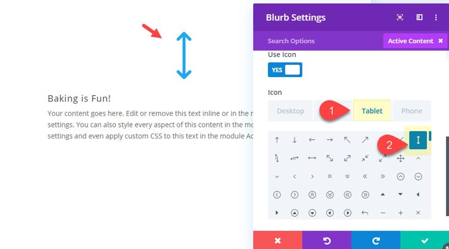
Then update the blurb icon as follows:
- Icon (desktop): horizontal arrow line icon (see screenshot)
- Icon (hover): check icon (see screenshot)
- Icon (tablet and phone): vertical arrow line icon (see screenshot)
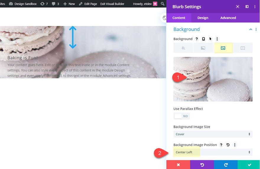
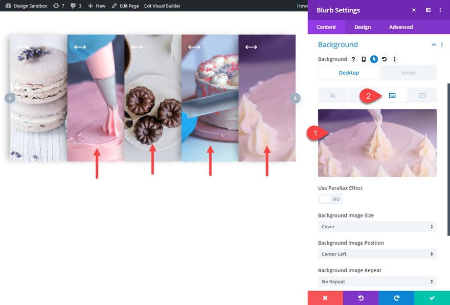
Background
Then give the blurb a background image and a gradient overlay on hover as follows:
- Add a Background Image at least 1000px wide
- Background Image Position: Center Left
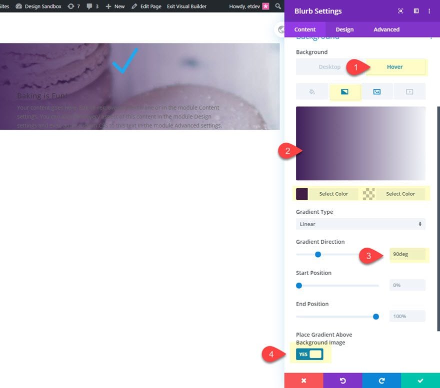
Then add a gradient background overlay on hover.
Hover
- Background Gradient Left Color (hover): #3e215b
- Background Gradient Right Color (hover): rgba(0,0,0,0)
- Gradient Direction: 90deg
- Place Gradient Above Background Image: YES
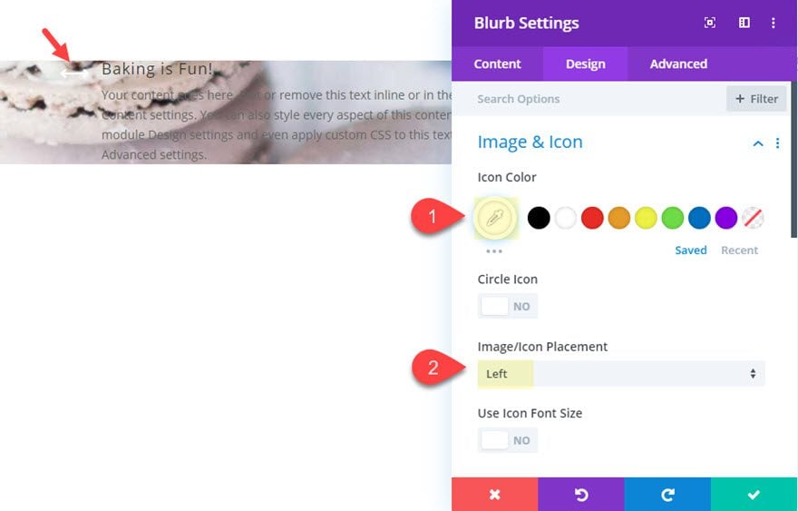
Icon
- Icon Color: #ffffff
- Image/Icon Placement: Left
Next, jump over to the design tab and update the following:
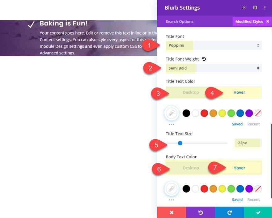
Title and Body Text
- Title Font: Poppins
- Title Font Weight: Semi Bold
- Title Text Color: transparent (desktop), #ffffff (hover)
- Title Text Size: 22px
- Body Text Color: transparent (desktop), #ffffff (hover)
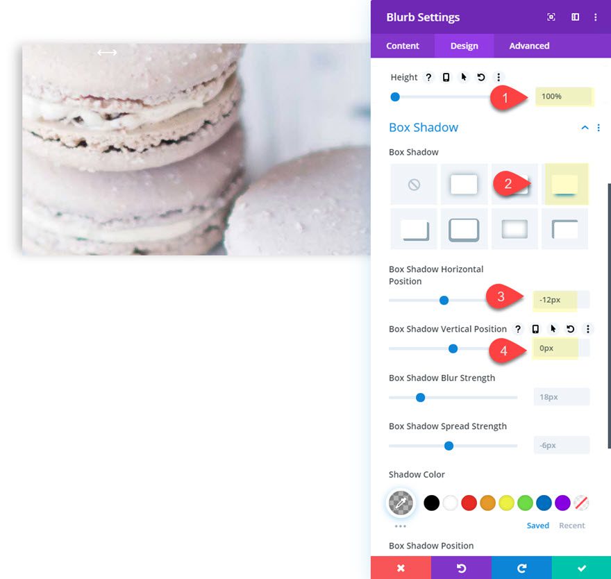
Height and Box Shadow
After the text is styled, give the module a 100% height and a box shadow as follows:
- Height: 100%
- Box Shadow: See Screenshot
- Box Shadow Horizontal Position: -12px
- Box Shadow Vertical Position: 0px
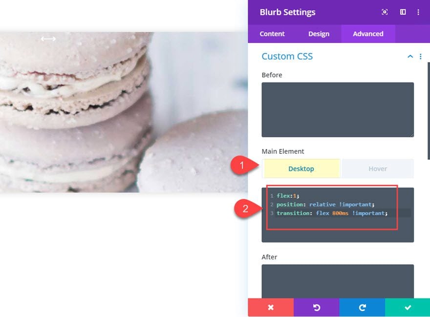
Blurb Custom CSS
In order to get our accordion panels (or blurb module) to expand and contract with the rest of the modules, we need to add some custom css to change the size of the module with flex-grow. Since we are going to have a total of 5 modules that make up the accordion, we add “flex:1” for the default state and then change it to “flex:5” on the hover state.
Under the advanced tab, add the following custom CSS the Blurb Main Element:
Desktop
flex:1;
position: relative !important;
transition: flex 800ms !important;
Tablet
flex:5;
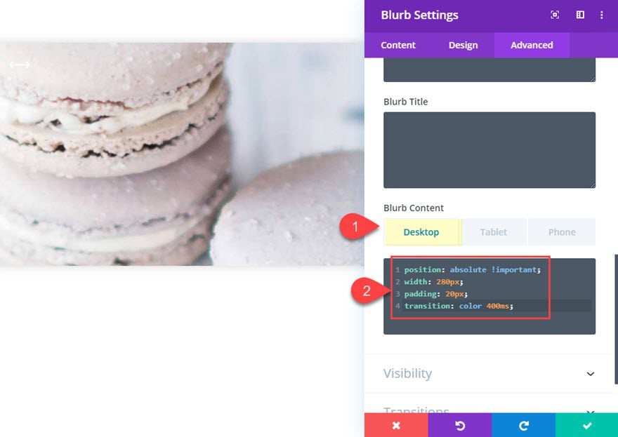
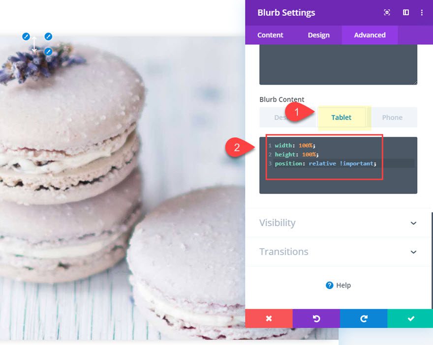
Then add the following custom css to the Blurb Content CSS:
Desktop
position: absolute !important;
width: 280px;
padding: 20px;
transition: color 400ms;
Tablet
position: relative !important;
width: 100%;
height: 100%;
padding: 20px;
transition: color 400ms;
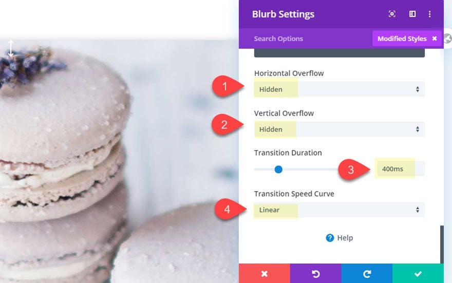
Overflow and Transition
- Horizontal Overflow: hidden
- Vertical Overflow: hidden
- Transition Duration : 400ms
- Transition Speed Curve: Linear
Alright! That was some serious customization to a blurb module. But the good news is that all we need to do is duplicate them to create the remaining accordion panels.
Duplicating the Blurbs for More Accordion Panels
Hover over the blurb module and click the duplicate icon four times to create a total of five accordion panels (or modules).
Then update the background images for each of the new blurbs you duplicated.
Final Result
Desktop
Tablet and Phone
Final Thoughts
This responsive accordion slider really does have some unique elements that make it fun to use. The accordion panels expand and contract seamlessly on hover without any unexpected glitches. And the blurb icons change on hover and on mobile in order to boost UX. Hopefully, this design will come in handy for your next project.
I look forward to hearing from you in the comments.
Cheers!


Any chance this is still getting updated? I’m trying to figure out how to add background videos and make them play only on hover.
Kinda crazy this post has been up for 4 years with this glaring error: “flex:5;” should be added to “hover”, not “tablet” as shown.
Indeed…
If the author placed the updated layout and everyone was so glad to have it – did they try to install it and use it?
It works fine on desktops but not at all on tablets and mobile.
This is cool, but I have run into an issue. I want the Title and Text (Content width) to be wider. The example has the content width set to 550px. If I change that content width setting at all, it adjusts and looks good on desktop, but it looks bad when it switches to horizontal on mobile and tablet. The overall width of each horizontal blurb changes to match the actual amount of text in each one. So each horizontal row in the accordion is a different width. They were lining up, but now they don’t. Any suggestions?
Can this be expanded to fill the desktop? I uploaded the JSON and it looks great on tablet and mobile, but it does not expand to fill my desktop.
why don’t the blurbs extend 100% on tablet?
http://prntscr.com/px0o7z
I can’t find any width or spacing related to that 🙁
Have you checked the custom css to see what it’s setting the width too? There could be an option in there to extend it to 100% width on mobile devices (this would include tablet based on the display width)
See my reply to Peter. Sorry for the confusion.
hi,
after the last update DIVI 4.0 the accordion doesn’t work with tablet and mobile.
do you have a solution?
Thanks for the heads up. I fixed the issue and updated the post with a new json download and also updated the custom CSS on tablet in the post as well.
Hi Jason,
this post is great! I like the accordion very much. Nevertheless, with 4.0.7 the issue seems to appear again, i. e. the accordion does not work on mobile. Is there a solution?
thx!
Peter,
Thanks. I think the problem was that the json download included custom CSS (“height: 100%”) for phone display that was overriding the other CSS properties set for tablet. In other words, just take out “height: 100%” for the column custom CSS for phone. I update the download file as well.
hi,
I’ve got the same question!
Hi Jason.. Thanks for this absolute gem it’s exactly what have been looking for…
But it seems to only work in desktop mode, it doesn’t expand for both mobile screen and tablet..
Please how do I fix this?
I fixed the issue and updated the post with a new json download and also updated the custom CSS on tablet in the post as well.
I’ve got the same question!
Column Settings. I can’t choose “desktop” or “tablet” for column settings : /
Hmm… What seems to be the problem exactly? Are you not able to hover over a option group and click the little tablet icon to deploy the responsive tabs?
Also, make sure that you are actually in column settings by clicking the gear icon on the column element under row settings.
Hope that helps.
very very good thank you
I appreciate the feedback, Alam. Thanks!
Thank You For This Article!
It is very enjoyable & Useful
Great to hear!
Hello,
I learned a lot from this tutorial again . Thank you.
One little information is missing for me, how can I set for example the middle blurb initial state to expanded?
If I change the middle blurb main css to flex:5, then it will start expanded,
but it doesn’t contract if the mouse is over other blurb.
Szabolcs,
Good question. My first thought is that it probably will not possible without some jQuery since you will have to change the middle blurb CSS (flex:5 to flex:1) when hovering over another blurb.
Hello Jason,
I liked the article. It’s clean and clearly understandable.
Always a fan of this website!
Thank you.
But there is a problem, can you please what will happen if i use ‘position: auto !important;’ instead of ‘position: relative !important;’?
Thank you in advance!
Hi Jason.. Thanks for this absolute gem it’s exactly what have been looking for…
But it only seems to work in desktop mode, it doesn’t expand for both mobile screen and tablet..
I follow the instructions exactly
Please what else can I do ?
I have the same problem. I see that if you let the ”flex-direction” to row on mobile and tablet, it works… I don t know why it is not working when it is set column.
I fixed the issue and update the post. There needed to be “display:flex” under the tablet tab as well, not just “flex-direction: column”.
Thanks, Muntasir. Sorry for the late reply. Each of the blurbs have a “position:relative” so that the blurb content can be positioned using “position: absolute”. Is this what you are asking?
https://www.w3schools.com/css/css_positioning.asp
Hello,
Really great !
You and Donjete, you offer us many
really useful tutorial.
This allows us to make sites with great effects.
thank you
This accordion slider is fun to use. It can make a website looks more attractive. Thank you, Jason.
Great !
Thanks for sharing.
How crazy creative and clever.
Thanks, Dominic!