

Looking for a way to put your global header on top of your pages’ hero sections? In today’s Divi tutorial, we’ll show you exactly how to do that. We’ll recreate a stunning global header from scratch (using Divi’s Theme Builder) and we’ll apply a floating effect to the menu bar. You’ll be able to download the JSON file for free as well!
Let’s get to it.
- 1 Preview
- 2 Download The Floating Menu Bar Global Header Template for FREE
- 3 Download For Free
- 4 You have successfully subscribed. Please check your email address to confirm your subscription and get access to free weekly Divi layout packs!
- 5 1. Go to Divi Theme Builder & Add New Template
- 6 2. Start Building Global Header
- 7 3. Save Builder Changes & View Result
- 8 Preview
- 9 Final Thoughts
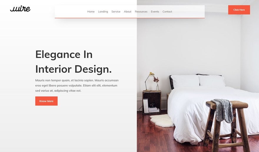
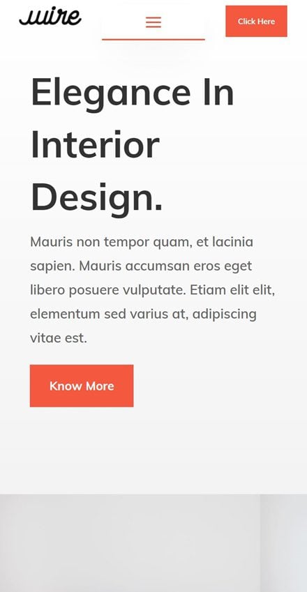
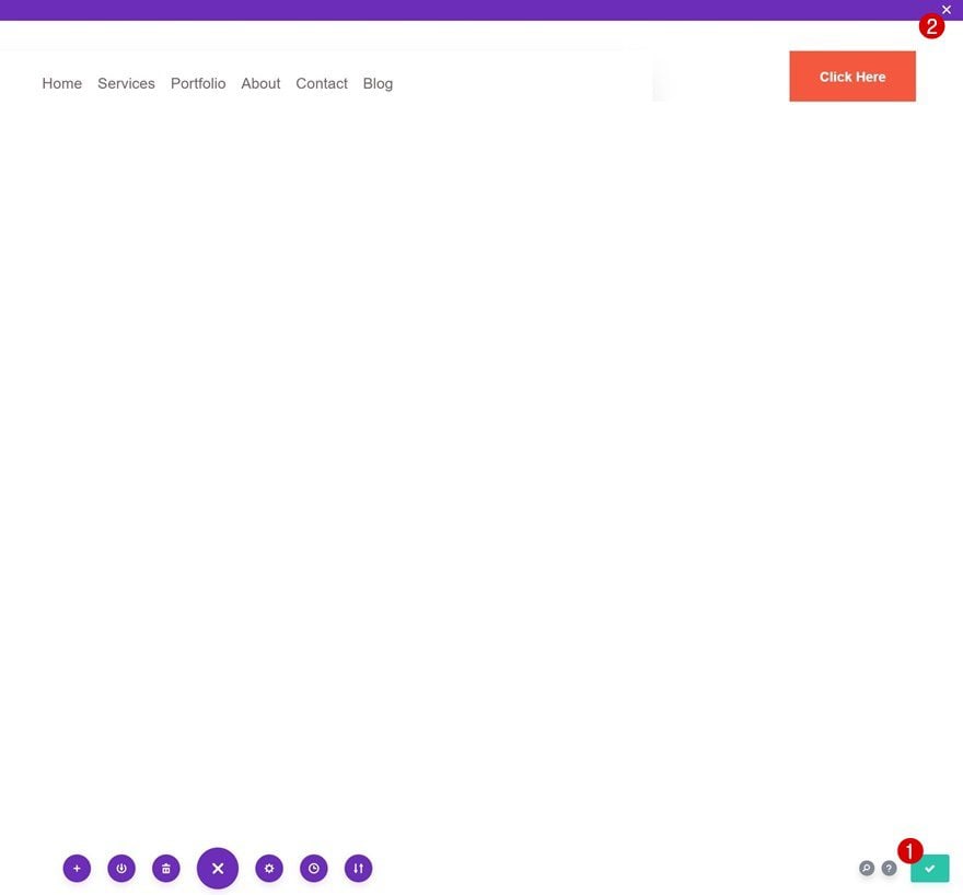
Preview
Before we dive into the tutorial, let’s take a quick look at the outcome across different screen sizes.
Desktop
Mobile
To lay your hands on the floating menu bar global header template, you will first need to download it using the button below. To gain access to the download you will need to subscribe to our newsletter by using the form below. As a new subscriber, you will receive even more Divi goodness and a free Divi Layout pack every Monday! If you’re already on the list, simply enter your email address below and click download. You will not be “resubscribed” or receive extra emails.

Subscribe To Our Youtube Channel
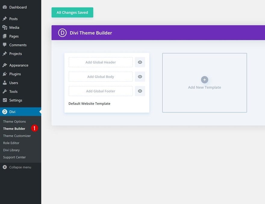
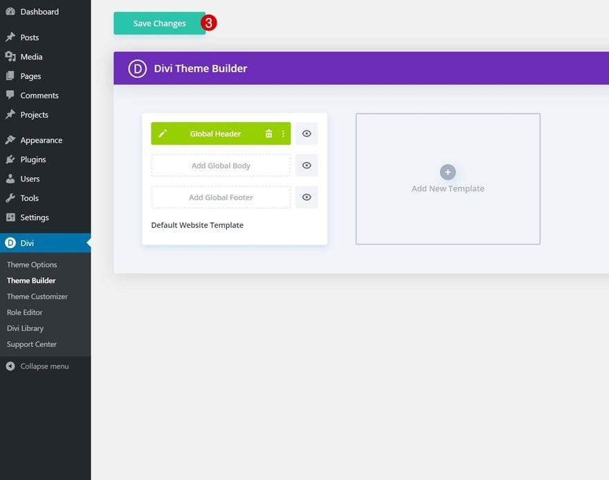
1. Go to Divi Theme Builder & Add New Template
Go to Divi Theme Builder
Start by going to the Divi Theme Builder.
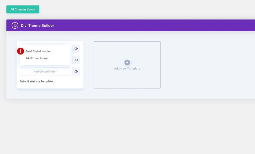
Start Building Global Header
Then, click on ‘Add Global Header’ and continue by selecting ‘Build Global Header’.
2. Start Building Global Header
Section Settings
Background Color
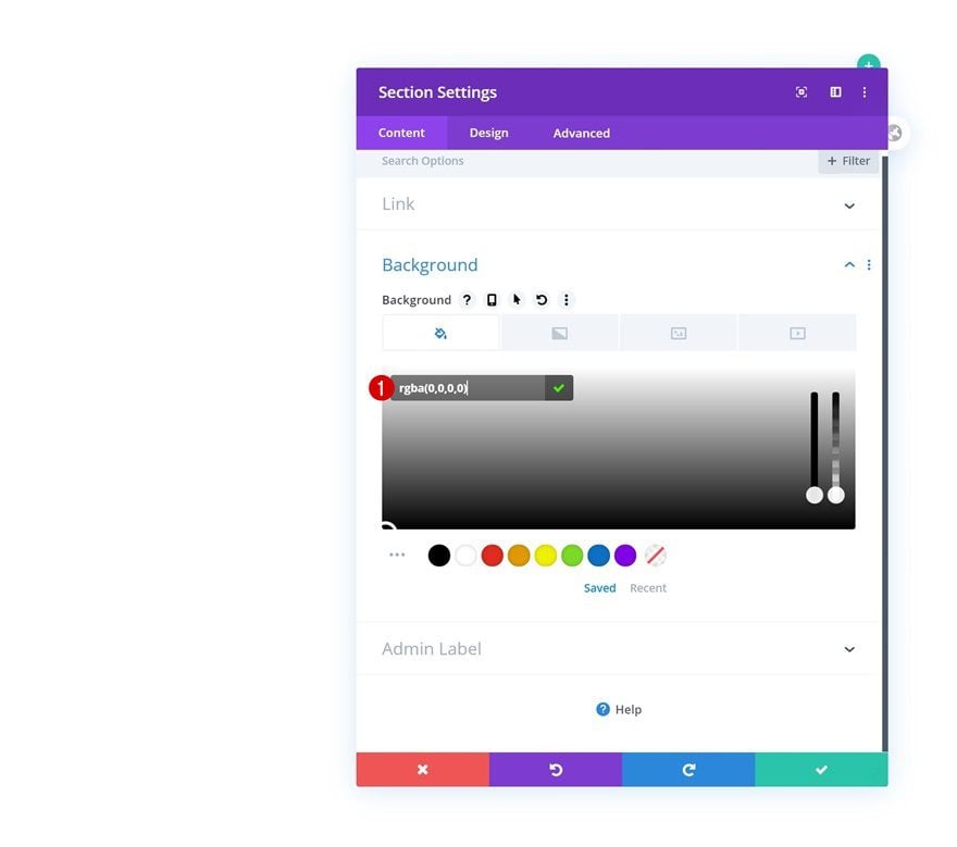
Once you’re inside the template editor, you’ll notice a section on the page. Open that section and change the background color into a completely transparent one. This will allow everything below the section to show through.
- Background Color: rgba(0,0,0,0)
Sizing
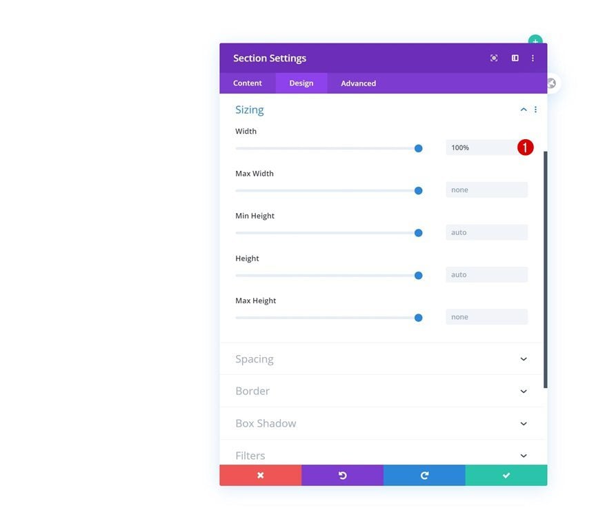
Go to the section’s design tab next and change the width.
- Width: 100%
Spacing
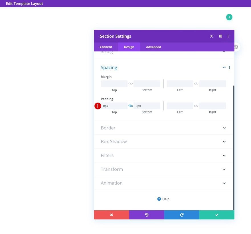
Remove all default top and bottom padding too.
- Top Padding: 0px
- Bottom Padding: 0px
Z Index
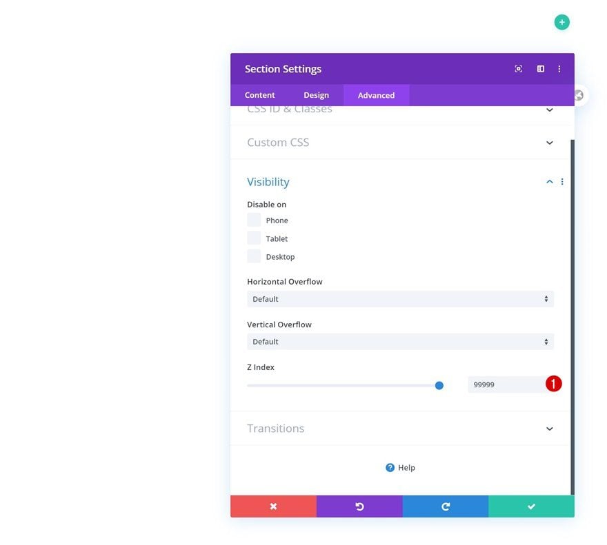
And to make sure the section remains on top off all hero section content, we’ll need to increase the section’s z index in the visibility settings.
- Z Index: 99999
Add New Row
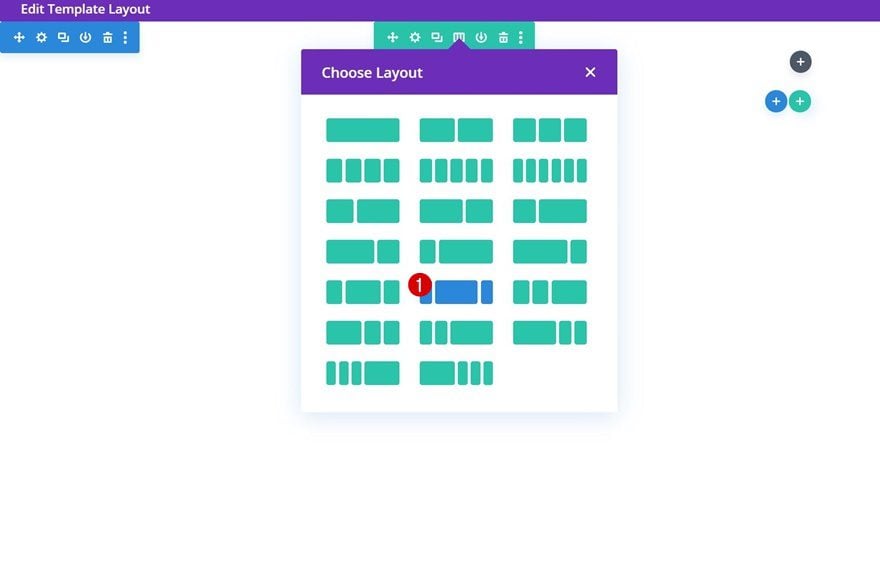
Column Structure
Once you’ve completed the section settings, you can add a new row using the following column structure:
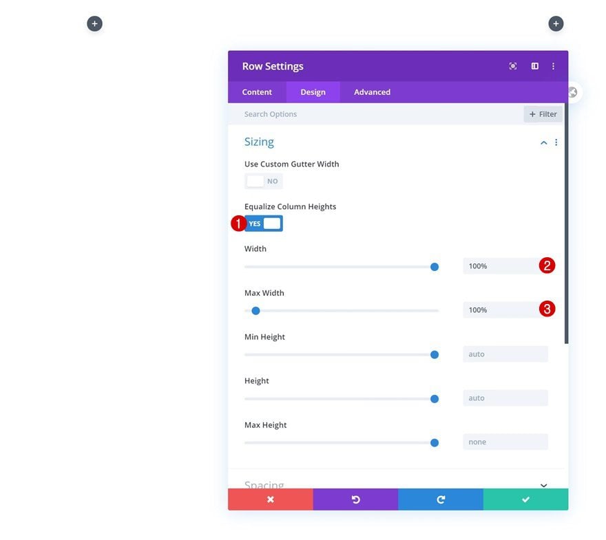
Sizing
Without adding any modules yet, open the row settings and change the sizing settings as follows:
- Equalize Column Heights: Yes
- Width: 100%
- Max Width: 100%
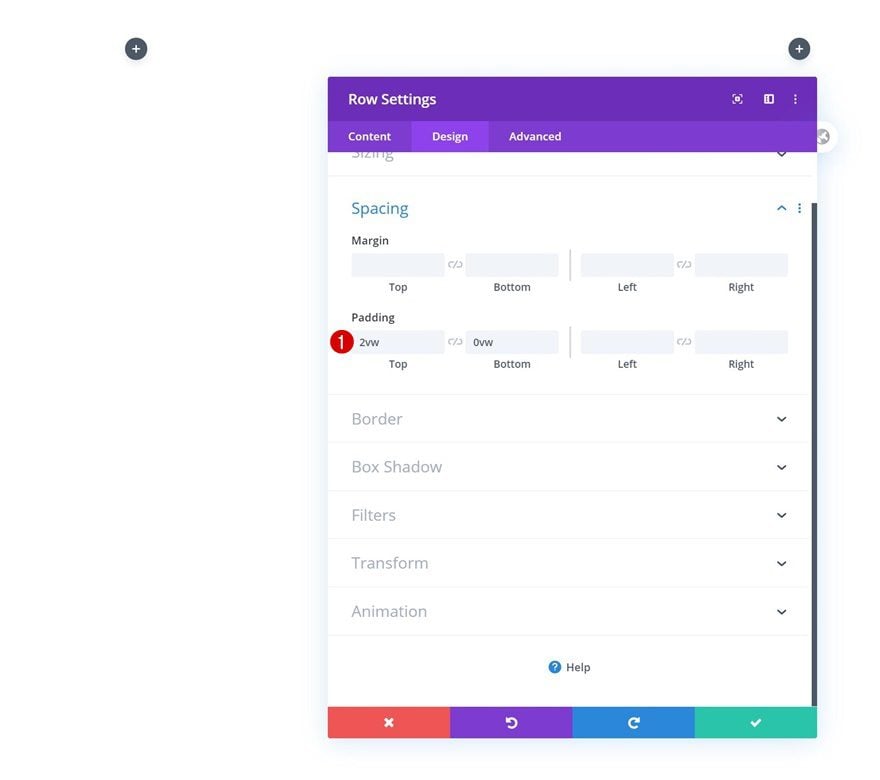
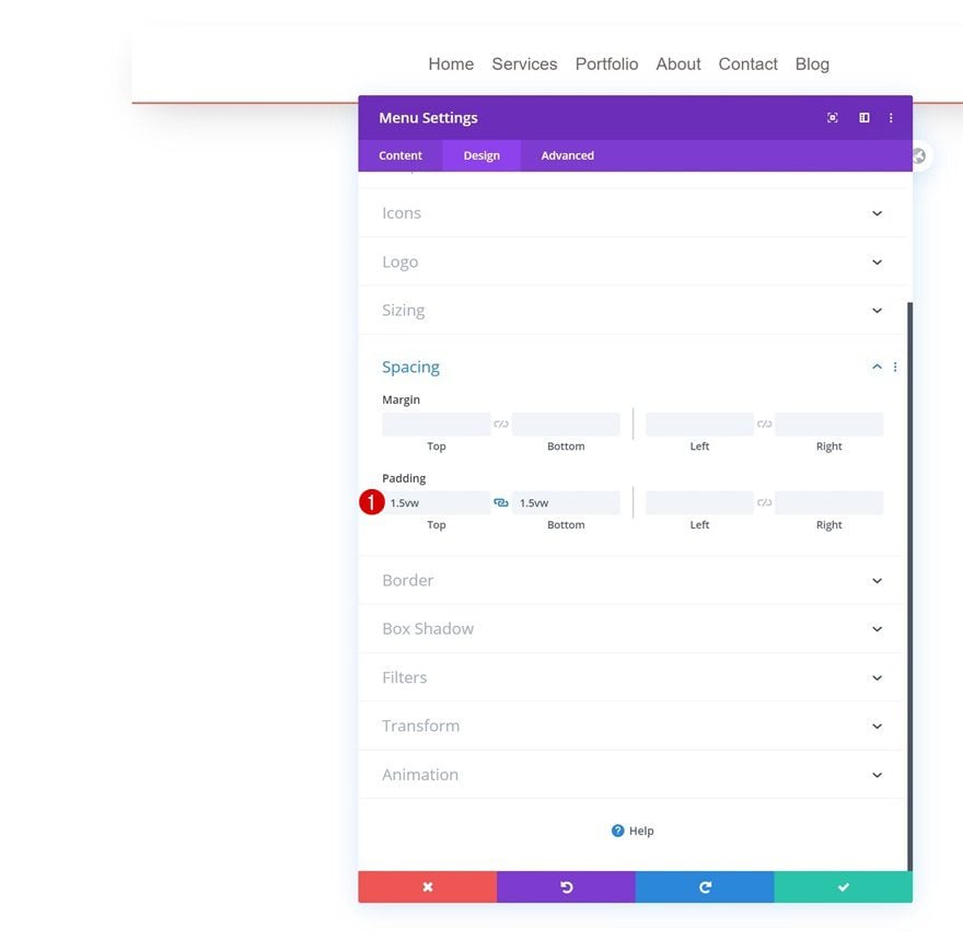
Spacing
Add some custom top and bottom padding next.
- Top Padding: 2vw
- Bottom Padding: 0vw
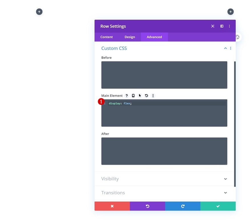
Main Element
Then, go to the advanced tab and make sure the columns remain next to each other on smaller screen sizes by adding one single line of CSS code to the row’s main element.
display: flex;
Column 2
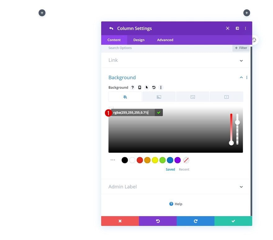
Background Color
Continue by opening the column 2 settings and change the background color into a semi-transparent one.
- Background Color: rgba(255,255,255,0.71)
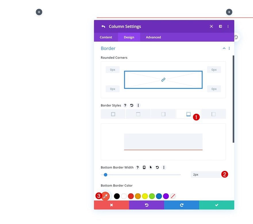
Border
Add a bottom border to the column too.
- Bottom Border Width: 2px
- Bottom Border Color: #f4583f
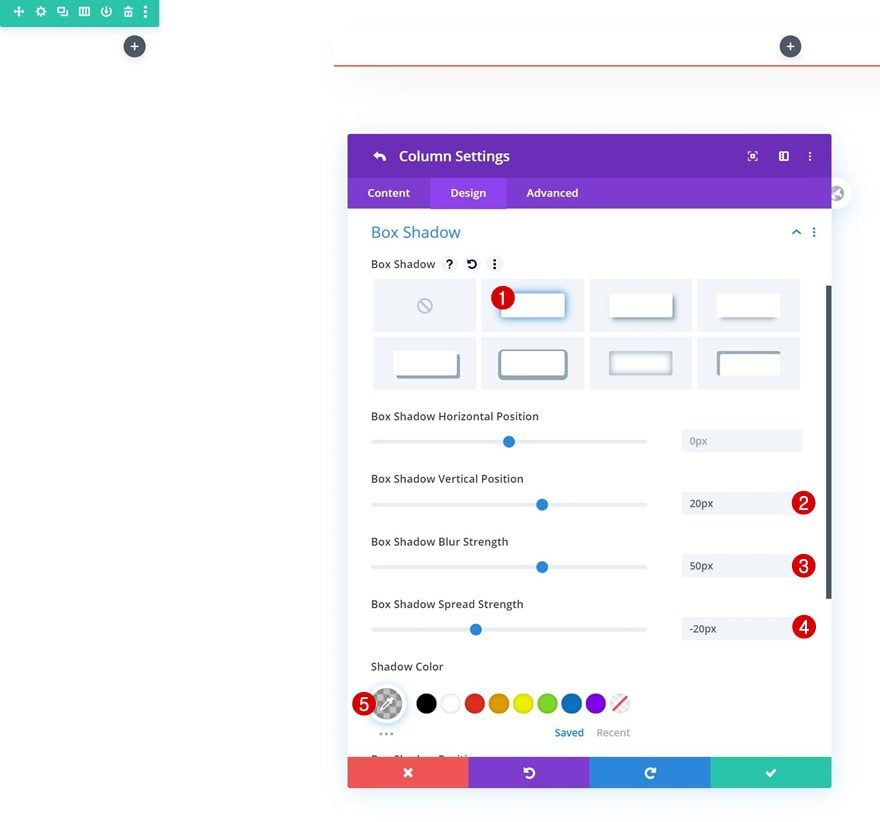
Box Shadow
And create a floating effect by adding a subtle box shadow.
- Box Shadow Vertical Position: 20px
- Box Shadow Blur Strength: 50px
- Box Shadow Spread Strength: -20px
- Shadow Color: rgba(0,0,0,0.23)
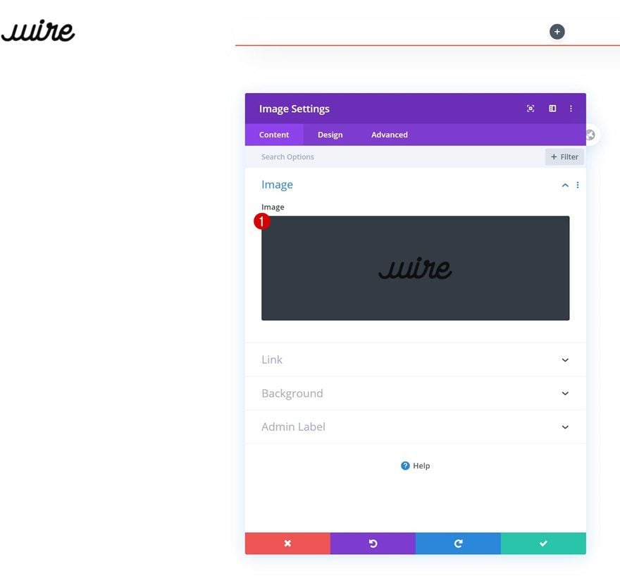
Add Image Module to Column 1
Upload Logo
Once you’ve completed the row and column settings, it’s time to add the modules, starting with an Image Module in column 1. Upload a logo with a transparent background.
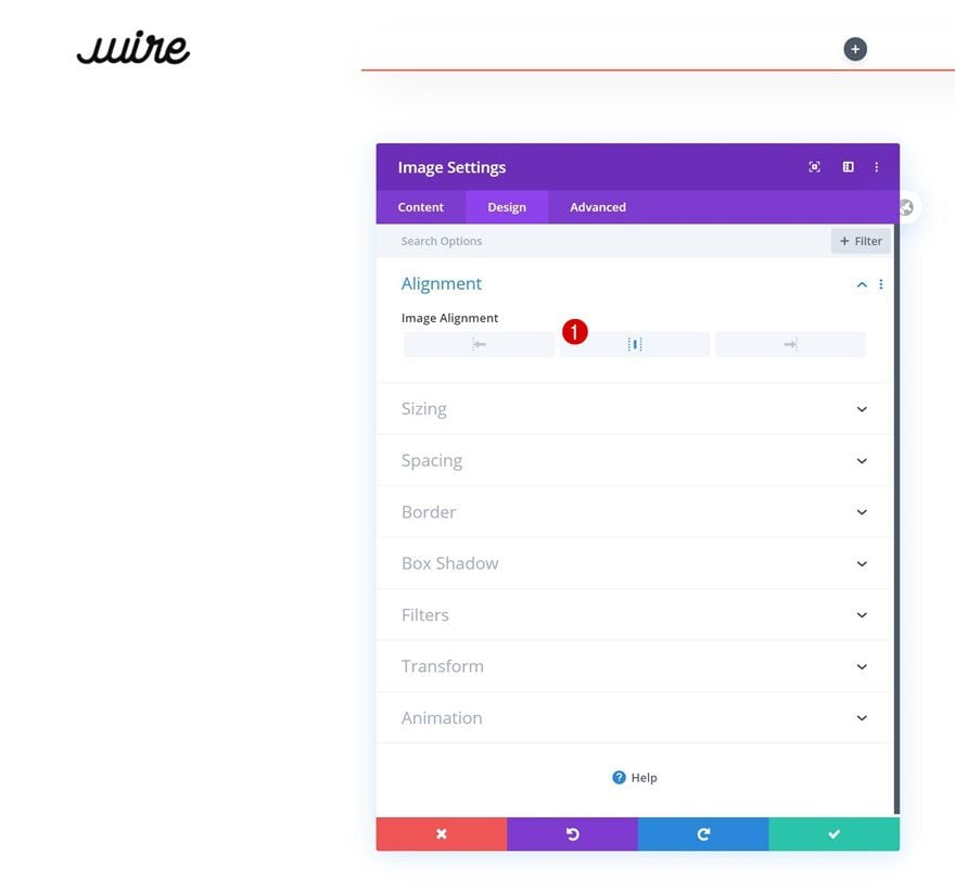
Alignment
Move on to the module’s design tab and change the alignment.
- Image Alignment : Center
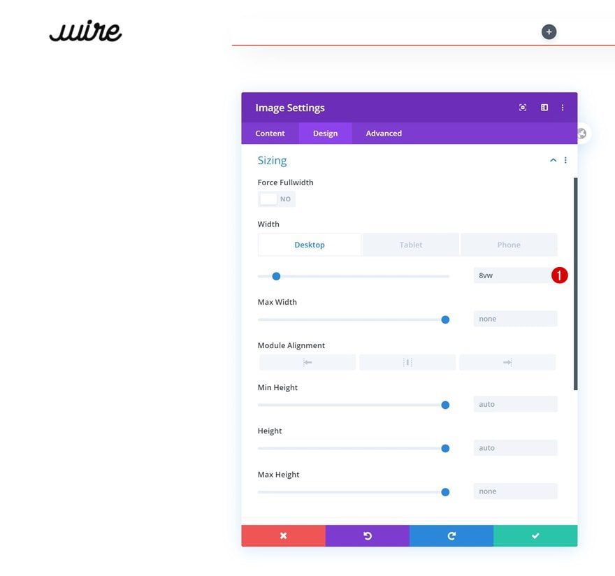
Sizing
Change the module’s width in the sizing settings too.
- Width: 8vw (Desktop), 14vw (Tablet), 21vw (Phone)
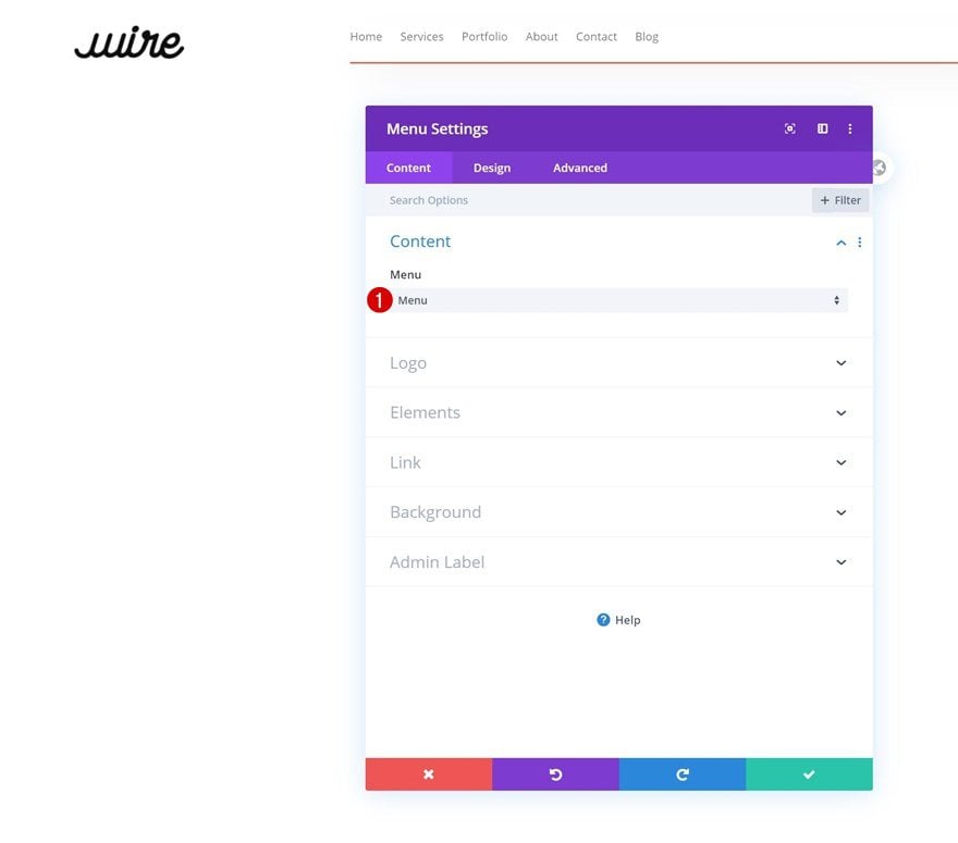
Select Menu
On to the next column. There, the only module we need is a Menu Module. Select a menu of your choice.
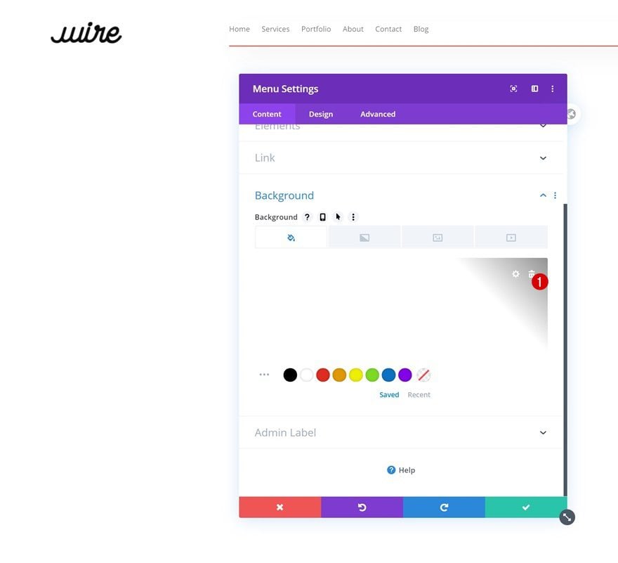
Remove Background Color
Then, go to the background settings and remove the background color.
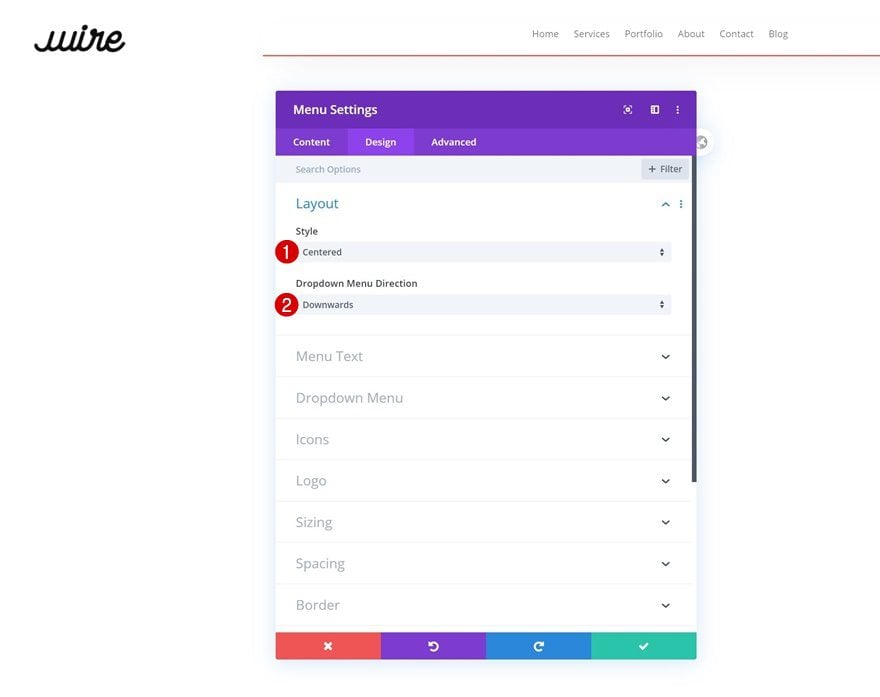
Layout
Move on to the module’s design tab and change the layout.
- Style: Centered
- Dropdown Menu Direction: Downwards
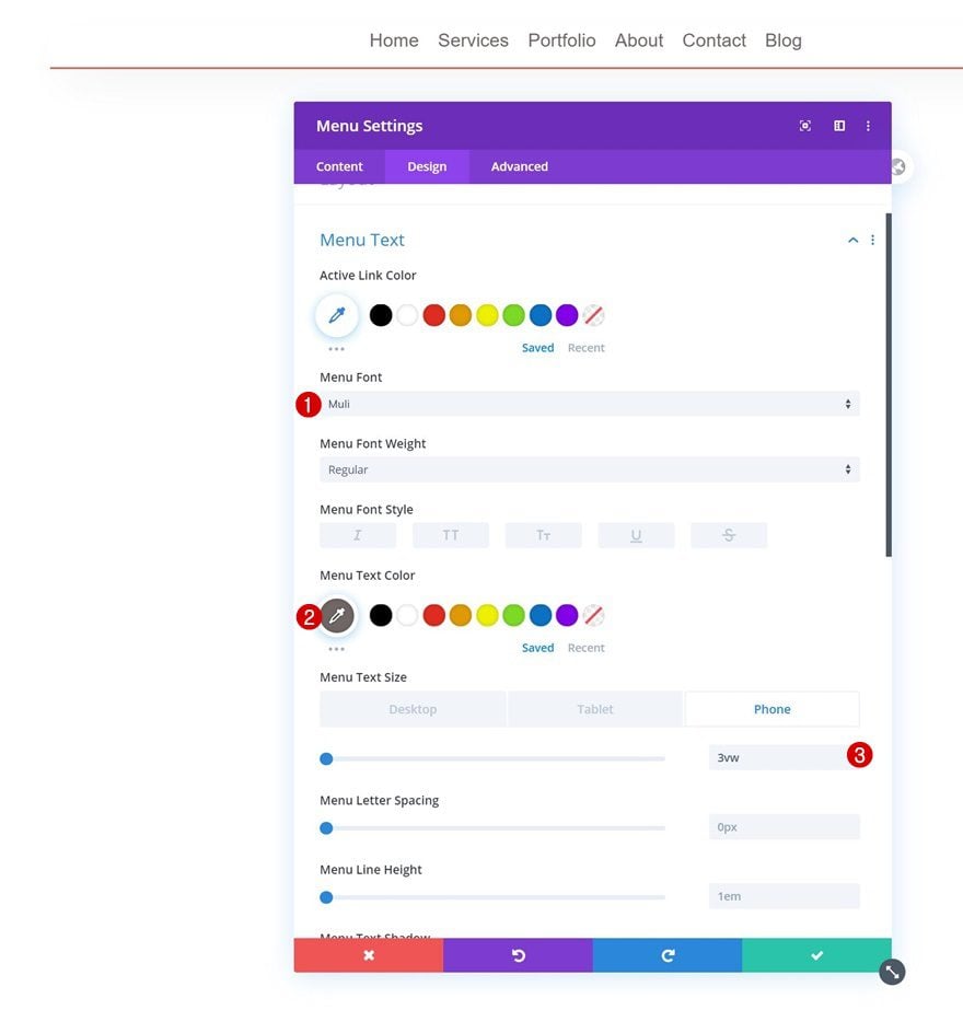
Menu Text
Style the menu text settings too.
- Menu Font: Muli
- Menu Text Color: #6f6666
- Menu Text Size: 1vw (Desktop), 2vw (Tablet), 3vw (Phone)
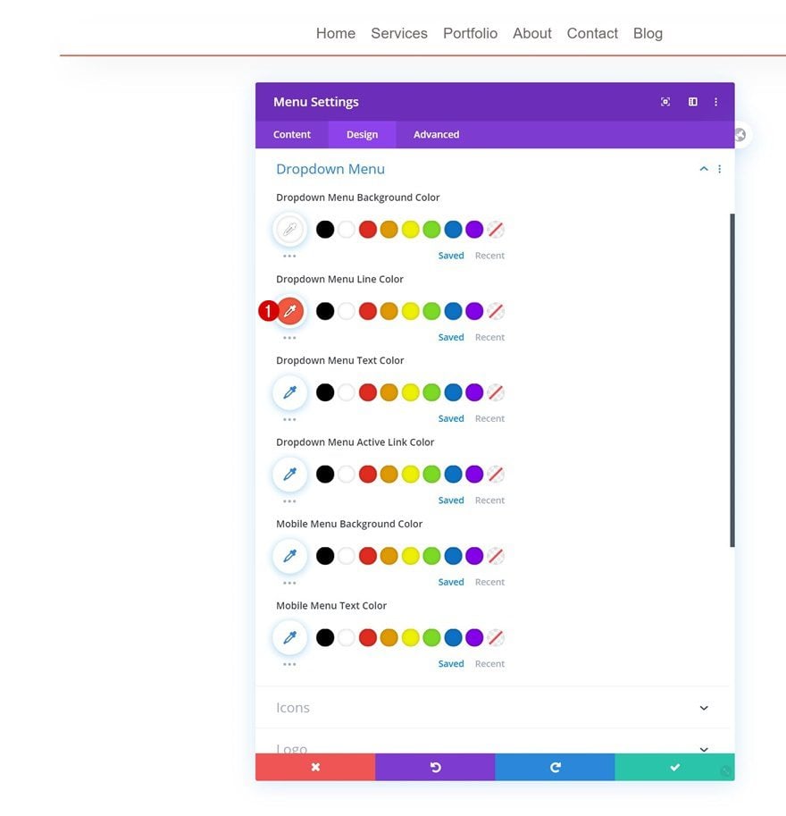
Dropdown Menu
Change the dropdown menu settings next.
- Dropdown Menu Line Color: #f4583f
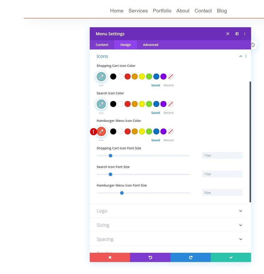
Icons
Use that same color for the hamburger menu icon color in the icons settings.
- Hamburger Menu Icon Color: #f4583f
Spacing
Complete the module’s settings by adding some top and bottom padding in the spacing settings.
- Top Padding: 1.5vw
- Bottom Padding: 1.5vw
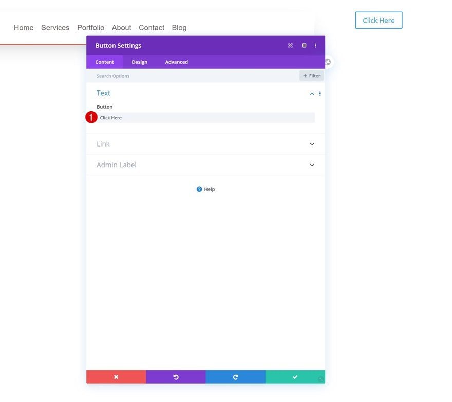
Add Copy
On to the next and last column. Add a Button Module with some copy of your choice.
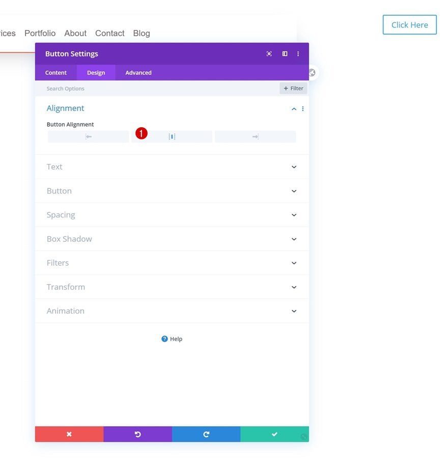
Alignment
Change the module’s alignment next.
- Button Alignment: Center
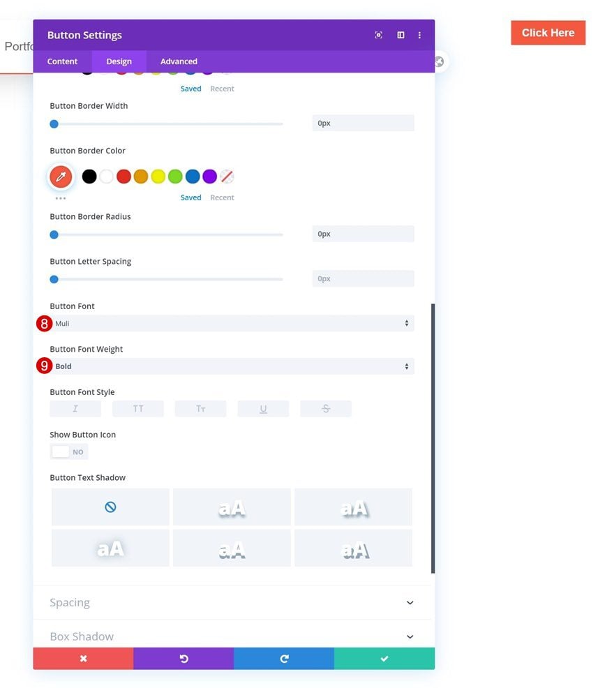
Button Settings
Continue by styling the button accordingly:
- Use Custom Styles For Button: Yes
- Button Text Size: 0.9vw (Desktop), 1.5vw (Tablet), 2.5vw (Phone)
- Button Text Color: #ffffff
- Button Background Color: #f4583f
- Button Border Width: 0px
- Button Border Color: #f4583f
- Button Border Radius: 0px
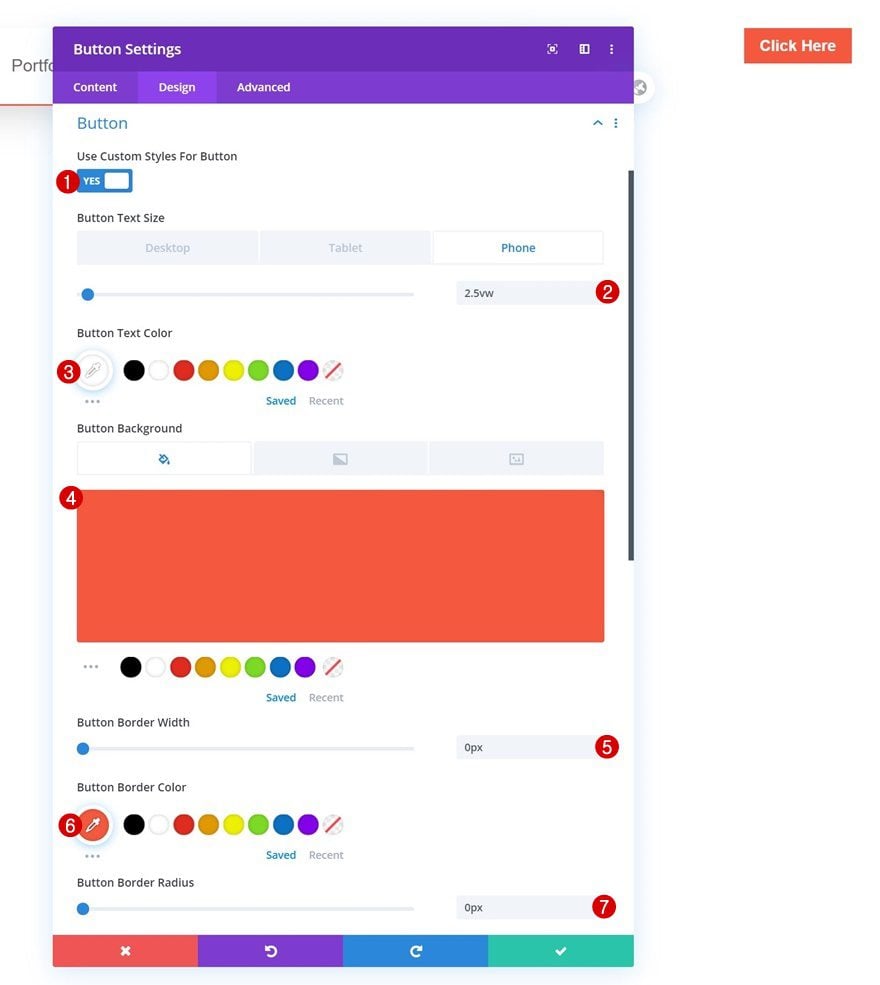
- Button Font: Muli
- Button Font Weight: Bold
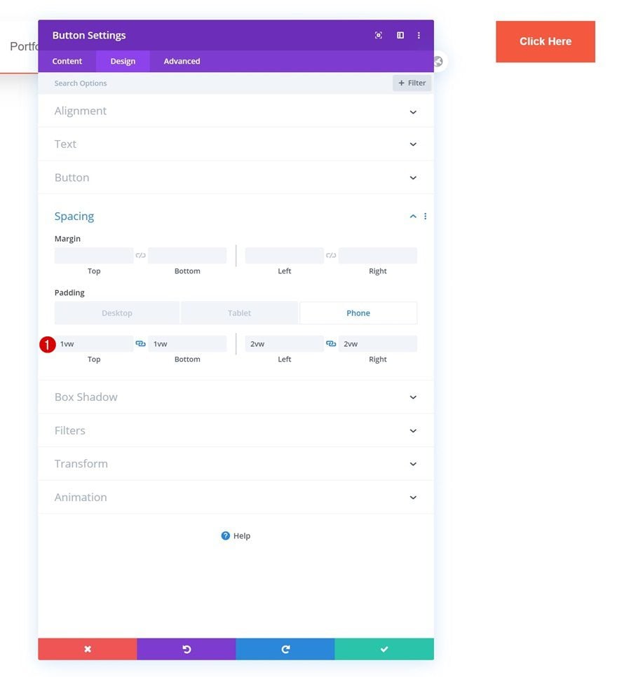
Spacing
And complete the module’s settings by adding some custom padding across different screen sizes.
- Top Padding: 1vw (Desktop), 2vw (Tablet), 3vw (Phone)
- Bottom Padding: 1vw (Desktop), 2vw (Tablet), 3vw (Phone)
- Left Padding: 2vw (Desktop), 3vw (Tablet), 4vw (Phone)
- Right Padding: 2vw (Desktop), 3vw (Tablet), 4vw (Phone)
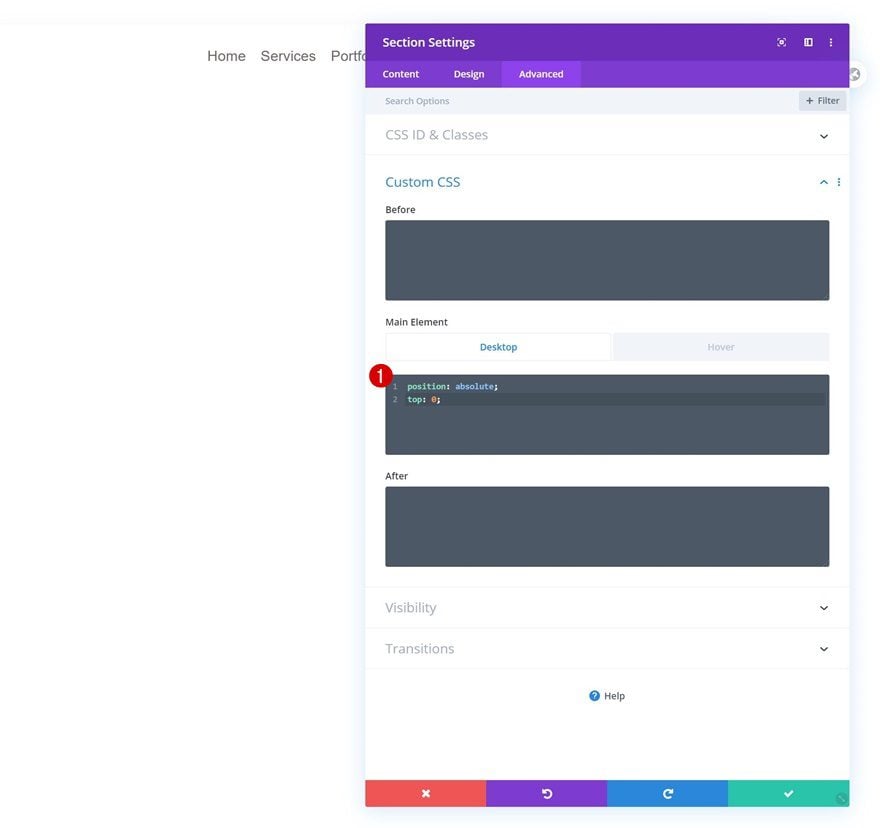
Additional Section Settings
Default Main Element
Once you’ve completed the overall design, there’s one thing left to do; placing the section on top of your page content. To do that, we’ll need to add two lines of CSS code to the section’s main element.
position: absolute;
top: 0;
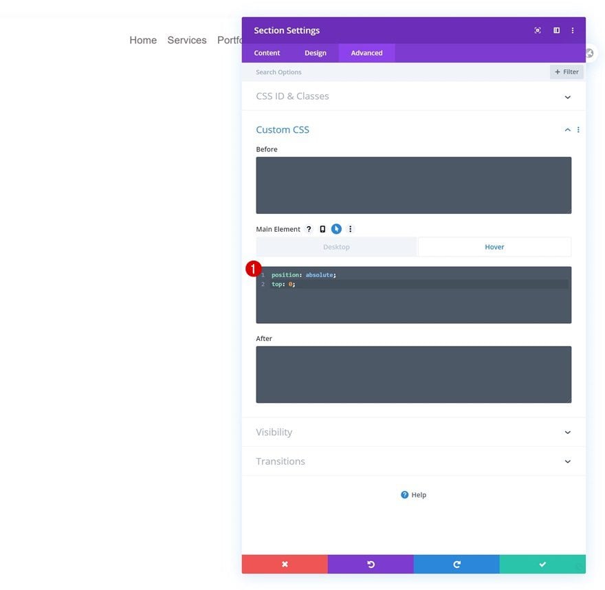
Hover Main Element
Make sure you add those same lines of CSS code to the hover option of the main element. This will prevent the section from flickering once you hover it.
position: absolute;
top: 0;
3. Save Builder Changes & View Result
Once you’ve completed the section, you can save the global header and view the result on your website!
Preview
Now that we’ve gone through all the steps, let’s take a final look at the outcome across different screen sizes.
Desktop
Mobile
Final Thoughts
In this post, we’ve shown you how to create a floating menu bar with Divi’s Theme Builder. This is a great way to blend your header and hero sections. The header is placed on top of the first section on your page or post. You were able to download the JSON file for free as well! If you have any questions or suggestions, feel free to leave a comment in the comment section below!
If you’re eager to learn more about Divi and get more Divi freebies, make sure you subscribe to our email newsletter and YouTube channel so you’ll always be one of the first people to know and get benefits from this free content.


So, even though padding-top was set to “0px” for the header section, there is still padding set by other Divi CSS somewhere. If I want to have the top of the navigation section coincide with the top of the browser viewport, how do I do that?
Hi! I suggest that you contact our Support Team by opening a chat using the pink circle button floating at the bottom and then share your website URL with them so they can inspect this CSS you’re referring to and help you further.
Hello.
Where can I upload the json file? When I add it to the Divi library, then it says “This file should not be imported in this context.”.
Since the layout is for a custom menu header, the JSON file should be imported in Divi > Theme Builder. Here’s a screenshot: https://prnt.sc/jx3799opoP_g
Hi Donjete,
such a great post,
i can’t Add a new row, please help me on that.
I’m having trouble getting back to the Section Settings. What am I missing?
If you’re having trouble opening settings of a certain element, you can always switch over to wireframe mode and access the settings that way. Hope that helps!
how can i create a mega menu by category with the theme builder
I added the template and looked fine but decided against using with the current site so deleted but now I don’t see the main menu at all.
Make sure you delete the header on all templates you’re using inside the theme builder. Hope that helps!
Please create number and social media icon in header also.
You can easily modify the design to include things like social media icons; simply insert the correct module (perhaps the Social Media Follow module, in this case) and style to your liking. You could easily, for example, use that instead of the CTA button in the 3rd column.
This is a sweet tutorial. ET nailed it again and I can’t help to feel zero regret moving from Elementor to Divi!
Happy you’re enjoying the tutorial + Divi! 🙂
Quick question: your tutorial was very clear, concise and it worked first time on a site I am working on. However, I would like the floating menu to remain visible at the top of the desktop viewport while scrolling. As it is now, it scrolls up & out of sight as I scroll the page.
Probably just a bit of CSS – hints?
Bill
Sorry – had an “oh duh” moment and fixed it.
used “fixed” instead of “absolute” in custom CSS.
Yup, you can just change the position CSS property! 🙂
I cannot find where the custom CSS was added to be able to change absolute to fixed. Please help
it’s in the section settings, just change
position: absolute;
top: 0;
to
position: fixed;
top: 0;
Nice header Donjetë. Would love to see some new designs for category and product pages. Is this something that is coming soon?
Thanks, Robin! We’ll definitely create more tutorials on category and product pages! 🙂