One of the standard tweaks to almost any website is the site’s logo. In some shape, form, or fashion, website owners will want to style their logo so that it stands out. And one of the best ways to draw attention to your logo is to have it offset and overlapping the elements behind it. For this tutorial, we are going to walk you through how to offset your site’s logo so that it sits overlapping the overall site header. Let’s dig in!
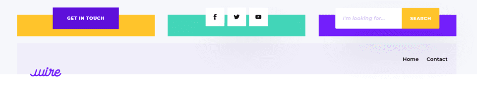
Preview of the Effect
Lets take a look at what we’re trying to achieve today.
Desktop
Mobile
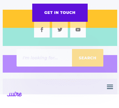
Create and Upload Your Global Header
The first thing we are going to do is download one of our free header & footer packs. For this article, we are using the electronics store layout pack, so we will download the matching freebie header & footer pack to upload later.
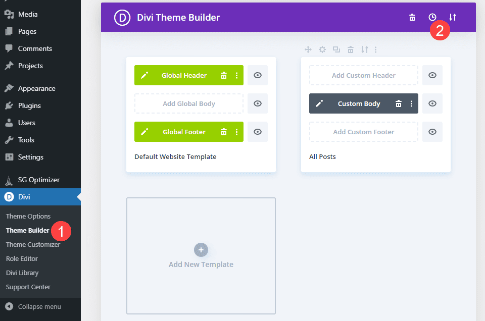
Next, head to the Divi Theme Builder. You will find it in your WordPress admin dashboard under Divi – Theme Builder. To upload the header & footer pack we downloaded, click on the up-and-down arrow icon in the upper right corner of the page. This opens up the Theme Builder portability options.
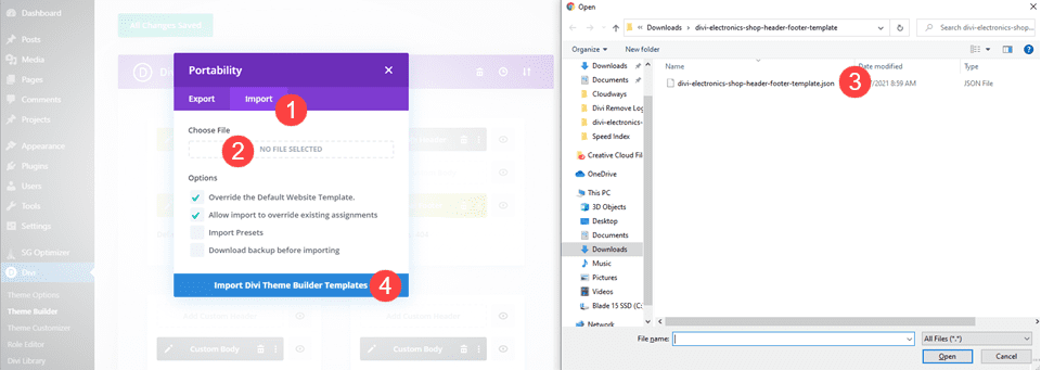
You then want to click on the Import tab, select the extracted JSON file for the header & footer pack, and then click the Import Divi Theme Builder Templates button.
After this, you can click into the green area that says Global Header. Doing so will open the visual builder. If you selected override the Default Website Template in the previous step, the header will already be in place. If not, simply load it in like any other layout pack from your library.
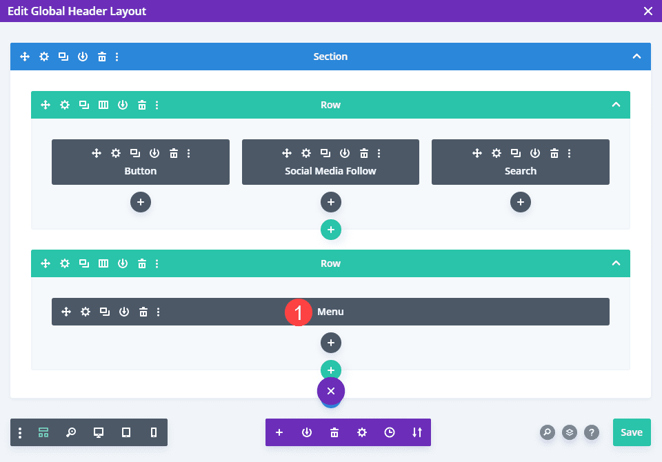
Create the Overlapping Logo
Now, it is time to begin styling the logo itself. To begin, open the menu module in the second section.
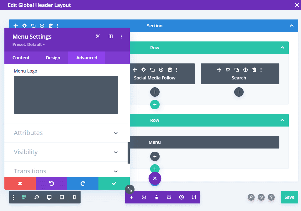
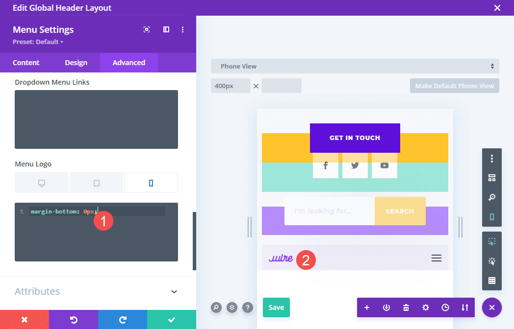
Once there, you will head to the Advanced tab and find the Menu Logo section under Custom CSS. There are a couple of different ways you can achieve this effect with CSS.
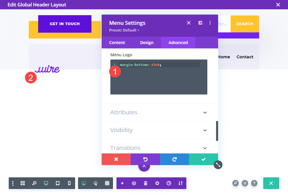
Using a Negative Bottom Margin
You can do this with a single line of CSS code. We will be adding a negative margin to the site logo, pulling it down and overlapping the menu element behind it. The value that you use will depend on your logo and header, specifically. Using relative values such as vh, vw, or % can help make the overlapping logo more consistent across a variety of devices.
CSS CODE margin-bottom; -60%; CSS CODE
You will also want to check the results using different display viewports. Most likely, it will need to be adjusted specifically for mobile versus desktop. To do this, just hover over the Menu Logo title and select the Mobile Phone icon. Then navigate to the Mobile Phone tab.
Now any changes you make to the CSS code will apply only on mobile device-sized viewports.
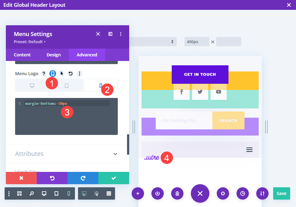
For Desktop Only
If, however, you only want the overlapping logo effect to happen on Desktop, enable the responsive options as above, only set the value at 0. This will cause the non-desktop versions to remain in their default position while keeping the Desktop effect like you designed.
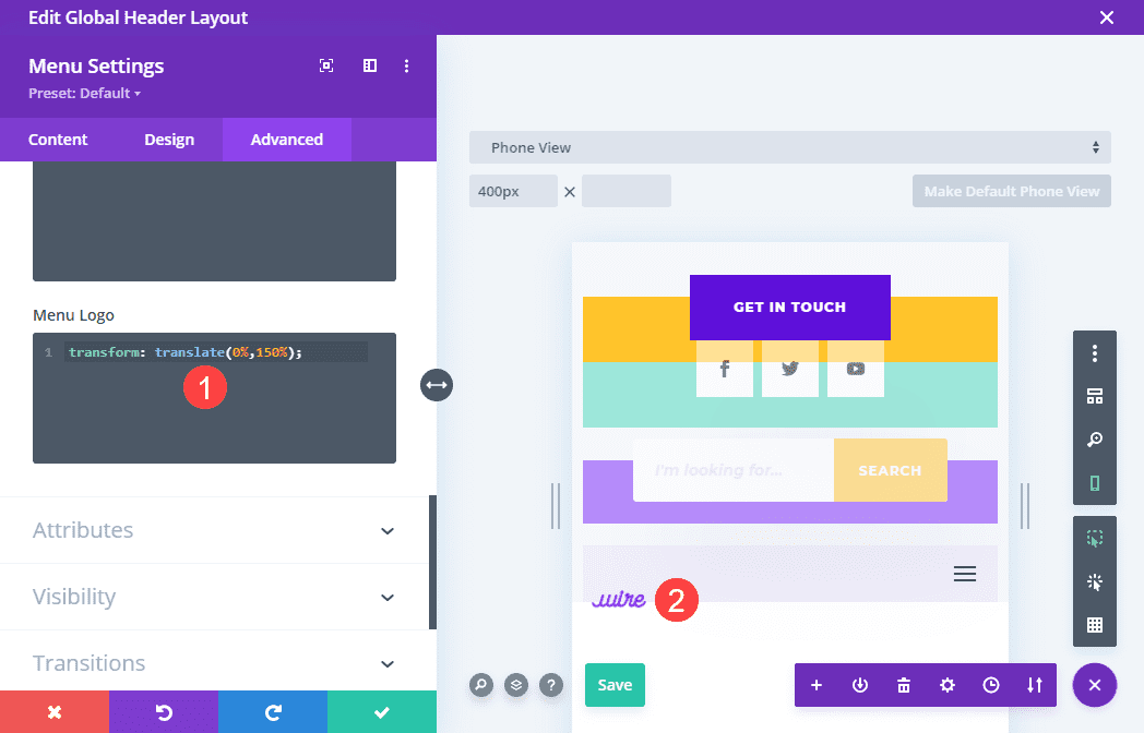
Using Transform Translate
Another way that you can achieve this effect is through the transform: translate CSS property. This is where you reposition an element on an X,Y axis and specify precisely where you want the element to appear on the page. You can get much finer control of the logo’s positioning using this property.
CSS CODE transform: translate(0%, 150%); CSS CODE
Using this method of CSS manipulation, you can do much more than simply overlap vertically. You can effectively move the logo anywhere you want, overlapping any element on the page, not just the part immediately behind it.
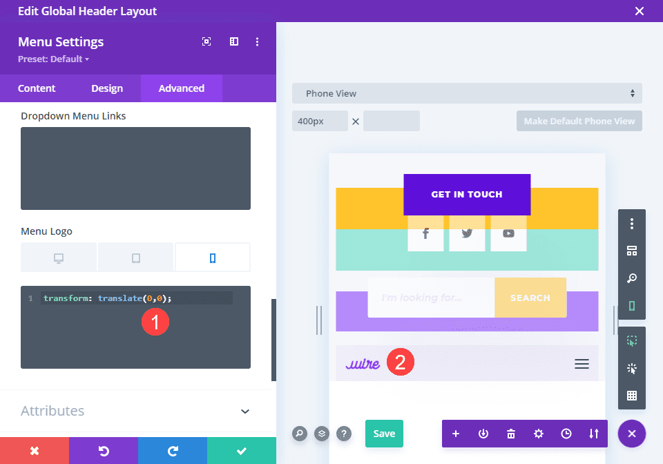
The first number will indicate where the logo sits on an X-axis (horizontally), and the second value is the Y-axis (vertically). A value of (0,0) is the logo’s default placement.
With that in mind, you for Desktop-only designs, you will need to enable responsive options and change any transform: translate values to (0,0) so they remain in place on non-desktop devices.
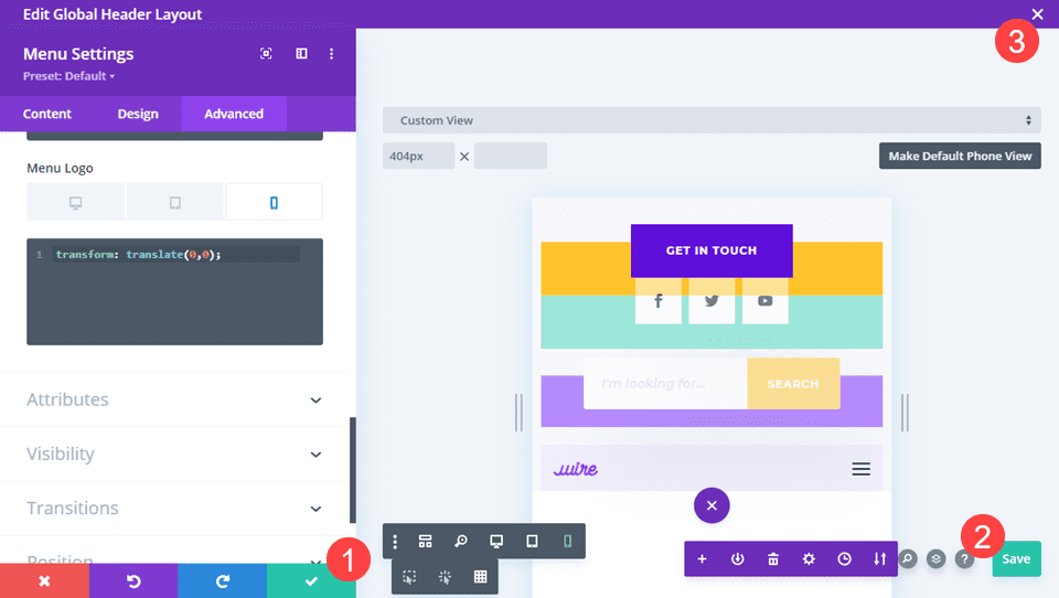
Save Your Changes
The final step is simply saving your changes. Be sure to click the green check in the module settings and the green save button in the lower-right corner. You are then save to click the X in the upper-right of the screen.
The last step to finalizing your overlapping logo is to be sure that all the Theme Builder changes have been saved. Be sure to click the Save button above the various templates, too.
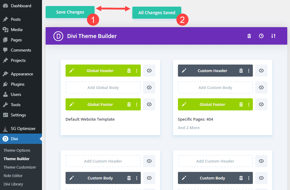
When it says All Changes Saved, your new overlapping logo will be live on your site.
Final Results
Let’s take a look at what your hard work got you, shall we? If you used the same freebie header layout pack as we did, you should see something similar to this.
Desktop
Mobile
Wrapping Up
Overlapping your logo with other elements on the page can be that pop of visual flair that your website has needed. It’s an easy, quick effect that you can pull off with a single line of CSS code right within the Divi builder. In fact, while we used the Theme Builder for this particular tutorial, you can apply this same code and effect to other images and elements on your page to shift them around and give them a visual boost.
What do you think about overlapping your Divi logo? Let us know in the comments!


Thanks so much for this; exactly what I needed!
Now I’ve tried adding an image in the footer, , and it too is overlapping the footer area. I can’t see how the css is being applied to the footer as well?