
A unique navigation design can give any website a bit of an edge. 4-corner fixed navigation, for example, is a good way to give viewers more options to interact with your website’s design. In fact, it adds another layer to your UX design throughout the site.
In this post, we are going to show you how to create your own 4-corner fixed navigation. We’ll explain how to create two slightly different styles, but these are just the tip of the iceberg. Since the navigation is created with Divi and its built-in elements, the customization possibilities are endless.
We hope this idea will inspire you to create amazing 4-corner fixed navigation designs for your upcoming Divi projects.
Let’s get started.
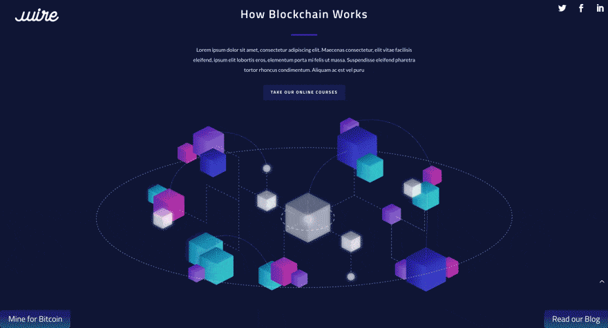
Previews
Let’s take a quick look at the 4-corner navigation we’ll be creating today. The first style places the buttons at the border of the screen, and the other has an interior float.
Style #1
Style #2

Subscribe To Our Youtube Channel
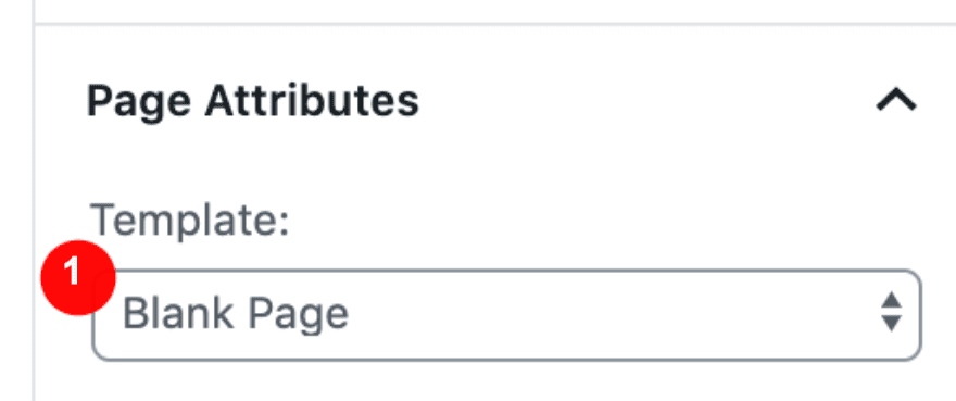
Create a New Blank Page
Open a new page and before editing with Divi, select ‘Blank Page’ in the Page Attributes. After that is done, enable the Divi Builder.
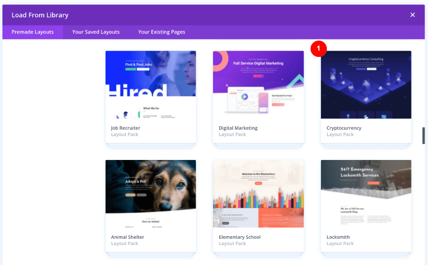
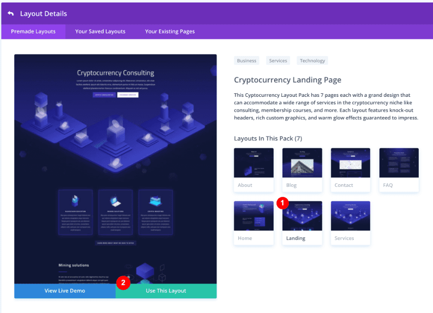
Upload Cryptocurrency Landing Page Layout
Once in the Divi Visual Builder, upload the Cryptocurrency Layout Pack’s landing page from the Premade Layouts tab.
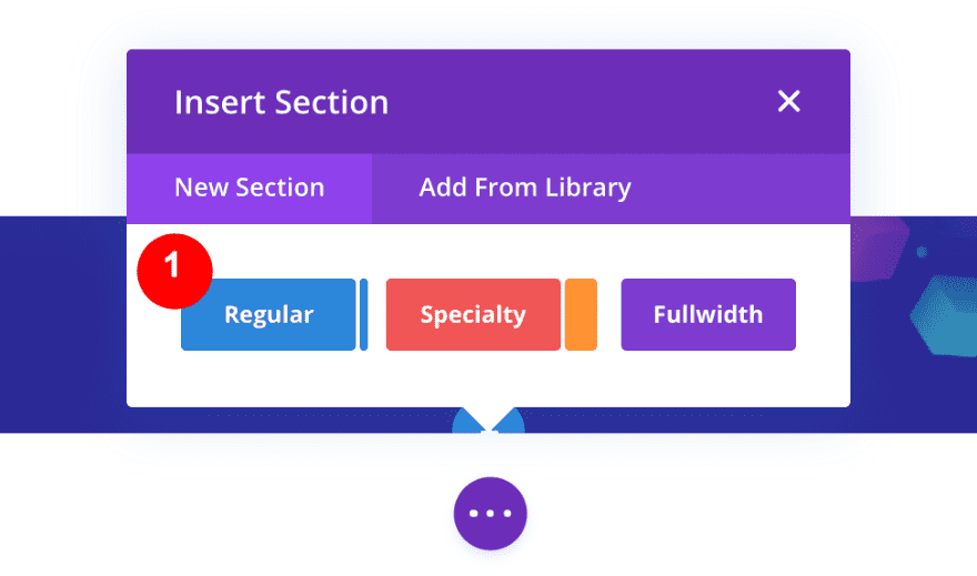
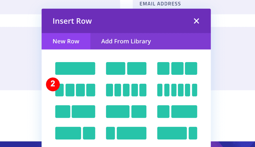
2. Create a New Section With a 4-Column Row
Add a New Regular Section With 4-Column Row
To create the 4 navigation items, we need a new section with a 4-column row. Scroll all the way to the bottom of the page and add a new regular section. Then, choose a row with 4 equally-sized columns.
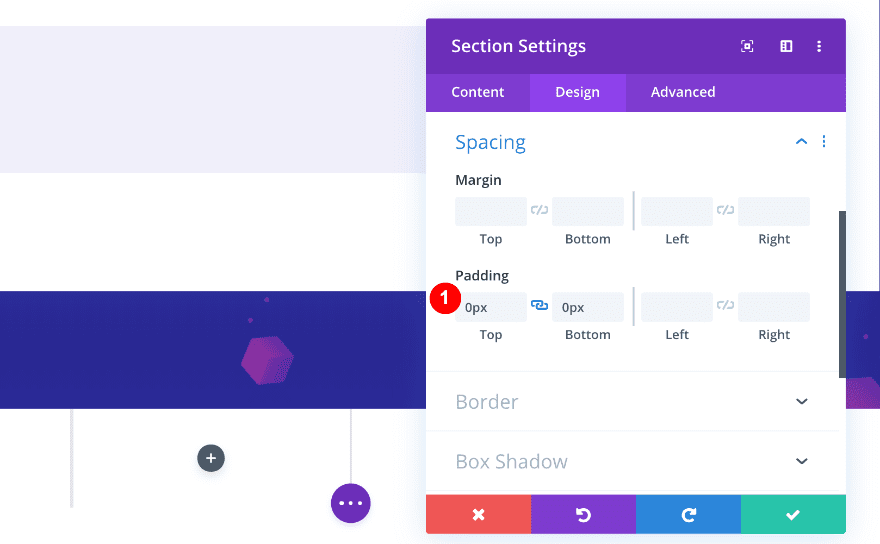
Remove The Default Padding of the Section
Before adding modules, make sure to remove padding of the section by adding ‘0px’ to the top and bottom. Also, doublecheck the section has no background color or gradient background.
- Top Padding: 0px
- Bottom Padding: 0px
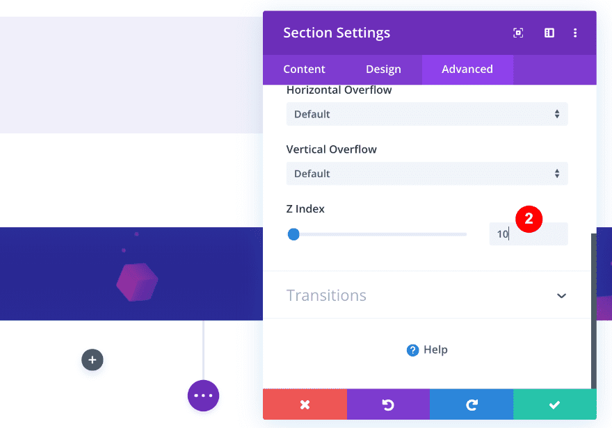
Increase the Z Index
We want this section to be above all the others as we scroll. That’s why we need to increase the Z Index value of the section. To do that, open the Advanced Tab and, go to the visibility settings and increase the Z Index.
- Z Index: 10
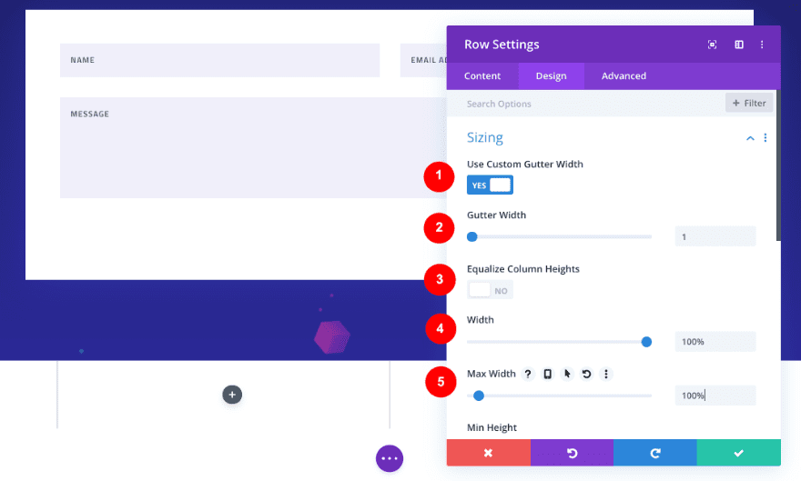
3. Adjust The Sizing of The Row
Next, we need to adjust the row’s sizing settings. Open the design tab and adjust the settings accordingly:
- Use Custom Gutter Width: Yes
- Gutter Width: 1
- Equalize Column Heights: No
- Width: 100%
- Max Width: 100%
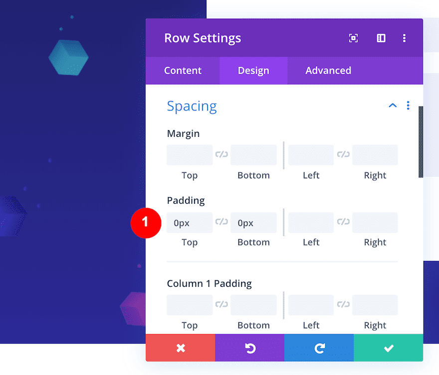
Remove The Default Padding of the Row
To make sure no space remains at the bottom of our page, remove the default padding of the row. In the Design tab, change the Spacing inputs to ‘0px’ for both top and bottom padding.
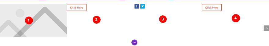
Add Modules to the Columns.
Now it’s time to add some modules to each column, starting from left to right.
- Column #1: Image
- Column #2: Button
- Column #3: Social Media Follow
- Column #4: Button
4. Style Each Column
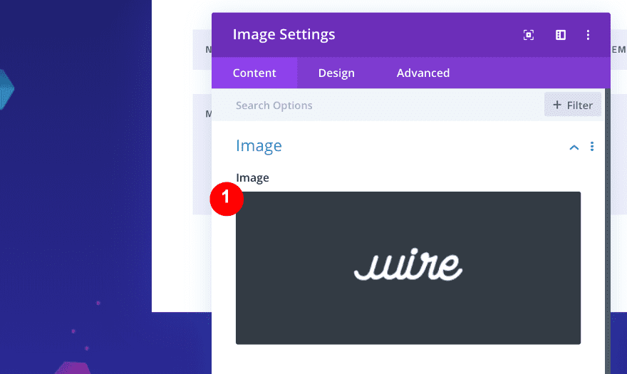
Column #1 – Image Module
Add a Company Logo
Open the Image Module in column #1. Upload your logo (width of 220px and height of 100px). Make sure it’s a transparent image where the logo is centered.
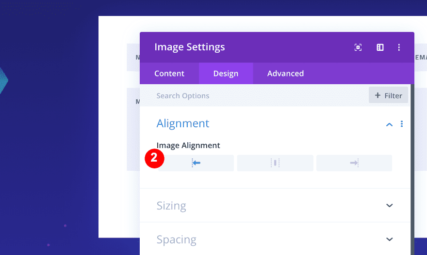
Align The Module
We want the logo to be placed at the top left corner of our page, so we need to align the module to the left. Open the Design tab in the Image Module and select left Image Alignment.
- Alignment: left
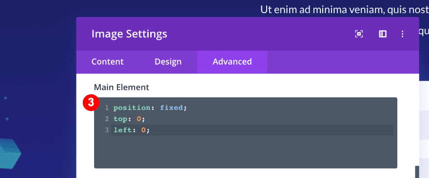
Add Custom CSS to Fix The Module’s Position
To make sure the position of the module stays fixed, go to the Advanced tab and add Custom CSS to the Main Element.
position: fixed;
top: 0;
left: 0;
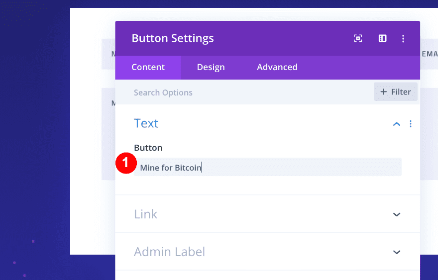
Add a Button
Now, in Column #2, add a Button Module.
Style the Button
In the Content tab, add text for your button.
- Content-Text: Mine for Bitcoin
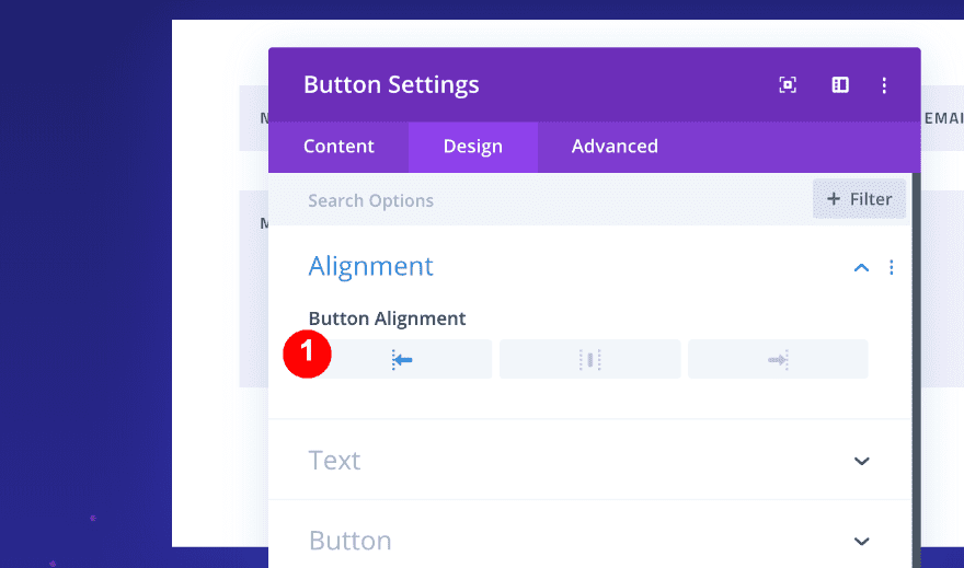
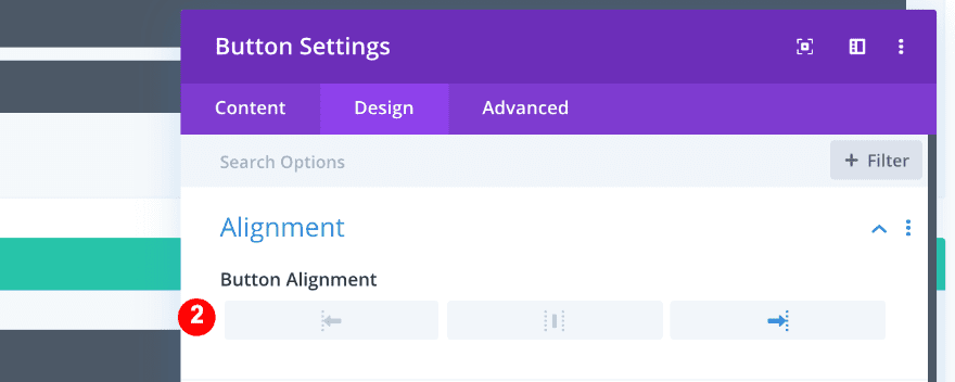
Next, in the Design tab, choose left Button Alignment.
- Alignment: left
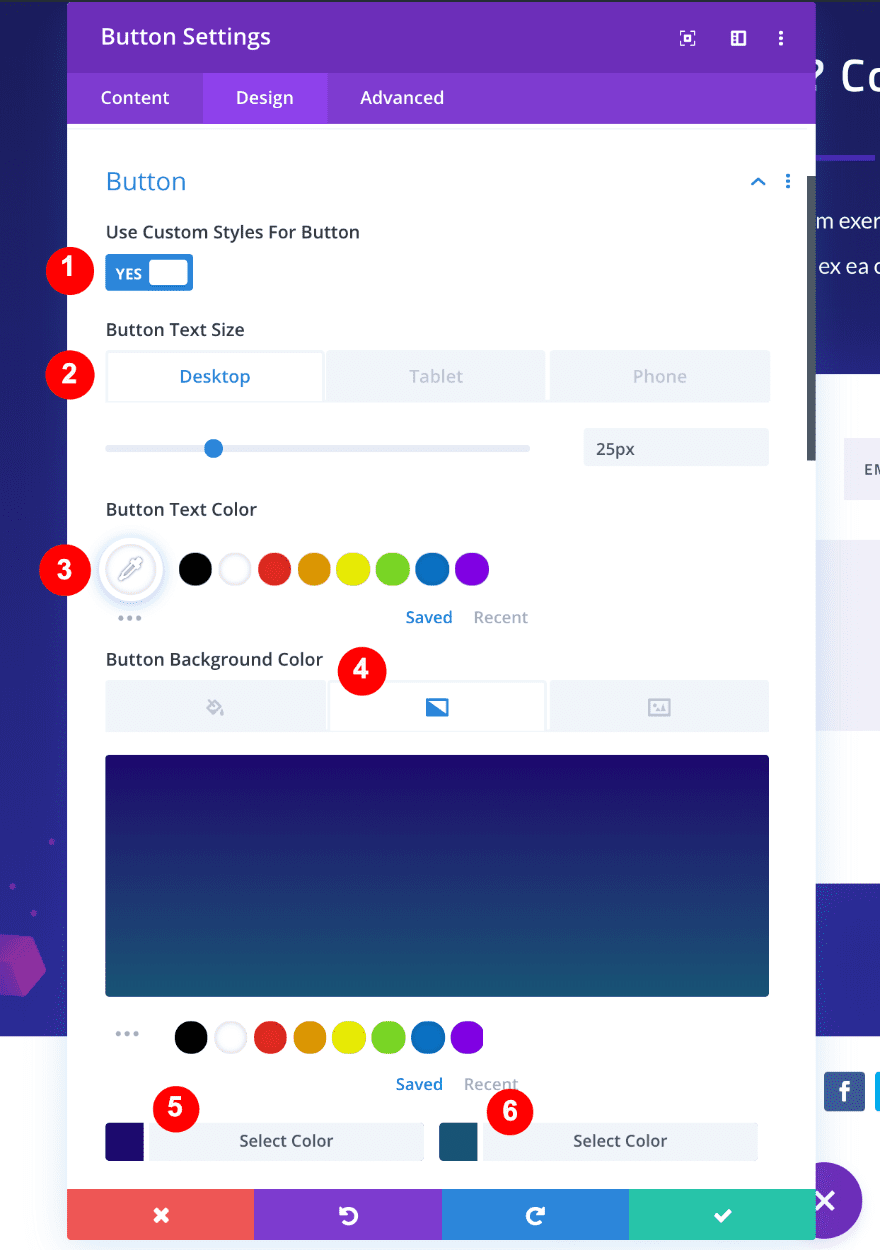
After that, slide the Custom Button Styles to yes and adjust the values accordingly:
- Custom Button Styles: Yes
- Button Text Size: Desktop; 25px, Tablet: 20px, Phone:20px
- Button Text Color: White, #ffffff
- Button Background Color: Gradient
- Top color:#1c076d, Bottom color: #185475
- Gradient Type: Linear
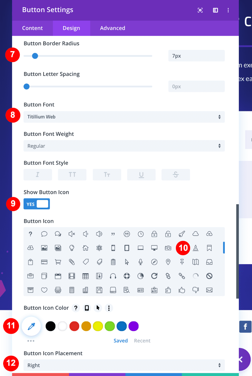
- Button Border Radius: 7 px
- Button Font: Tantillium Web (the same as the layout)
- Show Button Icon: Yes
- Button Icon: Traffic Cone
- Button Icon Color: White, #ffffff
- Button Icon Placement: Right
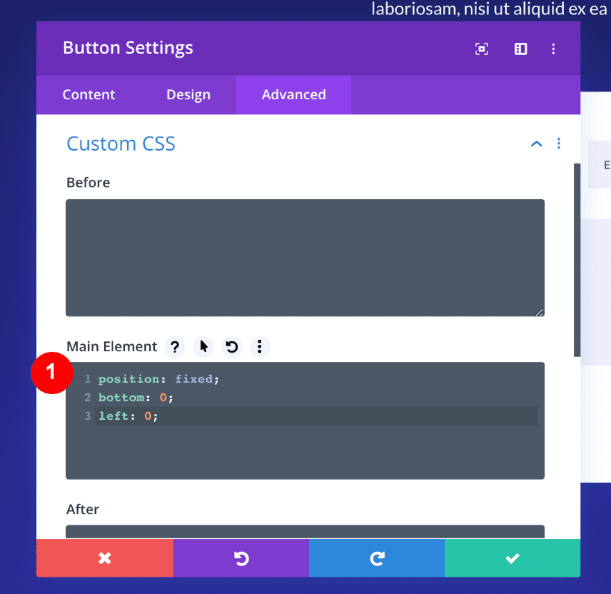
Add Custom CSS to Fix The Module’s Position
Finally, open the Advanced tab and add Custom CSS to fix the position of the module to the bottom left corner of the page.
position: fixed;
bottom: 0;
left: 0;
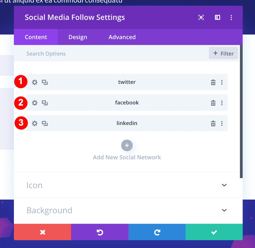
Add a Social Media Follow Module
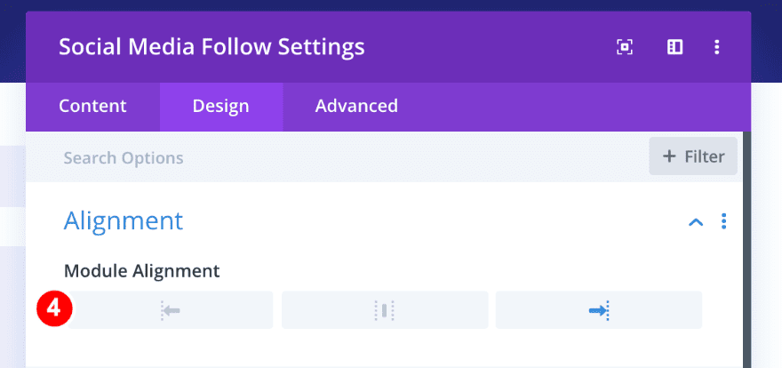
On to the third column. This time, we’ll need a Social Media Follow Module. Add three social networks of your choice.
Next, in the Design tab, choose right Module Alignment.
- Alignment: Right
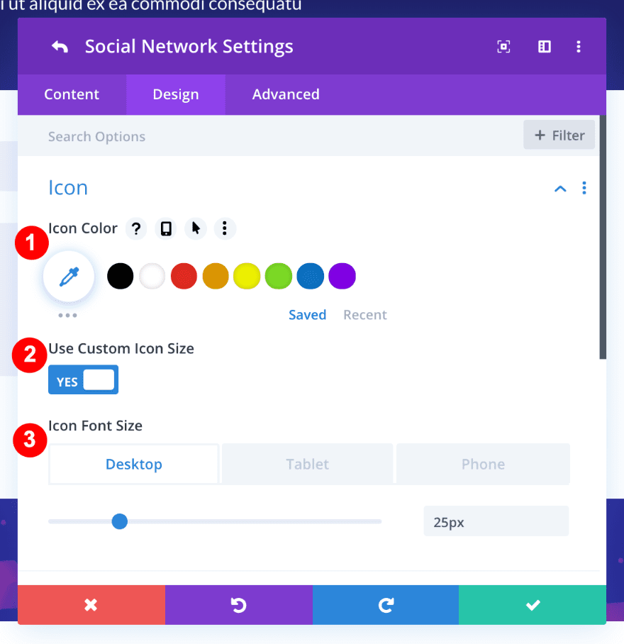
Style The Social Media Icons
Open the first social network’s individual settings, go to the design tab and change the icon settings accordingly:
- Icon Color: White #ffffff
- Use Custom Icon Size: Yes
- Icon Font Size: Desktop; 25px, Tablet: 20px, Phone:20px
- Background: None
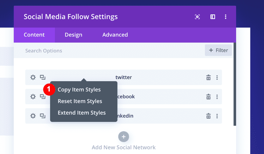
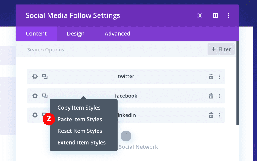
Copy and Paste The Item Styles
Go back to the main Social Media Follow window, right-click on the first item and select ‘Copy Item Styles.’ Then right-click on the two remaining social networks and paste the styles.
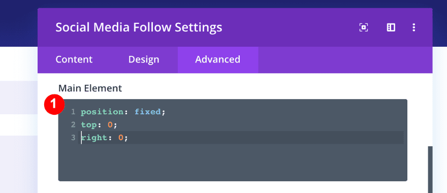
Add Custom CSS to The Module
Finally, in the Advanced Tab, add the following CSS code to make the module stick to the top right corner of the page:
position: fixed;
top: 0;
right: 0;
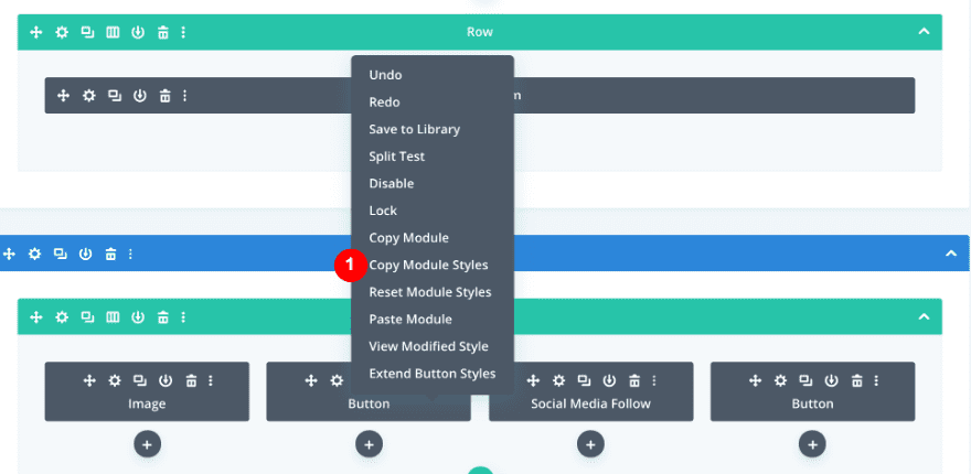
Copy The Module Styles from Module #2 and Adjust
In order to get the button in Module #4 to look exactly the same as the button in Module #2, we will use the ‘Copy Module Styles’ option. First, right-click on the Button Module in column 2, click on ‘Copy Module Styles’ and then paste it to Button Module in column 4.
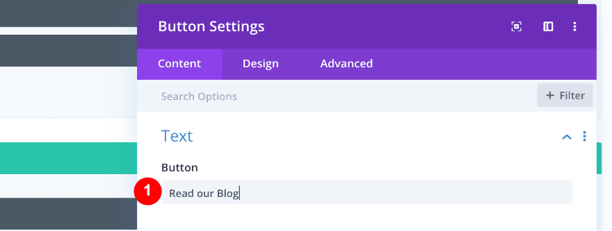
Now it’s time to change the settings in the Content tab. First, change the text content.
- Text: from “Mine for Bitcoin” to “Read our Blog”
Then, change the Button Alignment.
- Alignment: From left to right
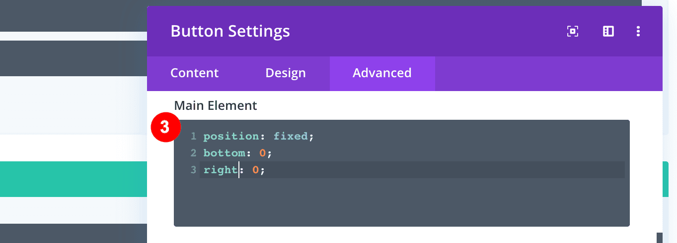
Finally, change the Custom CSS code in the Advanced tab:
- Change the code to:
position: fixed;
bottom: 0;
right: 0;
Outcome
5. Change the Custom CSS to Achieve The Second StyleExample
In the first style example, the corners are stuck to the corners. In order to get the second style, you just have to adjust the CSS code to make the corner modules float inwards just a bit.
Simply Adjust the Custom CSS in The Advanced Tab of All Four Modules
Module#1
position: fixed;
top: 1vw;
left: 1vw;
Module#2
position: fixed;
bottom: 2vw;
left: 2vw;
Module#3
position: fixed;
top: 3vw;
left: 2vw;
Module#4
position: fixed;
bottom: 2vw;
right: 2vw;
Final Result
Conclusion
This tutorial only skims the surface of what you can do with 4-corner fixed navigation using Divi. Ultimately, you can choose any module for each column, as long as you keep the Custom CSS we provided. We hope that this creative tutorial will inspire you to make your own 4-corner fixed navigation. If you have any questions or suggestions, make sure you leave a comment in the comment section below!


It looks great when scrolling however whenever I hover over any of the buttons, they seem to jump around and flicker. Its not clear to my why this is happening.
Very goods thanks. Some time ago I was trying to do that but with the sandwich menu in the upper right corner. Will it be possible?
Hi Percy, you can use a two-column row to create the bottom two buttons and use a regular (transparent) nav bar at the top with a fixed hamburger icon for a mega menu.
is it possible to change fixed navigation background color? I would love to do that.kindly reply my massage.anyways thanks for your guideline
Hi Shipon, you can change that color in Appearance > Customize > Header and Navigation. Good luck
Oh sweet, that’s a cool idea! Thanks for the tutorial, I will definitely give that a try.
Nice idea, but….
Why is there no demo page to see this in action? A few years ago Elegant themes users were giving feedback on columns like this that these kind of tutorials are waaaaay better when they offer a live example. I’m surprised it’s still not a policy.
You made the site, took screenshots, did all the work! Now just please give us a link to it!
Thanks-
I believe that is asking too much. It is enough that they prepare us step by step so that we can do it ourselves. It is better to be taught to fish than to bring the fried fish to the table. When you start doing the tutorial you exercise your creativity. Thank you very much Elegant Themes.
I agree. It will be also great to create a downloadable link whereby users can download it and upload to their library and make changes to suite their design. Most probably won’t remember all the steps to get this done. A downloadable layout will be an ideal way to go.
I second Jeff’s comment. This looks great but I would like to easily see how it performs in mobile.
Thanks a bunch Orana Velarde. This is very useful and has sparked a few new ideas!
Thanks so much Jeremiah! I’m glad it sparked your creativity.
Merci simple et éfficace
That is pretty neat! I have a few ideas about what would be a great fit for those corner navigation spots. Thanks again for an awesome tutorial!
Nice one.
Brilliant!