
Tabs definitely come in handy for making important information available in a concise area of your website. This reduces the need for the user to scroll through long page content. Divi’s tab module is easy to use and great for toggling through simple content on click.
But in this tutorial, I’m going to show you how to convert entire Divi rows into hover tabs. I’ll also show you how to create both horizontal and vertical tabs as well. This will unlock the power of Divi to design complete row layouts with multiple modules for each tab content area. No plugin needed!
Let’s get started.
- 1 Sneak Peek
- 2 Download the Divi Rows Hover Tabs Layout for FREE
- 3 Download For Free
- 4 What You Need to Get Started
-
5
Creating Horizontal Hover Tabs using Divi Rows
- 5.1 Row Background, Padding, and Box Shadow
- 5.2 Adding Content to the Row
- 5.3 Creating the Tab
- 5.4 Section Height and Spacing
- 5.5 Creating the Second Row of Tab Content
- 5.6 Adding Opacity Filter Hover Effect for the Second Row
- 5.7 Creating the Third Row of Tab Content
- 5.8 Overlapping the Rows with Absolute Positioning
- 5.9 Changing the Order of the Rows on Hover with Z Index
- 5.10 Final Result
- 6 Creating Vertical Hover Tabs
- 7 Final Thoughts
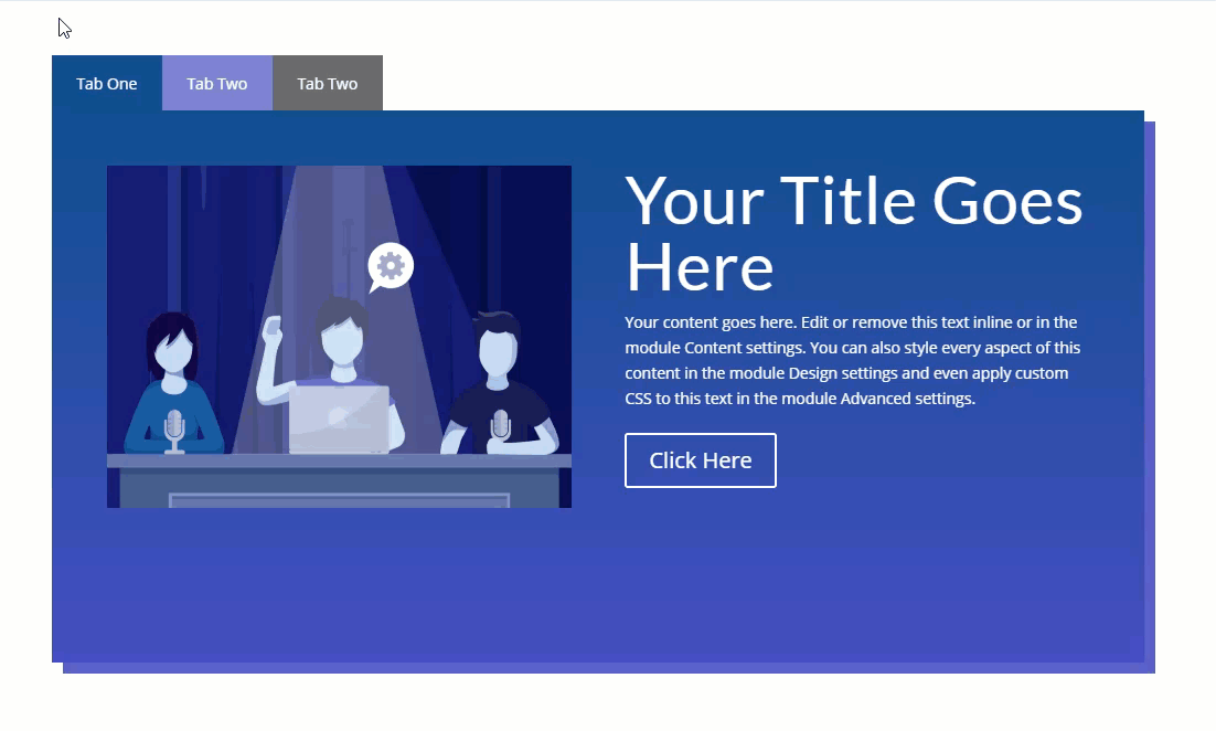
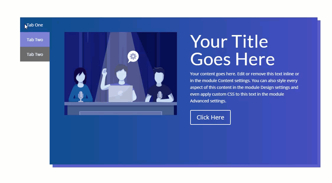
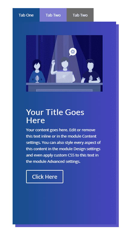
Sneak Peek
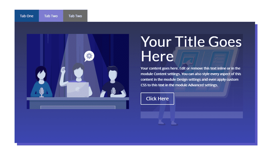
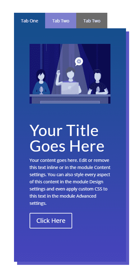
Here is a quick look at the horizontal and vertical hover tabs we will build together in this tutorial.
Download the Divi Rows Hover Tabs Layout for FREE
To lay your hands on the designs from this tutorial, you will first need to download it using the button below. To gain access to the download you will need to subscribe to our newsletter by using the form below. As a new subscriber, you will receive even more Divi goodness and a free Divi Layout pack every Monday! If you’re already on the list, simply enter your email address below and click download. You will not be “resubscribed” or receive extra emails.

To import the layout to your page, simply extract the zip file and drag the json file into the Divi Builder.
Let’s get to the tutorial shall we?
Subscribe To Our Youtube Channel
What You Need to Get Started
To get started, you will need to have the following setup:
- The Divi Theme installed and active
- A new page created to build from scratch on the front end (visual builder)
- Three images to be used for mock content
After that, you will have a blank canvas to start building some hover tabs in Divi.
Creating Horizontal Hover Tabs using Divi Rows
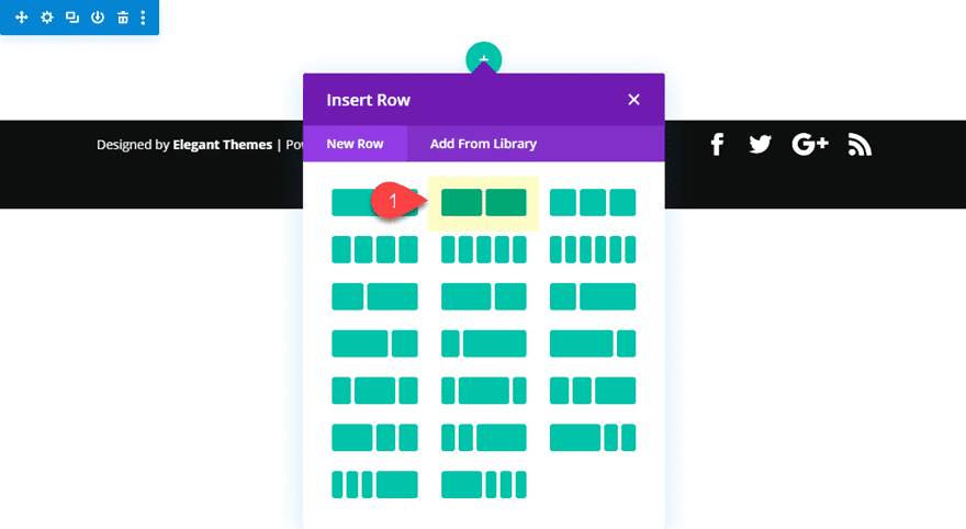
To get started, create a new regular section with a two-column row.
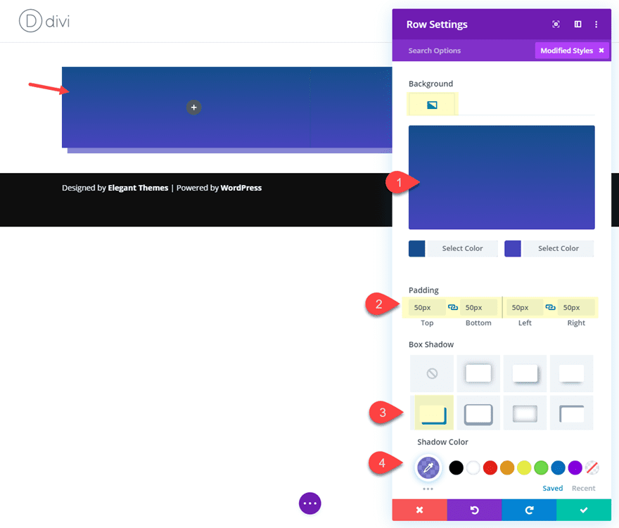
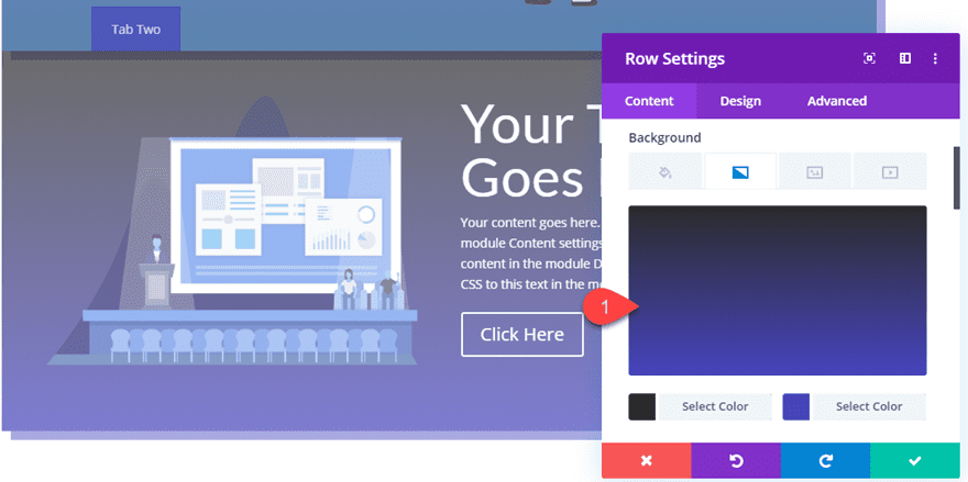
Row Background, Padding, and Box Shadow
Before we add our modules, let’s customize the row settings a bit first. We will need to come back to the row later to position it for our tab functionality.
Open the row settings and update the following:
Background Gradient Left Color: #284f91
Background Gradient Right Color: #4646c4
Padding: 50px top, 50px bottom, 50px left, 50px right
Box Shadow: see screenshot
Box Shadow Color: rgba(70,70,196,0.66)
Adding Content to the Row
Now we are going to add some mock content to our row. Keep in mind you can add any combination of columns and modules for your content area.
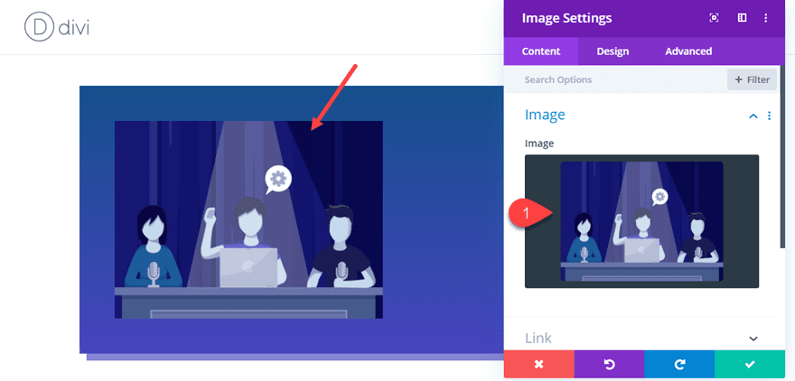
In column 1, add an image with an image module. I’m using one from the Design Conference Layout Pack.
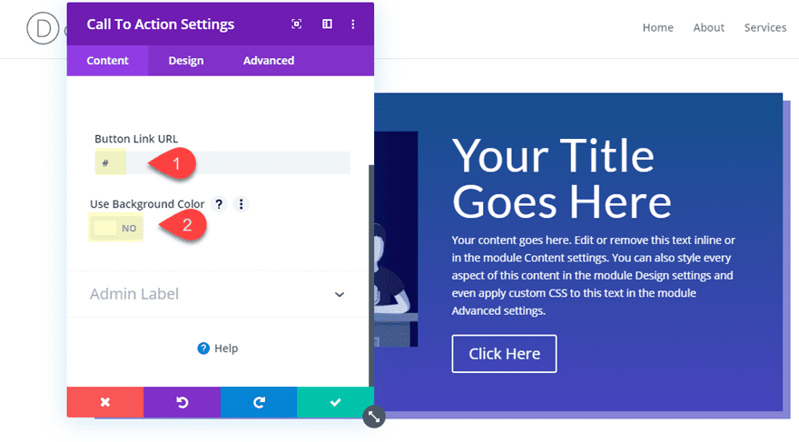
In the right column, add a call to action module and update the following:
Button Link URL: # (just to display the button for now)
Use Background Color: NO
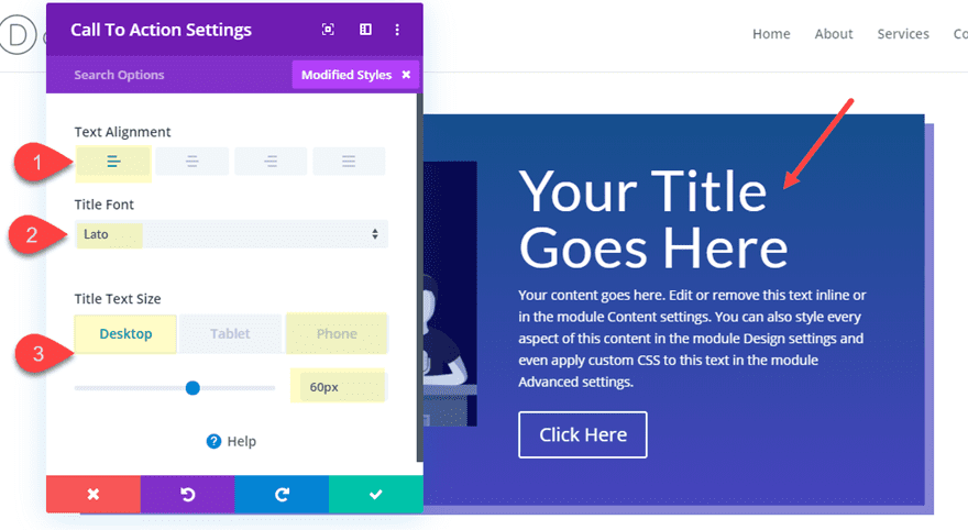
Text Alignment: left
Title Font: Lato
Title Text Size: 60px (desktop), 50px (phone)
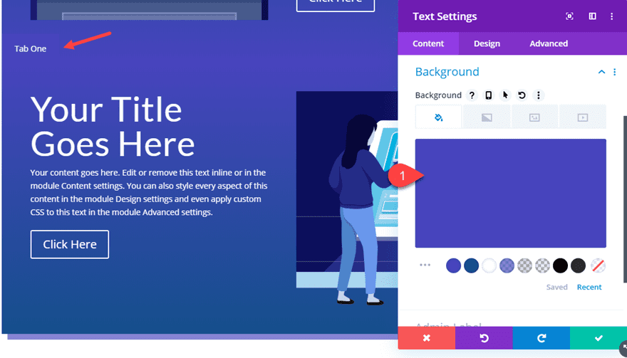
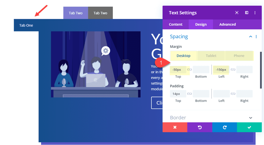
Creating the Tab
To create the actual tab users will hover over to reveal this row content, we need to create a text module and position it at the top right with some custom CSS.
Go ahead and add a new text module under the image in column 1 and update the following:
Content: “Tab One”
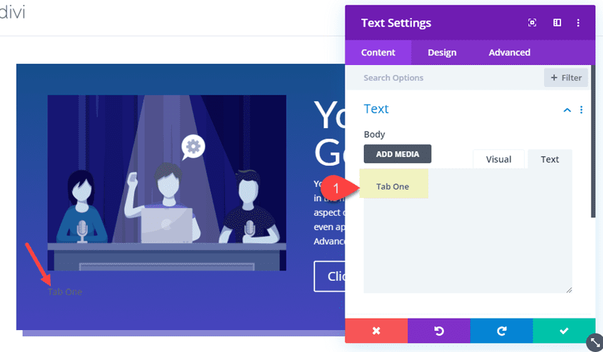
Background Color: #284f91 (this should match the left gradient color of the row)
Text Text Alignment: center
Text Text Color: #ffffff
Width: 100px
Height: 50px
Margin: -100px top, -50px left
Padding: 14px top
Finally, add the following custom css to the main element to give it an absolute position at the top of the row.
position: absolute !important;
top: 0;
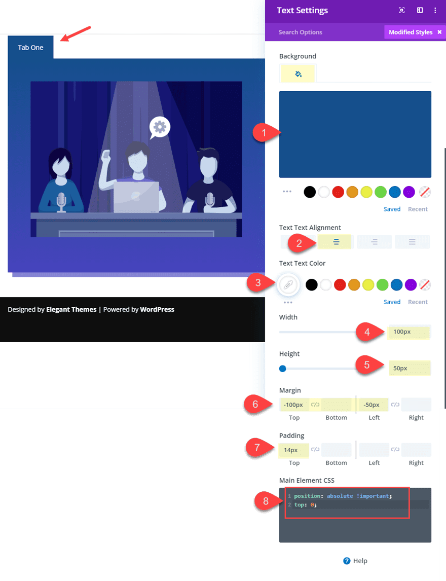
This css plus the custom margins we added will make sure the tab is positioned exactly at the top left of the row. It is important that the tabs actually sit above the row so that the user can hover over it later.
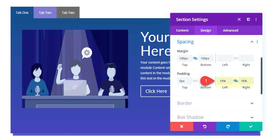
Section Height and Spacing
Now before we continue to create the remaining rows and tabs, let’s give our rows a little breathing room by adding some top and bottom margin to the section. For this design, it is important that we use margins to space out our section because we will be giving our section a set height as well. We need to give our section a set height because we want our rows to span the full height of our section. This means that each of our rows (the tab content) will have the same height of our section. So it is best that each of the rows have a similar amount of content or there will be unwanted negative space in some of the row tabs. This should make more sense later on.
For now, open the section settings and update the following:
Height: 500px (desktop), 900px (tablet), 750px (phone)
Margin: 100px top, 100px bottom
Padding: 0px top, 0px bottom
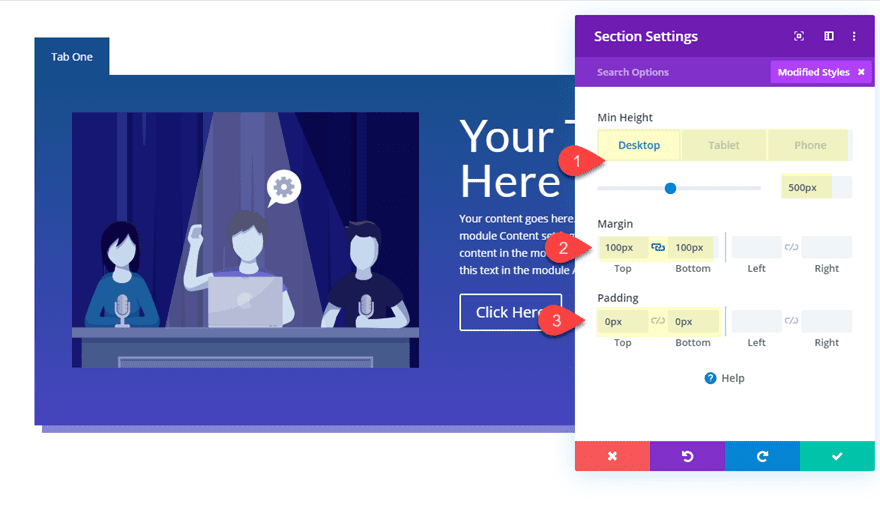
Notice that the height of the section will need to be adjusted to account for the longer content space when the row columns stack on mobile. So there will need to be some tweaking to this height for your own needs.
Now save your settings and let’s get back to adding those more rows.
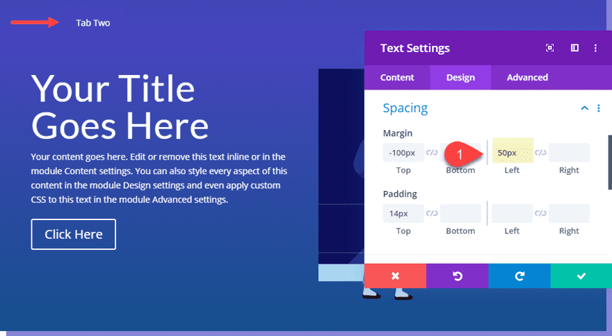
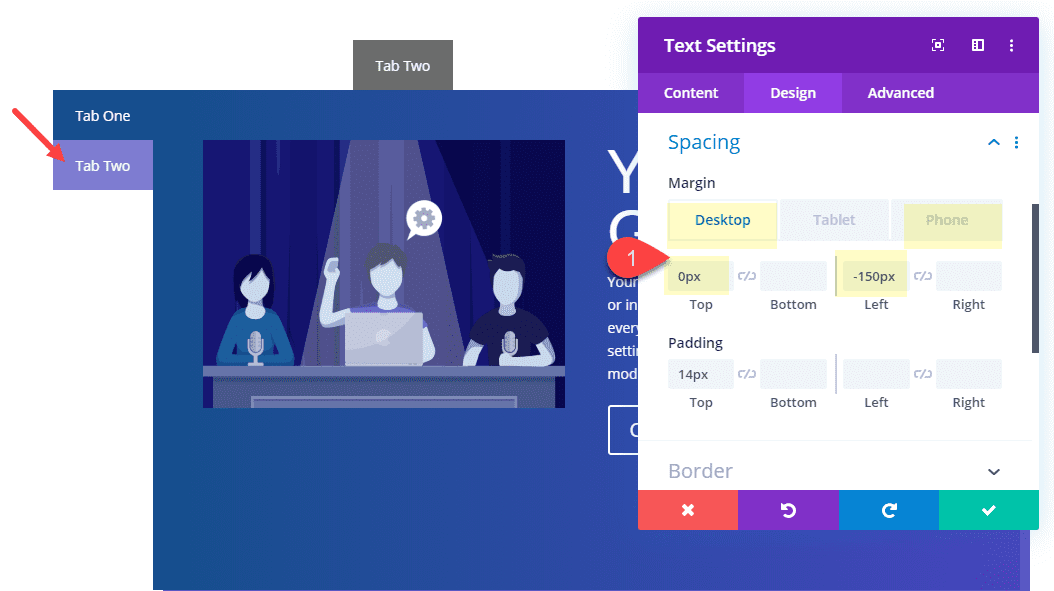
Creating the Second Row of Tab Content
To create the second row, duplicate the row you created earlier. Move the text module to column 1 and the image to column 2. Then update the image with a new one. This will help you get an idea of what different content looks like on each tab.
Open the settings of the second row and switch the background gradient colors by hovering over the background preview area and click the little “switch” icon.
Then open the settings of the text module used to create the tab in column 1 and give it a color that matches the new top gradient.
Background Color: #4646c4
Then we need to move the tab over to the right so that when this row overlaps the row above, you can see the tab directly to the right of the tab in the first row.
Margin: 50px Left
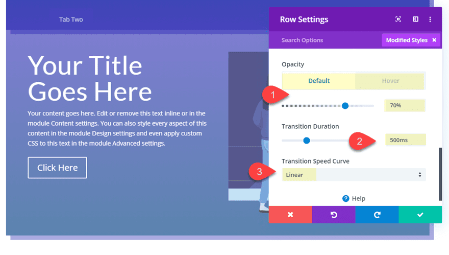
Adding Opacity Filter Hover Effect for the Second Row
For the row, we can add an opacity filter hover effect so that there is a nice hover transition when hovering over the tab and revealing the content of the row.
Open the row settings and add the following filter:
Opacity: 70% (default), 100% (hover)
Then add a transition duration and speed curve for the opacity filter hover effect.
Transition Duration: 500ms
Transition Speed Curve: Linear
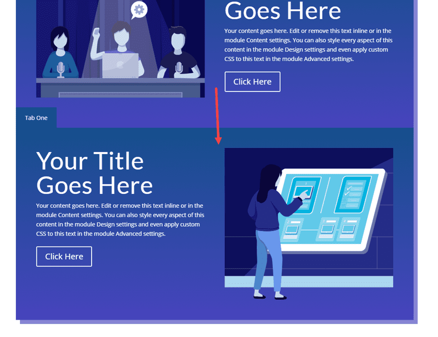
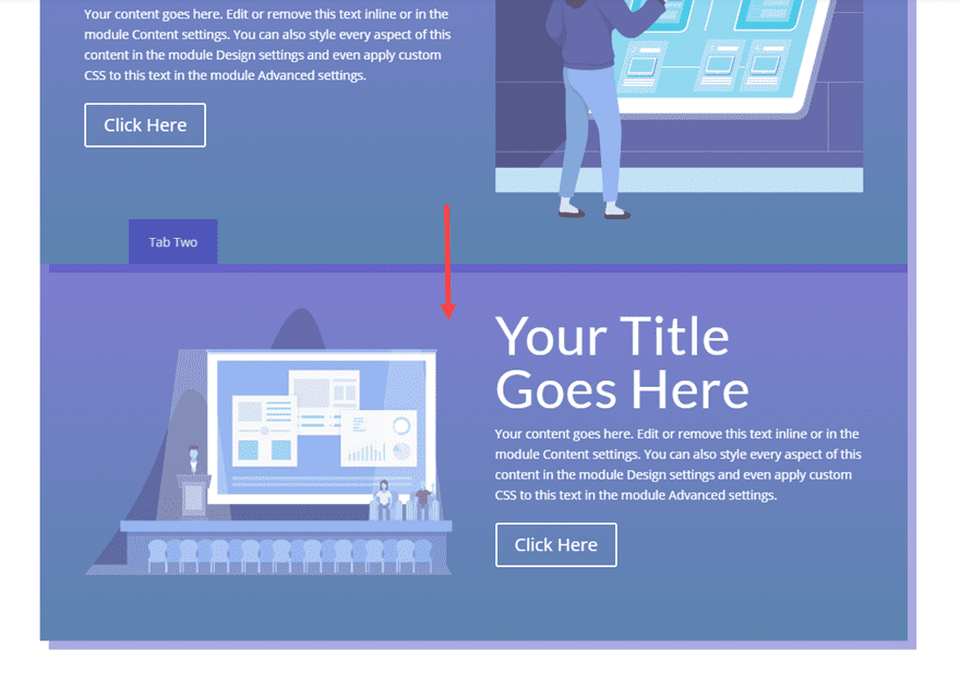
Creating the Third Row of Tab Content
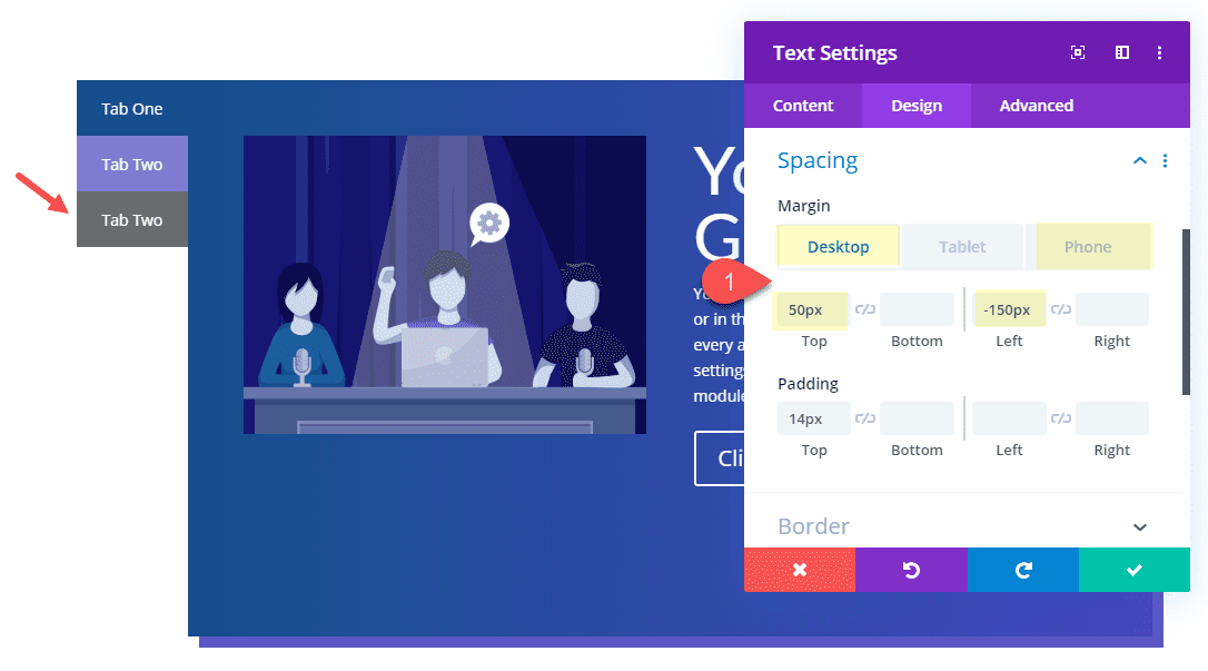
Now we can add our final row of tab content. To do this duplicate the second row you just created. Then move the text module to column 1 and the image to column 2. And update the image module with a new image.
Update the Row settings with a new background gradient.
Background Gradient Left Color: #333333
Background Gradient Right Color: #4646c4
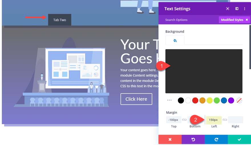
Next open the setting of the text module used to create the tab in column 1 and update the color and margin.
Background Color: #333333
Margin: 150px left
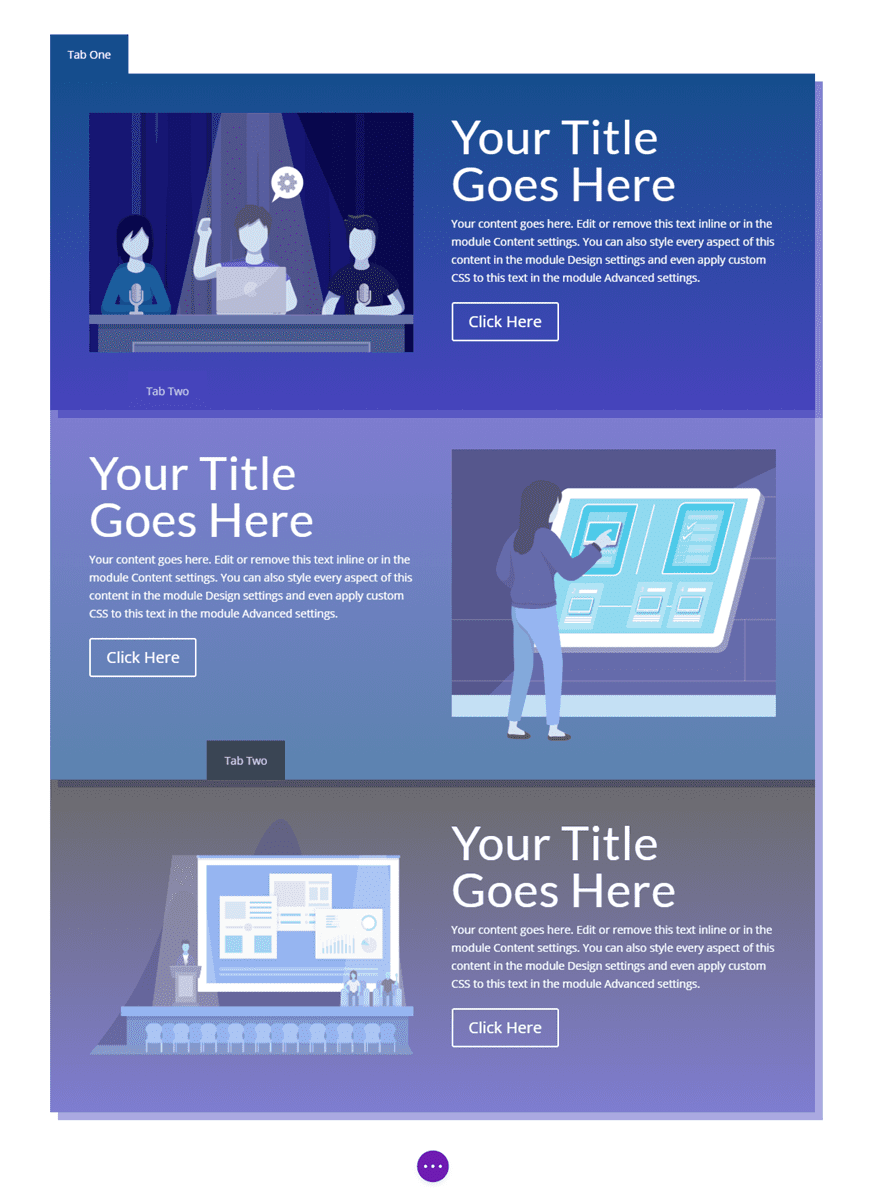
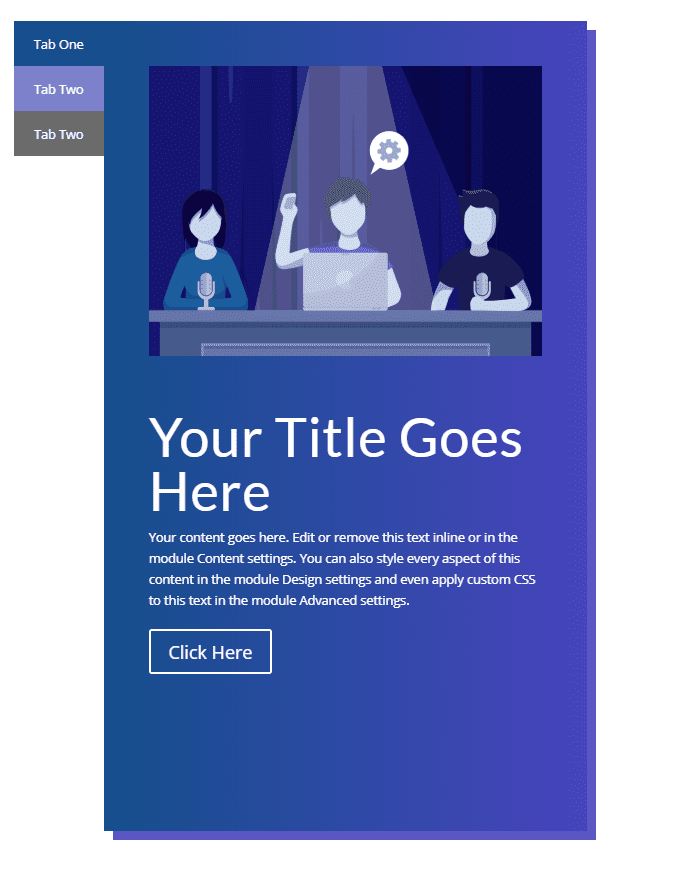
This is what your page should look like before we position our rows to overlap each other.
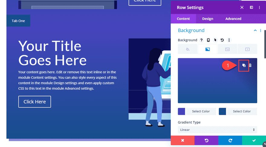
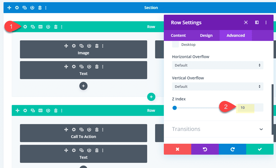
Overlapping the Rows with Absolute Positioning
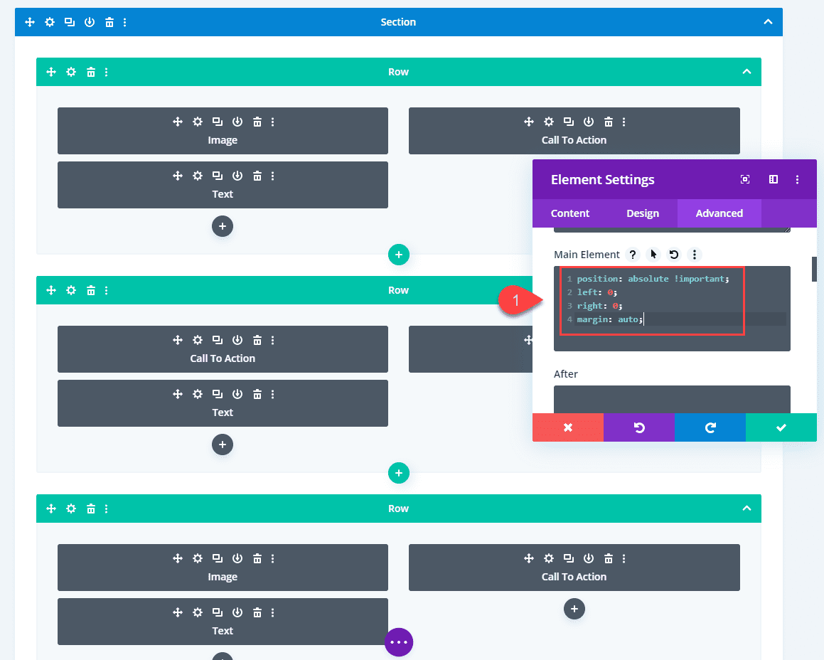
To overlap our rows, we need to use absolute positioning. Then we will use the Z index option to bring each row to the forefront when hovering over the tabs. But since we are giving our rows an absolute position (and the parent/section has a set height), we can add 100% height to each of the rows so that they span the full height of the section.
Here’s how to do it.
First, deploy wireframe mode. Then use multiselect to select all three of the rows and open the settings of one of them to deploy the element settings modal. Then update the height to 100%.
Height: 100%
This will set the height for all three rows to 100%.
Then add the following custom CSS to the Main Element:
position: absolute !important;
left: 0;
right: 0;
margin: auto;
Now deploy desktop view mode to see how the rows are overlapping nicely to create our tabs.
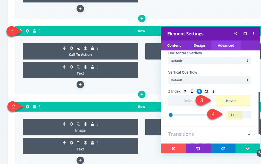
Changing the Order of the Rows on Hover with Z Index
Right now you may have noticed the third row/tab is at the forefront. So we need to reorder the rows using Z Index so that the first tab shows first until you hover over another tab.
To do this, go back to wireframe view mode and open the settings for the first row you created (with tab one). Then update the z index as follows:
Z Index: 10
Next use multiselect to select the second and third row. Then open the element settings modal and add the following z index on hover to both rows.
Z Index: 11 (hover)
That’s it. Let’s check out the final result.
Final Result
The reason this works is because techniqually each tab (text module) is a part of each row even though they are positioned above and outside of the row. That is why hovering over a tab will display the row it is contained in.
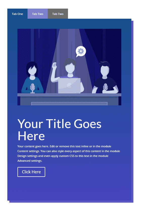
And here is how it looks on mobile.
Creating Vertical Hover Tabs
If you want to add vertical tabs to the rows, all you really need to do is reposition the text modules used to create each tab. We will also need to tweak the size of our rows and section spacing to make room for the tabs.
Here’s what to do.
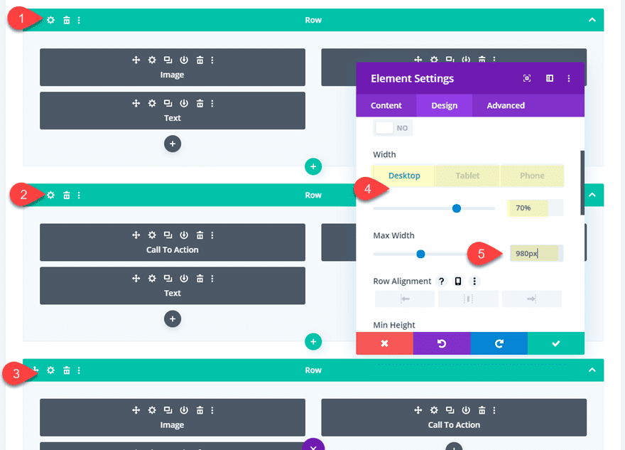
Go ahead and duplicate the section containing the hover tabs we just built so you have a new design to work with.
Then open the section settings and update the following:
Padding: 10% left, 10% right
Then use multiselect to select all three rows and update the element settings with the following:
Width: 70% (desktop), 70% (tablet), 80% (phone)
Max-Width: 980px
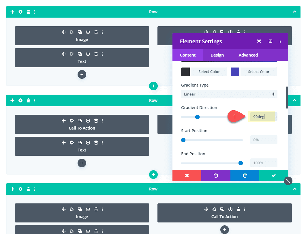
Then update the gradient Direction to 90deg for all three blurbs so that when we position the tabs on the left, the left gradient color will blend with the tab background color.
Gradient Direction: 90deg
Now it is time to position our text module tabs to the left of our rows to get the vertical tabs we want.
Open the text module tab setting in the first row and update the following:
Margin (desktop): -50px top, -150px left
Margin (phone): -100px top, -50px left
The margin setting for phone is to bring the tab back above the row for a horizontal tab display.
Next, open the settings for the text module tab in the section row and update the following:
Margin (desktop): 0px top, -150px left
Margin (phone): -100px top, 50px left
And for the final tab in the third row, update the following:
Margin (desktop): 50px top, -150px left
Margin (phone): -100px top, 150px left
Final Result
Now let’s check out the final result.
And here it is one tablet and phone.
Final Thoughts
With a little creative thinking and the power of Divi, you can create some pretty cool custom hover tabs using Divi rows. There are a few limitations to what you can display. For example, with this setup all of the rows must be the same height as the section. But, for not needing to use a plugin, I think this is a great solution. And don’t forget, since you can use Divi rows for your content, there are a ton of ways you can use these hover tabs in your next project.
I look forward to hearing from you in the comments.
Cheers!


Is it possible to create more than one tab?
I adjusted the margin but it’s still off and tends to float on its own
Good morning and sorry for my terrible English,
I need your help:
how do I get to a single menu tab? How should I write the link?
Example:
I have the tabs module with tab 1, tab 2 tab 3
How can I go from menu to reach the section and open tab 3?
Thanks
This is really cool and I’m now thinking about ways to implement this. I assume, word count wise, that this would be a total of all the modules? Just bc Google loves long content, lol. But really interesting option, thanks for the directions and the download!
How would this affect Google Indexing?
Got stuck at the Content: “Tab One” part as that option is not available in the text module portion of Divi. There is a tabs module, but I can’t go further at this point unless I’m missing something.
Johnny,
Sorry for the confusion. It should have read “Body: Tab One” instead of Content. Basically all I was trying to convey was that you needed to add the text “Tab One” to the text module body content. It doesn’t have to be “Tab One”. It could be any label text your want to display on your tab.
I was wondering this, too.
Good tutorial but you must add a background (also image is fine) to rows/tabs because otherwise, you will see messy overlapped elements/texts.
Also, be careful that adding too many rows will severely put to the test your CPU and your website won’t load smoothly as normal. I say you this because I’ve just created more than 20 rows/tabs.
Cheers!
Jason:
Thanks. It worked…Trying out the layout…. My first site on Divi and I am really loving the whole experience… Any other links to useful layouts like this would be appreciated..
Thanks
oke,
Glad this was helpful. There are a lot of great tutorials like this under our Divi Resources category here: https://www.elegantthemes.com/blog/category/divi-resources
I downloaded the layout file…. but couldnt load up the JSON file.. I got his response… File can not be uploaded in this context
Please advise!
oke,
Please use the portability feature when using the Divi Builder on a new page to import the layout. Or you can just drag it into the builder.
Thanks Jason Tabs are a beautiful way to show in web. With Divi and this post may be now easier.
Looks nice, but on my mobile the tabs go wired…
@jason – Nicely done. Thank you for taking the time to share…
Please make a video for this, Jason!
The video is coming soon. Thanks
Waiting until Tabs can contain actual rows/sections/modules without having to use a shortcode.
Thanks a bunch for all these time-saving work. <3
Thanks, It was really needed.
Thanks Jason, great job on your walk through! Would this work when a user clicks on the tab and moves the mouse somewhere else, or only when the mouse hovers over the tab? (not the expected result). The second scenario would not allow for the tabs to be interactive, but for informational purposes only. Sorry I didn’t read every detail of the post, but skimmed through. These posts are so amazing as I can come back here later if I need this in a future project.
Daniel,
There is no click functionality here. The tabs (and row) only show when hovering over them. Thanks.
Although you have given us a layout here we can download we really need this be standard as part of the tabs module to begin with.
It seems after we get the all important Theme builder update we need to look at a whole bunch of these modules and give them new features. Even the contact form module can use an update so we can add file support.
I fully agree, some of the modules, specially tabs, need updates to be on the same standard as newer divi features, and yes, theme/menu/header/footer builder should be by far the highest priority.
That’s a good article. I’ve been working with divi for a year now and I’m very happy. Giving this information to people like me is a positive point for you. Thank’s