
Progress Bar Indicators can add a nice touch to your website, boosting UX with a useful (and fun) interaction. Normally, progress bars stand alone at the top of the page without much connection to the actual content of the page. The user simply has a visual indicator of where they are on the page. But, today, we are going to take this functionality to another level.
In this tutorial, we are going to show you how to combine a scroll progress bar with a fixed navigation menu in Divi. This design is unique in that the progress bar correlates with the width of the menu buttons. And because the width of the menu buttons is equal (in percentages) to the height of the scrollable sections of content on the page, each button will be filled by the scroll progress bar precisely as the user reaches the button’s corresponding section. And if that isn’t enough, we’ll make each button an anchor link to those corresponding sections as well, for an added UX bonus!
This design would be perfect to bring a user through a landing page describing the steps of a process. Well, you’ll see.
Let’s get started!
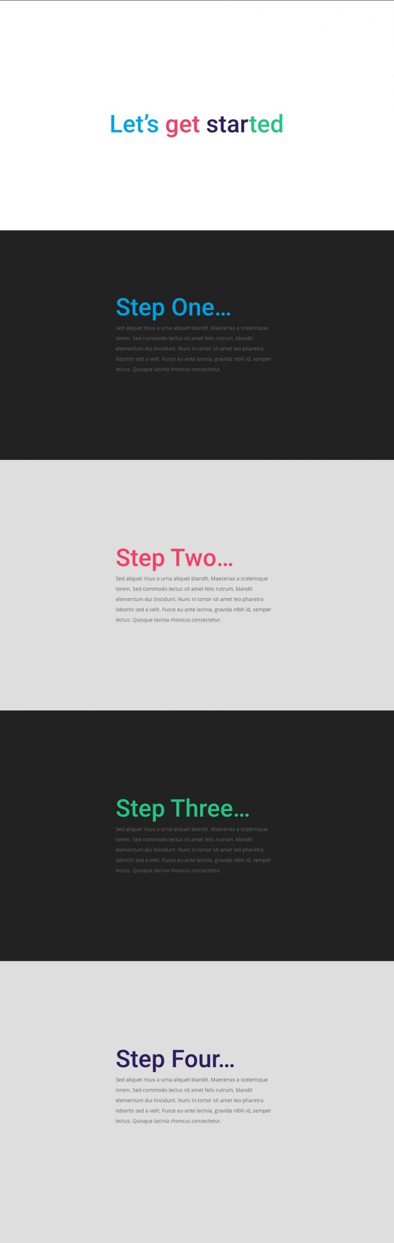
Sneak Peek
Here is a quick look at the design we’ll build in this tutorial.
Download the Layout for FREE
To lay your hands on the designs from this tutorial, you will first need to download it using the button below. To gain access to the download you will need to subscribe to our newsletter by using the form below. As a new subscriber, you will receive even more Divi goodness and a free Divi Layout pack every Monday! If you’re already on the list, simply enter your email address below and click download. You will not be “resubscribed” or receive extra emails.

https://youtu.be/Kf-ciVKEZFI
Subscribe To Our Youtube Channel
To import the section layout to your Divi Library, navigate to the Divi Library.
Click the Import button.
In the portability popup, select the import tab and choose the download file from your computer.
Then click the import button.

Once done, the section layout will be available in the Divi Builder.
Let’s get to the tutorial, shall we?
What You Need to Get Started

To get started, you will need to do the following:
- If you haven’t yet, install and activate the Divi Theme.
- Create a new page in WordPress and use the Divi Builder to edit the page on the front end (visual builder).
- Choose the option “Build From Scratch”.
After that, you will have a blank canvas to start designing in Divi.
Part 1: Creating the Fullscreen Section Page Layout
The Top Section
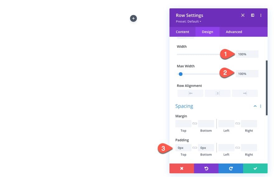
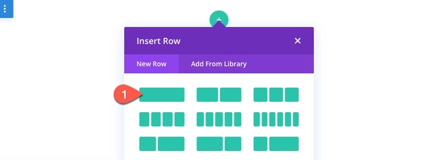
To get things started, add a one-column row to the section.
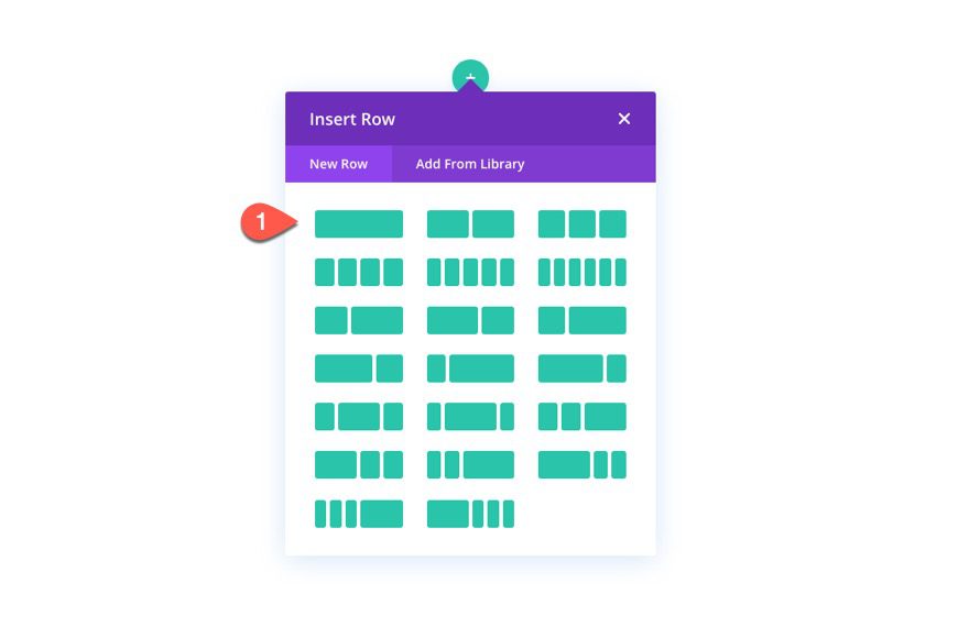
Before adding a module, update the row settings as follows:
- Width: 100%
- Max-Width: 100%
- Padding: 0px top, 0px bottom
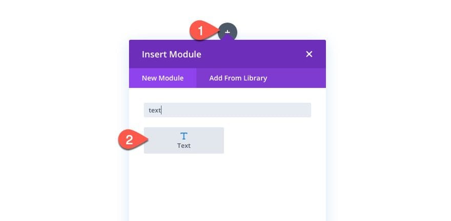
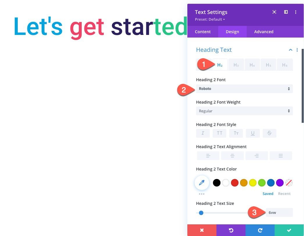
Inside the row, add a text module.
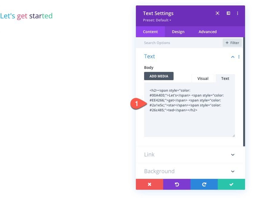
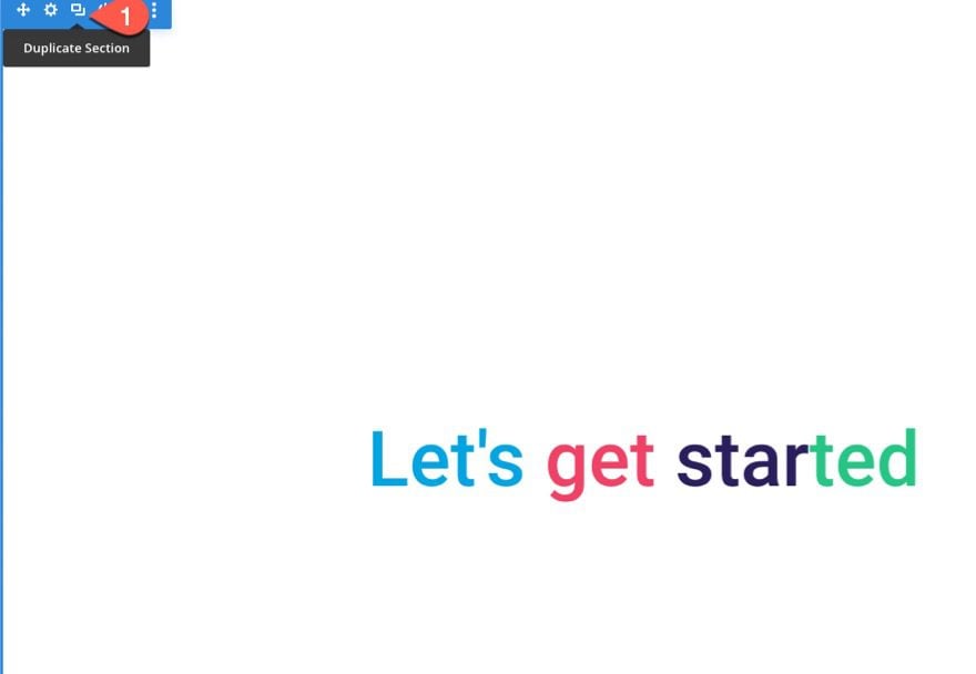
Then open the settings for the text module and paste the following HTML to create a colorful heading:
<h2><span style="color: #00A4E0;">Let's</span><span style="color: #EE4266;>get</span style="color: #2a1e5c;>star</span><span style="color: #26c485;">ted</span></h2>
Under the design tab, update the text alignment to center.
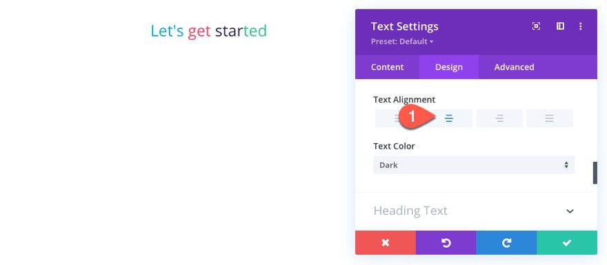
The update the following H2 Heading styles:
- Heading 2 Font: Roboto
- Heading 2 Text Size: 6vw
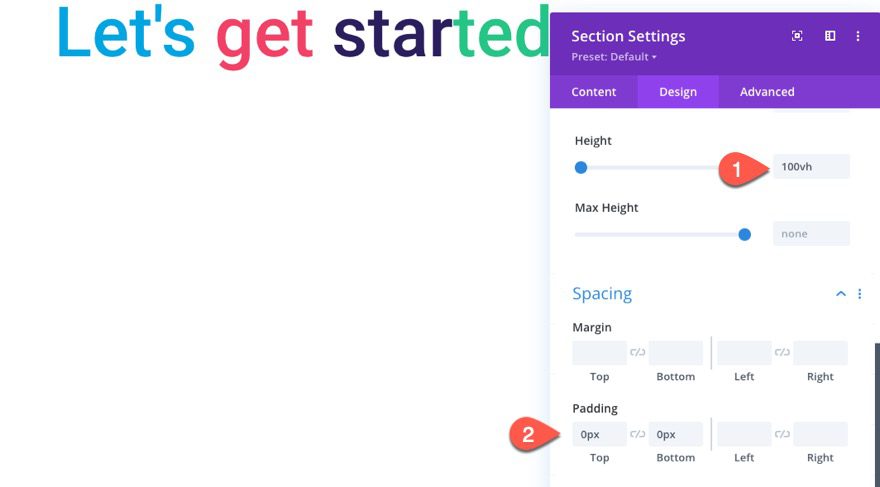
Open the section settings and update the height to be 100vh (or 100% of the viewport/window height). This will make sure the section is fullscreen. Then take out the padding as follows:
- Height: 100vh
- Padding: 0px top, 0px bottom
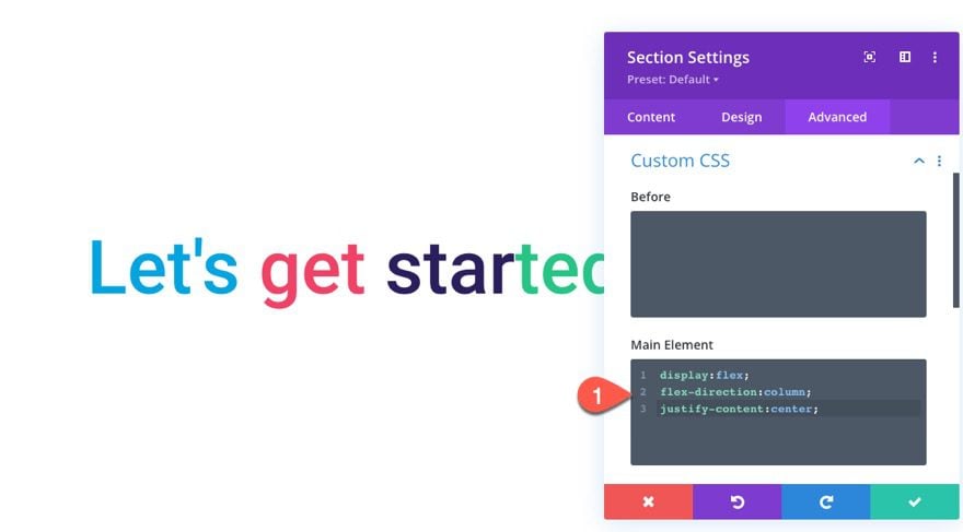
To make sure the row/content inside the section remains vertically centered within the section, add the following custom CSS to the Main Element of the Section:
display:flex;
flex-direction:column;
justify-content:center;
Step One Section
The next section in the layout will be the first of four steps. It is also the first section that our first menu anchor link will scroll to.
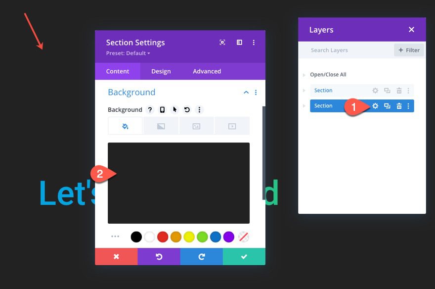
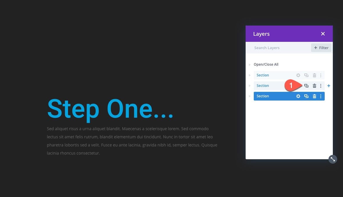
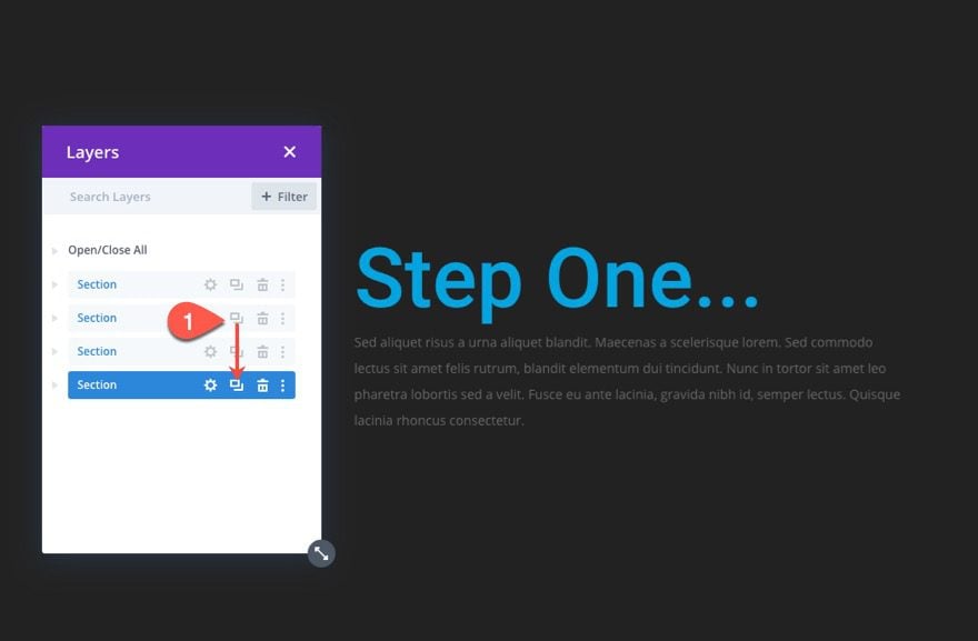
To create the first step section, duplicate the top section we just created.
Then open the settings for the duplicate section and update the background color:
- Background Color: #222222
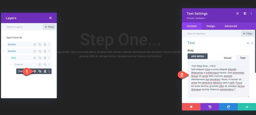
Next, open the text settings and replace the body text with the following:
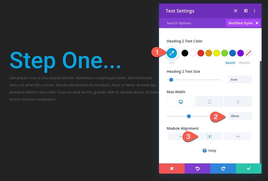
<h2>Step One...</h2>
Sed aliquet risus a urna aliquet blandit. Maecenas a scelerisque lorem. Sed commodo lectus sit amet felis rutrum, blandit elementum dui tincidunt. Nunc in tortor sit amet leo pharetra lobortis sed a velit. Fusce eu ante lacinia, gravida nibh id, semper lectus. Quisque lacinia rhoncus consectetur.
Change the text alignment to left-aligned.
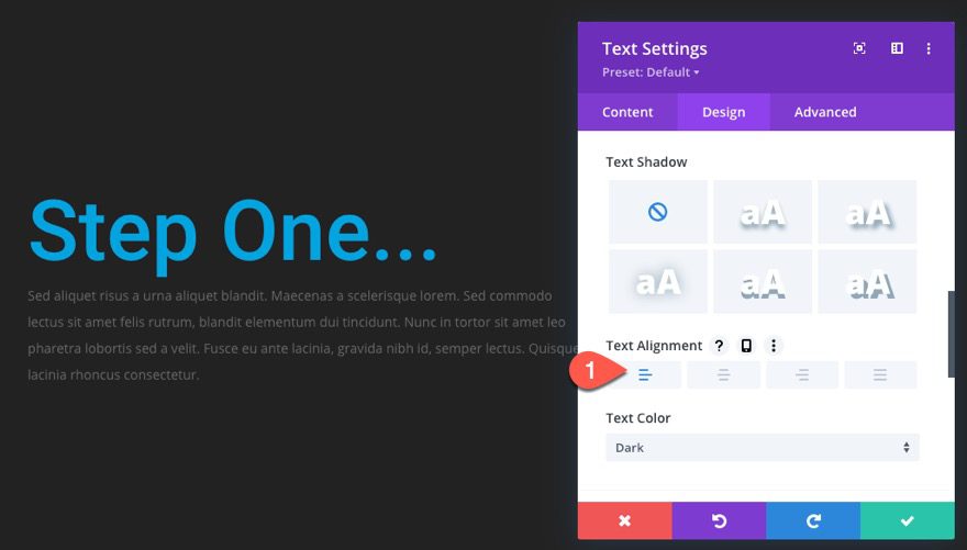
Then update the following:
- Heading 2 Text Color: #00a4e0
- Max Width: 40vh (desktop), 80vh (tablet)
- Module Alignment: center
That takes care of the step one section.
Step Two Section
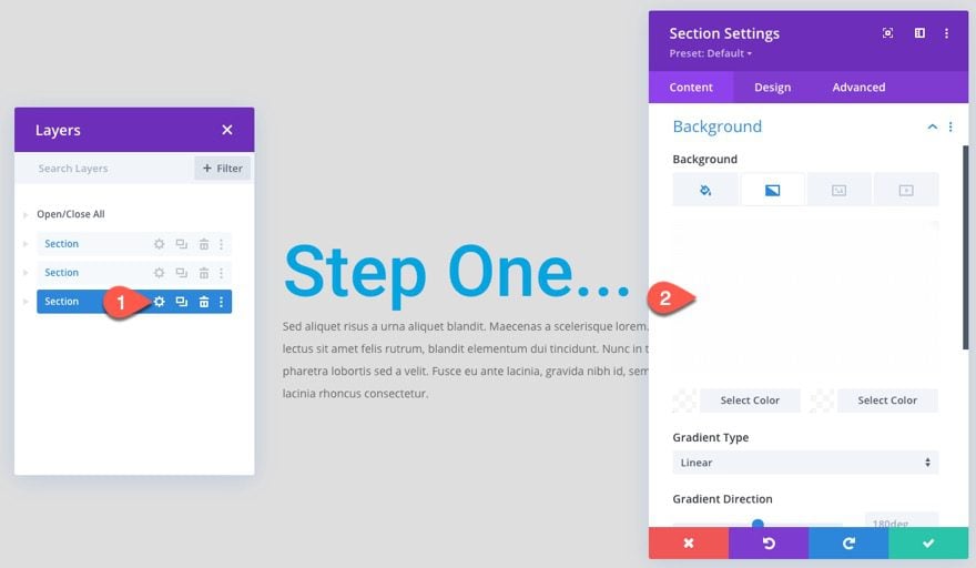
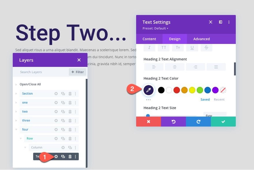
To create the step two section, duplicate the step one section we just created.
Open the section settings and add a background gradient on top of the background color as follows:
- Left Gradient Background Color: rgba(255,255,255,0.85)
- Right Gradient Background Color: rgba(255,255,255,0.85)
Then update the heading color:
- Heading 2 Text Color: #ee4266
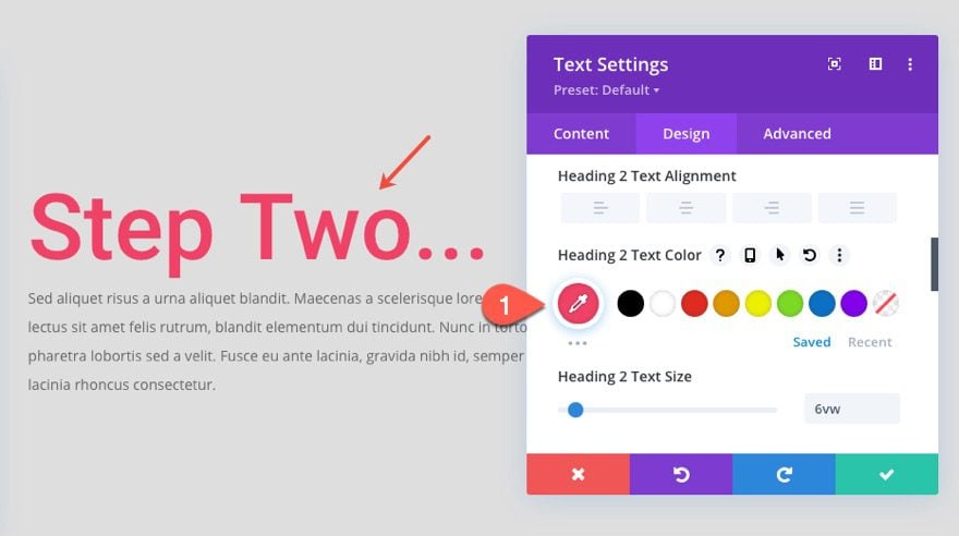
This section’s background and heading color will match the colors of the button that correlates to this section in the menu we’ll create later.
Step Three Section
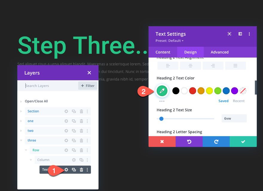
To create the step three section, duplicate step two section and drag it to the bottom of the page.
Then change the heading color of the text module.
- Heading 2 Text Color: #26c485
Step Four Section
Our final step is step four. To create this section, duplicate the step two section and drag it to the bottom of the page.
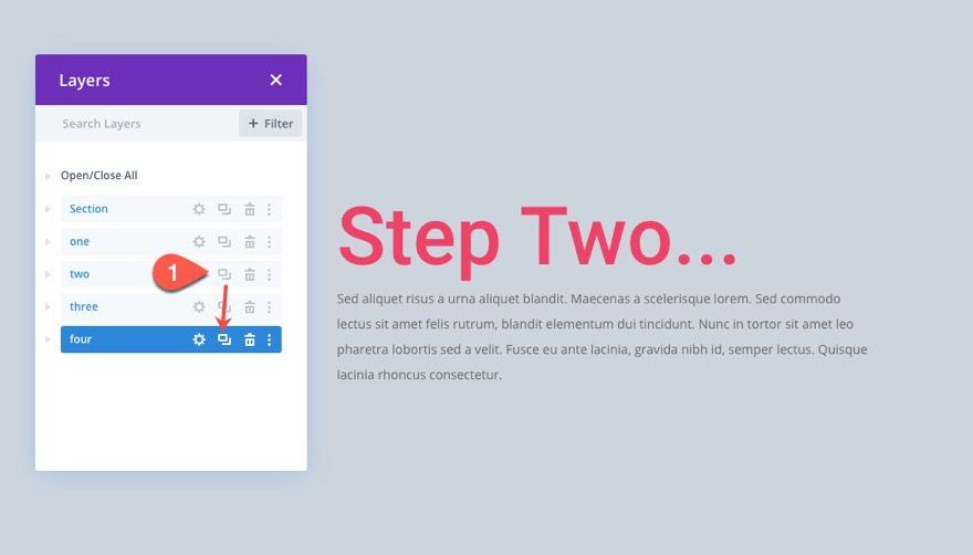
Then update the heading for the text module in that section.
- Heading 2 Text Color: #2a1e5c
Result
Here is the result of our layout so far.
This next part is where we finally create the scroll progress bar with our menu buttons. The idea is to add a fixed section to the top of the page. Then inside the section, we’ll create a row that holds a divider module that will serve as our progress bar indicator. On top of the row with the progress bar, we are going to add another row that will contain our buttons. Each button will have a transparent (or semi-transparent) background in order to reveal the progress bar behind it as the user scrolls down the page.
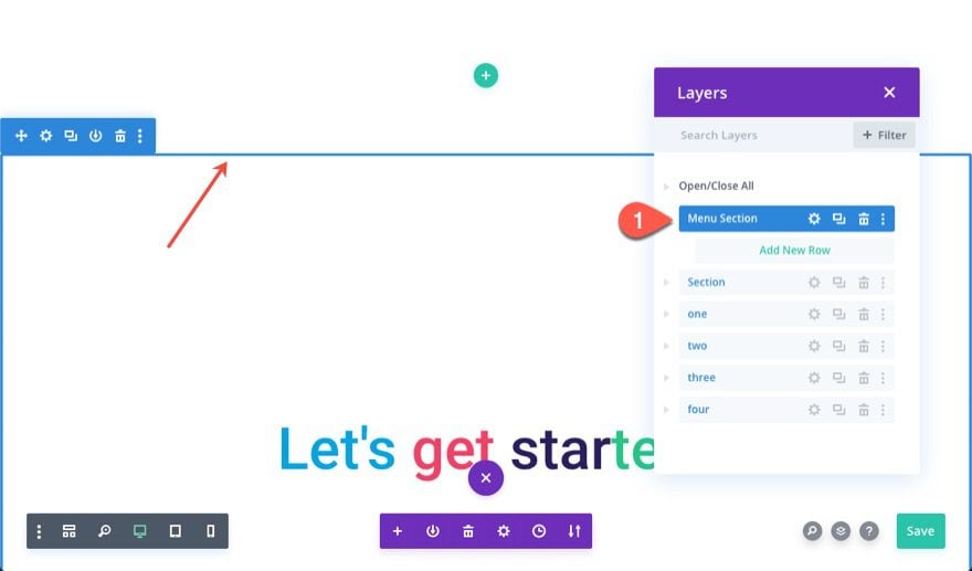
To start, let’s create the fixed section at the top of the page. Go ahead and create a new regular section and drag it to the top of the page layout.
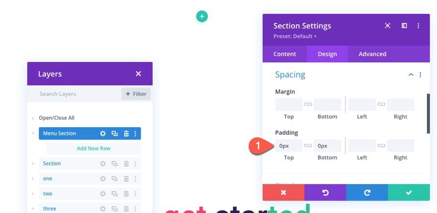
Open the section settings and take out the padding as follows:
- Padding: 0px top, 0px bottom
Under the advanced tab, update the following:
- Position: Fixed
- Z Index: 999
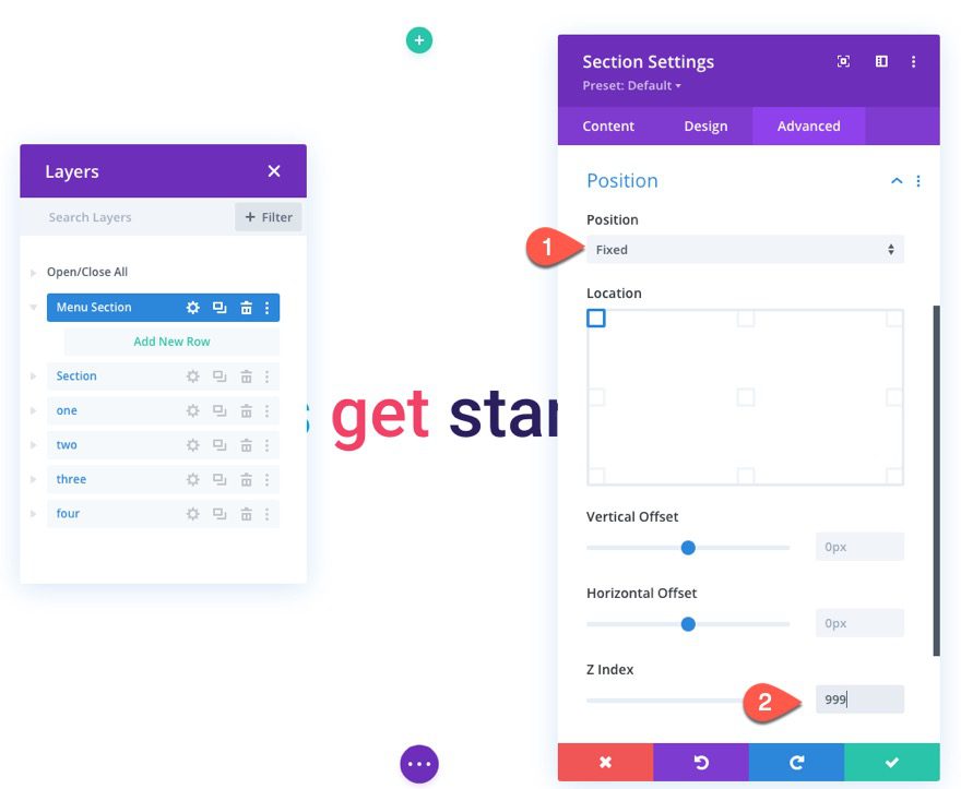
This will make sure the section stays fixed at the top of the browser window for easy anchor link functionality. It will also make sure the section breaks out of the normal flow of the document/html and doesn’t add to the height of the overall document. This will us to have the scroll bar reach the end of each button exactly when the user reaches each section/step on the page when scrolling.
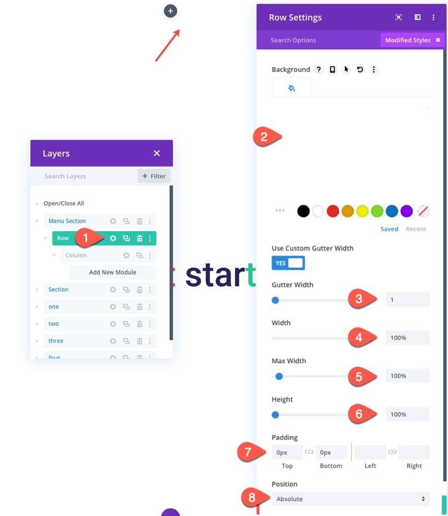
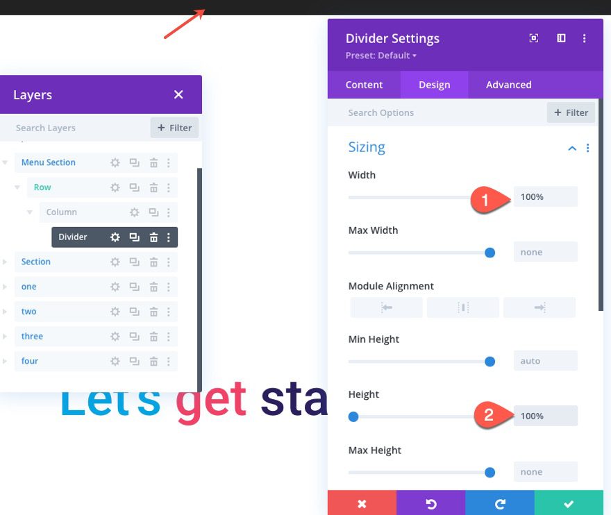
Inside the section, add a one-column row.
Open the row settings and update the following:
- Gutter Width: 1
- Width: 100%
- Max Width: 100%
- Padding: 0px top, 0px bottom
- Position: Absolute
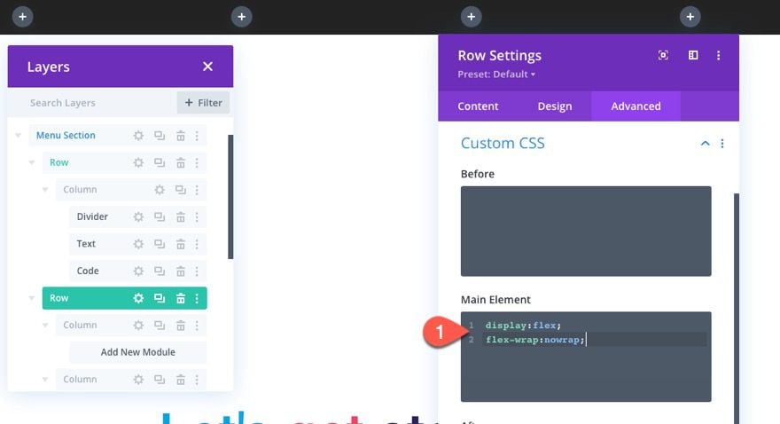
Open the column settings and add the following Custom CSS to the Main Element:
height: 100%;
display:flex;
align-items:center;
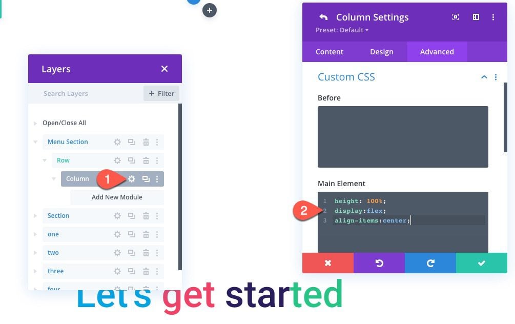
This will make sure the column has the same height as the section. It will also allow the modules to have a height of 100% as well. This will be key to making sure the progress bar fills the section.
To create the progress bar, add a divider module to the column.
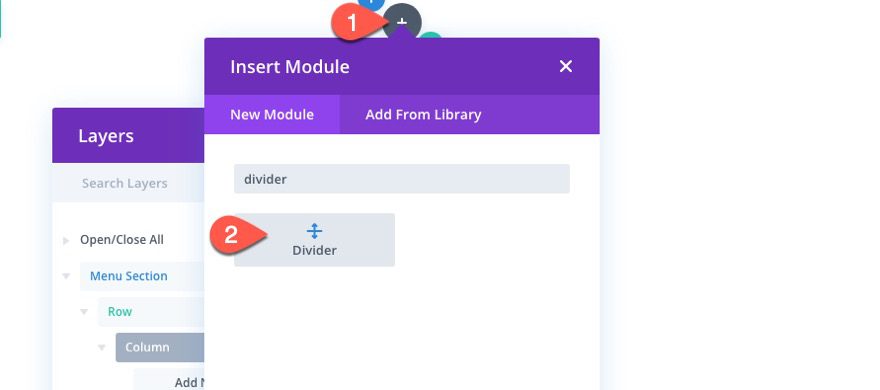
Then update the divider settings as follows:
- Show Divider: NO
- Background Color: #222222
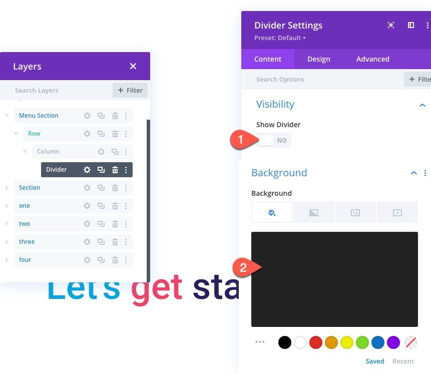
- Width: 100%
- Height: 100%
NOTE: We are giving the progress bar a width of 100% here so that you can see it within the design. We will increase and decrease the width of the divider/progress bar with JQuery.
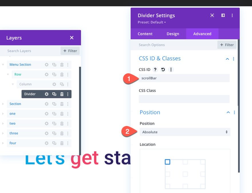
Under the advanced tab, add a CSS ID and give it an absolute position.
- CSS ID: scrollBar
- Position: Absolute
Adding the Percentage Text Indicator
Next, we are going to add a place to show the percentage of the scroll position as the user scrolls down the page. This will correlate to the width of the progress bar.
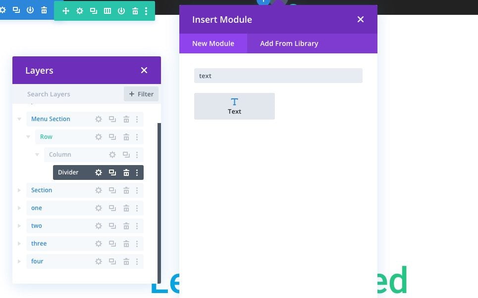
Under the divider, add a text module.
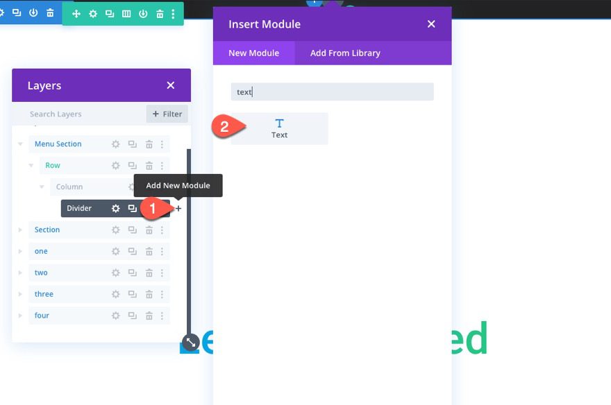
Then paste the following HTML to the body:
<p><span></span></p>
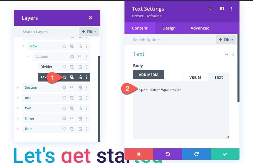
Our JQuery will write the percentage text to this HTML (between the span tags). You won’t be able to see anything now.
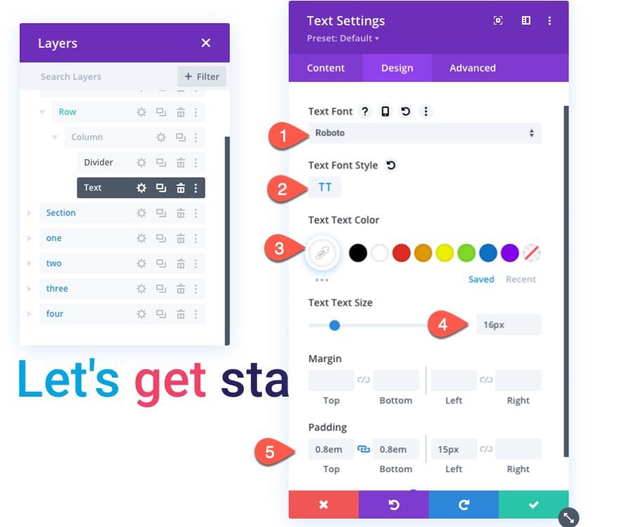
Although percentage text isn’t visible yet, we still need to add the following styling in anticipation of it showing up.
- Text Font: Roboto
- Text Font Style: TT
- Text Text Color: #ffffff
- Text Text Size: 16px
- Padding: 0.8em top, 0.8 bottom, 15px left
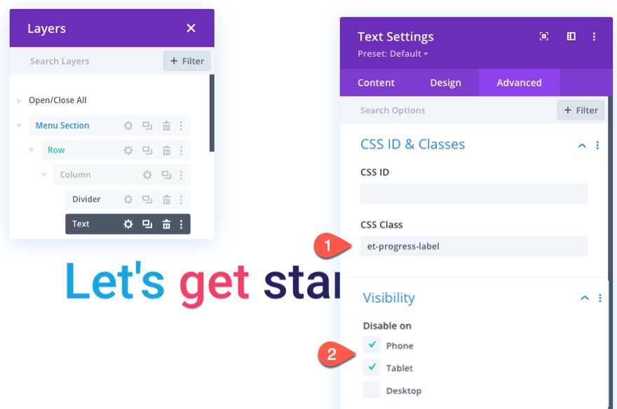
Under the advanced tab, give it a custom CSS Class and disable it on phone and tablet.
- CSS Class: et-progress-label
- Disable On: Phone, Tablet
Although we aren’t finished, this is a good spot to add our custom code needed to show the scroll progress bar and percentage.
To add the code, add a code module below the text module.
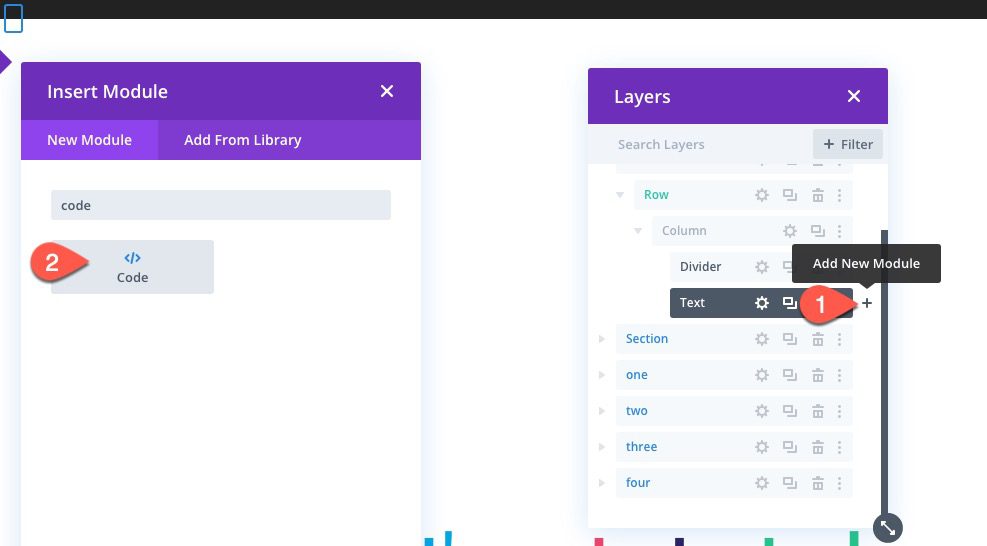
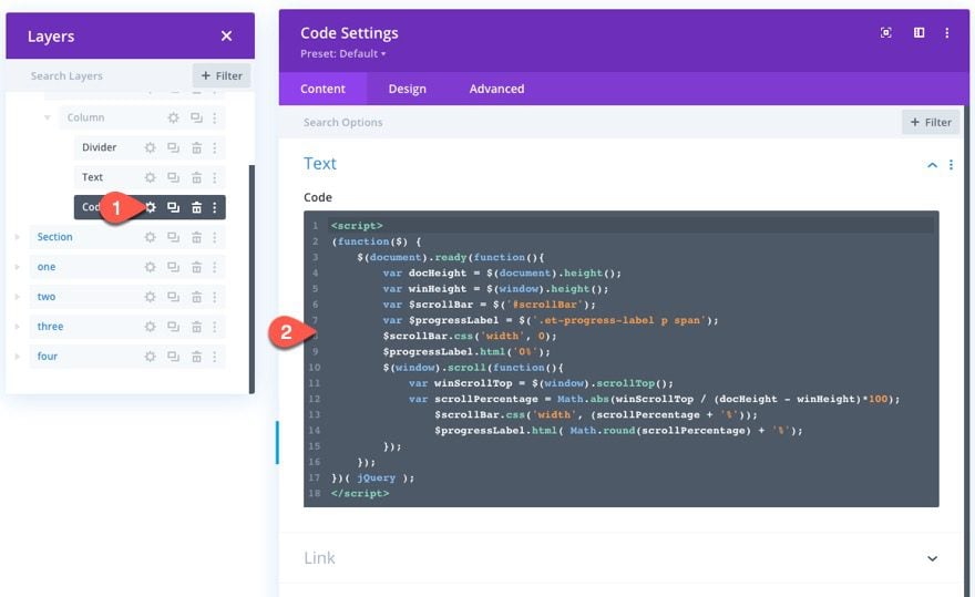
Then paste the following code in the code box making sure to wrap it with the required script tags:
(function($) {
$(document).ready(function(){
var docHeight = $(document).height();
var winHeight = $(window).height();
var $scrollBar = $('#scrollBar');
var $progressLabel = $('.et-progress-label p span');
$scrollBar.css('width', 0);
$progressLabel.html('0%');
$(window).scroll(function(){
var winScrollTop = $(window).scrollTop();
var scrollPercentage = Math.abs(winScrollTop / (docHeight - winHeight)*100);
$scrollBar.css('width', (scrollPercentage + '%'));
$progressLabel.html( Math.round(scrollPercentage) + '%');
});
});
})( jQuery );
That takes care of the progress bar and percentage text. Let’s move on the navigation menu.
Now we are ready to build the navigation menu which will include four buttons that span the full width of the browser. I thought it would be cool to have the scroll bar fill each button as the user reaches the corresponding section it is linking to. Here’s the idea. Each button will have a width of 25% of the total width of the browser. And since our four sections are all have the same height (100vh), each of the four sections represents 25% of the total scrollable area of the page layout. This will make sure the progress bar reaches the end of each button precisely as the corresponding section fills the viewport. Did you catch that? If not, hopefully it makes more sense later.
The Row and Column
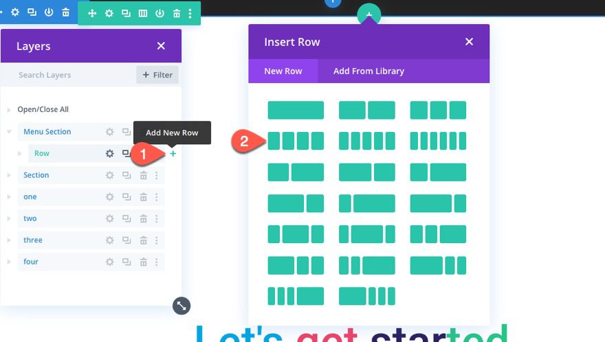
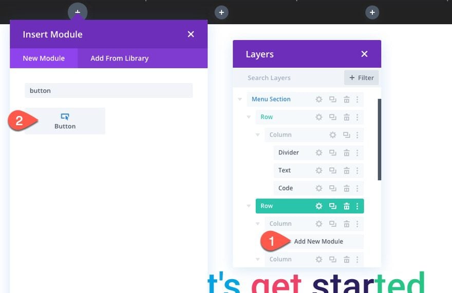
To create the menu buttons, first, we need to create a four-column row below the row containing the progress bar/divider.
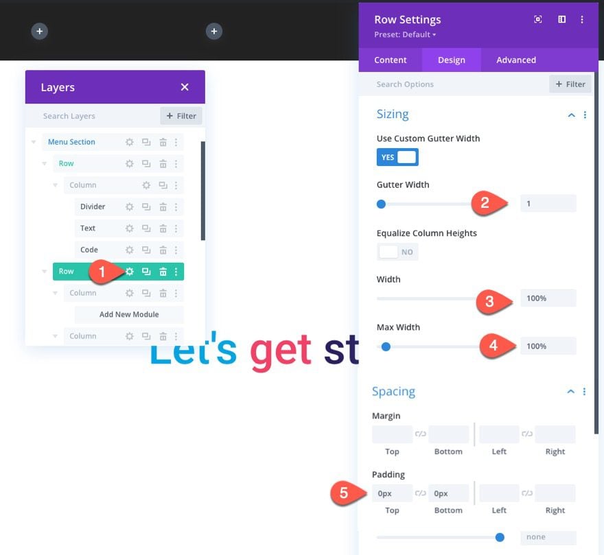
Open the row settings and update the following:
- Gutter Width: 1
- Width: 100%
- Max Width: 100%
- Padding: 0px top, 0px bottom
To make sure the columns to stack on mobile, we need to add the following custom CSS to the Main Element:
display:flex;
flex-wrap:nowrap;
Step One Button
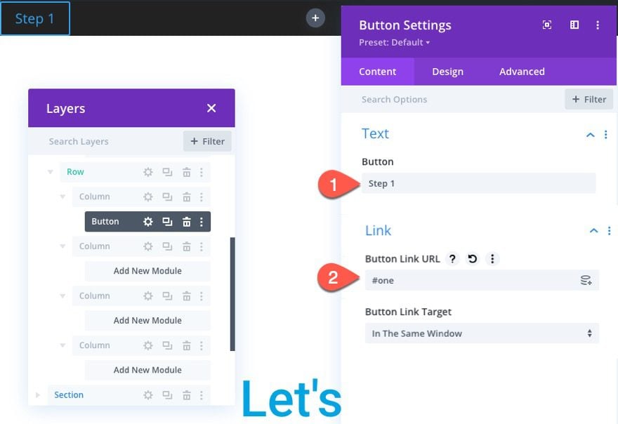
To create the first button, add a button module in the far left column.
Update the button text and link URL as follows:
- Button Text: Step 1
- Button Link URL: #one
(this anchor link will jump the section with the corresponding CSS ID we’ll add later)
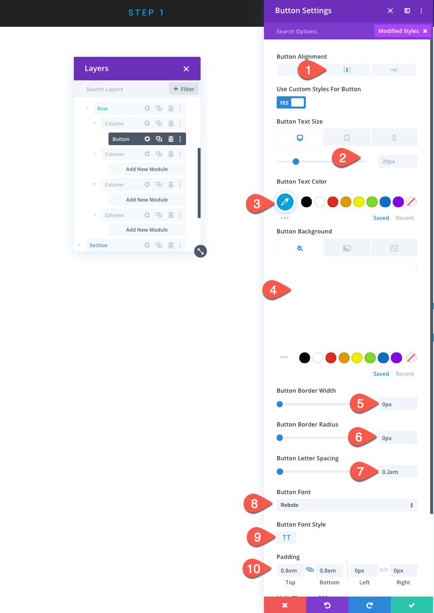
Next, update the button styles as follows:
- Button Alignment: Center
- Button Text Size: 20px (desktop), 14px (tablet)
- Button Background Color: transparent
- Button Border Width: 0px
- Button Border Radius: 0px
- Button Letter Spacing: 0.2em
- Button Font: Roboto
- Button Font Style: TT
- Padding: 0.8em top, 0.8em bottom, 0 left, 0 right
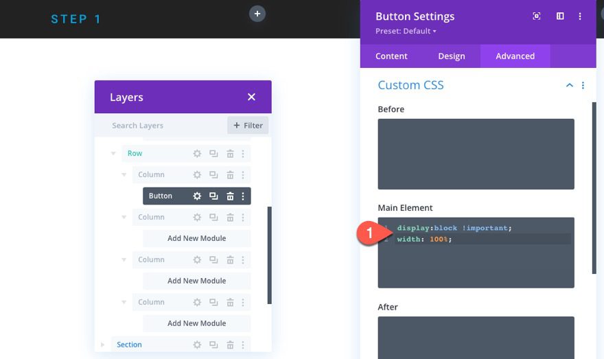
To make the button span the full width of the column, add the following custom CSS to the main element:
display:block !important;
width: 100%;
Step 2 Button
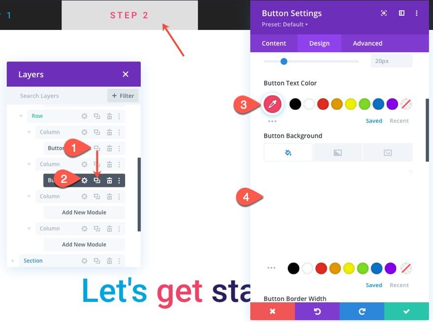
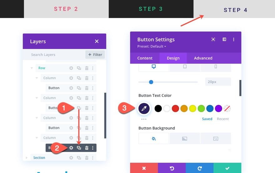
To create the button for step two, duplicate the button in column one and drag it into column 2.
Then update the following:
- Button Text Color: #ee4266
- Button Background Color: rgba(255,255,255,0.85)
The semi-transparent background color will be combined with the black progress bar color (behind it) to match the corresponding step two section background.
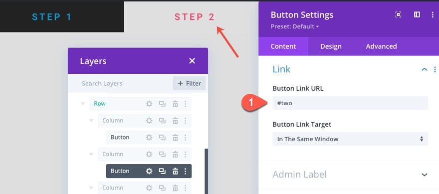
Then update the button link URL with the following:
- Button Link URL: #two
Step 3 Button
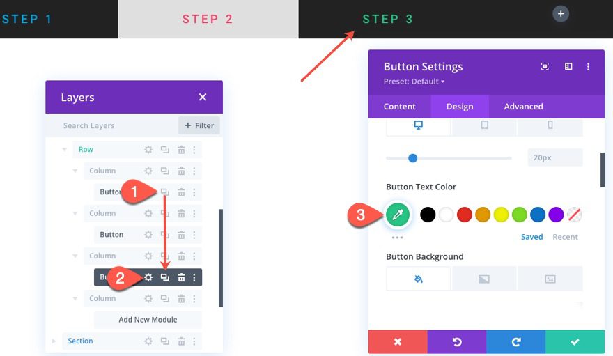
To create the step 3 button, duplicate the step 1 button (it has the same bg color), and drag it into column 3.
Then update the button text color:
- Button Text Color: #26c485
Then update the button link URL with the following:
- Button Link URL: #three
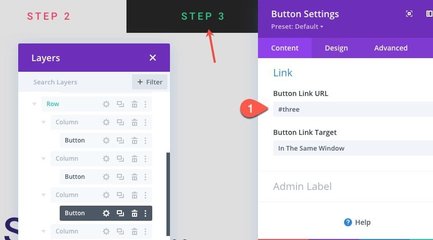
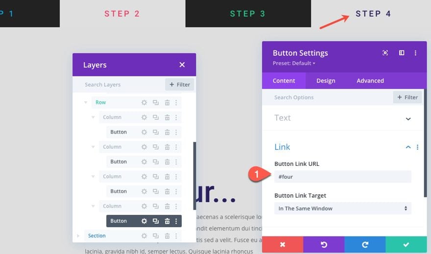
Step 4 Button
To create the step 3 button, duplicate the step 2 button (it has the same bg color), and drag it into column 4.
Then update the button text color:
- Button Text Color: #2a1e5c
Then update the button link URL with the following:
- Button Link URL: #four
Adding Corresponding Section CSS IDs for Anchor Links
Once the buttons are finished and they all have their anchor link URLs, we can add the corresponding section CSS IDs to each section we want each button to jump to on the page.
Step One Section CSS ID
Open the settings for the step one section and add the following CSS ID:
- CSS ID: one
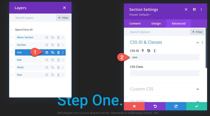
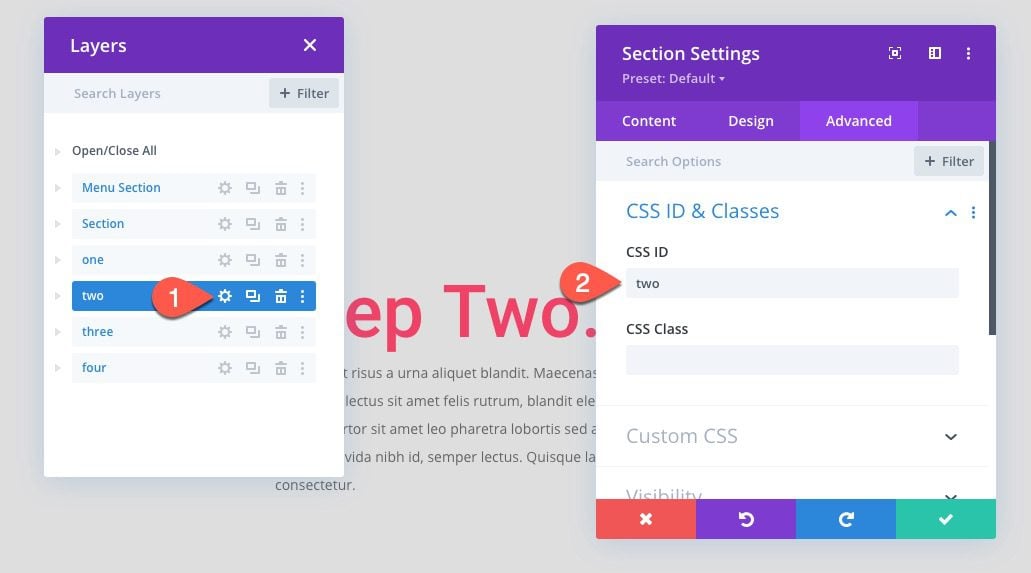
Step Two Section CSS ID
Open the settings for the step two section and add the following CSS ID:
- CSS ID: two
Step Three Section CSS ID
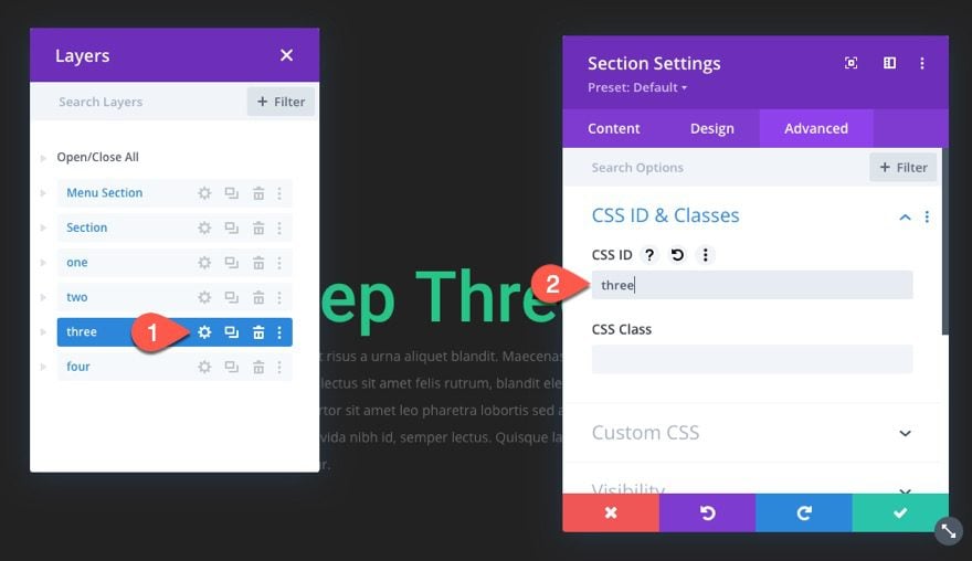
Open the settings for the step three section and add the following CSS ID:
- CSS ID: three
Step Four Section CSS ID
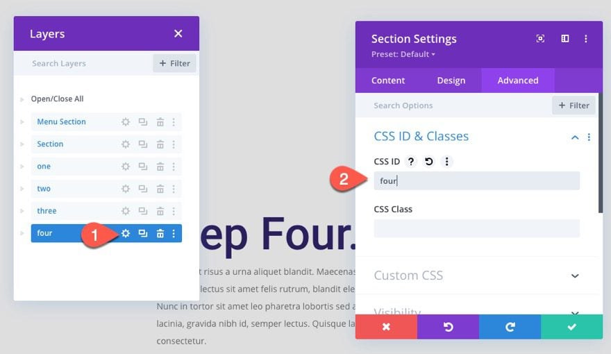
Open the settings for the step four section and add the following CSS ID:
- CSS ID: four
Final Result
Final Thoughts
This progress bar menu is definitely a unique design that has the potential for a variety of applications. Hopefully, it helps you with your next project. And, feel free to explore the countless design variations available within the Divi builder to create your own progress bar menu.
I look forward to hearing from you in the comments.
Cheers!


Very cool Jason! — I’m going to give this a go on a personal project coming up. I know not a lot on jQuery side, but I assume if I duplicated both buttons and sections to increase/decrease, the natural flow of the progress bar would also go faster/slower based on the content within? Is this correct?
Either way thanks for this neat tutorial!
Very interesting work, but unfortunately nothing worked for me. The problems started in Part 2: Creating the Scroll Progress Bar and Menu.
Sorry, Alex. Yeah this post is a bit technical so I’m not surprised if one of the steps may have been unclear. Maybe try downloading the template and maybe you can check the working version with your build. If that doesn’t help, reach out to our support team and they should be able to help. One thing to make sure is to wrap your code in the code module with the script tags. That’s an easy step to miss.
Excellent, Jason, I will definately use this one! 🙂
Awesome!
It looks great now
Thanks!
Straight to the point and no dressing on words
Really unique and refreshing article , to keep my eyes on
Good job !
Thanks so much for this blog. It’s delightful and inspiring.