
The popper.js library is a powerful positioning engine for tooltips and popovers. Today, we are homing in on how to make a popover. You can think of a popover as a tooltip that can contain more content. What makes Popper so effective is its ability to generate popovers that maintain an optimal position on the page when its location or the browser viewport changes. This can be a simple and effective UX and UI solution for web developers. That’s probably why it is integrated with other popular libraries like Boostrap and Material UI.
In this tutorial, we are going to harness the power of Popper.js in Divi to create a dynamically positioned popover when clicking a button. This will allow anyone to create a popover using Divi elements to display any content they want when clicking a button. Plus, the popover content will automatically adjust its position to preserve the most ideal visibility as the user interacts with your page.
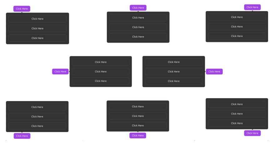
Here is an illustration of the positioning of these popovers…
To accomplish this, we are going to rely on some custom CSS and Javascript for the functionality. But we can still rely on the powerful design capabilities of the Divi Builder to create a Popper-powered popover using any Divi element. And the example we are going to build in this tutorial is a popover menu.
Let’s get started!
Sneak Peek
Here is a quick look at the example popover menu we will design in this tutorial.
Notice how the position of the popover changes dynamically as the user scrolls or changes the browser size.
If you click the button while it is at the very top of the browser viewport, the popover will be displayed below the button, and if you click the button while it is at the very bottom of the viewport, the popover will be displayed above the button. And if the popover is originally positioned to the right of the button on large viewports, it will flip to a top or bottom position on smaller viewports.
Also don’t miss the little arrow that is also positioned to dynamically point to its reference (or in this case, the button).
Also, here is a codepen that illustrates the same functionality.
Download the Layout for FREE
To lay your hands on the popover example layout from this tutorial, you will first need to download it using the button below. To gain access to the download you will need to subscribe to our newsletter by using the form below. As a new subscriber, you will receive even more Divi goodness and a free Divi Layout pack every Monday! If you’re already on the list, simply enter your email address below and click download. You will not be “resubscribed” or receive extra emails.

To import the section layout to your Divi Library, navigate to the Divi Library.
Click the Import button.
In the portability popup, select the import tab and choose the download file from your computer.
Then click the import button.

Once done, the section layout will be available in the Divi Builder.
Let’s get to the tutorial, shall we?
What You Need to Get Started

To get started, you will need to do the following:
- If you haven’t yet, install and activate the Divi Theme.
- Create a new page in WordPress and use the Divi Builder to edit the page on the front end (visual builder).
- Choose the option “Build From Scratch”.
After that, you will have a blank canvas to start designing in Divi.
Creating a Popover with Popper.js and Divi
As previously mentioned, we are going to use popper.js in Divi to create a dynamically positioned popover (the pop-up box) that is revealed when clicking on the popover’s reference (the button). With Divi, we can build these two (the pop-up box and the button) using the Divi builder. Then later we are going to add the code necessary to marry the two in perfect position harmony.
we are going to designate a row as the popper (the thing that popups up when clicking the button). Then we can add modules to the row to include the content we want to show in the popper popover. In this example
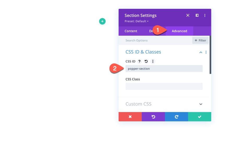
The Section
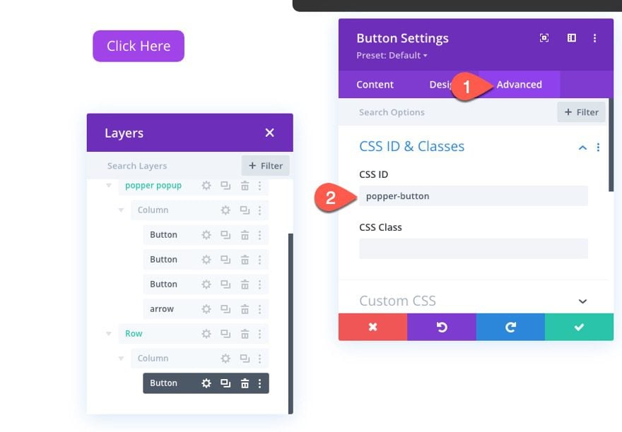
To begin, let’s go ahead and add a custom CSS ID to the regular section that is ready by default. Open the section settings and add the following ID:
- CSS ID: popper-section
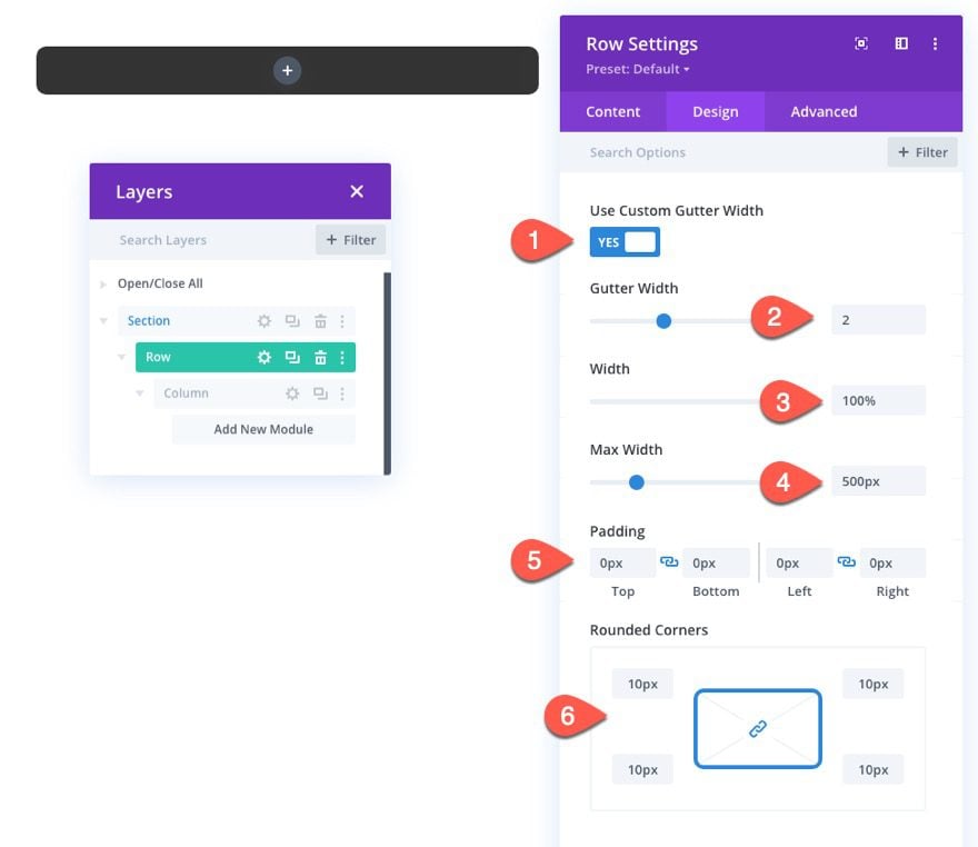
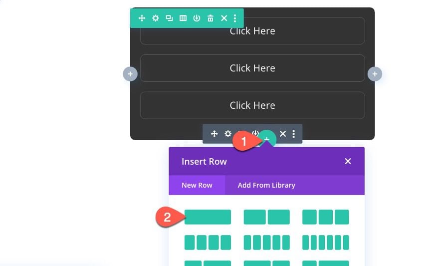
Create Popper Popover with Divi Row
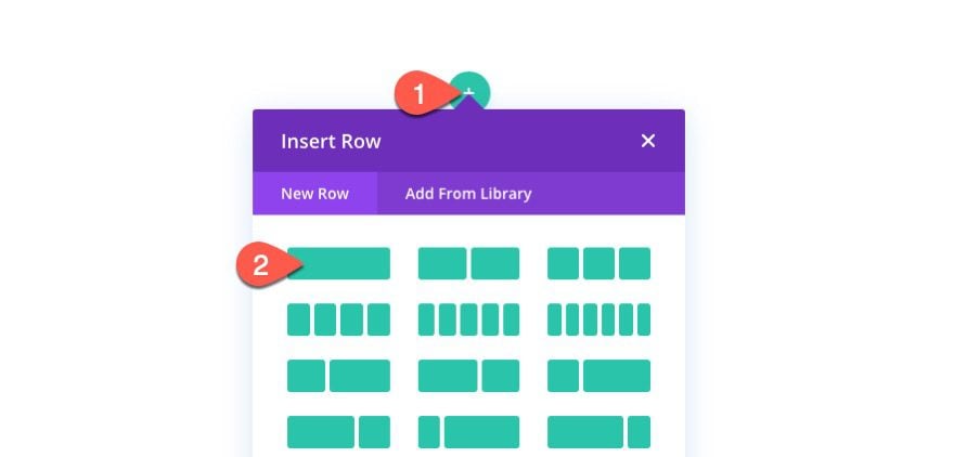
Next, add a one-column row to the section. This row will become our Popper popover element that pops up when clicking a button.
Open the row settings and update the styling as follows:
- Background Color: #333333
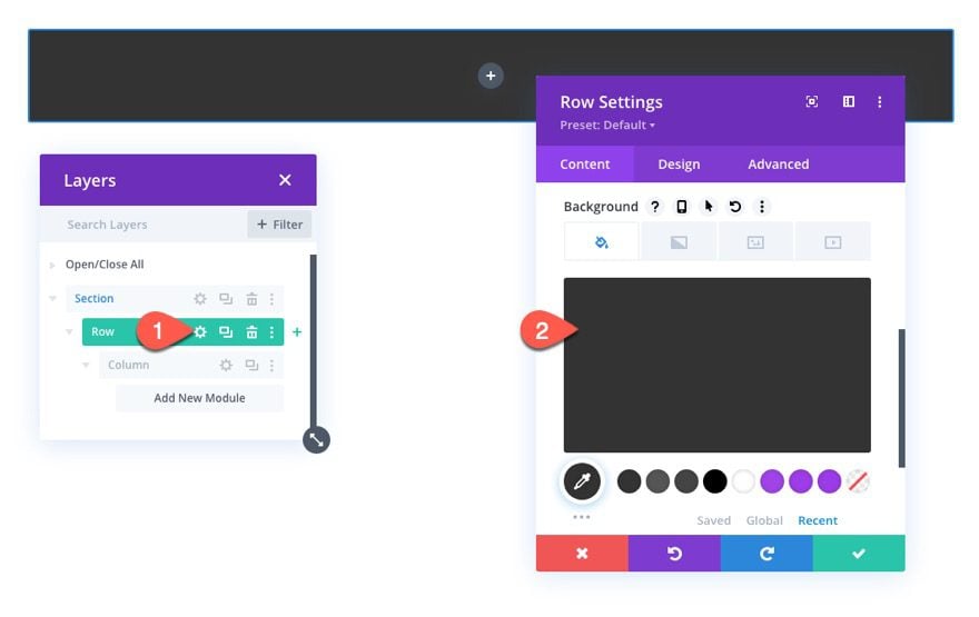
- Gutter Width: 2
- Width: 100%
- Max Width: 500px
- Padding: 0px top, 0px bottom, 0px left, 0px right
- Rounded Corners: 10px
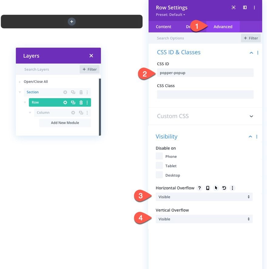
Because this row will become our popper popover element, we need to add a CSS ID to serve as a selector in our code. We also need to make sure the visibility remains on overflow (it is hidden by the rounded corners).
Go to the advanced tab and update the following:
- CSS ID: popper-popup
- Horizontal Overflow: visible
- Vertical Overflow: visible
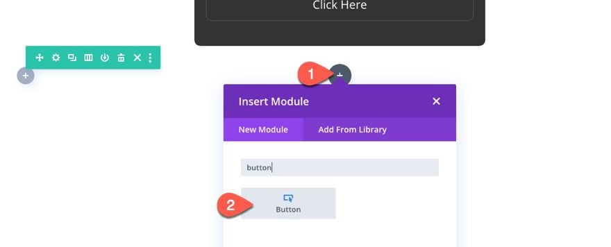
Add Content to Popover Row
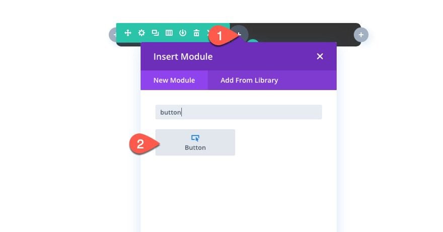
Here is where the power of Divi shines. We can add any module(s) we want to our row to fill the popover with whatever content we want using the Divi Builder to design them. For this example, we are going to add some buttons to the row to serve as a custom menu that appears within the popover.
To start, add a button module to the column of the row.
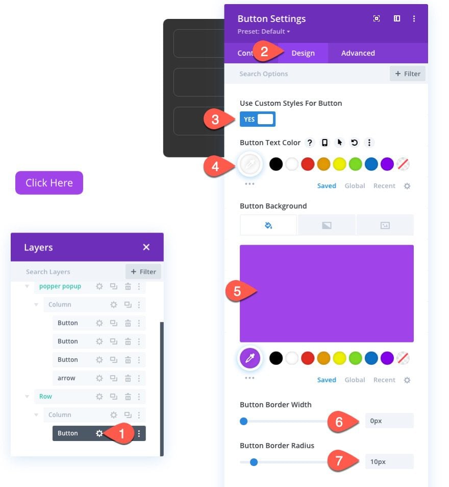
Now let’s add some styling to our button real quick. Update the button settings as follows:
- Button Alignment: center
- Use Custom Styles for Button: YES
- Button Border Width: 1px
- Button Border Color: #555555
- Button Border Radius: 10px
- Button Icon: see screenshot
- Margin: 20px top, 20px bottom, 20px left, 20px right
- Padding: 0.5em top, 0.5em bottom, 2em left, 2em right
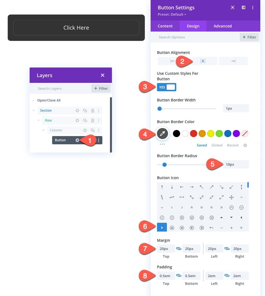
NOTE: We need to use margin on the modules to create spacing instead of relying on row (or column) padding because we will be adding an arrow (using a divider) that needs to be positioned on the edge of the row (with absolute position). Any row or column padding will push the arrow away from the edge.
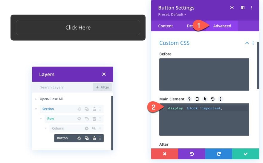
Next, add the following custom CSS snippet to the Main Element to make the button span the full width of the column/row:
display: block !important
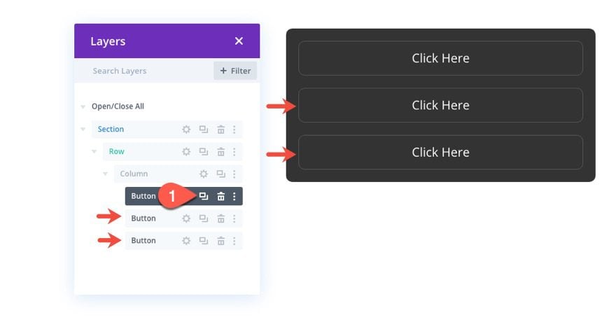
Now duplicate the button two (or more) times to add a few more buttons to our menu popover.
Creating the Popover Arrow
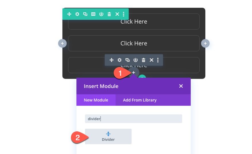
Popper.js has built-in support for positioning an arrow along with the popover. To build the arrow, add a new divider under the last button in our row.
In the divider settings, select not to show the divider.
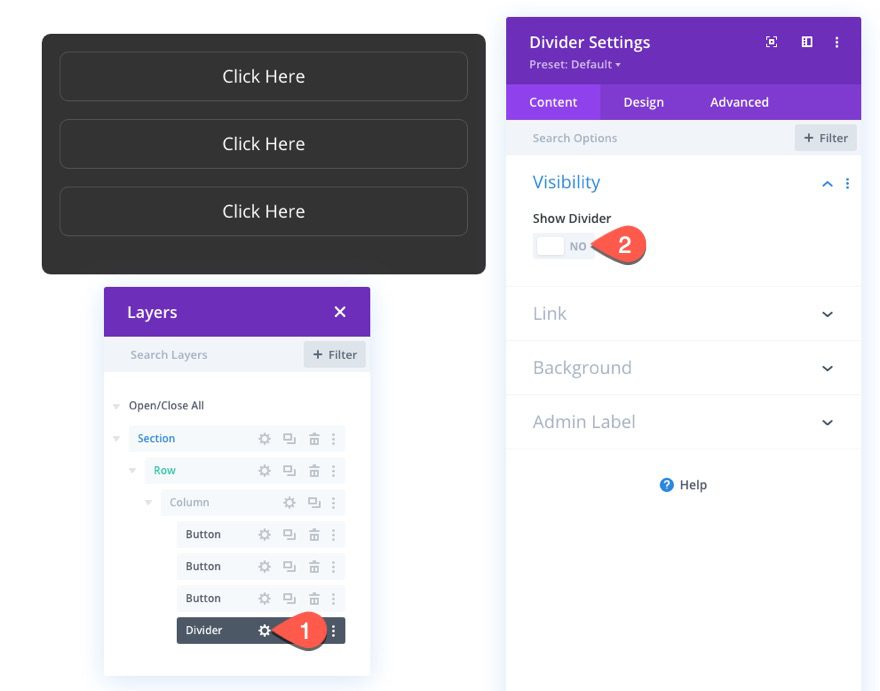
Then, under the advanced tab, add the following CSS ID:
- CSS ID: popper-arrow
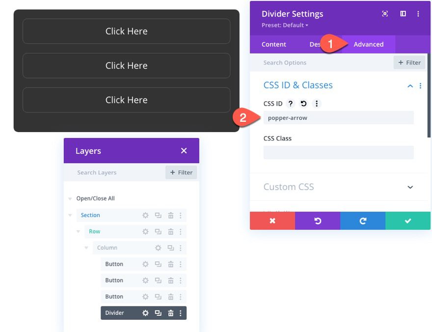
We’ll be using custom external CSS to style and position the arrow later.
The two key elements of a popper popover include the popover element (or popper) and the reference that the popover attaches itself to. You can use any Divi element as a reference that generates the popover, but for this example, we are going to use a button.
Before we create our button, we need to add a new one-column row under our popover row.
Then add a new button module to the row.
Update the button settings with some basic styling as follows:
- Button Text Color: #ffffff
- Button Background Color: #a043e8
- Button Border Width: 0px
- Button Border Radius: 10px
Next, add the necessary CSS ID that will allow us to target and use the button as our popover reference later:
- CSS ID: popper-button
The Code
Now that our popover and button are complete, we are ready to add the code to make the magic happen.
To do this, add a code module under the reference button module in the second row.
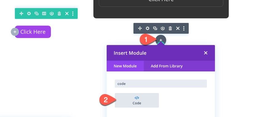
It is important that the code is at the bottom of the page for it to work.
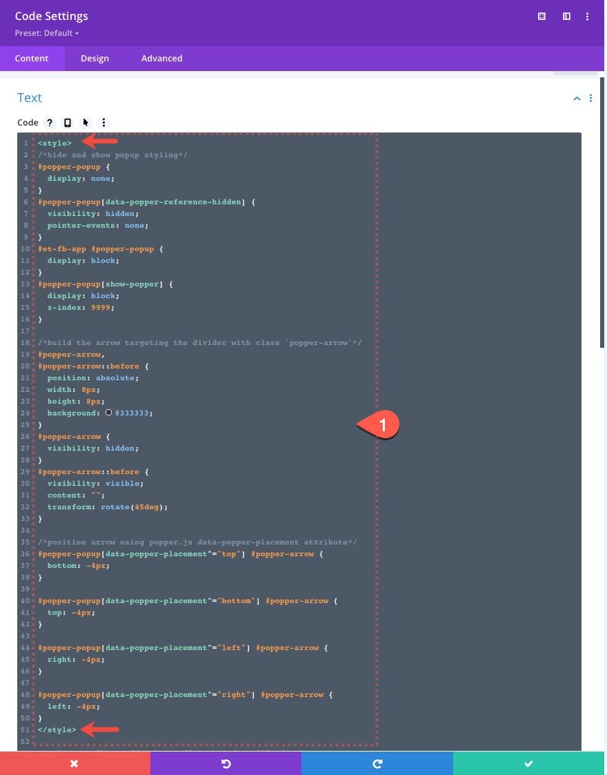
First, we’ll add the CSS.
In the code content box, add the style tags that are needed to wrap CSS in HTML. Then copy and paste the following CSS between the style tags:
/*hide and show popup styling*/
#popper-popup {
  display: none;
}
#popper-popup[data-popper-reference-hidden] {
  visibility: hidden;
  pointer-events: none;
}
#popper-popup[show-popper] {
  display: block;
  z-index: 9999;
}

/*keep popper visible in the Divi Builder for editing*/
#et-fb-app #popper-popup {
  display: block;
}

/*build the arrow targeting the divider with class 'popper-arrow'*/
#popper-arrow,
#popper-arrow::before {
  position: absolute;
  width: 8px;
  height: 8px;
  background: #333333;
}
#popper-arrow {
  visibility: hidden;
}
#popper-arrow::before {
  visibility: visible;
  content: "";
  transform: rotate(45deg);
}

/*position arrow using popper.js data-popper-placement attribute*/
#popper-popup[data-popper-placement^="top"] #popper-arrow {
  bottom: -4px;
}

#popper-popup[data-popper-placement^="bottom"] #popper-arrow {
  top: -4px;
}

#popper-popup[data-popper-placement^="left"] #popper-arrow {
  right: -4px;
}

#popper-popup[data-popper-placement^="right"] #popper-arrow {
  left: -4px;
}

/*hide arrow when reference outside of viewport*/
#popper-popup[data-popper-reference-hidden] #popper-arrow::before {
  visibility: hidden;
}
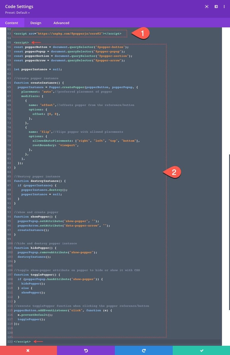
Next, we need to access the popper.js library by adding a script that imports Popper.js from their CDN (https://unpkg.com/@popperjs/core@2). Under the ending style tag, paste the following script in the code box.
Use the following src within a script tag to import the library:
src="https://unpkg.com/@popperjs/core@2"
It should look like this:

It is important to import Popper.js before adding the code that will use it. So, after the script pointing to Popper.js, add the necessary script tags to wrap the Javascript we need to add. Then paste the following Javascript in between the script tags.
const popperButton = document.querySelector("#popper-button");
const popperPopup = document.querySelector("#popper-popup");
const popperSection = document.querySelector("#popper-section");
const popperArrow = document.querySelector("#popper-arrow");

let popperInstance = null;

//create popper instance
function createInstance() {
  popperInstance = Popper.createPopper(popperButton, popperPopup, {
    placement: "auto",//preferred placement of popper
    modifiers: [
      {
        name: "offset",//offsets popper from the reference/button
        options: {
          offset: [0, 8],
        },
      },
      {
        name: "flip",//flips popper with allowed placements
        options: {
          allowedAutoPlacements: ["right", "left", "top", "bottom"],
          rootBoundary: "viewport",
        },
      },
    ],
  });
}

//destroy popper instance
function destroyInstance() {
  if (popperInstance) {
    popperInstance.destroy();
    popperInstance = null;
  }
}

//show and create popper
function showPopper() {
  popperPopup.setAttribute("show-popper", "");
  popperArrow.setAttribute("data-popper-arrow", "");
  createInstance();
}

//hide and destroy popper instance
function hidePopper() {
  popperPopup.removeAttribute("show-popper");
  popperArrow.removeAttribute("data-popper-arrow");
  destroyInstance();
}

//toggle show-popper attribute on popper to hide or show it with CSS
function togglePopper() {
  if (popperPopup.hasAttribute("show-popper")) {
    hidePopper();
  } else {
    showPopper();
  }
}
//execute togglePopper function when clicking the popper reference/button
popperButton.addEventListener("click", function (e) {
  e.preventDefault();
  togglePopper();
});
That’s it! We are all done. But before we check out the final result, let’s take a closer look at the code being used.
About the Code
The inspiration for this tutorial came from the Popper tutorial that shows you how to get a basic popup up and running. All I did was tweak the code to generate a popover on click and then used selectors to target Divi elements. Other than the unique constructor createPopper which creates the popper instance and the modifiers (like offset, and flip) used to control the popover positioning logic, the code is all basic Javascript.
If you are interested in how this code works, here is a quick overview.
The Javascript
First, you must import popper.js with their CDN.
Then, we need to add some variables that will be used to target 4 key selectors including the popper popover element (#popper-popup), the popper reference/button (#popper-button), the popper arrow that points to the reference/button (#popper-arrow), and the popper popover boundary to keep the popover from overflowing outside the viewport as long as possible (#popper-section).
const popperButton = document.querySelector("#popper-button");
const popperPopup = document.querySelector("#popper-popup");
const popperSection = document.querySelector("#popper-section");
const popperArrow = document.querySelector("#popper-arrow");
Next, we let the variable popperInstance = null to help keep the popperInstance from running until we need it.
let popperInstance = null;
Next, we create a Popper instance which will basically create the popper popover using a few modifiers that control how the popover will adjust its placement on the page.
//create popper instance
function createInstance() {
  popperInstance = Popper.createPopper(popperButton, popperPopup, {
    placement: "auto",//preferred placement of popper
    modifiers: [
      {
        name: "offset",//offsets popper from the reference/button
        options: {
          offset: [0, 8],
        },
      },
      {
        name: "flip",//flips popper with allowed placements
        options: {
          allowedAutoPlacements: ["right", "left", "top", "bottom"],
          rootBoundary: "viewport",
        },
      },
    ],
  });
}
Next, we create 4 functions to destroy the popper instance when not active, show the popper when active, hide the popper when not active, and toggle the show or hide functions when popper has the attribute show-popper.
//destroy popper instance
function destroyInstance() {
  if (popperInstance) {
    popperInstance.destroy();
    popperInstance = null;
  }
}

//show and create popper
function showPopper() {
  popperPopup.setAttribute("show-popper", "");
  popperArrow.setAttribute("data-popper-arrow", "");
  createInstance();
}

//hide and destroy popper instance
function hidePopper() {
  popperPopup.removeAttribute("show-popper");
  popperArrow.removeAttribute("data-popper-arrow");
  destroyInstance();
}

//toggle show-popper attribute on popper to hide or show it with CSS
function togglePopper() {
  if (popperPopup.hasAttribute("show-popper")) {
    hidePopper();
  } else {
    showPopper();
  }
}
Finally, we toggle the execution of the popper on click by running the togglePopper() function when clicking the reference/button.
//execute togglePopper function when clicking the popper reference/button
popperButton.addEventListener("click", function (e) {
  e.preventDefault();
  togglePopper();
});
The CSS
The popover functionality relies on some custom CSS to style the selectors we used in the Javascript.
The most essential CSS needed for the popover includes the snippets that hide and show the popper.
/*hide and show popup styling*/
#popper-popup {
  display: none;
}
#popper-popup[data-popper-reference-hidden] {
  visibility: hidden;
  pointer-events: none;
}
#popper-popup[show-popper] {
  display: block;
  z-index: 9999;
}
After that, the rest of the CSS is used to style and position the small popup arrow.
Here is the CSS that builds the arrow out of the Divi Divider.
/*build the arrow targeting the divider with class 'popper-arrow'*/
#popper-arrow,
#popper-arrow::before {
  position: absolute;
  width: 8px;
  height: 8px;
  background: #333333;
}
#popper-arrow {
  visibility: hidden;
}
#popper-arrow::before {
  visibility: visible;
  content: "";
  transform: rotate(45deg);
}
And here is the CSS that uses Popper’s built in data-popper-placement attribute to customize the position of the arrow at all four possible positions and then hides the arrow using the data-popper-reference-hidden attribute.
/*position arrow using popper.js data-popper-placement attribute*/
#popper-popup[data-popper-placement^="top"] #popper-arrow {
  bottom: -4px;
}

#popper-popup[data-popper-placement^="bottom"] #popper-arrow {
  top: -4px;
}

#popper-popup[data-popper-placement^="left"] #popper-arrow {
  right: -4px;
}

#popper-popup[data-popper-placement^="right"] #popper-arrow {
  left: -4px;
}

/*hide arrow when reference out of viewport*/
#popper-popup[data-popper-reference-hidden] #popper-arrow::before {
  visibility: hidden;
}
Final CSS and JS
And here is another look at the final CSS and JS code:
/*hide and show popup styling*/
#popper-popup {
  display: none;
}
#popper-popup[data-popper-reference-hidden] {
  visibility: hidden;
  pointer-events: none;
}
#popper-popup[show-popper] {
  display: block;
  z-index: 9999;
}

/*keep popper visible in the Divi Builder for editing*/
#et-fb-app #popper-popup {
  display: block;
}

/*build the arrow targeting the divider with class 'popper-arrow'*/
#popper-arrow,
#popper-arrow::before {
  position: absolute;
  width: 8px;
  height: 8px;
  background: #333333;
}
#popper-arrow {
  visibility: hidden;
}
#popper-arrow::before {
  visibility: visible;
  content: "";
  transform: rotate(45deg);
}

/*position arrow using popper.js data-popper-placement attribute*/
#popper-popup[data-popper-placement^="top"] #popper-arrow {
  bottom: -4px;
}

#popper-popup[data-popper-placement^="bottom"] #popper-arrow {
  top: -4px;
}

#popper-popup[data-popper-placement^="left"] #popper-arrow {
  right: -4px;
}

#popper-popup[data-popper-placement^="right"] #popper-arrow {
  left: -4px;
}

/*hide arrow when reference outside of viewport*/
#popper-popup[data-popper-reference-hidden] #popper-arrow::before {
  visibility: hidden;
}
const popperButton = document.querySelector("#popper-button");
const popperPopup = document.querySelector("#popper-popup");
const popperSection = document.querySelector("#popper-section");
const popperArrow = document.querySelector("#popper-arrow");

let popperInstance = null;

//create popper instance
function createInstance() {
  popperInstance = Popper.createPopper(popperButton, popperPopup, {
    placement: "auto",//preferred placement of popper
    modifiers: [
      {
        name: "offset",//offsets popper from the reference/button
        options: {
          offset: [0, 8],
        },
      },
      {
        name: "flip",//flips popper with allowed placements
        options: {
          allowedAutoPlacements: ["right", "left", "top", "bottom"],
          rootBoundary: "viewport",
        },
      },
    ],
  });
}

//destroy popper instance
function destroyInstance() {
  if (popperInstance) {
    popperInstance.destroy();
    popperInstance = null;
  }
}

//show and create popper
function showPopper() {
  popperPopup.setAttribute("show-popper", "");
  popperArrow.setAttribute("data-popper-arrow", "");
  createInstance();
}

//hide and destroy popper instance
function hidePopper() {
  popperPopup.removeAttribute("show-popper");
  popperArrow.removeAttribute("data-popper-arrow");
  destroyInstance();
}

//toggle show-popper attribute on popper to hide or show it with CSS
function togglePopper() {
  if (popperPopup.hasAttribute("show-popper")) {
    hidePopper();
  } else {
    showPopper();
  }
}
//execute togglePopper function when clicking the popper reference/button
popperButton.addEventListener("click", function (e) {
  e.preventDefault();
  togglePopper();
});
Viewing the Final Result
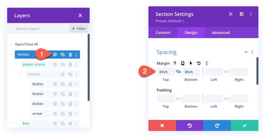
To view the result of this example, we need to create some scrolling space to test out the positioning magic of the popper popover.
To do this, open the section settings and add some margin as follows:
- Margin: 80vh top, 80vh bottom
Here is what the functionality looks like on a larger desktop viewport.
Here is what the functionality looks like when adjusting the browser width.
Notice how the position of the popover (and arrow) changes dynamically as the user scrolls or changes the browser size.
Also, here is a codepen that illustrates the same functionality.
Final Thoughts
Creating a popper.js popover in Divi does rely on a good bit of Javascript, but the result is worth it. The dynamic positioning of the popover is such a great UI component that would benefit any website. Hopefully, this will come in handy for any of your popover needs in Divi going forward.
I look forward to hearing from you in the comments.
Cheers!


Much obliged For sharing this fantastic article. It’s truly cool to share this educational article. I believe it’s best article.
Thanks, Mack!
Thanks Jason, this is great and timely too.
I have a client that wants a set of quick links to point users to important parts of their site and this will be perfect. Hidden away until needed.
Too cool.
Glad it was useful, Jean. Thanks for the comment.
This is excellent! But when I copy the whole section onto the same page, the second doesnt work. How do we have more than 1 on a page please?
Brad,
Right. Unfortunately, this is kind of a one-off application of a popover. So with the code, you currently only have one instance of the popover per document/page. The code would have to be adjusted for this additional functionality.
Very cool. Are there any other examples of how this feature might be used in a functioning website?
Charlie,
Not currently that I can think of off-hand. But, I’m sure there are a ton of ways it can be used. You can add the button(reference), the popover row, and the code like we did in this tutorial on any page of your website. Then fill the popover row with any content you want. One example is to use it for a type of mega menu for your header.
Wow that’s good. Can we make pop-up menu too in header or footer section ???
Yes, if you use the Theme Builder.
I’m looking forward to click actions being added in the Divi Builder as an addition to the existing hover effects.
Exactly, you can use it in the theme builder for menus if you want to.