")
If you are focusing on mobile-first designs, this post might help you out. We’ve created two beautiful examples of service showcases that look great on smaller screen sizes. More so, they were specifically designed to look their best on mobile while still maintaining a good design on desktop. In this post, we’ll show you step by step how to recreate them from scratch. We hope this tutorial will inspire you to unleash your creativity when designing services sections for any website you build. At the end of the tutorial, you’ll also be able to download the JSON files of both sections.
Let’s get to it!
Preview
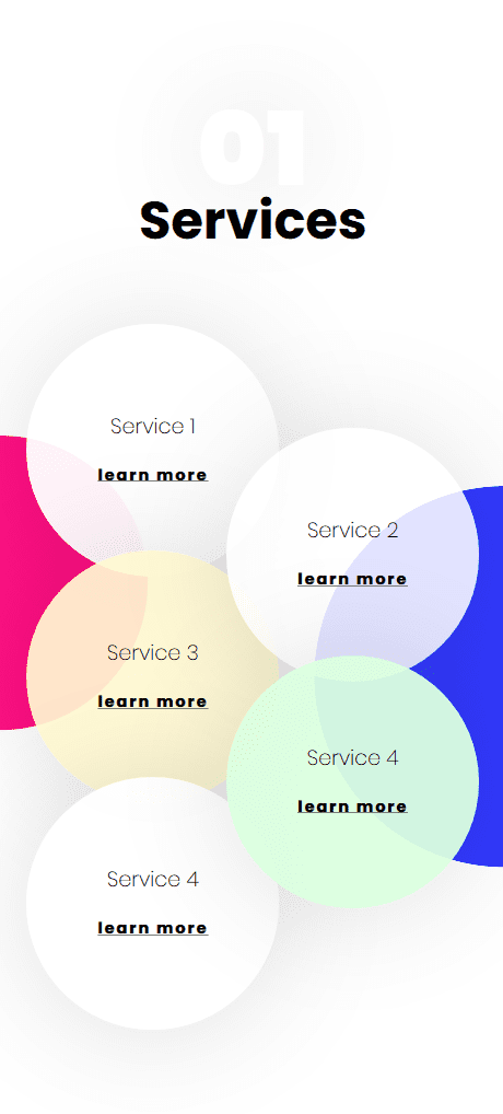
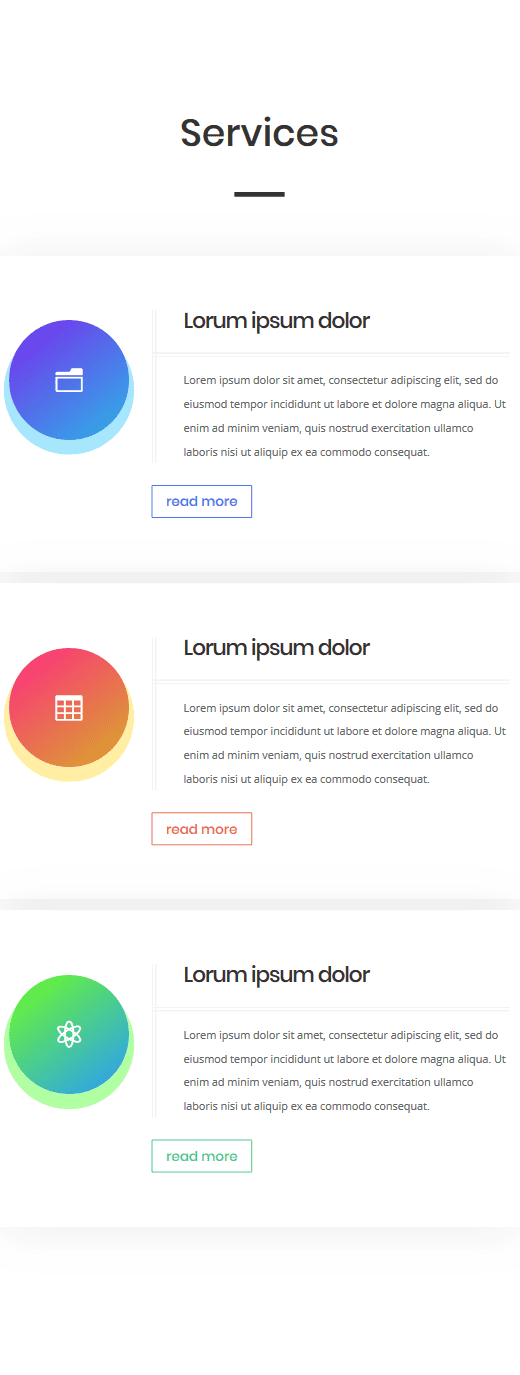
Before we dive into the tutorial, let’s take a quick look at the two mobile examples that we’ll recreate.
Example #1
Example #2
Let’s Start Recreating Example #1
Subscribe To Our Youtube Channel
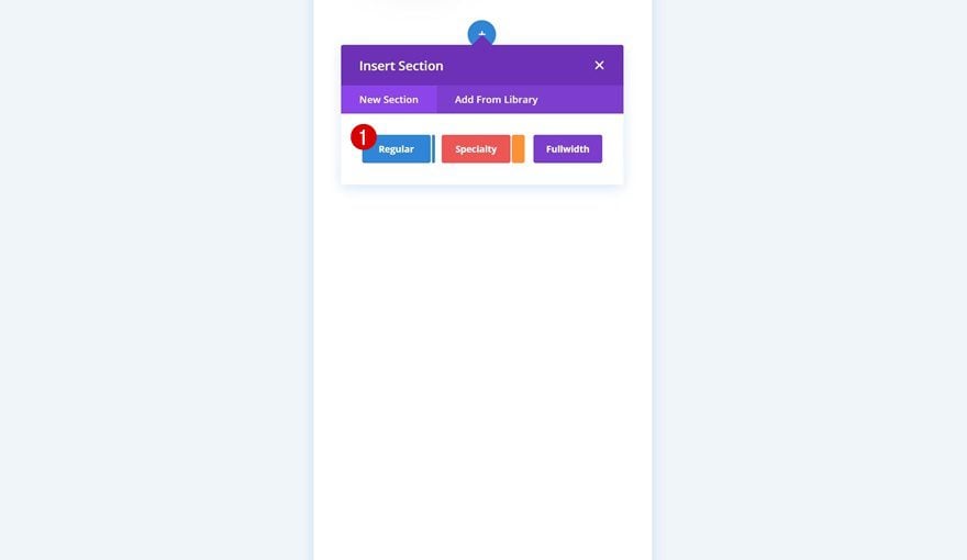
Add New Section
Gradient Background
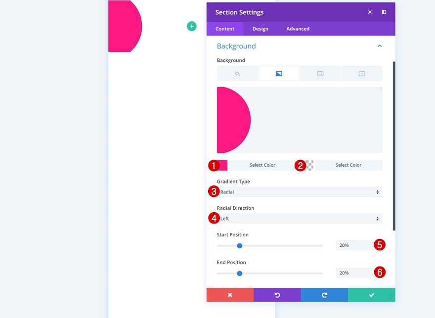
Create a new page and add a regular section to it. Open the section settings and add a gradient background.
- Color 1: #ff0f83
- Color 2: rgba(255,255,255,0)
- Gradient Type: Radial
- Radial Direction: Left
- Start Position: 20%
- End Position: 20%
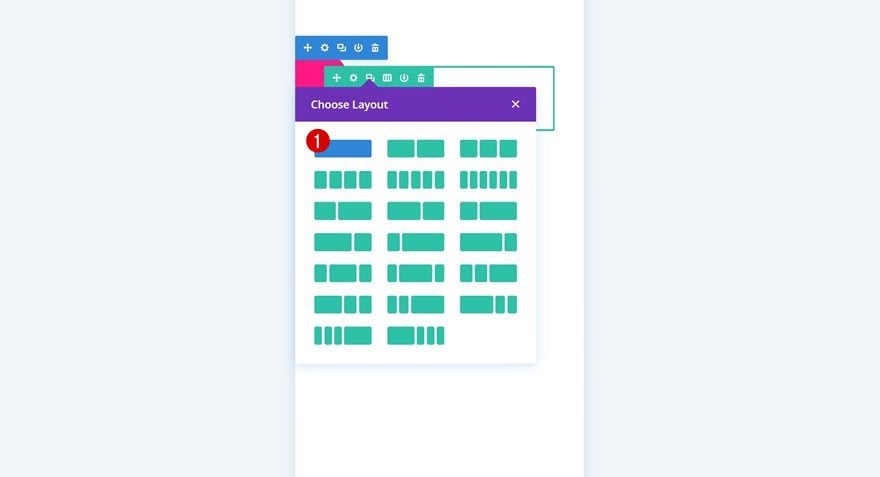
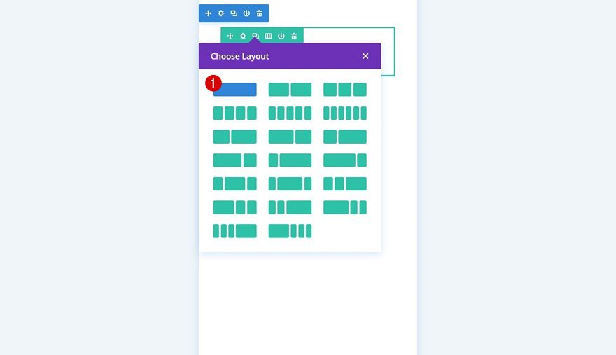
Add Row #1
Column Structure
Continue by adding a new row to the section using the following column structure:
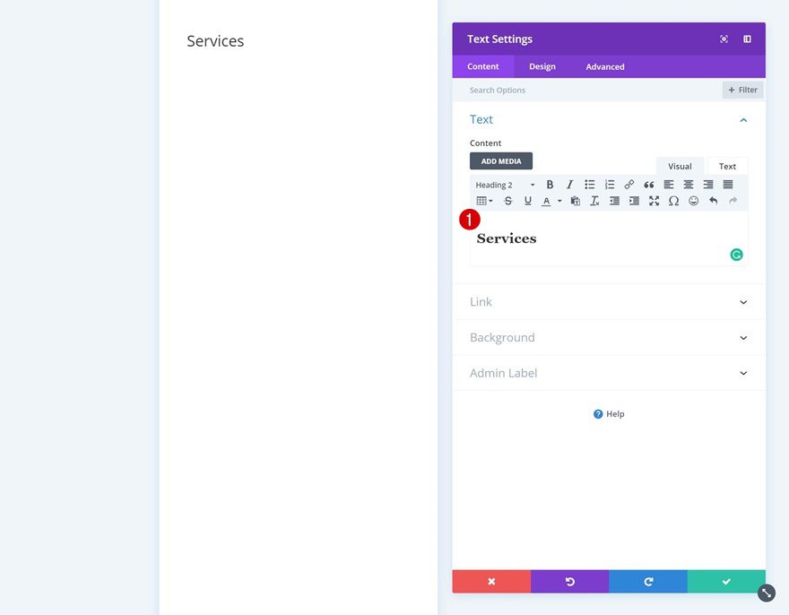
Add Text Module #1
Add Content
The first module we’ll need is a Text Module. Add some content to the content box.
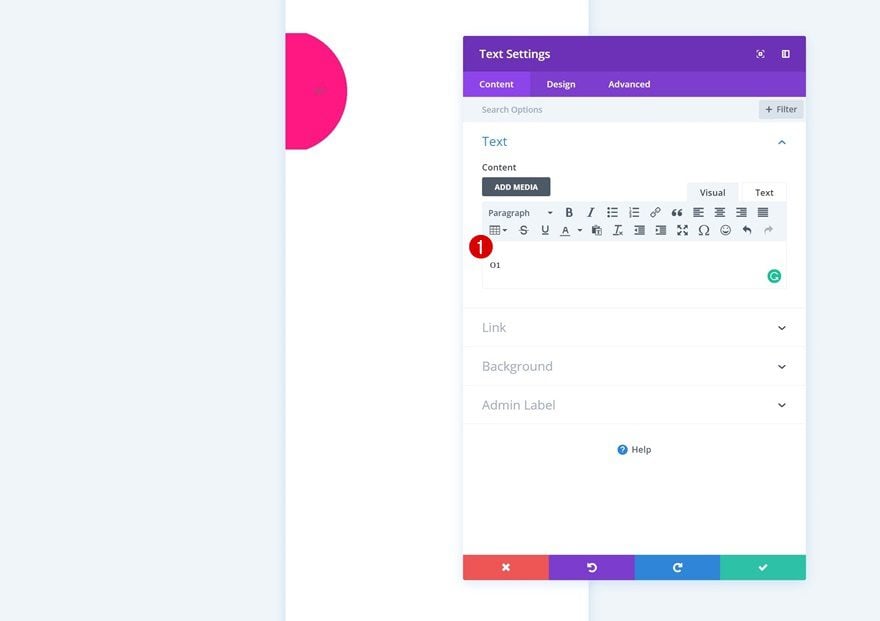
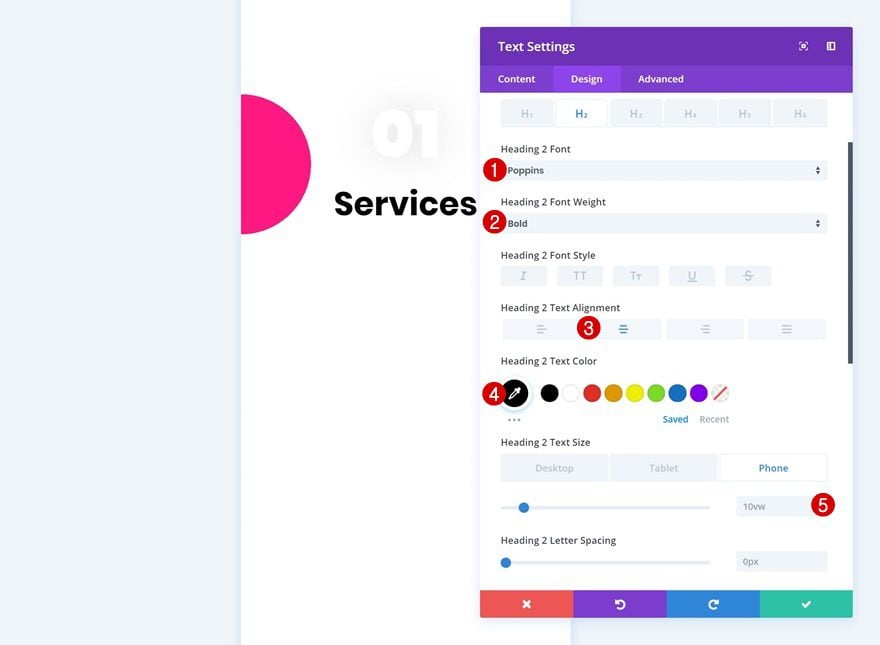
Text Settings
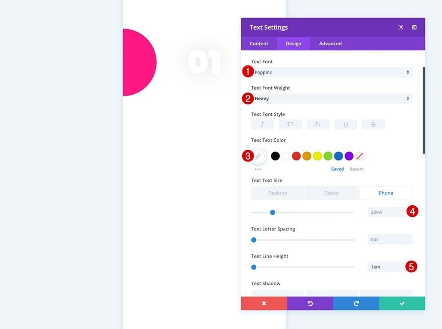
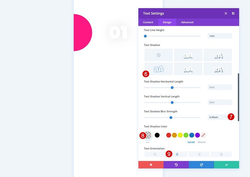
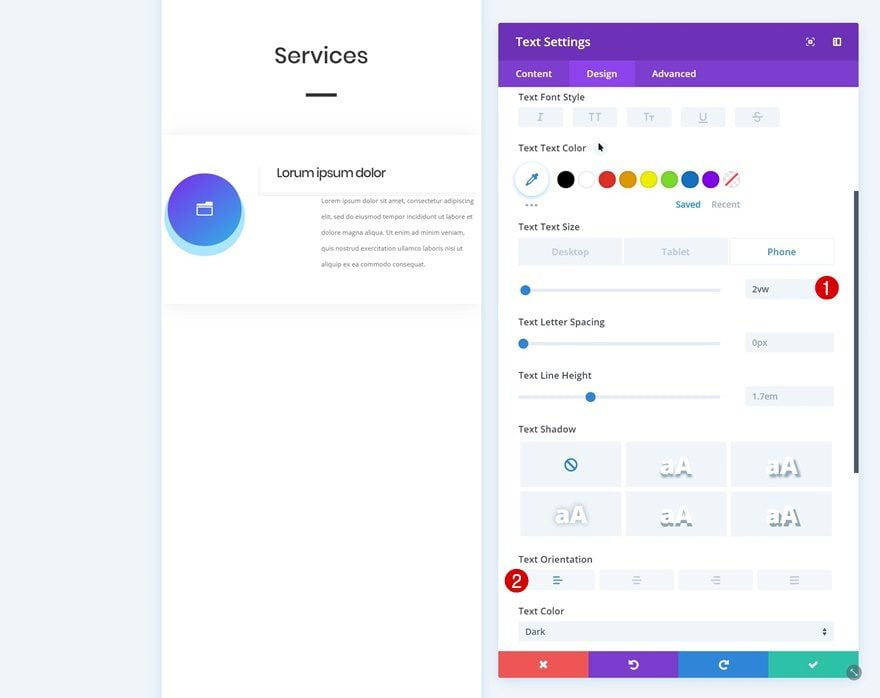
Then, go to the design tab and modify the text settings.
- Text Font: Poppins
- Text Font Weight: Heavy
- Text Color: #ffffff
- Text Size: 20vw
- Text Line Height: 1em
- Text Shadow Blur Strength: 0.95em
- Text Shadow Color: rgba(0,0,0,0.13)
- Text Orientation: Center
Add Text Module #2
Add H2 Content
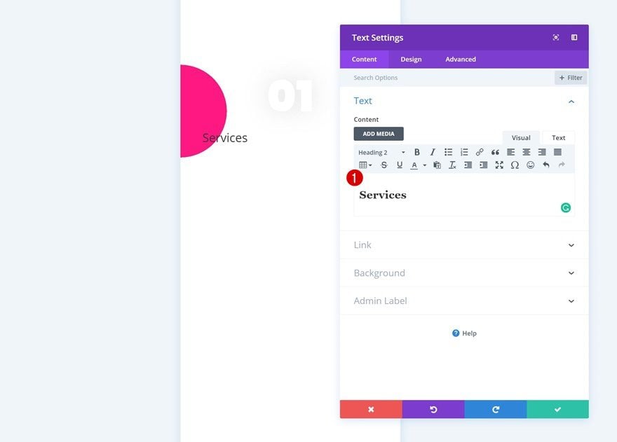
Add another Text Module right below the previous one. Enter some H2 content of your choice.
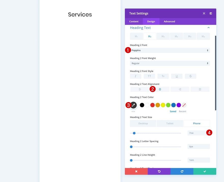
H2 Text Settings
Then, go to the design tab and modify the H2 text settings.
- Heading 2 Font: Poppins
- Heading 2 Font Weight: Bold
- Heading 2 Text Alignment: Center
- Heading 2 Text Color: #000000
- Heading 2 Text Size: 10vw (Phone & Tablet), 10vw (Desktop)
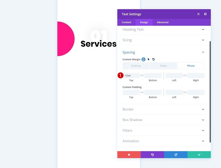
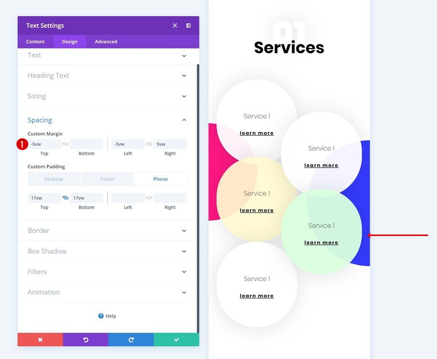
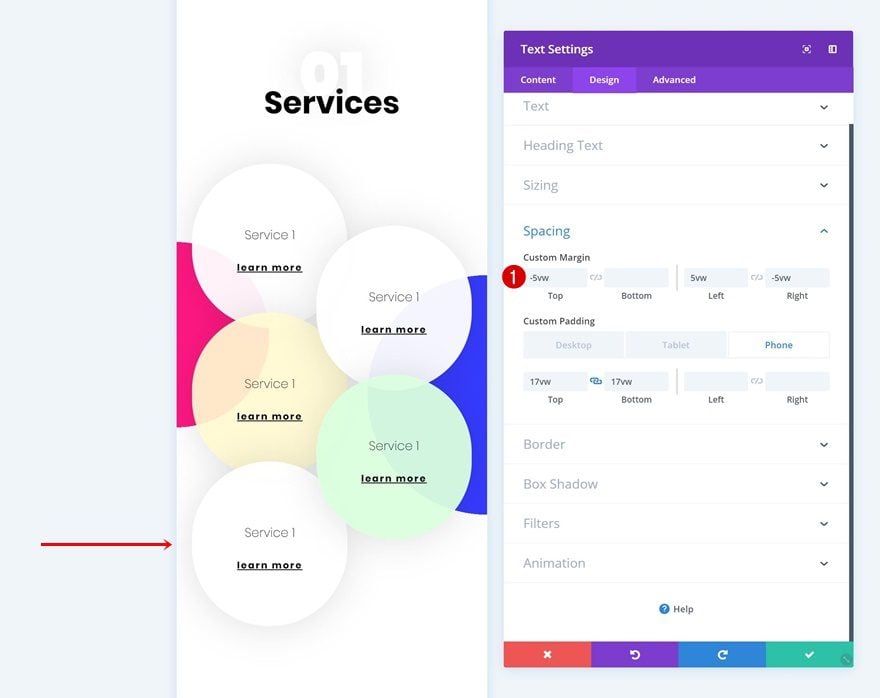
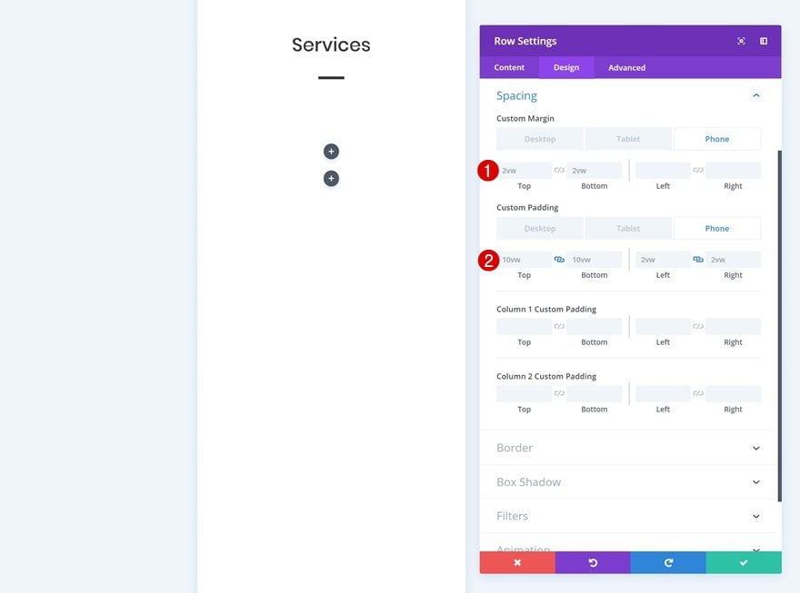
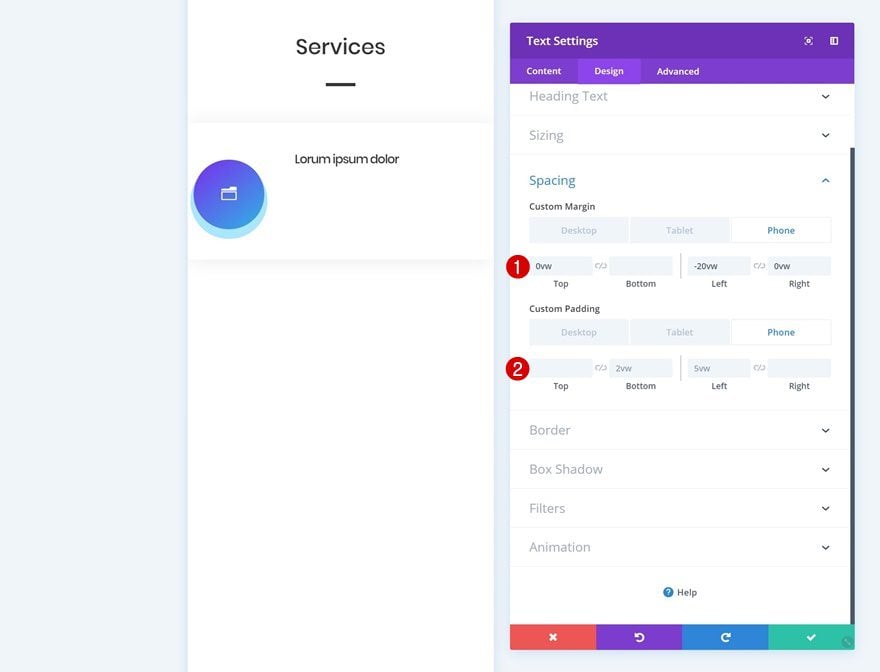
Spacing
Create an overlap between both text modules using some negative top margin.
- Top Margin: -12vw (Phone), -10vw (Tablet), -8vw (Desktop)
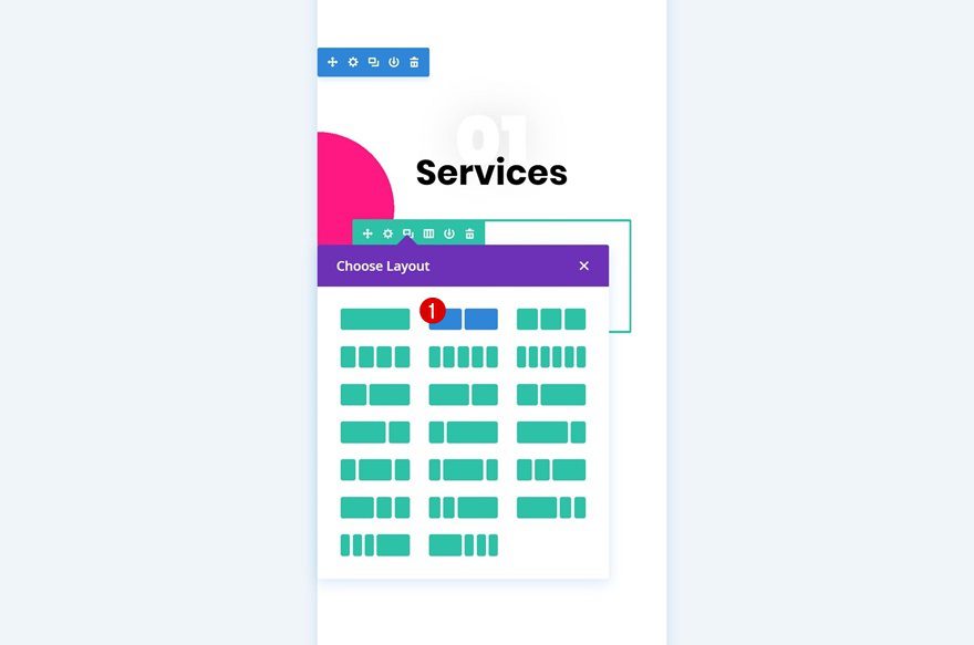
Add Row #2
Column Structure
Continue by adding another row using the following column structure:
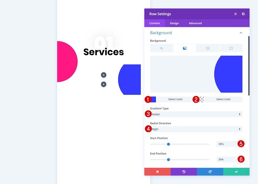
Gradient Background
Without adding any modules yet, open the row settings and add a gradient background.
- Color 1: #3239ff
- Color 2: rgba(255,255,255,0)
- Gradient Type: Radial
- Radial Direction: Right
- Start Position: 30%
- End Position: 30%
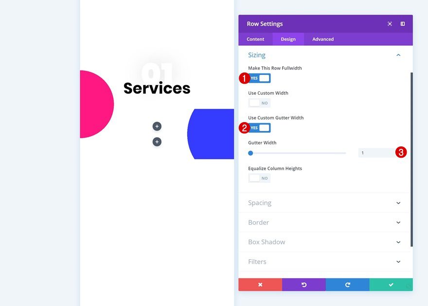
Sizing
Go to the sizing settings next and allow the row to take up the entire width of the screen.
- Make This Row Fullwidth: Yes
- Use Custom Gutter Width: Yes
- Gutter Width: 1
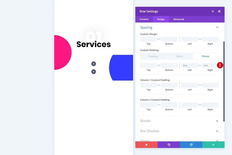
Spacing
Add some spacing values too. These values will make sure everything looks good across all screen sizes.
- Left Padding: 0vw (Phone & Tablet), 15vw (Desktop)
- Right Padding: 0vw (Phone & Tablet), 15vw (Desktop)
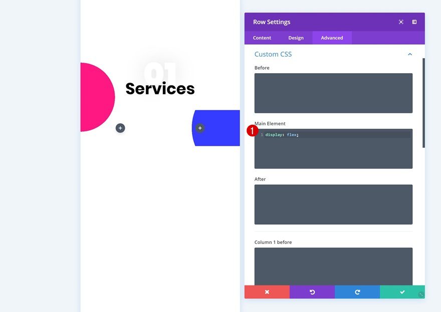
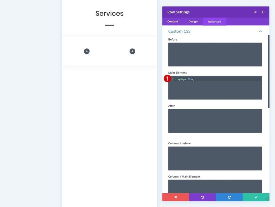
Custom CSS
We’re also placing the two columns right next to each other by adding one line of CSS code in the advanced tab.
display: flex;
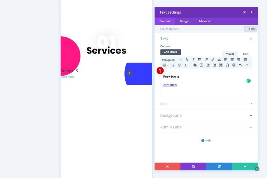
Add Text Module to Column 1
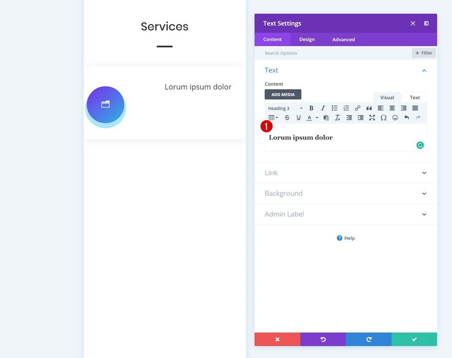
Add H3 & Link Content
Now we can start adding modules! Add a Text Module to the first column with some H3 copy and a link.
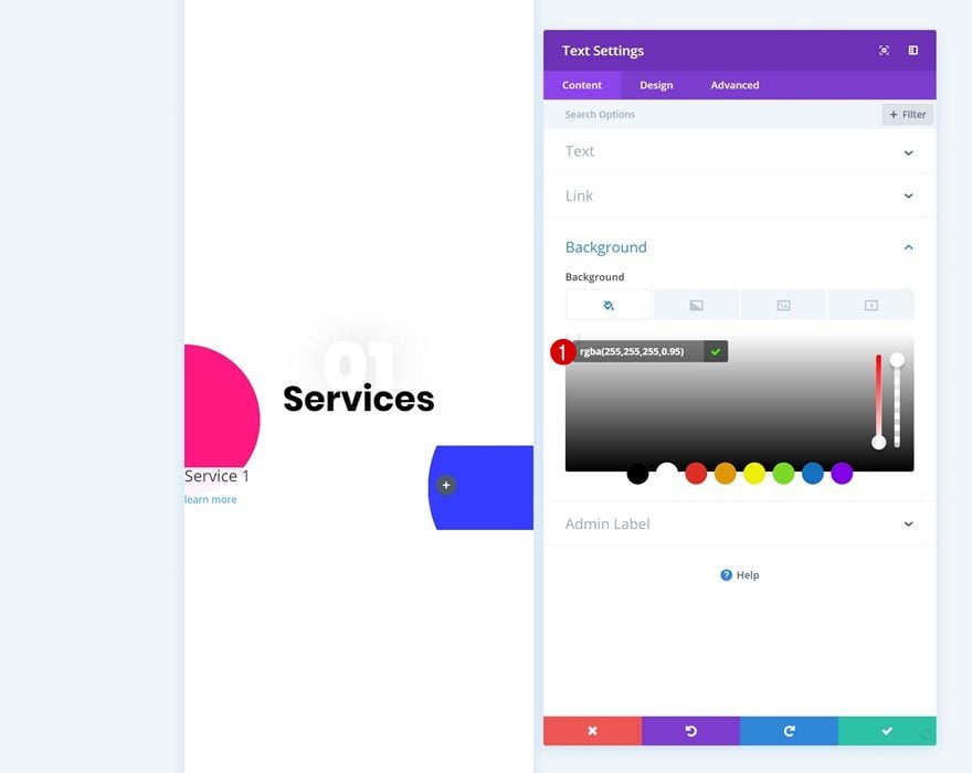
Background Color
Then, go to the background settings of the module and add a background color.
- Background Color: rgba(255,255,255,0.95)
Text Settings
Continue by changing the text orientation in the text settings of the module.
- Text Orientation: Center
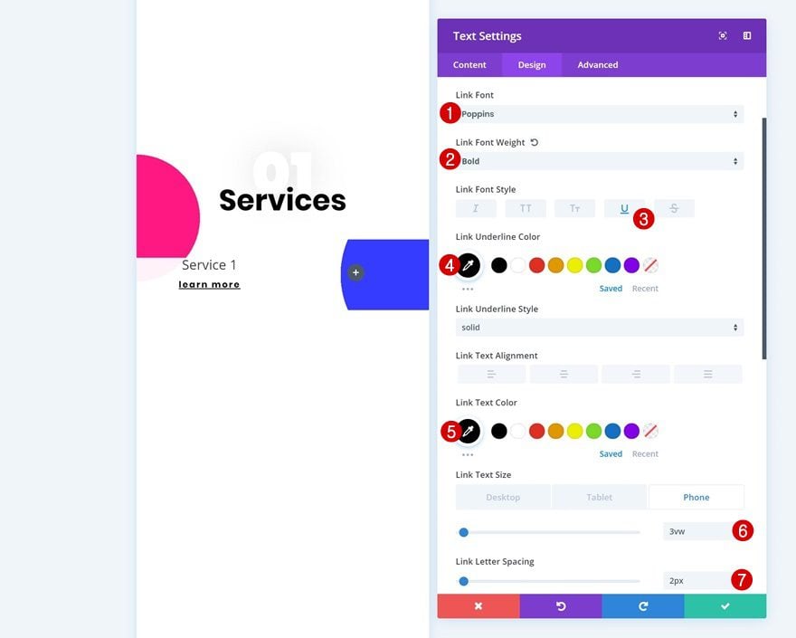
Link Text Settings
Modify the link text settings as well.
- Link Font: Poppins
- Linke Font Weight: Bold
- Link Font Style: Underline
- Link Underline Color: #000000
- Link Text Color: #000000
- Link Text Size: 3vw (Phone), 2vw (Tablet), 1vw (Desktop)
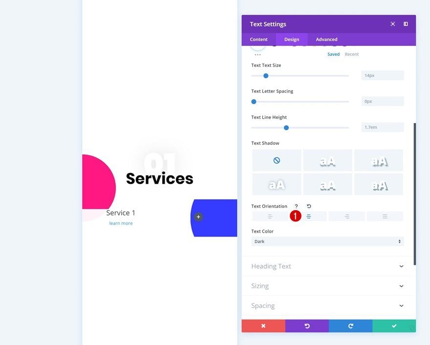
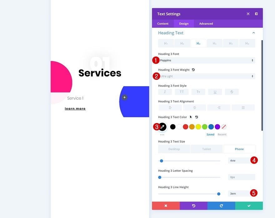
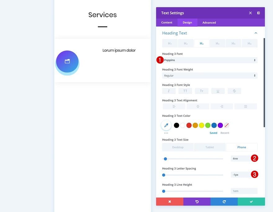
H3 Text Settings
Along with the H3 text settings.
- Heading 3 Font: Poppins
- Heading 3 Font Weight: Ultra Light
- Heading 3 Text Color: #000000
- Heading 3 Text Size: 4vw (Phone), 3vw (Tablet), 2vw (Desktop)
- Heading 3 Text Line Height: 1.9em for a circle shape or 3em for an oval one
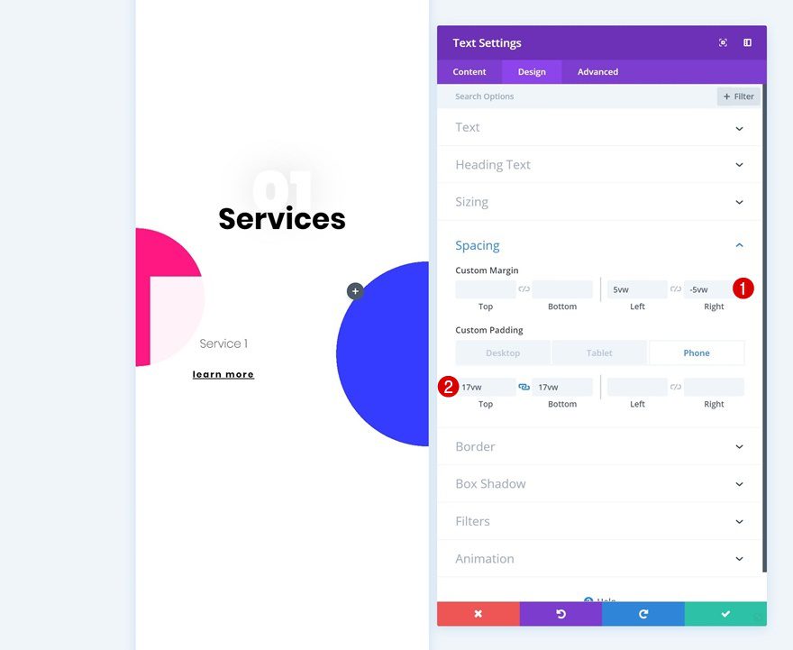
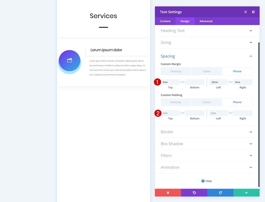
Spacing
To create a shape out of this module, we’re going to add some custom margin and padding values in the spacing settings.
- Left Margin: 5vw
- Right Margin: -5vw
- Top Padding: 17vw (Phone), 20vw (Tablet), 15vw (Desktop)
- Bottom Padding: 17vw (Phone), 20vw (Tablet), 15vw (Desktop)
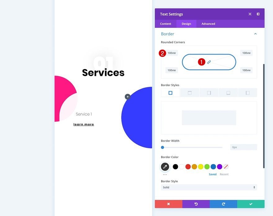
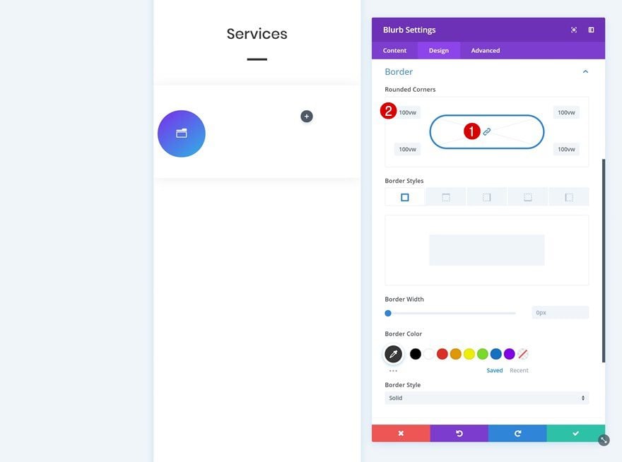
Border
We’re turning the square into a circle using rounded corners by adding ‘100vw’ to each one of the corners.
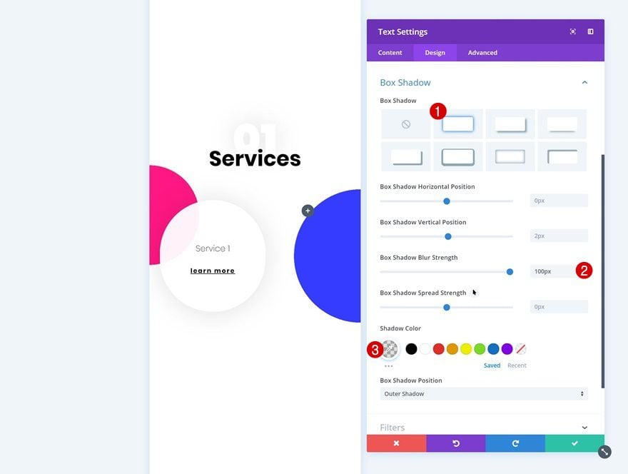
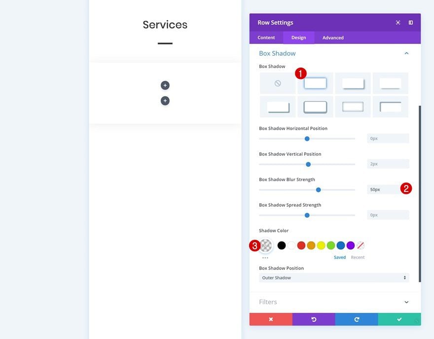
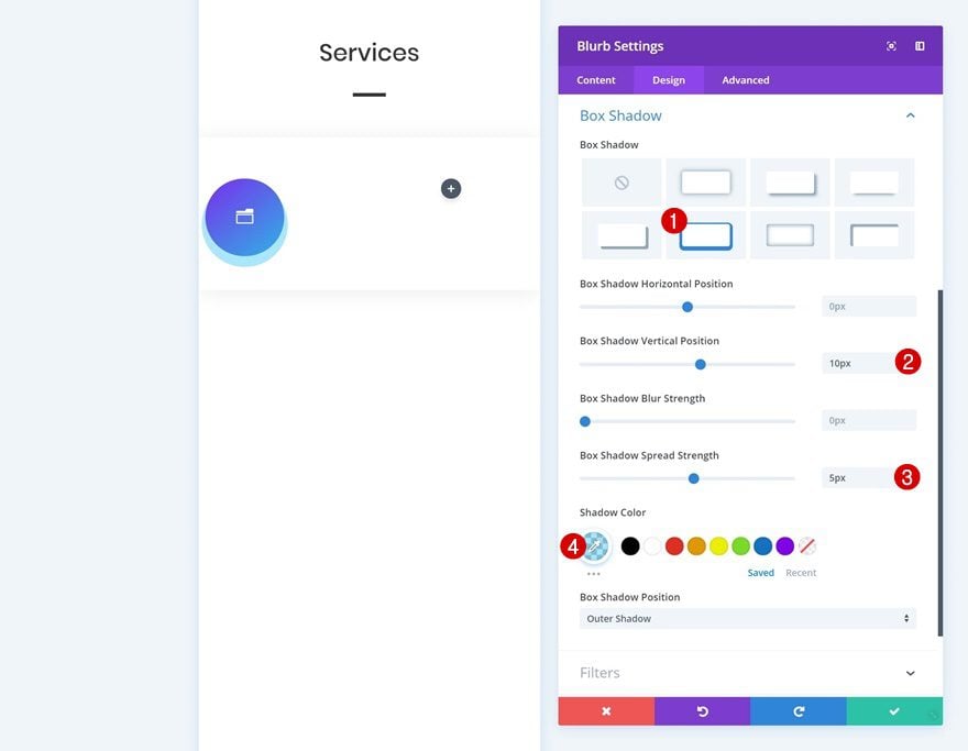
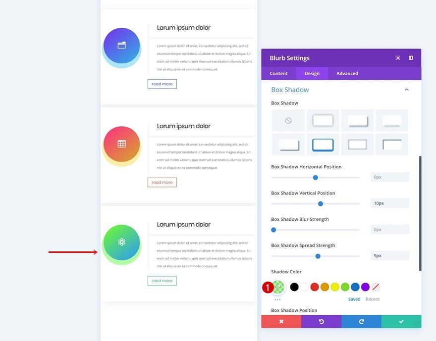
Box Shadow
And to create some depth, we’ll add a subtle box shadow.
- Box Shadow Blur Strength: 100px
- Shadow Color: rgba(0,0,0,0.12)
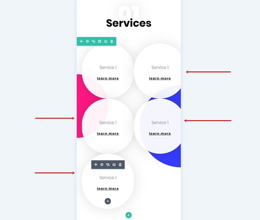
Clone Text Module 4 Times
Now that we’re done modifying the first Text Module, we can go ahead and clone it four times. Place two of the duplicates in the second column.
Modify Duplicate #1
Spacing
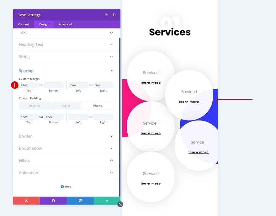
Continue by modifying the first duplicate’s spacing settings.
- Top Margin: 20vw
- Left Margin: -5vw
- Right Margin: 5vw
Modify Duplicate #2
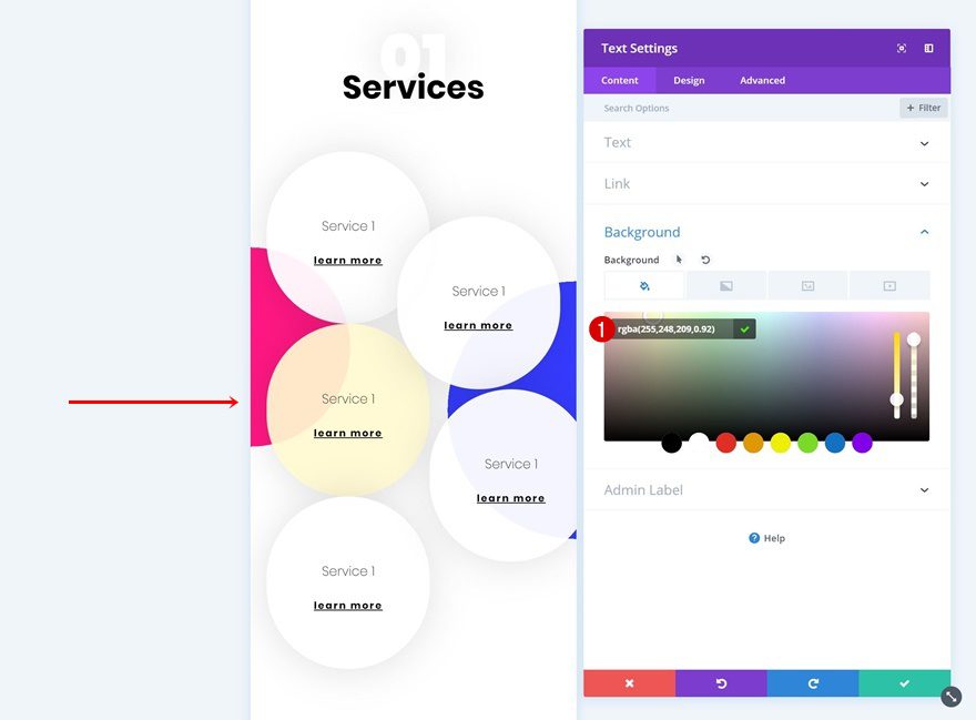
Background Color
Open the second duplicate next and change the background color.
- Background Color: rgba(255,248,209,0.92)
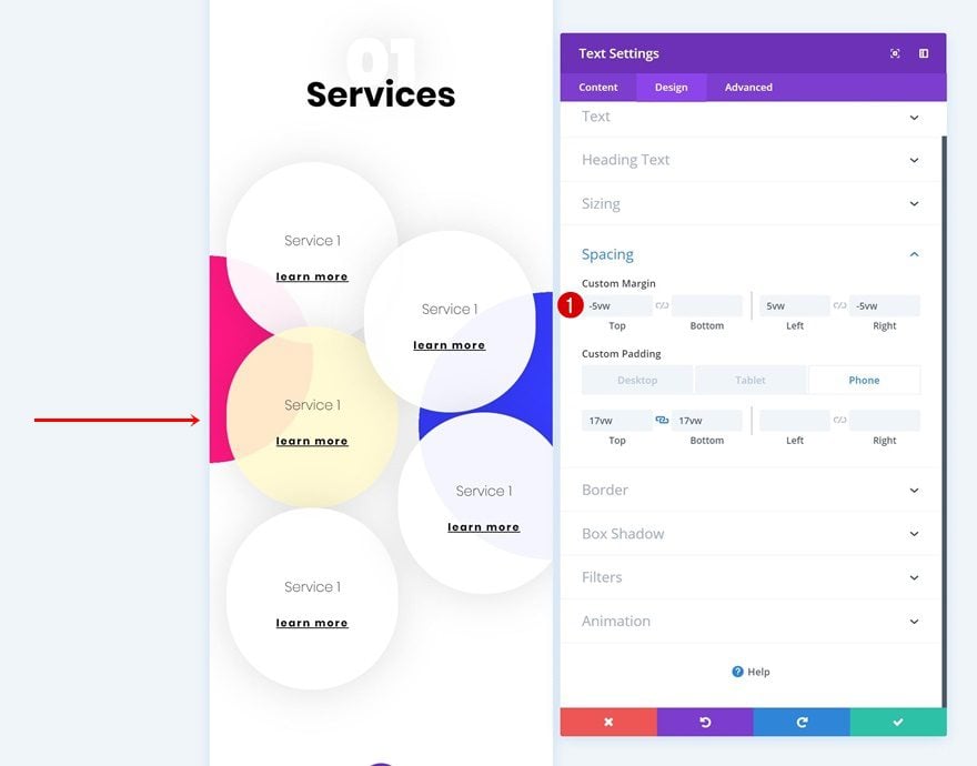
Spacing
Modify the spacing settings too.
- Top Margin: -5vw
Modify Duplicate #3
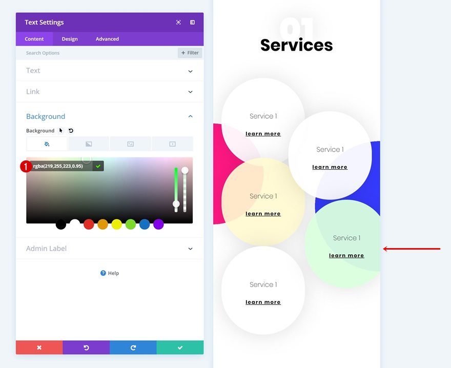
Background Color
Then, open the third duplicate and change the background color.
- Background Color: rgba(219,255,223,0.95)
Spacing
Modify the spacing settings next.
- Top Margin: -5vw
- Left Margin: -5vw
- Right Margin: 5vw
Modify Duplicate #4
Spacing
Open the last duplicate as well and add some negative top margin to finish the design.
- Top Margin: -5vw
Let’s Start Recreating Example #2
Add New Section
On to the second example! Add a new section to your page.
Add Row #1
Column Structure
Continue by adding a new row using the following column structure:
Add Text Module
Add H2 Content
The first module we’ll need is a Text Module. Enter some H2 content of your choice.
H2 Text Settings
Then, go to the design tab and modify the H2 text settings.
- Heading 2 Font: Poppins
- Heading 2 Text Alignment: Center
- Heading 2 Text Color: #333333
- Heading 2 Text Size: 7vw (Phone & Tablet), 4vw (Desktop)
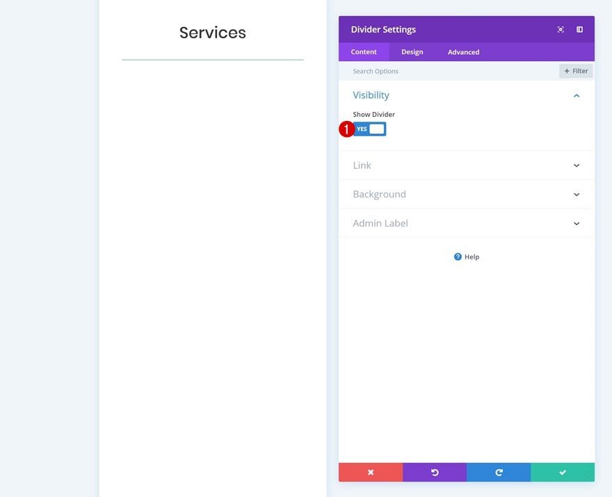
Add Divider Module
Visibility
Add a Divider Module right below the Text Module. Make sure the ‘Show Divider’ option is enabled.
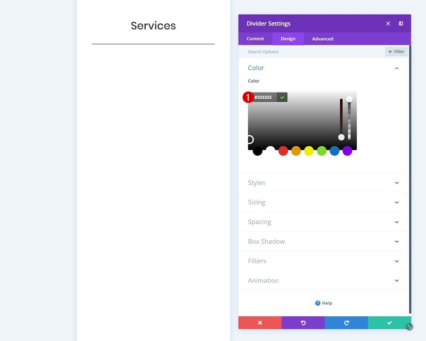
Color
Then, go to the design tab and modify the divider color.
- Color: #333333
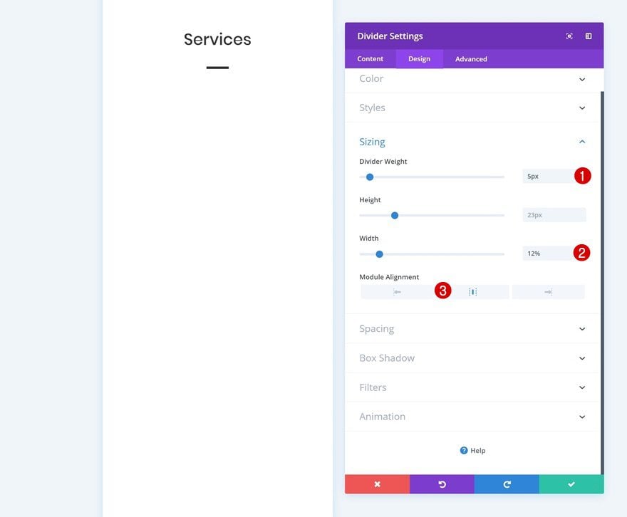
Sizing
Play around with the sizing settings as well.
- Divider Weight: 5px
- Width: 12%
- Module Alignment: Center
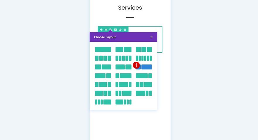
Add Row #2
Column Structure
Continue by adding a new row to the section using the following column structure:
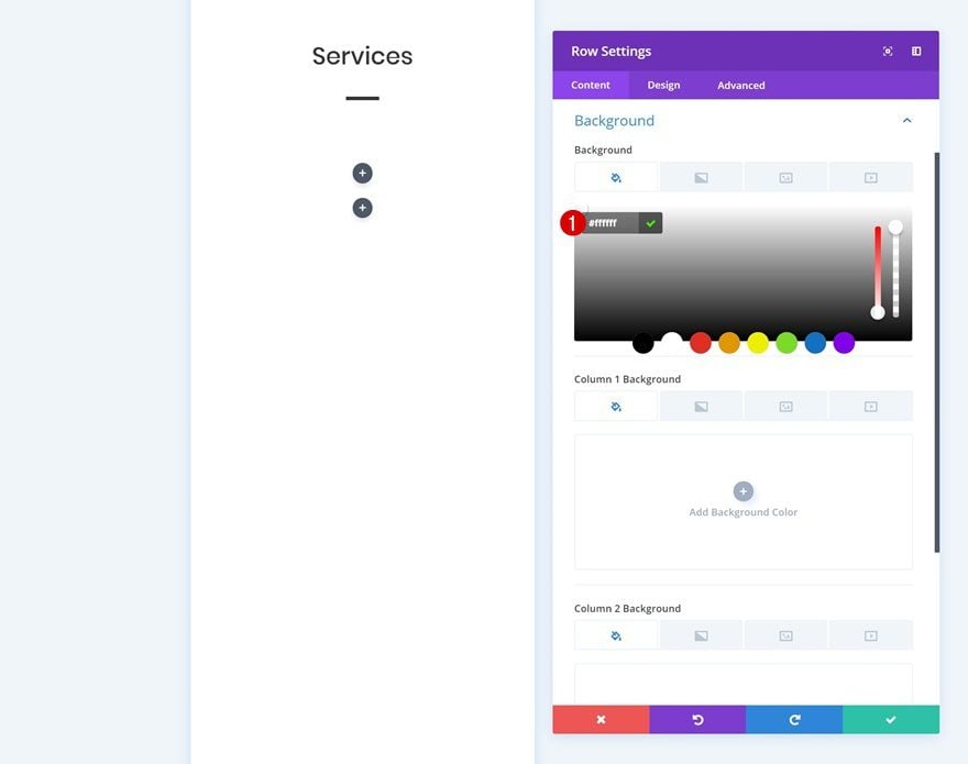
Background Color
Without adding any modules yet, open the row settings and add a white background color.
- Background Color: #ffffff
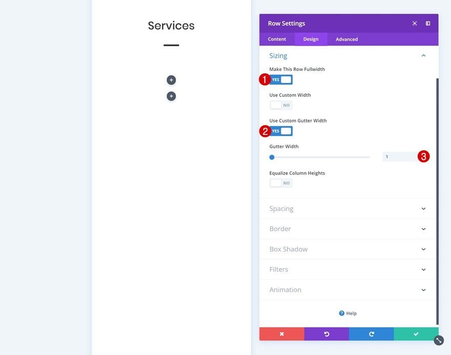
Sizing
Go to the sizing settings next and allow the row to take up the entire width of the screen.
- Make This Row Fullwidth: Yes
- Use Custom Gutter Width: Yes
- Gutter Width: 1
Spacing
Add some custom margin and padding values next to optimize the design for all screen sizes.
- Top Margin: 2vw
- Bottom Margin: 2vw
- Top Padding: 10vw (Phone & Tablet), 5vw (Desktop)
- Bottom Padding: 10vw (Phone & Tablet), 5vw (Desktop)
- Left Padding: 2vw (Phone & Tablet), 20vw (Desktop)
- Right Padding: 2vw (Phone & Tablet), 20vw (Desktop)
Box Shadow
We’re using a subtle box shadow too.
- Box Shadow Blur Strength: 50px
- Shadow Color: rgba(0,0,0,0.07)
Custom CSS
Last but not least, place both columns next to each other by adding a single CSS code line to the main element in the advanced tab.
display: flex;
Add Blurb Module to Column 1
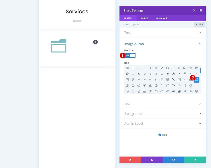
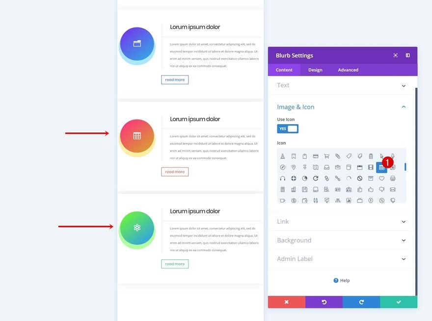
Select Icon
We can now start adding modules! The only module we need in column 1 is a Blurb Module. Select an icon of your choice.
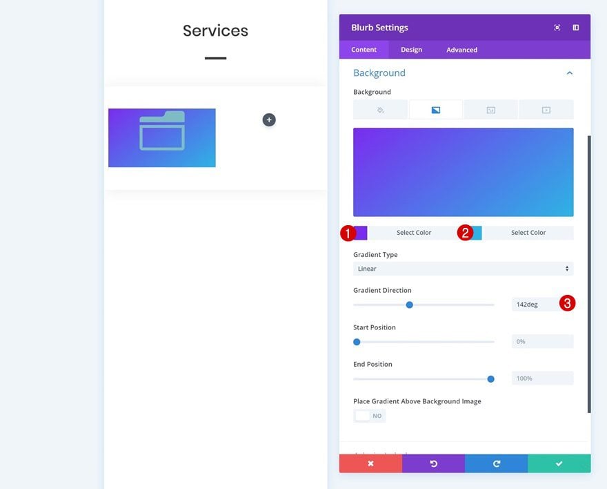
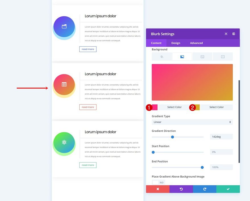
Gradient Background
Then, add a gradient background.
- Color 1: #7b28ef
- Color 2: #29b6e5
- Gradient Direction: 142deg
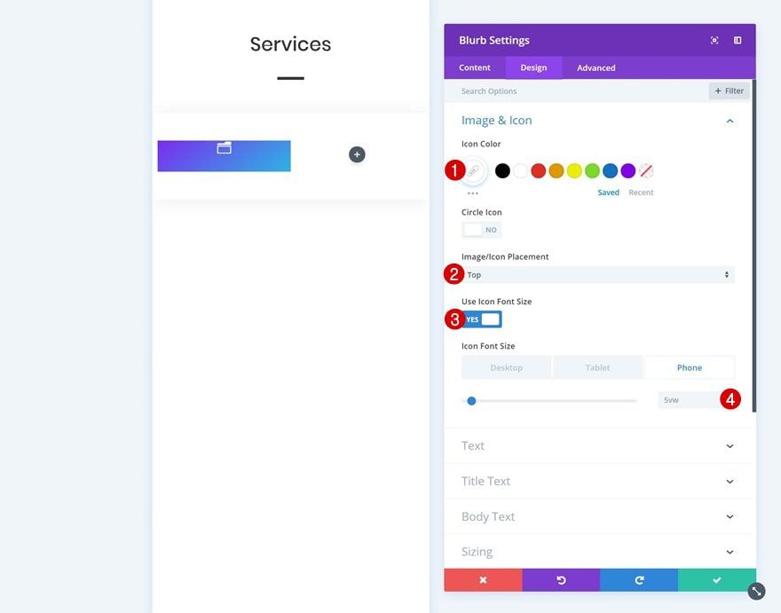
Icon Settings
Modify the icon settings next.
- Icon Color: #ffffff
- Icon Placement: Top
- Use Icon Font Size: Yes
- Icon Font Size: 5vw (Phone & Tablet), 4vw (Desktop)
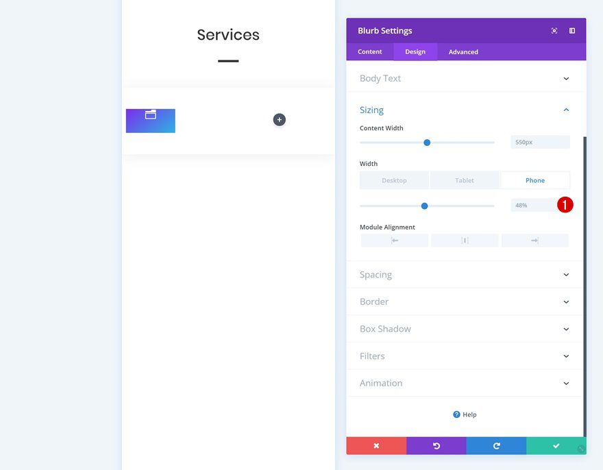
Sizing
And change around the sizing settings.
- Width: 48% (Phone & Tablet), 78% (Desktop)
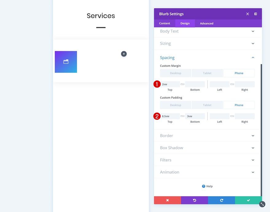
Spacing
We’re also adding some custom margin and padding values to optimize the design across all screen sizes.
- Top Margin: 2vw (Phone)
- Top Padding: 8.5vw (Phone), 9vw (Tablet), 6vw (Desktop)
- Bottom Padding: 3vw (Phone), 5vw (Tablet), 4vw (Desktop)
Border
Turn the module into a circle next by adding ‘100vw’ to each one of the corners in the border settings.
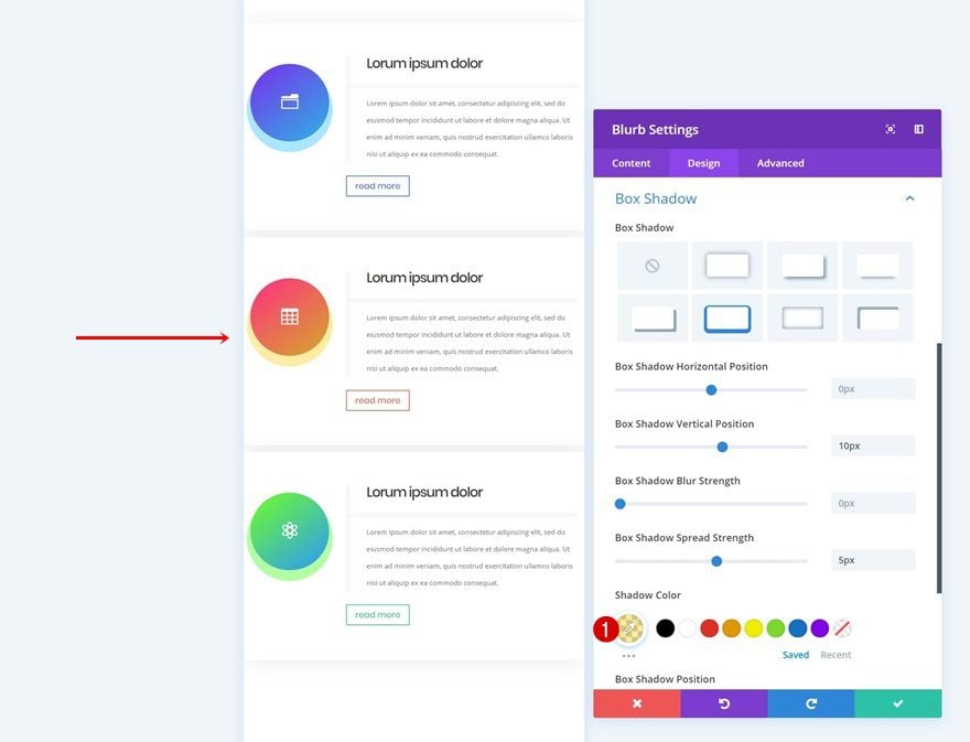
Box Shadow
We’re adding a box shadow too.
- Box Shadow Vertical Position: 10px
- Box Shadow Spread Strength: 5px
- Shadow Color: rgba(2,185,252,0.35)
Add Text Module #1 to Column 2
Add H3 Content
On to the second column! The first module we need there is a title Text Module. Add some H3 content.
H3 Text Settings
Then, go to the design tab and modify the H3 text settings.
- Heading 3 Font: Poppins
- Heading 3 Text Size: 4vw (Phone), 3vw (Tablet), 2vw (Desktop)
Spacing
Add some custom spacing values next.
- Top Margin: 0vw (Phone), 3vw (Tablet & Desktop)
- Left Margin: -20vw (Phone & Tablet), 0vw (Desktop)
- Right Margin: 0vw
- Bottom Padding: 2vw (Phone & Tablet), 1vw (Desktop)
- Left Padding: 5vw (Phone & Tablet), 2vw (Desktop)
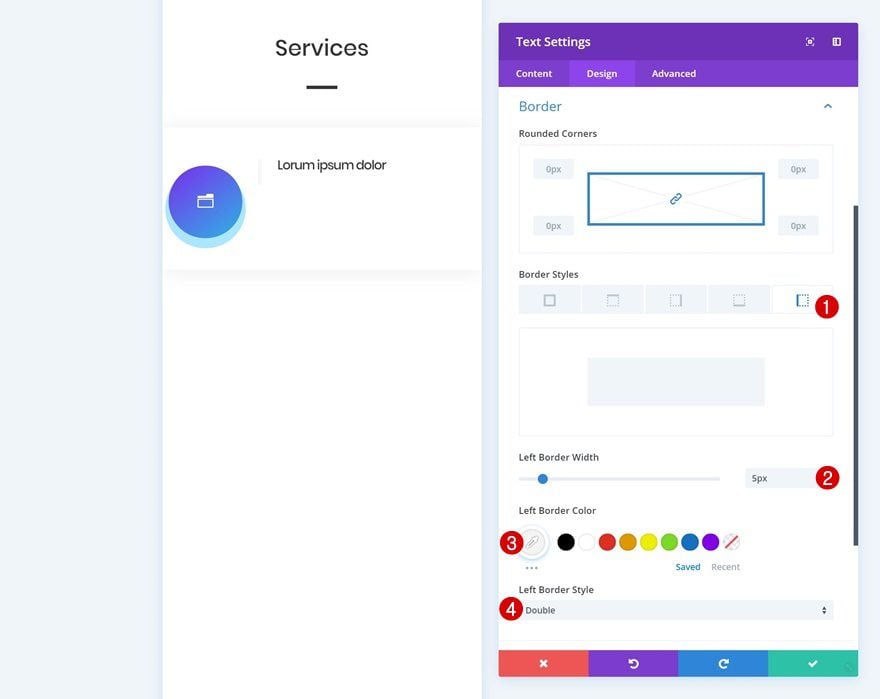
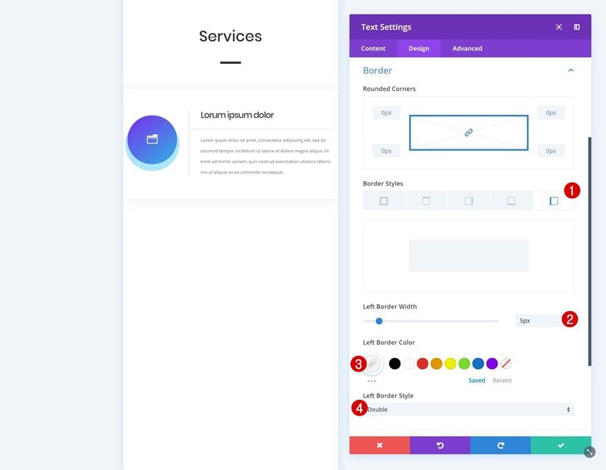
Border
Along with a left border.
- Left Border Width: 5px
- Left Border Color: #f4f4f4
- Left Border Style: Double
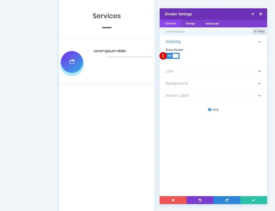
Add Divider Module to Column 2
Show Divider
The second module we need is a Divider Module. Make sure the ‘Show Divider’ option is enabled.
- Show Divider: Yes
Color
Then, go to the design tab and change the divider color.
- Color: #f4f4f4
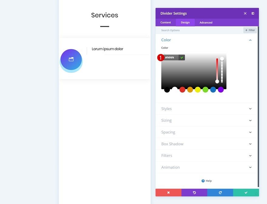
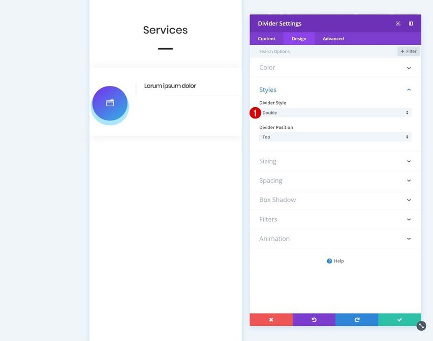
Styles
Change the divider style in the styles settings next.
- Divider Style: Double
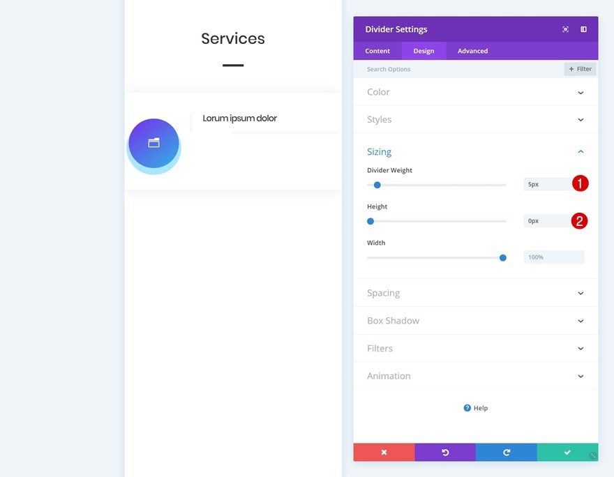
Sizing
Continue by modifying the different options in the sizing settings.
- Divider Weight: 5px
- Height: 0px
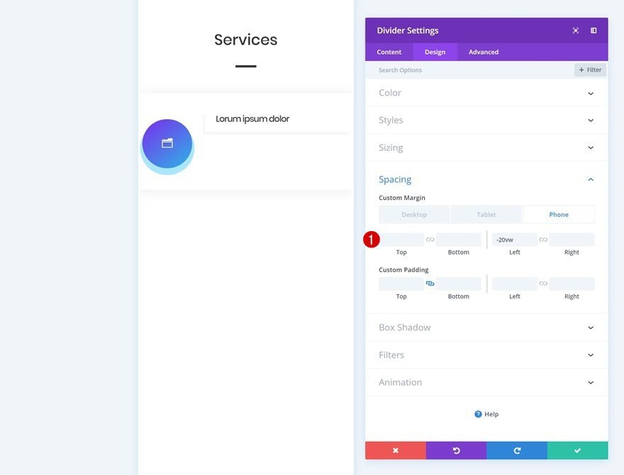
Spacing
And play around with the spacing values too.
- Left Margin: -20vw (Phone & Tablet), 0vw (Desktop)
Add Text Module #2 to Column 2
Add Content
The next module we need in the second column is another Text Module. Add some body content of choice.
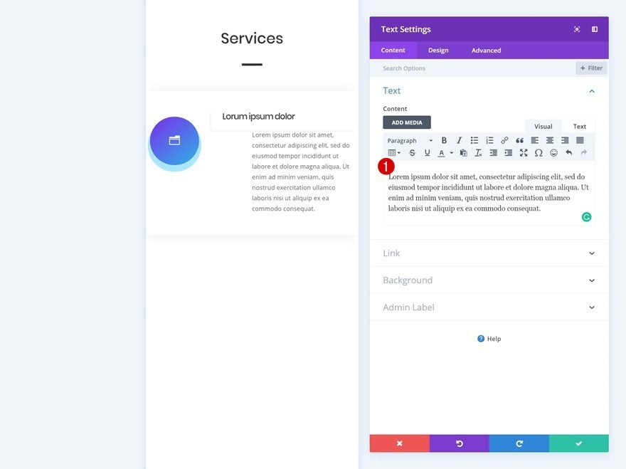
Text Settings
Then, go to the design tab and modify the text settings.
- Text Size: 2vw (Phone), 1.7vw (Tablet), 0.8vw (Desktop)
- Text Orientation: Left
Spacing
Play around with the spacing values as well.
- Top Margin: 0vw
- Left Margin: -20vw (Phone & Tablet), 0vw (Desktop)
- Right Margin: 0vw
- Top Padding: 3vw (Phone & Tablet), 2vw (Desktop)
- Left Padding: 5vw (Phone & Tablet), 2vw (Desktop)
Border
And add a left border.
- Left Border Width: 5px
- Left Border Color: #f4f4f4
- Left Border Style: Double
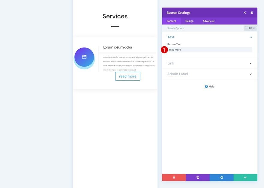
Add Copy
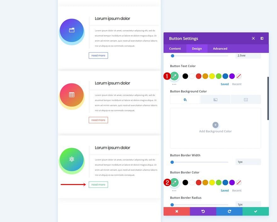
The next and last module we need in the second column is a Button Module. Add some copy.
Button Settings
Then, go to the design tab and change the button settings.
- Use Custom Styles for Button: Yes
- Button Text Size: 2.5vw (Phone), 2vw (Tablet), 1vw (Desktop)
- Button Text Color: #4f77e8
- Button Border Width: 1px
- Button Border Color: #4f77e8
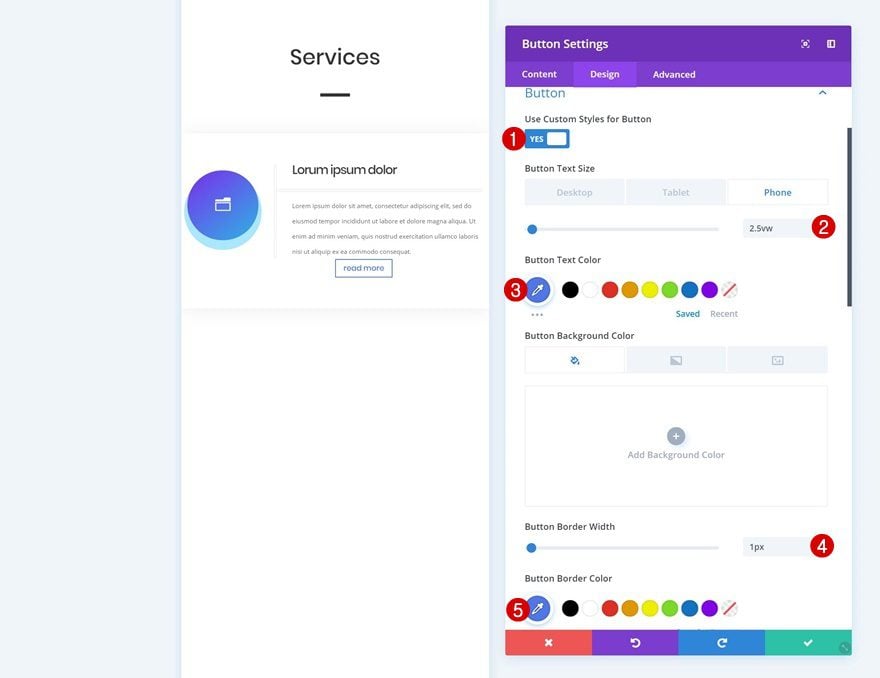
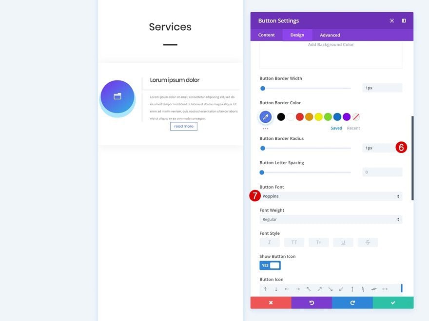
- Button Border Radius: 1px
- Button Font: Poppins
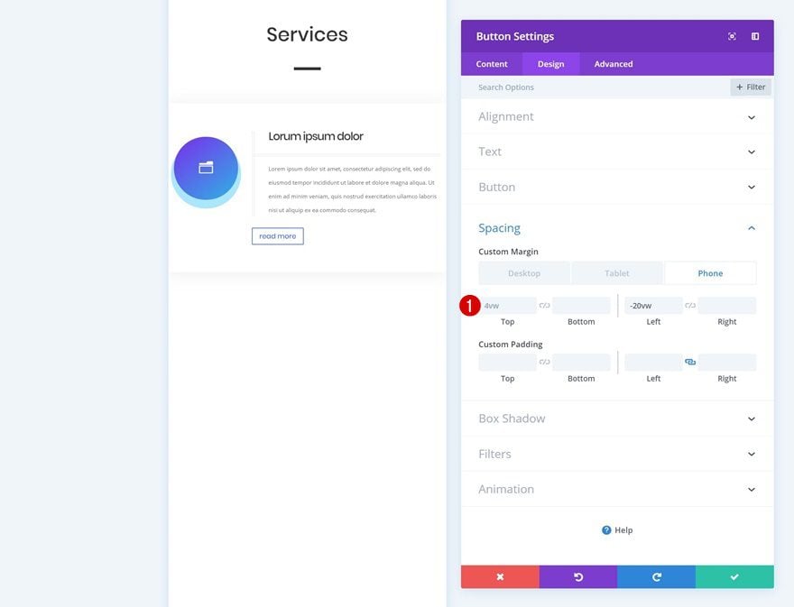
Spacing
Modify the spacing values as well.
- Top Margin: 4vw (Phone & Tablet), 2vw (Desktop)
- Left Margin: -20vw (Phone & Tablet), 0vw (Desktop)
Clone Row Twice
Now that we’re done modifying the row and all of its modules, we can clone it two times.
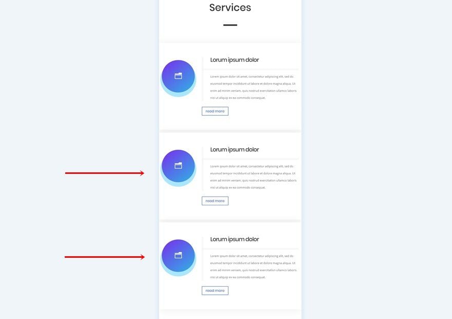
Change Icons
Make sure you change the icons for both Blurb Modules.
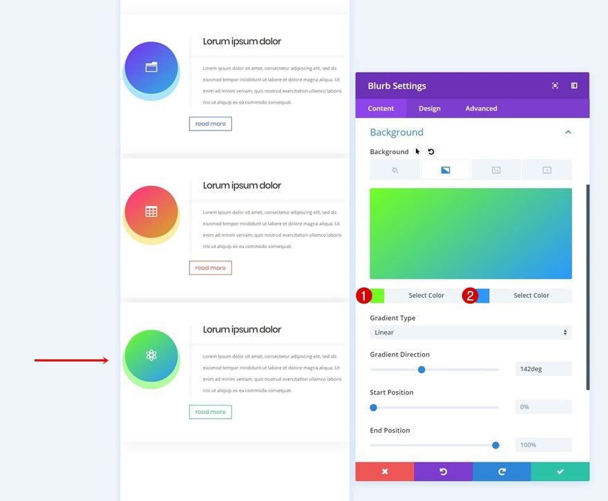
Change Gradient Backgrounds
Modify the gradient backgrounds as well.
- Color 1: #ff2885
- Color 2: #d6ac24
- Color 1: #70ff1e
- Color 2: #2699ff
Change Box Shadow Colors
Match the box shadow color with the new gradient background.
- Shadow Color: rgba(255,208,2,0.37)
- Shadow Color: rgba(42,255,0,0.37)
Change Button Border & Text Colors
And complete the design by changing the button border and text colors.
- Button Text Color: #e96c54
- Button Border Color: #e96c54

- Button Text Color: #4dcb93
- Button Border Color: #4dcb93
Download The Mobile Services Sections for FREE
To lay your hands on the free mobile services sections, you will first need to download them using the button below. To gain access to the download you will need to subscribe to our newsletter by using the form below. As a new subscriber, you will receive even more Divi goodness and a free Divi Layout pack every Monday! If you’re already on the list, simply enter your email address below and click download. You will not be “resubscribed” or receive extra emails.

Preview
Now that we’ve gone through all the steps, let’s take a final look at the mobile outcome of both examples.
Example #1
Example #2
Final Thoughts
In this post, we’ve shown you two creative ways on how to showcase services on mobile devices using Divi and its built-in options only. We hope this mobile-first approach will inspire you to get creative as well. If you have any questions or suggestions, make sure you leave a comment in the comment section below!


Hello,
Divi is a good responsive design theme. I am using may time Divi theme for my costume mobile design.
Your blog is so good for designing.
Thanks Donjete Vuniqi
Your work is always impeccable. Incredible tutorials, and the possibility of downloading for free is very good!
Thanks for sharing the downloads!
As much as I appreciate the step by step guidelines, won’t be easier to just share the saved layout instead? It would save everyone’s time 🙂
Very cool! Thanks
This is very cool and the download is VERY appreciated! Thanks.