
The way you design your product pages says a lot about your shop in general. Your product page’s design is an important part of the purchase experience, so going the extra mile is often worth it. If you’re looking to create a product page that is a bit more interactive, you’ll love this post. In this tutorial, we’ll show you how to add slide-in product info inside a beautifully-built product page layout. We’ll also turn this layout into a product page template and you’ll be able to download the JSON file for free!
Let’s get to it.
- 1 Preview
- 2 Download Slide-In Product Page Template for FREE
- 3 Download For Free
- 4 1. Add/Open WooCommerce Product
-
5
2. Create Slide-In Product Info Product Page Layout
- 5.1 Remove Multiple Rows on Page
- 5.2 Modify Section Settings
- 5.3 Modify Row Settings
- 5.4 Modify Column 2 Settings
- 5.5 Modify Woo Title Module in Column 2
- 5.6 Modify Woo Price Module in Column 2
- 5.7 Modify Woo Description Module in Column 2
- 5.8 Modify Woo Add to Cart Module in Column 2
- 5.9 Modify Woo Meta Module in Column 2
- 5.10 Add Code Module to Column 2
- 5.11 3. Add Synchronized Animation Settings to Containers
- 5.12 4. Turn Product Page Layout into Template
- 6 5. Save Theme Builder Changes & View Outcome
- 7 Preview
- 8 Final Thoughts
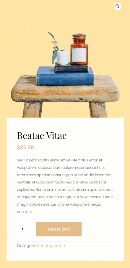
Preview
Before we dive into the tutorial, let’s take a quick look at the outcome across different screen sizes.
Desktop

Mobile
Download Slide-In Product Page Template for FREE
To lay your hands on the slide-in product page template, you will first need to download it using the button below. To gain access to the download you will need to subscribe to our newsletter by using the form below. As a new subscriber, you will receive even more Divi goodness and a free Divi Layout pack every Monday! If you’re already on the list, simply enter your email address below and click download. You will not be “resubscribed” or receive extra emails.

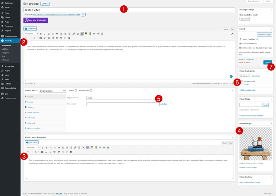
1. Add/Open WooCommerce Product
Product Details
Start by creating a new product or opening an existing one. To achieve the exact same outcome in design, you’ll need to add the following details to your product:
- Name
- Description
- Product image with transparent background
- Price
- Category
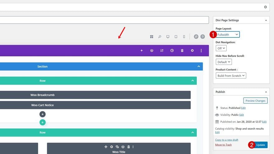
Enable Divi Builder & Modify Product Page Settings
Enable the Divi Builder and change the page layout in the top right corner.
- Page Layout: Fullwidth
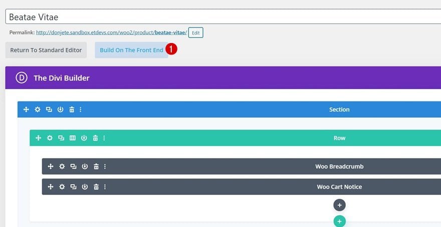
Switch Over to Visual Builder
Once you’ve changed the page layout, you can switch to Divi’s Visual Builder by clicking on ‘Build On The Front End’.
2. Create Slide-In Product Info Product Page Layout
Remove Multiple Rows on Page
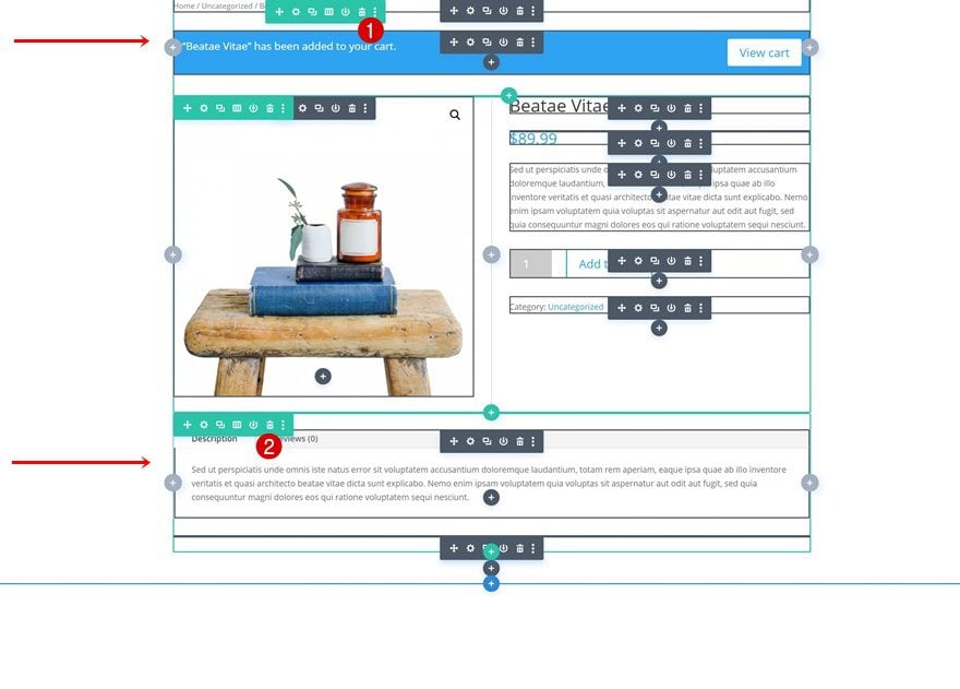
Inside the product page editor, you’ll notice various elements relevant to your product. We only need the second row’s elements so go ahead and delete the first and last row inside the section.
Modify Section Settings
Background Color
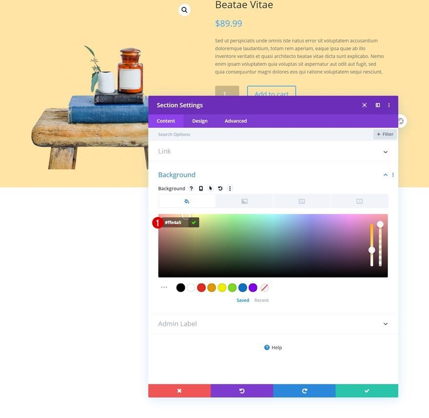
Time to start modifying the different elements to create our slide-in product info layout! Open the section settings and change the background color.
- Background Color: #ffe4a5
Sizing
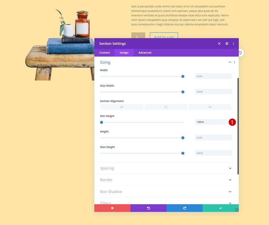
Add a minimum height to the sizing settings as well. This step will allow the section to take up the entire height of your browser.
- Min Height: 100vh
Spacing
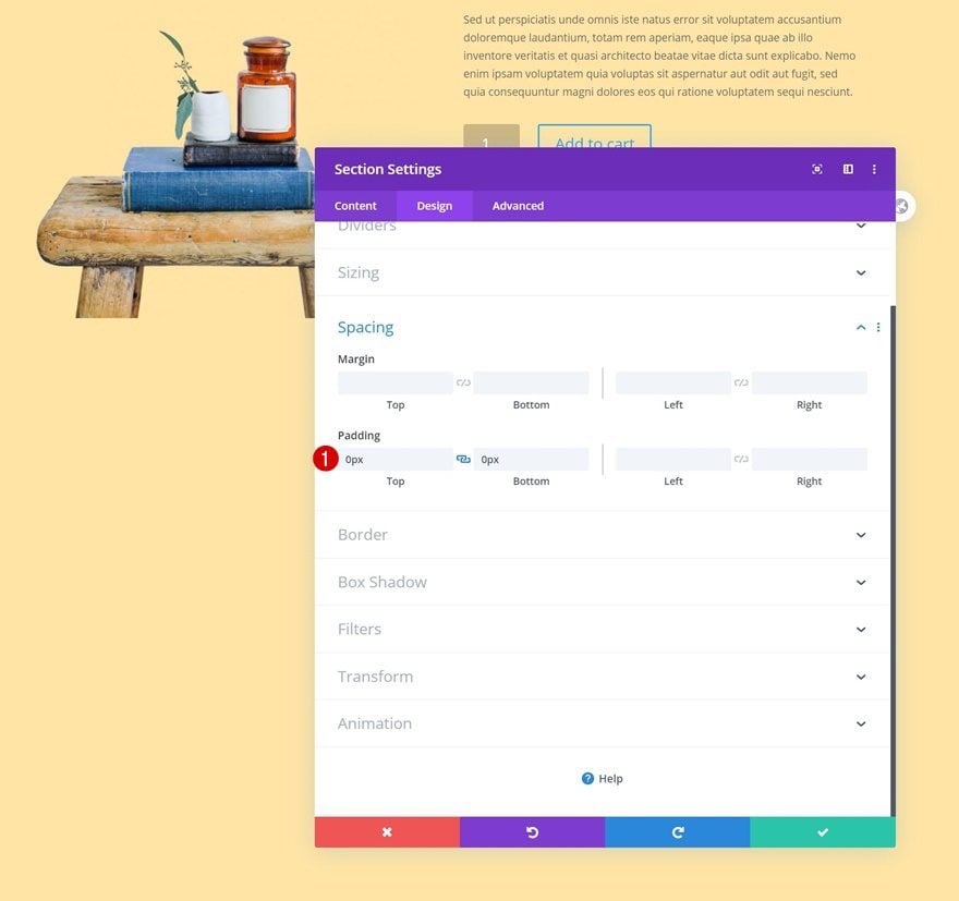
Then, go to the spacing settings and remove all default top and bottom padding.
- Top Padding: 0px
- Bottom Padding: 0px
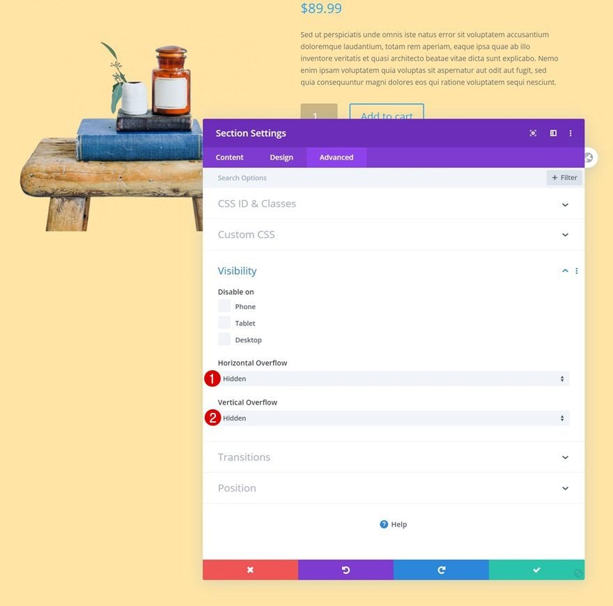
Visibility
Hide the section’s overflows as well. This will help ensure no horizontal bar appears when the animations are taking place.
- Horizontal Overflow: Hidden
- Vertical Overflow: Hidden
Modify Row Settings
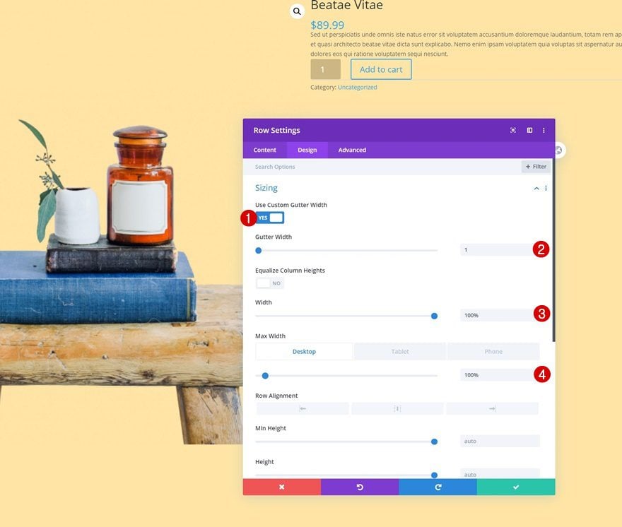
Sizing
Next, open the row settings and modify the sizing settings across different screen sizes.
- Use Custom Gutter Width: Yes
- Gutter Width: 1
- Width: 100%
- Max Width: 100% (Desktop), 90% (Tablet & Phone)
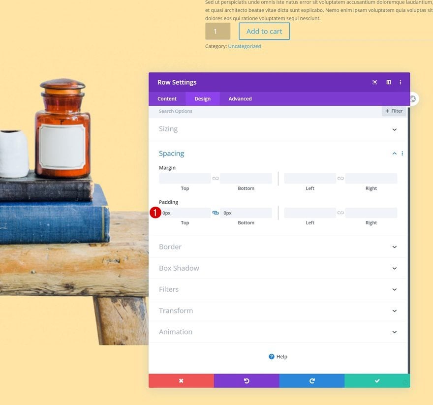
Spacing
Remove the row’s default top and bottom padding too.
- Top Padding: 0px
- Bottom Padding: 0px
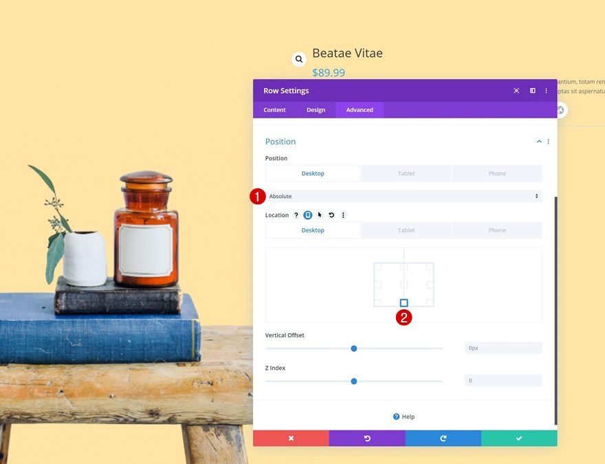
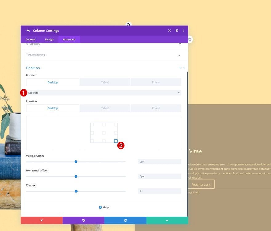
Position
Then, go to the position settings and make sure the row remains at the bottom of the section by modifying the settings accordingly:
- Position: Absolute (Desktop), Default (Tablet & Phone)
- Location: Bottom Center
Modify Column 2 Settings
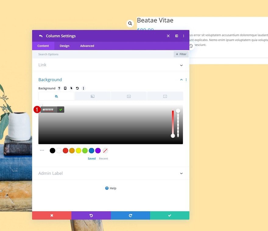
Background Color
Next, we’ll make some changes to the second column. Use a white background color.
- Background Color: #FFFFFF
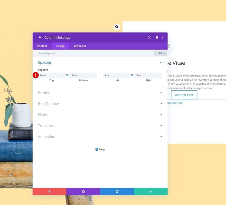
Spacing
Then, add some custom padding values to the spacing settings.
- Top Padding: 10vw
- Bottom Padding: 10vw
- Left Padding: 8vw
- Right Padding: 8vw
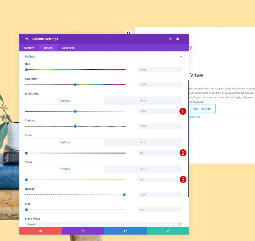
Default Filter
Move on to the column’s filters settings and make sure the brightness, invert and sepia filters keep their default value in a normal state.
- Brightness: 100%
- Invert: 0%
- Sepia: 0%
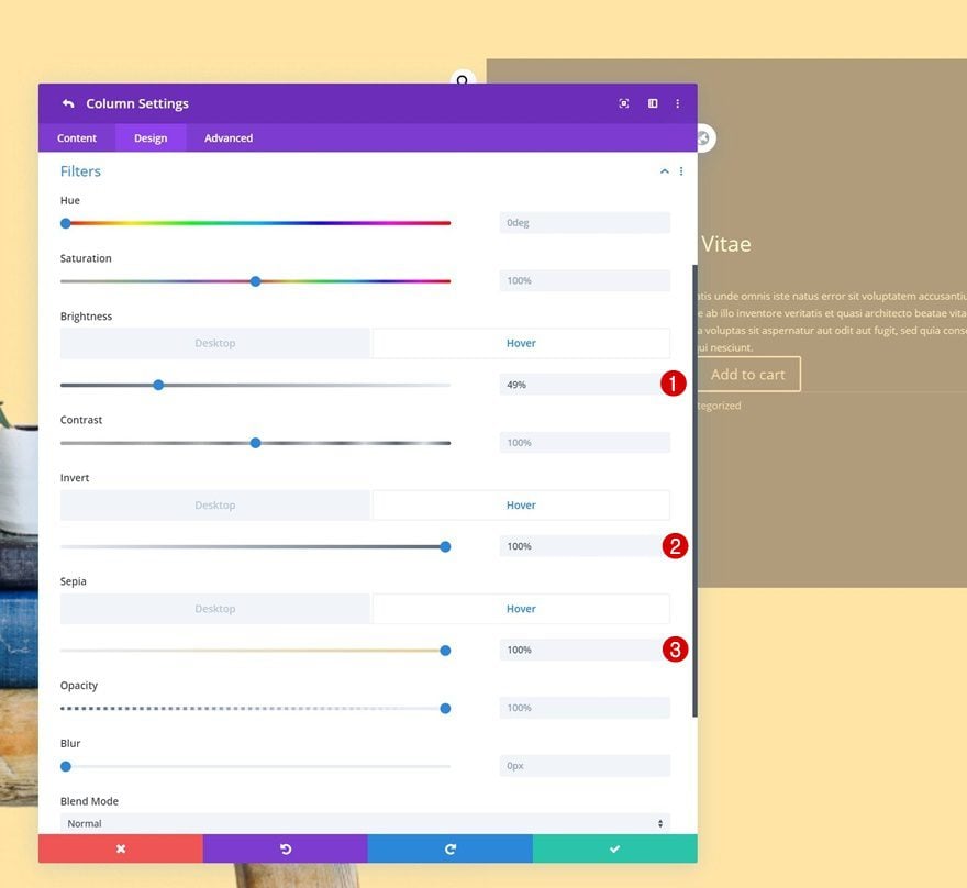
Hover Filter
On hover, however, we’ll change the values accordingly:
- Brightness: 49%
- Invert: 100%
- Sepia: 100%
Position
We’re also making sure the column is placed in the bottom right corner of the row container by applying the following position settings:
- Position: Absolute (Desktop), Default (Tablet & Phone)
- Location: Bottom Right
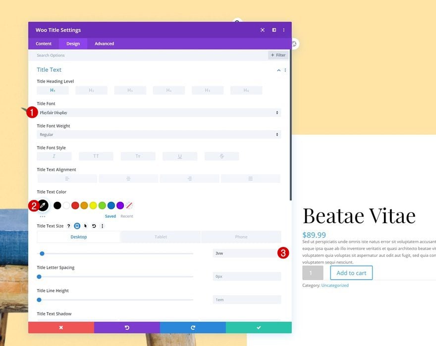
Modify Woo Title Module in Column 2
Title Text Settings
Time to start customizing the different modules in column 2! Open the Woo Title Module and change the H1 text settings as follows:
- Title Font: Playfair Display
- Title Text Color: #000000
- Title Text Size: 3vw (Desktop), 5vw (Tablet), 7vw (Phone)
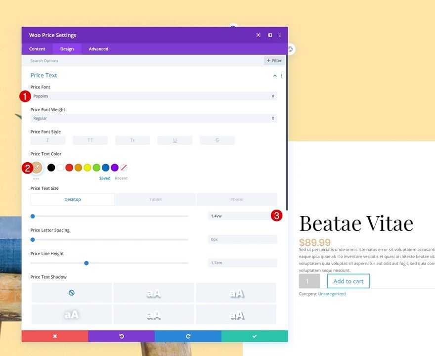
Modify Woo Price Module in Column 2
Price Text Settings
Open the Woo Price Module settings next and change the price text settings.
- Price Font: Poppins
- Price Text Color: #e5bc87
- Price Text Size: 1.4vw (Desktop), 3vw (Tablet), 4vw (Phone)
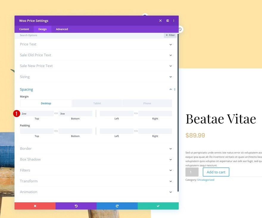
Spacing
Add some custom top and bottom margin across different screen sizes too.
- Top Margin: 2vw (Desktop), 4vw (Tablet & Phone)
- Bottom Margin: 3vw (Desktop), 5vw (Tablet & Phone)
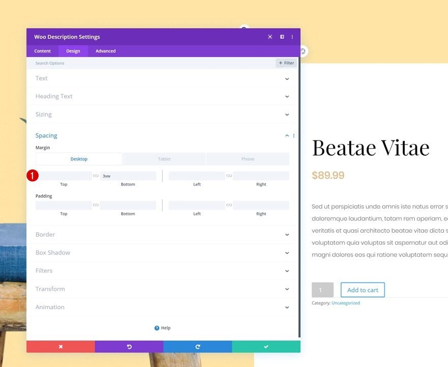
Modify Woo Description Module in Column 2
Text Settings
On to the Woo Description Module. Modify the module’s text settings accordingly:
- Text Font: Poppins
- Text Font Weight: Light
- Text Size: 0.8vw (Desktop), 1.8vw (Tablet), 2.7vw (Phone)
- Text Line Height: 2.1em
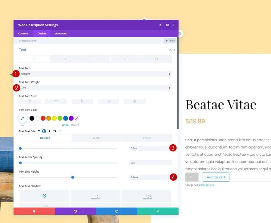
Spacing
Add some responsive bottom margin too.
- Bottom Margin: 3vw (Desktop), 5vw (Tablet & Phone)
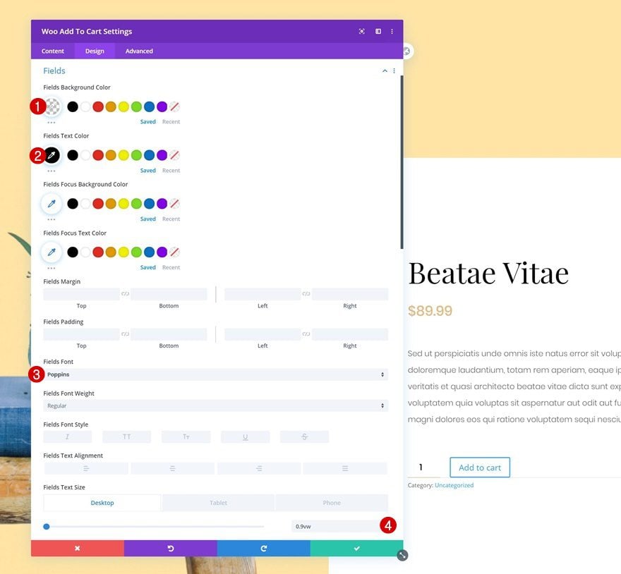
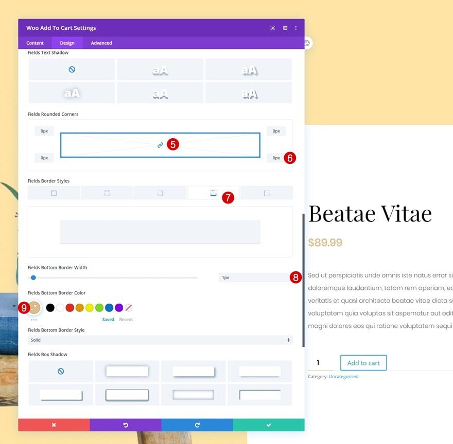
Modify Woo Add to Cart Module in Column 2
Fields Settings
Up next we have the Woo Add to Cart Module. Change the module’s fields settings.
- Fields Background Color: rgba(255,255,255,0)
- Fields Text Color: #000000
- Fields Font: Poppins
- Fields Text Size: 0.9vw (Desktop), 2vw (Tablet), 3vw (Phone)
- All Corners: 0px
- Fields Bottom Border Width: 1px
- Fields Bottom Border Color: #e5bc87
Button Settings
Move on to the button settings and style the button accordingly:
- Use Custom Styles For Button: Yes
- Button Text Size: 0.9vw (Desktop), 2vw (Tablet), 3vw (Phone)
- Button Text Color: #ffffff
- Gradient Color 1: #e5bd89
- Gradient Color 2: #e5bc87
- Gradient Type: Linear
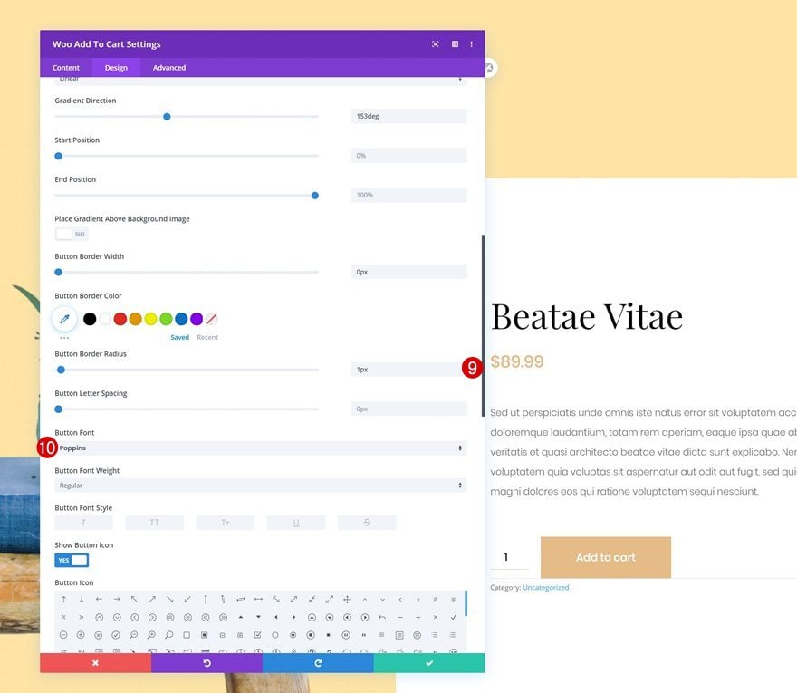
- Gradient Direction: 153deg
- Button Border Width: 0px
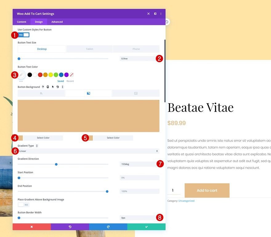
- Button Border Radius: 1px
- Button Font: Poppins
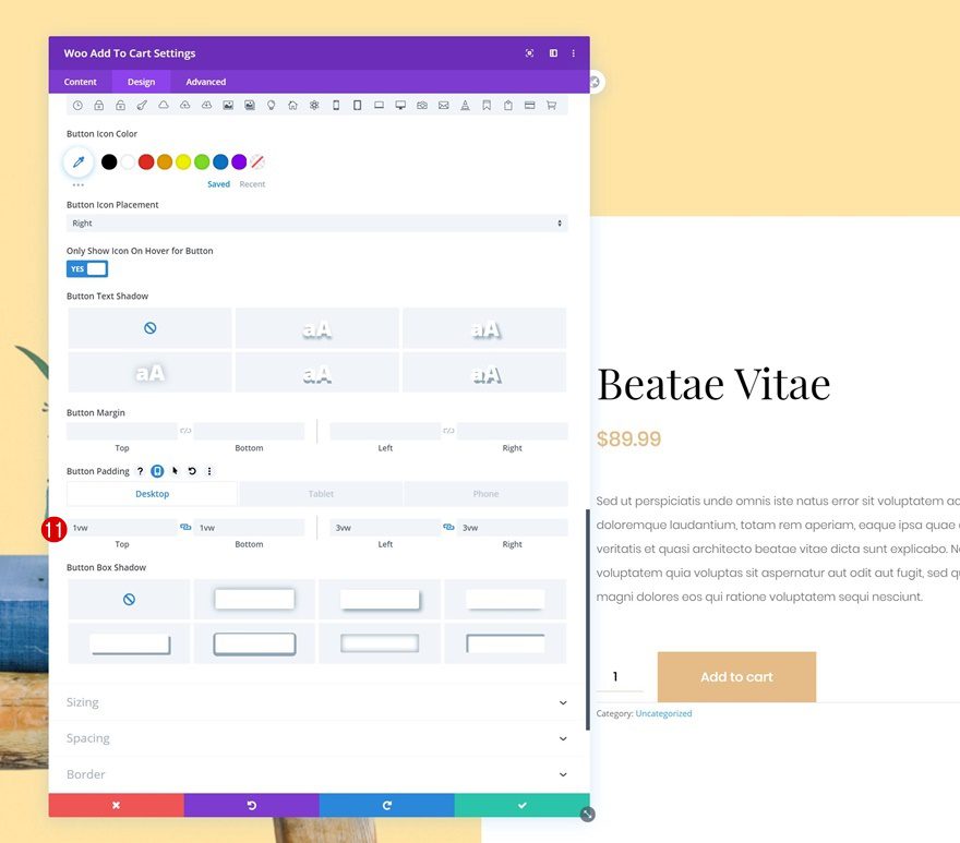
- Top Padding: 1vw (Desktop), 2vw (Tablet), 3vw (Phone)
- Bottom Padding: 1vw (Desktop), 2vw (Tablet), 3vw (Phone)
- Left Padding: 3vw (Desktop), 6vw (Tablet), 9vw (Phone)
- Right Padding: 3vw (Desktop), 6vw (Tablet), 9vw (Phone)
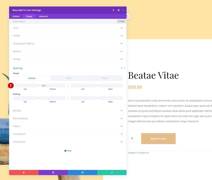
Spacing
Complete the module’s settings by adding some button margin across different screen sizes.
- Bottom Margin: 2vw (Destkop), 4vw (Tablet & Phone)
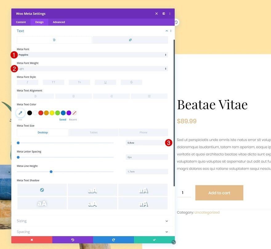
Modify Woo Meta Module in Column 2
Text Settings
Continue by opening the Woo Meta Module and change the text settings.
- Meta Font: Poppins
- Meta Font Weight: Light
- Meta Text Size: 0.8vw (Desktop), 1.8vw (Tablet), 3vw (Phone)
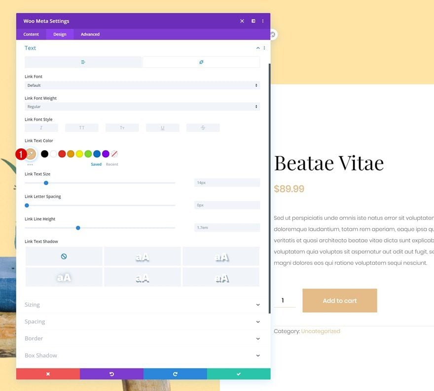
Link Text Settings
Change the link text color too.
- Link Text Color: #e5bc87
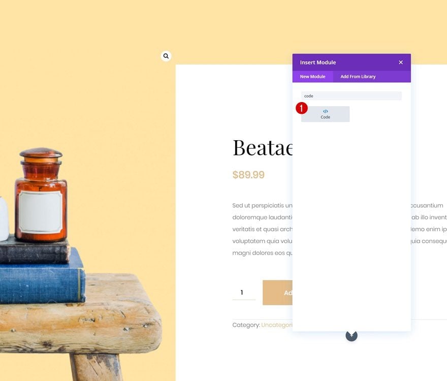
Add Code Module to Column 2
To change the Woo Image Module’s zoom background color, we’ll need a tiny bit of CSS code which we’ll place in a new Code Module in column 2.
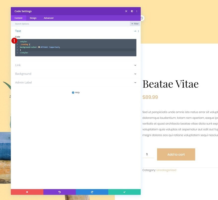
Add CSS Code to Change Woo Image Zoom Background Color
Add the following lines of CSS code to the Code Module:
<style>
.zoomImg {
background-color: #FFE4A5 !important;
}
</style>
3. Add Synchronized Animation Settings to Containers
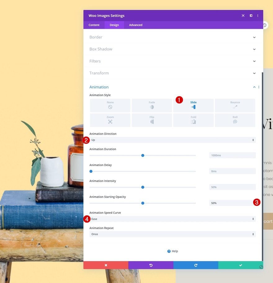
Woo Image Module
Now that we’ve styled the different elements on our product page, it’s time to make the slide-in product info effect happen! To accomplish this, we’ll use Divi’s built-in animation settings. Open the Woo Image Module in column 1 and apply the following animation:
- Animation Style: Slide
- Animation Direction: Up
- Animation Starting Opacity: 50%
- Animation Speed Curve: Ease
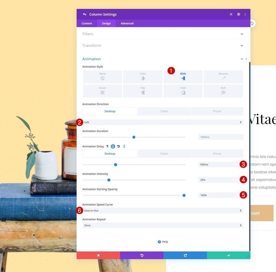
Column 1
Open the column 1 settings next and use the following animation settings:
- Animation Style: Slide
- Animation Direction: Left (Desktop), Up (Tablet & Phone)
- Animation Delay: 950ms (Desktop), 0vw (Tablet & Phone)
- Animation Intensity: 25%
- Animation Starting Opacity: 100%
- Animation Speed Curve: Ease-In-Out
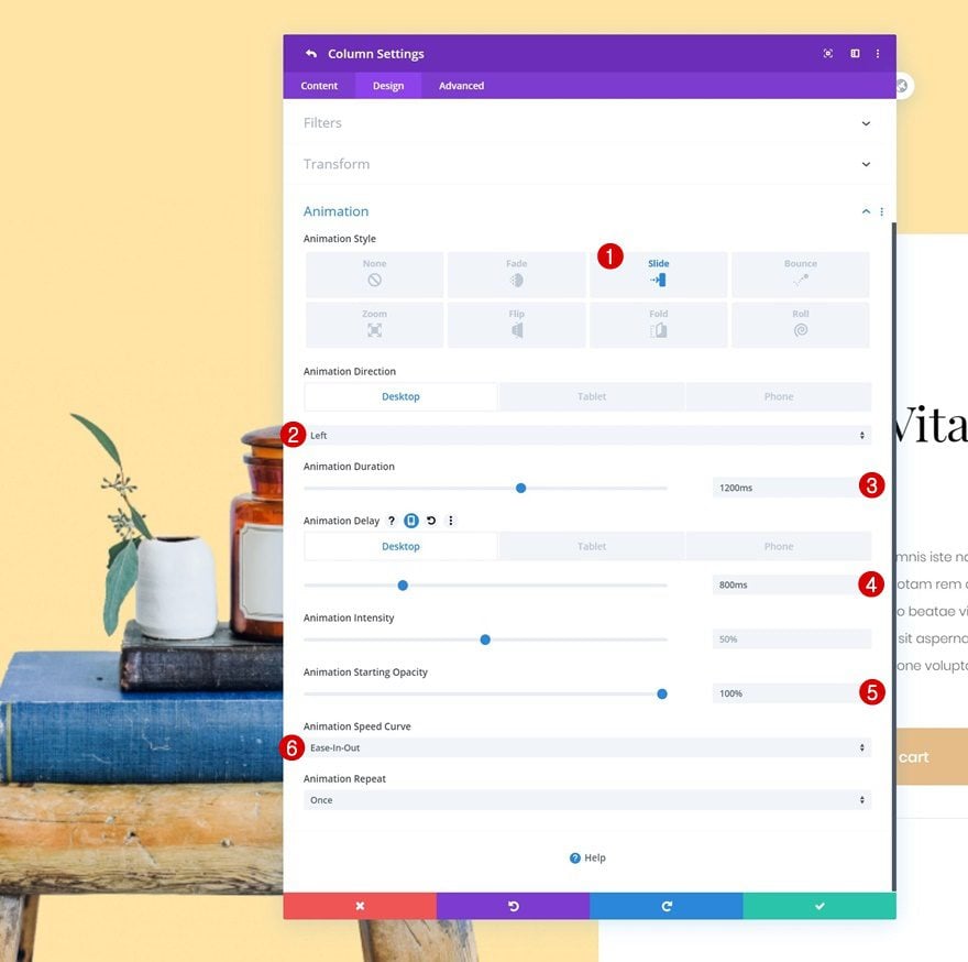
Column 2
Lastly, apply the following animation settings to column 2:
- Animation Style: Slide
- Animation Direction: Left (Desktop), Up (Tablet & Phone)
- Animation Duration: 1200ms
- Animation Delay: 800ms (Desktop), 0ms (Tablet & Phone)
- Animation Starting Opacity: 100%
- Animation Speed Curve: Ease-In-Out
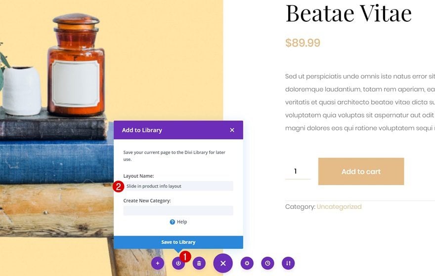
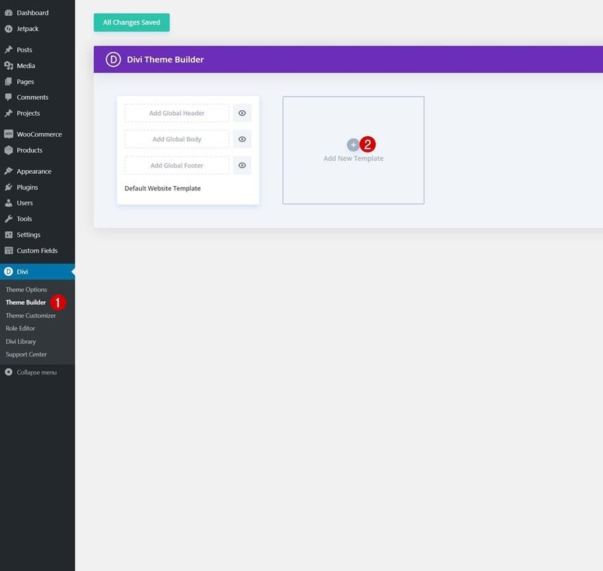
4. Turn Product Page Layout into Template
Save Layout to Divi Library
Once you’ve completed the entire product page design, you can save it to your Divi Library. We’ll use this saved product page layout to create a new product page template.
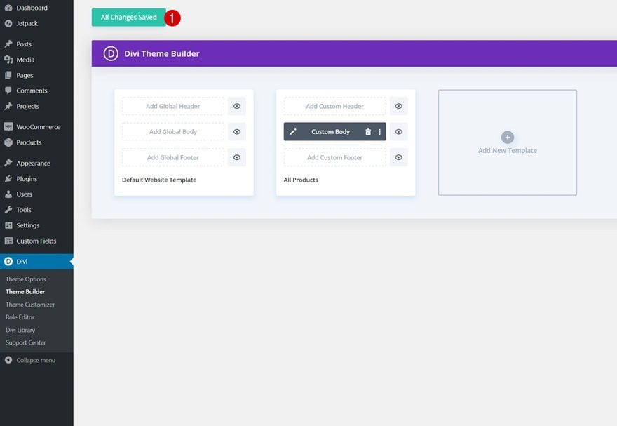
Go to Divi Theme Builder & Add New Template
Go to the Divi Theme Builder and add a new template.
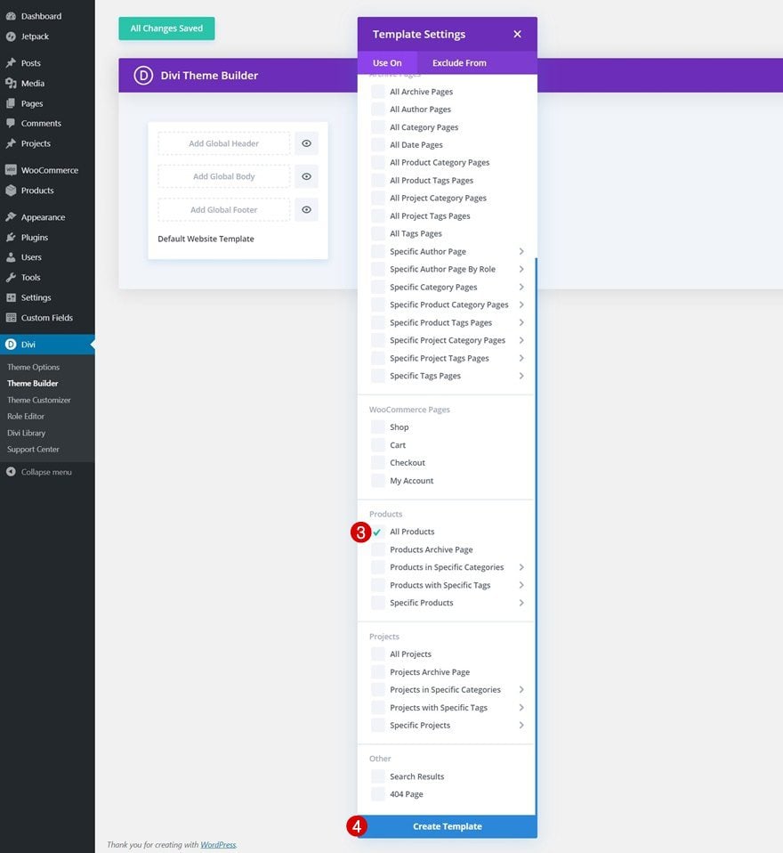
Use Template on All Products
Use the new template on all products.
- Use On: All Products
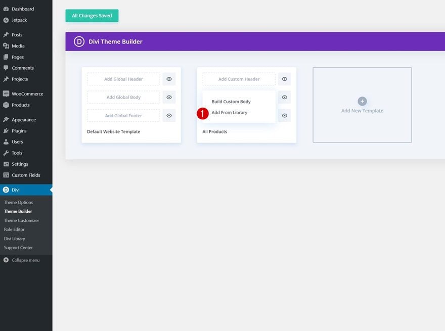
Upload Layout to Product Page Template’s Body
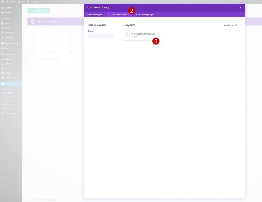
Then, click on ‘Add Custom Body’ and click on ‘Add From Library’.
Navigate to ‘Your Saved Layouts’ and select the product page layout you’ve uploaded to your Divi Library.
5. Save Theme Builder Changes & View Outcome
Once you’ve uploaded the layout to your new product page template, the only thing left to do is save all Theme Builder changes and view the outcome on your website!
Preview
Now that we’ve gone through all the steps, let’s take a final look at the outcome across different screen sizes.
Desktop
Mobile
Final Thoughts
In this post, we’ve shown you how to spice up your product pages by showing you how to design a slide-in product info layout. This is a great way to add some additional interaction to your product pages. You were able to download the JSON file for free as well! If you have any questions or suggestions, feel free to leave a comment in the comment section below.
If you’re eager to learn more about Divi and get more Divi freebies, make sure you subscribe to our email newsletter and YouTube channel so you’ll always be one of the first people to know and get benefits from this free content.


The JSON file is wrong, the import does not work.
Didn’t work for me either. If you open the JSON file the first item is a “context” field – in this file I noticed it was et_Theme_builder – Which I haven’t seen before – it’s usually et_builder.
Change the context to that and you should be able to import. Though, importing it after that change imports a blank page…. lol
Hi Donjete
If I add slides on my product page is there any chance to effect in loading speed time.
PS: right now I use divi.
Thanks for this step by step tutorial it’s very interesting and pretty helpful.
Hi, is there a way where I can make sure that the full image is always displayed? My current picture is too tall, so once it loads the top 20% is cut off.
I really like this though, so thanks for the tutorial.