
Every week, we provide you with new and free Divi layout packs which you can use for your next project. For one of the layout packs, we also share a use case that’ll help you take your website to the next level. This week, as part of our ongoing Divi design initiative, we’re going to show you how to add motion to your section dividers using Divi’s Transportation Services Layout Pack.
We’re already familiar with Divi and its built-in animations, they’re part of each one of the design elements that are included in the Visual Builder. But if you want to add an animation to a section, the animation will apply to all design elements that are included in that section. Want to avoid that? You can approach it differently. We’re going to show you how to add motion to section dividers only. By giving your website that extra bit of motion, especially in creative design elements such as section dividers, you can give your pages a new look and feel.
Let’s get to it!
Preview
Before we dive into the tutorial, let’s take a quick look at a GIF that will demonstrate the end result:
![]()
Approach
- Instead of using section dividers within the section itself, a section divider will have its own section
- The section we add for the section divider will be completely empty
- This allows us to add the animation to the entire section but it will only apply to the section divider because there are no other design elements there
- We’re making sure the transition is seamless by using a divider color that matches the next or previous section
- The animation we choose will depend on the section divider in question, not every animation matches a particular divider style
- We’re choosing animations that make the transition seem smooth and won’t give away that the section dividers aren’t actually part of the previous or next section
- You can use other section dividers of choice as well, but you’ll have to play around with the animation settings until you get the desired smooth result you’ve had in mind
Let’s Start Creating
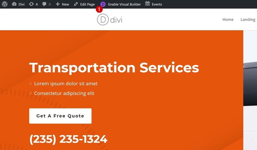
Enable Visual Builder on Transport Services Landing Page
Open the landing page of the website you’ve created (using Divi’s Transportation Services Layout Pack) with the Visual Builder. We’re going to demonstrate it on this page but you can apply this approach to any other page you’re working on.
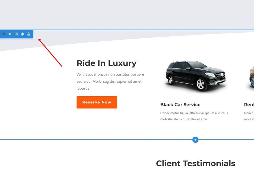
Change Section Background Color
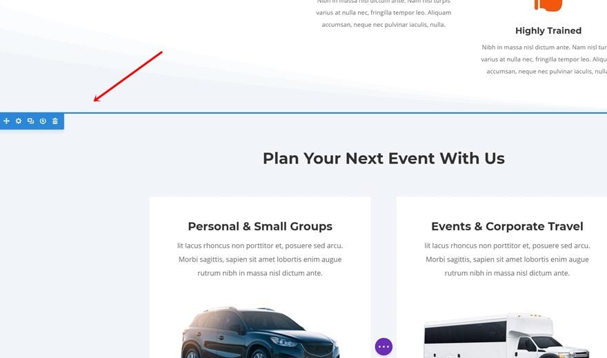
Locate Section
The first thing we’re going to do is change the background color of a section on our page. We’re going to make it slightly darker to make the section dividers more noticeable. Find the following section on your page:
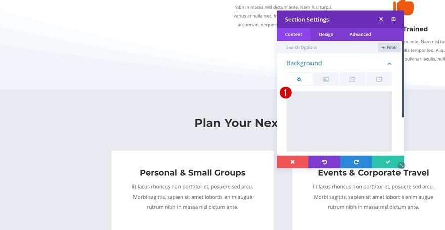
Change Background Color
Open the settings of this section, go to the Background options and change the background color into ‘#e8eaef’.
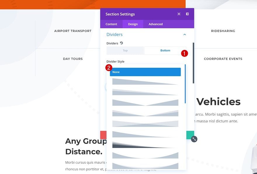
Remove Bottom Divider
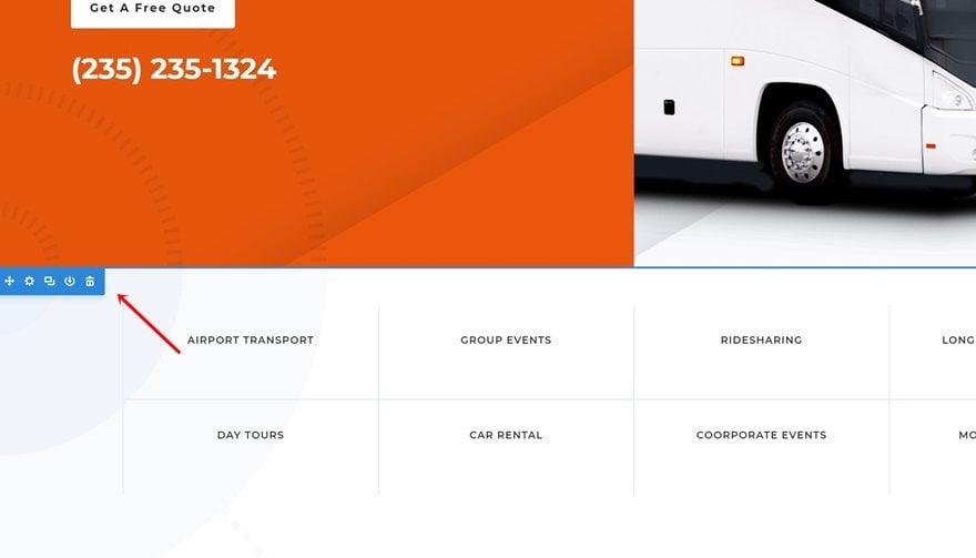
Locate Section
The next thing we’ll need to do is removing the bottom divider one of the sections on our page. As mentioned in the approach of this blog post, we’re going to create a separate section for our section divider. Go ahead and locate the following section on your page:
Remove Bottom Divider
Open the settings of this section and remove the bottom divider by selecting ‘None’ in the Divider Style list.
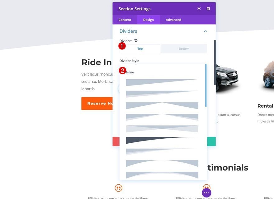
Remove Top Divider
Locate Section
The second divider we’re going to get rid of is the following one:
Remove Top Divider
Open the settings of this section and remove the top divider.
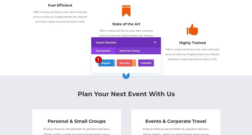
Add Motion Section Divider #1
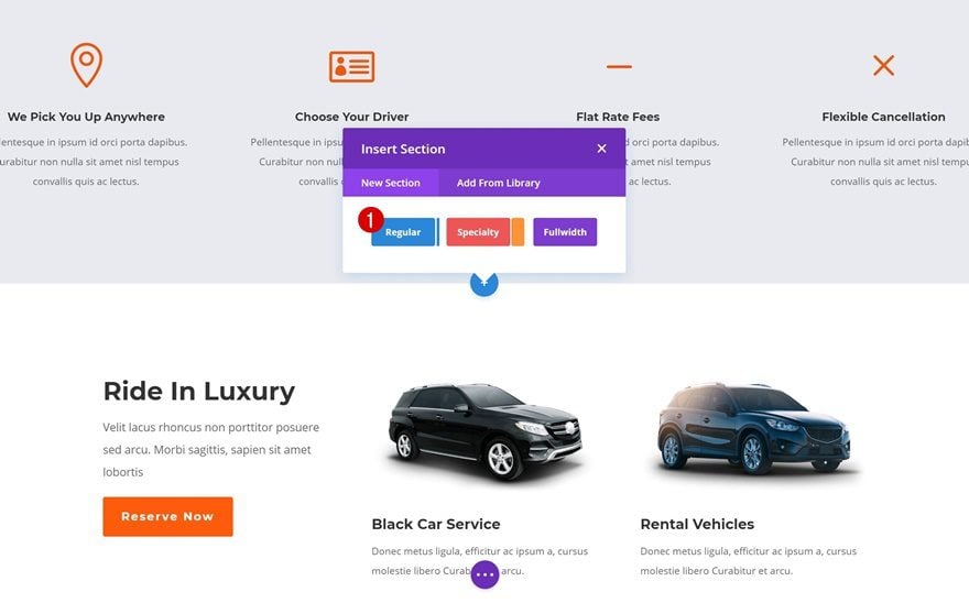
Add New Section
Position
We can now start adding our motion section dividers! We’ll start with the first one. Go ahead and add a new regular section right between the following two sections:
Bottom Divider
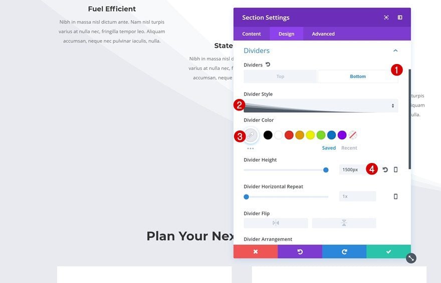
Don’t add any rows or modules to your section. Instead, open the section settings and add a bottom divider.
- Divider Style: Find in List
- Divider Color: #e8eaef
- Divider Height: 1500px
Animation
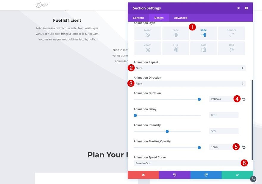
Continue by adding the animation style of your choice. The following animation settings go really well together with the divider style we’ve chosen:
- Animation Style: Slide
- Animation Repeat: Once
- Animation Direction: Right
- Animation Duration: 2000ms
- Animation Starting Opacity: 100%
- Animation Speed Curve: Ease-in-Out
Add Motion Section Divider #2
Add New Section
Position
Let’s add the second section divider as well. Scroll down your page and add a new standard section right here:
Top Divider
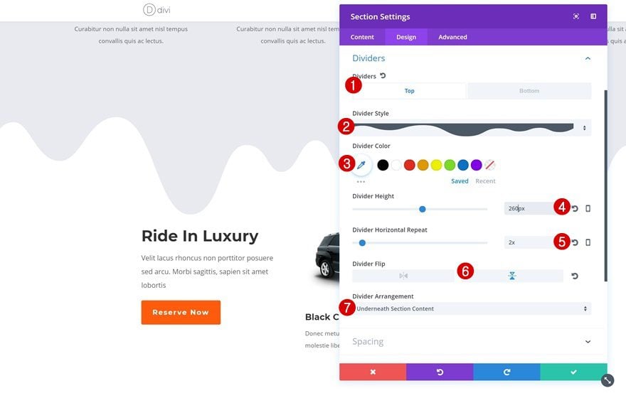
Open your section settings and add the following top divider:
- Divider Style: Find in List
- Divider Height: 260px
- Divider Horizontal Repeat: 2x
- Divider Flip: Vertical
- Divider Arrangement: Underneath Section Content
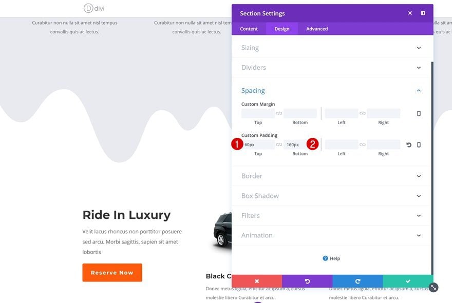
Spacing
To make sure the divider doesn’t get interrupted by the next section, we’re going to add some additional padding to the top and bottom:
- Top Padding: 60px
- Bottom Padding: 160px
Animation
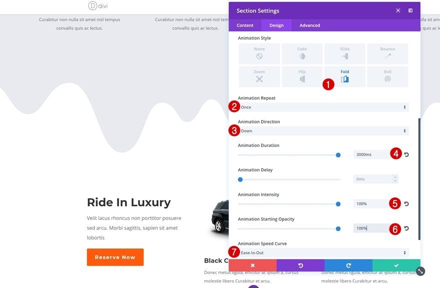
The following effect makes the divider look like it’s dripping down your page:
- Animation Style: Fold
- Animation Repeat: Once
- Animation Direction: Down
- Animation Duration: 3000ms
- Animation Intensity: 100%
- Animation Starting Opacity: 100%
- Animation Speed Curve: Ease-in-Out
Preview
Now that we’ve gone through all the steps, let’s take a final look at the result we’ve managed to obtain:
![]()
Final Thoughts
In this use case blog post, we’ve shown you how to add motion to your section dividers using Divi’s Transport Services Layout Pack. You’re probably used to adding animations to design elements in general but you can add animations to section dividers in particular as well. This results in an interactive design. Once you get the concept, you can add motion to any kind of section divider you’re using on your page. If you have any questions or suggestions, make sure you leave a comment in the comment section below!
Featured Image by Trend Creatives / shutterstock.com


the animation didn’t apply to the divider, but the section itself when I tried it.
Thank you so much Elegant Themes! Your creative ways of using Divi’s build in design options seems endless. Thank you for inspiring educating me every single day.
BR Rikke
I haven’t tried but maybe its a full-width one column section with a parallax background, and then another parallax background for the actual column (the arms/hands is a PNG file used in the background area).
Hi Joel, I would like to try to make this effect. I hope that in the meantime an explanatory tutorial will be made
Create a new section and select one column (can be standard). Under background of the Section Module settings add your image and select use Parallax Effect. Next under Row Module settings do the same for the background here too, only this time you add the PNG (transparent) image file you want (like the arms/hands in the sample page you linked). That’s really it man…you will prob have to tweak it though to make it look perfect.
Ok, achieving a parallax effect is not difficult. I was referring to the fact that in that example it seems to see 3 levels of parallax: background, png, text. I did some tests and I understood that it is possible to obtain it by applying the parallax (CSS method) to the background of the section and applying the parallax method TRUE to the background of the fullwidth row (png). The text is normally inserted in the row. In this way I perfectly reproduced this beautiful effect that gives the impression of having 3 superimposed levels.
Beautiful effect and excellent tutorial. I really like your desire to experiment and always find original solutions. Donjete, it would be nice if you could do a tutorial on particular effects of parallax.
For example, I really liked the effect I saw on a site created with Divi but that I still could not make. This is the http://www.atomivox.com/team page and the section is “Get a time”. The parallax effect is obtained on more than two levels. How to achieve this effect? Thank you
Perfect!
great guide, thanks
how do I combine it with adjacent section that has image in it rather than a BG color?
Thanks
You guys rock!
nice 🙂 simple, yet very effective.
This is the kind of stuff I enjoy seeing the most!
Wow, perfect work 🙂
Awesomely cool. Looking forward for more stuff like this.
A wonderful idea with one fatal flaw. It only seems to work if the page background color is white. Why is that? Cannot the dividers be programmed to have transparent backgrounds so that as they animate on, they do so over the page’s background color instead of popping a white background up?
Deadly. I was thinking about how this was done after seeing a site in one of the Divi showcase blogs, do just this.
Cheers.
This is really cool! I hope we get more tutorials like this. This type of post is very useful. Thank you.