
When building your website’s header, paying special attention to your visitors’ behavior can help boost clickthrough rates. Not only should your header look good, but it should also help guide visitors to the most important pages on your website. A frequently used technique is adding a call to action inside your global header, but that’s not the only option out there. You can also opt for a corner label on the menu items you want to put in the spotlight. In this tutorial, we’ll show you how to add a “featured” or “new” label to specific menu items. These corner labels will help emphasize the menu items in the list, which increases the change of your visitors being curious and clicking through. You’ll be able to download the global header template as well!
Let’s get to it.
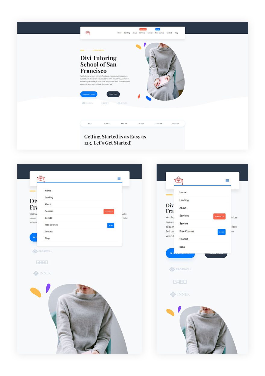
Preview
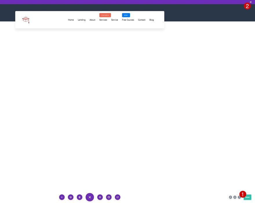
Before we dive into the tutorial, let’s take a quick look at the tutorial concept across different screen sizes.
Download The Global Header Template for FREE
To lay your hands on the free global header template, you will first need to download it using the button below. To gain access to the download you will need to subscribe to our newsletter by using the form below. As a new subscriber, you will receive even more Divi goodness and a free Divi Layout pack every Monday! If you’re already on the list, simply enter your email address below and click download. You will not be “resubscribed” or receive extra emails.

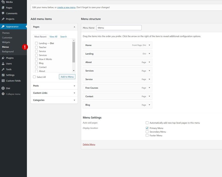
The first part of this tutorial is dedicated to setting up the labels inside your WordPress menu. To do that, navigate to your WordPress dashboard > Menus > Open the primary menu you’re using or create a new one.
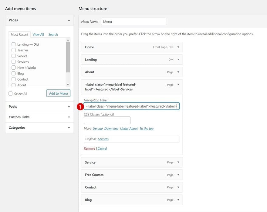
Next, we’ll add a featured label to a menu item of our choice by placing the label HTML tags in front of the menu item.
-
<label class="menu-label featured-label">Featured</label>
Services
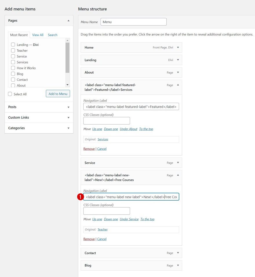
We’ll do the same thing for another menu item of our choice and change the CSS class inside the tags along with the label copy.
-
<label class="menu-label new-label">New</label>
Free Courses
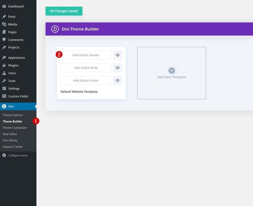
2. Go to Divi Theme Builder
Go to Divi Theme Builder & Add Global Header
Now that the labels have been set up, it’s time to switch over to Divi. Navigate to your website’s Divi Theme Builder and click on “Add Global Header.”
Start Building From Scratch
Then, select “Build Global Header” to be redirected to the template editor.
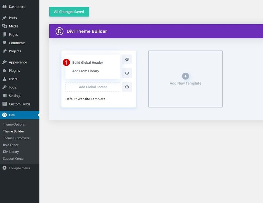
3. Build Global Header
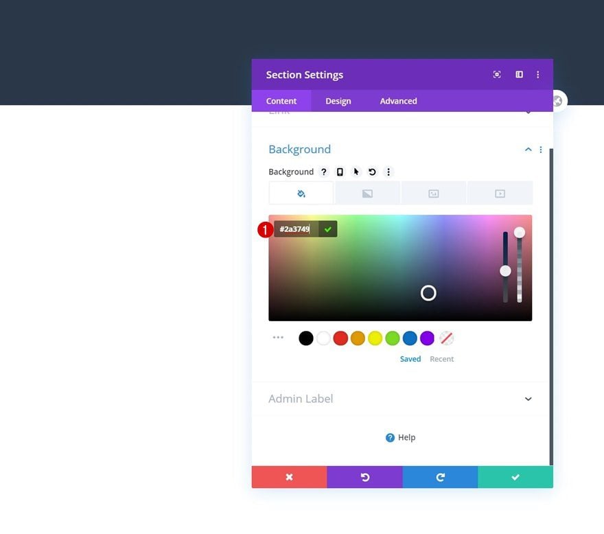
Section Settings
Background Color
Once inside the template editor, you’ll notice a section. Open that section and add a background color. The header design we’ll build goes well with the Tutor Layout Pack, but feel free to create any header design you want, as long as you include the Code Module (later on) in it.
- Background Color: #2a3749
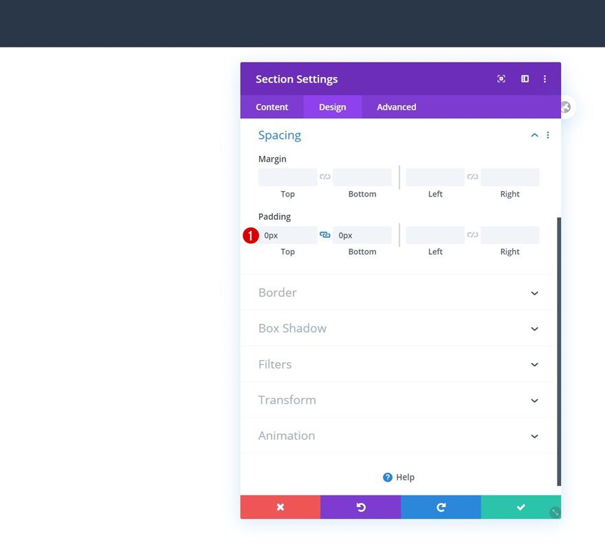
Spacing
Move on to the section’s design tab and remove all default top and bottom padding in the spacing settings.
- Top Padding: 0px
- Bottom Padding: 0px
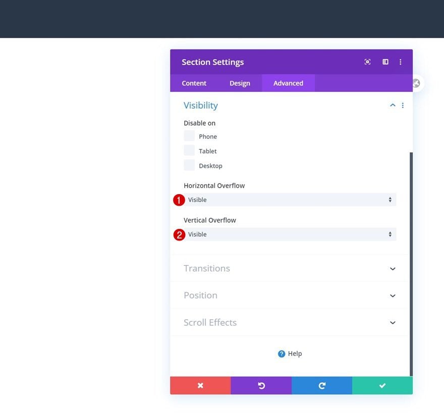
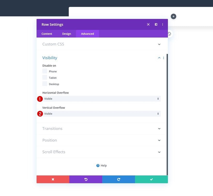
Visibility
Because of the overlap we’ll add to our row (as you can notice in the preview), we’ll need to set the section’s overflows to visible.
- Horizontal Overflow: Visible
- Vertical Overflow: Visible
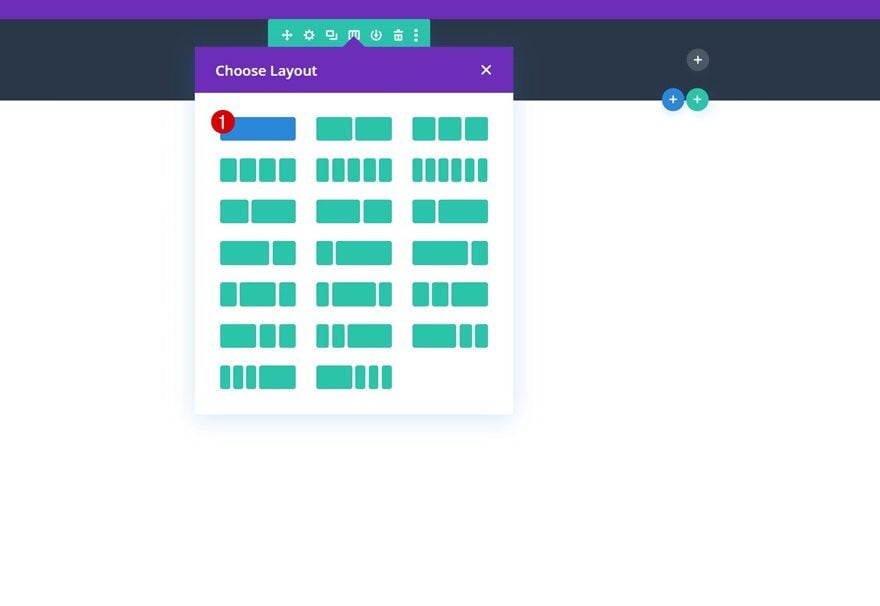
Add New Row
Column Structure
Continue by adding a new row to the section using the following column structure:
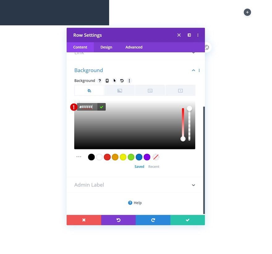
Background Color
Without adding any modules yet, open the row settings and apply a white background color.
- Background Color: #FFFFFF
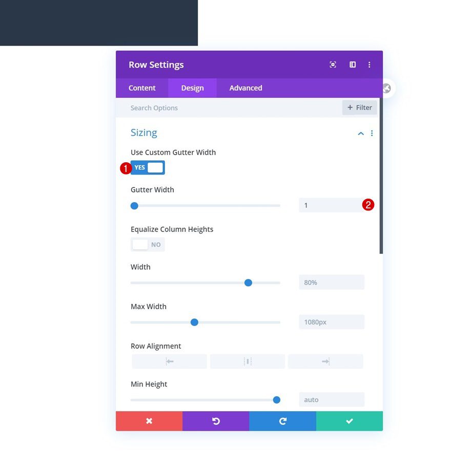
Sizing
Move on to the design tab and modify the sizing settings accordingly:
- Use Custom Gutter Width: Yes
- Gutter Width: 1
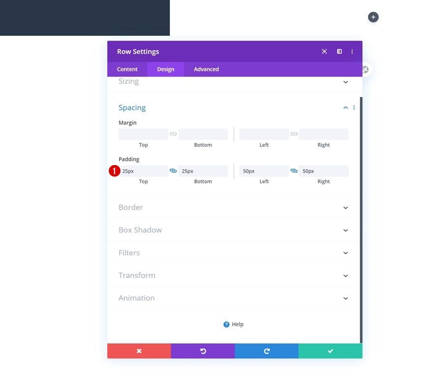
Spacing
We’ll apply some custom padding values to the spacing settings too.
- Top Padding: 25px
- Bottom Padding: 25px
- Left Padding: 50px
- Right Padding: 50px
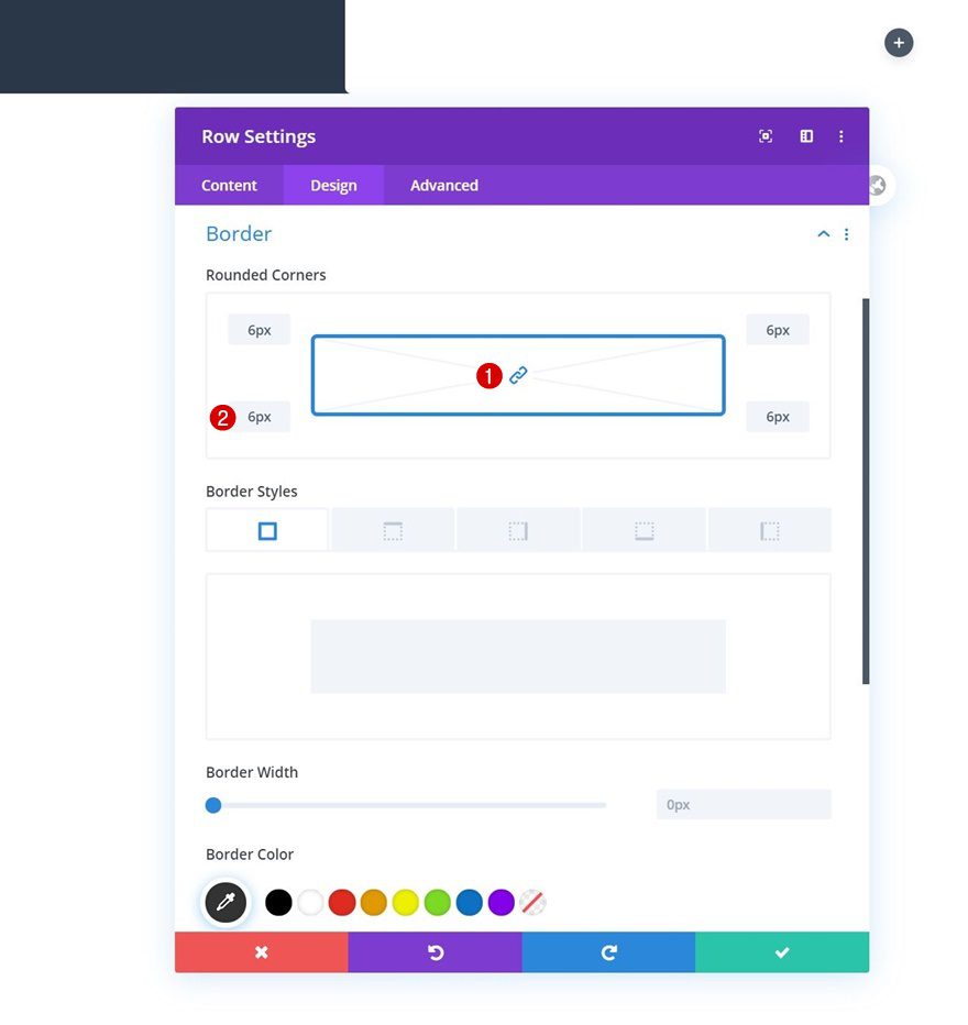
Border
Along with some rounded corners.
- All Corners: 6px
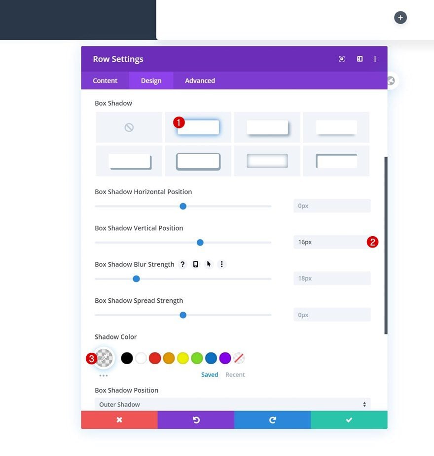
Box Shadow
And a subtle box shadow.
- Box Shadow Vertical Position: 16px
- Shadow Color: rgba(0,0,0,0.07)
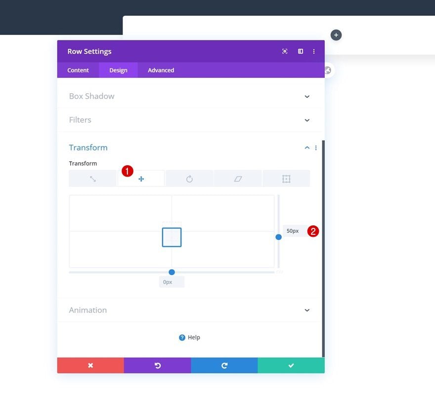
Transform Translate
Next, we’ll reposition the row using the transform translate settings in the design tab.
- Transform Translate Right: 50px
Overflows
To make sure our dropdowns appear on smaller screen sizes, we’ll complete the row settings by settings the overflows to visible.
- Horizontal Overflow: Visible
- Vertical Overflow: Visible
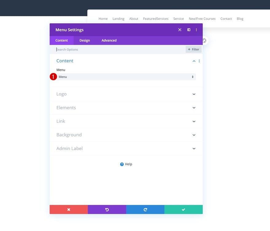
Select Menu
Time to add the Menu Module. Select the menu you’ve edited in the first part of this tutorial.
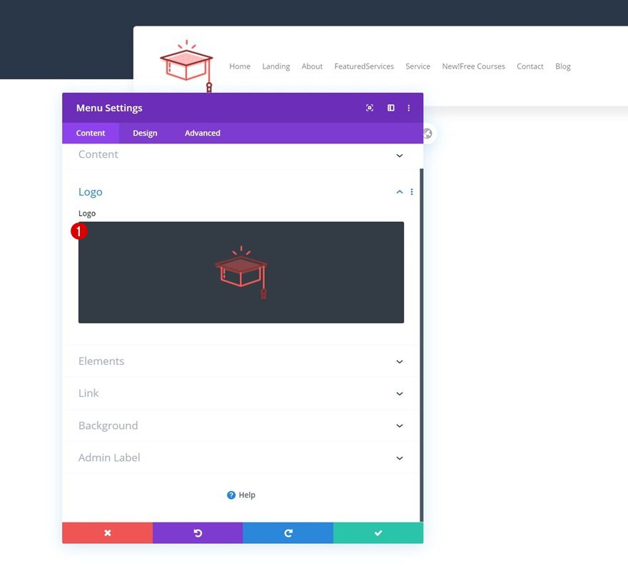
Upload Logo
Upload a logo next.
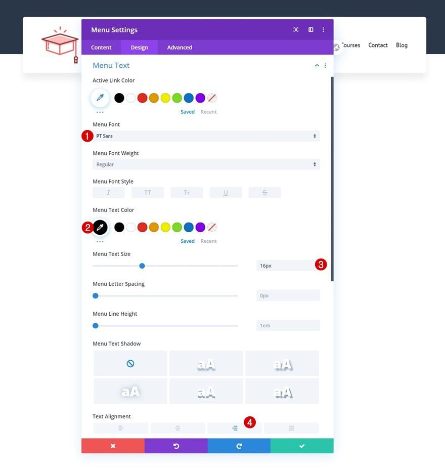
Menu Text Settings
Then, move on to the design tab and change the menu text settings as follows:
- Menu Font: PT Sans
- Menu Text Color: #000000
- Menu Text Size: 16px
- Text Alignment: Right
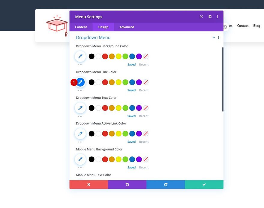
Dropdown Menu Settings
Modify the dropdown menu line color too.
- Dropdown Menu Line Color: #007aff
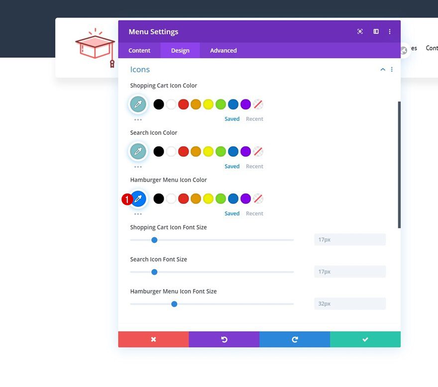
Icons
Continue by changing the hamburger menu icon color in the icons settings.
- Hamburger Menu Icon Color: #007aff
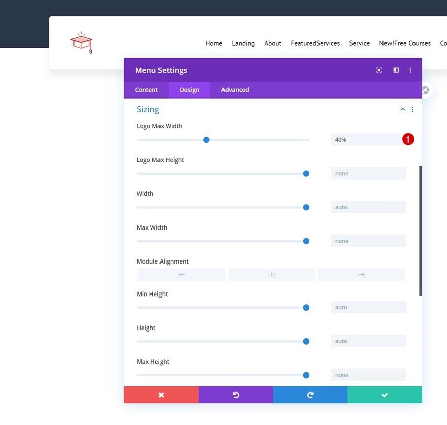
Sizing
And complete the module settings by assigning a logo max width to the sizing settings.
- Logo Max Width: 40%
Add Code Module to Column
Once you’ve completed the overall look and feel of your Menu Module continue by adding a Code Module right below it.
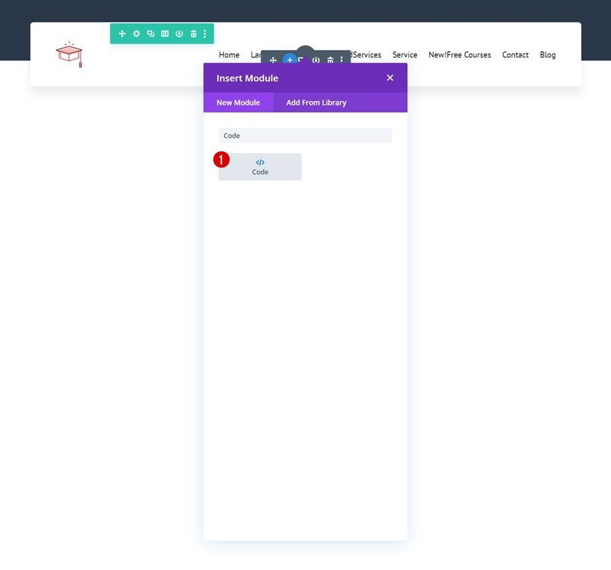
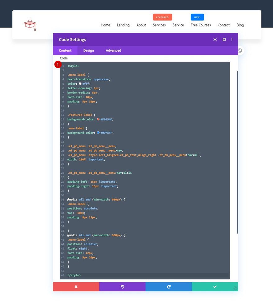
Add CSS Code
The following CSS code will help us style the menu labels individually and create a responsive design:
<style>

.menu-label {
text-transform: uppercase;
color: #fff;
letter-spacing: 1px;
border-radius: 5px;
font-size: 10px;
padding: 5px 10px;
}

.featured-label {
background-color: #F9654D;
}
.new-label {
background-color: #007AFF;
}

.et_pb_menu .et_pb_menu__menu,
.et_pb_menu .et_pb_menu__menu>nav,
.et_pb_menu--style-left_aligned.et_pb_text_align_right .et_pb_menu__menu>nav>ul {
width: 100% !important;
}

.et_pb_menu .et_pb_menu__menu>nav>ul>li
{
padding-left: 15px !important;
padding-right: 15px !important;
}

@media all and (min-width: 980px) {
.menu-label {
position: absolute;
top: -10px;
padding: 8px 15px;
}

}
@media all and (max-width: 980px) {
.menu-label {
position: relative;
float: right;
font-size: 12px;
padding: 5px 20px;
}
}

</style>
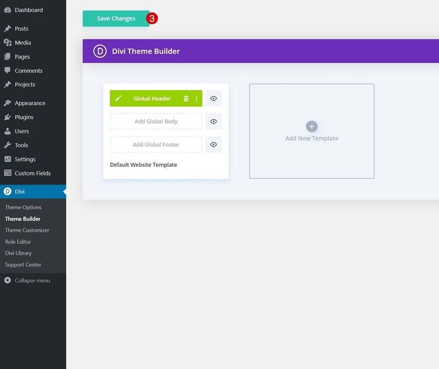
4. Save all Theme Builder Changes & Preview Outcome
Once you’ve completed the header design, make sure you save all Divi Theme Builder changes before viewing the outcome on your website!
Preview
Now that we’ve gone through all the steps, let’s take a quick look at the outcome across different screen sizes.
Final Thoughts
In this post, we’ve shown you how to highlight specific menu items inside your Divi-built global header. More specifically, we’ve included corner labels in our WordPress menu, which are displayed inside a Menu Module. This is a great way to highlight different menu items inside your menu without creating an overwhelming navigation journey. You were able to download the JSON file for free as well! If you have any questions or suggestions, feel free to leave a comment in the comment section below.
If you’re eager to learn more about Divi and get more Divi freebies, make sure you subscribe to our email newsletter and YouTube channel so you’ll always be one of the first people to know and get benefits from this free content.


how do I use the json file?